Arc Progress Bar
The Arc Progress Bar is an open source Flutter package that simplifies the creation of a curved or arc-shaped progress bar widget. It offers a wide range of customization options for users, taking care of the intricate curve calculations and animations on your behalf.
Add Dependency
Add this to your pubspec.yaml dependencies:
dependencies:
  arc_progress_bar: ^1.0.4
How to use
First of all make sure to call the import
import 'package:arc_progress_bar_new/arc_progress_bar_new.dart';
Then just customize the widget's parameters.
  ArcProgressBar(
    percentage: _progressPercentage,
    arcThickness: 5,
    innerPadding: 16,
    animateFromLastPercent: true,
    handleSize: 10,
    backgroundColor: Colors.black12,
    foregroundColor: Colors.black
    )

Screenshots & Implementations
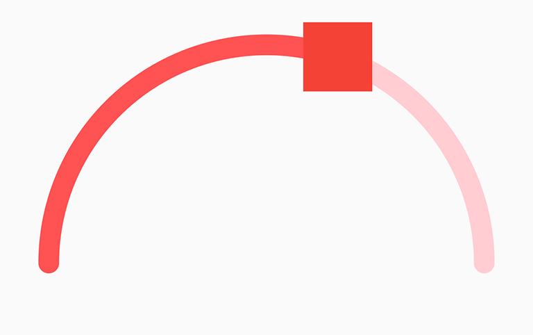
Example 1 - With custom Colors and Handle

 ArcProgressBar(
    percentage: _progressPercentage,
    arcThickness: 15,
    innerPadding: 48,
    strokeCap: StrokeCap.round,
    handleSize: 50,
    handleWidget: Container(
      decoration: const BoxDecoration(color: Colors.red)),
    foregroundColor: Colors.redAccent,
    backgroundColor: Colors.red.shade100,
 ),
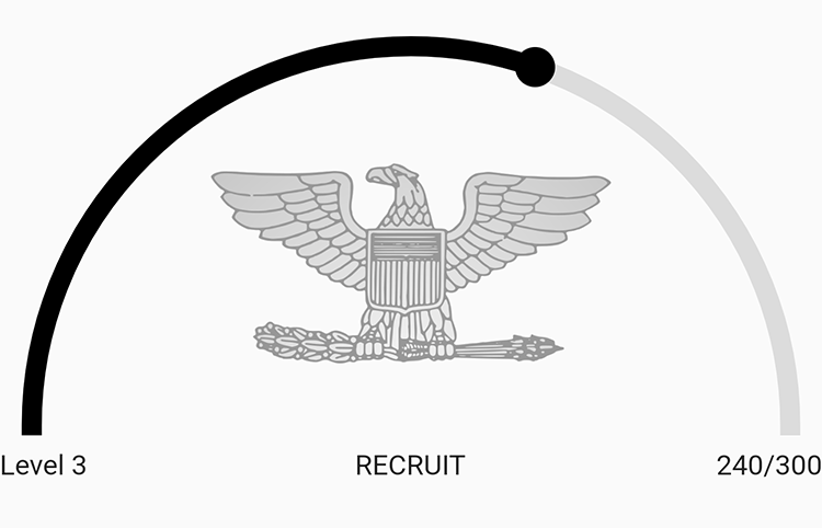
Example 2 - With Icon And Texts

 ArcProgressBar(
    percentage: _progressPercentage,
    bottomLeftWidget: const Text("Level 3"),
    bottomRightWidget: const Text("240/300"),
    bottomCenterWidget: const Text("RECRUIT"),
    centerWidget: Image.asset("assets/images/insignia.png",
        height: 200, width: 200, fit: BoxFit.contain)),
 ),
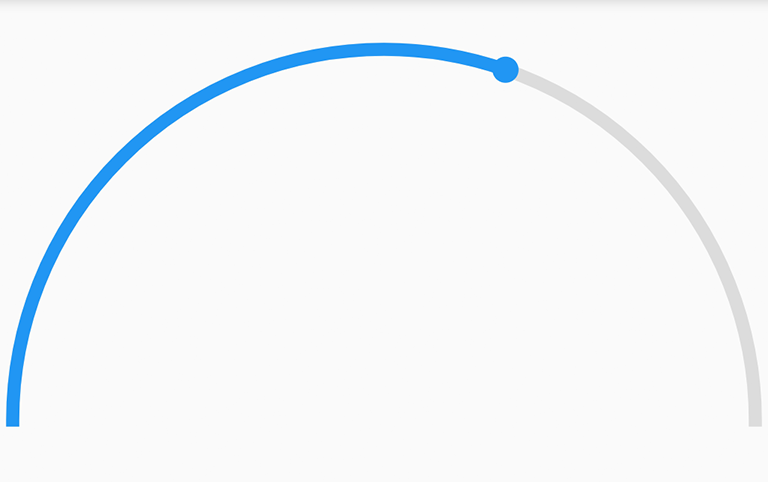
Example 3 - Very Simple & Customizable

 ArcProgressBar(
   percentage: _progressPercentage,
   arcThickness: 5,
   innerPadding: 16,
   animateFromLastPercent: true,
   handleSize: 10,
   backgroundColor: Colors.black12,
   foregroundColor: Colors.black),
Very customizable, feel free to customize however you like! 😎