Animated Loading Button
Animated loading button help you create animated button with customizable design, this animated uses asynchronous callback.

A new well designed animated loading button
 |
 |
|---|---|
 |
 |
Features
- Create button with built-in animation
- Customizable button design
- Progress indicator animated button
- Color changing animated button
- Built-in fading animation on button
- Rotated icon animation on button
- Asynchronous callback invoked with result callback
Getting started
In order to add motion toast to your project add this line to your pubspec.yaml file
dependencies:
	animated_loading_button: ^1.0.0
Usage
Parameters
///Future callback invoked when pressing the button
///required in all button types
final  Future<T> Function() onPress;

///callback invoked when [onPress] is finished
///required in all button types.
final  Function(T) onAsyncCallFinished;

///the button width
///by default the width is set to 200
final  double buttonWidth;

///the button height
///by default it's set to 50
final  double buttonHeight;

///the animation duration applied in all animations
///except progress indicator animation
final  Duration animationDuration;

///the button color, applied in all types except
///color changing animation button
///by default button color is `Colors.blue`
late  Color buttonColor;

///button radius by default it's set to null
final  BorderRadius? buttonRadius;

///the button shadow, by default it's null
final  BoxShadow? buttonShadow;

///the widget that will be rendered inside the button
late  Widget? buttonChild;

///required when using animatedIcon button
///the icon (widget) that will be drawn inside the button
late  Widget? buttonIcon;

///required when using animatedIcon button,
///the text that will be rendered inside the button
late  Text? buttonText;

///list of colors that will be used in creating
///color changing button animation
///
///should contains 2 colors at least
late  List<Color> colors;

///the progress indicator color
///by default it's set to `Colors.blue`
late  Color? progressIndicatorColor;

///the progress indicator background color
///by default it's set to `Colors.white`
late  Color? progressIndicatorBackground;

///the progress indicator height,
///by default it's set to 5
late  double progressIndicatorSize;
Examples
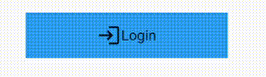
- Rotated icon animation
AnimatedLoadingButton<void>.iconRotation(
	buttonText:  const  Text('Login'),
	buttonIcon:  const  Icon(Icons.logout_outlined),
	onPress: onPress,
	onAsyncCallFinished: (value) {
		print('Login successfull');
	},
),

Future<void> onPress() async {
	await  Future.delayed(const  Duration(milliseconds:  4000,),);
}
- Color changing animation
AnimatedLoadingButton<void>.colorChangingButton(
	buttonChild:  Row(
		mainAxisAlignment:  MainAxisAlignment.center,
		children:  const [
			Icon(Icons.login),
			Text('Login')
		],
	),
	colors: [
		Colors.blue[400]!,
		Colors.blue[800]!,
		Colors.blue[900]!,
	],
	onPress: onPress,
	onAsyncCallFinished: (value) {},
),
- Fading animation
AnimatedLoadingButton<void>.fadingAnimation(
	buttonChild:  Row(
		mainAxisAlignment:  MainAxisAlignment.center,
		children:  const [
			Icon(Icons.login),
			Text('Login')
		],
	),
	onPress: onPress,
	onAsyncCallFinished: (value) {},
),
- Progress indicator animated button
AnimatedLoadingButton<void>.progressIndicator(
	buttonChild:  Row(
		mainAxisAlignment:  MainAxisAlignment.center,
		children:  const [
			Icon(Icons.login),
			Text('Login')
		],
	),
	onPress: onPress,
	onAsyncCallFinished: (value) {},
),
Additional information
Contribution
Of course the project is open source, and you can contribute to it repository link
- If you found a bug, open an issue.
- If you have a feature request, open an issue.
- If you want to contribute, submit a pull request.