

English | 中文简体
animated_digit
Scroll animation numbers widget, any number that need animation effects and easy to use.
Usage
🚴🏻 Easy Show
// only show
AnimatedDigitWidget(
  value: 9999
),
🚄 Easy Show & State
// simple state control
int value = 9999;
AnimatedDigitWidget(
  value: value
  textStyle: TextStyle(color: Colors.pink),
),
setState((){
  value = 191919;
});
🎡 Controller
Built-in accuracy calculation
AnimatedDigitController _controller = AnimatedDigitController(10240.987);
AnimatedDigitWidget(
controller: _controller,
textStyle: TextStyle(color: Colors.pink),
fractionDigits: 2, // number of decimal places reserved, not rounded
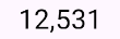
enableSeparator: true, // like this 10,240.98
),
// UI Result => 10,240.98
// increment
_controller.addValue(1314);
// minus
_controller.minusValue(1314); // from v3.1.0 added
// times
_controller.timesValue(1314); // from v3.1.0 added
// divide
_controller.divideValue(1314); // from v3.1.0 added
// reset
_controller.resetValue(1314);
// last
_controller.dispose();
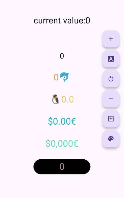
🖼 UI Effect Image & 💻 Code Example

AnimatedDigitWidget(
  value: 12531.98, // or use controller
),
AnimatedDigitWidget(
  value: 12531.98, // or use controller
  enableSeparator: true,
),
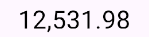
AnimatedDigitWidget(
  value: 12531.98, // or use controller
  fractionDigits: 2,
  enableSeparator: true,
),

SingleDigitProvider(
  data: SingleDigitData(
    useTextSize: true,
    builder: (size, value, isNumber, child) {
      return isNumber ? child : FlutterLogo();
    },
  ),
  child: AnimatedDigitWidget(
    value: 12531.98, // or use controller
    textStyle: TextStyle(color: Colors.pink[200], fontSize: 30),
    separateLength: 1,
    separateSymbol: "#",
    enableSeparator: true,
  ),
),
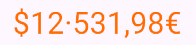
AnimatedDigitWidget(
  value: 12531.98, // or use controller
  textStyle: TextStyle(color: Colors.orangeAccent.shade700, fontSize: 30),
  fractionDigits: 2,
  enableSeparator: true,
  separateSymbol: "·",
  separateLength: 3,
  decimalSeparator: ",",
  prefix: "\$",
  suffix: "€",
),
✌ If you want to change color based on value
The add a ValueColor object to valueColors, which is an array, you can add more ...,but always take the last eligible
Since version v3.3.1+1, colors have supported animated transitions instead of abrupt direct color switching, eliminating harsh transitions.
int value = 9999; // or use Controller.value
AnimatedDigitWidget(
  value: value,
  textStyle: TextStyle(
    color: Colors.orange[200],
    fontSize: 30,
  ),
  valueColors: [
    ValueColor(
      //When value <= 0 , the color changes to red
      condition: () => value <= 0,
      color: Colors.red,
    ),
    // you can add more ...,but always take the last eligible.
  ],
),
🍓Disable the initial scroll animation.
AnimatedDigitWidget(
  ...,
  firstScrollAnimate: false // set false | >= v3.3.1+1
),
🍋Support for padding the integer part with leading zeros when the number of digits is less than the specified minimum
range:
0, 9, 🐧0 ➡️ 00、1 ➡️ 01、2 ➡️ 02 ...
AnimatedDigitWidget(
  ...,
  fractionDigits: 0, // It must be set to 0; if there are decimal places, it's really unnecessary (wry smile)~~
  enableMinIntegerDigits: true // set true, | >= v3.3.1+2
),
🐳 Widget Params & Documentation
🚀 Required Params
⚠️
valueandcontrollercannot be bothnull. ⚠️controllerhas higher priority.
-
controller- digit controller, The displayed number can be controlled viaaddValueandresetValue. -
value- the display number.
🍑 TextStyle And BoxStyle Setting
textStyle- the numbers text style.boxDecoration- Use withdecorationofContainer.
🍇 Int Type(default) Or Decimal Type Setting
- fractionDigits - the fraction digits,
int, default0.- 🖌 Example (
1000520.98765): 0=>1000520;1=>1000520.9;2=>1000520.98;3=>1000520.987;N=>1000520.[N];
- 🖌 Example (
The default
0means an integer, when it is a decimal, if the value is less than thefractionDigits, it will be filled with0to the right, and the truncation method is used, so there is no rounding.
🍓 Numbers Free Style Setting
-
decimalSeparator- the decimal separator,can be replaced by other symbols in place of decimal separators, default.. -
enableSeparator- enable digit separator. defaultfalsenot enable, onlytrue,separateLengthandseparateSymbolvalid.- 🖌 Example (
true):1000520=>1,000,520(seealsoseparateLengthorseparateSymbol)
- 🖌 Example (
-
separateSymbol- the numbers separator symbol (only enableSeparator is true), make numbers much easier to read, default,.- 🖌 Example (
1000520): ,=>1,000,520'=>1'000'520-=>1-000-520
- 🖌 Example (
-
separateLength- the numbers separator length (only enableSeparator is true),separateSymbolby separator length insert, default3.- 🖌 Example (
1000520): 1=>1,0,0,0,5,2,02=>1,00,05,203=>1,000,520
- 🖌 Example (
🥝 Scroll Animation Setting
duration- the animate duration, default Duration(milliseconds: 300).curve- the animate curve, default Curves.easeInOut. look animate curve.loop- enable loop scroll animate. default true, always scroll down, not scroll up from 9 -> 0;false, scroll up and down.
🍎 Digital Size Scheme Setting
-
autoSize- the default true is to automatically expand and contract according to the size of the (number/symbol) itself, false, the text size of the number0is used as the container size of each number, which can ensure the same width, but it seems that there is a slight interval between1and other numbers 😊 . -
animateAutoSize- the animation resizing. defaulttrue,falsewill change directly to the size of the number/symbol.
🍒 Number prefix and suffix Setting
prefix- the text to display in front of the counter.suffix- the text to display after the counter.