Animated Cross Fade Plus
A powerful Flutter package that enhances the traditional AnimatedCrossFade widget with support for multiple children, auto-play capabilities, and smooth transitions.
Demo
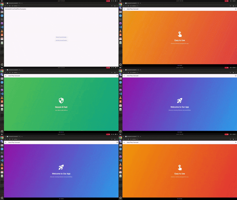
Auto-Play Carousel

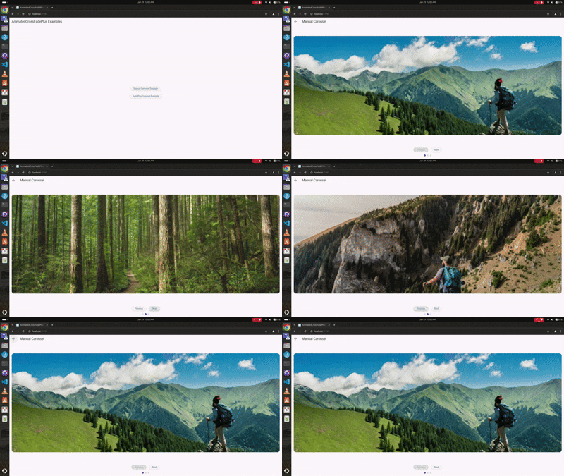
Manual Navigation

Youtube Video
🎥 Check out the tutorial video on my YouTube channel to see it in action! Youtube video
Features 🚀
- ✨ Support for unlimited children (not just two like AnimatedCrossFade)
- 🎮 Manual navigation controls
- 🎯 Auto-play functionality
- 🎨 Multiple transition types (fade, slide, scale, slideAndFade)
- 📱 Separate enter and exit animations
- 🎭 Customizable transition configurations
- 🔄 Built-in play/pause controls
- 📍 Progress indicators
Installation 💻
Add this to your package's pubspec.yaml file:
dependencies:
  animated_cross_fade_plus: ^0.0.4
Usage 🎯
Basic Auto-Play Carousel
class AutoPlayExample extends StatefulWidget {
  @override
  _AutoPlayExampleState createState() => _AutoPlayExampleState();
}

class _AutoPlayExampleState extends State<AutoPlayExample> {
  final List<SlideContent> _slides = [
    SlideContent(
      title: 'Welcome',
      gradient: [Colors.purple, Colors.blue],
      icon: Icons.rocket_launch,
    ),
    SlideContent(
      title: 'Easy to Use',
      gradient: [Colors.orange, Colors.red],
      icon: Icons.touch_app,
    ),
  ];

  @override
  Widget build(BuildContext context) {
    return AnimatedCrossFadePlus(
      children: _slides.map((slide) => _buildSlide(slide)).toList(),
      transitionType: CrossFadeTransitionType.scale,
      enterConfig: const TransitionConfig(
        curve: Curves.easeInOutCubic,
        duration: Duration(milliseconds: 1000),
      ),
      exitConfig: const TransitionConfig(
        curve: Curves.easeInOutCubic,
        duration: Duration(milliseconds: 1000),
      ),
      autoPlay: true,
      autoPlayDuration: const Duration(seconds: 3),
    );
  }
}
Manual Navigation Carousel
class ManualExample extends StatefulWidget {
  @override
  _ManualExampleState createState() => _ManualExampleState();
}

class _ManualExampleState extends State<ManualExample> {
  final GlobalKey<AnimatedCrossFadePlusState> _key = GlobalKey();
  int _currentIndex = 0;

  @override
  Widget build(BuildContext context) {
    return Column(
      children: [
        AnimatedCrossFadePlus(
          key: _key,
          children: _items.map((item) => _buildItem(item)).toList(),
          transitionType: CrossFadeTransitionType.slideAndFade,
          enterConfig: const TransitionConfig(
            curve: Curves.easeInOutCubic,
            duration: Duration(milliseconds: 800),
            direction: AxisDirection.left,
          ),
          exitConfig: const TransitionConfig(
            curve: Curves.easeInOutCubic,
            duration: Duration(milliseconds: 800),
            direction: AxisDirection.right,
          ),
          onIndexChanged: (index) => setState(() => _currentIndex = index),
        ),
        Row(
          children: [
            ElevatedButton(
              onPressed: () => _key.currentState?.animateToIndex((_currentIndex - 1) % _items.length),
              child: Text('Previous'),
            ),
            ElevatedButton(
              onPressed: () => _key.currentState?.animateToIndex((_currentIndex + 1) % _items.length),
              child: Text('Next'),
            ),
          ],
        ),
      ],
    );
  }
}
Parameters ⚙️
| Parameter | Type | Description |
|---|---|---|
| children | List | List of widgets to animate between |
| transitionType | CrossFadeTransitionType | Type of transition animation |
| enterConfig | TransitionConfig | Configuration for entering widget animation |
| exitConfig | TransitionConfig | Configuration for exiting widget animation |
| initialIndex | int | Starting index |
| autoPlay | bool | Enable/disable auto-play |
| autoPlayDuration | Duration? | Time between auto-play transitions |
| alignment | AlignmentGeometry | Alignment of children |
| constraints | BoxConstraints? | Optional size constraints |
| clipChildren | bool | Whether to clip children during animation |
| onIndexChanged | Function(int)? | Callback when index changes |
Transition Types 🎭
enum CrossFadeTransitionType {
  fade,           // Simple fade transition
  slide,          // Slide animation
  scale,          // Scale animation
  slideAndFade,   // Combined slide and fade
}
TransitionConfig Properties 🛠️
class TransitionConfig {
  final Curve curve;              // Animation curve
  final Duration duration;        // Animation duration
  final AxisDirection direction;  // Slide direction (for slide transitions)

  const TransitionConfig({
    this.curve = Curves.linear,
    this.duration = const Duration(milliseconds: 300),
    this.direction = AxisDirection.right,
  });
}
Controller Methods 🎮
final GlobalKey<AnimatedCrossFadePlusState> _key = GlobalKey();

// Navigation
_key.currentState?.animateToIndex(2);   // Navigate to specific index

// Auto-play control is handled through the autoPlay property
// Toggle by updating the widget's autoPlay value
Complete Examples 📱
Check out the example folder for complete implementation examples:
- Auto-play carousel with scale transitions
- Manual navigation with slide and fade transitions
- Progress indicators
- Play/pause controls
Contributing 🤝
Contributions are welcome! Please feel free to submit issues and pull requests.
- Fork it
- Create your feature branch (
git checkout -b feature/amazing) - Commit changes (
git commit -am 'Add amazing feature') - Push to branch (
git push origin feature/amazing) - Open a Pull Request
License 📄
This project is licensed under the MIT License - see the LICENSE file for details.
Maintainers 👥
- Muhammad Sohaib - creator and maintainer
Libraries
- animated_cross_fade_plus
- A Flutter package that provides enhanced cross-fade animations with multiple transition types. This is the main entry point for the package that exports all necessary components.


