animated_cards_carousel
animated_cards_carousel is a Flutter package that provides a customizable carousel of animated cards. It allows for smooth scrolling and visually appealing animations as cards transition into and out of the viewport.
Features
- Smooth scrolling with animation effects.
- Customizable card aspect ratio and margins.
- Easy integration with any list of widgets.
- Animated properties include translation, scaling, and opacity.
Installation
Add animated_cards_carousel to your pubspec.yaml file:
dependencies:
  animated_cards_carousel: ^1.0.1
Then, run the following command in your terminal to fetch the package:
flutter pub get
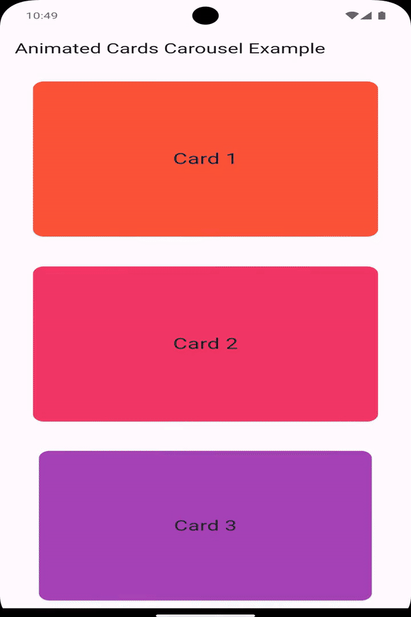
Preview
Usage
To use the AnimatedCardsCarousel, import the package and include it in your widget tree. Below is an example of how to set it up:
import 'package:flutter/material.dart';
import 'package:animated_cards_carousel/animated_cards_carousel.dart';

void main() {
  runApp(const MyApp());
}

class MyApp extends StatelessWidget {
  const MyApp({super.key});

  @override
  Widget build(BuildContext context) {
    return MaterialApp(
      home: Scaffold(
        appBar: AppBar(
          title: const Text('Animated Cards Carousel Example'),
        ),
        body: Padding(
          padding: const EdgeInsets.symmetric(horizontal: 32),
          child: AnimatedCardsCarousel(
            cardsList: List.generate(
              10,
                  (index) => Card(
                color: Colors.primaries[index % Colors.primaries.length],
                child: Center(
                  child: Text(
                    'Card ${index + 1}',
                    style: const TextStyle(fontSize: 24),
                  ),
                ),
              ),
            ),
          ),
        ),
      ),
    );
  }
}
Properties
cardAspectRatio: (Optional) The aspect ratio of the cards. Defaults to the golden ratio (1.61803399) in portrait mode and (10) in landscape mode.cardMargin: (Optional) The margin around each card. Defaults to16.0in portrait mode and (8.0) in landscape mode.cardsList: The list of widgets to be displayed as cards.
Customization
You can customize the appearance and behavior of the carousel by tweaking the properties provided:
- Aspect Ratio: Control the height-to-width ratio of the cards.
- Margins: Adjust the vertical spacing between the cards.
For example, to create a carousel with a square aspect ratio and no margins:
AnimatedCardsCarousel
(
cardAspectRatio: 1.0, // Square cards
cardMargin: 0.0, // No margin between cards
cardsList: yourListOfCards,
);
Contributing
Contributions are welcome! If you find any issues or have suggestions for improvements, please open an issue or submit a pull request on GitHub.
License
This project is licensed under the MIT License - see the LICENSE file for details.