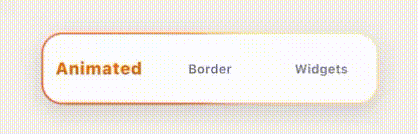
Animated Border Widgets
Animated gradient border widgets for Flutter with smooth rotation, boost interactions, configurable glowEffect, and fadeable enable/disable states.


Features
- Animated sweep-gradient border
- One-shot boost via
controller.triggerBoost() - Press-and-hold boost via
holdBoostMode - Optional
glowEffectwith tunable glow constructor - Animated on/off via
enabled+fadeDuration - Optional disabled static border (
showBorderWhenDisabled) - Optional child clipping (
clipChild) - Seamless gradient loop with
autoCloseGradientLoop - Smooth phase continuity (no jump back after boost)
- Rounded corners, configurable border width, inner color, and shadows
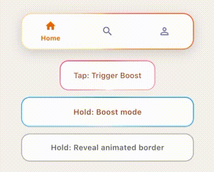
Bottom Bar Demo
Installation
dependencies:
  animated_border_widgets: ^0.2.0
Quick Start
import 'package:animated_border_widgets/animated_border_widgets.dart';
import 'package:flutter/material.dart';

class Demo extends StatefulWidget {
  const Demo({super.key});

  @override
  State<Demo> createState() => _DemoState();
}

class _DemoState extends State<Demo> {
  final controller = AnimatedGradientBorderController();

  @override
  void dispose() {
    controller.dispose();
    super.dispose();
  }

  @override
  Widget build(BuildContext context) {
    return AnimatedGradientBorder(
      controller: controller,
      borderRadius: BorderRadius.circular(20),
      borderWidth: 1.8,
      colors: const [
        Color(0xFFED7203),
        Color(0xFFFFA726),
        Color(0xFFFFD54F),
        Color(0xFFFFE0B2),
        Color(0xFFFFB74D),
        Color(0xFFFF8A65),
        Color(0xFFED7203),
      ],
      child: SizedBox(
        height: 56,
        child: ElevatedButton(
          onPressed: controller.triggerBoost,
          child: const Text('Boost'),
        ),
      ),
    );
  }
}
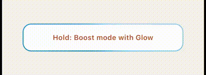
Simple glowEffect Example
AnimatedGradientBorder(
  glowEffect: true,
  colors: const [
    Color(0xFF2B7FFF),
    Color(0xFF55D4FF),
    Color(0xFF9FFFE0),
    Color(0xFF2B7FFF),
  ],
  child: const SizedBox(
    height: 52,
    child: Center(child: Text('Glow Effect')),
  ),
)
Hold Boost Mode
Use holdBoostMode for press-and-hold interactions:
AnimatedGradientBorder(
  holdBoostMode: isPressed,
  holdBoostTurnsPerSecond: 0.9,
  colors: palette,
  child: const SizedBox(height: 52),
)
Example
See the complete demo in example/:
- Demo bottom bar
- Tap boost button
- Hold boost button
- Gray border -> animated border reveal on hold
Full Parameter Set
AnimatedGradientBorder(
  key: const ValueKey('full-config'),
  child: const SizedBox(height: 52),
  colors: const [Colors.orange, Colors.yellow],
  borderRadius: const BorderRadius.all(Radius.circular(16)),
  borderWidth: 1.8,
  turnDuration: const Duration(seconds: 7),
  boostDuration: const Duration(milliseconds: 700),
  boostTurns: 0.24,
  innerColor: Colors.white,
  boxShadow: const [
    BoxShadow(
      color: Color(0x22000000),
      blurRadius: 12,
      offset: Offset(0, 6),
    ),
  ],
  controller: AnimatedGradientBorderController(),
  holdBoostMode: false,
  holdBoostTurnsPerSecond: 0.35,
  enabled: true,
  fadeDuration: const Duration(milliseconds: 300),
  showBorderWhenDisabled: true,
  disabledBorderColor: const Color(0x33000000),
  disabledBorderWidth: null, // defaults to borderWidth
  clipChild: false,
  autoCloseGradientLoop: true,
  glowEffect: false,
  glow: const AnimatedGradientBorderGlow(
    opacity: 0.55,
    outerBlurSigma: 18,
    innerBlurSigma: 8,
    outerStrokeWidth: 14,
    innerStrokeWidth: 8,
    spread: 4,
    blendMode: BlendMode.srcOver,
    fadeDuration: Duration(milliseconds: 220),
    fadeCurve: Curves.easeOut,
  ),
)
AnimatedGradientBorderController:
triggerBoost()
License
MIT License. See LICENSE.
How to Contribute
To get started, read CONTRIBUTING.md to learn about the guidelines within this project.
Changelog
Refer to the Changelog to get all release notes.
Maintainers
This library is open for issues and pull requests. If you have ideas for improvements or bugs, the repository is open to contributions!