📏 Advance Ruler Slider
A highly customizable and reusable Flutter ruler/scale slider widget designed for precise value selection. This package offers a flexible and visually rich UI component that can be adapted to a wide range of applications, from health trackers to audio editors.
✨ Why Choose Advance Ruler Slider?
The advance_ruler_slider stands out by offering unparalleled control over both the aesthetics and functionality of a ruler-style input. Whether you need a simple weight selector or a complex audio timeline, its extensive customization options, smooth animations, and haptic feedback make it a robust choice for creating intuitive and engaging user experiences.
🚀 Features at a Glance
🎨 Highly Customizable: Control every visual aspect, from tick colors and lengths to BoxDecoration.
↔️↕️ Horizontal & Vertical: Supports both orientations with consistent behavior.
👆 Tactile Feedback: Optional haptic feedback on value changes enhances user interaction.
✨ Smooth Animations: Programmatic jumps can be animated for a polished feel.
🎯 Precise Control: Define step values for accurate increments and pixelsPerUnit for visual density.
🔒 Read-Only Mode: Display values without allowing user interaction.
✍️ Custom Labels: Format tick labels with custom text or units.
💡 Custom Indicator: Use your own Widget as the central indicator for unique designs.
Highlight Active Range: Visually emphasize the currently visible portion of the ruler.
Boundary Labels: Always show min/max labels for clear range indication.
Flexible Scrolling: Apply custom ScrollPhysics for desired scroll behavior.
Scrollable Range Clamping: Restrict user interaction to a sub-range of the full scale.
📦 Installation
Add this to your pubspec.yaml file:
dependencies:
  advance_ruler_slider: ^0.0.3 # Always use the latest version
Then, run flutter pub get in your project's root directory.
🖼️ Preview
🚀 Basic Usage Example
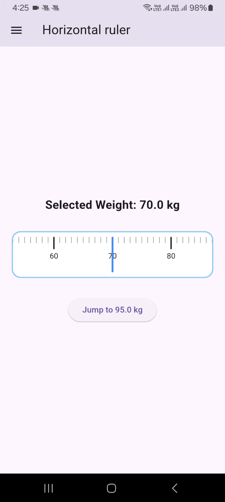
Here's a simple horizontal weight ruler:
import 'package:flutter/material.dart';
import 'package:advance_ruler_slider/advance_ruler_slider.dart'; // Import your package

class HorizontalRulerDemo extends StatefulWidget {
  const HorizontalRulerDemo({super.key});

  @override
  State<HorizontalRulerDemo> createState() => _HorizontalRulerDemoState();
}

class _HorizontalRulerDemoState extends State<HorizontalRulerDemo> {
  double _currentWeight = 70.0; // Initial value
  final RulerScaleController _weightRulerController = RulerScaleController();

  @override
  Widget build(BuildContext context) {
    return Center(
      child: Column(
        mainAxisAlignment: MainAxisAlignment.center,
        children: [
          Text(
            'Selected Weight: ${_currentWeight.toStringAsFixed(1)} kg',
            style: const TextStyle(fontSize: 20, fontWeight: FontWeight.bold),
          ),
          const SizedBox(height: 30),
          Padding(
            padding: const EdgeInsets.all(8.0),
            child: RulerScale(
              decoration: BoxDecoration(
                color: Colors.blue.shade50,
                borderRadius: BorderRadius.circular(12),
                border: Border.all(color: Colors.blue.shade200, width: 2),
              ),
              controller: _weightRulerController,
              rulerExtent: 90,
              step: 0.1,
              minValue: 10,
              maxValue: 200,
              majorTickInterval: 1,
              unitSpacing: 60, // Adjust for desired spacing
              initialValue: _currentWeight,
              hapticFeedbackEnabled: true,
              useScrollAnimation: true,
              showDefaultIndicator: false,
              selectedTickColor: Colors.blue,
              selectedTickWidth: 3,
              selectedTickLength: 20,
              indicatorWidth: 3.0,
              labelStyle: const TextStyle(color: Colors.black87, fontSize: 13),
              onValueChanged: (value) {
                setState(() {
                  _currentWeight = value;
                });
              },
            ),
          ),
          const SizedBox(height: 30),
          ElevatedButton(
            onPressed: () {
              _weightRulerController.jumpToValue(20); // Programmatic jump
            },
            child: const Text('Jump to 20KG'),
          ),
        ],
      ),
    );
  }
}
🛠️ Advanced Usage & Customization Examples
The RulerScale widget is incredibly flexible. Explore these examples to unlock its full potential:
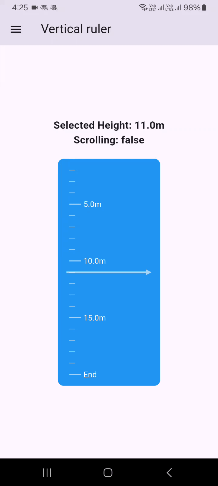
Vertical Ruler with Custom Formatting, Gradients, and Physics
import 'package:flutter/material.dart';
import 'package:advance_ruler_slider/advance_ruler_slider.dart';

class VerticalRuler extends StatefulWidget {
  const VerticalRuler({super.key});

  @override
  State<VerticalRuler> createState() => _VerticalRulerState();
}

class _VerticalRulerState extends State<VerticalRuler> {
  double _currentHeight = 10.5;
  bool isScrolling = false;

  @override
  Widget build(BuildContext context) {
    return Center(
      child: Column(
        mainAxisAlignment: MainAxisAlignment.center,
        crossAxisAlignment: CrossAxisAlignment.center,
        children: [
          Text(
            'Selected Height: ${_currentHeight.toStringAsFixed(1)}m',
            style: const TextStyle(fontSize: 18, fontWeight: FontWeight.bold),
          ),
          Text(
            'Scrolling: $isScrolling',
            style: const TextStyle(fontSize: 18, fontWeight: FontWeight.bold),
          ),
          const SizedBox(height: 20),
          SizedBox(
            height: 400,
            child: RulerScale(
              scrollPhysics: const BouncingScrollPhysics(), // iOS-like bounce
              decoration: BoxDecoration(
                borderRadius: BorderRadius.circular(12),
                gradient: LinearGradient(
                  colors: [Colors.deepPurple, Colors.pink],
                ),
              ),
              step: 1,
              direction: Axis.vertical,
              minValue: 1,
              maxValue: 20.0,
              majorTickInterval: 5.0,
              majorTickColor: Colors.white60,
              minorTickColor: Colors.white54,
              unitSpacing: 20.0, // More space for vertical ruler
              initialValue: _currentHeight,
              indicatorColor: Colors.white70,
              indicatorWidth: 3.0,
              rulerExtent: 190, // Width of the ruler component itself
              showBoundaryLabels: true,
              selectedTickWidth: 4,
              labelStyle: const TextStyle(color: Colors.white, fontSize: 14),
              onValueChanged: (value) {
                setState(() {
                  _currentHeight = value;
                });
              },
              hapticFeedbackEnabled: true,
              labelFormatter: (value) {
                if (value == 1) return 'Start';
                if (value == 20) return 'End';
                return '${value.toStringAsFixed(1)}m'; // Custom unit
              },

              onScrollStart: () {
                WidgetsBinding.instance.addPostFrameCallback((callback) {
                  setState(() {
                    isScrolling = true;
                  });
                });
              },
              onScrollEnd: () {
                WidgetsBinding.instance.addPostFrameCallback((callback) {
                  setState(() {
                    isScrolling = false;
                  });
                });
              },
            ),
          ),
        ],
      ),
    );
  }
}
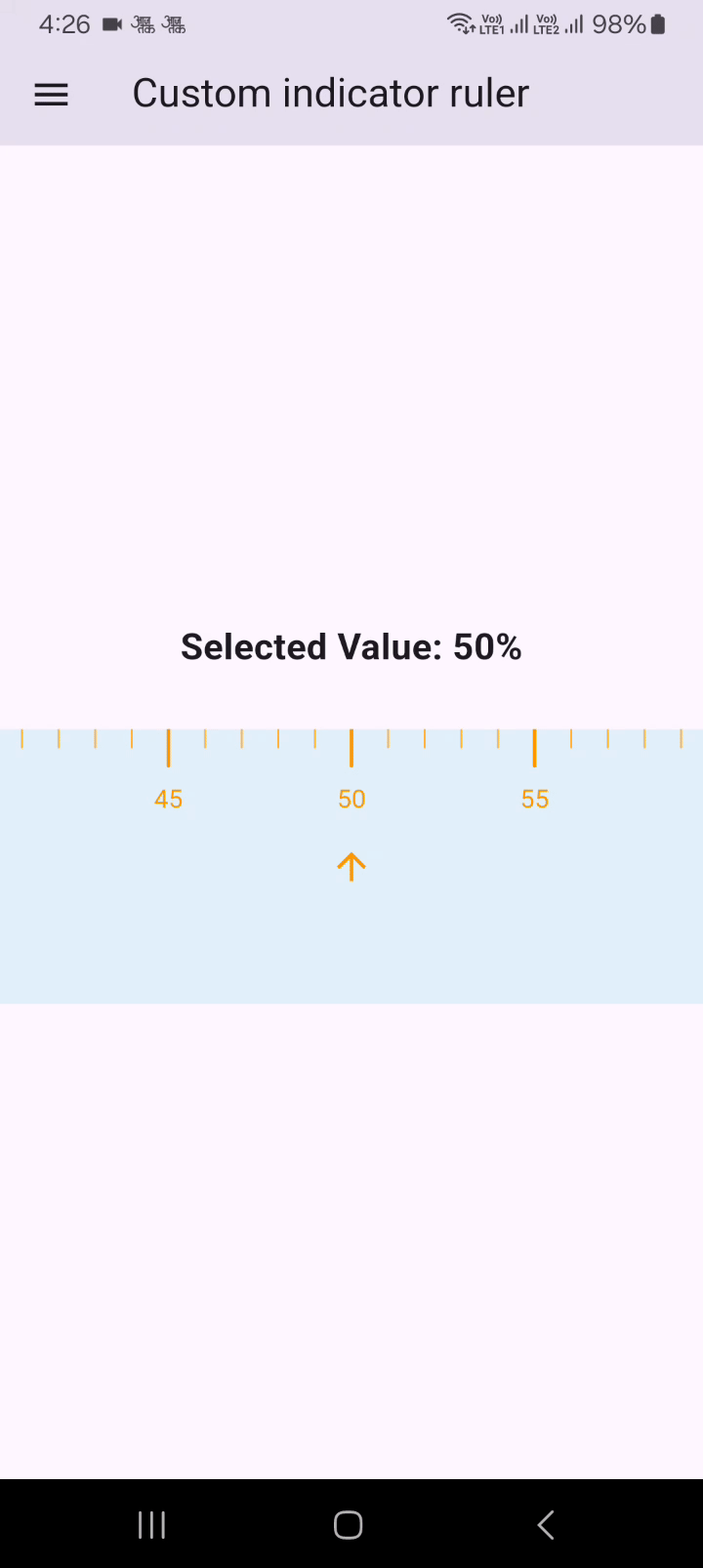
Ruler with a Custom Indicator Widget
import 'package:flutter/material.dart';
import 'package:advance_ruler_slider/advance_ruler_slider.dart';

class CustomIndicatorRuler extends StatefulWidget {
  const CustomIndicatorRuler({super.key});

  @override
  State<CustomIndicatorRuler> createState() => _CustomIndicatorRulerState();
}

class _CustomIndicatorRulerState extends State<CustomIndicatorRuler> {
  double _currentValue = 50.0;

  @override
  Widget build(BuildContext context) {
    return Center(
      child: Column(
        mainAxisAlignment: MainAxisAlignment.center,
        children: [
          Text(
            'Selected Value: ${_currentValue.toStringAsFixed(0)}%',
            style: const TextStyle(fontSize: 20, fontWeight: FontWeight.bold),
          ),
          const SizedBox(height: 30),
          RulerScale(
            decoration: BoxDecoration(color: Colors.black),
            direction: Axis.horizontal,
            minValue: 0.0,
            maxValue: 100.0,
            majorTickInterval: 5.0,
            unitSpacing: 20.0,
            initialValue: _currentValue,
            minorTickColor: Colors.orange.shade300,
            majorTickColor: Colors.orange,
            selectedTickColor: Colors.white,
            rulerExtent: 150.0,
            labelStyle: const TextStyle(color: Colors.orange, fontSize: 14),
            onValueChanged: (value) {
              setState(() {
                _currentValue = value;
              });
            },
            // Provide a custom indicator widget
            customIndicator: Icon(
              Icons.arrow_upward_outlined,
              color: Colors.white,
            ),
            labelOffset: 10.0, // Adjust label offset if needed
          ),
        ],
      ),
    );
  }
}
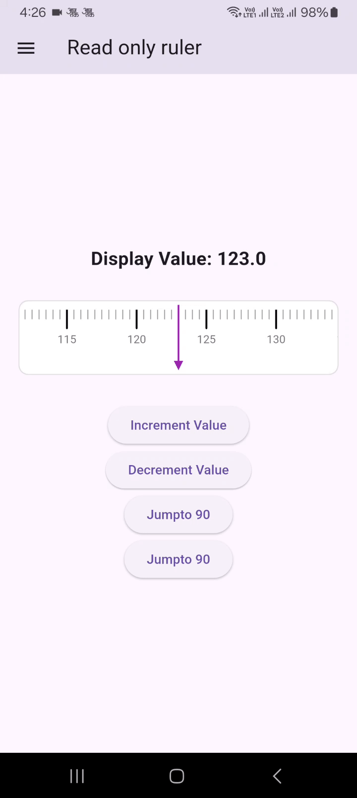
Read-Only Ruler
import 'package:flutter/material.dart';
import 'package:advance_ruler_slider/advance_ruler_slider.dart';
class ReadOnlyRulerDemo extends StatefulWidget {
  const ReadOnlyRulerDemo({super.key});

  @override
  State<ReadOnlyRulerDemo> createState() => _ReadOnlyRulerDemoState();
}

class _ReadOnlyRulerDemoState extends State<ReadOnlyRulerDemo> {
  double _displayValue = 123.4;
  final RulerScaleController _readOnlyRulerController = RulerScaleController();

  @override
  Widget build(BuildContext context) {
    return Center(
      child: Column(
        mainAxisAlignment: MainAxisAlignment.center,
        children: [
          Text(
            'Display Value: ${_displayValue.toStringAsFixed(1)}',
            style: const TextStyle(fontSize: 20, fontWeight: FontWeight.bold),
          ),
          const SizedBox(height: 30),
          Container(
            height: 80,
            margin: const EdgeInsets.symmetric(horizontal: 20),
            child: RulerScale(
              decoration: BoxDecoration(
                color: Colors.grey.shade50,
                borderRadius: BorderRadius.circular(10),
                border: Border.all(color: Colors.grey.shade300, width: 1),
              ),
              controller: _readOnlyRulerController,
              minValue: 0.0,
              maxValue: 200.0,
              initialValue: _displayValue,
              majorTickInterval: 5.0,
              useScrollAnimation: true,
              unitSpacing: 15.0,
              selectedTickWidth: 4,
              indicatorColor: Colors.purple,
              labelStyle: const TextStyle(color: Colors.black54, fontSize: 12),
              isReadOnly: true, // Make the ruler read-only
              hapticFeedbackEnabled: false, // No haptic feedback for read-only
              onValueChanged: (value) {
                setState(() {
                  _displayValue = value;
                });
              },
            ),
          ),
          const SizedBox(height: 30),
          ElevatedButton(
            onPressed: () {
              // You can still programmatically change the value
              setState(() {
                _displayValue = (_displayValue + 10).clamp(0.0, 200.0);
              });
              _readOnlyRulerController.jumpToValue(_displayValue);
            },
            child: const Text('Increment Value'),
          ),
          ElevatedButton(
            onPressed: () {
              // You can still programmatically change the value
              setState(() {
                _displayValue = (_displayValue - 10).clamp(0.0, 200.0);
              });
              _readOnlyRulerController.jumpToValue(_displayValue);
            },
            child: const Text('Decrement Value'),
          ),
          ElevatedButton(
            onPressed: () {
              _readOnlyRulerController.jumpToValue(90);
            },
            child: const Text('Jumpto 90'),
          ),
          ElevatedButton(
            onPressed: () {
              _readOnlyRulerController.jumpToValue(40);
            },
            child: const Text('Jumpto 40'),
          ),
        ],
      ),
    );
  }
}