Adaptive Chameleon Theme
A Flutter package that will automatically retrieve your OS defined Theme (Dynamic), force your prefered one (Light / Dark), allow you to present the user with a set of color themes to choose from and of course, persist this choice in your device.


Features
- Set default theme
- Override system theme mode and set yours (light/dark)
- Change theme colors
- Customize color palettes for different theme modes
Demo
Click below to watch a quick demo.
Getting started
Add the following dependency to your pubspec.yaml
dependencies:
  adaptive_chameleon_theme: <latest_version>
Usage
This package allows for an arbitrary number of themes to be defined. Each theme has a unique ID
of type int. To create the themes and map them to IDs, first you have to create an instance of
ThemeCollection, like so:
final themeCollection = ThemeCollection(
    themes: {
        0: ThemeData(primarySwatch: Colors.blue),
        1: ThemeData(primarySwatch: Colors.red),
    },
    fallbackTheme: ThemeData.light(), // optional fallback theme, default value is ThemeData.light()
);
I would however recommend you introduce a class with static const int values to
associate a name to each ID value for easier reference:
class AppThemes {
    static const int LightBlue = 0;
    static const int LightRed = 1;
}
final themeCollection = ThemeCollection(
    themes: {
        AppThemes.LightBlue: ThemeData(primarySwatch: Colors.blue),
        AppThemes.LightRed: ThemeData(primarySwatch: Colors.red),
    },
    fallbackTheme: ThemeData.light(),
);
final darkThemeCollection = ThemeCollection(
    themes: {
        AppThemes.Blue: ThemeData(primarySwatch: Colors.blue),
        AppThemes.Red: ThemeData(primarySwatch: Colors.red),
    },
    fallbackTheme: ThemeData.dark(),
);
NOTE: Remember to define a collection of dark themes equivalent in number to the normal themes.
Proceed to wrap your MaterialApp with AdaptiveChameleonThemeWidget in order to apply and modify UI
themes.
import 'package:example/themes.dart';
import 'package:flutter/material.dart';

import 'package:adaptive_chameleon_theme/adaptive_chameleon_theme.dart';

void main() {
  runApp(MyApp());
}

class MyApp extends StatelessWidget {

  @override
  Widget build(BuildContext context) {
    return AdaptiveChameleonThemeWidget(
            themeCollection: AppThemes.themeCollection,
            darkThemeCollection: AppThemes.darkThemeCollection,
            defaultThemeId: AppThemes.aokiji, // optional, default id is 0
            builder: (context, theme, darkTheme, themeMode) {
              return MaterialApp(
                title: 'Flutter Demo',
                theme: theme,
                darkTheme: darkTheme,
                themeMode: themeMode,
                home: const MyHomePage(title: 'Adaptive Chameleon Theme'),
              );
            }
    );
  }
}
Changing Theme Mode
You can utilise the changeThemeMode function from anywhere in your app. It provides a simple and straight forward way of altering the theme modes: light to dark, dark to light or to system default.
This function has two optional parameters: dynamic and dark. If the value of dynamic is true, it takes precedence over dark.
  // sets theme mode to dark
  AdaptiveChameleonTheme.of(context).changeThemeMode(dark: true);

  // sets theme mode to light
  AdaptiveChameleonTheme.of(context).changeThemeMode(dark: false);

  // sets theme mode to system default
  AdaptiveChameleonTheme.of(context).changeThemeMode(dynamic: true);
Changing Theme Color
The theme can be set anywhere in the app, provided you have a BuildContext, e.g.:
AdaptiveChameleonTheme.of(context).setTheme(AppThemes.LightRed);
By setting the theme, its ID is automatically saved via the
shared_preferences package, so the next time the
app starts, the theme can be restored automatically.
How to get the current theme
Current app ThemeMode
ThemeMode themeMode = AdaptiveChameleonTheme.of(context).themeMode;
The above example will return a value of the enum used by MaterialApp's ThemeMode with one of the following values:
system - Use either the light or dark theme based on what the user has selected in the system settings.
light - Always use the light mode regardless of system preference.
dark - Always use the dark mode (if available) regardless of system preference.
Current app ThemeId
To get the ID of the current theme, for example to create a selection UI as done in the example app provided with this package, call
final themeId = AdaptiveChameleonTheme.of(context).themeId;
Also Included
The plugin contains some out-of-the-box widgets to make implementation easier.
ThemeModeSelectorWidget
This is a toggle buttons widget that allows you to switch theme modes.
const ThemeModeSelectorWidget()


ThemeColorSelectorWidget
This is a toggle buttons widget that allows you to switch theme colors.
  ThemeColorSelectorWidget(
    themeCollection: AppThemes.themeCollection,
    selectedTheme: AdaptiveChameleonTheme.of(context).themeId,
  )

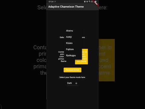
Example
The example app can be found in the example folder. It implements a dropdown menu to select
between 5 themes. The app is the source for the video demo above.
Showcase
Using this package in a live app? Let me know and I will add it here.
Maintainer
If you experience any problems using this package, please create an issue on Github. Pull requests are also welcome.
Acknowledgements
Many thanks to the projects/packages below that served as inspiration for this undertaking:
- dynamic_theme package from Norbert Kozsir
- easy_dynamic_theme package from Rene Lazo Mendez
- dynamic_themes package from Julian Aßmann
Liked Adaptive Chameleon Theme?
Show some love and support by starring the repository.
Or You can
