Adaptive Chameleon Theme
A Flutter package that will automatically retrieve your OS defined Theme (Dynamic), force your prefered one (Light / Dark), allow you to present the user with a set of color themes to choose from and of course, persist this choice in your device.

Features
- Set default theme
- Override system theme mode and set yours (light/dark)
- Change theme colors
- Customize color palettes for different theme modes
Demo
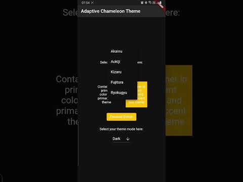
Click below to watch a quick demo.
Getting started
Add the following dependency to your pubspec.yaml
dependencies:
  adaptive_chameleon_theme: <latest_version>
Usage
This package allows for an arbitrary number of themes to be defined. Each theme has a unique ID
of type int. To create the themes and map them to IDs, first you have to create an instance of
ThemeCollection, like so:
final themeCollection = ThemeCollection(
    themes: {
        0: ThemeData(primarySwatch: Colors.blue),
        1: ThemeData(primarySwatch: Colors.red),
    },
    fallbackTheme: ThemeData.light(), // optional fallback theme, default value is ThemeData.light()
);
I would however recommend you introduce a class with static const int values to
associate a name to each ID value for easier reference:
class AppThemes {
    static const int LightBlue = 0;
    static const int LightRed = 1;
}
final themeCollection = ThemeCollection(
    themes: {
        AppThemes.LightBlue: ThemeData(primarySwatch: Colors.blue),
        AppThemes.LightRed: ThemeData(primarySwatch: Colors.red),
    },
    fallbackTheme: ThemeData.light(),
);
final darkThemeCollection = ThemeCollection(
    themes: {
        AppThemes.Blue: ThemeData(primarySwatch: Colors.blue),
        AppThemes.Red: ThemeData(primarySwatch: Colors.red),
    },
    fallbackTheme: ThemeData.dark(),
);
NOTE: Remember to define a collection of dark themes equivalent in number to the normal themes.
Proceed to wrap your MaterialApp with AdaptiveChameleonThemeWidget in order to apply and modify UI
themes.
import 'package:example/themes.dart';
import 'package:flutter/material.dart';

import 'package:adaptive_chameleon_theme/adaptive_chameleon_theme.dart';

void main() {
  runApp(MyApp());
}

class MyApp extends StatelessWidget {

  @override
  Widget build(BuildContext context) {
    return AdaptiveChameleonThemeWidget(
            themeCollection: AppThemes.themeCollection,
            darkThemeCollection: AppThemes.darkThemeCollection,
            defaultThemeId: AppThemes.aokiji, // optional, default id is 0
            builder: (context, theme, darkTheme, themeMode) {
              return MaterialApp(
                title: 'Flutter Demo',
                theme: theme,
                darkTheme: darkTheme,
                themeMode: themeMode,
                home: const MyHomePage(title: 'Adaptive Chameleon Theme'),
              );
            }
    );
  }
}
Changing Theme Mode
You can utilise the changeThemeMode function from anywhere in your app. It provides a simple and straight forward way of altering the theme modes: light to dark, dark to light or to system default.
This function has two optional parameters: dynamic and dark. If the value of dynamic is true, it takes precedence over dark.
  // sets theme mode to dark
  AdaptiveChameleonTheme.of(context).changeThemeMode(dark: true);

  // sets theme mode to light
  AdaptiveChameleonTheme.of(context).changeThemeMode(dark: false);

  // sets theme mode to system default
  AdaptiveChameleonTheme.of(context).changeThemeMode(dynamic: true);
Changing Theme Color
The theme can be set anywhere in the app, provided you have a BuildContext, e.g.:
AdaptiveChameleonTheme.of(context).setTheme(AppThemes.LightRed);
By setting the theme, its ID is automatically saved via the
shared_preferences package, so the next time the
app starts, the theme can be restored automatically.
How to get the current theme
Current app ThemeMode
ThemeMode themeMode = AdaptiveChameleonTheme.of(context).themeMode;
The above example will return a value of the enum used by MaterialApp's ThemeMode with one of the following values:
system - Use either the light or dark theme based on what the user has selected in the system settings.
light - Always use the light mode regardless of system preference.
dark - Always use the dark mode (if available) regardless of system preference.
Current app ThemeId
To get the ID of the current theme, for example to create a selection UI as done in the example app provided with this package, call
final themeId = AdaptiveChameleonTheme.of(context).themeId;
Also Included
The plugin contains some out-of-the-box widgets to make implementation easier.
ThemeModeSelectorWidget
This is a toggle buttons widget that allows you to switch theme modes.
const ThemeModeSelectorWidget()


ThemeColorSelectorWidget
This is a toggle buttons widget that allows you to switch theme colors.
  ThemeColorSelectorWidget(
    themeCollection: AppThemes.themeCollection,
    selectedTheme: AdaptiveChameleonTheme.of(context).themeId,
  )

Example
The example app can be found in the example folder. It implements a dropdown menu to select
between 5 themes. The app is the source for the video demo above.
Maintainer
If you experience any problems using this package, please create an issue on Github. Pull requests are also welcome.
Acknowledgements
Many thanks to the projects/packages below that served as inspiration for this undertaking:
- dynamic_theme package from Norbert Kozsir
- easy_dynamic_theme package from Rene Lazo Mendez
- dynamic_themes package from Julian Aßmann
Liked Adaptive Chameleon Theme?
Show some love and support by starring the repository.
Or You can


