adaptation
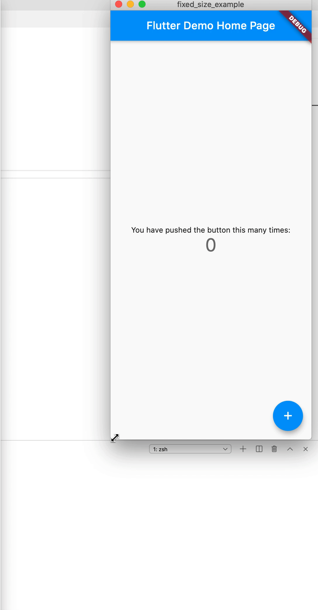
Screenshot

If you can't see the image from github, access it
import

dependencies:
  adaptation: ^0.2.0-nullsafety # nullsafety version
English
Usage
import 'package:adaptation/adaptation.dart';
return MaterialApp(
  title: 'Flutter Demo',
  theme: ThemeData(
    primarySwatch: Colors.blue,
    visualDensity: VisualDensity.adaptivePlatformDensity,
  ),
  home: MyHomePage(title: 'Flutter Demo Home Page'),
  builder: (context, widget) {
    return Adaptation(
      child: widget,
      designWidth: 375, // your design page width
    );
  },
);
Then the code can use all the values of the design page.
Description
You don't need a conversion method like pxToDp, you fill in the width of the drawing, and then all units in the project use the drawing.
For example, my drawing is 375 width, and the common text defaults to 14, just write it directly in the project.
If your drawing is 400 and the text is 13, just write 14, no more dp2Px conversions.
Personal views on screen adaptation
Although I wrote this library, I personally do not recommend equal scale enlargement of text/pictures.
Users use larger screens to receive more information, not to see larger words.
Based on this idea, I personally recommend using text streaming, image aspect ratio, widget flexibility scheme to do it.
But many beginners have a hard time grasping this principle, and equal scale is easier to understand, so I wrote this library.
中文
使用
import 'package:adaptation/adaptation.dart';
return MaterialApp(
  title: 'Flutter Demo',
  theme: ThemeData(
    primarySwatch: Colors.blue,
    visualDensity: VisualDensity.adaptivePlatformDensity,
  ),
  home: MyHomePage(title: 'Flutter Demo Home Page'),
  builder: (context, widget) {
    return Adaptation(
      child: widget,
      designWidth: 375, // 你的设计稿宽度
    );
  },
);
接着代码里全部使用设计图的数值即可
说明
不需要类似于 pxToDp 这种换算方法, 你设计图上宽度直接填上去, 然后项目里所有单位都用设计图的就可以了
比如我的设计图是 375 宽度, 常用文字默认为 14, 直接在项目里写就可以
如果你的设计图是 400, 文字为 13, 就写 14, 不用再 dp2Px 之类的换算
个人关于屏幕适配的观点
虽然我写了这个库, 但是我个人是不建议等比例放大文字/图片的
用户使用更大的屏幕是为了接收更多的信息, 而不是看到更大的字
基于这个观点, 我个人建议使用文字流式, 图片宽高比, 控件弹性的方案来做
但是很多初学者对于这个原则很难把握, 而等比例放大比较容易理解, 所以我写了这个库
LICENSE
Apache 2.0