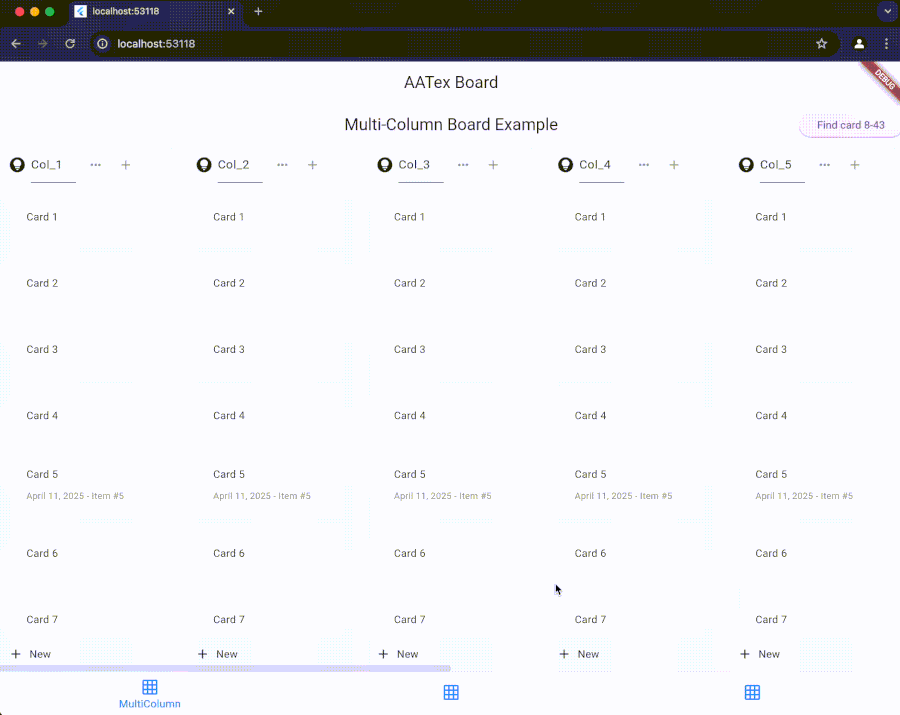
AATex Kanban Board
AATex Kanban Board is a fork of the AppFlowy Kanban Board, an open-source, flexible, and modern kanban board implementation.
Features
- Drag and drop cards within and between columns
- Customizable card and column appearance
- Cross-column animations with configurable duration
- Support for both vertical and horizontal layouts
- Active item highlighting
- Programmatic scrolling to specific items
- Support for phantom items during drag operations
- Auto-scrolling during drag operations
Installation
Add this to your package's pubspec.yaml file:
dependencies:
  aatex_board: ^latest_version
Then run:
flutter pub get
Usage
Basic Setup
import 'package:aatex_board/aatex_board.dart';
import 'package:flutter/material.dart';

// Create a controller
final AATexBoardController controller = AATexBoardController(
  onMoveGroup: (fromGroupId, fromIndex, toGroupId, toIndex) {
    print('Column moved from $fromIndex to $toIndex');
  },
  onMoveGroupItem: <T>(groupId, fromIndex, toIndex, item) {
    print('Item moved within column $groupId from $fromIndex to $toIndex');
  },
  onMoveGroupItemToGroup: <T>(fromGroupId, fromIndex, toGroupId, toIndex, T item) {
    print('Item moved from column $fromGroupId to column $toGroupId');
  },
  // Enable cross-column animations with 500ms duration (default)
  crossGroupAnimationDuration: const Duration(milliseconds: 500),
  enableCrossGroupAnimation: true,
);

// Create board scroll controller
final AATexBoardScrollController boardController = AATexBoardScrollController();

// Add columns (groups) and items
final group = AATexGroupData(
  id: "column_1",
  name: "To Do",
  items: [
    YourCustomItem(id: "item_1", text: "Task 1"),
    YourCustomItem(id: "item_2", text: "Task 2"),
  ]
);
controller.addGroup(group);

// Build the board
Widget build(BuildContext context) {
  return AATexBoard(
    controller: controller,
    boardScrollController: boardController,
    cardBuilder: (context, group, groupItem) {
      return AATexGroupCard(
        key: ValueKey(groupItem.id),
        child: YourCustomCardWidget(item: groupItem),
      );
    },
    headerBuilder: (context, columnData) {
      return AATexGroupHeader(
        title: Text(columnData.headerData.groupName),
        height: 50,
      );
    },
    footerBuilder: (context, columnData) {
      return AATexGroupFooter(
        icon: const Icon(Icons.add),
        title: const Text('Add new'),
        height: 50,
      );
    },
    groupConstraints: const BoxConstraints.tightFor(width: 300),
    config: AATexBoardConfig.config(),
  );
}
Custom Items
Create your own item classes that implement AATexGroupItem:
class YourCustomItem extends AATexGroupItem {
  final String _id;
  final String text;

  YourCustomItem({
    required String id,
    required this.text,
  }) : _id = id;

  @override
  String get id => _id;

  // Enable cross-group animation for this item (optional)
  @override
  bool get animateOnGroupChange => true;

  // Custom animation duration for this specific item (optional)
  @override
  Duration? get crossGroupAnimationDuration => const Duration(milliseconds: 300);
}
For items that can be highlighted/activated, implement the ActiveableGroupItem interface:
class ActiveableItem extends AATexGroupItem implements ActiveableGroupItem {
  final String _id;
  final String text;
  final bool _isActive;
  final Color? _highlightColor;
  final BorderSide? _highlightBorder;

  ActiveableItem({
    required String id,
    required this.text,
    bool isActive = false,
    Color? highlightColor,
    BorderSide? highlightBorder,
  }) : _id = id,
       _isActive = isActive,
       _highlightColor = highlightColor,
       _highlightBorder = highlightBorder;

  @override
  String get id => _id;

  @override
  bool get isActive => _isActive;

  @override
  Color? get highlightColor => _highlightColor;

  @override
  BorderSide? get highlightBorder => _highlightBorder;

  @override
  ActiveableItem copyWith({bool? isActive, Color? highlightColor, BorderSide? highlightBorder}) {
    return ActiveableItem(
      id: _id,
      text: text,
      isActive: isActive ?? _isActive,
      highlightColor: highlightColor ?? _highlightColor,
      highlightBorder: highlightBorder ?? _highlightBorder,
    );
  }
}
Key Components
AATexBoardController
Controls the entire board and provides methods to manage columns and items.
Properties:
crossGroupAnimationDuration: Duration for cross-column animations (default: 500ms)enableCrossGroupAnimation: Whether to enable animated transitions (default: true)
Methods:
-
Column Management:
addGroup(AATexGroupData): Add a columninsertGroup(int index, AATexGroupData): Insert a column at specific indexremoveGroup(String groupId): Remove a columnmoveGroup(int fromIndex, int toIndex): Move a columnclear(): Remove all columnsgetGroupController(String groupId): Get controller for specific column
-
Item Management:
addGroupItem(String groupId, AATexGroupItem item): Add item to a columninsertGroupItem(String groupId, int index, AATexGroupItem item): Insert item at specific positionremoveGroupItem(String groupId, String itemId): Remove itemmoveGroupItem(String groupId, int fromIndex, int toIndex, T item): Move item within columnupdateGroupItem(String groupId, AATexGroupItem item): Update or insert item
-
Navigation and Highlighting:
displayCard({required String groupId, required String itemId, ...}): Highlight a card and scroll to it
AATexGroupController
Controls a specific column, accessed via boardController.getGroupController(groupId).
Methods:
updateGroupName(String newName): Change column nameremoveAt(int index): Remove item at indexmove(int fromIndex, int toIndex): Move item within columninsert(int index, AATexGroupItem item): Insert item at indexadd(AATexGroupItem item): Add item to end of columnreplace(int index, AATexGroupItem newItem): Replace item at indexenableDragging(bool isEnable): Enable/disable dragging for all items in column
AATexBoardScrollController
Controls scrolling the board to specific positions.
Methods:
scrollToGroup(String groupId, {completed}): Scroll horizontally to show a specific columnscrollToItem(String groupId, int itemIndex, {completed}): Scroll vertically to show a specific itemscrollToBottom(String groupId, {completed}): Scroll to bottom of a column
Configuration
Customize the board appearance with AATexBoardConfig:
final config = AATexBoardConfig.config(
  groupBackgroundColor: Colors.grey[100],
  stretchGroupHeight: false,
  groupBodyPadding: const EdgeInsets.all(8.0),
  groupHeaderHeight: 50.0,
  groupFooterHeight: 40.0,
);
Events
Three main callback events are available when creating the controller:
onMoveGroup: Called when column position changesonMoveGroupItem: Called when item moves within a columnonMoveGroupItemToGroup: Called when item moves between columns
Animation Settings
The Kanban board provides smooth animations for cross-column movements:
// Board-level animation settings
final controller = AATexBoardController(
  crossGroupAnimationDuration: const Duration(milliseconds: 500), // Default
  enableCrossGroupAnimation: true, // Default
);

// Item-level animation settings (override board defaults)
class CustomItem extends AATexGroupItem {
  // ...

  @override
  bool get animateOnGroupChange => true;  // Whether this item should animate

  @override
  Duration? get crossGroupAnimationDuration => const Duration(milliseconds: 300);  // Custom duration
}
Advanced Usage: Working with Callbacks
A significant advantage of AATeX Kanban Board is the ability to receive the complete item object in callback methods, allowing you to access all object properties directly.
Passing Objects to Callbacks
When items are moved, you receive the actual item object in callbacks, not just its ID:
final controller = AATexBoardController(
  onMoveGroupItem: <CustomItem>(groupId, fromIndex, toIndex, item) {
    // Access the full item object and its properties
    print('Item ${item.id} with title "${item.title}" moved within column $groupId');

    // Use item properties to update your data model
    updateItemPosition(item.id, groupId, toIndex);

    // Perform conditional logic based on item properties
    if (item.isPriority) {
      notifyPriorityItemMoved(item);
    }
  },

  onMoveGroupItemToGroup: <CustomItem>(fromGroupId, fromIndex, toGroupId, toIndex, item) {
    // The full item object is available with all its properties
    print('Item ${item.id} moved from $fromGroupId to $toGroupId');

    // This simplifies logic for large boards with many items
    updateItemColumn(item.id, toGroupId);

    // You can directly access all custom properties from your item class
    if (item.dueDate != null && item.assignee != null) {
      sendNotification(item.assignee, 'Task moved to ${getColumnName(toGroupId)}');
    }
  }
);
Benefits for Large Boards
This approach significantly simplifies code for large boards:
- Direct Access to Properties: No need to lookup items by ID after movement
- Type Safety: Generic type parameters ensure you get the correct item type
- Reduced Data Lookups: All item data is immediately available in the callback
- Simplified State Management: Update your state directly with the provided item
Example with Custom Item Class
class TaskItem extends AATexGroupItem {
  final String _id;
  final String title;
  final String description;
  final DateTime? dueDate;
  final String? assignee;
  final bool isPriority;

  TaskItem({
    required String id,
    required this.title,
    this.description = '',
    this.dueDate,
    this.assignee,
    this.isPriority = false,
  }) : _id = id;

  @override
  String get id => _id;
}

// Later in your controller setup:
final boardController = AATexBoardController(
  onMoveGroupItemToGroup: <TaskItem>(fromGroupId, fromIndex, toGroupId, toIndex, item) {
    // Direct access to all TaskItem properties
    if (toGroupId == 'done_column' && item.isPriority) {
      notifyPriorityTaskCompleted(item.title, item.assignee);
    }
  },
);
Why this fork?
This fork was created to:
- Rapidly introduce and test new features
- Maintain a faster development and release cycle
- Experiment with custom workflows and UI adjustments
The original project is fantastic and actively maintained — huge thanks to the AppFlowy team for their inspiring work ❤️
License
This project is dual-licensed under:
You may choose to use the code under the terms of either license.
Credits
- Original project: AppFlowy Kanban Board
- Fork author: AATex
Contributing
Feel free to open issues or PRs if you'd like to help improve this version!
Libraries
- aatex_board
- AATexBoard library