suggest_a_feature 0.4.1  suggest_a_feature: ^0.4.1 copied to clipboard
 flutter.wtf
Ready-made Flutter package for collecting suggestions from users.
Suggest a Feature #

Crafted with passion by What the Flutter 🦜

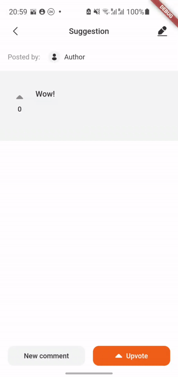
This Flutter package is a ready-made module which allows other developers to implement additional menu in their own mobile app where users can share their suggestions about the application in real time, discuss them with others, and vote for each other's suggestions.
You can check interactive example here.
A small demo:
Usage #
At first, you need to implement SuggestionsDataSource. This is an interface which we use to handle
all the data-layer logic. There you can add the connection to your DB.
If you use firestore as a data source, you can use our ready-made implementation Suggest a feature Firestore.
Then you need to move the SuggestionsPage. For example:
Navigator.of(context).push(
  MaterialPageRoute(
    builder: (context) => SuggestionsPage(
      userId: '1',
      suggestionsDataSource: MyDataSource(
        userId: '1',
      ),
      theme: SuggestionsTheme.initial(),
      onUploadMultiplePhotos: null,
      onSaveToGallery: null,
      onGetUserById: () {},
    ),
  ),
);
If you want to give a user the ability to attach photos to suggestions and save them to the gallery,
you just need to implement the onUploadMultiplePhotos and onSaveToGallery methods.
You can also either use our standard theme or create your own:
theme: SuggestionsTheme().copyWith(...),
Admin functionality #
Admin functionality allows you to edit any suggestion (e.g change its' status) and to leave comments from the 'Admin'.
A small demo:
In order to enable admin functionality, you should specify the adminSettings and set isAdmin to true:
SuggestionsPage(
  isAdmin: true,
  adminSettings: const AdminSettings(
    id: '3',
    username: 'Admin',
  ),
);
Localization #
At the moment the package supports 3 languages: English, Russian and Ukrainian.
English is the default language, it will be set in case the current locale is not supported by the SuggestionsLocalizations.delegate.
MaterialApp(
  home: SuggestionsPage(),
  localizationsDelegates: [
    SuggestionsLocalizations.delegate,
    GlobalMaterialLocalizations.delegate,
  ],
);
SuggestionsLocalizations- strings localizationGlobalMaterialLocalizations- date format localization
You also have to invoke initializeDateFormatting() before MaterialApp() widget creation in order to support date formatting.
initializeDateFormatting();
return MaterialApp(
  home: SuggestionsPage(),
);
Essential checks #
For each suggestion and comment manipulation (updating or deleting) we recommend to check whether
user has author rights to commit those actions. Author rights concept is as follows: the user who
has created a suggestion/comment is the only one who can delete or update it. If it somehow happens
that a user without author rights tries to delete/update a suggestion, an Exception will be thrown.
onGetUserById() function in SuggestionsPage constructor will help you with this.
Theme migration #
Since version 0.3.0 the package uses the material theme of your application. Here's what's changed from the previous version:
- primaryBackgroundColor -> ThemeData.colorScheme.background
- secondaryBackgroundColor -> ThemeData.colorScheme.surfaceVariant
- thirdBackgroundColor -> ThemeData.colorScheme.surface
- bottomSheetBackgroundColor -> ThemeData.bottomSheetTheme.backgroundColor ?? ThemeData.colorScheme.background,
- primaryTextColor and primaryIconColor -> ThemeData.colorScheme.onPrimary
- secondaryTextColor and secondaryIconColor -> ThemeData.colorScheme.onSurfaceVariant
- dividerColor -> ThemeData.dividerColor
- elevatedButtonColor -> ThemeData.colorScheme.primary
- pressedElevatedButtonColor -> ThemeData.colorScheme.primaryContainer
- elevatedButtonTextColor -> ThemeData.colorScheme.onPrimary
- focusedTextButtonColor -> ThemeData.colorScheme.secondaryContainer
- focusedTextColor -> ThemeData.colorTheme.onSecondaryContainer
- focusedTextFieldBorderLine -> ThemeData.colorScheme.primary
- focusedTonalButtonColor -> ThemeData.colorScheme.onSecondaryContainer
- enabledTextColor -> ThemeData.colorScheme.primary
- tonalButtonColor -> ThemeData.colorScheme.secondaryContainer
- fabColor -> ThemeData.floatingActionButtonTheme.backgroundColor ?? SuggestionsTheme.fabColor
- activatedUpvoteArrowColor -> ThemeData.colorScheme.primary
- barIndicatorColor -> ThemeData.colorScheme.primary
- disabledTextButtonColor -> ThemeData.disabledColor
- errorColor -> ThemeData.colorScheme.error
- dialogBarrierColor -> not used
Package uses your app's FilledButtonTheme, TextButtonTheme, TabBarTheme, TextTheme, DividerTheme, scaffoldBackgroundColor
Text styles used in package:
- TextTheme.titleLarge
- TextTheme.titleMedium
- TextTheme.labelLarge
- TextTheme.bodyMedium
Metadata
Publisher
Metadata
Ready-made Flutter package for collecting suggestions from users.
Homepage
Repository (GitHub)
View/report issues
Topics
#suggestions #bug-reporting #feedback
Documentation
License
 MIT (LICENSE)
Dependencies
equatable, flutter, flutter_svg, intl, wtf_sliding_sheet