styled_widget 0.2.1+1  styled_widget: ^0.2.1+1 copied to clipboard
Simplifying your widget tree structure by defining widget using methods. Taking ispiration from CSS and SwiftUI
Simplifying your widget tree structure by defining widgets using methods.


Thanks to the introduction of extension methods in Dart 2.7.0, styled_widget makes it possible to build widget tree`s more readable and efficient.
styled_widget is build as a tool to enhance your Flutter development experience and to seamlessly integrate with your codebase.
Basic example
styled_widget has a bottom up paradigm where you start with the inner most element and layer widget`s on top.The following example is structured as follows:
Icon -> blue circle -> light blue circle -> card -> background
Icon(OMIcons.home, color: Colors.white)
  .padding(all: 10)
  .decorated(color: Color(0xff7AC1E7), shape: BoxShape.circle)
  .padding(all: 15)
  .decorated(color: Color(0xffE8F2F7), shape: BoxShape.circle)
  .padding(all: 20)
  .card(
    elevation: 10,
    shape: RoundedRectangleBorder(
      borderRadius: BorderRadius.circular(20),
    ),
  )
  .alignment(Alignment.center)
  .backgroundColor(Color(0xffEBECF1));
Raw Flutter (click to show)
DecoratedBox(
  decoration: BoxDecoration(
    color: Color(0xffEBECF1),
  ),
  child: Align(
    alignment: Alignment.center,
    child: Card(
      elevation: 10,
      shape: RoundedRectangleBorder(
        borderRadius: BorderRadius.circular(20),
      ),
      child: Padding(
        padding: EdgeInsets.all(20),
        child: DecoratedBox(
          decoration: BoxDecoration(
            color: Color(0xffE8F2F7),
            shape: BoxShape.circle,
          ),
          child: Padding(
            padding: EdgeInsets.all(15),
            child: DecoratedBox(
              decoration: BoxDecoration(
                color: Color(0xff7AC1E7),
                shape: BoxShape.circle,
              ),
              child: Padding(
                padding: EdgeInsets.all(10),
                child: Icon(
                  OMIcons.home,
                  color: Colors.white,
                ),
              ),
            ),
          ),
        ),
      ),
    ),
  ),
);

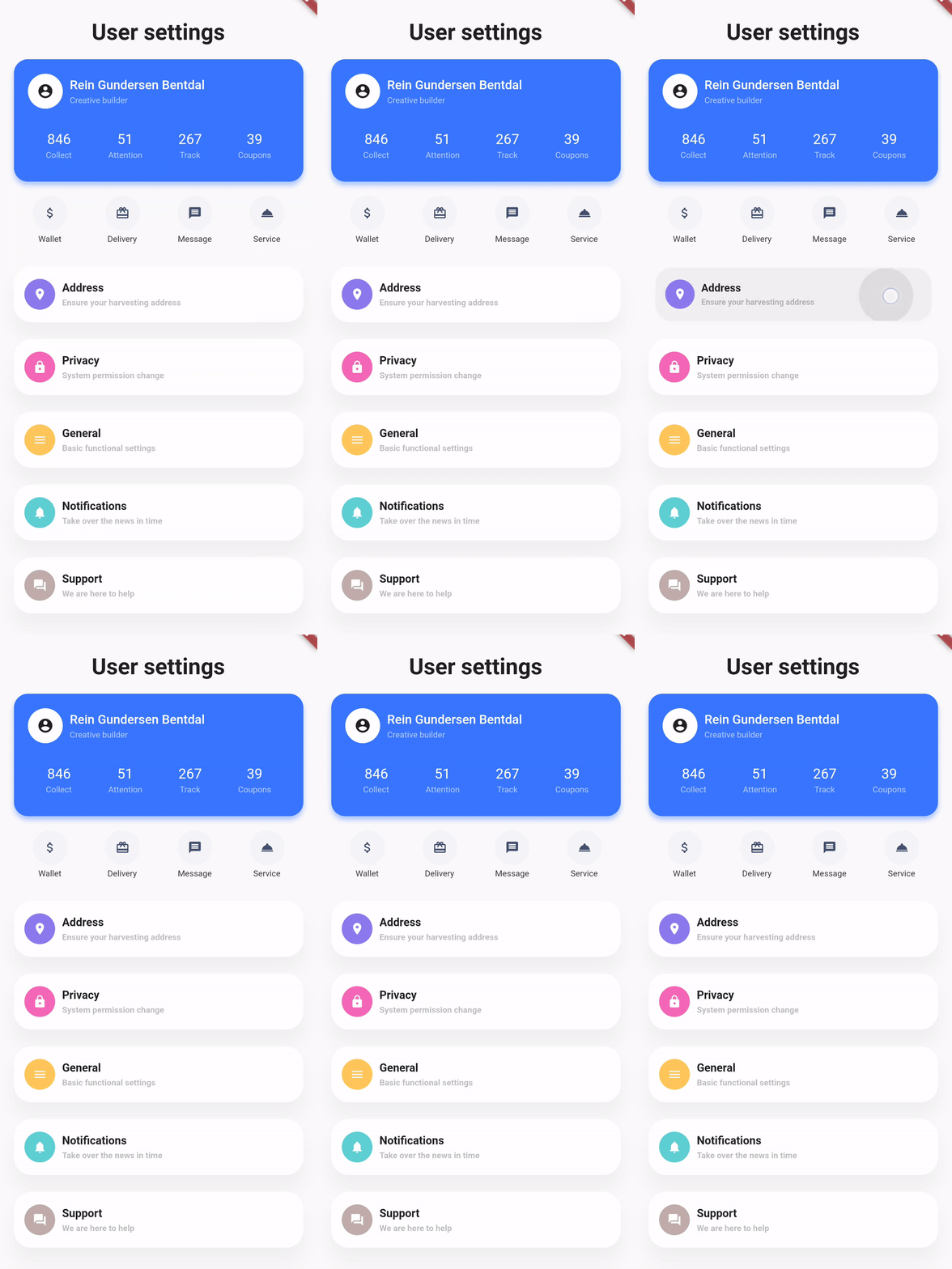
Showcase #
| Design, Code | Design, Code | Design, Code |
|---|---|---|
 |
 |
 |
Docs #
See the documentation at styled_widget/wiki for more information about using styled_widget!
Quicklinks
