slider_gradient 0.1.1  slider_gradient: ^0.1.1 copied to clipboard
A slider with gradient background color.
slider_gradient #
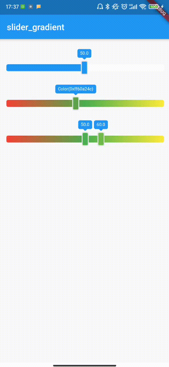
Slider with gradient background
display #
image
Usage #
| Name | Type | Description | Default |
|---|---|---|---|
| value | int | Default value | Slider default minimum |
| min | int | Slider minimum | 0 |
| max | int | Slider maximum | 100 |
| isShowLabel | bool | Show the label on the slider | false |
| label | String | Label displays data. It is valid only when "isShowlabel" is true. | null |
| isGradientBg | bool | Whether the background color of the background slider is a gradient. | true |
| onChange | SliderChangeCallback | A custom callback function that triggers as long as the slider moves | null |
| onChangeEnd | SliderChangeCallback | A Custom callback function triggered by slider stop movement | null |
| onChangeBegin | SliderChangeCallback | A Custom callback function triggered by slider start movement | null |
| colors | List< Color > | Slider background gradient from left to right | There are two colors by default, the first app is the main color, and the second is white |
| labelStyle | LabelStyle | Custom label style | this |
| sliderStyle | SliderStyle | slider label style | this |
| thumbStyle | ThumbStyle | thumb label style | this |
Metadata
3
likes
0
pub points
52%
popularity
Publisher
unverified uploader
Metadata
A slider with gradient background color.
Repository (GitHub)
View/report issues
License
 unknown (LICENSE)