input_code_field 2.0.2  input_code_field: ^2.0.2 copied to clipboard
Widget providing input code field to insert PIN, SMS OTPs and other auth codes.
Input Code Field #
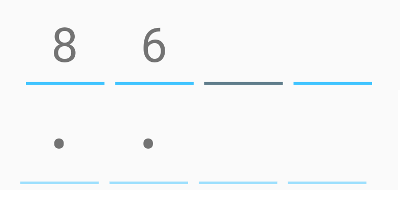
InputCodeControl widget provides a text field for entering pin codes, SMS codes, and other authentication codes. It can also be used for entering highly formatted inputs, such as dates and times. The widget supports the backspace keyboard button.
Support Development ☕ #
Developing and maintaining this plugin takes time and effort. If you find this plugin useful and would like to show your appreciation, consider making a donation. Your contributions help ensure the continued development and improvement of the plugin. 🚀
You can make a donation and buy me a cup of coffee to keep the momentum going:
Your support is invaluable, and every donation is deeply appreciated. Thank you for helping to make this plugin even better! 🙏
Usage #
InputCodeControl handles all logic, validation, and state management for the code field. It also stores the current value and an index pointer to the next field.
InputCodeField is a standard text field with an underline that can be customized using InputCodeDecoration. It supports enabling and disabling the field, obscuring the input, and setting the size, color, and other properties of the field.
final InputCodeControl codeControl = InputCodeControl(inputRegex: '^[0-9]*$');

InputCodeField(
  control: codeControl,
  count: 6,
  inputType: TextInputType.number,
  decoration: InputCodeDecoration(
    focusColor: Colors.blueGrey,
  ),
),

Manual customization #
For better visual control, you can use the itemBuilder callback to build custom field items. To get the character at a given index, use the [] operator on the InputCodeControl object. To check if an item at a given index is focused, use the InputCodeControl.isFocused(index) method. To check if the entire widget has focus, use the InputCodeControl.hasFocus method.
InputCodeField(
  control: codeControl
  itemBuilder: (context, index) => CustomCodeItem(
      char: control.stringCode.code[index],
      fieldFocused: codeControl.hasFocus,
      itemFocused: codeControl.isFocused(index),
    ),
);


class CustomCodeItem extends StatelessWidget {
  final String char;
  final bool fieldFocused;
  final bool itemFocused;

  const CustomCodeItem({
    Key key,
    this.char = '',
    this.fieldFocused = false,
    this.itemFocused = false,
  }) : super(key: key);

  @override
  Widget build(BuildContext context) {
    return Container(
      width: 42.0,
      height: 42.0,
      decoration: BoxDecoration(
        borderRadius: BorderRadius.circular(6.0),
        color: fieldFocused ? (itemFocused ? Colors.grey : Colors.grey.withOpacity(0.5)) : Colors.grey.withOpacity(0.25),
        border: Border.all(color: itemFocused ? Colors.black : Colors.grey),
      ),
      child: Center(
        child: Text(
          char,
          style: Theme.of(context).primaryTextTheme.headline4,
        ),
      ),
    );
  }
}

For total visual control, use the builder callback to build the entire input widget. InputCodeField and InputCodeControl will still handle all input logic and keyboard actions.
InputCodeField(
  control: codeControl
  builder: (context) => CustomCodeField(
    control: codeControl,
    ),
);


class CustomCodeField extends StatelessWidget {
  final InputCodeControl control;

  const CustomCodeField({
    Key key,
    required this.control,
  }) : super(key: key);

  @override
  Widget build(BuildContext context) {
    final List<Widget> items = <Widget>[];

    for (int i = 0; i < control.count; i++) {
      if (i > 0 && i % 3 == 0) {
        items.add(Container(
          margin: EdgeInsets.symmetric(horizontal: 24.0),
          height: 32.0,
          width: 2.0,
          color: control.hasFocus ? Colors.green : Colors.blueGrey,
        ));

        items.add(Container(
          height: 42,
          width: 1.0,
          color: Colors.blueGrey,
        ));
      }

      items.add(Expanded(
        child: Container(
          height: 42.0,
          color: control.isFocused(i, true) ? Colors.greenAccent.withOpacity(0.25) : Colors.transparent,
          child: Center(
            child: Text(
              control[i],
              style: Theme.of(context).primaryTextTheme.headline4,
            ),
          ),
        ),
      ));

      if (i < control.count - 1) {
        items.add(Container(
          height: 42,
          width: 1.0,
          color: Colors.blueGrey,
        ));
      }
    }

    return ClipRRect(
      borderRadius: BorderRadius.circular(16.0),
      child: Container(
        decoration: BoxDecoration(
          borderRadius: BorderRadius.circular(16.0),
          border: Border.all(color: control.hasFocus ? Colors.green : Colors.blueGrey),
        ),
        child: Row(
          children: items,
        ),
      ),
    );
  }
}

Features and known bugs #
Missing features #
- Overriding or editing the code from the middle
- A copy/paste toolbar
Credits #
- Migrated to Flutter 3.0 by Emilio Dalla Torre
- Original author: RomanBase
