groovin_widgets 1.3.0  groovin_widgets: ^1.3.0 copied to clipboard
 groovinchip.dev
A Flutter package containing widgets created by GroovinChip.
groovin_widgets #
A Flutter package containing widgets created by GroovinChip.
This package currently contains the following widgets:
- ModalDrawerHandle
- OutlineDropdownButton
- GroovinExpansionTile
ModalDrawerHandle #
ModalDrawerHandle allows you to add a highly customizable drawer handle widget to your modalBottomSheets.
Sample image:

Full image gallery: https://imgur.com/gallery/zf6NriP
YouTube video walkthrough: https://www.youtube.com/watch?v=VF-zR9ougi8&feature=youtu.be
Every aspect of the drawer handle can be customized:
- color
- height
- width
- the MainAxisAlignment of the Row it sits in
- the BorderRadius of all four corners
The recommended use of this widget is within the showModalBottomSheet builder (or the showRoundedModalBottomSheet builder, if you prefer the package by Gildaswise like I do).
The ideal use in this case is to return a Container that returns a Column, and the ModalDrawerHandle widget should be the first widget in the Column. I personally wrap the ModalDrawerHandle with a Padding that has a const EdgeInsets.all(8.0). Below is an example of this:
showRoundedModalBottomSheet(
  context: context,
  builder: (builder) {
    return Container(
	  child: Column(
	    mainAxisSize: MainAxisSize.min,
	    children: <Widget>[
		  Padding(
		    padding: const EdgeInsets.all(8.0),
		    child: ModalDrawerHandle(),
		  ),
	    ],
	  ),
    );
  },
);
By default, the ModalDrawerHandle is initialized with the following properties:
  ModalDrawerHandle({
    this.handleRowAlignment = MainAxisAlignment.center,
    this.handleHeight = 5.0,
    this.handleWidth = 25.0,
    Color handleColor,
    this.handleBorderRadius = const BorderRadius.all(Radius.circular(10.0))
  }):
     this.handleColor = handleColor ?? Colors.grey[300];
As such, developers can pass in any or all of their own custom values to the constructor as they choose.
OutlineDropdownButton #
OutlineDropdownButton is a standard DropdownButton with one additional feature: the ability to wrap it in a border. Every property that you'd expect to customize about a DropdownButton is available to the developer, and the InputDecoration that the OutlineDropdownButton uses is also fully customizable.
By default, OutlineDropdownButton is initialized with the following properties:
  OutlineDropdownButton({
    this.inputDecoration = const InputDecoration(
      border: OutlineInputBorder(),
      contentPadding: EdgeInsets.all(8.0),
    ),
    this.disabledHint,
    this.elevation = 8, // the default value per the source
    this.hint,
    this.iconSize = 24.0, // the default value per the source
    this.isDense = false, // the default value per the source
    this.isExpanded = true, // here I deviate from the source because this property is great
    this.items,
    this.onChanged,
    this.style,
    this.value,
  });
A default OutlineDropdownButton will look as follows:

OutlineDropdownButtonFormField #
OutlineDropdownButtonFormField is similar to OutlineDropdownButton but is optimized for Forms. The additional properties are:
final List<DropdownMenuItem<T>> items;
final ValueChanged<T> onChanged;
final FormFieldValidator<T> validator;
final FormFieldSetter<T> onSaved;
This widget builds the InputBorder explicitly in the widget rather than the constructor due to form validation limitations.
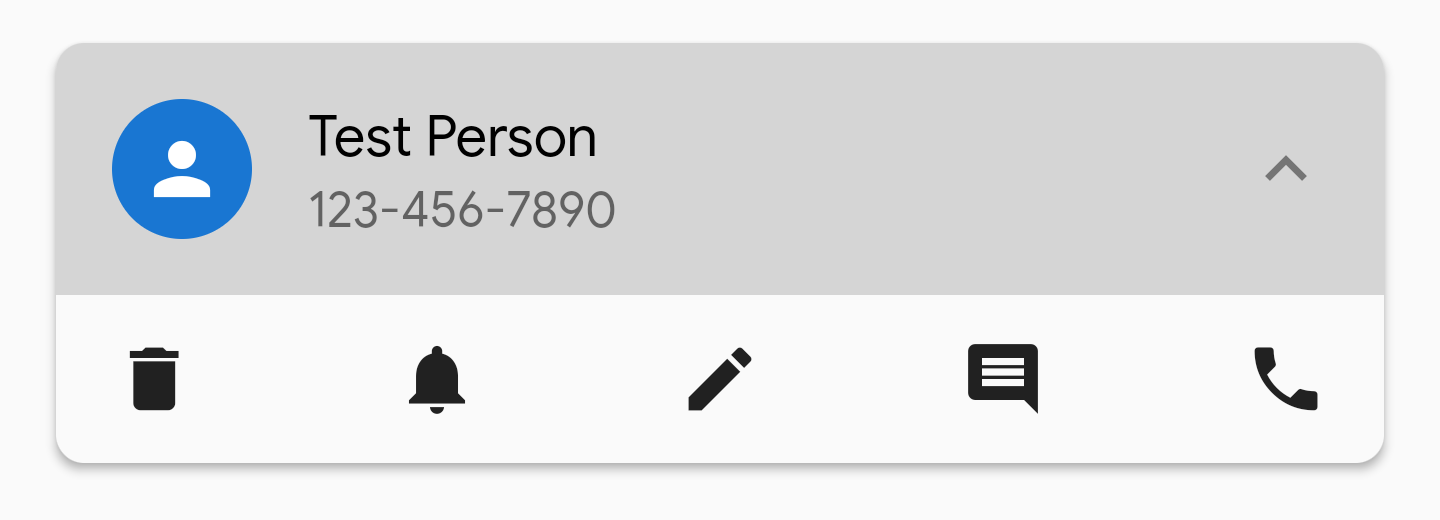
GroovinExpansionTile #
This widget is a modified Expansion tile that allows for more customization over its appearance. You can customize the BoxDecoration of the ExpansionTile so you can remove the lines that appear above and below it when expanded, and so on.
ExpansionTile builds a ListTile for the user to tap on; GroovinExpansionTile builds a custom ListTile so that you can add a subtitle and adjust the border radius of the InkWell the tile is contained in.
As of version 1.2.1 of this library, this widget's default trailing icon will have a set color of
Colors.grey. This icon color is open to customization via the parameter defaultTrailingIconColor.
Example images:
- Wrapped in Material with 2.0 elevation, not expanded:
- Wrapped Material with 2.0 elevation, expanded:

- Wrapped Material with 2.0 elevation, expanded, showing InkWell with topRight and topLeft radius:
Getting Started with Flutter #
For help getting started with Flutter, view our online documentation.
For help on editing package code, view the documentation.
Metadata
Publisher
Metadata
A Flutter package containing widgets created by GroovinChip.
Repository (GitHub)
View/report issues
License
 unknown (LICENSE)