

flex_color_scheme 5.0.0-dev.2  flex_color_scheme: ^5.0.0-dev.2 copied to clipboard
 rydmike.com
A Flutter package to use and make beautiful Material design based themes.


FlexColorScheme #
The documentation is moving #
The documentation for FlexColorScheme is moving to its own site powered by docs.page.
The work in progress documentation site is here.
The documentation site has not yet been updated to version 5, it is a work in progress!
Version 5.0.0-dev.2 Release Notice #
Version 5 is a big refactor with deprecation of previous variant based color names in favor of container ones that were added to updated M3 based ColorScheme in Flutter 2.10.0. The same additions and changes are now also introduced in FlexColorScheme. Despite being a very big release, with many new features, actual breaking changes are very few and mostly concerns in version 4 deprecated members and of course requiring minimum Flutter 2.10.0 to work.
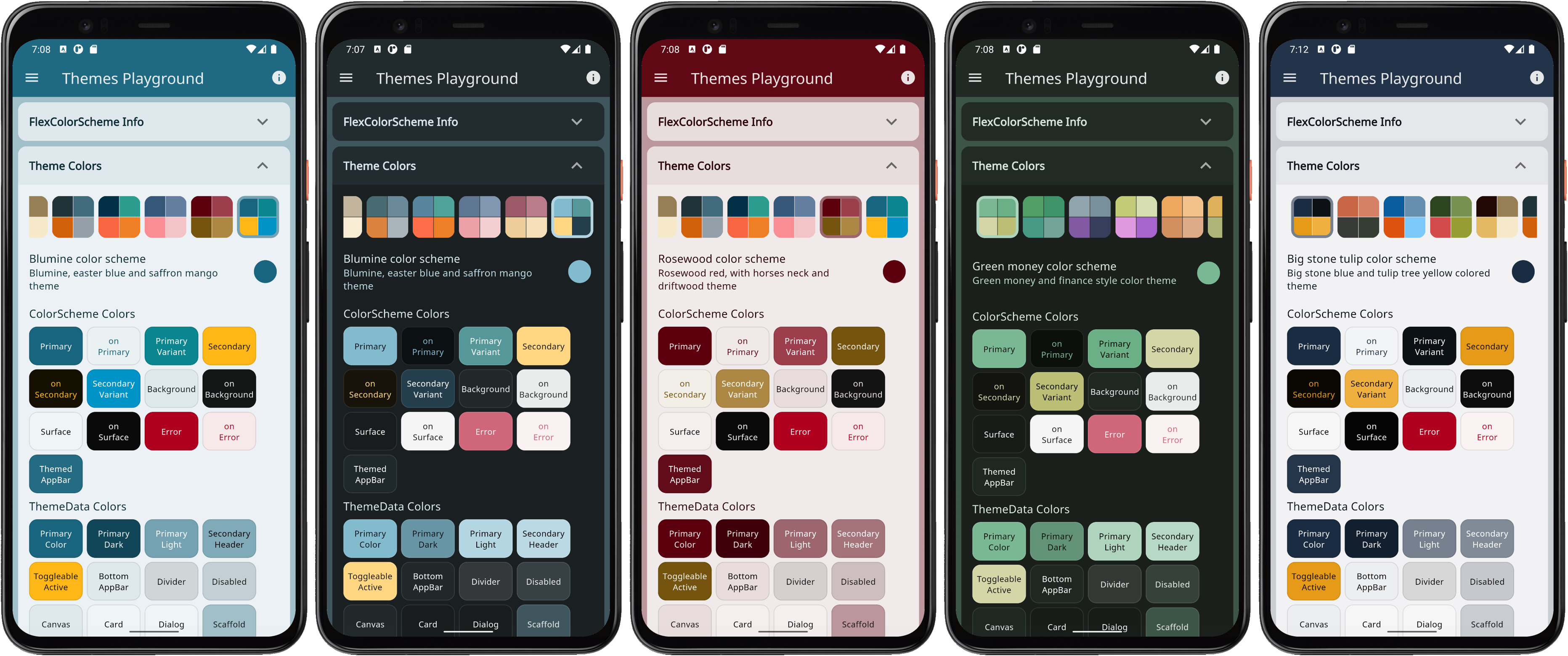
Version 5 has many new advanced coloring features and fully supports Material 3 based color schemes, including more powerful seed generated color schemes than what is available in Flutter SDK directly. Version 5 also comes with many more convenient component sub-theming options compared to previous versions. The companion app, the Themes Playground has been completely revised and has two view modes, the previous large masonry grid, but also a convenient topic based page view. In the new version you can also see the generated theme setup code as you change your theming settings. The app is still open source, more will be written about it in the docs and may an article as well later.
This is a minor breaking release with many major new Material 3 ColorScheme features. See change log for detailed change information. Generated API docs are available and up to date with version 5. The samples have also been updated, the live web builds of them are available here:
- Example 1 Basic Theme
- Example 2 Custom Theme
- Example 3 Four Themes
- Example 4 All Themes
- Example 5 Themes Playground The new version 5 of the Themes Playground demonstrates all the new features, including using Material 3 key color based seeded ColorSchemes.
- The default bundled example Hot Reload Playground has also been updated. Its comments contain a lot of documentation that will end up in the docs later.
- The sample with the Copy Playground Theme template that can be used to test themes using copy-pasted theme setup code from the Themes Playground is also up-to-date.
What remains to be done?
-
Q: Will there be significant changes from 5.0.0-dev.2 to 5.0.0 stable?
-
A: No, it is done and ready for release.
-
Q: What remains to be done before stable 5.0.0 is released?
-
A: Documentation, meaning this site should be updated and ready too.
-
Q: When will stable 5.0.0 be released?
-
A: When the task in previous answer is done :)
Introduction #
Use FlexColorScheme to make beautiful color scheme based Flutter themes, with optional primary color surface blends. The themes are based on the same concept as Flutter's ColorScheme based themes, but with many additional features.
 FlexColorScheme theme examples (click image to open hires version)
When you color theme a Flutter application, all built in widgets use the colors of the ColorScheme in your theme. At least in theory, and it is almost so if you defined your Flutter ThemeData by using the ThemeData.from factory, but even it misses a few details. FlexColorScheme goes the extra mile to ensure that all Flutter SDK widgets gets themed completely by its built-in color schemes, or custom colors you provide.
You can also opt in on using pre-made opinionated widget sub-themes. By opting in, you can for example adjust the border radius on all widgets with a single property to set the same themed border radius on all of them with one property. Current Flutter SDK widgets are based on the Material 2 guide and use 4 dp corner radius as default on most corners.
When you opt in on using the sub themes, the border radius on widgets default to the new rounded corners as specified by the Material 3 guide, where the rounding varies by widget type. You can stick with this, or set global radius to a value you prefer. You can also easily set the themed border radius per widget and override the shared radius value in just a few cases. Use simple property values per widget, no need for verbose custom sub theme Shape definitions.
Metadata
Publisher
Metadata
A Flutter package to use and make beautiful Material design based themes.
Repository (GitHub)
View/report issues
License
 unknown (LICENSE)
Dependencies
flutter, material_color_utilities