

flex_color_scheme 5.0.0  flex_color_scheme: ^5.0.0 copied to clipboard
 rydmike.com
A Flutter package to use and make beautiful Material design based themes.

FlexColorScheme #
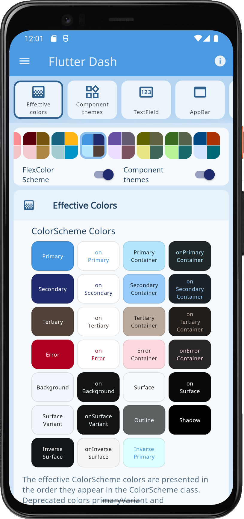
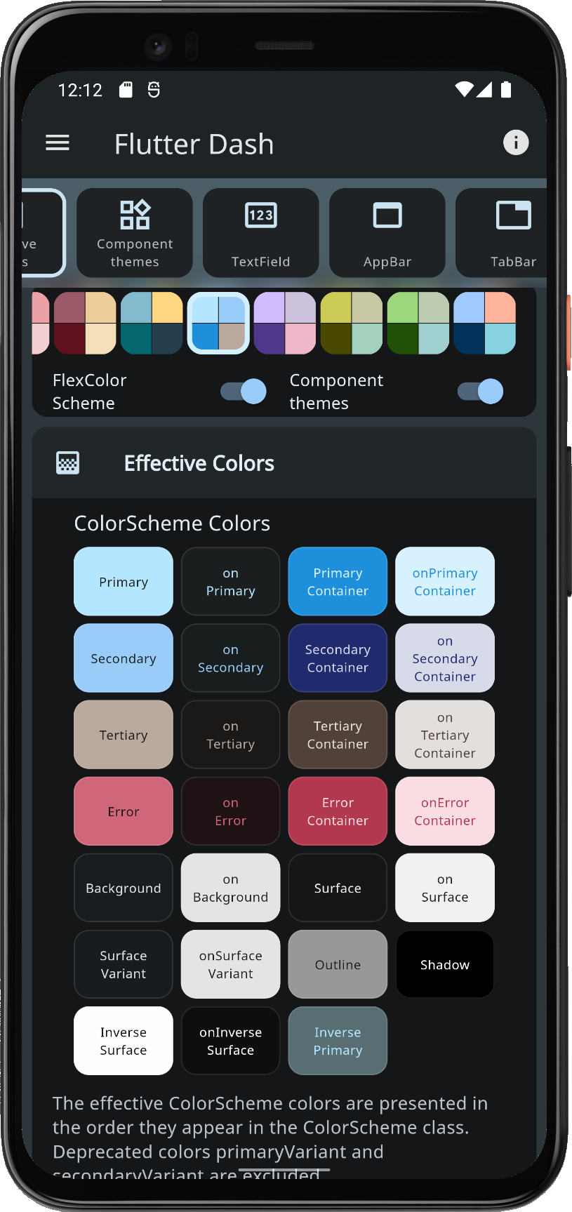
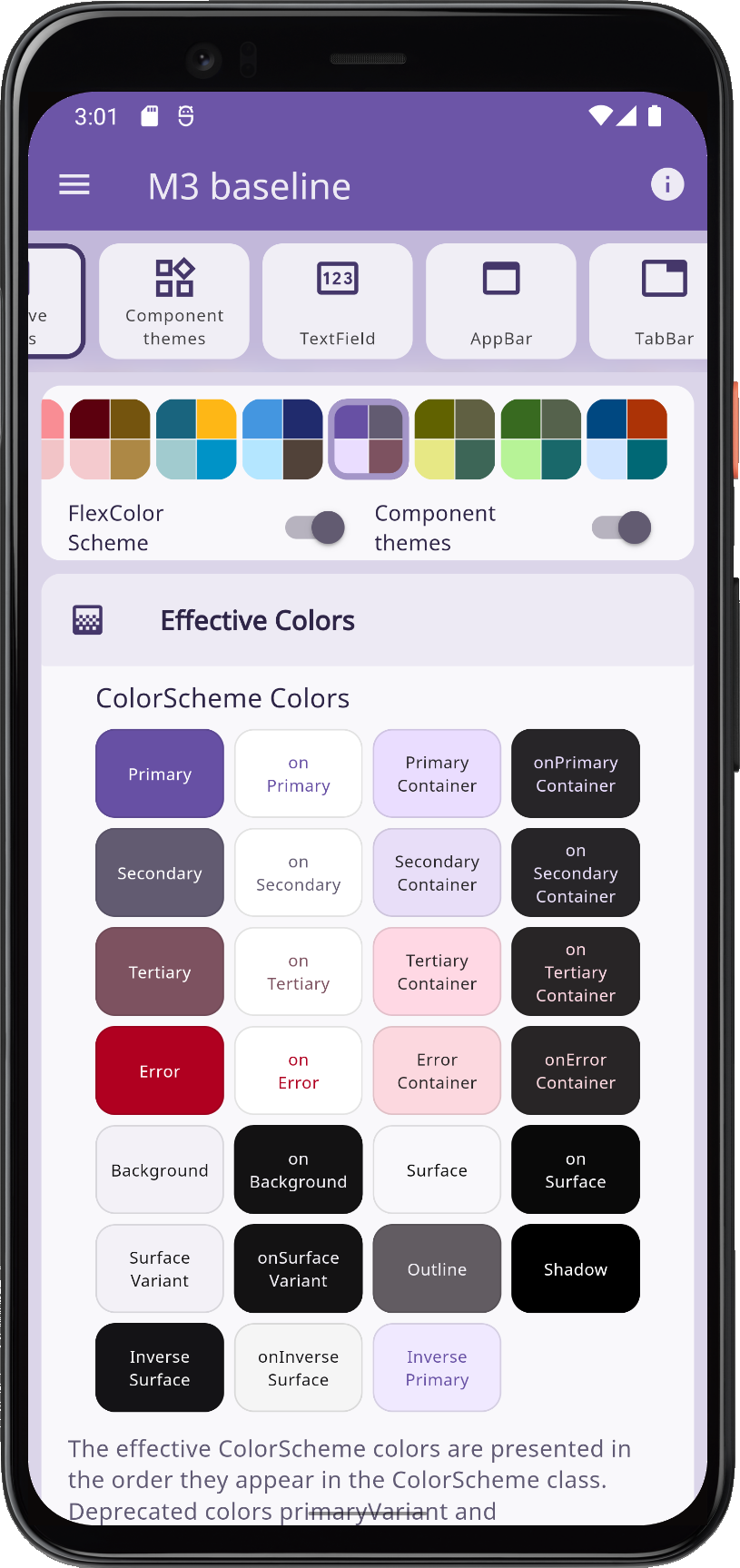
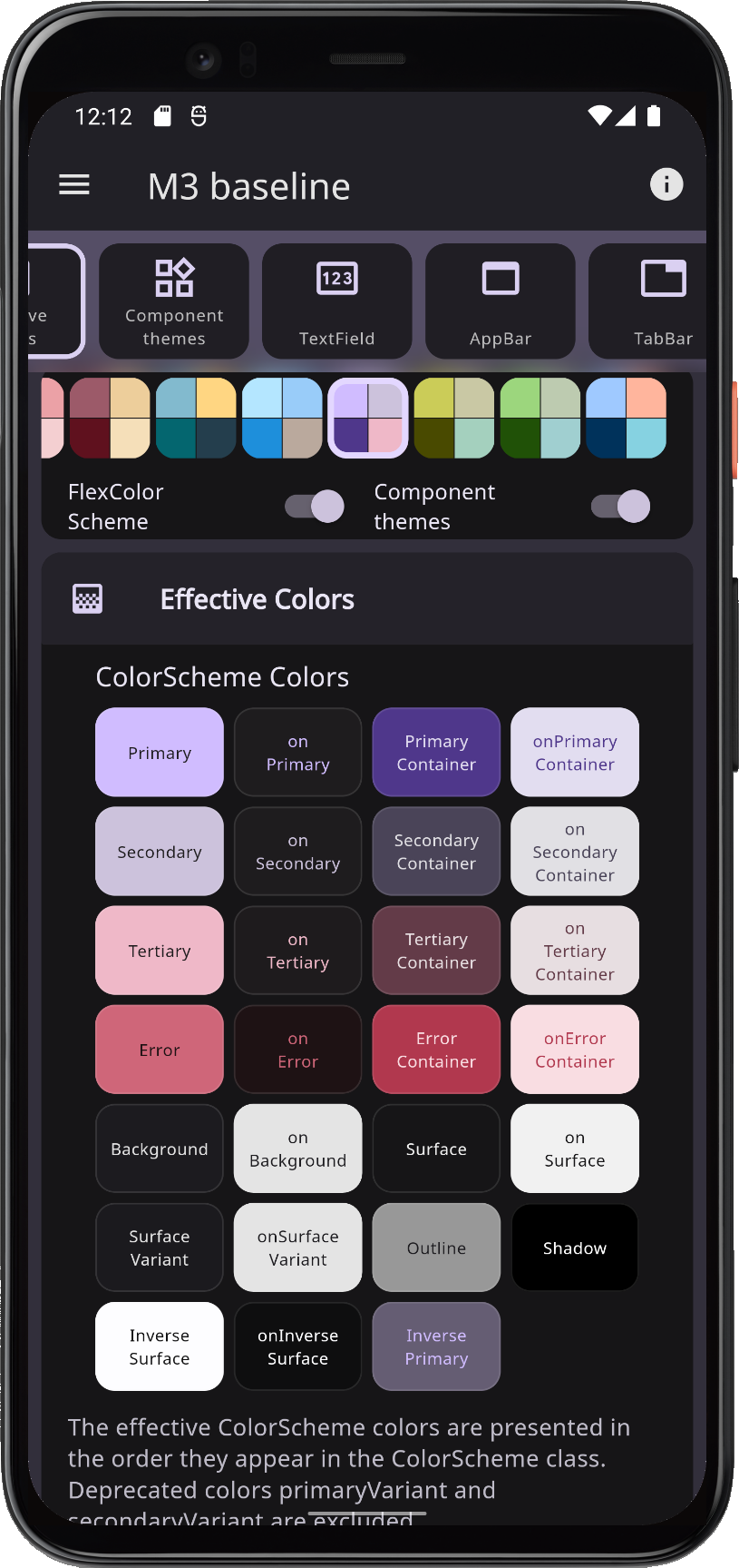
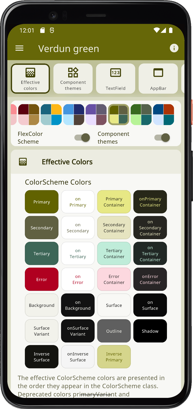
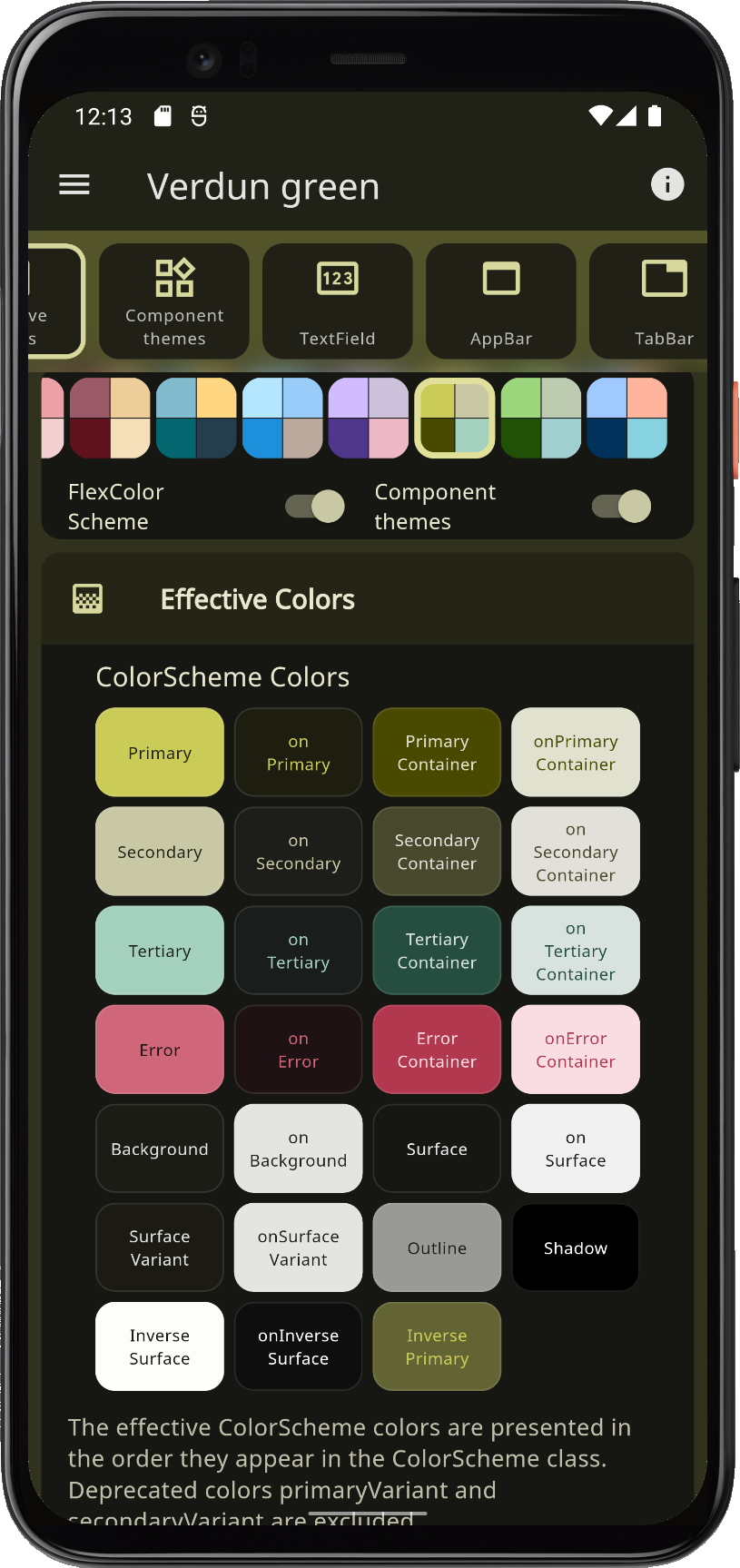
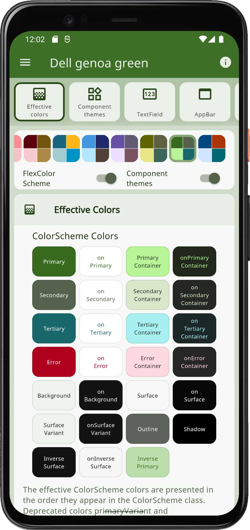
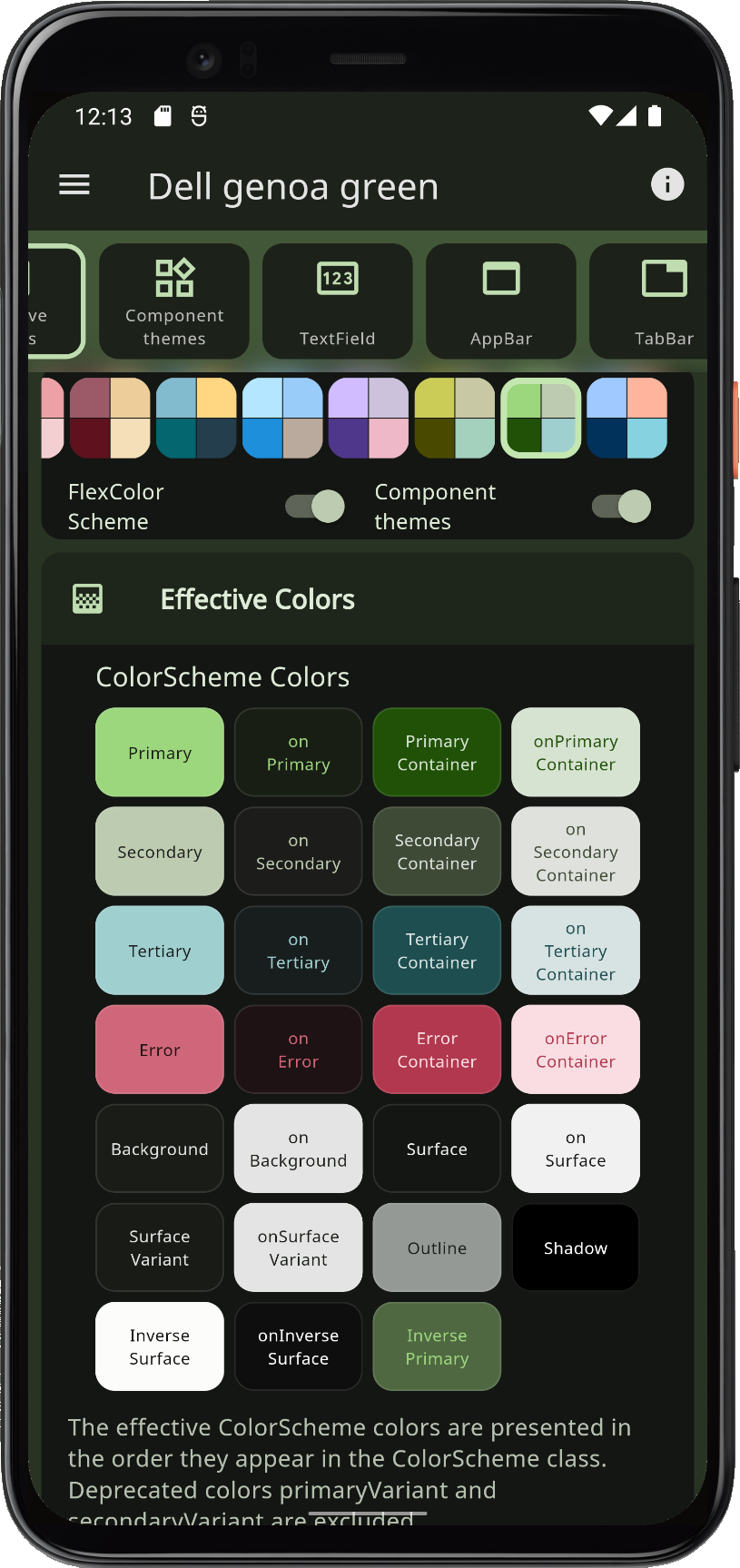
Use FlexColorScheme to make beautiful color scheme based Flutter themes, with optional primary color surface blends, or key color seeded schemes. The themes are based on the same concept as Flutter's ColorScheme based themes, but it offers many additional features and numerous pre-made themes.
 |
 |
 |
 |
When you theme a Flutter application, all built-in widgets use the colors of the
ColorScheme in your theme. At least in theory, and it is almost so if you defined
your ThemeData by using the ThemeData.from factory, but it still misses
a few details.
FlexColorScheme ensures that all Flutter SDK widgets gets themed completely by its
schemes and custom colors you provide. It applies its ColorScheme colors
to relevant color properties in ThemeData, as long as they still exist. This
ensures that all the direct colors properties in ThemeData match your ColorScheme.
You can opt-in on using opinionated component sub-themes. By doing so you can for example adjust the border radius on all UI widgets with a single property value. Flutter's Material UI widgets still default to being based on the Material 2 design, and thus use 4 dp corner radius on most widgets.
When you opt-in on using the component sub-themes, the border radius on widgets default to the new rounded corners as specified by the Material 3 guide, where the radius varies by widget type. You can keep this, or set the global widget radius to a value you prefer. You can also easily set the themed border radius per widget, and override the Material 3 default, or the global radius value you defined.
 |
 |
 |
 |
With FlexColorScheme component themes you use simple flat property values.
No need for verbose Flutter SDK component sub-themes, with ShapeBorder
definitions on multiple widget themes to change their border radius. The component
theming provides a large amount of easy to configure options via simple
properties, instead of complicated nested ones. In many cases you can
avoid the both complicated and confusing MaterialState theming properties.
FlexColorScheme has many advanced coloring features, like using
surface alpha blends. It also fully supports Material 3 based color schemes,
including seed key color generated ColorSchemes. It offers many configuration
options that you can use when you generate your ColorScheme from
key colors, customization features that are currently not available in Flutter.
Documentation #
FlexColorScheme has its own dedicated documentation site docs.flexcolorscheme.com. Please refer to it for more information and guidance on its usage and features. The documentation site is powered by docs.page from Invertase.
Complete generated package API documentation is also available.
Themes Playground #
If you are here for the FlexColorScheme companion application that allows you to configure a theme and copy-paste its setup code for use in your application, then head over to the Themes Playground.
Metadata
Publisher
Metadata
A Flutter package to use and make beautiful Material design based themes.
Repository (GitHub)
View/report issues
License
 unknown (LICENSE)
Dependencies
flutter, material_color_utilities