flex_color_picker 2.0.0-nullsafety.5  flex_color_picker: ^2.0.0-nullsafety.5 copied to clipboard
 rydmike.com
A customizable Flutter primary, accent and custom color picker. Includes an optional HSV wheel color picker.


FlexColorPicker #
FlexColorPicker is a customizable color picker for Flutter. The ColorPicker can show six different types of color
pickers, three of which are used for the standard Flutter Material colors and their shades. The size and style used
for the pick items can be customized.
The picker is also Windows, Mac, Linux and Web desktop compatible with focus handling, with optional menus for handling copy-paste of color from/to the picker, including desktop keyboard copy/paste shortcuts.
Contents #
- FlexColorPicker
- Tutorial
- FlexColorPicker API Guide
- Desktop and Web Ready
- Additional Resources
Color Picker Types #
The different types of available color pickers are:
- Material primary colors and its shades.
ColorPickerType.primary - Material accent colors and its shades.
ColorPickerType.accent - Both primary and accent colors and their shades, in the same color picker.
ColorPickerType.both - Black and white colors, including very near black and white shades.
ColorPickerType.bw - Custom color swatches and their shades, that you define and name.
ColorPickerType.custom - HSV color wheel picker, that allows you to select or enter any color.
ColorPickerType.wheel
When you show more than one color picker, a segmented sliding control allows you to select which one to use. You can
configure the ColorPicker to include any of the above color pickers. Showing pickers 1 and 2, together with picker 3
is not very useful, they are available as optional ways of showing and selecting the standard Material primary and
accent colors.
Give the ColorPicker a heading and a subheading for the color shades, typically Text widgets with appropriate style.
Decide if the Material shades can be selected or not and if the selected color name and RGB code are visible in the
picker. If the color HEX RGB code is visible, the picker can also include a button that allows you to copy the selected
color's code to the clipboard directly from the field. On the wheel picker you can enter a HEX RGB color code, and
the wheel picker will move to select the color as the color code is being entered, while also creating a color
swatch for it.
The shape, size and spacing of the color picker items can be modified. There is a built-in dialog that can be used to
show and use the ColorPicker in a dialog. You can of course also make your own dialog and just use the ColorPicker
widget in your own custom dialog or other overlay.
Getting Started #
In the pubspec.yaml of your Flutter project, add the following dependency:
dependencies:
  flex_color_picker: ^2.0.0-nullsafety.5
In your library file add the following import:
import 'package:flex_color_picker/flex_color_picker.dart';
Default Example Application #
To try a basic example of the ColorPicker on a device or simulator, clone the flex color picker repository and run the example:
cd example/
flutter run --release
The result is a default color picker with only the primary and accent color pickers available. Plus another picker
that opens up in a dialog, with all pickers enabled, except 3 ColorPickerType.both and 4 ColorPickerType.bw.
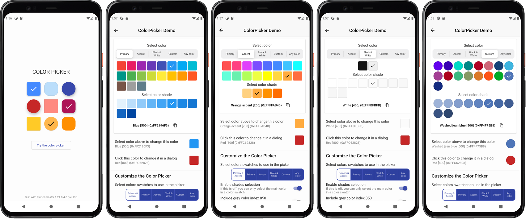
Live Web Demo #
You can also try a live Web demo of the FlexColorPicker here. With the Web demo you can modify most of the color picker's API values and use it as a tool to find a style that fits your application.
The source code for the Web demo, which is a bit more elaborate example than examples normally are, is also bundled with the package source code in the "example/lib/demo" folder.
The Web demo has a responsive view, that expands into maximum four separately scrollable columns. The columns contain a massive amount of controls that you can use to adjust the color picker's settings. On a 1080p desktop screen, you can see most of the settings at the same time as the color picker, so you can test the settings and see their impact on the picker as you adjust them.
The Web demo also has tooltips for each control. The tooltips show the name of the API it uses and its current value. With this feature you can use the web demo as a tool configure the color picker to a desired style, and find the APIs and values that you used. The same toggle that is used to turn OFF the tooltips in the picker, also turns OFF the API tooltips in the demo, in case they get in the way. By default, the tooltips are ON, to show the used API and its current value.
The FlexColorPicker Web demo also persist the settings you change, so the next time you use it, with the same device and browser, it will restore the configuration that you left it in last time you used it. You can reset the settings to their start default values as well.
Tutorial #
In this chapter we use the default bundled example application as an introduction to the FlexColorPicker. We will
create three different color pickers, with different configurations and using the ColorPicker three different ways
as well.
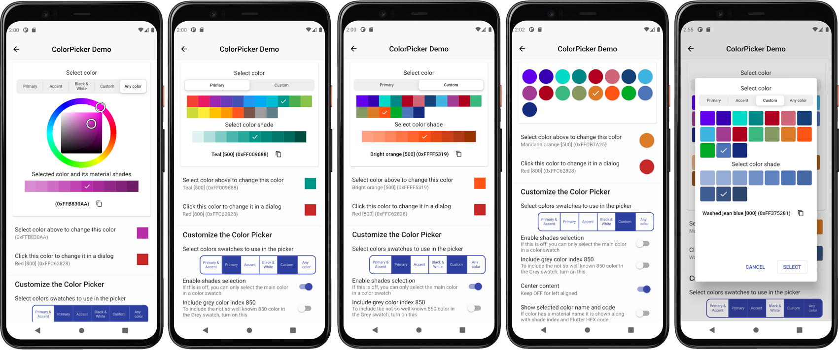
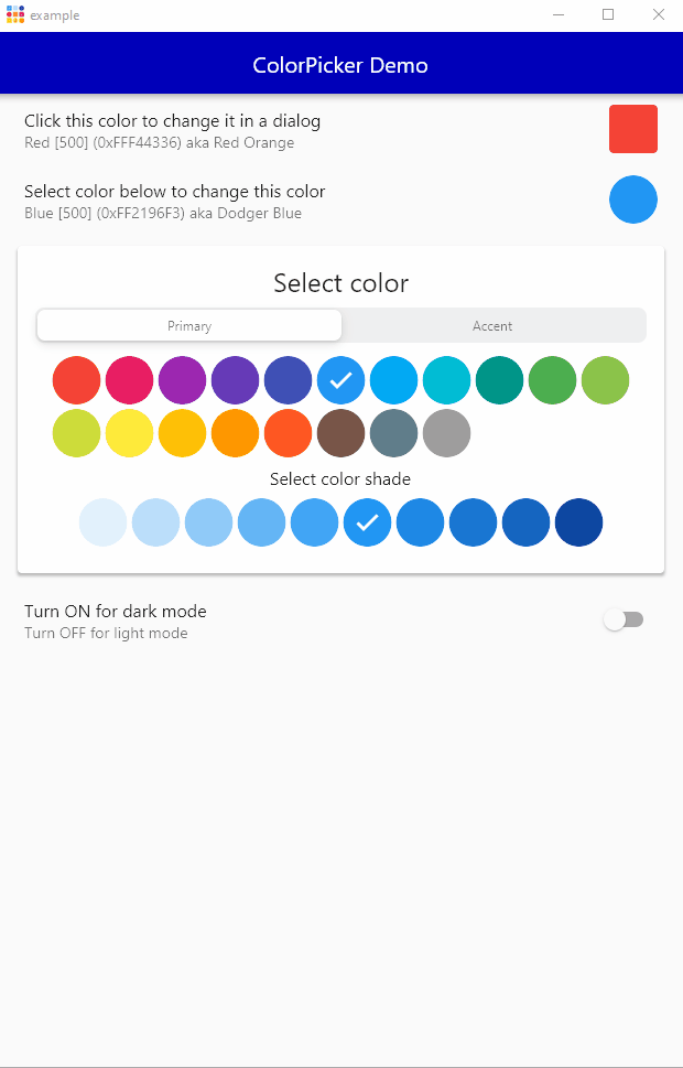
This example uses a StatefulWidget as its main page, the ColorPickerPage, where we define three different Color
objects in its local state, and give them a start value in the StatefulWidget's initState().
We will use these colors to indicate the currently selected color and as start color value for each picker.
class _ColorPickerPageState extends State<ColorPickerPage> {
  // Color for the picker shown in Card on the screen.
  late Color screenPickerColor;
  // Color for the picker in a dialog using onChanged.
  late Color dialogPickerColor;
  // Color for picker using the color select dialog.
  late Color dialogSelectColor;

@override
void initState() {
  super.initState();
  screenPickerColor = Colors.blue;  // Material blue.
  dialogPickerColor = Colors.red;   // Material red.
  dialogSelectColor = const Color(0xFFA239CA); // A purple color.
}
Color Indicator #
We can use the ColorIndicator Widget, that the ColorPicker uses internally, to show and select a new color.
Alternatively you can make and use a custom for Widget for this purpose. Here we use the ColorIndicator in
a ListTile, and use the ColorIndicator as its trailing property to show the selected color.
The FlexColorPicker package also includes ColorTools, a set of helper functions that you among other things,
can use to display names of the standard material colors, its shade index, as well as an optional Flutter
style Hex color code. We use the ColorTools.materialNameAndCode in the ListTile's subtitle property, to
describe the selected color by showing its Material color name and index, as well as its Flutter style HEX color value.
We also use the ColorTools.nameThatColor function, that names any color based on the closest matching color from a
list consisting of 1566 color values and their English names.
We begin by adding this ListTile to a ListView in the Scaffold body.
@override
Widget build(BuildContext context) {
return Scaffold(
appBar: AppBar(
centerTitle: true,
title: const Text('FlexColorPicker Demo'),
),
body: Scrollbar(
child: ListView(
padding: const EdgeInsets.fromLTRB(8, 0, 8, 0),
children: <Widget>[
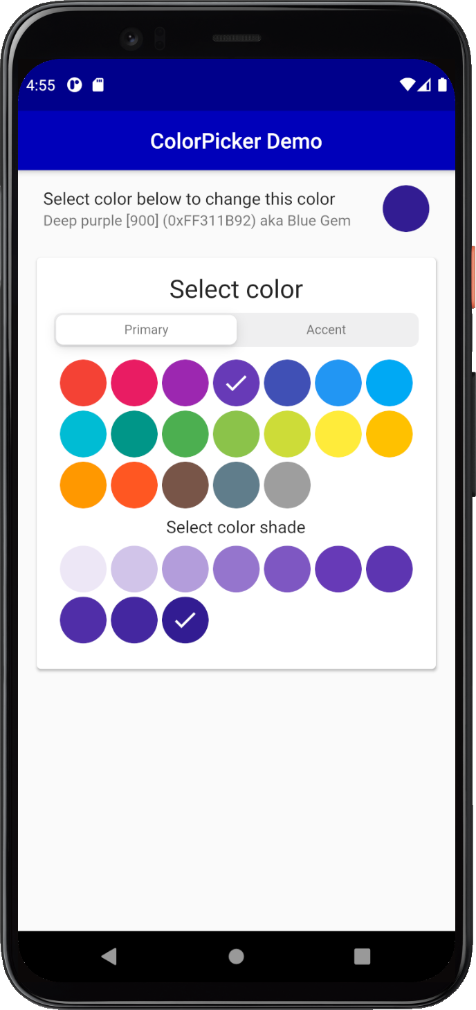
// Show the selected color.
ListTile(
title: const Text('Select color below to change this color'),
subtitle:
Text('${ColorTools.materialNameAndCode(screenPickerColor)} '
'aka ${ColorTools.nameThatColor(screenPickerColor)}'),
trailing: ColorIndicator(
width: 44,
height: 44,
borderRadius: 22,
color: screenPickerColor,
),
),
...
Screen ColorPicker #
Next we add the FlexColorPicker ColorPicker widget to the ListView. We give the ColorPicker's color property
the defined starting color, in this case screenPickerColor. We also give the picker a heading and subHeading,
plus the required onColorChanged callback function.
We use the color from the callback in a setState() to modify the screenPickerColor to the color returned by
the callback. The onColorChanged callback in the ColorPicker is called whenever you select a new color in
the ColorPicker with the selected Color value. In this example we have also wrapped the color picker in a Card.
  // Show the color picker in sized box in a raised card.
  SizedBox(
    width: double.infinity,
    child: Padding(
      padding: const EdgeInsets.all(6),
      child: Card(
        elevation: 2,
        child: ColorPicker(
          // Use the screenPickerColor as start color.
          color: screenPickerColor,
          // Update the screenPickerColor using the callback.
          onColorChanged: (Color color) =>
            setState(() => screenPickerColor = color),
          width: 44,
          height: 44,
          borderRadius: 22,
          heading: Text(
            'Select color',
            style: Theme.of(context).textTheme.headline5,
          ),
          subheading: Text(
            'Select color shade',
            style: Theme.of(context).textTheme.subtitle1,
          ),
        ),
      ),
    ),
  ),
This gives us round color pick items, and an indicator above the picker for the selected color:
Dialog ColorPicker Method #
A common use case for a color picker is to show a color selection widget and allow users to select a new color in
a dialog. The ColorPicker comes with a built-in dialog that can be used for this. Alternatively you can just use
the ColorPicker widget and include it in your own custom dialog.
For the first dialog example we will show all the built-in picker color selection options, except the combined
primary and accent colors picker, and the near black and white shades' picker. We will add some custom colors for the
Custom colors section of the ColorPicker.
First we define our custom colors and from our color definitions we create primary and accent color swatches by
using ColorTools.createPrimarySwatch or ColorTools.createAccentSwatch for accent color swatches.
We add these color swatches as keys to a ColorSwatch Map, that we map to our own String name values
for our custom color swatches. You don't have to use the ColorTools functions to create the color swatches from
a color, you can just as well define and use your own custom hand tuned ColorSwatch swatches created
with MaterialColor or MaterialAccentColor as shown in the custom color swatches chapter.
The ColorTools functions are just convenient helpers that can be used to make Material like primary and accent color
swatches from a single color value.
  // Define custom colors. The 'guide' color values are from
  // https://material.io/design/color/the-color-system.html#color-theme-creation
  static const Color guidePrimary = Color(0xFF6200EE);
  static const Color guidePrimaryVariant = Color(0xFF3700B3);
  static const Color guideSecondary = Color(0xFF03DAC6);
  static const Color guideSecondaryVariant = Color(0xFF018786);
  static const Color guideError = Color(0xFFB00020);
  static const Color guideErrorDark = Color(0xFFCF6679);
  static const Color blueBlues = Color(0xFF174378);

  // Make a custom ColorSwatch to name map from the above custom colors.
  final Map<ColorSwatch<Object>, String> colorsNameMap =
      <ColorSwatch<Object>, String>{
    ColorTools.createPrimarySwatch(guidePrimary): 'Guide Purple',
    ColorTools.createPrimarySwatch(guidePrimaryVariant): 'Guide Purple Variant',
    ColorTools.createAccentSwatch(guideSecondary): 'Guide Teal',
    ColorTools.createAccentSwatch(guideSecondaryVariant): 'Guide Teal Variant',
    ColorTools.createPrimarySwatch(guideError): 'Guide Error',
    ColorTools.createPrimarySwatch(guideErrorDark): 'Guide Error Dark',
    ColorTools.createPrimarySwatch(blueBlues): 'Blue blues',
  };
We will use another ListTile to display a ColorIndicator, that we style a bit differently for this example. We also
use its onSelect callback to open a dialog with another ColorPicker. As the selected color we will use the
dialogPickerColor we defined already in the beginnind of the tutorial.
Before we open the dialog we store the current dialogPickerColor's color value. This way we can restore this
color value if the user cancels the dialog. We put this ListTile before the previous one, first in our list view.
This will just ensure that it does not get hidden by the dialog on smaller phones. For demonstration purposes,
we want this color to be visible and not obscured by the dialog.
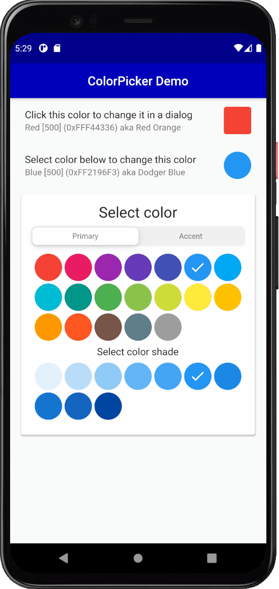
  // Pick color in a dialog.
  ListTile(
    title: const Text('Click this color to change it in a dialog'),
    subtitle: Text(
      '${ColorTools.materialNameAndCode(dialogPickerColor, '
      'colorSwatchNameMap: colorsNameMap)} '
      'aka ${ColorTools.nameThatColor(dialogPickerColor)}',
    ),
    trailing: ColorIndicator(
      width: 44,
      height: 44,
      borderRadius: 4,
      color: dialogPickerColor,
      onSelectFocus: false,
      onSelect: () async {
        // Store current color before we open the dialog.
        final Color colorBeforeDialog = dialogPickerColor;
        // Wait for the picker to close, if dialog was dismissed,
        // then restore the color we had before it was opened.
        if (!(await colorPickerDialog())) {
          setState(() {
            dialogPickerColor = colorBeforeDialog;
          });
        }
      },
    ),
  ),
The above
onSelectFocusproperty is just used to inform theColorIndicatorthat we do not want it to keep focus when we select and click on it in desktop and Web applications. On those platforms it gets focus when we click on it to open the dialog from it. If it keeps focus while the dialog is open and just after it closed, the active focus overlay color will distort its actual color a bit so that we cannot observe the correct color. We don't want that, this property addresses this issues by un-focusing it after we click on it.
Next we create a method to show a ColorPicker with the built-in dialog method. The colorPickerDialog method is an
asynchronous bool function, that returns true if the user closed the dialog picker with the OK or Select
button. If Cancel or Close was selected or if the user dismissed the dialog by clicking outside it, then
false is returned.
In this example we will first enable a few more color picker types. The pickersEnabled property takes a map
with ColorPickerType enum keys to boolean values. The map defines which color
pickers we want to enable and use in the ColorPicker. In the example below we included Material primary,
accent colors, and the custom colors we defined, plus the HSV color wheel that allows us to select any
color. We did not include the picker that combines the primary and accent colors in the same picker, nor the
near black and near white color picker.
Below the custom colors we defined in colorsNameMap are given to the color picker's
property customColorSwatchesAndNames. If you leave customColorSwatchesAndNames without an entry and
happen to have ColorPickerType.custom: true enabled, the custom picker will not be shown.
  Future<bool> colorPickerDialog() async {
    return ColorPicker(
      // Use the dialogPickerColor as start color.
      color: dialogPickerColor,
      // Update the dialogPickerColor using the callback.
      onColorChanged: (Color color) =>
          setState(() => dialogPickerColor = color),
      width: 40,
      height: 40,
      borderRadius: 4,
      spacing: 5,
      runSpacing: 5,
      wheelDiameter: 155,
      heading: Text(
        'Select color',
        style: Theme.of(context).textTheme.subtitle1,
      ),
      subheading: Text(
        'Select color shade',
        style: Theme.of(context).textTheme.subtitle1,
      ),
      wheelSubheading: Text(
        'Selected color and its shades',
        style: Theme.of(context).textTheme.subtitle1,
      ),
      showMaterialName: true,
      showColorName: true,
      showColorCode: true,
      copyPasteBehavior: const ColorPickerCopyPasteBehavior(
        longPressMenu: true,
      ),
      materialNameTextStyle: Theme.of(context).textTheme.caption,
      colorNameTextStyle: Theme.of(context).textTheme.caption,
      colorCodeTextStyle: Theme.of(context).textTheme.caption,
      pickersEnabled: const <ColorPickerType, bool>{
        ColorPickerType.both: false,
        ColorPickerType.primary: true,
        ColorPickerType.accent: true,
        ColorPickerType.bw: false,
        ColorPickerType.custom: true,
        ColorPickerType.wheel: true,
      },
      customColorSwatchesAndNames: colorsNameMap,
    ).showPickerDialog(
      context,
      constraints:
          const BoxConstraints(minHeight: 460, minWidth: 300, maxWidth: 320),
    );
  }
The above example uses a few more ColorPicker properties. It is styled to be more compact and to show the general
color name via showColorName, as well as the HEX color code with showColorCode of the selected color in the
dialog. With the color code field you can also copy the color value to the clipboard using the copy icon button
suffix in the field. When the wheel picker is active you can also enter a hex color RGB value in the field,
the two wheel color HSV selection indicators will then move to the color selection matching the entered HEX RGB value.
The above example also uses the copyPasteBehavior configuration class ColorPickerCopyPasteBehavior() with
longPressMenu set to true to activate a long press context copy-paste menu in the picker.
Most importantly the above example uses the showPickerDialog method to show the defined ColorPicker in a
pre-made dialog. The dialog also needs a build context, that we pass to it.
In this example we also define size constraints for the dialog. If you do not define size constraints, it will
auto size to fit the dialog content. Using constraints allows the dialog to keep the same size when the content
size changes slightly as you switch between the different color selection tools you enabled. It just looks a bit
better if the dialog size does not change when you switch picker type with the type selector. The color
wheel picker in particular will often require more space. The wheel size can be customized as well, it does
however become more difficult to operate if it is made very small. In this example it is on purposes on the
lower side of still usable size.
The end result of the above setup is a ListTile where the trailing color indicator widget can be clicked to
open a dialog to select a new color for the trailing ColorIndicator color.
As the dialogPickerColor changes the color in the dialog, the ColorIndicator's color also changes via this
interaction. If the dialog is cancelled, the ColorIndicator's original color is restored.
Bonus Exercise Not Included the Example Code
As an extra exercise, and to better see this interactive change of the color when it is modified in the dialog,
try connecting the dialogPickerColor color to the AppBar's backgroundColor property.
Did you manage to do it? What happened?
:
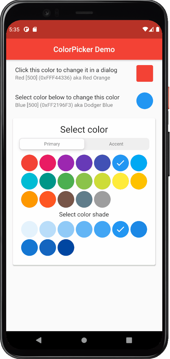
appBar: AppBar(
// To do this, just add this row to the AppBar in the example.
backgroundColor: dialogPickerColor,
elevation: 1,
centerTitle: true,
title: const Text('ColorPicker Demo'),
),
As can be seen below, now the selected color in the dialog changes the AppBar's color and this happens as you
change the color in the dialog, if you select the color, it is kept and cancelling it restores the AppBar's
color as well, pretty cool!
You can also use this principle to connect the color picking interaction to colors that define your application's theme colors and thus modify your application's theme color values interactively while the app is running. Showing how to do this goes a bit beyond the scope of this example, but it is pretty much as easy as the interactive AppBar background color manipulation we just did.
Dialog ColorPicker Function #
If you do not need the feature that allows you to modify and update colors interactively from the dialog via a callback, you can use a simpler more straight forward async dialog function API, that just opens the picker with a pre-selected color and either returns the new selected color if it is closed with OK or returns the color you opened it with, if the dialog is closed with Cancel or dismiss action.
You can call this showColorPickerDialog dialog function directly from e.g. onTap and onSelect callbacks
commonly found in Buttons, InkWell and similar Widgets with interaction callback, by making the callback async and
wait for showColorPickerDialog to return the selected color value and then do what you need with the returned color,
after the dialog has been closed and you have the color selection result.
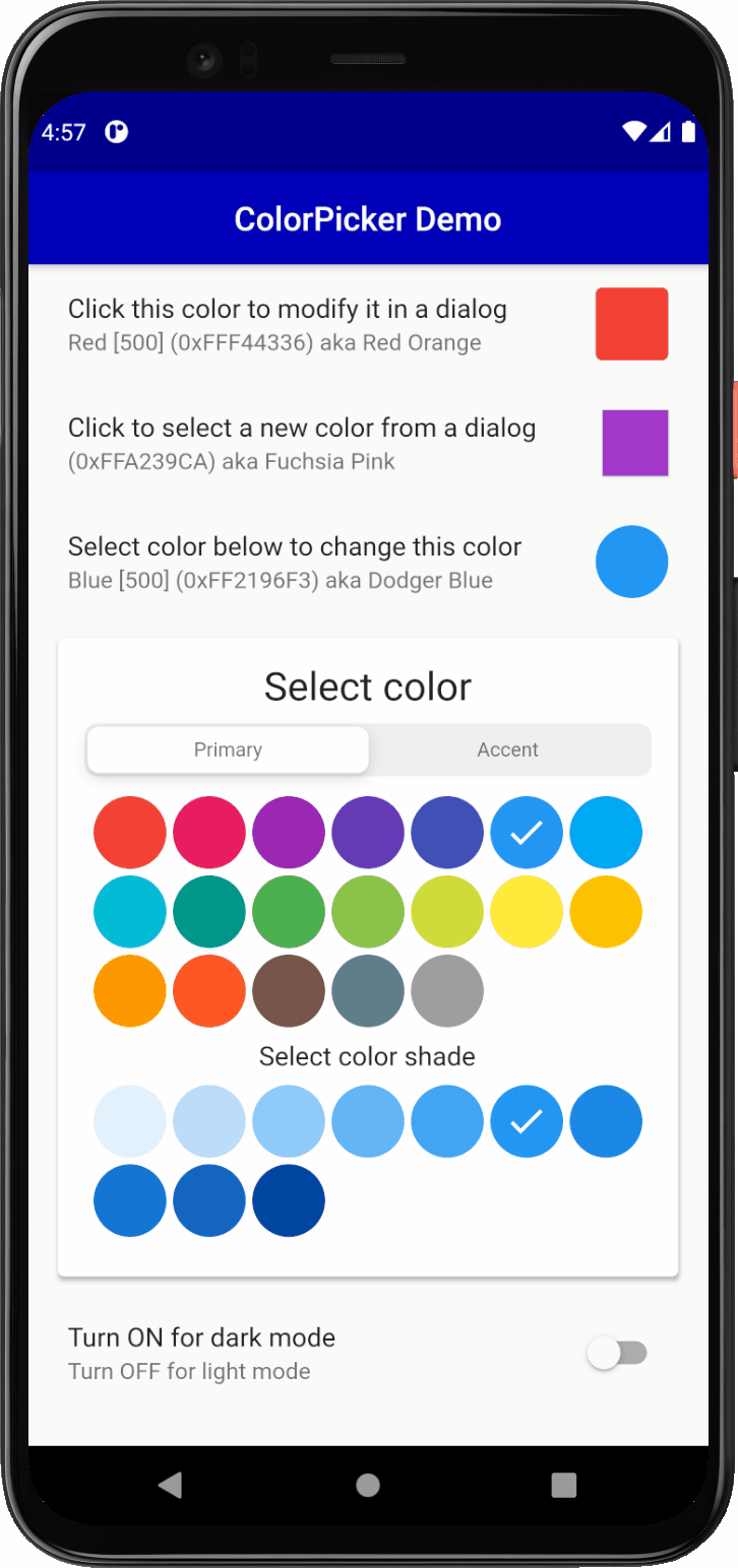
Let's take a look at how this works. As before first we define another ListTile with a trailing ColorIndicator.
We place it last after the previous two ListTile's in our ListView, just before the ColorPicker that is in
the Card in the ListView. For the color that we manipulate we use the dialogSelectColor Color that we defined
earlier. In this case the start color value is not a color that exists in the default Material primary and accent
color picker or any shade of them. The color picker will then automatically select the Wheel picker and show
the start color value we defined in it.
In this case we can make our ColorIndicator's onSelect callback async and directly from it call the
showColorPickerDialog. In the function call we also define the ColorPicker's properties we want it to use in
the dialog. We just give it the start color and wait for it to return the color selection result when the dialog is
closed via OK or CANCEL. After that we can e.g. use the returned color value, in this case we just update
our dialogSelectColor state variable.
ListTile(
  title: const Text('Click to select a new color from a dialog'),
  subtitle: Text(
    '${ColorTools.materialNameAndCode(dialogSelectColor, colorSwatchNameMap: colorsNameMap)} '
    'aka ${ColorTools.nameThatColor(dialogSelectColor)}',
  ),
  trailing: ColorIndicator(
      width: 40,
      height: 40,
      borderRadius: 0,
      color: dialogSelectColor,
      elevation: 1,
      onSelectFocus: false,
      onSelect: () async {
        // Wait for the dialog to return color selection result.
        final Color newColor = await showColorPickerDialog(
          // The dialog needs a context, we pass it in.
          context,
          // We use the dialogSelectColor, as its starting color.
          dialogSelectColor,
          title: Text('ColorPicker',
              style: Theme.of(context).textTheme.headline6),
          width: 40,
          height: 40,
          spacing: 0,
          runSpacing: 0,
          borderRadius: 0,
          wheelDiameter: 165,
          enableOpacity: true,
          showColorCode: true,
          colorCodeHasColor: true,
          pickersEnabled: <ColorPickerType, bool>{
            ColorPickerType.wheel: true,
          },
          copyPasteBehavior: const ColorPickerCopyPasteBehavior(
            copyButton: true,
            pasteButton: true,
            longPressMenu: true,
          ),
          actionButtons: const ColorPickerActionButtons(
            okButton: true,
            closeButton: true,
            dialogActionButtons: false,
          ),
          constraints: const BoxConstraints(
              minHeight: 480, minWidth: 320, maxWidth: 320),
        );
        // We update the dialogSelectColor, to the returned result
        // color. If the dialog was dismissed it actually returns
        // the color we started with. The extra update for that
        // below does not really matter, but if you want you can
        // check if they are equal and skip the update below.
        setState(() {
          dialogSelectColor = newColor;
        });
      }),
),
This dialog picker example also introduces a few more properties that we have not used before. For starters,
we gave it a title widget instead of a heading. The title is more like the title of an AppBar. We
also skipped all the sub-heading widgets to make a more compact picker.
We used the copyPasteBehavior to define a ColorPickerCopyPasteBehavior configuration
that enables both copy (copyButton: true) and paste (pasteButton: true) action icon buttons in the picker's top
title toolbar. We also kept the long-press copy-paste menu from the previous picker example.
Additionally, we use the actionButtons to configure some options for the dialog action buttons with a
ColorPickerActionButtons configuration class. With it, we set dialogActionButtons: false, to remove
the dialog's bottom CANCEL and OK action buttons. Instead, we set okButton: true and closeButton: true,
to enable an 'OK' check mark icon-button and a 'Close' x icon-button in the dialog's top toolbar.
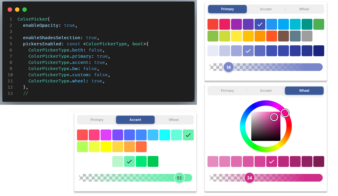
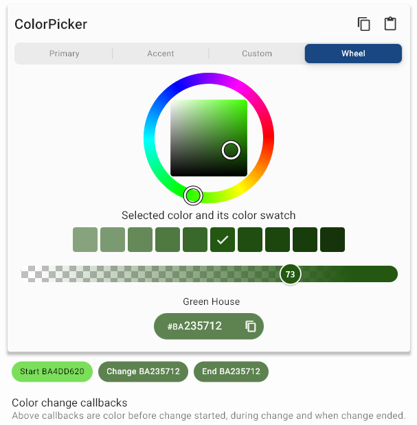
As a major new feature we also in the ColorPicker set enableOpacity: true. This showa an opacity slider
in the ColorPicker that we can adjust the opacity of the selected color with, from 0 to 100%. We also set
colorCodeHasColor: true, this changes the style of the displayed color code field's background color,
to always use and show the currently selected color as its background. Making it show the color result of our
current color selection and opacity slider value. The opacity slider also has a checkered background
so that you can get a feel for how opaque the selected opacity and active color is when overlayed on other
widgets or images.
Below you can see the result of this picker setup, and also a demo of how you can copy-paste a selected color. In the demo below we just copy and pate a color from one dialog picker to another, but you can copy-paste colors between the picker and any app. On desktop the app also supports keyboard copy-paste short-cuts. For more information about the copy-paste features, see the API guide's chapter on its features.
Under the hood showColorPickerDialog function uses the same ColorPicker and showPickerDialog method.
It just bundles them together in the single async showColorPickerDialog function.
The API surface of this function is quite larger, because it actually bundles, the ColorPicker its showPickerDialog
method, and an AlertDialog plus the showDialog function, all intoone large function.
Despite its large API surface, it is still rather convenient to use. You seldom need to use most of the underlying API properties, usually the default values for them work fine. They are however exposed to the degree they can be, should you ever need them.
Finally, the default example also includes a light and dark theme mode toggle. It is just there so you can test the look and operation of the color picker with a dark theme.
FlexColorPicker API Guide #
The FlexColorPicker has a large amount of additional features. Its behavior can easily be modified with its direct
properties and two additional configuration property classes ColorPickerActionButtons and
ColorPickerCopyPasteBehavior, that can be configured and passed in for even more customization options.
This guide goes through most of the API settings, and provides links to API references.
NOTE
In the 2.0.0-nullsafety.x releases the API doc reference links are not working to newer APIs. This is because the links have all been made with URLs that refer to "latest" released API, and many of the APIs do not exist in the last stable 1.x release. This will be fixed when the 2.0.0 is released as latest stable version.
Elements of the Picker #
This chapter shows the different visible elements of the color picker that you can enable and disable, or add as extra Widgets to the picker.
In main example and its tutorial, at the core is a passed in Color() object to the color picker's color
property. It is used to pass in the color that the picker should select. It will update to show the new color if the
picker Widget is updated with a new color. The color property is not required, it defaults to Colors.blue
if it is omitted.
The other important property is the ValueChanged<Color> callback onColorChanged. This is called whenever a new
color value is selected in the color picker, with the selected color. What you do with the callback color depends
on your use-case. In the shown examples we typically just update the passed in color with setState and this change
is color is shown the example app in color indicator widget in the shape of a colored box or circle.
However, in the earlier dialog example, it was also demonstrated how it can also be used to interactively change
the AppBar color of the app itself. You can of use the picker to change any color in
your application theme, or the color used by any Widget.
The two core properties of the ColorPicker:
ColorPicker(
  color: myColor,
  onColorChanged: (Color color) => setState(() => myColor = color),
),
Below we will explore more, both basic and advanced features of the FlexColorPicker.
Enabled Color Pickers #
API reference: pickersEnabled
By default, the Material primary colors and accent colors pickers are enabled. To change the enabled pickers
you provide a ColorPickerType key to bool value map, with the pickers you want enabled to the property
pickersEnabled. You only need to provide key-values pairs for picker keys you want to change. Key values that are not
provided use their defaults.
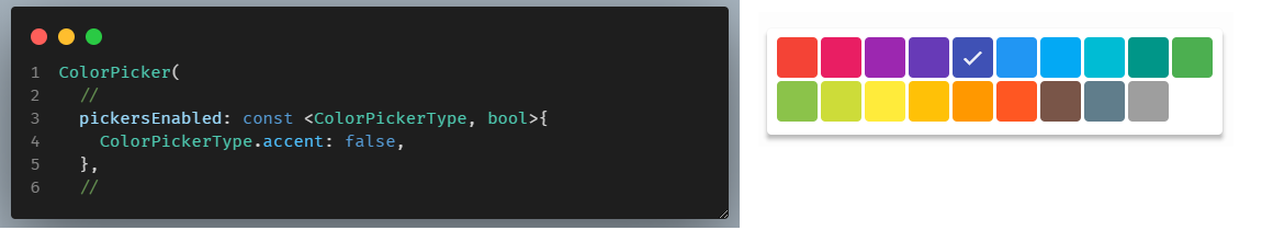
If you only have one picker enabled, there is no sliding segment control shown that will allow you to switch between different color pickers. That would be pointless, since there is only one color picker. If all pickers are disabled, the Material primary color picker will still shown.
If all other features are disabled (by default they are not), the screenshot below represents an example of a
bare-bones minimum picker, showing only the main colors of the Material primary colors. If other defaults are OFF,
to enable producing this picker style, only the pickersEnabled setting to disable the accent color picker is needed
to get the shown picker:
Normally you would enable a few more pickers, below we enable the primary, secondary, near black and white and the wheel pickers. Since more than one picker is enabled, the color picker selector automatically appears:
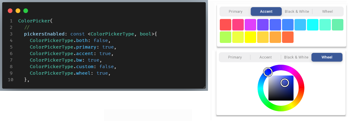
If you want to show both Material primary and accent colors in the same picker you can enable the
ColorPickerType.both picker. In that case you usually want to disable ColorPickerType.primary and
ColorPickerType.accent, as they contain duplicates of already available colors in the both picker. The live
Web demo implements this as exclusive selections in its own logic. It is of course possible to show all three pickers,
but it does not really make much sense.
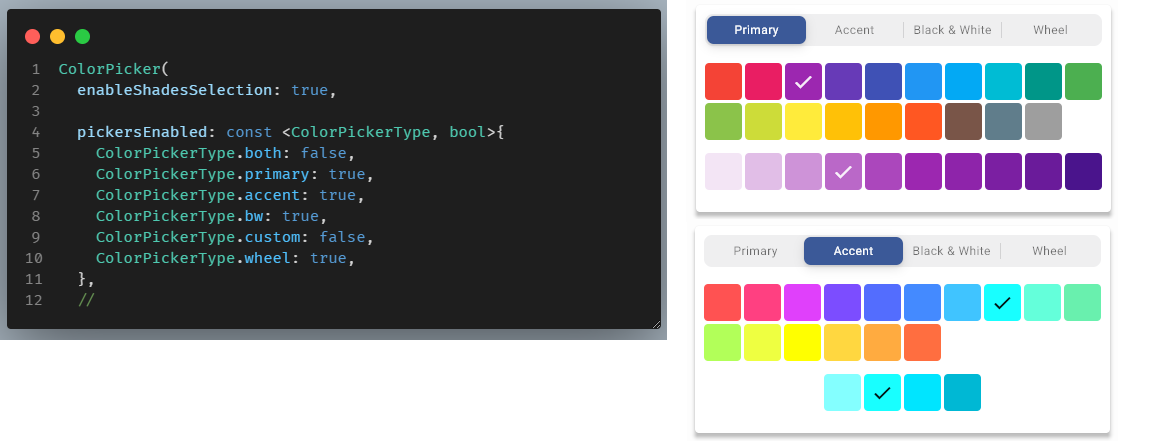
Enable Shades Selection #
API reference: enableShadesSelection
By default, selection of the Material primary and Accent color swatch shade color, after selection of the main
color is enabled. In the above example enableShadesSelection had on purpose been disabled to produce the above,
main only color picker example.
Below we enable the Material color swatch shades selection. You probably want to be able to also select the Material shade colors, so typically, you would just keep the default enabled value.
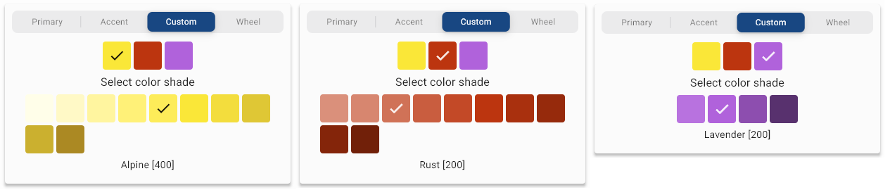
Custom Color Swatches #
API reference: customColorSwatchesAndNames
To use the custom color swatch picker you have to define your own custom ColorSwatch colors and pass them to the
picker via the customColorSwatchesAndNames property. By default, there are no custom colors defined. If you
enabled the custom picker and have not provided any custom color swatches, the picker will not be shown despite
being enabled, since it has no colors to show.
You can make ColorSwatch objects with the Flutter SDK MaterialColor or the MaterialAccentColor classes by
providing swatch color shades for each index. Alternatively you can use the helpers
ColorTools.createPrimarySwatch(color) and ColorTools.createAccentSwatch(color) by just giving it a single color
value. For createPrimarySwatch the provided color will always be used as the base for the [500] index and
for createAccentSwatch for as color for the index [200], the rest of the index color shades are computed.
Please note that these helpers just produce lighter and darker shades of the provided color for lower and higher swatch indexes. If you give e.g. the
createPrimarySwatchthe same color value as a built-in Material primary color with index [500], you will not get the same swatch as the built-in hand tuned Material primary color swatch.
First define a final Map with your custom ColorSwatch objects and their names. Here we make three, with the
different mentioned methods.
final Map<ColorSwatch<Object>, String> customSwatches =
<ColorSwatch<Object>, String>{
  const MaterialColor(0xFFfae738, <int, Color>{
    50: Color(0xFFfffee9),
    100: Color(0xFFfff9c6),
    200: Color(0xFFfff59f),
    300: Color(0xFFfff178),
    400: Color(0xFFfdec59),
    500: Color(0xFFfae738),
    600: Color(0xFFf3dd3d),
    700: Color(0xFFdfc735),
    800: Color(0xFFcbb02f),
    900: Color(0xFFab8923),
  }): 'Alpine',
  ColorTools.createPrimarySwatch(const Color(0xFFBC350F)): 'Rust',
  ColorTools.createAccentSwatch(const Color(0xFFB062DB)): 'Lavender',
};
Then use the customSwatches map in your color picker.
ColorPicker(
  color: myColor,
  onColorChanged: (Color color) => setState(() => myColor = color),
  pickersEnabled: const <ColorPickerType, bool>{
    ColorPickerType.both: false,
    ColorPickerType.primary: true,
    ColorPickerType.accent: true,
    ColorPickerType.bw: false,
    ColorPickerType.custom: true,
    ColorPickerType.wheel: true,
  },
  customColorSwatchesAndNames: customSwatches, // Our custom swatch colors.
This will create three custom swatches, using our "Alpine", "Rust" and "Lavender" custom names in the Custom
swatch picker.
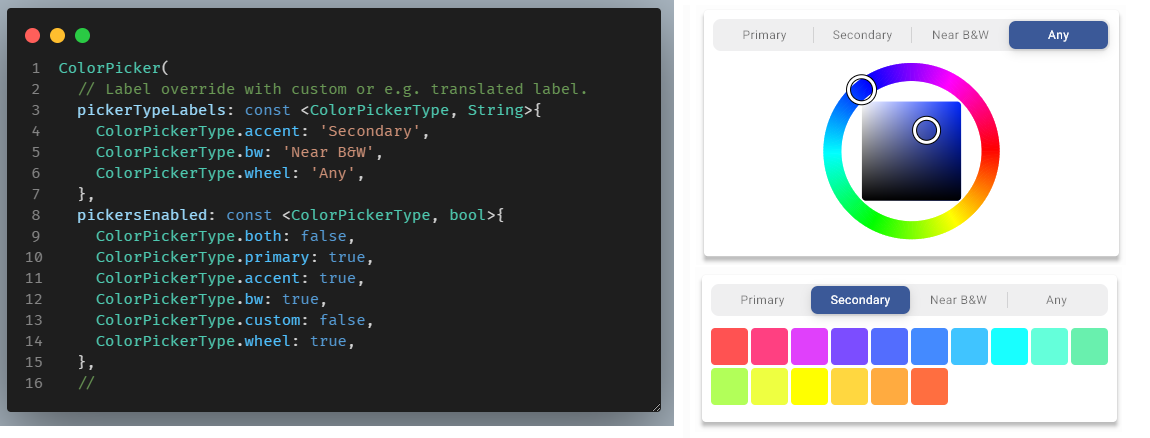
Customized labels #
API reference: pickerTypeLabels
The picker labels have default English labels, you can override them to customize or translate the labels. You set the
labels by providing a ColorPickerType key to String value map with the picker labels you want to change with the
property pickerTypeLabels. You only have to provide key-value pairs for the labels you want to change, omitted keys
will keep their default labels.
Enable Opacity #
API reference: enableOpacity
You can enable a color opacity slider by setting enableOpacity to true. With the slider you can adjust the opacity
of the selected color. You can adjust opacity from fully opaque at 100%, to totally transparent at 0%. The selected
color and the impact of the opacity value on it, is visualized by the checkered gradient on the opacity slider,
and the selected color's opacity gradient on the slider. The thumb's position is over the resulting color's opacity
when applied over a background.
The slider thumb label only show opacity value changes in 1% increments. However, the slider has 255 discrete steps, so there is a step for every alpha value in the resulting ARGB color value. If the color code value is also enabled and set to show alpha value, you can see that the alpha value can be adjusted in single steps if needed.
You cannot pass in the opacity separately to the color picker to get a starting opacity value. If your passed in color
value has opacity in its alpha channel, it will automatically get used, but only if enableOpacity is true. If it
is false, any passed in opacity/alpha in the color value, or in a color pasted into the picker, is ignored and used as
fully opaque by applying alpha value #FF to it.
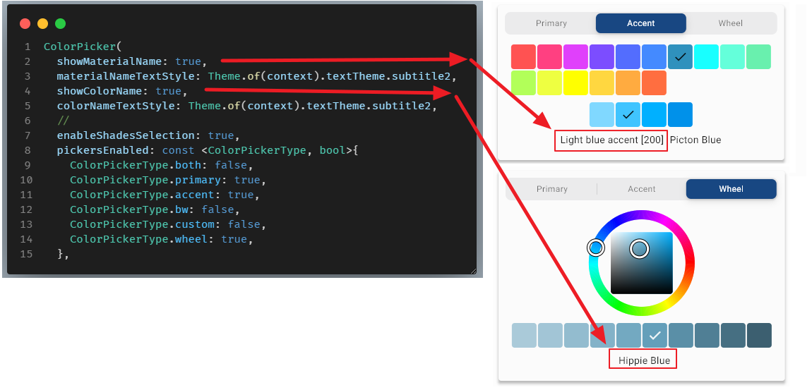
Show Color Names #
API reference: showMaterialName, materialNameTextStyle, showColorName, colorNameTextStyle.
The color picker can be configured to show the selected color's Material color name and its selected shade index number.
It can also be configured to show a color name for any selected color based on ColorTools.nameThatColor function,
that uses a lookup list of 1566 color codes and their names. It finds the color that closest matches the selected
color on the list, and shows this as the selected color's name after the Material color name. You can also provide
the text style for these color name labels. If not provided they default to
Theme.of(context).textTheme.bodyText2.
Translate Material Color Names
API reference: Static color names
The Material color names are defined as static values with English defaults for all Material colors in ColorTools.
You can modify these values by directly changing their static string values. You could do this in function that you
call just once, or every time your app changes its translated locale, and then in the custom function
provide your own localized Material color names. For example:
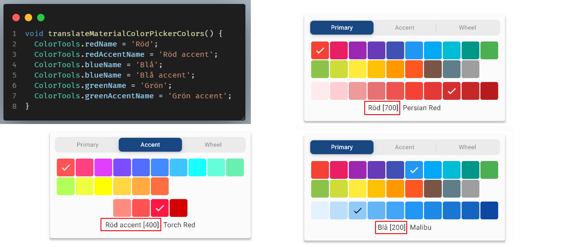
The "name that color" feature, using the lookup from 1566 color names, is only available in English and cannot be translated in the current version.
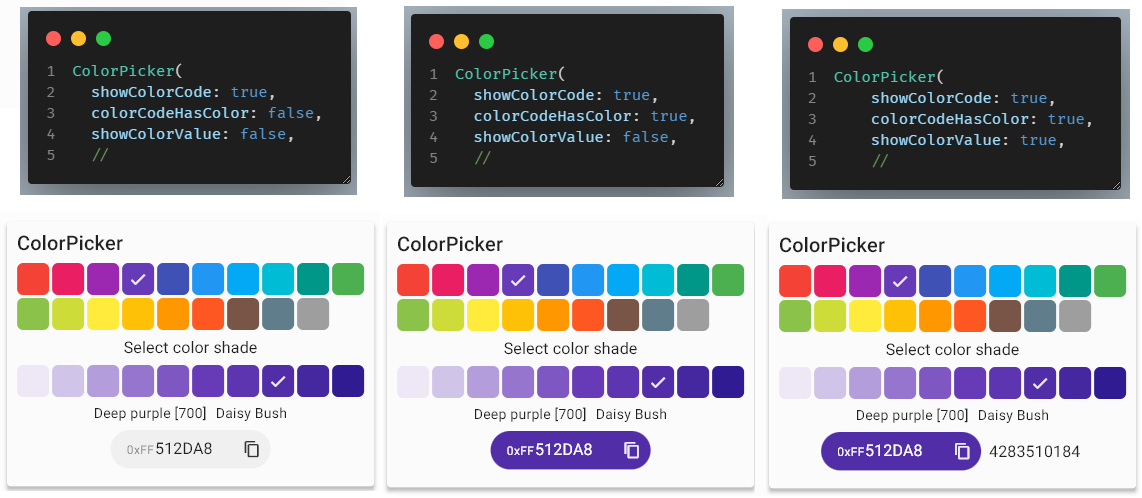
Show Color Code #
API reference: showColorCode, colorCodeHasColor, showColorValue, colorCodeTextStyle, colorCodePrefixStyle.
The color code field shows the RGB color value of the selected color. On the Wheel picker the field also functions as a HEX RGB color code entry field. The Wheel picker will move its indicators to show the color of the entered color code, as the entry is done.
By default, the code field just has a grey background, but you can also configure it to use the current selected color as its background color. The color code field can also have a copy button as a suffix. This is enabled by default, it allows you to copy the current color to the clipboard. There are different options for enabling copy-paste commands in the FlexColorPicker and configuring the copy format also shown as prefix in the color code field. These features are described in detail in the copy-paste actions and behavior chapter.
The TextStyle of the color code display and entry field can be changed with colorCodeTextStyle. It
defaults to Theme.of(context).textTheme.bodyText2, if not defined. There is also a separate style for the
color code prefix that can be changed with colorCodePrefixStyle, if not defined it defaults to the same style as
colorCodeTextStyle.
Show Recent Colors #
API reference: showRecentColors, maxRecentColors, recentColors, onRecentColorsChanged.
When showRecentColors is enabled, the color picker shows recently selected colors in a list at the bottom of the
color picker. The list uses first-in, first-out to keep min 2 to max 20 colors (defaults to 5) on the recently
used colors list, the desired max value can be modified with maxRecentColors.
Selecting a recently used color, moves the picker to the picker where the color is located and selects it again. If opacity is enabled, the opacity the color had when it was selected is also applied. Normally when selecting colors and opacity is enabled, the value the opacity slider is at is kept. However, when selecting a recently used color the opacity the color had when it was selected and added to the recently used colors list will be kept.
Selecting a color on the recently used colors will not move it first in the list, it will keep its current position. Selecting a color that is already on the list, will not add it again. The currently selected color is not added to the list until you select a new current color.
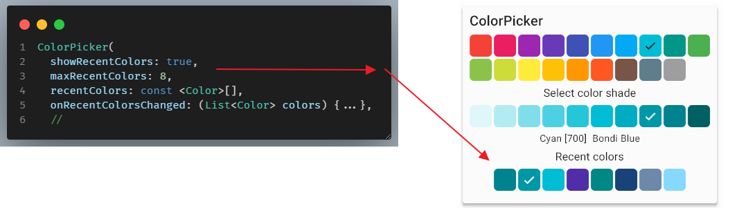
There is also an optional callback onRecentColorsChanged, that is called everytime a new color is added to the list
with the complete current list of recently used colors. If the optional callback is not provided, then it is not called.
You can use this callback to save and restore the recently used colors if so desired. To initialize the list when the
color picker is created give it a starting list with recentColors. This could be a list kept just in state variable
during the current app session that can be used when the color picker is created, or it could even have been persisted
and restored from a previous session.
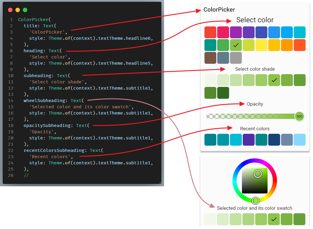
Title and Heading Widgets #
API reference: title, heading, subheading, wheelSubheading, opacitySubheading, recentColorsSubheading.
You can provide custom heading widgets for the picker toolbar title, main heading, shades selection color
subheading, and the wheelSubheading, opacity slider opacitySubheading and subheading for the recently used
colors list recentColorsSubheading. If a heading is null, it is omitted. The headings can be any Widget,
but typically they would be Text widgets with a suitable style, as shown below.
Picker Design #
The picker design APIs refers to properties that affect size, shape and spacing of the individual color indicator Widgets inside the color picker, as well as the color wheel and opacity slider sizing.
The ColorIndicator Widget can also be used as a color indicator and selection widget outside the color picker. This is done in the default example, where it is used to show the selected color and also to open a dialog to modify the color.
Color Picker Items #
API reference: height, width, borderRadius, hasBorder, borderColor, elevation, spacing, runSpacing.
The color items that show the available colors can be modified, height, width and borderRadius, their
elevation and if the have a border hasBorder and what color the border is borderColor (defaults to divider theme)
can all be changed.
Additionally, the spacing between the color box items and their runSpacing when they wrap to more than one
row can be adjusted. The color picker item for the Material, Accent, B&W and Custom colors are implemented
with a Wrap widget, as are their shade colors, and the recently used colors list.
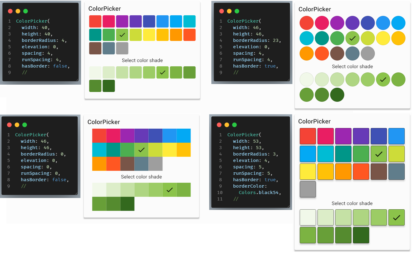
Please see above API reference for defaults and allowed values.
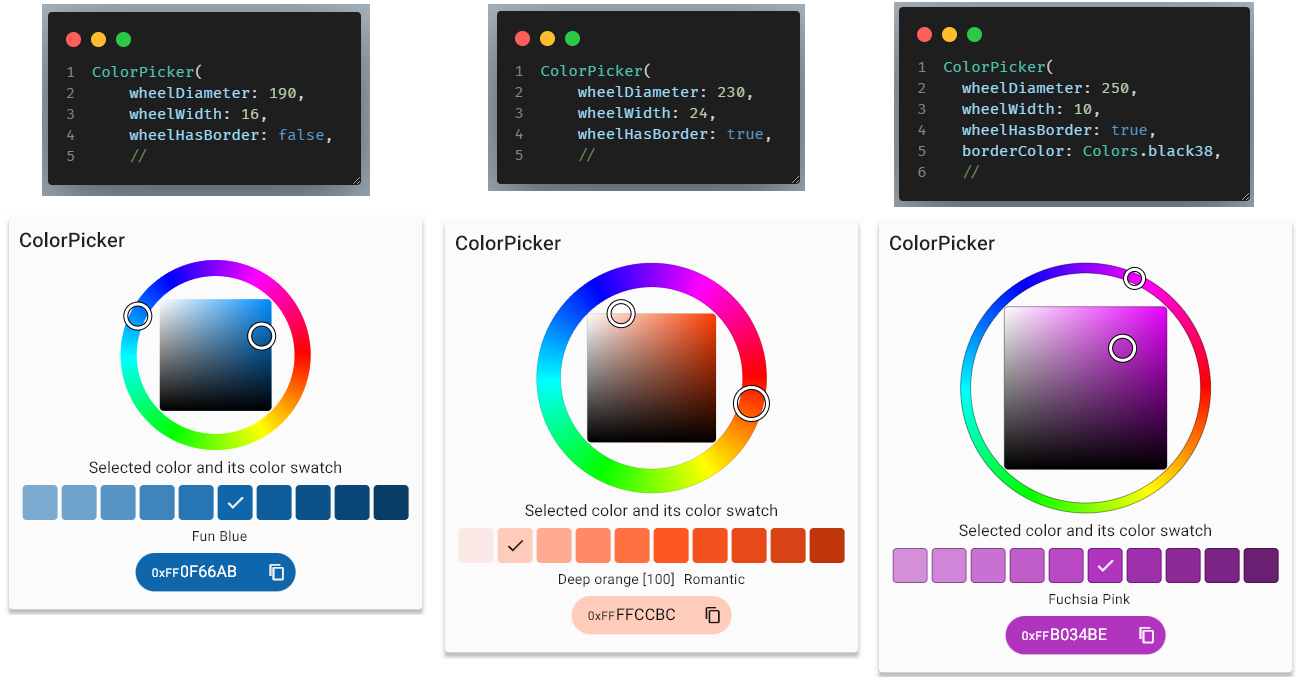
Wheel Diameter, Width and Border #
API reference: wheelDiameter, wheelWidth, wheelHasBorder, borderColor.
The color picker wheelDiameter, wheelWidth and the wheel's border can be modified. The borderColor is defined
by the same property as the color picker items, but it has its own enable/disable toggle wheelHasBorder. The
color wheel width must be from 4 to 50 dp, and it defaults to 16 dp. The color wheel diameter
must be from 100 to max 500 dp, and it defaults to 190 dp.
Opacity Slider Height, Width and Thumb Radius #
API reference: opacityTrackHeight, opacityTrackWidth, opacityThumbRadius.
The opacity slider's height opacityTrackHeight, width opacityTrackWidth and radius opacityThumbRadius can be
adjusted, below some examples:
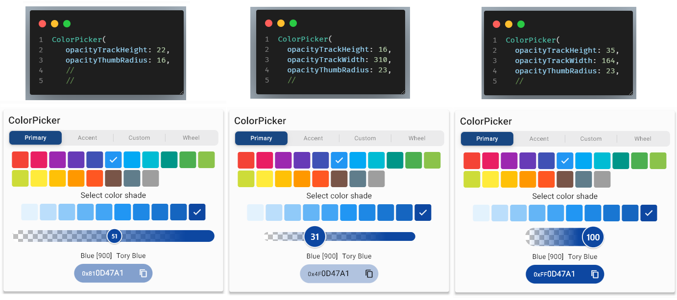
If the slider width is not defined (default) it expands to fill available picker width, it's minimum allowed width is 150 dp. The slider height must be from 8 to 50 dp and thumb radius from 12 to 30 dp.
Picker Layout #
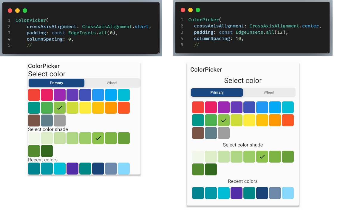
API reference: crossAxisAlignment, padding, columnSpacing.
The picker layout APIs deal with spacing of the elements in the color picker, their alignment and padding.
Use the properties crossAxisAlignment, padding and columnSpacing to adjust the look of the color picker content.
The columnSpacing refers to the additional vertical spacing between each element in the column, used by the color
picker layout. The padding and crossAxisAlignment are as typically used in Flutter. Please note that
title widget is not a part of the Column body layout of the color picker, and it is not affected by the
crossAxisAlignment property. you can think of the title a bit like an app bar title, but it is always start
aligned to leave enough room for 1 to 4 action buttons, that can optionally be enabled for the title bar, and that
always appear at the end.
Tooltips #
API reference: enableTooltips
The enableTooltips property defaults to true and enables all tooltips that are available in the color picker. If the
tooltips get in the way, you can disable them all by setting this property to false. Why not consider providing a
property in your app that allows users to turn ON and OFF all the tooltips in the app? FlexColorPicker includes this
toggle to make that easy to implement when it comes to its tooltip behavior.
The tooltip strings used in FlexColorPicker are all based on existing labels in Flutter SDK and by default use Material localizations and thus change with the locale. They thus support all languages that Flutter does out of the box. You can still override the tooltip labels if so required and provide your own tooltip labels.
The following tooltips exist, and have the default values shown in the table below.
| Usage | English tooltip | Used MaterialLocalizations.of(context) |
|---|---|---|
| Copy button | Copy | copyButtonLabel |
| Paste button | Paste | pasteButtonLabel |
| OK button | OK | okButtonLabel |
| Cancel button | Cancel | cancelButtonLabel |
| Close button | Close | closeButtonLabel |
When the keyboard copy/paste shortcuts are enabled, the Copy and Paste tooltips automatically also receive platform aware keyboard shortcut info, after the localized tooltip label. On macOS ' (CMD-C)' is appended to the copy tooltip and ' (CMD-V)' is appended to the paste tooltip. On other platforms ' (CTRL-C)' is appended to the copy tooltip and ' (CTRL-V)' to the paste tooltip.
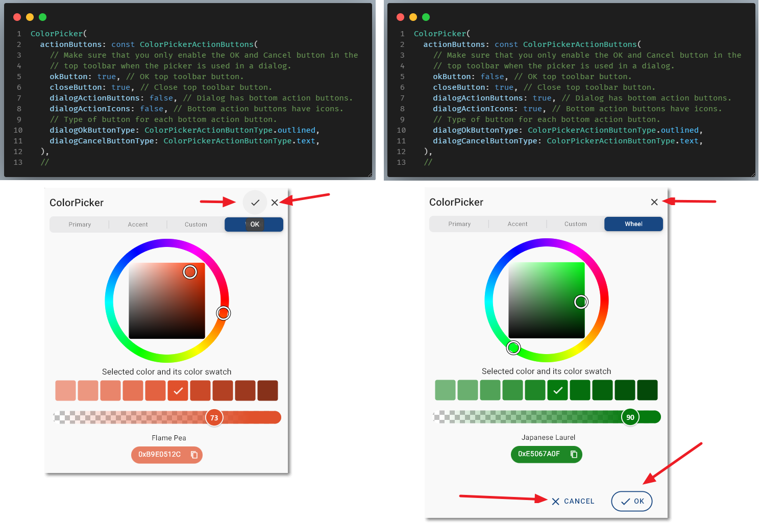
Dialog Action Buttons #
API reference: ColorPickerActionButtons
The API surface of the color picker was getting quite large, therefor two less used configuration classes were
created to group additional settings. The first one is the ColorPickerActionButtons used to define the color picker's
OK and Cancel action buttons, and their style when they are used by the built-in dialogs.
You use it by passing in a ColorPickerActionButtons configuration to the ColorPicker()'s property actionButtons:
ColorPicker(
  actionButtons: const ColorPickerActionButtons(...),
);
You can define if OK and Close action buttons are on the top toolbar or only in the dialog bottom. The top
toolbar buttons are plain icon only buttons. For the bottom dialog action buttons you can choose between
TextButton, OutlinedButton and ElevatedButton.
The used icons can be changed from default ones, as can used tooltips. The label's on the bottom action buttons can also be changed. By the default, they like the tooltips, use Material localizations, so they should work well enough out of the box for most locales. The bottom action buttons can also use the default or customized OK and Cancel icons as prefix icons to the labels. These icons are always shared with the corresponding top toolbar icon buttons.
The recommendation is to not use the top and bottom action buttons at the same time, but rather select one of the two options. The API does however allow using both or even a mix and match. It is for example possible to show Cancel and OK actions at the bottom of the dialog, and also add just an 'x' icon in the upper end corner of the dialog that also cancel-closes the dialog as expected. This is still a pretty nice option. Adding the OK, by default a check icon, as a select and close button, to the top toolbar is a bit unconventional, but it is available as an option too.
The bottom action buttons, and their style depend on their ambient theme.
There are a few more dialog action buttons design properties you can adjust, please se the ColorPickerActionButtons API reference for additional details.
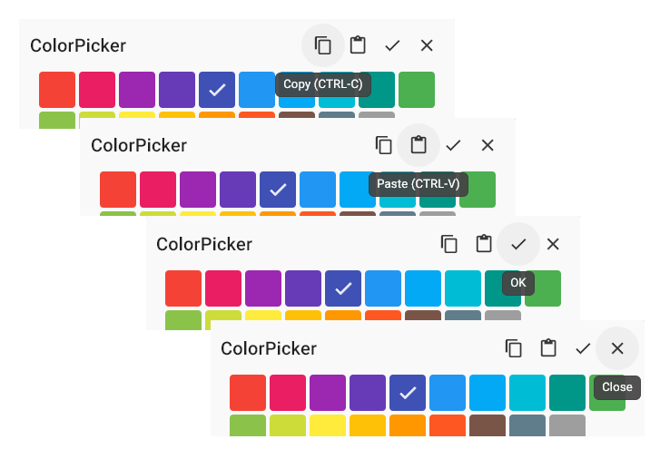
Copy-Paste Actions and Behavior #
API reference: ColorPickerCopyPasteBehavior
The ColorPickerCopyPasteBehavior is the second configuration class group. It is used to configure the desired
copy-paste behavior of the color picker. You use it by passing in a ColorPickerCopyPasteBehavior
configuration to the ColorPicker()'s property copyPasteBehavior:
ColorPicker(
  copyPasteBehavior: const ColorPickerCopyPasteBehavior(...),
);
You can control if the picker has:
- Copy and paste action buttons in the top toolbar.
- Long press and/or right click copy and paste context menu.
- Ctrl-C and Ctrl-V keyboard shortcuts, also when not in edit field. Keyboard shortcuts automatically uses Command instead of Ctrl on macOS.
- A copy color action button in the code entry and display field.
You can also:
- Define default result RGB string format of a copy command.
- Define icons for copy and paste action buttons.
- Define icon theme's for the copy and paste icons.
- Define paste color string parsing error feedback type and message if used.
- Modify the tooltips for copy and paste buttons.
Paste operation supports all RGB string formats defined by
ColorPickerCopyFormat,
but copy format is only in selected copyFormat.
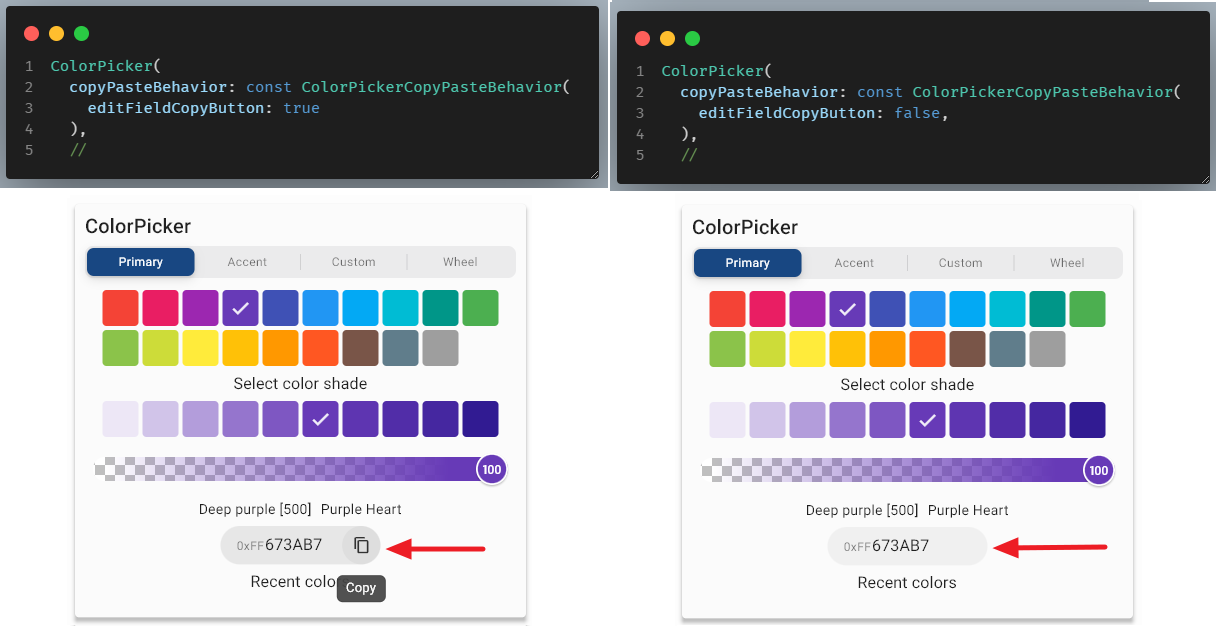
Code Field Copy Button #
API reference: editFieldCopyButton
The color code display and entry field suffix color copy icon button, is enabled by default. This
button existed already in version 1.x. It can now if so desired be removed by setting
ColorPickerCopyPasteBehavior.editFieldCopyButton to false.
Keyboard Shortcuts #
When ctrlC and ctrlV properties are set to true, they are by default, a CTRL/CMD-C keyboard press on a
desktop keyboard will copy the currently selected color's RGB color code as text to the clipboard. A CTRL/CMD-V will
paste the current clipboard text into the picker, and the color picker will try to parse the pasted value as a color
value and move to display the pasted color with the most suitable available picker.
When enabled, the keyboard copy color shortcuts work when one of the ColorPicker's focusable widgets have focus. Those include color indicator, color field, buttons, and the picker selector, as well as the color wheel. When the picker is used in a modal dialog this will typically always be the case, but if the picker is used in other layouts were other widgets may have focus, the keyboard shortcuts will not work until one of the color pickers focusable widgets have focus.
When the keyboard copy/paste shortcuts are enabled, the Copy and Paste tooltips by default also receive platform aware keyboard shortcut info. After the localized default tooltip label, on macOS ' (CMD-C)' is appended to the copy tooltip and ' (CMD-V)' is appended to the paste tooltip. On other platforms ' (CTRL-C)' is appended to the copy tooltip and ' (CTRL-V)' to the paste tooltip. This is shown in the example in the next chapter.
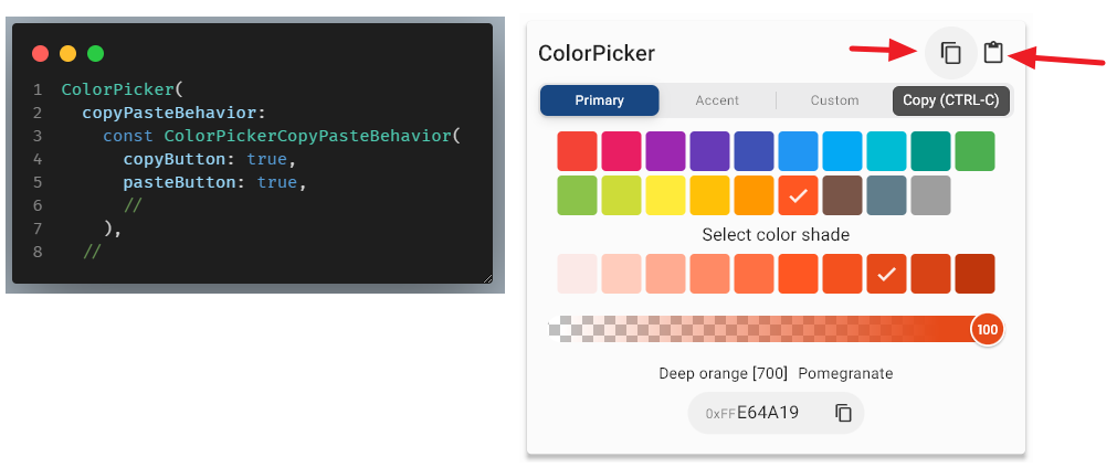
Toolbar Buttons #
API reference: copyButton, copyIcon, copyTooltip, pasteButton, pasteIcon, pasteTooltip.
You can show a copy and paste action icon button in the picker top toolbar at its end by setting copyButton and
pasteButton to true. You change the default icons, that are Icons.copy and Icons.paste, by defining the
properties copyIcon and pasteIcon. Their tooltips can also be changed.
The copyTooltip defaults to MaterialLocalizations.of(context).copyButtonLabel. If CTRL-C keyboard shortcut
copying is also enabled, the string ' (CTRL-C)' is added on Linux and Windows platforms and on macOS ' (CMD-C)'
is added.
The pasteTooltip defaults to MaterialLocalizations.of(context).pasteButtonLabel. If CTRL-V keyboard shortcut
copying is also enabled, the string ' (CTRL-V)' is added on Linux and Windows platforms and on macOS ' (CMD-V)'
is added.
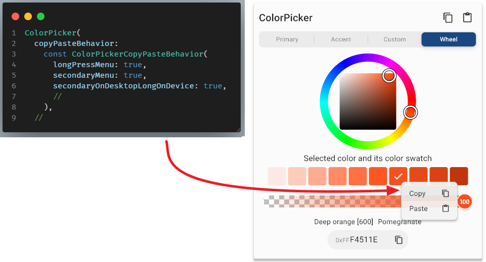
Context Menu #
API reference: secondaryMenu, longPressMenu, secondaryOnDesktopLongOnDevice.
The FlexColorPicker provides even more options for copying and pasting colors, from and to the picker. You can enable a context COPY-PASTE menu that can be triggered either via a long press or secondary mouse click, typically the right mouse button.
The secondary right click is often a good option on Windows and Linux desktop apps, to some extent also on desktop web browsers. However, desktop browsers' built in right click menu also tend to ge triggered by it, and this menu may get in the way of the color pickers COPY-PASTE menu when secondary click is used when running the app in a desktop Web browser.
On touch only devices, or other use cases when a mouse right click does not feel right, the long press option to show the COPY-PASTE menu may work better.
Set property secondaryMenu to true (defaults to false) to enable using secondary button click on the color
picker to open up the COPY-PASTE context menu.
Set property longPressMenu to true (defaults to false) to enable using long press in the color
picker, to open up the COPY-PASTE context menu.
Set property secondaryOnDesktopLongOnDevice to true (defaults to false) to enable using long press in the color
picker, to open up the COPY-PASTE context menu on iOS and Android touch devices, and to use secondary mouse button
on desktop platforms Windows, Mac and Linux.
NOTE:
Due to secondary mouse button on desktop Web browsers often activating the browsers own secondary button context menu, this last option is not ideal for desktop web browsers. You may want to implement your own preferred platform behavior by just usingsecondaryMenuandlongPressMenuas appropriate for your use case. A future enhancement might add asecondaryOnDesktopLongOnDeviceAndWeboption to avoid right click menu on web desktop automatically, and prefer long press on it as well.
If you want to style and customozie the look of the popup menu this can also be done, please refer to the following APIs menuThemeData, , menuWidth, menuItemHeight, and menuIconThemeData.
Color Code Formats and Paste Parsing #
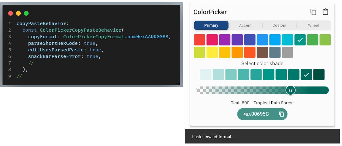
API reference: copyFormat, parseShortHexCode, editUsesParsedPaste, snackBarParseError, snackBarMessage, snackBarDuration, feedbackParseError.
copyFormat
The color code display field's value can be shown in five different formats by the setting the copyformat enum
ColorPickerCopyFormat
to desired value. The copyFormat also defines the received string format of the copied RGB value when any
of the copy functions are used. It defaults to ColorPickerCopyFormat.dartCode.
| ColorPickerCopyFormat | Resulting format |
|---|---|
| dartCode | Flutter Hex RGB format '0xAARRGGBB' (default) |
| hexRRGGBB | Hex RGB format with no alpha 'RRGGBB' |
| hexAARRGGBB | Hex RGB format with alpha 'AARRGGBB' |
| numHexRRGGBB | Web Hex RGB format with a leading num # sign and no alpha '#RRGGBB' |
| numHexAARRGGBB | Web Hex RGB format with a leading num # sign and alpha '#AARRGGBB' |
When pasting color RGB text values into the color picker, any of the above formats are always accepted and parsed. The color picker's paste parser also filters out none valid HEX code related characters from the strings, and truncates it to the max length of above formats. Partial values like e.g. '0', 'aC', '#334' and '0xFF34' are also allowed and are interpreted as being right aligned in the complete 8-char hex code. If alpha values are not included in a pasted hex char string, it is always set to 'FF'. If alpha is included in the pasted color value, but alpha is not enabled for the color picker, the alpha value included in the pasted value will be replaced with 'FF'.
parseShortHexCode
The color picker's paste parser can optionally also interpret 3-char hex code as done by CSS/WEB. This is enabled by
setting parseShortHexCode to true (default to false). When true the hex color code paste action and field
entry parser, will interpret short three character web hex color codes like in CSS/WEB. This results in short HEX RGB
color codes, like 123, ABC, F0C and 5D1 being interpreted as 112233, AABBCC, FF00CC and 55DD11.
editUsesParsedPaste
The color code entry field can also be set to use the paste parser by setting editUsesParsedPaste to true (defaults
to false). When true, the color code entry field uses the paste parser for keyboard shortcuts CTRL-V and CMD-V.
A standard text field, will just paste whatever text is in the copy/paste buffer into the field. This is the
false default behavior here too, with the exception that the field only accepts valid hex value input
chars (0-9, A-F), so it always filters and pastes only the acceptable input chars from the paste buffer.
When editUsesParsedPaste property is true, the edit field will use the same color paste value parsing as used by the
other paste actions when the input field is not in focus. This results in a paste action in the entry field that
always fully replaces the content with the parsed color value of the pasted data, not just pasting in the string in
the paste buffer into the text field. Currently this setting only impacts CTRL-V and CMD-V keyboard shortcut pasting
on desktops. The paste on Android and iOS are not intercepted when this setting is true. The false setting is
equivalent to past versions (1.x) default behavior when pasting strings into the code entry field.
Setting editUsesParsedPaste to true may be preferred for a more consistent paste experience.
snackBarParseError
Set snackBarParseError to true to show a snack bar paste parse error message when pasting something that
could not be parsed to a color value into the color picker. A paste parse error occurs when something is pasted
that cannot parsed to a color value.
Below an example of a copyformat, parseShortHexCode, editUsesParsedPaste and snackBarParseError configuration.
snackBarMessage
The text message shown in the paste parse error snack bar. The String is shown in the snack bar when there
is a paste parse error and snackBarParseError is true.
If the snackBarMessage is not defined, ie null, it defaults to the combination of the two Material localization
labels pasteButtonLabel: invalidDateFormatLabel in a [Text] widget. In English this will it say
"Paste: Invalid format.". The snackbar uses the closest ambient theme with SnackBarThemeData for its theming.
snackBarDuration
The duration the paste parse error snack bar message is shown can be set via snackBarDuration. It defaults to
const Duration(milliseconds: 1800).
feedbackParseError
By setting feedbackParseError to true the device will vibrate, make on audible click or an alert sound on some
platforms, when a paste parse error occurs.
This feature is experimental, its support is limited on most platforms in Flutter. If Flutter one day supports the
Material Sound Guide, this feature can be improved with better sound effects. Currently, it cannot be improved
without importing none SDK plugins/packages to make sounds. This package strives to work without any plugins or
packages, so it will not add any additional none Flutter SDK imports. (Defaults to false).
onChange Callbacks #
API reference: onColorChanged, onColorChangeStart, onColorChangeEnd, onRecentColorsChanged.
The onChange callbacks inform you about color selection changes the user is doing in the color picker as they
are happening. Only the onColorChanged callback is required, the other callbacks can be omitted if they are
not needed. If they are null, they will not be called.
onColorChanged
A required ValueChanged<Color> callback, called when user selects a new color with the selected new color value.
Called every time the color value changes via a color selection click, when operating thumbs on the color wheel, or
transparency sliders, or entering a new character in the color code field. Changing which picker type is viewed does not
trigger this callback, it is not triggered until a color in the viewed picker is selected.
onColorChangeStart
Optional ValueChanged<Color> callback. Called when user starts color selection with current color value before
the new color was selected. When clicking a new color in color items, the color value before the selected new value was
clicked, is thus returned. It is also called with the current color, when user starts the interaction on the color
wheel, or the transparency slider.
onColorChangeEnd
Optional ValueChanged<Color> callback. Called when user ends color selection with the new color value.
When clicking a new color on color items, the clicked color is returned. It is also called with the resulting color
value, when user ends the interaction on the color wheel or the transparency slider.
If you are using a state logging solution in your application, you could use the start and end
events to get current selected color state when the change starts, and then just store the end result when the
use has finished changing the color if the color value was different. This is useful on the wheel thumbs and opacity
slider operations, as they will generate a lot of onColorChanged events while they are operated which you may not
want to log.
It is worth noticing that for keyboard entry, as its entry also changes the selected color interactively for every entered character, we cannot know when the editing is actually done, so keyboard entries generate start and end events for every char input, just as a selecting a color with click or pasting in a new color value does.
You can you the LIVE web example to observe and study the behavior of the above callbacks when you use the picker.
onRecentColorsChanged
Optional ValueChanged<List<Color>> callback that returns the current list of recently selected colors.
This optional callback is called every time a new color is added to the recent colors list with the complete current
list of recently used colors. If the optional callback is not provided, then it is not called. You can
use this callback to save and restore the recently used colors. To initialize the list when the color picker is created
give it a starting via recentColors. This could be a list kept just in state during the current app session,
or it could have been persisted and restored from a previous session.
Dialogs #
The FlexColorPicker comes with two built-in ready to use dialogs. You can also make your own by including the
ColorPicker() in your own dialog or overlays designs. In this chapter we will look at the two built in dialogs,
that are really the same dialog but designed for slightly different use cases.
ColorPicker showPickerDialog Method #
API reference: showPickerDialog
This dialog allows you track the ColorPicker's different onChange callbacks when the dialog is open and colors are being manipulated and react to the changes as they happen. You can use this to for example interactively change color properties of the application's Widgets and even its theme, and see the effect of changes applied as a new color is selected in the dialog picker, even while using the wheel and sliders.
The dialog demo in the default example app shown earlier here explains how to use the default built-in ColorPicker(...).showPickerDialog method.
The disadvantage with this picker is that you have to maintain the state, store color before you open the dialog and restore this color if the dialog is cancelled instead of a color selected. The API can also be bit cumbersome to use, although the above mentioned example show how it is done.
Function showColorPickerDialog #
API reference: showColorPickerDialog
The showColorPickerDialog function is often simpler to use, just call the function and await for it to return the
selected color when the dialog is closed, if no color is selected it just returns the passed in color.
This picker might be simpler to use in many scenarios, but it does not allow for the feature where colors and theme's can update in the background behind the dialog, as colors are selected in it, before it is even closed. It also cannot return the list of recently selected colors, but you can provide it starting set of recently selected colors.
In many case you just need to open a picker dialog, select a color, or cancel the selection and move on, this
version offers a simpler API for that. Under the hood it is just a wrapper for the previous more
capable version with the onChange callbacks. It shares all other properties and features with the ColorPicker
combined with its showPickerDialog method.
Since the properties elevation and title in the showPickerDialog method, would collide with the same
named ones in the ColorPicker, the dialog's elevation and title in showColorPickerDialog are instead
called dailogElevation and dialogTitle to avoid the property name conflict when they are present in the
same function.
Desktop and Web Ready #
FlexColorPicker works on all Flutter platforms, Android, iOS, Web, Windows, macOS and Linux. Here is an example of the demo application running on Windows desktop.
The live Web demo is of course an example of it running in a Web environment, it runs well with either Flutter Web renderer, HTML or CanvasKit.
The FlexColorPicker goes a bit further than just working on Web and Desktop. For example, pick item focusing behaves as can be expected. The picker supports keyboard navigation and control selection and activation, especially when it is used in a dialog where other controls on the screen do not affect the intended keyboard navigation order. As mentioned in the API guide, if the picker is so configured, it also has keyboard shortcuts for copy and paste commands, that even adapt to the used desktop platform.
The wheel picker cannot be operated with just a keyboard, it needs mouse or touch control. It will remain so, as it is not a design well suited to keyboard control, it is designed to require mouse or touch input to be operated.
The opacity slider can be operated via keyboard only. Future picker options will offer other color picker type designs using only sliders for custom color selection, this will enable them to use keyboard color control and selection as well.
The used color picker type selector control is based on the CupertinoSlidingSegmentedControl widget. It does not
support keyboard control. A future version may include additional optional picker type selection controls, that support
keyboard navigation and picker selection. When added the current version will remain available as default for backwards
compatibility.
Additional Resources #
There are more configuration options available in the ColorPicker than those described in the above
API guide, use the complete API doc reference for
additional information.
The source code of the live Web example is included in the package example folder, in "example/lib/demo". By studying it you can see a practical examples of how to use all the features it uses.
The live Web demo also has tooltips showing the used API behind every demonstrated interactive control. This can be used as quick reference and to find the actual used API-value as you interactively configure the Web example.
Happy color picking!
Metadata
Publisher
Metadata
A customizable Flutter primary, accent and custom color picker. Includes an optional HSV wheel color picker.
Repository (GitHub)
View/report issues
License
 unknown (LICENSE)