flex_color_picker 1.1.2  flex_color_picker: ^1.1.2 copied to clipboard
 rydmike.com
A customizable Flutter primary, accent and custom color picker. Includes an optional HSV wheel color picker.
Flex ColorPicker #
Flex ColorPicker is a customizable color picker for Flutter. The ColorPicker can show six different types of color pickers, three of which are used for the standard Flutter Material colors and their shades. The size and style used for the pick items can be customized.
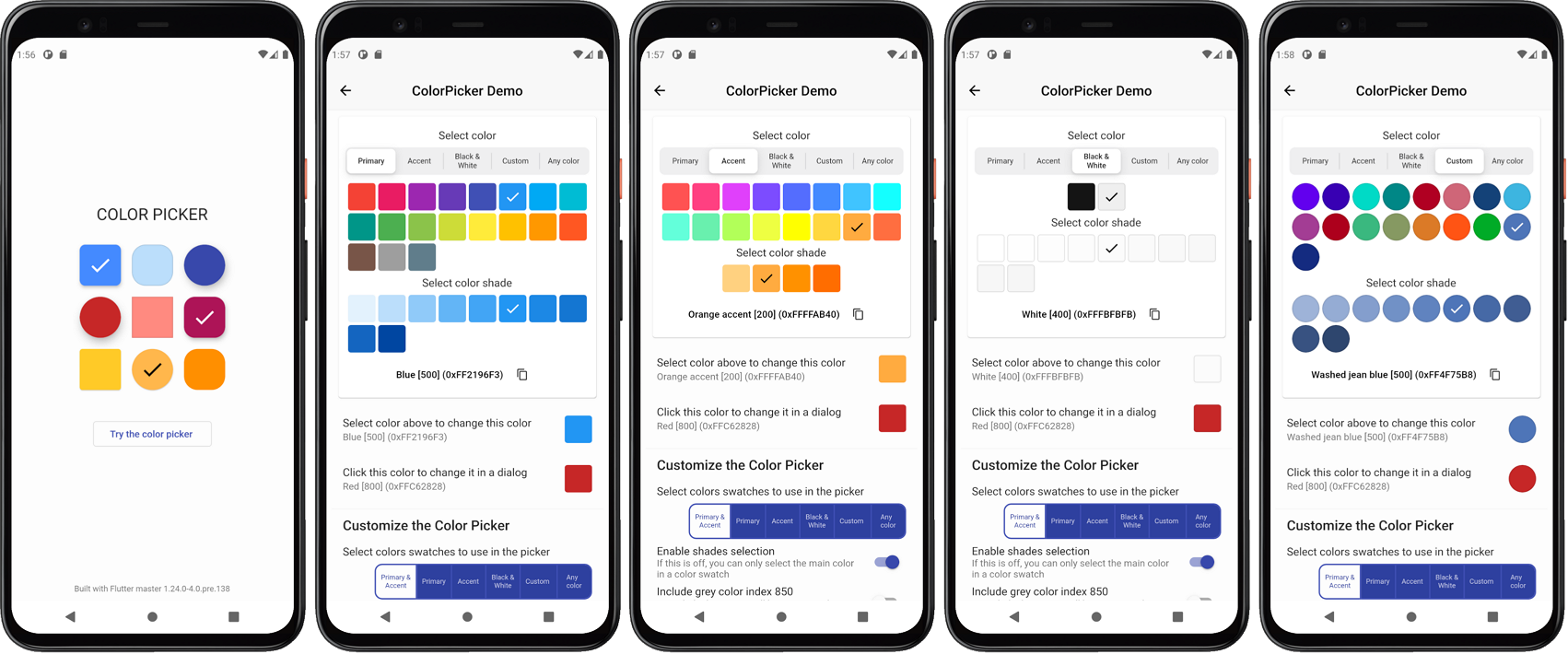
The different types of available pickers are
- Material primary colors and its shades.
ColorPickerType.primary - Material accent colors and its shades.
ColorPickerType.accent - Both primary and accent colors and their shades, in the same color picker.
ColorPickerType.both - Black and white colors, including near black and near white shades.
ColorPickerType.bw - Custom material like colors and their shades, that you define and name.
ColorPickerType.custom - HSV color wheel picker, that allows you to select or enter any color.
ColorPickerType.wheel
When you show more than one color picker, a segmented sliding control allows you to select which one to use. You can configure the ColorPicker to include any of the above color pickers. Showing pickers 1 and 2, together with picker 3 is not very useful, they are available as optional ways of showing and selecting the standard Material primary and accent colors.
Give the ColorPicker a heading and a subheading for the color shades, typically Text widgets with appropriate style. Decide if the Material shades can be selected or not and if the selected color names and code are visible in the picker. If the color HEX RGB code is visible, the picker also includes a button that allows you to copy the selected color's code to the clipboard. On the wheel picker you can also enter a HEX RGB for the color to be selected.
The shape, size and spacing of the color picker items can be modified. There is a built-in dialog that can be used to show and use the ColorPicker in a pre-made dialog. You can of course also make your own dialog and just use the color picker widget in your custom dialog.
Getting Started #
In the pubspec.yaml of your Flutter project, add the following dependency:
dependencies:
  ...
  flex_color_picker:
In your library file add the following import:
import 'package:flex_color_picker/flex_color_picker.dart';
Example Application #
To try a basic example of the ColorPicker on a device or simulator, clone the flex color picker repository and run the example:
cd example/
flutter run --release
The result is a default color picker with only the primary and accent color pickers available. Plus another picker that opens up in a dialog, with all pickers enabled, except 3 ColorPickerType.both and 4 ColorPickerType.bw.
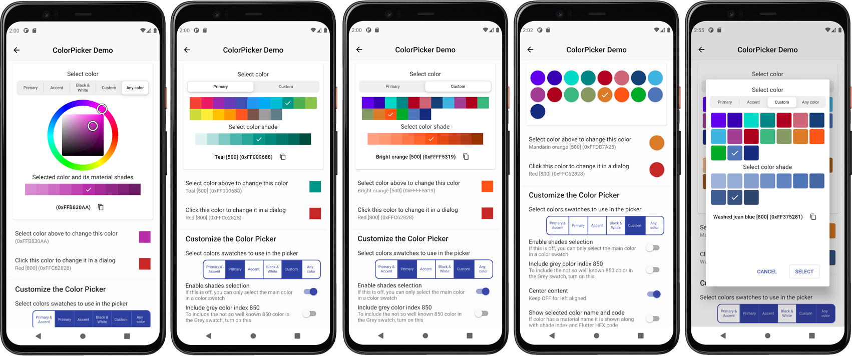
Live Web Example #
You can also try a live web example of the ColorPicker here. With the web demo you can modify many of the ColorPicker's API values and use it as a tool to find a style that fits your application.
The source code for the Web demo, which is a slightly more elaborate example than the basic sample bundled with the package, is available separately here.
Introduction to the ColorPicker #
As an introduction to the ColorPicker we will go through the example application. The example uses a StatefulWidget where we define a Color variable and give it a start value in the StatefulWidget's initState().
class _ColorPickerPageState extends State<ColorPickerPage> {
  Color screenPickerColor;

@override
void initState() {
  super.initState();
  screenPickerColor = Colors.blue;
}
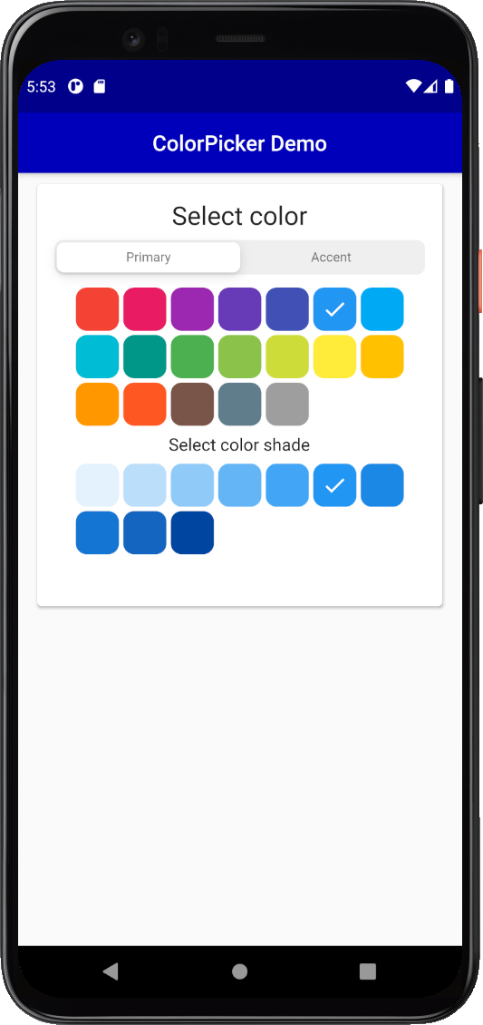
Add the ColorPicker to the build method, could for example be in a ListView or Column. Give it the defined starting color, a heading and subHeading, plus the required onColorChanged callback function. Use the color from the callback in a setState() to modify the screenPickerColor to the color returned by the callback. The callback in the ColorPicker is called whenever you select a new color in the ColorPicker.
ColorPicker(
  color: screenPickerColor,
  onColorChanged: (Color color) =>
    setState(() => screenPickerColor = color),
  heading: Text(
    'Select color',
    style: Theme.of(context).textTheme.headline5,
  ),
  subheading: Text(
    'Select color shade',
    style: Theme.of(context).textTheme.subtitle1,
  ),
),
The result will look like this:
Change the pick item style, by giving it a defined size and let's make it circular:
ColorPicker(
  color: screenPickerColor,
  onColorChanged: (Color color) =>
    setState(() => screenPickerColor = color),
  width: 44,
  height: 44,
  borderRadius: 22,
 :
),
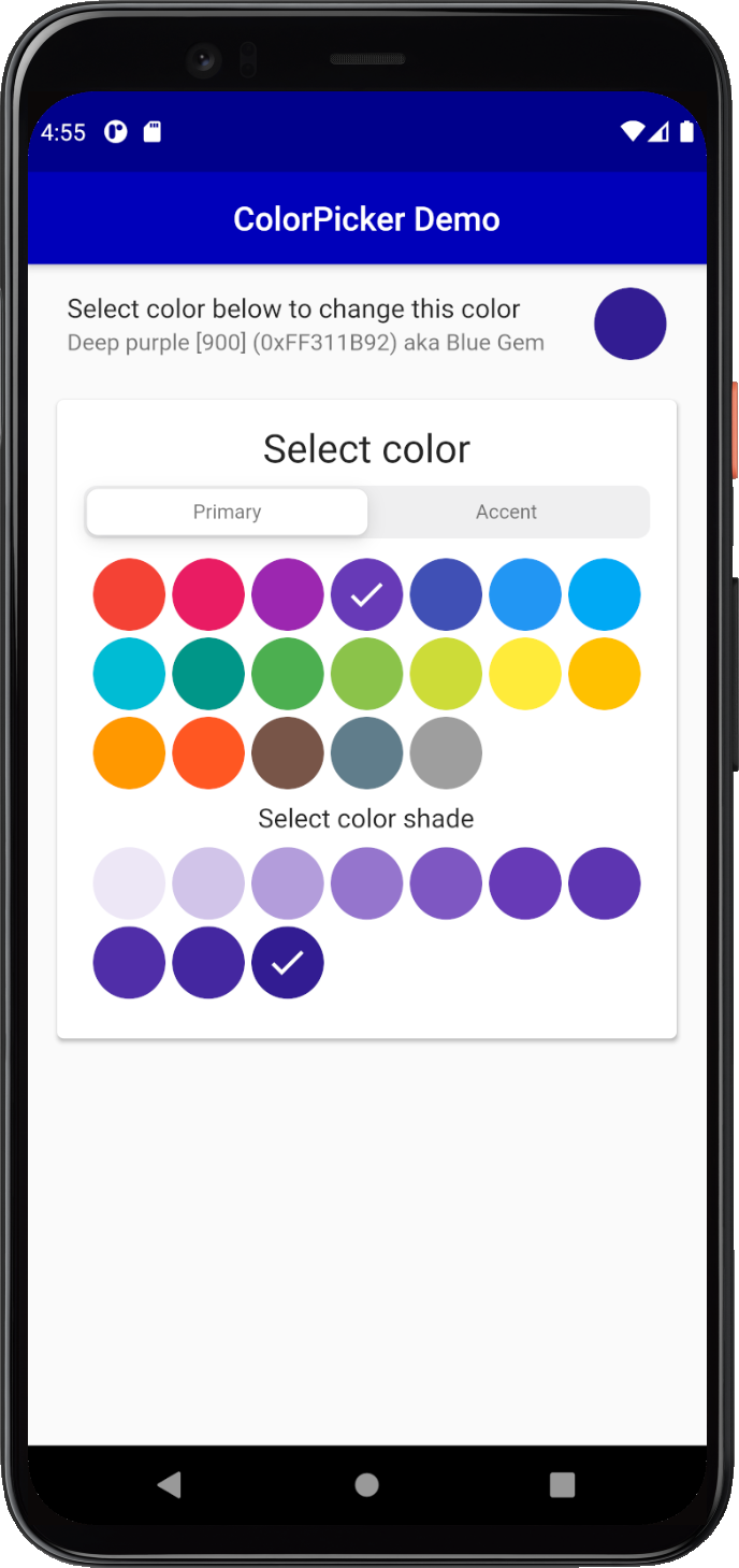
You can use same the ColorIndicator Widget that the ColorPicker uses internally as a color indicator. Here we use it in a ListTile, that we add above the ColorPicker and use the ColorIndicator as its trailing property to show the selected color. The ColorPicker also includes ColorTools, a set of helper functions, that you can use to display names of the standard material colors, and their shade index value, as well as an optional Flutter style Hex color code. Below we use ColorTools.materialNameAndCode in a ListTile subtitle property to describe the selected color. We show its Material color name and index and Flutter style HEX code. We also use ColorTools.nameThatColor function, that will name any color based on the closest matching color from a list consisting of 1566 colors and names.
ListTile(
  title: const Text('Select color above to change this color'),
  subtitle: Text('${ColorTools.materialNameAndCode(screenPickerColor)} '
                 'aka ${ColorTools.nameThatColor(screenPickerColor)}'),
  trailing: ColorIndicator(
    width: 44,
    height: 44,
    borderRadius: 22,
    color: screenPickerColor,
  ),
),
This gives us round color pick items and an indicator for the selected color:
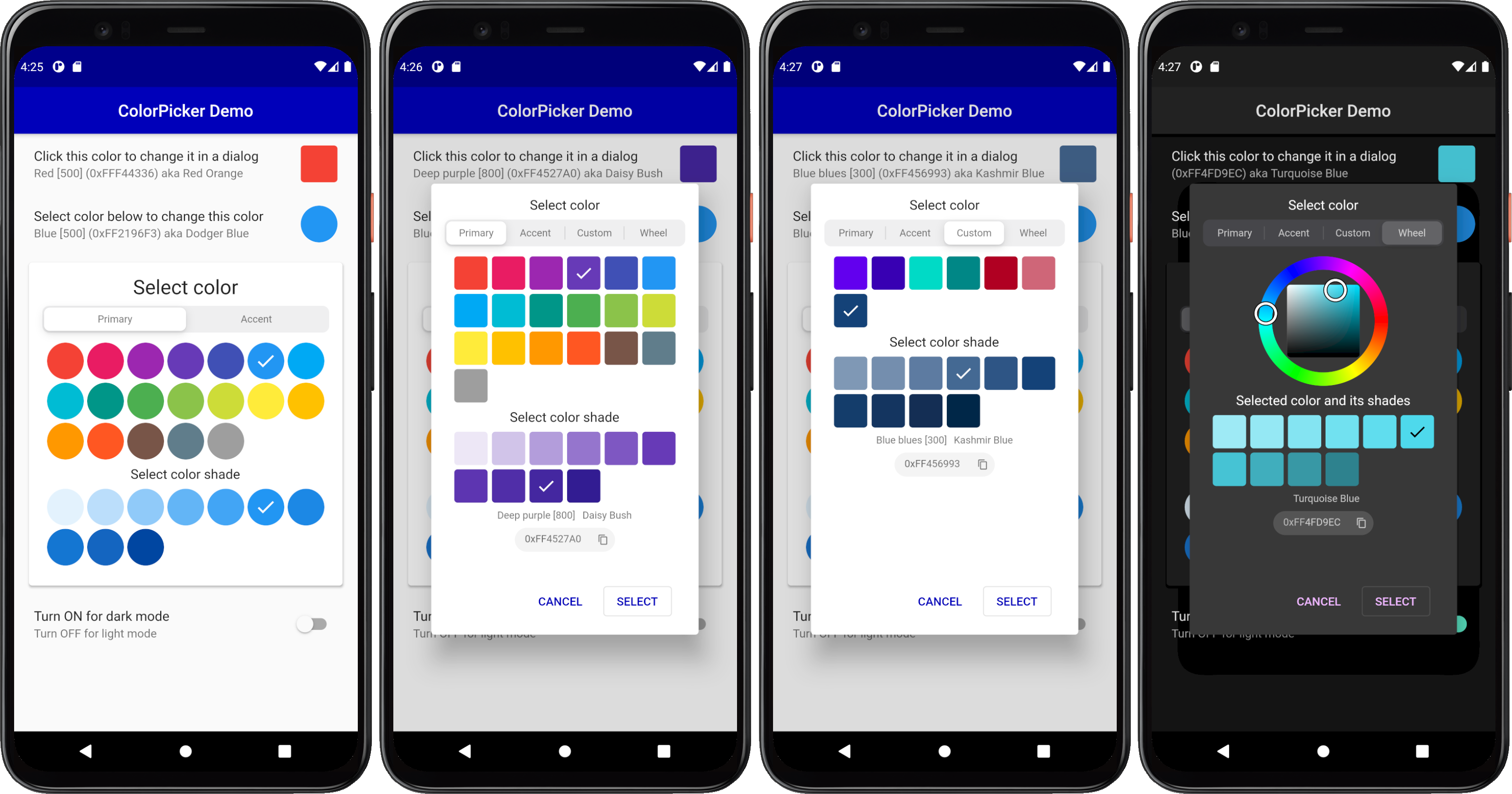
ColorPicker as a Dialog #
A common use case for a color picker is to show a color selection widget and allow users to select a new color in a dialog. The ColorPicker comes with a built-in dialog that can be used for this. Alternatively you can just use the ColorPicker widget and include it in your own dialog.
For the dialog example we will show all the built in picker color selection options, except the combined primary and accent colors picker, and the black and white shades' picker. We will also add some custom colors for the Custom colors section of the ColorPicker.
First we define our custom colors and from our color definitions we create primary and accent color swatches by using ColorTools.createPrimarySwatch or ColorTools.createAccentSwatch for accent color swatches. We add these color swatches as keys to a ColorSwatch Map, that we map to our own custom String name values for our custom color swatches. You don't have to use the ColorTools functions to create the color swatches from a color, you can just as well define and use your own custom hand tuned ColorSwatch swatches. The functions are just convenient helpers that can be used to make Material like color swatches from a single color.
  // Define custom colors. The 'guide' color values are from
  // https://material.io/design/color/the-color-system.html#color-theme-creation
  static const Color guidePrimary = Color(0xFF6200EE);
  static const Color guidePrimaryVariant = Color(0xFF3700B3);
  static const Color guideSecondary = Color(0xFF03DAC6);
  static const Color guideSecondaryVariant = Color(0xFF018786);
  static const Color guideError = Color(0xFFB00020);
  static const Color guideErrorDark = Color(0xFFCF6679);
  static const Color blueBlues = Color(0xFF174378);

  // Make a custom ColorSwatch to name map from the above custom colors.
  final Map<ColorSwatch<Object>, String> colorsNameMap =
      <ColorSwatch<Object>, String>{
    ColorTools.createPrimarySwatch(guidePrimary): 'Guide Purple',
    ColorTools.createPrimarySwatch(guidePrimaryVariant): 'Guide Purple Variant',
    ColorTools.createAccentSwatch(guideSecondary): 'Guide Teal',
    ColorTools.createAccentSwatch(guideSecondaryVariant): 'Guide Teal Variant',
    ColorTools.createPrimarySwatch(guideError): 'Guide Error',
    ColorTools.createPrimarySwatch(guideErrorDark): 'Guide Error Dark',
    ColorTools.createPrimarySwatch(blueBlues): 'Blue blues',
  };
Then add a variable for the dialog picked color dialogPickerColor and set a start value for it as well.
class _ColorPickerPageState extends State<ColorPickerPage> {
  Color screenPickerColor;
  Color dialogPickerColor;

@override
void initState() {
  super.initState();
  screenPickerColor = Colors.blue;
  dialogPickerColor = Colors.red;
}
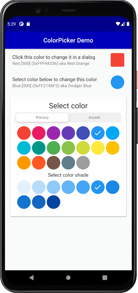
We use another ListTile to display a ColorIndicator, that we style a bit differently for this example. We also use its onSelect callback to open a dialog with another ColorPicker. Before we open the dialog we store the current dialogPickerColor's color value. This way we can restore this color value if the user cancels the dialog. Put this ListTile before the previous one, first in the /column or list view, this will just ensure that it does not get hidden by the dialog on most phones.
  ListTile(
    title: const Text('Click this color to change it in a dialog'),
    subtitle: Text(
      '${ColorTools.materialNameAndCode(dialogPickerColor, colorSwatchNameMap: colorsNameMap)} '
      'aka ${ColorTools.nameThatColor(dialogPickerColor)}',
    ),
    trailing: ColorIndicator(
      width: 44,
      height: 44,
      borderRadius: 4,
      color: dialogPickerColor,
      onSelect: () async {
        final Color colorBeforeDialog = dialogPickerColor;
        if (!(await colorPickerDialog())) {
          setState(() {
            dialogPickerColor = colorBeforeDialog;
          });
        }
      },
    ),
  ),
Create a method to show a ColorPicker with the built-in dialog. The colorPickerDialog is an asynchronous bool function, that returns true if the user closed the dialog picker with the Select button. If Cancel was selected or user dismissed the dialog by clicking outside of it, false is returned.
The pickersEnabled takes a map with ColorPickerType enum keys to boolean values. The map defines which color pickers we want to enable and use in the ColorPicker. In the example below we included Material primary, accent colors, and the custom colors we defined, plus the HSV color wheel that allows us to select any color. We did not include the picker that combines the primary and accent colors in the same picker, nor the near black and white color picker.
In the example below the custom colors we defined in colorsNameMap are given to the color picker's constructor property customColorSwatchesAndNames. If you leave customColorSwatchesAndNames without an entry and happen to have ColorPickerType.custom: true enabled, the custom picker will still not be shown, both are required for the custom color swatches to show up.
  Future<bool> colorPickerDialog() async {
    return ColorPicker(
      color: dialogPickerColor,
      onColorChanged: (Color color) =>
          setState(() => dialogPickerColor = color),
      width: 40,
      height: 40,
      borderRadius: 4,
      spacing: 5,
      runSpacing: 5,
      wheelDiameter: 155,
      heading: Text(
        'Select color',
        style: Theme.of(context).textTheme.subtitle1,
      ),
      subheading: Text(
        'Select color shade',
        style: Theme.of(context).textTheme.subtitle1,
      ),
      wheelSubheading: Text(
        'Selected color and its shades',
        style: Theme.of(context).textTheme.subtitle1,
      ),
      showMaterialName: true,
      showColorName: true,
      showColorCode: true,
      materialNameTextStyle: Theme.of(context).textTheme.caption,
      colorNameTextStyle: Theme.of(context).textTheme.caption,
      colorCodeTextStyle: Theme.of(context).textTheme.caption,
      pickersEnabled: const <ColorPickerType, bool>{
        ColorPickerType.both: false,
        ColorPickerType.primary: true,
        ColorPickerType.accent: true,
        ColorPickerType.bw: false,
        ColorPickerType.custom: true,
        ColorPickerType.wheel: true,
      },
      customColorSwatchesAndNames: colorsNameMap,
    ).showPickerDialog(
      context,
      constraints:
          const BoxConstraints(minHeight: 460, minWidth: 300, maxWidth: 320),
    );
  }
The above example uses a few more styling properties, to make it more compact and to show the general color name as well as the HEX color code of the selected color in the dialog. With the color code indicator you can also copy the color code with the copy icon button. When the wheel picker is active you can enter a RGB hex color, the two wheel color HSV selection indicators will then move to the color selection matching the entered HEX RGB value.
Most importantly the above example uses the showPickerDialog method to show the defined ColorPicker in a pre-made dialog. The dialog also needs a context, so we just pass it along to it.
In this example we also define size constraints for the dialog. If you do not define size constraints, it will auto size to fit the dialog content. Using constraints allows the dialog to keep the same size when the content size changes slightly as you switch between the different color selection tools you enabled. It looks better if the dialog size does not change when you switch picker type with the selector. The color wheel picker in particular will often require a bit more space. The wheel size can be customized as well, it does however become more difficult to operate it, if it is made very small. In this example it is on purposes on the lower side of still usable size.
The end result of the above setup is a ListTile where the trailing color indicator widget can be clicked to open a dialog to select a new color for the trailing ColorIndicator color.
As the dialogPickerColor color changes in the dialog, the ColorIndicator's color also changes via this interaction. If the dialog is cancelled, the ColorIndicator's original color is restored.
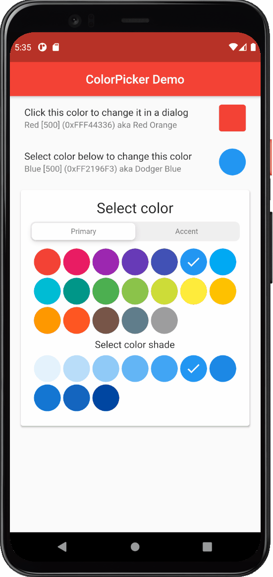
As an extra exercise, and to better see this interactive change of the color when it is modified in the dialog, try connecting the dialogPickerColor value to the AppBar's backgroundColor property. Did you manage to do it? What happened?
:
appBar: AppBar(
  backgroundColor: dialogPickerColor,
  elevation: 1,
  centerTitle: true,
  title: const Text('Color Picker Simple Demo'),
),
As can be seen below, now the selected color in the dialog changes the AppBar's color as you select color in the dialog and cancelling it restores the AppBar's color as well, pretty cool!
You can connect the color picking interaction to theme colors and modify your application's theme color values interactively as well, but that goes beyond the scope of this example.
The example also includes a light and dark theme mode toggle, so you can test the look and operation of the color picker with a dark theme.
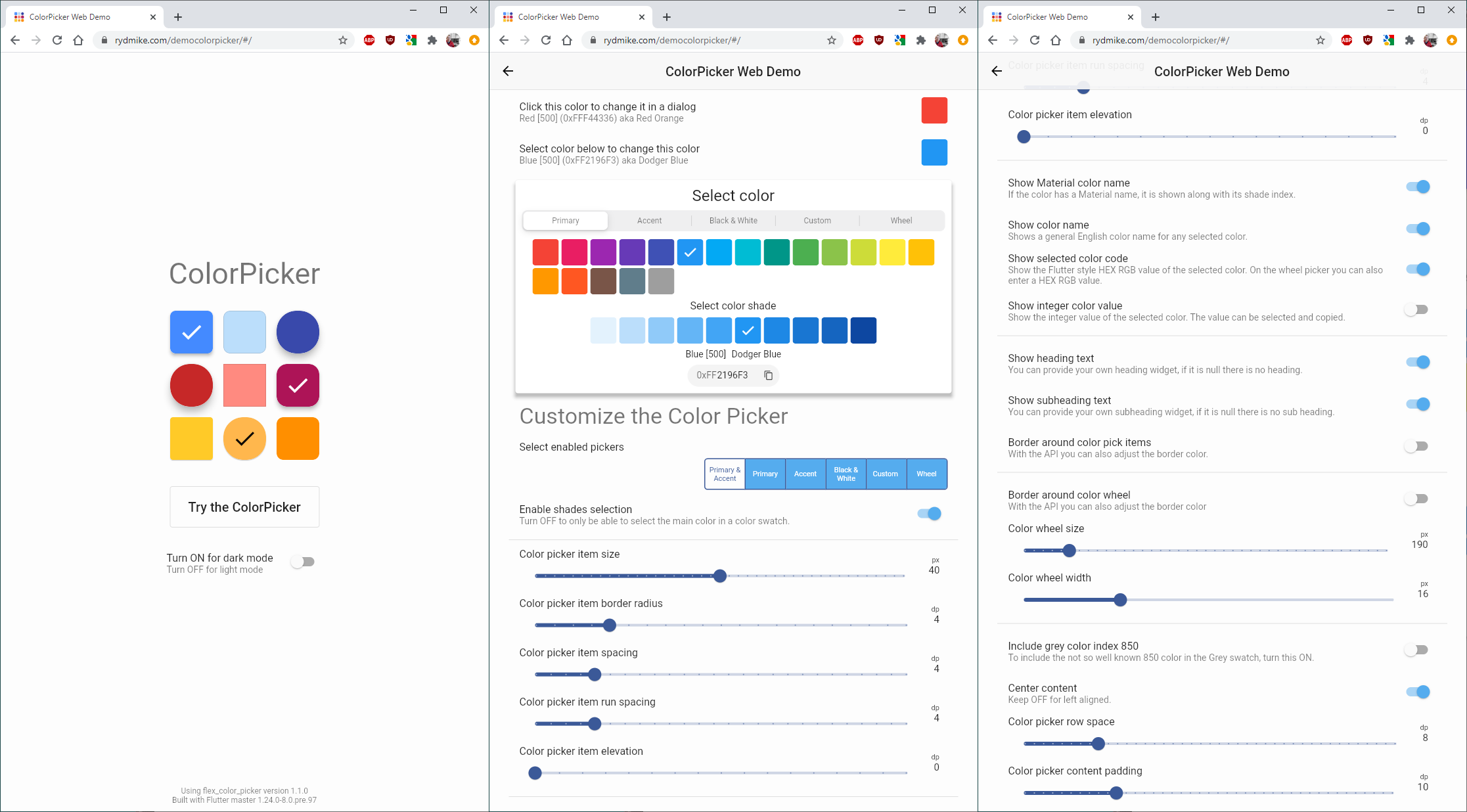
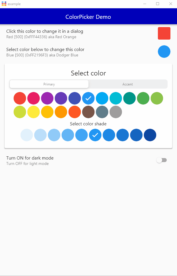
Flex ColorPicker works on all Flutter platforms, Android, iOS, Web, Windows, MacOS and Linux. Here is an example of the demo application running on Windows desktop.
Additional Resources #
The above introduction was a walk through of the bundled example, please see the example section for the complete source code.
There are a few more configuration options available for the ColorPicker, use the API reference guide for additional information.
You can also try the more complete live web example and study its source code here.
Happy color picking!
Metadata
Publisher
Metadata
A customizable Flutter primary, accent and custom color picker. Includes an optional HSV wheel color picker.
Repository (GitHub)
View/report issues
License
 unknown (LICENSE)