division 0.4.0  division: ^0.4.0 copied to clipboard
A common use Widget to simplify styling and reduce nesting, inspired by CSS. Styling a widget has never been easier!
division #
A flutter widget with the goal of simplifying styling and to reduce nesting, inspired by CSS
Getting Started #
The Division widget has 3 properties. A style property, a gesture property and a child property. As simple as that!
Division(style: StyleClass, gesture: GestureClass, child, Widget);
Simple example #
Import
import 'package:division/division.dart';
Simple usage
Division(
  style: StyleClass()
    ..width(200)
    ..height(100)
    ..backgroundColor(hex: 'eeeeee')
    ..borderRadius(all: 30.0)
    ..elevation(30)
    ..align('center')
    ..alignChild('center'),
  gesture: GestureClass()
    ..onTap(() => print('Widget pressed')),
  child: Text('Some text'),
);
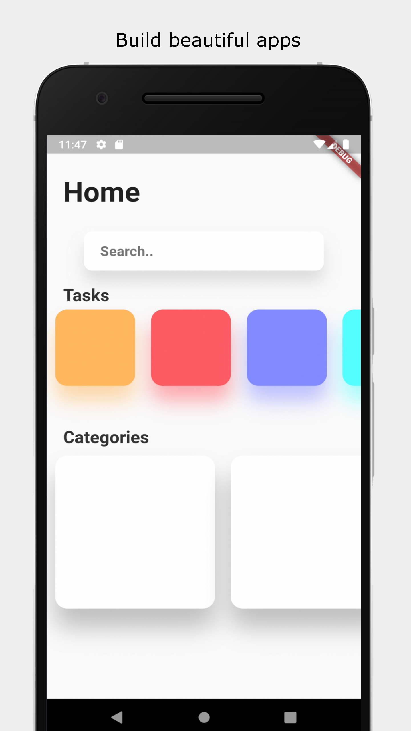
The result

Style property #
The style property expects a StyleClass which is a class holding all the styling for the widget.
StyleClass #
To add a style to the StyleClass, use the ..[style] syntax. The two dots is used to not return [style], but the StyleClass
Align
..align(dynamic alignment)
align parameters support [String] value ('center', 'left', 'bottomRight'...), [List
Align child
..alignChild(dynamic alignment)
align parameters support [String] value ('center', 'left', 'bottomRight'...), [List
Padding
..padding({double all,
      double horizontal,
      double vertical,
      double top,
      double bottom,
      double left,
      double right})
If all is defined, non of the other properties will have an effect.
If horizontal and vertical is defined, top, bottom, left, and right will have no effect.
Margin
..margin({double all,
      double horizontal,
      double vertical,
      double top,
      double bottom,
      double left,
      double right})
If all is defined, non of the other properties will have an effect.
If horizontal and vertical is defined, top, bottom, left, and right will have no effect.
Background color
..backgroundColor(dynamic color)
color parameter supports HEX ('#xxxxxx'), RGB ([int, int, int]), RGBA ([int, int, int, double]) and [Color].
Gradient
..linearGradient({dynamic beginAlign = 'left',
      dynamic endAlign = 'right',
      @required List<dynamic> colors,
      TileMode tileMode = TileMode.clamp,
      List<double> stops})

..radialGradient(
      {dynamic centerAlign = 'center',
      double radius = 0.5,
      @required List<dynamic> colors,
      TileMode tileMode = TileMode.clamp,
      List<double> stops})

..sweepGradient(
      {dynamic centerAlign = 'center',
      double startAngle = 0.0,
      double endAngle,
      @required List<dynamic> colors,
      TileMode tileMode = TileMode.clamp,
      List<double> stops})
Choose between 3 gradient variants.
sweepGradient() by default does not use radians for the startAngle and the endAngle. By default 0.25 equals 45 degrees, 1 equals one full turn etc.
To change to use radians do: StyleClass(useRadians: true)...
color parameter supports HEX ('#xxxxxx'), RGB ([int, int, int]), RGBA ([int, int, int, double]) and [Color].
align parameters support [String] value ('center', 'left', 'bottomRight'...), [List
Border #
..border(
      {double all,
      double left,
      double right,
      double top,
      double bottom,
      dynamic color = const Color(0xFF000000),
      BorderStyle style = BorderStyle.solid})
Choose between all or left, right, top and bottom.
color parameter supports HEX ('#xxxxxx'), RGB ([int, int, int]), RGBA ([int, int, int, double]) and [Color].
Border radius
..borderRadius(
      {double all,
      double topLeft,
      double topRight,
      double bottomLeft,
      double bottomRight})
Eigther use the all property to apply to all corners, or user topLeft, topRight, bottomLeft and bottomRight.
If the all property is defined, the other properties will have no effect.
Box shadow
..boxShadow(
      {dynamic color = const Color(0x33000000),
      double blur,
      List<double> offset,
      double spread})
color parameter supports HEX ('#xxxxxx'), RGB ([int, int, int]), RGBA ([int, int, int, double]) and [Color].
If defined while the elevation property is defined, the last one defined will be the style applied.
offset is given in the format [double dx, double dy]
Elevation
..elevation(
      double elevation,
      {bool angled = false,
      dynamic color = const Color(0x33000000)})
Elevates the widget with a boxShadow.
If the elevation property is used at the same time as the boxShadow property, the last one
defined will be the applied style.
color parameter supports HEX ('#xxxxxx'), RGB ([int, int, int]), RGBA ([int, int, int, double]) and [Color].
If the angled property is true, the shadow will be att 45 degrees.
Scale
..scale(double scale)
Scale the widget
Offset
..offset([double dx, double dy])
Offsets the widget
Rotate
..rotate(double rotate)
Rotates the widget.
By default one turn equals 1. To change to radians: StyleClass(useRadians: true)..
Ripple
Material ripple effect
..ripple({bool enable = false, dynamic splashColor, dynamic highlightColor})
Still a [beta] feature with known issues.
Animate
..animate([int duration, Curve curve = Curves.linear])
Animates the widget when one of its style properties changes.
duration is given in milliseconds.
I am considering to implement a only parameter to choose to only animate certain properties.
Add
..add(StyleClass styleClass, {bool override = false})
Adds a StyleClass to a StyleClass.
By default the added StyleClass does not override already set style. Change override to true, to override already set style.
Width, minWidth, maxWidth, Height, minHeight, maxHeight
..[type](double length)
Gesture property #
The gesture property expects a GestureClass which is a class holding all the gestures for the widget.
GestureClass #
To add a style to the GestureClass, use the ..[gesture] syntax. The two dots is used to not return the [gesture], but the GestureClass
The GestureClass takes all the same parameters as the GestureDetector widget.
..[gesture](function)
Child property #
Widget child
Metadata
Publisher
unverified uploader
Metadata
A common use Widget to simplify styling and reduce nesting, inspired by CSS. Styling a widget has never been easier!
Repository (GitHub)
View/report issues
License
 unknown (LICENSE)