dash_chat 1.0.1  dash_chat: ^1.0.1 copied to clipboard
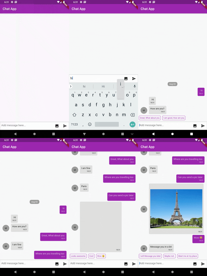
The most complete Chat UI for flutter inspired by react-native-gifted-chat.

💬 Dash Chat
The most complete Chat UI for flutter
Inspired by react-native-gifted-chat. Highly customizable and helps developing chat UI faster.
Usage 💻 #
To use this package, add dash_chat as a dependency in your pubspec.yaml file.
Features 🔮 #
- Fully customizable components
- Copy messages to clipboard
- Multi-line TextInput
- Touchable links using flutter_parsed_text
- Avatar as user's initials
- Quick Reply messages
- Load earlier messages
- Scroll to bottom Widget
- Composer actions (to attach photos, etc.) - WIP
Message object 📦 #
example, Chat Message
ChatMessage(
        text: "Hello",
        user: ChatUser(
          name: "Fayeed",
          uid: "123456789",
          avatar: "https://www.wrappixel.com/ampleadmin/assets/images/users/4.jpg",
        ),
        createdAt: DateTime.now(),
        image: "http://www.sclance.com/images/picture/Picture_753248.jpg",
    );
example, Chat Message with Quick Replies
ChatMessage(
        text: "This is a quick reply example.",
        user: ChatUser(),
        createdAt: DateTime.now(),
        quickReplies: QuickReplies(
          values: <Reply>[
            Reply(
              title: "😋 Yes",
              value: "Yes",
            ),
            Reply(
              title: "😞 Nope. What?",
              value: "no",
            ),
          ],
        ),
      ),
Parameters ⚙️ #
messageContainerFlex(int) - Flex value for the messeage container defaults to1height(double) - Height for the Dash chat Widget.width(double) - Width for the Dash chat Widget.messages(Listtext(String) - [optional parameter] If provided will stop using the default controller.onTextChange(Function(String)) - If the text parameter is passed then onTextChange must also be passed.inputDecoration(InputDecoration) - Used to provide input decoration to the text.messageIdGenerator(String Function) - Usually new message added by the user gets UUID v4 String generater by uuid.user(ChatUser) - The current user object.
  DashChat(
    user: ChatUser(
      name: "Jhon Doe",
      uid: "xxxxxxxxx",
      avatar: "https://www.wrappixel.com/ampleadmin/assets/images/users/4.jpg",
    )
  );
onSend(Function(ChatMessage)) - Callback when sending a message.alwaysShowSend(bool) - Should the send button be always active defaults to false.dateFormat(DateFormat) - Format to use for rendering date default isyyyy-MM-dd.timeFormat(DateFormat) - Format to use for rendering time default isHH:mm:ss.showUserAvatar(bool) - Should the user avatar be shown.showAvatarForEveryMessage(bool) - Should the avatar be shown for every message defaults to false.onPressAvatar(Function(ChatUser)) - Callback funtion when avatar is tapped on.onLongPressAvatar(Function(ChatUser)) - Callback funtion when avatar is long pressed on.onLongPressMessage(Function(ChatUser)) - Callback funtion when message is long pressed on.inverted(bool) - Should the messages be shown in reversed orderavatarBuilder(Widget Function(ChatUser)) - Will override the the default avatar.messageBuilder(Widget Function(ChatMessage)) - Will override the the default message widget.messageTextBuilder(Widget Function(String)) - Will override the the default message text widget.messageImageBuilder(Widget Function(String)) - Will override the the default message imaeg widgetmessageTimeBuilder(Widget Function(String)) - Will override the the default message time widget.dateBuilder(Widget Function(String)) - Will override the the default chat view date widget.sendButtonBuilder(Widget Function(Function)) - Will override the the default send button widget.chatFooterBuilder(Widget Function) - A Widget that will be shown below the MessageListView like you can a "tying..." Text Widget at the end.inputFooterBuilder(Widget Function) - A Widget that will be shown below the ChatInputToolbar.maxInputLength(int) - Main input length of the input text box defaulst to no limit.parsePatterns(ListmessageContainerDecoration(BoxDecoration) - Provides a custom style to the message container.leading(List<Widget>) - List of Widget to show before the TextField.trailing(List<Widget>) - List of Widget to show after the TextField will remove the send button.showTraillingBeforeSend- Should the trailling widgets be shown before the send button defaults totrue.inputTextStyle(TextStyle) - Style for the TextField.inputContainerStyle(BoxDecoration) - TextField container style.inputMaxLines(int) - Max length of the input lines default to 1.showInputCursor(bool) - Should the input cursor be shown defaults to true.inputCursorWidth(double) - Width of the text input defaults to 2.0.inputCursorColor(Color) - Color of the input cursor defaults to theme.scrollController(ScrollController) - ScrollController for the MessageListView.messageContainerPadding(EdgeInsetsGeometry) - Padding for the MessageListView.onQuickReply(Funtion(Reply)) - Callback method when the quickReply was tapped on.quickReplyStyle(BoxDecoration) - Container style for the QuickReply Container.quickReplyTextStyle(TextStyle) - QuickReply text style.quickReplyBuilder(Widget Function(Reply)) - Will override the the default QuickReply Widget.scrollToBottom(bool) - Should the scroll to bottom widget be shown defaults totrue.scrollToBottomWidget(Widget Function()) - Overrides the default scrollToBottomWidget with a custom widget.onScrollToBottomPress(Function) - override the default behaviour of the onScrollToBottom Widget.shouldShowLoadEarlier(bool) - Should the LoadEarlier Floating widget be shown or use load as you scroll scheme whcih will call the onLoadEarlier defaults to false which is this scheme.showLoadEarlierWidget(Widget Function()) - Override the default behaviour of the onScrollToBottom Widget.onLoadEarlier(Function) - Override the default behaviour of the onLoadEarleir Widget or used as a callback when the listView reaches the top.
Credits 👨🏻💻 #
- Transparent Image - Brian Egan
- uuid - Yulian Kuncheff
Found this project useful? ❤️ #
If you found this project useful, then please consider giving it a ⭐️ on Github and sharing it with your friends via social media.
License ⚖️ #
API details 📝 #
See the dash_chat.dart for more API details
Issues and feedback 💭 #
If you have any suggestion for including a feature or if something doesn't work, feel free to open a Github issue for us to have a discussion on it.