custom_quick_alert 1.1.0  custom_quick_alert: ^1.1.0 copied to clipboard
 ariyanshipu.me
Instantly display animated alert dialogs like success, error, warning, confirm, loading, or custom — all with minimal code.
 #
#
A highly customizable and beautifully animated CustomQuickAlert dialog package for Flutter. Create stunning, professional-looking alerts for any situation with minimal code.


✨ Features #
| Feature | Description |
|---|---|
| 🎨 Versatile Alert Types | Includes pre-built styles for success, error, warning, info, confirm, and loading. |
| 🎬 Engaging Animations | Each alert type is enhanced with a smooth, high-quality Lottie animation for a polished user experience. |
| 🔧 Deeply Customizable | Tailor every detail—colors, text styles, buttons, and more. You can even embed your own custom widgets. |
| 🚀 Developer-Friendly API | A clean and intuitive API lets you trigger beautiful alerts with just a single line of code. |
| 🌐 Context-Free Triggering | Display alerts from your business logic (ViewModels, BLoCs, etc.) without needing to pass context. |
| ⏱️ Auto-Dismiss Timer | Configure alerts to automatically close after a specified duration. |
| 🌟 Entrance Animations | Choose how your alert appears on screen, with options like scale, slideIn, and rotate. |
| 📱 Responsive by Design | Looks great on any screen size and supports custom widget content for ultimate flexibility. |
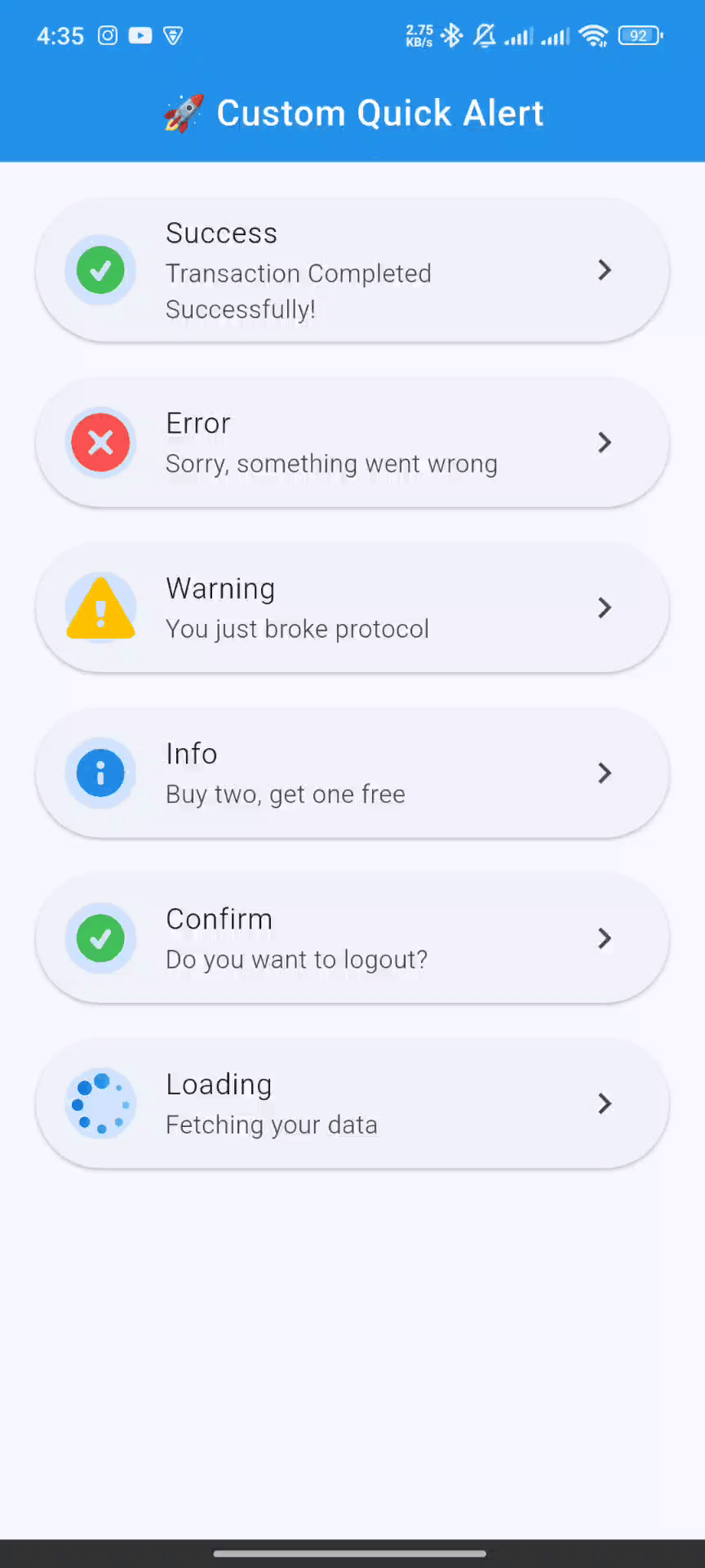
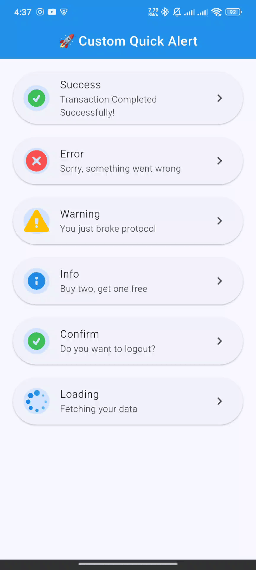
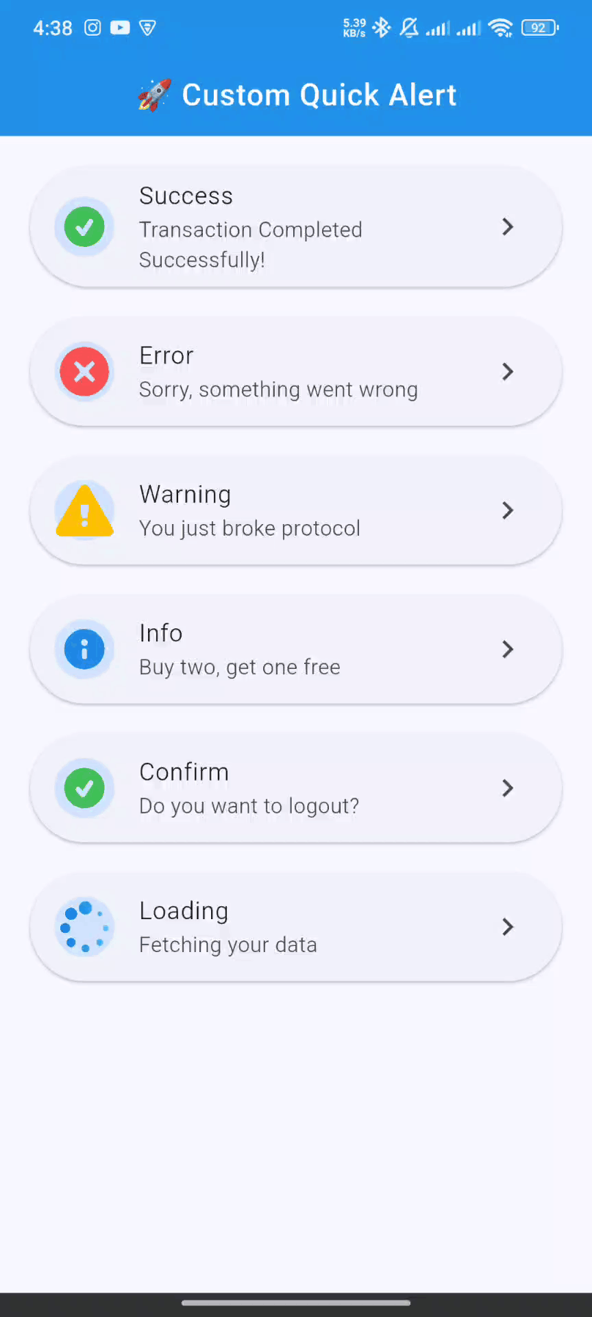
📸 Screenshots #
| Success | Error | Warning |
|---|---|---|
 |
 |
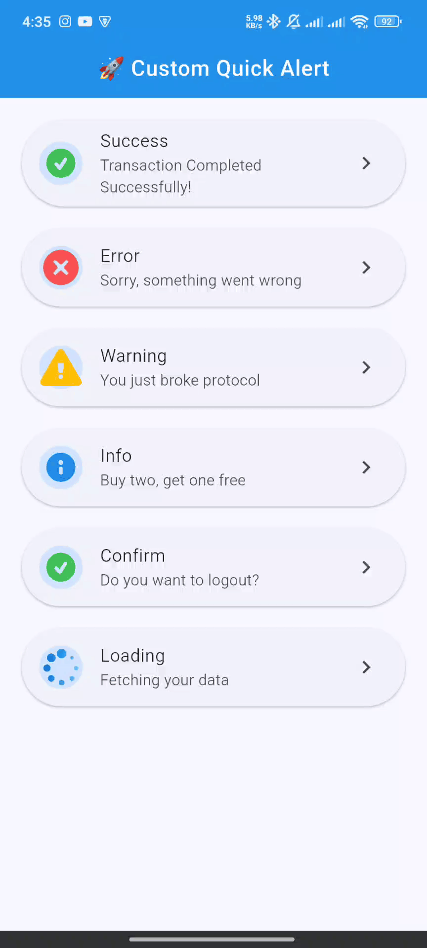 |
| Info | Confirm | Loading |
|---|---|---|
 |
 |
 |
🚀 Getting Started #
Follow these steps to get custom_quick_alert up and running in your project.
1. Installation #
Add custom_quick_alert to your project's dependencies by running this command in your terminal:
flutter pub add custom_quick_alert
This will add the latest version to your pubspec.yaml file and run flutter pub get automatically.
2. Import #
Import the package where you intend to use it:
import 'package:custom_quick_alert/custom_quick_alert.dart';
3. Crucial Setup for MaterialApp #
To enable showing alerts from anywhere in your app (without passing context), you must assign the customQuickAlertNavigatorKey to the navigatorKey property of your MaterialApp or CupelationApp.
import 'package:flutter/material.dart';
import 'package:custom_quick_alert/custom_quick_alert.dart';

void main() {
  runApp(const MyApp());
}

class MyApp extends StatelessWidget {
  const MyApp({super.key});

  @override
  Widget build(BuildContext context) {
    return MaterialApp(
      title: 'Custom Quick Alert Demo',
      // THIS IS THE CRUCIAL PART
      navigatorKey: customQuickAlertNavigatorKey,
      home: const HomePage(),
    );
  }
}
💡 Basic Usage #
Calling an alert is incredibly simple. Here are examples for each built-in type.
✅ Success Alert #
CustomQuickAlert.success(
  title: 'Success!',
  message: 'Your profile has been updated.',
);
❌ Error Alert
CustomQuickAlert.error(
  title: 'Oops!',
  message: 'Failed to connect to the server.',
);
⚠️ Warning Alert
CustomQuickAlert.warning(
  title: 'Are you sure?',
  message: 'This will permanently delete your account.',
);
ℹ️ Info Alert
CustomQuickAlert.info(
  title: 'Did you know?',
  message: 'You can customize almost everything in this alert.',
);
🤔 Confirm Alert
Use this to get user confirmation. The onConfirm and onCancel callbacks handle the user's choice.
CustomQuickAlert.confirm(
  title: 'Save Changes?',
  message: 'Any unsaved progress will be lost.',
  confirmText: 'Save',
  cancelText: 'Discard',
  onConfirm: () {
    print('Confirmed! Saving data...');
    // You can call CustomQuickAlert.dismiss() here if you want to close the dialog manually
  },
  onCancel: () {
    print('Cancelled! Discarding changes.');
  },
);
⏳ Loading Alert
Show a loading indicator during an async operation. Remember to dismiss it manually!
void processPayment() async {
  // Show loading alert
  CustomQuickAlert.loading();

  // Simulate a network request
  await Future.delayed(const Duration(seconds: 3));

  // Dismiss the loading alert
  CustomQuickAlert.dismiss();

  // Show success alert
  CustomQuickAlert.success(title: 'Payment Complete!');
}
🛠️ Advanced Customization #
Unleash the full power of custom_quick_alert by using the CustomQuickAlert.show() method. This gives you fine-grained control over every element.
Customization Parameters #
| Parameter | Type | Description |
|---|---|---|
type |
CustomQuickAlertType |
Required. The type of alert (success, error, custom, etc.). |
title |
String? |
The main title of the alert. |
message |
String? |
The body text of the alert. |
lottieAsset |
String? |
Path to a custom Lottie JSON file from your assets. |
customContent |
Widget? |
A custom widget to display below the message for extra content. |
animType |
CustomQuickAlertAnimType |
The entrance animation (scale, slideInDown, etc.). |
position |
CustomQuickAlertPosition |
The position on the screen (center, top, bottom). |
barrierDismissible |
bool |
If true, tapping the overlay dismisses the alert. Defaults to true. |
showCancel |
bool |
Toggles the visibility of the cancel button. |
showConfirm |
bool |
Toggles the visibility of the confirm button. |
confirmText |
String |
Custom text for the confirm button. |
cancelText |
String |
Custom text for the cancel button. |
onConfirm |
VoidCallback? |
Action to perform when the confirm button is tapped. |
onCancel |
VoidCallback? |
Action to perform when the cancel button is tapped. |
confirmBtnColor |
Color |
Background color of the confirm button. |
cancelBtnColor |
Color |
Outline and text color of the cancel button. |
confirmTextColor |
Color |
Text color for the confirm button. |
cancelTextColor |
Color |
Text color for the cancel button. |
backgroundColor |
Color |
Background color of the entire alert dialog. |
titleColor |
Color |
Color of the title text. |
messageColor |
Color |
Color of the message text. |
autoCloseDuration |
Duration? |
If set, the dialog automatically closes after this duration. |
borderRadius |
double |
The corner radius of the dialog card. |
width |
double? |
Manually set a custom width for the dialog. |
disableBackBtn |
bool |
If true, the Android back button will not dismiss the dialog. |
Full Customization Example #
Here's an example of a completely custom alert:
CustomQuickAlert.show(
  type: CustomQuickAlertType.custom,
  // Use your own Lottie animation
  lottieAsset: 'assets/custom_animation.json',
  title: 'Rate Your Experience!',
  message: 'How would you rate our service today?',
  // Add a custom widget
  customContent: const Row(
    mainAxisAlignment: MainAxisAlignment.center,
    children: [
      Icon(Icons.star, color: Colors.amber),
      Icon(Icons.star, color: Colors.amber),
      Icon(Icons.star, color: Colors.amber),
      Icon(Icons.star, color: Colors.amber),
      Icon(Icons.star_border, color: Colors.grey),
    ],
  ),
  // Customize buttons and colors
  confirmText: 'Submit',
  cancelText: 'Later',
  showCancel: true,
  onConfirm: () => print('Rating submitted!'),
  onCancel: () => print('Rating skipped.'),
  confirmBtnColor: Colors.green,
  backgroundColor: const Color(0xFF222831),
  titleColor: Colors.white,
  messageColor: Colors.white70,
  // Other properties
  animType: CustomQuickAlertAnimType.slideInLeft,
  position: CustomQuickAlertPosition.bottom,
  borderRadius: 20.0,
  disableBackBtn: true,
);
🕹️ API Reference #
CustomQuickAlertAnimType #
Choose the entrance animation for the alert.
scale(default)rotateslideInDownslideInUpslideInLeftslideInRight
CustomQuickAlertPosition #
Set the position of the alert on the screen.
center(default)topbottom
CustomQuickAlert.dismiss() #
A static method to programmatically dismiss the currently visible alert.
// Dismisses any active alert
CustomQuickAlert.dismiss();
🤝 Contributing #
Contributions are what make the open-source community such an amazing place to learn, inspire, and create. Any contributions you make are greatly appreciated.
- Fork the Project
- Create your Feature Branch (
git checkout -b feature/AmazingFeature) - Commit your Changes (
git commit -m 'Add some AmazingFeature') - Push to the Branch (
git push origin feature/AmazingFeature) - Open a Pull Request
📄 License #
Distributed under the MIT License. See LICENSE for more information.
Made with ❤️ by Your Name *
Metadata
Publisher
Weekly Downloads
Metadata
Instantly display animated alert dialogs like success, error, warning, confirm, loading, or custom — all with minimal code.
Repository (GitHub)
View/report issues
Contributing
Topics
#alert #dialog #popup #animation #lottie
Documentation
License
 MIT (license)