Grouped list package for Flutter.

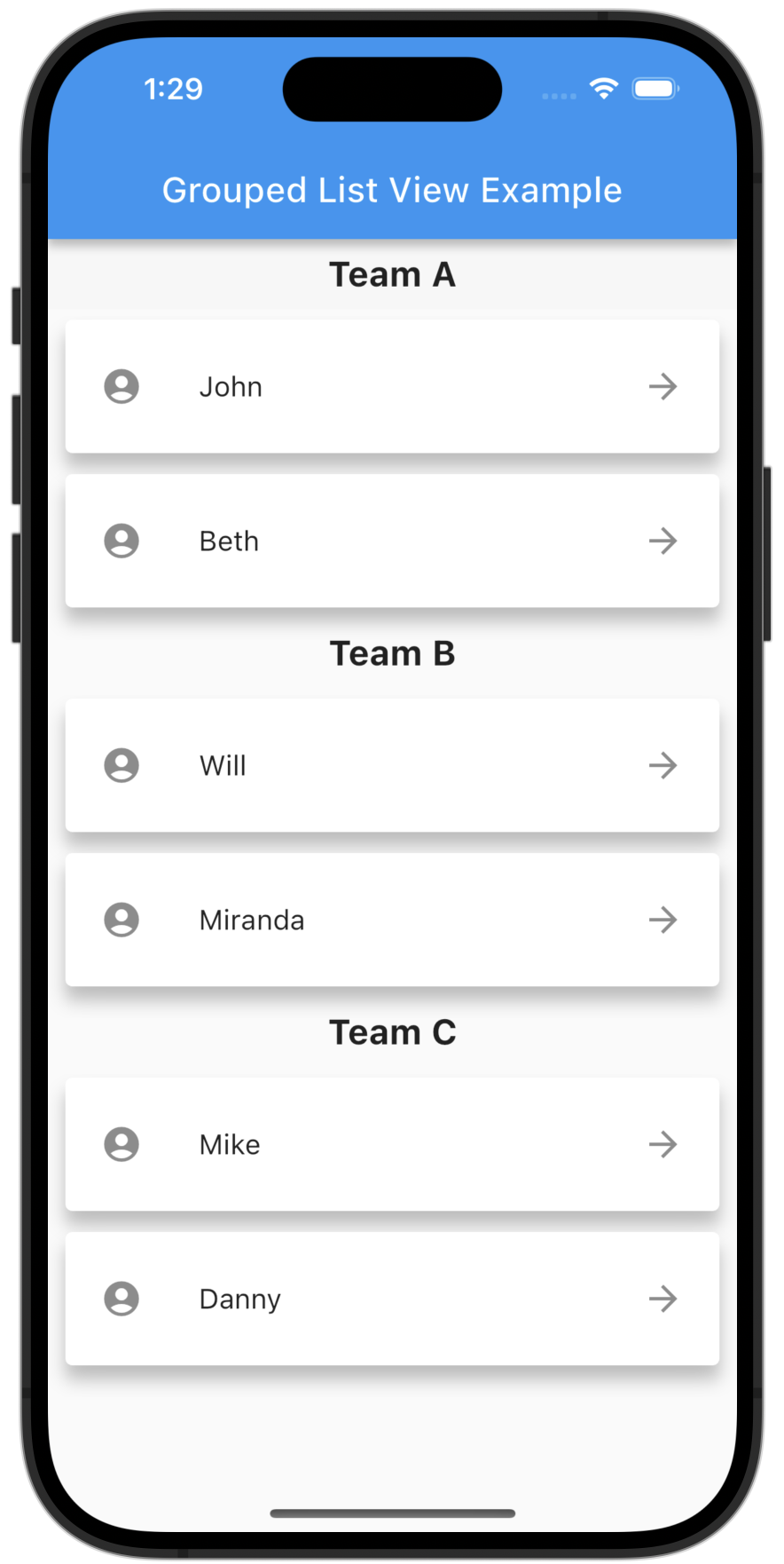
A flutter ListView in which list items can be grouped to sections.
Features
- Sound null safety support!
- Easy creation of chat dialog.
- List Items can be separated in groups.
- For the groups an individual header can be set.
- Almost all fields from
ListView.builderavailable.
Getting Started
Add the package to your pubspec.yaml:
grouped_list: ^4.2.0
In your dart file, import the library:
import 'package:grouped_list/grouped_list.dart';
Instead of using a ListView create a GroupedListView Widget:
 GroupedListView<dynamic, String>(
   elements: _elements,
   groupBy: (element) => element['group'],
   groupSeparatorBuilder: (String groupByValue) => Text(groupByValue),
   itemBuilder: (context, dynamic element) => Text(element['name']),
   itemComparator: (item1, item2) => item1['name'].compareTo(item2['name']), // optional
   useStickyGroupSeparators: true, // optional
   floatingHeader: true, // optional
   order: GroupedListOrder.ASC, // optional
 ),
Parameters:
| Name | Description | Required | Default value |
|---|---|---|---|
elements |
A list of the data you want to display in the list | required | - |
groupBy |
Function which maps an element to its grouped value | required | - |
itemBuilder / indexedItemBuilder |
Function which returns an Widget which defines the item. indexedItemBuilder provides the current index as well. If both are defined indexedItemBuilder is preferred |
yes, either of them | - |
groupSeparatorBuilder / groupHeaderBuilder |
Function which returns an Widget which defines the group headers. While groupSeparatorBuilder gets the groupBy-value as parameter groupHeaderBuilder gets the whole element. If both are defined groupHeaderBuilder is preferred |
yes, either of them | - |
useStickyGroupSeparators |
When set to true the group header of the current visible group will stick on top | no | false |
floatingHeader |
Whether the sticky group header float over the list or occupy it's own space | no | false |
stickyHeaderBackgroundColor |
Defines the background color of the sticky header. Will only be used if useStickyGroupSeparators is used |
no | Color(0xffF7F7F7) |
separator |
A Widget which defines a separator between items inside a group | no | no separator |
groupComparator |
Can be used to define a custom sorting for the groups. Otherwise the natural sorting order is used | no | - |
itemComparator |
Can be used to define a custom sorting for the elements inside each group. Otherwise the natural sorting order is used | no | - |
order |
Change to GroupedListOrder.DESC to reverse the group sorting |
no | GroupedListOrder.ASC |
Also the fields from ListView.builder can be used.
Highlight - SilverGroupedList
Now supporting a grouped list based on a silver list. Just use SilverGroupedListView instead of GroupedListView. An example can be found under example/lib/example_silver.
Note that some options of the GroupedListView are currently not available in SilverGroupedListView.
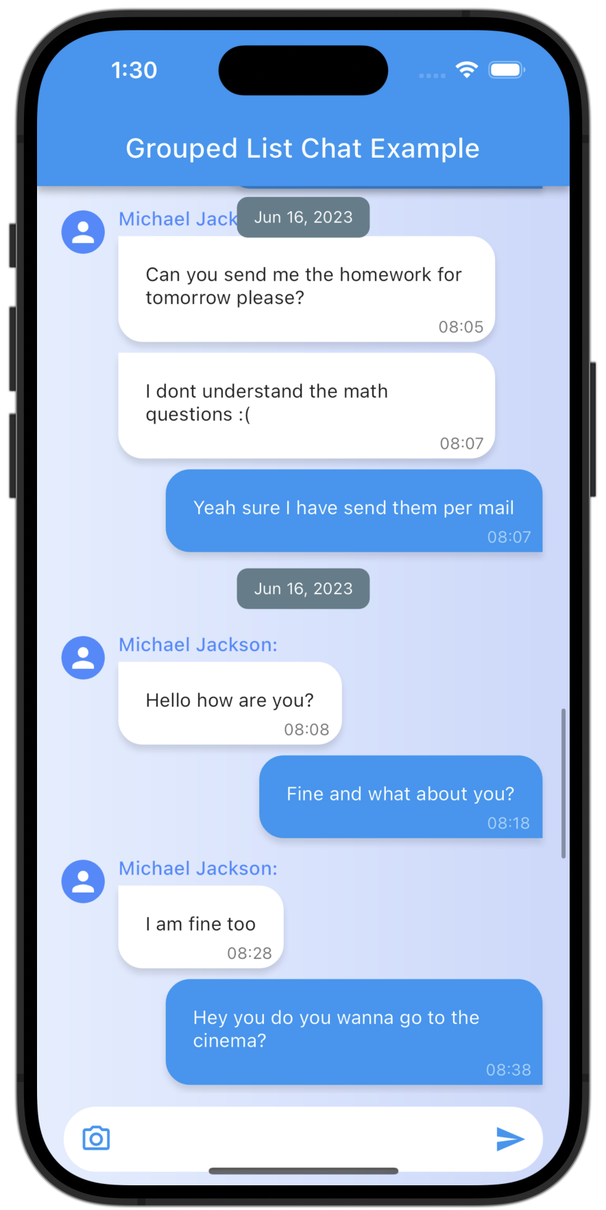
Highlight - Chat Dialog
Easy creation of chat dialogs.
Just set the option reverse to true and order to GroupedListOrder.DESC. A full example can be found in the examples.
The list will be scrolled to the end in the initial state and therefore scrolling will be against redeaing direction.
My other packages :
For easy creation of chat-like dialogs:
Check out my other package StickyGroupedList, which is based on the scrollable_positioned_list.