Flutter Custom Cards
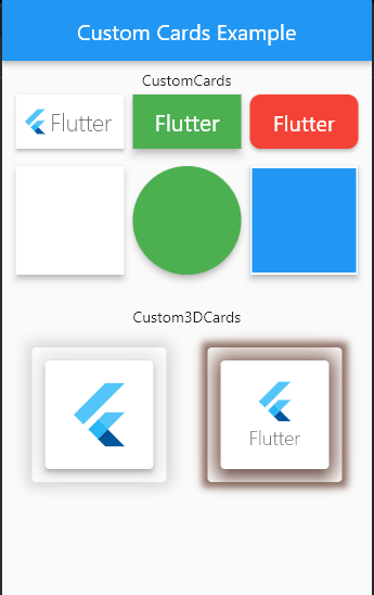
Flutter Custom Cards help developers to create beautiful custom cards and 3D cards with flutter.
Demo Screenshot
Getting Started
Add the package In your pubspec.yaml
flutter_custom_cards: ^0.2.1
Import and use
import 'package:flutter_custom_cards/flutter_custom_card.dart'
Basic Usages
To create a CustomCard
CustomCard(
  borderRadius: 10,
  color: Colors.yellow,
  hoverColor: Colors.indigo,
  onTap: () {},
  child: Text('Flutter'),
),
To Create a Custom3DCard
Custom3DCard(
  elevation: 4,
  child: SizedBox(
    height: 100,
    width: 100,
    child: Center(
      child: FlutterLogo(size: 65),
    ),
  ),
),
For Full Uses See Example Section
Major Changes
On version 0.2 the following major changes were done on the release
TextCard,ImageCardandWidgetCardhave been merged into single card namedCustomCard.- Now new CustomCards supports onTap, hoverColor, height, width and more.
Custom3DCardis introduced in this version that was not in the previous version.- Now there are only two cards
CustomCardandCustom3DCard
CustomCard Options
The following options are available on CustomCard
| Property | Type | Description |
|---|---|---|
| borderColor | Color | Border color of card |
| borderRadius | double | Radius of the card |
| borderWidth | double | Border width of card |
| child | Widget | child Widget of card |
| childPadding | double | Padding for the child widget (default is 5) |
| color | Color | Background Color for card |
| elevation | double | Elevation for the card (default is 3) |
| height | double | Height of the card (if null the height will be according to child widget) |
| hoverColor | Color | Hover color of card (only visible if onTap is not null) |
| key | Key | Key is an identifier for card |
| onTap | GestureTapCallback | Signature for when a tap has occurred. |
| shadowColor | Color | Shadow color of card |
| splashColor | Color | Splash color of card (only visible if onTap is not null |
| width | double | Width of the card (if null the width will be according to child widget) |
Custom3DCard Options
The following options are available on Custom3DCard
| Property | Type | Description |
|---|---|---|
| borderOnForeground | bool | If false, the border will be painted behind the child (default true) |
| child | Widget | Child widget of card |
| color | Color | Color of card |
| elevation | double | Elevation of card |
| key | Key | Key is an identifier for card |
| margin | EdgeInsetsGeometry | The empty space that surrounds the card |
| semanticContainer | bool | Whether this widget represents a single semantic container (default true) |
| shadowColor | Color | The color to paint the shadow below the card. |
| shadowSpread | double | Spread distance of shadow below card (default is 10) |
| shape | ShapeBorder | The shape of the card |
Upcoming
The following features will rollout soon
onTapoption onCustom3DCardas wellonHoveroption in both of the cardsonLongPressedandonDoubleTapoption in both of the cardsstyleproperty inCustom3DCardusing this we can create different types of 3d cards.
License
This project is licensed under the MIT license. See LICENSE for details.
