search_choices.iml���������������������������������������������������������������������������������� 644 0 0 3206 14342407401 12327 0����������������������������������������������������������������������������������������������������ustar�0 pub�����������������������������pub��������������������������������������������������������������������������������������������������������������������������������������������������������������������������������������������������������������������
������������������������������������������������������������������������������������������������������������������������������������������������������������������������������������������������������������������������������������������������������������������������������������������������������������������������������������������������������������������������������������������CHANGELOG.md���������������������������������������������������������������������������������������� 644 0 0 23604 14366546420 10532 0����������������������������������������������������������������������������������������������������ustar�0 pub�����������������������������pub��������������������������������������������������������������������������������������������������������������������������������������������������������������������������������������������������������������������## 2.2.2
* subtitle1 is deprecated. Use titleMedium instead.
* compileSdkVersion 33
* started with task 2 of https://github.com/lcuis/search_choices/issues/100
## 2.2.1
* If there is no validator nor any listValidator, form validation is not triggered. Thanks @Macacoazul01 https://github.com/lcuis/search_choices/pull/102
## 2.2.0
* Avoided a warning when validating a form with multiple objects. Thanks @Macacoazul01 https://github.com/lcuis/search_choices/issues/97
* Separated big classes. Thanks @Macacoazul01 https://github.com/lcuis/search_choices/issues/100
## 2.1.8
* Added parameter giveMeThePop to allow closing the dialog or menu from outside the widget. Thanks @krButani https://github.com/lcuis/search_choices/issues/94
## 2.1.7
* Removed assertion condition forcing buildDropDownDialog to be null if dialogBox is false. Thanks @krButani https://github.com/lcuis/search_choices/issues/93
## 2.1.6
* Removed assertion preventing the use of validator together with fieldDecoration. Thanks @willhhf https://github.com/lcuis/search_choices/issues/92
## 2.1.5
* Validator in form: The form field validator is called by the parent form validator. Thanks @martin-labanic https://github.com/lcuis/search_choices/issues/68
## 2.1.4
* Updated kotlin version from 1.3.50 to 1.7.20 . Thanks @wutsi https://github.com/lcuis/search_choices/issues/91
## 2.1.3
* Corrected video link on readme page to use https instead of http.
## 2.1.2
* Sort and filter buttons don't appear when searchHint is not provided. Thanks @rob-mur https://github.com/lcuis/search_choices/issues/88
* Initial effort to support FormField parameters. Thanks @martin-labanic https://github.com/lcuis/search_choices/issues/68
* Recording Flutster automated integration testing as a playable video.
## 2.1.1
* Preventing a breaking change when projects older than 2.0.21 set an int padding. Thanks @MikeAndrson https://github.com/lcuis/search_choices/commit/6c05345c0144b82034f98997ba7067f51f950ee3#commitcomment-79884226
## 2.1.0
* Added Flutster integration testing.
* Customize the call to showDialog with showDialogFn. Thanks @slavap https://github.com/lcuis/search_choices/issues/84
## 2.0.21
* Updated license date. Fixed a deprecation warning in pub.dev with isAlwaysShown.
* Fixed increasing or decreasing size between hint, enabled, disabled, selected states. Thanks @vaibhavjoshi247 https://github.com/lcuis/search_choices/issues/81
* Added fieldDecoration. Thanks @rhernandez-itemsoft https://github.com/lcuis/search_choices/issues/78
* Added clearSearchIcon. Thanks @gslender https://github.com/lcuis/search_choices/issues/73
## 2.0.20
* Added dropDownDialogPadding parameter. Thanks @Macacoazul01 https://github.com/lcuis/search_choices/issues/77
## 2.0.19
* ScrollBar parameter isAlwaysShown is back instead of thumbVisibility as it broke the build as shown in https://github.com/lcuis/search_choices/issues/70
* Working with stable flutter channel on GitHub CI/CD instead of dev channel.
## 2.0.18
* Added fieldPresentationFn for the needs of https://github.com/lcuis/search_choices/issues/69 . Thanks @sajiyabro98 .
## 2.0.17
* Bug 63 1.1 Click on dropdown button while menu is opened doesn't close menu. Thanks @Macacoazul01 https://github.com/lcuis/search_choices/issues/63
* Enhancement 63 1.2 Pop menu from onChanged. Thanks @Macacoazul01 https://github.com/lcuis/search_choices/issues/63
* Enhancement 63 2.2 Pop menu from updateParent. Thanks @Macacoazul01 https://github.com/lcuis/search_choices/issues/63
* Bug 63 3. Delete last item from menu causes index error. Thanks @Macacoazul01 https://github.com/lcuis/search_choices/issues/63
## 2.0.16
* Added searchDelay to give some time before search function is called in Future and non-Future cases. Thanks @rhernandez-itemsoft https://github.com/lcuis/search_choices/issues/58
## 2.0.15
* Customize error - retry button through new parameter futureSearchRetryButton. Thanks @rhernandez-itemsoft https://github.com/lcuis/search_choices/issues/56
## 2.0.14
* Use of context for onChange was potentially breaking situations where Widget was already disposed. Thanks @bondjpf https://github.com/lcuis/search_choices/issues/51
## 2.0.13
* Removed issue example from example project.
## 2.0.12
* Trying to comply with the pub.dev formatting.
## 2.0.11
* Trying to comply with the pub.dev formatting.
* Fixed some gradle problems: https://jeroenmols.com/blog/2021/02/04/migratingjcenter/
## 2.0.10
* Trying to comply with the pub.dev formatting.
## 2.0.9
* Trying to comply with the pub.dev formatting unmentioned requirements.
## 2.0.8
* Calling non future items onTap if not null when list item is tapped. Thanks @EbrahimMosaaed https://github.com/lcuis/search_choices/issues/49
* Fixed some typos.
* Added the following example code to the README: Multi dialog paged future
## 2.0.7
* Fixed bug: Multi future selected items did not appear as selected when reopening the list. Thanks @bhimpratapsingh https://github.com/lcuis/search_choices/issues/44
* Fixed bug: future search dialog box iOS: filter doesn't change list. https://github.com/lcuis/search_choices/issues/46
* Added an example: Multi dialog paged future
## 2.0.6
* Added emptyListWidget parameter. Thanks @KhatibFX https://github.com/lcuis/search_choices/issues/42
* Added onTap parameter. Thanks @KhatibFX https://github.com/lcuis/search_choices/issues/26
* Removed useless DropdownButtonNoSelDisp class.
## 2.0.5
* Corrected bug on pagination: scroll down and move to next page or type a new keyword, the scroll remained down.
* Improved documentation.
## 2.0.4
* Added pagination with itemsPerPage, currentPage and customPaginationDisplay parameters
* Added possibility to perform future/network searches with order and filter selections through the addition of the futureSearchFn, futureSearchOrderOptions, futureSearchFilterOptions and futureSelectedValues parameters
## 2.0.3
* New searchInputDecoration parameter, thanks @develogo https://github.com/lcuis/search_choices/pull/35
## 2.0.2
* Lets implementation control dropdown dialog layout display through buildDropDownDialog function, thanks @slavap https://github.com/lcuis/search_choices/issues/23 and https://github.com/lcuis/search_choices/issues/22
## 2.0.1
* Improved dartdoc documentation.
* Added dartdoc command script that is not affected by the issue where dartdoc tries to parse SDK libraries.
* Added linux release and mentioned windows as a possibility.
## 2.0.0
* Migrated to sound null safety with Flutter 2, thanks @Raphael-Jose-Ferraro-IRForever https://github.com/lcuis/search_choices/issues/31
* Added padding parameter to set the padding around the DropdownButton, thanks to @luis-cruzt https://github.com/lcuis/search_choices/pull/27
* Migrated buttons to non-deprecated versions
* Added the possibility to call the dialog with the search terms from a button, thanks to @ettiennelr https://github.com/lcuis/search_choices/issues/30
## 1.0.17
* Present selected values in a custom widget through selectedAggregateWidgetFn. Thanks @slavap https://github.com/lcuis/search_choices/issues/12
## 1.0.16
* avoid deprecated subhead warning in pub.dev
* search field autofocus parameter, thanks @slavap https://github.com/lcuis/search_choices/issues/11
* not displaying validation twice when in menu mode, thanks @geriby23 https://github.com/lcuis/search_choices/issues/10
## 1.0.15
* Bug: menu mode didn't open choices when on hosted web. https://github.com/lcuis/search_choices/issues/9 and https://github.com/icemanbsi/searchable_dropdown/issues/39
## 1.0.14
* Surrounded the DropdownDialog with a StatefulBuilder to allow the refresh of the display when there is a call to updateParent through a setState.
## 1.0.13
* surrounded a setState by an if statement to check that mounted is set to true
* corrected issue 8: ios compile error: search_choices_for_push-Swift.h file not found. Thanks @jaspervdbijl !
## 1.0.12
* improvement of the selection update logic
* consecutive adaptation of the examples
## 1.0.11
* bug: allow multiselection dialog select all to update when outside a tab bar: https://github.com/icemanbsi/searchable_dropdown/issues/21#issuecomment-599198943 thanks to @ettiennelr
## 1.0.10
* bug: allow selection update from outside the plugin: https://github.com/icemanbsi/searchable_dropdown/issues/21 (thanks to @ettiennelr and @lechuk)
## 1.0.9
* adapted dropdown list display to support multiple selection editable list
* added an example of multiple selection editable list
## 1.0.8
* added rightToLeft parameter to README
## 1.0.7
* made it possible to make a dark mode without changing the theme with an example
* added an example for ellipsis text overflow handling
* made it possible to support right to left languages with an example
## 1.0.6
* selectable items can be added and removed by the user
## 1.0.5
* added demonstration for disabled and readOnly
* test formatted
* added readOnly and menuBackgroundColor parameters
* clear icon disabled when Widget is disabled
## 1.0.4
* minor changes to CI/CD
* git cleanups
## 1.0.3
* minor improvements to README
## 1.0.2
* minor improvements to README
## 1.0.1
* CI/CD improved automated deployment
## 0.0.1
Improvements on a pull request that was probably changing too many things to be accepted of the great icemanbsi's searchable_dropdown:
https://github.com/icemanbsi/searchable_dropdown/pull/11
Part of the pull request I proposed:
* keyboardType
* validator
* label
* searchFn
* multipleSelection
New with this repository:
* demo app with a gallery as tabs or as a single page (change through a switch)
* automated testing
* continuous integration (CI)
* continuous deployment (CD)
* license is MIT
* split constructors between single and multiple selection
* comments on the constructors
* selection can be done in a menu, not just a dialog box
* solution to allow flexibility to provide a String, a Widget or a Function that returns either one of String or Widget for several components of the Widget
* documentation
* keyboard doesn't overlap dialog
����������������������������������������������������������������������������������������������������������������������������pubspec.yaml���������������������������������������������������������������������������������������� 644 0 0 5205 14366561122 11217 0����������������������������������������������������������������������������������������������������ustar�0 pub�����������������������������pub��������������������������������������������������������������������������������������������������������������������������������������������������������������������������������������������������������������������name: search_choices
description: Highly versatile Widget to search through a single or multiple choices list in a dialog box or a menu. Supports pagination and future/API/webservice searches with sort and filter.
version: 2.2.2
homepage: https://github.com/lcuis/search_choices
repository: https://github.com/lcuis/search_choices
issue_tracker: https://github.com/lcuis/search_choices/issues
environment:
sdk: ">=2.12.0 <3.0.0"
flutter: ">=1.12.0"
dependencies:
flutter:
sdk: flutter
dev_dependencies:
flutter_test:
sdk: flutter
# For information on the generic Dart part of this file, see the
# following page: https://dart.dev/tools/pub/pubspec
# The following section is specific to Flutter.
flutter:
# This section identifies this Flutter project as a plugin project.
# The androidPackage and pluginClass identifiers should not ordinarily
# be modified. They are used by the tooling to maintain consistency when
# adding or updating assets for this project.
plugin:
platforms:
android:
package: li.jod.search_choices
pluginClass: SearchChoicesPlugin
ios:
pluginClass: SearchChoicesPlugin
macos:
pluginClass: SearchChoicesPlugin
default_package: search_choices
linux:
pluginClass: SearchChoicesPlugin
default_package: search_choices
windows:
pluginClass: SearchChoicesPlugin
default_package: search_choices
web:
pluginClass: SearchChoicesPlugin
fileName: search_choices.dart
default_package: search_choices
# To add assets to your plugin package, add an assets section, like this:
# assets:
# - images/a_dot_burr.jpeg
# - images/a_dot_ham.jpeg
#
# For details regarding assets in packages, see
# https://flutter.dev/assets-and-images/#from-packages
#
# An image asset can refer to one or more resolution-specific "variants", see
# https://flutter.dev/assets-and-images/#resolution-aware.
# To add custom fonts to your plugin package, add a fonts section here,
# in this "flutter" section. Each entry in this list should have a
# "family" key with the font family name, and a "fonts" key with a
# list giving the asset and other descriptors for the font. For
# example:
# fonts:
# - family: Schyler
# fonts:
# - asset: fonts/Schyler-Regular.ttf
# - asset: fonts/Schyler-Italic.ttf
# style: italic
# - family: Trajan Pro
# fonts:
# - asset: fonts/TrajanPro.ttf
# - asset: fonts/TrajanPro_Bold.ttf
# weight: 700
#
# For details regarding fonts in packages, see
# https://flutter.dev/custom-fonts/#from-packages
�������������������������������������������������������������������������������������������������������������������������������������������������������������������������������������������������������������������������������������������������������������������������������������������������������������������������������������������������������������������������������������������doc/api/file-___home_me_StudioProjects_search_choices_lib_search_choices/prepareWidget.html��������� 644 0 0 22154 14317727124 30642 0����������������������������������������������������������������������������������������������������ustar�0 pub�����������������������������pub��������������������������������������������������������������������������������������������������������������������������������������������������������������������������������������������������������������������
prepareWidget function - search_choices library - Dart API
Function mainly called internally to transform an object (either a Widget,
a String or a Function returning a Widget or a String) to a Widget
If a Function is passed as object, it can have as arguments either nothing
or:
parameter, context, updateParent
parameter, context
parameter, updateParent
context, updateParent
parameter
context
updateParent
Implementation
Widget? prepareWidget(dynamic object,
{dynamic parameter = const NotGiven(),
Function? updateParent,
BuildContext? context,
Function? stringToWidgetFunction}) {
if (object == null) {
return (null);
}
if (object is Widget) {
return (object);
}
if (object is String) {
if (stringToWidgetFunction == null) {
return (Text(
object,
));
} else {
return (stringToWidgetFunction(object));
}
}
if (object is Function) {
dynamic objectResult = NotGiven();
if (!(parameter is NotGiven) && context != null && updateParent != null) {
try {
objectResult = object(parameter, context, updateParent);
} on NoSuchMethodError {
objectResult = NotGiven();
}
}
if (objectResult is NotGiven &&
!(parameter is NotGiven) &&
context != null) {
try {
objectResult = object(parameter, context);
} on NoSuchMethodError {
objectResult = NotGiven();
}
}
if (objectResult is NotGiven &&
!(parameter is NotGiven) &&
updateParent != null) {
try {
objectResult = object(parameter, updateParent);
} on NoSuchMethodError {
objectResult = NotGiven();
}
}
if (objectResult is NotGiven && context != null && updateParent != null) {
try {
objectResult = object(context, updateParent);
} on NoSuchMethodError {
objectResult = NotGiven();
}
}
if (objectResult is NotGiven && !(parameter is NotGiven)) {
try {
objectResult = object(parameter);
} on NoSuchMethodError {
objectResult = NotGiven();
}
}
if (objectResult is NotGiven && context != null) {
try {
objectResult = object(context);
} on NoSuchMethodError {
objectResult = NotGiven();
}
}
if (objectResult is NotGiven && updateParent != null) {
try {
objectResult = object(updateParent);
} on NoSuchMethodError {
objectResult = NotGiven();
}
}
if (objectResult is NotGiven) {
try {
objectResult = object();
} on NoSuchMethodError {
objectResult = Text(
"Call failed",
style: TextStyle(color: Colors.red),
);
}
}
return (prepareWidget(objectResult,
stringToWidgetFunction: stringToWidgetFunction));
}
return (Text(
"Unknown type: ${object.runtimeType.toString()}",
style: TextStyle(color: Colors.red),
));
}
Used for the setOpenDialog. This allows the dialogBox to be opened with
search terms preset from an external button as shown in example Single dialog open and set search terms.
Used for the setOpenDialog. This allows the dialogBox to be opened with
search terms preset from an external button as shown in example Single dialog open and set search terms.
fieldDecorationDecoration is the decoration of the SearchChoices
Widget while displaying the hints or the selected values.
Should differ when selection is not valid.
onTapFunction called when the user clicks on the Widget before it
opens the dialog or the menu. Note that this is not called in case the
Widget is disabled.
futureSearchFn Future Function(String keyword,
List itemsListToClearAndFill, int pageNb) used to
search items from the network. Must return items (up to itemsPerPage if
set). Must return an int with the total number of results (allows the
handling of pagination).
customPaginationDisplay Widget Function(Widget listWidget, int
totalFilteredItemsNb, Function updateSearchPage) if itemsPerPage is set,
customizes the display and the handling of the pagination on the search
list.
Implementation
final Widget Function(Widget listWidget, int totalFilteredItemsNb,
Function updateSearchPage)? customPaginationDisplay;
setOpenDialogFunction sets the function to call to set the function
to call in order to open the dialog with the search terms string as a
parameter, defaulted to null.
selectedAggregateWidgetFnFunction with parameter: list of widgets
presenting selected values , returning Widget to be displayed to
present the selected items.
menuConstraintsBoxConstraints used to define the zone where to
display the search menu. Example:
BoxConstraints.tight(Size.fromHeight(250)) .
Not to be used for dialogBox = true.
searchHintString|Widget|Function with no parameter returning
String|Widget displayed at the top of the search dialog box.
hintString|Widget|Function with no parameter returning
String|Widget displayed before any value is selected or after the
selection is cleared.
disabledHintString|Widget|Function with no parameter returning
String|Widget displayed instead of hint when the widget is displayed.
iconString|Widget|Function with parameter: selectedItems
returning String|Widget displayed next to the selected items or the
hint if none.
underlineString|Widget|Function with parameter:
selectedItems returning String|Widget displayed below the selected
items or the hint if none.
doneButtonString|Widget|Function with parameter:
selectedItems returning String|Widget displayed at the top of the
search dialog box. Cannot be null in multiple selection mode.
labelString|Widget|Function with parameter: selectedItems
returning String|Widget displayed above the selected items or the hint
if none.
closeButtonString|Widget|Function with parameter:
selectedItems returning String|Widget displayed at the bottom of
the search dialog box.
displayClearIcon whether or not to display an icon to clear the
selected values.
clearIconIcon to be used for clearing the selected values.
iconEnabledColorColor to be used for enabled icons.
iconDisabledColorColor to be used for disabled icons.
iconSize for the icons next to the selected values (icon and
clearIcon).
isExpanded can be necessary to avoid pixel overflows (zebra symptom).
isCaseSensitiveSearch only used when searchFn is not specified.
searchFnFunction with parameters: keyword, items returning
List<int> as the list of indexes for the items to be displayed.
onClearFunction with no parameter not returning executed when the
clear icon is tapped.
selectedValueWidgetFnFunction with parameter: item returning
Widget to be used to display the selected values.
keyboardType used for the search.
validatorFunction with parameter: selectedItems returning
String displayed below selected values when not valid and null when
valid.
displayItemFunction with parameters: item, selected
returning Widget to be displayed in the search list.
dialogBox whether the search should be displayed as a dialog box or as
a menu below the selected values if any.
menuConstraintsBoxConstraints used to define the zone where to
display the search menu. Example:
BoxConstraints.tight(Size.fromHeight(250)) . Not to be used for
dialogBox = true.
readOnlybool whether to let the user choose the value to select or
just present the selected value if any.
menuBackgroundColorColor background color of the menu whether in
dialog box or menu mode.
rightToLeftbool mirrors the widgets display for right to left
languages defaulted to false.
autofocusbool automatically focuses on the search field bringing up
the keyboard defaulted to true.
selectedAggregateWidgetFnFunction with parameter: list of widgets
presenting selected values , returning Widget to be displayed to
present the selected items.
paddingdouble or EdgeInsets sets the padding around the
DropdownButton, defaulted to 10.0.
setOpenDialogFunction sets the function to call to set the function
to call in order to open the dialog with the search terms string as a
parameter, defaulted to null.
buildDropDownDialogFunction controls the layout of the dropdown
dialog.
dropDownDialogPaddingEdgeInsets sets the padding between the screen
and the dialog.
searchInputDecorationInputDecoration sets the search bar
decoration.
itemsPerPageint if set, organizes the search list per page with the
given number of items displayed per page.
currentPageint if itemsPerPage is set, holds the page number for
the search items to be displayed.
customPaginationDisplay Widget Function(Widget listWidget,
int totalFilteredItemsNb, Function updateSearchPage) if itemsPerPage is
set, customizes the display and the handling of the pagination on the
search list.
futureSearchFn Future Function(String keyword,
List itemsListToClearAndFill, int pageNb) used to
search items from the network. Must return items (up to itemsPerPage if
set). Must return an int with the total number of results (allows the
handling of pagination).
futureSelectedValuesList<T> contains the list of selected values in
case of future search in multiple selection mode.
emptyListWidgetString|Widget|Function with parameter:
keyword returning String|Widget displayed instead of the list of
items in case it is empty.
onTapFunction called when the user clicks on the Widget before it
opens the dialog or the menu. Note that this is not called in case the
Widget is disabled.
futureSearchRetryButtonFunction called to customize the Error -
retry button displayed when there is an issue with the future search.
searchDelayint in milliseconds applied before the search is
initiated. This applies to future and non-future searches.
fieldPresentationFnFunction returning a Widget to customize the
display of the field.
fieldDecorationDecoration is the decoration of the SearchChoices
Widget while displaying the hints or the selected values.
Should differ when selection is not valid.
clearSearchIconWidget sets the icon to be used to clear the search.
showDialogFnFunction allows the control of the dialog display.
listValidatorFunction with parameter: List returning String
displayed below selected value when not valid and null when valid.
searchHintString|Widget|Function with no parameter returning
String|Widget displayed at the top of the search dialog box.
hintString|Widget|Function with no parameter returning
String|Widget displayed before any value is selected or after the
selection is cleared.
disabledHintString|Widget|Function with no parameter returning
String|Widget displayed instead of hint when the widget is displayed.
iconString|Widget|Function with parameter: value returning
String|Widget displayed next to the selected item or the hint if none.
underlineString|Widget|Function with parameter: value
returning String|Widget displayed below the selected item or the hint
if none.
doneButtonString|Widget|Function with parameter: value
returning String|Widget displayed at the top of the search dialog box.
labelString|Widget|Function with parameter: value returning
String|Widget displayed above the selected item or the hint if none.
closeButtonString|Widget|Function with parameter: value
returning String|Widget displayed at the bottom of the search dialog
box.
displayClearIcon whether or not to display an icon to clear the
selected value.
clearIconIcon to be used for clearing the selected value.
iconEnabledColorColor to be used for enabled icons.
iconDisabledColorColor to be used for disabled icons.
iconSize for the icons next to the selected value
(icon and clearIcon).
isExpanded can be necessary to avoid pixel overflows (zebra symptom).
isCaseSensitiveSearch only used when searchFn is not specified.
searchFnFunction with parameters: keyword, items returning
List<int> as the list of indexes for the items to be displayed.
onClearFunction with no parameter not returning executed when the
clear icon is tapped.
selectedValueWidgetFnFunction with parameter: item returning
Widget to be used to display the selected value.
keyboardType used for the search.
validatorFunction with parameter: value returning String
displayed below selected value when not valid and null when valid.
assertUniqueValue whether to run a consistency check of the list of
items.
displayItemFunction with parameters: item, selected
returning Widget to be displayed in the search list.
dialogBox whether the search should be displayed as a dialog box or as
a menu below the selected value if any.
menuConstraintsBoxConstraints used to define the zone where to
display the search menu. Example:
BoxConstraints.tight(Size.fromHeight(250)) .
Not to be used for dialogBox = true.
readOnlybool whether to let the user choose the value to select or
just present the selected value if any.
menuBackgroundColorColor background color of the menu whether in
dialog box or menu mode.
rightToLeftbool mirrors the widgets display for right to left
languages defaulted to false.
autofocusbool automatically focuses on the search field bringing up
the keyboard defaulted to true.
selectedAggregateWidgetFnFunction with parameter: list of widgets
presenting selected values , returning Widget to be displayed to
present the selected items.
paddingdouble or EdgeInsets sets the padding around the
DropdownButton, defaulted to 10.0.
setOpenDialogFunction sets the function to call to set the function
to call in order to open the dialog with the search terms string as a
parameter, defaulted to null.
buildDropDownDialogFunction controls the layout of the dropdown
dialog.
dropDownDialogPaddingEdgeInsets sets the padding between the screen
and the dialog.
searchInputDecorationInputDecoration sets the search bar
decoration.
itemsPerPageint if set, organizes the search list per page with the
given number of items displayed per page.
currentPagePointerThisPlease<int> if itemsPerPage is set, holds
the page number for the search items to be displayed.
customPaginationDisplay Widget Function(Widget listWidget,
int totalFilteredItemsNb, Function updateSearchPage)
if itemsPerPage is set, customizes the display and the handling of the
pagination on the search list.
futureSearchFn Future Function(String keyword,
List itemsListToClearAndFill, int pageNb) used to
search items from the network. Must return items(up to itemsPerPage if
set). Must return an int with the total number of results (allows the
handling of pagination).
emptyListWidgetString|Widget|Function with parameter:
keyword returning String|Widget displayed instead of the list of
items in case it is empty.
onTapFunction called when the user clicks on the Widget before it
opens the dialog or the menu. Note that this is not called in case the
Widget is disabled.
futureSearchRetryButtonFunction called to customize the Error -
retry button displayed when there is an issue with the future search.
searchDelayint in milliseconds applied before the search is
initiated. This applies to future and non-future searches.
fieldPresentationFnFunction returning a Widget to customize the
display of the field.
fieldDecorationDecoration is the decoration of the SearchChoices
Widget while displaying the hints or the selected values.
Should differ when selection is not valid.
clearSearchIconWidget sets the icon to be used to clear the search.
showDialogFnFunction allows the control of the dialog display.
onSaved as in FormField.
listValidatorFunction with parameter: List returning String
displayed below selected value when not valid and null when valid.
SearchChoices widget that allows the opening of a searchable dropdown.
Use the SearchChoices.single factory if only one item needs to be
selected.
Use the SearchChoices.multiple factory if user must be able to select
multiple items at once.
customPaginationDisplay Widget Function(Widget listWidget, int
totalFilteredItemsNb, Function updateSearchPage) if itemsPerPage is set,
customizes the display and the handling of the pagination on the search
list.
fieldDecorationDecoration is the decoration of the SearchChoices
Widget while displaying the hints or the selected values.
Should differ when selection is not valid.
futureSearchFn Future Function(String keyword,
List itemsListToClearAndFill, int pageNb) used to
search items from the network. Must return items (up to itemsPerPage if
set). Must return an int with the total number of results (allows the
handling of pagination).
menuConstraintsBoxConstraints used to define the zone where to
display the search menu. Example:
BoxConstraints.tight(Size.fromHeight(250)) .
Not to be used for dialogBox = true.
onTapFunction called when the user clicks on the Widget before it
opens the dialog or the menu. Note that this is not called in case the
Widget is disabled.
selectedAggregateWidgetFnFunction with parameter: list of widgets
presenting selected values , returning Widget to be displayed to
present the selected items.
setOpenDialogFunction sets the function to call to set the function
to call in order to open the dialog with the search terms string as a
parameter, defaulted to null.
SearchChoices widget that allows the opening of a searchable dropdown.
Use the SearchChoices.single factory if only one item needs to be
selected.
Use the SearchChoices.multiple factory if user must be able to select
multiple items at once.
Function mainly called internally to transform an object (either a Widget,
a String or a Function returning a Widget or a String) to a Widget
If a Function is passed as object, it can have as arguments either nothing
or:
"},"bK":{"b1":["P"]},"d1":{"e":["d"],"j":["d"],"o":["d"],"f":["d"],"e.E":"d"},"d2":{"e":["a0"],"j":["a0"],"o":["a0"],"f":["a0"],"e.E":"a0"},"d3":{"x":[],"m":[]},"aS":{"e":["m"],"j":["m"],"o":["m"],"f":["m"],"e.E":"m"},"bQ":{"m":[]},"at":{"x":[],"m":[]},"bi":{"h":[]},"dd":{"u":["d","@"],"E.V":"@"},"de":{"u":["d","@"],"E.V":"@"},"df":{"e":["ac"],"j":["ac"],"o":["ac"],"f":["ac"],"e.E":"ac"},"I":{"e":["m"],"j":["m"],"f":["m"],"e.E":"m"},"c3":{"e":["m"],"j":["m"],"o":["m"],"f":["m"],"e.E":"m"},"dr":{"e":["ad"],"j":["ad"],"o":["ad"],"f":["ad"],"e.E":"ad"},"dt":{"u":["d","@"],"E.V":"@"},"dv":{"x":[],"m":[]},"dx":{"e":["af"],"j":["af"],"o":["af"],"f":["af"],"e.E":"af"},"dy":{"e":["ag"],"j":["ag"],"o":["ag"],"f":["ag"],"e.E":"ag"},"dA":{"u":["d","d"],"E.V":"d"},"ca":{"x":[],"m":[]},"dD":{"x":[],"m":[]},"dE":{"x":[],"m":[]},"bp":{"x":[],"m":[]},"dG":{"e":["X"],"j":["X"],"o":["X"],"f":["X"],"e.E":"X"},"dH":{"e":["ai"],"j":["ai"],"o":["ai"],"f":["ai"],"e.E":"ai"},"dI":{"e":["aj"],"j":["aj"],"o":["aj"],"f":["aj"],"e.E":"aj"},"N":{"h":[]},"bt":{"m":[]},"dV":{"e":["w"],"j":["w"],"o":["w"],"f":["w"],"e.E":"w"},"cd":{"b1":["P"]},"e7":{"e":["a9?"],"j":["a9?"],"o":["a9?"],"f":["a9?"],"e.E":"a9?"},"ck":{"e":["m"],"j":["m"],"o":["m"],"f":["m"],"e.E":"m"},"et":{"e":["ah"],"j":["ah"],"o":["ah"],"f":["ah"],"e.E":"ah"},"ez":{"e":["W"],"j":["W"],"o":["W"],"f":["W"],"e.E":"W"},"dS":{"u":["d","d"]},"cf":{"u":["d","d"],"E.V":"d"},"dX":{"u":["d","d"],"E.V":"d"},"e2":{"a3":["d"],"ae":["d"],"f":["d"]},"c4":{"a2":[]},"cr":{"a2":[]},"eB":{"a2":[]},"eA":{"a2":[]},"cZ":{"a3":["d"],"ae":["d"],"f":["d"]},"aU":{"e":["1"],"j":["1"],"f":["1"],"e.E":"1"},"da":{"e":["av"],"j":["av"],"f":["av"],"e.E":"av"},"dn":{"e":["aw"],"j":["aw"],"f":["aw"],"e.E":"aw"},"bl":{"i":[],"x":[],"m":[]},"dC":{"e":["d"],"j":["d"],"f":["d"],"e.E":"d"},"cQ":{"a3":["d"],"ae":["d"],"f":["d"]},"i":{"x":[],"m":[]},"dJ":{"e":["aA"],"j":["aA"],"f":["aA"],"e.E":"aA"},"cR":{"u":["d","@"],"E.V":"@"},"bq":{"j":["l"],"f":["l"],"R":[]}}'))
A.lD(v.typeUniverse,JSON.parse('{"bE":1,"bY":1,"dc":2,"dP":1,"bO":1,"dM":1,"br":1,"cD":2,"bF":2,"db":1,"bj":1,"dB":2,"ev":1,"ci":1,"bX":1,"bZ":2,"E":2,"eL":2,"c_":2,"c7":1,"cp":1,"cj":1,"cq":1,"cA":2,"cE":1,"cW":2,"cY":2,"d5":1,"y":1,"bP":1,"bw":1}'))
var u={c:"Error handler must accept one Object or one Object and a StackTrace as arguments, and return a value of the returned future's type"}
var t=(function rtii(){var s=A.cJ
return{D:s("be"),d:s("aM"),Y:s("aN"),m:s("bG"),O:s("f<@>"),h:s("x"),U:s("v"),E:s("h"),Z:s("aR"),c:s("a8<@>"),I:s("bR"),r:s("at"),k:s("A"),M:s("A"),Q:s("A"),l:s("A"),s:s("A"),n:s("A"),b:s("A<@>"),t:s("A"),T:s("bT"),g:s("aa"),p:s("o<@>"),F:s("aU<@>"),B:s("aV"),w:s("bV"),u:s("bi"),j:s("j<@>"),a:s("u"),L:s("J"),e:s("J"),G:s("m"),P:s("D"),K:s("q"),q:s("b1
"),W:s("bl"),J:s("az"),N:s("d"),bM:s("i"),bg:s("bp"),b7:s("aB"),f:s("R"),o:s("b2"),V:s("aC"),R:s("dO"),cg:s("bs"),bj:s("al"),x:s("bt"),ba:s("I"),aY:s("F<@>"),y:s("O"),i:s("a4"),z:s("@"),v:s("@(q)"),C:s("@(q,az)"),S:s("l"),A:s("0&*"),_:s("q*"),bc:s("a8?"),cD:s("at?"),X:s("q?"),H:s("P")}})();(function constants(){var s=hunkHelpers.makeConstList
B.k=A.aN.prototype
B.L=A.bQ.prototype
B.f=A.at.prototype
B.M=J.aT.prototype
B.b=J.A.prototype
B.c=J.bS.prototype
B.e=J.bh.prototype
B.a=J.au.prototype
B.N=J.aa.prototype
B.O=J.a.prototype
B.Y=A.c2.prototype
B.y=J.dq.prototype
B.z=A.ca.prototype
B.j=J.b2.prototype
B.a1=new A.f6()
B.A=new A.f5()
B.a2=new A.fm()
B.B=new A.fl()
B.l=function getTagFallback(o) {
var s = Object.prototype.toString.call(o);
return s.substring(8, s.length - 1);
}
B.C=function() {
var toStringFunction = Object.prototype.toString;
function getTag(o) {
var s = toStringFunction.call(o);
return s.substring(8, s.length - 1);
}
function getUnknownTag(object, tag) {
if (/^HTML[A-Z].*Element$/.test(tag)) {
var name = toStringFunction.call(object);
if (name == "[object Object]") return null;
return "HTMLElement";
}
}
function getUnknownTagGenericBrowser(object, tag) {
if (self.HTMLElement && object instanceof HTMLElement) return "HTMLElement";
return getUnknownTag(object, tag);
}
function prototypeForTag(tag) {
if (typeof window == "undefined") return null;
if (typeof window[tag] == "undefined") return null;
var constructor = window[tag];
if (typeof constructor != "function") return null;
return constructor.prototype;
}
function discriminator(tag) { return null; }
var isBrowser = typeof navigator == "object";
return {
getTag: getTag,
getUnknownTag: isBrowser ? getUnknownTagGenericBrowser : getUnknownTag,
prototypeForTag: prototypeForTag,
discriminator: discriminator };
}
B.H=function(getTagFallback) {
return function(hooks) {
if (typeof navigator != "object") return hooks;
var ua = navigator.userAgent;
if (ua.indexOf("DumpRenderTree") >= 0) return hooks;
if (ua.indexOf("Chrome") >= 0) {
function confirm(p) {
return typeof window == "object" && window[p] && window[p].name == p;
}
if (confirm("Window") && confirm("HTMLElement")) return hooks;
}
hooks.getTag = getTagFallback;
};
}
B.D=function(hooks) {
if (typeof dartExperimentalFixupGetTag != "function") return hooks;
hooks.getTag = dartExperimentalFixupGetTag(hooks.getTag);
}
B.E=function(hooks) {
var getTag = hooks.getTag;
var prototypeForTag = hooks.prototypeForTag;
function getTagFixed(o) {
var tag = getTag(o);
if (tag == "Document") {
if (!!o.xmlVersion) return "!Document";
return "!HTMLDocument";
}
return tag;
}
function prototypeForTagFixed(tag) {
if (tag == "Document") return null;
return prototypeForTag(tag);
}
hooks.getTag = getTagFixed;
hooks.prototypeForTag = prototypeForTagFixed;
}
B.G=function(hooks) {
var userAgent = typeof navigator == "object" ? navigator.userAgent : "";
if (userAgent.indexOf("Firefox") == -1) return hooks;
var getTag = hooks.getTag;
var quickMap = {
"BeforeUnloadEvent": "Event",
"DataTransfer": "Clipboard",
"GeoGeolocation": "Geolocation",
"Location": "!Location",
"WorkerMessageEvent": "MessageEvent",
"XMLDocument": "!Document"};
function getTagFirefox(o) {
var tag = getTag(o);
return quickMap[tag] || tag;
}
hooks.getTag = getTagFirefox;
}
B.F=function(hooks) {
var userAgent = typeof navigator == "object" ? navigator.userAgent : "";
if (userAgent.indexOf("Trident/") == -1) return hooks;
var getTag = hooks.getTag;
var quickMap = {
"BeforeUnloadEvent": "Event",
"DataTransfer": "Clipboard",
"HTMLDDElement": "HTMLElement",
"HTMLDTElement": "HTMLElement",
"HTMLPhraseElement": "HTMLElement",
"Position": "Geoposition"
};
function getTagIE(o) {
var tag = getTag(o);
var newTag = quickMap[tag];
if (newTag) return newTag;
if (tag == "Object") {
if (window.DataView && (o instanceof window.DataView)) return "DataView";
}
return tag;
}
function prototypeForTagIE(tag) {
var constructor = window[tag];
if (constructor == null) return null;
return constructor.prototype;
}
hooks.getTag = getTagIE;
hooks.prototypeForTag = prototypeForTagIE;
}
B.m=function(hooks) { return hooks; }
B.I=new A.fq()
B.J=new A.dp()
B.a3=new A.fK()
B.n=new A.fX()
B.o=new A.hm()
B.d=new A.hn()
B.K=new A.ey()
B.P=new A.fr(null)
B.p=A.n(s([0,0,32776,33792,1,10240,0,0]),t.t)
B.Q=A.n(s(["*::class","*::dir","*::draggable","*::hidden","*::id","*::inert","*::itemprop","*::itemref","*::itemscope","*::lang","*::spellcheck","*::title","*::translate","A::accesskey","A::coords","A::hreflang","A::name","A::shape","A::tabindex","A::target","A::type","AREA::accesskey","AREA::alt","AREA::coords","AREA::nohref","AREA::shape","AREA::tabindex","AREA::target","AUDIO::controls","AUDIO::loop","AUDIO::mediagroup","AUDIO::muted","AUDIO::preload","BDO::dir","BODY::alink","BODY::bgcolor","BODY::link","BODY::text","BODY::vlink","BR::clear","BUTTON::accesskey","BUTTON::disabled","BUTTON::name","BUTTON::tabindex","BUTTON::type","BUTTON::value","CANVAS::height","CANVAS::width","CAPTION::align","COL::align","COL::char","COL::charoff","COL::span","COL::valign","COL::width","COLGROUP::align","COLGROUP::char","COLGROUP::charoff","COLGROUP::span","COLGROUP::valign","COLGROUP::width","COMMAND::checked","COMMAND::command","COMMAND::disabled","COMMAND::label","COMMAND::radiogroup","COMMAND::type","DATA::value","DEL::datetime","DETAILS::open","DIR::compact","DIV::align","DL::compact","FIELDSET::disabled","FONT::color","FONT::face","FONT::size","FORM::accept","FORM::autocomplete","FORM::enctype","FORM::method","FORM::name","FORM::novalidate","FORM::target","FRAME::name","H1::align","H2::align","H3::align","H4::align","H5::align","H6::align","HR::align","HR::noshade","HR::size","HR::width","HTML::version","IFRAME::align","IFRAME::frameborder","IFRAME::height","IFRAME::marginheight","IFRAME::marginwidth","IFRAME::width","IMG::align","IMG::alt","IMG::border","IMG::height","IMG::hspace","IMG::ismap","IMG::name","IMG::usemap","IMG::vspace","IMG::width","INPUT::accept","INPUT::accesskey","INPUT::align","INPUT::alt","INPUT::autocomplete","INPUT::autofocus","INPUT::checked","INPUT::disabled","INPUT::inputmode","INPUT::ismap","INPUT::list","INPUT::max","INPUT::maxlength","INPUT::min","INPUT::multiple","INPUT::name","INPUT::placeholder","INPUT::readonly","INPUT::required","INPUT::size","INPUT::step","INPUT::tabindex","INPUT::type","INPUT::usemap","INPUT::value","INS::datetime","KEYGEN::disabled","KEYGEN::keytype","KEYGEN::name","LABEL::accesskey","LABEL::for","LEGEND::accesskey","LEGEND::align","LI::type","LI::value","LINK::sizes","MAP::name","MENU::compact","MENU::label","MENU::type","METER::high","METER::low","METER::max","METER::min","METER::value","OBJECT::typemustmatch","OL::compact","OL::reversed","OL::start","OL::type","OPTGROUP::disabled","OPTGROUP::label","OPTION::disabled","OPTION::label","OPTION::selected","OPTION::value","OUTPUT::for","OUTPUT::name","P::align","PRE::width","PROGRESS::max","PROGRESS::min","PROGRESS::value","SELECT::autocomplete","SELECT::disabled","SELECT::multiple","SELECT::name","SELECT::required","SELECT::size","SELECT::tabindex","SOURCE::type","TABLE::align","TABLE::bgcolor","TABLE::border","TABLE::cellpadding","TABLE::cellspacing","TABLE::frame","TABLE::rules","TABLE::summary","TABLE::width","TBODY::align","TBODY::char","TBODY::charoff","TBODY::valign","TD::abbr","TD::align","TD::axis","TD::bgcolor","TD::char","TD::charoff","TD::colspan","TD::headers","TD::height","TD::nowrap","TD::rowspan","TD::scope","TD::valign","TD::width","TEXTAREA::accesskey","TEXTAREA::autocomplete","TEXTAREA::cols","TEXTAREA::disabled","TEXTAREA::inputmode","TEXTAREA::name","TEXTAREA::placeholder","TEXTAREA::readonly","TEXTAREA::required","TEXTAREA::rows","TEXTAREA::tabindex","TEXTAREA::wrap","TFOOT::align","TFOOT::char","TFOOT::charoff","TFOOT::valign","TH::abbr","TH::align","TH::axis","TH::bgcolor","TH::char","TH::charoff","TH::colspan","TH::headers","TH::height","TH::nowrap","TH::rowspan","TH::scope","TH::valign","TH::width","THEAD::align","THEAD::char","THEAD::charoff","THEAD::valign","TR::align","TR::bgcolor","TR::char","TR::charoff","TR::valign","TRACK::default","TRACK::kind","TRACK::label","TRACK::srclang","UL::compact","UL::type","VIDEO::controls","VIDEO::height","VIDEO::loop","VIDEO::mediagroup","VIDEO::muted","VIDEO::preload","VIDEO::width"]),t.s)
B.h=A.n(s([0,0,65490,45055,65535,34815,65534,18431]),t.t)
B.q=A.n(s([0,0,26624,1023,65534,2047,65534,2047]),t.t)
B.R=A.n(s(["HEAD","AREA","BASE","BASEFONT","BR","COL","COLGROUP","EMBED","FRAME","FRAMESET","HR","IMAGE","IMG","INPUT","ISINDEX","LINK","META","PARAM","SOURCE","STYLE","TITLE","WBR"]),t.s)
B.r=A.n(s([]),t.s)
B.t=A.n(s([]),t.b)
B.T=A.n(s([0,0,32722,12287,65534,34815,65534,18431]),t.t)
B.u=A.n(s([0,0,24576,1023,65534,34815,65534,18431]),t.t)
B.V=A.n(s([0,0,32754,11263,65534,34815,65534,18431]),t.t)
B.v=A.n(s([0,0,65490,12287,65535,34815,65534,18431]),t.t)
B.w=A.n(s(["bind","if","ref","repeat","syntax"]),t.s)
B.i=A.n(s(["A::href","AREA::href","BLOCKQUOTE::cite","BODY::background","COMMAND::icon","DEL::cite","FORM::action","IMG::src","INPUT::src","INS::cite","Q::cite","VIDEO::poster"]),t.s)
B.W=new A.a6(0,{},B.r,A.cJ("a6"))
B.S=A.n(s([]),A.cJ("A"))
B.x=new A.a6(0,{},B.S,A.cJ("a6"))
B.U=A.n(s(["library","class","mixin","extension","typedef","method","accessor","operator","constant","property","constructor"]),t.s)
B.X=new A.a6(11,{library:2,class:2,mixin:3,extension:3,typedef:3,method:4,accessor:4,operator:4,constant:4,property:4,constructor:4},B.U,A.cJ("a6"))
B.Z=new A.bn("call")
B.a_=A.n6("q")
B.a0=new A.fY(!1)})();(function staticFields(){$.hk=null
$.jg=null
$.j3=null
$.j2=null
$.k_=null
$.jV=null
$.k6=null
$.hP=null
$.ig=null
$.iQ=null
$.bz=null
$.cF=null
$.cG=null
$.iK=!1
$.B=B.d
$.b5=A.n([],A.cJ("A"))
$.as=null
$.iq=null
$.j7=null
$.j6=null
$.e8=A.ft(t.N,t.Z)})();(function lazyInitializers(){var s=hunkHelpers.lazyFinal
s($,"nf","il",()=>A.jZ("_$dart_dartClosure"))
s($,"nr","ka",()=>A.ak(A.fQ({
toString:function(){return"$receiver$"}})))
s($,"ns","kb",()=>A.ak(A.fQ({$method$:null,
toString:function(){return"$receiver$"}})))
s($,"nt","kc",()=>A.ak(A.fQ(null)))
s($,"nu","kd",()=>A.ak(function(){var $argumentsExpr$="$arguments$"
try{null.$method$($argumentsExpr$)}catch(r){return r.message}}()))
s($,"nx","kg",()=>A.ak(A.fQ(void 0)))
s($,"ny","kh",()=>A.ak(function(){var $argumentsExpr$="$arguments$"
try{(void 0).$method$($argumentsExpr$)}catch(r){return r.message}}()))
s($,"nw","kf",()=>A.ak(A.jo(null)))
s($,"nv","ke",()=>A.ak(function(){try{null.$method$}catch(r){return r.message}}()))
s($,"nA","kj",()=>A.ak(A.jo(void 0)))
s($,"nz","ki",()=>A.ak(function(){try{(void 0).$method$}catch(r){return r.message}}()))
s($,"nF","iT",()=>A.lk())
s($,"nB","kk",()=>new A.h_().$0())
s($,"nC","kl",()=>new A.fZ().$0())
s($,"nG","km",()=>A.kY(A.m7(A.n([-2,-2,-2,-2,-2,-2,-2,-2,-2,-2,-2,-2,-2,-2,-2,-2,-2,-2,-2,-2,-2,-2,-2,-2,-2,-2,-2,-2,-2,-2,-2,-2,-2,-2,-2,-2,-2,-1,-2,-2,-2,-2,-2,62,-2,62,-2,63,52,53,54,55,56,57,58,59,60,61,-2,-2,-2,-1,-2,-2,-2,0,1,2,3,4,5,6,7,8,9,10,11,12,13,14,15,16,17,18,19,20,21,22,23,24,25,-2,-2,-2,-2,63,-2,26,27,28,29,30,31,32,33,34,35,36,37,38,39,40,41,42,43,44,45,46,47,48,49,50,51,-2,-2,-2,-2,-2],t.t))))
s($,"nZ","kp",()=>A.k3(B.a_))
s($,"o_","kq",()=>A.m6())
s($,"nI","kn",()=>A.jb(["A","ABBR","ACRONYM","ADDRESS","AREA","ARTICLE","ASIDE","AUDIO","B","BDI","BDO","BIG","BLOCKQUOTE","BR","BUTTON","CANVAS","CAPTION","CENTER","CITE","CODE","COL","COLGROUP","COMMAND","DATA","DATALIST","DD","DEL","DETAILS","DFN","DIR","DIV","DL","DT","EM","FIELDSET","FIGCAPTION","FIGURE","FONT","FOOTER","FORM","H1","H2","H3","H4","H5","H6","HEADER","HGROUP","HR","I","IFRAME","IMG","INPUT","INS","KBD","LABEL","LEGEND","LI","MAP","MARK","MENU","METER","NAV","NOBR","OL","OPTGROUP","OPTION","OUTPUT","P","PRE","PROGRESS","Q","S","SAMP","SECTION","SELECT","SMALL","SOURCE","SPAN","STRIKE","STRONG","SUB","SUMMARY","SUP","TABLE","TBODY","TD","TEXTAREA","TFOOT","TH","THEAD","TIME","TR","TRACK","TT","U","UL","VAR","VIDEO","WBR"],t.N))
s($,"nd","k9",()=>A.la("^\\S+$"))
s($,"nX","ko",()=>A.jU(self))
s($,"nH","iU",()=>A.jZ("_$dart_dartObject"))
s($,"nY","iV",()=>function DartObject(a){this.o=a})})();(function nativeSupport(){!function(){var s=function(a){var m={}
m[a]=1
return Object.keys(hunkHelpers.convertToFastObject(m))[0]}
v.getIsolateTag=function(a){return s("___dart_"+a+v.isolateTag)}
var r="___dart_isolate_tags_"
var q=Object[r]||(Object[r]=Object.create(null))
var p="_ZxYxX"
for(var o=0;;o++){var n=s(p+"_"+o+"_")
if(!(n in q)){q[n]=1
v.isolateTag=n
break}}v.dispatchPropertyName=v.getIsolateTag("dispatch_record")}()
hunkHelpers.setOrUpdateInterceptorsByTag({ArrayBuffer:J.aT,WebGL:J.aT,AnimationEffectReadOnly:J.a,AnimationEffectTiming:J.a,AnimationEffectTimingReadOnly:J.a,AnimationTimeline:J.a,AnimationWorkletGlobalScope:J.a,AuthenticatorAssertionResponse:J.a,AuthenticatorAttestationResponse:J.a,AuthenticatorResponse:J.a,BackgroundFetchFetch:J.a,BackgroundFetchManager:J.a,BackgroundFetchSettledFetch:J.a,BarProp:J.a,BarcodeDetector:J.a,BluetoothRemoteGATTDescriptor:J.a,Body:J.a,BudgetState:J.a,CacheStorage:J.a,CanvasGradient:J.a,CanvasPattern:J.a,CanvasRenderingContext2D:J.a,Client:J.a,Clients:J.a,CookieStore:J.a,Coordinates:J.a,Credential:J.a,CredentialUserData:J.a,CredentialsContainer:J.a,Crypto:J.a,CryptoKey:J.a,CSS:J.a,CSSVariableReferenceValue:J.a,CustomElementRegistry:J.a,DataTransfer:J.a,DataTransferItem:J.a,DeprecatedStorageInfo:J.a,DeprecatedStorageQuota:J.a,DeprecationReport:J.a,DetectedBarcode:J.a,DetectedFace:J.a,DetectedText:J.a,DeviceAcceleration:J.a,DeviceRotationRate:J.a,DirectoryEntry:J.a,webkitFileSystemDirectoryEntry:J.a,FileSystemDirectoryEntry:J.a,DirectoryReader:J.a,WebKitDirectoryReader:J.a,webkitFileSystemDirectoryReader:J.a,FileSystemDirectoryReader:J.a,DocumentOrShadowRoot:J.a,DocumentTimeline:J.a,DOMError:J.a,DOMImplementation:J.a,Iterator:J.a,DOMMatrix:J.a,DOMMatrixReadOnly:J.a,DOMParser:J.a,DOMPoint:J.a,DOMPointReadOnly:J.a,DOMQuad:J.a,DOMStringMap:J.a,Entry:J.a,webkitFileSystemEntry:J.a,FileSystemEntry:J.a,External:J.a,FaceDetector:J.a,FederatedCredential:J.a,FileEntry:J.a,webkitFileSystemFileEntry:J.a,FileSystemFileEntry:J.a,DOMFileSystem:J.a,WebKitFileSystem:J.a,webkitFileSystem:J.a,FileSystem:J.a,FontFace:J.a,FontFaceSource:J.a,FormData:J.a,GamepadButton:J.a,GamepadPose:J.a,Geolocation:J.a,Position:J.a,GeolocationPosition:J.a,Headers:J.a,HTMLHyperlinkElementUtils:J.a,IdleDeadline:J.a,ImageBitmap:J.a,ImageBitmapRenderingContext:J.a,ImageCapture:J.a,InputDeviceCapabilities:J.a,IntersectionObserver:J.a,IntersectionObserverEntry:J.a,InterventionReport:J.a,KeyframeEffect:J.a,KeyframeEffectReadOnly:J.a,MediaCapabilities:J.a,MediaCapabilitiesInfo:J.a,MediaDeviceInfo:J.a,MediaError:J.a,MediaKeyStatusMap:J.a,MediaKeySystemAccess:J.a,MediaKeys:J.a,MediaKeysPolicy:J.a,MediaMetadata:J.a,MediaSession:J.a,MediaSettingsRange:J.a,MemoryInfo:J.a,MessageChannel:J.a,Metadata:J.a,MutationObserver:J.a,WebKitMutationObserver:J.a,MutationRecord:J.a,NavigationPreloadManager:J.a,Navigator:J.a,NavigatorAutomationInformation:J.a,NavigatorConcurrentHardware:J.a,NavigatorCookies:J.a,NavigatorUserMediaError:J.a,NodeFilter:J.a,NodeIterator:J.a,NonDocumentTypeChildNode:J.a,NonElementParentNode:J.a,NoncedElement:J.a,OffscreenCanvasRenderingContext2D:J.a,OverconstrainedError:J.a,PaintRenderingContext2D:J.a,PaintSize:J.a,PaintWorkletGlobalScope:J.a,PasswordCredential:J.a,Path2D:J.a,PaymentAddress:J.a,PaymentInstruments:J.a,PaymentManager:J.a,PaymentResponse:J.a,PerformanceEntry:J.a,PerformanceLongTaskTiming:J.a,PerformanceMark:J.a,PerformanceMeasure:J.a,PerformanceNavigation:J.a,PerformanceNavigationTiming:J.a,PerformanceObserver:J.a,PerformanceObserverEntryList:J.a,PerformancePaintTiming:J.a,PerformanceResourceTiming:J.a,PerformanceServerTiming:J.a,PerformanceTiming:J.a,Permissions:J.a,PhotoCapabilities:J.a,PositionError:J.a,GeolocationPositionError:J.a,Presentation:J.a,PresentationReceiver:J.a,PublicKeyCredential:J.a,PushManager:J.a,PushMessageData:J.a,PushSubscription:J.a,PushSubscriptionOptions:J.a,Range:J.a,RelatedApplication:J.a,ReportBody:J.a,ReportingObserver:J.a,ResizeObserver:J.a,ResizeObserverEntry:J.a,RTCCertificate:J.a,RTCIceCandidate:J.a,mozRTCIceCandidate:J.a,RTCLegacyStatsReport:J.a,RTCRtpContributingSource:J.a,RTCRtpReceiver:J.a,RTCRtpSender:J.a,RTCSessionDescription:J.a,mozRTCSessionDescription:J.a,RTCStatsResponse:J.a,Screen:J.a,ScrollState:J.a,ScrollTimeline:J.a,Selection:J.a,SharedArrayBuffer:J.a,SpeechRecognitionAlternative:J.a,SpeechSynthesisVoice:J.a,StaticRange:J.a,StorageManager:J.a,StyleMedia:J.a,StylePropertyMap:J.a,StylePropertyMapReadonly:J.a,SyncManager:J.a,TaskAttributionTiming:J.a,TextDetector:J.a,TextMetrics:J.a,TrackDefault:J.a,TreeWalker:J.a,TrustedHTML:J.a,TrustedScriptURL:J.a,TrustedURL:J.a,UnderlyingSourceBase:J.a,URLSearchParams:J.a,VRCoordinateSystem:J.a,VRDisplayCapabilities:J.a,VREyeParameters:J.a,VRFrameData:J.a,VRFrameOfReference:J.a,VRPose:J.a,VRStageBounds:J.a,VRStageBoundsPoint:J.a,VRStageParameters:J.a,ValidityState:J.a,VideoPlaybackQuality:J.a,VideoTrack:J.a,VTTRegion:J.a,WindowClient:J.a,WorkletAnimation:J.a,WorkletGlobalScope:J.a,XPathEvaluator:J.a,XPathExpression:J.a,XPathNSResolver:J.a,XPathResult:J.a,XMLSerializer:J.a,XSLTProcessor:J.a,Bluetooth:J.a,BluetoothCharacteristicProperties:J.a,BluetoothRemoteGATTServer:J.a,BluetoothRemoteGATTService:J.a,BluetoothUUID:J.a,BudgetService:J.a,Cache:J.a,DOMFileSystemSync:J.a,DirectoryEntrySync:J.a,DirectoryReaderSync:J.a,EntrySync:J.a,FileEntrySync:J.a,FileReaderSync:J.a,FileWriterSync:J.a,HTMLAllCollection:J.a,Mojo:J.a,MojoHandle:J.a,MojoWatcher:J.a,NFC:J.a,PagePopupController:J.a,Report:J.a,Request:J.a,Response:J.a,SubtleCrypto:J.a,USBAlternateInterface:J.a,USBConfiguration:J.a,USBDevice:J.a,USBEndpoint:J.a,USBInTransferResult:J.a,USBInterface:J.a,USBIsochronousInTransferPacket:J.a,USBIsochronousInTransferResult:J.a,USBIsochronousOutTransferPacket:J.a,USBIsochronousOutTransferResult:J.a,USBOutTransferResult:J.a,WorkerLocation:J.a,WorkerNavigator:J.a,Worklet:J.a,IDBCursor:J.a,IDBCursorWithValue:J.a,IDBFactory:J.a,IDBIndex:J.a,IDBObjectStore:J.a,IDBObservation:J.a,IDBObserver:J.a,IDBObserverChanges:J.a,SVGAngle:J.a,SVGAnimatedAngle:J.a,SVGAnimatedBoolean:J.a,SVGAnimatedEnumeration:J.a,SVGAnimatedInteger:J.a,SVGAnimatedLength:J.a,SVGAnimatedLengthList:J.a,SVGAnimatedNumber:J.a,SVGAnimatedNumberList:J.a,SVGAnimatedPreserveAspectRatio:J.a,SVGAnimatedRect:J.a,SVGAnimatedString:J.a,SVGAnimatedTransformList:J.a,SVGMatrix:J.a,SVGPoint:J.a,SVGPreserveAspectRatio:J.a,SVGRect:J.a,SVGUnitTypes:J.a,AudioListener:J.a,AudioParam:J.a,AudioTrack:J.a,AudioWorkletGlobalScope:J.a,AudioWorkletProcessor:J.a,PeriodicWave:J.a,WebGLActiveInfo:J.a,ANGLEInstancedArrays:J.a,ANGLE_instanced_arrays:J.a,WebGLBuffer:J.a,WebGLCanvas:J.a,WebGLColorBufferFloat:J.a,WebGLCompressedTextureASTC:J.a,WebGLCompressedTextureATC:J.a,WEBGL_compressed_texture_atc:J.a,WebGLCompressedTextureETC1:J.a,WEBGL_compressed_texture_etc1:J.a,WebGLCompressedTextureETC:J.a,WebGLCompressedTexturePVRTC:J.a,WEBGL_compressed_texture_pvrtc:J.a,WebGLCompressedTextureS3TC:J.a,WEBGL_compressed_texture_s3tc:J.a,WebGLCompressedTextureS3TCsRGB:J.a,WebGLDebugRendererInfo:J.a,WEBGL_debug_renderer_info:J.a,WebGLDebugShaders:J.a,WEBGL_debug_shaders:J.a,WebGLDepthTexture:J.a,WEBGL_depth_texture:J.a,WebGLDrawBuffers:J.a,WEBGL_draw_buffers:J.a,EXTsRGB:J.a,EXT_sRGB:J.a,EXTBlendMinMax:J.a,EXT_blend_minmax:J.a,EXTColorBufferFloat:J.a,EXTColorBufferHalfFloat:J.a,EXTDisjointTimerQuery:J.a,EXTDisjointTimerQueryWebGL2:J.a,EXTFragDepth:J.a,EXT_frag_depth:J.a,EXTShaderTextureLOD:J.a,EXT_shader_texture_lod:J.a,EXTTextureFilterAnisotropic:J.a,EXT_texture_filter_anisotropic:J.a,WebGLFramebuffer:J.a,WebGLGetBufferSubDataAsync:J.a,WebGLLoseContext:J.a,WebGLExtensionLoseContext:J.a,WEBGL_lose_context:J.a,OESElementIndexUint:J.a,OES_element_index_uint:J.a,OESStandardDerivatives:J.a,OES_standard_derivatives:J.a,OESTextureFloat:J.a,OES_texture_float:J.a,OESTextureFloatLinear:J.a,OES_texture_float_linear:J.a,OESTextureHalfFloat:J.a,OES_texture_half_float:J.a,OESTextureHalfFloatLinear:J.a,OES_texture_half_float_linear:J.a,OESVertexArrayObject:J.a,OES_vertex_array_object:J.a,WebGLProgram:J.a,WebGLQuery:J.a,WebGLRenderbuffer:J.a,WebGLRenderingContext:J.a,WebGL2RenderingContext:J.a,WebGLSampler:J.a,WebGLShader:J.a,WebGLShaderPrecisionFormat:J.a,WebGLSync:J.a,WebGLTexture:J.a,WebGLTimerQueryEXT:J.a,WebGLTransformFeedback:J.a,WebGLUniformLocation:J.a,WebGLVertexArrayObject:J.a,WebGLVertexArrayObjectOES:J.a,WebGL2RenderingContextBase:J.a,DataView:A.b_,ArrayBufferView:A.b_,Float32Array:A.aZ,Float64Array:A.aZ,Int16Array:A.dg,Int32Array:A.dh,Int8Array:A.di,Uint16Array:A.dj,Uint32Array:A.dk,Uint8ClampedArray:A.c1,CanvasPixelArray:A.c1,Uint8Array:A.c2,HTMLAudioElement:A.k,HTMLBRElement:A.k,HTMLButtonElement:A.k,HTMLCanvasElement:A.k,HTMLContentElement:A.k,HTMLDListElement:A.k,HTMLDataElement:A.k,HTMLDataListElement:A.k,HTMLDetailsElement:A.k,HTMLDialogElement:A.k,HTMLDivElement:A.k,HTMLEmbedElement:A.k,HTMLFieldSetElement:A.k,HTMLHRElement:A.k,HTMLHeadElement:A.k,HTMLHeadingElement:A.k,HTMLHtmlElement:A.k,HTMLIFrameElement:A.k,HTMLImageElement:A.k,HTMLLIElement:A.k,HTMLLabelElement:A.k,HTMLLegendElement:A.k,HTMLLinkElement:A.k,HTMLMapElement:A.k,HTMLMediaElement:A.k,HTMLMenuElement:A.k,HTMLMetaElement:A.k,HTMLMeterElement:A.k,HTMLModElement:A.k,HTMLOListElement:A.k,HTMLObjectElement:A.k,HTMLOptGroupElement:A.k,HTMLOptionElement:A.k,HTMLOutputElement:A.k,HTMLParagraphElement:A.k,HTMLParamElement:A.k,HTMLPictureElement:A.k,HTMLPreElement:A.k,HTMLProgressElement:A.k,HTMLQuoteElement:A.k,HTMLScriptElement:A.k,HTMLShadowElement:A.k,HTMLSlotElement:A.k,HTMLSourceElement:A.k,HTMLSpanElement:A.k,HTMLStyleElement:A.k,HTMLTableCaptionElement:A.k,HTMLTableCellElement:A.k,HTMLTableDataCellElement:A.k,HTMLTableHeaderCellElement:A.k,HTMLTableColElement:A.k,HTMLTextAreaElement:A.k,HTMLTimeElement:A.k,HTMLTitleElement:A.k,HTMLTrackElement:A.k,HTMLUListElement:A.k,HTMLUnknownElement:A.k,HTMLVideoElement:A.k,HTMLDirectoryElement:A.k,HTMLFontElement:A.k,HTMLFrameElement:A.k,HTMLFrameSetElement:A.k,HTMLMarqueeElement:A.k,HTMLElement:A.k,AccessibleNodeList:A.f_,HTMLAnchorElement:A.cM,HTMLAreaElement:A.cN,HTMLBaseElement:A.be,Blob:A.aM,HTMLBodyElement:A.aN,CDATASection:A.a_,CharacterData:A.a_,Comment:A.a_,ProcessingInstruction:A.a_,Text:A.a_,CSSPerspective:A.f8,CSSCharsetRule:A.w,CSSConditionRule:A.w,CSSFontFaceRule:A.w,CSSGroupingRule:A.w,CSSImportRule:A.w,CSSKeyframeRule:A.w,MozCSSKeyframeRule:A.w,WebKitCSSKeyframeRule:A.w,CSSKeyframesRule:A.w,MozCSSKeyframesRule:A.w,WebKitCSSKeyframesRule:A.w,CSSMediaRule:A.w,CSSNamespaceRule:A.w,CSSPageRule:A.w,CSSRule:A.w,CSSStyleRule:A.w,CSSSupportsRule:A.w,CSSViewportRule:A.w,CSSStyleDeclaration:A.bH,MSStyleCSSProperties:A.bH,CSS2Properties:A.bH,CSSImageValue:A.S,CSSKeywordValue:A.S,CSSNumericValue:A.S,CSSPositionValue:A.S,CSSResourceValue:A.S,CSSUnitValue:A.S,CSSURLImageValue:A.S,CSSStyleValue:A.S,CSSMatrixComponent:A.a7,CSSRotation:A.a7,CSSScale:A.a7,CSSSkew:A.a7,CSSTranslation:A.a7,CSSTransformComponent:A.a7,CSSTransformValue:A.fa,CSSUnparsedValue:A.fb,DataTransferItemList:A.fc,XMLDocument:A.aQ,Document:A.aQ,DOMException:A.fd,ClientRectList:A.bJ,DOMRectList:A.bJ,DOMRectReadOnly:A.bK,DOMStringList:A.d1,DOMTokenList:A.fe,Element:A.x,AbortPaymentEvent:A.h,AnimationEvent:A.h,AnimationPlaybackEvent:A.h,ApplicationCacheErrorEvent:A.h,BackgroundFetchClickEvent:A.h,BackgroundFetchEvent:A.h,BackgroundFetchFailEvent:A.h,BackgroundFetchedEvent:A.h,BeforeInstallPromptEvent:A.h,BeforeUnloadEvent:A.h,BlobEvent:A.h,CanMakePaymentEvent:A.h,ClipboardEvent:A.h,CloseEvent:A.h,CustomEvent:A.h,DeviceMotionEvent:A.h,DeviceOrientationEvent:A.h,ErrorEvent:A.h,ExtendableEvent:A.h,ExtendableMessageEvent:A.h,FetchEvent:A.h,FontFaceSetLoadEvent:A.h,ForeignFetchEvent:A.h,GamepadEvent:A.h,HashChangeEvent:A.h,InstallEvent:A.h,MediaEncryptedEvent:A.h,MediaKeyMessageEvent:A.h,MediaQueryListEvent:A.h,MediaStreamEvent:A.h,MediaStreamTrackEvent:A.h,MessageEvent:A.h,MIDIConnectionEvent:A.h,MIDIMessageEvent:A.h,MutationEvent:A.h,NotificationEvent:A.h,PageTransitionEvent:A.h,PaymentRequestEvent:A.h,PaymentRequestUpdateEvent:A.h,PopStateEvent:A.h,PresentationConnectionAvailableEvent:A.h,PresentationConnectionCloseEvent:A.h,ProgressEvent:A.h,PromiseRejectionEvent:A.h,PushEvent:A.h,RTCDataChannelEvent:A.h,RTCDTMFToneChangeEvent:A.h,RTCPeerConnectionIceEvent:A.h,RTCTrackEvent:A.h,SecurityPolicyViolationEvent:A.h,SensorErrorEvent:A.h,SpeechRecognitionError:A.h,SpeechRecognitionEvent:A.h,SpeechSynthesisEvent:A.h,StorageEvent:A.h,SyncEvent:A.h,TrackEvent:A.h,TransitionEvent:A.h,WebKitTransitionEvent:A.h,VRDeviceEvent:A.h,VRDisplayEvent:A.h,VRSessionEvent:A.h,MojoInterfaceRequestEvent:A.h,ResourceProgressEvent:A.h,USBConnectionEvent:A.h,IDBVersionChangeEvent:A.h,AudioProcessingEvent:A.h,OfflineAudioCompletionEvent:A.h,WebGLContextEvent:A.h,Event:A.h,InputEvent:A.h,SubmitEvent:A.h,AbsoluteOrientationSensor:A.c,Accelerometer:A.c,AccessibleNode:A.c,AmbientLightSensor:A.c,Animation:A.c,ApplicationCache:A.c,DOMApplicationCache:A.c,OfflineResourceList:A.c,BackgroundFetchRegistration:A.c,BatteryManager:A.c,BroadcastChannel:A.c,CanvasCaptureMediaStreamTrack:A.c,EventSource:A.c,FileReader:A.c,FontFaceSet:A.c,Gyroscope:A.c,XMLHttpRequest:A.c,XMLHttpRequestEventTarget:A.c,XMLHttpRequestUpload:A.c,LinearAccelerationSensor:A.c,Magnetometer:A.c,MediaDevices:A.c,MediaKeySession:A.c,MediaQueryList:A.c,MediaRecorder:A.c,MediaSource:A.c,MediaStream:A.c,MediaStreamTrack:A.c,MessagePort:A.c,MIDIAccess:A.c,MIDIInput:A.c,MIDIOutput:A.c,MIDIPort:A.c,NetworkInformation:A.c,Notification:A.c,OffscreenCanvas:A.c,OrientationSensor:A.c,PaymentRequest:A.c,Performance:A.c,PermissionStatus:A.c,PresentationAvailability:A.c,PresentationConnection:A.c,PresentationConnectionList:A.c,PresentationRequest:A.c,RelativeOrientationSensor:A.c,RemotePlayback:A.c,RTCDataChannel:A.c,DataChannel:A.c,RTCDTMFSender:A.c,RTCPeerConnection:A.c,webkitRTCPeerConnection:A.c,mozRTCPeerConnection:A.c,ScreenOrientation:A.c,Sensor:A.c,ServiceWorker:A.c,ServiceWorkerContainer:A.c,ServiceWorkerRegistration:A.c,SharedWorker:A.c,SpeechRecognition:A.c,SpeechSynthesis:A.c,SpeechSynthesisUtterance:A.c,VR:A.c,VRDevice:A.c,VRDisplay:A.c,VRSession:A.c,VisualViewport:A.c,WebSocket:A.c,Worker:A.c,WorkerPerformance:A.c,BluetoothDevice:A.c,BluetoothRemoteGATTCharacteristic:A.c,Clipboard:A.c,MojoInterfaceInterceptor:A.c,USB:A.c,IDBDatabase:A.c,IDBOpenDBRequest:A.c,IDBVersionChangeRequest:A.c,IDBRequest:A.c,IDBTransaction:A.c,AnalyserNode:A.c,RealtimeAnalyserNode:A.c,AudioBufferSourceNode:A.c,AudioDestinationNode:A.c,AudioNode:A.c,AudioScheduledSourceNode:A.c,AudioWorkletNode:A.c,BiquadFilterNode:A.c,ChannelMergerNode:A.c,AudioChannelMerger:A.c,ChannelSplitterNode:A.c,AudioChannelSplitter:A.c,ConstantSourceNode:A.c,ConvolverNode:A.c,DelayNode:A.c,DynamicsCompressorNode:A.c,GainNode:A.c,AudioGainNode:A.c,IIRFilterNode:A.c,MediaElementAudioSourceNode:A.c,MediaStreamAudioDestinationNode:A.c,MediaStreamAudioSourceNode:A.c,OscillatorNode:A.c,Oscillator:A.c,PannerNode:A.c,AudioPannerNode:A.c,webkitAudioPannerNode:A.c,ScriptProcessorNode:A.c,JavaScriptAudioNode:A.c,StereoPannerNode:A.c,WaveShaperNode:A.c,EventTarget:A.c,File:A.a0,FileList:A.d2,FileWriter:A.fi,HTMLFormElement:A.d3,Gamepad:A.a9,History:A.fk,HTMLCollection:A.aS,HTMLFormControlsCollection:A.aS,HTMLOptionsCollection:A.aS,HTMLDocument:A.bQ,ImageData:A.bR,HTMLInputElement:A.at,KeyboardEvent:A.bi,Location:A.fv,MediaList:A.fx,MIDIInputMap:A.dd,MIDIOutputMap:A.de,MimeType:A.ac,MimeTypeArray:A.df,DocumentFragment:A.m,ShadowRoot:A.m,DocumentType:A.m,Node:A.m,NodeList:A.c3,RadioNodeList:A.c3,Plugin:A.ad,PluginArray:A.dr,RTCStatsReport:A.dt,HTMLSelectElement:A.dv,SourceBuffer:A.af,SourceBufferList:A.dx,SpeechGrammar:A.ag,SpeechGrammarList:A.dy,SpeechRecognitionResult:A.ah,Storage:A.dA,CSSStyleSheet:A.W,StyleSheet:A.W,HTMLTableElement:A.ca,HTMLTableRowElement:A.dD,HTMLTableSectionElement:A.dE,HTMLTemplateElement:A.bp,TextTrack:A.ai,TextTrackCue:A.X,VTTCue:A.X,TextTrackCueList:A.dG,TextTrackList:A.dH,TimeRanges:A.fN,Touch:A.aj,TouchList:A.dI,TrackDefaultList:A.fO,CompositionEvent:A.N,FocusEvent:A.N,MouseEvent:A.N,DragEvent:A.N,PointerEvent:A.N,TextEvent:A.N,TouchEvent:A.N,WheelEvent:A.N,UIEvent:A.N,URL:A.fW,VideoTrackList:A.h0,Window:A.bs,DOMWindow:A.bs,DedicatedWorkerGlobalScope:A.al,ServiceWorkerGlobalScope:A.al,SharedWorkerGlobalScope:A.al,WorkerGlobalScope:A.al,Attr:A.bt,CSSRuleList:A.dV,ClientRect:A.cd,DOMRect:A.cd,GamepadList:A.e7,NamedNodeMap:A.ck,MozNamedAttrMap:A.ck,SpeechRecognitionResultList:A.et,StyleSheetList:A.ez,IDBKeyRange:A.bV,SVGLength:A.av,SVGLengthList:A.da,SVGNumber:A.aw,SVGNumberList:A.dn,SVGPointList:A.fG,SVGScriptElement:A.bl,SVGStringList:A.dC,SVGAElement:A.i,SVGAnimateElement:A.i,SVGAnimateMotionElement:A.i,SVGAnimateTransformElement:A.i,SVGAnimationElement:A.i,SVGCircleElement:A.i,SVGClipPathElement:A.i,SVGDefsElement:A.i,SVGDescElement:A.i,SVGDiscardElement:A.i,SVGEllipseElement:A.i,SVGFEBlendElement:A.i,SVGFEColorMatrixElement:A.i,SVGFEComponentTransferElement:A.i,SVGFECompositeElement:A.i,SVGFEConvolveMatrixElement:A.i,SVGFEDiffuseLightingElement:A.i,SVGFEDisplacementMapElement:A.i,SVGFEDistantLightElement:A.i,SVGFEFloodElement:A.i,SVGFEFuncAElement:A.i,SVGFEFuncBElement:A.i,SVGFEFuncGElement:A.i,SVGFEFuncRElement:A.i,SVGFEGaussianBlurElement:A.i,SVGFEImageElement:A.i,SVGFEMergeElement:A.i,SVGFEMergeNodeElement:A.i,SVGFEMorphologyElement:A.i,SVGFEOffsetElement:A.i,SVGFEPointLightElement:A.i,SVGFESpecularLightingElement:A.i,SVGFESpotLightElement:A.i,SVGFETileElement:A.i,SVGFETurbulenceElement:A.i,SVGFilterElement:A.i,SVGForeignObjectElement:A.i,SVGGElement:A.i,SVGGeometryElement:A.i,SVGGraphicsElement:A.i,SVGImageElement:A.i,SVGLineElement:A.i,SVGLinearGradientElement:A.i,SVGMarkerElement:A.i,SVGMaskElement:A.i,SVGMetadataElement:A.i,SVGPathElement:A.i,SVGPatternElement:A.i,SVGPolygonElement:A.i,SVGPolylineElement:A.i,SVGRadialGradientElement:A.i,SVGRectElement:A.i,SVGSetElement:A.i,SVGStopElement:A.i,SVGStyleElement:A.i,SVGSVGElement:A.i,SVGSwitchElement:A.i,SVGSymbolElement:A.i,SVGTSpanElement:A.i,SVGTextContentElement:A.i,SVGTextElement:A.i,SVGTextPathElement:A.i,SVGTextPositioningElement:A.i,SVGTitleElement:A.i,SVGUseElement:A.i,SVGViewElement:A.i,SVGGradientElement:A.i,SVGComponentTransferFunctionElement:A.i,SVGFEDropShadowElement:A.i,SVGMPathElement:A.i,SVGElement:A.i,SVGTransform:A.aA,SVGTransformList:A.dJ,AudioBuffer:A.f2,AudioParamMap:A.cR,AudioTrackList:A.f4,AudioContext:A.bd,webkitAudioContext:A.bd,BaseAudioContext:A.bd,OfflineAudioContext:A.fF})
hunkHelpers.setOrUpdateLeafTags({ArrayBuffer:true,WebGL:true,AnimationEffectReadOnly:true,AnimationEffectTiming:true,AnimationEffectTimingReadOnly:true,AnimationTimeline:true,AnimationWorkletGlobalScope:true,AuthenticatorAssertionResponse:true,AuthenticatorAttestationResponse:true,AuthenticatorResponse:true,BackgroundFetchFetch:true,BackgroundFetchManager:true,BackgroundFetchSettledFetch:true,BarProp:true,BarcodeDetector:true,BluetoothRemoteGATTDescriptor:true,Body:true,BudgetState:true,CacheStorage:true,CanvasGradient:true,CanvasPattern:true,CanvasRenderingContext2D:true,Client:true,Clients:true,CookieStore:true,Coordinates:true,Credential:true,CredentialUserData:true,CredentialsContainer:true,Crypto:true,CryptoKey:true,CSS:true,CSSVariableReferenceValue:true,CustomElementRegistry:true,DataTransfer:true,DataTransferItem:true,DeprecatedStorageInfo:true,DeprecatedStorageQuota:true,DeprecationReport:true,DetectedBarcode:true,DetectedFace:true,DetectedText:true,DeviceAcceleration:true,DeviceRotationRate:true,DirectoryEntry:true,webkitFileSystemDirectoryEntry:true,FileSystemDirectoryEntry:true,DirectoryReader:true,WebKitDirectoryReader:true,webkitFileSystemDirectoryReader:true,FileSystemDirectoryReader:true,DocumentOrShadowRoot:true,DocumentTimeline:true,DOMError:true,DOMImplementation:true,Iterator:true,DOMMatrix:true,DOMMatrixReadOnly:true,DOMParser:true,DOMPoint:true,DOMPointReadOnly:true,DOMQuad:true,DOMStringMap:true,Entry:true,webkitFileSystemEntry:true,FileSystemEntry:true,External:true,FaceDetector:true,FederatedCredential:true,FileEntry:true,webkitFileSystemFileEntry:true,FileSystemFileEntry:true,DOMFileSystem:true,WebKitFileSystem:true,webkitFileSystem:true,FileSystem:true,FontFace:true,FontFaceSource:true,FormData:true,GamepadButton:true,GamepadPose:true,Geolocation:true,Position:true,GeolocationPosition:true,Headers:true,HTMLHyperlinkElementUtils:true,IdleDeadline:true,ImageBitmap:true,ImageBitmapRenderingContext:true,ImageCapture:true,InputDeviceCapabilities:true,IntersectionObserver:true,IntersectionObserverEntry:true,InterventionReport:true,KeyframeEffect:true,KeyframeEffectReadOnly:true,MediaCapabilities:true,MediaCapabilitiesInfo:true,MediaDeviceInfo:true,MediaError:true,MediaKeyStatusMap:true,MediaKeySystemAccess:true,MediaKeys:true,MediaKeysPolicy:true,MediaMetadata:true,MediaSession:true,MediaSettingsRange:true,MemoryInfo:true,MessageChannel:true,Metadata:true,MutationObserver:true,WebKitMutationObserver:true,MutationRecord:true,NavigationPreloadManager:true,Navigator:true,NavigatorAutomationInformation:true,NavigatorConcurrentHardware:true,NavigatorCookies:true,NavigatorUserMediaError:true,NodeFilter:true,NodeIterator:true,NonDocumentTypeChildNode:true,NonElementParentNode:true,NoncedElement:true,OffscreenCanvasRenderingContext2D:true,OverconstrainedError:true,PaintRenderingContext2D:true,PaintSize:true,PaintWorkletGlobalScope:true,PasswordCredential:true,Path2D:true,PaymentAddress:true,PaymentInstruments:true,PaymentManager:true,PaymentResponse:true,PerformanceEntry:true,PerformanceLongTaskTiming:true,PerformanceMark:true,PerformanceMeasure:true,PerformanceNavigation:true,PerformanceNavigationTiming:true,PerformanceObserver:true,PerformanceObserverEntryList:true,PerformancePaintTiming:true,PerformanceResourceTiming:true,PerformanceServerTiming:true,PerformanceTiming:true,Permissions:true,PhotoCapabilities:true,PositionError:true,GeolocationPositionError:true,Presentation:true,PresentationReceiver:true,PublicKeyCredential:true,PushManager:true,PushMessageData:true,PushSubscription:true,PushSubscriptionOptions:true,Range:true,RelatedApplication:true,ReportBody:true,ReportingObserver:true,ResizeObserver:true,ResizeObserverEntry:true,RTCCertificate:true,RTCIceCandidate:true,mozRTCIceCandidate:true,RTCLegacyStatsReport:true,RTCRtpContributingSource:true,RTCRtpReceiver:true,RTCRtpSender:true,RTCSessionDescription:true,mozRTCSessionDescription:true,RTCStatsResponse:true,Screen:true,ScrollState:true,ScrollTimeline:true,Selection:true,SharedArrayBuffer:true,SpeechRecognitionAlternative:true,SpeechSynthesisVoice:true,StaticRange:true,StorageManager:true,StyleMedia:true,StylePropertyMap:true,StylePropertyMapReadonly:true,SyncManager:true,TaskAttributionTiming:true,TextDetector:true,TextMetrics:true,TrackDefault:true,TreeWalker:true,TrustedHTML:true,TrustedScriptURL:true,TrustedURL:true,UnderlyingSourceBase:true,URLSearchParams:true,VRCoordinateSystem:true,VRDisplayCapabilities:true,VREyeParameters:true,VRFrameData:true,VRFrameOfReference:true,VRPose:true,VRStageBounds:true,VRStageBoundsPoint:true,VRStageParameters:true,ValidityState:true,VideoPlaybackQuality:true,VideoTrack:true,VTTRegion:true,WindowClient:true,WorkletAnimation:true,WorkletGlobalScope:true,XPathEvaluator:true,XPathExpression:true,XPathNSResolver:true,XPathResult:true,XMLSerializer:true,XSLTProcessor:true,Bluetooth:true,BluetoothCharacteristicProperties:true,BluetoothRemoteGATTServer:true,BluetoothRemoteGATTService:true,BluetoothUUID:true,BudgetService:true,Cache:true,DOMFileSystemSync:true,DirectoryEntrySync:true,DirectoryReaderSync:true,EntrySync:true,FileEntrySync:true,FileReaderSync:true,FileWriterSync:true,HTMLAllCollection:true,Mojo:true,MojoHandle:true,MojoWatcher:true,NFC:true,PagePopupController:true,Report:true,Request:true,Response:true,SubtleCrypto:true,USBAlternateInterface:true,USBConfiguration:true,USBDevice:true,USBEndpoint:true,USBInTransferResult:true,USBInterface:true,USBIsochronousInTransferPacket:true,USBIsochronousInTransferResult:true,USBIsochronousOutTransferPacket:true,USBIsochronousOutTransferResult:true,USBOutTransferResult:true,WorkerLocation:true,WorkerNavigator:true,Worklet:true,IDBCursor:true,IDBCursorWithValue:true,IDBFactory:true,IDBIndex:true,IDBObjectStore:true,IDBObservation:true,IDBObserver:true,IDBObserverChanges:true,SVGAngle:true,SVGAnimatedAngle:true,SVGAnimatedBoolean:true,SVGAnimatedEnumeration:true,SVGAnimatedInteger:true,SVGAnimatedLength:true,SVGAnimatedLengthList:true,SVGAnimatedNumber:true,SVGAnimatedNumberList:true,SVGAnimatedPreserveAspectRatio:true,SVGAnimatedRect:true,SVGAnimatedString:true,SVGAnimatedTransformList:true,SVGMatrix:true,SVGPoint:true,SVGPreserveAspectRatio:true,SVGRect:true,SVGUnitTypes:true,AudioListener:true,AudioParam:true,AudioTrack:true,AudioWorkletGlobalScope:true,AudioWorkletProcessor:true,PeriodicWave:true,WebGLActiveInfo:true,ANGLEInstancedArrays:true,ANGLE_instanced_arrays:true,WebGLBuffer:true,WebGLCanvas:true,WebGLColorBufferFloat:true,WebGLCompressedTextureASTC:true,WebGLCompressedTextureATC:true,WEBGL_compressed_texture_atc:true,WebGLCompressedTextureETC1:true,WEBGL_compressed_texture_etc1:true,WebGLCompressedTextureETC:true,WebGLCompressedTexturePVRTC:true,WEBGL_compressed_texture_pvrtc:true,WebGLCompressedTextureS3TC:true,WEBGL_compressed_texture_s3tc:true,WebGLCompressedTextureS3TCsRGB:true,WebGLDebugRendererInfo:true,WEBGL_debug_renderer_info:true,WebGLDebugShaders:true,WEBGL_debug_shaders:true,WebGLDepthTexture:true,WEBGL_depth_texture:true,WebGLDrawBuffers:true,WEBGL_draw_buffers:true,EXTsRGB:true,EXT_sRGB:true,EXTBlendMinMax:true,EXT_blend_minmax:true,EXTColorBufferFloat:true,EXTColorBufferHalfFloat:true,EXTDisjointTimerQuery:true,EXTDisjointTimerQueryWebGL2:true,EXTFragDepth:true,EXT_frag_depth:true,EXTShaderTextureLOD:true,EXT_shader_texture_lod:true,EXTTextureFilterAnisotropic:true,EXT_texture_filter_anisotropic:true,WebGLFramebuffer:true,WebGLGetBufferSubDataAsync:true,WebGLLoseContext:true,WebGLExtensionLoseContext:true,WEBGL_lose_context:true,OESElementIndexUint:true,OES_element_index_uint:true,OESStandardDerivatives:true,OES_standard_derivatives:true,OESTextureFloat:true,OES_texture_float:true,OESTextureFloatLinear:true,OES_texture_float_linear:true,OESTextureHalfFloat:true,OES_texture_half_float:true,OESTextureHalfFloatLinear:true,OES_texture_half_float_linear:true,OESVertexArrayObject:true,OES_vertex_array_object:true,WebGLProgram:true,WebGLQuery:true,WebGLRenderbuffer:true,WebGLRenderingContext:true,WebGL2RenderingContext:true,WebGLSampler:true,WebGLShader:true,WebGLShaderPrecisionFormat:true,WebGLSync:true,WebGLTexture:true,WebGLTimerQueryEXT:true,WebGLTransformFeedback:true,WebGLUniformLocation:true,WebGLVertexArrayObject:true,WebGLVertexArrayObjectOES:true,WebGL2RenderingContextBase:true,DataView:true,ArrayBufferView:false,Float32Array:true,Float64Array:true,Int16Array:true,Int32Array:true,Int8Array:true,Uint16Array:true,Uint32Array:true,Uint8ClampedArray:true,CanvasPixelArray:true,Uint8Array:false,HTMLAudioElement:true,HTMLBRElement:true,HTMLButtonElement:true,HTMLCanvasElement:true,HTMLContentElement:true,HTMLDListElement:true,HTMLDataElement:true,HTMLDataListElement:true,HTMLDetailsElement:true,HTMLDialogElement:true,HTMLDivElement:true,HTMLEmbedElement:true,HTMLFieldSetElement:true,HTMLHRElement:true,HTMLHeadElement:true,HTMLHeadingElement:true,HTMLHtmlElement:true,HTMLIFrameElement:true,HTMLImageElement:true,HTMLLIElement:true,HTMLLabelElement:true,HTMLLegendElement:true,HTMLLinkElement:true,HTMLMapElement:true,HTMLMediaElement:true,HTMLMenuElement:true,HTMLMetaElement:true,HTMLMeterElement:true,HTMLModElement:true,HTMLOListElement:true,HTMLObjectElement:true,HTMLOptGroupElement:true,HTMLOptionElement:true,HTMLOutputElement:true,HTMLParagraphElement:true,HTMLParamElement:true,HTMLPictureElement:true,HTMLPreElement:true,HTMLProgressElement:true,HTMLQuoteElement:true,HTMLScriptElement:true,HTMLShadowElement:true,HTMLSlotElement:true,HTMLSourceElement:true,HTMLSpanElement:true,HTMLStyleElement:true,HTMLTableCaptionElement:true,HTMLTableCellElement:true,HTMLTableDataCellElement:true,HTMLTableHeaderCellElement:true,HTMLTableColElement:true,HTMLTextAreaElement:true,HTMLTimeElement:true,HTMLTitleElement:true,HTMLTrackElement:true,HTMLUListElement:true,HTMLUnknownElement:true,HTMLVideoElement:true,HTMLDirectoryElement:true,HTMLFontElement:true,HTMLFrameElement:true,HTMLFrameSetElement:true,HTMLMarqueeElement:true,HTMLElement:false,AccessibleNodeList:true,HTMLAnchorElement:true,HTMLAreaElement:true,HTMLBaseElement:true,Blob:false,HTMLBodyElement:true,CDATASection:true,CharacterData:true,Comment:true,ProcessingInstruction:true,Text:true,CSSPerspective:true,CSSCharsetRule:true,CSSConditionRule:true,CSSFontFaceRule:true,CSSGroupingRule:true,CSSImportRule:true,CSSKeyframeRule:true,MozCSSKeyframeRule:true,WebKitCSSKeyframeRule:true,CSSKeyframesRule:true,MozCSSKeyframesRule:true,WebKitCSSKeyframesRule:true,CSSMediaRule:true,CSSNamespaceRule:true,CSSPageRule:true,CSSRule:true,CSSStyleRule:true,CSSSupportsRule:true,CSSViewportRule:true,CSSStyleDeclaration:true,MSStyleCSSProperties:true,CSS2Properties:true,CSSImageValue:true,CSSKeywordValue:true,CSSNumericValue:true,CSSPositionValue:true,CSSResourceValue:true,CSSUnitValue:true,CSSURLImageValue:true,CSSStyleValue:false,CSSMatrixComponent:true,CSSRotation:true,CSSScale:true,CSSSkew:true,CSSTranslation:true,CSSTransformComponent:false,CSSTransformValue:true,CSSUnparsedValue:true,DataTransferItemList:true,XMLDocument:true,Document:false,DOMException:true,ClientRectList:true,DOMRectList:true,DOMRectReadOnly:false,DOMStringList:true,DOMTokenList:true,Element:false,AbortPaymentEvent:true,AnimationEvent:true,AnimationPlaybackEvent:true,ApplicationCacheErrorEvent:true,BackgroundFetchClickEvent:true,BackgroundFetchEvent:true,BackgroundFetchFailEvent:true,BackgroundFetchedEvent:true,BeforeInstallPromptEvent:true,BeforeUnloadEvent:true,BlobEvent:true,CanMakePaymentEvent:true,ClipboardEvent:true,CloseEvent:true,CustomEvent:true,DeviceMotionEvent:true,DeviceOrientationEvent:true,ErrorEvent:true,ExtendableEvent:true,ExtendableMessageEvent:true,FetchEvent:true,FontFaceSetLoadEvent:true,ForeignFetchEvent:true,GamepadEvent:true,HashChangeEvent:true,InstallEvent:true,MediaEncryptedEvent:true,MediaKeyMessageEvent:true,MediaQueryListEvent:true,MediaStreamEvent:true,MediaStreamTrackEvent:true,MessageEvent:true,MIDIConnectionEvent:true,MIDIMessageEvent:true,MutationEvent:true,NotificationEvent:true,PageTransitionEvent:true,PaymentRequestEvent:true,PaymentRequestUpdateEvent:true,PopStateEvent:true,PresentationConnectionAvailableEvent:true,PresentationConnectionCloseEvent:true,ProgressEvent:true,PromiseRejectionEvent:true,PushEvent:true,RTCDataChannelEvent:true,RTCDTMFToneChangeEvent:true,RTCPeerConnectionIceEvent:true,RTCTrackEvent:true,SecurityPolicyViolationEvent:true,SensorErrorEvent:true,SpeechRecognitionError:true,SpeechRecognitionEvent:true,SpeechSynthesisEvent:true,StorageEvent:true,SyncEvent:true,TrackEvent:true,TransitionEvent:true,WebKitTransitionEvent:true,VRDeviceEvent:true,VRDisplayEvent:true,VRSessionEvent:true,MojoInterfaceRequestEvent:true,ResourceProgressEvent:true,USBConnectionEvent:true,IDBVersionChangeEvent:true,AudioProcessingEvent:true,OfflineAudioCompletionEvent:true,WebGLContextEvent:true,Event:false,InputEvent:false,SubmitEvent:false,AbsoluteOrientationSensor:true,Accelerometer:true,AccessibleNode:true,AmbientLightSensor:true,Animation:true,ApplicationCache:true,DOMApplicationCache:true,OfflineResourceList:true,BackgroundFetchRegistration:true,BatteryManager:true,BroadcastChannel:true,CanvasCaptureMediaStreamTrack:true,EventSource:true,FileReader:true,FontFaceSet:true,Gyroscope:true,XMLHttpRequest:true,XMLHttpRequestEventTarget:true,XMLHttpRequestUpload:true,LinearAccelerationSensor:true,Magnetometer:true,MediaDevices:true,MediaKeySession:true,MediaQueryList:true,MediaRecorder:true,MediaSource:true,MediaStream:true,MediaStreamTrack:true,MessagePort:true,MIDIAccess:true,MIDIInput:true,MIDIOutput:true,MIDIPort:true,NetworkInformation:true,Notification:true,OffscreenCanvas:true,OrientationSensor:true,PaymentRequest:true,Performance:true,PermissionStatus:true,PresentationAvailability:true,PresentationConnection:true,PresentationConnectionList:true,PresentationRequest:true,RelativeOrientationSensor:true,RemotePlayback:true,RTCDataChannel:true,DataChannel:true,RTCDTMFSender:true,RTCPeerConnection:true,webkitRTCPeerConnection:true,mozRTCPeerConnection:true,ScreenOrientation:true,Sensor:true,ServiceWorker:true,ServiceWorkerContainer:true,ServiceWorkerRegistration:true,SharedWorker:true,SpeechRecognition:true,SpeechSynthesis:true,SpeechSynthesisUtterance:true,VR:true,VRDevice:true,VRDisplay:true,VRSession:true,VisualViewport:true,WebSocket:true,Worker:true,WorkerPerformance:true,BluetoothDevice:true,BluetoothRemoteGATTCharacteristic:true,Clipboard:true,MojoInterfaceInterceptor:true,USB:true,IDBDatabase:true,IDBOpenDBRequest:true,IDBVersionChangeRequest:true,IDBRequest:true,IDBTransaction:true,AnalyserNode:true,RealtimeAnalyserNode:true,AudioBufferSourceNode:true,AudioDestinationNode:true,AudioNode:true,AudioScheduledSourceNode:true,AudioWorkletNode:true,BiquadFilterNode:true,ChannelMergerNode:true,AudioChannelMerger:true,ChannelSplitterNode:true,AudioChannelSplitter:true,ConstantSourceNode:true,ConvolverNode:true,DelayNode:true,DynamicsCompressorNode:true,GainNode:true,AudioGainNode:true,IIRFilterNode:true,MediaElementAudioSourceNode:true,MediaStreamAudioDestinationNode:true,MediaStreamAudioSourceNode:true,OscillatorNode:true,Oscillator:true,PannerNode:true,AudioPannerNode:true,webkitAudioPannerNode:true,ScriptProcessorNode:true,JavaScriptAudioNode:true,StereoPannerNode:true,WaveShaperNode:true,EventTarget:false,File:true,FileList:true,FileWriter:true,HTMLFormElement:true,Gamepad:true,History:true,HTMLCollection:true,HTMLFormControlsCollection:true,HTMLOptionsCollection:true,HTMLDocument:true,ImageData:true,HTMLInputElement:true,KeyboardEvent:true,Location:true,MediaList:true,MIDIInputMap:true,MIDIOutputMap:true,MimeType:true,MimeTypeArray:true,DocumentFragment:true,ShadowRoot:true,DocumentType:true,Node:false,NodeList:true,RadioNodeList:true,Plugin:true,PluginArray:true,RTCStatsReport:true,HTMLSelectElement:true,SourceBuffer:true,SourceBufferList:true,SpeechGrammar:true,SpeechGrammarList:true,SpeechRecognitionResult:true,Storage:true,CSSStyleSheet:true,StyleSheet:true,HTMLTableElement:true,HTMLTableRowElement:true,HTMLTableSectionElement:true,HTMLTemplateElement:true,TextTrack:true,TextTrackCue:true,VTTCue:true,TextTrackCueList:true,TextTrackList:true,TimeRanges:true,Touch:true,TouchList:true,TrackDefaultList:true,CompositionEvent:true,FocusEvent:true,MouseEvent:true,DragEvent:true,PointerEvent:true,TextEvent:true,TouchEvent:true,WheelEvent:true,UIEvent:false,URL:true,VideoTrackList:true,Window:true,DOMWindow:true,DedicatedWorkerGlobalScope:true,ServiceWorkerGlobalScope:true,SharedWorkerGlobalScope:true,WorkerGlobalScope:true,Attr:true,CSSRuleList:true,ClientRect:true,DOMRect:true,GamepadList:true,NamedNodeMap:true,MozNamedAttrMap:true,SpeechRecognitionResultList:true,StyleSheetList:true,IDBKeyRange:true,SVGLength:true,SVGLengthList:true,SVGNumber:true,SVGNumberList:true,SVGPointList:true,SVGScriptElement:true,SVGStringList:true,SVGAElement:true,SVGAnimateElement:true,SVGAnimateMotionElement:true,SVGAnimateTransformElement:true,SVGAnimationElement:true,SVGCircleElement:true,SVGClipPathElement:true,SVGDefsElement:true,SVGDescElement:true,SVGDiscardElement:true,SVGEllipseElement:true,SVGFEBlendElement:true,SVGFEColorMatrixElement:true,SVGFEComponentTransferElement:true,SVGFECompositeElement:true,SVGFEConvolveMatrixElement:true,SVGFEDiffuseLightingElement:true,SVGFEDisplacementMapElement:true,SVGFEDistantLightElement:true,SVGFEFloodElement:true,SVGFEFuncAElement:true,SVGFEFuncBElement:true,SVGFEFuncGElement:true,SVGFEFuncRElement:true,SVGFEGaussianBlurElement:true,SVGFEImageElement:true,SVGFEMergeElement:true,SVGFEMergeNodeElement:true,SVGFEMorphologyElement:true,SVGFEOffsetElement:true,SVGFEPointLightElement:true,SVGFESpecularLightingElement:true,SVGFESpotLightElement:true,SVGFETileElement:true,SVGFETurbulenceElement:true,SVGFilterElement:true,SVGForeignObjectElement:true,SVGGElement:true,SVGGeometryElement:true,SVGGraphicsElement:true,SVGImageElement:true,SVGLineElement:true,SVGLinearGradientElement:true,SVGMarkerElement:true,SVGMaskElement:true,SVGMetadataElement:true,SVGPathElement:true,SVGPatternElement:true,SVGPolygonElement:true,SVGPolylineElement:true,SVGRadialGradientElement:true,SVGRectElement:true,SVGSetElement:true,SVGStopElement:true,SVGStyleElement:true,SVGSVGElement:true,SVGSwitchElement:true,SVGSymbolElement:true,SVGTSpanElement:true,SVGTextContentElement:true,SVGTextElement:true,SVGTextPathElement:true,SVGTextPositioningElement:true,SVGTitleElement:true,SVGUseElement:true,SVGViewElement:true,SVGGradientElement:true,SVGComponentTransferFunctionElement:true,SVGFEDropShadowElement:true,SVGMPathElement:true,SVGElement:false,SVGTransform:true,SVGTransformList:true,AudioBuffer:true,AudioParamMap:true,AudioTrackList:true,AudioContext:true,webkitAudioContext:true,BaseAudioContext:false,OfflineAudioContext:true})
A.bj.$nativeSuperclassTag="ArrayBufferView"
A.cl.$nativeSuperclassTag="ArrayBufferView"
A.cm.$nativeSuperclassTag="ArrayBufferView"
A.aZ.$nativeSuperclassTag="ArrayBufferView"
A.cn.$nativeSuperclassTag="ArrayBufferView"
A.co.$nativeSuperclassTag="ArrayBufferView"
A.c0.$nativeSuperclassTag="ArrayBufferView"
A.cs.$nativeSuperclassTag="EventTarget"
A.ct.$nativeSuperclassTag="EventTarget"
A.cv.$nativeSuperclassTag="EventTarget"
A.cw.$nativeSuperclassTag="EventTarget"})()
convertAllToFastObject(w)
convertToFastObject($);(function(a){if(typeof document==="undefined"){a(null)
return}if(typeof document.currentScript!="undefined"){a(document.currentScript)
return}var s=document.scripts
function onLoad(b){for(var q=0;qkUnalignedButtonPadding constant - search_choices library - Dart API
Function mainly called internally to transform an object (either a Widget,
a String or a Function returning a Widget or a String) to a Widget
If a Function is passed as object, it can have as arguments either nothing
or:
parameter, context, updateParent
parameter, context
parameter, updateParent
context, updateParent
parameter
context
updateParent
Implementation
Widget? prepareWidget(dynamic object,
{dynamic parameter = const NotGiven(),
Function? updateParent,
BuildContext? context,
Function? stringToWidgetFunction}) {
if (object == null) {
return (null);
}
if (object is Widget) {
return (object);
}
if (object is String) {
if (stringToWidgetFunction == null) {
return (Text(
object,
));
} else {
return (stringToWidgetFunction(object));
}
}
if (object is Function) {
dynamic objectResult = NotGiven();
if (!(parameter is NotGiven) && context != null && updateParent != null) {
try {
objectResult = object(parameter, context, updateParent);
} on NoSuchMethodError {
objectResult = NotGiven();
}
}
if (objectResult is NotGiven &&
!(parameter is NotGiven) &&
context != null) {
try {
objectResult = object(parameter, context);
} on NoSuchMethodError {
objectResult = NotGiven();
}
}
if (objectResult is NotGiven &&
!(parameter is NotGiven) &&
updateParent != null) {
try {
objectResult = object(parameter, updateParent);
} on NoSuchMethodError {
objectResult = NotGiven();
}
}
if (objectResult is NotGiven && context != null && updateParent != null) {
try {
objectResult = object(context, updateParent);
} on NoSuchMethodError {
objectResult = NotGiven();
}
}
if (objectResult is NotGiven && !(parameter is NotGiven)) {
try {
objectResult = object(parameter);
} on NoSuchMethodError {
objectResult = NotGiven();
}
}
if (objectResult is NotGiven && context != null) {
try {
objectResult = object(context);
} on NoSuchMethodError {
objectResult = NotGiven();
}
}
if (objectResult is NotGiven && updateParent != null) {
try {
objectResult = object(updateParent);
} on NoSuchMethodError {
objectResult = NotGiven();
}
}
if (objectResult is NotGiven) {
try {
objectResult = object();
} on NoSuchMethodError {
objectResult = Text(
"Call failed",
style: TextStyle(color: Colors.red),
);
}
}
return (prepareWidget(objectResult,
stringToWidgetFunction: stringToWidgetFunction));
}
return (Text(
"Unknown type: ${object.runtimeType.toString()}",
style: TextStyle(color: Colors.red),
));
}
The framework can call this method multiple times over the lifetime of
a StatefulWidget. For example, if the widget is inserted into the tree
in multiple locations, the framework will create a separate State object
for each location. Similarly, if the widget is removed from the tree and
later inserted into the tree again, the framework will call createState
again to create a fresh State object, simplifying the lifecycle of
State objects.
Used for the setOpenDialog. This allows the dialogBox to be opened with
search terms preset from an external button as shown in example Single dialog open and set search terms.
Used for the setOpenDialog. This allows the dialogBox to be opened with
search terms preset from an external button as shown in example Single dialog open and set search terms.
The framework can call this method multiple times over the lifetime of
a StatefulWidget. For example, if the widget is inserted into the tree
in multiple locations, the framework will create a separate State object
for each location. Similarly, if the widget is removed from the tree and
later inserted into the tree again, the framework will call createState
again to create a fresh State object, simplifying the lifecycle of
State objects.
fieldDecorationDecoration is the decoration of the SearchChoices
Widget while displaying the hints or the selected values.
Should differ when selection is not valid.
onTapFunction called when the user clicks on the Widget before it
opens the dialog or the menu. Note that this is not called in case the
Widget is disabled.
futureSearchFn Future Function(String keyword,
List itemsListToClearAndFill, int pageNb) used to
search items from the network. Must return items (up to itemsPerPage if
set). Must return an int with the total number of results (allows the
handling of pagination).
customPaginationDisplay Widget Function(Widget listWidget, int
totalFilteredItemsNb, Function updateSearchPage) if itemsPerPage is set,
customizes the display and the handling of the pagination on the search
list.
Implementation
final Widget Function(Widget listWidget, int totalFilteredItemsNb,
Function updateSearchPage)? customPaginationDisplay;
setOpenDialogFunction sets the function to call to set the function
to call in order to open the dialog with the search terms string as a
parameter, defaulted to null.
selectedAggregateWidgetFnFunction with parameter: list of widgets
presenting selected values , returning Widget to be displayed to
present the selected items.
menuConstraintsBoxConstraints used to define the zone where to
display the search menu. Example:
BoxConstraints.tight(Size.fromHeight(250)) .
Not to be used for dialogBox = true.
hintString|Widget|Function with no parameter returning
String|Widget displayed before any value is selected or after the
selection is cleared.
disabledHintString|Widget|Function with no parameter returning
String|Widget displayed instead of hint when the widget is displayed.
iconString|Widget|Function with parameter: selectedItems
returning String|Widget displayed next to the selected items or the
hint if none.
underlineString|Widget|Function with parameter:
selectedItems returning String|Widget displayed below the selected
items or the hint if none.
doneButtonString|Widget|Function with parameter:
selectedItems returning String|Widget displayed at the top of the
search dialog box. Cannot be null in multiple selection mode.
labelString|Widget|Function with parameter: selectedItems
returning String|Widget displayed above the selected items or the hint
if none.
closeButtonString|Widget|Function with parameter:
selectedItems returning String|Widget displayed at the bottom of
the search dialog box.
displayClearIcon whether or not to display an icon to clear the
selected values.
clearIconIcon to be used for clearing the selected values.
iconEnabledColorColor to be used for enabled icons.
iconDisabledColorColor to be used for disabled icons.
iconSize for the icons next to the selected values (icon and
clearIcon).
isExpanded can be necessary to avoid pixel overflows (zebra symptom).
isCaseSensitiveSearch only used when searchFn is not specified.
searchFnFunction with parameters: keyword, items returning
List<int> as the list of indexes for the items to be displayed.
onClearFunction with no parameter not returning executed when the
clear icon is tapped.
selectedValueWidgetFnFunction with parameter: item returning
Widget to be used to display the selected values.
keyboardType used for the search.
validatorFunction with parameter: selectedItems returning
String displayed below selected values when not valid and null when
valid.
displayItemFunction with parameters: item, selected
returning Widget to be displayed in the search list.
dialogBox whether the search should be displayed as a dialog box or as
a menu below the selected values if any.
menuConstraintsBoxConstraints used to define the zone where to
display the search menu. Example:
BoxConstraints.tight(Size.fromHeight(250)) . Not to be used for
dialogBox = true.
readOnlybool whether to let the user choose the value to select or
just present the selected value if any.
menuBackgroundColorColor background color of the menu whether in
dialog box or menu mode.
rightToLeftbool mirrors the widgets display for right to left
languages defaulted to false.
autofocusbool automatically focuses on the search field bringing up
the keyboard defaulted to true.
selectedAggregateWidgetFnFunction with parameter: list of widgets
presenting selected values , returning Widget to be displayed to
present the selected items.
paddingdouble or EdgeInsets sets the padding around the
DropdownButton, defaulted to 10.0.
setOpenDialogFunction sets the function to call to set the function
to call in order to open the dialog with the search terms string as a
parameter, defaulted to null.
buildDropDownDialogFunction controls the layout of the dropdown
dialog.
dropDownDialogPaddingEdgeInsets sets the padding between the screen
and the dialog.
searchInputDecorationInputDecoration sets the search bar
decoration.
itemsPerPageint if set, organizes the search list per page with the
given number of items displayed per page.
currentPageint if itemsPerPage is set, holds the page number for
the search items to be displayed.
customPaginationDisplay Widget Function(Widget listWidget,
int totalFilteredItemsNb, Function updateSearchPage) if itemsPerPage is
set, customizes the display and the handling of the pagination on the
search list.
futureSearchFn Future Function(String keyword,
List itemsListToClearAndFill, int pageNb) used to
search items from the network. Must return items (up to itemsPerPage if
set). Must return an int with the total number of results (allows the
handling of pagination).
futureSelectedValuesList<T> contains the list of selected values in
case of future search in multiple selection mode.
emptyListWidgetString|Widget|Function with parameter:
keyword returning String|Widget displayed instead of the list of
items in case it is empty.
onTapFunction called when the user clicks on the Widget before it
opens the dialog or the menu. Note that this is not called in case the
Widget is disabled.
futureSearchRetryButtonFunction called to customize the Error -
retry button displayed when there is an issue with the future search.
searchDelayint in milliseconds applied before the search is
initiated. This applies to future and non-future searches.
fieldPresentationFnFunction returning a Widget to customize the
display of the field.
fieldDecorationDecoration is the decoration of the SearchChoices
Widget while displaying the hints or the selected values.
Should differ when selection is not valid.
clearSearchIconWidget sets the icon to be used to clear the search.
showDialogFnFunction allows the control of the dialog display.
listValidatorFunction with parameter: List returning String
displayed below selected value when not valid and null when valid.
labelString|Widget|Function with parameter: value returning
String|Widget displayed above the selected item or the hint if none.
closeButtonString|Widget|Function with parameter: value
returning String|Widget displayed at the bottom of the search dialog
box.
displayClearIcon whether or not to display an icon to clear the
selected value.
clearIconIcon to be used for clearing the selected value.
iconEnabledColorColor to be used for enabled icons.
iconDisabledColorColor to be used for disabled icons.
iconSize for the icons next to the selected value
(icon and clearIcon).
isExpanded can be necessary to avoid pixel overflows (zebra symptom).
isCaseSensitiveSearch only used when searchFn is not specified.
searchFnFunction with parameters: keyword, items returning
List<int> as the list of indexes for the items to be displayed.
onClearFunction with no parameter not returning executed when the
clear icon is tapped.
selectedValueWidgetFnFunction with parameter: item returning
Widget to be used to display the selected value.
keyboardType used for the search.
validatorFunction with parameter: value returning String
displayed below selected value when not valid and null when valid.
assertUniqueValue whether to run a consistency check of the list of
items.
displayItemFunction with parameters: item, selected
returning Widget to be displayed in the search list.
dialogBox whether the search should be displayed as a dialog box or as
a menu below the selected value if any.
menuConstraintsBoxConstraints used to define the zone where to
display the search menu. Example:
BoxConstraints.tight(Size.fromHeight(250)) .
Not to be used for dialogBox = true.
readOnlybool whether to let the user choose the value to select or
just present the selected value if any.
menuBackgroundColorColor background color of the menu whether in
dialog box or menu mode.
rightToLeftbool mirrors the widgets display for right to left
languages defaulted to false.
autofocusbool automatically focuses on the search field bringing up
the keyboard defaulted to true.
selectedAggregateWidgetFnFunction with parameter: list of widgets
presenting selected values , returning Widget to be displayed to
present the selected items.
paddingdouble or EdgeInsets sets the padding around the
DropdownButton, defaulted to 10.0.
setOpenDialogFunction sets the function to call to set the function
to call in order to open the dialog with the search terms string as a
parameter, defaulted to null.
buildDropDownDialogFunction controls the layout of the dropdown
dialog.
dropDownDialogPaddingEdgeInsets sets the padding between the screen
and the dialog.
searchInputDecorationInputDecoration sets the search bar
decoration.
itemsPerPageint if set, organizes the search list per page with the
given number of items displayed per page.
currentPagePointerThisPlease<int> if itemsPerPage is set, holds
the page number for the search items to be displayed.
customPaginationDisplay Widget Function(Widget listWidget,
int totalFilteredItemsNb, Function updateSearchPage)
if itemsPerPage is set, customizes the display and the handling of the
pagination on the search list.
futureSearchFn Future Function(String keyword,
List itemsListToClearAndFill, int pageNb) used to
search items from the network. Must return items(up to itemsPerPage if
set). Must return an int with the total number of results (allows the
handling of pagination).
emptyListWidgetString|Widget|Function with parameter:
keyword returning String|Widget displayed instead of the list of
items in case it is empty.
onTapFunction called when the user clicks on the Widget before it
opens the dialog or the menu. Note that this is not called in case the
Widget is disabled.
futureSearchRetryButtonFunction called to customize the Error -
retry button displayed when there is an issue with the future search.
searchDelayint in milliseconds applied before the search is
initiated. This applies to future and non-future searches.
fieldPresentationFnFunction returning a Widget to customize the
display of the field.
fieldDecorationDecoration is the decoration of the SearchChoices
Widget while displaying the hints or the selected values.
Should differ when selection is not valid.
clearSearchIconWidget sets the icon to be used to clear the search.
showDialogFnFunction allows the control of the dialog display.
onSaved as in FormField.
listValidatorFunction with parameter: List returning String
displayed below selected value when not valid and null when valid.
autovalidateMode as in FormField.
restorationId as in FormField.
giveMeThePopFunction to pass the pop function so that the menu or
dialog can be closed from outside the widget.
SearchChoices widget that allows the opening of a searchable dropdown.
Use the SearchChoices.single factory if only one item needs to be
selected.
Use the SearchChoices.multiple factory if user must be able to select
multiple items at once.
Function that returns the widget representing this form field. It is
passed the form field state as input, containing the current value and
validation state of this field.
customPaginationDisplay Widget Function(Widget listWidget, int
totalFilteredItemsNb, Function updateSearchPage) if itemsPerPage is set,
customizes the display and the handling of the pagination on the search
list.
fieldDecorationDecoration is the decoration of the SearchChoices
Widget while displaying the hints or the selected values.
Should differ when selection is not valid.
futureSearchFn Future Function(String keyword,
List itemsListToClearAndFill, int pageNb) used to
search items from the network. Must return items (up to itemsPerPage if
set). Must return an int with the total number of results (allows the
handling of pagination).
menuConstraintsBoxConstraints used to define the zone where to
display the search menu. Example:
BoxConstraints.tight(Size.fromHeight(250)) .
Not to be used for dialogBox = true.
onTapFunction called when the user clicks on the Widget before it
opens the dialog or the menu. Note that this is not called in case the
Widget is disabled.
selectedAggregateWidgetFnFunction with parameter: list of widgets
presenting selected values , returning Widget to be displayed to
present the selected items.
setOpenDialogFunction sets the function to call to set the function
to call in order to open the dialog with the search terms string as a
parameter, defaulted to null.
Highly versatile Widget to search through a single or multiple choices list in a dialog box or a menu. Supports pagination and future/API/webservice searches with sort and filter.
Examples can be found in the example subfolder.
Please raise issues here: https://github.com/lcuis/search_choices/issues
SearchChoices widget that allows the opening of a searchable dropdown.
Use the SearchChoices.single factory if only one item needs to be
selected.
Use the SearchChoices.multiple factory if user must be able to select
multiple items at once.
Function mainly called internally to transform an object (either a Widget,
a String or a Function returning a Widget or a String) to a Widget
If a Function is passed as object, it can have as arguments either nothing
or:
Highly versatile Widget to search through a single or multiple choices list in a dialog box or a menu. Supports pagination and future/network/API/webservice searches with sort and filter.
Platforms
This widget has been successfully tested on iOS, Android, Linux and Chrome. It is expected to work fine on MacOS and Windows.
items with child: Widget displayed ; value: any object with .toString() used to match search keyword.
onChanged Function with parameter: value not returning executed after the selection is done.
value value to be preselected.
style used for the hint if it is given is String.
searchHint String|Widget|Function with no parameter returning String|Widget displayed at the top of the search dialog box.
hint String|Widget|Function with no parameter returning String|Widget displayed before any value is selected or after the selection is cleared.
disabledHint String|Widget|Function with no parameter returning String|Widget displayed instead of hint when the widget is displayed.
icon String|Widget|Function with parameter: value returning String|Widget displayed next to the selected item or the hint if none.
underline String|Widget|Function with parameter: value returning String|Widget displayed below the selected item or the hint if none.
doneButton String|Widget|Function with parameter: value returning String|Widget displayed at the top of the search dialog box.
label String|Widget|Function with parameter: value returning String|Widget displayed above the selected item or the hint if none.
closeButton String|Widget|Function with parameter: value returning String|Widget displayed at the bottom of the search dialog box.
displayClearIcon whether or not to display an icon to clear the selected value.
clearIcon Icon to be used for clearing the selected value.
iconEnabledColor Color to be used for enabled icons.
iconDisabledColor Color to be used for disabled icons.
iconSize for the icons next to the selected value (icon and clearIcon).
isExpanded can be necessary to avoid pixel overflows (zebra symptom).
isCaseSensitiveSearch only used when searchFn is not specified.
searchFn Function with parameters: keyword, items returning List as the list of indexes for the items to be displayed.
onClear Function with no parameter not returning executed when the clear icon is tapped.
selectedValueWidgetFn Function with parameter: item returning Widget to be used to display the selected value.
keyboardType used for the search.
validator Function with parameter: value returning String displayed below selected value when not valid and null when valid.
assertUniqueValue whether to run a consistency check of the list of items.
displayItem Function with parameters: item, selected returning Widget to be displayed in the search list.
dialogBox whether the search should be displayed as a dialog box or as a menu below the selected value if any.
menuConstraints BoxConstraints used to define the zone where to display the search menu. Example: BoxConstraints.tight(Size.fromHeight(250)) . Not to be used for dialogBox = true.
readOnly bool whether to let the user choose the value to select or just present the selected value if any.
menuBackgroundColor Color background color of the menu whether in dialog box or menu mode.
rightToLeft bool mirrors the widgets display for right to left languages defaulted to false.
autofocus bool automatically focuses on the search field bringing up the keyboard defaulted to true.
selectedAggregateWidgetFn Function with parameter: list of widgets presenting selected values, returning Widget to be displayed to present the selected items.
padding double or EdgeInsets sets the padding around the DropdownButton, defaulted to 10.0.
setOpenDialog Function sets the function to call to set the function to call in order to open the dialog with the search terms string as a parameter, defaulted to null.
buildDropDownDialog Function controls the layout of the dropdown dialog.
dropDownDialogPadding EdgeInsets sets the padding between the screen and the dialog.
searchInputDecoration InputDecoration sets the search bar decoration.
itemsPerPage int if set, organizes the search list per page with the given number of items displayed per page.
currentPage PointerThisPlease of an int if itemsPerPage is set, holds the page number for the search items to be displayed.
customPaginationDisplay Widget Function(Widget listWidget, int totalFilteredItemsNb, Function updateSearchPage) if itemsPerPage is set, customizes the display and the handling of the pagination on the search list.
futureSearchFn Function used to search items from the network. Must return items (up to itemsPerPage if set). Must return an int with the total number of results (allows the handling of pagination).
futureSearchOrderOptions Map when futureSearchFn is set, can be used to display search order options specified in the form {"order1Name":{"icon":order1IconWidget,"asc":true},}. Please refer to the documentation example: https://github.com/lcuis/search_choices/blob/master/example/lib/main.dart.
futureSearchFilterOptions Map when futureSearchFn is set, can be used to display search filters specified in the form {"filter1Name":{"icon":filter1IconWidget,"values":["value1",{"value2":filter1Value2Widget}}}. Please refer to the documentation example: https://github.com/lcuis/search_choices/blob/master/example/lib/main.dart.
emptyListWidget String|Widget|Function with parameter: keyword returning String|Widget displayed instead of the list of items in case it is empty.
onTap Function called when the user clicks on the Widget before it opens the dialog or the menu. Note that this is not called in case the Widget is disabled.
futureSearchRetryButton Function called to customize the Error - retry button displayed when there is an issue with the future search.
searchDelay int in milliseconds applied before the search is initiated. This applies to future and non-future searches.
fieldPresentationFn Function returning a Widget to customize the display of the field.
fieldDecoration Decoration is the decoration of the SearchChoices Widget while displaying the hints or the selected values. Should differ when selection is not valid.
clearSearchIcon Widget sets the icon to be used to clear the search.
showDialogFn Function allows the control of the dialog display.
onSaved as in FormField.
autovalidateMode as in FormField.
restorationId as in FormField.
giveMeThePop Function to pass the pop function so that the menu or dialog can be closed from outside the widget.
Multiple choice constructor
Search choices Widget with a multiple choice that opens a dialog or a menu to let the user do the selection conveniently with a search.
items with child: Widget displayed ; value: any object with .toString() used to match search keyword.
onChanged Function with parameter: selectedItems not returning executed after the selection is done.
selectedItems indexes of items to be preselected.
style used for the hint if it is given is String.
searchHint String|Widget|Function with no parameter returning String|Widget displayed at the top of the search dialog box.
hint String|Widget|Function with no parameter returning String|Widget displayed before any value is selected or after the selection is cleared.
disabledHint String|Widget|Function with no parameter returning String|Widget displayed instead of hint when the widget is displayed.
icon String|Widget|Function with parameter: selectedItems returning String|Widget displayed next to the selected items or the hint if none.
underline String|Widget|Function with parameter: selectedItems returning String|Widget displayed below the selected items or the hint if none.
doneButton String|Widget|Function with parameter: selectedItems returning String|Widget displayed at the top of the search dialog box. Cannot be null in multiple selection mode.
label String|Widget|Function with parameter: selectedItems returning String|Widget displayed above the selected items or the hint if none.
closeButton String|Widget|Function with parameter: selectedItems returning String|Widget displayed at the bottom of the search dialog box.
displayClearIcon whether or not to display an icon to clear the selected values.
clearIcon Icon to be used for clearing the selected values.
iconEnabledColor Color to be used for enabled icons.
iconDisabledColor Color to be used for disabled icons.
iconSize for the icons next to the selected values (icon and clearIcon).
isExpanded can be necessary to avoid pixel overflows (zebra symptom).
isCaseSensitiveSearch only used when searchFn is not specified.
searchFn Function with parameters: keyword, items returning List as the list of indexes for the items to be displayed.
onClear Function with no parameter not returning executed when the clear icon is tapped.
selectedValueWidgetFn Function with parameter: item returning Widget to be used to display the selected values.
keyboardType used for the search.
validator Function with parameter: selectedItems returning String displayed below selected values when not valid and null when valid.
displayItem Function with parameters: item, selected returning Widget to be displayed in the search list.
dialogBox whether the search should be displayed as a dialog box or as a menu below the selected values if any.
menuConstraints BoxConstraints used to define the zone where to display the search menu. Example: BoxConstraints.tight(Size.fromHeight(250)) . Not to be used for dialogBox = true.
readOnly bool whether to let the user choose the value to select or just present the selected value if any.
menuBackgroundColor Color background color of the menu whether in dialog box or menu mode.
rightToLeft bool mirrors the widgets display for right to left languages defaulted to false.
autofocus bool automatically focuses on the search field bringing up the keyboard defaulted to true.
selectedAggregateWidgetFn Function with parameter: list of widgets presenting selected values, returning Widget to be displayed to present the selected items.
padding double or EdgeInsets sets the padding around the DropdownButton, defaulted to 10.0.
setOpenDialog Function sets the function to call to set the function to call in order to open the dialog with the search terms string as a parameter, defaulted to null.
buildDropDownDialog Function controls the layout of the dropdown dialog.
dropDownDialogPadding EdgeInsets sets the padding between the screen and the dialog.
searchInputDecoration InputDecoration sets the search bar decoration.
itemsPerPage int if set, organizes the search list per page with the given number of items displayed per page.
currentPage PointerThisPlease if itemsPerPage is set, holds the page number for the search items to be displayed.
customPaginationDisplay Widget Function(Widget listWidget, int totalFilteredItemsNb, Function updateSearchPage) if itemsPerPage is set, customizes the display and the handling of the pagination on the search list.
futureSearchFn Future Function(String keyword, List itemsListToClearAndFill, int pageNb) used to search items from the network. Must return items (up to itemsPerPage if set). Must return an int with the total number of results (allows the handling of pagination).
futureSearchOrderOptions Map<String, Map<String,dynamic>> when futureSearchFn is set, can be used to display search order options specified in the form {"order1Name":{"icon":order1IconWidget,"asc":true},}. Please refer to the documentation example: https://github.com/lcuis/search_choices/blob/master/example/lib/main.dart.
futureSearchFilterOptions Map<String, Map<String, Object>> when futureSearchFn is set, can be used to display search filters specified in the form {"filter1Name":{"icon":filter1IconWidget,"values":["value1",{"value2":filter1Value2Widget}}}. Please refer to the documentation example: https://github.com/lcuis/search_choices/blob/master/example/lib/main.dart.
futureSelectedValues List contains the list of selected values in case of future search in multiple selection mode.
emptyListWidget String|Widget|Function with parameter: keyword returning String|Widget displayed instead of the list of items in case it is empty.
onTap Function called when the user clicks on the Widget before it opens the dialog or the menu. Note that this is not called in case the Widget is disabled.
futureSearchRetryButton Function called to customize the Error - retry button displayed when there is an issue with the future search.
searchDelay int in milliseconds applied before the search is initiated. This applies to future and non-future searches.
fieldPresentationFn Function returning a Widget to customize the display of the field.
fieldDecoration Decoration is the decoration of the SearchChoices Widget while displaying the hints or the selected values. Should differ when selection is not valid.
clearSearchIcon Widget sets the icon to be used to clear the search.
showDialogFn Function allows the control of the dialog display.
onSaved as in FormField.
listValidator Function with parameter: List returning String displayed below selected value when not valid and null when valid.
autovalidateMode as in FormField.
restorationId as in FormField.
giveMeThePop Function to pass the pop function so that the menu or dialog can be closed from outside the widget.
SearchChoices.single(
items: [
DropdownMenuItem(
child: Text(
"way too long text for a smartphone at least one that goes in a normal sized pair of trousers but maybe not for a gigantic screen like there is one at my cousin's home in a very remote country where I wouldn't want to go right now"),
value:
"way too long text for a smartphone at least one that goes in a normal sized pair of trousers but maybe not for a gigantic screen like there is one at my cousin's home in a very remote country where I wouldn't want to go right now",
)
],
value: selectedValueSingleDialogOverflow,
hint: "Select one",
searchHint: "Select one",
onChanged: (value) {
setState(() {
selectedValueSingleDialogOverflow = value;
});
},
dialogBox: true,
isExpanded: true,
)
This example lets the user add and remove items to and from the list of choices within a dialog. One can limit the number of items that can be added (100 here).
This example lets the user add and remove items to and from the list of choices within a menu. One can limit the number of items that can be added (100 here).
SearchChoices.single(
items: [
DropdownMenuItem(
child: Text(
"way too long text for a smartphone at least one that goes in a normal sized pair of trousers but maybe not for a gigantic screen like there is one at my cousin's home in a very remote country where I wouldn't want to go right now",
overflow: TextOverflow.ellipsis,
),
value:
"way too long text for a smartphone at least one that goes in a normal sized pair of trousers but maybe not for a gigantic screen like there is one at my cousin's home in a very remote country where I wouldn't want to go right now",
)
],
value: selectedValueSingleDialogEllipsis,
hint: "Select one",
searchHint: "Select one",
onChanged: (value) {
setState(() {
selectedValueSingleDialogEllipsis = value;
});
},
selectedValueWidgetFn: (item) {
return DropdownMenuItem(
child: (Text(
item,
overflow: TextOverflow.ellipsis,
)),
);
},
dialogBox: true,
isExpanded: true,
)
Single dialog right to left
In support for Arabic, Hebrew and other RTL languages.
Custom pagination can let the user choose which page to display instead of having next and previous buttons. Useful when displaying a huge amount of items.
Future/network/internet/web/API/webservice call displayed paged in a dialog. This example doesn't work on web because of the get function call, though, the plugin features should work on web. This example shows that this would work with PHP-CRUD-API.
Future/network/internet/web/API/webservice call displayed paged in a menu. This example doesn't work on web because of the get function call, though, the plugin features should work on web. This example shows that this would work with PHP-CRUD-API.
Highly versatile Widget to search through a single or multiple choices list in a dialog box or a menu. Supports pagination and future/API/webservice searches with sort and filter.
Examples can be found in the example subfolder.
Please raise issues here: https://github.com/lcuis/search_choices/issues
��������README.md������������������������������������������������������������������������������������������� 644 0 0 330757 14343454600 10223 0����������������������������������������������������������������������������������������������������ustar�0 pub�����������������������������pub��������������������������������������������������������������������������������������������������������������������������������������������������������������������������������������������������������������������# search_choices
Highly versatile Widget to search through a single or multiple choices list in a dialog box or a menu. Supports pagination and future/network/API/webservice searches with sort and filter.
## Platforms
This widget has been successfully tested on iOS, Android, Linux and [Chrome](https://lcuis.github.io/search_choices/demo/). It is expected to work fine on MacOS and Windows.
## Examples
The following examples are extracted from the [example project available in the repository](https://github.com/lcuis/search_choices/tree/master/example).
More examples are available in this project.
### Gallery
See code below.
| Example name | Demonstration |
|---------------------------------------------------------------------------------------------|------------------------------------------------------------------------------------------------------------------------------------------------|
| [Single dialog](#Single-dialog) | 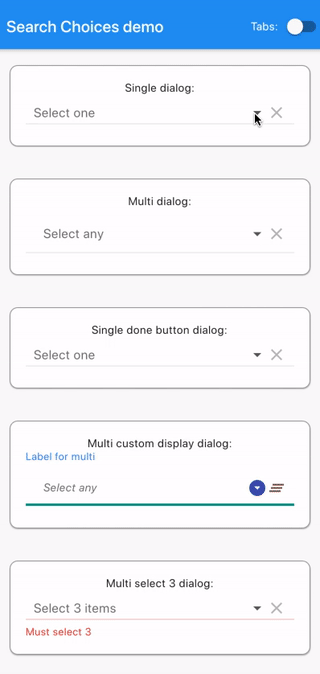 |
| [Multi dialog](#Multi-dialog) | 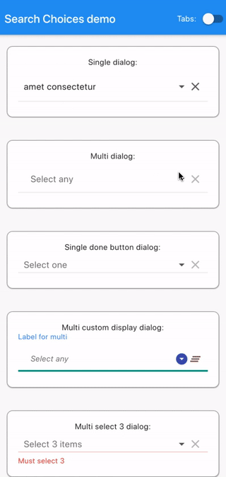 |
| [Single done button dialog](#Single-done-button-dialog) | 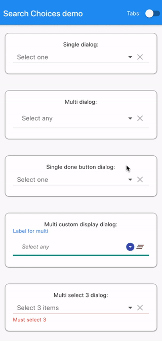 |
| [Multi custom display dialog](#Multi-custom-display-dialog) | 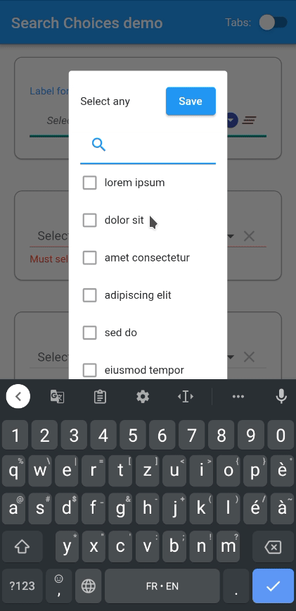 |
| [Multi select 3 dialog](#Multi-select-3-dialog) |  |
| [Single menu](#Single-menu) |  |
| [Multi menu](#Multi-menu) |  |
| [Multi menu select all/none](#Multi-menu-select-allnone) |  |
| [Multi dialog select all/none without clear](#Multi-dialog-select-allnone-without-clear) | 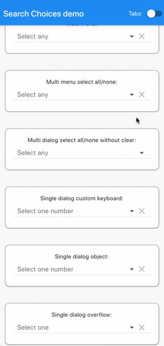 |
| [Single dialog custom keyboard](#Single-dialog-custom-keyboard) | 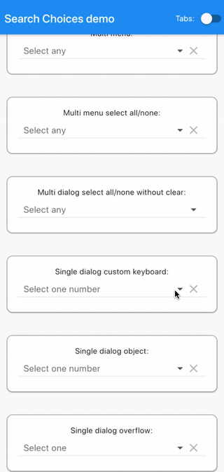 |
| [Single dialog object](#Single-dialog-object) | 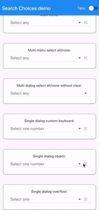 |
| [Single dialog overflow](#Single-dialog-overflow) | 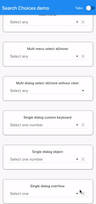 |
| [Single dialog readOnly](#Single-dialog-readOnly) | 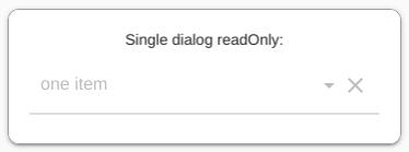 |
| [Single dialog disabled](#Single-dialog-disabled) | 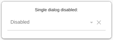 |
| [Single dialog editable items](#Single-dialog-editable-items) | 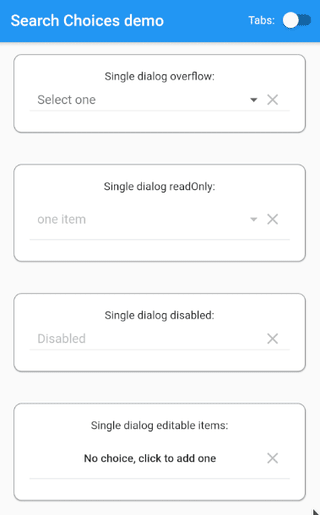 |
| [Single menu editable items](#Single-menu-editable-items) | 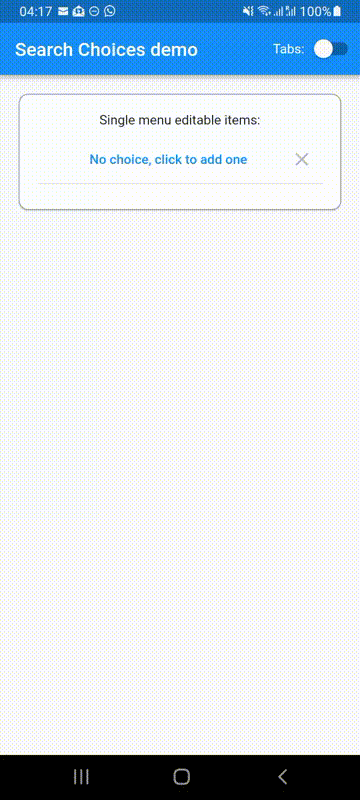 |
| [Multi dialog editable items](#Multi-dialog-editable-items) | 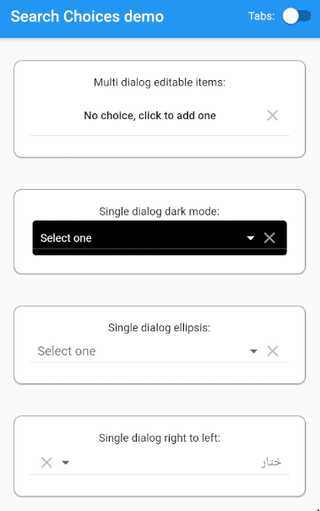 |
| [Single dialog dark mode](#Single-dialog-dark-mode) | 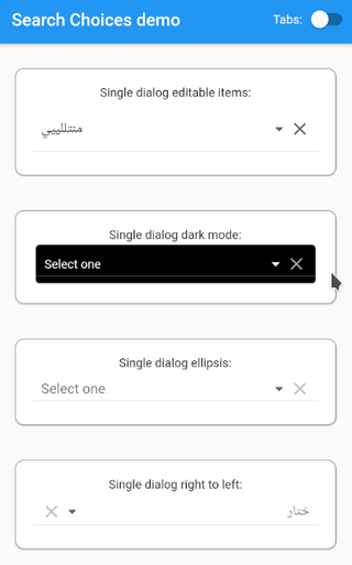 |
| [Single dialog ellipsis](#Single-dialog-ellipsis) |  |
| [Single dialog right to left](#Single-dialog-right-to-left) |  |
| [Update value from outside the plugin](#Update-value-from-outside-the-plugin) | 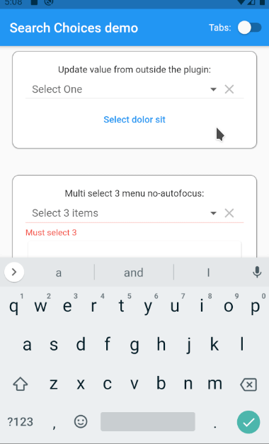 |
| [Multi select 3 menu no-autofocus](#Multi-select-3-menu-no-autofocus) | 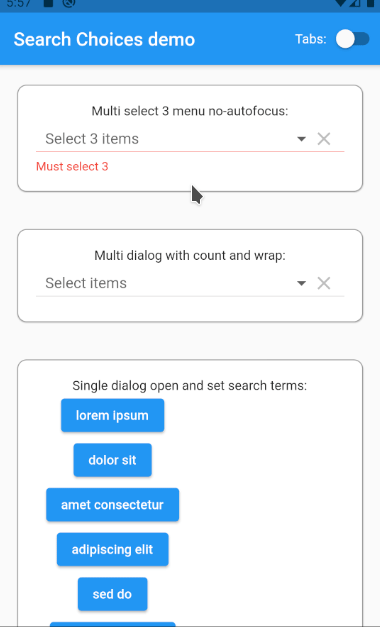 |
| [Multi dialog with count and wrap](#Multi-dialog-with-count-and-wrap) | 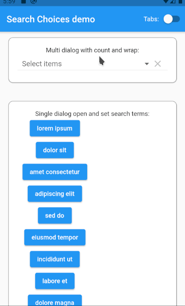 |
| [Single dialog open and set search terms](#Single-dialog-open-and-set-search-terms) | 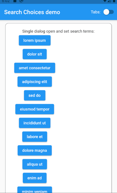 |
| [Single dialog custom dialog](#Single-dialog-custom-dialog) | 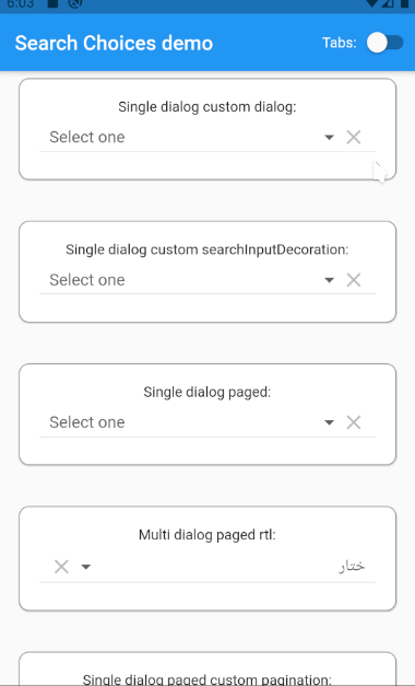 |
| [Single dialog custom decorations](#Single-dialog-custom-decorations) | 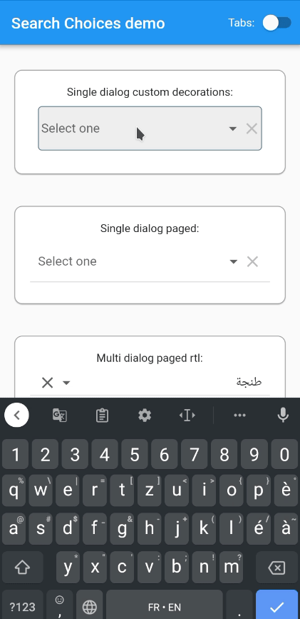 |
| [Single dialog paged](#Single-dialog-paged) | 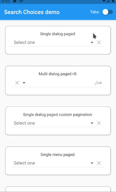 |
| [Multi dialog paged rtl](#Multi-dialog-paged-rtl) | 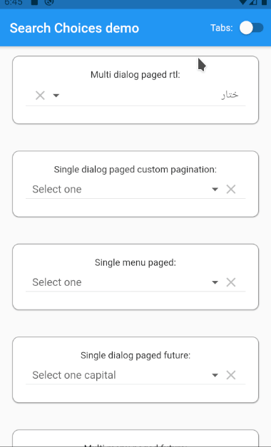 |
| [Single dialog paged custom pagination](#Single-dialog-paged-custom-pagination) | 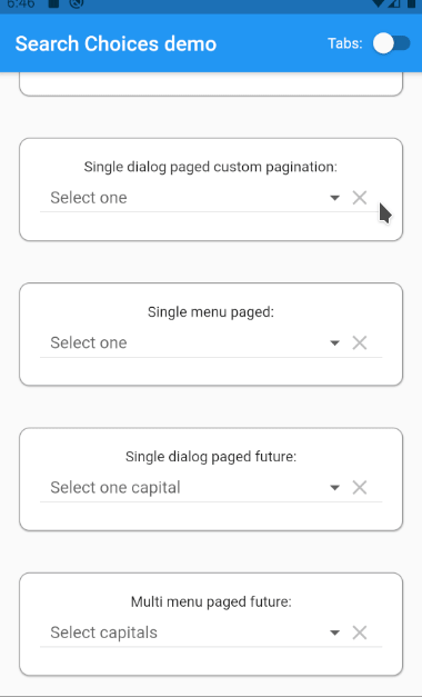 |
| [Single menu paged](#Single-menu-paged) | 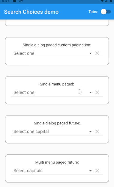 |
| [Single dialog paged future](#Single-dialog-paged-future) | 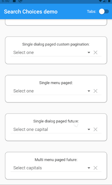 |
| [Multi menu paged future](#Multi-menu-paged-future) | 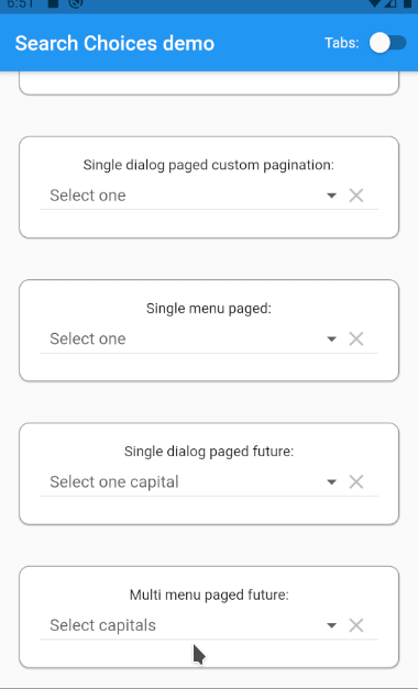 |
| [Single dialog custom empty list](#Single-dialog-custom-empty-list) | 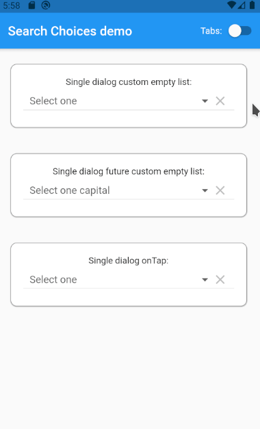 |
| [Single dialog future custom empty list](#Single-dialog-future-custom-empty-list) | 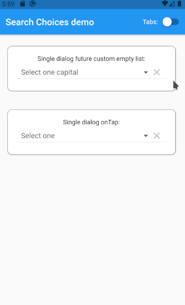 |
| [Single dialog onTap](#Single-dialog-onTap) | 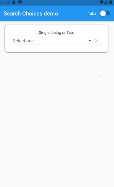 |
| [Multi dialog paged future](#Multi-dialog-paged-future) | 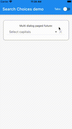 |
| [Single dialog future custom error button](#Single-dialog-future-custom-error-button) | 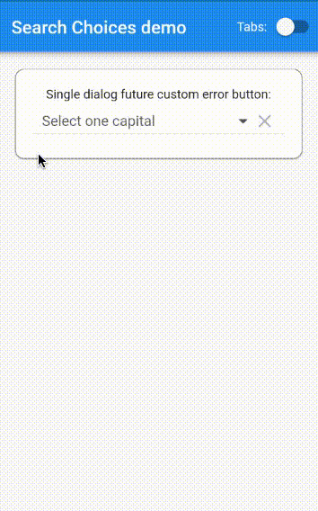 |
| [Single dialog paged delayed](#Single-dialog-paged-delayed) | 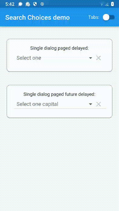 |
| [Single dialog paged future delayed](#Single-dialog-paged-future-delayed) | 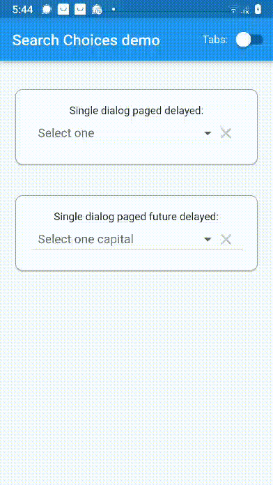 |
| [Single dialog custom field presentation](#Single-dialog-custom-field-presentation) | 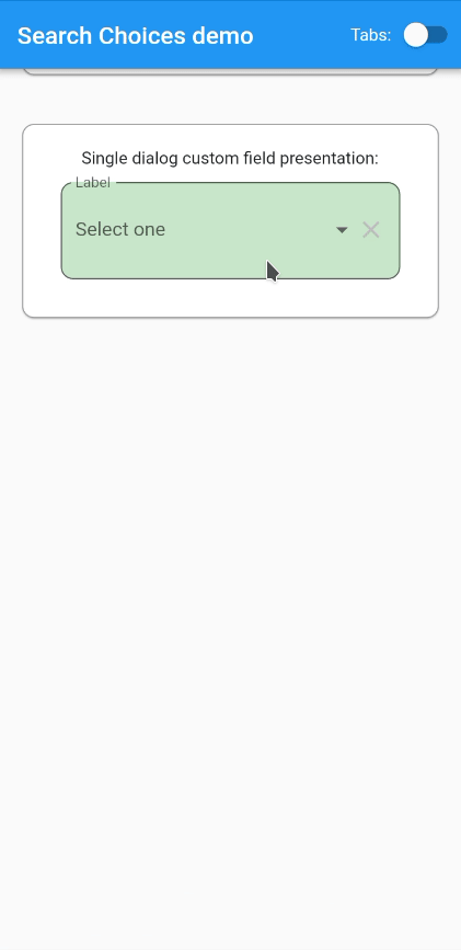 |
| [Single custom showDialogFn](#Single-custom-showDialogFn) | 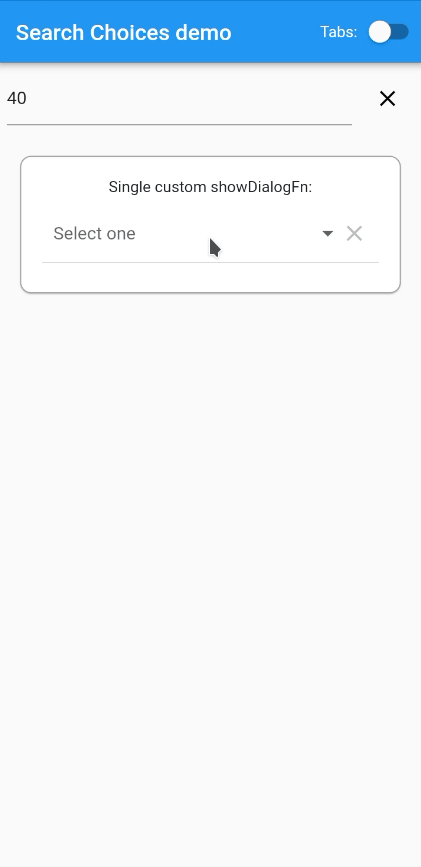 |
| [Validator in form](#Validator-in-form) | 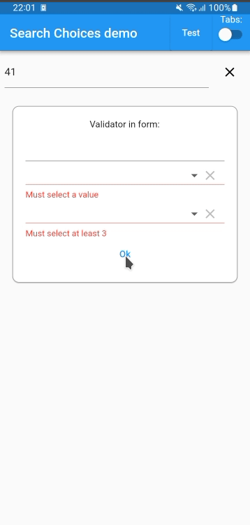 |
### Code
#### Plugin usage
Add to your `pubspec.yaml` in the `dependencies` section:
```
search_choices:
```
Get packages with command:
```
flutter packages get
```
Import:
```dart
import 'package:search_choices/search_choices.dart';
```
Call either the single choice or the multiple choice constructor.
#### Single choice constructor
Search choices Widget with a single choice that opens a dialog or a menu to let the user do the selection conveniently with a search.
```dart
factory SearchChoices.single({
Key? key,
required List> items,
Function? onChanged,
T? value,
TextStyle? style,
dynamic searchHint,
dynamic hint,
dynamic disabledHint,
dynamic icon = const Icon(Icons.arrow_drop_down),
dynamic underline,
dynamic doneButton,
dynamic label,
dynamic closeButton = "Close",
bool displayClearIcon = true,
Icon clearIcon = const Icon(Icons.clear),
Color? iconEnabledColor,
Color? iconDisabledColor,
double iconSize = 24.0,
bool isExpanded = false,
bool isCaseSensitiveSearch = false,
Function? searchFn,
Function? onClear,
Function? selectedValueWidgetFn,
TextInputType keyboardType = TextInputType.text,
Function? validator,
bool assertUniqueValue = true,
Function? displayItem,
bool dialogBox = true,
BoxConstraints? menuConstraints,
bool readOnly = false,
Color? menuBackgroundColor,
bool rightToLeft = false,
bool autofocus = true,
Function? selectedAggregateWidgetFn,
dynamic padding = 10.0,
Function? setOpenDialog,
Widget Function (Widget titleBar,Widget searchBar, Widget list, Widget closeButton, BuildContext dropDownContext,)? buildDropDownDialog,
EdgeInsets? dropDownDialogPadding,
InputDecoration searchInputDecoration = const InputDecoration(
prefixIcon: Icon(
Icons.search,
size: 24,
),
contentPadding: EdgeInsets.symmetric(vertical: 12),
),
int? itemsPerPage,
PointerThisPlease? currentPage,
Widget Function(Widget listWidget, int totalFilteredItemsNb,
Function updateSearchPage)?
customPaginationDisplay,
Future, int>> Function(
String? keyword,
String? orderBy,
bool? orderAsc,
List>? filters,
int? pageNb)?
futureSearchFn,
Map>? futureSearchOrderOptions,
Map>? futureSearchFilterOptions,
dynamic emptyListWidget,
Function? onTap,
Function? futureSearchRetryButton,
int? searchDelay,
Widget Function(Widget fieldWidget,{bool selectionIsValid})? fieldPresentationFn,
Decoration? fieldDecoration,
Widget? clearSearchIcon,
Future Function(
BuildContext context,
Widget Function({
String searchTerms,
})
menuWidget,
String searchTerms,
)?
showDialogFn,
FormFieldSetter? onSaved,
AutovalidateMode autovalidateMode = AutovalidateMode.onUserInteraction,
String? restorationId,
Function(Function pop)? giveMeThePop,
})
```
* items with child: Widget displayed ; value: any object with .toString() used to match search keyword.
* onChanged Function with parameter: value not returning executed after the selection is done.
* value value to be preselected.
* style used for the hint if it is given is String.
* searchHint String|Widget|Function with no parameter returning String|Widget displayed at the top of the search dialog box.
* hint String|Widget|Function with no parameter returning String|Widget displayed before any value is selected or after the selection is cleared.
* disabledHint String|Widget|Function with no parameter returning String|Widget displayed instead of hint when the widget is displayed.
* icon String|Widget|Function with parameter: value returning String|Widget displayed next to the selected item or the hint if none.
* underline String|Widget|Function with parameter: value returning String|Widget displayed below the selected item or the hint if none.
* doneButton String|Widget|Function with parameter: value returning String|Widget displayed at the top of the search dialog box.
* label String|Widget|Function with parameter: value returning String|Widget displayed above the selected item or the hint if none.
* closeButton String|Widget|Function with parameter: value returning String|Widget displayed at the bottom of the search dialog box.
* displayClearIcon whether or not to display an icon to clear the selected value.
* clearIcon Icon to be used for clearing the selected value.
* iconEnabledColor Color to be used for enabled icons.
* iconDisabledColor Color to be used for disabled icons.
* iconSize for the icons next to the selected value (icon and clearIcon).
* isExpanded can be necessary to avoid pixel overflows (zebra symptom).
* isCaseSensitiveSearch only used when searchFn is not specified.
* searchFn Function with parameters: keyword, items returning List as the list of indexes for the items to be displayed.
* onClear Function with no parameter not returning executed when the clear icon is tapped.
* selectedValueWidgetFn Function with parameter: item returning Widget to be used to display the selected value.
* keyboardType used for the search.
* validator Function with parameter: value returning String displayed below selected value when not valid and null when valid.
* assertUniqueValue whether to run a consistency check of the list of items.
* displayItem Function with parameters: item, selected returning Widget to be displayed in the search list.
* dialogBox whether the search should be displayed as a dialog box or as a menu below the selected value if any.
* menuConstraints BoxConstraints used to define the zone where to display the search menu. Example: BoxConstraints.tight(Size.fromHeight(250)) . Not to be used for dialogBox = true.
* readOnly bool whether to let the user choose the value to select or just present the selected value if any.
* menuBackgroundColor Color background color of the menu whether in dialog box or menu mode.
* rightToLeft bool mirrors the widgets display for right to left languages defaulted to false.
* autofocus bool automatically focuses on the search field bringing up the keyboard defaulted to true.
* selectedAggregateWidgetFn Function with parameter: list of widgets presenting selected values, returning Widget to be displayed to present the selected items.
* padding double or EdgeInsets sets the padding around the DropdownButton, defaulted to 10.0.
* setOpenDialog Function sets the function to call to set the function to call in order to open the dialog with the search terms string as a parameter, defaulted to null.
* buildDropDownDialog Function controls the layout of the dropdown dialog.
* dropDownDialogPadding EdgeInsets sets the padding between the screen and the dialog.
* searchInputDecoration InputDecoration sets the search bar decoration.
* itemsPerPage int if set, organizes the search list per page with the given number of items displayed per page.
* currentPage PointerThisPlease of an int if itemsPerPage is set, holds the page number for the search items to be displayed.
* customPaginationDisplay Widget Function(Widget listWidget, int totalFilteredItemsNb, Function updateSearchPage) if itemsPerPage is set, customizes the display and the handling of the pagination on the search list.
* futureSearchFn Function used to search items from the network. Must return items (up to itemsPerPage if set). Must return an int with the total number of results (allows the handling of pagination).
* futureSearchOrderOptions Map when futureSearchFn is set, can be used to display search order options specified in the form {"order1Name":{"icon":order1IconWidget,"asc":true},}. Please refer to the documentation example: https://github.com/lcuis/search_choices/blob/master/example/lib/main.dart.
* futureSearchFilterOptions Map when futureSearchFn is set, can be used to display search filters specified in the form {"filter1Name":{"icon":filter1IconWidget,"values":["value1",{"value2":filter1Value2Widget}}}. Please refer to the documentation example: https://github.com/lcuis/search_choices/blob/master/example/lib/main.dart.
* emptyListWidget String|Widget|Function with parameter: keyword returning String|Widget displayed instead of the list of items in case it is empty.
* onTap Function called when the user clicks on the Widget before it opens the dialog or the menu. Note that this is not called in case the Widget is disabled.
* futureSearchRetryButton Function called to customize the Error - retry button displayed when there is an issue with the future search.
* searchDelay int in milliseconds applied before the search is initiated. This applies to future and non-future searches.
* fieldPresentationFn Function returning a Widget to customize the display of the field.
* fieldDecoration Decoration is the decoration of the SearchChoices Widget while displaying the hints or the selected values. Should differ when selection is not valid.
* clearSearchIcon Widget sets the icon to be used to clear the search.
* showDialogFn Function allows the control of the dialog display.
* onSaved as in FormField.
* autovalidateMode as in FormField.
* restorationId as in FormField.
* giveMeThePop Function to pass the pop function so that the menu or dialog can be closed from outside the widget.
#### Multiple choice constructor
Search choices Widget with a multiple choice that opens a dialog or a menu to let the user do the selection conveniently with a search.
```dart
factory SearchChoices.multiple({
Key? key,
required List> items,
Function? onChanged,
List selectedItems = const [],
TextStyle? style,
dynamic searchHint,
dynamic hint,
dynamic disabledHint,
dynamic icon = const Icon(Icons.arrow_drop_down),
dynamic underline,
dynamic doneButton = "Done",
dynamic label,
dynamic closeButton = "Close",
bool displayClearIcon = true,
Icon clearIcon = const Icon(Icons.clear),
Color? iconEnabledColor,
Color? iconDisabledColor,
double iconSize = 24.0,
bool isExpanded = false,
bool isCaseSensitiveSearch = false,
Function? searchFn,
Function? onClear,
Function? selectedValueWidgetFn,
TextInputType keyboardType = TextInputType.text,
Function? validator,
Function? displayItem,
bool dialogBox = true,
BoxConstraints? menuConstraints,
bool readOnly = false,
Color? menuBackgroundColor,
bool rightToLeft = false,
bool autofocus = true,
Function? selectedAggregateWidgetFn,
dynamic padding = 10.0,
Function? setOpenDialog,
Widget Function (Widget titleBar,Widget searchBar, Widget list, Widget closeButton, BuildContext dropDownContext,)? buildDropDownDialog,
EdgeInsets? dropDownDialogPadding,
InputDecoration searchInputDecoration = const InputDecoration(
prefixIcon: Icon(
Icons.search,
size: 24,
),
contentPadding: EdgeInsets.symmetric(vertical: 12),
),
int? itemsPerPage,
PointerThisPlease? currentPage,
Widget Function(Widget listWidget, int totalFilteredItemsNb,
Function updateSearchPage)?
customPaginationDisplay,
Future, int>> Function(
String? keyword,
String? orderBy,
bool? orderAsc,
List>? filters,
int? pageNb)?
futureSearchFn,
Map>? futureSearchOrderOptions,
Map>? futureSearchFilterOptions,
List? futureSelectedValues,
dynamic emptyListWidget,
Function? onTap,
Function? futureSearchRetryButton,
int? searchDelay,
Widget Function(Widget fieldWidget,{bool selectionIsValid})? fieldPresentationFn,
Decoration? fieldDecoration,
Widget? clearSearchIcon,
Future Function(
BuildContext context,
Widget Function({
String searchTerms,
})
menuWidget,
String searchTerms,
)?
showDialogFn,
FormFieldSetter? onSaved,
String? Function(List)? listValidator,
AutovalidateMode autovalidateMode = AutovalidateMode.onUserInteraction,
String? restorationId,
Function(Function pop)? giveMeThePop,
})
```
* items with child: Widget displayed ; value: any object with .toString() used to match search keyword.
* onChanged Function with parameter: selectedItems not returning executed after the selection is done.
* selectedItems indexes of items to be preselected.
* style used for the hint if it is given is String.
* searchHint String|Widget|Function with no parameter returning String|Widget displayed at the top of the search dialog box.
* hint String|Widget|Function with no parameter returning String|Widget displayed before any value is selected or after the selection is cleared.
* disabledHint String|Widget|Function with no parameter returning String|Widget displayed instead of hint when the widget is displayed.
* icon String|Widget|Function with parameter: selectedItems returning String|Widget displayed next to the selected items or the hint if none.
* underline String|Widget|Function with parameter: selectedItems returning String|Widget displayed below the selected items or the hint if none.
* doneButton String|Widget|Function with parameter: selectedItems returning String|Widget displayed at the top of the search dialog box. Cannot be null in multiple selection mode.
* label String|Widget|Function with parameter: selectedItems returning String|Widget displayed above the selected items or the hint if none.
* closeButton String|Widget|Function with parameter: selectedItems returning String|Widget displayed at the bottom of the search dialog box.
* displayClearIcon whether or not to display an icon to clear the selected values.
* clearIcon Icon to be used for clearing the selected values.
* iconEnabledColor Color to be used for enabled icons.
* iconDisabledColor Color to be used for disabled icons.
* iconSize for the icons next to the selected values (icon and clearIcon).
* isExpanded can be necessary to avoid pixel overflows (zebra symptom).
* isCaseSensitiveSearch only used when searchFn is not specified.
* searchFn Function with parameters: keyword, items returning List as the list of indexes for the items to be displayed.
* onClear Function with no parameter not returning executed when the clear icon is tapped.
* selectedValueWidgetFn Function with parameter: item returning Widget to be used to display the selected values.
* keyboardType used for the search.
* validator Function with parameter: selectedItems returning String displayed below selected values when not valid and null when valid.
* displayItem Function with parameters: item, selected returning Widget to be displayed in the search list.
* dialogBox whether the search should be displayed as a dialog box or as a menu below the selected values if any.
* menuConstraints BoxConstraints used to define the zone where to display the search menu. Example: BoxConstraints.tight(Size.fromHeight(250)) . Not to be used for dialogBox = true.
* readOnly bool whether to let the user choose the value to select or just present the selected value if any.
* menuBackgroundColor Color background color of the menu whether in dialog box or menu mode.
* rightToLeft bool mirrors the widgets display for right to left languages defaulted to false.
* autofocus bool automatically focuses on the search field bringing up the keyboard defaulted to true.
* selectedAggregateWidgetFn Function with parameter: list of widgets presenting selected values, returning Widget to be displayed to present the selected items.
* padding double or EdgeInsets sets the padding around the DropdownButton, defaulted to 10.0.
* setOpenDialog Function sets the function to call to set the function to call in order to open the dialog with the search terms string as a parameter, defaulted to null.
* buildDropDownDialog Function controls the layout of the dropdown dialog.
* dropDownDialogPadding EdgeInsets sets the padding between the screen and the dialog.
* searchInputDecoration InputDecoration sets the search bar decoration.
* itemsPerPage int if set, organizes the search list per page with the given number of items displayed per page.
* currentPage PointerThisPlease if itemsPerPage is set, holds the page number for the search items to be displayed.
* customPaginationDisplay Widget Function(Widget listWidget, int totalFilteredItemsNb, Function updateSearchPage) if itemsPerPage is set, customizes the display and the handling of the pagination on the search list.
* futureSearchFn Future Function(String keyword, List itemsListToClearAndFill, int pageNb) used to search items from the network. Must return items (up to itemsPerPage if set). Must return an int with the total number of results (allows the handling of pagination).
* futureSearchOrderOptions Map> when futureSearchFn is set, can be used to display search order options specified in the form {"order1Name":{"icon":order1IconWidget,"asc":true},}. Please refer to the documentation example: https://github.com/lcuis/search_choices/blob/master/example/lib/main.dart.
* futureSearchFilterOptions Map> when futureSearchFn is set, can be used to display search filters specified in the form {"filter1Name":{"icon":filter1IconWidget,"values":["value1",{"value2":filter1Value2Widget}}}. Please refer to the documentation example: https://github.com/lcuis/search_choices/blob/master/example/lib/main.dart.
* futureSelectedValues List contains the list of selected values in case of future search in multiple selection mode.
* emptyListWidget String|Widget|Function with parameter: keyword returning String|Widget displayed instead of the list of items in case it is empty.
* onTap Function called when the user clicks on the Widget before it opens the dialog or the menu. Note that this is not called in case the Widget is disabled.
* futureSearchRetryButton Function called to customize the Error - retry button displayed when there is an issue with the future search.
* searchDelay int in milliseconds applied before the search is initiated. This applies to future and non-future searches.
* fieldPresentationFn Function returning a Widget to customize the display of the field.
* fieldDecoration Decoration is the decoration of the SearchChoices Widget while displaying the hints or the selected values. Should differ when selection is not valid.
* clearSearchIcon Widget sets the icon to be used to clear the search.
* showDialogFn Function allows the control of the dialog display.
* onSaved as in FormField.
* listValidator Function with parameter: List returning String displayed below selected value when not valid and null when valid.
* autovalidateMode as in FormField.
* restorationId as in FormField.
* giveMeThePop Function to pass the pop function so that the menu or dialog can be closed from outside the widget.
#### Example app usage
Clone repository:
```
git clone https://github.com/lcuis/search_choices.git
```
Go to plugin folder:
```
cd search_choices
```
Optionally enable web:
```
flutter config --enable-web
```
Create project:
```
flutter create .
```
To run automated tests:
```
flutter test
```
Optionally generate documentation:
```
pub global activate dartdoc
dartdoc
```
Go to example app folder:
```
cd example
```
To run web:
```
run -d chrome
```
To build web to folder `build/web`:
```
flutter build web
```
To run on a connected device:
```
flutter run
```
To build Android app to `build/app/outputs/apk/release/app-release.apk`:
```
flutter build apk
```
To build iOS app on Mac:
```
flutter build ios
```
#### Single dialog
```dart
SearchChoices.single(
items: items,
value: selectedValueSingleDialog,
hint: "Select one",
searchHint: "Select one",
onChanged: (value) {
setState(() {
selectedValueSingleDialog = value;
});
},
isExpanded: true,
)
```
#### Multi dialog
```dart
SearchChoices.multiple(
items: items,
selectedItems: selectedItemsMultiDialog,
hint: Padding(
padding: const EdgeInsets.all(12.0),
child: Text("Select any"),
),
searchHint: "Select any",
onChanged: (value) {
setState(() {
selectedItemsMultiDialog = value;
});
},
closeButton: (selectedItems) {
return (selectedItems.isNotEmpty
? "Save ${selectedItems.length == 1 ? '"' + items[selectedItems.first].value.toString() + '"' : '(' + selectedItems.length.toString() + ')'}"
: "Save without selection");
},
isExpanded: true,
)
```
#### Single done button dialog
```dart
SearchChoices.single(
items: items,
value: selectedValueSingleDoneButtonDialog,
hint: "Select one",
searchHint: "Select one",
onChanged: (value) {
setState(() {
selectedValueSingleDoneButtonDialog = value;
});
},
doneButton: "Done",
displayItem: (item, selected) {
return (Row(children: [
selected
? Icon(
Icons.radio_button_checked,
color: Colors.grey,
)
: Icon(
Icons.radio_button_unchecked,
color: Colors.grey,
),
SizedBox(width: 7),
Expanded(
child: item,
),
]));
},
isExpanded: true,
)
```
#### Multi custom display dialog
```dart
SearchChoices.multiple(
items: items,
selectedItems: selectedItemsMultiCustomDisplayDialog,
hint: Padding(
padding: const EdgeInsets.all(12.0),
child: Text("Select any"),
),
searchHint: "Select any",
onChanged: (value) {
setState(() {
selectedItemsMultiCustomDisplayDialog = value;
});
},
displayItem: (item, selected) {
return (Row(children: [
selected
? Icon(
Icons.check,
color: Colors.green,
)
: Icon(
Icons.check_box_outline_blank,
color: Colors.grey,
),
SizedBox(width: 7),
Expanded(
child: item,
),
]));
},
selectedValueWidgetFn: (item) {
return (Center(
child: Card(
shape: RoundedRectangleBorder(
borderRadius: BorderRadius.circular(10),
side: BorderSide(
color: Colors.brown,
width: 0.5,
),
),
margin: EdgeInsets.all(12),
child: Padding(
padding: const EdgeInsets.all(8),
child: Text(item.toString()),
))));
},
doneButton: (selectedItemsDone, doneContext) {
return (ElevatedButton(
onPressed: () {
Navigator.pop(doneContext);
setState(() {});
},
child: Text("Save")));
},
closeButton: null,
style: TextStyle(fontStyle: FontStyle.italic),
searchFn: (String keyword, items) {
List ret = [];
if (items != null && keyword.isNotEmpty) {
keyword.split(" ").forEach((k) {
int i = 0;
items.forEach((item) {
if (k.isNotEmpty &&
(item.value
.toString()
.toLowerCase()
.contains(k.toLowerCase()))) {
ret.add(i);
}
i++;
});
});
}
if (keyword.isEmpty) {
ret = Iterable.generate(items.length).toList();
}
return (ret);
},
clearIcon: Icon(Icons.clear_all),
icon: Icon(Icons.arrow_drop_down_circle),
label: "Label for multi",
underline: Container(
height: 1.0,
decoration: BoxDecoration(
border:
Border(bottom: BorderSide(color: Colors.teal, width: 3.0))),
),
iconDisabledColor: Colors.brown,
iconEnabledColor: Colors.indigo,
dropDownDialogPadding: EdgeInsets.symmetric(
vertical: 80,
horizontal: 80,
),
isExpanded: true,
)
```
#### Multi select 3 dialog
```dart
SearchChoices.multiple(
items: items,
selectedItems: selectedItemsMultiSelect3Dialog,
hint: "Select 3 items",
searchHint: "Select 3",
validator: (selectedItemsForValidator) {
if (selectedItemsForValidator.length != 3) {
return ("Must select 3");
}
return (null);
},
onChanged: (value) {
setState(() {
selectedItemsMultiSelect3Dialog = value;
});
},
doneButton: (selectedItemsDone, doneContext) {
return (ElevatedButton(
onPressed: selectedItemsDone.length != 3
? null
: () {
Navigator.pop(doneContext);
setState(() {});
},
child: Text("Save")));
},
closeButton: (selectedItemsClose) {
return (selectedItemsClose.length == 3 ? "Ok" : null);
},
isExpanded: true,
)
```
#### Single menu
```dart
SearchChoices.single(
items: items,
value: selectedValueSingleMenu,
hint: "Select one",
searchHint: null,
onChanged: (value) {
setState(() {
selectedValueSingleMenu = value;
});
},
dialogBox: false,
isExpanded: true,
menuConstraints: BoxConstraints.tight(Size.fromHeight(350)),
)
```
#### Multi menu
```dart
SearchChoices.multiple(
items: items,
selectedItems: selectedItemsMultiMenu,
hint: "Select any",
searchHint: "",
doneButton: "Close",
closeButton: SizedBox.shrink(),
onChanged: (value) {
setState(() {
selectedItemsMultiMenu = value;
});
},
dialogBox: false,
isExpanded: true,
menuConstraints: BoxConstraints.tight(Size.fromHeight(350)),
)
```
#### Multi menu select all/none
```dart
SearchChoices.multiple(
items: items,
selectedItems: selectedItemsMultiMenuSelectAllNone,
hint: "Select any",
searchHint: "Select any",
onChanged: (value) {
setState(() {
selectedItemsMultiMenuSelectAllNone = value;
});
},
dialogBox: false,
closeButton: (selectedItemsClose, closeContext, Function updateParent) {
return Row(
mainAxisAlignment: MainAxisAlignment.spaceBetween,
children: [
ElevatedButton(
onPressed: () {
setState(() {
selectedItemsClose.clear();
selectedItemsClose.addAll(
Iterable.generate(items.length).toList());
});
updateParent(selectedItemsClose);
},
child: Text("Select all")),
ElevatedButton(
onPressed: () {
setState(() {
selectedItemsClose.clear();
});
updateParent(selectedItemsClose);
},
child: Text("Select none")),
],
);
},
isExpanded: true,
menuConstraints: BoxConstraints.tight(Size.fromHeight(350)),
)
```
#### Multi dialog select all/none without clear
```dart
SearchChoices.multiple(
items: items,
selectedItems: selectedItemsMultiDialogSelectAllNoneWoClear,
hint: "Select any",
searchHint: "Select any",
displayClearIcon: false,
onChanged: (value) {
setState(() {
selectedItemsMultiDialogSelectAllNoneWoClear = value;
});
},
dialogBox: true,
closeButton: (selectedItemsClose, closeContext, Function updateParent) {
return Row(
mainAxisAlignment: MainAxisAlignment.spaceBetween,
children: [
ElevatedButton(
onPressed: () {
setState(() {
selectedItemsClose.clear();
selectedItemsClose.addAll(
Iterable.generate(items.length).toList());
});
updateParent(selectedItemsClose);
},
child: Text("Select all")),
ElevatedButton(
onPressed: () {
setState(() {
selectedItemsClose.clear();
});
updateParent(selectedItemsClose);
},
child: Text("Select none")),
],
);
},
isExpanded: true,
)
```
#### Single dialog custom keyboard
```dart
SearchChoices.single(
items: Iterable.generate(20).toList().map((i) {
return (DropdownMenuItem(
child: Text(i.toString()),
value: i.toString(),
));
}).toList(),
value: selectedValueSingleDialogCustomKeyboard,
hint: "Select one number",
searchHint: "Select one number",
onChanged: (value) {
setState(() {
selectedValueSingleDialogCustomKeyboard = value;
});
},
dialogBox: true,
keyboardType: TextInputType.number,
isExpanded: true,
)
```
#### Single dialog object
```dart
SearchChoices.single(
items: numberItems,
value: selectedNumber,
hint: "Select one number",
searchHint: "Select one number",
onChanged: (value) {
setState(() {
selectedNumber = value;
});
},
dialogBox: true,
isExpanded: true,
)
```
#### Single dialog overflow
```dart
SearchChoices.single(
items: [
DropdownMenuItem(
child: Text(
"way too long text for a smartphone at least one that goes in a normal sized pair of trousers but maybe not for a gigantic screen like there is one at my cousin's home in a very remote country where I wouldn't want to go right now"),
value:
"way too long text for a smartphone at least one that goes in a normal sized pair of trousers but maybe not for a gigantic screen like there is one at my cousin's home in a very remote country where I wouldn't want to go right now",
)
],
value: selectedValueSingleDialogOverflow,
hint: "Select one",
searchHint: "Select one",
onChanged: (value) {
setState(() {
selectedValueSingleDialogOverflow = value;
});
},
dialogBox: true,
isExpanded: true,
)
```
#### Single dialog readOnly
```dart
SearchChoices.single(
items: [
DropdownMenuItem(
child: Text("one item"),
value: "one item",
)
],
value: "one item",
hint: "Select one",
searchHint: "Select one",
disabledHint: "Disabled",
onChanged: (value) {
setState(() {});
},
dialogBox: true,
isExpanded: true,
readOnly: true,
)
```
#### Single dialog disabled
```dart
SearchChoices.single(
items: [
DropdownMenuItem(
child: Text("one item"),
value: "one item",
)
],
value: "one item",
hint: "Select one",
searchHint: "Select one",
disabledHint: "Disabled",
onChanged: null,
dialogBox: true,
isExpanded: true,
)
```
#### Single dialog editable items
This example lets the user add and remove items to and from the list of choices within a dialog. One can limit the number of items that can be added (100 here).
```dart
input = TextFormField(
validator: (value) {
return ((value?.length ?? 0) < 6
? "must be at least 6 characters long"
: null);
},
initialValue: inputString,
onChanged: (value) {
inputString = value;
},
autofocus: true,
);
...
addItemDialog() async {
return await showDialog(
context: MyApp.navKey.currentState?.overlay?.context ?? context,
builder: (BuildContext alertContext) {
return (AlertDialog(
title: Text("Add an item"),
content: Form(
key: _formKey,
child: Column(
mainAxisSize: MainAxisSize.min,
children: [
input ?? SizedBox.shrink(),
TextButton(
onPressed: () {
if (_formKey.currentState?.validate() ?? false) {
setState(() {
editableItems.add(DropdownMenuItem(
child: Text(inputString),
value: inputString,
));
});
Navigator.pop(alertContext, inputString);
}
},
child: Text("Ok"),
),
TextButton(
onPressed: () {
Navigator.pop(alertContext, null);
},
child: Text("Cancel"),
),
],
),
),
));
},
);
}
...
SearchChoices.single(
items: editableItems,
value: selectedValueSingleDialogEditableItems,
hint: "Select one",
searchHint: "Select one",
disabledHint: (Function updateParent) {
return (TextButton(
onPressed: () {
addItemDialog().then((value) async {
updateParent(value);
});
},
child: Text("No choice, click to add one"),
));
},
closeButton:
(String? value, BuildContext closeContext, Function updateParent) {
return (editableItems.length >= 100
? "Close"
: TextButton(
onPressed: () {
addItemDialog().then((value) async {
if (value != null &&
editableItems.indexWhere(
(element) => element.value == value) !=
-1) {
Navigator.pop(
MyApp.navKey.currentState?.overlay?.context ??
context);
updateParent(value);
}
});
},
child: Text("Add and select item"),
));
},
onChanged: (String? value) {
setState(() {
if (!(value is NotGiven)) {
selectedValueSingleDialogEditableItems = value;
}
});
},
displayItem: (item, selected, Function updateParent) {
return (Row(children: [
selected
? Icon(
Icons.check,
color: Colors.green,
)
: Icon(
Icons.check_box_outline_blank,
color: Colors.transparent,
),
SizedBox(width: 7),
Expanded(
child: item,
),
IconButton(
icon: Icon(
Icons.delete,
color: Colors.red,
),
onPressed: () {
editableItems.removeWhere((element) => item == element);
updateParent(null);
setState(() {});
},
),
]));
},
dialogBox: true,
isExpanded: true,
doneButton: "Done",
)
```
#### Single menu editable items
This example lets the user add and remove items to and from the list of choices within a menu. One can limit the number of items that can be added (100 here).
```dart
SearchChoices.single(
items: editableItems,
value: selectedValueSingleMenuEditableItems,
hint: "Select one",
searchHint: "Select one",
disabledHint: (Function updateParent) {
return (TextButton(
onPressed: () {
addItemDialog().then((value) async {
updateParent(value);
});
},
child: Text("No choice, click to add one"),
));
},
closeButton:
(String? value, BuildContext closeContext, Function updateParent) {
return (editableItems.length >= 100
? "Close"
: TextButton(
onPressed: () {
addItemDialog().then((value) async {
if (value != null &&
editableItems.indexWhere(
(element) => element.value == value) !=
-1) {
updateParent(value, true);
}
});
},
child: Text("Add and select item"),
));
},
onChanged: (String? value, Function? pop) {
setState(() {
if (!(value is NotGiven)) {
selectedValueSingleMenuEditableItems = value;
}
});
if (pop != null && !(value is NotGiven) && value != null) {
pop();
}
},
displayItem: (DropdownMenuItem item, selected, Function updateParent) {
bool deleteRequested = false;
return ListTile(
leading: selected
? Icon(
Icons.check,
color: Colors.green,
)
: Icon(
Icons.check_box_outline_blank,
color: Colors.transparent,
),
title: item,
trailing: IconButton(
icon: Icon(
Icons.delete,
color: Colors.red,
),
onPressed: () {
deleteRequested = true;
editableItems.removeWhere((element) => item == element);
updateParent(selected ? null : NotGiven(), false);
setState(() {});
},
),
onTap: () {
if (!deleteRequested) {
updateParent(item.value, true);
}
},
horizontalTitleGap: 0,
);
},
dialogBox: false,
isExpanded: true,
doneButton: "Done",
menuConstraints: BoxConstraints.tight(Size.fromHeight(350)),
)
```
#### Multi dialog editable items
Same example as previously but with multiple selection.
```dart
input = TextFormField(
validator: (value) {
return ((value?.length ?? 0) < 6
? "must be at least 6 characters long"
: null);
},
initialValue: inputString,
onChanged: (value) {
inputString = value;
},
autofocus: true,
);
super.initState();
}
...
addItemDialog() async {
return await showDialog(
context: MyApp.navKey.currentState?.overlay?.context ?? context,
builder: (BuildContext alertContext) {
return (AlertDialog(
title: Text("Add an item"),
content: Form(
key: _formKey,
child: Column(
mainAxisSize: MainAxisSize.min,
children: [
input ?? SizedBox.shrink(),
TextButton(
onPressed: () {
if (_formKey.currentState?.validate() ?? false) {
setState(() {
editableItems.add(DropdownMenuItem(
child: Text(inputString),
value: inputString,
));
});
Navigator.pop(alertContext, inputString);
}
},
child: Text("Ok"),
),
TextButton(
onPressed: () {
Navigator.pop(alertContext, null);
},
child: Text("Cancel"),
),
],
),
),
));
},
);
}
...
SearchChoices.multiple(
items: editableItems,
selectedItems: editableSelectedItems,
hint: "Select any",
searchHint: "Select any",
disabledHint: (Function updateParent) {
return (TextButton(
onPressed: () {
addItemDialog().then((value) async {
if (value != null) {
editableSelectedItems = [0];
updateParent(editableSelectedItems);
}
});
},
child: Text("No choice, click to add one"),
));
},
closeButton: (List values, BuildContext closeContext,
Function updateParent) {
return (editableItems.length >= 100
? "Close"
: TextButton(
onPressed: () {
addItemDialog().then((value) async {
if (value != null) {
int itemIndex = editableItems
.indexWhere((element) => element.value == value);
if (itemIndex != -1) {
editableSelectedItems.add(itemIndex);
Navigator.pop(
MyApp.navKey.currentState?.overlay?.context ??
context);
updateParent(editableSelectedItems);
}
}
});
},
child: Text("Add and select item"),
));
},
onChanged: (values) {
setState(() {
if (!(values is NotGiven)) {
editableSelectedItems = values;
}
});
},
displayItem: (item, selected, Function updateParent) {
return (Row(children: [
selected
? Icon(
Icons.check_box,
color: Colors.black,
)
: Icon(
Icons.check_box_outline_blank,
color: Colors.black,
),
SizedBox(width: 7),
Expanded(
child: item,
),
IconButton(
icon: Icon(
Icons.delete,
color: Colors.red,
),
onPressed: () {
int indexOfItem = editableItems.indexOf(item);
editableItems.removeWhere((element) => item == element);
editableSelectedItems
.removeWhere((element) => element == indexOfItem);
for (int i = 0; i < editableSelectedItems.length; i++) {
if (editableSelectedItems[i] > indexOfItem) {
editableSelectedItems[i]--;
}
}
updateParent(editableSelectedItems);
setState(() {});
},
),
]));
},
dialogBox: true,
isExpanded: true,
doneButton: "Done",
)
```
### Single dialog dark mode
```dart
Card(
color: Colors.black,
child: SearchChoices.single(
items: items.map((item) {
return (DropdownMenuItem(
child: Text(
item.value,
style: TextStyle(color: Colors.white),
),
value: item.value,
));
}).toList(),
value: selectedValueSingleDialogDarkMode,
hint: Text(
"Select one",
style: TextStyle(color: Colors.white),
),
searchHint: Text(
"Select one",
style: TextStyle(color: Colors.white),
),
style: TextStyle(color: Colors.white, backgroundColor: Colors.black),
closeButton: TextButton(
onPressed: () {
Navigator.pop(
MyApp.navKey.currentState?.overlay?.context ?? context);
},
child: Text(
"Close",
style: TextStyle(color: Colors.white),
),
),
menuBackgroundColor: Colors.black,
iconEnabledColor: Colors.white,
iconDisabledColor: Colors.grey,
onChanged: (value) {
setState(() {
selectedValueSingleDialogDarkMode = value;
});
},
isExpanded: true,
),
)
```
### Single dialog ellipsis
```dart
SearchChoices.single(
items: [
DropdownMenuItem(
child: Text(
"way too long text for a smartphone at least one that goes in a normal sized pair of trousers but maybe not for a gigantic screen like there is one at my cousin's home in a very remote country where I wouldn't want to go right now",
overflow: TextOverflow.ellipsis,
),
value:
"way too long text for a smartphone at least one that goes in a normal sized pair of trousers but maybe not for a gigantic screen like there is one at my cousin's home in a very remote country where I wouldn't want to go right now",
)
],
value: selectedValueSingleDialogEllipsis,
hint: "Select one",
searchHint: "Select one",
onChanged: (value) {
setState(() {
selectedValueSingleDialogEllipsis = value;
});
},
selectedValueWidgetFn: (item) {
return DropdownMenuItem(
child: (Text(
item,
overflow: TextOverflow.ellipsis,
)),
);
},
dialogBox: true,
isExpanded: true,
)
```
### Single dialog right to left
In support for Arabic, Hebrew and other RTL languages.
```dart
SearchChoices.single(
items: [
"طنجة",
"فاس",
"أكادير",
"تزنيت",
"آكــلــو",
"سيدي بيبي",
].map>((string) {
return (DropdownMenuItem(
child: Text(
string,
textDirection: TextDirection.rtl,
),
value: string,
));
}).toList(),
value: selectedValueSingleDialogRightToLeft,
hint: Row(
textDirection: TextDirection.rtl,
children: [
Text(
"ختار",
textDirection: TextDirection.rtl,
),
],
),
searchHint: Text(
"ختار",
textDirection: TextDirection.rtl,
),
closeButton: TextButton(
onPressed: () {
Navigator.pop(
MyApp.navKey.currentState?.overlay?.context ?? context);
},
child: SizedBox(
width: 50,
child: Text(
"سدّ",
maxLines: 1,
softWrap: false,
textDirection: TextDirection.rtl,
),
),
),
onChanged: (value) {
setState(() {
selectedValueSingleDialogRightToLeft = value;
});
},
isExpanded: true,
rightToLeft: true,
displayItem: (item, selected) {
return (Row(textDirection: TextDirection.rtl, children: [
selected
? Icon(
Icons.radio_button_checked,
color: Colors.grey,
)
: Icon(
Icons.radio_button_unchecked,
color: Colors.grey,
),
SizedBox(width: 7),
item,
Expanded(
child: SizedBox.shrink(),
),
]));
},
selectedValueWidgetFn: (item) {
return DropdownMenuItem(
child: Row(
textDirection: TextDirection.rtl,
children: [
(Text(
item,
textDirection: TextDirection.rtl,
)),
],
),
);
},
)
```
### Update value from outside the plugin
A button external to the plugin can be used to set the selected value.
```dart
Column(
children: [
SearchChoices.single(
items: items,
value: selectedValueUpdateFromOutsideThePlugin,
hint: Text('Select One'),
searchHint: new Text(
'Select One',
style: new TextStyle(fontSize: 20),
),
onChanged: (value) {
setState(() {
selectedValueUpdateFromOutsideThePlugin = value;
});
},
isExpanded: true,
),
TextButton(
child: Text("Select dolor sit"),
onPressed: () {
setState(() {
selectedValueUpdateFromOutsideThePlugin = "dolor sit";
});
},
),
],
)
```
### Multi select 3 menu no-autofocus
Doesn't bring up the keyboard automatically.
```dart
SearchChoices.multiple(
items: items,
selectedItems: selectedItemsMultiSelect3Menu,
hint: "Select 3 items",
searchHint: "Select 3",
validator: (selectedItemsForValidatorWithMenu) {
if (selectedItemsForValidatorWithMenu.length != 3) {
return ("Must select 3");
}
return (null);
},
onChanged: (value) {
setState(() {
selectedItemsMultiSelect3Menu = value;
});
},
isExpanded: true,
dialogBox: false,
menuConstraints: BoxConstraints.tight(Size.fromHeight(350)),
autofocus: false,
)
```
### Multi dialog with count and wrap
Customization of the way the selection is displayed.
```dart
SearchChoices.multiple(
items: items,
selectedItems: selectedItemsMultiDialogWithCountAndWrap,
hint: "Select items",
searchHint: "Select items",
onChanged: (value) {
setState(() {
selectedItemsMultiDialogWithCountAndWrap = value;
});
},
isExpanded: true,
selectedValueWidgetFn: (item) {
return (Container(
margin: const EdgeInsets.all(15.0),
padding: const EdgeInsets.all(3.0),
decoration:
BoxDecoration(border: Border.all(color: Colors.blueAccent)),
child: Text(
item,
overflow: TextOverflow.ellipsis,
),
));
},
selectedAggregateWidgetFn: (List list) {
return (Column(children: [
Text("${list.length} items selected"),
Wrap(children: list),
]));
},
)
```
### Single dialog open and set search terms
A button external to the plugin can be used to open the dialog and set the search terms.
```dart
SearchChoices.single(
label: Column(
children: items.map((item) {
return (ElevatedButton(
child: item.child,
onPressed: () {
openDialog!(item.value.toString());
},
));
}).toList(),
),
items: items,
value: selectedValueSingleDialog,
hint: "Select one",
searchHint: "Select one",
onChanged: (value) {
setState(() {
selectedValueSingleDialog = value;
});
},
isExpanded: true,
setOpenDialog: (externalOpenDialog) {
openDialog = externalOpenDialog;
},
)
```
### Single dialog custom dialog
Customize the way the dialog is displayed to define how to show the title bar, the search bar, the list and the close button.
```dart
SearchChoices.single(
items: items,
value: selectedValueSingleDialog,
hint: "Select one",
searchHint: "Select one",
onChanged: (value) {
setState(() {
selectedValueSingleDialog = value;
});
},
isExpanded: true,
buildDropDownDialog: (
Widget titleBar,
Widget searchBar,
Widget list,
Widget closeButton,
BuildContext dropDownContext,
) {
return (AnimatedContainer(
padding: MediaQuery.of(dropDownContext).viewInsets,
duration: const Duration(milliseconds: 300),
child: Card(
margin: EdgeInsets.symmetric(vertical: 30, horizontal: 40),
child: Container(
padding: EdgeInsets.symmetric(vertical: 35, horizontal: 45),
child: Column(
mainAxisAlignment: MainAxisAlignment.start,
crossAxisAlignment: CrossAxisAlignment.start,
mainAxisSize: MainAxisSize.min,
children: [
titleBar,
searchBar,
list,
closeButton,
],
),
),
),
));
},
)
```
### Single dialog custom decorations
Can customize the way the search bar and field are displayed.
```dart
items: items,
value: selectedValueSingleDialog,
hint: Padding(
padding: EdgeInsets.all(3),
child: DropdownMenuItem(
child: Text("Select one"),
)),
searchHint: "Select one",
onChanged: (value) {
setState(() {
selectedValueSingleDialog = value;
});
},
isExpanded: true,
searchInputDecoration: InputDecoration(
icon: Icon(Icons.airline_seat_flat),
border: OutlineInputBorder(),
),
fieldDecoration: BoxDecoration(
color: Colors.grey.shade200,
shape: BoxShape.rectangle,
borderRadius: BorderRadius.circular(5),
border: Border.all(
color: Colors.blueGrey,
width: 1,
style: BorderStyle.solid,
),
),
selectedValueWidgetFn: (selectedValue) {
return (Padding(
padding: EdgeInsets.all(3),
child: DropdownMenuItem(child: Text(selectedValue)),
));
},
)
```
### Single dialog paged
Useful when displaying a huge amount of items.
```dart
SearchChoices.single(
items: items,
value: selectedValueSingleDialogPaged,
hint: "Select one",
searchHint: "Search one",
onChanged: (value) {
setState(() {
selectedValueSingleDialogPaged = value;
});
},
isExpanded: true,
itemsPerPage: 5,
currentPage: currentPage,
)
```
### Multi dialog paged rtl
Pagination also works on multiple selection and with right to left languages such as Arabic and Hebrew. Useful when displaying a huge amount of items.
```dart
SearchChoices.multiple(
items: [
"طنجة",
"فاس",
"أكادير",
"تزنيت",
"آكــلــو",
"سيدي بيبي",
].map>((string) {
return (DropdownMenuItem(
child: Text(
string,
textDirection: TextDirection.rtl,
),
value: string,
));
}).toList(),
selectedItems: selectedItemsMultiDialogPaged,
hint: Row(
textDirection: TextDirection.rtl,
children: [
Text(
"ختار",
textDirection: TextDirection.rtl,
),
],
),
searchHint: Text(
"ختار",
textDirection: TextDirection.rtl,
),
closeButton: TextButton(
onPressed: () {
Navigator.pop(
MyApp.navKey.currentState?.overlay?.context ?? context);
},
child: SizedBox(
width: 50,
child: Text(
"سدّ",
maxLines: 1,
softWrap: false,
textDirection: TextDirection.rtl,
),
),
),
onChanged: (value) {
setState(() {
selectedItemsMultiDialogPaged = value;
});
},
isExpanded: true,
rightToLeft: true,
displayItem: (item, selected) {
return (Row(textDirection: TextDirection.rtl, children: [
SizedBox(width: 7),
selected
? Icon(
Icons.radio_button_checked,
color: Colors.grey,
)
: Icon(
Icons.radio_button_unchecked,
color: Colors.grey,
),
SizedBox(width: 7),
item,
Expanded(
child: SizedBox.shrink(),
),
]));
},
selectedValueWidgetFn: (item) {
return DropdownMenuItem(
child: Row(
textDirection: TextDirection.rtl,
children: [
(Text(
item,
textDirection: TextDirection.rtl,
)),
],
),
);
},
itemsPerPage: 5,
currentPage: currentPage,
doneButton: "قريب",
)
```
### Single dialog paged custom pagination
Custom pagination can let the user choose which page to display instead of having next and previous buttons. Useful when displaying a huge amount of items.
```dart
SearchChoices.single(
items: items,
value: selectedValueSingleDialogPaged,
hint: "Select one",
searchHint: "Search one",
onChanged: (value) {
setState(() {
selectedValueSingleDialogPaged = value;
});
},
isExpanded: true,
itemsPerPage: 5,
currentPage: currentPage,
customPaginationDisplay: (Widget listWidget, int totalFilteredItemsNb,
Function updateSearchPage) {
return (Expanded(
child: Column(children: [
listWidget,
SingleChildScrollView(
scrollDirection: Axis.horizontal,
child: Row(children: [
Text("Page:"),
SizedBox(
width: 10,
),
Wrap(
spacing: 10,
children:
Iterable.generate((totalFilteredItemsNb / 5).ceil())
.toList()
.map((i) {
return (SizedBox(
width: (31 + 9 * (i + 1).toString().length) + 0.0,
height: 30.0,
child: ElevatedButton(
child: Text("${i + 1}"),
onPressed: (i + 1) == currentPage.value
? null
: () {
currentPage.value = i + 1;
updateSearchPage();
},
),
));
}).toList(),
),
]),
),
])));
},
)
```
### Single menu paged
Showing pagination in a single selection menu. Useful when displaying a huge amount of items.
```dart
SearchChoices.single(
items: items,
value: selectedValueSingleDialogPaged,
hint: "Select one",
searchHint: null,
onChanged: (value) {
setState(() {
selectedValueSingleDialogPaged = value;
});
},
dialogBox: false,
isExpanded: true,
menuConstraints: BoxConstraints.tight(Size.fromHeight(350)),
itemsPerPage: 5,
currentPage: currentPage,
)
```
### Single dialog paged future
Future/network/internet/web/API/webservice call displayed paged in a dialog. This example doesn't work on web because of the `get` function call, though, the plugin features should work on web. This example shows that this would work with PHP-CRUD-API.
```dart
SearchChoices.single(
value: selectedValueSingleDialogPagedFuture,
hint: kIsWeb ? "Example not for web" : "Select one capital",
searchHint: "Search capitals",
onChanged: kIsWeb
? null
: (value) {
setState(() {
selectedValueSingleDialogPagedFuture = value;
});
},
isExpanded: true,
itemsPerPage: 10,
currentPage: currentPage,
selectedValueWidgetFn: (item) {
return (Center(
child: Card(
shape: RoundedRectangleBorder(
borderRadius: BorderRadius.circular(4),
side: BorderSide(
color: Colors.grey,
width: 1,
),
),
margin: EdgeInsets.all(1),
child: Padding(
padding: const EdgeInsets.all(6),
child: Text(item["capital"]),
))));
},
futureSearchFn: (String? keyword, String? orderBy, bool? orderAsc,
List>? filters, int? pageNb) async {
String filtersString = "";
int i = 1;
filters?.forEach((element) {
filtersString += "&filter" +
i.toString() +
"=" +
element.item1 +
"," +
element.item2;
i++;
});
Response response = await get(Uri.parse(
"https://searchchoices.jod.li/exampleList.php?page=${pageNb ?? 1},10${orderBy == null ? "" : "&order=" + orderBy + "," + (orderAsc ?? true ? "asc" : "desc")}${(keyword == null || keyword.isEmpty) ? "" : "&filter=capital,cs," + keyword}$filtersString"))
.timeout(Duration(
seconds: 10,
));
if (response.statusCode != 200) {
throw Exception("failed to get data from internet");
}
dynamic data = jsonDecode(response.body);
int nbResults = data["results"];
List results = (data["records"] as List)
.map((item) => DropdownMenuItem(
value: item,
child: Card(
shape: RoundedRectangleBorder(
borderRadius: BorderRadius.circular(4),
side: BorderSide(
color: Colors.blue,
width: 1,
),
),
margin: EdgeInsets.all(1),
child: Padding(
padding: const EdgeInsets.all(6),
child: Text(
"${item["capital"]} - ${item["country"]} - ${item["continent"]} - pop.: ${item["population"]}"),
),
),
))
.toList();
return (Tuple2, int>(results, nbResults));
},
futureSearchOrderOptions: {
"country": {
"icon": Wrap(children: [
Icon(Icons.flag),
Text(
"Country",
)
]),
"asc": true
},
"capital": {
"icon":
Wrap(children: [Icon(Icons.location_city), Text("Capital")]),
"asc": true
},
"continent": {"icon": "Continent", "asc": true},
"population": {
"icon": Wrap(children: [Icon(Icons.people), Text("Population")]),
"asc": false
},
},
futureSearchFilterOptions: {
"continent": {
"icon": Text("Continent"),
"exclusive": true,
"values": [
{"eq,Africa": "Africa"},
{"eq,Americas": "Americas"},
{"eq,Asia": "Asia"},
{"eq,Australia": "Australia"},
{"eq,Europe": "Europe"},
{"eq,Oceania": "Oceania"}
]
},
"population": {
"icon": Wrap(children: [Icon(Icons.people), Text("Population")]),
"exclusive": true,
"values": [
{
"lt,1000": Wrap(children: [Icon(Icons.person), Text("<1,000")])
},
{
"lt,100000":
Wrap(children: [Icon(Icons.person_add), Text("<100,000")])
},
{
"lt,1000000": Wrap(
children: [Icon(Icons.nature_people), Text("<1,000,000")])
},
{
"gt,1000000":
Wrap(children: [Icon(Icons.people), Text(">1,000,000")])
},
{
"gt,10000000": Wrap(
children: [Icon(Icons.location_city), Text(">10,000,000")])
},
]
},
},
closeButton: (selectedItemsDone, doneContext) {
return Row(
mainAxisAlignment: MainAxisAlignment.end,
children: [
SizedBox(
height: 25,
width: 48,
child: (ElevatedButton(
onPressed: () {
Navigator.pop(doneContext);
setState(() {});
},
child: Icon(
Icons.close,
size: 17,
))),
),
],
);
},
)
```
### Multi menu paged future
Future/network/internet/web/API/webservice call displayed paged in a menu. This example doesn't work on web because of the `get` function call, though, the plugin features should work on web. This example shows that this would work with PHP-CRUD-API.
```dart
SearchChoices.multiple(
futureSelectedValues: selectedItemsMultiMenuPagedFuture,
hint: kIsWeb ? "Example not for web" : "Select capitals",
searchHint: "",
dialogBox: false,
onChanged: kIsWeb
? null
: (value) {
setState(() {
selectedItemsMultiMenuPagedFuture = value;
});
},
isExpanded: true,
itemsPerPage: 10,
currentPage: currentPage,
selectedValueWidgetFn: (item) {
return (Center(
child: Card(
shape: RoundedRectangleBorder(
borderRadius: BorderRadius.circular(4),
side: BorderSide(
color: Colors.grey,
width: 1,
),
),
margin: EdgeInsets.all(1),
child: Padding(
padding: const EdgeInsets.all(6),
child: Text(item["capital"]),
))));
},
futureSearchFn: (String? keyword, String? orderBy, bool? orderAsc,
List>? filters, int? pageNb) async {
String filtersString = "";
int i = 1;
filters?.forEach((element) {
filtersString += "&filter" +
i.toString() +
"=" +
element.item1 +
"," +
element.item2;
i++;
});
Response response = await get(Uri.parse(
"https://searchchoices.jod.li/exampleList.php?page=${pageNb ?? 1},10${orderBy == null ? "" : "&order=" + orderBy + "," + (orderAsc ?? true ? "asc" : "desc")}${(keyword == null || keyword.isEmpty) ? "" : "&filter=capital,cs," + keyword}$filtersString"))
.timeout(Duration(
seconds: 10,
));
if (response.statusCode != 200) {
throw Exception("failed to get data from internet");
}
dynamic data = jsonDecode(response.body);
int nbResults = data["results"];
List results = (data["records"] as List)
.map((item) => DropdownMenuItem(
value: item,
child: Card(
shape: RoundedRectangleBorder(
borderRadius: BorderRadius.circular(4),
side: BorderSide(
color: Colors.blue,
width: 1,
),
),
margin: EdgeInsets.all(1),
child: Padding(
padding: const EdgeInsets.all(6),
child: Text(
"${item["capital"]} - ${item["country"]} - ${item["continent"]} - pop.: ${item["population"]}"),
),
),
))
.toList();
return (Tuple2, int>(results, nbResults));
},
futureSearchOrderOptions: {
"country": {
"icon": Wrap(children: [
Icon(Icons.flag),
Text(
"Country",
)
]),
"asc": true
},
"capital": {
"icon":
Wrap(children: [Icon(Icons.location_city), Text("Capital")]),
"asc": true
},
"continent": {"icon": "Continent", "asc": true},
"population": {
"icon": Wrap(children: [Icon(Icons.people), Text("Population")]),
"asc": false
},
},
futureSearchFilterOptions: {
"continent": {
"icon": Text("Continent"),
"exclusive": true,
"values": [
{"eq,Africa": "Africa"},
{"eq,Americas": "Americas"},
{"eq,Asia": "Asia"},
{"eq,Australia": "Australia"},
{"eq,Europe": "Europe"},
{"eq,Oceania": "Oceania"}
]
},
"population": {
"icon": Wrap(children: [Icon(Icons.people), Text("Population")]),
"exclusive": true,
"values": [
{
"lt,1000": Wrap(children: [Icon(Icons.person), Text("<1,000")])
},
{
"lt,100000":
Wrap(children: [Icon(Icons.person_add), Text("<100,000")])
},
{
"lt,1000000": Wrap(
children: [Icon(Icons.nature_people), Text("<1,000,000")])
},
{
"gt,1000000":
Wrap(children: [Icon(Icons.people), Text(">1,000,000")])
},
{
"gt,10000000": Wrap(
children: [Icon(Icons.location_city), Text(">10,000,000")])
},
]
},
},
menuConstraints: BoxConstraints.tight(Size.fromHeight(350)),
)
```
### Single dialog custom empty list
When the list gets empty after the keyword is typed, the dialog displays the given text with the keyword as a parameter.
```dart
SearchChoices.single(
items: items,
value: selectedValueSingleDialog,
hint: "Select one",
searchHint: "Select one",
onChanged: (value) {
setState(() {
selectedValueSingleDialog = value;
});
},
isExpanded: true,
emptyListWidget: (String keyword) =>
"No result with the \"$keyword\" keyword",
)
```
### Single dialog future custom empty list
When the future/network search keyword filters out all the results, the given emptyListWidget is displayed.
```dart
SearchChoices.single(
value: selectedValueSingleDialogFuture,
hint: kIsWeb ? "Example not for web" : "Select one capital",
searchHint: "Search capitals",
onChanged: kIsWeb
? null
: (value) {
setState(() {
selectedValueSingleDialogFuture = value;
});
},
isExpanded: true,
selectedValueWidgetFn: (item) {
return (Center(
child: Card(
shape: RoundedRectangleBorder(
borderRadius: BorderRadius.circular(4),
side: BorderSide(
color: Colors.grey,
width: 1,
),
),
margin: EdgeInsets.all(1),
child: Padding(
padding: const EdgeInsets.all(6),
child: Text(item["capital"]),
))));
},
futureSearchFn: (String? keyword, String? orderBy, bool? orderAsc,
List>? filters, int? pageNb) async {
String filtersString = "";
int i = 1;
filters?.forEach((element) {
// This example doesn't have any futureSearchFilterOptions parameter, thus, this loop will never run anything.
filtersString += "&filter" +
i.toString() +
"=" +
element.item1 +
"," +
element.item2;
i++;
});
Response response = await get(Uri.parse(
"https://searchchoices.jod.li/exampleList.php?page=${pageNb ?? 1},10${orderBy == null ? "" : "&order=" + orderBy + "," + (orderAsc ?? true ? "asc" : "desc")}${(keyword == null || keyword.isEmpty) ? "" : "&filter=capital,cs," + keyword}$filtersString"))
.timeout(Duration(
seconds: 10,
));
if (response.statusCode != 200) {
throw Exception("failed to get data from internet");
}
dynamic data = jsonDecode(response.body);
int nbResults = data["results"];
List results = (data["records"] as List)
.map((item) => DropdownMenuItem(
value: item,
child: Card(
shape: RoundedRectangleBorder(
borderRadius: BorderRadius.circular(4),
side: BorderSide(
color: Colors.blue,
width: 1,
),
),
margin: EdgeInsets.all(1),
child: Padding(
padding: const EdgeInsets.all(6),
child: Text(
"${item["capital"]} - ${item["country"]} - ${item["continent"]} - pop.: ${item["population"]}"),
),
),
))
.toList();
return (Tuple2, int>(results, nbResults));
},
emptyListWidget: () => Text(
"No result",
style: TextStyle(
fontStyle: FontStyle.italic,
color: Colors.grey,
),
),
)
```
### Single dialog onTap
onTap parameter can be used to clear the selected value or to unfocus as shown in https://github.com/lcuis/search_choices/issues/26
```dart
SearchChoices.single(
items: items,
value: selectedValueSingleDialog,
hint: "Select one",
searchHint: "Select one",
onChanged: (value) {
setState(() {
selectedValueSingleDialog = value;
});
},
isExpanded: true,
onTap: () {
setState(() {
selectedValueSingleDialog = null;
});
},
)
```
### Multi dialog paged future
Multiple choice dialog box search with pagination, with future items coming from the API and with filter and sort options.
```dart
SearchChoices.multiple(
futureSelectedValues: selectedItemsMultiDialogPagedFuture,
hint: kIsWeb ? "Example not for web" : "Select capitals",
searchHint: "",
dialogBox: true,
onChanged: kIsWeb
? null
: (value) {
setState(() {
selectedItemsMultiDialogPagedFuture = value;
});
},
isExpanded: true,
itemsPerPage: 10,
currentPage: currentPage,
selectedValueWidgetFn: (item) {
return (Center(
child: Card(
shape: RoundedRectangleBorder(
borderRadius: BorderRadius.circular(4),
side: BorderSide(
color: Colors.grey,
width: 1,
),
),
margin: EdgeInsets.all(1),
child: Padding(
padding: const EdgeInsets.all(6),
child: Text(item["capital"]),
))));
},
futureSearchFn: (String? keyword, String? orderBy, bool? orderAsc,
List>? filters, int? pageNb) async {
String filtersString = "";
int i = 1;
filters?.forEach((element) {
filtersString += "&filter" +
i.toString() +
"=" +
element.item1 +
"," +
element.item2;
i++;
});
Response response = await get(Uri.parse(
"https://searchchoices.jod.li/exampleList.php?page=${pageNb ??
1},10${orderBy == null ? "" : "&order=" + orderBy + "," +
(orderAsc ?? true ? "asc" : "desc")}${(keyword == null ||
keyword.isEmpty) ? "" : "&filter=capital,cs," +
keyword}$filtersString"))
.timeout(Duration(
seconds: 10,
));
if (response.statusCode != 200) {
throw Exception("failed to get data from internet");
}
dynamic data = jsonDecode(response.body);
int nbResults = data["results"];
List results = (data["records"] as List)
.map((item) =>
DropdownMenuItem(
value: item,
child: Card(
shape: RoundedRectangleBorder(
borderRadius: BorderRadius.circular(4),
side: BorderSide(
color: Colors.blue,
width: 1,
),
),
margin: EdgeInsets.all(10),
child: Padding(
padding: const EdgeInsets.all(6),
child: Text(
"${item["capital"]} - ${item["country"]} - ${item["continent"]} - pop.: ${item["population"]}"),
),
),
))
.toList();
return (Tuple2, int>(results, nbResults));
},
futureSearchOrderOptions: {
"country": {
"icon": Wrap(children: [
Icon(Icons.flag),
Text(
"Country",
)
]),
"asc": true
},
"capital": {
"icon":
Wrap(children: [Icon(Icons.location_city), Text("Capital")]),
"asc": true
},
"continent": {"icon": "Continent", "asc": true},
"population": {
"icon": Wrap(children: [Icon(Icons.people), Text("Population")]),
"asc": false
},
},
futureSearchFilterOptions: {
"continent": {
"icon": Text("Continent"),
"exclusive": true,
"values": [
{"eq,Africa": "Africa"},
{"eq,Americas": "Americas"},
{"eq,Asia": "Asia"},
{"eq,Australia": "Australia"},
{"eq,Europe": "Europe"},
{"eq,Oceania": "Oceania"}
]
},
"population": {
"icon": Wrap(children: [Icon(Icons.people), Text("Population")]),
"exclusive": true,
"values": [
{
"lt,1000": Wrap(children: [Icon(Icons.person), Text("<1,000")])
},
{
"lt,100000":
Wrap(children: [Icon(Icons.person_add), Text("<100,000")])
},
{
"lt,1000000": Wrap(
children: [Icon(Icons.nature_people), Text("<1,000,000")])
},
{
"gt,1000000":
Wrap(children: [Icon(Icons.people), Text(">1,000,000")])
},
{
"gt,10000000": Wrap(
children: [Icon(Icons.location_city), Text(">10,000,000")])
},
]
},
},
)
```
### Single dialog future custom error button
Single choice dialog box search with intentional future search error to show an example of futureSearchRetryButton usa.
```dart
SearchChoices.single(
value: selectedValueSingleDialogFuture,
hint: kIsWeb ? "Example not for web" : "Select one capital",
searchHint: "Search capitals",
onChanged: kIsWeb
? null
: (value) {
setState(() {
selectedValueSingleDialogFuture = value;
});
},
isExpanded: true,
selectedValueWidgetFn: (item) {
return (Center(
child: Card(
shape: RoundedRectangleBorder(
borderRadius: BorderRadius.circular(4),
side: BorderSide(
color: Colors.grey,
width: 1,
),
),
margin: EdgeInsets.all(1),
child: Padding(
padding: const EdgeInsets.all(6),
child: Text(item["capital"]),
))));
},
futureSearchFn: (String? keyword, String? orderBy, bool? orderAsc,
List>? filters, int? pageNb) async {
String filtersString = "";
int i = 1;
filters?.forEach((element) {
// This example doesn't have any futureSearchFilterOptions parameter, thus, this loop will never run anything.
filtersString += "&filter" +
i.toString() +
"=" +
element.item1 +
"," +
element.item2;
i++;
});
Response response = await get(Uri.parse(
"https://FAULTYsearchchoices.jod.li/exampleList.php?page=${pageNb ?? 1},10${orderBy == null ? "" : "&order=" + orderBy + "," + (orderAsc ?? true ? "asc" : "desc")}${(keyword == null || keyword.isEmpty) ? "" : "&filter=capital,cs," + keyword}$filtersString"))
.timeout(Duration(
seconds: 10,
));
if (response.statusCode != 200) {
throw Exception("failed to get data from internet");
}
dynamic data = jsonDecode(response.body);
int nbResults = data["results"];
List results = (data["records"] as List)
.map((item) => DropdownMenuItem(
value: item,
child: Card(
shape: RoundedRectangleBorder(
borderRadius: BorderRadius.circular(4),
side: BorderSide(
color: Colors.blue,
width: 1,
),
),
margin: EdgeInsets.all(10),
child: Padding(
padding: const EdgeInsets.all(6),
child: Text(
"${item["capital"]} - ${item["country"]} - ${item["continent"]} - pop.: ${item["population"]}"),
),
),
))
.toList();
return (Tuple2, int>(results, nbResults));
},
futureSearchRetryButton: (Function onPressed) => Column(children: [
SizedBox(height: 15),
Center(
child: ElevatedButton.icon(
onPressed: (){onPressed();},
icon: Icon(Icons.repeat),
label: Text("Intentional error - retry")),
)
]),
)
```
### Single dialog paged delayed
Delayed search lets the user some time before calling the search function and work for Future and non-Future cases.
```dart
SearchChoices.single(
items: items,
value: selectedValueSingleDialogPaged,
hint: "Select one",
searchHint: "Search one",
onChanged: (value) {
setState(() {
selectedValueSingleDialogPaged = value;
});
},
isExpanded: true,
itemsPerPage: 5,
currentPage: currentPage,
searchDelay: 500,
)
```
### Single dialog paged future delayed
Delayed search lets the user some time before calling the search function and work for Future and non-Future cases.
```dart
SearchChoices.single(
value: selectedValueSingleDialogPagedFuture,
hint: kIsWeb ? "Example not for web" : "Select one capital",
searchHint: "Search capitals",
onChanged: kIsWeb
? null
: (value) {
setState(() {
selectedValueSingleDialogPagedFuture = value;
});
},
isExpanded: true,
itemsPerPage: 10,
currentPage: currentPage,
selectedValueWidgetFn: (item) {
return (Center(
child: Card(
shape: RoundedRectangleBorder(
borderRadius: BorderRadius.circular(4),
side: BorderSide(
color: Colors.grey,
width: 1,
),
),
margin: EdgeInsets.all(1),
child: Padding(
padding: const EdgeInsets.all(6),
child: Text(item["capital"]),
))));
},
futureSearchFn: (String? keyword, String? orderBy, bool? orderAsc,
List>? filters, int? pageNb) async {
print("searching for ${keyword ?? ""}");
String filtersString = "";
int i = 1;
filters?.forEach((element) {
filtersString += "&filter" +
i.toString() +
"=" +
element.item1 +
"," +
element.item2;
i++;
});
Response response = await get(Uri.parse(
"https://searchchoices.jod.li/exampleList.php?page=${pageNb ?? 1},10${orderBy == null ? "" : "&order=" + orderBy + "," + (orderAsc ?? true ? "asc" : "desc")}${(keyword == null || keyword.isEmpty) ? "" : "&filter=capital,cs," + keyword}$filtersString"))
.timeout(Duration(
seconds: 10,
));
if (response.statusCode != 200) {
throw Exception("failed to get data from internet");
}
dynamic data = jsonDecode(response.body);
int nbResults = data["results"];
List results = (data["records"] as List)
.map((item) => DropdownMenuItem(
value: item,
child: Card(
shape: RoundedRectangleBorder(
borderRadius: BorderRadius.circular(4),
side: BorderSide(
color: Colors.blue,
width: 1,
),
),
margin: EdgeInsets.all(10),
child: Padding(
padding: const EdgeInsets.all(6),
child: Text(
"${item["capital"]} - ${item["country"]} - ${item["continent"]} - pop.: ${item["population"]}"),
),
),
))
.toList();
return (Tuple2, int>(results, nbResults));
},
futureSearchOrderOptions: {
"country": {
"icon": Wrap(children: [
Icon(Icons.flag),
Text(
"Country",
)
]),
"asc": true
},
"capital": {
"icon":
Wrap(children: [Icon(Icons.location_city), Text("Capital")]),
"asc": true
},
"continent": {"icon": "Continent", "asc": true},
"population": {
"icon": Wrap(children: [Icon(Icons.people), Text("Population")]),
"asc": false
},
},
futureSearchFilterOptions: {
"continent": {
"icon": Text("Continent"),
"exclusive": true,
"values": [
{"eq,Africa": "Africa"},
{"eq,Americas": "Americas"},
{"eq,Asia": "Asia"},
{"eq,Australia": "Australia"},
{"eq,Europe": "Europe"},
{"eq,Oceania": "Oceania"}
]
},
"population": {
"icon": Wrap(children: [Icon(Icons.people), Text("Population")]),
"exclusive": true,
"values": [
{
"lt,1000": Wrap(children: [Icon(Icons.person), Text("<1,000")])
},
{
"lt,100000":
Wrap(children: [Icon(Icons.person_add), Text("<100,000")])
},
{
"lt,1000000": Wrap(
children: [Icon(Icons.nature_people), Text("<1,000,000")])
},
{
"gt,1000000":
Wrap(children: [Icon(Icons.people), Text(">1,000,000")])
},
{
"gt,10000000": Wrap(
children: [Icon(Icons.location_city), Text(">10,000,000")])
},
],
},
},
closeButton: (selectedItemsDone, doneContext) {
return Row(
mainAxisAlignment: MainAxisAlignment.end,
children: [
SizedBox(
height: 25,
width: 48,
child: (ElevatedButton(
onPressed: () {
Navigator.pop(doneContext);
setState(() {});
},
child: Icon(
Icons.close,
size: 17,
))),
),
],
);
},
searchDelay: 500,
)
```
### Single dialog custom field presentation
Making use of `fieldPresentationFn` to display the result of the selection in a custom way.
```dart
SearchChoices.single(
items: items,
value: selectedValueSingleDialog,
hint: "Select one",
searchHint: "Select one",
onChanged: (value) {
setState(() {
selectedValueSingleDialog = value;
});
},
isExpanded: true,
fieldPresentationFn: (Widget fieldWidget, {bool? selectionIsValid}) {
return Container(
padding: const EdgeInsets.all(12.0),
child: InputDecorator(
decoration: InputDecoration(
labelText: 'Label',
isDense: true,
filled: true,
fillColor: Colors.green.shade100,
border: OutlineInputBorder(
borderRadius: BorderRadius.all(Radius.circular(10)),
),
),
child: fieldWidget,
),
);
},
)
```
### Single custom showDialogFn
Customizing the call to showDialog.
```dart
SearchChoices.single(
items: items,
value: selectedValueSingleDialog,
onChanged: (value) {
setState(() {
selectedValueSingleDialog = value;
});
},
hint: "Select one",
isExpanded: true,
showDialogFn: (
BuildContext context,
Widget Function({String searchTerms}) menuWidget,
String searchTerms,
) async {
await showDialog(
barrierColor: Colors.pinkAccent,
context: context,
barrierDismissible: false,
builder: (BuildContext dialogContext) {
return (menuWidget(searchTerms: searchTerms));
});
},
)
```
### Validator in form
The form field validator is called by the parent form validator.
```dart
Form(
key: _formKeyForValidator,
child: Column(
mainAxisSize: MainAxisSize.min,
children: [
TextFormField(
validator: (String? value) {
if (value == "ok") {
return (null);
}
return ("Not the expected value");
},
),
SearchChoices.single(
items: items,
value: selectedValueSingleDialog,
onChanged: (value) {
setState(() {
selectedValueSingleDialog = value;
});
},
isExpanded: true,
validator: (dynamic value) {
if (value == null) {
return ("Must select a value");
}
if (!(value is String)) {
return ("Selected value must be a String");
}
if (value.startsWith("l")) {
return (null);
}
return ("Must start with 'l'");
},
),
SearchChoices.multiple(
items: items,
selectedItems: selectedItemsMultiDialog,
onChanged: (value) {
setState(() {
selectedItemsMultiDialog = value;
});
},
isExpanded: true,
validator: (dynamic value) {
if (value == null) {
return ("Must select some values");
}
if (!(value is List)) {
return ("Selection is of unexpected type");
}
if (value.length < 3) {
return ("Must select at least 3");
}
return (null);
},
),
TextButton(
onPressed: () {
if (_formKeyForValidator.currentState?.validate() ?? false) {
setState(() {
formResult = "All good";
});
} else {
setState(() {
formResult = "Form is not valid!";
});
}
},
child: const Text("Ok"),
),
formResult == null
? SizedBox.shrink()
: Text(formResult ?? "",
style: TextStyle(
color:
formResult == "All good" ? Colors.black : Colors.red,
)),
],
),
)
```
## Feature requests/comments/questions/bugs
Feel free to log your feature requests/comments/questions/bugs here:
https://github.com/lcuis/search_choices/issues
## Contributions
This solution is based on improvements done on a pull request that was probably already changing too many things to the [great original repository](https://github.com/icemanbsi/searchable_dropdown):
https://github.com/icemanbsi/searchable_dropdown/pull/11
I would be happy to merge pull request proposals provided that:
* they don't break the compilation
* they pass the automated testing
* they provide the relevant adaptations to documentation and automated testing
* they bring value
* they don't completely transform the code
* they are readable (though, I enjoy https://www.ioccc.org/ as a contest full of curiosities)
Contributions and forks are very welcome!
In your pull request, feel free to add your line in the contributors section below:
### Contributors
* (great initial project) https://github.com/icemanbsi/searchable_dropdown/pull/11
* https://github.com/lcuis
* https://github.com/avalentic
* https://github.com/luis-cruzt
* https://github.com/develogo
* https://github.com/Macacoazul01
## CI/CD
Continuous integration/deployment status: 
Automated integration testing was done using [Flutster](https://flutster.com). Here is the latest recorded video of this automated integration testing: [https://searchchoices.jod.li/integration_test.mkv](https://searchchoices.jod.li/integration_test.mkv)�����������������test_example_with_flutster.sh����������������������������������������������������������������������� 755 0 0 1133 14271263015 14675 0����������������������������������������������������������������������������������������������������ustar�0 pub�����������������������������pub��������������������������������������������������������������������������������������������������������������������������������������������������������������������������������������������������������������������#!/bin/bash
if [[ -z "${SEARCHCHOICESFLUTSTERKEY}" ]]; then
export SEARCHCHOICESFLUTSTERKEY=${{ secrets.FLUTSTERAPIKEY }}
fi
if [[ -z "${SEARCHCHOICESFLUTSTERUSER}" ]]; then
export SEARCHCHOICESFLUTSTERUSER=${{ secrets.FLUTSTERAPIUSER }}
fi
if [[ -z "${SEARCHCHOICESFLUTSTERURL}" ]]; then
export SEARCHCHOICESFLUTSTERURL=${{ secrets.FLUTSTERAPIURL }}
fi
pushd example
flutter test integration_test/example_test.dart --dart-define="flutsterKey=$SEARCHCHOICESFLUTSTERKEY" --dart-define="flutsterUser=$SEARCHCHOICESFLUTSTERUSER" --dart-define="flutsterUrl=$SEARCHCHOICESFLUTSTERURL"
popd
�������������������������������������������������������������������������������������������������������������������������������������������������������������������������������������������������������������������������������������������������������������������������������������������������������������������������������������������������������������������������������������������������������������������������������������test/search_choices_test.dart����������������������������������������������������������������������� 644 0 0 52753 14271263015 14553 0����������������������������������������������������������������������������������������������������ustar�0 pub�����������������������������pub��������������������������������������������������������������������������������������������������������������������������������������������������������������������������������������������������������������������import 'package:flutter/foundation.dart';
import 'package:flutter/material.dart';
import 'package:flutter_test/flutter_test.dart';
import 'package:search_choices/search_choices.dart';
class ExampleNumber {
int number;
static final Map map = {
0: "zero",
1: "one",
2: "two",
3: "three",
4: "four",
5: "five",
6: "six",
7: "seven",
8: "eight",
9: "nine",
10: "ten",
11: "eleven",
12: "twelve",
13: "thirteen",
14: "fourteen",
15: "fifteen",
};
String get numberString {
return ((map.containsKey(number) ? map[number] : "unknown") ?? "unknown");
}
ExampleNumber(this.number);
String toString() {
return ("$number $numberString");
}
static List get list {
return (map.keys.map((num) {
return (ExampleNumber(num));
})).toList();
}
}
void main() {
testWidgets(
'single dialog open dialog, search keyword, select single value, clear',
(WidgetTester tester) async {
String? selectedValue;
String searchKeyword = "4";
List items = [];
for (int i = 0; i < 20; i++) {
items.add(new DropdownMenuItem(
child: new Text(
'test ' + i.toString(),
),
value: 'test ' + i.toString(),
));
}
await tester.pumpWidget(MaterialApp(
home: Scaffold(
appBar: AppBar(
title: const Text('Search Choices plugin test'),
),
body: Center(
child: SearchChoices.single(
items: items,
value: selectedValue,
hint: new Text('Select One'),
searchHint: new Text(
'Search and select one',
style: new TextStyle(fontSize: 20),
),
onChanged: (value) {
// setState(() {
selectedValue = value;
// });
},
),
),
),
));
final clickableResultPlaceHolderFinder =
find.byKey(Key("clickableResultPlaceHolder"));
expect(clickableResultPlaceHolderFinder, findsNWidgets(1),
reason: "Initial widget in place");
final nothingSelectedFinder = find.descendant(
of: clickableResultPlaceHolderFinder,
matching: find.text("Select One"));
expect(nothingSelectedFinder, findsNWidgets(1), reason: "No selection");
await tester.tap(
nothingSelectedFinder,
warnIfMissed: false,
);
await tester.pump();
final listViewFinder = find.byType(ListView);
expect(listViewFinder, findsNWidgets(1),
reason: "List of items displayed");
ListView listView = tester.element(listViewFinder).widget as ListView;
final textFieldFinder = find.byType(TextField);
expect(textFieldFinder, findsNWidgets(1),
reason: "Search field displayed");
expect(listView.semanticChildCount, items.length,
reason: "List of items is complete");
await tester.enterText(textFieldFinder, searchKeyword);
await tester.pump();
listView = tester.element(listViewFinder).widget as ListView;
int expectedNbResults = items.where((it) {
return (it.value.toString().contains(searchKeyword));
}).length;
expect(listView.semanticChildCount, expectedNbResults,
reason: "Search filter number of items displayed");
String expectedValue = items.firstWhere((it) {
return (it.value.toString().contains(searchKeyword));
}).value;
final itemFinder = find.descendant(
of: listViewFinder,
matching: find.widgetWithText(DropdownMenuItem, expectedValue));
expect(itemFinder, findsNWidgets(1),
reason: "One item corresponds to search criteria");
await tester.tap(
itemFinder,
warnIfMissed: false,
);
await tester.pump();
final dropDownDialogFinder = find.byType(DropdownDialog);
expect(dropDownDialogFinder, findsNWidgets(0),
reason: "Items list is closed after selection");
expect(selectedValue, expectedValue,
reason: "Selected value corresponds to tapped item");
expect(nothingSelectedFinder, findsNWidgets(0),
reason: "Something selected");
final valueSelectedFinder = find.descendant(
of: clickableResultPlaceHolderFinder,
matching: find.text(expectedValue));
expect(valueSelectedFinder, findsNWidgets(1),
reason: "Expected is selected");
final clearButtonFinder = find.byIcon(Icons.clear);
expect(clearButtonFinder, findsNWidgets(1), reason: "One clear icon");
await tester.tap(
clearButtonFinder,
warnIfMissed: false,
);
await tester.pump();
expect(nothingSelectedFinder, findsNWidgets(1), reason: "No selection");
expect(selectedValue, null, reason: "selectedValue cleared");
},
skip: false,
);
testWidgets(
'single menu open menu, search keyword, select single value, clear',
(WidgetTester tester) async {
String? selectedValue;
String searchKeyword = "4";
List items = [];
for (int i = 0; i < 20; i++) {
items.add(new DropdownMenuItem(
child: new Text(
'test ' + i.toString(),
),
value: 'test ' + i.toString(),
));
}
await tester.pumpWidget(MaterialApp(
home: Scaffold(
appBar: AppBar(
title: const Text('Search Choices plugin test'),
),
body: Center(
child: SearchChoices.single(
items: items,
value: selectedValue,
dialogBox: false,
hint: new Text('Select One'),
searchHint: new Text(
'Search and select one',
style: new TextStyle(fontSize: 20),
),
onChanged: (value) {
// setState(() {
selectedValue = value;
// });
},
menuConstraints: BoxConstraints.tight(Size.fromHeight(350)),
),
),
),
));
final clickableResultPlaceHolderFinder =
find.byKey(Key("clickableResultPlaceHolder"));
expect(clickableResultPlaceHolderFinder, findsNWidgets(1),
reason: "Initial widget in place");
final nothingSelectedFinder = find.descendant(
of: clickableResultPlaceHolderFinder,
matching: find.text("Select One"));
expect(nothingSelectedFinder, findsNWidgets(1), reason: "No selection");
await tester.tap(
nothingSelectedFinder,
warnIfMissed: false,
);
await tester.pump();
final listViewFinder = find.byType(ListView);
expect(listViewFinder, findsNWidgets(1),
reason: "List of items displayed");
ListView listView = tester.element(listViewFinder).widget as ListView;
final textFieldFinder = find.byType(TextField);
expect(textFieldFinder, findsNWidgets(1),
reason: "Search field displayed");
expect(listView.semanticChildCount, items.length,
reason: "List of items is complete");
await tester.enterText(textFieldFinder, searchKeyword);
await tester.pump();
listView = tester.element(listViewFinder).widget as ListView;
int expectedNbResults = items.where((it) {
return (it.value.toString().contains(searchKeyword));
}).length;
expect(listView.semanticChildCount, expectedNbResults,
reason: "Search filter number of items displayed");
String expectedValue = items.firstWhere((it) {
return (it.value.toString().contains(searchKeyword));
}).value;
final itemFinder = find.descendant(
of: listViewFinder,
matching: find.widgetWithText(DropdownMenuItem, expectedValue));
expect(itemFinder, findsNWidgets(1),
reason: "One item corresponds to search criteria");
await tester.tap(
itemFinder,
warnIfMissed: false,
);
await tester.pump();
final dropDownDialogFinder = find.byType(DropdownDialog);
expect(dropDownDialogFinder, findsNWidgets(0),
reason: "Items list is closed after selection");
expect(selectedValue, expectedValue,
reason: "Selected value corresponds to tapped item");
expect(nothingSelectedFinder, findsNWidgets(0),
reason: "Something selected");
final valueSelectedFinder = find.descendant(
of: clickableResultPlaceHolderFinder,
matching: find.text(expectedValue));
expect(valueSelectedFinder, findsNWidgets(1),
reason: "Expected is selected");
final clearButtonFinder = find.byIcon(Icons.clear);
expect(clearButtonFinder, findsNWidgets(1), reason: "One clear icon");
await tester.tap(
clearButtonFinder,
warnIfMissed: false,
);
await tester.pump();
expect(nothingSelectedFinder, findsNWidgets(1), reason: "No selection");
expect(selectedValue, null, reason: "selectedValue cleared");
},
skip: false,
);
testWidgets(
'single object dialog open dialog, search keyword, select single value, clear',
(WidgetTester tester) async {
ExampleNumber? selectedNumber;
String searchKeyword = "4";
List items = ExampleNumber.list.map((exNum) {
return (DropdownMenuItem(
key: Key("dropdown${exNum.number}"),
child: Text(exNum.numberString),
value: exNum));
}).toList();
await tester.pumpWidget(MaterialApp(
home: Scaffold(
appBar: AppBar(
title: const Text('Search Choices plugin test'),
),
body: Center(
child: SearchChoices.single(
items: items,
value: selectedNumber,
hint: "Select one number",
searchHint: "Select one number",
onChanged: (value) {
// setState(() {
selectedNumber = value;
// });
},
dialogBox: true,
isExpanded: true,
),
),
),
));
final clickableResultPlaceHolderFinder =
find.byKey(Key("clickableResultPlaceHolder"));
expect(clickableResultPlaceHolderFinder, findsNWidgets(1),
reason: "Initial widget in place");
final nothingSelectedFinder = find.descendant(
of: clickableResultPlaceHolderFinder,
matching: find.text("Select one number"));
expect(nothingSelectedFinder, findsNWidgets(1), reason: "No selection");
await tester.tap(
nothingSelectedFinder,
warnIfMissed: false,
);
await tester.pump();
final listViewFinder = find.byType(ListView);
expect(listViewFinder, findsNWidgets(1),
reason: "List of items displayed");
ListView listView = tester.element(listViewFinder).widget as ListView;
final textFieldFinder = find.byType(TextField);
expect(textFieldFinder, findsNWidgets(1),
reason: "Search field displayed");
expect(listView.semanticChildCount, items.length,
reason: "List of items is complete");
await tester.enterText(textFieldFinder, searchKeyword);
await tester.pump();
listView = tester.element(listViewFinder).widget as ListView;
int expectedNbResults = items.where((it) {
return (it.value.toString().contains(searchKeyword));
}).length;
expect(listView.semanticChildCount, expectedNbResults,
reason: "Search filter number of items displayed");
ExampleNumber expectedValue = items.firstWhere((it) {
return (it.value.toString().contains(searchKeyword));
}).value;
final itemFinder = find.byKey(Key("dropdown${expectedValue.number}"));
expect(itemFinder, findsNWidgets(1),
reason: "One item corresponds to search criteria");
await tester.tap(
itemFinder,
warnIfMissed: false,
);
await tester.pump();
final dropDownDialogFinder = find.byType(DropdownDialog);
expect(dropDownDialogFinder, findsNWidgets(0),
reason: "Items list is closed after selection");
expect(selectedNumber, expectedValue,
reason: "Selected value corresponds to tapped item");
expect(nothingSelectedFinder, findsNWidgets(0),
reason: "Something selected");
final valueSelectedFinder = find.descendant(
of: clickableResultPlaceHolderFinder,
matching: find.text(expectedValue.numberString));
expect(valueSelectedFinder, findsNWidgets(1),
reason: "Expected is selected");
final clearButtonFinder = find.byIcon(Icons.clear);
expect(clearButtonFinder, findsNWidgets(1), reason: "One clear icon");
await tester.tap(
clearButtonFinder,
warnIfMissed: false,
);
await tester.pump();
expect(nothingSelectedFinder, findsNWidgets(1), reason: "No selection");
expect(selectedNumber, null, reason: "selectedValue cleared");
},
skip: false,
);
testWidgets(
'single dialog text no overflow because expanded',
(WidgetTester tester) async {
String searchKeyword = "at";
String? selectedValue;
List items = [
DropdownMenuItem(
child: Text(
"way too long text for a smartphone at least one that goes in a normal sized pair of trousers"),
value:
"way too long text for a smartphone at least one that goes in a normal sized pair of trousers")
];
await tester.pumpWidget(MaterialApp(
home: Scaffold(
appBar: AppBar(
title: const Text('Search Choices plugin test'),
),
body: Center(
child: SearchChoices.single(
items: items,
value: "",
hint: "Select one number",
searchHint: "Select one number",
onChanged: (value) {
// setState(() {
selectedValue = value;
// });
},
dialogBox: true,
isExpanded: true,
),
),
),
));
final clickableResultPlaceHolderFinder =
find.byKey(Key("clickableResultPlaceHolder"));
expect(clickableResultPlaceHolderFinder, findsNWidgets(1),
reason: "Initial widget in place");
final nothingSelectedFinder = find.descendant(
of: clickableResultPlaceHolderFinder,
matching: find.text("Select one number"));
expect(nothingSelectedFinder, findsNWidgets(1), reason: "No selection");
await tester.tap(
nothingSelectedFinder,
warnIfMissed: false,
);
await tester.pump();
final listViewFinder = find.byType(ListView);
expect(listViewFinder, findsNWidgets(1),
reason: "List of items displayed");
ListView listView = tester.element(listViewFinder).widget as ListView;
final textFieldFinder = find.byType(TextField);
expect(textFieldFinder, findsNWidgets(1),
reason: "Search field displayed");
expect(listView.semanticChildCount, items.length,
reason: "List of items is complete");
await tester.enterText(textFieldFinder, searchKeyword);
await tester.pump();
listView = tester.element(listViewFinder).widget as ListView;
int expectedNbResults = items.where((it) {
return (it.value.toString().contains(searchKeyword));
}).length;
expect(listView.semanticChildCount, expectedNbResults,
reason: "Search filter number of items displayed");
String expectedValue = items.firstWhere((it) {
return (it.value.toString().contains(searchKeyword));
}).value;
final itemFinder = find.descendant(
of: listViewFinder,
matching: find.widgetWithText(DropdownMenuItem, expectedValue));
expect(itemFinder, findsNWidgets(1),
reason: "One item corresponds to search criteria");
await tester.tap(
itemFinder,
warnIfMissed: false,
);
await tester.pump();
final dropDownDialogFinder = find.byType(DropdownDialog);
expect(dropDownDialogFinder, findsNWidgets(0),
reason: "Items list is closed after selection");
expect(selectedValue, expectedValue,
reason: "Selected value corresponds to tapped item");
expect(nothingSelectedFinder, findsNWidgets(0),
reason: "Something selected");
final valueSelectedFinder = find.descendant(
of: clickableResultPlaceHolderFinder,
matching: find.text(expectedValue));
expect(valueSelectedFinder, findsNWidgets(1),
reason: "Expected is selected");
final clearButtonFinder = find.byIcon(Icons.clear);
expect(clearButtonFinder, findsNWidgets(1), reason: "One clear icon");
await tester.tap(
clearButtonFinder,
warnIfMissed: false,
);
await tester.pump();
expect(nothingSelectedFinder, findsNWidgets(1), reason: "No selection");
expect(selectedValue, null, reason: "selectedValue cleared");
},
skip: false,
);
testWidgets(
'multi dialog open dialog, search keyword, select multiple values, clear',
(WidgetTester tester) async {
List selectedItems = [];
String searchKeyword = "4";
List items = [];
for (int i = 0; i < 20; i++) {
items.add(new DropdownMenuItem(
child: new Text(
'test ' + i.toString(),
),
value: 'test ' + i.toString(),
));
}
await tester.pumpWidget(MaterialApp(
home: Scaffold(
appBar: AppBar(
title: const Text('Search Choices plugin test'),
),
body: Center(
child: SearchChoices.multiple(
items: items,
selectedItems: selectedItems,
hint: new Text('Select any'),
searchHint: new Text(
'Search and select any',
style: new TextStyle(fontSize: 20),
),
onChanged: (value) {
// setState(() {
selectedItems = value;
// });
},
),
),
),
));
final clickableResultPlaceHolderFinder =
find.byKey(Key("clickableResultPlaceHolder"));
expect(clickableResultPlaceHolderFinder, findsNWidgets(1),
reason: "Initial widget in place");
final nothingSelectedFinder = find.descendant(
of: clickableResultPlaceHolderFinder,
matching: find.text("Select any"));
expect(nothingSelectedFinder, findsNWidgets(1), reason: "No selection");
await tester.tap(
nothingSelectedFinder,
warnIfMissed: false,
);
await tester.pump();
final listViewFinder = find.byType(ListView);
expect(listViewFinder, findsNWidgets(1),
reason: "List of items displayed");
ListView listView = tester.element(listViewFinder).widget as ListView;
final textFieldFinder = find.byType(TextField);
expect(textFieldFinder, findsNWidgets(1),
reason: "Search field displayed");
expect(listView.semanticChildCount, items.length,
reason: "List of items is complete");
await tester.enterText(textFieldFinder, searchKeyword);
await tester.pump();
listView = tester.element(listViewFinder).widget as ListView;
int expectedNbResults = items.where((it) {
return (it.value.toString().contains(searchKeyword));
}).length;
expect(listView.semanticChildCount, expectedNbResults,
reason: "Search filter number of items displayed");
List expectedList = [];
for (int i = 0; i < items.length; i++) {
var item = items[i];
if (item.value.toString().contains(searchKeyword)) {
expectedList.add(i);
final itemFinder = find.descendant(
of: listViewFinder,
matching:
find.widgetWithText(DropdownMenuItem, item.value.toString()));
expect(itemFinder, findsNWidgets(1),
reason: "One item corresponds to search criteria");
await tester.tap(
itemFinder,
warnIfMissed: false,
);
}
}
await tester.pump();
final doneButtonFinder = find.widgetWithText(TextButton, "Close");
expect(doneButtonFinder, findsNWidgets(1), reason: "Done button");
await tester.tap(
doneButtonFinder,
warnIfMissed: false,
);
await tester.pump();
final dropDownDialogFinder = find.byType(DropdownDialog);
expect(dropDownDialogFinder, findsNWidgets(0),
reason: "Items list is closed after selection");
expect(listEquals(selectedItems, expectedList), true,
reason: "Selected values corresponds to tapped items");
expect(nothingSelectedFinder, findsNWidgets(0),
reason: "Something selected");
expectedList.forEach((i) {
final valueSelectedFinder = find.descendant(
of: clickableResultPlaceHolderFinder,
matching: find.text(items[i].value.toString()));
expect(valueSelectedFinder, findsNWidgets(1),
reason: "Expected is selected");
});
final clearButtonFinder = find.byIcon(Icons.clear);
expect(clearButtonFinder, findsNWidgets(1), reason: "One clear icon");
await tester.tap(
clearButtonFinder,
warnIfMissed: false,
);
await tester.pump();
expect(nothingSelectedFinder, findsNWidgets(1), reason: "No selection");
expect(selectedItems.length, 0, reason: "selectedValue cleared");
},
skip: false,
);
}
���������������������run_example_with_flutster.sh������������������������������������������������������������������������ 755 0 0 1067 14271263015 14530 0����������������������������������������������������������������������������������������������������ustar�0 pub�����������������������������pub��������������������������������������������������������������������������������������������������������������������������������������������������������������������������������������������������������������������#!/bin/bash
if [[ -z "${SEARCHCHOICESFLUTSTERKEY}" ]]; then
export SEARCHCHOICESFLUTSTERKEY=${{ secrets.FLUTSTERAPIKEY }}
fi
if [[ -z "${SEARCHCHOICESFLUTSTERUSER}" ]]; then
export SEARCHCHOICESFLUTSTERUSER=${{ secrets.FLUTSTERAPIUSER }}
fi
if [[ -z "${SEARCHCHOICESFLUTSTERURL}" ]]; then
export SEARCHCHOICESFLUTSTERURL=${{ secrets.FLUTSTERAPIURL }}
fi
pushd example
flutter run --dart-define="flutsterKey=$SEARCHCHOICESFLUTSTERKEY" --dart-define="flutsterUser=$SEARCHCHOICESFLUTSTERUSER" --dart-define="flutsterUrl=$SEARCHCHOICESFLUTSTERURL"
popd
�������������������������������������������������������������������������������������������������������������������������������������������������������������������������������������������������������������������������������������������������������������������������������������������������������������������������������������������������������������������������������������������������������������������������������������������������������������������������lib/src/search_choices.dart������������������������������������������������������������������������� 644 0 0 167144 14366540401 14115 0����������������������������������������������������������������������������������������������������ustar�0 pub�����������������������������pub��������������������������������������������������������������������������������������������������������������������������������������������������������������������������������������������������������������������import 'package:flutter/material.dart';
import 'package:search_choices/search_choices.dart';
import 'dart:core';
/// SearchChoices widget that allows the opening of a searchable dropdown.
/// Use the [SearchChoices.single] factory if only one item needs to be
/// selected.
/// Use the [SearchChoices.multiple] factory if user must be able to select
/// multiple items at once.
class SearchChoices extends FormField {
/// [dialogBoxMenuWrapper] [Function] called to wrap the menu widget when
/// in dialog box mode. This is useful for testing mainly.
static Widget Function(Widget)? dialogBoxMenuWrapper;
/// [items] with __child__: [Widget] displayed ; __value__: any object with
/// .toString() used to match search keyword.
final List>? items;
/// [onChanged] [Function] with parameter: __value__ not returning executed
/// after the selection is done.
final Function? onChanged;
/// [value] value to be preselected.
final T? value;
/// [style] used for the hint if it is given is [String].
final TextStyle? style;
/// [searchHint] [String]|[Widget]|[Function] with no parameter returning
/// [String]|[Widget] displayed at the top of the search dialog box.
final dynamic searchHint;
/// [hint] [String]|[Widget]|[Function] with no parameter returning
/// [String]|[Widget] displayed before any value is selected or after the
/// selection is cleared.
final dynamic hint;
/// [disabledHint] [String]|[Widget]|[Function] with no parameter returning
/// [String]|[Widget] displayed instead of hint when the widget is displayed.
final dynamic disabledHint;
/// [icon] [String]|[Widget]|[Function] with parameter: __value__ returning
/// [String]|[Widget] displayed next to the selected item or the hint if none.
final dynamic icon;
/// [underline] [String]|[Widget]|[Function] with parameter: __value__
/// returning [String]|[Widget] displayed below the selected item or the hint
/// if none.
final dynamic underline;
/// [doneButton] [String]|[Widget]|[Function] with parameter: __value__
/// returning [String]|[Widget] displayed at the top of the search dialog box.
final dynamic doneButton;
/// [label] [String]|[Widget]|[Function] with parameter: __value__ returning
/// [String]|[Widget] displayed above the selected item or the hint if none.
final dynamic label;
/// [closeButton] [String]|[Widget]|[Function] with parameter: __value__
/// returning [String]|[Widget] displayed at the bottom of the search dialog
/// box.
final dynamic closeButton;
/// [displayClearIcon] whether or not to display an icon to clear the selected
/// value.
final bool displayClearIcon;
/// [clearIcon] [Icon] to be used for clearing the selected value.
final Icon clearIcon;
/// [iconEnabledColor] [Color] to be used for enabled icons.
final Color? iconEnabledColor;
/// [iconDisabledColor] [Color] to be used for disabled icons.
final Color? iconDisabledColor;
/// [iconSize] for the icons next to the selected value (icon and clearIcon).
final double iconSize;
/// [isExpanded] can be necessary to avoid pixel overflows (zebra symptom).
final bool isExpanded;
/// [isCaseSensitiveSearch] only used when searchFn is not specified.
final bool isCaseSensitiveSearch;
/// [searchFn] [Function] with parameters: __keyword__, __items__ returning
/// [List] as the list of indexes for the items to be displayed.
final Function? searchFn;
/// [onClear] [Function] with no parameter not returning executed when the
/// clear icon is tapped.
final Function? onClear;
/// [selectedValueWidgetFn] [Function] with parameter: __item__ returning
/// [Widget] to be used to display the selected value.
final Function? selectedValueWidgetFn;
/// [keyboardType] used for the search.
final TextInputType keyboardType;
/// [validator] [Function] with parameter: __value__ returning [String]
/// displayed below selected value when not valid and null when valid.
final String? Function(T?)? validator;
/// [multipleSelection] indicates whether user can select one or more items.
final bool multipleSelection;
/// [selectedItems] indexes of items to be preselected.
final List selectedItems;
/// [displayItem] [Function] with parameters: __item__, __selected__ returning
/// [Widget] to be displayed in the search list.
final Function? displayItem;
/// [dialogBox] whether the search should be displayed as a dialog box or as a
/// menu below the selected value if any.
final bool dialogBox;
/// [menuConstraints] [BoxConstraints] used to define the zone where to
/// display the search menu. Example:
/// BoxConstraints.tight(Size.fromHeight(250)) .
/// Not to be used for dialogBox = true.
final BoxConstraints? menuConstraints;
/// [readOnly] [bool] whether to let the user choose the value to select or
/// just present the selected value if any.
final bool readOnly;
/// [menuBackgroundColor] [Color] background color of the menu whether in
/// dialog box or menu mode.
final Color? menuBackgroundColor;
/// [rightToLeft] [bool] mirrors the widgets display for right to left
/// languages defaulted to false.
final bool rightToLeft;
/// [autofocus] [bool] automatically focuses on the search field bringing up
/// the keyboard defaulted to true.
final bool autofocus;
/// [selectedAggregateWidgetFn] [Function] with parameter: __list of widgets
/// presenting selected values__ , returning [Widget] to be displayed to
/// present the selected items.
final Function? selectedAggregateWidgetFn;
/// [padding] [double] or [EdgeInsets] sets the padding around the
/// DropdownButton, defaulted to 10.0.
final dynamic padding;
/// [setOpenDialog] [Function] sets the function to call to set the function
/// to call in order to open the dialog with the search terms string as a
/// parameter, defaulted to null.
final Function? setOpenDialog;
/// [buildDropDownDialog] [Function] controls the layout of the dropdown
/// dialog.
/// If null, equivalent to:
/// ```
/// (Widget titleBar, Widget searchBar, Widget list, Widget closeButton,
/// BuildContext dropDownContext,){
/// return AnimatedContainer(
/// padding: MediaQuery.of(dropDownContext).viewInsets,
/// duration: const Duration(milliseconds: 300),
/// child: Card(
/// color: widget.menuBackgroundColor,
/// margin: EdgeInsets.symmetric(
/// vertical: widget.dialogBox ? 10 : 5,
/// horizontal: widget.dialogBox ? 10 : 4),
/// child: Container(
/// constraints: widget.menuConstraints,
/// padding: EdgeInsets.symmetric(vertical: 15, horizontal: 15),
/// child: Column(
/// mainAxisAlignment: MainAxisAlignment.start,
/// crossAxisAlignment: CrossAxisAlignment.start,
/// mainAxisSize: MainAxisSize.min,
/// children: [
/// titleBar,
/// searchBar,
/// list,
/// closeButton,
/// ],
/// ),
/// ),
/// ),
/// );
/// }
/// ```
final Widget Function(
Widget titleBar,
Widget searchBar,
Widget list,
Widget closeButton,
BuildContext dropDownContext,
)? buildDropDownDialog;
/// [dropDownDialogPadding] [EdgeInsets] sets the padding between the screen
/// and the dialog.
final EdgeInsets? dropDownDialogPadding;
/// [searchInputDecoration] [InputDecoration] sets the search bar decoration.
final InputDecoration? searchInputDecoration;
/// [itemsPerPage] [int] if set, organizes the search list per page with the
/// given number of items displayed per page. Must give [currentPage].
final int? itemsPerPage;
/// [currentPage] [PointerThisPlease] if [itemsPerPage] is set, holds the
/// page number for the search items to be displayed.
final PointerThisPlease? currentPage;
/// [customPaginationDisplay] Widget Function(Widget listWidget, int
/// totalFilteredItemsNb, Function updateSearchPage) if [itemsPerPage] is set,
/// customizes the display and the handling of the pagination on the search
/// list.
final Widget Function(Widget listWidget, int totalFilteredItemsNb,
Function updateSearchPage)? customPaginationDisplay;
/// [futureSearchFn] Future


