404: Something's gone wrong :-(
You've tried to visit a page that doesn't exist. Luckily this site has other pages.
If you were looking for something specific, try searching:
You've tried to visit a page that doesn't exist. Luckily this site has other pages.
If you were looking for something specific, try searching:
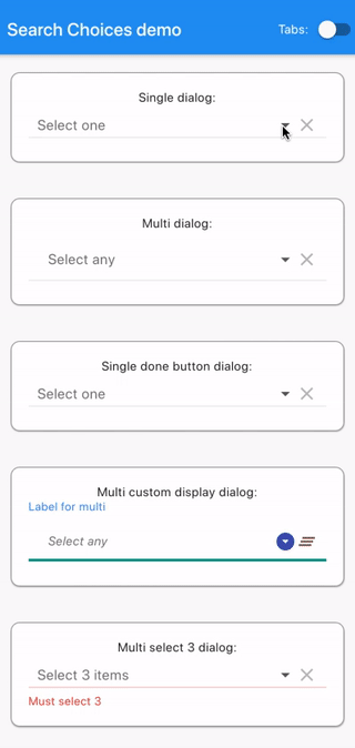
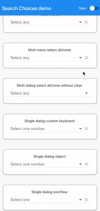
Highly versatile Widget to search through a single or multiple choices list in a dialog box or a menu. Supports pagination and future/network/API/webservice searches with sort and filter.
This widget has been successfully tested on iOS, Android, Linux and Chrome. It is expected to work fine on MacOS and Windows.
The following examples are extracted from the example project available in the repository. More examples are available in this project.
See code below.
An Android demonstration is available here: https://searchchoices.jod.li/app-release.apk
Add to your pubspec.yaml in the dependencies section:
search_choices:
Get packages with command:
flutter packages get
Import:
import 'package:search_choices/search_choices.dart';
Call either the single choice or the multiple choice constructor.
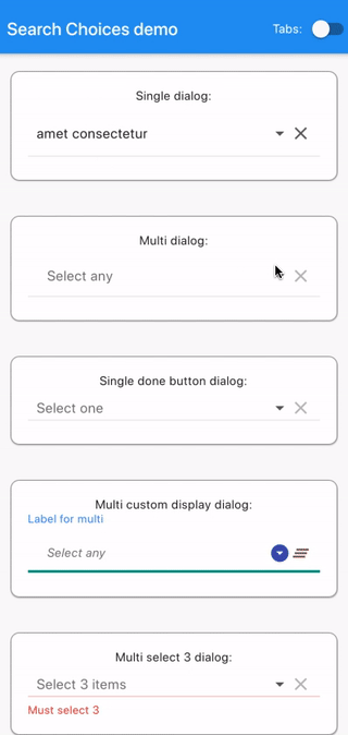
Search choices Widget with a single choice that opens a dialog or a menu to let the user do the selection conveniently with a search.
factory SearchChoices.single({
Key? key,
required List<DropdownMenuItem<T>> items,
Function? onChanged,
T? value,
TextStyle? style,
dynamic searchHint,
dynamic hint,
dynamic disabledHint,
dynamic icon = const Icon(Icons.arrow_drop_down),
dynamic underline,
dynamic doneButton,
dynamic label,
dynamic closeButton = "Close",
bool displayClearIcon = true,
Icon clearIcon = const Icon(Icons.clear),
Color? iconEnabledColor,
Color? iconDisabledColor,
double iconSize = 24.0,
bool isExpanded = false,
bool isCaseSensitiveSearch = false,
Function? searchFn,
Function? onClear,
Function? selectedValueWidgetFn,
TextInputType keyboardType = TextInputType.text,
Function? validator,
bool assertUniqueValue = true,
Function? displayItem,
bool dialogBox = true,
BoxConstraints? menuConstraints,
bool readOnly = false,
Color? menuBackgroundColor,
bool rightToLeft = false,
bool autofocus = true,
Function? selectedAggregateWidgetFn,
double padding = 10.0,
Function? setOpenDialog,
Widget Function (Widget titleBar,Widget searchBar, Widget list, Widget closeButton, BuildContext dropDownContext,)? buildDropDownDialog,
InputDecoration searchInputDecoration = const InputDecoration(
prefixIcon: Icon(
Icons.search,
size: 24,
),
contentPadding: EdgeInsets.symmetric(vertical: 12),
),
int? itemsPerPage,
PointerThisPlease<int>? currentPage,
Widget Function(Widget listWidget, int totalFilteredItemsNb,
Function updateSearchPage)?
customPaginationDisplay,
Future<Tuple2<List<DropdownMenuItem>, int>> Function(
String? keyword,
String? orderBy,
bool? orderAsc,
List<Tuple2<String, String>>? filters,
int? pageNb)?
futureSearchFn,
Map<String, Map<String, dynamic>>? futureSearchOrderOptions,
Map<String, Map<String, Object>>? futureSearchFilterOptions,
dynamic emptyListWidget,
Function? onTap,
})
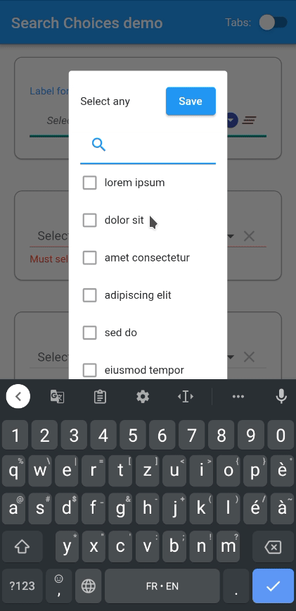
Search choices Widget with a multiple choice that opens a dialog or a menu to let the user do the selection conveniently with a search.
factory SearchChoices.multiple({
Key? key,
required List<DropdownMenuItem<T>> items,
Function? onChanged,
List<int> selectedItems = const [],
TextStyle? style,
dynamic searchHint,
dynamic hint,
dynamic disabledHint,
dynamic icon = const Icon(Icons.arrow_drop_down),
dynamic underline,
dynamic doneButton = "Done",
dynamic label,
dynamic closeButton = "Close",
bool displayClearIcon = true,
Icon clearIcon = const Icon(Icons.clear),
Color? iconEnabledColor,
Color? iconDisabledColor,
double iconSize = 24.0,
bool isExpanded = false,
bool isCaseSensitiveSearch = false,
Function? searchFn,
Function? onClear,
Function? selectedValueWidgetFn,
TextInputType keyboardType = TextInputType.text,
Function? validator,
Function? displayItem,
bool dialogBox = true,
BoxConstraints? menuConstraints,
bool readOnly = false,
Color? menuBackgroundColor,
bool rightToLeft = false,
bool autofocus = true,
Function? selectedAggregateWidgetFn,
double padding = 10.0,
Function? setOpenDialog,
Widget Function (Widget titleBar,Widget searchBar, Widget list, Widget closeButton, BuildContext dropDownContext,)? buildDropDownDialog,
InputDecoration searchInputDecoration = const InputDecoration(
prefixIcon: Icon(
Icons.search,
size: 24,
),
contentPadding: EdgeInsets.symmetric(vertical: 12),
),
int? itemsPerPage,
PointerThisPlease<int>? currentPage,
Widget Function(Widget listWidget, int totalFilteredItemsNb,
Function updateSearchPage)?
customPaginationDisplay,
Future<Tuple2<List<DropdownMenuItem>, int>> Function(
String? keyword,
String? orderBy,
bool? orderAsc,
List<Tuple2<String, String>>? filters,
int? pageNb)?
futureSearchFn,
Map<String, Map<String, dynamic>>? futureSearchOrderOptions,
Map<String, Map<String, Object>>? futureSearchFilterOptions,
List<T>? futureSelectedValues,
dynamic emptyListWidget,
Function? onTap,
})
Clone repository:
git clone https://github.com/lcuis/search_choices.git
Go to plugin folder:
cd search_choices
Optionally enable web:
flutter config --enable-web
Create project:
flutter create .
To run automated tests:
flutter test
Optionally generate documentation:
pub global activate dartdoc
dartdoc
Go to example app folder:
cd example
To run web:
run -d chrome
To build web to folder build/web:
flutter build web
To run on a connected device:
flutter run
To build Android app to build/app/outputs/apk/release/app-release.apk:
flutter build apk
To build iOS app on Mac:
flutter build ios
SearchChoices.single(
items: items,
value: selectedValueSingleDialog,
hint: "Select one",
searchHint: "Select one",
onChanged: (value) {
setState(() {
selectedValueSingleDialog = value;
});
},
isExpanded: true,
)
SearchChoices.multiple(
items: items,
selectedItems: selectedItemsMultiDialog,
hint: Padding(
padding: const EdgeInsets.all(12.0),
child: Text("Select any"),
),
searchHint: "Select any",
onChanged: (value) {
setState(() {
selectedItemsMultiDialog = value;
});
},
closeButton: (selectedItems) {
return (selectedItems.isNotEmpty
? "Save ${selectedItems.length == 1 ? '"' + items[selectedItems.first].value.toString() + '"' : '(' + selectedItems.length.toString() + ')'}"
: "Save without selection");
},
isExpanded: true,
)
SearchChoices.single(
items: items,
value: selectedValueSingleDoneButtonDialog,
hint: "Select one",
searchHint: "Select one",
onChanged: (value) {
setState(() {
selectedValueSingleDoneButtonDialog = value;
});
},
doneButton: "Done",
displayItem: (item, selected) {
return (Row(children: [
selected
? Icon(
Icons.radio_button_checked,
color: Colors.grey,
)
: Icon(
Icons.radio_button_unchecked,
color: Colors.grey,
),
SizedBox(width: 7),
Expanded(
child: item,
),
]));
},
isExpanded: true,
)
SearchChoices.multiple(
items: items,
selectedItems: selectedItemsMultiCustomDisplayDialog,
hint: Padding(
padding: const EdgeInsets.all(12.0),
child: Text("Select any"),
),
searchHint: "Select any",
onChanged: (value) {
setState(() {
selectedItemsMultiCustomDisplayDialog = value;
});
},
displayItem: (item, selected) {
return (Row(children: [
selected
? Icon(
Icons.check,
color: Colors.green,
)
: Icon(
Icons.check_box_outline_blank,
color: Colors.grey,
),
SizedBox(width: 7),
Expanded(
child: item,
),
]));
},
selectedValueWidgetFn: (item) {
return (Center(
child: Card(
shape: RoundedRectangleBorder(
borderRadius: BorderRadius.circular(10),
side: BorderSide(
color: Colors.brown,
width: 0.5,
),
),
margin: EdgeInsets.all(12),
child: Padding(
padding: const EdgeInsets.all(8),
child: Text(item.toString()),
))));
},
doneButton: (selectedItemsDone, doneContext) {
return (ElevatedButton(
onPressed: () {
Navigator.pop(doneContext);
setState(() {});
},
child: Text("Save")));
},
closeButton: null,
style: TextStyle(fontStyle: FontStyle.italic),
searchFn: (String keyword, items) {
List<int> ret = [];
if (items != null && keyword.isNotEmpty) {
keyword.split(" ").forEach((k) {
int i = 0;
items.forEach((item) {
if (k.isNotEmpty &&
(item.value
.toString()
.toLowerCase()
.contains(k.toLowerCase()))) {
ret.add(i);
}
i++;
});
});
}
if (keyword.isEmpty) {
ret = Iterable<int>.generate(items.length).toList();
}
return (ret);
},
clearIcon: Icon(Icons.clear_all),
icon: Icon(Icons.arrow_drop_down_circle),
label: "Label for multi",
underline: Container(
height: 1.0,
decoration: BoxDecoration(
border:
Border(bottom: BorderSide(color: Colors.teal, width: 3.0))),
),
iconDisabledColor: Colors.brown,
iconEnabledColor: Colors.indigo,
isExpanded: true,
)
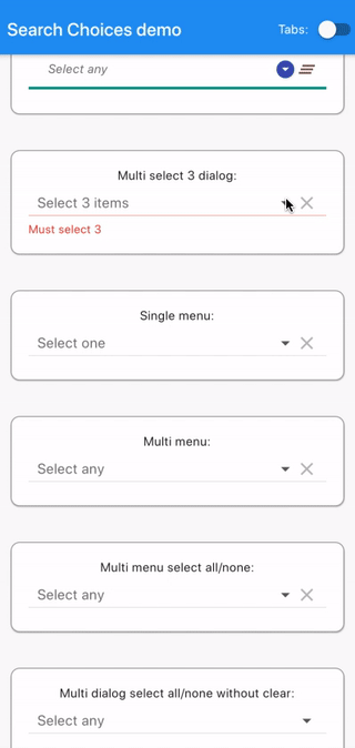
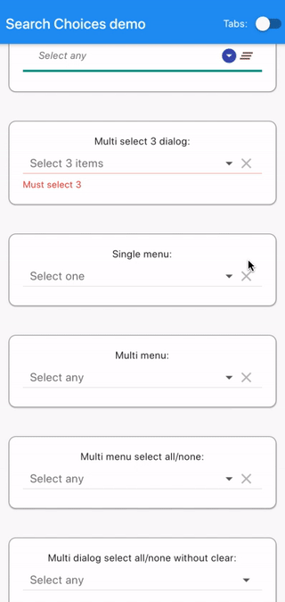
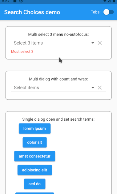
SearchChoices.multiple(
items: items,
selectedItems: selectedItemsMultiSelect3Dialog,
hint: "Select 3 items",
searchHint: "Select 3",
validator: (selectedItemsForValidator) {
if (selectedItemsForValidator.length != 3) {
return ("Must select 3");
}
return (null);
},
onChanged: (value) {
setState(() {
selectedItemsMultiSelect3Dialog = value;
});
},
doneButton: (selectedItemsDone, doneContext) {
return (ElevatedButton(
onPressed: selectedItemsDone.length != 3
? null
: () {
Navigator.pop(doneContext);
setState(() {});
},
child: Text("Save")));
},
closeButton: (selectedItemsClose) {
return (selectedItemsClose.length == 3 ? "Ok" : null);
},
isExpanded: true,
)
SearchChoices.single(
items: items,
value: selectedValueSingleMenu,
hint: "Select one",
searchHint: null,
onChanged: (value) {
setState(() {
selectedValueSingleMenu = value;
});
},
dialogBox: false,
isExpanded: true,
menuConstraints: BoxConstraints.tight(Size.fromHeight(350)),
)
SearchChoices.multiple(
items: items,
selectedItems: selectedItemsMultiMenu,
hint: "Select any",
searchHint: "",
doneButton: "Close",
closeButton: SizedBox.shrink(),
onChanged: (value) {
setState(() {
selectedItemsMultiMenu = value;
});
},
dialogBox: false,
isExpanded: true,
menuConstraints: BoxConstraints.tight(Size.fromHeight(350)),
)
SearchChoices.multiple(
items: items,
selectedItems: selectedItemsMultiMenuSelectAllNone,
hint: "Select any",
searchHint: "Select any",
onChanged: (value) {
setState(() {
selectedItemsMultiMenuSelectAllNone = value;
});
},
dialogBox: false,
closeButton: (selectedItemsClose, closeContext, Function updateParent) {
return Row(
mainAxisAlignment: MainAxisAlignment.spaceBetween,
children: <Widget>[
ElevatedButton(
onPressed: () {
setState(() {
selectedItemsClose.clear();
selectedItemsClose.addAll(
Iterable<int>.generate(items.length).toList());
});
updateParent(selectedItemsClose);
},
child: Text("Select all")),
ElevatedButton(
onPressed: () {
setState(() {
selectedItemsClose.clear();
});
updateParent(selectedItemsClose);
},
child: Text("Select none")),
],
);
},
isExpanded: true,
menuConstraints: BoxConstraints.tight(Size.fromHeight(350)),
)
SearchChoices.multiple(
items: items,
selectedItems: selectedItemsMultiDialogSelectAllNoneWoClear,
hint: "Select any",
searchHint: "Select any",
displayClearIcon: false,
onChanged: (value) {
setState(() {
selectedItemsMultiDialogSelectAllNoneWoClear = value;
});
},
dialogBox: true,
closeButton: (selectedItemsClose, closeContext, Function updateParent) {
return Row(
mainAxisAlignment: MainAxisAlignment.spaceBetween,
children: <Widget>[
ElevatedButton(
onPressed: () {
setState(() {
selectedItemsClose.clear();
selectedItemsClose.addAll(
Iterable<int>.generate(items.length).toList());
});
updateParent(selectedItemsClose);
},
child: Text("Select all")),
ElevatedButton(
onPressed: () {
setState(() {
selectedItemsClose.clear();
});
updateParent(selectedItemsClose);
},
child: Text("Select none")),
],
);
},
isExpanded: true,
)
SearchChoices.single(
items: Iterable<int>.generate(20).toList().map((i) {
return (DropdownMenuItem(
child: Text(i.toString()),
value: i.toString(),
));
}).toList(),
value: selectedValueSingleDialogCustomKeyboard,
hint: "Select one number",
searchHint: "Select one number",
onChanged: (value) {
setState(() {
selectedValueSingleDialogCustomKeyboard = value;
});
},
dialogBox: true,
keyboardType: TextInputType.number,
isExpanded: true,
)
SearchChoices.single(
items: numberItems,
value: selectedNumber,
hint: "Select one number",
searchHint: "Select one number",
onChanged: (value) {
setState(() {
selectedNumber = value;
});
},
dialogBox: true,
isExpanded: true,
)
SearchChoices.single(
items: [
DropdownMenuItem(
child: Text(
"way too long text for a smartphone at least one that goes in a normal sized pair of trousers but maybe not for a gigantic screen like there is one at my cousin's home in a very remote country where I wouldn't want to go right now"),
value:
"way too long text for a smartphone at least one that goes in a normal sized pair of trousers but maybe not for a gigantic screen like there is one at my cousin's home in a very remote country where I wouldn't want to go right now",
)
],
value: selectedValueSingleDialogOverflow,
hint: "Select one",
searchHint: "Select one",
onChanged: (value) {
setState(() {
selectedValueSingleDialogOverflow = value;
});
},
dialogBox: true,
isExpanded: true,
)
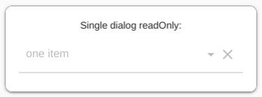
SearchChoices.single(
items: [
DropdownMenuItem(
child: Text("one item"),
value: "one item",
)
],
value: "one item",
hint: "Select one",
searchHint: "Select one",
disabledHint: "Disabled",
onChanged: (value) {
setState(() {});
},
dialogBox: true,
isExpanded: true,
readOnly: true,
)
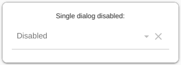
SearchChoices.single(
items: [
DropdownMenuItem(
child: Text("one item"),
value: "one item",
)
],
value: "one item",
hint: "Select one",
searchHint: "Select one",
disabledHint: "Disabled",
onChanged: null,
dialogBox: true,
isExpanded: true,
)
This example lets the user add and remove items to and from the list of choices. One can limit the number of items that can be added (100 here).
input = TextFormField(
validator: (value) {
return ((value?.length ?? 0) < 6
? "must be at least 6 characters long"
: null);
},
initialValue: inputString,
onChanged: (value) {
inputString = value;
},
autofocus: true,
);
super.initState();
}
...
addItemDialog() async {
return await showDialog(
context: MyApp.navKey.currentState?.overlay?.context ?? context,
builder: (BuildContext alertContext) {
return (AlertDialog(
title: Text("Add an item"),
content: Form(
key: _formKey,
child: Column(
mainAxisSize: MainAxisSize.min,
children: <Widget>[
input ?? SizedBox.shrink(),
TextButton(
onPressed: () {
if (_formKey.currentState?.validate() ?? false) {
setState(() {
editableItems.add(DropdownMenuItem(
child: Text(inputString),
value: inputString,
));
});
Navigator.pop(alertContext, inputString);
}
},
child: Text("Ok"),
),
TextButton(
onPressed: () {
Navigator.pop(alertContext, null);
},
child: Text("Cancel"),
),
],
),
),
));
},
);
}
...
SearchChoices.single(
items: editableItems,
value: selectedValueSingleDialogEditableItems,
hint: "Select one",
searchHint: "Select one",
disabledHint: (Function updateParent) {
return (TextButton(
onPressed: () {
addItemDialog().then((value) async {
updateParent(value);
});
},
child: Text("No choice, click to add one"),
));
},
closeButton:
(String? value, BuildContext closeContext, Function updateParent) {
return (editableItems.length >= 100
? "Close"
: TextButton(
onPressed: () {
addItemDialog().then((value) async {
if (value != null &&
editableItems.indexWhere(
(element) => element.value == value) !=
-1) {
Navigator.pop(
MyApp.navKey.currentState?.overlay?.context ??
context);
updateParent(value);
}
});
},
child: Text("Add and select item"),
));
},
onChanged: (String? value) {
setState(() {
if (!(value is NotGiven)) {
selectedValueSingleDialogEditableItems = value;
}
});
},
displayItem: (item, selected, Function updateParent) {
return (Row(children: [
selected
? Icon(
Icons.check,
color: Colors.green,
)
: Icon(
Icons.check_box_outline_blank,
color: Colors.transparent,
),
SizedBox(width: 7),
Expanded(
child: item,
),
IconButton(
icon: Icon(
Icons.delete,
color: Colors.red,
),
onPressed: () {
editableItems.removeWhere((element) => item == element);
updateParent(null);
setState(() {});
},
),
]));
},
dialogBox: true,
isExpanded: true,
doneButton: "Done",
)
Same example as previously but with multiple selection.
input = TextFormField(
validator: (value) {
return ((value?.length ?? 0) < 6
? "must be at least 6 characters long"
: null);
},
initialValue: inputString,
onChanged: (value) {
inputString = value;
},
autofocus: true,
);
super.initState();
}
...
addItemDialog() async {
return await showDialog(
context: MyApp.navKey.currentState?.overlay?.context ?? context,
builder: (BuildContext alertContext) {
return (AlertDialog(
title: Text("Add an item"),
content: Form(
key: _formKey,
child: Column(
mainAxisSize: MainAxisSize.min,
children: <Widget>[
input ?? SizedBox.shrink(),
TextButton(
onPressed: () {
if (_formKey.currentState?.validate() ?? false) {
setState(() {
editableItems.add(DropdownMenuItem(
child: Text(inputString),
value: inputString,
));
});
Navigator.pop(alertContext, inputString);
}
},
child: Text("Ok"),
),
TextButton(
onPressed: () {
Navigator.pop(alertContext, null);
},
child: Text("Cancel"),
),
],
),
),
));
},
);
}
...
SearchChoices.multiple(
items: editableItems,
selectedItems: editableSelectedItems,
hint: "Select any",
searchHint: "Select any",
disabledHint: (Function updateParent) {
return (TextButton(
onPressed: () {
addItemDialog().then((value) async {
if (value != null) {
editableSelectedItems = [0];
updateParent(editableSelectedItems);
}
});
},
child: Text("No choice, click to add one"),
));
},
closeButton: (List<int> values, BuildContext closeContext,
Function updateParent) {
return (editableItems.length >= 100
? "Close"
: TextButton(
onPressed: () {
addItemDialog().then((value) async {
if (value != null) {
int itemIndex = editableItems
.indexWhere((element) => element.value == value);
if (itemIndex != -1) {
editableSelectedItems.add(itemIndex);
Navigator.pop(
MyApp.navKey.currentState?.overlay?.context ??
context);
updateParent(editableSelectedItems);
}
}
});
},
child: Text("Add and select item"),
));
},
onChanged: (values) {
setState(() {
if (!(values is NotGiven)) {
editableSelectedItems = values;
}
});
},
displayItem: (item, selected, Function updateParent) {
return (Row(children: [
selected
? Icon(
Icons.check_box,
color: Colors.black,
)
: Icon(
Icons.check_box_outline_blank,
color: Colors.black,
),
SizedBox(width: 7),
Expanded(
child: item,
),
IconButton(
icon: Icon(
Icons.delete,
color: Colors.red,
),
onPressed: () {
int indexOfItem = editableItems.indexOf(item);
editableItems.removeWhere((element) => item == element);
editableSelectedItems
.removeWhere((element) => element == indexOfItem);
for (int i = 0; i < editableSelectedItems.length; i++) {
if (editableSelectedItems[i] > indexOfItem) {
editableSelectedItems[i]--;
}
}
updateParent(editableSelectedItems);
setState(() {});
},
),
]));
},
dialogBox: true,
isExpanded: true,
doneButton: "Done",
)
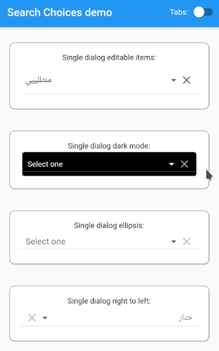
Card(
color: Colors.black,
child: SearchChoices.single(
items: items.map((item) {
return (DropdownMenuItem(
child: Text(
item.value,
style: TextStyle(color: Colors.white),
),
value: item.value,
));
}).toList(),
value: selectedValueSingleDialogDarkMode,
hint: Text(
"Select one",
style: TextStyle(color: Colors.white),
),
searchHint: Text(
"Select one",
style: TextStyle(color: Colors.white),
),
style: TextStyle(color: Colors.white, backgroundColor: Colors.black),
closeButton: TextButton(
onPressed: () {
Navigator.pop(
MyApp.navKey.currentState?.overlay?.context ?? context);
},
child: Text(
"Close",
style: TextStyle(color: Colors.white),
),
),
menuBackgroundColor: Colors.black,
iconEnabledColor: Colors.white,
iconDisabledColor: Colors.grey,
onChanged: (value) {
setState(() {
selectedValueSingleDialogDarkMode = value;
});
},
isExpanded: true,
),
)
SearchChoices.single(
items: [
DropdownMenuItem(
child: Text(
"way too long text for a smartphone at least one that goes in a normal sized pair of trousers but maybe not for a gigantic screen like there is one at my cousin's home in a very remote country where I wouldn't want to go right now",
overflow: TextOverflow.ellipsis,
),
value:
"way too long text for a smartphone at least one that goes in a normal sized pair of trousers but maybe not for a gigantic screen like there is one at my cousin's home in a very remote country where I wouldn't want to go right now",
)
],
value: selectedValueSingleDialogEllipsis,
hint: "Select one",
searchHint: "Select one",
onChanged: (value) {
setState(() {
selectedValueSingleDialogEllipsis = value;
});
},
selectedValueWidgetFn: (item) {
return (Text(
item,
overflow: TextOverflow.ellipsis,
));
},
dialogBox: true,
isExpanded: true,
)
In support for Arabic and Hebrew languages.
SearchChoices.single(
items: ["طنجة", "فاس", "أكادير", "تزنيت", "آكــلــو", "سيدي بيبي"]
.map<DropdownMenuItem<String>>((string) {
return (DropdownMenuItem<String>(
child: Text(
string,
textDirection: TextDirection.rtl,
),
value: string,
));
}).toList(),
value: selectedValueSingleDialogRightToLeft,
hint: Text(
"ختار",
textDirection: TextDirection.rtl,
),
searchHint: Text(
"ختار",
textDirection: TextDirection.rtl,
),
closeButton: TextButton(
onPressed: () {
Navigator.pop(
MyApp.navKey.currentState?.overlay?.context ?? context);
},
child: Text(
"سدّ",
textDirection: TextDirection.rtl,
),
),
onChanged: (value) {
setState(() {
selectedValueSingleDialogRightToLeft = value;
});
},
isExpanded: true,
rightToLeft: true,
displayItem: (item, selected) {
return (Row(textDirection: TextDirection.rtl, children: [
selected
? Icon(
Icons.radio_button_checked,
color: Colors.grey,
)
: Icon(
Icons.radio_button_unchecked,
color: Colors.grey,
),
SizedBox(width: 7),
item,
Expanded(
child: SizedBox.shrink(),
),
]));
},
selectedValueWidgetFn: (item) {
return Row(
textDirection: TextDirection.rtl,
children: <Widget>[
(Text(
item,
textDirection: TextDirection.rtl,
)),
],
);
},
)
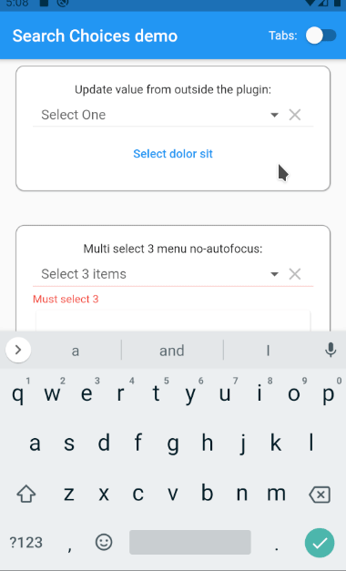
A button external to the plugin can be used to set the selected value.
Column(
children: [
SearchChoices.single(
items: items,
value: selectedValueUpdateFromOutsideThePlugin,
hint: Text('Select One'),
searchHint: new Text(
'Select One',
style: new TextStyle(fontSize: 20),
),
onChanged: (value) {
setState(() {
selectedValueUpdateFromOutsideThePlugin = value;
});
},
isExpanded: true,
),
TextButton(
child: Text("Select dolor sit"),
onPressed: () {
setState(() {
selectedValueUpdateFromOutsideThePlugin = "dolor sit";
});
},
),
],
)
Doesn't bring up the keyboard automatically.
SearchChoices.multiple(
items: items,
selectedItems: selectedItemsMultiSelect3Menu,
hint: "Select 3 items",
searchHint: "Select 3",
validator: (selectedItemsForValidatorWithMenu) {
if (selectedItemsForValidatorWithMenu.length != 3) {
return ("Must select 3");
}
return (null);
},
onChanged: (value) {
setState(() {
selectedItemsMultiSelect3Menu = value;
});
},
isExpanded: true,
dialogBox: false,
menuConstraints: BoxConstraints.tight(Size.fromHeight(350)),
autofocus: false,
)
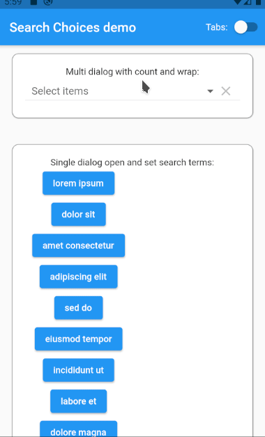
Customization of the way the selection is displayed.
SearchChoices.multiple(
items: items,
selectedItems: selectedItemsMultiDialogWithCountAndWrap,
hint: "Select items",
searchHint: "Select items",
onChanged: (value) {
setState(() {
selectedItemsMultiDialogWithCountAndWrap = value;
});
},
isExpanded: true,
selectedValueWidgetFn: (item) {
return (Container(
margin: const EdgeInsets.all(15.0),
padding: const EdgeInsets.all(3.0),
decoration:
BoxDecoration(border: Border.all(color: Colors.blueAccent)),
child: Text(
item,
overflow: TextOverflow.ellipsis,
),
));
},
selectedAggregateWidgetFn: (List<Widget> list) {
return (Column(children: [
Text("${list.length} items selected"),
Wrap(children: list),
]));
},
)
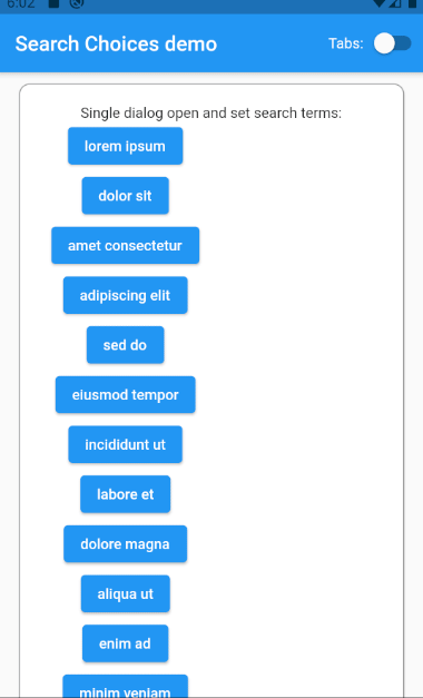
A button external to the plugin can be used to open the dialog and set the search terms.
SearchChoices.single(
label: Column(
children: items.map((item) {
return (ElevatedButton(
child: item.child,
onPressed: () {
openDialog!(item.value.toString());
},
));
}).toList(),
),
items: items,
value: selectedValueSingleDialog,
hint: "Select one",
searchHint: "Select one",
onChanged: (value) {
setState(() {
selectedValueSingleDialog = value;
});
},
isExpanded: true,
setOpenDialog: (externalOpenDialog) {
openDialog = externalOpenDialog;
},
)
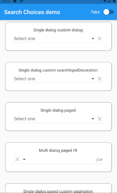
Customize the way the dialog is displayed to define how to show the title bar, the search bar, the list and the close button.
SearchChoices.single(
items: items,
value: selectedValueSingleDialog,
hint: "Select one",
searchHint: "Select one",
onChanged: (value) {
setState(() {
selectedValueSingleDialog = value;
});
},
isExpanded: true,
buildDropDownDialog: (
Widget titleBar,
Widget searchBar,
Widget list,
Widget closeButton,
BuildContext dropDownContext,
) {
return (AnimatedContainer(
padding: MediaQuery.of(dropDownContext).viewInsets,
duration: const Duration(milliseconds: 300),
child: Card(
margin: EdgeInsets.symmetric(vertical: 30, horizontal: 40),
child: Container(
padding: EdgeInsets.symmetric(vertical: 35, horizontal: 45),
child: Column(
mainAxisAlignment: MainAxisAlignment.start,
crossAxisAlignment: CrossAxisAlignment.start,
mainAxisSize: MainAxisSize.min,
children: <Widget>[
titleBar,
searchBar,
list,
closeButton,
],
),
),
),
));
},
)
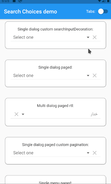
Can customize the way the search bar is displayed.
SearchChoices.single(
items: items,
value: selectedValueSingleDialog,
hint: "Select one",
searchHint: "Select one",
onChanged: (value) {
setState(() {
selectedValueSingleDialog = value;
});
},
isExpanded: true,
searchInputDecoration: InputDecoration(
icon: Icon(Icons.airline_seat_flat), border: OutlineInputBorder()),
)
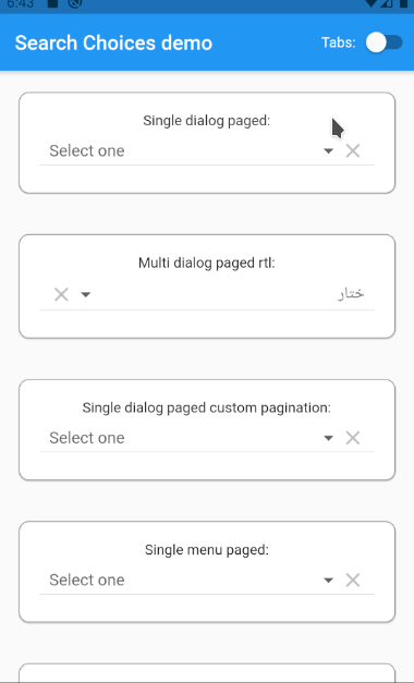
Useful when displaying a huge amount of items.
SearchChoices.single(
items: items,
value: selectedValueSingleDialogPaged,
hint: "Select one",
searchHint: "Search one",
onChanged: (value) {
setState(() {
selectedValueSingleDialogPaged = value;
});
},
isExpanded: true,
itemsPerPage: 5,
currentPage: currentPage,
)
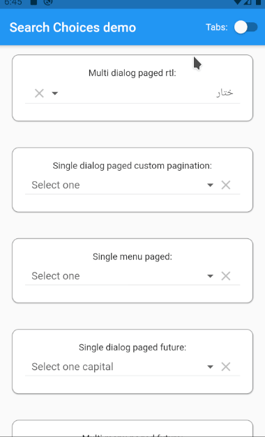
Pagination also works on multiple selection and with right to left languages such as Arabic and Hebrew. Useful when displaying a huge amount of items.
SearchChoices.multiple(
items: ["طنجة", "فاس", "أكادير", "تزنيت", "آكــلــو", "سيدي بيبي"]
.map<DropdownMenuItem<String>>((string) {
return (DropdownMenuItem<String>(
child: Text(
string,
textDirection: TextDirection.rtl,
),
value: string,
));
}).toList(),
selectedItems: selectedItemsMultiDialogPaged,
hint: Text(
"ختار",
textDirection: TextDirection.rtl,
),
searchHint: Text(
"ختار",
textDirection: TextDirection.rtl,
),
closeButton: TextButton(
onPressed: () {
Navigator.pop(
MyApp.navKey.currentState?.overlay?.context ?? context);
},
child: Text(
"سدّ",
textDirection: TextDirection.rtl,
),
),
onChanged: (value) {
setState(() {
selectedItemsMultiDialogPaged = value;
});
},
isExpanded: true,
rightToLeft: true,
displayItem: (item, selected) {
return (Row(textDirection: TextDirection.rtl, children: [
selected
? Icon(
Icons.radio_button_checked,
color: Colors.grey,
)
: Icon(
Icons.radio_button_unchecked,
color: Colors.grey,
),
SizedBox(width: 7),
item,
Expanded(
child: SizedBox.shrink(),
),
]));
},
selectedValueWidgetFn: (item) {
return Row(
textDirection: TextDirection.rtl,
children: <Widget>[
(Text(
item,
textDirection: TextDirection.rtl,
)),
],
);
},
itemsPerPage: 5,
currentPage: currentPage,
doneButton: "قريب",
)
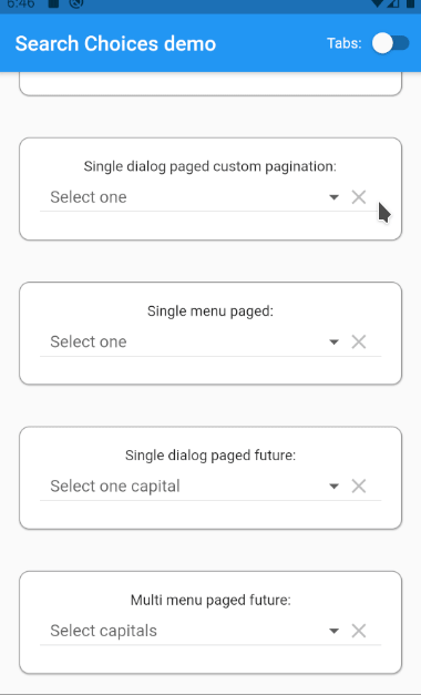
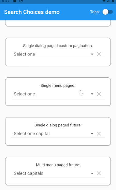
Custom pagination can let the user choose which page to display instead of having next and previous buttons. Useful when displaying a huge amount of items.
SearchChoices.single(
items: items,
value: selectedValueSingleDialogPaged,
hint: "Select one",
searchHint: "Search one",
onChanged: (value) {
setState(() {
selectedValueSingleDialogPaged = value;
});
},
isExpanded: true,
itemsPerPage: 5,
currentPage: currentPage,
customPaginationDisplay: (Widget listWidget, int totalFilteredItemsNb,
Function updateSearchPage) {
return (Expanded(
child: Column(children: [
listWidget,
SingleChildScrollView(
scrollDirection: Axis.horizontal,
child: Row(children: [
Text("Page:"),
SizedBox(
width: 10,
),
Wrap(
spacing: 10,
children:
Iterable<int>.generate((totalFilteredItemsNb / 5).ceil())
.toList()
.map((i) {
return (SizedBox(
width: (31 + 9 * (i + 1).toString().length) + 0.0,
height: 30.0,
child: ElevatedButton(
child: Text("${i + 1}"),
onPressed: (i + 1) == currentPage.value
? null
: () {
currentPage.value = i + 1;
updateSearchPage();
},
),
));
}).toList(),
),
]),
),
])));
},
)
Showing pagination in a single selection menu. Useful when displaying a huge amount of items.
SearchChoices.single(
items: items,
value: selectedValueSingleDialogPaged,
hint: "Select one",
searchHint: null,
onChanged: (value) {
setState(() {
selectedValueSingleDialogPaged = value;
});
},
dialogBox: false,
isExpanded: true,
menuConstraints: BoxConstraints.tight(Size.fromHeight(350)),
itemsPerPage: 5,
currentPage: currentPage,
)
Future/network/internet/web/API/webservice call displayed paged in a dialog. This example doesn't work on web because of the get function call, though, the plugin features should work on web. This example shows that this would work with PHP-CRUD-API.
SearchChoices.single(
value: selectedValueSingleDialogPagedFuture,
hint: kIsWeb ? "Example not for web" : "Select one capital",
searchHint: "Search capitals",
onChanged: kIsWeb
? null
: (value) {
setState(() {
selectedValueSingleDialogPagedFuture = value;
});
},
isExpanded: true,
itemsPerPage: 10,
currentPage: currentPage,
selectedValueWidgetFn: (item) {
return (Center(
child: Card(
shape: RoundedRectangleBorder(
borderRadius: BorderRadius.circular(4),
side: BorderSide(
color: Colors.grey,
width: 1,
),
),
margin: EdgeInsets.all(1),
child: Padding(
padding: const EdgeInsets.all(6),
child: Text(item["capital"]),
))));
},
futureSearchFn: (String? keyword, String? orderBy, bool? orderAsc,
List<Tuple2<String, String>>? filters, int? pageNb) async {
String filtersString = "";
int i = 1;
filters?.forEach((element) {
filtersString += "&filter" +
i.toString() +
"=" +
element.item1 +
"," +
element.item2;
i++;
});
Response response = await get(Uri.parse(
"https://searchchoices.jod.li/exampleList.php?page=${pageNb ?? 1},10${orderBy == null ? "" : "&order=" + orderBy + "," + (orderAsc ?? true ? "asc" : "desc")}${(keyword == null || keyword.isEmpty) ? "" : "&filter=capital,cs," + keyword}$filtersString"))
.timeout(Duration(
seconds: 10,
));
if (response.statusCode != 200) {
throw Exception("failed to get data from internet");
}
dynamic data = jsonDecode(response.body);
int nbResults = data["results"];
List<DropdownMenuItem> results = (data["records"] as List<dynamic>)
.map<DropdownMenuItem>((item) => DropdownMenuItem(
value: item,
child: Card(
shape: RoundedRectangleBorder(
borderRadius: BorderRadius.circular(4),
side: BorderSide(
color: Colors.blue,
width: 1,
),
),
margin: EdgeInsets.all(1),
child: Padding(
padding: const EdgeInsets.all(6),
child: Text(
"${item["capital"]} - ${item["country"]} - ${item["continent"]} - pop.: ${item["population"]}"),
),
),
))
.toList();
return (Tuple2<List<DropdownMenuItem>, int>(results, nbResults));
},
futureSearchOrderOptions: {
"country": {
"icon": Wrap(children: [
Icon(Icons.flag),
Text(
"Country",
)
]),
"asc": true
},
"capital": {
"icon":
Wrap(children: [Icon(Icons.location_city), Text("Capital")]),
"asc": true
},
"continent": {"icon": "Continent", "asc": true},
"population": {
"icon": Wrap(children: [Icon(Icons.people), Text("Population")]),
"asc": false
},
},
futureSearchFilterOptions: {
"continent": {
"icon": Text("Continent"),
"exclusive": true,
"values": [
{"eq,Africa": "Africa"},
{"eq,Americas": "Americas"},
{"eq,Asia": "Asia"},
{"eq,Australia": "Australia"},
{"eq,Europe": "Europe"},
{"eq,Oceania": "Oceania"}
]
},
"population": {
"icon": Wrap(children: [Icon(Icons.people), Text("Population")]),
"exclusive": true,
"values": [
{
"lt,1000": Wrap(children: [Icon(Icons.person), Text("<1,000")])
},
{
"lt,100000":
Wrap(children: [Icon(Icons.person_add), Text("<100,000")])
},
{
"lt,1000000": Wrap(
children: [Icon(Icons.nature_people), Text("<1,000,000")])
},
{
"gt,1000000":
Wrap(children: [Icon(Icons.people), Text(">1,000,000")])
},
{
"gt,10000000": Wrap(
children: [Icon(Icons.location_city), Text(">10,000,000")])
},
]
},
},
closeButton: (selectedItemsDone, doneContext) {
return Row(
mainAxisAlignment: MainAxisAlignment.end,
children: [
SizedBox(
height: 25,
width: 48,
child: (ElevatedButton(
onPressed: () {
Navigator.pop(doneContext);
setState(() {});
},
child: Icon(
Icons.close,
size: 17,
))),
),
],
);
},
)
Future/network/internet/web/API/webservice call displayed paged in a menu. This example doesn't work on web because of the get function call, though, the plugin features should work on web. This example shows that this would work with PHP-CRUD-API.
SearchChoices.multiple(
futureSelectedValues: selectedItemsMultiMenuPagedFuture,
hint: kIsWeb ? "Example not for web" : "Select capitals",
searchHint: "",
dialogBox: false,
onChanged: kIsWeb
? null
: (value) {
setState(() {
selectedItemsMultiMenuPagedFuture = value;
});
},
isExpanded: true,
itemsPerPage: 10,
currentPage: currentPage,
selectedValueWidgetFn: (item) {
return (Center(
child: Card(
shape: RoundedRectangleBorder(
borderRadius: BorderRadius.circular(4),
side: BorderSide(
color: Colors.grey,
width: 1,
),
),
margin: EdgeInsets.all(1),
child: Padding(
padding: const EdgeInsets.all(6),
child: Text(item["capital"]),
))));
},
futureSearchFn: (String? keyword, String? orderBy, bool? orderAsc,
List<Tuple2<String, String>>? filters, int? pageNb) async {
String filtersString = "";
int i = 1;
filters?.forEach((element) {
filtersString += "&filter" +
i.toString() +
"=" +
element.item1 +
"," +
element.item2;
i++;
});
Response response = await get(Uri.parse(
"https://searchchoices.jod.li/exampleList.php?page=${pageNb ?? 1},10${orderBy == null ? "" : "&order=" + orderBy + "," + (orderAsc ?? true ? "asc" : "desc")}${(keyword == null || keyword.isEmpty) ? "" : "&filter=capital,cs," + keyword}$filtersString"))
.timeout(Duration(
seconds: 10,
));
if (response.statusCode != 200) {
throw Exception("failed to get data from internet");
}
dynamic data = jsonDecode(response.body);
int nbResults = data["results"];
List<DropdownMenuItem> results = (data["records"] as List<dynamic>)
.map<DropdownMenuItem>((item) => DropdownMenuItem(
value: item,
child: Card(
shape: RoundedRectangleBorder(
borderRadius: BorderRadius.circular(4),
side: BorderSide(
color: Colors.blue,
width: 1,
),
),
margin: EdgeInsets.all(1),
child: Padding(
padding: const EdgeInsets.all(6),
child: Text(
"${item["capital"]} - ${item["country"]} - ${item["continent"]} - pop.: ${item["population"]}"),
),
),
))
.toList();
return (Tuple2<List<DropdownMenuItem>, int>(results, nbResults));
},
futureSearchOrderOptions: {
"country": {
"icon": Wrap(children: [
Icon(Icons.flag),
Text(
"Country",
)
]),
"asc": true
},
"capital": {
"icon":
Wrap(children: [Icon(Icons.location_city), Text("Capital")]),
"asc": true
},
"continent": {"icon": "Continent", "asc": true},
"population": {
"icon": Wrap(children: [Icon(Icons.people), Text("Population")]),
"asc": false
},
},
futureSearchFilterOptions: {
"continent": {
"icon": Text("Continent"),
"exclusive": true,
"values": [
{"eq,Africa": "Africa"},
{"eq,Americas": "Americas"},
{"eq,Asia": "Asia"},
{"eq,Australia": "Australia"},
{"eq,Europe": "Europe"},
{"eq,Oceania": "Oceania"}
]
},
"population": {
"icon": Wrap(children: [Icon(Icons.people), Text("Population")]),
"exclusive": true,
"values": [
{
"lt,1000": Wrap(children: [Icon(Icons.person), Text("<1,000")])
},
{
"lt,100000":
Wrap(children: [Icon(Icons.person_add), Text("<100,000")])
},
{
"lt,1000000": Wrap(
children: [Icon(Icons.nature_people), Text("<1,000,000")])
},
{
"gt,1000000":
Wrap(children: [Icon(Icons.people), Text(">1,000,000")])
},
{
"gt,10000000": Wrap(
children: [Icon(Icons.location_city), Text(">10,000,000")])
},
]
},
},
menuConstraints: BoxConstraints.tight(Size.fromHeight(350)),
)
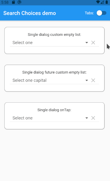
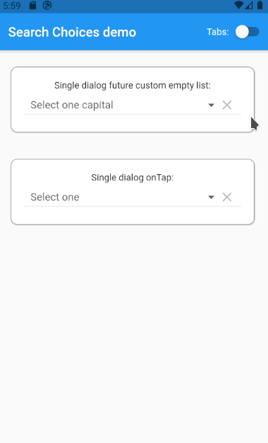
When the list gets empty after the keyword is typed, the dialog displays the given text with the keyword as a parameter.
SearchChoices.single(
items: items,
value: selectedValueSingleDialog,
hint: "Select one",
searchHint: "Select one",
onChanged: (value) {
setState(() {
selectedValueSingleDialog = value;
});
},
isExpanded: true,
emptyListWidget: (String keyword) =>
"No result with the \"$keyword\" keyword",
)
When the future/network search keyword filters out all the results, the given emptyListWidget is displayed.
SearchChoices.single(
value: selectedValueSingleDialogFuture,
hint: kIsWeb ? "Example not for web" : "Select one capital",
searchHint: "Search capitals",
onChanged: kIsWeb
? null
: (value) {
setState(() {
selectedValueSingleDialogFuture = value;
});
},
isExpanded: true,
selectedValueWidgetFn: (item) {
return (Center(
child: Card(
shape: RoundedRectangleBorder(
borderRadius: BorderRadius.circular(4),
side: BorderSide(
color: Colors.grey,
width: 1,
),
),
margin: EdgeInsets.all(1),
child: Padding(
padding: const EdgeInsets.all(6),
child: Text(item["capital"]),
))));
},
futureSearchFn: (String? keyword, String? orderBy, bool? orderAsc,
List<Tuple2<String, String>>? filters, int? pageNb) async {
String filtersString = "";
int i = 1;
filters?.forEach((element) {
// This example doesn't have any futureSearchFilterOptions parameter, thus, this loop will never run anything.
filtersString += "&filter" +
i.toString() +
"=" +
element.item1 +
"," +
element.item2;
i++;
});
Response response = await get(Uri.parse(
"https://searchchoices.jod.li/exampleList.php?page=${pageNb ?? 1},10${orderBy == null ? "" : "&order=" + orderBy + "," + (orderAsc ?? true ? "asc" : "desc")}${(keyword == null || keyword.isEmpty) ? "" : "&filter=capital,cs," + keyword}$filtersString"))
.timeout(Duration(
seconds: 10,
));
if (response.statusCode != 200) {
throw Exception("failed to get data from internet");
}
dynamic data = jsonDecode(response.body);
int nbResults = data["results"];
List<DropdownMenuItem> results = (data["records"] as List<dynamic>)
.map<DropdownMenuItem>((item) => DropdownMenuItem(
value: item,
child: Card(
shape: RoundedRectangleBorder(
borderRadius: BorderRadius.circular(4),
side: BorderSide(
color: Colors.blue,
width: 1,
),
),
margin: EdgeInsets.all(1),
child: Padding(
padding: const EdgeInsets.all(6),
child: Text(
"${item["capital"]} - ${item["country"]} - ${item["continent"]} - pop.: ${item["population"]}"),
),
),
))
.toList();
return (Tuple2<List<DropdownMenuItem>, int>(results, nbResults));
},
emptyListWidget: () => Text(
"No result",
style: TextStyle(
fontStyle: FontStyle.italic,
color: Colors.grey,
),
),
)
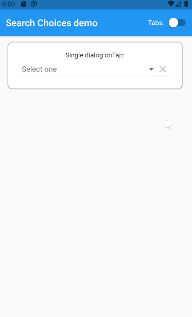
onTap parameter can be used to clear the selected value or to unfocus as shown in https://github.com/lcuis/search_choices/issues/26
SearchChoices.single(
items: items,
value: selectedValueSingleDialog,
hint: "Select one",
searchHint: "Select one",
onChanged: (value) {
setState(() {
selectedValueSingleDialog = value;
});
},
isExpanded: true,
onTap: () {
setState(() {
selectedValueSingleDialog = null;
});
},
)
Feel free to log your feature requests/comments/questions/bugs here: https://github.com/lcuis/search_choices/issues
This solution is based on improvements done on a pull request that was probably already changing too many things to the great original repository: https://github.com/icemanbsi/searchable_dropdown/pull/11
I would be happy to merge pull request proposals provided that:
Contributions and forks are very welcome!
In your pull request, feel free to add your line in the contributors section below:
Continuous integration/deployment status: 
Class mainly used internally to display the available choices. Cannot be made private because of automated testing.
Single dialog open and set search terms.
DropdownDialog({
Key? key,
this.items,
this.hint,
this.isCaseSensitiveSearch = false,
this.closeButton,
this.keyboardType,
this.searchFn,
required this.multipleSelection,
this.selectedItems,
this.displayItem,
this.doneButton,
this.validator,
required this.dialogBox,
required this.displayMenu,
this.menuConstraints,
this.callOnPop,
this.menuBackgroundColor,
this.updateParent,
this.style,
this.iconEnabledColor,
this.iconDisabledColor,
required this.rightToLeft,
required this.autofocus,
required this.initialSearchTerms,
this.buildDropDownDialog,
this.searchInputDecoration,
this.itemsPerPage,
this.currentPage,
this.customPaginationDisplay,
this.futureSearchFn,
this.futureSearchOrderOptions,
this.futureSearchFilterOptions,
this.futureSelectedValues,
this.emptyListWidget,
this.onTap,
}) : super(key: key);See SearchChoices class.
final bool autofocus;
See SearchChoices class.
final Widget Function(
Widget titleBar,
Widget searchBar,
Widget list,
Widget closeButton,
BuildContext dropDownContext,
)? buildDropDownDialog;
Function to be called whenever the dialogbox is poped or the menu gets closed.
final Function? callOnPop;
See SearchChoices class.
final dynamic closeButton;
Creates the mutable state for this widget at a given location in the tree.
Subclasses should override this method to return a newly created instance of their associated State subclass:
@override
_MyState createState() => _MyState();
The framework can call this method multiple times over the lifetime of a StatefulWidget. For example, if the widget is inserted into the tree in multiple locations, the framework will create a separate State object for each location. Similarly, if the widget is removed from the tree and later inserted into the tree again, the framework will call createState again to create a fresh State object, simplifying the lifecycle of State objects.
_DropdownDialogState<T> createState() => _DropdownDialogState<T>();See SearchChoices class.
final PointerThisPlease<int>? currentPage;
See SearchChoices class.
final Widget Function(Widget listWidget, int totalFilteredItemsNb,
Function updateSearchPage)? customPaginationDisplay;
See SearchChoices class.
final bool dialogBox;
See SearchChoices class.
final Function? displayItem;
See SearchChoices class.
final PointerThisPlease<bool> displayMenu;
See SearchChoices class.
final dynamic doneButton;
See SearchChoices class.
final dynamic emptyListWidget;
See SearchChoices class.
final Future<Tuple2<List<DropdownMenuItem>, int>> Function(
String? keyword,
String? orderBy,
bool? orderAsc,
List<Tuple2<String, String>>? filters,
int? pageNb)? futureSearchFn;
See SearchChoices class.
final Map<String, Map<String, dynamic>>? futureSearchOrderOptions;
See SearchChoices class.
final List<T>? futureSelectedValues;
See SearchChoices class.
final Widget? hint;
See SearchChoices class.
final Color? iconDisabledColor;
See SearchChoices class.
final Color? iconEnabledColor;
Used for the setOpenDialog. This allows the dialogbox to be opened with search terms preset from an external button as shown in example Single dialog open and set search terms.
final String initialSearchTerms;
See SearchChoices class.
final bool isCaseSensitiveSearch;
See SearchChoices class.
final List<DropdownMenuItem<T>>? items;
See SearchChoices class.
final int? itemsPerPage;
See SearchChoices class.
final TextInputType? keyboardType;
Allows to reset the scroll to the top of the list after changing the page
final ScrollController listScrollController = ScrollController();
See SearchChoices class.
final Color? menuBackgroundColor;
See SearchChoices class.
final BoxConstraints? menuConstraints;
See SearchChoices class.
final bool multipleSelection;
See SearchChoices class.
final Function? onTap;
See SearchChoices class.
final bool rightToLeft;
See SearchChoices class.
final Function? searchFn;
See SearchChoices class.
final InputDecoration? searchInputDecoration;
See SearchChoices class.
final List<int>? selectedItems;
See SearchChoices class.
final TextStyle? style;
Function called to update the parent screen when necessary. Calls setState.
final Function? updateParent;
See SearchChoices class.
final Function? validator;
Class mainly used internally to set a value to NotGiven by its type
Simplest constructor ever
const NotGiven();Class used to send pointers to variables instead of the variable directly so that the called function can update the variable value
Simple constructor that sets the value that can be updated by a called method.
PointerThisPlease(this.value);Value to be pointed to that can be changed by the called method.
T value;
SearchChoices widget that allows the opening of a searchable dropdown. Use the SearchChoices.single factory if only one item needs to be selected. Use the SearchChoices.multiple factory if user must be able to select multiple items at once.
Widget Function(Widget listWidget, int totalFilteredItemsNb, Function updateSearchPage) if itemsPerPage is set, customizes the display and the handling of the pagination on the search list.
Map<String, Map<String, Object>> when futureSearchFn is set, can be used to display search filters specified in the form {"filter1Name":{"icon":filter1IconWidget,"values":["value1",{"value2":filter1Value2Widget}}}. Please refer to the documentation example: https://github.com/lcuis/search_choices/blob/master/example/lib/main.dart.
Future<int> Function(String keyword, List<DropdownMenuItem> itemsListToClearAndFill, int pageNb) used to search items from the network. Must return items (up to itemsPerPage if set). Must return an int with the total number of results (allows the handling of pagination).
Map<String, Map<String,dynamic>> when futureSearchFn is set, can be used to display search order options specified in the form {"order1Name":{"icon":order1IconWidget,"asc":true},}. Please refer to the documentation example: https://github.com/lcuis/search_choices/blob/master/example/lib/main.dart.
Search choices Widget with a multiple choice that opens a dialog or a menu to let the user do the selection conveniently with a search.
items with child: Widget displayed ; value: any object with .toString() used to match search keyword.onChanged Function with parameter: selectedItems not returning executed after the selection is done.selectedItems indexes of items to be preselected.style used for the hint if it is given is String.searchHint String|Widget|Function with no parameter returning String|Widget displayed at the top of the search dialog box.hint String|Widget|Function with no parameter returning String|Widget displayed before any value is selected or after the selection is cleared.disabledHint String|Widget|Function with no parameter returning String|Widget displayed instead of hint when the widget is displayed.icon String|Widget|Function with parameter: selectedItems returning String|Widget displayed next to the selected items or the hint if none.underline String|Widget|Function with parameter: selectedItems returning String|Widget displayed below the selected items or the hint if none.doneButton String|Widget|Function with parameter: selectedItems returning String|Widget displayed at the top of the search dialog box. Cannot be null in multiple selection mode.label String|Widget|Function with parameter: selectedItems returning String|Widget displayed above the selected items or the hint if none.closeButton String|Widget|Function with parameter: selectedItems returning String|Widget displayed at the bottom of the search dialog box.displayClearIcon whether or not to display an icon to clear the selected values.clearIcon Icon to be used for clearing the selected values.iconEnabledColor Color to be used for enabled icons.iconDisabledColor Color to be used for disabled icons.iconSize for the icons next to the selected values (icon and clearIcon).isExpanded can be necessary to avoid pixel overflows (zebra symptom).isCaseSensitiveSearch only used when searchFn is not specified.searchFn Function with parameters: keyword, items returning List<int> as the list of indexes for the items to be displayed.onClear Function with no parameter not returning executed when the clear icon is tapped.selectedValueWidgetFn Function with parameter: item returning Widget to be used to display the selected values.keyboardType used for the search.validator Function with parameter: selectedItems returning String displayed below selected values when not valid and null when valid.displayItem Function with parameters: item, selected returning Widget to be displayed in the search list.dialogBox whether the search should be displayed as a dialog box or as a menu below the selected values if any.menuConstraints BoxConstraints used to define the zone where to display the search menu. Example: BoxConstraints.tight(Size.fromHeight(250)) . Not to be used for dialogBox = true.readOnly bool whether to let the user choose the value to select or just present the selected value if any.menuBackgroundColor Color background color of the menu whether in dialog box or menu mode.rightToLeft bool mirrors the widgets display for right to left languages defaulted to false.autofocus bool automatically focuses on the search field bringing up the keyboard defaulted to true.selectedAggregateWidgetFn Function with parameter: list of widgets presenting selected values , returning Widget to be displayed to present the selected items.padding double sets the padding around the DropdownButton, defaulted to 10.0.setOpenDialog Function sets the function to call to set the function to call in order to open the dialog with the search terms string as a parameter, defaulted to null.buildDropDownDialog Function controls the layout of the dropdown dialog.searchInputDecoration InputDecoration sets the search bar decoration.itemsPerPage int if set, organizes the search list per page with the given number of items displayed per page.currentPage int if itemsPerPage is set, holds the page number for the search items to be displayed.customPaginationDisplay Widget Function(Widget listWidget, int totalFilteredItemsNb, Function updateSearchPage) if itemsPerPage is set, customizes the display and the handling of the pagination on the search list.futureSearchFn Future<int> Function(String keyword, List<DropdownMenuItem> itemsListToClearAndFill, int pageNb) used to search items from the network. Must return items (up to itemsPerPage if set). Must return an int with the total number of results (allows the handling of pagination).futureSearchOrderOptions Map<String, Map<String,dynamic>> when futureSearchFn is set, can be used to display search order options specified in the form {"order1Name":{"icon":order1IconWidget,"asc":true},}. Please refer to the documentation example: https://github.com/lcuis/search_choices/blob/master/example/lib/main.dart.futureSearchFilterOptions Map<String, Map<String, Object>> when futureSearchFn is set, can be used to display search filters specified in the form {"filter1Name":{"icon":filter1IconWidget,"values":["value1",{"value2":filter1Value2Widget}}}. Please refer to the documentation example: https://github.com/lcuis/search_choices/blob/master/example/lib/main.dart.futureSelectedValues List<T> contains the list of selected values in case of future search in multiple selection mode.emptyListWidget String|Widget|Function with parameter: keyword returning String|Widget displayed instead of the list of items in case it is empty.onTap Function called when the user clicks on the Widget before it opens the dialog or the menu. Note that this is not called in case the Widget is disabled.factory SearchChoices.multiple({
Key? key,
List<DropdownMenuItem<T>>? items,
Function? onChanged,
List<int> selectedItems = const [],
TextStyle? style,
dynamic searchHint,
dynamic hint,
dynamic disabledHint,
dynamic icon = const Icon(Icons.arrow_drop_down),
dynamic underline,
dynamic doneButton = "Done",
dynamic label,
dynamic closeButton = "Close",
bool displayClearIcon = true,
Icon clearIcon = const Icon(Icons.clear),
Color? iconEnabledColor,
Color? iconDisabledColor,
double iconSize = 24.0,
bool isExpanded = false,
bool isCaseSensitiveSearch = false,
Function? searchFn,
Function? onClear,
Function? selectedValueWidgetFn,
TextInputType keyboardType = TextInputType.text,
Function? validator,
Function? displayItem,
bool dialogBox = true,
BoxConstraints? menuConstraints,
bool readOnly = false,
Color? menuBackgroundColor,
bool rightToLeft = false,
bool autofocus = true,
Function? selectedAggregateWidgetFn,
double padding = 10.0,
Function? setOpenDialog,
Widget Function(
Widget titleBar,
Widget searchBar,
Widget list,
Widget closeButton,
BuildContext dropDownContext,
)?
buildDropDownDialog,
InputDecoration? searchInputDecoration,
int? itemsPerPage,
PointerThisPlease<int>? currentPage,
Widget Function(Widget listWidget, int totalFilteredItemsNb,
Function updateSearchPage)?
customPaginationDisplay,
Future<Tuple2<List<DropdownMenuItem>, int>> Function(
String? keyword,
String? orderBy,
bool? orderAsc,
List<Tuple2<String, String>>? filters,
int? pageNb)?
futureSearchFn,
Map<String, Map<String, dynamic>>? futureSearchOrderOptions,
Map<String, Map<String, Object>>? futureSearchFilterOptions,
List<T>? futureSelectedValues,
dynamic emptyListWidget,
Function? onTap,
}) {
return (SearchChoices._(
key: key,
items: items,
style: style,
searchHint: searchHint,
hint: hint,
disabledHint: disabledHint,
icon: icon,
underline: underline,
iconEnabledColor: iconEnabledColor,
iconDisabledColor: iconDisabledColor,
iconSize: iconSize,
isExpanded: isExpanded,
isCaseSensitiveSearch: isCaseSensitiveSearch,
closeButton: closeButton,
displayClearIcon: displayClearIcon,
clearIcon: clearIcon,
onClear: onClear,
selectedValueWidgetFn: selectedValueWidgetFn,
keyboardType: keyboardType,
validator: validator,
label: label,
searchFn: searchFn,
multipleSelection: true,
selectedItems: selectedItems,
doneButton: doneButton,
onChanged: onChanged,
displayItem: displayItem,
dialogBox: dialogBox,
menuConstraints: menuConstraints,
readOnly: readOnly,
menuBackgroundColor: menuBackgroundColor,
rightToLeft: rightToLeft,
autofocus: autofocus,
selectedAggregateWidgetFn: selectedAggregateWidgetFn,
padding: padding,
setOpenDialog: setOpenDialog,
buildDropDownDialog: buildDropDownDialog,
searchInputDecoration: searchInputDecoration,
itemsPerPage: itemsPerPage,
currentPage: currentPage,
customPaginationDisplay: customPaginationDisplay,
futureSearchFn: futureSearchFn,
futureSearchOrderOptions: futureSearchOrderOptions,
futureSearchFilterOptions: futureSearchFilterOptions,
futureSelectedValues: futureSelectedValues,
emptyListWidget: emptyListWidget,
onTap: onTap,
));
}Search choices Widget with a single choice that opens a dialog or a menu to let the user do the selection conveniently with a search.
items with child: Widget displayed ; value: any object with .toString() used to match search keyword.onChanged Function with parameter: value not returning executed after the selection is done.value value to be preselected.style used for the hint if it is given is String.searchHint String|Widget|Function with no parameter returning String|Widget displayed at the top of the search dialog box.hint String|Widget|Function with no parameter returning String|Widget displayed before any value is selected or after the selection is cleared.disabledHint String|Widget|Function with no parameter returning String|Widget displayed instead of hint when the widget is displayed.icon String|Widget|Function with parameter: value returning String|Widget displayed next to the selected item or the hint if none.underline String|Widget|Function with parameter: value returning String|Widget displayed below the selected item or the hint if none.doneButton String|Widget|Function with parameter: value returning String|Widget displayed at the top of the search dialog box.label String|Widget|Function with parameter: value returning String|Widget displayed above the selected item or the hint if none.closeButton String|Widget|Function with parameter: value returning String|Widget displayed at the bottom of the search dialog box.displayClearIcon whether or not to display an icon to clear the selected value.clearIcon Icon to be used for clearing the selected value.iconEnabledColor Color to be used for enabled icons.iconDisabledColor Color to be used for disabled icons.iconSize for the icons next to the selected value (icon and clearIcon).isExpanded can be necessary to avoid pixel overflows (zebra symptom).isCaseSensitiveSearch only used when searchFn is not specified.searchFn Function with parameters: keyword, items returning List<int> as the list of indexes for the items to be displayed.onClear Function with no parameter not returning executed when the clear icon is tapped.selectedValueWidgetFn Function with parameter: item returning Widget to be used to display the selected value.keyboardType used for the search.validator Function with parameter: value returning String displayed below selected value when not valid and null when valid.assertUniqueValue whether to run a consistency check of the list of items.displayItem Function with parameters: item, selected returning Widget to be displayed in the search list.dialogBox whether the search should be displayed as a dialog box or as a menu below the selected value if any.menuConstraints BoxConstraints used to define the zone where to display the search menu. Example: BoxConstraints.tight(Size.fromHeight(250)) . Not to be used for dialogBox = true.readOnly bool whether to let the user choose the value to select or just present the selected value if any.menuBackgroundColor Color background color of the menu whether in dialog box or menu mode.rightToLeft bool mirrors the widgets display for right to left languages defaulted to false.autofocus bool automatically focuses on the search field bringing up the keyboard defaulted to true.selectedAggregateWidgetFn Function with parameter: list of widgets presenting selected values , returning Widget to be displayed to present the selected items.padding double sets the padding around the DropdownButton, defaulted to 10.0.setOpenDialog Function sets the function to call to set the function to call in order to open the dialog with the search terms string as a parameter, defaulted to null.buildDropDownDialog Function controls the layout of the dropdown dialog.searchInputDecoration InputDecoration sets the search bar decoration.itemsPerPage int if set, organizes the search list per page with the given number of items displayed per page.currentPage PointerThisPlease<int> if itemsPerPage is set, holds the page number for the search items to be displayed.customPaginationDisplay Widget Function(Widget listWidget, int totalFilteredItemsNb, Function updateSearchPage) if itemsPerPage is set, customizes the display and the handling of the pagination on the search list.futureSearchFn Future<int> Function(String keyword, List<DropdownMenuItem> itemsListToClearAndFill, int pageNb) used to search items from the network. Must return items (up to itemsPerPage if set). Must return an int with the total number of results (allows the handling of pagination).futureSearchOrderOptions Map<String, Map<String,dynamic>> when futureSearchFn is set, can be used to display search order options specified in the form {"order1Name":{"icon":order1IconWidget,"asc":true},}. Please refer to the documentation example: https://github.com/lcuis/search_choices/blob/master/example/lib/main.dart.futureSearchFilterOptions Map<String, Map<String, Object>> when futureSearchFn is set, can be used to display search filters specified in the form {"filter1Name":{"icon":filter1IconWidget,"values":["value1",{"value2":filter1Value2Widget}}}. Please refer to the documentation example: https://github.com/lcuis/search_choices/blob/master/example/lib/main.dart.emptyListWidget String|Widget|Function with parameter: keyword returning String|Widget displayed instead of the list of items in case it is empty.onTap Function called when the user clicks on the Widget before it opens the dialog or the menu. Note that this is not called in case the Widget is disabled.factory SearchChoices.single({
Key? key,
List<DropdownMenuItem<T>>? items,
Function? onChanged,
T? value,
TextStyle? style,
dynamic searchHint,
dynamic hint,
dynamic disabledHint,
dynamic icon = const Icon(Icons.arrow_drop_down),
dynamic underline,
dynamic doneButton,
dynamic label,
dynamic closeButton = "Close",
bool displayClearIcon = true,
Icon clearIcon = const Icon(Icons.clear),
Color? iconEnabledColor,
Color? iconDisabledColor,
double iconSize = 24.0,
bool isExpanded = false,
bool isCaseSensitiveSearch = false,
Function? searchFn,
Function? onClear,
Function? selectedValueWidgetFn,
TextInputType keyboardType = TextInputType.text,
Function? validator,
bool assertUniqueValue = true,
Function? displayItem,
bool dialogBox = true,
BoxConstraints? menuConstraints,
bool readOnly = false,
Color? menuBackgroundColor,
bool rightToLeft = false,
bool autofocus = true,
Function? selectedAggregateWidgetFn,
double padding = 10.0,
Function? setOpenDialog,
Widget Function(
Widget titleBar,
Widget searchBar,
Widget list,
Widget closeButton,
BuildContext dropDownContext,
)?
buildDropDownDialog,
InputDecoration? searchInputDecoration,
int? itemsPerPage,
PointerThisPlease<int>? currentPage,
Widget Function(Widget listWidget, int totalFilteredItemsNb,
Function updateSearchPage)?
customPaginationDisplay,
Future<Tuple2<List<DropdownMenuItem>, int>> Function(
String? keyword,
String? orderBy,
bool? orderAsc,
List<Tuple2<String, String>>? filters,
int? pageNb)?
futureSearchFn,
Map<String, Map<String, dynamic>>? futureSearchOrderOptions,
Map<String, Map<String, Object>>? futureSearchFilterOptions,
dynamic emptyListWidget,
Function? onTap,
}) {
return (SearchChoices._(
key: key,
items: items,
onChanged: onChanged,
value: value,
style: style,
searchHint: searchHint,
hint: hint,
disabledHint: disabledHint,
icon: icon,
underline: underline,
iconEnabledColor: iconEnabledColor,
iconDisabledColor: iconDisabledColor,
iconSize: iconSize,
isExpanded: isExpanded,
isCaseSensitiveSearch: isCaseSensitiveSearch,
closeButton: closeButton,
displayClearIcon: displayClearIcon,
clearIcon: clearIcon,
onClear: onClear,
selectedValueWidgetFn: selectedValueWidgetFn,
keyboardType: keyboardType,
validator: validator,
label: label,
searchFn: searchFn,
multipleSelection: false,
doneButton: doneButton,
displayItem: displayItem,
dialogBox: dialogBox,
menuConstraints: menuConstraints,
readOnly: readOnly,
menuBackgroundColor: menuBackgroundColor,
rightToLeft: rightToLeft,
autofocus: autofocus,
selectedAggregateWidgetFn: selectedAggregateWidgetFn,
padding: padding,
setOpenDialog: setOpenDialog,
buildDropDownDialog: buildDropDownDialog,
searchInputDecoration: searchInputDecoration,
itemsPerPage: itemsPerPage,
currentPage: currentPage,
customPaginationDisplay: customPaginationDisplay,
futureSearchFn: futureSearchFn,
futureSearchOrderOptions: futureSearchOrderOptions,
futureSearchFilterOptions: futureSearchFilterOptions,
emptyListWidget: emptyListWidget,
onTap: onTap,
));
}autofocus bool automatically focuses on the search field bringing up the keyboard defaulted to true.
final bool autofocus;
buildDropDownDialog Function controls the layout of the dropdown dialog. If null, equivalent to:
(Widget titleBar, Widget searchBar, Widget list, Widget closeButton, BuildContext dropDownContext,){
return AnimatedContainer(
padding: MediaQuery.of(dropDownContext).viewInsets,
duration: const Duration(milliseconds: 300),
child: Card(
color: widget.menuBackgroundColor,
margin: EdgeInsets.symmetric(
vertical: widget.dialogBox ? 10 : 5,
horizontal: widget.dialogBox ? 10 : 4),
child: Container(
constraints: widget.menuConstraints,
padding: EdgeInsets.symmetric(vertical: 15, horizontal: 15),
child: Column(
mainAxisAlignment: MainAxisAlignment.start,
crossAxisAlignment: CrossAxisAlignment.start,
mainAxisSize: MainAxisSize.min,
children: <Widget>[
titleBar,
searchBar,
list,
closeButton,
],
),
),
),
);
}
final Widget Function(
Widget titleBar,
Widget searchBar,
Widget list,
Widget closeButton,
BuildContext dropDownContext,
)? buildDropDownDialog;
closeButton String|Widget|Function with parameter: value returning String|Widget displayed at the bottom of the search dialog box.
final dynamic closeButton;
Creates the mutable state for this widget at a given location in the tree.
Subclasses should override this method to return a newly created instance of their associated State subclass:
@override
_MyState createState() => _MyState();
The framework can call this method multiple times over the lifetime of a StatefulWidget. For example, if the widget is inserted into the tree in multiple locations, the framework will create a separate State object for each location. Similarly, if the widget is removed from the tree and later inserted into the tree again, the framework will call createState again to create a fresh State object, simplifying the lifecycle of State objects.
@override
_SearchChoicesState<T> createState() => _SearchChoicesState();currentPage PointerThisPlease<int> if itemsPerPage is set, holds the page number for the search items to be displayed.
final PointerThisPlease<int>? currentPage;
customPaginationDisplay Widget Function(Widget listWidget, int totalFilteredItemsNb, Function updateSearchPage) if itemsPerPage is set, customizes the display and the handling of the pagination on the search list.
final Widget Function(Widget listWidget, int totalFilteredItemsNb,
Function updateSearchPage)? customPaginationDisplay;
dialogBox whether the search should be displayed as a dialog box or as a menu below the selected value if any.
final bool dialogBox;
disabledHint String|Widget|Function with no parameter returning String|Widget displayed instead of hint when the widget is displayed.
final dynamic disabledHint;
displayClearIcon whether or not to display an icon to clear the selected value.
final bool displayClearIcon;
displayItem Function with parameters: item, selected returning Widget to be displayed in the search list.
final Function? displayItem;
doneButton String|Widget|Function with parameter: value returning String|Widget displayed at the top of the search dialog box.
final dynamic doneButton;
emptyListWidget String|Widget|Function with parameter: keyword returning String|Widget displayed instead of the list of items in case it is empty.
final dynamic emptyListWidget;
futureSearchFilterOptions Map<String, Map<String, Object>> when futureSearchFn is set, can be used to display search filters specified in the form {"filter1Name":{"icon":filter1IconWidget,"values":["value1",{"value2":filter1Value2Widget}}}. Please refer to the documentation example: https://github.com/lcuis/search_choices/blob/master/example/lib/main.dart.
final Map<String, Map<String, Object>>? futureSearchFilterOptions;
futureSearchFn Future<int> Function(String keyword, List<DropdownMenuItem> itemsListToClearAndFill, int pageNb) used to search items from the network. Must return items (up to itemsPerPage if set). Must return an int with the total number of results (allows the handling of pagination).
final Future<Tuple2<List<DropdownMenuItem>, int>> Function(
String? keyword,
String? orderBy,
bool? orderAsc,
List<Tuple2<String, String>>? filters,
int? pageNb)? futureSearchFn;
futureSearchOrderOptions Map<String, Map<String,dynamic>> when futureSearchFn is set, can be used to display search order options specified in the form {"order1Name":{"icon":order1IconWidget,"asc":true},}. Please refer to the documentation example: https://github.com/lcuis/search_choices/blob/master/example/lib/main.dart.
final Map<String, Map<String, dynamic>>? futureSearchOrderOptions;
futureSelectedValues List<T> contains the list of selected values in case of future search in multiple selection mode.
final List<T>? futureSelectedValues;
iconDisabledColor Color to be used for disabled icons.
final Color? iconDisabledColor;
iconEnabledColor Color to be used for enabled icons.
final Color? iconEnabledColor;
iconSize for the icons next to the selected value (icon and clearIcon).
final double iconSize;
isCaseSensitiveSearch only used when searchFn is not specified.
final bool isCaseSensitiveSearch;
isExpanded can be necessary to avoid pixel overflows (zebra symptom).
final bool isExpanded;
items with child: Widget displayed ; value: any object with .toString() used to match search keyword.
final List<DropdownMenuItem<T>>? items;
itemsPerPage int if set, organizes the search list per page with the given number of items displayed per page. Must give currentPage.
final int? itemsPerPage;
keyboardType used for the search.
final TextInputType keyboardType;
menuBackgroundColor Color background color of the menu whether in dialog box or menu mode.
final Color? menuBackgroundColor;
menuConstraints BoxConstraints used to define the zone where to display the search menu. Example: BoxConstraints.tight(Size.fromHeight(250)) . Not to be used for dialogBox = true.
final BoxConstraints? menuConstraints;
multipleSelection indicates whether user can select one or more items.
final bool multipleSelection;
onChanged Function with parameter: value not returning executed after the selection is done.
final Function? onChanged;
onClear Function with no parameter not returning executed when the clear icon is tapped.
final Function? onClear;
onTap Function called when the user clicks on the Widget before it opens the dialog or the menu. Note that this is not called in case the Widget is disabled.
final Function? onTap;
padding double sets the padding around the DropdownButton, defaulted to 10.0.
final double padding;
readOnly bool whether to let the user choose the value to select or just present the selected value if any.
final bool readOnly;
rightToLeft bool mirrors the widgets display for right to left languages defaulted to false.
final bool rightToLeft;
searchFn Function with parameters: keyword, items returning List<int> as the list of indexes for the items to be displayed.
final Function? searchFn;
searchHint String|Widget|Function with no parameter returning String|Widget displayed at the top of the search dialog box.
final dynamic searchHint;
searchInputDecoration InputDecoration sets the search bar decoration.
final InputDecoration? searchInputDecoration;
selectedAggregateWidgetFn Function with parameter: list of widgets presenting selected values , returning Widget to be displayed to present the selected items.
final Function? selectedAggregateWidgetFn;
selectedItems indexes of items to be preselected.
final List<int> selectedItems;
selectedValueWidgetFn Function with parameter: item returning Widget to be used to display the selected value.
final Function? selectedValueWidgetFn;
setOpenDialog Function sets the function to call to set the function to call in order to open the dialog with the search terms string as a parameter, defaulted to null.
final Function? setOpenDialog;
validator Function with parameter: value returning String displayed below selected value when not valid and null when valid.
final Function? validator;
value value to be preselected.
final T? value;
Class used internally as a tuple with 2 items.
Tuple2(this.item1, this.item2);Class used internally as a tuple with 3 items.
Tuple3(this.item1, this.item2, this.item3);Function mainly called internally to transform an object (either a Widget, a String or a Function returning a Widget or a String) to a Widget
If a Function is passed as object, it can have as arguments either nothing or:
parameter, context, updateParentparameter, contextparameter, updateParentcontext, updateParentparametercontextupdateParentWidget? prepareWidget(dynamic object,
{dynamic parameter = const NotGiven(),
Function? updateParent,
BuildContext? context,
Function? stringToWidgetFunction}) {
if (object == null) {
return (null);
}
if (object is Widget) {
return (object);
}
if (object is String) {
if (stringToWidgetFunction == null) {
return (Text(
object,
));
} else {
return (stringToWidgetFunction(object));
}
}
if (object is Function) {
dynamic objectResult = NotGiven();
if (!(parameter is NotGiven) && context != null && updateParent != null) {
try {
objectResult = object(parameter, context, updateParent);
} on NoSuchMethodError {
objectResult = NotGiven();
}
}
if (objectResult is NotGiven &&
!(parameter is NotGiven) &&
context != null) {
try {
objectResult = object(parameter, context);
} on NoSuchMethodError {
objectResult = NotGiven();
}
}
if (objectResult is NotGiven &&
!(parameter is NotGiven) &&
updateParent != null) {
try {
objectResult = object(parameter, updateParent);
} on NoSuchMethodError {
objectResult = NotGiven();
}
}
if (objectResult is NotGiven && context != null && updateParent != null) {
try {
objectResult = object(context, updateParent);
} on NoSuchMethodError {
objectResult = NotGiven();
}
}
if (objectResult is NotGiven && !(parameter is NotGiven)) {
try {
objectResult = object(parameter);
} on NoSuchMethodError {
objectResult = NotGiven();
}
}
if (objectResult is NotGiven && context != null) {
try {
objectResult = object(context);
} on NoSuchMethodError {
objectResult = NotGiven();
}
}
if (objectResult is NotGiven && updateParent != null) {
try {
objectResult = object(updateParent);
} on NoSuchMethodError {
objectResult = NotGiven();
}
}
if (objectResult is NotGiven) {
try {
objectResult = object();
} on NoSuchMethodError {
objectResult = Text(
"Call failed",
style: TextStyle(color: Colors.red),
);
}
}
return (prepareWidget(objectResult,
stringToWidgetFunction: stringToWidgetFunction));
}
return (Text(
"Unknown type: ${object.runtimeType.toString()}",
style: TextStyle(color: Colors.red),
));
}object (either a Widget, a String or a Function returning a Widget or a String) to a Widget
If a Function is passed as object, it can have as arguments either nothing or: [...]
The specified file was not found on this website. Please check the URL for mistakes and try again.
This page was generated by the Firebase Command-Line Interface. To modify it, edit the 404.html file in your project's configured public directory.