404: Something's gone wrong :-(
You've tried to visit a page that doesn't exist. Luckily this site has other pages.
If you were looking for something specific, try searching:
You've tried to visit a page that doesn't exist. Luckily this site has other pages.
If you were looking for something specific, try searching:
ActivationMode.singleTap activates the acitvation mode on singleTap, whereas ActivationMode.doubleTap activates the acitvation mode on doubleTap, whereas ActivationMode.longPress activates the acitvation mode on longPress, and ActivationMode.none touch activation will not work.
const ActivationMode(1)
const ActivationMode(2)
const ActivationMode(3)
const ActivationMode(0)
A constant List of the values in this enum, in order of their declaration.
const List<ActivationMode>
Holds the onActualRangeChanged event arguments.
dynamic actualInterval
dynamic actualMax
dynamic actualMin
AxisOrientation orientation
dynamic visibleInterval
dynamic visibleMax
dynamic visibleMin
AnnotationRegion.chart places the annotation anywhere in chart area, and AnnotationRegion.logicalPixel places the annotation plot area.
const AnnotationRegion(0)
const AnnotationRegion(1)
A constant List of the values in this enum, in order of their declaration.
const List<AnnotationRegion>
AreaBorderMode.all zooms border for all sides of area series, whereas AreaBorderMode.top border for only top, and AreaBorderMode.excludeBottom border except for bottom.
const AreaBorderMode(0)
const AreaBorderMode(2)
const AreaBorderMode(1)
A constant List of the values in this enum, in order of their declaration.
const List<AreaBorderMode>
Creates the segments for area series.
Calculates the rendering bounds of a segment.
@override
void calculateSegmentPoints() {
final Rect rect = series._chart._chartAxis._axisClipRect;
_CartesianChartPoint<dynamic> prevPoint;
_ChartLocation currentPoint, originPoint;
final ChartAxis xAxis = series._xAxis;
final ChartAxis yAxis = series._yAxis;
_CartesianChartPoint<dynamic> point;
_path = Path();
_strokePath = Path();
for (int pointIndex = 0;
pointIndex < series._dataPoints.length;
pointIndex++) {
point = series._dataPoints[pointIndex];
if (point.isVisible) {
currentPoint = _calculatePoint(point.xValue, point.yValue, xAxis, yAxis,
series._chart._requireInvertedAxis, series, rect);
originPoint = _calculatePoint(
point.xValue,
math_lib.max(yAxis._visibleRange.minimum, 0),
xAxis,
yAxis,
series._chart._requireInvertedAxis,
series,
rect);
if (prevPoint == null ||
series._dataPoints[pointIndex - 1].isGap == true ||
(series._dataPoints[pointIndex].isGap == true) ||
(series._dataPoints[pointIndex - 1].isVisible == false &&
series.emptyPointSettings.mode == EmptyPointMode.gap)) {
_path.moveTo(originPoint.x, originPoint.y);
_strokePath.moveTo(currentPoint.x, currentPoint.y);
_path.lineTo(currentPoint.x, currentPoint.y);
} else if (pointIndex == series._dataPoints.length - 1 ||
series._dataPoints[pointIndex + 1].isGap == true) {
_strokePath.lineTo(currentPoint.x, currentPoint.y);
_path.lineTo(currentPoint.x, currentPoint.y);
_path.lineTo(originPoint.x, originPoint.y);
} else {
_strokePath.lineTo(currentPoint.x, currentPoint.y);
_path.lineTo(currentPoint.x, currentPoint.y);
}
prevPoint = point;
}
}
final AreaSeries<dynamic, dynamic> areaSeries = series;
if (areaSeries.borderMode == AreaBorderMode.all) {
_path.close();
_strokePath = _path;
} else if (areaSeries.borderMode == AreaBorderMode.excludeBottom) {
_strokePath = _path;
}
_pathRect = _path.getBounds();
}Gets the color of the series.
@override
Paint getFillPaint() {
fillPaint = Paint();
if (series.gradient == null) {
if (color != null) {
fillPaint.color = color;
fillPaint.style = PaintingStyle.fill;
_defaultFillColor = fillPaint;
}
} else {
fillPaint = _getLinearGradientPaint(
series.gradient, _pathRect, series._chart._requireInvertedAxis);
}
fillPaint.color = fillPaint.color.withOpacity(series.opacity);
return fillPaint;
}Gets the border color of the series.
@override
Paint getStrokePaint() {
final Paint strokePaint = Paint();
if (strokeColor != null) {
strokePaint
..color = series.borderColor.withOpacity(series.opacity)
..style = PaintingStyle.stroke
..strokeWidth = series.borderWidth;
series.borderWidth == 0
? strokePaint.color = Colors.transparent
: strokePaint.color;
}
strokePaint.strokeCap = StrokeCap.round;
_defaultStrokeColor = strokePaint;
return strokePaint;
}Draws segment in series bounds.
@override
void onPaint(Canvas canvas) {
series.selectionSettings._selectionRenderer
._checkWithSelectionState(series.segments[0], series._chart);
canvas.drawPath(_path, fillPaint);
if (strokePaint.color != Colors.transparent)
_drawDashedLine(canvas, series, strokePaint, _strokePath);
}Area series
XyDataSeries<dynamic, dynamic> series
Renders the area series.
Widget build(BuildContext context) {
return Container(
child: SfCartesianChart(
series: <AreaSeries<SalesData, num>>[
AreaSeries<SalesData, num>(
borderMode: AreaBorderMode.all,
),
],
));
}
AreaSeries(
{@required List<T> dataSource,
@required ChartValueMapper<T, D> xValueMapper,
@required ChartValueMapper<T, num> yValueMapper,
ChartValueMapper<T, dynamic> sortFieldValueMapper,
ChartValueMapper<T, Color> pointColorMapper,
ChartValueMapper<T, String> dataLabelMapper,
SortingOrder sortingOrder,
String xAxisName,
String yAxisName,
String name,
Color color,
MarkerSettings markerSettings,
EmptyPointSettings emptyPointSettings,
DataLabelSettings dataLabelSettings,
bool isVisible,
bool enableTooltip,
List<double> dashArray,
double animationDuration,
Color borderColor,
double borderWidth,
LinearGradient gradient,
SelectionSettings selectionSettings,
bool isVisibleInLegend,
LegendIconType legendIconType,
String legendItemtext,
double opacity,
AreaBorderMode borderMode})
: borderMode = borderMode ?? AreaBorderMode.top,
super(
xValueMapper: xValueMapper,
yValueMapper: yValueMapper,
sortFieldValueMapper: sortFieldValueMapper,
pointColorMapper: pointColorMapper,
dataLabelMapper: dataLabelMapper,
dataSource: dataSource,
xAxisName: xAxisName,
yAxisName: yAxisName,
name: name,
color: color,
markerSettings: markerSettings,
dataLabelSettings: dataLabelSettings,
isVisible: isVisible,
emptyPointSettings: emptyPointSettings,
enableTooltip: enableTooltip,
dashArray: dashArray,
animationDuration: animationDuration,
borderColor: borderColor,
borderWidth: borderWidth,
gradient: gradient,
selectionSettings: selectionSettings,
legendItemText: legendItemtext,
isVisibleInLegend: isVisibleInLegend,
legendIconType: legendIconType,
sortingOrder: sortingOrder,
opacity: opacity);Widget build(BuildContext context) {
return Container(
child: SfCartesianChart(
series: <AreaSeries<SalesData, num>>[
AreaSeries<SalesData, num>(
borderMode: AreaBorderMode.all,
),
],
));
}
final AreaBorderMode borderMode
Creates a segment for a data point in the series.
@override
ChartSegment createSegment() {
return AreaSegment();
}Creates a collection of segments for the points in the series.
@override
void createSegments() {
_createSegment(_dataPoints);
}Changes the series color, border color, and border width.
@override
void customizeSegment(ChartSegment segment) {
segment.color = segment.series._seriesColor;
segment.strokeColor = segment.series.borderColor;
segment.strokeWidth = segment.series.borderWidth;
}Draws data label text of the appropriate data point in a series.
@override
void drawDataLabel(int index, Canvas canvas, String dataLabel, double pointX,
double pointY, int angle, ChartTextStyle style) {
_drawText(canvas, dataLabel, Offset(pointX, pointY), style, angle);
}Draws marker with different shape and color of the appropriate data point in the series.
@override
void drawDataMarker(int index, Canvas canvas, Paint fillPaint,
Paint strokePaint, double pointX, double pointY) {
canvas.drawPath(_markerShapes[index], strokePaint);
canvas.drawPath(_markerShapes[index], fillPaint);
}Holds the axis label information.
AxisLabel(this.labelStyle, this.labelSize, this.text, this.value);It specifies the textstyle of label
ChartTextStyle labelStyle
It holds text of label to be print
String text
AxisLabelIntersectAction.none makes the axis labels overlap with the other when intersects, whereas AxisLabelIntersectAction.hide makes the axis label to be hidden, whereas AxisLabelIntersectAction.wrap makes the axis label wrapped to the next line, whereas AxisLabelIntersectAction.multipleRows moves the axis label to the next line, whereas AxisLabelIntersectAction.rotate45 rotates the axis label to 45°, and AxisLabelIntersectAction.rotate90 rotates the axis label to 90°.
const AxisLabelIntersectAction(1)
const AxisLabelIntersectAction(3)
const AxisLabelIntersectAction(0)
const AxisLabelIntersectAction(4)
const AxisLabelIntersectAction(5)
A constant List of the values in this enum, in order of their declaration.
const List<AxisLabelIntersectAction>
const AxisLabelIntersectAction(2)
Holds the onAxisLabelRender event arguments.
AxisOrientation orientation
ChartTextStyle textStyle = ChartTextStyle()
Holds the onAxisLabelTapped event arguments.
Customizes the axis line.
Color of the axis line. Color will be applied based on the brightness property of the app.
Defaults to null
Widget build(BuildContext context) {
return Container(
child: SfCartesianChart(
primaryXAxis: NumericAxis(
axisLine:AxisLine(
color:Colors.blue,
)
),
));
}
final Color color
Dashes of the axis line. Any number of values can be provided in the list. Odd value is considered as rendering size and even value is considered as gap.
Defaults to null
Widget build(BuildContext context) {
return Container(
child: SfCartesianChart(
primaryXAxis: NumericAxis(
axisLine:AxisLine(
dashArray: <double>[5,5],
)
),
));
}
final List<double> dashArray
Width of the axis line.
Defaults to 1
Widget build(BuildContext context) {
return Container(
child: SfCartesianChart(
primaryXAxis: NumericAxis(
axisLine:AxisLine(
width: 2
)
),
));
}
final double width
AxisOrientation specifies the orientation of an axis either vertical or horizontal.
const AxisOrientation(1)
A constant List of the values in this enum, in order of their declaration.
const List<AxisOrientation>
const AxisOrientation(0)
Customizes the axis title.
AxisTitle(
{this.text,
ChartTextStyle textStyle,
this.alignment = ChartAlignment.center})
: textStyle = _getTextStyle(
textStyle: textStyle,
fontFamily: 'Segoe UI',
fontSize: 15.0,
fontStyle: FontStyle.normal,
fontWeight: FontWeight.normal);Aligns the axis title. It is applicable for both vertical and horizontal axes.
ChartAlignment.near moves the axis title to the beginning of the axis, whereas ChartAlignment.far moves the axis title to the end of the axis, and ChartAlignment.center moves the axis title to the center position of the axis.
Defaults to ChartAlignment.center
Widget build(BuildContext context) {
return Container(
child: SfCartesianChart(
primaryXAxis: NumericAxis(
title: AxisTitle(
text: 'Axis Title',
alignment: ChartAlignment.far,
)
),
));
}
final ChartAlignment alignment
Text to be displayed as axis title.
Defaults to ‘’
Widget build(BuildContext context) {
return Container(
child: SfCartesianChart(
primaryXAxis: NumericAxis(
title: AxisTitle(
text: 'Axis Title',
)
),
));
}
final String text
/Customizes the appearance of text in axis title.
Widget build(BuildContext context) {
return Container(
child: SfCartesianChart(
primaryXAxis: NumericAxis(
title: AxisTitle(
text: 'Axis Title',
textStyle: ChartTextStyle(
color: Colors.blue,
fontStyle: FontStyle.italic,
fontWeight: FontWeight.w600,
fontFamily: 'Roboto'
)
)
),
));
}
final ChartTextStyle textStyle
Creates the segments for bar series.
Calculates the rendering bounds of a segment.
@override
void calculateSegmentPoints() {
final BarSeries<dynamic, dynamic> barSeries = series;
_borderRadius = barSeries.borderRadius;
if (_currentPoint.region != null) {
segmentRect = RRect.fromRectAndCorners(
_currentPoint.region,
bottomLeft: _borderRadius.bottomLeft,
bottomRight: _borderRadius.bottomRight,
topLeft: _borderRadius.topLeft,
topRight: _borderRadius.topRight,
);
//Tracker rect
if (barSeries.isTrackVisible) {
_trackBarRect = RRect.fromRectAndCorners(
_currentPoint.trackerRectRegion,
bottomLeft: _borderRadius.bottomLeft,
bottomRight: _borderRadius.bottomRight,
topLeft: _borderRadius.topLeft,
topRight: _borderRadius.topRight,
);
}
}
}Gets the color of the series.
@override
Paint getFillPaint() {
final bool hasPointColor = series.pointColorMapper != null ? true : false;
if (series.gradient == null) {
if (color != null) {
fillPaint = Paint()
..color = _currentPoint.isEmpty == true
? series.emptyPointSettings.color
: (hasPointColor ? _currentPoint.pointColorMapper : color)
..style = PaintingStyle.fill;
_defaultFillColor = fillPaint;
}
} else {
fillPaint = _getLinearGradientPaint(series.gradient, _currentPoint.region,
series._chart._requireInvertedAxis);
}
fillPaint.color = fillPaint.color.withOpacity(series.opacity);
return fillPaint;
}Gets the border color of the series.
@override
Paint getStrokePaint() {
strokePaint = Paint()
..color = _currentPoint.isEmpty == true
? series.emptyPointSettings.borderColor
: strokeColor
..style = PaintingStyle.stroke
..strokeWidth = _currentPoint.isEmpty == true
? series.emptyPointSettings.borderWidth
: strokeWidth;
series.borderWidth == 0
? strokePaint.color = Colors.transparent
: strokePaint.color;
_defaultStrokeColor = strokePaint;
return strokePaint;
}Draws segment in series bounds.
@override
void onPaint(Canvas canvas) {
final BarSeries<dynamic, dynamic> barSeries = series;
series.selectionSettings._selectionRenderer._checkWithSelectionState(
series.segments[currentSegmentIndex], series._chart);
if (_trackerFillPaint != null && barSeries.isTrackVisible) {
canvas.drawRRect(_trackBarRect, _trackerFillPaint);
}
if (_trackerStrokePaint != null && barSeries.isTrackVisible) {
canvas.drawRRect(_trackBarRect, _trackerStrokePaint);
}
if (fillPaint != null) {
series.animationDuration > 0
? _animateBarSeries(canvas, series, fillPaint, segmentRect,
_currentPoint.yValue, animationFactor)
: canvas.drawRRect(segmentRect, fillPaint);
}
if (strokePaint != null) {
series.animationDuration > 0
? _animateBarSeries(canvas, series, strokePaint, segmentRect,
_currentPoint.yValue, animationFactor)
: canvas.drawRRect(segmentRect, strokePaint);
}
}Renders the bar series.
BarSeries(
{@required List<T> dataSource,
@required ChartValueMapper<T, D> xValueMapper,
@required ChartValueMapper<T, num> yValueMapper,
ChartValueMapper<T, dynamic> sortFieldValueMapper,
ChartValueMapper<T, Color> pointColorMapper,
ChartValueMapper<T, String> dataLabelMapper,
SortingOrder sortingOrder,
this.isTrackVisible = false,
String xAxisName,
String yAxisName,
String name,
Color color,
double width,
double spacing,
MarkerSettings markerSettings,
EmptyPointSettings emptyPointSettings,
DataLabelSettings dataLabelSettings,
bool isVisible,
LinearGradient gradient,
BorderRadius borderRadius,
bool enableTooltip,
double animationDuration,
Color trackColor,
Color trackBorderColor,
double trackBorderWidth,
double trackPadding,
Color borderColor,
double borderWidth,
SelectionSettings selectionSettings,
bool isVisibleInLegend,
LegendIconType legendIconType,
String legendItemText,
double opacity})
: trackColor = trackColor ?? Colors.grey,
trackBorderColor = trackBorderColor ?? Colors.transparent,
trackBorderWidth = trackBorderWidth ?? 1,
trackPadding = trackPadding ?? 0,
spacing = spacing ?? 0,
borderRadius = borderRadius ?? const BorderRadius.all(Radius.zero),
super(
name: name,
xValueMapper: xValueMapper,
yValueMapper: yValueMapper,
sortFieldValueMapper: sortFieldValueMapper,
pointColorMapper: pointColorMapper,
dataLabelMapper: dataLabelMapper,
dataSource: dataSource,
xAxisName: xAxisName,
yAxisName: yAxisName,
color: color,
width: width ?? 0.7,
markerSettings: markerSettings,
dataLabelSettings: dataLabelSettings,
emptyPointSettings: emptyPointSettings,
isVisible: isVisible,
gradient: gradient,
enableTooltip: enableTooltip,
animationDuration: animationDuration,
borderColor: borderColor,
borderWidth: borderWidth,
selectionSettings: selectionSettings,
legendItemText: legendItemText,
isVisibleInLegend: isVisibleInLegend,
legendIconType: legendIconType,
sortingOrder: sortingOrder,
opacity: opacity);Customizes the corners of the bar. Each corner can be customized with desired value or with a single value.
Defaults to Radius.zero
Widget build(BuildContext context) {
return Container(
child: SfCartesianChart(
selectionGesture: ActivationMode.doubleTap,
series: <BarSeries<SalesData, num>>[
BarSeries<SalesData, num>(
borderRadius: BorderRadius.all(Radius.circular(5)),
),
],
));
}
final BorderRadius borderRadius
Creates a segment for a data point in the series.
@override
ChartSegment createSegment() {
return BarSegment();
}Creates a collection of segments for the points in the series.
@override
void createSegments() {
int segmentIndex = 0;
for (int i = 0; i < _dataPoints.length; i++) {
if (_dataPoints[i].isVisible && _dataPoints[i].isGap != true) {
final List<num> values = <num>[];
values.add(_dataPoints[i].xValue);
values.add(_dataPoints[i].yValue);
_createSegment(values, _dataPoints[i], segmentIndex);
segmentIndex++;
}
}
}Changes the series color, border color, and border width.
@override
void customizeSegment(ChartSegment segment) {
segment.color = segment.series._seriesColor;
segment.strokeColor = segment.series.borderColor;
segment.strokeWidth = segment.series.borderWidth;
}Draws data label text of the appropriate data point in a series.
@override
void drawDataLabel(int index, Canvas canvas, String dataLabel, double pointX,
double pointY, int angle, ChartTextStyle style) {
_drawText(canvas, dataLabel, Offset(pointX, pointY), style, angle);
}Draws marker with different shape and color of the appropriate data point in the series.
@override
void drawDataMarker(int index, Canvas canvas, Paint fillPaint,
Paint strokePaint, double pointX, double pointY) {
canvas.drawPath(_markerShapes[index], strokePaint);
canvas.drawPath(_markerShapes[index], fillPaint);
}Renders bars with track. Track is a rectangular bar rendered from the start to the end of the axis.
Bar series will be rendered above the track.
Defaults to false
Widget build(BuildContext context) {
return Container(
child: SfCartesianChart(
selectionGesture: ActivationMode.doubleTap,
series: <BarSeries<SalesData, num>>[
BarSeries<SalesData, num>(
isTrackVisible: true
),
],
));
}
final bool isTrackVisible
Spacing between the bars. The value ranges from 0 to 1. 1 represents 100% and 0 represents 0% of the available space.
Spacing also affects the height of the bar. For example, setting 20% spacing and 100% height renders the bar with 80% of total height.
Defaults to 0
Widget build(BuildContext context) {
return Container(
child: SfCartesianChart(
selectionGesture: ActivationMode.doubleTap,
series: <BarSeries<SalesData, num>>[
BarSeries<SalesData, num>(
spacing: 0,
),
],
));
}
final double spacing
Color of the track border.
Defaults to transparent
Widget build(BuildContext context) {
return Container(
child: SfCartesianChart(
selectionGesture: ActivationMode.doubleTap,
series: <BarSeries<SalesData, num>>[
BarSeries<SalesData, num>(
isTrackVisible: true,
trackBorderColor: Colors.red
),
],
));
}
final Color trackBorderColor
Width of the track border.
Defaults to 1
Widget build(BuildContext context) {
return Container(
child: SfCartesianChart(
selectionGesture: ActivationMode.doubleTap,
series: <BarSeries<SalesData, num>>[
BarSeries<SalesData, num>(
isTrackVisible: true,
trackBorderColor: Colors.red,
trackBorderWidth: 2
),
],
));
}
final double trackBorderWidth
Color of the track.
Defaults to grey
Widget build(BuildContext context) {
return Container(
child: SfCartesianChart(
selectionGesture: ActivationMode.doubleTap,
series: <BarSeries<SalesData, num>>[
BarSeries<SalesData, num>(
isTrackVisible: true,
trackColor: Colors.red
),
],
));
}
final Color trackColor
Padding of the track.
Defaults to 0
Widget build(BuildContext context) {
return Container(
child: SfCartesianChart(
selectionGesture: ActivationMode.doubleTap,
series: <BarSeries<SalesData, num>>[
BarSeries<SalesData, num>(
isTrackVisible: true,
trackPadding: 2
),
],
));
}
final double trackPadding
Creates the segments for bubble series.
Calculates the rendering bounds of a segment.
@override
void calculateSegmentPoints() {
centerX = centerY = double.nan;
final Rect rect = _calculatePlotOffset(
series._chart._chartAxis._axisClipRect,
Offset(series._xAxis.plotOffset, series._yAxis.plotOffset));
final _ChartLocation currentPoint = _calculatePoint(
xData,
yData,
series._xAxis,
series._yAxis,
series._chart._requireInvertedAxis,
series,
rect);
centerX = currentPoint.x;
centerY = currentPoint.y;
radius = size;
}Gets the color of the series.
@override
Paint getFillPaint() {
final bool hasPointColor = series.pointColorMapper != null ? true : false;
if (series.gradient == null) {
if (color != null) {
fillPaint = Paint()
..color = _currentPoint.isEmpty == true
? series.emptyPointSettings.color
: (hasPointColor ? _currentPoint.pointColorMapper : color)
..style = PaintingStyle.fill;
}
} else {
fillPaint = _getLinearGradientPaint(series.gradient, _currentPoint.region,
series._chart._requireInvertedAxis);
}
fillPaint.color = fillPaint.color.withOpacity(series.opacity);
_defaultFillColor = fillPaint;
return fillPaint;
}Gets the border color of the series.
@override
Paint getStrokePaint() {
final Paint strokePaint = Paint()
..color = _currentPoint.isEmpty == true
? series.emptyPointSettings.borderColor
: strokeColor
..style = PaintingStyle.stroke
..strokeWidth = _currentPoint.isEmpty == true
? series.emptyPointSettings.borderWidth
: strokeWidth;
series.borderWidth == 0
? strokePaint.color = Colors.transparent
: strokePaint.color;
strokePaint.color = strokePaint.color == Colors.transparent
? strokePaint.color
: strokePaint.color.withOpacity(series.opacity);
_defaultStrokeColor = strokePaint;
return strokePaint;
}Draws segment in series bounds.
@override
void onPaint(Canvas canvas) {
series.selectionSettings._selectionRenderer._checkWithSelectionState(
series.segments[currentSegmentIndex], series._chart);
segmentRect = RRect.fromRectAndRadius(_currentPoint.region, Radius.zero);
canvas.drawCircle(
Offset(centerX, centerY), radius * animationFactor, fillPaint);
canvas.drawCircle(
Offset(centerX, centerY), radius * animationFactor, strokePaint);
}Bubble series.
XyDataSeries<dynamic, dynamic> series
Renders the bubble series
BubbleSeries(
{@required List<T> dataSource,
@required ChartValueMapper<T, D> xValueMapper,
@required ChartValueMapper<T, num> yValueMapper,
ChartValueMapper<T, dynamic> sortFieldValueMapper,
ChartValueMapper<T, num> sizeValueMapper,
ChartValueMapper<T, Color> pointColorMapper,
ChartValueMapper<T, String> dataLabelMapper,
String xAxisName,
String yAxisName,
Color color,
double width,
MarkerSettings markerSettings,
num minimumRadius,
num maximumRadius,
EmptyPointSettings emptyPointSettings,
DataLabelSettings dataLabelSettings,
bool isVisible,
String name,
bool enableTooltip,
List<double> dashArray,
double animationDuration,
Color borderColor,
double borderWidth,
LinearGradient gradient,
SelectionSettings selectionSettings,
bool isVisibleInLegend,
LegendIconType legendIconType,
SortingOrder sortingOrder,
String legendItemText,
double opacity})
: minimumRadius = minimumRadius ?? 3,
maximumRadius = maximumRadius ?? 10,
super(
name: name,
xValueMapper: xValueMapper,
yValueMapper: yValueMapper,
sortFieldValueMapper: sortFieldValueMapper,
pointColorMapper: pointColorMapper,
dataLabelMapper: dataLabelMapper,
sizeValueMapper: sizeValueMapper,
dataSource: dataSource,
xAxisName: xAxisName,
yAxisName: yAxisName,
color: color,
width: width ?? 2,
markerSettings: markerSettings,
emptyPointSettings: emptyPointSettings,
dataLabelSettings: dataLabelSettings,
isVisible: isVisible,
enableTooltip: enableTooltip,
dashArray: dashArray,
animationDuration: animationDuration,
borderColor: borderColor,
borderWidth: borderWidth,
gradient: gradient,
selectionSettings: selectionSettings,
legendItemText: legendItemText,
isVisibleInLegend: isVisibleInLegend,
legendIconType: legendIconType,
sortingOrder: sortingOrder,
opacity: opacity);Creates a segment for a data point in the series.
@override
ChartSegment createSegment() {
return BubbleSegment();
}Creates a collection of segments for the points in the series.
@override
void createSegments() {
int segmentIndex = 0;
for (int i = 0; i < _dataPoints.length; i++) {
if (_dataPoints[i].isVisible && _dataPoints[i].isGap != true) {
if (_dataPoints[i].region != null) {
final List<num> values = <num>[];
values.add(_dataPoints[i].xValue);
values.add(_dataPoints[i].yValue);
values.add(_dataPoints[i].region.width / 2);
_createSegment(values, _dataPoints[i], segmentIndex);
segmentIndex++;
}
}
}
}Changes the series color, border color, and border width.
@override
void customizeSegment(ChartSegment segment) {
segment.color = segment.series._seriesColor;
segment.strokeColor = segment.series.borderColor;
segment.strokeWidth = segment.series.borderWidth;
}Draws data label text of the appropriate data point in a series.
@override
void drawDataLabel(int index, Canvas canvas, String dataLabel, double pointX,
double pointY, int angle, ChartTextStyle style) {
_drawText(canvas, dataLabel, Offset(pointX, pointY), style, angle);
}Draws marker with different shape and color of the appropriate data point in the series.
@override
void drawDataMarker(int index, Canvas canvas, Paint fillPaint,
Paint strokePaint, double pointX, double pointY) {
canvas.drawPath(_markerShapes[index], strokePaint);
canvas.drawPath(_markerShapes[index], fillPaint);
}The maximum radius value of the bubble in the series.
Defaults to 10
Widget build(BuildContext context) {
return Container(
child: SfCartesianChart(
selectionGesture: ActivationMode.doubleTap,
series: <BubbleSeries<BubbleColors, num>>[
BubbleSeries<BubbleColors, num>(
maximumRadius: 9
),
],
));
}
final num maximumRadius
The minimum radius value of the bubble in the series.
Defaults to 3
Widget build(BuildContext context) {
return Container(
child: SfCartesianChart(
selectionGesture: ActivationMode.doubleTap,
series: <BubbleSeries<BubbleColors, num>>[
BubbleSeries<BubbleColors, num>(
minimumRadius: 2
),
],
));
}
final num minimumRadius
Customizes the annotation of cartesian chart.
CartesianChartAnnotation(
{this.child,
CoordinateUnit coordinateUnit,
AnnotationRegion region,
ChartAlignment horizontalAlignment,
ChartAlignment verticalAlignment,
dynamic x,
dynamic y,
this.xAxisName,
this.yAxisName})
: coordinateUnit = coordinateUnit ?? CoordinateUnit.logicalPixel,
region = region ?? AnnotationRegion.chart,
x = x ?? 0,
y = y ?? 0,
horizontalAlignment = horizontalAlignment ?? ChartAlignment.center,
verticalAlignment = verticalAlignment ?? ChartAlignment.center;Considers any widget as annotation.
Defaults to null
Widget build(BuildContext context) {
return Container(
child: SfCartesianChart(
annotations: <CartesianChartAnnotation>[
CartesianChartAnnotation(
child: Container(
child: const Text('Empty Data')),
coordinateUnit: CoordinateUnit.point,
region: AnnotationRegion.chartArea,
x: 3.5,
y: 60
),
],
));
}
final Widget child
Specifies the coordinate units for placing the annotation in either logicalPixel or point.
Defaults to CoordinateUnit.logicalPixel
Also refer CoordinateUnit
Widget build(BuildContext context) {
return Container(
child: SfCartesianChart(
annotations: <CartesianChartAnnotation>[
CartesianChartAnnotation(
child: Container(
child: const Text('Empty data')),
coordinateUnit: CoordinateUnit.point,
region: AnnotationRegion.chartArea,
x: 3.5,
y: 60
),
],
));
}
final CoordinateUnit coordinateUnit
Aligns the annotations horizontally. Alignment can be set to near, far, or center.
Defaults to ChartAlignment.center
Also refer ChartAlignment
Widget build(BuildContext context) {
return Container(
child: SfCartesianChart(
annotations: <CartesianChartAnnotation>[
CartesianChartAnnotation(
child: Container(
child: const Text('Empty data')),
coordinateUnit: CoordinateUnit.point,
region: AnnotationRegion.chartArea,
x: 3.5,
y: 60,
HorizontalAlignment: HorizontalAlignment.near,
),
],
));
}
final ChartAlignment horizontalAlignment
Annotations can be placed with respect to either plotArea or chart.
Defaults to AnnotationRegion.chart
Widget build(BuildContext context) {
return Container(
child: SfCartesianChart(
annotations: <CartesianChartAnnotation>[
CartesianChartAnnotation(
child: Container(
child: const Text('Empty data')),
coordinateUnit: CoordinateUnit.point,
region: AnnotationRegion.chartArea,
x: 3.5,
y: 60
),
],
));
}
final AnnotationRegion region
Aligns the annotations vertically. Alignment can be set to near, far, or center.
Defaults to ChartAlignment.center
Also refer ChartAlignment
Widget build(BuildContext context) {
return Container(
child: SfCartesianChart(
annotations: <CartesianChartAnnotation>[
CartesianChartAnnotation(
child: Container(
child: const Text('Empty data')),
coordinateUnit: CoordinateUnit.point,
region: AnnotationRegion.chartArea,
x: 3.5,
y: 60,
verticalAllignment: VerticalAlignment.bottom,
),
],
));
}
final ChartAlignment verticalAlignment
Specifies the x-values as pixel or point values based on the coordinateUnit.
Defaults to null
Widget build(BuildContext context) {
return Container(
child: SfCartesianChart(
annotations: <CartesianChartAnnotation>[
CartesianChartAnnotation(
child: Container(
child: const Text('Empty data')),
coordinateUnit: CoordinateUnit.point,
region: AnnotationRegion.chartArea,
x: 3.5,
y: 60
),
],
));
}
final dynamic x
Specifies the x-axis name to the annotation that should be bound.
Defaults to ‘’
Widget build(BuildContext context) {
return Container(
child: SfCartesianChart(
series: <ChartSeries<SalesData, num>>[
LineSeries<SalesData, num>(
xAxisName: 'Gold'
),
],
annotations: <CartesianChartAnnotation>[
CartesianChartAnnotation(
child: Container(
child: const Text('Empty data')),
coordinateUnit: CoordinateUnit.point,
region: AnnotationRegion.chartArea,
x: 3.5,
y: 60,
xAxisName: 'Gold'
),
],
));
}
final dynamic xAxisName
Specifies the y-values as pixel or point values based on the coordinateUnit.
Defaults to null
Widget build(BuildContext context) {
return Container(
child: SfCartesianChart(
annotations: <CartesianChartAnnotation>[
CartesianChartAnnotation(
child: Container(
child: const Text('Empty data')),
coordinateUnit: CoordinateUnit.point,
region: AnnotationRegion.chartArea,
x: 3.5,
y: 60
),
],
));
}
final num y
Specifies the y-axis name to the annotation that should be bound.
Defaults to ‘’
Widget build(BuildContext context) {
return Container(
child: SfCartesianChart(
series: <ChartSeries<SalesData, num>>[
LineSeries<SalesData, num>(
yAxisName: 'Gold'
),
],
annotations: <CartesianChartAnnotation>[
CartesianChartAnnotation(
child: Container(
child: const Text('Empty data')),
coordinateUnit: CoordinateUnit.point,
region: AnnotationRegion.chartArea,
x: 3.5,
y: 60,
yAxisName: 'Diamond'
),
],
));
}
final dynamic yAxisName
CartesianLabelPosition.auto places the data label either top or bottom position of a point based on the position, whereas CartesianLabelPosition.outer places the data label at the outer side of a point, whereas CartesianLabelPosition.top places the data label at the top position of a point, whereas CartesianLabelPosition.bottom places the data label at the bottom position of a point and CartesianLabelPosition.middle places the data label at the middle position of a point.
const CartesianLabelPosition(0)
const CartesianLabelPosition(3)
const CartesianLabelPosition(4)
const CartesianLabelPosition(1)
const CartesianLabelPosition(2)
A constant List of the values in this enum, in order of their declaration.
const List<CartesianLabelPosition>
Renders the cartesian type series.
CartesianSeries(
{this.xValueMapper,
this.yValueMapper,
this.dataLabelMapper,
this.name,
this.dataSource,
this.xAxisName,
this.yAxisName,
this.sizeValueMapper,
this.pointColorMapper,
this.color,
this.legendItemText,
this.sortFieldValueMapper,
this.gradient,
this.width,
MarkerSettings markerSettings,
bool isVisible,
bool enableTooltip,
EmptyPointSettings emptyPointSettings,
DataLabelSettings dataLabelSettings,
double animationDuration,
List<double> dashArray,
Color borderColor,
double borderWidth,
SelectionSettings selectionSettings,
bool isVisibleInLegend,
LegendIconType legendIconType,
double opacity,
List<ChartSegment> segments,
SortingOrder sortingOrder})
: isVisible = isVisible ?? true,
markerSettings = markerSettings ?? MarkerSettings(),
dataLabelSettings = dataLabelSettings ?? DataLabelSettings(),
enableTooltip = enableTooltip ?? true,
emptyPointSettings = emptyPointSettings ?? EmptyPointSettings(),
dashArray = dashArray ?? <double>[0, 0],
animationDuration = animationDuration ?? 1500,
borderColor = borderColor ?? Colors.transparent,
selectionSettings = selectionSettings ?? SelectionSettings(),
legendIconType = legendIconType ?? LegendIconType.seriesType,
isVisibleInLegend = isVisibleInLegend ?? true,
borderWidth = borderWidth ?? 0,
opacity = opacity ?? 1,
sortingOrder = sortingOrder ?? SortingOrder.none,
segments = segments ?? <ChartSegment>[],
super(
name: name,
xValueMapper: xValueMapper,
yValueMapper: yValueMapper,
sortFieldValueMapper: sortFieldValueMapper,
pointColorMapper: pointColorMapper,
dataLabelMapper: dataLabelMapper,
dataSource: dataSource,
emptyPointSettings: emptyPointSettings,
dataLabelSettings: dataLabelSettings,
enableTooltip: enableTooltip,
animationDuration: animationDuration,
selectionSettings: selectionSettings,
legendIconType: legendIconType,
sortingOrder: sortingOrder,
opacity: opacity);Duration of the series animation. It takes millisecond value as input.
Defaults to 1500
Widget build(BuildContext context) {
return Container(
child: SfCartesianChart(
series: <LineSeries<SalesData, String>>[
LineSeries<SalesData, String>(
animationDuration: 1000,
),
],
));
}
final double animationDuration
Border color of the series.
Note – This is not applicable for line, spline, step line, and fast line series types
Defaults to Colors.transparent
Widget build(BuildContext context) {
return Container(
child: SfCartesianChart(
series: <LineSeries<SalesData, String>>[
LineSeries<SalesData, String>(
borderColor: Colors.red,
),
],
));
}
final Color borderColor
Border width of the series.
Note – This is not applicable for line, spline, step line, and fast line series types.
Defaults to 0
Widget build(BuildContext context) {
return Container(
child: SfCartesianChart(
series: <LineSeries<SalesData, String>>[
LineSeries<SalesData, String>(
borderWidth: 5,
),
],
));
}
final double borderWidth
Color of the series. If no color is specified, then the series will be rendered with the default palette color.
Defaults to null
Widget build(BuildContext context) {
return Container(
child: SfCartesianChart(
series: <BubbleSeries<BubbleColors, num>>[
BubbleSeries<BubbleColors, num>(
color: const Color.fromRGBO(255, 0, 102, 1),
),
],
));
}
final Color color
To create segment for series
ChartSegment createSegment();Creates collection of segments for series
void createSegments();To customize each segments
void customizeSegment(ChartSegment segment);Dashes of the series. Any number of values can be provided in the list. Odd value is considered as rendering size and even value is considered as gap.
Note - This is applicable for line, spline, step line, and fast line series only.
Defaults to null
Widget build(BuildContext context) {
return Container(
child: SfCartesianChart(
series: <LineSeries<SalesData, String>>[
LineSeries<SalesData, String>(
dashArray: <double>[10, 10],
),
],
));
}
final List<double> dashArray
Field in the data source, which is considered as text for the data points.
Defaults to null
Widget build(BuildContext context) {
return Container(
child: SfCartesianChart(
series: <BarSeries<SalesData, num>>[
BarSeries<SalesData, num>(
dataSource: <SalesData>[
SalesData(DateTime(2005, 0, 1), 'India', 16),
SalesData(DateTime(2006, 0, 1), 'China', 12),
SalesData(DateTime(2007, 0, 1), 'USA',18),
],
dataLabelSettings: DataLabelSettings(isVisible:true),
dataLabelMapper: (ChartData data, _) => data.category,
),
],
));
}
class SalesData {
SalesData(this.year, this.category, this.sales1);
final DateTime year;
final String category;
final int sales1;
}
final ChartIndexedValueMapper<String> dataLabelMapper
Customizes the data labels in a series. Data label is a text, which displays the details about the data point.
Widget build(BuildContext context) {
return Container(
child: SfCartesianChart(
series: <LineSeries<ChartData, num>>[
LineSeries<ChartData, num>(
dataLabelSettings: DataLabelSettings(isVisible: true),
),
],
));
}
final DataLabelSettings dataLabelSettings
Data required for rendering the series. If no data source is specified, empty chart will be rendered without series.
Defaults to null.
Widget build(BuildContext context) {
return Container(
child: SfCartesianChart(
series: <ColumnSeries<SalesData, num>>[
ColumnSeries<SalesData, num>(
dataSource: chartData,
xValueMapper: (SalesData sales, _) => sales.x,
yValueMapper: (SalesData sales, _) => sales.y,
),
],
));
}
final List<SalesData> chartData = <SalesData>[
SalesData(1, 23),
SalesData(2, 35),
SalesData(3, 19)
];
class SalesData {
SalesData(this.x, this.y);
final double x;
final double y;
}
final List<T> dataSource
To customize each data labels
void drawDataLabel(int index, Canvas canvas, String dataLabel, double pointX,
double pointY, int angle, ChartTextStyle style);Customizes the empty points, i.e. null data points in a series.
Widget build(BuildContext context) {
return Container(
child: SfCartesianChart(
series: <ColumnSeries<ChartData, num>>[
ColumnSeries<ChartData, num>(
emptyPointSettings: EmptyPointSettings(color: Colors.black),
),
],
));
}
final EmptyPointSettings emptyPointSettings
Enables or disables the tooltip for this series. Tooltip will display more details about data points when tapping the data point region.
Widget build(BuildContext context) {
return Container(
child: SfCartesianChart(
series: <BubbleSeries<BubbleColors, num>>[
BubbleSeries<BubbleColors, num>(
enableTooltip: true,
),
],
));
}
final bool enableTooltip
Fills the chart series with gradient color.
Default to null
final List <Color> color = <Color>[];
color.add(Colors.pink[50]);
color.add(Colors.pink[200]);
color.add(Colors.pink);
final List<double> stops = <double>[];
stops.add(0.0);
stops.add(0.5);
stops.add(1.0);
final LinearGradient gradients = LinearGradient(colors: color, stops: stops);
Widget build(BuildContext context) {
return Container(
child: SfCartesianChart(
series: <BarSeries<SalesData, String>>[
BarSeries<SalesData, String>(
gradient: gradients,
),
],
));
}
final LinearGradient gradient
Toggles the visibility of the series.
Defaults to true.
Widget build(BuildContext context) {
return Container(
child: SfCartesianChart(
series: <BarSeries<SalesData, num>>[
BarSeries<SalesData, num>(
isVisible:false,
),
],
));
}
final bool isVisible
bool isVisibleToggles the visibility of the legend item of this specific series in the legend. If it is set to false, the legend item for this series will not be visible in the legend.
Defaults to true.
Widget build(BuildContext context) {
return Container(
child: SfCartesianChart(
series: <LineSeries<SalesData, String>>[
LineSeries<SalesData, String>(
isVisibleInLegend: true,
),
],
));
}
final bool isVisibleInLegend
Shape of the legend icon. Any shape in the LegendIconType can be applied to this property. By default, icon will be rendered based on the type of the series.
Defaults to LegendIconType.seriesType
Also refer LegendIconType
Widget build(BuildContext context) {
return Container(
child: SfCartesianChart(
series: <LineSeries<SalesData, String>>[
LineSeries<SalesData, String>(
legendIconType: LegendIconType.diamond,
),
],
));
}
final LegendIconType legendIconType
Text to be displayed in legend. By default, the series name will be displayed in the legend. You can change this by setting values to this property.
Defaults to ‘’
Widget build(BuildContext context) {
return Container(
child: SfCartesianChart(
series: <LineSeries<SalesData, String>>[
LineSeries<SalesData, String>(
legendItemText: 'legend',
),
],
));
}
final String legendItemText
Indication of data points. Mark the data point location with symbols for better indication. The shape, color, border, and size of the marker can be customized.
Widget build(BuildContext context) {
return Container(
child: SfCartesianChart(
series: <LineSeries<ChartData, num>>[
LineSeries<ChartData, num>(
markerSettings: MarkerSettings(isVisible: true),
),
],
));
}
final MarkerSettings markerSettings
Name of the series. The name will be displayed in legend item by default. If name is not specified for the series, then the current series index with ‘series’ text prefix will be considered as series name.
Widget build(BuildContext context) {
return Container(
child: SfCartesianChart(
series: <BubbleSeries<BubbleColors, num>>[
BubbleSeries<BubbleColors, num>(
name: 'Bubble Series',
),
],
));
}
final String name
Opacity of the series. The value ranges from 0 to 1.
Defaults to 1
Widget build(BuildContext context) {
return Container(
child: SfCartesianChart(
series: <BarSeries<SalesData, num>>[
BarSeries<SalesData, num>(
opacity: 1
),
],
));
}
final double opacity
Field in the data source, which is considered as fill color for the data points.
Defaults to null
Widget build(BuildContext context) {
return Container(
child: SfCartesianChart(
series: <ColumnSeries<ColumnColors, num>>[
ColumnSeries<ColumnColors, num>(
dataSource: chartData,
xValueMapper: (ColumnColors sales, _) => sales.x,
yValueMapper: (ColumnColors sales, _) => sales.y,
pointColorMapper: (ColumnColors sales, _) => sales.pointColorMapper,
),
],
));
}
final dynamic chartData = <ColumnColors>[
ColumnColors(1991, 7.8, const Color.fromRGBO(0, 0, 255, 1)),
ColumnColors(1992, 6.5, const Color.fromRGBO(255, 0, 0, 1)),
ColumnColors(1993, 6.0, const Color.fromRGBO(255, 100, 102, 1)),
];
class ColumnColors {
ColumnColors(this.x, this.y,this.pointColorMapper);
final num x;
final num y;
final Color pointColorMapper;
}
final ChartIndexedValueMapper<Color> pointColorMapper
Gets the Segments collection variable declarations.
final List<ChartSegment> segments
Customizes the data points or series on selection.
Widget build(BuildContext context) {
return Container(
child: SfCartesianChart(
series: <BarSeries<SalesData, num>>[
BarSeries<SalesData, num>(
selectionSettings: SelectionSettings(
selectedColor: Colors.red,
unselectedColor: Colors.grey,
selectedOpacity : 0.8,
unselectedOpacity: 0.4
),
),
],
));
}
final SelectionSettings selectionSettings
Field in the data source, which is considered as size of the bubble for all the data points.
Note – This is applicable only for bubble series.
Defaults to null
Widget build(BuildContext context) {
return Container(
child: SfCartesianChart(
series: <BubbleSeries<BubbleColors, num>>[
BubbleSeries<BubbleColors, num>(
dataSource: chartData,
sizeValueMapper: (BubbleColors sales, _) => sales.bubbleSize,
),
],
));
}
final dynamic chartData = <BubbleColors>[
BubbleColors(92.2, 7.8, 1.347, const Color.fromRGBO(0, 0, 255, 1)),
BubbleColors(74, 6.5, 1.241, const Color.fromRGBO(255, 0, 0, 1)),
BubbleColors(90.4, 6.0, 0.238, const Color.fromRGBO(255, 100, 102, 1)),
BubbleColors(99.4, 2.2, 0.197, const Color.fromRGBO(122, 100, 255, 1)),
];
class BubbleColors {
BubbleColors(this.year, this.growth,[this.bubbleSize, this.sizeValueMapper]);
final num year;
final num growth;
final num bubbleSize;
final Color pointColorMapper;
}
final ChartIndexedValueMapper<num> sizeValueMapper
Field in the data source, which is considered for sorting the data points.
Defaults to null
Widget build(BuildContext context) {
return Container(
child: SfCartesianChart(
series: <ColumnSeries<SalesData, num>>[
ColumnSeries<SalesData, num>(
dataSource: chartData,
xValueMapper: (SalesData sales, _) => sales.x,
yValueMapper: (SalesData sales, _) => sales.y,
sortFieldValueMapper: (SalesData sales, _) => sales.x,
),
],
));
}
final List<SalesData> chartData = <SalesData>[
SalesData(1, 23),
SalesData(2, 35),
SalesData(3, 19)
];
class SalesData {
SalesData(this.x, this.y);
final double x;
final double y;
}
final ChartIndexedValueMapper<dynamic> sortFieldValueMapper
The data points in the series can be sorted in ascending or descending order. The data points will be rendered in the specified order if it is set to none.
Default to none
Also refer SortingOrder
Widget build(BuildContext context) {
return Container(
child: SfCartesianChart(
series: <BarSeries<SalesData, num>>[
BarSeries<SalesData, num>(
sortingOrder: SortingOrder.ascending,
),
],
));
}
final SortingOrder sortingOrder
Width of the series. In line, spline, step line, and fast line series, width of the line will be changed. In column series, width of the column rectangle will be changed. In bar series, the height of the bar rectangle will be changed.
Note – This is not applicable for area, scatter, and bubble series.
Default to 2
Widget build(BuildContext context) {
return Container(
child: SfCartesianChart(
series: <LineSeries<LineData, num>>[
LineSeries<LineData, num>(
width: 2,
),
],
));
}
final double width
Name of the x-axis to bind the series.
Defaults to ‘’
Widget build(BuildContext context) {
return Container(
child: SfCartesianChart(
axes: <ChartAxis>[
NumericAxis(
plotOffset: 0,
majorGridLines: MajorGridLines(color: Colors.transparent),
opposedPosition: true,
name: 'xAxis1',
axisTitle: AxisTitle(
text: 'China - Growth'))
],
series: <BubbleSeries<BubbleColors, num>>[
BubbleSeries<BubbleColors, num>(
dataSource: chartData,
xAxisName: 'xAxis1',
),
],
));
}
final dynamic chartData = <BubbleColors>[
BubbleColors(92.2, 7.8, 1.347, const Color.fromRGBO(0, 0, 255, 1)),
BubbleColors(74, 6.5, 1.241, const Color.fromRGBO(255, 0, 0, 1)),
BubbleColors(90.4, 6.0, 0.238, const Color.fromRGBO(255, 100, 102, 1)),
BubbleColors(99.4, 2.2, 0.197, const Color.fromRGBO(122, 100, 255, 1)),
];
final String xAxisName
Field in the data source, which is considered as x-value.
Defaults to null
Widget build(BuildContext context) {
return Container(
child: SfCartesianChart(
series: <ColumnSeries<SalesData, num>>[
ColumnSeries<SalesData, num>(
dataSource: chartData,
xValueMapper: (SalesData sales, _) => sales.x,
yValueMapper: (SalesData sales, _) => sales.y,
),
],
));
}
final List<SalesData> chartData = <SalesData>[
SalesData(1, 23),
SalesData(2, 35),
SalesData(3, 19)
];
class SalesData {
SalesData(this.x, this.y);
final double x;
final double y;
}
final ChartIndexedValueMapper<D> xValueMapper
Name of the y-axis to bind the series.
Defaults to ‘’
Widget build(BuildContext context) {
return Container(
child: SfCartesianChart(
axes: <ChartAxis>[
NumericAxis(
plotOffset: 0,
majorGridLines: MajorGridLines(color: Colors.transparent),
opposedPosition: true,
name: 'yAxis1',
axisTitle: AxisTitle(
text: 'China - Population '))
],
series: <BubbleSeries<BubbleColors, num>>[
BubbleSeries<BubbleColors, num>(
dataSource: chartData,
yAxisName: 'yAxis1',
),
],
));
}
final dynamic chartData = <BubbleColors>[
BubbleColors(92.2, 7.8, 1.347, const Color.fromRGBO(0, 0, 255, 1)),
BubbleColors(74, 6.5, 1.241, const Color.fromRGBO(255, 0, 0, 1)),
BubbleColors(90.4, 6.0, 0.238, const Color.fromRGBO(255, 100, 102, 1)),
BubbleColors(99.4, 2.2, 0.197, const Color.fromRGBO(122, 100, 255, 1)),
];
final String yAxisName
Field in the data source, which is considered as y-value.
Defaults to null
Widget build(BuildContext context) {
return Container(
child: SfCartesianChart(
series: <ColumnSeries<SalesData, num>>[
ColumnSeries<SalesData, num>(
dataSource: chartData,
xValueMapper: (SalesData sales, _) => sales.x,
yValueMapper: (SalesData sales, _) => sales.y,
),
],
));
}
final List<SalesData> chartData = <SalesData>[
SalesData(1, 23),
SalesData(2, 35),
SalesData(3, 19)
];
class SalesData {
SalesData(this.x, this.y);
final double x;
final double y;
}
final ChartIndexedValueMapper<num> yValueMapper
Renders the category axis.
CategoryAxis(
{String name,
bool isVisible,
AxisTitle title,
AxisLine axisLine,
bool arrangeByIndex,
LabelPlacement labelPlacement,
EdgeLabelPlacement edgeLabelPlacement,
LabelPosition labelPosition,
TickPosition tickPosition,
int labelRotation,
AxisLabelIntersectAction labelIntersectAction,
bool isInversed,
bool opposedPosition,
int minorTicksPerInterval,
int maximumLabels,
MajorTickLines majorTickLines,
MinorTickLines minorTickLines,
MajorGridLines majorGridLines,
MinorGridLines minorGridLines,
ChartTextStyle labelStyle,
double plotOffset,
double zoomFactor,
double zoomPosition,
InteractiveTooltip crosshairTooltip,
this.minimum,
this.maximum,
double interval,
this.visibleMinimum,
this.visibleMaximum})
: arrangeByIndex = arrangeByIndex ?? false,
labelPlacement = labelPlacement ?? LabelPlacement.betweenTicks,
super(
name: name,
isVisible: isVisible,
isInversed: isInversed,
plotOffset: plotOffset,
opposedPosition: opposedPosition,
edgeLabelPlacement: edgeLabelPlacement,
labelRotation: labelRotation,
labelPosition: labelPosition,
tickPosition: tickPosition,
labelIntersectAction: labelIntersectAction,
minorTicksPerInterval: minorTicksPerInterval,
maximumLabels: maximumLabels,
labelStyle: labelStyle,
title: title,
axisLine: axisLine,
majorTickLines: majorTickLines,
minorTickLines: minorTickLines,
majorGridLines: majorGridLines,
minorGridLines: minorGridLines,
zoomFactor: zoomFactor,
zoomPosition: zoomPosition,
crosshairTooltip: crosshairTooltip,
interval: interval) {
_labels = <dynamic>[];
}Applies range padding
@override
void applyRangePadding(_VisibleRange range, num interval) {
ActualRangeChangedArgs rangeChangedArgs;
if (labelPlacement == LabelPlacement.betweenTicks) {
range.minimum -= 0.5;
range.maximum += 0.5;
range.delta = range.maximum - range.minimum;
}
calculateVisibleRange(Size(_rect.width, _rect.height));
/// Setting range as visible zoomRange
if (visibleMinimum != null && visibleMaximum != null) {
_visibleRange.minimum = visibleMinimum;
_visibleRange.maximum = visibleMaximum;
_visibleRange.delta = _visibleRange.maximum - _visibleRange.minimum;
_zoomFactor = _visibleRange.delta / range.delta;
}
if (_chart.onActualRangeChanged != null) {
rangeChangedArgs = ActualRangeChangedArgs();
rangeChangedArgs.axisName = _name;
rangeChangedArgs.orientation = _orientation;
rangeChangedArgs.axis = this;
rangeChangedArgs.actualMin = range.minimum;
rangeChangedArgs.actualMax = range.maximum;
rangeChangedArgs.actualInterval = range.interval;
rangeChangedArgs.visibleMin = _visibleRange.minimum;
rangeChangedArgs.visibleMax = _visibleRange.maximum;
rangeChangedArgs.visibleInterval = _visibleRange.interval;
_chart.onActualRangeChanged(rangeChangedArgs);
_visibleRange.minimum = rangeChangedArgs.visibleMin;
_visibleRange.maximum = rangeChangedArgs.visibleMax;
_visibleRange.interval = rangeChangedArgs.visibleInterval;
}
}Plots the data points based on the index value. By default, data points will be grouped and plotted based on the x-value. They can also be grouped by the data point index value.
Defaults to false
Widget build(BuildContext context) {
return Container(
child: SfCartesianChart(
primaryXAxis: CategoryAxis(arrangeByIndex: true),
));
}
final bool arrangeByIndex
Finds the interval of an axis.
@override
num calculateInterval(_VisibleRange range, Size availableSize) {
return math
.max(
1,
(_actualRange.delta /
_calculateDesiredIntervalCount(
Size(_rect.width, _rect.height), this))
.floor())
.toInt();
}Finds the minimum and maximum ranges of an axis.
@override
void calculateRange() {
_min = null;
_max = null;
List<CartesianSeries<dynamic, dynamic>> seriesCollection;
CartesianSeries<dynamic, dynamic> series;
if (_orientation == AxisOrientation.horizontal) {
seriesCollection = _series;
for (int i = 0; i < seriesCollection.length; i++) {
series = seriesCollection[i];
_chart._requireInvertedAxis
? _findMinMax(series._minimumY, series._maximumY)
: _findMinMax(series._minimumX, series._maximumX);
}
} else if (_orientation == AxisOrientation.vertical) {
seriesCollection = _series;
for (int i = 0; i < seriesCollection.length; i++) {
series = seriesCollection[i];
_chart._requireInvertedAxis
? _findMinMax(series._minimumX, series._maximumX)
: _findMinMax(series._minimumY, series._maximumY);
}
}
_getActualRange();
}Calculates the visible range for an axis in chart.
@override
void calculateVisibleRange(Size availableSize) {
_visibleRange = _actualRange;
_checkWithZoomState(this, _chart._chartState.zoomedAxisStates);
if (_zoomFactor < 1 || _zoomPosition > 0) {
_calculateZoomRange(this, availableSize);
}
}Generates the visible axis labels.
@override
void generateVisibleLabels() {
num tempInterval = _visibleRange.minimum.ceil();
num position;
String labelText;
Size labelSize;
_visibleLabels = <AxisLabel>[];
for (;
tempInterval <= _visibleRange.maximum;
tempInterval += _visibleRange.interval) {
if (_withIn(tempInterval, _visibleRange)) {
position = tempInterval.round();
labelText = _labels[position] ?? position.toString();
labelSize = _measureText(labelText, labelStyle, labelRotation);
_visibleLabels
.add(AxisLabel(labelStyle, labelSize, labelText, position));
}
}
_calculateMaximumLabelSize(this, _chart);
}Position of the category axis labels. The labels can be placed either between the ticks or at the major ticks.
Defaults to LabelPlacement.betweenTicks
Widget build(BuildContext context) {
return Container(
child: SfCartesianChart(
primaryXAxis: CategoryAxis(labelPlacement: LabelPlacement.onTicks),
));
}
final LabelPlacement labelPlacement
The maximum value of the axis. The axis will end at this value.
Defaults to null
Widget build(BuildContext context) {
return Container(
child: SfCartesianChart(
primaryYAxis: CategoryAxis(maximum: 10),
));
}
final double maximum
The minimum value of the axis. The axis will start from this value.
Defaults to null
Widget build(BuildContext context) {
return Container(
child: SfCartesianChart(
primaryYAxis: CategoryAxis(minimum: 0),
));
}
final double minimum
The maximum visible value of the axis. The axis is rendered to this value initially.
Defaults to null
Widget build(BuildContext context) {
return Container(
child: SfCartesianChart(
primaryYAxis: CategoryAxis(visibleMaximum: 20),
));
}
final double visibleMaximum
The minimum visible value of the axis. The axis is rendered from this value initially.
Defaults to null
Widget build(BuildContext context) {
return Container(
child: SfCartesianChart(
primaryYAxis: CategoryAxis(visibleMinimum: 0),
));
}
final double visibleMinimum
Returns the ActualRangeChangedArgs.
typedef ChartActualRangeChangedCallback = void Function(
ActualRangeChangedArgs rangeChangedArgs);ChartAlignment.near aligns to the near position, whereas ChartAlignment.center aligns to the center position, and ChartAlignment.far aligns to the far position.
const ChartAlignment(1)
const ChartAlignment(2)
const ChartAlignment(0)
A constant List of the values in this enum, in order of their declaration.
const List<ChartAlignment>
Customizes the axis in the cartesian chart.
ChartAxis(
{this.name,
double plotOffset,
bool isVisible,
AxisTitle title,
AxisLine axisLine,
ChartRangePadding rangePadding,
int labelRotation,
LabelPosition labelPosition,
TickPosition tickPosition,
MajorTickLines majorTickLines,
MinorTickLines minorTickLines,
ChartTextStyle labelStyle,
AxisLabelIntersectAction labelIntersectAction,
this.desiredIntervals,
MajorGridLines majorGridLines,
MinorGridLines minorGridLines,
int maximumLabels,
int minorTicksPerInterval,
bool isInversed,
bool opposedPosition,
EdgeLabelPlacement edgeLabelPlacement,
bool enableAutoIntervalOnZooming,
double zoomFactor,
double zoomPosition,
InteractiveTooltip crosshairTooltip,
this.interval})
: isVisible = isVisible ?? true,
crosshairTooltip = crosshairTooltip ?? InteractiveTooltip(),
isInversed = isInversed ?? false,
plotOffset = plotOffset ?? 0,
opposedPosition = opposedPosition ?? false,
rangePadding = rangePadding ?? ChartRangePadding.auto,
labelRotation = labelRotation ?? 0,
labelPosition = labelPosition ?? LabelPosition.outside,
tickPosition = tickPosition ?? TickPosition.outside,
labelIntersectAction =
labelIntersectAction ?? AxisLabelIntersectAction.hide,
minorTicksPerInterval = minorTicksPerInterval ?? 0,
maximumLabels = maximumLabels ?? 3,
labelStyle = _getTextStyle(
textStyle: labelStyle,
fontSize: 12.0,
fontStyle: FontStyle.normal,
fontWeight: FontWeight.normal,
fontFamily: 'Normal'),
title = title ?? AxisTitle(),
axisLine = axisLine ?? AxisLine(),
majorTickLines = majorTickLines ?? MajorTickLines(),
minorTickLines = minorTickLines ?? MinorTickLines(),
majorGridLines = majorGridLines ?? MajorGridLines(),
minorGridLines = minorGridLines ?? MinorGridLines(),
edgeLabelPlacement = edgeLabelPlacement ?? EdgeLabelPlacement.none,
_bounds = Rect.fromLTWH(0, 0, 0, 0),
zoomFactor = zoomFactor ?? 1,
zoomPosition = zoomPosition ?? 0,
enableAutoIntervalOnZooming = enableAutoIntervalOnZooming ?? true,
_visibleLabels = <AxisLabel>[] {
_axisRenderer = _ChartAxisRenderer();
_maximumLabelSize = const Size(0, 0);
_series = <CartesianSeries<dynamic, dynamic>>[];
_name = name;
_labelRotation = this.labelRotation;
_zoomFactor = this.zoomFactor;
_zoomPosition = this.zoomPosition;
}void applyRangePadding(_VisibleRange range, num interval);Customizes the appearance of the axis line. The axis line is visible by default.
Widget build(BuildContext context) {
return Container(
child: SfCartesianChart(
primaryXAxis: NumericAxis(axisLine: AxisLine(width: 10)),
));
}
final AxisLine axisLine
void calculateRange();void calculateVisibleRange(Size availableSize);Customizes the crosshair tooltip. Crosshair tooltip displays the current axis value based on the crosshair position at an axis.
Widget build(BuildContext context) {
return Container(
child: SfCartesianChart(
primaryXAxis: NumericAxis(
crosshairTooltip: InteractiveTooltip(enable: true)),
));
}
final InteractiveTooltip crosshairTooltip
The number of intervals in an axis. By default, the number of intervals is calculated based on the minimum and maximum values and the axis width and height.
Defaults to null
Widget build(BuildContext context) {
return Container(
child: SfCartesianChart(
primaryXAxis: NumericAxis(desiredIntervals: 2),
));
}
final int desiredIntervals
Position of the edge labels. The edge labels in an axis can be hidden or shifted inside the axis bounds.
Defaults to EdgeLabelPlacement.none
Also refer EdgeLabelPlacement
Widget build(BuildContext context) {
return Container(
child: SfCartesianChart(
primaryXAxis: NumericAxis(edgeLabelPlacement: EdgeLabelPlacement.hide),
));
}
final EdgeLabelPlacement edgeLabelPlacement
Enables or disables the automatic interval while zooming.
Defaults to true.
Widget build(BuildContext context) {
return Container(
child: SfCartesianChart(
primaryXAxis: NumericAxis(enableAutoIntervalOnZooming: true),
));
}
final bool enableAutoIntervalOnZooming
void generateVisibleLabels();Axis interval value. Using this, the axis labels can be displayed after certain interval value.
Defaults to null
Widget build(BuildContext context) {
return Container(
child: SfCartesianChart(
primaryXAxis: NumericAxis(interval: 1),
));
}
final double interval
Inverts the axis. Axis is rendered from the minimum value to maximum value by default, and it can be inverted to render the axis from the maximum value to minimum value.
Defaults to false
Widget build(BuildContext context) {
return Container(
child: SfCartesianChart(
primaryXAxis: NumericAxis(isInversed: true),
));
}
final bool isInversed
Toggles the visibility of the axis. Visibility of all the elements in the axis such as title, labels, major tick lines, and major grid lines will be toggled together.
Defaults to true
Widget build(BuildContext context) {
return Container(
child: SfCartesianChart(
primaryXAxis: NumericAxis(isVisible: false),
));
}
final bool isVisible
Axis labels intersecting action. Various actions such as hide, trim, wrap, rotate 90 degree, rotate 45 degree, and placing the labels in multiple rows can be handled when the axis labels collide with each other.
Defaults to AxisLabelIntersectAction.hide
Also refer AxisLabelIntersectAction
Widget build(BuildContext context) {
return Container(
child: SfCartesianChart(
primaryXAxis: NumericAxis(labelIntersectAction: AxisLabelIntersectAction.multipleRows),
));
}
final AxisLabelIntersectAction labelIntersectAction
Position of the labels. Axis labels can be placed either inside or outside the plot area.
Defaults to LabelPosition.outside
Also refer LabelPosition
Widget build(BuildContext context) {
return Container(
child: SfCartesianChart(
primaryXAxis: NumericAxis(labelPosition: LabelPosition.inside),
));
}
final LabelPosition labelPosition
Angle for axis labels. The axis labels can be rotated to any angle.
Defaults to 0
Widget build(BuildContext context) {
return Container(
child: SfCartesianChart(
primaryXAxis: NumericAxis(labelRotation: 90),
));
}
final int labelRotation
Customizes the appearance of the axis labels. Labels are the axis values placed at each interval. Axis labels are visible by default.
Widget build(BuildContext context) {
return Container(
child: SfCartesianChart(
primaryXAxis: NumericAxis(labelStyle: ChartTextStyle(color: Colors.black)),
));
}
This property is used to show or hide the axis labels.
final ChartTextStyle labelStyle
Customizes the appearance of the major grid lines. Major grids are the lines drawn on the plot area at all the major intervals in an axis. Major grid lines are visible by default.
Widget build(BuildContext context) {
return Container(
child: SfCartesianChart(
primaryXAxis: NumericAxis(majorGridLines: MajorGridLines(width: 2)),
));
}
final MajorGridLines majorGridLines
Customizes the appearance of the major tick lines.Major ticks are small lines used to indicate the intervals in an axis. Major tick lines are visible by default.
Widget build(BuildContext context) {
return Container(
child: SfCartesianChart(
primaryXAxis: NumericAxis(majorTickLines: MajorTickLines(width: 2)),
));
}
final MajorTickLines majorTickLines
The maximum number of labels to be displayed in an axis in 100 logical pixels.
Defaults to 3
Widget build(BuildContext context) {
return Container(
child: SfCartesianChart(
primaryXAxis: NumericAxis(maximumLabels: 4),
));
}
final int maximumLabels
Customizes the appearance of the minor grid lines. Minor grids are the lines drawn on the plot area at all the minor intervals between the major intervals.
Widget build(BuildContext context) {
return Container(
child: SfCartesianChart(
primaryXAxis: NumericAxis(minorGridLines: MinorGridLines(width: 0)),
));
}
final MinorGridLines minorGridLines
Customizes the appearance of the minor tick lines. Minor ticks are small lines used to indicate the minor intervals between a major interval
Widget build(BuildContext context) {
return Container(
child: SfCartesianChart(
primaryXAxis: NumericAxis(minorTickLines: MinorTickLines(width: 2)),
));
}
final MinorTickLines minorTickLines
Interval of the minor ticks.
Defaults to 0
Widget build(BuildContext context) {
return Container(
child: SfCartesianChart(
primaryXAxis: NumericAxis(minorTicksPerInterval: 2),
));
}
final int minorTicksPerInterval
Name of an axis. A unique name further used for linking the series to this appropriate axis.
Defaults to null
Widget build(BuildContext context) {
return Container(
child: SfCartesianChart(
primaryXAxis: NumericAxis(name: 'primaryXAxis'),
));
}
final String name
Opposes the axis position. An axis can be placed at the opposite side of its default position.
Defaults to false
Widget build(BuildContext context) {
return Container(
child: SfCartesianChart(
primaryXAxis: NumericAxis(opposedPosition: true),
));
}
final bool opposedPosition
Padding for plot area. The axis is rendered in chart with padding.
Defaults to 0
Widget build(BuildContext context) {
return Container(
child: SfCartesianChart(
primaryXAxis: NumericAxis(plotOffset: 60),
));
}
final double plotOffset
Padding for minimum and maximum values in an axis. Various types of range padding such as round, none, normal, and additional can be applied.
Also refer ChartRangePadding
Widget build(BuildContext context) {
return Container(
child: SfCartesianChart(
primaryXAxis: NumericAxis(rangePadding: ChartRangePadding.round),
));
}
final ChartRangePadding rangePadding
Position of the tick lines. Tick lines can be placed either inside or outside the plot area.
Defaults to TickPosition.outside
Also refer TickPosition
Widget build(BuildContext context) {
return Container(
child: SfCartesianChart(
primaryXAxis: NumericAxis(tickPosition: TickPosition.inside),
));
}
final TickPosition tickPosition
Customizes the appearance of the axis title.
Widget build(BuildContext context) {
return Container(
child: SfCartesianChart(
primaryXAxis: NumericAxis(title: AxisTitle( text: 'Year')),
));
}
final AxisTitle title
Zoom factor of an axis. Scale the axis based on this value, and it ranges from 0 to 1.
Defaults to 1
Widget build(BuildContext context) {
return Container(
child: SfCartesianChart(
primaryXAxis: NumericAxis(zoomFactor: 0.5),
));
}
final double zoomFactor
Position of the zoomed axis. The value ranges from 0 to 1.
Defaults to 0
Widget build(BuildContext context) {
return Container(
child: SfCartesianChart(
primaryXAxis: NumericAxis(zoomPosition: 0.6),
));
}
final double zoomPosition
Returns the AxisLabelRenderArgs.
typedef ChartAxisLabelRenderCallback = void Function(
AxisLabelRenderArgs axisLabelRenderArgs);Returns the AxisLabelTapArgs.
typedef ChartAxisLabelTapCallback = void Function(
AxisLabelTapArgs axisLabelTapArgs);Holds the gestures for chart.
Returns the CrosshairRenderArgs
typedef ChartCrosshairCallback = void Function(
CrosshairRenderArgs crosshairArgs);Returns the DataLabelRenderArgs.
typedef ChartDatalabelRenderCallback = void Function(
DataLabelRenderArgs dataLabelArgs);Maps the index value.
typedef ChartIndexedValueMapper<R> = R Function(int index);Returns the LegendRenderArgs.
typedef ChartLegendRenderCallback = void Function(
LegendRenderArgs legendRenderArgs);Returns the LegendTapArgs.
typedef ChartLegendTapCallback = void Function(LegendTapArgs legendTapArgs);Returns the PointTapArgs.
typedef ChartPointTapCallback = void Function(PointTapArgs pointTapArgs);ChartRangePadding.auto, the horizontal numeric axis takes None as padding calculation, while the vertical numeric axis takes Normal as padding calculation, whereas ChartRangePadding.none, minimum and maximum of an axis is based on the data, whereas ChartRangePadding.normal, padding is applied to the axis based on default range calculation, whereas ChartRangePadding.additional, an interval of an axis will be added to the minimum and maximum of the axis, and ChartRangePadding.round, minimum and maximum will be rounded to the nearest possible value, which is divisible by an interval.
const ChartRangePadding(3)
const ChartRangePadding(0)
const ChartRangePadding(1)
const ChartRangePadding(2)
const ChartRangePadding(4)
A constant List of the values in this enum, in order of their declaration.
const List<ChartRangePadding>
Creates the segments for chart series.
Animation factor value
double animationFactor
Calculates the rendering bounds of a segment
void calculateSegmentPoints();int currentSegmentIndex
Fill paint of the segment
Paint fillPaint
Gets the color of the series
Paint getFillPaint();Gets the border color of the series
Paint getStrokePaint();Draws segment in series bounds.
void onPaint(Canvas canvas);Rectangle of the segment
RRect segmentRect
Chart series
XyDataSeries<dynamic, dynamic> series
Border color of the segment
Color strokeColor
Stroke paint of the segment
Paint strokePaint
Border width of the segment
double strokeWidth
Customizes the selection in chart.
Returns the SelectionArgs.
typedef ChartSelectionCallback = void Function(SelectionArgs selectionArgs);Renders the series.
ChartSeries(
{this.xValueMapper,
this.yValueMapper,
this.dataLabelMapper,
this.name,
this.dataSource,
this.pointColorMapper,
this.sortFieldValueMapper,
this.enableTooltip,
this.emptyPointSettings,
this.dataLabelSettings,
this.animationDuration,
this.borderColor,
this.borderWidth,
this.selectionSettings,
this.legendIconType,
this.opacity,
this.sortingOrder}) {
_needsRepaint = true;
}Duration of the series animation. It takes millisecond value as input.
Defaults to 1500
Widget build(BuildContext context) {
return Container(
child: SfCartesianChart(
series: <LineSeries<SalesData, String>>[
LineSeries<SalesData, String>(
animationDuration: 1500,
),
],
));
}
final double animationDuration
Border color of the series.
Note – This is not applicable for line, spline, step line, and fast line series types
Defaults to Colors.transparent
Widget build(BuildContext context) {
return Container(
child: SfCartesianChart(
series: <LineSeries<SalesData, String>>[
LineSeries<SalesData, String>(
borderColor: Colors.red,
),
],
));
}
final Color borderColor
Border width of the series.
Note – This is not applicable for line, spline, step line, and fast line series types.
Defaults to 0
Widget build(BuildContext context) {
return Container(
child: SfCartesianChart(
series: <LineSeries<SalesData, String>>[
LineSeries<SalesData, String>(
borderWidth: 5,
),
],
));
}
final double borderWidth
Field in the data source, which is considered as text for the data points.
Defaults to null
Widget build(BuildContext context) {
return Container(
child: SfCartesianChart(
series: <BarSeries<SalesData, num>>[
BarSeries<SalesData, num>(
dataSource: <SalesData>[
SalesData(DateTime(2005, 0, 1), 'India', 16),
SalesData(DateTime(2006, 0, 1), 'China', 12),
SalesData(DateTime(2007, 0, 1), 'USA',18),
],
dataLabelSettings: DataLabelSettings(isVisible:true),
dataLabelMapper: (ChartData data, _) => data.category,
),
],
));
}
class SalesData {
SalesData(this.year, this.category, this.sales1);
final DateTime year;
final String category;
final int sales1;
}
final ChartIndexedValueMapper<String> dataLabelMapper
Customizes the data labels in a series. Data label is a text, which displays the details about the data point.
Widget build(BuildContext context) {
return Container(
child: SfCartesianChart(
series: <LineSeries<ChartData, num>>[
LineSeries<ChartData, num>(
dataLabelSettings: DataLabelSettings(isVisible: true),
),
],
));
}
final DataLabelSettings dataLabelSettings
Data required for rendering the series. If no data source is specified, empty chart will be rendered without series.
Defaults to null.
Widget build(BuildContext context) {
return Container(
child: SfCartesianChart(
series: <ColumnSeries<SalesData, num>>[
ColumnSeries<SalesData, num>(
dataSource: chartData,
xValueMapper: (SalesData sales, _) => sales.x,
yValueMapper: (SalesData sales, _) => sales.y,
),
],
));
}
final List<SalesData> chartData = <SalesData>[
SalesData(1, 23),
SalesData(2, 35),
SalesData(3, 19)
];
class SalesData {
SalesData(this.x, this.y);
final double x;
final double y;
}
final List<T> dataSource
Customizes the empty points, i.e. null data points in a series.
Widget build(BuildContext context) {
return Container(
child: SfCartesianChart(
series: <ColumnSeries<ChartData, num>>[
ColumnSeries<ChartData, num>(
emptyPointSettings: EmptyPointSettings(color: Colors.black),
),
],
));
}
final EmptyPointSettings emptyPointSettings
Enables or disables the tooltip for this series. Tooltip will display more details about data points when tapping the data point region.
Widget build(BuildContext context) {
return Container(
child: SfCartesianChart(
series: <BubbleSeries<BubbleColors, num>>[
BubbleSeries<BubbleColors, num>(
enableTooltip: true,
),
],
));
}
final bool enableTooltip
Shape of the legend icon. Any shape in the LegendIconType can be applied to this property. By default, icon will be rendered based on the type of the series.
Defaults to LegendIconType.seriesType
Also refer LegendIconType
Widget build(BuildContext context) {
return Container(
child: SfCartesianChart(
series: <LineSeries<SalesData, String>>[
LineSeries<SalesData, String>(
legendIconType: LegendIconType.diamond,
),
],
));
}
final LegendIconType legendIconType
Name of the series. The name will be displayed in legend item by default. If name is not specified for the series, then the current series index with ‘series’ text prefix will be considered as series name.
Widget build(BuildContext context) {
return Container(
child: SfCartesianChart(
series: <BubbleSeries<BubbleColors, num>>[
BubbleSeries<BubbleColors, num>(
name: 'Bubble Series',
),
],
));
}
final String name
Opacity of the series. The value ranges from 0 to 1.
Defaults to 1
Widget build(BuildContext context) {
return Container(
child: SfCartesianChart(
series: <BarSeries<SalesData, num>>[
BarSeries<SalesData, num>(
opacity: 1
),
],
));
}
final double opacity
Field in the data source, which is considered as fill color for the data points.
Defaults to null
Widget build(BuildContext context) {
return Container(
child: SfCartesianChart(
series: <ColumnSeries<ColumnColors, num>>[
ColumnSeries<ColumnColors, num>(
dataSource: chartData,
xValueMapper: (ColumnColors sales, _) => sales.x,
yValueMapper: (ColumnColors sales, _) => sales.y,
pointColorMapper: (ColumnColors sales, _) => sales.pointColorMapper,
),
],
));
}
final dynamic chartData = <ColumnColors>[
ColumnColors(1991, 7.8, const Color.fromRGBO(0, 0, 255, 1)),
ColumnColors(1992, 6.5, const Color.fromRGBO(255, 0, 0, 1)),
ColumnColors(1993, 6.0, const Color.fromRGBO(255, 100, 102, 1)),
];
class ColumnColors {
ColumnColors(this.x, this.y,this.pointColorMapper);
final num x;
final num y;
final Color pointColorMapper;
}
final ChartIndexedValueMapper<Color> pointColorMapper
Customizes the data points or series on selection.
Widget build(BuildContext context) {
return Container(
child: SfCartesianChart(
series: <BarSeries<SalesData, num>>[
BarSeries<SalesData, num>(
selectionSettings: SelectionSettings(
selectedColor: Colors.red,
unselectedColor: Colors.grey,
selectedOpacity : 0.8,
unselectedOpacity: 0.4
),
),
],
));
}
final SelectionSettings selectionSettings
Field in the data source, which is considered for sorting the data points.
Defaults to null
Widget build(BuildContext context) {
return Container(
child: SfCartesianChart(
series: <ColumnSeries<SalesData, num>>[
ColumnSeries<SalesData, num>(
dataSource: chartData,
xValueMapper: (SalesData sales, _) => sales.x,
yValueMapper: (SalesData sales, _) => sales.y,
sortFieldValueMapper: (SalesData sales, _) => sales.x,
),
],
));
}
final List<SalesData> chartData = <SalesData>[
SalesData(1, 23),
SalesData(2, 35),
SalesData(3, 19)
];
class SalesData {
SalesData(this.x, this.y);
final double x;
final double y;
}
final ChartIndexedValueMapper<dynamic> sortFieldValueMapper
The data points in the series can be sorted in ascending or descending order. The data points will be rendered in the specified order if it is set to none.
Default to none
Also refer SortingOrder
Widget build(BuildContext context) {
return Container(
child: SfCartesianChart(
series: <BarSeries<SalesData, num>>[
BarSeries<SalesData, num>(
sortingOrder: SortingOrder.ascending,
),
],
));
}
final SortingOrder sortingOrder
Field in the data source, which is considered as x-value.
Defaults to null
Widget build(BuildContext context) {
return Container(
child: SfCartesianChart(
series: <ColumnSeries<SalesData, num>>[
ColumnSeries<SalesData, num>(
dataSource: chartData,
xValueMapper: (SalesData sales, _) => sales.x,
yValueMapper: (SalesData sales, _) => sales.y,
),
],
));
}
final List<SalesData> chartData = <SalesData>[
SalesData(1, 23),
SalesData(2, 35),
SalesData(3, 19)
];
class SalesData {
SalesData(this.x, this.y);
final double x;
final double y;
}
final ChartIndexedValueMapper<D> xValueMapper
Field in the data source, which is considered as y-value.
Defaults to null
Widget build(BuildContext context) {
return Container(
child: SfCartesianChart(
series: <ColumnSeries<SalesData, num>>[
ColumnSeries<SalesData, num>(
dataSource: chartData,
xValueMapper: (SalesData sales, _) => sales.x,
yValueMapper: (SalesData sales, _) => sales.y,
),
],
));
}
final List<SalesData> chartData = <SalesData>[
SalesData(1, 23),
SalesData(2, 35),
SalesData(3, 19)
];
class SalesData {
SalesData(this.x, this.y);
final double x;
final double y;
}
final ChartIndexedValueMapper<num> yValueMapper
Customizes the text in chart.
ChartTextStyle(
{this.color,
this.fontFamily = 'Roboto',
this.fontStyle = FontStyle.normal,
this.fontWeight = FontWeight.normal,
this.fontSize = 12});Customizes the chart title.
ChartTitle(
{this.text = '',
ChartTextStyle textStyle,
this.alignment = ChartAlignment.center,
this.borderColor = Colors.transparent,
this.borderWidth = 0,
this.backgroundColor})
: textStyle = _getTextStyle(
textStyle: textStyle,
fontSize: 15.0,
fontFamily: 'Segoe UI',
fontStyle: FontStyle.normal,
fontWeight: FontWeight.normal);Aligns the chart title. The alignment change is applicable only when the width of the chart title is less than the width of the chart.
ChartAlignment.near places the chart title at the beginning of the chart, whereas ChartAlignment.far moves the chart title to end of the chart, and ChartAlignment.center places the title at the center position of the chart’s width.
Defaults to ChartAlignment.center
Also refer ChartAlignment
Widget build(BuildContext context) {
return Container(
child: SfCartesianChart(
title: ChartTitle(
text: 'Chart Title',
alignment: ChartAlignment.near
)
));
}
final ChartAlignment alignment
Background color of the chart title.
Defaults to Colors.transparent
Widget build(BuildContext context) {
return Container(
child: SfCartesianChart(
title: ChartTitle(
text: 'Chart Title',
backgroundColor: Colors.white,
)
));
}
final Color backgroundColor
Border color of the chart title.
Defaults to Colors.transparent
Widget build(BuildContext context) {
return Container(
child: SfCartesianChart(
title: ChartTitle(
text: 'Chart Title',
borderColor: Colors.red,
)
));
}
final Color borderColor
Border width of the chart title.
Defaults to 0
Widget build(BuildContext context) {
return Container(
child: SfCartesianChart(
title: ChartTitle(
text: 'Chart Title',
borderWidth: 1
)
));
}
final double borderWidth
Text to be displayed as chart title. Any desired text can be set as chart title. If the width of the chart title exceeds the width of the chart, then the title will be wrapped to multiple rows.
Widget build(BuildContext context) {
return Container(
child: SfCartesianChart(
title: ChartTitle(
text: 'Chart Title'
)
));
}
final String text
Customizes the appearance of the chart title text.
Widget build(BuildContext context) {
return Container(
child: SfCartesianChart(
title: ChartTitle(
text: 'Chart Title',
textStyle: ChartTextStyle(
color: Colors.red,
fontSize: 12,
fontStyle: FontStyle.normal,
fontWeight: FontWeight.w400,
fontFamily: 'Roboto'
))
));
}
final ChartTextStyle textStyle
Returns the TooltipArgs.
typedef ChartTooltipCallback = void Function(TooltipArgs tooltipArgs);Returns the TrackballArgs.
typedef ChartTrackballCallback = void Function(TrackballArgs trackballArgs);Maps the data from data source.
typedef ChartValueMapper<T, R> = R Function(T datum, int index);Returns the ZoomPanArgs.
typedef ChartZoomingCallback = void Function(ZoomPanArgs zoomingArgs);Customizes the annotation of circular chart.
CircularChartAnnotation(
{int angle,
String radius,
this.child,
String height,
String width,
ChartAlignment horizontalAlignment,
ChartAlignment verticalAlignment})
: angle = angle ?? 0,
radius = radius ?? '0%',
height = height ?? '0%',
width = width ?? '0%',
verticalAlignment = verticalAlignment ?? ChartAlignment.center,
horizontalAlignment = horizontalAlignment ?? ChartAlignment.center;Angle to rotate the annotation.
Defaults to 0
Widget build(BuildContext context) {
return Container(
child: SfCircularChart(
annotations: <CircularChartAnnotation>[
CircularChartAnnotation(
angle: 40,
child: Container(
child: const Text('Empty data')),
),
],
));
}
final int angle
Considers any widget as annotation.
Defaults to null
Widget build(BuildContext context) {
return Container(
child: SfCircularChart(
annotations: <CircularChartAnnotation>[
CircularChartAnnotation(
child: Container(
child:Text('Annotation')),
),
],
));
}
final Widget child
Height of the annotation.
Defaults to 0%.
Widget build(BuildContext context) {
return Container(
child: SfCircularChart(
annotations: <CircularChartAnnotation>[
CircularChartAnnotation(
height: '10%',
child: Container(
child: const Text('Empty data'),
),
),
],
));
}
final String height
Aligns the annotation horizontally. Alignment can be set to near, far, or center.
Defaults to ChartAlignment.center
Also refer ChartAlignment
Widget build(BuildContext context) {
return Container(
child: SfCircularChart(
annotations: <CircularChartAnnotation>[
CircularChartAnnotation(
horizonatlAlignment: ChartAlignment.near
child: Container(
child: const Text('Empty data'),
),
),
],
));
}
final ChartAlignment horizontalAlignment
Radius for placing the annotation. The value ranges from 0% to 100%.
Defaults to 0%
Widget build(BuildContext context) {
return Container(
child: SfCircularChart(
annotations: <CircularChartAnnotation>[
CircularChartAnnotation(
radius: '10%'
child: Container(
child: const Text('Empty data'),
),
),
],
));
}
final String radius
Aligns the annotation vertically. Alignment can be set to near, far, or center.
Defaults to ChartAlignment.center
Also refer ChartAlignment
Widget build(BuildContext context) {
return Container(
child: SfCircularChart(
annotations: <CircularChartAnnotation>[
CircularChartAnnotation(
verticalAlignment: ChartAlignment.near
child: Container(
child: const Text('Empty data'),
),
),
],
));
}
final ChartAlignment verticalAlignment
Width of the annotation.
Defaults to 0%.
Widget build(BuildContext context) {
return Container(
child: SfCircularChart(
annotations: <CircularChartAnnotation>[
CircularChartAnnotation(
width: '10%',
child: Container(
child: const Text('Empty data'),
),
),
],
));
}
final String width
CircularChartGroupMode.point groups the points based on length, and CircularChartGroupMode.value groups the points based on the y-value.
const CircularChartGroupMode(0)
const CircularChartGroupMode(1)
A constant List of the values in this enum, in order of their declaration.
const List<CircularChartGroupMode>
Returns the DataLabelRenderArgs.
typedef CircularDatalabelRenderCallback = DataLabelRenderArgs Function(
DataLabelRenderArgs dataLabelArgs);CircularLabelPosition.curve places the data label inside the point, and CircularLabelPosition.line places the data label outside of the point.
const CircularLabelPosition(0)
const CircularLabelPosition(1)
A constant List of the values in this enum, in order of their declaration.
const List<CircularLabelPosition>
Returns the LegendRenderArgs.
typedef CircularLegendRenderCallback = LegendRenderArgs Function(
LegendRenderArgs legendRenderArgs);Returns the PointTapArgs.
typedef CircularPointTapCallback = PointTapArgs Function(
PointTapArgs pointTapArgs);Returns the SelectionArgs.
typedef CircularSelectionCallback = SelectionArgs Function(
SelectionArgs selectionArgs);Renders the circular series.
CircularSeries(
{this.dataSource,
this.xValueMapper,
this.yValueMapper,
this.pointColorMapper,
this.pointRadiusMapper,
this.dataLabelMapper,
this.sortFieldValueMapper,
int startAngle,
int endAngle,
String radius,
String innerRadius,
bool explode,
bool explodeAll,
this.explodeIndex,
ActivationMode explodeGesture,
String explodeOffset,
this.groupTo,
this.groupMode,
String gap,
double opacity,
this.maximumValue,
EmptyPointSettings emptyPointSettings,
Color borderColor,
double borderWidth,
DataLabelSettings dataLabelSettings,
bool enableTooltip,
bool enableSmartLabels,
this.name,
double animationDuration,
SelectionSettings selectionSettings,
SortingOrder sortingOrder,
LegendIconType legendIconType,
CornerStyle cornerStyle})
: startAngle = startAngle ?? 0,
animationDuration = animationDuration ?? 1500,
endAngle = endAngle ?? 360,
radius = radius ?? '80%',
innerRadius = innerRadius ?? '50%',
explode = explode ?? false,
explodeAll = explodeAll ?? false,
explodeOffset = explodeOffset ?? '10%',
explodeGesture = explodeGesture ?? ActivationMode.singleTap,
gap = gap ?? '1%',
cornerStyle = cornerStyle ?? CornerStyle.bothFlat,
dataLabelSettings = dataLabelSettings ?? DataLabelSettings(),
emptyPointSettings = emptyPointSettings ?? EmptyPointSettings(),
selectionSettings = selectionSettings ?? SelectionSettings(),
borderColor = borderColor ?? Colors.transparent,
borderWidth = borderWidth ?? 0.0,
opacity = opacity ?? 1,
enableTooltip = enableTooltip ?? true,
sortingOrder = sortingOrder ?? SortingOrder.none,
legendIconType = legendIconType ?? LegendIconType.seriesType,
enableSmartLabels = enableSmartLabels ?? true,
super(name: name) {
_needsRepaint = true;
_renderer = _ChartSeriesRender();
}Duration for animating the data points.
Defaults to 1500
Widget build(BuildContext context) {
return Container(
child: SfCircularChart(
series: <PieSeries<ChartData, String>>[
PieSeries<ChartData, String>(
animationDuration: 3000;
),
],
));
}
final double animationDuration
Border color of the data points in the series.
Defaults to Colors.transparent
Widget build(BuildContext context) {
return Container(
child: SfCircularChart(
borderColor: Colors.red
));
}
final Color borderColor
Border width of the data points in the series.
Defaults to 0
Widget build(BuildContext context) {
return Container(
child: SfCircularChart(
borderColor: Colors.red,
borderWidth: 2
));
}
final double borderWidth
Specifies the radial bar’s corner type.
Note – This is applicable only for radial bar series type.
Defaults to CornerStyle.bothFlat
Also refer CornerStyle
Widget build(BuildContext context) {
return Container(
child: SfCircularChart(
series: <RadialBarSeries<ChartData, String>>[
RadialBarSeries<ChartData, String>(
cornerStyle: CornerStyle.bothCurve,
),
],
));
}
final CornerStyle cornerStyle
Maps the field name, which will be considered as text for the data points.
Defaults to null
Widget build(BuildContext context) {
return Container(
child: SfCircularChart(
series: <PieSeries<ChartData, String>>[
PieSeries<ChartData, String>(
dataSource: <ChartData>[
ChartData('USA', 10),
ChartData('China', 11),
ChartData('Russia', 9),
ChartData('Germany', 10),
],
dataLabelMapper: (ChartData data, _) => data.xVal,
),
],
));
}
class ChartData {
ChartData(this.xVal, this.yVal, [this.radius]);
final String xVal;
final int yVal;
final String radius;
}
final ChartIndexedValueMapper<String> dataLabelMapper
Toggles the visibility of the tooltip for this series.
Defaults to true
Widget build(BuildContext context) {
return Container(
child: SfCircularChart(
series: <PieSeries<ChartData, String>>[
PieSeries<ChartData, String>(
dataSource: <ChartData>[
ChartData('USA', 10),
ChartData('China', 11),
ChartData('Russia', 9),
ChartData('Germany', 10),
],
dataLabelSettings: DataLabelSettings(isVisible: true),
),
],
));
}
final DataLabelSettings dataLabelSettings
A collection of data required for rendering the series. If no data source is specified, empty chart will be rendered without series.
Defaults to null
Widget build(BuildContext context) {
return Container(
child: SfCircularChart(
series: <PieSeries<ChartData, String>>[
PieSeries<ChartData, String>(
dataSource: <ChartData>[
ChartData('USA', 10),
ChartData('China', 11),
ChartData('Russia', 9),
ChartData('Germany', 10),
],
),
],
));
}
final List<T> dataSource
Customizes the empty data points in the series
Widget build(BuildContext context) {
return Container(
child: SfCircularChart(
series: <PieSeries<ChartData, String>>[
PieSeries<ChartData, String>(
emptyPointSettings: EmptyPointSettings (color: Colors.red)
),
],
));
}
final EmptyPointSettings emptyPointSettings
Data label placement without collision.
Defaults to true
Widget build(BuildContext context) {
return Container(
child: SfCircularChart(
series: <PieSeries<ChartData, String>>[
PieSeries<ChartData, String>(
enableSmartLabels: true,
)
),
],
));
}
final bool enableSmartLabels
Toggles the visibility of the tooltip for this series.
Defaults to true
Widget build(BuildContext context) {
return Container(
child: SfCircularChart(
series: <PieSeries<ChartData, String>>[
PieSeries<ChartData, String>(
enableTooltip: true,
),
],
));
}
final bool enableTooltip
Ending angle of the series.
Defaults to 360
Widget build(BuildContext context) {
return Container(
child: SfCircularChart(
series: <PieSeries<ChartData, String>>[
PieSeries<ChartData, String>(
endAngle: 270;
),
],
));
}
final int endAngle
Enables or disables the explode of slices on tap.
Default to false.
Widget build(BuildContext context) {
return Container(
child: SfCircularChart(
series: <PieSeries<ChartData, String>>[
PieSeries<ChartData, String>(
explode: true;
),
],
));
}
final bool explode
Enables or disables exploding all the slices at the initial rendering.
Defaults to false.
Widget build(BuildContext context) {
return Container(
child: SfCircularChart(
series: <PieSeries<ChartData, String>>[
PieSeries<ChartData, String>(
explodeAll: true
),
],
));
}
final bool explodeAll
Gesture for activating the explode. Explode can be activated in tap, double tap, and long press.
Defaults to ActivationMode.tap
Also refer ActivationMode
Widget build(BuildContext context) {
return Container(
child: SfCircularChart(
series: <PieSeries<ChartData, String>>[
PieSeries<ChartData, String>(
explode: true,
explodeGesture: ActivationMode.singleTap
),
],
));
}
final ActivationMode explodeGesture
Index of the slice to explode it at the initial rendering.
Defaults to null
Widget build(BuildContext context) {
return Container(
child: SfCircularChart(
series: <PieSeries<ChartData, String>>[
PieSeries<ChartData, String>(
explode: true,
explodeIndex: 2
),
],
));
}
final int explodeIndex
Offset of exploded slice. The value ranges from 0% to 100%.
Defaults to 20%.
Widget build(BuildContext context) {
return Container(
child: SfCircularChart(
series: <PieSeries<ChartData, String>>[
PieSeries<ChartData, String>(
explode: true,
explodeOffset: '30%'
),
],
));
}
final String explodeOffset
Specifies the gap between the radial bars in percentage.
Defaults to null
Widget build(BuildContext context) {
return Container(
child: SfCircularChart(
series: <RadialBarSeries<ChartData, String>>[
RadialBarSeries<ChartData, String>(
gap: '10%',
),
],
));
}
final String gap
Slice can also be grouped based on the data points value or based on index.
Defaults to CircularChartGroupMode.point
Also refer CircularChartGroupMode
Widget build(BuildContext context) {
return Container(
child: SfCircularChart(
series: <PieSeries<ChartData, String>>[
PieSeries<ChartData, String>(
groupTo: 3,
groupMode: CircularChartGroupMode.point,
),
],
));
}
final CircularChartGroupMode groupMode
Groups the data points of the series based on their index or values.
Defaults to null
Widget build(BuildContext context) {
return Container(
child: SfCircularChart(
series: <PieSeries<ChartData, String>>[
PieSeries<ChartData, String>(
groupTo: 4,
groupMode: CircularChartGroupMode.point
),
],
));
}
final double groupTo
Inner radius of the series. The value ranges from 0% to 100%.
Defaults to ‘50%’
Widget build(BuildContext context) {
return Container(
child: SfCircularChart(
series: <DoughnutSeries<ChartData, String>>[
DoughnutSeries<ChartData, String>(
innerRadius: '20%';
),
],
));
}
final String innerRadius
Shape of the legend icon. Any shape in the LegendIconType can be applied to this property. By default, icon will be rendered based on the type of the series.
Defaults to LegendIconType.seriesType
Also refer LegendIconType
Widget build(BuildContext context) {
return Container(
child: SfCircularChart(
series: <PieSeries<ChartData, String>>[
PieSeries<ChartData, String>(
legendIconType: LegendIconType.diamond,
)
),
],
));
}
final LegendIconType legendIconType
Specifies the maximum value of the radial bar. By default, the maximum value of the data point will be considered as maximum value.
Defaults to null
Widget build(BuildContext context) {
return Container(
child: SfCircularChart(
series: <RadialBarSeries<ChartData, String>>[
RadialBarSeries<ChartData, String>(
maximumValue: 100,
),
],
));
}
final double maximumValue
Name of the series.
Defaults to ‘’
Widget build(BuildContext context) {
return Container(
child: SfCircularChart(
series: <PieSeries<ChartData, String>>[
PieSeries<ChartData, String>(
name: 'default',
),
],
));
}
final String name
Opacity of the series. The value ranges from 0 to 1.
Defaults to 1
Widget build(BuildContext context) {
return Container(
child: SfCircularChart(
series: <PieSeries<ChartData, String>>[
PieSeries<ChartData, String>(
dataSource: <ChartData>[
ChartData('USA', 10),
ChartData('China', 11),
ChartData('Russia', 9),
ChartData('Germany', 10),
],
opacity: 1,
),
],
));
}
final double opacity
Maps the field name, which will be considered as x-values.
Defaults to null
Widget build(BuildContext context) {
return Container(
child: SfCircularChart(
series: <PieSeries<ChartData, String>>[
PieSeries<ChartData, String>(
dataSource: <ChartData>[
ChartData('USA', 10, Colors.red),
ChartData('China', 11, Colors.green),
ChartData('Russia', 9, Colors.blue),
ChartData('Germany', 10, Colors.voilet),
],
pointColorMapper: (ChartData data, _) => data.pointColor,
),
],
));
}
class ChartData {
ChartData(this.xVal, this.yVal, [this.pointColor]);
final String xVal;
final int yVal;
final Color pointColor;
}
final ChartIndexedValueMapper<Color> pointColorMapper
Maps the field name, which will be considered for calculating the radius of all the data points.
Defaults to null
Widget build(BuildContext context) {
return Container(
child: SfCircularChart(
series: <PieSeries<ChartData, String>>[
PieSeries<ChartData, String>(
dataSource: <ChartData>[
ChartData('USA', 10, '50%'),
ChartData('China', 11, '55%'),
ChartData('Russia', 9, '60%'),
ChartData('Germany', 10, '65%'),
],
pointRadiusMapper: (ChartData data, _) => data.radius,
),
],
));
}
class ChartData {
ChartData(this.xVal, this.yVal, [this.radius]);
final String xVal;
final int yVal;
final String radius;
}
final ChartIndexedValueMapper<String> pointRadiusMapper
Radius of the series. The value ranges from 0% to 100%.
Defaults to ‘80%’
Widget build(BuildContext context) {
return Container(
child: SfCircularChart(
series: <PieSeries<ChartData, String>>[
PieSeries<ChartData, String>(
radius: '10%';
),
],
));
}
final String radius
Customizes the selection of series.
Widget build(BuildContext context) {
return Container(
child: SfCircularChart(
series: <PieSeries<ChartData, String>>[
PieSeries<ChartData, String>(
selectionSettings: SelectionSettings(
selectedColor: Colors.red,
unselectedColor: Colors.grey
),
),
],
));
}
final SelectionSettings selectionSettings
Field in the data source for performing sorting. Sorting will be performed based on this field.
Defaults to null
Widget build(BuildContext context) {
return Container(
child: SfCircularChart(
series: <PieSeries<ChartData, String>>[
PieSeries<ChartData, String>(
dataSource: <ChartData>[
ChartData('USA', 10),
ChartData('China', 11),
ChartData('Russia', 9),
ChartData('Germany', 10),
],
sortFieldValueMapper: (ChartData data, _) => data.xVal,
),
],
));
}
class ChartData {
ChartData(this.xVal, this.yVal, [this.radius]);
final String xVal;
final int yVal;
final String radius;
}
final ChartIndexedValueMapper<dynamic> sortFieldValueMapper
Type of sorting. The data points in the series can be sorted in ascending or descending order.The data points will be rendered in the specified order if it is set to none.
Default to none
Also refer SortingOrder
Widget build(BuildContext context) {
return Container(
child: SfCircularChart(
series: <PieSeries<ChartData, String>>[
PieSeries<ChartData, String>(
sortingOrder: SortingOrder.ascending,
)
),
],
));
}
final SortingOrder sortingOrder
Starting angle of the series.
Defaults to 0
Widget build(BuildContext context) {
return Container(
child: SfCircularChart(
series: <PieSeries<ChartData, String>>[
PieSeries<ChartData, String>(
startAngle: 270;
),
],
));
}
final int startAngle
Maps the field name, which will be considered as x-values.
Defaults to null
Widget build(BuildContext context) {
return Container(
child: SfCircularChart(
series: <PieSeries<ChartData, String>>[
PieSeries<ChartData, String>(
dataSource: <ChartData>[
ChartData('USA', 10),
ChartData('China', 11),
ChartData('Russia', 9),
ChartData('Germany', 10),
],
xValueMapper: (ChartData data, _) => data.xVal,
),
],
));
}
class ChartData {
ChartData(this.xVal, this.yVal, [this.radius]);
final String xVal;
final int yVal;
final String radius;
}
final ChartIndexedValueMapper<D> xValueMapper
Maps the field name, which will be considered as y-values.
Defaults to null
Widget build(BuildContext context) {
return Container(
child: SfCircularChart(
series: <PieSeries<ChartData, String>>[
PieSeries<ChartData, String>(
dataSource: <ChartData>[
ChartData('USA', 10),
ChartData('China', 11),
ChartData('Russia', 9),
ChartData('Germany', 10),
],
yValueMapper: (ChartData data, _) => data.yVal,
),
],
));
}
class ChartData {
ChartData(this.xVal, this.yVal, [this.radius]);
final String xVal;
final int yVal;
final String radius;
}
final ChartIndexedValueMapper<num> yValueMapper
Returns the TooltipArgs.
typedef CircularTooltipCallback = TooltipArgs Function(TooltipArgs tooltipArgs);Creates the segments for column series.
Calculates the rendering bounds of a segment.
@override
void calculateSegmentPoints() {
final ColumnSeries<dynamic, dynamic> columnSeries = series;
_borderRadius = columnSeries.borderRadius;
if (_currentPoint.region != null) {
segmentRect = RRect.fromRectAndCorners(
_currentPoint.region,
bottomLeft: _borderRadius.bottomLeft,
bottomRight: _borderRadius.bottomRight,
topLeft: _borderRadius.topLeft,
topRight: _borderRadius.topRight,
);
//Tracker rect
if (columnSeries.isTrackVisible) {
_trackRect = RRect.fromRectAndCorners(
_currentPoint.trackerRectRegion,
bottomLeft: _borderRadius.bottomLeft,
bottomRight: _borderRadius.bottomRight,
topLeft: _borderRadius.topLeft,
topRight: _borderRadius.topRight,
);
}
}
}Gets the color of the series.
@override
Paint getFillPaint() {
final bool hasPointColor = series.pointColorMapper != null ? true : false;
/// Get and set the paint options for column series.
if (series.gradient == null) {
if (color != null) {
fillPaint = Paint()
..color = _currentPoint.isEmpty == true
? series.emptyPointSettings.color
: (hasPointColor ? _currentPoint.pointColorMapper : color)
..style = PaintingStyle.fill;
_defaultFillColor = fillPaint;
}
} else {
fillPaint = _getLinearGradientPaint(series.gradient, _currentPoint.region,
series._chart._requireInvertedAxis);
}
fillPaint.color = fillPaint.color.withOpacity(series.opacity);
return fillPaint;
}Gets the border color of the series.
@override
Paint getStrokePaint() {
if (strokeColor != null) {
strokePaint = Paint()
..color = _currentPoint.isEmpty == true
? series.emptyPointSettings.borderColor
: strokeColor
..style = PaintingStyle.stroke
..strokeWidth = _currentPoint.isEmpty == true
? series.emptyPointSettings.borderWidth
: strokeWidth;
_defaultStrokeColor = strokePaint;
}
series.borderWidth == 0
? strokePaint.color = Colors.transparent
: strokePaint.color;
strokePaint.color = strokePaint.color == Colors.transparent
? strokePaint.color
: strokePaint.color.withOpacity(series.opacity);
return strokePaint;
}Draws segment in series bounds.
@override
void onPaint(Canvas canvas) {
final ColumnSeries<dynamic, dynamic> columnSeries = series;
series.selectionSettings._selectionRenderer._checkWithSelectionState(
series.segments[currentSegmentIndex], series._chart);
if (_trackerFillPaint != null && columnSeries.isTrackVisible) {
canvas.drawRRect(_trackRect, _trackerFillPaint);
}
if (_trackerStrokePaint != null && columnSeries.isTrackVisible) {
canvas.drawRRect(_trackRect, _trackerStrokePaint);
}
if (fillPaint != null) {
series.animationDuration > 0
? _animateColumnSeries(canvas, series, fillPaint, segmentRect,
_currentPoint.yValue, animationFactor)
: canvas.drawRRect(segmentRect, fillPaint);
}
if (strokePaint != null) {
series.animationDuration > 0
? _animateColumnSeries(canvas, series, strokePaint, segmentRect,
_currentPoint.yValue, animationFactor)
: canvas.drawRRect(segmentRect, strokePaint);
}
}Renders the column series.
ColumnSeries(
{@required List<T> dataSource,
@required ChartValueMapper<T, D> xValueMapper,
@required ChartValueMapper<T, num> yValueMapper,
ChartValueMapper<T, dynamic> sortFieldValueMapper,
ChartValueMapper<T, Color> pointColorMapper,
ChartValueMapper<T, String> dataLabelMapper,
SortingOrder sortingOrder,
this.isTrackVisible = false,
String xAxisName,
String yAxisName,
String name,
Color color,
double width,
double spacing,
MarkerSettings markerSettings,
EmptyPointSettings emptyPointSettings,
DataLabelSettings dataLabelSettings,
bool isVisible,
LinearGradient gradient,
BorderRadius borderRadius,
bool enableTooltip,
double animationDuration,
Color trackColor,
Color trackBorderColor,
double trackBorderWidth,
double trackPadding,
Color borderColor,
double borderWidth,
SelectionSettings selectionSettings,
bool isVisibleInLegend,
LegendIconType legendIconType,
String legendItemText,
double opacity})
: trackColor = trackColor ?? Colors.grey,
trackBorderColor = trackBorderColor ?? Colors.transparent,
trackBorderWidth = trackBorderWidth ?? 1,
trackPadding = trackPadding ?? 0,
spacing = spacing ?? 0,
borderRadius = borderRadius ?? const BorderRadius.all(Radius.zero),
super(
name: name,
xValueMapper: xValueMapper,
yValueMapper: yValueMapper,
sortFieldValueMapper: sortFieldValueMapper,
pointColorMapper: pointColorMapper,
dataLabelMapper: dataLabelMapper,
dataSource: dataSource,
xAxisName: xAxisName,
yAxisName: yAxisName,
color: color,
width: width ?? 0.7,
markerSettings: markerSettings,
dataLabelSettings: dataLabelSettings,
isVisible: isVisible,
gradient: gradient,
emptyPointSettings: emptyPointSettings,
enableTooltip: enableTooltip,
animationDuration: animationDuration,
borderColor: borderColor,
borderWidth: borderWidth,
selectionSettings: selectionSettings,
legendItemText: legendItemText,
isVisibleInLegend: isVisibleInLegend,
legendIconType: legendIconType,
sortingOrder: sortingOrder,
opacity: opacity);Customizes the corners of the column. Each corner can be customized with a desired value or with a single value.
Defaults to Radius.zero
Widget build(BuildContext context) {
return Container(
child: SfCartesianChart(
selectionGesture: ActivationMode.doubleTap,
series: <ColumnSeries<SalesData, num>>[
ColumnSeries<SalesData, num>(
borderRadius: BorderRadius.circular(5),
),
],
));
}
final BorderRadius borderRadius
Creates a segment for a data point in the series.
@override
ChartSegment createSegment() {
return ColumnSegment();
}Creates a collection of segments for the points in the series.
@override
void createSegments() {
int segmentIndex = 0;
for (int i = 0; i < _dataPoints.length; i++) {
if (_dataPoints[i].isVisible && _dataPoints[i].isGap != true) {
final List<num> values = <num>[];
values.add(_dataPoints[i].xValue);
values.add(_dataPoints[i].yValue);
_createSegment(values, _dataPoints[i], segmentIndex);
segmentIndex++;
}
}
}Changes the series color, border color, and border width.
@override
void customizeSegment(ChartSegment segment) {
segment.color = segment.series._seriesColor;
segment.strokeColor = segment.series.borderColor;
segment.strokeWidth = segment.series.borderWidth;
}Draws data label text of the appropriate data point in a series.
@override
void drawDataLabel(int index, Canvas canvas, String dataLabel, double pointX,
double pointY, int angle, ChartTextStyle style) {
_drawText(canvas, dataLabel, Offset(pointX, pointY), style, angle);
}Draws marker with different shape and color of the appropriate data point in the series.
@override
void drawDataMarker(int index, Canvas canvas, Paint fillPaint,
Paint strokePaint, double pointX, double pointY) {
canvas.drawPath(_markerShapes[index], strokePaint);
canvas.drawPath(_markerShapes[index], fillPaint);
}Renders column with track. Track is a rectangular bar rendered from the start to the end of the axis. Column series will be rendered above the track.
Defaults to false
Widget build(BuildContext context) {
return Container(
child: SfCartesianChart(
selectionGesture: ActivationMode.doubleTap,
series: <ColumnSeries<SalesData, num>>[
ColumnSeries<SalesData, num>(
isTrackVisible: true,
),
],
));
}
final bool isTrackVisible
Spacing between the columns. The value ranges from 0 to 1. 1 represents 100% and 0 represents 0% of the available space.
Spacing also affects the width of the column. For example, setting 20% spacing and 100% width renders the column with 80% of total width.
Defaults to 0
Widget build(BuildContext context) {
return Container(
child: SfCartesianChart(
selectionGesture: ActivationMode.doubleTap,
series: <ColumnSeries<SalesData, num>>[
ColumnSeries<SalesData, num>(
spacing: 0,
),
],
));
}
final double spacing
Color of the track border.
Defaults to transparent
Widget build(BuildContext context) {
return Container(
child: SfCartesianChart(
selectionGesture: ActivationMode.doubleTap,
series: <ColumnSeries<SalesData, num>>[
ColumnSeries<SalesData, num>(
isTrackVisible: true,
trackBorderColor: Colors.red
),
],
));
}
final Color trackBorderColor
Width of the track border.
Defaults to 1
Widget build(BuildContext context) {
return Container(
child: SfCartesianChart(
selectionGesture: ActivationMode.doubleTap,
series: <ColumnSeries<SalesData, num>>[
ColumnSeries<SalesData, num>(
isTrackVisible: true,
trackBorderColor: Colors.red ,
trackBorderWidth: 2
),
],
));
}
final double trackBorderWidth
Color of the track.
Defaults to grey
Widget build(BuildContext context) {
return Container(
child: SfCartesianChart(
selectionGesture: ActivationMode.doubleTap,
series: <ColumnSeries<SalesData, num>>[
ColumnSeries<SalesData, num>(
isTrackVisible: true,
trackColor: Colors.red
),
],
));
}
final Color trackColor
Padding of the track.
Defaults to 0
Widget build(BuildContext context) {
return Container(
child: SfCartesianChart(
selectionGesture: ActivationMode.doubleTap,
series: <ColumnSeries<SalesData, num>>[
ColumnSeries<SalesData, num>(
isTrackVisible: true,
trackPadding: 2
),
],
));
}
final double trackPadding
Customizes the connector line.
ConnectorLineSettings(
{String length, double width, ConnectorType type, this.color})
: length = length ?? '10%',
width = width ?? 1.0,
type = type ?? ConnectorType.line;Color of the connector line.
Defaults to null
Widget build(BuildContext context) {
return Container(
child: SfCartesianChart(
dataLabelSettings: DataLabelSettings(
connectorLineSettings: ConnectorLineSettings(
color: Colors.red,
)
)
));
}
final Color color
Length of the connector line.
Defaults to 10%
Widget build(BuildContext context) {
return Container(
child: SfCartesianChart(
dataLabelSettings: DataLabelSettings(
connectorLineSettings: ConnectorLineSettings(
length: '8%
)
)
));
}
final String length
Type of the connector line.
Defaults to ConnectorType.line
Widget build(BuildContext context) {
return Container(
child: SfCartesianChart(
dataLabelSettings: DataLabelSettings(
connectorLineSettings: ConnectorLineSettings(
type: ConnectorType.curve
)
)
));
}
final ConnectorType type
Width of the connector line.
Defaults to 1.0
Widget build(BuildContext context) {
return Container(
child: SfCartesianChart(
dataLabelSettings: DataLabelSettings(
connectorLineSettings: ConnectorLineSettings(
width: 2
)
)
));
}
final double width
ConnectorType.curve data label connector line shape is of curve type, and ConnectorType.line data label connector line shape is of line type.
const ConnectorType(0)
const ConnectorType(1)
A constant List of the values in this enum, in order of their declaration.
const List<ConnectorType>
CoordinateUnit.point places the annotation concerning points, and CoordinateUnit.logicalPixel places the annotation concerning pixel value.
const CoordinateUnit(1)
const CoordinateUnit(0)
A constant List of the values in this enum, in order of their declaration.
const List<CoordinateUnit>
CornerStyle.bothFlat corner style of radial bar at start and end is of plot type, whereas CornerStyle.bothCurve corner style of radial bar at start and end is of curve type, whereas CornerStyle.startCurve corner style of radial bar at start is of curve type, and CornerStyle.endCurve corner style of radial bar at end is of curve type.
const CornerStyle(1)
const CornerStyle(0)
const CornerStyle(3)
const CornerStyle(2)
A constant List of the values in this enum, in order of their declaration.
const List<CornerStyle>
Customizes the crosshair.
CrosshairBehavior({
ActivationMode activationMode,
CrosshairLineType lineType,
this.lineDashArray,
this.enable = false,
this.lineColor,
this.lineWidth = 1,
this.shouldAlwaysShow = false,
}) : activationMode = activationMode ?? ActivationMode.longPress,
lineType = lineType ?? CrosshairLineType.both {
_isLongPressActivated = false;
}Gesture for activating the crosshair. Crosshair can be activated in tap, double tap and long press.
Defaults to ActivationMode.longPress
Also refer ActivationMode
Widget build(BuildContext context) {
return Container(
child: SfCartesianChart(
crosshairBehavior: CrosshairBehavior(
enable: true, activationMode: ActivationMode.doubleTap),
));
}
final ActivationMode activationMode
Toggles the visibility of the crosshair.
Defaults to false
Widget build(BuildContext context) {
return Container(
child: SfCartesianChart(
crosshairBehavior: CrosshairBehavior(enable: true),
));
}
final bool enable
Hides the crosshair if it is displayed.
void hide() {
if (_crosshairPainter != null) {
_crosshairPainter.canResetPath = true;
_crosshairPainter.chart._chartState.crosshairRepaintNotifier.value++;
}
}Color of the crosshair line. Color will be applied based on the brightness property of the app.
Defaults to 1
Widget build(BuildContext context) {
return Container(
child: SfCartesianChart(
crosshairBehavior: CrosshairBehavior(
enable: true, lineColor: Colors.red),
));
}
final Color lineColor
Dashes of the crosshair line. Any number of values can be provided in the list. Odd value is considered as rendering size and even value is considered as gap.
Dafaults to 0,0
Widget build(BuildContext context) {
return Container(
child: SfCartesianChart(
crosshairBehavior: CrosshairBehavior(
enable: true, lineDashArray: [10,10]),
));
}
final List<double> lineDashArray
Type of crosshair line. By default, both vertical and horizontal lines will be displayed. You can change this by specifying values to this property.
Defaults to CrosshairLineType.both
Also refer CrosshairLineType
Widget build(BuildContext context) {
return Container(
child: SfCartesianChart(
crosshairBehavior: CrosshairBehavior(
enable: true, lineType: CrosshairLineType.horizontal),
));
}
final CrosshairLineType lineType
Width of the crosshair line.
Defaults to 1
Widget build(BuildContext context) {
return Container(
child: SfCartesianChart(
crosshairBehavior: CrosshairBehavior(
enable: true, lineWidth: 5),
));
}
final double lineWidth
Draws the crosshair.
@override
void onPaint(Canvas canvas) {
if (_crosshairPainter != null) {
_crosshairPainter.drawCrosshair(canvas);
}
}Enables or disables the crosshair. By default, the crosshair will be hidden on touch. To avoid this, set this property to true.
Defaults to false
Widget build(BuildContext context) {
return Container(
child: SfCartesianChart(
crosshairBehavior: CrosshairBehavior(enable: true, shouldAlwaysShow: true),
));
}
final bool shouldAlwaysShow
Displays the crosshair at the specified x and y-positions.
void show(double x, double y) {
if (_crosshairPainter != null &&
activationMode != ActivationMode.none &&
x != null &&
y != null) {
_crosshairPainter.generateAllPoints(Offset(x, y));
_crosshairPainter.canResetPath = false;
_crosshairPainter.chart._chartState.crosshairRepaintNotifier.value++;
}
}CrosshairLineType.both horizotal and vertical lines are shown, whereas CrosshairLineType.horizontal horizontal line is shown, whereas CrosshairLineType.vertical vertical line is shown, and CrosshairLineType.none crosshair line will not be shown.
const CrosshairLineType(0)
const CrosshairLineType(1)
const CrosshairLineType(3)
A constant List of the values in this enum, in order of their declaration.
const List<CrosshairLineType>
const CrosshairLineType(2)
Holds the onCrosshairPositionChanging event arguments.
AxisOrientation orientation
dynamic value
Holds the onDataLabelRender event arguments.
dynamic series
ChartTextStyle textStyle = ChartTextStyle()
Customizes the data label.
DataLabelSettings(
{this.alignment = ChartAlignment.center,
this.color,
ChartTextStyle textStyle,
EdgeInsets margin,
this.opacity = 1,
this.position = CartesianLabelPosition.auto,
this.borderRadius = 5,
this.isVisible = false,
this.angle = 0,
this.builder,
this.useSeriesColor = false,
Color borderColor,
double borderWidth,
LabelIntersectAction labelIntersectAction,
ConnectorLineSettings connectorLineSettings,
LabelPosition labelPosition})
: borderColor = borderColor ?? Colors.transparent,
labelPosition = labelPosition ?? LabelPosition.inside,
borderWidth = borderWidth ?? 0,
margin = margin ?? const EdgeInsets.fromLTRB(0, 0, 0, 0),
connectorLineSettings =
connectorLineSettings ?? ConnectorLineSettings(),
labelIntersectAction =
labelIntersectAction ?? LabelIntersectAction.hide,
textStyle = textStyle ?? ChartTextStyle();Alignment of the data label. The data label can be aligned far, near, or center of the data point position.
Defaults to ChartAlignment.center
Also refer ChartAlignment
Widget build(BuildContext context) {
return Container(
child: SfCartesianChart(
series: <SplineSeries<SalesData, num>>[
SplineSeries<SalesData, num>(
dataLabelSettings: DataLabelSettings(isVisible: true, alignment: ChartAlignment.center),
),
],
));
}
final ChartAlignment alignment
Rotation angle of the data label.
Defaults to 0
Widget build(BuildContext context) {
return Container(
child: SfCartesianChart(
series: <SplineSeries<SalesData, num>>[
SplineSeries<SalesData, num>(
dataLabelSettings: DataLabelSettings(
isVisible: true,
angle:40)
],
));
}
final int angle
Border color of the data label.
Defaults to Colors.transparent
Widget build(BuildContext context) {
return Container(
child: SfCartesianChart(
series: <SplineSeries<SalesData, num>>[
SplineSeries<SalesData, num>(
dataLabelSettings: DataLabelSettings(
isVisible: true,
borderColor: Colors.red,
borderWidth: 2),
),
],
));
}
final Color borderColor
Customizes the data label border radius.
Defaults to 5
Widget build(BuildContext context) {
return Container(
child: SfCartesianChart(
series: <SplineSeries<SalesData, num>>[
SplineSeries<SalesData, num>(
dataLabelSettings: DataLabelSettings(
isVisible: true,
borderRadius: 3,
borderColor: Colors.red,
borderWidth: 2),
),
],
));
}
final double borderRadius
Border width of the data label.
Defaults to 0
Widget build(BuildContext context) {
return Container(
child: SfCartesianChart(
series: <SplineSeries<SalesData, num>>[
SplineSeries<SalesData, num>(
dataLabelSettings: DataLabelSettings(
isVisible: true,
borderColor: Colors.red,
borderWidth: 2),
),
],
));
}
final double borderWidth
Builder for data label.
Defaults to null
Widget build(BuildContext context) {
return Container(
child: SfCartesianChart(
series: <SplineSeries<SalesData, num>>[
SplineSeries<SalesData, num>(
dataLabelSettings: DataLabelSettings(
isVisible: true,color: Colors.yellow
builder: (dynamic data, dynamic point, dynamic series,
int pointIndex, int seriesIndex) {
return Container(height: 30, width: 30,
child: Image.asset('images/horse.jpg'));
}),
),
],
));
}
final ChartWidgetBuilder<dynamic> builder
Color of the data label.
Widget build(BuildContext context) {
return Container(
child: SfCartesianChart(
series: <SplineSeries<SalesData, num>>[
SplineSeries<SalesData, num>(
dataLabelSettings: DataLabelSettings(isVisible: true, color: Colors.red),
),
],
));
}
final Color color
Customizes the connector lines. Connector line is rendered when the data label is placed outside the chart.
Note - This is applicable for pie and doughnut series types alone.
Widget build(BuildContext context) {
return Container(
child: SfCircularChart(
series: <PieSeries<SalesData, String>>[
PieSeries<SalesData, String>(
dataLabelSettings: DataLabelSettings(
isVisible: true,
connectorLineSettings:ConnectorLineSettings(
width: 6,
type:ConnectorType.curve)),
),
],
));
}
final ConnectorLineSettings connectorLineSettings
Toggles the visibility of the data label in the series.
Defaults to false
Widget build(BuildContext context) {
return Container(
child: SfCartesianChart(
series: <SplineSeries<SalesData, num>>[
SplineSeries<SalesData, num>(
dataLabelSettings: DataLabelSettings(
isVisible: true)
],
));
}
final bool isVisible
Action on data labels intersection. The intersecting data labels can be hidden.
Defaults to LabelIntersectAction.hide
Also refer LabelIntersectAction
Widget build(BuildContext context) {
return Container(
child: SfCartesianChart(
series: <SplineSeries<SalesData, num>>[
SplineSeries<SalesData, num>(
dataLabelSettings: DataLabelSettings(
isVisible: true,color: Colors.yellow
labelIntersectAction: LabelIntersectAction.none),
),
],
));
}
final LabelIntersectAction labelIntersectAction
Position of the data label.
Note - This is applicable for pie and doughnut series types alone.
Defaults to LabelPosition.inside
Widget build(BuildContext context) {
return Container(
child: SfCircularChart(
series: <PieSeries<SalesData, String>>[
PieSeries<SalesData, String>(
dataLabelSettings: DataLabelSettings(
isVisible: true,
labelPosition: LabelPosition.outside),
),
],
));
}
final LabelPosition labelPosition
Margin between the data label text and its shape.
Widget build(BuildContext context) {
return Container(
child: SfCartesianChart(
series: <SplineSeries<SalesData, num>>[
SplineSeries<SalesData, num>(
dataLabelSettings: DataLabelSettings(
isVisible: true,
margin: const EdgeInsets.all(2),
borderColor: Colors.red,
borderWidth: 2),
),
],
));
}
final EdgeInsets margin
Opacity of the data label. The value ranges from 0 to 1.
Defaults to 1
Widget build(BuildContext context) {
return Container(
child: SfCartesianChart(
series: <SplineSeries<SalesData, num>>[
SplineSeries<SalesData, num>(
dataLabelSettings: DataLabelSettings(
isVisible: true,
color: Colors.pink,
opacity: 0.5),
),
],
));
}
final double opacity
Position of the data label.
Note - This is applicable for Cartesian chart.
Defaults to CartesianLabelPosition.auto
Widget build(BuildContext context) {
return Container(
child: SfCartesianChart(
series: <LineSeries<SalesData, num>>[
LineSeries<SalesData, num>(
dataLabelSettings: DataLabelSettings(
isVisible: true,
position: CartesianLabelPosition.auto),
),
],
));
}
final CartesianLabelPosition position
Customizes the data label font.
Widget build(BuildContext context) {
return Container(
child: SfCartesianChart(
series: <SplineSeries<SalesData, num>>[
SplineSeries<SalesData, num>(
dataLabelSettings: DataLabelSettings(isVisible:true,
textStyle: ChartTextStyle(color: Colors.red)),
),
],
));
}
final ChartTextStyle textStyle
Uses the series color for filling the data label shape
Widget build(BuildContext context) {
return Container(
child: SfCartesianChart(
series: <SplineSeries<SalesData, num>>[
SplineSeries<SalesData, num>(
dataLabelSettings: DataLabelSettings(
isVisible: true,
useSeriesColor: true),
),
],
));
}
final bool useSeriesColor
Returns the widget.
typedef DataLabelTemplateBuilder<T> = Widget Function(
T data, _CartesianChartPoint<dynamic> point, int pointIndex,
{int seriesIndex, CartesianSeries<dynamic, dynamic> series});DataMarkerType supports the below shapes. If the shape is DataMarkerType.image, specify the image path in imageUrl property of markerSettings.
const DataMarkerType(0)
const DataMarkerType(6)
const DataMarkerType(5)
const DataMarkerType(2)
const DataMarkerType(8)
const DataMarkerType(3)
const DataMarkerType(1)
const DataMarkerType(7)
A constant List of the values in this enum, in order of their declaration.
const List<DataMarkerType>
const DataMarkerType(4)
Renders the data time axis.
DateTimeAxis(
{String name,
bool isVisible,
AxisTitle title,
AxisLine axisLine,
ChartRangePadding rangePadding,
AxisLabelIntersectAction labelIntersectAction,
LabelPosition labelPosition,
TickPosition tickPosition,
EdgeLabelPlacement edgeLabelPlacement,
double zoomFactor,
double zoomPosition,
bool enableAutoIntervalOnZooming,
int labelRotation,
bool isInversed,
bool opposedPosition,
int minorTicksPerInterval,
int maximumLabels,
MajorTickLines majorTickLines,
MinorTickLines minorTickLines,
MajorGridLines majorGridLines,
MinorGridLines minorGridLines,
ChartTextStyle labelStyle,
this.dateFormat,
DateTimeIntervalType intervalType,
InteractiveTooltip crosshairTooltip,
this.labelFormat,
this.minimum,
this.maximum,
double interval,
this.visibleMinimum,
this.visibleMaximum})
: intervalType = intervalType ?? DateTimeIntervalType.auto,
super(
name: name,
isVisible: isVisible,
isInversed: isInversed,
opposedPosition: opposedPosition,
rangePadding: rangePadding,
labelRotation: labelRotation,
labelIntersectAction: labelIntersectAction,
minorTicksPerInterval: minorTicksPerInterval,
maximumLabels: maximumLabels,
labelStyle: labelStyle,
title: title,
axisLine: axisLine,
majorTickLines: majorTickLines,
minorTickLines: minorTickLines,
majorGridLines: majorGridLines,
minorGridLines: minorGridLines,
edgeLabelPlacement: edgeLabelPlacement,
labelPosition: labelPosition,
tickPosition: tickPosition,
zoomFactor: zoomFactor,
zoomPosition: zoomPosition,
enableAutoIntervalOnZooming: enableAutoIntervalOnZooming,
crosshairTooltip: crosshairTooltip,
interval: interval);Applies range padding to auto, normal, additional, round, and none types.
@override
void applyRangePadding(_VisibleRange range, num interval) {
_min = range.minimum;
_max = range.maximum;
ActualRangeChangedArgs rangeChangedArgs;
if (minimum == null && maximum == null) {
final ChartRangePadding rangePadding =
_calculateRangePadding(this, _chart);
final DateTime minimum = DateTime.fromMillisecondsSinceEpoch(_min);
final DateTime maximum = DateTime.fromMillisecondsSinceEpoch(_max);
if (rangePadding == ChartRangePadding.none) {
_min = minimum.millisecondsSinceEpoch;
_max = maximum.millisecondsSinceEpoch;
} else if (rangePadding == ChartRangePadding.additional ||
rangePadding == ChartRangePadding.round) {
switch (_actualIntervalType) {
case DateTimeIntervalType.years:
_calculateYear(minimum, maximum, rangePadding, interval.toInt());
break;
case DateTimeIntervalType.months:
_calculateMonth(minimum, maximum, rangePadding, interval.toInt());
break;
case DateTimeIntervalType.days:
_calculateDay(minimum, maximum, rangePadding, interval.toInt());
break;
case DateTimeIntervalType.hours:
_calculateHour(minimum, maximum, rangePadding, interval.toInt());
break;
case DateTimeIntervalType.minutes:
_calculateMinute(minimum, maximum, rangePadding, interval.toInt());
break;
case DateTimeIntervalType.seconds:
_calculateSecond(minimum, maximum, rangePadding, interval.toInt());
break;
default:
break;
}
}
}
range.minimum = _min;
range.maximum = _max;
range.delta = range.maximum - range.minimum;
calculateVisibleRange(_axisSize);
/// Setting range as visible zoomRange
if (visibleMinimum != null && visibleMaximum != null) {
_visibleRange.minimum = visibleMinimum.millisecondsSinceEpoch;
_visibleRange.maximum = visibleMaximum.millisecondsSinceEpoch;
_visibleRange.delta = _visibleRange.maximum - _visibleRange.minimum;
_zoomFactor = _visibleRange.delta / range.delta;
}
if (_chart.onActualRangeChanged != null) {
rangeChangedArgs = ActualRangeChangedArgs();
rangeChangedArgs.axis = this;
rangeChangedArgs.axisName = _name;
rangeChangedArgs.orientation = _orientation;
rangeChangedArgs.actualMin = range.minimum;
rangeChangedArgs.actualMax = range.maximum;
rangeChangedArgs.actualInterval = range.interval;
rangeChangedArgs.visibleMin = _visibleRange.minimum;
rangeChangedArgs.visibleMax = _visibleRange.maximum;
rangeChangedArgs.visibleInterval = _visibleRange.interval;
_chart.onActualRangeChanged(rangeChangedArgs);
_visibleRange.minimum = rangeChangedArgs.visibleMin;
_visibleRange.maximum = rangeChangedArgs.visibleMax;
_visibleRange.interval = rangeChangedArgs.visibleInterval;
}
}Finds the minimum and maximum ranges of an axis.
@override
void calculateRange() {
_min = null;
_max = null;
List<CartesianSeries<dynamic, dynamic>> visibleSeries;
CartesianSeries<dynamic, dynamic> series;
visibleSeries = _series;
for (int i = 0; i < visibleSeries.length; i++) {
series = visibleSeries[i];
if (series._dataPoints.isNotEmpty) {
num paddingInterval = 0;
if (series is ColumnSeries &&
_orientation == AxisOrientation.horizontal) {
if (series._xAxis is DateTimeAxis) {
paddingInterval =
(_calculateMinPointsDelta(this, visibleSeries, _chart).toInt() /
2)
.floor();
}
}
if (_orientation == AxisOrientation.horizontal) {
(_chart._requireInvertedAxis)
? _findMinMax(series._minimumX, series._maximumX)
: _findMinMax(series._minimumX - paddingInterval,
series._maximumX + paddingInterval);
} else if (_orientation == AxisOrientation.vertical) {
(!_chart._requireInvertedAxis)
? _findMinMax(series._minimumX, series._maximumX)
: _findMinMax(series._minimumX - paddingInterval,
series._maximumX + paddingInterval);
}
}
}
_getActualRange();
}Calculates the visible range for an axis in chart.
@override
void calculateVisibleRange(Size availableSize) {
_visibleRange = _actualRange;
_checkWithZoomState(this, _chart._chartState.zoomedAxisStates);
if (_zoomFactor < 1 || _zoomPosition > 0) {
_calculateZoomRange(this, availableSize);
_visibleRange.interval = enableAutoIntervalOnZooming
? calculateInterval(_visibleRange, availableSize)
: _visibleRange.interval;
_visibleRange.minimum = (_visibleRange.minimum).floor();
_visibleRange.maximum = (_visibleRange.maximum).floor();
}
}Formats the date-time axis labels. The default data-time axis label can be formatted with various built-in date formats.
Widget build(BuildContext context) {
return Container(
child: SfCartesianChart(
primaryXAxis: DateTimeAxis(dateFormat: DateFormat.y()),
));
}
final DateFormat dateFormat
Generates the visible axis labels.
@override
void generateVisibleLabels() {
_visibleLabels = <AxisLabel>[];
int interval = _visibleRange.minimum;
interval = _alignRangeStart(this, interval, _visibleRange.interval);
while (interval <= _visibleRange.maximum) {
if (_withIn(interval, _visibleRange)) {
final DateFormat format = dateFormat ?? _getLabelFormat(this);
String labelText =
format.format(DateTime.fromMillisecondsSinceEpoch(interval));
if (labelFormat != null) {
labelText = labelFormat.replaceAll(RegExp('{value}'), labelText);
}
final Size size = _measureText(labelText, labelStyle, labelRotation);
_visibleLabels.add(AxisLabel(labelStyle, size, labelText, interval));
}
interval =
_increaseDateTimeInterval(this, interval, _visibleRange.interval)
.millisecondsSinceEpoch;
}
_calculateMaximumLabelSize(this, _chart);
}Customizes the date-time axis intervals. Intervals can be set to days, hours, milliseconds, minutes, months, seconds, years, and auto. If it is set to auto, interval type will be decided based on the data.
Defaults to DateTimeIntervalType.auto
Also refer DateTimeIntervalType
Widget build(BuildContext context) {
return Container(
child: SfCartesianChart(
primaryXAxis: DateTimeAxis(intervalType: DateTimeIntervalType.years),
));
}
final DateTimeIntervalType intervalType
Formats the date time-axis labels. The labels can be customized by adding desired text to prefix or suffix.
Widget build(BuildContext context) {
return Container(
child: SfCartesianChart(
primaryXAxis: DateTimeAxis(labelFormat: '{value}M'),
));
}
final String labelFormat
Maximum value of the axis. The axis will end at this date.
Defaults to null
Widget build(BuildContext context) {
return Container(
child: SfCartesianChart(
primaryXAxis: DateTimeAxis(maximum: DateTime(2019)),
));
}
final DateTime maximum
Minimum value of the axis. The axis will start from this date.
Defaults to null
Widget build(BuildContext context) {
return Container(
child: SfCartesianChart(
primaryXAxis: DateTimeAxis(minimum: DateTime(2000)),
));
}
final DateTime minimum
The maximum visible value of the axis. The axis will be rendered from this date initially.
Defaults to null
Widget build(BuildContext context) {
return Container(
child: SfCartesianChart(
primaryXAxis: DateTimeAxis(visibleMaximum: DateTime(2019)),
));
}
final DateTime visibleMaximum
The minimum visible value of the axis. The axis will be rendered from this date initially.
Defaults to null
Widget build(BuildContext context) {
return Container(
child: SfCartesianChart(
primaryXAxis: DateTimeAxis(visibleMinimum: DateTime(2000)),
));
}
final DateTime visibleMinimum
DateTimeIntervalType.auto intervals are calcualted based in the data points, whereas DateTimeIntervalType.years intervals are calculated based on years, whereas DateTimeIntervalType.months intervals are calculated based on months, whereas DateTimeIntervalType.days intervals are calculated based on days, whereas DateTimeIntervalType.hours intervals are calculated based on hours, whereas DateTimeIntervalType.minutes intervals are calculated based on minutes, and DateTimeIntervalType.seconds intervals are calculated based on seconds.
const DateTimeIntervalType(0)
const DateTimeIntervalType(3)
const DateTimeIntervalType(4)
const DateTimeIntervalType(5)
const DateTimeIntervalType(2)
const DateTimeIntervalType(6)
A constant List of the values in this enum, in order of their declaration.
const List<DateTimeIntervalType>
const DateTimeIntervalType(1)
/ Renders the doughnut series.
DoughnutSeries(
{List<T> dataSource,
ChartValueMapper<T, D> xValueMapper,
ChartValueMapper<T, num> yValueMapper,
ChartValueMapper<T, Color> pointColorMapper,
ChartValueMapper<T, String> pointRadiusMapper,
ChartValueMapper<T, String> dataLabelMapper,
ChartValueMapper<T, String> sortFieldValueMapper,
int startAngle,
int endAngle,
String radius,
String innerRadius,
bool explode,
bool explodeAll,
int explodeIndex,
String explodeOffset,
ActivationMode explodeGesture,
double groupTo,
CircularChartGroupMode groupMode,
EmptyPointSettings emptyPointSettings,
Color strokeColor,
double strokeWidth,
DataLabelSettings dataLabelSettings,
bool enableTooltip,
bool enableSmartLabels,
String name,
double opacity,
double animationDuration,
SelectionSettings selectionSettings,
SortingOrder sortingOrder,
LegendIconType legendIconType,
CornerStyle cornerStyle})
: super(
dataSource: dataSource,
xValueMapper: (int index) => xValueMapper(dataSource[index], index),
yValueMapper: (int index) => yValueMapper(dataSource[index], index),
pointColorMapper: (int index) => pointColorMapper != null
? pointColorMapper(dataSource[index], index)
: null,
pointRadiusMapper: (int index) => pointRadiusMapper != null
? pointRadiusMapper(dataSource[index], index)
: null,
dataLabelMapper: (int index) => dataLabelMapper != null
? dataLabelMapper(dataSource[index], index)
: null,
sortFieldValueMapper: sortFieldValueMapper != null
? (int index) => sortFieldValueMapper(dataSource[index], index)
: null,
animationDuration: animationDuration,
startAngle: startAngle,
endAngle: endAngle,
radius: radius,
innerRadius: innerRadius,
explode: explode,
opacity: opacity,
explodeAll: explodeAll,
explodeIndex: explodeIndex,
explodeOffset: explodeOffset,
explodeGesture: explodeGesture,
groupMode: groupMode,
groupTo: groupTo,
emptyPointSettings: emptyPointSettings,
borderColor: strokeColor,
borderWidth: strokeWidth,
dataLabelSettings: dataLabelSettings,
enableTooltip: enableTooltip,
name: name,
selectionSettings: selectionSettings,
legendIconType: legendIconType,
sortingOrder: sortingOrder,
enableSmartLabels: enableSmartLabels,
cornerStyle: cornerStyle);EdgeLabelPlacement.none places the axis edge labels in normal position, whereas EdgeLabelPlacement.hides hide the edge labels, and EdgeLabelPlacement.shift shift the edge labels.
const EdgeLabelPlacement(1)
const EdgeLabelPlacement(0)
const EdgeLabelPlacement(2)
A constant List of the values in this enum, in order of their declaration.
const List<EdgeLabelPlacement>
EmptyPointMode.gap the point is considered as a gap, whereas EmptyPointMode.zero y value is considered as zero whereas EmptyPointMode.drop y value drops to a minimum of the axis, and EmptyPointMode.average y value is considered as the average of two points.
const EmptyPointMode(3)
const EmptyPointMode(2)
const EmptyPointMode(0)
A constant List of the values in this enum, in order of their declaration.
const List<EmptyPointMode>
const EmptyPointMode(1)
Customizes the empty point.
EmptyPointSettings(
{this.color = Colors.grey,
this.mode = EmptyPointMode.gap,
this.borderColor = Colors.transparent,
this.borderWidth = 0});Border color of the empty data point.
Defaults to transparent
Widget build(BuildContext context) {
return Container(
child: SfCartesianChart(
series: <BubbleSeries<BubbleColors, num>>[
BubbleSeries<BubbleColors, num>(
emptyPointSettings: EmptyPointSettings(borderColor: Colors.black, EmptyPointMode.zero),
),
],
));
}
final Color borderColor
Border width of the empty data point.
Defaults to null
Widget build(BuildContext context) {
return Container(
child: SfCartesianChart(
series: <BubbleSeries<BubbleColors, num>>[
BubbleSeries<BubbleColors, num>(
emptyPointSettings: EmptyPointSettings(borderColor: Colors.black,
borderWidth:2, EmptyPointMode.average),
),
],
));
}
final double borderWidth
Color of the empty data point.
Defaults to grey
Widget build(BuildContext context) {
return Container(
child: SfCartesianChart(
series: <BubbleSeries<BubbleColors, num>>[
BubbleSeries<BubbleColors, num>(
emptyPointSettings: EmptyPointSettings(color: Colors.black, mode:EmptyPointMode.Zero),
),
],
));
}
final Color color
By default, gap will be generated for empty points, i.e. data points with null value. The empty points display the values that can be considered as zero, average, or gap.
Defaults to EmptyPointMode.gap.
Also refer EmptyPointMode
Widget build(BuildContext context) {
return Container(
child: SfCartesianChart(
series: <BubbleSeries<BubbleColors, num>>[
BubbleSeries<BubbleColors, num>(
emptyPointSettings: EmptyPointSettings(EmptyPointMode.zero),
),
],
));
}
final EmptyPointMode mode
Creates the segments for fast line series.
Calculates the rendering bounds of a segment.
@override
void calculateSegmentPoints() {
final ChartAxis xAxis = series._xAxis;
final ChartAxis yAxis = series._yAxis;
final Rect rect = _calculatePlotOffset(
series._chart._chartAxis._axisClipRect,
Offset(xAxis.plotOffset, yAxis.plotOffset));
_CartesianChartPoint<dynamic> prevPoint, point;
_ChartLocation currentLocation;
_path = Path();
final _VisibleRange xVisibleRange = series._xAxis._visibleRange;
final _VisibleRange yVisibleRange = series._yAxis._visibleRange;
final List<_CartesianChartPoint<dynamic>> seriesPoints = series._dataPoints;
final Rect areaBounds = series._chart._chartAxis._axisClipRect;
final num xTolerance = (xVisibleRange.delta / areaBounds.width).abs();
final num yTolerance = (yVisibleRange.delta / areaBounds.height).abs();
num prevXValue = (seriesPoints.isNotEmpty &&
seriesPoints[0] != null &&
seriesPoints[0].xValue > xTolerance)
? 0
: xTolerance;
num prevYValue = (seriesPoints.isNotEmpty &&
seriesPoints[0] != null &&
seriesPoints[0].yValue > yTolerance)
? 0
: yTolerance;
num xVal = 0;
num yVal = 0;
///Eliminating nearest points
dynamic currentPoint;
for (int pointIndex = 0;
pointIndex < series._dataPoints.length;
pointIndex++) {
currentPoint = series._dataPoints[pointIndex];
xVal = currentPoint.xValue != null
? currentPoint.xValue
: xVisibleRange.minimum;
yVal = currentPoint.yValue != null
? currentPoint.yValue
: yVisibleRange.minimum;
if ((prevXValue - xVal).abs() >= xTolerance ||
(prevYValue - yVal).abs() >= yTolerance) {
point = currentPoint;
if (point.isVisible) {
currentLocation = _calculatePoint(point.xValue, point.yValue, xAxis,
yAxis, series._chart._requireInvertedAxis, series, rect);
point.markerPoint = currentLocation;
if (prevPoint == null)
_path.moveTo(currentLocation.x, currentLocation.y);
else if (series._dataPoints[pointIndex - 1].isVisible == false &&
series.emptyPointSettings.mode == EmptyPointMode.gap)
_path.moveTo(currentLocation.x, currentLocation.y);
else if (point.isGap != true &&
series._dataPoints[pointIndex - 1].isGap != true &&
series._dataPoints[pointIndex].isVisible == true)
_path.lineTo(currentLocation.x, currentLocation.y);
else
_path.moveTo(currentLocation.x, currentLocation.y);
}
prevPoint = point;
prevXValue = xVal;
prevYValue = yVal;
}
}
}Gets the color of the series.
@override
Paint getFillPaint() {
final Paint fillPaint = Paint();
if (color != null) {
fillPaint.color = color.withOpacity(series.opacity);
}
fillPaint.style = PaintingStyle.fill;
_defaultFillColor = fillPaint;
_defaultFillColor = fillPaint;
return fillPaint;
}Gets the stroke color of the series.
@override
Paint getStrokePaint() {
final Paint strokePaint = Paint();
if (series.gradient == null) {
if (strokeColor != null) {
strokePaint.color = strokeColor.withOpacity(series.opacity);
}
} else {
strokePaint.color = series.gradient.colors[0];
}
strokePaint.strokeWidth = strokeWidth;
strokePaint.style = PaintingStyle.stroke;
strokePaint.strokeCap = StrokeCap.round;
_defaultStrokeColor = strokePaint;
return strokePaint;
}Draws segment in series bounds.
@override
void onPaint(Canvas canvas) {
series.selectionSettings._selectionRenderer
._checkWithSelectionState(series.segments[0], series._chart);
series.dashArray != null
? _drawDashedLine(canvas, series, strokePaint, _path)
: canvas.drawPath(_path, strokePaint);
}Renders the fast line series.
FastLineSeries(
{@required List<T> dataSource,
@required ChartValueMapper<T, D> xValueMapper,
@required ChartValueMapper<T, num> yValueMapper,
ChartValueMapper<T, dynamic> sortFieldValueMapper,
ChartValueMapper<T, String> dataLabelMapper,
String xAxisName,
String yAxisName,
Color color,
double width,
List<double> dashArray,
LinearGradient gradient,
MarkerSettings markerSettings,
EmptyPointSettings emptyPointSettings,
DataLabelSettings dataLabelSettings,
SortingOrder sortingOrder,
bool isVisible,
String name,
bool enableTooltip,
double animationDuration,
SelectionSettings selectionSettings,
bool isVisibleInLegend,
LegendIconType legendIconType,
String legendItemText,
double opacity})
: super(
name: name,
xValueMapper: xValueMapper,
yValueMapper: yValueMapper,
sortFieldValueMapper: sortFieldValueMapper,
dataLabelMapper: dataLabelMapper,
dataSource: dataSource,
xAxisName: xAxisName,
yAxisName: yAxisName,
color: color,
width: width ?? 2,
gradient: gradient,
dashArray: dashArray,
markerSettings: markerSettings,
emptyPointSettings: emptyPointSettings,
dataLabelSettings: dataLabelSettings,
isVisible: isVisible,
enableTooltip: enableTooltip,
animationDuration: animationDuration,
selectionSettings: selectionSettings,
legendItemText: legendItemText,
isVisibleInLegend: isVisibleInLegend,
legendIconType: legendIconType,
sortingOrder: sortingOrder,
opacity: opacity);Creates a segment for a data point in the series.
@override
ChartSegment createSegment() {
return FastLineSegment();
}Creates a collection of segments for the points in the series.
@override
void createSegments() {
_createSegment(_dataPoints);
}Changes the series color, border color, and border width.
@override
void customizeSegment(ChartSegment segment) {
segment.color = segment.series._seriesColor;
segment.strokeColor = segment.series._seriesColor;
segment.strokeWidth = segment.series.width;
}Draws data label text of the appropriate data point in a series.
@override
void drawDataLabel(int index, Canvas canvas, String dataLabel, double pointX,
double pointY, int angle, ChartTextStyle style) {
_drawText(canvas, dataLabel, Offset(pointX, pointY), style, angle);
}Draws marker with different shape and color of the appropriate data point in the series.
@override
void drawDataMarker(int index, Canvas canvas, Paint fillPaint,
Paint strokePaint, double pointX, double pointY) {
canvas.drawPath(_markerShapes[index], strokePaint);
canvas.drawPath(_markerShapes[index], fillPaint);
}Holds the series index and point index for selection.
Index of the data point to be selected.
Defaults to null
Widget build(BuildContext context) {
return Container(
child: SfCartesianChart(
initialSelectedDataIndexes: <IndexesModel>[IndexesModel(2, 0)],
);
}
final int pointIndex
Index of the series to be selected.
Defaults to null
Widget build(BuildContext context) {
return Container(
child: SfCartesianChart(
initialSelectedDataIndexes: <IndexesModel>[IndexesModel(2, 0)],
);
}
final int seriesIndex
Customizes the interactive tooltip.
InteractiveTooltip(
{this.enable = true,
this.color,
this.borderColor,
this.borderWidth = 0,
this.borderRadius = 5,
this.arrowLength = 7,
this.arrowWidth = 5,
this.format,
ChartTextStyle textStyle})
: textStyle = textStyle ?? ChartTextStyle();Length of the tooltip arrow.
Defaults to 7
Widget build(BuildContext context) {
return Container(
child: SfCartesianChart(
trackballBehavior: TrackballBehavior(enable: true,
tooltipSettings: InteractiveTooltip(
arrowLength:4)),
));
}
final double arrowLength
Width of the tooltip arrow.
Defaults to 5
Widget build(BuildContext context) {
return Container(
child: SfCartesianChart(
trackballBehavior: TrackballBehavior(enable: true,
tooltipSettings: InteractiveTooltip(
arrowWidth:4)),
));
}
final double arrowWidth
Border color of the interactive tooltip.
Defaults to Colors.black
Widget build(BuildContext context) {
return Container(
child: SfCartesianChart(
trackballBehavior: TrackballBehavior(enable: true,
tooltipSettings: InteractiveTooltip(
borderColor:Colors.white,
borderWidth:2)),
));
}
final Color borderColor
Customizes the corners of the interactive tooltip. Each corner can be customized with a desired value or with a single value.
Defaults to Radius.zero
Widget build(BuildContext context) {
return Container(
child: SfCartesianChart(
trackballBehavior: TrackballBehavior(enable: true,
tooltipSettings: InteractiveTooltip(
borderColor:Colors.white,
borderWidth:3,
borderRadius:2)),
));
}
final double borderRadius
Border width of the interactive tooltip.
Defaults to 0.
Widget build(BuildContext context) {
return Container(
child: SfCartesianChart(
trackballBehavior: TrackballBehavior(enable: true,
tooltipSettings: InteractiveTooltip(
borderColor:Colors.white,
borderWidth:2)),
));
}
final double borderWidth
Color of the interactive tooltip.
Defaults to null
Widget build(BuildContext context) {
return Container(
child: SfCartesianChart(
trackballBehavior: TrackballBehavior(enable: true,
tooltipSettings: InteractiveTooltip(
color:Colors.grey)),
));
}
final Color color
Toggles the visibility of the interactive tooltip in an axis. This tooltip will be displayed at the axis for crosshair and will be displayed near to the track line for trackball.
Defaults to true
Widget build(BuildContext context) {
return Container(
child: SfCartesianChart(
trackballBehavior: TrackballBehavior(enable: true,
tooltipSettings: InteractiveTooltip(enable:false)),
));
}
final bool enable
Text format of the interactive tooltip.
By default, axis value will be displayed in the tooltip, and it can be customized by adding desired text as prefix or suffix.
Widget build(BuildContext context) {
return Container(
child: SfCartesianChart(
trackballBehavior: TrackballBehavior(enable: true,
tooltipSettings: InteractiveTooltip(
format:'point.x %')),
));
}
final String format
Customizes the text in the interactive tooltip.
Widget build(BuildContext context) {
return Container(
child: SfCartesianChart(
trackballBehavior: TrackballBehavior(enable: true,
tooltipSettings: InteractiveTooltip(
textStyle: ChartTextStyle(color:Colors.red))),
));
}
final ChartTextStyle textStyle
LabelIntersectAction.hide data label is hidden on intersection, and LabelIntersectAction.none data label is not shown on intersection.
const LabelIntersectAction(0)
const LabelIntersectAction(1)
A constant List of the values in this enum, in order of their declaration.
const List<LabelIntersectAction>
LabelPlacement.betweenTicks places the axis label between the ticks, and LabelPlacement.onTicks places the axis label on the ticks.
const LabelPlacement(0)
const LabelPlacement(1)
A constant List of the values in this enum, in order of their declaration.
const List<LabelPlacement>
LabelPosition.inside places the axis label inside the plot area, and LabelPosition.outside places the axis label outside the plot area.
const LabelPosition(0)
const LabelPosition(1)
A constant List of the values in this enum, in order of their declaration.
const List<LabelPosition>
Customizes the legend.
Legend(
{bool isVisible,
LegendPosition position,
ChartAlignment alignment,
this.backgroundColor,
Color borderColor,
double borderWidth,
double opacity,
this.height,
this.width,
double padding,
double iconHeight,
double iconWidth,
bool toggleSeriesVisibility,
ChartTextStyle textStyle,
bool isResponsive,
LegendItemOrientation orientation,
LegendTitle title,
LegendItemOverflowMode overflowMode,
this.legendItemBuilder,
Color iconBorderColor,
double iconBorderWidth,
double itemPadding})
: isVisible = isVisible ?? false,
position = position ?? LegendPosition.auto,
alignment = alignment ?? ChartAlignment.center,
borderColor = borderColor ?? Colors.transparent,
borderWidth = borderWidth ?? 0.0,
iconBorderColor = iconBorderColor ?? Colors.transparent,
iconBorderWidth = iconBorderWidth ?? 0.0,
opacity = opacity ?? 1.0,
padding = padding ?? 5.0,
textStyle = _getTextStyle(
textStyle: textStyle,
fontSize: 13.0,
fontStyle: FontStyle.normal,
fontFamily: 'Segoe UI'),
iconHeight = iconHeight ?? 12.0,
iconWidth = iconWidth ?? 12.0,
toggleSeriesVisibility = toggleSeriesVisibility ?? true,
isResponsive = isResponsive ?? false,
orientation = orientation ?? LegendItemOrientation.auto,
overflowMode = overflowMode ?? LegendItemOverflowMode.scroll,
itemPadding = itemPadding ?? 10.0,
title = title ?? LegendTitle() {
_renderer = _LegendRenderer();
}Alignment of the legend. Alignment will work if the legend width is greater than the total legend items’ width.
Defaults to ChartAlignment.center
Also refer ChartAlignment
Widget build(BuildContext context) {
return Container(
child: SfCartesianChart(
legend: Legend(
isVisible: true,
alignment: ChartAlignment.near)
));
}
final ChartAlignment alignment
Background color of the legend.
Defaults to null
Widget build(BuildContext context) {
return Container(
child: SfCartesianChart(
legend: Legend(
isVisible: true,
backgroundColor: Colors.transparent)
));
}
final Color backgroundColor
Border color of the legend.
Defaults to Colors.transparent
Widget build(BuildContext context) {
return Container(
child: SfCartesianChart(
legend: Legend(
isVisible: true,
boderColor: Colors.brown)
));
}
final Color borderColor
Border width of the legend.
Defaults to 0
Widget build(BuildContext context) {
return Container(
child: SfCartesianChart(
legend: Legend(
isVisible: true,
borderWidth: 3)
));
}
final double borderWidth
The height of the legend. It takes percentage value from the overall chart height.
Defaults to null
Widget build(BuildContext context) {
return Container(
child: SfCartesianChart(
legend: Legend(
isVisible: true,
height: '30%')
));
}
final String height
Border color of the icon in the legend items.
Defaults to Colors.transparent
Widget build(BuildContext context) {
return Container(
child: SfCartesianChart(
legend: Legend(
isVisible: true,
iconBorderColor: Colors.yellow)
));
}
final Color iconBorderColor
Border width of the icon in the legend items.
Defaults to 0
Widget build(BuildContext context) {
return Container(
child: SfCartesianChart(
legend: Legend(
isVisible: true,
iconBorderwidth: 2)
));
}
final double iconBorderWidth
Height of the icon in legend item.
Defaults to 12
Widget build(BuildContext context) {
return Container(
child: SfCartesianChart(
legend: Legend(
isVisible: true,
iconWidth: 14)
));
}
final double iconHeight
Width of the icon in legend item.
Defaults to 12
Widget build(BuildContext context) {
return Container(
child: SfCartesianChart(
legend: Legend(
isVisible: true,
iconWidth: 14)
));
}
final double iconWidth
Toggles the visibility of the legend if the width or height of the legend is greater than the plot area bounds.
Defaults to false
Widget build(BuildContext context) {
return Container(
child: SfCartesianChart(
legend: Legend(
isVisible: true,
isResponsive: true)
));
}
final bool isResponsive
Toggles the visibility of the legend.
Defaults to false.
Widget build(BuildContext context) {
return Container(
child: SfCartesianChart(
legend: Legend(
isVisible: true)
));
}
final bool isVisible
Padding of the legend items.
Defaults to 10.0.
Widget build(BuildContext context) {
return Container(
child: SfCartesianChart(
legend: Legend(
isVisible: true,
itemPadding: 5)
));
}
final double itemPadding
Widget builder for legend items.
Defaults to null
Widget build(BuildContext context) {
return Container(
child: SfCartesianChart(
legend: Legend(
isVisible: true,
legendItemBuilder: (String name, dynamic series,dynamic point, int index) {
return Container(
height: 30, width: 80,child: Row(children: <Widget>[
Container(child: Image.asset('images/bike.png')),
Container(child: Text(index.toString())),
]));
})
));
}
final LegendItemBuilder legendItemBuilder
LegendPosition legendPosition
Opacity of the legend. The value ranges from 0 to 1.
Defaults to 1
Widget build(BuildContext context) {
return Container(
child: SfCartesianChart(
legend: Legend(
isVisible: true,
opacity: 0.5)
));
}
final double opacity
Orientation of the legend. The legend items will be placed either in horizontal or in vertical orientation. By default, it is set to auto, i.e. if the legend position is top or bottom, orientation is set to horizontal, else it is set to vertical.
Defaults to LegendItemOrientation.auto
Also refer LegendItemOrientation
Widget build(BuildContext context) {
return Container(
child: SfCartesianChart(
legend: Legend(
isVisible: true,
orientation: LegendItemOrientation.vertical)
));
}
final LegendItemOrientation orientation
The legend items can be scrolled, wrapped, or left as it is when it exceeds the available size.
Defaults to LegendItemOverflowMode.scroll
Also refer LegendItemOverflowMode
Widget build(BuildContext context) {
return Container(
child: SfCartesianChart(
legend: Legend(
isVisible: true,
overflowMode: LegendOverflowMode.wrap)
));
}
final LegendItemOverflowMode overflowMode
Padding between the legend items.
Defaults to 5.0
Widget build(BuildContext context) {
return Container(
child: SfCartesianChart(
legend: Legend(
isVisible: true,
padding: 4.0)
));
}
final double padding
Position of the legend. By default, the legend position is auto. i.e. If the chart width is greater than chart height, then the legend will be placed at the right, else it will be placed at the bottom of the chart.
Defaults to LegendPosition.auto
Also refer LegendPosition
Widget build(BuildContext context) {
return Container(
child: SfCartesianChart(
legend: Legend(
isVisible: true,
position: LegendPosition.bottom)
));
}
final LegendPosition position
Customizes the legend item text.
Widget build(BuildContext context) {
return Container(
child: SfCartesianChart(
legend: Legend(
isVisible: true,
textStyle: ChartTextStyle(color: Colors.red))
));
}
final ChartTextStyle textStyle
Customizes the legend title.
Widget build(BuildContext context) {
return Container(
child: SfCartesianChart(
legend: Legend(
isVisible: true,
title: ChartTitle(
text: 'Countries'
))
));
}
final LegendTitle title
Toggles the series visibility. If it is set to false, then on tapping the legend item, series visibility will not be toggled.
Defaults to true
Widget build(BuildContext context) {
return Container(
child: SfCartesianChart(
legend: Legend(
isVisible: true,
toggleSeriesVisibility: false)
));
}
final bool toggleSeriesVisibility
The width of the legend. It takes percentage value from the overall chart width.
Defaults to null
Widget build(BuildContext context) {
return Container(
child: SfCartesianChart(
legend: Legend(
isVisible: true,
width: '30%')
));
}
final String width
LegendIconType supports the below shapes.
const LegendIconType(1)
const LegendIconType(7)
const LegendIconType(6)
const LegendIconType(3)
const LegendIconType(9)
const LegendIconType(4)
const LegendIconType(2)
const LegendIconType(0)
const LegendIconType(8)
A constant List of the values in this enum, in order of their declaration.
const List<LegendIconType>
const LegendIconType(5)
LegendItemOrientation.auto aligns the legend items based on size, whereas LegendItemOrientation.horizontal aligns horizontally aligns the legend, and LegendItemOrientation.vertical vertically aligns the legend.
const LegendItemOrientation(0)
const LegendItemOrientation(1)
A constant List of the values in this enum, in order of their declaration.
const List<LegendItemOrientation>
const LegendItemOrientation(2)
LegendItemOverflowMode.wrap legends are wrapped to next line, whereas LegendItemOverflowMode.scroll legends are placed in a single line that can be scrolled, and LegendItemOverflowMode.none legend's position which exceeds the size will not be visible.
const LegendItemOverflowMode(2)
const LegendItemOverflowMode(1)
A constant List of the values in this enum, in order of their declaration.
const List<LegendItemOverflowMode>
const LegendItemOverflowMode(0)
LegendPosition.auto places the legend either at the bottom when the height is greater than the width, or at right when the width is greater than height, whereas LegendPosition.bottom places the legend at the bottom of the plot area, whereas LegendPosition.left places the legend at the left of the plot area, whereas LegendPosition.right places the legend at the right of the plot area, and LegendPosition.top places the legend at the top of the plot area.
const LegendPosition(0)
const LegendPosition(1)
const LegendPosition(2)
const LegendPosition(3)
const LegendPosition(4)
A constant List of the values in this enum, in order of their declaration.
const List<LegendPosition>
Holds the onLegendItemRender event arguments.
LegendIconType legendIconType
Holds the onLegendTapped event arguments.
CartesianSeries<dynamic, dynamic> series
Customizes the legend title.
LegendTitle({this.text, ChartTextStyle textStyle, ChartAlignment alignment})
: textStyle = _getTextStyle(
textStyle: textStyle,
fontSize: 14.0,
fontStyle: FontStyle.normal,
fontFamily: 'Segoe UI'),
alignment = alignment ?? ChartAlignment.center;Alignment of the legend title.
Defaults to ChartAlignment.center.
Also refer ChartAlignment
Widget build(BuildContext context) {
return Container(
child: SfCartesianChart(
legend: Legend(
isVisible: true,
title: ChartTitle(
text: 'Countries',
alignment: ChartAlignment.center
))
));
}
final ChartAlignment alignment
Legend title text.
Defaults to ‘’
Widget build(BuildContext context) {
return Container(
child: SfCartesianChart(
legend: Legend(
isVisible: true,
title: ChartTitle(
text: 'Countries'
))
));
}
final String text
Customize the legend title text.
Widget build(BuildContext context) {
return Container(
child: SfCartesianChart(
legend: Legend(
isVisible: true,
title: ChartTitle(
text: 'Countries',
textStyle: ChartTextStyle(
color: Colors.red,
fontSize: 12,
fontStyle: FontStyle.normal,
fontWeight: FontWeight.w400,
fontFamily: 'Roboto')
))
));
}
final ChartTextStyle textStyle
Creates the segments for line series.
Calculates the rendering bounds of a segment.
@override
void calculateSegmentPoints() {
final dynamic start = series._xAxis._visibleRange.minimum;
final dynamic end = series._xAxis._visibleRange.maximum;
x1 = y1 = x2 = y2 = double.nan;
final Rect rect = _calculatePlotOffset(
series._chart._chartAxis._axisClipRect,
Offset(series._xAxis.plotOffset, series._yAxis.plotOffset));
if ((_x1Pos != null &&
_x2Pos != null &&
_y1Pos != null &&
_y2Pos != null) &&
((_x1Pos >= start && _x1Pos <= end) ||
(_x2Pos >= start && _x2Pos <= end) ||
(start >= _x1Pos && start <= _x2Pos))) {
final _ChartLocation currentChartPoint = _calculatePoint(
_x1Pos,
_y1Pos,
series._xAxis,
series._yAxis,
series._chart._requireInvertedAxis,
series,
rect);
final _ChartLocation nextPoint = _calculatePoint(
_x2Pos,
_y2Pos,
series._xAxis,
series._yAxis,
series._chart._requireInvertedAxis,
series,
rect);
x1 = currentChartPoint.x;
y1 = currentChartPoint.y;
x2 = nextPoint.x;
y2 = nextPoint.y;
}
}Gets the color of the series.
@override
Paint getFillPaint() {
final Paint fillPaint = Paint();
if (color != null) {
fillPaint.color = _pointColorMapper ?? color.withOpacity(series.opacity);
}
fillPaint.strokeWidth = strokeWidth;
fillPaint.style = PaintingStyle.fill;
_defaultFillColor = fillPaint;
return fillPaint;
}Gets the stroke color of the series.
@override
Paint getStrokePaint() {
final Paint strokePaint = Paint();
if (series.gradient == null) {
if (strokeColor != null) {
strokePaint.color =
_pointColorMapper ?? strokeColor.withOpacity(series.opacity);
}
} else {
strokePaint.color = series.gradient.colors[0];
}
strokePaint.strokeWidth = strokeWidth;
strokePaint.style = PaintingStyle.stroke;
strokePaint.strokeCap = StrokeCap.round;
_defaultStrokeColor = strokePaint;
return strokePaint;
}Draws segment in series bounds.
@override
void onPaint(Canvas canvas) {
series.selectionSettings._selectionRenderer._checkWithSelectionState(
series.segments[currentSegmentIndex], series._chart);
final Path path = Path();
path.moveTo(x1, y1);
path.lineTo(x2, y2);
_drawDashedLine(canvas, series, strokePaint, path);
}Renders the line series.
LineSeries(
{@required List<T> dataSource,
@required ChartValueMapper<T, D> xValueMapper,
@required ChartValueMapper<T, num> yValueMapper,
ChartValueMapper<T, dynamic> sortFieldValueMapper,
ChartValueMapper<T, Color> pointColorMapper,
ChartValueMapper<T, String> dataLabelMapper,
String xAxisName,
String yAxisName,
Color color,
double width,
LinearGradient gradient,
MarkerSettings markerSettings,
EmptyPointSettings emptyPointSettings,
DataLabelSettings dataLabelSettings,
bool isVisible,
String name,
bool enableTooltip,
List<double> dashArray,
double animationDuration,
SelectionSettings selectionSettings,
bool isVisibleInLegend,
LegendIconType legendIconType,
SortingOrder sortingOrder,
String legendItemText,
double opacity})
: super(
name: name,
xValueMapper: xValueMapper,
yValueMapper: yValueMapper,
sortFieldValueMapper: sortFieldValueMapper,
pointColorMapper: pointColorMapper,
dataLabelMapper: dataLabelMapper,
dataSource: dataSource,
xAxisName: xAxisName,
yAxisName: yAxisName,
color: color,
width: width ?? 2,
gradient: gradient,
markerSettings: markerSettings,
emptyPointSettings: emptyPointSettings,
dataLabelSettings: dataLabelSettings,
isVisible: isVisible,
enableTooltip: enableTooltip,
dashArray: dashArray,
animationDuration: animationDuration,
selectionSettings: selectionSettings,
legendItemText: legendItemText,
isVisibleInLegend: isVisibleInLegend,
legendIconType: legendIconType,
sortingOrder: sortingOrder,
opacity: opacity);Creates a segment for a data point in the series.
@override
ChartSegment createSegment() {
return LineSegment();
}Creates a collection of segments for the points in the series.
@override
void createSegments() {
List<num> values = <num>[];
int segmentIndex = 0;
for (int i = 0; i < _dataPoints.length; i++) {
if (_dataPoints.length > 1) {
if (values != null && values.isNotEmpty && values.length > 2) {
values[0] = values[2];
values[1] = values[3];
values.removeRange(2, 4);
}
if (_dataPoints[i].isVisible) {
if (_dataPoints[i].isGap != true) {
if (values.isEmpty ||
(values.isNotEmpty &&
!(values[0] == _dataPoints[i].xValue &&
values[1] == _dataPoints[i].yValue))) {
values.add(_dataPoints[i].xValue);
values.add(_dataPoints[i].yValue);
}
}
if ((i == 0 || _dataPoints[i - 1].isGap == true) &&
_dataPoints[i].isGap != true &&
_dataPoints[i + 1].isGap != true &&
_dataPoints[i + 1].isVisible) {
values.add(_dataPoints[i + 1].xValue);
values.add(_dataPoints[i + 1].yValue);
} else if (_dataPoints[i].isGap == true) {
values = <num>[];
}
}
}
if (values != null && values.isNotEmpty && values.length > 2) {
_createSegment(values, _dataPoints[i], segmentIndex);
segmentIndex++;
}
}
}Changes the series color, border color, and border width.
@override
void customizeSegment(ChartSegment segment) {
segment.color = segment.series._seriesColor;
segment.strokeColor = segment.series._seriesColor;
segment.strokeWidth = segment.series.width;
}Draws data label text of the appropriate data point in a series.
@override
void drawDataLabel(int index, Canvas canvas, String dataLabel, double pointX,
double pointY, int angle, ChartTextStyle style) {
_drawText(canvas, dataLabel, Offset(pointX, pointY), style, angle);
}Draws marker with different shape and color of the appropriate data point in the series.
@override
void drawDataMarker(int index, Canvas canvas, Paint fillPaint,
Paint strokePaint, double pointX, double pointY) {
canvas.drawPath(_markerShapes[index], strokePaint);
canvas.drawPath(_markerShapes[index], fillPaint);
}Customizes the major grid lines.
Color of the major grid lines.
Defaults to null
Widget build(BuildContext context) {
return Container(
child: SfCartesianChart(
primaryXAxis: NumericAxis(
majorGridLines: MajorGridLines(
color:Colors.red
)
),
));
}
final Color color
Dashes of the major grid lines.
Defaults to 0,0
Widget build(BuildContext context) {
return Container(
child: SfCartesianChart(
primaryXAxis: NumericAxis(
majorGridLines: MajorGridLines(
dashArray: [1,2]
)
),
));
}
final List<double> dashArray
Width of the major grid lines.
Defaults to 0.7
Widget build(BuildContext context) {
return Container(
child: SfCartesianChart(
primaryXAxis: NumericAxis(
majorGridLines: MajorGridLines(
width:2
)
),
));
}
final double width
Customizes the major tick lines.
Colors of the major tick lines.
Defaults to null.
Widget build(BuildContext context) {
return Container(
child: SfCartesianChart(
primaryXAxis: NumericAxis(
majorTickLines: MajorTickLines(
color: Colors.black
)
),
));
}
final Color color
Size of the major tick lines.
Defaults to 8
Widget build(BuildContext context) {
return Container(
child: SfCartesianChart(
primaryXAxis: NumericAxis(
majorTickLines: MajorTickLines(
size: 6
)
),
));
}
final double size
Width of the major tick lines.
Defaults to 1
Widget build(BuildContext context) {
return Container(
child: SfCartesianChart(
primaryXAxis: NumericAxis(
majorTickLines: MajorTickLines(
width: 2
)
),
));
}
final double width
Customizes the markers.
MarkerSettings(
{this.isVisible = false,
this.height = 8,
this.width = 8,
this.color = Colors.white,
this.shape = DataMarkerType.circle,
this.borderWidth = 2,
this.borderColor,
this.imageUrl});Border color of the marker.
Defaults to null
Widget build(BuildContext context) {
return Container(
child: SfCartesianChart(
selectionGesture: ActivationMode.doubleTap,
series: <SplineSeries<SalesData, num>>[
SplineSeries<SalesData, num>(
markerSettings: MarkerSettings(
isVisible: true,
borderColor: Colors.red, borderWidth: 3),
),
],
));
}
final Color borderColor
Border width of the marker.
Defaults to 2
Widget build(BuildContext context) {
return Container(
child: SfCartesianChart(
selectionGesture: ActivationMode.doubleTap,
series: <SplineSeries<SalesData, num>>[
SplineSeries<SalesData, num>(
markerSettings: MarkerSettings(
isVisible: true,
borderWidth: 2, borderColor: Colors.pink),
),
],
));
}
final double borderWidth
Color of the marker shape.
Defaults to null
Widget build(BuildContext context) {
return Container(
child: SfCartesianChart(
selectionGesture: ActivationMode.doubleTap,
series: <SplineSeries<SalesData, num>>[
SplineSeries<SalesData, num>(
markerSettings: MarkerSettings(
isVisible: true, color: Colors.red),
),
],
));
}
final Color color
Height of the marker shape.
Defaults to 4
Widget build(BuildContext context) {
return Container(
child: SfCartesianChart(
selectionGesture: ActivationMode.doubleTap,
series: <SplineSeries<SalesData, num>>[
SplineSeries<SalesData, num>(
markerSettings: MarkerSettings(
isVisible: true, height: 10),
),
],
));
}
final double height
Image to be used as marker.
Defaults to null
Widget build(BuildContext context) {
return Container(
child: SfCartesianChart(
selectionGesture: ActivationMode.doubleTap,
series: <SplineSeries<SalesData, num>>[
SplineSeries<SalesData, num>(
markerSettings: MarkerSettings(
isVisible: true, imageUrl: 'images/bike.png',
shape: DataMarkerType.image),
),
],
));
}
final String imageUrl
Toggles the visibility of the marker.
Defaults to false
Widget build(BuildContext context) {
return Container(
child: SfCartesianChart(
selectionGesture: ActivationMode.doubleTap,
series: <SplineSeries<SalesData, num>>[
SplineSeries<SalesData, num>(
markerSettings: MarkerSettings(isVisible: true),
),
],
));
}
final bool isVisible
Shape of the marker.
Defaults to DataMarkerType.circle.
Also refer DataMarkerType
Widget build(BuildContext context) {
return Container(
child: SfCartesianChart(
selectionGesture: ActivationMode.doubleTap,
series: <SplineSeries<SalesData, num>>[
SplineSeries<SalesData, num>(
markerSettings: MarkerSettings(
isVisible: true, shape: DataMarkerType.diamond),
),
],
));
}
final DataMarkerType shape
Width of the marker shape.
Defaults to 4
Widget build(BuildContext context) {
return Container(
child: SfCartesianChart(
selectionGesture: ActivationMode.doubleTap,
series: <SplineSeries<SalesData, num>>[
SplineSeries<SalesData, num>(
markerSettings: MarkerSettings(
isVisible: true, width: 10),
),
],
));
}
final double width
Customizes the minor grid lines.
Color of the minor grid lines.
Defaults to null
Widget build(BuildContext context) {
return Container(
child: SfCartesianChart(
primaryXAxis: NumericAxis(
minorTicksPerInterval: 5,
minorGridLines: MinorGridLines(
color: Colors.red,
),
)
));
}
final Color color
Dashes of minor grid lines.
Defaults to 0,0
Widget build(BuildContext context) {
return Container(
child: SfCartesianChart(
primaryXAxis: NumericAxis(
minorTicksPerInterval: 5,
minorGridLines: MinorGridLines(
dashArray: <double>[10, 20],
)
)
));
}
final List<double> dashArray
Width of the minor grid lines.
Defaults to 0.5
Widget build(BuildContext context) {
return Container(
child: SfCartesianChart(
primaryXAxis: NumericAxis(
minorTicksPerInterval: 5,
minorGridLines: MinorGridLines(
width: 0.7,
)
)
));
}
final double width
Customizes the minor tick lines.
Color of the minor tick lines.
Defaults to null
Widget build(BuildContext context) {
return Container(
child: SfCartesianChart(
primaryXAxis: NumericAxis(
minorTicksPerInterval: 5,
minorTickLines: MinorTickLines(
color:Colors.red,
)
)
));
}
final Color color
Height of the minor tick lines.
Defaults to 5
Widget build(BuildContext context) {
return Container(
child: SfCartesianChart(
primaryXAxis: NumericAxis(
minorTicksPerInterval: 5,
minorTickLines: MinorTickLines(
size: 5.0,
)
)
));
}
final double size
Width of the minor tick lines.
Defaults to 0.7
Widget build(BuildContext context) {
return Container(
child: SfCartesianChart(
primaryXAxis: NumericAxis(
minorTicksPerInterval: 5,
minorTickLines: MinorTickLines(
width: 0.5,
)
)
));
}
final double width
Renders the numeric axis.
NumericAxis(
{String name,
bool isVisible,
AxisTitle title,
AxisLine axisLine,
ChartRangePadding rangePadding,
AxisLabelIntersectAction labelIntersectAction,
int labelRotation,
this.labelFormat,
this.numberFormat,
LabelPosition labelPosition,
TickPosition tickPosition,
bool isInversed,
bool opposedPosition,
int minorTicksPerInterval,
int maximumLabels,
MajorTickLines majorTickLines,
MinorTickLines minorTickLines,
MajorGridLines majorGridLines,
MinorGridLines minorGridLines,
EdgeLabelPlacement edgeLabelPlacement,
ChartTextStyle labelStyle,
double plotOffset,
double zoomFactor,
double zoomPosition,
InteractiveTooltip crosshairTooltip,
this.minimum,
this.maximum,
double interval,
this.visibleMinimum,
this.visibleMaximum})
: super(
name: name,
isVisible: isVisible,
isInversed: isInversed,
opposedPosition: opposedPosition,
rangePadding: rangePadding,
labelRotation: labelRotation,
labelIntersectAction: labelIntersectAction,
labelPosition: labelPosition,
tickPosition: tickPosition,
minorTicksPerInterval: minorTicksPerInterval,
maximumLabels: maximumLabels,
labelStyle: labelStyle,
title: title,
axisLine: axisLine,
edgeLabelPlacement: edgeLabelPlacement,
majorTickLines: majorTickLines,
minorTickLines: minorTickLines,
majorGridLines: majorGridLines,
minorGridLines: minorGridLines,
plotOffset: plotOffset,
zoomFactor: zoomFactor,
zoomPosition: zoomPosition,
crosshairTooltip: crosshairTooltip,
interval: interval);Applies range padding to auto, normal, additional, round, and none types.
@override
void applyRangePadding(_VisibleRange range, num interval) {
final num start = range.minimum;
final num end = range.maximum;
ActualRangeChangedArgs rangeChangedArgs;
if (!(minimum != null && maximum != null)) {
final ChartRangePadding padding = _calculateRangePadding(this, _chart);
if (padding == ChartRangePadding.additional ||
padding == ChartRangePadding.round) {
/// Get the additional range
_findAdditionalRange(this, start, end, interval);
} else if (padding == ChartRangePadding.normal) {
/// Get the normal range
_findNormalRange(this, start, end, interval);
} else {
_updateActualRange(this, start, end, interval);
}
range.delta = range.maximum - range.minimum;
}
calculateVisibleRange(_axisSize);
/// Setting range as visible zoomRange
if (visibleMinimum != null && visibleMaximum != null) {
_visibleRange.minimum = visibleMinimum;
_visibleRange.maximum = visibleMaximum;
_visibleRange.delta = _visibleRange.maximum - _visibleRange.minimum;
}
if (_chart.onActualRangeChanged != null) {
rangeChangedArgs = ActualRangeChangedArgs();
rangeChangedArgs.axis = this;
rangeChangedArgs.axisName = _name;
rangeChangedArgs.orientation = _orientation;
rangeChangedArgs.actualMin = range.minimum;
rangeChangedArgs.actualMax = range.maximum;
rangeChangedArgs.actualInterval = range.interval;
rangeChangedArgs.visibleMin = _visibleRange.minimum;
rangeChangedArgs.visibleMax = _visibleRange.maximum;
rangeChangedArgs.visibleInterval = _visibleRange.interval;
_chart.onActualRangeChanged(rangeChangedArgs);
_visibleRange.minimum = rangeChangedArgs.visibleMin;
_visibleRange.maximum = rangeChangedArgs.visibleMax;
_visibleRange.interval = rangeChangedArgs.visibleInterval;
}
}Finds the interval of an axis.
@override
num calculateInterval(_VisibleRange range, Size availableSize) {
return _calculateNumericNiceInterval(this, _visibleRange.delta, _axisSize);
}Finds the minimum and maximum ranges of an axis.
@override
void calculateRange() {
_min = null;
_max = null;
List<CartesianSeries<dynamic, dynamic>> visibleSeries;
CartesianSeries<dynamic, dynamic> series;
double paddingInterval = 0;
if (_orientation == AxisOrientation.horizontal) {
visibleSeries = _series;
for (int i = 0; i < visibleSeries.length; i++) {
series = visibleSeries[i];
if ((series._seriesType == 'column' && !_chart.isTransposed) ||
(series._seriesType == 'bar' && _chart.isTransposed)) {
paddingInterval =
_calculateMinPointsDelta(this, visibleSeries, _chart) / 2;
}
_chart._requireInvertedAxis
? _findMinMax(series._minimumY, series._maximumY)
: _findMinMax(series._minimumX - paddingInterval,
series._maximumX + paddingInterval);
}
} else if (_orientation == AxisOrientation.vertical) {
visibleSeries = _series;
for (int i = 0; i < visibleSeries.length; i++) {
series = visibleSeries[i];
if ((series._seriesType == 'bar' && !_chart.isTransposed) ||
(series._seriesType == 'column' && _chart.isTransposed)) {
paddingInterval =
_calculateMinPointsDelta(this, visibleSeries, _chart) / 2;
}
_chart._requireInvertedAxis
? _findMinMax(series._minimumX - paddingInterval,
series._maximumX + paddingInterval)
: _findMinMax(series._minimumY, series._maximumY);
}
}
_getActualRange();
}Calculates the visible range for an axis in chart.
@override
void calculateVisibleRange(Size availableSize) {
_visibleRange = _actualRange;
_checkWithZoomState(this, _chart._chartState.zoomedAxisStates);
if (_zoomFactor < 1 || _zoomPosition > 0) {
_calculateZoomRange(this, availableSize);
_visibleRange.interval = enableAutoIntervalOnZooming
? calculateInterval(_visibleRange, _axisSize)
: _visibleRange.interval;
}
}Generates the visible axis labels.
@override
void generateVisibleLabels() {
num tempInterval = _visibleRange.minimum;
String text;
final String minimum = tempInterval.toString();
final num maximumVisibleRange = _visibleRange.maximum;
num interval = _visibleRange.interval;
interval = interval.toString().split('.').length >= 2
? interval.toString().split('.')[1].length == 1 &&
interval.toString().split('.')[1] == '0'
? interval.floor()
: interval
: interval;
_visibleLabels = <AxisLabel>[];
for (; tempInterval <= maximumVisibleRange; tempInterval += interval) {
num minimumVisibleRange = tempInterval;
if (minimumVisibleRange <= maximumVisibleRange &&
minimumVisibleRange >= _visibleRange.minimum) {
final int fractionDigits = (minimum.split('.').length >= 2)
? minimum.split('.')[1].toString().length
: (minimumVisibleRange.toString().split('.').length >= 2)
? minimumVisibleRange.toString().split('.')[1].toString().length
: 0;
minimumVisibleRange =
num.tryParse(minimumVisibleRange.toStringAsFixed(fractionDigits));
if (minimumVisibleRange is double) {
final String str = minimumVisibleRange.toString();
final List<dynamic> list = str.split('.');
minimumVisibleRange =
double.parse(minimumVisibleRange.toStringAsFixed(3));
if (list[1] == '0' || list[1] == '00' || list[1] == '000')
minimumVisibleRange = minimumVisibleRange.round();
}
text = minimumVisibleRange.toString();
if (numberFormat != null) {
text = numberFormat.format(minimumVisibleRange);
}
if (labelFormat != null) {
text = labelFormat.replaceAll(RegExp('{value}'), text);
}
final Size labelSize = _measureText(text, labelStyle, labelRotation);
_visibleLabels
.add(AxisLabel(labelStyle, labelSize, text, minimumVisibleRange));
}
}
/// Get the maximum label of width and height in axis.
_calculateMaximumLabelSize(this, _chart);
}Formats the numeric axis labels. The labels can be customized by adding desired text as prefix or suffix.
Defaults to null
Widget build(BuildContext context) {
return Container(
child: SfCartesianChart(
primaryXAxis: NumericAxis(labelFormat: '{value}M'),
));
}
final String labelFormat
The maximum value of the axis. The axis will end at this value.
Defaults to null
Widget build(BuildContext context) {
return Container(
child: SfCartesianChart(
primaryXAxis: NumericAxis(maximum: 200),
));
}
final double maximum
The minimum value of the axis. The axis will start from this value.
Defaults to null
Widget build(BuildContext context) {
return Container(
child: SfCartesianChart(
primaryXAxis: NumericAxis(minimum: 0),
));
}
final double minimum
Formats the numeric axis labels with globalized label formats.
Defaults to null
Widget build(BuildContext context) {
return Container(
child: SfCartesianChart(
primaryXAxis: NumericAxis(numberFormat: NumberFormat.currencyCompact()),
));
}
final NumberFormat numberFormat
The minimum visible value of the axis. The axis will be rendered from this value initially.
Defaults to null
Widget build(BuildContext context) {
return Container(
child: SfCartesianChart(
primaryXAxis: NumericAxis(visibleMaximum: 200),
));
}
final double visibleMaximum
The minimum visible value of the axis. The axis will be rendered from this value initially.
Defaults to null
Widget build(BuildContext context) {
return Container(
child: SfCartesianChart(
primaryXAxis: NumericAxis(visibleMinimum: 0),
));
}
final double visibleMinimum
Renders the pie series.
PieSeries(
{List<T> dataSource,
ChartValueMapper<T, D> xValueMapper,
ChartValueMapper<T, num> yValueMapper,
ChartValueMapper<T, Color> pointColorMapper,
ChartValueMapper<T, String> pointRadiusMapper,
ChartValueMapper<T, String> dataLabelMapper,
ChartValueMapper<T, String> sortFieldValueMapper,
int startAngle,
int endAngle,
String radius,
bool explode,
bool explodeAll,
int explodeIndex,
ActivationMode explodeGesture,
String explodeOffset,
double groupTo,
CircularChartGroupMode groupMode,
EmptyPointSettings emptyPointSettings,
Color strokeColor,
double strokeWidth,
double opacity,
DataLabelSettings dataLabelSettings,
bool enableTooltip,
bool enableSmartLabels,
String name,
double animationDuration,
SelectionSettings selectionSettings,
SortingOrder sortingOrder,
LegendIconType legendIconType})
: super(
animationDuration: animationDuration,
dataSource: dataSource,
xValueMapper: (int index) => xValueMapper(dataSource[index], index),
yValueMapper: (int index) => yValueMapper(dataSource[index], index),
pointColorMapper: (int index) => pointColorMapper != null
? pointColorMapper(dataSource[index], index)
: null,
pointRadiusMapper: (int index) => pointRadiusMapper != null
? pointRadiusMapper(dataSource[index], index)
: null,
dataLabelMapper: (int index) => dataLabelMapper != null
? dataLabelMapper(dataSource[index], index)
: null,
sortFieldValueMapper: sortFieldValueMapper != null
? (int index) => sortFieldValueMapper(dataSource[index], index)
: null,
startAngle: startAngle,
endAngle: endAngle,
radius: radius,
explode: explode,
explodeAll: explodeAll,
explodeIndex: explodeIndex,
explodeOffset: explodeOffset,
explodeGesture: explodeGesture,
groupTo: groupTo,
groupMode: groupMode,
emptyPointSettings: emptyPointSettings,
borderColor: strokeColor,
borderWidth: strokeWidth,
opacity: opacity,
dataLabelSettings: dataLabelSettings,
enableTooltip: enableTooltip,
name: name,
selectionSettings: selectionSettings,
legendIconType: legendIconType,
sortingOrder: sortingOrder,
enableSmartLabels: enableSmartLabels);Holds the onPointTapped event arguments.
Position.left places the data label to the left side, and Position.right places the data label to the right side.
Renders the radial bar series.
RadialBarSeries(
{List<T> dataSource,
ChartValueMapper<T, D> xValueMapper,
ChartValueMapper<T, num> yValueMapper,
ChartValueMapper<T, Color> pointColorMapper,
ChartValueMapper<T, String> pointRadiusMapper,
ChartValueMapper<T, String> dataLabelMapper,
ChartValueMapper<T, String> sortFieldValueMapper,
this.trackColor = const Color.fromRGBO(234, 236, 239, 1.0),
this.trackBorderWidth = 0.0,
this.trackOpacity = 1,
this.useSeriesColor = false,
this.trackBorderColor = Colors.transparent,
DataLabelSettings dataLabelSettings,
String radius,
String innerRadius,
String gap,
double maximumValue,
double strokeWidth,
double opacity,
Color strokeColor,
bool enableTooltip,
bool enableSmartLabels,
String name,
double animationDuration,
SelectionSettings selectionSettings,
SortingOrder sortingOrder,
LegendIconType legendIconType,
CornerStyle cornerStyle})
: super(
dataSource: dataSource,
animationDuration: animationDuration,
xValueMapper: (int index) => xValueMapper(dataSource[index], index),
yValueMapper: (int index) => yValueMapper(dataSource[index], index),
pointColorMapper: (int index) => pointColorMapper != null
? pointColorMapper(dataSource[index], index)
: null,
pointRadiusMapper: (int index) => pointRadiusMapper != null
? pointRadiusMapper(dataSource[index], index)
: null,
dataLabelMapper: (int index) => dataLabelMapper != null
? dataLabelMapper(dataSource[index], index)
: null,
sortFieldValueMapper: sortFieldValueMapper != null
? (int index) => sortFieldValueMapper(dataSource[index], index)
: null,
radius: radius,
innerRadius: innerRadius,
gap: gap,
maximumValue: maximumValue,
borderColor: strokeColor,
borderWidth: strokeWidth,
opacity: opacity,
enableTooltip: enableTooltip,
dataLabelSettings: dataLabelSettings,
name: name,
selectionSettings: selectionSettings,
sortingOrder: sortingOrder,
legendIconType: legendIconType,
enableSmartLabels: enableSmartLabels,
cornerStyle: cornerStyle);Border color of the track
Widget build(BuildContext context) {
return Container(
child: SfCircularChart(
series: <RadialBarSeries<ChartData, String>>[
RadialBarSeries<ChartData, String>(
trackBorderColor: Colors.red,
),
],
));
}
final Color trackBorderColor
Border width of the track
Widget build(BuildContext context) {
return Container(
child: SfCircularChart(
series: <RadialBarSeries<ChartData, String>>[
RadialBarSeries<ChartData, String>(
trackBorderColor: Colors.red,
trackBorderWidth: 2,
),
],
));
}
final double trackBorderWidth
Color of the track
Widget build(BuildContext context) {
return Container(
child: SfCircularChart(
series: <RadialBarSeries<ChartData, String>>[
RadialBarSeries<ChartData, String>(
trackColor: Colors.red,
),
],
));
}
final Color trackColor
Opacity of the track
Widget build(BuildContext context) {
return Container(
child: SfCircularChart(
series: <RadialBarSeries<ChartData, String>>[
RadialBarSeries<ChartData, String>(
trackOpacity: 0.2,
),
],
));
}
final double trackOpacity
Uses the point color for filling the track
Widget build(BuildContext context) {
return Container(
child: SfCircularChart(
series: <RadialBarSeries<ChartData, String>>[
RadialBarSeries<ChartData, String>(
useSeriesColor:true
),
],
));
}
final bool useSeriesColor
Creates the segments for scatter series.
Calculates the rendering bounds of a segment.
@override
void calculateSegmentPoints() {
centerX = centerY = double.nan;
final Rect rect = _calculatePlotOffset(
series._chart._chartAxis._axisClipRect,
Offset(series._xAxis.plotOffset, series._yAxis.plotOffset));
final _ChartLocation currentPoint = _calculatePoint(
xData,
yData,
series._xAxis,
series._yAxis,
series._chart._requireInvertedAxis,
series,
rect);
centerX = currentPoint.x;
centerY = currentPoint.y;
radius = size;
}Gets the color of the series.
@override
Paint getFillPaint() {
final bool hasPointColor = series.pointColorMapper != null ? true : false;
if (series.gradient == null) {
if (color != null) {
fillPaint = Paint()
..color = _currentPoint.isEmpty == true
? series.emptyPointSettings.color
: (hasPointColor
? _currentPoint.pointColorMapper
: series.markerSettings.isVisible
? series.markerSettings.color ?? series._seriesColor
: color)
..style = PaintingStyle.fill;
_defaultFillColor = fillPaint;
}
} else {
fillPaint = _getLinearGradientPaint(series.gradient, _currentPoint.region,
series._chart._requireInvertedAxis);
}
fillPaint.color = fillPaint.color.withOpacity(series.opacity);
return fillPaint;
}Gets the border color of the series.
@override
Paint getStrokePaint() {
final Paint strokePaint = Paint()
..color = _currentPoint.isEmpty == true
? series.emptyPointSettings.borderColor
: series.markerSettings.isVisible
? series.markerSettings.borderColor ?? series._seriesColor
: strokeColor
..style = PaintingStyle.stroke
..strokeWidth = _currentPoint.isEmpty == true
? series.emptyPointSettings.borderWidth
: strokeWidth;
series.borderWidth == 0
? strokePaint.color = Colors.transparent
: strokePaint.color;
strokePaint.color = strokePaint.color == Colors.transparent
? strokePaint.color
: strokePaint.color.withOpacity(series.opacity);
_defaultStrokeColor = strokePaint;
return strokePaint;
}Draws segment in series bounds.
@override
void onPaint(Canvas canvas) {
series.selectionSettings._selectionRenderer._checkWithSelectionState(
series.segments[currentSegmentIndex], series._chart);
if (fillPaint != null) {
series.animationDuration > 0
? _animateScatterSeries(
series, _point, animationFactor, canvas, fillPaint, strokePaint)
: series.drawDataMarker(currentSegmentIndex, canvas, fillPaint,
strokePaint, _point.markerPoint.x, _point.markerPoint.y);
}
}Renders the scatter series.
ScatterSeries(
{@required List<T> dataSource,
@required ChartValueMapper<T, D> xValueMapper,
@required ChartValueMapper<T, num> yValueMapper,
ChartValueMapper<T, dynamic> sortFieldValueMapper,
ChartValueMapper<T, Color> pointColorMapper,
ChartValueMapper<T, String> dataLabelMapper,
String xAxisName,
String yAxisName,
String name,
Color color,
MarkerSettings markerSettings,
EmptyPointSettings emptyPointSettings,
bool isVisible,
double width,
DataLabelSettings dataLabelSettings,
bool enableTooltip,
double animationDuration,
Color borderColor,
double borderWidth,
LinearGradient gradient,
SelectionSettings selectionSettings,
bool isVisibleInLegend,
LegendIconType legendIconType,
SortingOrder sortingOrder,
String legendItemText,
double opacity})
: super(
xValueMapper: xValueMapper,
yValueMapper: yValueMapper,
sortFieldValueMapper: sortFieldValueMapper,
pointColorMapper: pointColorMapper,
dataLabelMapper: dataLabelMapper,
dataSource: dataSource,
xAxisName: xAxisName,
yAxisName: yAxisName,
name: name,
color: color,
width: width ?? 2,
markerSettings: markerSettings,
dataLabelSettings: dataLabelSettings,
emptyPointSettings: emptyPointSettings,
enableTooltip: enableTooltip,
isVisible: isVisible,
animationDuration: animationDuration,
borderColor: borderColor,
borderWidth: borderWidth,
gradient: gradient,
selectionSettings: selectionSettings,
legendItemText: legendItemText,
isVisibleInLegend: isVisibleInLegend,
legendIconType: legendIconType,
sortingOrder: sortingOrder,
opacity: opacity);Creates a segment for a data point in the series.
@override
ChartSegment createSegment() {
return ScatterSegment();
}Creates a collection of segments for the points in the series.
@override
void createSegments() {
int segmentIndex = 0;
for (int i = 0; i < _dataPoints.length; i++) {
if (_dataPoints[i].isVisible && _dataPoints[i].isGap != true) {
final List<num> values = <num>[];
values.add(_dataPoints[i].xValue);
values.add(_dataPoints[i].yValue);
values.add(markerSettings.width);
_point = _dataPoints[i];
_createSegment(values, _dataPoints[i], segmentIndex);
segmentIndex++;
}
}
}Changes the series color, border color, and border width.
@override
void customizeSegment(ChartSegment segment) {
segment.color = segment.series._seriesColor;
segment.strokeColor = segment.series.borderColor;
segment.strokeWidth = segment.series.borderWidth;
}Draws data label text of the appropriate data point in a series.
@override
void drawDataLabel(int index, Canvas canvas, String dataLabel, double pointX,
double pointY, int angle, ChartTextStyle style) {
_drawText(canvas, dataLabel, Offset(pointX, pointY), style, angle);
}Draws marker with different shape and color of the appropriate data point in the series.
@override
void drawDataMarker(int index, Canvas canvas, Paint fillPaint,
Paint strokePaint, double pointX, double pointY) {
canvas.drawPath(_markerShapes[index], strokePaint);
canvas.drawPath(_markerShapes[index], fillPaint);
}Holds the onSelectionChanged event arguments.
Color selectedBorderColor
double selectedBorderWidth
dynamic series
Color unselectedBorderColor
double unselectedBorderWidth
Customizes the selection options.
SelectionSettings(
{bool enable,
this.selectedColor,
this.selectedBorderColor,
this.selectedBorderWidth,
this.unselectedColor,
this.unselectedBorderColor,
this.unselectedBorderWidth,
double selectedOpacity,
double unselectedOpacity})
: enable = enable ?? false,
selectedOpacity = selectedOpacity ?? 1.0,
unselectedOpacity = unselectedOpacity ?? 0.5;Enables or disables the selection. By enabling this, each data point or series in the chart can be selected.
Defaults to false
Widget build(BuildContext context) {
return Container(
child: SfCartesianChart(
series: <BarSeries<SalesData, num>>[
BarSeries<SalesData, num>(
selectionSettings: SelectionSettings(
enable: true
),
),
],
));
}
final bool enable
Gets the selected item border color of a circular series.
@override
Color getCircularSelectedItemBorder(Color color, int seriesIndex,
int pointIndex, List<_Region> selectedRegions) {
return color;
}Gets the selected item color of a circular series.
@override
Color getCircularSelectedItemFill(Color color, int seriesIndex,
int pointIndex, List<_Region> selectedRegions) {
return color;
}Gets the unselected item border color of a circular series.
@override
Color getCircularUnSelectedItemBorder(Color color, int seriesIndex,
int pointIndex, List<_Region> unselectedRegions) {
return color;
}Gets the unselected item color of a circular series.
@override
Color getCircularUnSelectedItemFill(Color color, int seriesIndex,
int pointIndex, List<_Region> unselectedRegions) {
return color;
}Gets the selected item border color of a Cartesian series.
@override
Paint getSelectedItemBorder(Paint paint, int seriesIndex, int pointIndex,
List<ChartSegment> selectedSegments) {
return paint;
}Gets the selected item color of a Cartesian series.
@override
Paint getSelectedItemFill(Paint paint, int seriesIndex, int pointIndex,
List<ChartSegment> selectedSegments) {
return paint;
}Gets the unselected item border color of a Cartesian series.
@override
Paint getUnselectedItemBorder(Paint paint, int seriesIndex, int pointIndex,
List<ChartSegment> unselectedSegments) {
return paint;
}Gets the unselected item color of a Cartesian series.
@override
Paint getUnselectedItemFill(Paint paint, int seriesIndex, int pointIndex,
List<ChartSegment> unselectedSegments) {
return paint;
}Performs the double-tap action of circular series.
@override
void onCircularDoubleTap(int pointIndex, int seriesIndex) {
_selectionRenderer.performCircularSelection(pointIndex, seriesIndex);
}Performs the long press action of circular series.
@override
void onCircularLongPress(int pointIndex, int seriesIndex) {
_selectionRenderer.performCircularSelection(pointIndex, seriesIndex);
}Performs the touch-down action of circular series.
@override
void onCircularTouchDown(int pointIndex, int seriesIndex) {
_selectionRenderer.performCircularSelection(pointIndex, seriesIndex);
}Border color of the selected data points or series.
Defaults to null
Widget build(BuildContext context) {
return Container(
child: SfCartesianChart(
series: <BarSeries<SalesData, num>>[
BarSeries<SalesData, num>(
selectionSettings: SelectionSettings(
selectedBorderColor: Colors.red,
),
),
],
));
}
final Color selectedBorderColor
Border width of the selected data points or series.
Defaults to null
Widget build(BuildContext context) {
return Container(
child: SfCartesianChart(
series: <BarSeries<SalesData, num>>[
BarSeries<SalesData, num>(
selectionSettings: SelectionSettings(
selectedColor: Colors.red,
selectedBorderWidth: 2
),
),
],
));
}
final double selectedBorderWidth
Color of the selected data points or series.
Defaults to null
Widget build(BuildContext context) {
return Container(
child: SfCartesianChart(
series: <BarSeries<SalesData, num>>[
BarSeries<SalesData, num>(
selectionSettings: SelectionSettings(
selectedColor: Colors.red
),
),
],
));
}
final Color selectedColor
Opacity of the selected series or data point.
Default to 1.0
Widget build(BuildContext context) {
return Container(
child: SfCartesianChart(
series: <BarSeries<SalesData, num>>[
BarSeries<SalesData, num>(
selectionSettings: SelectionSettings(
selectedOpacity: 0.5,
),
),
],
));
}
final double selectedOpacity
Specifies the index of the data point that needs to be selected initially while rendering a chart.
void selectionIndex(int pointIndex, int seriesIndex,
[SelectionType selectionType, bool multiSelect]) {
_selectionRenderer?.selectionIndex(
pointIndex, seriesIndex, selectionType, multiSelect);
}Border color of the unselected data points or series.
Defaults to null
Widget build(BuildContext context) {
return Container(
child: SfCartesianChart(
series: <BarSeries<SalesData, num>>[
BarSeries<SalesData, num>(
selectionSettings: SelectionSettings(
unselectedBorderColor: Colors.grey,
),
),
],
));
}
final Color unselectedBorderColor
Border width of the unselected data points or series.
Defaults to null
Widget build(BuildContext context) {
return Container(
child: SfCartesianChart(
series: <BarSeries<SalesData, num>>[
BarSeries<SalesData, num>(
selectionSettings: SelectionSettings(
unselectedBorderWidth: 2
),
),
],
));
}
final double unselectedBorderWidth
Color of the unselected data points or series.
Defaults to null
Widget build(BuildContext context) {
return Container(
child: SfCartesianChart(
series: <BarSeries<SalesData, num>>[
BarSeries<SalesData, num>(
selectionSettings: SelectionSettings(
unselectedColor: Colors.grey,
),
),
],
));
}
final Color unselectedColor
Opacity of the unselected series or data point.
Defaults to 0.5
Widget build(BuildContext context) {
return Container(
child: SfCartesianChart(
series: <BarSeries<SalesData, num>>[
BarSeries<SalesData, num>(
selectionSettings: SelectionSettings(
unselectedOpacity: 0.4,
),
),
],
));
}
``
final double unselectedOpacity
SelectionType.point zooms selects the individual point, whereas SelectionType.series selects the entire series, and SelectionType.cluster selects the cluster of points.
const SelectionType(2)
const SelectionType(0)
const SelectionType(1)
A constant List of the values in this enum, in order of their declaration.
const List<SelectionType>
Renders the cartesian type chart
Widget build(BuildContext context) {
return Center(
child:SfCartesianChart(
title: ChartTitle(text: 'Flutter Chart'),
legend: Legend(isVisible: true),
series: getDefaultData(),
tooltipBehavior: TooltipBehavior(enable: true),
)
);
}
static List<LineSeries<SalesData, num>> getDefaultData() {
final dynamic chartData = <SalesData>[
SalesData(DateTime(2005, 0, 1), 'India', 1.5, 21, 28, 680, 760),
SalesData(DateTime(2006, 0, 1), 'China', 2.2, 24, 44, 550, 880),
SalesData(DateTime(2007, 0, 1), 'USA', 3.32, 36, 48, 440, 788),
SalesData(DateTime(2008, 0, 1), 'Japan', 4.56, 38, 50, 350, 560),
SalesData(DateTime(2009, 0, 1), 'Russia', 5.87, 54, 66, 444, 566),
SalesData(DateTime(2010, 0, 1), 'France', 6.8, 57, 78, 780, 650),
SalesData(DateTime(2011, 0, 1), 'Germany', 8.5, 70, 84, 450, 800)
];
return <LineSeries<SalesData, num>>[
LineSeries<SalesData, num>(
enableToolTip: isTooltipVisible,
dataSource: chartData,
xValueMapper: (SalesData sales, _) => sales.numeric,
yValueMapper: (SalesData sales, _) => sales.sales1,
width: lineWidth ?? 2,
enableAnimation: false,
markerSettings: MarkerSettings(
isVisible: isMarkerVisible,
height: markerWidth ?? 4,
width: markerHeight ?? 4,
shape: DataMarkerType.Circle,
borderWidth: 3,
borderColor: Colors.red),
dataLabelSettings: DataLabelSettings(
visible: isDataLabelVisible, position: CartesianLabelPosition.Auto)),
LineSeries<SalesData, num>(
enableToolTip: isTooltipVisible,
dataSource: chartData,
enableAnimation: false,
width: lineWidth ?? 2,
xValueMapper: (SalesData sales, _) => sales.numeric,
yValueMapper: (SalesData sales, _) => sales.sales2,
markerSettings: MarkerSettings(
isVisible: isMarkerVisible,
height: markerWidth ?? 4,
width: markerHeight ?? 4,
shape: DataMarkerType.Circle,
borderWidth: 3,
borderColor: Colors.black),
dataLabelSettings: DataLabelSettings(
isVisible: isDataLabelVisible, position: CartesianLabelPosition.Auto))
];
}
Widget build(BuildContext context) {
return Container(
child: SfCartesianChart(
zoomPanBehavior: ZoomPanBehavior(enableSelectionZooming: true),
onZooming: (ZoomingArgs args) => zoom(args),
));
}
dynamic zoom(ZoomingArgs args) {
print(args.currentZoomPosition);
}
StatefulElement to manage this widget's location in the tree. [...]
DiagnosticsNode objects describing this node's
children. [...]
SfCartesianChart(
{Key key,
this.backgroundColor = Colors.transparent,
this.enableSideBySideSeriesPlacement = true,
this.borderColor = Colors.transparent,
this.borderWidth = 0,
this.plotAreaBackgroundColor,
this.plotAreaBorderColor = const Color.fromRGBO(219, 219, 219, 1),
this.plotAreaBorderWidth = 0.7,
this.plotAreaBackgroundImageUrl,
this.onTooltipRender,
this.onActualRangeChanged,
this.onAxisLabelRender,
this.onDataLabelRender,
this.onLegendItemRender,
this.onTrackballPositionChanging,
this.onCrosshairPositionChanging,
this.onZooming,
this.onZoomStart,
this.onZoomEnd,
this.onZoomReset,
this.onPointTapped,
this.onAxisLabelTapped,
this.onLegendTapped,
this.onSelectionChanged,
this.isTransposed = false,
this.annotations,
this.palette = const <Color>[
Color.fromRGBO(53, 92, 125, 1),
Color.fromRGBO(192, 108, 132, 1),
Color.fromRGBO(246, 114, 128, 1),
Color.fromRGBO(248, 177, 149, 1),
Color.fromRGBO(116, 180, 155, 1),
Color.fromRGBO(0, 168, 181, 1),
Color.fromRGBO(73, 76, 162, 1),
Color.fromRGBO(255, 205, 96, 1),
Color.fromRGBO(255, 240, 219, 1),
Color.fromRGBO(238, 238, 238, 1)
],
ChartAxis primaryXAxis,
ChartAxis primaryYAxis,
EdgeInsets margin,
TooltipBehavior tooltipBehavior,
ZoomPanBehavior zoomPanBehavior,
Legend legend,
SelectionType selectionType,
ActivationMode selectionGesture,
bool enableMultiSelection,
CrosshairBehavior crosshairBehavior,
TrackballBehavior trackballBehavior,
dynamic series,
List<IndexesModel> initialSelectedDataIndexes,
ChartTitle title,
List<ChartAxis> axes})
: primaryXAxis = primaryXAxis ?? NumericAxis(),
primaryYAxis = primaryYAxis ?? NumericAxis(),
title = title ?? ChartTitle(),
axes = axes ?? <ChartAxis>[],
series = series ?? <ChartSeries<dynamic, dynamic>>[],
initialSelectedDataIndexes =
initialSelectedDataIndexes ?? <IndexesModel>[],
margin = margin ?? const EdgeInsets.all(10),
zoomPanBehavior = zoomPanBehavior ?? ZoomPanBehavior(),
tooltipBehavior = tooltipBehavior ?? TooltipBehavior(),
crosshairBehavior = crosshairBehavior ?? CrosshairBehavior(),
trackballBehavior = trackballBehavior ?? TrackballBehavior(),
legend = legend ?? Legend(),
selectionType = selectionType ?? SelectionType.point,
selectionGesture = selectionGesture ?? ActivationMode.singleTap,
enableMultiSelection = enableMultiSelection ?? false,
super(key: key) {
_chartAxis = _ChartAxis();
_chartSeries = _ChartSeries();
_chartLegend = _ChartLegend();
_chartTheme = _ChartTheme();
}Customizes the annotations. Annotations are used to mark the specific area of interest in the plot area with texts, shapes, or images.
Widget build(BuildContext context) {
return Container(
child: SfCartesianChart(
annotations: <CartesianChartAnnotation>[
CartesianChartAnnotation(
child: Container(
child: const Text('Empty data')),
coordinateUnit: CoordinateUnit.point,
region: AnnotationRegion.chartArea,
x: 3.5,
y: 60
),
],
));
}
final List<CartesianChartAnnotation> annotations
Customizes the additional axes in the chart.
Widget build(BuildContext context) {
return Container(
child: SfCartesianChart(
axes: <ChartAxis>[
NumericAxis(
majorGridLines: MajorGridLines(
color: Colors.transparent)
)]
));
}
final List<ChartAxis> axes
Background color of the chart.
Defaults to Colors.transparent
Widget build(BuildContext context) {
return Container(
child: SfCartesianChart(
backgroundColor: Colors.blue
));
}
final Color backgroundColor
Color of the chart border.
Defaults to Colors.transparent
Widget build(BuildContext context) {
return Container(
child: SfCartesianChart(
borderColor: Colors.red
));
}
final Color borderColor
Width of the chart border.
Defaults to 0
Widget build(BuildContext context) {
return Container(
child: SfCartesianChart(
borderColor: Colors.red,
borderWidth: 2
));
}
final double borderWidth
Creates a StatefulElement to manage this widget's location in the tree.
It is uncommon for subclasses to override this method.
@override
StatefulElement createElement() => StatefulElement(this);Creates the mutable state for this widget at a given location in the tree.
Subclasses should override this method to return a newly created
instance of their associated State subclass:
@override
_MyState createState() => _MyState();
The framework can call this method multiple times over the lifetime of
a StatefulWidget. For example, if the widget is inserted into the tree
in multiple locations, the framework will create a separate State object
for each location. Similarly, if the widget is removed from the tree and
later inserted into the tree again, the framework will call createState
again to create a fresh State object, simplifying the lifecycle of
State objects.
@override
State<StatefulWidget> createState() {
return _SfCartesianChartState();
}Customizes the crosshair in chart.
Widget build(BuildContext context) {
return Container(
child: SfCartesianChart(
crosshairBehavior: CrosshairBehavior(enable: true),
));
}
final CrosshairBehavior crosshairBehavior
Returns a list of DiagnosticsNode objects describing this node's
children.
Children that are offstage should be added with style set to
DiagnosticsTreeStyle.offstage to indicate that they are offstage.
The list must not contain any null entries. If there are explicit null
children to report, consider new DiagnosticsNode.message or
DiagnosticsProperty<Object> as possible DiagnosticsNode objects to
provide.
Used by toStringDeep, toDiagnosticsNode and toStringShallow.
See also:
@protected
List<DiagnosticsNode> debugDescribeChildren() => const <DiagnosticsNode>[];Add additional properties associated with the node.
Use the most specific DiagnosticsProperty existing subclass to describe
each property instead of the DiagnosticsProperty base class. There are
only a small number of DiagnosticsProperty subclasses each covering a
common use case. Consider what values a property is relevant for users
debugging as users debugging large trees are overloaded with information.
Common named parameters in DiagnosticsNode subclasses help filter when
and how properties are displayed.
defaultValue, showName, showSeparator, and level keep string
representations of diagnostics terse and hide properties when they are not
very useful.
defaultValue any time the default value of a property is
uninteresting. For example, specify a default value of null any time
a property being null does not indicate an error.level parameter unless the result you want
cannot be achieved by using the defaultValue parameter or using
the ObjectFlagProperty class to conditionally display the property
as a flag.showName and showSeparator in rare cases where the string
output would look clumsy if they were not set.
DiagnosticsProperty<Object>('child(3, 4)', null, ifNull: 'is null', showSeparator: false).toString()
showSeparator to get output child(3, 4) is null which
is more polished than child(3, 4): is null.
DiagnosticsProperty<IconData>('icon', icon, ifNull: '<empty>', showName: false)).toString()
showName to omit the property name as in this context the
property name does not add useful information.ifNull, ifEmpty, unit, and tooltip make property
descriptions clearer. The examples in the code sample below illustrate
good uses of all of these parameters.
StringProperty, which supports automatically enclosing a String
value in quotes.DoubleProperty, which supports specifying a unit of measurement for
a double value.PercentProperty, which clamps a double to between 0 and 1 and
formats it as a percentage.IntProperty, which supports specifying a unit of measurement for an
int value.FlagProperty, which formats a bool value as one or more flags.
Depending on the use case it is better to format a bool as
DiagnosticsProperty<bool> instead of using FlagProperty as the
output is more verbose but unambiguous.DiagnosticsProperty variantsEnumProperty, which provides terse descriptions of enum values
working around limitations of the toString implementation for Dart
enum types.IterableProperty, which handles iterable values with display
customizable depending on the DiagnosticsTreeStyle used.ObjectFlagProperty, which provides terse descriptions of whether a
property value is present or not. For example, whether an onClick
callback is specified or an animation is in progress.ColorProperty, which must be used if the property value is
a Color or one of its subclasses.IconDataProperty, which must be used if the property value
is of type IconData.If none of these subclasses apply, use the DiagnosticsProperty
constructor or in rare cases create your own DiagnosticsProperty
subclass as in the case for TransformProperty which handles Matrix4
that represent transforms. Generally any property value with a good
toString method implementation works fine using DiagnosticsProperty
directly.
Used by toDiagnosticsNode and toString.
@override
void debugFillProperties(DiagnosticPropertiesBuilder properties) {
super.debugFillProperties(properties);
properties.defaultDiagnosticsTreeStyle = DiagnosticsTreeStyle.dense;
}Enables or disables the multiple data points or series selection.
Defaults to false
Widget build(BuildContext context) {
return Container(
child: SfCartesianChart(
enableMultiSelection: true,
series: <BarSeries<SalesData, num>>[
BarSeries<SalesData, num>(
selectionSettings: SelectionSettings(
selectedColor: Colors.red,
unselectedColor: Colors.grey
),
),
],
));
}
final bool enableMultiSelection
Enables or disables the placing of series side by side.
Defaults to true.
Widget build(BuildContext context) {
return Container(
child: SfCartesianChart(
enableSideBySideSeriesPlacement: false
));
}
final bool enableSideBySideSeriesPlacement
Data points or series can be selected while performing interaction on the chart. It can also be selected at the initial rendering using this property.
Defaults to []
Widget build(BuildContext context) {
return Container(
child: SfCartesianChart(
initialSelectedDataIndexes: <IndexesModel>[IndexesModel(2,0)],
series: <BarSeries<SalesData, num>>[
BarSeries<SalesData, num>(
selectionSettings: SelectionSettings(
selectedColor: Colors.red,
unselectedColor: Colors.grey
),
),
],
));
}
final List<IndexesModel> initialSelectedDataIndexes
By setting this, the orientation of x-axis is set to vertical and orientation of y-axis is set to horizontal.
Defaults to false
Widget build(BuildContext context) {
return Container(
child: SfCartesianChart(
isTransposed: true,
));
}
final bool isTransposed
Controls how one widget replaces another widget in the tree.
If the runtimeType and key properties of the two widgets are
operator==, respectively, then the new widget replaces the old widget by
updating the underlying element (i.e., by calling Element.update with the
new widget). Otherwise, the old element is removed from the tree, the new
widget is inflated into an element, and the new element is inserted into the
tree.
In addition, using a GlobalKey as the widget's key allows the element
to be moved around the tree (changing parent) without losing state. When a
new widget is found (its key and type do not match a previous widget in
the same location), but there was a widget with that same global key
elsewhere in the tree in the previous frame, then that widget's element is
moved to the new location.
Generally, a widget that is the only child of another widget does not need an explicit key.
See also the discussions at Key and GlobalKey.
final Key key
Customizes the legend in the chart.
Widget build(BuildContext context) {
return Container(
child: SfCartesianChart(
legend: Legend(isVisible: true),
));
}
final Legend legend
Margin for chart.
Widget build(BuildContext context) {
return Container(
child: SfCartesianChart(
margin: const EdgeInsets.all(2),
borderColor: Colors.blue
));
}
final EdgeInsets margin
Occurs when the visible range of an axis is changed, i.e. value changes for minimum, maximum, and interval. Here, you can get the actual and visible range of an axis.
Widget build(BuildContext context) {
return Container(
child: SfCartesianChart(
onActualRangeChanged: (ActualRangeChangedArgs args) => range(args)
));
}
dynamic range(ActualRangeChangedArgs args) {
print(args.visibleMin);
}
final ChartActualRangeChangedCallback onActualRangeChanged
Occurs while rendering the axis labels. Text and text styles such as color, font size, and font weight can be customized.
Widget build(BuildContext context) {
return Container(
child: SfCartesianChart(
onAxisLabelRender: (AxisLabelRenderArgs args) => axis(args),
));
}
dynamic axis(AxisLabelRenderArgs args) {
args.text = 'axis Label';
}
final ChartAxisLabelRenderCallback onAxisLabelRender
Occurs when tapping the axis label. Here, you can get the appropriate axis that is tapped and the axis label text.
Widget build(BuildContext context) {
return Container(
child: SfCartesianChart(
onAxisLabelTapped: (AxisLabelTapArgs args) => axis(args),
));
}
dynamic axis(AxisLabelTapArgs args) {
print(args.text);
}
final ChartAxisLabelTapCallback onAxisLabelTapped
Occurs when tapping the axis label. Here, you can get the appropriate axis that is tapped and the axis label text.
Widget build(BuildContext context) {
return Container(
child: SfCartesianChart(
crosshairBehavior: CrosshairBehavior(enable: true),
onCrosshairPositionChanging: (CrosshairRenderArgs args) => crosshair(args)
));
}
dynamic crosshair(CrosshairRenderArgs args) {
args.text = 'crosshair';
}
final ChartCrosshairCallback onCrosshairPositionChanging
Occurs when tapping the axis label. Here, you can get the appropriate axis that is tapped and the axis label text.
Widget build(BuildContext context) {
return Container(
child: SfCartesianChart(
onDataLabelRender: (DataLabelRenderArgs args) => dataLabel(args),
));
}
dynamic dataLabel(DataLabelRenderArgs args) {
args.text = 'data Label';
}
final ChartDatalabelRenderCallback onDataLabelRender
Occurs when the legend item is rendered. Here, you can get the legend’s text, shape, series index, and point index of circular series.
Widget build(BuildContext context) {
return Container(
child: SfCartesianChart(
legend: Legend(isVisible: true),
onLegendItemRender: (LegendRenderArgs args) => legend(args)
));
}
dynamic legend(LegendRenderArgs args) {
args.seriesIndex = 2;
}
final ChartLegendRenderCallback onLegendItemRender
Occurs when the legend item is rendered. Here, you can get the legend’s text, shape, series index, and point index of circular series.
Widget build(BuildContext context) {
return Container(
child: SfCartesianChart(
onLegendTapped: (LegendTapArgs args) => legend(args),
));
}
dynamic legend(LegendTapArgs args) {
print(args.pointIndex);
}
final ChartLegendTapCallback onLegendTapped
Occurs when tapping the series point. Here, you can get the series, series index and point index.
Widget build(BuildContext context) {
return Container(
child: SfCartesianChart(
onPointTapped: (PointTapArgs args) => point(args),
));
}
dynamic point(PointTapArgs args) {
print(args.seriesIndex);
}
final ChartPointTapCallback onPointTapped
Occurs while selection changes. Here, you can get the series, selected color, unselected color, selected border color, unselected border color, selected border width, unselected border width, series index, and point index.
Widget build(BuildContext context) {
return Container(
child: SfCartesianChart(
onSelectionChanged: (SelectionArgs args) => print(args.selectedColor),
));
}
final ChartSelectionCallback onSelectionChanged
Occurs while tooltip is rendered. You can customize the position and header. Here, you can get the text, header, point index, series, x and y-positions.
Widget build(BuildContext context) {
return Container(
child: SfCartesianChart(
tooltipBehavior: TooltipBehavior(enable: true)
onTooltipRender: (TooltipArgs args) => tool(args)
));
}
dynamic tool(TooltipArgs args) {
args.locationX = 30;
}
final ChartTooltipCallback onTooltipRender
Occurs while the trackball position is changed. Here, you can customize the text of the trackball.
Widget build(BuildContext context) {
return Container(
child: SfCartesianChart(
trackballBehavior: TrackballBehavior(enable: true),
onTrackballPositionChanging: (TrackballArgs args) => trackball(args)
));
}
dynamic trackball(TrackballArgs args) {
args.chartPointInfo = ChartPointInfo();
}
final ChartTrackballCallback onTrackballPositionChanging
Occurs when the zooming action is completed. Here, you can get the axis, current zoom factor, current zoom position, previous zoom factor, and previous zoom position.
Widget build(BuildContext context) {
return Container(
child: SfCartesianChart(
zoomPanBehavior: ZoomPanBehavior(enableSelectionZooming: true),
onZoomEnd: (ZoomingArgs args) => zoom(args),
));
}
dynamic zoom(ZoomingArgs args) {
print(args.currentZoomPosition);
}
final ChartZoomingCallback onZoomEnd
Occurs when zoomed state is reset. Here, you can get the axis, current zoom factor, current zoom position, previous zoom factor, and previous zoom position.
Widget build(BuildContext context) {
return Container(
child: SfCartesianChart(
zoomPanBehavior: ZoomPanBehavior(enableSelectionZooming: true),
onZoomReset: (ZoomingArgs args) => zoom(args),
));
}
dynamic zoom(ZoomingArgs args) {
print(args.currentZoomPosition);
}
final ChartZoomingCallback onZoomReset
Occurs when zooming action begins. You can customize the zoom factor and zoom position of an axis. Here, you can get the axis, current zoom factor, current zoom position, previous zoom factor, and previous zoom position.
Widget build(BuildContext context) {
return Container(
child: SfCartesianChart(
zoomPanBehavior: ZoomPanBehavior(enableSelectionZooming: true),
onZoomStart: (ZoomingArgs args) => zoom(args),
));
}
dynamic zoom(ZoomingArgs args) {
args.currentZoomFactor = 0.2;
}
final ChartZoomingCallback onZoomStart
Widget build(BuildContext context) {
return Container(
child: SfCartesianChart(
zoomPanBehavior: ZoomPanBehavior(enableSelectionZooming: true),
onZooming: (ZoomingArgs args) => zoom(args),
));
}
dynamic zoom(ZoomingArgs args) {
print(args.currentZoomPosition);
}
final ChartZoomingCallback onZooming
Color palette for chart series. If the series color is not specified, then the series will be rendered with appropriate palette color. Ten colors are available by default.
Widget build(BuildContext context) {
return Container(
child: SfCartesianChart(
palette: <Color>[Colors.red, Colors.green]
));
}
final List<Color> palette
Background color of the plot area.
Defaults to Colors.transparent
Widget build(BuildContext context) {
return Container(
child: SfCartesianChart(
plotAreaBackgroundColor: Colors.red,
));
}
final Color plotAreaBackgroundColor
Background image for chart.
Defaults to null
Widget build(BuildContext context) {
return Container(
child: SfCartesianChart(
plotAreaBackgroundImageUrl: 'images/bike.png',
));
}
final String plotAreaBackgroundImageUrl
Border color of the plot area.
Defaults to Colors.grey
Widget build(BuildContext context) {
return Container(
child: SfCartesianChart(
plotAreaBorderColor: Colors.red,
));
}
final Color plotAreaBorderColor
Border width of the plot area.
Defaults to 0
Widget build(BuildContext context) {
return Container(
child: SfCartesianChart(
plotAreaBorderColor: Colors.red,
plotAreaBorderWidth: 2
));
}
final double plotAreaBorderWidth
Customizes the primary x-axis in chart.
Widget build(BuildContext context) {
return Container(
child: SfCartesianChart(
primaryXAxis: DateTimeAxis(interval: 1)
));
}
final ChartAxis primaryXAxis
Customizes the primary y-axis in chart.
Widget build(BuildContext context) {
return Container(
child: SfCartesianChart(
primaryYAxis: NumericAxis(isinversed: false)
));
}
final ChartAxis primaryYAxis
Gesture for activating the selection. Selection can be activated in tap, double tap, and long press.
Defaults to ActivationMode.tap
Also refer ActivationMode
Widget build(BuildContext context) {
return Container(
child: SfCartesianChart(
selectionGesture: ActivationMode.doubleTap,
series: <BarSeries<SalesData, num>>[
BarSeries<SalesData, num>(
selectionSettings: SelectionSettings(
selectedColor: Colors.red,
unselectedColor: Colors.grey
),
),
],
));
}
final ActivationMode selectionGesture
Mode of selecting the data points or series.
Defaults to SelectionType.point
Also refer SelectionType
Widget build(BuildContext context) {
return Container(
child: SfCartesianChart(
selectionType: SelectionType.series,
));
}
final SelectionType selectionType
Customizes the series in chart.
Widget build(BuildContext context) {
return Container(
child: SfCartesianChart(
series: <ChartSeries<SalesData, num>>[
AreaSeries<SalesData, num>(
dataSource: chartData,
),
],
));
}
final List<ChartSeries<dynamic, dynamic>> series
Customizes the chart title
Widget build(BuildContext context) {
return Container(
child: SfCartesianChart(
title: ChartTitle(
text: 'Area with animation',
alignment: ChartAlignment.center,
backgroundColor: Colors.white,
borderColor: Colors.transparent,
borderWidth: 0)
));
}
final ChartTitle title
Returns a debug representation of the object that is used by debugging tools and by DiagnosticsNode.toStringDeep.
Leave name as null if there is not a meaningful description of the
relationship between the this node and its parent.
Typically the style argument is only specified to indicate an atypical
relationship between the parent and the node. For example, pass
DiagnosticsTreeStyle.offstage to indicate that a node is offstage.
@override
DiagnosticsNode toDiagnosticsNode({ String name, DiagnosticsTreeStyle style }) {
return DiagnosticableTreeNode(
name: name,
value: this,
style: style,
);
}Returns a string representation of this object.
@override
String toString({ DiagnosticLevel minLevel = DiagnosticLevel.debug }) {
String fullString;
assert(() {
fullString = toDiagnosticsNode(style: DiagnosticsTreeStyle.singleLine).toString(minLevel: minLevel);
return true;
}());
return fullString ?? toStringShort();
}Returns a string representation of this node and its descendants.
prefixLineOne will be added to the front of the first line of the
output. prefixOtherLines will be added to the front of each other line.
If prefixOtherLines is null, the prefixLineOne is used for every line.
By default, there is no prefix.
minLevel specifies the minimum DiagnosticLevel for properties included
in the output.
The toStringDeep method takes other arguments, but those are intended for internal use when recursing to the descendants, and so can be ignored.
See also:
String toStringDeep({
String prefixLineOne = '',
String prefixOtherLines,
DiagnosticLevel minLevel = DiagnosticLevel.debug,
}) {
return toDiagnosticsNode().toStringDeep(prefixLineOne: prefixLineOne, prefixOtherLines: prefixOtherLines, minLevel: minLevel);
}Returns a one-line detailed description of the object.
This description is often somewhat long. This includes the same information given by toStringDeep, but does not recurse to any children.
joiner specifies the string which is place between each part obtained
from debugFillProperties. Passing a string such as '\n ' will result
in a multi-line string that indents the properties of the object below its
name (as per toString).
minLevel specifies the minimum DiagnosticLevel for properties included
in the output.
See also:
String toStringShallow({
String joiner = ', ',
DiagnosticLevel minLevel = DiagnosticLevel.debug,
}) {
if (kReleaseMode) {
return toString();
}
final StringBuffer result = StringBuffer();
result.write(toString());
result.write(joiner);
final DiagnosticPropertiesBuilder builder = DiagnosticPropertiesBuilder();
debugFillProperties(builder);
result.write(
builder.properties.where((DiagnosticsNode n) => !n.isFiltered(minLevel)).join(joiner),
);
return result.toString();
}A short, textual description of this widget.
@override
String toStringShort() {
return key == null ? '$runtimeType' : '$runtimeType-$key';
}Customizes the tooltip in chart.
Widget build(BuildContext context) {
return Container(
child: SfCartesianChart(
tooltipBehavior: TooltipBehavior(enable: true)
));
}
final TooltipBehavior tooltipBehavior
Customizes the trackball in chart.
Widget build(BuildContext context) {
return Container(
child: SfCartesianChart(
trackballBehavior: TrackballBehavior(enable: true),
));
}
final TrackballBehavior trackballBehavior
Customizes the zooming and panning settings.
Widget build(BuildContext context) {
return Container(
child: SfCartesianChart(
zoomPanBehavior: ZoomPanBehavior( enablePanning: true),
));
}
final ZoomPanBehavior zoomPanBehavior
Renders the circular chart
Widget build(BuildContext context) {
return Center(
child:SfCircularChart(
title: ChartTitle(text: 'Sales by sales person'),
legend: Legend(isVisible: true),
series: <PieSeries<_PieData, String>>[
PieSeries<_PieData, String>(
explode: true,
explodeIndex: 0,
dataSource: pieData,
xValueMapper: (_PieData data, _) => data.xData,
yValueMapper: (_PieData data, _) => data.yData,
dataLabelMapper: (_PieData data, _) => data.text,
dataLabelSettings: DataLabelSettings(isVisible: true)),
]
)
);
}
class _PieData {
_PieData(this.xData, this.yData, [this.text]);
final String xData;
final num yData;
final String text;
}
StatefulElement to manage this widget's location in the tree. [...]
DiagnosticsNode objects describing this node's
children. [...]
SfCircularChart(
{Key key,
this.backgroundColor,
this.backgroundImage,
this.annotations,
this.borderColor = Colors.transparent,
this.borderWidth = 0.0,
this.onLegendItemRender,
this.onTooltipRender,
this.onDataLabelRender,
this.onPointTapped,
this.onLegendTapped,
this.onSelectionChanged,
this.palette = const <Color>[
Color.fromRGBO(53, 92, 125, 1),
Color.fromRGBO(192, 108, 132, 1),
Color.fromRGBO(246, 114, 128, 1),
Color.fromRGBO(248, 177, 149, 1),
Color.fromRGBO(116, 180, 155, 1),
Color.fromRGBO(0, 168, 181, 1),
Color.fromRGBO(73, 76, 162, 1),
Color.fromRGBO(255, 205, 96, 1),
Color.fromRGBO(255, 240, 219, 1),
Color.fromRGBO(238, 238, 238, 1)
],
ChartTitle title,
EdgeInsets margin,
List<CircularSeries<dynamic, dynamic>> series,
Legend legend,
String centerX,
String centerY,
TooltipBehavior tooltipBehavior,
List<IndexesModel> initialSelectedDataIndexes,
ActivationMode selectionGesture,
bool enableMultiSelection})
: initialSelectedDataIndexes =
initialSelectedDataIndexes ?? <IndexesModel>[],
series = series = series ?? <CircularSeries<dynamic, dynamic>>[],
title = title ?? ChartTitle(),
legend = legend ?? Legend(),
margin = margin ?? const EdgeInsets.fromLTRB(10, 10, 10, 10),
centerX = centerX ?? '50%',
centerY = centerY ?? '50%',
tooltipBehavior = tooltipBehavior ?? TooltipBehavior(),
selectionGesture = selectionGesture ?? ActivationMode.singleTap,
enableMultiSelection = enableMultiSelection ?? false,
super(key: key) {
_chartSeries = _CircularSeries();
_chartLegend = _ChartLegend();
_chartTheme = _ChartTheme();
_needToMoveFromCenter = true;
}Customizes the annotations. Annotations are used to mark the specific area of interest in the plot area with texts, shapes, or images
Widget build(BuildContext context) {
return Container(
child: SfCircularChart(
annotations: <CircularChartAnnotation>[
CircularChartAnnotation(
child Container(
child: const Text('Empty data'),
angle: 200,
radius: '80%'
),
),
],
));
}
final List<CircularChartAnnotation> annotations
Background color of the chart
Widget build(BuildContext context) {
return Container(
child: SfCircularChart(
backgroundColor: Colors.blue
));
}
final Color backgroundColor
Background image for chart.
Defaults to null
Widget build(BuildContext context) {
return Container(
child: SfCircularChart(
backgroundImage: const AssetImage('image.png'),
));
}
final ImageProvider backgroundImage
Border color of the chart
Widget build(BuildContext context) {
return Container(
child: SfCircularChart(
borderColor: Colors.red
));
}
final Color borderColor
Border width of the chart
Widget build(BuildContext context) {
return Container(
child: SfCircularChart(
borderWidth: 2,
borderColor: Colors.red
));
}
final double borderWidth
X value for placing the chart.
Defaults to null
Widget build(BuildContext context) {
return Container(
child: SfCircularChart(
centerX: '50%'
));
}
final String centerX
Y value for placing the chart.
Defaults to null
Widget build(BuildContext context) {
return Container(
child: SfCircularChart(
centerY: '50%'
));
}
final String centerY
Creates a StatefulElement to manage this widget's location in the tree.
It is uncommon for subclasses to override this method.
@override
StatefulElement createElement() => StatefulElement(this);Creates the mutable state for this widget at a given location in the tree.
Subclasses should override this method to return a newly created
instance of their associated State subclass:
@override
_MyState createState() => _MyState();
The framework can call this method multiple times over the lifetime of
a StatefulWidget. For example, if the widget is inserted into the tree
in multiple locations, the framework will create a separate State object
for each location. Similarly, if the widget is removed from the tree and
later inserted into the tree again, the framework will call createState
again to create a fresh State object, simplifying the lifecycle of
State objects.
@override
State<StatefulWidget> createState() => _SfCircularChartState();Returns a list of DiagnosticsNode objects describing this node's
children.
Children that are offstage should be added with style set to
DiagnosticsTreeStyle.offstage to indicate that they are offstage.
The list must not contain any null entries. If there are explicit null
children to report, consider new DiagnosticsNode.message or
DiagnosticsProperty<Object> as possible DiagnosticsNode objects to
provide.
Used by toStringDeep, toDiagnosticsNode and toStringShallow.
See also:
@protected
List<DiagnosticsNode> debugDescribeChildren() => const <DiagnosticsNode>[];Add additional properties associated with the node.
Use the most specific DiagnosticsProperty existing subclass to describe
each property instead of the DiagnosticsProperty base class. There are
only a small number of DiagnosticsProperty subclasses each covering a
common use case. Consider what values a property is relevant for users
debugging as users debugging large trees are overloaded with information.
Common named parameters in DiagnosticsNode subclasses help filter when
and how properties are displayed.
defaultValue, showName, showSeparator, and level keep string
representations of diagnostics terse and hide properties when they are not
very useful.
defaultValue any time the default value of a property is
uninteresting. For example, specify a default value of null any time
a property being null does not indicate an error.level parameter unless the result you want
cannot be achieved by using the defaultValue parameter or using
the ObjectFlagProperty class to conditionally display the property
as a flag.showName and showSeparator in rare cases where the string
output would look clumsy if they were not set.
DiagnosticsProperty<Object>('child(3, 4)', null, ifNull: 'is null', showSeparator: false).toString()
showSeparator to get output child(3, 4) is null which
is more polished than child(3, 4): is null.
DiagnosticsProperty<IconData>('icon', icon, ifNull: '<empty>', showName: false)).toString()
showName to omit the property name as in this context the
property name does not add useful information.ifNull, ifEmpty, unit, and tooltip make property
descriptions clearer. The examples in the code sample below illustrate
good uses of all of these parameters.
StringProperty, which supports automatically enclosing a String
value in quotes.DoubleProperty, which supports specifying a unit of measurement for
a double value.PercentProperty, which clamps a double to between 0 and 1 and
formats it as a percentage.IntProperty, which supports specifying a unit of measurement for an
int value.FlagProperty, which formats a bool value as one or more flags.
Depending on the use case it is better to format a bool as
DiagnosticsProperty<bool> instead of using FlagProperty as the
output is more verbose but unambiguous.DiagnosticsProperty variantsEnumProperty, which provides terse descriptions of enum values
working around limitations of the toString implementation for Dart
enum types.IterableProperty, which handles iterable values with display
customizable depending on the DiagnosticsTreeStyle used.ObjectFlagProperty, which provides terse descriptions of whether a
property value is present or not. For example, whether an onClick
callback is specified or an animation is in progress.ColorProperty, which must be used if the property value is
a Color or one of its subclasses.IconDataProperty, which must be used if the property value
is of type IconData.If none of these subclasses apply, use the DiagnosticsProperty
constructor or in rare cases create your own DiagnosticsProperty
subclass as in the case for TransformProperty which handles Matrix4
that represent transforms. Generally any property value with a good
toString method implementation works fine using DiagnosticsProperty
directly.
Used by toDiagnosticsNode and toString.
@override
void debugFillProperties(DiagnosticPropertiesBuilder properties) {
super.debugFillProperties(properties);
properties.defaultDiagnosticsTreeStyle = DiagnosticsTreeStyle.dense;
}Enables or disables the multiple data points or series selection.
Defaults to false
Widget build(BuildContext context) {
return Container(
child: SfCircularChart(
enableMultiSelection: true,
series: <PieSeries<ChartData, String>>[
PieSeries<ChartData, String>(
selectionSettings: SelectionSettings(
selectedColor: Colors.red.withOpacity(0.8),
unselectedColor: Colors.grey.withOpacity(0.5)
),
),
],
));
}
final bool enableMultiSelection
Data points or series can be selected while performing interaction on the chart. It can also be selected at the initial rendering using this property.
Defaults to []
Widget build(BuildContext context) {
return Container(
child: SfCircularChart(
initialSelectedDataIndexes: <IndexesModel>[IndexesModel(2,0)],
series: <PieSeries<ChartData, String>>[
PieSeries<ChartData, String>(
selectionSettings: SelectionSettings(
selectedColor: Colors.red.withOpacity(0.8),
unselectedColor: Colors.grey.withOpacity(0.5)
),
),
],
));
}
final List<IndexesModel> initialSelectedDataIndexes
Controls how one widget replaces another widget in the tree.
If the runtimeType and key properties of the two widgets are
operator==, respectively, then the new widget replaces the old widget by
updating the underlying element (i.e., by calling Element.update with the
new widget). Otherwise, the old element is removed from the tree, the new
widget is inflated into an element, and the new element is inserted into the
tree.
In addition, using a GlobalKey as the widget's key allows the element
to be moved around the tree (changing parent) without losing state. When a
new widget is found (its key and type do not match a previous widget in
the same location), but there was a widget with that same global key
elsewhere in the tree in the previous frame, then that widget's element is
moved to the new location.
Generally, a widget that is the only child of another widget does not need an explicit key.
See also the discussions at Key and GlobalKey.
final Key key
Customizes the legend in the chart
Widget build(BuildContext context) {
return Container(
child: SfCircularChart(
legend: Legend(isVisible: true, position: LegendPosition.auto)
));
}
final Legend legend
Margin for chart
Widget build(BuildContext context) {
return Container(
child: SfCircularChart(
margin: const EdgeInsets.all(2),
borderColor: Colors.blue
));
}
final EdgeInsets margin
Occurs while rendering the data label. The data label and text styles such as color, font size, and font weight can be customized. You can get the series index, point index, text, and text style.
Widget build(BuildContext context) {
return Container(
child: SfCircularChart(
onDataLabelRender: (DataLabelRenderArgs args) => datalabel(args),
series: <PieSeries<ChartData, String>>[
PieSeries<ChartData, String>(
enableTooltip: true,
),
],
));
}
dynamic datalabel(DataLabelRenderArgs args) {
args.text = 'datalabel';
}
final CircularDatalabelRenderCallback onDataLabelRender
Occurs while legend is rendered. Here, you can get the legend’s text, shape series index, and point index case of circular series.
Widget build(BuildContext context) {
return Container(
child: SfCircularChart(
legend: Legend(isVisible: true),
onLegendItemRender: (LegendRendererArgs args) => legend(args),
));
}
dynamic legend(LegendRendererArgs args) {
args.legendIconType = LegendIconType.diamond;
}
final CircularLegendRenderCallback onLegendItemRender
Occurs when the legend is tapped. Here, you can get the series, series index, and point index.
Widget build(BuildContext context) {
return Container(
child: SfCircularChart(
onLegendTapped: (LegendTapArgs args) => legend(args),
));
}
dynamic legend(LegendTapArgs args) {
print(args.pointIndex);
}
final ChartLegendTapCallback onLegendTapped
Occurs when tapping a series point. Here, you can get the series, series index and point index.
Widget build(BuildContext context) {
return Container(
child: SfCircularChart(
onPointTapped: (PointTapArgs args) => point(args),
));
}
dynamic point(PointTapArgs args) {
print(args.seriesIndex);
}
final CircularPointTapCallback onPointTapped
Occurs while selection changes. Here, you can get the series, selected color, unselected color, selected border color, unselected border color, selected border width, unselected border width, series index, and point index.
Widget build(BuildContext context) {
return Container(
child: SfCircularChart(
onSelectionChanged: (SelectionArgs args) => select(args),
));
}
dynamic select(SelectionArgs args) {
print(args.selectedBorderColor);
}
final CircularSelectionCallback onSelectionChanged
Occurs while tooltip is rendered. You can customize the position and header. Here, you can get the text, header, point index, series, x and y-positions.
Widget build(BuildContext context) {
return Container(
child: SfCircularChart(
tooltipBehavior: TooltipBehavior(enable: true)
onTooltipRender: (TooltipArgs args) => tool(args)
));
}
dynamic tool(TooltipArgs args) {
args.locationX = 30;
}
final CircularTooltipCallback onTooltipRender
Color palette for the data points in the chart series. If the series color is not specified, then the series will be rendered with appropriate palette color. Ten colors are available by default.
Widget build(BuildContext context) {
return Container(
child: SfCircularChart(
palette: <Color>[Colors.red, Colors.green]
));
}
final List<Color> palette
Gesture for activating the selection. Selection can be activated in tap, double tap, and long press.
Defaults to ActivationMode.tap
Also refer ActivationMode
Widget build(BuildContext context) {
return Container(
child: SfCircularChart(
selectionGesture: ActivationMode.singleTap,
series: <PieSeries<ChartData, String>>[
PieSeries<ChartData, String>(
selectionSettings: SelectionSettings(
selectedColor: Colors.red.withOpacity(0.8),
unselectedColor: Colors.grey.withOpacity(0.5)
),
),
],
));
}
final ActivationMode selectionGesture
Customizes the chart series.
Widget build(BuildContext context) {
return Container(
child: SfCircularChart(
series: <PieSeries<ChartData, String>>[
PieSeries<ChartData, String>(
enableTooltip: true,
),
],
));
}
final List<CircularSeries<dynamic, dynamic>> series
Customizes the chart title
Widget build(BuildContext context) {
return Container(
child: SfCircularChart(
title: ChartTitle(text: 'Default rendering')
));
}
final ChartTitle title
Returns a debug representation of the object that is used by debugging tools and by DiagnosticsNode.toStringDeep.
Leave name as null if there is not a meaningful description of the
relationship between the this node and its parent.
Typically the style argument is only specified to indicate an atypical
relationship between the parent and the node. For example, pass
DiagnosticsTreeStyle.offstage to indicate that a node is offstage.
@override
DiagnosticsNode toDiagnosticsNode({ String name, DiagnosticsTreeStyle style }) {
return DiagnosticableTreeNode(
name: name,
value: this,
style: style,
);
}Returns a string representation of this object.
@override
String toString({ DiagnosticLevel minLevel = DiagnosticLevel.debug }) {
String fullString;
assert(() {
fullString = toDiagnosticsNode(style: DiagnosticsTreeStyle.singleLine).toString(minLevel: minLevel);
return true;
}());
return fullString ?? toStringShort();
}Returns a string representation of this node and its descendants.
prefixLineOne will be added to the front of the first line of the
output. prefixOtherLines will be added to the front of each other line.
If prefixOtherLines is null, the prefixLineOne is used for every line.
By default, there is no prefix.
minLevel specifies the minimum DiagnosticLevel for properties included
in the output.
The toStringDeep method takes other arguments, but those are intended for internal use when recursing to the descendants, and so can be ignored.
See also:
String toStringDeep({
String prefixLineOne = '',
String prefixOtherLines,
DiagnosticLevel minLevel = DiagnosticLevel.debug,
}) {
return toDiagnosticsNode().toStringDeep(prefixLineOne: prefixLineOne, prefixOtherLines: prefixOtherLines, minLevel: minLevel);
}Returns a one-line detailed description of the object.
This description is often somewhat long. This includes the same information given by toStringDeep, but does not recurse to any children.
joiner specifies the string which is place between each part obtained
from debugFillProperties. Passing a string such as '\n ' will result
in a multi-line string that indents the properties of the object below its
name (as per toString).
minLevel specifies the minimum DiagnosticLevel for properties included
in the output.
See also:
String toStringShallow({
String joiner = ', ',
DiagnosticLevel minLevel = DiagnosticLevel.debug,
}) {
if (kReleaseMode) {
return toString();
}
final StringBuffer result = StringBuffer();
result.write(toString());
result.write(joiner);
final DiagnosticPropertiesBuilder builder = DiagnosticPropertiesBuilder();
debugFillProperties(builder);
result.write(
builder.properties.where((DiagnosticsNode n) => !n.isFiltered(minLevel)).join(joiner),
);
return result.toString();
}A short, textual description of this widget.
@override
String toStringShort() {
return key == null ? '$runtimeType' : '$runtimeType-$key';
}Customizes the tooltip in chart
Widget build(BuildContext context) {
return Container(
child: SfCircularChart(
tooltipBehavior: TooltipBehavior(enable: true)
));
}
final TooltipBehavior tooltipBehavior
SortingOrder.ascending arranges the points in ascending order, whereas SortingOrder.descending arranges the points in descending order, and SortingOrder.none renders the points normally.
const SortingOrder(0)
const SortingOrder(1)
const SortingOrder(2)
A constant List of the values in this enum, in order of their declaration.
const List<SortingOrder>
Creates the segments for spline series.
Calculates the rendering bounds of a segment.
@override
void calculateSegmentPoints() {
x1 = _x1Pos;
y1 = _y1Pos;
x2 = _x2Pos;
y2 = _y2Pos;
}double startControlX, startControlY, endControlX
double startControlX, startControlY, endControlX, endControlY
Gets the color of the series.
@override
Paint getFillPaint() {
final Paint fillPaint = Paint();
if (strokeColor != null) {
fillPaint.color = strokeColor.withOpacity(series.opacity);
}
fillPaint.strokeWidth = strokeWidth;
fillPaint.style = PaintingStyle.stroke;
_defaultFillColor = fillPaint;
return fillPaint;
}Gets the stroke color of the series.
@override
Paint getStrokePaint() {
final Paint strokePaint = Paint();
if (series.gradient == null) {
if (strokeColor != null) {
strokePaint.color =
_pointColorMapper ?? strokeColor.withOpacity(series.opacity);
}
} else {
strokePaint.color = series.gradient.colors[0];
}
strokePaint.strokeWidth = strokeWidth;
strokePaint.style = PaintingStyle.stroke;
strokePaint.strokeCap = StrokeCap.round;
_defaultStrokeColor = strokePaint;
return strokePaint;
}Draws segment in series bounds.
@override
void onPaint(Canvas canvas) {
final Path path = Path();
series.selectionSettings._selectionRenderer._checkWithSelectionState(
series.segments[currentSegmentIndex], series._chart);
/// Draw spline series
path.moveTo(x1, y1);
if (_currentPoint.isGap != true && _nextPoint.isGap != true) {
path.cubicTo(
startControlX, startControlY, endControlX, endControlY, x2, y2);
_drawDashedLine(canvas, series, strokePaint, path);
}
}double startControlX, startControlY
Renders the spline series.
SplineSeries(
{@required List<T> dataSource,
@required ChartValueMapper<T, D> xValueMapper,
@required ChartValueMapper<T, num> yValueMapper,
ChartValueMapper<T, dynamic> sortFieldValueMapper,
ChartValueMapper<T, Color> pointColorMapper,
ChartValueMapper<T, String> dataLabelMapper,
String xAxisName,
String yAxisName,
String name,
Color color,
double width,
LinearGradient gradient,
MarkerSettings markerSettings,
this.splineType,
this.cardinalSplineTension,
EmptyPointSettings emptyPointSettings,
DataLabelSettings dataLabelSettings,
bool isVisible,
bool enableTooltip,
List<double> dashArray,
double animationDuration,
SelectionSettings selectionSettings,
bool isVisibleInLegend,
LegendIconType legendIconType,
SortingOrder sortingOrder,
String legendItemText,
double opacity})
: super(
xValueMapper: xValueMapper,
yValueMapper: yValueMapper,
sortFieldValueMapper: sortFieldValueMapper,
pointColorMapper: pointColorMapper,
dataLabelMapper: dataLabelMapper,
dataSource: dataSource,
xAxisName: xAxisName,
yAxisName: yAxisName,
name: name,
color: color,
width: width ?? 2,
gradient: gradient,
markerSettings: markerSettings,
dataLabelSettings: dataLabelSettings,
emptyPointSettings: emptyPointSettings,
enableTooltip: enableTooltip,
isVisible: isVisible,
dashArray: dashArray,
animationDuration: animationDuration,
selectionSettings: selectionSettings,
legendItemText: legendItemText,
isVisibleInLegend: isVisibleInLegend,
legendIconType: legendIconType,
sortingOrder: sortingOrder,
opacity: opacity);Line tension of the cardinal spline. The value ranges from 0 to 1.
Defaults to 0.5
Widget build(BuildContext context) {
return Container(
child: SfCartesianChart(
selectionGesture: ActivationMode.doubleTap,
series: <SplineSeries<SalesData, num>>[
SplineSeries<SalesData, num>(
splineType: SplineType.natural,
cardinalSplineTension: 0.4,
),
],
));
}
double cardinalSplineTension
Creates a segment for a data point in the series.
@override
ChartSegment createSegment() {
return SplineSegment();
}Creates a collection of segments for the points in the series.
@override
void createSegments() {
final Rect rect = _calculatePlotOffset(_chart._chartAxis._axisClipRect,
Offset(_xAxis.plotOffset, _yAxis.plotOffset));
List<num> yCoef = <num>[];
final List<num> xValues = <num>[];
final List<num> yValues = <num>[];
List<double> controlPoints = <double>[];
double x1, x2, y1, y2;
double startControlX;
double startControlY;
double endControlX;
double endControlY;
dynamic splineType;
if (this is SplineSeries) {
splineType = this.splineType;
}
for (int i = 0; i < _dataPoints.length; i++) {
if (_dataPoints[i].isDrop != true) {
xValues.add(_dataPoints[i].xValue);
yValues.add(_dataPoints[i].yValue);
}
}
if (xValues.isNotEmpty) {
final List<num> dx = List<num>(xValues.length - 1);
/// Check the type of spline
if (splineType == SplineType.monotonic) {
yCoef =
_getMonotonicSpline(xValues, yValues, yCoef, xValues.length, dx);
} else if (splineType == SplineType.cardinal) {
if (this is SplineSeries) {
cardinalSplineTension = cardinalSplineTension ?? 0.5;
yCoef = _getCardinalSpline(
xValues, yValues, yCoef, xValues.length, cardinalSplineTension);
}
} else {
yCoef =
_naturalSpline(xValues, yValues, yCoef, xValues.length, splineType);
}
for (int pointIndex = 0; pointIndex < xValues.length - 1; pointIndex++) {
if (xValues[pointIndex] != null &&
yValues[pointIndex] != null &&
xValues[pointIndex + 1] != null &&
yValues[pointIndex + 1] != null) {
final double x = xValues[pointIndex].toDouble();
final double y = yValues[pointIndex].toDouble();
final double nextX = xValues[pointIndex + 1].toDouble();
final double nextY = yValues[pointIndex + 1].toDouble();
if (splineType == SplineType.monotonic) {
controlPoints = _calculateMonotonicControlPoints(
x,
y,
nextX,
nextY,
yCoef[pointIndex].toDouble(),
yCoef[pointIndex + 1].toDouble(),
dx[pointIndex].toDouble());
} else if (splineType == SplineType.cardinal) {
controlPoints = _calculateCardinalControlPoints(x, y, nextX, nextY,
yCoef[pointIndex].toDouble(), yCoef[pointIndex + 1].toDouble());
} else {
controlPoints = _calculateControlPoints(
xValues,
yValues,
yCoef[pointIndex].toDouble(),
yCoef[pointIndex + 1].toDouble(),
pointIndex);
}
final num currentPointXValue = xValues[pointIndex];
final num currentPointYValue = yValues[pointIndex];
final num nextPointXValue = xValues[pointIndex + 1];
final num nextPointYValue = yValues[pointIndex + 1];
x1 = _calculatePoint(currentPointXValue, currentPointYValue, _xAxis,
_yAxis, _chart._requireInvertedAxis, this, rect)
.x;
y1 = _calculatePoint(currentPointXValue, currentPointYValue, _xAxis,
_yAxis, _chart._requireInvertedAxis, this, rect)
.y;
x2 = _calculatePoint(nextPointXValue, nextPointYValue, _xAxis, _yAxis,
_chart._requireInvertedAxis, this, rect)
.x;
y2 = _calculatePoint(nextPointXValue, nextPointYValue, _xAxis, _yAxis,
_chart._requireInvertedAxis, this, rect)
.y;
startControlX = _calculatePoint(controlPoints[0], controlPoints[1],
_xAxis, _yAxis, _chart._requireInvertedAxis, this, rect)
.x;
startControlY = _calculatePoint(controlPoints[0], controlPoints[1],
_xAxis, _yAxis, _chart._requireInvertedAxis, this, rect)
.y;
endControlX = _calculatePoint(controlPoints[2], controlPoints[3],
_xAxis, _yAxis, _chart._requireInvertedAxis, this, rect)
.x;
endControlY = _calculatePoint(controlPoints[2], controlPoints[3],
_xAxis, _yAxis, _chart._requireInvertedAxis, this, rect)
.y;
final List<num> values = <num>[];
values.add(x1);
values.add(y1);
values.add(x2);
values.add(y2);
values.add(startControlX);
values.add(startControlY);
values.add(endControlX);
values.add(endControlY);
_createSegment(
values, _dataPoints[pointIndex], _dataPoints[pointIndex + 1]);
}
}
}
}Changes the series color, border color, and border width.
@override
void customizeSegment(ChartSegment segment) {
segment.color = segment.series._seriesColor;
segment.strokeColor = segment.series._seriesColor;
segment.strokeWidth = segment.series.width;
}Draws data label text of the appropriate data point in a series.
@override
void drawDataLabel(int index, Canvas canvas, String dataLabel, double pointX,
double pointY, int angle, ChartTextStyle style) {
_drawText(canvas, dataLabel, Offset(pointX, pointY), style, angle);
}Draws marker with different shape and color of the appropriate data point in the series.
@override
void drawDataMarker(int index, Canvas canvas, Paint fillPaint,
Paint strokePaint, double pointX, double pointY) {
canvas.drawPath(_markerShapes[index], strokePaint);
canvas.drawPath(_markerShapes[index], fillPaint);
}Type of the spline curve. Various type of curves such as clamped, cardinal, monotonic, and natural can be rendered between the data points.
Defaults to splineType.natural
Also refer SplineType
Widget build(BuildContext context) {
return Container(
child: SfCartesianChart(
selectionGesture: ActivationMode.doubleTap,
series: <SplineSeries<SalesData, num>>[
SplineSeries<SalesData, num>(
splineType: SplineType.monotonic,
),
],
));
}
final SplineType splineType
SplineType supports the following types. If SplineType.cardinal type is specified, then specify the line tension using cardinalSplineTension of series property.
const SplineType(2)
const SplineType(3)
const SplineType(1)
const SplineType(0)
A constant List of the values in this enum, in order of their declaration.
const List<SplineType>
Creates the segments for step line series.
Calculates the rendering bounds of a segment.
@override
void calculateSegmentPoints() {
final dynamic start = series._xAxis._visibleRange.minimum;
final dynamic end = series._xAxis._visibleRange.maximum;
x1 = y1 = x2 = y2 = double.nan;
final Rect rect = _calculatePlotOffset(
series._chart._chartAxis._axisClipRect,
Offset(series._xAxis.plotOffset, series._yAxis.plotOffset));
if ((_x1Pos != null &&
_x2Pos != null &&
_y1Pos != null &&
_y2Pos != null) &&
((_x1Pos >= start && _x1Pos <= end) ||
(_x2Pos >= start && _x2Pos <= end) ||
(start >= _x1Pos && start <= _x2Pos))) {
final _ChartLocation currentPoint = _calculatePoint(
_x1Pos,
_y1Pos,
series._xAxis,
series._yAxis,
series._chart._requireInvertedAxis,
series,
rect);
final _ChartLocation nextPoint = _calculatePoint(
_x2Pos,
_y2Pos,
series._xAxis,
series._yAxis,
series._chart._requireInvertedAxis,
series,
rect);
final _ChartLocation midPoint = _calculatePoint(
_midX,
_midY,
series._xAxis,
series._yAxis,
series._chart._requireInvertedAxis,
series,
rect);
x1 = currentPoint.x;
y1 = currentPoint.y;
x2 = nextPoint.x;
y2 = nextPoint.y;
x3 = midPoint.x;
y3 = midPoint.y;
segmentRect = RRect.fromRectAndRadius(_presentPoint.region, Radius.zero);
}
}Gets the color of the series.
@override
Paint getFillPaint() {
final Paint fillPaint = Paint();
if (color != null) {
fillPaint.color = color.withOpacity(series.opacity);
}
fillPaint.strokeWidth = strokeWidth;
fillPaint.style = PaintingStyle.stroke;
_defaultFillColor = fillPaint;
return fillPaint;
}Gets the stroke color of the series.
@override
Paint getStrokePaint() {
final Paint strokePaint = Paint();
if (series.gradient == null) {
if (strokeColor != null) {
strokePaint.color =
_pointColorMapper ?? strokeColor.withOpacity(series.opacity);
}
} else {
strokePaint.color = series.gradient.colors[0];
}
strokePaint.strokeWidth = strokeWidth;
strokePaint.style = PaintingStyle.stroke;
strokePaint.strokeCap = StrokeCap.square;
_defaultStrokeColor = strokePaint;
return strokePaint;
}Draws segment in series bounds.
@override
void onPaint(Canvas canvas) {
final Path path = Path();
series.selectionSettings._selectionRenderer._checkWithSelectionState(
series.segments[currentSegmentIndex], series._chart);
path.moveTo(x1, y1);
path.lineTo(x3, y3);
path.lineTo(x2, y2);
_drawDashedLine(canvas, series, strokePaint, path);
}Renders the step line series.
StepLineSeries(
{@required List<T> dataSource,
@required ChartValueMapper<T, D> xValueMapper,
@required ChartValueMapper<T, num> yValueMapper,
ChartValueMapper<T, dynamic> sortFieldValueMapper,
ChartValueMapper<T, Color> pointColorMapper,
ChartValueMapper<T, String> dataLabelMapper,
String xAxisName,
String yAxisName,
String name,
Color color,
double width,
LinearGradient gradient,
MarkerSettings markerSettings,
EmptyPointSettings emptyPointSettings,
DataLabelSettings dataLabelSettings,
bool isVisible,
bool enableTooltip,
List<double> dashArray,
double animationDuration,
SelectionSettings selectionSettings,
SortingOrder sortingOrder,
bool isVisibleInLegend,
LegendIconType legendIconType,
String legendItemText,
double opacity})
: super(
xValueMapper: xValueMapper,
yValueMapper: yValueMapper,
sortFieldValueMapper: sortFieldValueMapper,
pointColorMapper: pointColorMapper,
dataLabelMapper: dataLabelMapper,
dataSource: dataSource,
xAxisName: xAxisName,
yAxisName: yAxisName,
name: name,
color: color,
width: width ?? 2,
gradient: gradient,
markerSettings: markerSettings,
dataLabelSettings: dataLabelSettings,
emptyPointSettings: emptyPointSettings,
enableTooltip: enableTooltip,
dashArray: dashArray,
isVisible: isVisible,
animationDuration: animationDuration,
selectionSettings: selectionSettings,
legendItemText: legendItemText,
isVisibleInLegend: isVisibleInLegend,
legendIconType: legendIconType,
sortingOrder: sortingOrder,
opacity: opacity);Creates a segment for a data point in the series.
@override
ChartSegment createSegment() {
return StepLineSegment();
}Creates a collection of segments for the points in the series.
@override
void createSegments() {
List<num> values = <num>[];
int segmentIndex = 0;
for (int i = 0; i < _dataPoints.length; i++) {
if (_dataPoints.length > 1) {
if (values != null && values.isNotEmpty && values.length > 2) {
values[0] = values[2];
values[1] = values[3];
values.removeRange(2, 4);
}
if (_dataPoints[i].isVisible) {
if (_dataPoints[i].isGap != true) {
if (values.isEmpty ||
(values.isNotEmpty &&
!(values[0] == _dataPoints[i].xValue &&
values[1] == _dataPoints[i].yValue))) {
values.add(_dataPoints[i].xValue);
values.add(_dataPoints[i].yValue);
}
}
if ((i == 0 || _dataPoints[i - 1].isGap == true) &&
_dataPoints[i].isGap != true &&
_dataPoints[i + 1].isGap != true &&
_dataPoints[i + 1].isVisible) {
values.add(_dataPoints[i + 1].xValue);
values.add(_dataPoints[i + 1].yValue);
} else if (_dataPoints[i].isGap == true) {
values = <num>[];
}
}
}
if (values != null && values.isNotEmpty && values.length > 2) {
_createSegment(values, _dataPoints[i], segmentIndex);
segmentIndex++;
}
}
}Changes the series color, border color, and border width.
@override
void customizeSegment(ChartSegment segment) {
segment.color = segment.series._seriesColor;
segment.strokeColor = segment.series._seriesColor;
segment.strokeWidth = segment.series.width;
}Draws data label text of the appropriate data point in a series.
@override
void drawDataLabel(int index, Canvas canvas, String dataLabel, double pointX,
double pointY, int angle, ChartTextStyle style) {
_drawText(canvas, dataLabel, Offset(pointX, pointY), style, angle);
}Draws marker with different shape and color of the appropriate data point in the series.
@override
void drawDataMarker(int index, Canvas canvas, Paint fillPaint,
Paint strokePaint, double pointX, double pointY) {
canvas.drawPath(_markerShapes[index], strokePaint);
canvas.drawPath(_markerShapes[index], fillPaint);
}TickPosition.inside places the ticks inside the plot area, and TickPosition.outside places the ticks outside the plot area.
const TickPosition(0)
const TickPosition(1)
A constant List of the values in this enum, in order of their declaration.
const List<TickPosition>
Holds the onTooltipRender event arguments.
dynamic seriesIndex
Customizes the tooltip.
TooltipBehavior(
{ChartTextStyle textStyle,
ActivationMode activationMode,
int animationDuration,
bool enable,
double opacity,
Color borderColor,
double borderWidth,
double duration,
bool shouldAlwaysShow,
double elevation,
bool canShowMarker,
ChartAlignment textAlignment,
this.color,
this.header,
this.format,
this.builder,
this.shadowColor})
: animationDuration = animationDuration ?? 350,
textAlignment = textAlignment ?? ChartAlignment.center,
textStyle = textStyle ?? ChartTextStyle(fontSize: 12),
activationMode = activationMode ?? ActivationMode.singleTap,
borderColor = borderColor ?? Colors.transparent,
borderWidth = borderWidth ?? 0,
duration = duration ?? 3000,
enable = enable ?? false,
opacity = opacity ?? 1,
shouldAlwaysShow = shouldAlwaysShow ?? false,
canShowMarker = canShowMarker ?? true,
elevation = elevation ?? 5.0;Gesture for activating the tooltip. Tooltip can be activated in tap, double tap, and long press. Defaults to ActivationMode.tap
Also refer ActivationMode
Widget build(BuildContext context) {
return Container(
child: SfCartesianChart(
tooltipBehavior: TooltipBehavior(
enable: true,
activationMode: ActivationMode.doubleTap),
));
}
final ActivationMode activationMode
Duration for animating the tooltip.
Defaults to 350
Widget build(BuildContext context) {
return Container(
child: SfCartesianChart(
tooltipBehavior: TooltipBehavior(enable: true, animationDuration: 1000),
));
}
final int animationDuration
Border color of the tooltip.
Defaults to Colors.transparent
Widget build(BuildContext context) {
return Container(
child: SfCartesianChart(
tooltipBehavior: TooltipBehavior(enable: true, borderColor: Colors.red),
));
}
final Color borderColor
Border width of the tooltip.
Defaults to 0
Widget build(BuildContext context) {
return Container(
child: SfCartesianChart(
tooltipBehavior: TooltipBehavior(
enable: true,
borderWidth: 2,
borderColor: Colors.red
),
));
}
final double borderWidth
Builder of the tooltip.
Defaults to null
Widget build(BuildContext context) {
return Container(
child: SfCartesianChart(
tooltipBehavior: TooltipBehavior(
enable: true,
builder: (dynamic data, dynamic point,
dynamic series, int pointIndex, int seriesIndex) {
return Container(
height: 50,
width: 100,
decoration: const BoxDecoration(
color: Color.fromRGBO(66, 244, 164, 1)),
child: Row(
children: <Widget>[
Container(
width: 50,
child: Image.asset('images/bike.png')),],
));
}),
));
}
final ChartWidgetBuilder<dynamic> builder
Toggles the visibility of the marker in the tooltip.
Defaults to true
Widget build(BuildContext context) {
return Container(
child: SfCartesianChart(
tooltipBehavior: TooltipBehavior(enable: true, canShowMarker: true),
));
}
final bool canShowMarker
Color of the tooltip.
Defaults to null
Widget build(BuildContext context) {
return Container(
child: SfCartesianChart(
tooltipBehavior: TooltipBehavior(enable: true, color: Colors.yellow),
));
}
final Color color
Duration for displaying the tooltip.
Defaults to 3000
Widget build(BuildContext context) {
return Container(
child: SfCartesianChart(
tooltipBehavior: TooltipBehavior(enable: true, duration: 1000),
));
}
final double duration
Elevation of the tooltip.
Defaults to 5.0
Widget build(BuildContext context) {
return Container(
child: SfCartesianChart(
tooltipBehavior: TooltipBehavior(enable: true, elevation: 10),
));
}
final double elevation
Toggles the visibility of the tooltip.
Defaults to false
Widget build(BuildContext context) {
return Container(
child: SfCartesianChart(
tooltipBehavior: TooltipBehavior(enable: true),
));
}
final bool enable
Formats the tooltip text. By default, the tooltip will be rendered with x and y-values. You can add prefix or suffix to x, y, and series name values in the tooltip by formatting them.
Widget build(BuildContext context) {
return Container(
child: SfCartesianChart(
tooltipBehavior: TooltipBehavior(enable: true, format: '{value}%'),
));
}
final String format
Header of the tooltip. By default, the series name will be displayed in the header.
Defaults to ‘’
Widget build(BuildContext context) {
return Container(
child: SfCartesianChart(
tooltipBehavior: TooltipBehavior(enable: true, header: 'Default'),
));
}
final String header
Hides the tooltip if it is displayed.
void hide() {
_painter.getLocation(const Offset(null, null));
}Draws tooltip
@override
void onPaint(Canvas canvas) {
if (_painter != null) {
_painter.renderTooltip(canvas);
}
}Opacity of the tooltip. The value ranges from 0 to 1.
Defaults to 1
Widget build(BuildContext context) {
return Container(
child: SfCartesianChart(
tooltipBehavior: TooltipBehavior(enable: true, opacity: 0.7),
));
}
final double opacity
Color of the tooltip shadow.
Defaults to null
Widget build(BuildContext context) {
return Container(
child: SfCartesianChart(
tooltipBehavior: TooltipBehavior(enable: true, shadowColor: Colors.green),
));
}
final Color shadowColor
Shows or hides the tooltip. By default, the tooltip will be hidden on touch. To avoid this, set this property to true.
Defaults to false
Widget build(BuildContext context) {
return Container(
child: SfCartesianChart(
tooltipBehavior: TooltipBehavior(enable: true, shouldAlwaysShow: true),
));
}
final bool shouldAlwaysShow
Alignment of the text in the tooltip
Widget build(BuildContext context) {
return Container(
child: SfCartesianChart(
tooltipBehavior: TooltipBehavior(enable: true,textAlignment : ChartAlignment.near),
));
}
final ChartAlignment textAlignment
Customizes the tooltip text
Widget build(BuildContext context) {
return Container(
child: SfCartesianChart(
tooltipBehavior: TooltipBehavior(
enable: true,
textStyle: ChartTextStyle(color: Colors.green)),
));
}
final ChartTextStyle textStyle
Holds the onTrackballPositionChanging event arguments.
_ChartPointInfo chartPointInfo = _ChartPointInfo()
Customizes the trackball.
TrackballBehavior({
ActivationMode activationMode,
TrackballLineType lineType,
TrackballDisplayMode tooltipDisplayMode,
ChartAlignment tooltipAlignment,
InteractiveTooltip tooltipSettings,
this.lineDashArray,
this.enable = false,
this.lineColor,
this.lineWidth = 1,
this.shouldAlwaysShow = false,
}) : activationMode = activationMode ?? ActivationMode.longPress,
tooltipAlignment = tooltipAlignment ?? ChartAlignment.center,
tooltipDisplayMode =
tooltipDisplayMode ?? TrackballDisplayMode.floatAllPoints,
tooltipSettings = tooltipSettings ?? InteractiveTooltip(),
lineType = lineType ?? TrackballLineType.vertical {
_isLongPressActivated = false;
}Gesture for activating the trackball. Trackball can be activated in tap, double tap, and long press.
Defaults to ActivationMode.longPress
Also refer ActivationMode
Widget build(BuildContext context) {
return Container(
child: SfCartesianChart(
trackballBehavior: TrackballBehavior(
enable: true,
activationMode: ActivationMode.doubleTap
),
));
}
final ActivationMode activationMode
Toggles the visibility of the trackball.
Defaults to false
Widget build(BuildContext context) {
return Container(
child: SfCartesianChart(
trackballBehavior: TrackballBehavior(enable: true),
));
}
final bool enable
Hides the trackball if it is displayed.
void hide() {
if (_trackballPainter != null && activationMode != ActivationMode.none) {
_trackballPainter.canResetPath = true;
_trackballPainter.chart._chartState.trackballRepaintNotifier.value++;
}
}Color of the track line.
Defaults to null
Widget build(BuildContext context) {
return Container(
child: SfCartesianChart(
trackballBehavior: TrackballBehavior(enable: true, lineColor: Colors.red),
));
}
final Color lineColor
Dashes of the track line.
Defaults to 0,0
Widget build(BuildContext context) {
return Container(
child: SfCartesianChart(
trackballBehavior: TrackballBehavior(enable: true, lineDashArray: [10,10]),
));
}
final List<double> lineDashArray
Type of trackball line. By default, vertical line will be displayed. You can change this by specifying values to this property.
Defaults to TrackballLineType.vertical
Also refer TrackballLineType
Widget build(BuildContext context) {
return Container(
child: SfCartesianChart(
trackballBehavior: TrackballBehavior(
enable: true,
lineType: TrackballLineType.horizontal
),
));
}
final TrackballLineType lineType
Width of the track line.
Defaults to 1
Widget build(BuildContext context) {
return Container(
child: SfCartesianChart(
trackballBehavior: TrackballBehavior(enable: true, lineWidth: 5),
));
}
final double lineWidth
Draws trackball
@override
void onPaint(Canvas canvas) {
if (_trackballPainter != null && !_trackballPainter.canResetPath) {
_trackballPainter.drawTrackball(canvas);
}
}Shows or hides the trackball. By default, the trackball will be hidden on touch. To avoid this, set this property to true.
Defaults to false
Widget build(BuildContext context) {
return Container(
child: SfCartesianChart(
trackballBehavior: TrackballBehavior(enable: true, shouldAlwaysShow: true),
));
}
final bool shouldAlwaysShow
Displays the trackball at the specified x and y-positions.
void show(double x, double y) {
if (_trackballPainter != null &&
activationMode != ActivationMode.none &&
x != null &&
y != null) {
_trackballPainter.generateAllPoints(Offset(x, y));
_trackballPainter.canResetPath = false;
_trackballPainter.chart._chartState.trackballRepaintNotifier.value++;
}
}Alignment of the trackball tooltip. The trackball tooltip can be aligned at the top, bottom, and center position of the chart.
Note – This is applicable only when the tooltipDisplay mode is set to groupAllPoints.
Widget build(BuildContext context) {
return Container(
child: SfCartesianChart(
trackballBehavior: TrackballBehavior(
enable: true,
tooltipAlignment: ChartAlignment.far,
tooltipDisplayMode: TrackballDisplayMode.groupAllPoints,
),
));
}
final ChartAlignment tooltipAlignment
Display mode of tooltip. By default, tooltip of all the series under the current point index value will be shown.
Defaults to TrackballDisplayMode.floatAllPoints
Also refer TrackballDisplayMode
Widget build(BuildContext context) {
return Container(
child: SfCartesianChart(
trackballBehavior: TrackballBehavior(
enable: true,
tooltipDisplayMode: TrackballDisplayMode.floatAllPoints
),
));
}
final TrackballDisplayMode tooltipDisplayMode
Customizes the trackball tooltip.
Widget build(BuildContext context) {
return Container(
child: SfCartesianChart(
trackballBehavior: TrackballBehavior(
tooltipSettings: InteractiveTooltip(
enable: true
),
),
));
}
InteractiveTooltip tooltipSettings
TrackballDisplayMode.floatAllPoints points of different series are individually shown, whereas TrackballDisplayMode.groupAllPoints points of different series are grouped, whereas TrackballDisplayMode.nearestPoint nearest point is shown, and TrackballDisplayMode.none trackball is not shown.
const TrackballDisplayMode(1)
const TrackballDisplayMode(2)
const TrackballDisplayMode(3)
const TrackballDisplayMode(0)
A constant List of the values in this enum, in order of their declaration.
const List<TrackballDisplayMode>
TrackballLineType.vertical vertical trackball line is shown, whereas TrackballLineType.horizontal horizontal trackball line is shown, and TrackballLineType.none trackball line is shown.
const TrackballLineType(1)
const TrackballLineType(2)
A constant List of the values in this enum, in order of their declaration.
const List<TrackballLineType>
const TrackballLineType(0)
Renders the xy series.
XyDataSeries(
{ChartValueMapper<T, D> xValueMapper,
ChartValueMapper<T, num> yValueMapper,
ChartValueMapper<T, String> dataLabelMapper,
String name,
@required List<T> dataSource,
String xAxisName,
String yAxisName,
ChartValueMapper<T, Color> pointColorMapper,
String legendItemText,
ChartValueMapper<T, dynamic> sortFieldValueMapper,
LinearGradient gradient,
ChartValueMapper<T, num> sizeValueMapper,
double width,
MarkerSettings markerSettings,
bool isVisible,
bool enableTooltip,
EmptyPointSettings emptyPointSettings,
DataLabelSettings dataLabelSettings,
double animationDuration,
List<double> dashArray,
Color borderColor,
double borderWidth,
SelectionSettings selectionSettings,
bool isVisibleInLegend,
LegendIconType legendIconType,
double opacity,
List<ChartSegment> segments,
Color color,
SortingOrder sortingOrder})
: super(
isVisible: isVisible,
legendItemText: legendItemText,
xAxisName: xAxisName,
dashArray: dashArray,
segments: segments,
isVisibleInLegend: isVisibleInLegend,
borderColor: borderColor,
borderWidth: borderWidth,
yAxisName: yAxisName,
color: color,
name: name,
width: width,
xValueMapper: (int index) => xValueMapper(dataSource[index], index),
yValueMapper: (int index) => yValueMapper(dataSource[index], index),
sortFieldValueMapper: sortFieldValueMapper != null
? (int index) => sortFieldValueMapper(dataSource[index], index)
: null,
pointColorMapper: pointColorMapper != null
? (int index) => pointColorMapper(dataSource[index], index)
: null,
dataLabelMapper: dataLabelMapper != null
? (int index) => dataLabelMapper(dataSource[index], index)
: null,
sizeValueMapper: sizeValueMapper != null
? (int index) => sizeValueMapper(dataSource[index], index)
: null,
dataSource: dataSource,
emptyPointSettings: emptyPointSettings,
dataLabelSettings: dataLabelSettings,
enableTooltip: enableTooltip,
animationDuration: animationDuration,
selectionSettings: selectionSettings,
legendIconType: legendIconType,
sortingOrder: sortingOrder,
opacity: opacity,
gradient: gradient,
markerSettings: markerSettings);Holds the zooming gestures.
ZoomMode.x zooms in the x-direction, whereas ZoomMode.y zooms in the y-direction, and ZoomMode.xy zooms in xy direction.
Holds the zooming event arguments.
double currentZoomFactor
double currentZoomPosition
double previousZoomFactor
double previousZoomPosition
Customizes the zooming options.
ZoomPanBehavior(
{this.enablePinching = false,
this.enableDoubleTapZooming = false,
this.enablePanning = false,
this.enableSelectionZooming = false,
this.zoomMode = ZoomMode.xy,
this.maximumZoomLevel,
this.selectionRectBorderWidth = 1,
this.selectionRectBorderColor,
this.selectionRectColor}) {
_touchStartPositions = <PointerEvent>[];
_touchMovePositions = <PointerEvent>[];
}Enables or disables the double tap zooming.
Defaults to false
Widget build(BuildContext context) {
return Container(
child: SfCartesianChart(
zoomPanBehavior: ZoomPanBehavior(enableDoubleTapZooming: true),
));
}
final bool enableDoubleTapZooming
Enables or disables the panning. Panning can be performed on a zoomed axis.
Defaults to false
Widget build(BuildContext context) {
return Container(
child: SfCartesianChart(
zoomPanBehavior: ZoomPanBehavior(enablePanning: true),
));
}
final bool enablePanning
Enables or disables the pinch zooming. Pinching can be performed by moving two fingers over the chart.
Defaults to false
Widget build(BuildContext context) {
return Container(
child: SfCartesianChart(
zoomPanBehavior: ZoomPanBehavior(enablePinchZooming: true),
));
}
final bool enablePinching
Enables or disables the selection zooming. Selection zooming can be performed by dragging. The drawn rectangular region will be zoomed on touch.
Defaults to false.
Widget build(BuildContext context) {
return Container(
child: SfCartesianChart(
zoomPanBehavior: ZoomPanBehavior(enableSelectionZooming: true),
));
}
final bool enableSelectionZooming
Maximum zoom level. Zooming will be stopped after reached this value.
Defaults to null
Widget build(BuildContext context) {
return Container(
child: SfCartesianChart(
zoomPanBehavior: ZoomPanBehavior(enableSelectionZooming: true, maximumZoomLevel: 2),
));
}
final double maximumZoomLevel
Performs selection zooming.
@override
void onDrawSelectionZoomRect(
double currentX, double currentY, double startX, double startY) {
_drawSelectionZoomRect(currentX, currentY, startX, startY);
}Draws selection zoomRect
@override
void onPaint(Canvas canvas) {
_painter.drawRect(canvas);
}Performs pinch end action.
@override
void onPinchEnd(ChartAxis axis, double firstX, double firstY, double secondX,
double secondY, double scaleFactor) {}Performs pinch start action.
@override
void onPinchStart(ChartAxis axis, double firstX, double firstY,
double secondX, double secondY, double scaleFactor) {}Pans the plot area for given left, right, top, and bottom directions. To perform this action, the plot area needs to be in zoomed state.
void panToDirection(String direction) {
direction = direction.toLowerCase();
for (int axisIndex = 0;
axisIndex < _chart._chartAxis._axisCollections.length;
axisIndex++) {
final dynamic axis = _chart._chartAxis._axisCollections[axisIndex];
if (axis._orientation == AxisOrientation.horizontal) {
if (direction == 'left') {
axis._zoomPosition =
(axis._zoomPosition >= 0.1 && axis._zoomPosition <= 1)
? axis._zoomPosition - 0.1
: axis._zoomPosition;
}
if (direction == 'right') {
axis._zoomPosition =
(axis._zoomPosition >= 0 && axis._zoomPosition <= 0.9)
? axis._zoomPosition + 0.1
: axis._zoomPosition;
}
} else {
if (direction == 'bottom') {
axis._zoomPosition =
(axis._zoomPosition >= 0.1 && axis._zoomPosition <= 1)
? axis._zoomPosition - 0.1
: axis._zoomPosition;
}
if (direction == 'top') {
axis._zoomPosition =
(axis._zoomPosition >= 0 && axis._zoomPosition <= 0.9)
? axis._zoomPosition + 0.1
: axis._zoomPosition;
}
}
}
_chart._chartState._redraw();
}Returns the plot area back to its original position after zooming.
void reset() {
for (int index = 0;
index < _chart._chartAxis._axisCollections.length;
index++) {
final dynamic axis = _chart._chartAxis._axisCollections[index];
axis._zoomFactor = 1.0;
axis._zoomPosition = 0.0;
}
_chart._chartState._redraw();
}Border color of the selection zooming rectangle.
Defaults to Colors.grey
Widget build(BuildContext context) {
return Container(
child: SfCartesianChart(
zoomPanBehavior: ZoomPanBehavior(enableSelectionZooming: true, selectionRectBorderColor: Colors.red),
));
}
final Color selectionRectBorderColor
Border width of the selection zooming rectangle.
Defaults to 1
Widget build(BuildContext context) {
return Container(
child: SfCartesianChart(
zoomPanBehavior: ZoomPanBehavior(enableSelectionZooming: true, selectionRectBorderWidth: 2),
));
}
final double selectionRectBorderWidth
Color of the selection zooming rectangle.
Defaults to Color.fromRGBO(89, 244, 66, 0.2)
Widget build(BuildContext context) {
return Container(
child: SfCartesianChart(
zoomPanBehavior: ZoomPanBehavior(enableSelectionZooming: true, selectionRectColor: Colors.yellow),
));
}
final Color selectionRectColor
Changes the zoom level using zoom factor. Here, you can pass the zoom factor of an axis to magnify the plot area. The value ranges from 0 to 1.
void zoomByFactor(double zoomFactor) {
for (int index = 0;
index < _chart._chartAxis._axisCollections.length;
index++) {
final dynamic axis = _chart._chartAxis._axisCollections[index];
axis._zoomFactor = zoomFactor;
_chart._chartState._redraw();
}
}Zooms the chart for a given rectangle value. Here, you can pass the rectangle with the left, right, top, and bottom values, using which the selection zooming will be performed.
void zoomByRect(Rect rect) {
_chart.zoomPanBehavior._doSelectionZooming(rect);
}Increases the magnification of the plot area.
void zoomIn() {
bool needZoom;
for (int index = 0;
index < _chart._chartAxis._axisCollections.length;
index++) {
final dynamic axis = _chart._chartAxis._axisCollections[index];
if (axis._zoomFactor <= 1.0 && axis._zoomFactor > 0.0) {
if (axis._zoomFactor - 0.1 < 0) {
needZoom = false;
break;
} else {
axis._zoomFactor -= 0.1;
axis._zoomPosition = 0.2;
needZoom = true;
}
}
}
if (needZoom) {
_chart._chartState._redraw();
}
}By default, both the x and y-axes in the chart can be zoomed. It can be changed by setting value to this property.
Defaults to ZoomMode.xy
Also refer ZoomMode
Widget build(BuildContext context) {
return Container(
child: SfCartesianChart(
zoomPanBehavior: ZoomPanBehavior(enableSelectionZooming: true, zoomMode: ZoomMode.x),
));
}
final ZoomMode zoomMode
Decreases the magnification of the plot area.
void zoomOut() {
for (int index = 0;
index < _chart._chartAxis._axisCollections.length;
index++) {
final dynamic axis = _chart._chartAxis._axisCollections[index];
if (axis._zoomFactor < 1.0 && axis._zoomFactor >= 0.0) {
axis._zoomFactor += 0.1;
axis._zoomPosition = 0.2;
}
}
_chart._chartState._redraw();
}Change the zoom level of an appropriate axis. Here, you need to pass axis, zoom factor, zoom position of the zoom level that needs to be modified.
void zoomToSingleAxis(
ChartAxis axiss, double zoomPosition, double zoomFactor) {
final dynamic axis = axiss;
axis._zoomFactor = zoomFactor;
axis._zoomPosition = zoomPosition;
_chart._chartState._redraw();
}Pair of error and stack trace. Returned by Zone.errorCallback.
AsyncError(this.error, this.stackTrace);Returns a string representation of this object.
String toString() => '$error';A way to produce Future objects and to complete them later with a value or error.
Most of the time, the simplest way to create a future is to just use one of the Future constructors to capture the result of a single asynchronous computation:
new Future(() { doSomething(); return result; });
or, if the future represents the result of a sequence of asynchronous computations, they can be chained using Future.then or similar functions on Future:
Future doStuff(){
return someAsyncOperation().then((result) {
return someOtherAsyncOperation(result);
});
}
If you do need to create a Future from scratch — for example, when you're converting a callback-based API into a Future-based one — you can use a Completer as follows:
class AsyncOperation {
Completer _completer = new Completer();
Future<T> doOperation() {
_startOperation();
return _completer.future; // Send future object back to client.
}
// Something calls this when the value is ready.
void _finishOperation(T result) {
_completer.complete(result);
}
// If something goes wrong, call this.
void _errorHappened(error) {
_completer.completeError(error);
}
}
Creates a new completer.
The general workflow for creating a new future is to 1) create a new completer, 2) hand out its future, and, at a later point, 3) invoke either complete or completeError.
The completer completes the future asynchronously. That means that callbacks registered on the future are not called immediately when complete or completeError is called. Instead the callbacks are delayed until a later microtask.
Example:
var completer = new Completer();
handOut(completer.future);
later: {
completer.complete('completion value');
}
factory Completer() => new _AsyncCompleter<T>();Completes the future synchronously.
This constructor should be avoided unless the completion of the future is known to be the final result of another asynchronous operation. If in doubt use the default Completer constructor.
Using an normal, asynchronous, completer will never give the wrong behavior, but using a synchronous completer incorrectly can cause otherwise correct programs to break.
A synchronous completer is only intended for optimizing event
propagation when one asynchronous event immediately triggers another.
It should not be used unless the calls to complete and completeError
are guaranteed to occur in places where it won't break Future invariants.
Completing synchronously means that the completer's future will be completed immediately when calling the complete or completeError method on a synchronous completer, which also calls any callbacks registered on that future.
Completing synchronously must not break the rule that when you add a callback on a future, that callback must not be called until the code that added the callback has completed. For that reason, a synchronous completion must only occur at the very end (in "tail position") of another synchronous event, because at that point, completing the future immediately is be equivalent to returning to the event loop and completing the future in the next microtask.
Example:
var completer = new Completer.sync();
// The completion is the result of the asynchronous onDone event.
// No other operation is performed after the completion. It is safe
// to use the Completer.sync constructor.
stream.listen(print, onDone: () { completer.complete("done"); });
Bad example. Do not use this code. Only for illustrative purposes:
var completer = new Completer.sync();
completer.future.then((_) { bar(); });
// The completion is the result of the asynchronous onDone event.
// However, there is still code executed after the completion. This
// operation is *not* safe.
stream.listen(print, onDone: () {
completer.complete("done");
foo(); // In this case, foo() runs after bar().
});
factory Completer.sync() => new _SyncCompleter<T>();Completes future with the supplied values.
The value must be either a value of type T
or a future of type Future<T>.
If the value is itself a future, the completer will wait for that future to complete, and complete with the same result, whether it is a success or an error.
Calling complete or completeError must be done at most once.
All listeners on the future are informed about the value.
void complete([FutureOr<T> value]);Complete future with an error.
Calling complete or completeError must be done at most once.
Completing a future with an error indicates that an exception was thrown while trying to produce a value.
If error is null, it is replaced by a NullThrownError.
If error is a Future, the future itself is used as the error value.
If you want to complete with the result of the future, you can use:
thisCompleter.complete(theFuture)
or if you only want to handle an error from the future:
theFuture.catchError(thisCompleter.completeError);
void completeError(Object error, [StackTrace stackTrace]);The future that is completed by this completer.
The future that is completed when complete or completeError is called.
Future<T> get future;Whether the future has been completed.
Reflects whether complete or completeError has been called.
A true value doesn't necessarily mean that listeners of this future
have been invoked yet, either because the completer usually waits until
a later microtask to propagate the result, or because complete
was called with a future that hasn't completed yet.
When this value is true, complete and completeError must not be
called again.
bool get isCompleted;Type of a stream controller's onListen, onPause and onResume callbacks.
typedef void ControllerCallback();Type of stream controller onCancel callbacks.
The callback may return either void or a future.
typedef ControllerCancelCallback();typedef Timer CreateTimerHandler(
Zone self, ZoneDelegate parent, Zone zone, Duration duration, void f());Indicates that loading of libraryName is deferred.
This class is obsolete. Instead use the syntax: import "library.dart" deferred as prefix;
Ensure that libraryName has been loaded.
If the library fails to load, the Future will complete with a DeferredLoadException.
external Future<Null> load();Thrown when a deferred library fails to load.
DeferredLoadException(this._s);Returns a string representation of this object.
String toString() => "DeferredLoadException: '$_s'";typedef AsyncError ErrorCallbackHandler(Zone self, ZoneDelegate parent,
Zone zone, Object error, StackTrace stackTrace);A Sink that supports adding errors.
This makes it suitable for capturing the results of asynchronous computations, which can complete with a value or an error.
The EventSink has been designed to handle asynchronous events from
Streams. See, for example, Stream.eventTransformed which uses
EventSinks to transform events.
event to the sink. [...]
error to the sink. [...]
Adds a data event to the sink.
Must not be called on a closed sink.
void add(T event);Adds an error to the sink.
Must not be called on a closed sink.
void addError(Object error, [StackTrace stackTrace]);typedef Zone ForkHandler(Zone self, ZoneDelegate parent, Zone zone,
ZoneSpecification specification, Map zoneValues);An object representing a delayed computation.
A Future is used to represent a potential value, or error, that will be available at some time in the future. Receivers of a Future can register callbacks that handle the value or error once it is available. For example:
Future<int> future = getFuture();
future.then((value) => handleValue(value))
.catchError((error) => handleError(error));
A Future can be completed in two ways: with a value ("the future succeeds") or with an error ("the future fails"). Users can install callbacks for each case.
In some cases we say that a future is completed with another future. This is a short way of stating that the future is completed in the same way, with the same value or error, as the other future once that completes. Whenever a function in the core library may complete a future (for example Completer.complete or new Future.value), then it also accepts another future and does this work for the developer.
The result of registering a pair of callbacks is a new Future (the "successor") which in turn is completed with the result of invoking the corresponding callback. The successor is completed with an error if the invoked callback throws. For example:
Future<int> successor = future.then((int value) {
// Invoked when the future is completed with a value.
return 42; // The successor is completed with the value 42.
},
onError: (e) {
// Invoked when the future is completed with an error.
if (canHandle(e)) {
return 499; // The successor is completed with the value 499.
} else {
throw e; // The successor is completed with the error e.
}
});
If a future does not have a successor when it completes with an error, it forwards the error message to the global error-handler. This behavior makes sure that no error is silently dropped. However, it also means that error handlers should be installed early, so that they are present as soon as a future is completed with an error. The following example demonstrates this potential bug:
var future = getFuture();
new Timer(new Duration(milliseconds: 5), () {
// The error-handler is not attached until 5 ms after the future has
// been received. If the future fails before that, the error is
// forwarded to the global error-handler, even though there is code
// (just below) to eventually handle the error.
future.then((value) { useValue(value); },
onError: (e) { handleError(e); });
});
When registering callbacks, it's often more readable to register the two callbacks separately, by first using then with one argument (the value handler) and using a second catchError for handling errors. Each of these will forward the result that they don't handle to their successors, and together they handle both value and error result. It also has the additional benefit of the catchError handling errors in the then value callback too. Using sequential handlers instead of parallel ones often leads to code that is easier to reason about. It also makes asynchronous code very similar to synchronous code:
// Synchronous code.
try {
int value = foo();
return bar(value);
} catch (e) {
return 499;
}
Equivalent asynchronous code, based on futures:
Future<int> future = new Future(foo); // Result of foo() as a future.
future.then((int value) => bar(value))
.catchError((e) => 499);
Similar to the synchronous code, the error handler (registered with
catchError) is handling any errors thrown by either foo or bar.
If the error-handler had been registered as the onError parameter of
the then call, it would not catch errors from the bar call.
Futures can have more than one callback-pair registered. Each successor is treated independently and is handled as if it was the only successor.
A future may also fail to ever complete. In that case, no callbacks are called.
computation
asynchronously with Timer.run. [...]
computation
asynchronously with scheduleMicrotask. [...]
computation. [...]
value. [...]
timeLimit has passed. [...]
futures to complete. [...]
false. [...]
Creates a future that runs its computation after a delay.
The computation will be executed after the given duration has passed,
and the future is completed with the result of the computation.
If computation returns a future,
the future returned by this constructor will complete with the value or
error of that future.
If the duration is 0 or less, it completes no sooner than in the next event-loop iteration, after all microtasks have run.
If computation is omitted,
it will be treated as if computation was () => null,
and the future will eventually complete with the null value.
If calling computation throws, the created future will complete with the
error.
See also Completer for a way to create and complete a future at a later time that isn't necessarily after a known fixed duration.
factory Future.delayed(Duration duration, [FutureOr<T> computation()]) {
_Future<T> result = new _Future<T>();
new Timer(duration, () {
if (computation == null) {
result._complete(null);
} else {
try {
result._complete(computation());
} catch (e, s) {
_completeWithErrorCallback(result, e, s);
}
}
});
return result;
}Creates a future that completes with an error.
The created future will be completed with an error in a future microtask. This allows enough time for someone to add an error handler on the future. If an error handler isn't added before the future completes, the error will be considered unhandled.
If error is null, it is replaced by a NullThrownError.
Use Completer to create a future and complete it later.
factory Future.error(Object error, [StackTrace stackTrace]) {
error = _nonNullError(error);
if (!identical(Zone.current, _rootZone)) {
AsyncError replacement = Zone.current.errorCallback(error, stackTrace);
if (replacement != null) {
error = _nonNullError(replacement.error);
stackTrace = replacement.stackTrace;
}
}
return new _Future<T>.immediateError(error, stackTrace);
}Creates a future containing the result of calling computation
asynchronously with Timer.run.
If the result of executing computation throws, the returned future is
completed with the error.
If the returned value is itself a Future, completion of the created future will wait until the returned future completes, and will then complete with the same result.
If a non-future value is returned, the returned future is completed with that value.
factory Future(FutureOr<T> computation()) {
_Future<T> result = new _Future<T>();
Timer.run(() {
try {
result._complete(computation());
} catch (e, s) {
_completeWithErrorCallback(result, e, s);
}
});
return result;
}Creates a future containing the result of calling computation
asynchronously with scheduleMicrotask.
If executing computation throws,
the returned future is completed with the thrown error.
If calling computation returns a Future, completion of
the created future will wait until the returned future completes,
and will then complete with the same result.
If calling computation returns a non-future value,
the returned future is completed with that value.
factory Future.microtask(FutureOr<T> computation()) {
_Future<T> result = new _Future<T>();
scheduleMicrotask(() {
try {
result._complete(computation());
} catch (e, s) {
_completeWithErrorCallback(result, e, s);
}
});
return result;
}Returns a future containing the result of immediately calling
computation.
If calling computation throws, the returned future is completed with the
error.
If calling computation returns a Future<T>, that future is returned.
If calling computation returns a non-future value,
a future is returned which has been completed with that value.
factory Future.sync(FutureOr<T> computation()) {
try {
var result = computation();
if (result is Future<T>) {
return result;
} else {
return new _Future<T>.value(result);
}
} catch (error, stackTrace) {
var future = new _Future<T>();
AsyncError replacement = Zone.current.errorCallback(error, stackTrace);
if (replacement != null) {
future._asyncCompleteError(
_nonNullError(replacement.error), replacement.stackTrace);
} else {
future._asyncCompleteError(error, stackTrace);
}
return future;
}
}Creates a future completed with value.
If value is a future, the created future waits for the
value future to complete, and then completes with the same result.
Since a value future can complete with an error, so can the future
created by Future.value, even if the name suggests otherwise.
If value is not a Future, the created future is completed
with the value value,
equivalently to new Future<T>.sync(() => value).
Use Completer to create a future and complete it later.
factory Future.value([FutureOr<T> value]) {
return new _Future<T>.immediate(value);
}Returns the result of the first future in futures to complete.
The returned future is completed with the result of the first
future in futures to report that it is complete,
whether it's with a value or an error.
The results of all the other futures are discarded.
If futures is empty, or if none of its futures complete,
the returned future never completes.
static Future<T> any<T>(Iterable<Future<T>> futures) {
var completer = new Completer<T>.sync();
var onValue = (T value) {
if (!completer.isCompleted) completer.complete(value);
};
var onError = (error, StackTrace stack) {
if (!completer.isCompleted) completer.completeError(error, stack);
};
for (var future in futures) {
future.then(onValue, onError: onError);
}
return completer.future;
}Creates a Stream containing the result of this future.
The stream will produce single data or error event containing the completion result of this future, and then it will close with a done event.
If the future never completes, the stream will not produce any events.
Stream<T> asStream();Handles errors emitted by this Future.
This is the asynchronous equivalent of a "catch" block.
Returns a new Future that will be completed with either the result of
this future or the result of calling the onError callback.
If this future completes with a value, the returned future completes with the same value.
If this future completes with an error,
then test is first called with the error value.
If test returns false, the exception is not handled by this catchError,
and the returned future completes with the same error and stack trace
as this future.
If test returns true,
onError is called with the error and possibly stack trace,
and the returned future is completed with the result of this call
in exactly the same way as for then's onError.
If test is omitted, it defaults to a function that always returns true.
The test function should not throw, but if it does, it is handled as
if the onError function had thrown.
Note that futures don't delay reporting of errors until listeners are
added. If the first catchError (or then) call happens after this future
has completed with an error then the error is reported as unhandled error.
See the description on Future.
// The `Function` below stands for one of two types:
// - (dynamic) -> FutureOr<T>
// - (dynamic, StackTrace) -> FutureOr<T>
// Given that there is a `test` function that is usually used to do an
// `isCheck` we should also expect functions that take a specific argument.
// Note: making `catchError` return a `Future<T>` in non-strong mode could be
// a breaking change.
Future<T> catchError(Function onError, {bool test(Object error)});Performs an operation repeatedly until it returns false.
The operation, action, may be either synchronous or asynchronous.
The operation is called repeatedly as long as it returns either the bool
value true or a Future<bool> which completes with the value true.
If a call to action returns false or a Future that completes to
false, iteration ends and the future returned by doWhile is completed
with a null value.
If a call to action throws or a future returned by action completes
with an error, iteration ends and the future returned by doWhile
completes with the same error.
Calls to action may happen at any time,
including immediately after calling doWhile.
The only restriction is a new call to action won't happen before
the previous call has returned, and if it returned a Future<bool>, not
until that future has completed.
static Future doWhile(FutureOr<bool> action()) {
_Future doneSignal = new _Future();
void Function(bool) nextIteration;
// Bind this callback explicitly so that each iteration isn't bound in the
// context of all the previous iterations' callbacks.
// This avoids, e.g., deeply nested stack traces from the stack trace
// package.
nextIteration = Zone.current.bindUnaryCallbackGuarded((bool keepGoing) {
while (keepGoing) {
FutureOr<bool> result;
try {
result = action();
} catch (error, stackTrace) {
// Cannot use _completeWithErrorCallback because it completes
// the future synchronously.
_asyncCompleteWithErrorCallback(doneSignal, error, stackTrace);
return;
}
if (result is Future<bool>) {
result.then(nextIteration, onError: doneSignal._completeError);
return;
}
keepGoing = result;
}
doneSignal._complete(null);
});
nextIteration(true);
return doneSignal;
}Performs an action for each element of the iterable, in turn.
The action may be either synchronous or asynchronous.
Calls action with each element in elements in order.
If the call to action returns a Future<T>, the iteration waits
until the future is completed before continuing with the next element.
Returns a Future that completes with null when all elements have been
processed.
Non-Future return values, and completion-values of returned Futures, are discarded.
Any error from action, synchronous or asynchronous,
will stop the iteration and be reported in the returned Future.
static Future forEach<T>(Iterable<T> elements, FutureOr action(T element)) {
var iterator = elements.iterator;
return doWhile(() {
if (!iterator.moveNext()) return false;
var result = action(iterator.current);
if (result is Future) return result.then(_kTrue);
return true;
});
}Register callbacks to be called when this future completes.
When this future completes with a value,
the onValue callback will be called with that value.
If this future is already completed, the callback will not be called
immediately, but will be scheduled in a later microtask.
If onError is provided, and this future completes with an error,
the onError callback is called with that error and its stack trace.
The onError callback must accept either one argument or two arguments
where the latter is a StackTrace.
If onError accepts two arguments,
it is called with both the error and the stack trace,
otherwise it is called with just the error object.
The onError callback must return a value or future that can be used
to complete the returned future, so it must be something assignable to
FutureOr<R>.
Returns a new Future
which is completed with the result of the call to onValue
(if this future completes with a value)
or to onError (if this future completes with an error).
If the invoked callback throws,
the returned future is completed with the thrown error
and a stack trace for the error.
In the case of onError,
if the exception thrown is identical to the error argument to onError,
the throw is considered a rethrow,
and the original stack trace is used instead.
If the callback returns a Future,
the future returned by then will be completed with
the same result as the future returned by the callback.
If onError is not given, and this future completes with an error,
the error is forwarded directly to the returned future.
In most cases, it is more readable to use catchError separately, possibly
with a test parameter, instead of handling both value and error in a
single then call.
Note that futures don't delay reporting of errors until listeners are
added. If the first then or catchError call happens after this future
has completed with an error then the error is reported as unhandled error.
See the description on Future.
Future<R> then<R>(FutureOr<R> onValue(T value), {Function onError});Time-out the future computation after timeLimit has passed.
Returns a new future that completes with the same value as this future, if this future completes in time.
If this future does not complete before timeLimit has passed,
the onTimeout action is executed instead, and its result (whether it
returns or throws) is used as the result of the returned future.
The onTimeout function must return a T or a Future<T>.
If onTimeout is omitted, a timeout will cause the returned future to
complete with a TimeoutException.
Future<T> timeout(Duration timeLimit, {FutureOr<T> onTimeout()});Waits for multiple futures to complete and collects their results.
Returns a future which will complete once all the provided futures have completed, either with their results, or with an error if any of the provided futures fail.
The value of the returned future will be a list of all the values that
were produced in the order that the futures are provided by iterating
futures.
If any future completes with an error, then the returned future completes with that error. If further futures also complete with errors, those errors are discarded.
If eagerError is true, the returned future completes with an error
immediately on the first error from one of the futures. Otherwise all
futures must complete before the returned future is completed (still with
the first error; the remaining errors are silently dropped).
In the case of an error, cleanUp (if provided), is invoked on any
non-null result of successful futures.
This makes it possible to cleanUp resources that would otherwise be
lost (since the returned future does not provide access to these values).
The cleanUp function is unused if there is no error.
The call to cleanUp should not throw. If it does, the error will be an
uncaught asynchronous error.
static Future<List<T>> wait<T>(Iterable<Future<T>> futures,
{bool eagerError: false, void cleanUp(T successValue)}) {
final _Future<List<T>> result = new _Future<List<T>>();
List<T> values; // Collects the values. Set to null on error.
int remaining = 0; // How many futures are we waiting for.
var error; // The first error from a future.
StackTrace stackTrace; // The stackTrace that came with the error.
// Handle an error from any of the futures.
// TODO(jmesserly): use `void` return type once it can be inferred for the
// `then` call below.
handleError(theError, StackTrace theStackTrace) {
remaining--;
if (values != null) {
if (cleanUp != null) {
for (var value in values) {
if (value != null) {
// Ensure errors from cleanUp are uncaught.
new Future.sync(() {
cleanUp(value);
});
}
}
}
values = null;
if (remaining == 0 || eagerError) {
result._completeError(theError, theStackTrace);
} else {
error = theError;
stackTrace = theStackTrace;
}
} else if (remaining == 0 && !eagerError) {
result._completeError(error, stackTrace);
}
}
try {
// As each future completes, put its value into the corresponding
// position in the list of values.
for (var future in futures) {
int pos = remaining;
future.then((T value) {
remaining--;
if (values != null) {
values[pos] = value;
if (remaining == 0) {
result._completeWithValue(values);
}
} else {
if (cleanUp != null && value != null) {
// Ensure errors from cleanUp are uncaught.
new Future.sync(() {
cleanUp(value);
});
}
if (remaining == 0 && !eagerError) {
result._completeError(error, stackTrace);
}
}
}, onError: handleError);
// Increment the 'remaining' after the call to 'then'.
// If that call throws, we don't expect any future callback from
// the future, and we also don't increment remaining.
remaining++;
}
if (remaining == 0) {
return new Future.value(const []);
}
values = new List<T>(remaining);
} catch (e, st) {
// The error must have been thrown while iterating over the futures
// list, or while installing a callback handler on the future.
if (remaining == 0 || eagerError) {
// Throw a new Future.error.
// Don't just call `result._completeError` since that would propagate
// the error too eagerly, not giving the callers time to install
// error handlers.
// Also, don't use `_asyncCompleteError` since that one doesn't give
// zones the chance to intercept the error.
return new Future.error(e, st);
} else {
// Don't allocate a list for values, thus indicating that there was an
// error.
// Set error to the caught exception.
error = e;
stackTrace = st;
}
}
return result;
}Registers a function to be called when this future completes.
The action function is called when this future completes, whether it
does so with a value or with an error.
This is the asynchronous equivalent of a "finally" block.
The future returned by this call, f, will complete the same way
as this future unless an error occurs in the action call, or in
a Future returned by the action call. If the call to action
does not return a future, its return value is ignored.
If the call to action throws, then f is completed with the
thrown error.
If the call to action returns a Future, f2, then completion of
f is delayed until f2 completes. If f2 completes with
an error, that will be the result of f too. The value of f2 is always
ignored.
This method is equivalent to:
Future<T> whenComplete(action()) {
return this.then((v) {
var f2 = action();
if (f2 is Future) return f2.then((_) => v);
return v
}, onError: (e) {
var f2 = action();
if (f2 is Future) return f2.then((_) { throw e; });
throw e;
});
}
Future<T> whenComplete(FutureOr action());A type representing values that are either Future<T> or T.
This class declaration is a public stand-in for an internal future-or-value generic type. References to this class are resolved to the internal type.
It is a compile-time error for any class to extend, mix in or implement
FutureOr.
Note: the FutureOr<T> type is interpreted as dynamic in non strong-mode.
// The `Future<T>.then` function takes a callback [f] that returns either
// an `S` or a `Future<S>`.
Future<S> then<S>(FutureOr<S> f(T x), ...);
// `Completer<T>.complete` takes either a `T` or `Future<T>`.
void complete(FutureOr<T> value);
The FutureOr<int> type is actually the "type union" of the types int and
Future<int>. This type union is defined in such a way that
FutureOr<Object> is both a super- and sub-type of Object (sub-type
because Object is one of the types of the union, super-type because
Object is a super-type of both of the types of the union). Together it
means that FutureOr<Object> is equivalent to Object.
As a corollary, FutureOr<Object> is equivalent to
FutureOr<FutureOr<Object>>, FutureOr<Future<Object>> is equivalent to
Future<Object>.
typedef HandleUncaughtErrorHandler = void Function(Zone self,
ZoneDelegate parent, Zone zone, Object error, StackTrace stackTrace);typedef void PrintHandler(
Zone self, ZoneDelegate parent, Zone zone, String line);typedef RegisterBinaryCallbackHandler
= ZoneBinaryCallback<R, T1, T2> Function<R, T1, T2>(Zone self,
ZoneDelegate parent, Zone zone, R Function(T1 arg1, T2 arg2) f);typedef RegisterCallbackHandler = ZoneCallback<R> Function<R>(
Zone self, ZoneDelegate parent, Zone zone, R Function() f);typedef RegisterUnaryCallbackHandler = ZoneUnaryCallback<R, T> Function<R, T>(
Zone self, ZoneDelegate parent, Zone zone, R Function(T arg) f);typedef RunBinaryHandler = R Function<R, T1, T2>(Zone self, ZoneDelegate parent,
Zone zone, R Function(T1 arg1, T2 arg2) f, T1 arg1, T2 arg2);typedef RunHandler = R Function<R>(
Zone self, ZoneDelegate parent, Zone zone, R Function() f);typedef RunUnaryHandler = R Function<R, T>(
Zone self, ZoneDelegate parent, Zone zone, R Function(T arg) f, T arg);typedef void ScheduleMicrotaskHandler(
Zone self, ZoneDelegate parent, Zone zone, void f());A source of asynchronous data events.
A Stream provides a way to receive a sequence of events. Each event is either a data event, also called an element of the stream, or an error event, which is a notification that something has failed. When a stream has emitted all its event, a single "done" event will notify the listener that the end has been reached.
You listen on a stream to make it start generating events, and to set up listeners that receive the events. When you listen, you receive a StreamSubscription object which is the active object providing the events, and which can be used to stop listening again, or to temporarily pause events from the subscription.
There are two kinds of streams: "Single-subscription" streams and "broadcast" streams.
A single-subscription stream allows only a single listener during the whole lifetime of the stream. It doesn't start generating events until it has a listener, and it stops sending events when the listener is unsubscribed, even if the source of events could still provide more.
Listening twice on a single-subscription stream is not allowed, even after the first subscription has been canceled.
Single-subscription streams are generally used for streaming chunks of larger contiguous data like file I/O.
A broadcast stream allows any number of listeners, and it fires its events when they are ready, whether there are listeners or not.
Broadcast streams are used for independent events/observers.
If several listeners want to listen to a single subscription stream, use asBroadcastStream to create a broadcast stream on top of the non-broadcast stream.
On either kind of stream, stream transformations, such as where and skip, return the same type of stream as the one the method was called on, unless otherwise noted.
When an event is fired, the listener(s) at that time will receive the event. If a listener is added to a broadcast stream while an event is being fired, that listener will not receive the event currently being fired. If a listener is canceled, it immediately stops receiving events. Listening on a broadcast stream can be treated as listening on a new stream containing only the events that have not yet been emitted when the listen call occurs. For example, the first getter listens to the stream, then returns the first event that listener receives. This is not necessarily the first even emitted by the stream, but the first of the remaining events of the broadcast stream.
When the "done" event is fired, subscribers are unsubscribed before receiving the event. After the event has been sent, the stream has no subscribers. Adding new subscribers to a broadcast stream after this point is allowed, but they will just receive a new "done" event as soon as possible.
Stream subscriptions always respect "pause" requests. If necessary they need to buffer their input, but often, and preferably, they can simply request their input to pause too.
The default implementation of isBroadcast returns false.
A broadcast stream inheriting from Stream must override isBroadcast
to return true.
elements. [...]
period intervals. [...]
test accepts any element provided by this stream. [...]
Stream<R>. [...]
needle occurs in the elements provided by this stream. [...]
indexth data event of this stream. [...]
test accepts all elements provided by this stream. [...]
test. [...]
combine. [...]
action on each element of this stream. [...]
test. [...]
streamConsumer. [...]
combine. [...]
test. [...]
count data events from this stream. [...]
test. [...]
count data events of this stream. [...]
test is successful. [...]
streamTransformer to this stream. [...]
Creates an empty broadcast stream.
This is a stream which does nothing except sending a done event when it's listened to.
const factory Stream.empty() = _EmptyStream<T>;Creates a stream where all events of an existing stream are piped through a sink-transformation.
The given mapSink closure is invoked when the returned stream is
listened to. All events from the source are added into the event sink
that is returned from the invocation. The transformation puts all
transformed events into the sink the mapSink closure received during
its invocation. Conceptually the mapSink creates a transformation pipe
with the input sink being the returned EventSink and the output sink
being the sink it received.
This constructor is frequently used to build transformers.
Example use for a duplicating transformer:
class DuplicationSink implements EventSink<String> {
final EventSink<String> _outputSink;
DuplicationSink(this._outputSink);
void add(String data) {
_outputSink.add(data);
_outputSink.add(data);
}
void addError(e, [st]) { _outputSink.addError(e, st); }
void close() { _outputSink.close(); }
}
class DuplicationTransformer extends StreamTransformerBase<String, String> {
// Some generic types omitted for brevity.
Stream bind(Stream stream) => new Stream<String>.eventTransformed(
stream,
(EventSink sink) => new DuplicationSink(sink));
}
stringStream.transform(new DuplicationTransformer());
The resulting stream is a broadcast stream if source is.
factory Stream.eventTransformed(
Stream source, EventSink mapSink(EventSink<T> sink)) {
return new _BoundSinkStream(source, mapSink);
}Creates a new single-subscription stream from the future.
When the future completes, the stream will fire one event, either data or error, and then close with a done-event.
factory Stream.fromFuture(Future<T> future) {
// Use the controller's buffering to fill in the value even before
// the stream has a listener. For a single value, it's not worth it
// to wait for a listener before doing the `then` on the future.
_StreamController<T> controller = new StreamController<T>(sync: true);
future.then((value) {
controller._add(value);
controller._closeUnchecked();
}, onError: (error, stackTrace) {
controller._addError(error, stackTrace);
controller._closeUnchecked();
});
return controller.stream;
}Create a stream from a group of futures.
The stream reports the results of the futures on the stream in the order in which the futures complete. Each future provides either a data event or an error event, depending on how the future completes.
If some futures have already completed when Stream.fromFutures is called,
their results will be emitted in some unspecified order.
When all futures have completed, the stream is closed.
If futures is empty, the stream closes as soon as possible.
factory Stream.fromFutures(Iterable<Future<T>> futures) {
_StreamController<T> controller = new StreamController<T>(sync: true);
int count = 0;
// Declare these as variables holding closures instead of as
// function declarations.
// This avoids creating a new closure from the functions for each future.
var onValue = (T value) {
if (!controller.isClosed) {
controller._add(value);
if (--count == 0) controller._closeUnchecked();
}
};
var onError = (error, StackTrace stack) {
if (!controller.isClosed) {
controller._addError(error, stack);
if (--count == 0) controller._closeUnchecked();
}
};
// The futures are already running, so start listening to them immediately
// (instead of waiting for the stream to be listened on).
// If we wait, we might not catch errors in the futures in time.
for (var future in futures) {
count++;
future.then(onValue, onError: onError);
}
// Use schedule microtask since controller is sync.
if (count == 0) scheduleMicrotask(controller.close);
return controller.stream;
}Creates a single-subscription stream that gets its data from elements.
The iterable is iterated when the stream receives a listener, and stops
iterating if the listener cancels the subscription, or if the
Iterator.moveNext method returns false or throws.
Iteration is suspended while the stream subscription is paused.
If calling Iterator.moveNext on elements.iterator throws,
the stream emits that error and then it closes.
If reading Iterator.current on elements.iterator throws,
the stream emits that error, but keeps iterating.
factory Stream.fromIterable(Iterable<T> elements) {
return new _GeneratedStreamImpl<T>(
() => new _IterablePendingEvents<T>(elements));
}Stream();Creates a stream that repeatedly emits events at period intervals.
The event values are computed by invoking computation. The argument to
this callback is an integer that starts with 0 and is incremented for
every event.
If computation is omitted the event values will all be null.
factory Stream.periodic(Duration period,
[T computation(int computationCount)]) {
Timer timer;
int computationCount = 0;
StreamController<T> controller;
// Counts the time that the Stream was running (and not paused).
Stopwatch watch = new Stopwatch();
void sendEvent() {
watch.reset();
T data;
if (computation != null) {
try {
data = computation(computationCount++);
} catch (e, s) {
controller.addError(e, s);
return;
}
}
controller.add(data);
}
void startPeriodicTimer() {
assert(timer == null);
timer = new Timer.periodic(period, (Timer timer) {
sendEvent();
});
}
controller = new StreamController<T>(
sync: true,
onListen: () {
watch.start();
startPeriodicTimer();
},
onPause: () {
timer.cancel();
timer = null;
watch.stop();
},
onResume: () {
assert(timer == null);
Duration elapsed = watch.elapsed;
watch.start();
timer = new Timer(period - elapsed, () {
timer = null;
startPeriodicTimer();
sendEvent();
});
},
onCancel: () {
if (timer != null) timer.cancel();
timer = null;
return Future._nullFuture;
});
return controller.stream;
}Checks whether test accepts any element provided by this stream.
Calls test on each element of this stream.
If the call returns true, the returned future is completed with true
and processing stops.
If this stream ends without finding an element that test accepts,
the returned future is completed with false.
If this stream emits an error, or if the call to test throws,
the returned future is completed with that error,
and processing stops.
Future<bool> any(bool test(T element)) {
_Future<bool> future = new _Future<bool>();
StreamSubscription subscription;
subscription = this.listen(
(T element) {
_runUserCode(() => test(element), (bool isMatch) {
if (isMatch) {
_cancelAndValue(subscription, future, true);
}
}, _cancelAndErrorClosure(subscription, future));
},
onError: future._completeError,
onDone: () {
future._complete(false);
},
cancelOnError: true);
return future;
}Returns a multi-subscription stream that produces the same events as this.
The returned stream will subscribe to this stream when its first subscriber is added, and will stay subscribed until this stream ends, or a callback cancels the subscription.
If onListen is provided, it is called with a subscription-like object
that represents the underlying subscription to this stream. It is
possible to pause, resume or cancel the subscription during the call
to onListen. It is not possible to change the event handlers, including
using StreamSubscription.asFuture.
If onCancel is provided, it is called in a similar way to onListen
when the returned stream stops having listener. If it later gets
a new listener, the onListen function is called again.
Use the callbacks, for example, for pausing the underlying subscription while having no subscribers to prevent losing events, or canceling the subscription when there are no listeners.
Stream<T> asBroadcastStream(
{void onListen(StreamSubscription<T> subscription),
void onCancel(StreamSubscription<T> subscription)}) {
return new _AsBroadcastStream<T>(this, onListen, onCancel);
}Transforms each element into a sequence of asynchronous events.
Returns a new stream and for each event of this stream, do the following:
convert function is called
with the element as argument to produce a convert-stream for the element.null, no further action is taken for the elements.The returned stream is a broadcast stream if this stream is.
Stream<E> asyncExpand<E>(Stream<E> convert(T event)) {
_StreamControllerBase<E> controller;
StreamSubscription<T> subscription;
void onListen() {
assert(controller is _StreamController ||
controller is _BroadcastStreamController);
subscription = this.listen((T event) {
Stream<E> newStream;
try {
newStream = convert(event);
} catch (e, s) {
controller.addError(e, s);
return;
}
if (newStream != null) {
subscription.pause();
controller.addStream(newStream).whenComplete(subscription.resume);
}
},
onError: controller._addError, // Avoid Zone error replacement.
onDone: controller.close);
}
if (this.isBroadcast) {
controller = new StreamController<E>.broadcast(
onListen: onListen,
onCancel: () {
subscription.cancel();
},
sync: true);
} else {
controller = new StreamController<E>(
onListen: onListen,
onPause: () {
subscription.pause();
},
onResume: () {
subscription.resume();
},
onCancel: () => subscription.cancel(),
sync: true);
}
return controller.stream;
}Creates a new stream with each data event of this stream asynchronously mapped to a new event.
This acts like map, except that convert may return a Future,
and in that case, this stream waits for that future to complete before
continuing with its result.
The returned stream is a broadcast stream if this stream is.
Stream<E> asyncMap<E>(FutureOr<E> convert(T event)) {
_StreamControllerBase<E> controller;
StreamSubscription<T> subscription;
void onListen() {
final add = controller.add;
assert(controller is _StreamController<E> ||
controller is _BroadcastStreamController);
final addError = controller._addError;
subscription = this.listen((T event) {
FutureOr<E> newValue;
try {
newValue = convert(event);
} catch (e, s) {
controller.addError(e, s);
return;
}
if (newValue is Future<E>) {
subscription.pause();
newValue
.then(add, onError: addError)
.whenComplete(subscription.resume);
} else {
controller.add(newValue);
}
}, onError: addError, onDone: controller.close);
}
if (this.isBroadcast) {
controller = new StreamController<E>.broadcast(
onListen: onListen,
onCancel: () {
subscription.cancel();
},
sync: true);
} else {
controller = new StreamController<E>(
onListen: onListen,
onPause: () {
subscription.pause();
},
onResume: () {
subscription.resume();
},
onCancel: () => subscription.cancel(),
sync: true);
}
return controller.stream;
}Adapt this stream to be a Stream<R>.
This stream is wrapped as a Stream<R> which checks at run-time that
each data event emitted by this stream is also an instance of R.
Stream<R> cast<R>() => Stream.castFrom<T, R>(this);Adapts source to be a Stream<T>.
This allows source to be used at the new type, but at run-time it
must satisfy the requirements of both the new type and its original type.
Data events created by the source stream must also be instances of T.
static Stream<T> castFrom<S, T>(Stream<S> source) =>
new CastStream<S, T>(source);Returns whether needle occurs in the elements provided by this stream.
Compares each element of this stream to needle using Object.==.
If an equal element is found, the returned future is completed with true.
If this stream ends without finding a match, the future is completed with
false.
If this stream emits an error, or the call to Object.== throws, the returned future is completed with that error, and processing stops.
Future<bool> contains(Object needle) {
_Future<bool> future = new _Future<bool>();
StreamSubscription subscription;
subscription = this.listen(
(T element) {
_runUserCode(() => (element == needle), (bool isMatch) {
if (isMatch) {
_cancelAndValue(subscription, future, true);
}
}, _cancelAndErrorClosure(subscription, future));
},
onError: future._completeError,
onDone: () {
future._complete(false);
},
cancelOnError: true);
return future;
}Skips data events if they are equal to the previous data event.
The returned stream provides the same events as this stream, except that it never provides two consecutive data events that are equal. That is, errors are passed through to the returned stream, and data events are passed through if they are distinct from the most recently emitted data event.
Equality is determined by the provided equals method. If that is
omitted, the '==' operator on the last provided data element is used.
If equals throws, the data event is replaced by an error event
containing the thrown error. The behavior is equivalent to the
original stream emitting the error event, and it doesn't change
the what the most recently emitted data event is.
The returned stream is a broadcast stream if this stream is.
If a broadcast stream is listened to more than once, each subscription
will individually perform the equals test.
Stream<T> distinct([bool equals(T previous, T next)]) {
return new _DistinctStream<T>(this, equals);
}Discards all data on this stream, but signals when it is done or an error occurred.
When subscribing using drain, cancelOnError will be true. This means
that the future will complete with the first error on this stream and then
cancel the subscription.
If this stream emits an error, or the call to combine throws,
the returned future is completed with that error,
and processing is stopped.
In case of a done event the future completes with the given
futureValue.
Future<E> drain<E>([E futureValue]) =>
listen(null, cancelOnError: true).asFuture<E>(futureValue);Returns the value of the indexth data event of this stream.
Stops listening to this stream after the indexth data event has been
received.
Internally the method cancels its subscription after these elements. This means that single-subscription (non-broadcast) streams are closed and cannot be reused after a call to this method.
If an error event occurs before the value is found, the future completes with this error.
If a done event occurs before the value is found, the future completes with a RangeError.
Future<T> elementAt(int index) {
ArgumentError.checkNotNull(index, "index");
RangeError.checkNotNegative(index, "index");
_Future<T> future = new _Future<T>();
StreamSubscription subscription;
int elementIndex = 0;
subscription = this.listen(
(T value) {
if (index == elementIndex) {
_cancelAndValue(subscription, future, value);
return;
}
elementIndex += 1;
},
onError: future._completeError,
onDone: () {
future._completeError(
new RangeError.index(index, this, "index", null, elementIndex));
},
cancelOnError: true);
return future;
}Checks whether test accepts all elements provided by this stream.
Calls test on each element of this stream.
If the call returns false, the returned future is completed with false
and processing stops.
If this stream ends without finding an element that test rejects,
the returned future is completed with true.
If this stream emits an error, or if the call to test throws,
the returned future is completed with that error,
and processing stops.
Future<bool> every(bool test(T element)) {
_Future<bool> future = new _Future<bool>();
StreamSubscription subscription;
subscription = this.listen(
(T element) {
_runUserCode(() => test(element), (bool isMatch) {
if (!isMatch) {
_cancelAndValue(subscription, future, false);
}
}, _cancelAndErrorClosure(subscription, future));
},
onError: future._completeError,
onDone: () {
future._complete(true);
},
cancelOnError: true);
return future;
}Transforms each element of this stream into a sequence of elements.
Returns a new stream where each element of this stream is replaced
by zero or more data events.
The event values are provided as an Iterable by a call to convert
with the element as argument, and the elements of that iterable is
emitted in iteration order.
If calling convert throws, or if the iteration of the returned values
throws, the error is emitted on the returned stream and iteration ends
for that element of this stream.
Error events and the done event of this stream are forwarded directly to the returned stream.
The returned stream is a broadcast stream if this stream is.
If a broadcast stream is listened to more than once, each subscription
will individually call convert and expand the events.
Stream<S> expand<S>(Iterable<S> convert(T element)) {
return new _ExpandStream<T, S>(this, convert);
}The first element of this stream.
Stops listening to this stream after the first element has been received.
Internally the method cancels its subscription after the first element. This means that single-subscription (non-broadcast) streams are closed and cannot be reused after a call to this getter.
If an error event occurs before the first data event, the returned future is completed with that error.
If this stream is empty (a done event occurs before the first data event), the returned future completes with an error.
Except for the type of the error, this method is equivalent to
this.elementAt(0).
Future<T> get first {
_Future<T> future = new _Future<T>();
StreamSubscription subscription;
subscription = this.listen(
(T value) {
_cancelAndValue(subscription, future, value);
},
onError: future._completeError,
onDone: () {
try {
throw IterableElementError.noElement();
} catch (e, s) {
_completeWithErrorCallback(future, e, s);
}
},
cancelOnError: true);
return future;
}Finds the first element of this stream matching test.
Returns a future that is completed with the first element of this stream
that test returns true for.
If no such element is found before this stream is done, and a
orElse function is provided, the result of calling orElse
becomes the value of the future. If orElse throws, the returned
future is completed with that error.
If this stream emits an error before the first matching element, the returned future is completed with that error, and processing stops.
Stops listening to this stream after the first matching element or error has been received.
Internally the method cancels its subscription after the first element that matches the predicate. This means that single-subscription (non-broadcast) streams are closed and cannot be reused after a call to this method.
If an error occurs, or if this stream ends without finding a match and
with no orElse function provided,
the returned future is completed with an error.
Future<T> firstWhere(bool test(T element), {T orElse()}) {
_Future<T> future = new _Future();
StreamSubscription subscription;
subscription = this.listen(
(T value) {
_runUserCode(() => test(value), (bool isMatch) {
if (isMatch) {
_cancelAndValue(subscription, future, value);
}
}, _cancelAndErrorClosure(subscription, future));
},
onError: future._completeError,
onDone: () {
if (orElse != null) {
_runUserCode(orElse, future._complete, future._completeError);
return;
}
try {
throw IterableElementError.noElement();
} catch (e, s) {
_completeWithErrorCallback(future, e, s);
}
},
cancelOnError: true);
return future;
}Combines a sequence of values by repeatedly applying combine.
Similar to Iterable.fold, this function maintains a value,
starting with initialValue and updated for each element of
this stream.
For each element, the value is updated to the result of calling
combine with the previous value and the element.
When this stream is done, the returned future is completed with
the value at that time.
For an empty stream, the future is completed with initialValue.
If this stream emits an error, or the call to combine throws,
the returned future is completed with that error,
and processing is stopped.
Future<S> fold<S>(S initialValue, S combine(S previous, T element)) {
_Future<S> result = new _Future<S>();
S value = initialValue;
StreamSubscription subscription;
subscription = this.listen(
(T element) {
_runUserCode(() => combine(value, element), (S newValue) {
value = newValue;
}, _cancelAndErrorClosure(subscription, result));
},
onError: result._completeError,
onDone: () {
result._complete(value);
},
cancelOnError: true);
return result;
}Executes action on each element of this stream.
Completes the returned Future when all elements of this stream have been processed.
If this stream emits an error, or if the call to action throws,
the returned future completes with that error,
and processing stops.
Future forEach(void action(T element)) {
_Future future = new _Future();
StreamSubscription subscription;
subscription = this.listen(
(T element) {
// TODO(floitsch): the type should be 'void' and inferred.
_runUserCode<dynamic>(() => action(element), (_) {},
_cancelAndErrorClosure(subscription, future));
},
onError: future._completeError,
onDone: () {
future._complete(null);
},
cancelOnError: true);
return future;
}Creates a wrapper Stream that intercepts some errors from this stream.
If this stream sends an error that matches test, then it is intercepted
by the onError function.
The onError callback must be of type void onError(error) or
void onError(error, StackTrace stackTrace).
The function type determines whether onError is invoked with a stack
trace argument.
The stack trace argument may be null if this stream received an error
without a stack trace.
An asynchronous error error is matched by a test function if
test(error) returns true. If test is omitted, every error is considered
matching.
If the error is intercepted, the onError function can decide what to do
with it. It can throw if it wants to raise a new (or the same) error,
or simply return to make this stream forget the error.
If the received error value is thrown again by the onError function,
it acts like a rethrow and it is emitted along with its original
stack trace, not the stack trace of the throw inside onError.
If you need to transform an error into a data event, use the more generic Stream.transform to handle the event by writing a data event to the output sink.
The returned stream is a broadcast stream if this stream is.
If a broadcast stream is listened to more than once, each subscription
will individually perform the test and handle the error.
Stream<T> handleError(Function onError, {bool test(error)}) {
return new _HandleErrorStream<T>(this, onError, test);
}Whether this stream is a broadcast stream.
bool get isBroadcast => false;Whether this stream contains any elements.
Waits for the first element of this stream, then completes the returned
future with true.
If this stream ends without emitting any elements, the returned future is
completed with false.
If the first event is an error, the returned future is completed with that error.
This operation listens to this stream, and a non-broadcast stream cannot be reused after checking whether it is empty.
Future<bool> get isEmpty {
_Future<bool> future = new _Future<bool>();
StreamSubscription subscription;
subscription = this.listen(
(_) {
_cancelAndValue(subscription, future, false);
},
onError: future._completeError,
onDone: () {
future._complete(true);
},
cancelOnError: true);
return future;
}Combines the string representation of elements into a single string.
Each element is converted to a string using its Object.toString method.
If separator is provided, it is inserted between element string
representations.
The returned future is completed with the combined string when this stream is done.
If this stream emits an error, or the call to Object.toString throws, the returned future is completed with that error, and processing stops.
Future<String> join([String separator = ""]) {
_Future<String> result = new _Future<String>();
StringBuffer buffer = new StringBuffer();
StreamSubscription subscription;
bool first = true;
subscription = this.listen(
(T element) {
if (!first) {
buffer.write(separator);
}
first = false;
try {
buffer.write(element);
} catch (e, s) {
_cancelAndErrorWithReplacement(subscription, result, e, s);
}
},
onError: result._completeError,
onDone: () {
result._complete(buffer.toString());
},
cancelOnError: true);
return result;
}The last element of this stream.
If this stream emits an error event, the returned future is completed with that error and processing stops.
If this stream is empty (the done event is the first event), the returned future completes with an error.
Future<T> get last {
_Future<T> future = new _Future<T>();
T result;
bool foundResult = false;
listen(
(T value) {
foundResult = true;
result = value;
},
onError: future._completeError,
onDone: () {
if (foundResult) {
future._complete(result);
return;
}
try {
throw IterableElementError.noElement();
} catch (e, s) {
_completeWithErrorCallback(future, e, s);
}
},
cancelOnError: true);
return future;
}Finds the last element in this stream matching test.
If this stream emits an error, the returned future is completed with that error, and processing stops.
Otherwise as firstWhere, except that the last matching element is found instead of the first. That means that a non-error result cannot be provided before this stream is done.
Future<T> lastWhere(bool test(T element), {T orElse()}) {
_Future<T> future = new _Future();
T result;
bool foundResult = false;
StreamSubscription subscription;
subscription = this.listen(
(T value) {
_runUserCode(() => true == test(value), (bool isMatch) {
if (isMatch) {
foundResult = true;
result = value;
}
}, _cancelAndErrorClosure(subscription, future));
},
onError: future._completeError,
onDone: () {
if (foundResult) {
future._complete(result);
return;
}
if (orElse != null) {
_runUserCode(orElse, future._complete, future._completeError);
return;
}
try {
throw IterableElementError.noElement();
} catch (e, s) {
_completeWithErrorCallback(future, e, s);
}
},
cancelOnError: true);
return future;
}The number of elements in this stream.
Waits for all elements of this stream. When this stream ends, the returned future is completed with the number of elements.
If this stream emits an error, the returned future is completed with that error, and processing stops.
This operation listens to this stream, and a non-broadcast stream cannot be reused after finding its length.
Future<int> get length {
_Future<int> future = new _Future<int>();
int count = 0;
this.listen(
(_) {
count++;
},
onError: future._completeError,
onDone: () {
future._complete(count);
},
cancelOnError: true);
return future;
}Adds a subscription to this stream.
Returns a StreamSubscription which handles events from this stream using
the provided onData, onError and onDone handlers.
The handlers can be changed on the subscription, but they start out
as the provided functions.
On each data event from this stream, the subscriber's onData handler
is called. If onData is null, nothing happens.
On errors from this stream, the onError handler is called with the
error object and possibly a stack trace.
The onError callback must be of type void onError(error) or
void onError(error, StackTrace stackTrace). If onError accepts
two arguments it is called with the error object and the stack trace
(which could be null if this stream itself received an error without
stack trace).
Otherwise it is called with just the error object.
If onError is omitted, any errors on this stream are considered unhandled,
and will be passed to the current Zone's error handler.
By default unhandled async errors are treated
as if they were uncaught top-level errors.
If this stream closes and sends a done event, the onDone handler is
called. If onDone is null, nothing happens.
If cancelOnError is true, the subscription is automatically canceled
when the first error event is delivered. The default is false.
While a subscription is paused, or when it has been canceled, the subscription doesn't receive events and none of the event handler functions are called.
StreamSubscription<T> listen(void onData(T event),
{Function onError, void onDone(), bool cancelOnError});Transforms each element of this stream into a new stream event.
Creates a new stream that converts each element of this stream
to a new value using the convert function, and emits the result.
For each data event, o, in this stream, the returned stream
provides a data event with the value convert(o).
If convert throws, the returned stream reports it as an error
event instead.
Error and done events are passed through unchanged to the returned stream.
The returned stream is a broadcast stream if this stream is.
The convert function is called once per data event per listener.
If a broadcast stream is listened to more than once, each subscription
will individually call convert on each data event.
Unlike transform, this method does not treat the stream as chunks of a single value. Instead each event is converted independently of the previous and following events, which may not always be correct. For example, UTF-8 encoding, or decoding, will give wrong results if a surrogate pair, or a multibyte UTF-8 encoding, is split into separate events, and those events are attempted encoded or decoded independently.
Stream<S> map<S>(S convert(T event)) {
return new _MapStream<T, S>(this, convert);
}Pipes the events of this stream into streamConsumer.
All events of this stream are added to streamConsumer using
StreamConsumer.addStream.
The streamConsumer is closed when this stream has been successfully added
to it - when the future returned by addStream completes without an error.
Returns a future which completes when this stream has been consumed and the consumer has been closed.
The returned future completes with the same result as the future returned by StreamConsumer.close. If the call to StreamConsumer.addStream fails in some way, this method fails in the same way.
Future pipe(StreamConsumer<T> streamConsumer) {
return streamConsumer.addStream(this).then((_) => streamConsumer.close());
}Combines a sequence of values by repeatedly applying combine.
Similar to Iterable.reduce, this function maintains a value,
starting with the first element of this stream
and updated for each further element of this stream.
For each element after the first,
the value is updated to the result of calling combine
with the previous value and the element.
When this stream is done, the returned future is completed with the value at that time.
If this stream is empty, the returned future is completed with
an error.
If this stream emits an error, or the call to combine throws,
the returned future is completed with that error,
and processing is stopped.
Future<T> reduce(T combine(T previous, T element)) {
_Future<T> result = new _Future<T>();
bool seenFirst = false;
T value;
StreamSubscription subscription;
subscription = this.listen(
(T element) {
if (seenFirst) {
_runUserCode(() => combine(value, element), (T newValue) {
value = newValue;
}, _cancelAndErrorClosure(subscription, result));
} else {
value = element;
seenFirst = true;
}
},
onError: result._completeError,
onDone: () {
if (!seenFirst) {
try {
// Throw and recatch, instead of just doing
// _completeWithErrorCallback, e, theError, StackTrace.current),
// to ensure that the stackTrace is set on the error.
throw IterableElementError.noElement();
} catch (e, s) {
_completeWithErrorCallback(result, e, s);
}
} else {
result._complete(value);
}
},
cancelOnError: true);
return result;
}The single element of this stream.
If this stream emits an error event, the returned future is completed with that error and processing stops.
If this is empty or has more than one element, the returned future completes with an error.
Future<T> get single {
_Future<T> future = new _Future<T>();
T result;
bool foundResult = false;
StreamSubscription subscription;
subscription = this.listen(
(T value) {
if (foundResult) {
// This is the second element we get.
try {
throw IterableElementError.tooMany();
} catch (e, s) {
_cancelAndErrorWithReplacement(subscription, future, e, s);
}
return;
}
foundResult = true;
result = value;
},
onError: future._completeError,
onDone: () {
if (foundResult) {
future._complete(result);
return;
}
try {
throw IterableElementError.noElement();
} catch (e, s) {
_completeWithErrorCallback(future, e, s);
}
},
cancelOnError: true);
return future;
}Finds the single element in this stream matching test.
Like lastWhere, except that it is an error if more than one matching element occurs in this stream.
Future<T> singleWhere(bool test(T element), {T orElse()}) {
_Future<T> future = new _Future<T>();
T result;
bool foundResult = false;
StreamSubscription subscription;
subscription = this.listen(
(T value) {
_runUserCode(() => true == test(value), (bool isMatch) {
if (isMatch) {
if (foundResult) {
try {
throw IterableElementError.tooMany();
} catch (e, s) {
_cancelAndErrorWithReplacement(subscription, future, e, s);
}
return;
}
foundResult = true;
result = value;
}
}, _cancelAndErrorClosure(subscription, future));
},
onError: future._completeError,
onDone: () {
if (foundResult) {
future._complete(result);
return;
}
try {
if (orElse != null) {
_runUserCode(orElse, future._complete, future._completeError);
return;
}
throw IterableElementError.noElement();
} catch (e, s) {
_completeWithErrorCallback(future, e, s);
}
},
cancelOnError: true);
return future;
}Skips the first count data events from this stream.
Returns a stream that emits the same events as this stream would
if listened to at the same time, except that the first count
data events are not emitted.
The returned stream is done when this stream is.
If this stream emits fewer than count data events
before being done, the returned stream emits no data events.
The returned stream is a broadcast stream if this stream is. For a broadcast stream, the events are only counted from the time the returned stream is listened to.
Stream<T> skip(int count) {
return new _SkipStream<T>(this, count);
}Skip data events from this stream while they are matched by test.
Returns a stream that emits the same events as this stream,
except that data events are not emitted until a data event fails test.
The test fails when called with a data event
if it returns a non-true value or if the call to test throws.
If the call throws, the error is emitted as an error event
on the returned stream instead of the data event,
otherwise the event that made test return non-true is emitted as the
first data event.
Error and done events are provided by the returned stream unmodified.
The returned stream is a broadcast stream if this stream is. For a broadcast stream, the events are only tested from the time the returned stream is listened to.
Stream<T> skipWhile(bool test(T element)) {
return new _SkipWhileStream<T>(this, test);
}Provides at most the first count data events of this stream.
Returns a stream that emits the same events that this stream would
if listened to at the same time,
until either this stream ends or it has emitted count data events,
at which point the returned stream is done.
If this stream produces fewer than count data events before it's done,
so will the returned stream.
Starts listening to this stream when the returned stream is listened to
and stops listening when the first count data events have been received.
This means that if this is a single-subscription (non-broadcast) streams it cannot be reused after the returned stream has been listened to.
If this is a broadcast stream, the returned stream is a broadcast stream. In that case, the events are only counted from the time the returned stream is listened to.
Stream<T> take(int count) {
return new _TakeStream<T>(this, count);
}Forwards data events while test is successful.
Returns a stream that provides the same events as this stream
until test fails for a data event.
The returned stream is done when either this stream is done,
or when this stream first emits a data event that fails test.
The test call is considered failing if it returns a non-true value
or if it throws. If the test call throws, the error is emitted as the
last event on the returned streams.
Stops listening to this stream after the accepted elements.
Internally the method cancels its subscription after these elements. This means that single-subscription (non-broadcast) streams are closed and cannot be reused after a call to this method.
The returned stream is a broadcast stream if this stream is. For a broadcast stream, the events are only tested from the time the returned stream is listened to.
Stream<T> takeWhile(bool test(T element)) {
return new _TakeWhileStream<T>(this, test);
}Creates a new stream with the same events as this stream.
Whenever more than timeLimit passes between two events from this stream,
the onTimeout function is called, which can emit further events on
the returned stream.
The countdown doesn't start until the returned stream is listened to. The countdown is reset every time an event is forwarded from this stream, or when this stream is paused and resumed.
The onTimeout function is called with one argument: an
EventSink that allows putting events into the returned stream.
This EventSink is only valid during the call to onTimeout.
Calling EventSink.close on the sink passed to onTimeout closes the
returned stream, and no further events are processed.
If onTimeout is omitted, a timeout will just put a TimeoutException
into the error channel of the returned stream.
If the call to onTimeout throws, the error is emitted on the returned
stream.
The returned stream is a broadcast stream if this stream is. If a broadcast stream is listened to more than once, each subscription will have its individually timer that starts counting on listen, and the subscriptions' timers can be paused individually.
Stream<T> timeout(Duration timeLimit, {void onTimeout(EventSink<T> sink)}) {
_StreamControllerBase<T> controller;
// The following variables are set on listen.
StreamSubscription<T> subscription;
Timer timer;
Zone zone;
_TimerCallback timeout;
void onData(T event) {
timer.cancel();
controller.add(event);
timer = zone.createTimer(timeLimit, timeout);
}
void onError(error, StackTrace stackTrace) {
timer.cancel();
assert(controller is _StreamController ||
controller is _BroadcastStreamController);
controller._addError(error, stackTrace); // Avoid Zone error replacement.
timer = zone.createTimer(timeLimit, timeout);
}
void onDone() {
timer.cancel();
controller.close();
}
void onListen() {
// This is the onListen callback for of controller.
// It runs in the same zone that the subscription was created in.
// Use that zone for creating timers and running the onTimeout
// callback.
zone = Zone.current;
if (onTimeout == null) {
timeout = () {
controller.addError(
new TimeoutException("No stream event", timeLimit), null);
};
} else {
// TODO(floitsch): the return type should be 'void', and the type
// should be inferred.
var registeredOnTimeout =
zone.registerUnaryCallback<dynamic, EventSink<T>>(onTimeout);
var wrapper = new _ControllerEventSinkWrapper<T>(null);
timeout = () {
wrapper._sink = controller; // Only valid during call.
zone.runUnaryGuarded(registeredOnTimeout, wrapper);
wrapper._sink = null;
};
}
subscription = this.listen(onData, onError: onError, onDone: onDone);
timer = zone.createTimer(timeLimit, timeout);
}
Future onCancel() {
timer.cancel();
Future result = subscription.cancel();
subscription = null;
return result;
}
controller = isBroadcast
? new _SyncBroadcastStreamController<T>(onListen, onCancel)
: new _SyncStreamController<T>(onListen, () {
// Don't null the timer, onCancel may call cancel again.
timer.cancel();
subscription.pause();
}, () {
subscription.resume();
timer = zone.createTimer(timeLimit, timeout);
}, onCancel);
return controller.stream;
}Collects all elements of this stream in a List.
Creates a List<T> and adds all elements of this stream to the list
in the order they arrive.
When this stream ends, the returned future is completed with that list.
If this stream emits an error, the returned future is completed with that error, and processing stops.
Future<List<T>> toList() {
List<T> result = <T>[];
_Future<List<T>> future = new _Future<List<T>>();
this.listen(
(T data) {
result.add(data);
},
onError: future._completeError,
onDone: () {
future._complete(result);
},
cancelOnError: true);
return future;
}Collects the data of this stream in a Set.
Creates a Set<T> and adds all elements of this stream to the set.
in the order they arrive.
When this stream ends, the returned future is completed with that set.
The returned set is the same type as returned by new Set<T>().
If another type of set is needed, either use forEach to add each
element to the set, or use
toList().then((list) => new SomeOtherSet.from(list))
to create the set.
If this stream emits an error, the returned future is completed with that error, and processing stops.
Future<Set<T>> toSet() {
Set<T> result = new Set<T>();
_Future<Set<T>> future = new _Future<Set<T>>();
this.listen(
(T data) {
result.add(data);
},
onError: future._completeError,
onDone: () {
future._complete(result);
},
cancelOnError: true);
return future;
}Applies streamTransformer to this stream.
Returns the transformed stream,
that is, the result of streamTransformer.bind(this).
This method simply allows writing the call to streamTransformer.bind
in a chained fashion, like
stream.map(mapping).transform(transformation).toList()
which can be more convenient than calling bind directly.
The streamTransformer can return any stream.
Whether the returned stream is a broadcast stream or not,
and which elements it will contain,
is entirely up to the transformation.
This method should always be used for transformations which treat the entire stream as representing a single value which has perhaps been split into several parts for transport, like a file being read from disk or being fetched over a network. The transformation will then produce a new stream which transforms the stream's value incrementally (perhaps using Converter.startChunkedConversion). The resulting stream may again be chunks of the result, but does not have to correspond to specific events from the source string.
Stream<S> transform<S>(StreamTransformer<T, S> streamTransformer) {
return streamTransformer.bind(this);
}Creates a new stream from this stream that discards some elements.
The new stream sends the same error and done events as this stream,
but it only sends the data events that satisfy the test.
If the test function throws, the data event is dropped and the
error is emitted on the returned stream instead.
The returned stream is a broadcast stream if this stream is.
If a broadcast stream is listened to more than once, each subscription
will individually perform the test.
Stream<T> where(bool test(T event)) {
return new _WhereStream<T>(this, test);
}Abstract interface for a "sink" accepting multiple entire streams.
A consumer can accept a number of consecutive streams using addStream, and when no further data need to be added, the close method tells the consumer to complete its work and shut down.
The Stream.pipe accepts a StreamConsumer and will pass the stream
to the consumer's addStream method. When that completes, it will
call close and then complete its own returned future.
stream. [...]
Consumes the elements of stream.
Listens on stream and does something for each event.
Returns a future which is completed when the stream is done being added, and the consumer is ready to accept a new stream. No further calls to addStream or close should happen before the returned future has completed.
The consumer may stop listening to the stream after an error, it may consume all the errors and only stop at a done event, or it may be canceled early if the receiver don't want any further events.
If the consumer stops listening because of some error preventing it
from continuing, it may report this error in the returned future,
otherwise it will just complete the future with null.
Future addStream(Stream<S> stream);Tells the consumer that no further streams will be added.
This allows the consumer to complete any remaining work and release resources that are no longer needed
Returns a future which is completed when the consumer has shut down.
If cleaning up can fail, the error may be reported in the returned future,
otherwise it completes with null.
Future close();A controller with the stream it controls.
This controller allows sending data, error and done events on its stream. This class can be used to create a simple stream that others can listen on, and to push events to that stream.
It's possible to check whether the stream is paused or not, and whether it has subscribers or not, as well as getting a callback when either of these change.
event. [...]
source and puts them into this controller's stream. [...]
A controller where stream can be listened to more than once.
The Stream returned by stream is a broadcast stream. It can be listened to more than once.
A Stream should be inert until a subscriber starts listening on it (using
the onListen callback to start producing events). Streams should not
leak resources (like websockets) when no user ever listens on the stream.
Broadcast streams do not buffer events when there is no listener.
The controller distributes any events to all currently subscribed
listeners at the time when add, addError or close is called.
It is not allowed to call add, addError, or close before a previous
call has returned. The controller does not have any internal queue of
events, and if there are no listeners at the time the event is added,
it will just be dropped, or, if it is an error, be reported as uncaught.
Each listener subscription is handled independently, and if one pauses, only the pausing listener is affected. A paused listener will buffer events internally until unpaused or canceled.
If sync is true, events may be fired directly by the stream's
subscriptions during an add, addError or close call.
The returned stream controller is a SynchronousStreamController,
and must be used with the care and attention necessary to not break
the Stream contract.
See Completer.sync for some explanations on when a synchronous
dispatching can be used.
If in doubt, keep the controller non-sync.
If sync is false, the event will always be fired at a later time,
after the code adding the event has completed.
In that case, no guarantees are given with regard to when
multiple listeners get the events, except that each listener will get
all events in the correct order. Each subscription handles the events
individually.
If two events are sent on an async controller with two listeners,
one of the listeners may get both events
before the other listener gets any.
A listener must be subscribed both when the event is initiated
(that is, when add is called)
and when the event is later delivered,
in order to receive the event.
The onListen callback is called when the first listener is subscribed,
and the onCancel is called when there are no longer any active listeners.
If a listener is added again later, after the onCancel was called,
the onListen will be called again.
factory StreamController.broadcast(
{void onListen(), void onCancel(), bool sync: false}) {
return sync
? new _SyncBroadcastStreamController<T>(onListen, onCancel)
: new _AsyncBroadcastStreamController<T>(onListen, onCancel);
}A controller with a stream that supports only one single subscriber.
If sync is true, the returned stream controller is a
SynchronousStreamController, and must be used with the care
and attention necessary to not break the Stream contract. If in doubt,
use the non-sync version.
Using an asynchronous controller will never give the wrong behavior, but using a synchronous controller incorrectly can cause otherwise correct programs to break.
A synchronous controller is only intended for optimizing event
propagation when one asynchronous event immediately triggers another.
It should not be used unless the calls to add or addError
are guaranteed to occur in places where it won't break Stream invariants.
Use synchronous controllers only to forward (potentially transformed) events from another stream or a future.
A Stream should be inert until a subscriber starts listening on it (using
the onListen callback to start producing events). Streams should not
leak resources (like websockets) when no user ever listens on the stream.
The controller buffers all incoming events until a subscriber is registered, but this feature should only be used in rare circumstances.
The onPause function is called when the stream becomes
paused. onResume is called when the stream resumed.
The onListen callback is called when the stream
receives its listener and onCancel when the listener ends
its subscription. If onCancel needs to perform an asynchronous operation,
onCancel should return a future that completes when the cancel operation
is done.
If the stream is canceled before the controller needs new data the
onResume call might not be executed.
factory StreamController(
{void onListen(),
void onPause(),
void onResume(),
onCancel(),
bool sync: false}) {
return sync
? new _SyncStreamController<T>(onListen, onPause, onResume, onCancel)
: new _AsyncStreamController<T>(onListen, onPause, onResume, onCancel);
}Sends a data event.
Listeners receive this event in a later microtask.
Note that a synchronous controller (created by passing true to the sync
parameter of the StreamController constructor) delivers events
immediately. Since this behavior violates the contract mentioned here,
synchronous controllers should only be used as described in the
documentation to ensure that the delivered events always appear as if
they were delivered in a separate microtask.
void add(T event);Sends or enqueues an error event.
If error is null, it is replaced by a NullThrownError.
Listeners receive this event at a later microtask. This behavior can be
overridden by using sync controllers. Note, however, that sync
controllers have to satisfy the preconditions mentioned in the
documentation of the constructors.
void addError(Object error, [StackTrace stackTrace]);Receives events from source and puts them into this controller's stream.
Returns a future which completes when the source stream is done.
Events must not be added directly to this controller using add, addError, close or addStream, until the returned future is complete.
Data and error events are forwarded to this controller's stream. A done
event on the source will end the addStream operation and complete the
returned future.
If cancelOnError is true, only the first error on source is
forwarded to the controller's stream, and the addStream ends
after this. If cancelOnError is false, all errors are forwarded
and only a done event will end the addStream.
If cancelOnError is omitted, it defaults to false.
Future addStream(Stream<T> source, {bool cancelOnError});Closes the stream.
Listeners receive the done event at a later microtask. This behavior can be
overridden by using sync controllers. Note, however, that sync
controllers have to satisfy the preconditions mentioned in the
documentation of the constructors.
Future close();Whether the stream controller is closed for adding more events.
The controller becomes closed by calling the close method. New events cannot be added, by calling add or addError, to a closed controller.
If the controller is closed, the "done" event might not have been delivered yet, but it has been scheduled, and it is too late to add more events.
bool get isClosed;Whether the subscription would need to buffer events.
This is the case if the controller's stream has a listener and it is paused, or if it has not received a listener yet. In that case, the controller is considered paused as well.
A broadcast stream controller is never considered paused. It always forwards its events to all uncanceled subscriptions, if any, and let the subscriptions handle their own pausing and buffering.
bool get isPaused;The callback which is called when the stream is canceled.
May be set to null, in which case no callback will happen.
ControllerCancelCallback get onCancel;void set onCancel(onCancelHandler());The callback which is called when the stream is listened to.
May be set to null, in which case no callback will happen.
ControllerCallback get onListen;void set onListen(void onListenHandler());The callback which is called when the stream is paused.
May be set to null, in which case no callback will happen.
Pause related callbacks are not supported on broadcast stream controllers.
ControllerCallback get onPause;void set onPause(void onPauseHandler());The callback which is called when the stream is resumed.
May be set to null, in which case no callback will happen.
Pause related callbacks are not supported on broadcast stream controllers.
ControllerCallback get onResume;void set onResume(void onResumeHandler());Returns a view of this object that only exposes the StreamSink interface.
StreamSink<T> get sink;The stream that this controller is controlling.
Stream<T> get stream;An Iterator like interface for the values of a Stream.
This wraps a Stream and a subscription on the stream. It listens on the stream, and completes the future returned by moveNext when the next value becomes available.
The stream may be paused between calls to moveNext.
stream.
Create a StreamIterator on stream.
factory StreamIterator(Stream<T> stream)
// TODO(lrn): use redirecting factory constructor when type
// arguments are supported.
=>
new _StreamIterator<T>(stream);Cancels the stream iterator (and the underlying stream subscription) early.
The stream iterator is automatically canceled if the moveNext future
completes with either false or an error.
If you need to stop listening for values before the stream iterator is automatically closed, you must call cancel to ensure that the stream is properly closed.
If moveNext has been called when the iterator is canceled,
its returned future will complete with false as value,
as will all further calls to moveNext.
Returns a future if the cancel-operation is not completed synchronously.
Otherwise returns null.
Future cancel();The current value of the stream.
Is null before the first call to moveNext and after a call to
moveNext completes with a false result or an error.
When a moveNext call completes with true, the current field holds
the most recent event of the stream, and it stays like that until the next
call to moveNext.
Between a call to moveNext and when its returned future completes,
the value is unspecified.
T get current;Wait for the next stream value to be available.
Returns a future which will complete with either true or false.
Completing with true means that another event has been received and
can be read as current.
Completing with false means that the stream iteration is done and
no further events will ever be available.
The future may complete with an error, if the stream produces an error,
which also ends iteration.
The function must not be called again until the future returned by a previous call is completed.
Future<bool> moveNext();A object that accepts stream events both synchronously and asynchronously.
A StreamSink combines the methods from StreamConsumer and EventSink.
The EventSink methods can't be used while the addStream is called. As soon as the addStream's Future completes with a value, the EventSink methods can be used again.
If addStream is called after any of the EventSink methods, it'll be delayed until the underlying system has consumed the data added by the EventSink methods.
When EventSink methods are used, the done Future can be used to catch any errors.
event to the sink. [...]
error to the sink. [...]
stream. [...]
Tells the stream sink that no further streams will be added.
This allows the stream sink to complete any remaining work and release resources that are no longer needed
Returns a future which is completed when the stream sink has shut down.
If cleaning up can fail, the error may be reported in the returned future,
otherwise it completes with null.
Returns the same future as done.
The stream sink may close before the close method is called, either due
to an error or because it is itself providing events to someone who has
stopped listening. In that case, the done future is completed first,
and the close method will return the done future when called.
Unifies StreamConsumer.close and EventSink.close which both mark their object as not expecting any further events.
Future close();Return a future which is completed when the StreamSink is finished.
If the StreamSink fails with an error,
perhaps in response to adding events using add, addError or close,
the done future will complete with that error.
Otherwise, the returned future will complete when either:
Future get done;A subscription on events from a Stream.
When you listen on a Stream using Stream.listen, a StreamSubscription object is returned.
The subscription provides events to the listener, and holds the callbacks used to handle the events. The subscription can also be used to unsubscribe from the events, or to temporarily pause the events from the stream.
Returns a future that handles the onDone and onError callbacks.
This method overwrites the existing onDone and onError callbacks with new ones that complete the returned future.
In case of an error the subscription will automatically cancel (even
when it was listening with cancelOnError set to false).
In case of a done event the future completes with the given
futureValue.
Future<E> asFuture<E>([E futureValue]);Cancels this subscription.
After this call, the subscription no longer receives events.
The stream may need to shut down the source of events and clean up after the subscription is canceled.
Returns a future that is completed once the stream has finished its cleanup.
For historical reasons, may also return null if no cleanup was necessary.
Returning null is deprecated and should be avoided.
Typically, futures are returned when the stream needs to release resources. For example, a stream might need to close an open file (as an asynchronous operation). If the listener wants to delete the file after having canceled the subscription, it must wait for the cleanup future to complete.
A returned future completes with a null value.
If the cleanup throws, which it really shouldn't, the returned future
completes with that error.
Future cancel();Whether the StreamSubscription is currently paused.
If there have been more calls to pause than to resume on this
stream subscription, the subscription is paused, and this getter
returns true.
Returns false if the stream can currently emit events, or if
the subscription has completed or been cancelled.
bool get isPaused;Replaces the data event handler of this subscription.
The handleData function is called for each element of the stream
after this function is called.
If handleData is null, further elements are ignored.
This method replaces the current handler set by the invocation of Stream.listen or by a previous call to onData.
void onData(void handleData(T data));Replaces the done event handler of this subscription.
The handleDone function is called when the stream closes.
The value may be null, in which case no function is called.
This method replaces the current handler set by the invocation of Stream.listen, by calling asFuture, or by a previous call to onDone.
void onDone(void handleDone());Replaces the error event handler of this subscription.
The handleError function must be able to be called with either
one positional argument, or with two positional arguments
where the seconds is always a StackTrace.
The handleError argument may be null, in which case further
error events are considered unhandled, and will be reported to
Zone.handleUncaughtError.
The provided function is called for all error events from the stream subscription.
This method replaces the current handler set by the invocation of Stream.listen, by calling asFuture, or by a previous call to onError.
void onError(Function handleError);Request that the stream pauses events until further notice.
While paused, the subscription will not fire any events. If it receives events from its source, they will be buffered until the subscription is resumed. For non-broadcast streams, the underlying source is usually informed about the pause, so it can stop generating events until the subscription is resumed.
To avoid buffering events on a broadcast stream, it is better to cancel this subscription, and start to listen again when events are needed, if the intermediate events are not important.
If resumeSignal is provided, the stream subscription will undo the pause
when the future completes, as if by a call to resume.
If the future completes with an error,
the stream will still resume, but the error will be considered unhandled
and is passed to Zone.handleUncaughtError.
A call to resume will also undo a pause.
If the subscription is paused more than once, an equal number
of resumes must be performed to resume the stream.
Calls to resume and the completion of a resumeSignal are
interchangeable - the pause which was passed a resumeSignal may be
ended by a call to resume, and completing the resumeSignal may end a
different pause.
It is safe to resume or complete a resumeSignal even when the
subscription is not paused, and the resume will have no effect.
Currently DOM streams silently drop events when the stream is paused. This is a bug and will be fixed.
void pause([Future resumeSignal]);Resume after a pause.
This undoes one previous call to pause.
When all previously calls to pause have been matched by a calls to
resume, possibly through a resumeSignal passed to pause,
the stream subscription may emit events again.
It is safe to resume even when the subscription is not paused, and the resume will have no effect.
void resume();Transforms a Stream.
When a stream's Stream.transform method is invoked with a StreamTransformer, the stream calls the bind method on the provided transformer. The resulting stream is then returned from the Stream.transform method.
Conceptually, a transformer is simply a function from Stream to Stream that is encapsulated into a class.
It is good practice to write transformers that can be used multiple times.
All other transforming methods on Stream, such as Stream.map, Stream.where or Stream.expand can be implemented using Stream.transform. A StreamTransformer is thus very powerful but often also a bit more complicated to use.
onListen callback. [...]
bind callback. [...]
stream. [...]
StreamTransformer<RS, RT> view of this stream transformer. [...]
source to be a StreamTransformer<TS, TT>. [...]
Creates a StreamTransformer based on a bind callback.
The returned stream transformer uses the bind argument to implement the
StreamTransformer.bind API and can be used when the transformation is
available as a stream-to-stream function.
final splitDecoded = StreamTransformer<List<int>, String>.fromBind(
(stream) => stream.transform(utf8.decoder).transform(LineSplitter()));
@Since("2.1")
factory StreamTransformer.fromBind(Stream<T> Function(Stream<S>) bind) =
_StreamBindTransformer<S, T>;Creates a StreamTransformer that delegates events to the given functions.
Example use of a duplicating transformer:
stringStream.transform(new StreamTransformer<String, String>.fromHandlers(
handleData: (String value, EventSink<String> sink) {
sink.add(value);
sink.add(value); // Duplicate the incoming events.
}));
Transformers that are constructed this way cannot use captured state if they are used in streams that can be listened to multiple times.
StreamController<String> controller;
controller = new StreamController.broadcast(onListen: () {
scheduleMicrotask(() {
controller.addError("Bad");
controller.addError("Worse");
controller.addError("Worst");
});
});
var sharedState = 0;
var transformedStream = controller.stream.transform(
new StreamTransformer<String>.fromHandlers(
handleError: (error, stackTrace, sink) {
sharedState++; // Increment shared error-counter.
sink.add("Error $sharedState: $error");
}));
transformedStream.listen(print);
transformedStream.listen(print); // Listen twice.
// Listening twice to the same stream makes the transformer share the same
// state. Instead of having "Error 1: Bad", "Error 2: Worse",
// "Error 3: Worst" as output (each twice for the separate subscriptions),
// this program emits:
// Error 1: Bad
// Error 2: Bad
// Error 3: Worse
// Error 4: Worse
// Error 5: Worst
// Error 6: Worst
factory StreamTransformer.fromHandlers(
{void handleData(S data, EventSink<T> sink),
void handleError(Object error, StackTrace stackTrace, EventSink<T> sink),
void handleDone(EventSink<T> sink)}) = _StreamHandlerTransformer<S, T>;Creates a StreamTransformer based on the given onListen callback.
The returned stream transformer uses the provided onListen callback
when a transformed stream is listened to. At that time, the callback
receives the input stream (the one passed to bind) and a
boolean flag cancelOnError to create a StreamSubscription.
If the transformed stream is a broadcast stream, so is the stream returned by the StreamTransformer.bind method by this transformer.
If the transformed stream is listened to multiple times, the onListen
callback is called again for each new Stream.listen call.
This happens whether the stream is a broadcast stream or not,
but the call will usually fail for non-broadcast streams.
The onListen callback does not receive the handlers that were passed
to Stream.listen. These are automatically set after the call to the
onListen callback (using StreamSubscription.onData,
StreamSubscription.onError and StreamSubscription.onDone).
Most commonly, an onListen callback will first call Stream.listen on
the provided stream (with the corresponding cancelOnError flag), and then
return a new StreamSubscription.
There are two common ways to create a StreamSubscription:
Example:
/// Starts listening to [input] and duplicates all non-error events.
StreamSubscription<int> _onListen(Stream<int> input, bool cancelOnError) {
StreamSubscription<String> subscription;
// Create controller that forwards pause, resume and cancel events.
var controller = new StreamController<String>(
onPause: () {
subscription.pause();
},
onResume: () {
subscription.resume();
},
onCancel: () => subscription.cancel(),
sync: true); // "sync" is correct here, since events are forwarded.
// Listen to the provided stream using `cancelOnError`.
subscription = input.listen((data) {
// Duplicate the data.
controller.add(data);
controller.add(data);
},
onError: controller.addError,
onDone: controller.close,
cancelOnError: cancelOnError);
// Return a new [StreamSubscription] by listening to the controller's
// stream.
return controller.stream.listen(null);
}
// Instantiate a transformer:
var duplicator = const StreamTransformer<int, int>(_onListen);
// Use as follows:
intStream.transform(duplicator);
const factory StreamTransformer(
StreamSubscription<T> onListen(
Stream<S> stream, bool cancelOnError)) =
_StreamSubscriptionTransformer<S, T>;Transforms the provided stream.
Returns a new stream with events that are computed from events of the
provided stream.
The StreamTransformer interface is completely generic, so it cannot say what subclasses do. Each StreamTransformer should document clearly how it transforms the stream (on the class or variable used to access the transformer), as well as any differences from the following typical behavior:
stream.stream.stream."Reasonable time" depends on the transformer and stream. Some transformers, like a "timeout" transformer, might make these operations depend on a duration. Others might not delay them at all, or just by a microtask.
Transformers are free to handle errors in any way. A transformer implementation may choose to propagate errors, or convert them to other events, or ignore them completely, but if errors are ignored, it should be documented explicitly.
Stream<T> bind(Stream<S> stream);Provides a StreamTransformer<RS, RT> view of this stream transformer.
The resulting transformer will check at run-time that all data events
of the stream it transforms are actually instances of S,
and it will check that all data events produced by this transformer
are actually instances of RT.
StreamTransformer<RS, RT> cast<RS, RT>();Adapts source to be a StreamTransformer<TS, TT>.
This allows source to be used at the new type, but at run-time it
must satisfy the requirements of both the new type and its original type.
Data events passed into the returned transformer must also be instances
of SS, and data events produced by source for those events must
also be instances of TT.
static StreamTransformer<TS, TT> castFrom<SS, ST, TS, TT>(
StreamTransformer<SS, ST> source) {
return new CastStreamTransformer<SS, ST, TS, TT>(source);
}Base class for implementing StreamTransformer.
Contains default implementations of every method except bind.
StreamTransformer<RS, RT> view of this stream transformer. [...]
stream. [...]
const StreamTransformerBase();Provides a StreamTransformer<RS, RT> view of this stream transformer.
The resulting transformer will check at run-time that all data events
of the stream it transforms are actually instances of S,
and it will check that all data events produced by this transformer
are actually instances of RT.
StreamTransformer<RS, RT> cast<RS, RT>() =>
StreamTransformer.castFrom<S, T, RS, RT>(this);test accepts any element provided by this stream. [...]
Stream<R>. [...]
needle occurs in the elements provided by this stream. [...]
indexth data event of this stream. [...]
test accepts all elements provided by this stream. [...]
test. [...]
combine. [...]
action on each element of this stream. [...]
test. [...]
streamConsumer. [...]
combine. [...]
test. [...]
count data events from this stream. [...]
test. [...]
count data events of this stream. [...]
test is successful. [...]
streamTransformer to this stream. [...]
const StreamView(Stream<T> stream)
: _stream = stream,
super._internal();Returns a multi-subscription stream that produces the same events as this.
The returned stream will subscribe to this stream when its first subscriber is added, and will stay subscribed until this stream ends, or a callback cancels the subscription.
If onListen is provided, it is called with a subscription-like object
that represents the underlying subscription to this stream. It is
possible to pause, resume or cancel the subscription during the call
to onListen. It is not possible to change the event handlers, including
using StreamSubscription.asFuture.
If onCancel is provided, it is called in a similar way to onListen
when the returned stream stops having listener. If it later gets
a new listener, the onListen function is called again.
Use the callbacks, for example, for pausing the underlying subscription while having no subscribers to prevent losing events, or canceling the subscription when there are no listeners.
Stream<T> asBroadcastStream(
{void onListen(StreamSubscription<T> subscription),
void onCancel(StreamSubscription<T> subscription)}) =>
_stream.asBroadcastStream(onListen: onListen, onCancel: onCancel);Whether this stream is a broadcast stream.
bool get isBroadcast => _stream.isBroadcast;Adds a subscription to this stream.
Returns a StreamSubscription which handles events from this stream using
the provided onData, onError and onDone handlers.
The handlers can be changed on the subscription, but they start out
as the provided functions.
On each data event from this stream, the subscriber's onData handler
is called. If onData is null, nothing happens.
On errors from this stream, the onError handler is called with the
error object and possibly a stack trace.
The onError callback must be of type void onError(error) or
void onError(error, StackTrace stackTrace). If onError accepts
two arguments it is called with the error object and the stack trace
(which could be null if this stream itself received an error without
stack trace).
Otherwise it is called with just the error object.
If onError is omitted, any errors on this stream are considered unhandled,
and will be passed to the current Zone's error handler.
By default unhandled async errors are treated
as if they were uncaught top-level errors.
If this stream closes and sends a done event, the onDone handler is
called. If onDone is null, nothing happens.
If cancelOnError is true, the subscription is automatically canceled
when the first error event is delivered. The default is false.
While a subscription is paused, or when it has been canceled, the subscription doesn't receive events and none of the event handler functions are called.
StreamSubscription<T> listen(void onData(T value),
{Function onError, void onDone(), bool cancelOnError}) {
return _stream.listen(onData,
onError: onError, onDone: onDone, cancelOnError: cancelOnError);
}A stream controller that delivers its events synchronously.
A synchronous stream controller is intended for cases where an already asynchronous event triggers an event on a stream.
Instead of adding the event to the stream in a later microtask, causing extra latency, the event is instead fired immediately by the synchronous stream controller, as if the stream event was the current event or microtask.
The synchronous stream controller can be used to break the contract on Stream, and it must be used carefully to avoid doing so.
The only advantage to using a SynchronousStreamController over a normal StreamController is the improved latency. Only use the synchronous version if the improvement is significant, and if its use is safe. Otherwise just use a normal stream controller, which will always have the correct behavior for a Stream, and won't accidentally break other code.
Adding events to a synchronous controller should only happen as the very last part of the handling of the original event. At that point, adding an event to the stream is equivalent to returning to the event loop and adding the event in the next microtask.
Each listener callback will be run as if it was a top-level event or microtask. This means that if it throws, the error will be reported as uncaught as soon as possible. This is one reason to add the event as the last thing in the original event handler - any action done after adding the event will delay the report of errors in the event listener callbacks.
If an event is added in a setting that isn't known to be another event, it may cause the stream's listener to get that event before the listener is ready to handle it. We promise that after calling Stream.listen, you won't get any events until the code doing the listen has completed. Calling add in response to a function call of unknown origin may break that promise.
An onListen callback from the controller is not an asynchronous event,
and adding events to the controller in the onListen callback is always
wrong. The events will be delivered before the listener has even received
the subscription yet.
The synchronous broadcast stream controller also has a restrictions that a normal stream controller does not: The add, addError, close and addStream methods must not be called while an event is being delivered. That is, if a callback on a subscription on the controller's stream causes a call to any of the functions above, the call will fail. A broadcast stream may have more than one listener, and if an event is added synchronously while another is being also in the process of being added, the latter event might reach some listeners before the former. To prevent that, an event cannot be added while a previous event is being fired. This guarantees that an event is fully delivered when the first add, addError or close returns, and further events will be delivered in the correct order.
This still only guarantees that the event is delivered to the subscription. If the subscription is paused, the actual callback may still happen later, and the event will instead be buffered by the subscription. Barring pausing, and the following buffered events that haven't been delivered yet, callbacks will be called synchronously when an event is added.
Adding an event to a synchronous non-broadcast stream controller while another event is in progress may cause the second event to be delayed and not be delivered synchronously, and until that event is delivered, the controller will not act synchronously.
source and puts them into this controller's stream. [...]
Adds event to the controller's stream.
As StreamController.add, but must not be called while an event is being added by add, addError or close.
void add(T data);Adds error to the controller's stream.
As StreamController.addError, but must not be called while an event is being added by add, addError or close.
void addError(Object error, [StackTrace stackTrace]);Closes the controller's stream.
As StreamController.close, but must not be called while an event is being added by add, addError or close.
Future close();Thrown when a scheduled timeout happens while waiting for an async result.
The duration that was exceeded.
final Duration duration
Description of the cause of the timeout.
final String message
Returns a string representation of this object.
String toString() {
String result = "TimeoutException";
if (duration != null) result = "TimeoutException after $duration";
if (message != null) result = "$result: $message";
return result;
}A count-down timer that can be configured to fire once or repeatedly.
The timer counts down from the specified duration to 0. When the timer reaches 0, the timer invokes the specified callback function. Use a periodic timer to repeatedly count down the same interval.
A negative duration is treated the same as a duration of 0. If the duration is statically known to be 0, consider using run.
Frequently the duration is either a constant or computed as in the following example (taking advantage of the multiplication operator of the Duration class):
const timeout = const Duration(seconds: 3);
const ms = const Duration(milliseconds: 1);
startTimeout([int milliseconds]) {
var duration = milliseconds == null ? timeout : ms * milliseconds;
return new Timer(duration, handleTimeout);
}
...
void handleTimeout() { // callback function
...
}
Note: If Dart code using Timer is compiled to JavaScript, the finest granularity available in the browser is 4 milliseconds.
See Stopwatch for measuring elapsed time.
Creates a new timer.
The callback function is invoked after the given duration.
factory Timer(Duration duration, void callback()) {
if (Zone.current == Zone.root) {
// No need to bind the callback. We know that the root's timer will
// be invoked in the root zone.
return Zone.current.createTimer(duration, callback);
}
return Zone.current
.createTimer(duration, Zone.current.bindCallbackGuarded(callback));
}Creates a new repeating timer.
The callback is invoked repeatedly with duration intervals until
canceled with the cancel function.
The exact timing depends on the underlying timer implementation.
No more than n callbacks will be made in duration * n time,
but the time between two consecutive callbacks
can be shorter and longer than duration.
In particular, an implementation may schedule the next callback, e.g.,
a duration after either when the previous callback ended,
when the previous callback started, or when the previous callback was
scheduled for - even if the actual callback was delayed.
factory Timer.periodic(Duration duration, void callback(Timer timer)) {
if (Zone.current == Zone.root) {
// No need to bind the callback. We know that the root's timer will
// be invoked in the root zone.
return Zone.current.createPeriodicTimer(duration, callback);
}
var boundCallback = Zone.current.bindUnaryCallbackGuarded<Timer>(callback);
return Zone.current.createPeriodicTimer(duration, boundCallback);
}Returns whether the timer is still active.
A non-periodic timer is active if the callback has not been executed, and the timer has not been canceled.
A periodic timer is active if it has not been canceled.
bool get isActive;Runs the given callback asynchronously as soon as possible.
This function is equivalent to new Timer(Duration.zero, callback).
static void run(void callback()) {
new Timer(Duration.zero, callback);
}The number of durations preceding the most recent timer event.
The value starts at zero and is incremented each time a timer event occurs, so each callback will see a larger value than the previous one.
If a periodic timer with a non-zero duration is delayed too much, so more than one tick should have happened, all but the last tick in the past are considered "missed", and no callback is invoked for them. The tick count reflects the number of durations that have passed and not the number of callback invocations that have happened.
int get tick;A zone represents an environment that remains stable across asynchronous calls.
Code is always executed in the context of a zone, available as
Zone.current. The initial main function runs in the context of the
default zone (Zone.root). Code can be run in a different zone using either
runZoned, to create a new zone, or Zone.run to run code in the context of
an existing zone likely created using Zone.fork.
Developers can create a new zone that overrides some of the functionality of
an existing zone. For example, custom zones can replace of modify the
behavior of print, timers, microtasks or how uncaught errors are handled.
The Zone class is not subclassable, but users can provide custom zones by
forking an existing zone (usually Zone.current) with a ZoneSpecification.
This is similar to creating a new class that extends the base Zone class
and that overrides some methods, except without actually creating a new
class. Instead the overriding methods are provided as functions that
explicitly take the equivalent of their own class, the "super" class and the
this object as parameters.
Asynchronous callbacks always run in the context of the zone where they were scheduled. This is implemented using two steps:
Future.then)
also remembers the current zone so that it can later run the callback in
that zone.This is all handled internally by the platform code and most users don't need to worry about it. However, developers of new asynchronous operations, provided by the underlying system or through native extensions, must follow the protocol to be zone compatible.
For convenience, zones provide bindCallback (and the corresponding
bindUnaryCallback and bindBinaryCallback) to make it easier to respect
the zone contract: these functions first invoke the corresponding register
functions and then wrap the returned function so that it runs in the current
zone when it is later asynchronously invoked.
Similarly, zones provide bindCallbackGuarded (and the corresponding bindUnaryCallbackGuarded and bindBinaryCallbackGuarded), when the callback should be invoked through Zone.runGuarded.
callback and returns a function that will
execute in this zone. [...]
callback and returns a function that will
execute in this zone. [...]
callback and returns a function that will
execute in this zone. [...]
callback and returns a function that will
execute in this zone. [...]
callback and returns a function that will
execute in this zone. [...]
callback and returns a function that will
execute in this zone. [...]
Future or Stream. [...]
this. [...]
this and otherZone are in the same error zone. [...]
line. [...]
action in this zone. [...]
action with argument1 and argument2 in this
zone. [...]
action with argument1 and argument2 in this
zone and catches synchronous errors. [...]
action in this zone and catches synchronous
errors. [...]
action with argument in this zone. [...]
action with argument in this zone and
catches synchronous errors. [...]
callback asynchronously in this zone. [...]
key. [...]
Registers the provided callback and returns a function that will
execute in this zone.
Equivalent to:
ZoneCallback registered = registerBinaryCallback(callback);
return (arg1, arg2) => thin.runBinary(registered, arg1, arg2);
ZoneBinaryCallback<R, T1, T2> bindBinaryCallback<R, T1, T2>(
R callback(T1 argument1, T2 argument2));Registers the provided callback and returns a function that will
execute in this zone.
Equivalent to:
ZoneCallback registered = registerBinaryCallback(callback);
return (arg1, arg2) => this.runBinaryGuarded(registered, arg1, arg2);
void Function(T1, T2) bindBinaryCallbackGuarded<T1, T2>(
void callback(T1 argument1, T2 argument2));Registers the provided callback and returns a function that will
execute in this zone.
Equivalent to:
ZoneCallback registered = this.registerCallback(callback);
return () => this.run(registered);
ZoneCallback<R> bindCallback<R>(R callback());Registers the provided callback and returns a function that will
execute in this zone.
When the function executes, errors are caught and treated as uncaught errors.
Equivalent to:
ZoneCallback registered = this.registerCallback(callback);
return () => this.runGuarded(registered);
void Function() bindCallbackGuarded(void callback());Registers the provided callback and returns a function that will
execute in this zone.
Equivalent to:
ZoneCallback registered = this.registerUnaryCallback(callback);
return (arg) => thin.runUnary(registered, arg);
ZoneUnaryCallback<R, T> bindUnaryCallback<R, T>(R callback(T argument));Registers the provided callback and returns a function that will
execute in this zone.
When the function executes, errors are caught and treated as uncaught errors.
Equivalent to:
ZoneCallback registered = this.registerUnaryCallback(callback);
return (arg) => this.runUnaryGuarded(registered, arg);
void Function(T) bindUnaryCallbackGuarded<T>(void callback(T argument));The zone that is currently active.
static Zone get current => _current;Intercepts errors when added programmatically to a Future or Stream.
When calling Completer.completeError, StreamController.addError, or some Future constructors, the current zone is allowed to intercept and replace the error.
Future constructors invoke this function when the error is received directly, for example with Future.error, or when the error is caught synchronously, for example with Future.sync.
There is no guarantee that an error is only sent through errorCallback once. Libraries that use intermediate controllers or completers might end up invoking errorCallback multiple times.
Returns null if no replacement is desired. Otherwise returns an instance
of AsyncError holding the new pair of error and stack trace.
Although not recommended, the returned instance may have its error member
(AsyncError.error) be equal to null in which case the error should be
replaced by a NullThrownError.
Custom zones may intercept this operation.
Implementations of a new asynchronous primitive that converts synchronous errors to asynchronous errors rarely need to invoke errorCallback, since errors are usually reported through future completers or stream controllers.
AsyncError errorCallback(Object error, StackTrace stackTrace);The error zone is the one that is responsible for dealing with uncaught errors.
This is the closest parent zone of this zone that provides a handleUncaughtError method.
Asynchronous errors never cross zone boundaries between zones with different error handlers.
Example:
import 'dart:async';
main() {
var future;
runZoned(() {
// The asynchronous error is caught by the custom zone which prints
// 'asynchronous error'.
future = new Future.error("asynchronous error");
}, onError: (e) { print(e); }); // Creates a zone with an error handler.
// The following `catchError` handler is never invoked, because the
// custom zone created by the call to `runZoned` provides an
// error handler.
future.catchError((e) { throw "is never reached"; });
}
Note that errors cannot enter a child zone with a different error handler either:
import 'dart:async';
main() {
runZoned(() {
// The following asynchronous error is *not* caught by the `catchError`
// in the nested zone, since errors are not to cross zone boundaries
// with different error handlers.
// Instead the error is handled by the current error handler,
// printing "Caught by outer zone: asynchronous error".
var future = new Future.error("asynchronous error");
runZoned(() {
future.catchError((e) { throw "is never reached"; });
}, onError: (e) { throw "is never reached"; });
}, onError: (e) { print("Caught by outer zone: $e"); });
}
Zone get errorZone;Creates a new zone as a child of this.
The new zone uses the closures in the given specification to override
the current's zone behavior. All specification entries that are null
inherit the behavior from the parent zone (this).
The new zone inherits the stored values (accessed through operator [])
of this zone and updates them with values from zoneValues, which either
adds new values or overrides existing ones.
Note that the fork operation is interceptible. A zone can thus change the zone specification (or zone values), giving the forking zone full control over the child zone.
Zone fork({ZoneSpecification specification, Map zoneValues});Handles uncaught asynchronous errors.
There are two kind of asynchronous errors that are handled by this function:
throw in the function passed to Timer.run.By default, when handled by the root zone, uncaught asynchronous errors are treated like uncaught synchronous exceptions.
void handleUncaughtError(error, StackTrace stackTrace);Retrieves the zone-value associated with key.
If this zone does not contain the value looks up the same key in the
parent zone. If the key is not found returns null.
Any object can be used as key, as long as it has compatible operator ==
and hashCode implementations.
By controlling access to the key, a zone can grant or deny access to the
zone value.
operator [](Object key);Prints the given line.
The global print function delegates to the current zone's print
function which makes it possible to intercept printing.
Example:
import 'dart:async';
main() {
runZoned(() {
// Ends up printing: "Intercepted: in zone".
print("in zone");
}, zoneSpecification: new ZoneSpecification(
print: (Zone self, ZoneDelegate parent, Zone zone, String line) {
parent.print(zone, "Intercepted: $line");
}));
}
void print(String line);Registers the given callback in this zone.
Similar to registerCallback but with a unary callback.
ZoneBinaryCallback<R, T1, T2> registerBinaryCallback<R, T1, T2>(
R callback(T1 arg1, T2 arg2));Registers the given callback in this zone.
When implementing an asynchronous primitive that uses callbacks, the callback must be registered using registerCallback at the point where the user provides the callback. This allows zones to record other information that they need at the same time, perhaps even wrapping the callback, so that the callback is prepared when it is later run in the same zones (using run). For example, a zone may decide to store the stack trace (at the time of the registration) with the callback.
Returns the callback that should be used in place of the provided
callback. Frequently zones simply return the original callback.
Custom zones may intercept this operation. The default implementation in Zone.root returns the original callback unchanged.
ZoneCallback<R> registerCallback<R>(R callback());Registers the given callback in this zone.
Similar to registerCallback but with a unary callback.
ZoneUnaryCallback<R, T> registerUnaryCallback<R, T>(R callback(T arg));The root zone.
All isolate entry functions (main or spawned functions) start running in
the root zone (that is, Zone.current is identical to Zone.root when the
entry function is called). If no custom zone is created, the rest of the
program always runs in the root zone.
The root zone implements the default behavior of all zone operations. Many methods, like registerCallback do the bare minimum required of the function, and are only provided as a hook for custom zones. Others, like scheduleMicrotask, interact with the underlying system to implement the desired behavior.
static const Zone root = _rootZone
Executes action in this zone.
By default (as implemented in the root zone), runs action
with current set to this zone.
If action throws, the synchronous exception is not caught by the zone's
error handler. Use runGuarded to achieve that.
Since the root zone is the only zone that can modify the value of current, custom zones intercepting run should always delegate to their parent zone. They may take actions before and after the call.
R run<R>(R action());Executes the given action with argument1 and argument2 in this
zone.
As run except that action is called with two arguments instead of none.
R runBinary<R, T1, T2>(
R action(T1 argument1, T2 argument2), T1 argument1, T2 argument2);Executes the given action with argument1 and argument2 in this
zone and catches synchronous errors.
See runGuarded.
void runBinaryGuarded<T1, T2>(
void action(T1 argument1, T2 argument2), T1 argument1, T2 argument2);Executes the given action in this zone and catches synchronous
errors.
This function is equivalent to:
try {
this.run(action);
} catch (e, s) {
this.handleUncaughtError(e, s);
}
See run.
void runGuarded(void action());Executes the given action with argument in this zone.
As run except that action is called with one argument instead of
none.
R runUnary<R, T>(R action(T argument), T argument);Executes the given action with argument in this zone and
catches synchronous errors.
See runGuarded.
void runUnaryGuarded<T>(void action(T argument), T argument);Runs callback asynchronously in this zone.
The global scheduleMicrotask delegates to the current zone's
scheduleMicrotask. The root zone's implementation interacts with the
underlying system to schedule the given callback as a microtask.
Custom zones may intercept this operation (for example to wrap the given
callback).
void scheduleMicrotask(void callback());typedef R ZoneBinaryCallback<R, T1, T2>(T1 arg1, T2 arg2);typedef R ZoneCallback<R>();An adapted view of the parent zone.
This class allows the implementation of a zone method to invoke methods on the parent zone while retaining knowledge of the originating zone.
Custom zones (created through Zone.fork or runZoned) can provide implementations of most methods of zones. This is similar to overriding methods on Zone, except that this mechanism doesn't require subclassing.
A custom zone function (provided through a ZoneSpecification) typically records or wraps its parameters and then delegates the operation to its parent zone using the provided ZoneDelegate.
While zones have access to their parent zone (through Zone.parent) it is recommended to call the methods on the provided parent delegate for two reasons:
zone argument which is the
zone the action has been initiated in.AsyncError errorCallback(Zone zone, Object error, StackTrace stackTrace);Zone fork(Zone zone, ZoneSpecification specification, Map zoneValues);void handleUncaughtError(Zone zone, error, StackTrace stackTrace);ZoneBinaryCallback<R, T1, T2> registerBinaryCallback<R, T1, T2>(
Zone zone, R f(T1 arg1, T2 arg2));ZoneCallback<R> registerCallback<R>(Zone zone, R f());ZoneUnaryCallback<R, T> registerUnaryCallback<R, T>(Zone zone, R f(T arg));R runBinary<R, T1, T2>(Zone zone, R f(T1 arg1, T2 arg2), T1 arg1, T2 arg2);R runUnary<R, T>(Zone zone, R f(T arg), T arg);void scheduleMicrotask(Zone zone, void f());This class provides the specification for a forked zone.
When forking a new zone (see Zone.fork) one can override the default behavior of the zone by providing callbacks. These callbacks must be given in an instance of this class.
Handlers have the same signature as the same-named methods on Zone but receive three additional arguments:
Handlers can either stop propagation the request (by simply not calling the parent handler), or forward to the parent zone, potentially modifying the arguments on the way.
other with the provided handlers overriding
the ones in other.
Creates a specification from other with the provided handlers overriding
the ones in other.
factory ZoneSpecification.from(ZoneSpecification other,
{HandleUncaughtErrorHandler handleUncaughtError,
RunHandler run,
RunUnaryHandler runUnary,
RunBinaryHandler runBinary,
RegisterCallbackHandler registerCallback,
RegisterUnaryCallbackHandler registerUnaryCallback,
RegisterBinaryCallbackHandler registerBinaryCallback,
ErrorCallbackHandler errorCallback,
ScheduleMicrotaskHandler scheduleMicrotask,
CreateTimerHandler createTimer,
CreatePeriodicTimerHandler createPeriodicTimer,
PrintHandler print,
ForkHandler fork}) {
return new ZoneSpecification(
handleUncaughtError: handleUncaughtError ?? other.handleUncaughtError,
run: run ?? other.run,
runUnary: runUnary ?? other.runUnary,
runBinary: runBinary ?? other.runBinary,
registerCallback: registerCallback ?? other.registerCallback,
registerUnaryCallback:
registerUnaryCallback ?? other.registerUnaryCallback,
registerBinaryCallback:
registerBinaryCallback ?? other.registerBinaryCallback,
errorCallback: errorCallback ?? other.errorCallback,
scheduleMicrotask: scheduleMicrotask ?? other.scheduleMicrotask,
createTimer: createTimer ?? other.createTimer,
createPeriodicTimer: createPeriodicTimer ?? other.createPeriodicTimer,
print: print ?? other.print,
fork: fork ?? other.fork);
}Creates a specification with the provided handlers.
const factory ZoneSpecification(
{HandleUncaughtErrorHandler handleUncaughtError,
RunHandler run,
RunUnaryHandler runUnary,
RunBinaryHandler runBinary,
RegisterCallbackHandler registerCallback,
RegisterUnaryCallbackHandler registerUnaryCallback,
RegisterBinaryCallbackHandler registerBinaryCallback,
ErrorCallbackHandler errorCallback,
ScheduleMicrotaskHandler scheduleMicrotask,
CreateTimerHandler createTimer,
CreatePeriodicTimerHandler createPeriodicTimer,
PrintHandler print,
ForkHandler fork}) = _ZoneSpecification;CreatePeriodicTimerHandler get createPeriodicTimer;CreateTimerHandler get createTimer;ErrorCallbackHandler get errorCallback;ForkHandler get fork;HandleUncaughtErrorHandler get handleUncaughtError;PrintHandler get print;RegisterBinaryCallbackHandler get registerBinaryCallback;RegisterCallbackHandler get registerCallback;RegisterUnaryCallbackHandler get registerUnaryCallback;RunHandler get run;RunBinaryHandler get runBinary;RunUnaryHandler get runUnary;ScheduleMicrotaskHandler get scheduleMicrotask;typedef R ZoneUnaryCallback<R, T>(T arg);Support for asynchronous programming, with classes such as Future and Stream.
Understanding Futures and Streams is a prerequisite for writing just about any Dart program.
To use this library in your code:
import 'dart:async';
A Future object represents a computation whose return value might not yet be available. The Future returns the value of the computation when it completes at some time in the future. Futures are often used for potentially lengthy computations such as I/O and interaction with users.
Many methods in the Dart libraries return Futures when
performing tasks. For example, when binding an HttpServer
to a host and port, the bind() method returns a Future.
HttpServer.bind('127.0.0.1', 4444)
.then((server) => print('${server.isBroadcast}'))
.catchError(print);
Future.then registers a callback function that runs
when the Future's operation, in this case the bind() method,
completes successfully.
The value returned by the operation
is passed into the callback function.
In this example, the bind() method returns the HttpServer
object. The callback function prints one of its properties.
Future.catchError registers a callback function that
runs if an error occurs within the Future.
A Stream provides an asynchronous sequence of data. Examples of data sequences include individual events, like mouse clicks, or sequential chunks of larger data, like multiple byte lists with the contents of a file such as mouse clicks, and a stream of byte lists read from a file. The following example opens a file for reading. Stream.listen registers a callback function that runs each time more data is available.
Stream<List<int>> stream = new File('quotes.txt').openRead();
stream.transform(utf8.decoder).listen(print);
The stream emits a sequence of a list of bytes.
The program must interpret the bytes or handle the raw byte data.
Here, the code uses a UTF-8 decoder (provided in the dart:convert library)
to convert the sequence of bytes into a sequence
of Dart strings.
Another common use of streams is for user-generated events in a web app: The following code listens for mouse clicks on a button.
querySelector('#myButton').onClick.listen((_) => print('Click.'));
The dart:async section of the library tour: A brief overview of asynchronous programming.
Use Future-Based APIs: A closer look at Futures and how to use them to write asynchronous Dart code.
Futures and Error Handling: Everything you wanted to know about handling errors and exceptions when working with Futures (but were afraid to ask).
The Event Loop and Dart: Learn how Dart handles the event queue and microtask queue, so you can write better asynchronous code with fewer surprises.
test package: Asynchronous Tests: How to test asynchronous code.
Future<T> or T. [...]
body in its own zone. [...]
onListen, onPause and onResume callbacks.
onCancel callbacks. [...]
Runs body in its own zone.
Creates a new zone using Zone.fork based on zoneSpecification and
zoneValues, then runs body in that zone and returns the result.
If onError is provided, it must have one of the types
void Function(Object)void Function(Object, StackTrace)
and the onError handler is used both to handle asynchronous errors
by overriding ZoneSpecification.handleUncaughtError in zoneSpecification,
if any, and to handle errors thrown synchronously by the call to body.If an error occurs synchronously in body,
then throwing in the onError handler
makes the call to runZone throw that error,
and otherwise the call to runZoned returns null.
If the zone specification has a handleUncaughtError value or the onError
parameter is provided, the zone becomes an error-zone.
Errors will never cross error-zone boundaries by themselves. Errors that try to cross error-zone boundaries are considered uncaught in their originating error zone.
var future = new Future.value(499);
runZoned(() {
var future2 = future.then((_) { throw "error in first error-zone"; });
runZoned(() {
var future3 = future2.catchError((e) { print("Never reached!"); });
}, onError: (e) { print("unused error handler"); });
}, onError: (e) { print("catches error of first error-zone."); });
Example:
runZoned(() {
new Future(() { throw "asynchronous error"; });
}, onError: print); // Will print "asynchronous error".
It is possible to manually pass an error from one error zone to another
by re-throwing it in the new zone. If onError throws, that error will
occur in the original zone where runZoned was called.
R runZoned<R>(R body(),
{Map zoneValues, ZoneSpecification zoneSpecification, Function onError}) {
if (onError == null) {
return _runZoned<R>(body, zoneValues, zoneSpecification);
}
void Function(Object) unaryOnError;
void Function(Object, StackTrace) binaryOnError;
if (onError is void Function(Object, StackTrace)) {
binaryOnError = onError;
} else if (onError is void Function(Object)) {
unaryOnError = onError;
} else {
throw new ArgumentError("onError callback must take either an Object "
"(the error), or both an Object (the error) and a StackTrace.");
}
HandleUncaughtErrorHandler errorHandler = (Zone self, ZoneDelegate parent,
Zone zone, error, StackTrace stackTrace) {
try {
if (binaryOnError != null) {
self.parent.runBinary(binaryOnError, error, stackTrace);
} else {
assert(unaryOnError != null);
self.parent.runUnary(unaryOnError, error);
}
} catch (e, s) {
if (identical(e, error)) {
parent.handleUncaughtError(zone, error, stackTrace);
} else {
parent.handleUncaughtError(zone, e, s);
}
}
};
if (zoneSpecification == null) {
zoneSpecification =
new ZoneSpecification(handleUncaughtError: errorHandler);
} else {
zoneSpecification = new ZoneSpecification.from(zoneSpecification,
handleUncaughtError: errorHandler);
}
try {
return _runZoned<R>(body, zoneValues, zoneSpecification);
} catch (e, stackTrace) {
if (binaryOnError != null) {
binaryOnError(e, stackTrace);
} else {
assert(unaryOnError != null);
unaryOnError(e);
}
}
return null;
}Runs a function asynchronously.
Callbacks registered through this function are always executed in order and are guaranteed to run before other asynchronous events (like Timer events, or DOM events).
Warning: it is possible to starve the DOM by registering asynchronous callbacks through this method. For example the following program runs the callbacks without ever giving the Timer callback a chance to execute:
main() {
Timer.run(() { print("executed"); }); // Will never be executed.
foo() {
scheduleMicrotask(foo); // Schedules [foo] in front of other events.
}
foo();
}
void scheduleMicrotask(void callback()) {
_Zone currentZone = Zone.current;
if (identical(_rootZone, currentZone)) {
// No need to bind the callback. We know that the root's scheduleMicrotask
// will be invoked in the root zone.
_rootScheduleMicrotask(null, null, _rootZone, callback);
return;
}
_ZoneFunction implementation = currentZone._scheduleMicrotask;
if (identical(_rootZone, implementation.zone) &&
_rootZone.inSameErrorZone(currentZone)) {
_rootScheduleMicrotask(
null, null, currentZone, currentZone.registerCallback(callback));
return;
}
Zone.current.scheduleMicrotask(Zone.current.bindCallbackGuarded(callback));
}A Queue implementation based on a double-linked list.
Allows constant time add, remove-at-ends and peek operations.
elements. [...]
elements. [...]
true if there are no elements in this collection. [...]
Iterator that allows iterating the elements of this
Iterable. [...]
value at the end of the queue.
iterable at the end of the queue. The
length of the queue is extended by the length of iterable.
value at the beginning of the queue.
value at the end of the queue.
R instances. [...]
action for each entry object of this double-linked queue. [...]
value from the queue. [...]
test from the queue. [...]
test from the queue. [...]
this. [...]
test. [...]
element. [...]
indexth element. [...]
test. [...]
test. [...]
other. [...]
f to each element of this collection in iteration
order.
test. [...]
f on each element of this Iterable in iteration order. [...]
test. [...]
count elements. [...]
Iterable that skips leading elements while test is satisfied. [...]
count first elements of this iterable. [...]
test. [...]
test. [...]
T. [...]
Creates a double-linked queue containing all elements.
The element order in the queue is as if the elements were added using
addLast in the order provided by elements.iterator.
All the elements should be instances of E.
The elements iterable itself may have any element type, so this
constructor can be used to down-cast a Queue, for example as:
Queue<SuperType> superQueue = ...;
Queue<SubType> subQueue =
new DoubleLinkedQueue<SubType>.from(superQueue.whereType<SubType>());
factory DoubleLinkedQueue.from(Iterable elements) {
Queue<E> list = DoubleLinkedQueue<E>();
for (final e in elements) {
list.addLast(e);
}
return list;
}DoubleLinkedQueue() {
_sentinel = _DoubleLinkedQueueSentinel<E>(this);
}Creates a double-linked queue from elements.
The element order in the queue is as if the elements were added using
addLast in the order provided by elements.iterator.
factory DoubleLinkedQueue.of(Iterable<E> elements) =>
DoubleLinkedQueue<E>()..addAll(elements);Adds value at the end of the queue.
void add(E value) {
_sentinel._prepend(value);
_elementCount++;
}Adds all elements of iterable at the end of the queue. The
length of the queue is extended by the length of iterable.
void addAll(Iterable<E> iterable) {
for (final E value in iterable) {
_sentinel._prepend(value);
_elementCount++;
}
}Adds value at the beginning of the queue.
void addFirst(E value) {
_sentinel._append(value);
_elementCount++;
}Adds value at the end of the queue.
void addLast(E value) {
_sentinel._prepend(value);
_elementCount++;
}Provides a view of this iterable as an iterable of R instances.
If this iterable only contains instances of R, all operations
will work correctly. If any operation tries to access an element
that is not an instance of R, the access will throw instead.
When the returned iterable creates a new object that depends on
the type R, e.g., from toList, it will have exactly the type R.
Queue<R> cast<R>() => Queue.castFrom<E, R>(this);Removes all elements in the queue. The size of the queue becomes zero.
void clear() {
_sentinel._nextLink = _sentinel;
_sentinel._previousLink = _sentinel;
_elementCount = 0;
}Returns the first element.
Throws a StateError if this is empty.
Otherwise returns the first element in the iteration order,
equivalent to this.elementAt(0).
E get first {
_DoubleLinkedQueueEntry<E> firstEntry = _sentinel._nextLink;
return firstEntry._element;
}The entry object of the first element in the queue.
Each element of the queue has an associated DoubleLinkedQueueEntry. Returns the entry object corresponding to the first element of the queue.
The entry objects can also be accessed using lastEntry, and they can be iterated using DoubleLinkedQueueEntry.nextEntry() and DoubleLinkedQueueEntry.previousEntry().
DoubleLinkedQueueEntry<E> firstEntry() {
return _sentinel.nextEntry();
}Calls action for each entry object of this double-linked queue.
Each element of the queue has an associated DoubleLinkedQueueEntry.
This method iterates the entry objects from first to last and calls
action with each object in turn.
The entry objects can also be accessed using firstEntry and lastEntry, and iterated using DoubleLinkedQueueEntry.nextEntry() and DoubleLinkedQueueEntry.previousEntry().
The action function can use methods on DoubleLinkedQueueEntry to
remove the entry or it can insert elements before or after then entry.
If the current entry is removed, iteration continues with the entry that
was following the current entry when action was called. Any elements
inserted after the current element before it is removed will not be
visited by the iteration.
void forEachEntry(void action(DoubleLinkedQueueEntry<E> element)) {
_DoubleLinkedQueueEntry<E> entry = _sentinel._nextLink;
while (!identical(entry, _sentinel)) {
_DoubleLinkedQueueElement<E> element = entry;
_DoubleLinkedQueueEntry<E> next = element._nextLink;
// Remember both entry and entry._nextLink.
// If someone calls `element.remove()` we continue from `next`.
// Otherwise we use the value of entry._nextLink which may have been
// updated.
action(element);
if (identical(this, entry._queue)) {
next = entry._nextLink;
} else if (!identical(this, next._queue)) {
throw ConcurrentModificationError(this);
}
entry = next;
}
}Returns true if there are no elements in this collection.
May be computed by checking if iterator.moveNext() returns false.
bool get isEmpty {
return (identical(_sentinel._nextLink, _sentinel));
}Returns a new Iterator that allows iterating the elements of this
Iterable.
Iterable classes may specify the iteration order of their elements (for example List always iterate in index order), or they may leave it unspecified (for example a hash-based Set may iterate in any order).
Each time iterator is read, it returns a new iterator,
which can be used to iterate through all the elements again.
The iterators of the same iterable can be stepped through independently,
but should return the same elements in the same order,
as long as the underlying collection isn't changed.
Modifying the collection may cause new iterators to produce different elements, and may change the order of existing elements. A List specifies its iteration order precisely, so modifying the list changes the iteration order predictably. A hash-based Set may change its iteration order completely when adding a new element to the set.
Modifying the underlying collection after creating the new iterator may cause an error the next time Iterator.moveNext is called on that iterator. Any modifiable iterable class should specify which operations will break iteration.
_DoubleLinkedQueueIterator<E> get iterator {
return _DoubleLinkedQueueIterator<E>(_sentinel);
}Returns the last element.
Throws a StateError if this is empty.
Otherwise may iterate through the elements and returns the last one
seen.
Some iterables may have more efficient ways to find the last element
(for example a list can directly access the last element,
without iterating through the previous ones).
E get last {
_DoubleLinkedQueueEntry<E> lastEntry = _sentinel._previousLink;
return lastEntry._element;
}The entry object of the last element in the queue.
Each element of the queue has an associated DoubleLinkedQueueEntry. Returns the entry object corresponding to the last element of the queue.
The entry objects can also be accessed using firstEntry, and they can be iterated using DoubleLinkedQueueEntry.nextEntry() and DoubleLinkedQueueEntry.previousEntry().
DoubleLinkedQueueEntry<E> lastEntry() {
return _sentinel.previousEntry();
}Remove a single instance of value from the queue.
Returns true if a value was removed, or false if the queue
contained no element equal to value.
bool remove(Object o) {
_DoubleLinkedQueueEntry<E> entry = _sentinel._nextLink;
while (!identical(entry, _sentinel)) {
bool equals = (entry._element == o);
if (!identical(this, entry._queue)) {
// Entry must still be in the queue.
throw ConcurrentModificationError(this);
}
if (equals) {
entry._remove();
_elementCount--;
return true;
}
entry = entry._nextLink;
}
return false;
}Removes and returns the first element of this queue.
The queue must not be empty when this method is called.
E removeFirst() {
_DoubleLinkedQueueEntry<E> firstEntry = _sentinel._nextLink;
E result = firstEntry._remove();
_elementCount--;
return result;
}Removes and returns the last element of the queue.
The queue must not be empty when this method is called.
E removeLast() {
_DoubleLinkedQueueEntry<E> lastEntry = _sentinel._previousLink;
E result = lastEntry._remove();
_elementCount--;
return result;
}Removes all elements matched by test from the queue.
The test function must not throw or modify the queue.
void removeWhere(bool test(E element)) {
_filter(test, true);
}Removes all elements not matched by test from the queue.
The test function must not throw or modify the queue.
void retainWhere(bool test(E element)) {
_filter(test, false);
}Checks that this iterable has only one element, and returns that element.
Throws a StateError if this is empty or has more than one element.
E get single {
// Note that this throws correctly if the queue is empty
// because reading the element of the sentinel throws.
if (identical(_sentinel._nextLink, _sentinel._previousLink)) {
_DoubleLinkedQueueEntry<E> entry = _sentinel._nextLink;
return entry._element;
}
throw IterableElementError.tooMany();
}Returns a string representation of (some of) the elements of this.
Elements are represented by their own toString results.
The default representation always contains the first three elements. If there are less than a hundred elements in the iterable, it also contains the last two elements.
If the resulting string isn't above 80 characters, more elements are included from the start of the iterable.
The conversion may omit calling toString on some elements if they
are known to not occur in the output, and it may stop iterating after
a hundred elements.
String toString() => IterableBase.iterableToFullString(this, '{', '}');An entry in a doubly linked list. It contains a pointer to the next entry, the previous entry, and the boxed element.
e as entry just after this entry.
null if there is none.
e as entry just before this entry.
null if there is none.
DoubleLinkedQueueEntry(this.element);Appends the given e as entry just after this entry.
void append(E e) {
DoubleLinkedQueueEntry<E>(e)._link(this, _nextLink);
}The element in the queue.
E element
Returns the next entry or null if there is none.
DoubleLinkedQueueEntry<E> nextEntry() => _nextLink;Prepends the given e as entry just before this entry.
void prepend(E e) {
DoubleLinkedQueueEntry<E>(e)._link(_previousLink, this);
}Returns the previous entry or null if there is none.
DoubleLinkedQueueEntry<E> previousEntry() => _previousLink;E remove() {
_unlink();
return element;
}The HasNextIterator class wraps an Iterator and provides methods to
iterate over an object using hasNext and next.
An HasNextIterator does not implement the Iterator interface.
HasNextIterator(this._iterator);bool get hasNext {
if (_state == _NOT_MOVED_YET) _move();
return _state == _HAS_NEXT_AND_NEXT_IN_CURRENT;
}E next() {
// Call to hasNext is necessary to make sure we are positioned at the first
// element when we start iterating.
if (!hasNext) throw StateError("No more elements");
assert(_state == _HAS_NEXT_AND_NEXT_IN_CURRENT);
E result = _iterator.current;
_move();
return result;
}A hash-table based implementation of Map.
The keys of a HashMap must have consistent Object.==
and Object.hashCode implementations. This means that the == operator
must define a stable equivalence relation on the keys (reflexive,
symmetric, transitive, and consistent over time), and that hashCode
must be the same for objects that are considered equal by ==.
The map allows null as a key.
Iterating the map's keys, values or entries (through forEach) may happen in any order. The iteration order only changes when the map is modified. Values are iterated in the same order as their associated keys, so iterating the keys and values in parallel will give matching key and value pairs.
other. [...]
entries. [...]
iterable. [...]
keys to values. [...]
other.
other to this map. [...]
newEntries to this map. [...]
RK keys and RV instances,
if necessary. [...]
key. [...]
value. [...]
f to each key/value pair of the map. [...]
f function.
key, or add a new value if it isn't there. [...]
key and its associated value, if present, from the map. [...]
predicate.
key. [...]
key or null if key is not in the map. [...]
key with the given value. [...]
Creates a HashMap that contains all key/value pairs of other.
The keys must all be instances of K and the values of V.
The other map itself can have any type.
factory HashMap.from(Map other) {
Map<K, V> result = HashMap<K, V>();
other.forEach((k, v) {
result[k] = v;
});
return result;
}Creates a HashMap containing the entries of entries.
Returns a new HashMap<K, V> where all entries of entries
have been added in iteration order.
If multiple entries have the same key,
later occurrences overwrite the earlier ones.
@Since("2.1")
factory HashMap.fromEntries(Iterable<MapEntry<K, V>> entries) =>
HashMap<K, V>()..addEntries(entries);Creates a HashMap where the keys and values are computed from the
iterable.
For each element of the iterable this constructor computes a key/value
pair, by applying key and value respectively.
The keys of the key/value pairs do not need to be unique. The last occurrence of a key will simply overwrite any previous value.
If no values are specified for key and value the default is the
identity function.
factory HashMap.fromIterable(Iterable iterable,
{K key(element), V value(element)}) {
Map<K, V> map = HashMap<K, V>();
MapBase._fillMapWithMappedIterable(map, iterable, key, value);
return map;
}Creates a HashMap associating the given keys to values.
This constructor iterates over keys and values and maps each element
of keys to the corresponding element of values.
If keys contains the same object multiple times, the last occurrence
overwrites the previous value.
It is an error if the two Iterables don't have the same length.
factory HashMap.fromIterables(Iterable<K> keys, Iterable<V> values) {
Map<K, V> map = HashMap<K, V>();
MapBase._fillMapWithIterables(map, keys, values);
return map;
}Creates an unordered hash-table based Map.
The created map is not ordered in any way. When iterating the keys or values, the iteration order is unspecified except that it will stay the same as long as the map isn't changed.
If equals is provided, it is used to compare the keys in the table with
new keys. If equals is omitted, the key's own Object.== is used
instead.
Similar, if hashCode is provided, it is used to produce a hash value
for keys in order to place them in the hash table. If it is omitted, the
key's own Object.hashCode is used.
If using methods like operator [], remove and containsKey together
with a custom equality and hashcode, an extra isValidKey function
can be supplied. This function is called before calling equals or
hashCode with an argument that may not be a K instance, and if the
call returns false, the key is assumed to not be in the set.
The isValidKey function defaults to just testing if the object is a
K instance.
Example:
new HashMap<int,int>(equals: (int a, int b) => (b - a) % 5 == 0,
hashCode: (int e) => e % 5)
This example map does not need an isValidKey function to be passed.
The default function accepts only int values, which can safely be
passed to both the equals and hashCode functions.
If neither equals, hashCode, nor isValidKey is provided,
the default isValidKey instead accepts all keys.
The default equality and hashcode operations are assumed to work on all
objects.
Likewise, if equals is identical, hashCode is identityHashCode
and isValidKey is omitted, the resulting map is identity based,
and the isValidKey defaults to accepting all keys.
Such a map can be created directly using HashMap.identity.
The used equals and hashCode method should always be consistent,
so that if equals(a, b) then hashCode(a) == hashCode(b). The hash
of an object, or what it compares equal to, should not change while the
object is a key in the map. If it does change, the result is
unpredictable.
If you supply one of equals and hashCode,
you should generally also to supply the other.
external factory HashMap(
{bool equals(K key1, K key2),
int hashCode(K key),
bool isValidKey(potentialKey)});Creates an unordered identity-based map.
Effectively a shorthand for:
new HashMap<K, V>(equals: identical,
hashCode: identityHashCode)
external factory HashMap.identity();An unordered hash-table based Set implementation.
The elements of a HashSet must have consistent equality
and hashCode implementations. This means that the equals operation
must define a stable equivalence relation on the elements (reflexive,
symmetric, transitive, and consistent over time), and that the hashCode
must consistent with equality, so that the same for objects that are
considered equal.
The set allows null as an element.
Most simple operations on HashSet are done in (potentially amortized)
constant time: add, contains, remove, and length, provided the hash
codes of objects are well distributed.
The iteration order of the set is not specified and depends on the hashcodes of the provided elements. However, the order is stable: multiple iterations over the same set produce the same order, as long as the set is not modified.
equals as equality. [...]
elements. [...]
elements. [...]
true if there are no elements in this collection. [...]
value to the set. [...]
elements to this Set. [...]
test. [...]
R instances. [...]
value is in the set.
other.
other. [...]
indexth element. [...]
test. [...]
test. [...]
other. [...]
f to each element of this collection in iteration
order.
other. [...]
test. [...]
object is in the set, return it. [...]
f on each element of this Iterable in iteration order. [...]
value from the set. Returns true if value was
in the set. Returns false otherwise. The method has no effect
if value value was not in the set.
elements from this set.
test.
elements. [...]
test.
test. [...]
count elements. [...]
Iterable that skips leading elements while test is satisfied. [...]
count first elements of this iterable. [...]
test. [...]
other. [...]
test. [...]
T. [...]
Create a hash set containing all elements.
Creates a hash set as by new HashSet<E>() and adds all given elements
to the set. The elements are added in order. If elements contains
two entries that are equal, but not identical, then the first one is
the one in the resulting set.
All the elements should be instances of E.
The elements iterable itself may have any element type, so this
constructor can be used to down-cast a Set, for example as:
Set<SuperType> superSet = ...;
Set<SubType> subSet =
new HashSet<SubType>.from(superSet.whereType<SubType>());
factory HashSet.from(Iterable elements) {
HashSet<E> result = HashSet<E>();
for (final e in elements) {
result.add(e);
}
return result;
}Create a hash set using the provided equals as equality.
The provided equals must define a stable equivalence relation, and
hashCode must be consistent with equals. If the equals or hashCode
methods won't work on all objects, but only on some instances of E, the
isValidKey predicate can be used to restrict the keys that the functions
are applied to.
Any key for which isValidKey returns false is automatically assumed
to not be in the set when asking contains.
If equals or hashCode are omitted, the set uses
the elements' intrinsic Object.== and Object.hashCode.
If you supply one of equals and hashCode,
you should generally also to supply the other.
If the supplied equals or hashCode functions won't work on all E
objects, and the map will be used in a setting where a non-E object
is passed to, e.g., contains, then the isValidKey function should
also be supplied.
If isValidKey is omitted, it defaults to testing if the object is an
E instance. That means that:
new HashSet<int>(equals: (int e1, int e2) => (e1 - e2) % 5 == 0,
hashCode: (int e) => e % 5)
does not need an isValidKey argument, because it defaults to only
accepting int values which are accepted by both equals and hashCode.
If neither equals, hashCode, nor isValidKey is provided,
the default isValidKey instead accepts all values.
The default equality and hashcode operations are assumed to work on all
objects.
Likewise, if equals is identical, hashCode is identityHashCode
and isValidKey is omitted, the resulting set is identity based,
and the isValidKey defaults to accepting all keys.
Such a map can be created directly using HashSet.identity.
external factory HashSet(
{bool equals(E e1, E e2),
int hashCode(E e),
bool isValidKey(potentialKey)});Creates an unordered identity-based set.
Effectively a shorthand for:
new HashSet<E>(equals: identical,
hashCode: identityHashCode)
external factory HashSet.identity();Create a hash set containing all elements.
Creates a hash set as by new HashSet<E>() and adds all given elements
to the set. The elements are added in order. If elements contains
two entries that are equal, but not identical, then the first one is
the one in the resulting set.
factory HashSet.of(Iterable<E> elements) => HashSet<E>()..addAll(elements);Provides an iterator that iterates over the elements of this set.
The order of iteration is unspecified, but consistent between changes to the set.
Iterator<E> get iterator;Returns the number of elements in the iterable.
This is an efficient operation that doesn't require iterating through the elements.
int get length;Base class for implementing Iterable.
This class implements all methods of Iterable, except Iterable.iterator,
in terms of iterator.
true if there are no elements in this collection. [...]
Iterator that allows iterating the elements of this
Iterable. [...]
test. [...]
R instances. [...]
element. [...]
indexth element. [...]
test. [...]
test. [...]
other. [...]
f to each element of this collection in iteration
order.
test. [...]
f on each element of this Iterable in iteration order. [...]
test. [...]
count elements. [...]
Iterable that skips leading elements while test is satisfied. [...]
count first elements of this iterable. [...]
test. [...]
this. [...]
test. [...]
T. [...]
Iterable to a string. [...]
Iterable to a string like IterableBase.toString. [...]
const IterableBase();Converts an Iterable to a string.
Converts each elements to a string, and separates the results by ", ".
Then wraps the result in leftDelimiter and rightDelimiter.
Unlike iterableToShortString, this conversion doesn't omit any elements or puts any limit on the size of the result.
Handles circular references where converting one of the elements
to a string ends up converting iterable to a string again.
static String iterableToFullString(Iterable iterable,
[String leftDelimiter = '(', String rightDelimiter = ')']) {
if (_isToStringVisiting(iterable)) {
return "$leftDelimiter...$rightDelimiter";
}
StringBuffer buffer = StringBuffer(leftDelimiter);
_toStringVisiting.add(iterable);
try {
buffer.writeAll(iterable, ", ");
} finally {
assert(identical(_toStringVisiting.last, iterable));
_toStringVisiting.removeLast();
}
buffer.write(rightDelimiter);
return buffer.toString();
}Convert an Iterable to a string like IterableBase.toString.
Allows using other delimiters than '(' and ')'.
Handles circular references where converting one of the elements
to a string ends up converting iterable to a string again.
static String iterableToShortString(Iterable iterable,
[String leftDelimiter = '(', String rightDelimiter = ')']) {
if (_isToStringVisiting(iterable)) {
if (leftDelimiter == "(" && rightDelimiter == ")") {
// Avoid creating a new string in the "common" case.
return "(...)";
}
return "$leftDelimiter...$rightDelimiter";
}
List<String> parts = <String>[];
_toStringVisiting.add(iterable);
try {
_iterablePartsToStrings(iterable, parts);
} finally {
assert(identical(_toStringVisiting.last, iterable));
_toStringVisiting.removeLast();
}
return (StringBuffer(leftDelimiter)
..writeAll(parts, ", ")
..write(rightDelimiter))
.toString();
}This Iterable mixin implements all Iterable members except iterator.
All other methods are implemented in terms of iterator.
true if there are no elements in this collection. [...]
Iterator that allows iterating the elements of this
Iterable. [...]
test. [...]
R instances. [...]
element. [...]
indexth element. [...]
test. [...]
test. [...]
other. [...]
f to each element of this collection in iteration
order.
test. [...]
f on each element of this Iterable in iteration order. [...]
test. [...]
count elements. [...]
Iterable that skips leading elements while test is satisfied. [...]
count first elements of this iterable. [...]
test. [...]
test. [...]
T. [...]
Checks whether any element of this iterable satisfies test.
Checks every element in iteration order, and returns true if
any of them make test return true, otherwise returns false.
bool any(bool test(E element)) {
for (E element in this) {
if (test(element)) return true;
}
return false;
}Provides a view of this iterable as an iterable of R instances.
If this iterable only contains instances of R, all operations
will work correctly. If any operation tries to access an element
that is not an instance of R, the access will throw instead.
When the returned iterable creates a new object that depends on
the type R, e.g., from toList, it will have exactly the type R.
Iterable<R> cast<R>() => Iterable.castFrom<E, R>(this);Returns true if the collection contains an element equal to element.
This operation will check each element in order for being equal to
element, unless it has a more efficient way to find an element
equal to element.
The equality used to determine whether element is equal to an element of
the iterable defaults to the Object.== of the element.
Some types of iterable may have a different equality used for its elements.
For example, a Set may have a custom equality
(see Set.identity) that its contains uses.
Likewise the Iterable returned by a Map.keys call
should use the same equality that the Map uses for keys.
bool contains(Object element) {
for (E e in this) {
if (e == element) return true;
}
return false;
}Returns the indexth element.
The index must be non-negative and less than length.
Index zero represents the first element (so iterable.elementAt(0) is
equivalent to iterable.first).
May iterate through the elements in iteration order, ignoring the
first index elements and then returning the next.
Some iterables may have more a efficient way to find the element.
E elementAt(int index) {
ArgumentError.checkNotNull(index, "index");
RangeError.checkNotNegative(index, "index");
int elementIndex = 0;
for (E element in this) {
if (index == elementIndex) return element;
elementIndex++;
}
throw RangeError.index(index, this, "index", null, elementIndex);
}Checks whether every element of this iterable satisfies test.
Checks every element in iteration order, and returns false if
any of them make test return false, otherwise returns true.
bool every(bool f(E element)) {
for (E element in this) {
if (!f(element)) return false;
}
return true;
}Expands each element of this Iterable into zero or more elements.
The resulting Iterable runs through the elements returned
by f for each element of this, in iteration order.
The returned Iterable is lazy, and calls f for each element
of this every time it's iterated.
Example:
var pairs = [[1, 2], [3, 4]];
var flattened = pairs.expand((pair) => pair).toList();
print(flattened); // => [1, 2, 3, 4];
var input = [1, 2, 3];
var duplicated = input.expand((i) => [i, i]).toList();
print(duplicated); // => [1, 1, 2, 2, 3, 3]
Iterable<T> expand<T>(Iterable<T> f(E element)) =>
ExpandIterable<E, T>(this, f);Returns the first element.
Throws a StateError if this is empty.
Otherwise returns the first element in the iteration order,
equivalent to this.elementAt(0).
E get first {
Iterator<E> it = iterator;
if (!it.moveNext()) {
throw IterableElementError.noElement();
}
return it.current;
}Returns the first element that satisfies the given predicate test.
Iterates through elements and returns the first to satisfy test.
If no element satisfies test, the result of invoking the orElse
function is returned.
If orElse is omitted, it defaults to throwing a StateError.
E firstWhere(bool test(E value), {E orElse()}) {
for (E element in this) {
if (test(element)) return element;
}
if (orElse != null) return orElse();
throw IterableElementError.noElement();
}Reduces a collection to a single value by iteratively combining each element of the collection with an existing value
Uses initialValue as the initial value,
then iterates through the elements and updates the value with
each element using the combine function, as if by:
var value = initialValue;
for (E element in this) {
value = combine(value, element);
}
return value;
Example of calculating the sum of an iterable:
iterable.fold(0, (prev, element) => prev + element);
T fold<T>(T initialValue, T combine(T previousValue, E element)) {
var value = initialValue;
for (E element in this) value = combine(value, element);
return value;
}Returns the lazy concatentation of this iterable and other.
The returned iterable will provide the same elements as this iterable,
and, after that, the elements of other, in the same order as in the
original iterables.
Iterable<E> followedBy(Iterable<E> other) {
// Type workaround because IterableMixin<E> doesn't promote
// to EfficientLengthIterable<E>.
Iterable<E> self = this;
if (self is EfficientLengthIterable<E>) {
return FollowedByIterable<E>.firstEfficient(self, other);
}
return FollowedByIterable<E>(this, other);
}Applies the function f to each element of this collection in iteration
order.
void forEach(void f(E element)) {
for (E element in this) f(element);
}Returns true if there are no elements in this collection.
May be computed by checking if iterator.moveNext() returns false.
bool get isEmpty => !iterator.moveNext();Returns true if there is at least one element in this collection.
May be computed by checking if iterator.moveNext() returns true.
bool get isNotEmpty => !isEmpty;Converts each element to a String and concatenates the strings.
Iterates through elements of this iterable,
converts each one to a String by calling Object.toString,
and then concatenates the strings, with the
separator string interleaved between the elements.
String join([String separator = ""]) {
Iterator<E> iterator = this.iterator;
if (!iterator.moveNext()) return "";
StringBuffer buffer = StringBuffer();
if (separator == null || separator == "") {
do {
buffer.write("${iterator.current}");
} while (iterator.moveNext());
} else {
buffer.write("${iterator.current}");
while (iterator.moveNext()) {
buffer.write(separator);
buffer.write("${iterator.current}");
}
}
return buffer.toString();
}Returns the last element.
Throws a StateError if this is empty.
Otherwise may iterate through the elements and returns the last one
seen.
Some iterables may have more efficient ways to find the last element
(for example a list can directly access the last element,
without iterating through the previous ones).
E get last {
Iterator<E> it = iterator;
if (!it.moveNext()) {
throw IterableElementError.noElement();
}
E result;
do {
result = it.current;
} while (it.moveNext());
return result;
}Returns the last element that satisfies the given predicate test.
An iterable that can access its elements directly may check its
elements in any order (for example a list starts by checking the
last element and then moves towards the start of the list).
The default implementation iterates elements in iteration order,
checks test(element) for each,
and finally returns that last one that matched.
If no element satisfies test, the result of invoking the orElse
function is returned.
If orElse is omitted, it defaults to throwing a StateError.
E lastWhere(bool test(E value), {E orElse()}) {
E result;
bool foundMatching = false;
for (E element in this) {
if (test(element)) {
result = element;
foundMatching = true;
}
}
if (foundMatching) return result;
if (orElse != null) return orElse();
throw IterableElementError.noElement();
}Returns the number of elements in this.
Counting all elements may involve iterating through all elements and can therefore be slow. Some iterables have a more efficient way to find the number of elements.
int get length {
assert(this is! EfficientLengthIterable);
int count = 0;
Iterator it = iterator;
while (it.moveNext()) {
count++;
}
return count;
}Returns a new lazy Iterable with elements that are created by
calling f on each element of this Iterable in iteration order.
This method returns a view of the mapped elements. As long as the
returned Iterable is not iterated over, the supplied function f will
not be invoked. The transformed elements will not be cached. Iterating
multiple times over the returned Iterable will invoke the supplied
function f multiple times on the same element.
Methods on the returned iterable are allowed to omit calling f
on any element where the result isn't needed.
For example, elementAt may call f only once.
Iterable<T> map<T>(T f(E element)) => MappedIterable<E, T>(this, f);Reduces a collection to a single value by iteratively combining elements of the collection using the provided function.
The iterable must have at least one element. If it has only one element, that element is returned.
Otherwise this method starts with the first element from the iterator, and then combines it with the remaining elements in iteration order, as if by:
E value = iterable.first;
iterable.skip(1).forEach((element) {
value = combine(value, element);
});
return value;
Example of calculating the sum of an iterable:
iterable.reduce((value, element) => value + element);
E reduce(E combine(E value, E element)) {
Iterator<E> iterator = this.iterator;
if (!iterator.moveNext()) {
throw IterableElementError.noElement();
}
E value = iterator.current;
while (iterator.moveNext()) {
value = combine(value, iterator.current);
}
return value;
}Checks that this iterable has only one element, and returns that element.
Throws a StateError if this is empty or has more than one element.
E get single {
Iterator<E> it = iterator;
if (!it.moveNext()) throw IterableElementError.noElement();
E result = it.current;
if (it.moveNext()) throw IterableElementError.tooMany();
return result;
}Returns the single element that satisfies test.
Checks elements to see if test(element) returns true.
If exactly one element satisfies test, that element is returned.
If more than one matching element is found, throws StateError.
If no matching element is found, returns the result of orElse.
If orElse is omitted, it defaults to throwing a StateError.
E singleWhere(bool test(E element), {E orElse()}) {
E result;
bool foundMatching = false;
for (E element in this) {
if (test(element)) {
if (foundMatching) {
throw IterableElementError.tooMany();
}
result = element;
foundMatching = true;
}
}
if (foundMatching) return result;
if (orElse != null) return orElse();
throw IterableElementError.noElement();
}Returns an Iterable that provides all but the first count elements.
When the returned iterable is iterated, it starts iterating over this,
first skipping past the initial count elements.
If this has fewer than count elements, then the resulting Iterable is
empty.
After that, the remaining elements are iterated in the same order as
in this iterable.
Some iterables may be able to find later elements without first iterating through earlier elements, for example when iterating a List. Such iterables are allowed to ignore the initial skipped elements.
The count must not be negative.
Iterable<E> skip(int count) {
return SkipIterable<E>(this, count);
}Returns an Iterable that skips leading elements while test is satisfied.
The filtering happens lazily. Every new Iterator of the returned
iterable iterates over all elements of this.
The returned iterable provides elements by iterating this iterable,
but skipping over all initial elements where test(element) returns
true. If all elements satisfy test the resulting iterable is empty,
otherwise it iterates the remaining elements in their original order,
starting with the first element for which test(element) returns false.
Iterable<E> skipWhile(bool test(E value)) {
return SkipWhileIterable<E>(this, test);
}Returns a lazy iterable of the count first elements of this iterable.
The returned Iterable may contain fewer than count elements, if this
contains fewer than count elements.
The elements can be computed by stepping through iterator until count
elements have been seen.
The count must not be negative.
Iterable<E> take(int count) {
return TakeIterable<E>(this, count);
}Returns a lazy iterable of the leading elements satisfying test.
The filtering happens lazily. Every new iterator of the returned
iterable starts iterating over the elements of this.
The elements can be computed by stepping through iterator until an
element is found where test(element) is false. At that point,
the returned iterable stops (its moveNext() returns false).
Iterable<E> takeWhile(bool test(E value)) {
return TakeWhileIterable<E>(this, test);
}Creates a List containing the elements of this Iterable.
The elements are in iteration order.
The list is fixed-length if growable is false.
List<E> toList({bool growable = true}) =>
List<E>.from(this, growable: growable);Creates a Set containing the same elements as this iterable.
The set may contain fewer elements than the iterable, if the iterable contains an element more than once, or it contains one or more elements that are equal. The order of the elements in the set is not guaranteed to be the same as for the iterable.
Set<E> toSet() => Set<E>.from(this);Returns a string representation of this object.
String toString() => IterableBase.iterableToShortString(this, '(', ')');Returns a new lazy Iterable with all elements that satisfy the
predicate test.
The matching elements have the same order in the returned iterable as they have in iterator.
This method returns a view of the mapped elements.
As long as the returned Iterable is not iterated over,
the supplied function test will not be invoked.
Iterating will not cache results, and thus iterating multiple times over
the returned Iterable may invoke the supplied
function test multiple times on the same element.
Iterable<E> where(bool f(E element)) => WhereIterable<E>(this, f);Returns a new lazy Iterable with all elements that have type T.
The matching elements have the same order in the returned iterable as they have in iterator.
This method returns a view of the mapped elements. Iterating will not cache results, and thus iterating multiple times over the returned Iterable may yield different results, if the underlying elements change between iterations.
Iterable<T> whereType<T>() => WhereTypeIterable<T>(this);A hash-table based implementation of Map.
The insertion order of keys is remembered, and keys are iterated in the order they were inserted into the map. Values are iterated in their corresponding key's order. Changing a key's value, when the key is already in the map, does not change the iteration order, but removing the key and adding it again will make it be last in the iteration order.
The keys of a LinkedHashMap must have consistent Object.==
and Object.hashCode implementations. This means that the == operator
must define a stable equivalence relation on the keys (reflexive,
symmetric, transitive, and consistent over time), and that hashCode
must be the same for objects that are considered equal by ==.
The map allows null as a key.
other. [...]
entries. [...]
iterable. [...]
keys to values. [...]
other.
other to this map. [...]
newEntries to this map. [...]
RK keys and RV instances,
if necessary. [...]
key. [...]
value. [...]
f to each key/value pair of the map. [...]
f function.
key, or add a new value if it isn't there. [...]
key and its associated value, if present, from the map. [...]
predicate.
key. [...]
key or null if key is not in the map. [...]
key with the given value. [...]
Creates a LinkedHashMap that contains all key value pairs of other.
The keys must all be instances of K and the values to V.
The other map itself can have any type.
factory LinkedHashMap.from(Map other) {
LinkedHashMap<K, V> result = LinkedHashMap<K, V>();
other.forEach((k, v) {
result[k] = v;
});
return result;
}Creates a LinkedHashMap containing the entries of entries.
Returns a new LinkedHashMap<K, V> where all entries of entries
have been added in iteration order.
If multiple entries have the same key,
later occurrences overwrite the earlier ones.
@Since("2.1")
factory LinkedHashMap.fromEntries(Iterable<MapEntry<K, V>> entries) =>
<K, V>{}..addEntries(entries);Creates a LinkedHashMap where the keys and values are computed from the
iterable.
For each element of the iterable this constructor computes a key/value
pair, by applying key and value respectively.
The keys of the key/value pairs do not need to be unique. The last occurrence of a key will simply overwrite any previous value.
If no values are specified for key and value the default is the
identity function.
factory LinkedHashMap.fromIterable(Iterable iterable,
{K key(element), V value(element)}) {
LinkedHashMap<K, V> map = LinkedHashMap<K, V>();
MapBase._fillMapWithMappedIterable(map, iterable, key, value);
return map;
}Creates a LinkedHashMap associating the given keys to values.
This constructor iterates over keys and values and maps each element of
keys to the corresponding element of values.
If keys contains the same object multiple times, the last occurrence
overwrites the previous value.
It is an error if the two Iterables don't have the same length.
factory LinkedHashMap.fromIterables(Iterable<K> keys, Iterable<V> values) {
LinkedHashMap<K, V> map = LinkedHashMap<K, V>();
MapBase._fillMapWithIterables(map, keys, values);
return map;
}Creates an insertion-ordered hash-table based Map.
If equals is provided, it is used to compare the keys in the table with
new keys. If equals is omitted, the key's own Object.== is used
instead.
Similar, if hashCode is provided, it is used to produce a hash value
for keys in order to place them in the hash table. If it is omitted, the
key's own Object.hashCode is used.
If using methods like operator [], remove and containsKey together
with a custom equality and hashcode, an extra isValidKey function
can be supplied. This function is called before calling equals or
hashCode with an argument that may not be a K instance, and if the
call returns false, the key is assumed to not be in the set.
The isValidKey function defaults to just testing if the object is a
K instance.
Example:
new LinkedHashMap<int,int>(equals: (int a, int b) => (b - a) % 5 == 0,
hashCode: (int e) => e % 5)
This example map does not need an isValidKey function to be passed.
The default function accepts only int values, which can safely be
passed to both the equals and hashCode functions.
If neither equals, hashCode, nor isValidKey is provided,
the default isValidKey instead accepts all keys.
The default equality and hashcode operations are assumed to work on all
objects.
Likewise, if equals is identical, hashCode is identityHashCode
and isValidKey is omitted, the resulting map is identity based,
and the isValidKey defaults to accepting all keys.
Such a map can be created directly using LinkedHashMap.identity.
The used equals and hashCode method should always be consistent,
so that if equals(a, b) then hashCode(a) == hashCode(b). The hash
of an object, or what it compares equal to, should not change while the
object is in the table. If it does change, the result is unpredictable.
If you supply one of equals and hashCode,
you should generally also to supply the other.
external factory LinkedHashMap(
{bool equals(K key1, K key2),
int hashCode(K key),
bool isValidKey(potentialKey)});Creates an insertion-ordered identity-based map.
Effectively a shorthand for:
new LinkedHashMap<K, V>(equals: identical,
hashCode: identityHashCode)
external factory LinkedHashMap.identity();Creates a LinkedHashMap that contains all key value pairs of other.
factory LinkedHashMap.of(Map<K, V> other) =>
LinkedHashMap<K, V>()..addAll(other);A LinkedHashSet is a hash-table based Set implementation.
The LinkedHashSet also keep track of the order that elements were inserted
in, and iteration happens in first-to-last insertion order.
The elements of a LinkedHashSet must have consistent Object.==
and Object.hashCode implementations. This means that the == operator
must define a stable equivalence relation on the elements (reflexive,
symmetric, transitive, and consistent over time), and that hashCode
must be the same for objects that are considered equal by ==.
The set allows null as an element.
Iteration of elements is done in element insertion order. An element that was added after another will occur later in the iteration. Adding an element that is already in the set does not change its position in the iteration order, but removing an element and adding it again, will make it the last element of an iteration.
Most simple operations on HashSet are done in (potentially amortized)
constant time: add, contains, remove, and length, provided the hash
codes of objects are well distributed..
equals and hashCode. [...]
elements. [...]
elements. [...]
true if there are no elements in this collection. [...]
value to the set. [...]
elements to this Set. [...]
test. [...]
R instances. [...]
value is in the set.
other.
other. [...]
indexth element. [...]
test. [...]
test. [...]
other. [...]
other. [...]
test. [...]
object is in the set, return it. [...]
f on each element of this Iterable in iteration order. [...]
value from the set. Returns true if value was
in the set. Returns false otherwise. The method has no effect
if value value was not in the set.
elements from this set.
test.
elements. [...]
test.
test. [...]
count elements. [...]
Iterable that skips leading elements while test is satisfied. [...]
count first elements of this iterable. [...]
test. [...]
other. [...]
test. [...]
T. [...]
Create a linked hash set containing all elements.
Creates a linked hash set as by new LinkedHashSet<E>() and adds each
element of elements to this set in the order they are iterated.
All the elements should be instances of E.
The elements iterable itself may have any element type,
so this constructor can be used to down-cast a Set, for example as:
Set<SuperType> superSet = ...;
Iterable<SuperType> tmp = superSet.where((e) => e is SubType);
Set<SubType> subSet = new LinkedHashSet<SubType>.from(tmp);
factory LinkedHashSet.from(Iterable elements) {
LinkedHashSet<E> result = LinkedHashSet<E>();
for (final element in elements) {
result.add(element);
}
return result;
}Create an insertion-ordered hash set using the provided
equals and hashCode.
The provided equals must define a stable equivalence relation, and
hashCode must be consistent with equals. If the equals or hashCode
methods won't work on all objects, but only on some instances of E, the
isValidKey predicate can be used to restrict the keys that the functions
are applied to.
Any key for which isValidKey returns false is automatically assumed
to not be in the set when asking contains.
If equals or hashCode are omitted, the set uses
the elements' intrinsic Object.== and Object.hashCode,
and isValidKey is ignored since these operations are assumed
to work on all objects.
If you supply one of equals and hashCode,
you should generally also to supply the other.
If the supplied equals or hashCode functions won't work on all E
objects, and the map will be used in a setting where a non-E object
is passed to, e.g., contains, then the isValidKey function should
also be supplied.
If isValidKey is omitted, it defaults to testing if the object is an
E instance. That means that:
new LinkedHashSet<int>(equals: (int e1, int e2) => (e1 - e2) % 5 == 0,
hashCode: (int e) => e % 5)
does not need an isValidKey argument, because it defaults to only
accepting int values which are accepted by both equals and hashCode.
If neither equals, hashCode, nor isValidKey is provided,
the default isValidKey instead accepts all values.
The default equality and hashcode operations are assumed to work on all
objects.
Likewise, if equals is identical, hashCode is identityHashCode
and isValidKey is omitted, the resulting set is identity based,
and the isValidKey defaults to accepting all keys.
Such a map can be created directly using LinkedHashSet.identity.
external factory LinkedHashSet(
{bool equals(E e1, E e2),
int hashCode(E e),
bool isValidKey(potentialKey)});Creates an insertion-ordered identity-based set.
Effectively a shorthand for:
new LinkedHashSet<E>(equals: identical,
hashCode: identityHashCode)
external factory LinkedHashSet.identity();Create a linked hash set from elements.
Creates a linked hash set as by new LinkedHashSet<E>() and adds each
element of elements to this set in the order they are iterated.
factory LinkedHashSet.of(Iterable<E> elements) =>
LinkedHashSet<E>()..addAll(elements);Executes a function on each element of the set.
The elements are iterated in insertion order.
void forEach(void action(E element));Provides an iterator that iterates over the elements in insertion order.
Iterator<E> get iterator;Returns the number of elements in the iterable.
This is an efficient operation that doesn't require iterating through the elements.
int get length;A specialized double-linked list of elements that extends LinkedListEntry.
This is not a generic data structure. It only accepts elements that extend the LinkedListEntry class. See the Queue implementations for generic collections that allow constant time adding and removing at the ends.
This is not a List implementation. Despite its name, this class does not implement the List interface. It does not allow constant time lookup by index.
Because the elements themselves contain the links of this linked list, each element can be in only one list at a time. To add an element to another list, it must first be removed from its current list (if any).
In return, each element knows its own place in the linked list, as well as which list it is in. This allows constant time LinkedListEntry.insertAfter, LinkedListEntry.insertBefore and LinkedListEntry.unlink operations when all you have is the element.
A LinkedList also allows constant time adding and removing at either end,
and a constant time length getter.
true if there are no elements in this collection. [...]
Iterator that allows iterating the elements of this
Iterable. [...]
entry to the end of the linked list.
entries to the end of the linked list.
entry to the beginning of the linked list.
action with each entry in this linked list. [...]
entry from the linked list. [...]
test. [...]
R instances. [...]
element. [...]
indexth element. [...]
test. [...]
test. [...]
other. [...]
test. [...]
f on each element of this Iterable in iteration order. [...]
test. [...]
count elements. [...]
Iterable that skips leading elements while test is satisfied. [...]
count first elements of this iterable. [...]
test. [...]
this. [...]
test. [...]
T. [...]
Construct a new empty linked list.
LinkedList();Add entry to the end of the linked list.
void add(E entry) {
_insertBefore(_first, entry, updateFirst: false);
}Add entries to the end of the linked list.
void addAll(Iterable<E> entries) {
entries.forEach(add);
}Add entry to the beginning of the linked list.
void addFirst(E entry) {
_insertBefore(_first, entry, updateFirst: true);
_first = entry;
}Remove all elements from this linked list.
void clear() {
_modificationCount++;
if (isEmpty) return;
E next = _first;
do {
E entry = next;
next = entry._next;
entry._next = entry._previous = entry._list = null;
} while (!identical(next, _first));
_first = null;
_length = 0;
}Returns the first element.
Throws a StateError if this is empty.
Otherwise returns the first element in the iteration order,
equivalent to this.elementAt(0).
E get first {
if (isEmpty) {
throw StateError('No such element');
}
return _first;
}Call action with each entry in this linked list.
It's an error if action modify the linked list.
void forEach(void action(E entry)) {
int modificationCount = _modificationCount;
if (isEmpty) return;
E current = _first;
do {
action(current);
if (modificationCount != _modificationCount) {
throw ConcurrentModificationError(this);
}
current = current._next;
} while (!identical(current, _first));
}Returns true if there are no elements in this collection.
May be computed by checking if iterator.moveNext() returns false.
bool get isEmpty => _length == 0;Returns a new Iterator that allows iterating the elements of this
Iterable.
Iterable classes may specify the iteration order of their elements (for example List always iterate in index order), or they may leave it unspecified (for example a hash-based Set may iterate in any order).
Each time iterator is read, it returns a new iterator,
which can be used to iterate through all the elements again.
The iterators of the same iterable can be stepped through independently,
but should return the same elements in the same order,
as long as the underlying collection isn't changed.
Modifying the collection may cause new iterators to produce different elements, and may change the order of existing elements. A List specifies its iteration order precisely, so modifying the list changes the iteration order predictably. A hash-based Set may change its iteration order completely when adding a new element to the set.
Modifying the underlying collection after creating the new iterator may cause an error the next time Iterator.moveNext is called on that iterator. Any modifiable iterable class should specify which operations will break iteration.
Iterator<E> get iterator => _LinkedListIterator<E>(this);Returns the last element.
Throws a StateError if this is empty.
Otherwise may iterate through the elements and returns the last one
seen.
Some iterables may have more efficient ways to find the last element
(for example a list can directly access the last element,
without iterating through the previous ones).
E get last {
if (isEmpty) {
throw StateError('No such element');
}
return _first._previous;
}Remove entry from the linked list.
Returns false and does nothing if entry is not in this linked list.
This is equivalent to calling entry.unlink() if the entry is in this
list.
bool remove(E entry) {
if (entry._list != this) return false;
_unlink(entry); // Unlink will decrement length.
return true;
}Checks that this iterable has only one element, and returns that element.
Throws a StateError if this is empty or has more than one element.
E get single {
if (isEmpty) {
throw StateError('No such element');
}
if (_length > 1) {
throw StateError('Too many elements');
}
return _first;
}An object that can be an element in a LinkedList.
All elements of a LinkedList must extend this class.
The class provides the internal links that link elements together
in the LinkedList, and a reference to the linked list itself
that an element is currently part of.
An entry can be in at most one linked list at a time.
While an entry is in a linked list, the list property points to that
linked list, and otherwise the list property is null.
When created, an entry is not in any linked list.
Insert an element after this element in this element's linked list.
This entry must be in a linked list when this method is called.
The entry must not be in a linked list.
void insertAfter(E entry) {
_list._insertBefore(_next, entry, updateFirst: false);
}Insert an element before this element in this element's linked list.
This entry must be in a linked list when this method is called.
The entry must not be in a linked list.
void insertBefore(E entry) {
_list._insertBefore(this, entry, updateFirst: true);
}Get the linked list containing this element.
Returns null if this entry is not currently in any list.
LinkedList<E> get list => _list;Return the successor of this element in its linked list.
Returns null if there is no successor in the linked list, or if this
entry is not currently in any list.
E get next {
if (_list == null || identical(_list.first, _next)) return null;
return _next;
}Return the predecessor of this element in its linked list.
Returns null if there is no predecessor in the linked list, or if this
entry is not currently in any list.
E get previous {
if (_list == null || identical(this, _list.first)) return null;
return _previous;
}Unlink the element from its linked list.
The entry must currently be in a linked list when this method is called.
void unlink() {
_list._unlink(this);
}Abstract implementation of a list.
ListBase can be used as a base class for implementing the List
interface.
All operations are defined in terms of length, operator[],
operator[]= and length=, which need to be implemented.
NOTICE: Forwarding just these four operations to a normal growable List
(as created by new List()) will give very bad performance for add and
addAll operations of ListBase. These operations are implemented by
increasing the length of the list by one for each add operation, and
repeatedly increasing the length of a growable list is not efficient.
To avoid this, either override 'add' and 'addAll' to also forward directly
to the growable list, or, preferably, use DelegatingList from
"package:collection/wrappers.dart" instead.
true if there are no elements in this collection. [...]
Iterator that allows iterating the elements of this
Iterable. [...]
value to the end of this list,
extending the length by one. [...]
iterable to the end of this list. [...]
test. [...]
this. [...]
R instances. [...]
element. [...]
indexth element. [...]
test. [...]
start inclusive to end exclusive
to the given fillValue. [...]
test. [...]
other. [...]
f to each element of this collection in iteration
order.
start inclusive to end exclusive. [...]
element in this list. [...]
test. [...]
index in this list. [...]
iterable at position index in this list. [...]
element in this list. [...]
test. [...]
test. [...]
f on each element of this Iterable in iteration order. [...]
value from this list. [...]
index from this list. [...]
start inclusive to end exclusive. [...]
test. [...]
start inclusive to end exclusive
and inserts the contents of replacement in its place. [...]
test. [...]
this with the objects of iterable, starting
at position index in this list. [...]
iterable, skipping skipCount objects first,
into the range start, inclusive, to end, exclusive, of the list. [...]
test. [...]
count elements. [...]
Iterable that skips leading elements while test is satisfied. [...]
compare function. [...]
start and end. [...]
count first elements of this iterable. [...]
test. [...]
test. [...]
T. [...]
other. [...]
index in the list
or throws a RangeError if index is out of bounds.
index in the list to value
or throws a RangeError if index is out of bounds.
List to a string as [each, element, as, string]. [...]
Convert a List to a string as [each, element, as, string].
Handles circular references where converting one of the elements
to a string ends up converting list to a string again.
static String listToString(List list) =>
IterableBase.iterableToFullString(list, '[', ']');Base implementation of a List class.
ListMixin can be used as a mixin to make a class implement
the List interface.
This implements all read operations using only the length and
operator[] members. It implements write operations using those and
length= and operator[]=
NOTICE: Forwarding just these four operations to a normal growable List
(as created by new List()) will give very bad performance for add and
addAll operations of ListBase. These operations are implemented by
increasing the length of the list by one for each add operation, and
repeatedly increasing the length of a growable list is not efficient.
To avoid this, either override 'add' and 'addAll' to also forward directly
to the growable list, or, if possible, use DelegatingList from
"package:collection/wrappers.dart" instead.
true if there are no elements in this collection. [...]
Iterator that allows iterating the elements of this
Iterable. [...]
value to the end of this list,
extending the length by one. [...]
iterable to the end of this list. [...]
test. [...]
this. [...]
R instances. [...]
element. [...]
indexth element. [...]
test. [...]
start inclusive to end exclusive
to the given fillValue. [...]
test. [...]
other. [...]
f to each element of this collection in iteration
order.
start inclusive to end exclusive. [...]
element in this list. [...]
test. [...]
index in this list. [...]
iterable at position index in this list. [...]
element in this list. [...]
test. [...]
test. [...]
f on each element of this Iterable in iteration order. [...]
value from this list. [...]
index from this list. [...]
start inclusive to end exclusive. [...]
test. [...]
start inclusive to end exclusive
and inserts the contents of replacement in its place. [...]
test. [...]
this with the objects of iterable, starting
at position index in this list. [...]
iterable, skipping skipCount objects first,
into the range start, inclusive, to end, exclusive, of the list. [...]
test. [...]
count elements. [...]
Iterable that skips leading elements while test is satisfied. [...]
compare function. [...]
start and end. [...]
count first elements of this iterable. [...]
test. [...]
test. [...]
T. [...]
other. [...]
index in the list
or throws a RangeError if index is out of bounds.
index in the list to value
or throws a RangeError if index is out of bounds.
Adds value to the end of this list,
extending the length by one.
Throws an UnsupportedError if the list is fixed-length.
void add(E element) {
this[this.length++] = element;
}Appends all objects of iterable to the end of this list.
Extends the length of the list by the number of objects in iterable.
Throws an UnsupportedError if this list is fixed-length.
void addAll(Iterable<E> iterable) {
int i = this.length;
for (E element in iterable) {
assert(this.length == i || (throw ConcurrentModificationError(this)));
this.length = i + 1;
this[i] = element;
i++;
}
}Checks whether any element of this iterable satisfies test.
Checks every element in iteration order, and returns true if
any of them make test return true, otherwise returns false.
bool any(bool test(E element)) {
int length = this.length;
for (int i = 0; i < length; i++) {
if (test(this[i])) return true;
if (length != this.length) {
throw ConcurrentModificationError(this);
}
}
return false;
}Returns an unmodifiable Map view of this.
The map uses the indices of this list as keys and the corresponding objects
as values. The Map.keys Iterable iterates the indices of this list
in numerical order.
List<String> words = ['fee', 'fi', 'fo', 'fum'];
Map<int, String> map = words.asMap();
map[0] + map[1]; // 'feefi';
map.keys.toList(); // [0, 1, 2, 3]
Map<int, E> asMap() {
return ListMapView<E>(this);
}Returns a view of this list as a list of R instances.
If this list contains only instances of R, all read operations
will work correctly. If any operation tries to access an element
that is not an instance of R, the access will throw instead.
Elements added to the list (e.g., by using add or addAll)
must be instance of R to be valid arguments to the adding function,
and they must be instances of E as well to be accepted by
this list as well.
Typically implemented as List.castFrom<E, R>(this).
List<R> cast<R>() => List.castFrom<E, R>(this);Removes all objects from this list; the length of the list becomes zero.
Throws an UnsupportedError, and retains all objects, if this is a fixed-length list.
void clear() {
this.length = 0;
}Returns true if the collection contains an element equal to element.
This operation will check each element in order for being equal to
element, unless it has a more efficient way to find an element
equal to element.
The equality used to determine whether element is equal to an element of
the iterable defaults to the Object.== of the element.
Some types of iterable may have a different equality used for its elements.
For example, a Set may have a custom equality
(see Set.identity) that its contains uses.
Likewise the Iterable returned by a Map.keys call
should use the same equality that the Map uses for keys.
bool contains(Object element) {
int length = this.length;
for (int i = 0; i < length; i++) {
if (this[i] == element) return true;
if (length != this.length) {
throw ConcurrentModificationError(this);
}
}
return false;
}Returns the indexth element.
The index must be non-negative and less than length.
Index zero represents the first element (so iterable.elementAt(0) is
equivalent to iterable.first).
May iterate through the elements in iteration order, ignoring the
first index elements and then returning the next.
Some iterables may have more a efficient way to find the element.
E elementAt(int index) => this[index];Checks whether every element of this iterable satisfies test.
Checks every element in iteration order, and returns false if
any of them make test return false, otherwise returns true.
bool every(bool test(E element)) {
int length = this.length;
for (int i = 0; i < length; i++) {
if (!test(this[i])) return false;
if (length != this.length) {
throw ConcurrentModificationError(this);
}
}
return true;
}Expands each element of this Iterable into zero or more elements.
The resulting Iterable runs through the elements returned
by f for each element of this, in iteration order.
The returned Iterable is lazy, and calls f for each element
of this every time it's iterated.
Example:
var pairs = [[1, 2], [3, 4]];
var flattened = pairs.expand((pair) => pair).toList();
print(flattened); // => [1, 2, 3, 4];
var input = [1, 2, 3];
var duplicated = input.expand((i) => [i, i]).toList();
print(duplicated); // => [1, 1, 2, 2, 3, 3]
Iterable<T> expand<T>(Iterable<T> f(E element)) =>
ExpandIterable<E, T>(this, f);Sets the objects in the range start inclusive to end exclusive
to the given fillValue.
The provided range, given by start and end, must be valid.
A range from start to end is valid if 0 <= start <= end <= len, where
len is this list's length. The range starts at start and has length
end - start. An empty range (with end == start) is valid.
void fillRange(int start, int end, [E fill]) {
RangeError.checkValidRange(start, end, this.length);
for (int i = start; i < end; i++) {
this[i] = fill;
}
}Returns the first element.
Throws a StateError if this is empty.
Otherwise returns the first element in the iteration order,
equivalent to this.elementAt(0).
E get first {
if (length == 0) throw IterableElementError.noElement();
return this[0];
}Updates the first position of the list to contain value.
Equivalent to theList[0] = value;.
The list must be non-empty.
void set first(E value) {
if (length == 0) throw IterableElementError.noElement();
this[0] = value;
}Returns the first element that satisfies the given predicate test.
Iterates through elements and returns the first to satisfy test.
If no element satisfies test, the result of invoking the orElse
function is returned.
If orElse is omitted, it defaults to throwing a StateError.
E firstWhere(bool test(E element), {E orElse()}) {
int length = this.length;
for (int i = 0; i < length; i++) {
E element = this[i];
if (test(element)) return element;
if (length != this.length) {
throw ConcurrentModificationError(this);
}
}
if (orElse != null) return orElse();
throw IterableElementError.noElement();
}Reduces a collection to a single value by iteratively combining each element of the collection with an existing value
Uses initialValue as the initial value,
then iterates through the elements and updates the value with
each element using the combine function, as if by:
var value = initialValue;
for (E element in this) {
value = combine(value, element);
}
return value;
Example of calculating the sum of an iterable:
iterable.fold(0, (prev, element) => prev + element);
T fold<T>(T initialValue, T combine(T previousValue, E element)) {
var value = initialValue;
int length = this.length;
for (int i = 0; i < length; i++) {
value = combine(value, this[i]);
if (length != this.length) {
throw ConcurrentModificationError(this);
}
}
return value;
}Returns the lazy concatentation of this iterable and other.
The returned iterable will provide the same elements as this iterable,
and, after that, the elements of other, in the same order as in the
original iterables.
Iterable<E> followedBy(Iterable<E> other) =>
FollowedByIterable<E>.firstEfficient(this, other);Applies the function f to each element of this collection in iteration
order.
void forEach(void action(E element)) {
int length = this.length;
for (int i = 0; i < length; i++) {
action(this[i]);
if (length != this.length) {
throw ConcurrentModificationError(this);
}
}
}Returns an Iterable that iterates over the objects in the range
start inclusive to end exclusive.
The provided range, given by start and end, must be valid at the time
of the call.
A range from start to end is valid if 0 <= start <= end <= len, where
len is this list's length. The range starts at start and has length
end - start. An empty range (with end == start) is valid.
The returned Iterable behaves like skip(start).take(end - start).
That is, it does not throw if this list changes size.
List<String> colors = ['red', 'green', 'blue', 'orange', 'pink'];
Iterable<String> range = colors.getRange(1, 4);
range.join(', '); // 'green, blue, orange'
colors.length = 3;
range.join(', '); // 'green, blue'
Iterable<E> getRange(int start, int end) {
RangeError.checkValidRange(start, end, this.length);
return SubListIterable<E>(this, start, end);
}Returns the first index of element in this list.
Searches the list from index start to the end of the list.
The first time an object o is encountered so that o == element,
the index of o is returned.
List<String> notes = ['do', 're', 'mi', 're'];
notes.indexOf('re'); // 1
notes.indexOf('re', 2); // 3
Returns -1 if element is not found.
notes.indexOf('fa'); // -1
int indexOf(Object element, [int start = 0]) {
if (start < 0) start = 0;
for (int i = start; i < this.length; i++) {
if (this[i] == element) return i;
}
return -1;
}Returns the first index in the list that satisfies the provided test.
Searches the list from index start to the end of the list.
The first time an object o is encountered so that test(o) is true,
the index of o is returned.
List<String> notes = ['do', 're', 'mi', 're'];
notes.indexWhere((note) => note.startsWith('r')); // 1
notes.indexWhere((note) => note.startsWith('r'), 2); // 3
Returns -1 if element is not found.
notes.indexWhere((note) => note.startsWith('k')); // -1
int indexWhere(bool test(E element), [int start = 0]) {
if (start < 0) start = 0;
for (int i = start; i < this.length; i++) {
if (test(this[i])) return i;
}
return -1;
}Inserts the object at position index in this list.
This increases the length of the list by one and shifts all objects at or after the index towards the end of the list.
An error occurs if the index is less than 0 or greater than length.
An UnsupportedError occurs if the list is fixed-length.
void insert(int index, E element) {
ArgumentError.checkNotNull(index, "index");
RangeError.checkValueInInterval(index, 0, length, "index");
if (index == this.length) {
add(element);
return;
}
this.length++;
setRange(index + 1, this.length, this, index);
this[index] = element;
}Inserts all objects of iterable at position index in this list.
This increases the length of the list by the length of iterable and
shifts all later objects towards the end of the list.
An error occurs if the index is less than 0 or greater than length.
An UnsupportedError occurs if the list is fixed-length.
void insertAll(int index, Iterable<E> iterable) {
RangeError.checkValueInInterval(index, 0, length, "index");
if (iterable is! EfficientLengthIterable || identical(iterable, this)) {
iterable = iterable.toList();
}
int insertionLength = iterable.length;
// There might be errors after the length change, in which case the list
// will end up being modified but the operation not complete. Unless we
// always go through a "toList" we can't really avoid that.
this.length += insertionLength;
if (iterable.length != insertionLength) {
// If the iterable's length is linked to this list's length somehow,
// we can't insert one in the other.
this.length -= insertionLength;
throw ConcurrentModificationError(iterable);
}
setRange(index + insertionLength, this.length, this, index);
setAll(index, iterable);
}Returns true if there are no elements in this collection.
May be computed by checking if iterator.moveNext() returns false.
bool get isEmpty => length == 0;Returns true if there is at least one element in this collection.
May be computed by checking if iterator.moveNext() returns true.
bool get isNotEmpty => !isEmpty;Returns a new Iterator that allows iterating the elements of this
Iterable.
Iterable classes may specify the iteration order of their elements (for example List always iterate in index order), or they may leave it unspecified (for example a hash-based Set may iterate in any order).
Each time iterator is read, it returns a new iterator,
which can be used to iterate through all the elements again.
The iterators of the same iterable can be stepped through independently,
but should return the same elements in the same order,
as long as the underlying collection isn't changed.
Modifying the collection may cause new iterators to produce different elements, and may change the order of existing elements. A List specifies its iteration order precisely, so modifying the list changes the iteration order predictably. A hash-based Set may change its iteration order completely when adding a new element to the set.
Modifying the underlying collection after creating the new iterator may cause an error the next time Iterator.moveNext is called on that iterator. Any modifiable iterable class should specify which operations will break iteration.
Iterator<E> get iterator => ListIterator<E>(this);Converts each element to a String and concatenates the strings.
Iterates through elements of this iterable,
converts each one to a String by calling Object.toString,
and then concatenates the strings, with the
separator string interleaved between the elements.
String join([String separator = ""]) {
if (length == 0) return "";
StringBuffer buffer = StringBuffer()..writeAll(this, separator);
return buffer.toString();
}Returns the last element.
Throws a StateError if this is empty.
Otherwise may iterate through the elements and returns the last one
seen.
Some iterables may have more efficient ways to find the last element
(for example a list can directly access the last element,
without iterating through the previous ones).
E get last {
if (length == 0) throw IterableElementError.noElement();
return this[length - 1];
}Updates the last position of the list to contain value.
Equivalent to theList[theList.length - 1] = value;.
The list must be non-empty.
void set last(E value) {
if (length == 0) throw IterableElementError.noElement();
this[length - 1] = value;
}Returns the last index of element in this list.
Searches the list backwards from index start to 0.
The first time an object o is encountered so that o == element,
the index of o is returned.
List<String> notes = ['do', 're', 'mi', 're'];
notes.lastIndexOf('re', 2); // 1
If start is not provided, this method searches from the end of the
list./Returns
notes.lastIndexOf('re'); // 3
Returns -1 if element is not found.
notes.lastIndexOf('fa'); // -1
int lastIndexOf(Object element, [int start]) {
if (start == null || start >= this.length) start = this.length - 1;
for (int i = start; i >= 0; i--) {
if (this[i] == element) return i;
}
return -1;
}Returns the last index in the list that satisfies the provided test.
Searches the list from index start to 0.
The first time an object o is encountered so that test(o) is true,
the index of o is returned.
List<String> notes = ['do', 're', 'mi', 're'];
notes.lastIndexWhere((note) => note.startsWith('r')); // 3
notes.lastIndexWhere((note) => note.startsWith('r'), 2); // 1
Returns -1 if element is not found.
notes.lastIndexWhere((note) => note.startsWith('k')); // -1
int lastIndexWhere(bool test(E element), [int start]) {
if (start == null || start >= this.length) start = this.length - 1;
for (int i = start; i >= 0; i--) {
if (test(this[i])) return i;
}
return -1;
}Returns the last element that satisfies the given predicate test.
An iterable that can access its elements directly may check its
elements in any order (for example a list starts by checking the
last element and then moves towards the start of the list).
The default implementation iterates elements in iteration order,
checks test(element) for each,
and finally returns that last one that matched.
If no element satisfies test, the result of invoking the orElse
function is returned.
If orElse is omitted, it defaults to throwing a StateError.
E lastWhere(bool test(E element), {E orElse()}) {
int length = this.length;
for (int i = length - 1; i >= 0; i--) {
E element = this[i];
if (test(element)) return element;
if (length != this.length) {
throw ConcurrentModificationError(this);
}
}
if (orElse != null) return orElse();
throw IterableElementError.noElement();
}Returns a new lazy Iterable with elements that are created by
calling f on each element of this Iterable in iteration order.
This method returns a view of the mapped elements. As long as the
returned Iterable is not iterated over, the supplied function f will
not be invoked. The transformed elements will not be cached. Iterating
multiple times over the returned Iterable will invoke the supplied
function f multiple times on the same element.
Methods on the returned iterable are allowed to omit calling f
on any element where the result isn't needed.
For example, elementAt may call f only once.
Iterable<T> map<T>(T f(E element)) => MappedListIterable<E, T>(this, f);Returns the concatenation of this list and other.
Returns a new list containing the elements of this list followed by
the elements of other.
The default behavior is to return a normal growable list. Some list types may choose to return a list of the same type as themselves (see Uint8List.+);
List<E> operator +(List<E> other) {
var result = <E>[]..length = (this.length + other.length);
result.setRange(0, this.length, this);
result.setRange(this.length, result.length, other);
return result;
}Reduces a collection to a single value by iteratively combining elements of the collection using the provided function.
The iterable must have at least one element. If it has only one element, that element is returned.
Otherwise this method starts with the first element from the iterator, and then combines it with the remaining elements in iteration order, as if by:
E value = iterable.first;
iterable.skip(1).forEach((element) {
value = combine(value, element);
});
return value;
Example of calculating the sum of an iterable:
iterable.reduce((value, element) => value + element);
E reduce(E combine(E previousValue, E element)) {
int length = this.length;
if (length == 0) throw IterableElementError.noElement();
E value = this[0];
for (int i = 1; i < length; i++) {
value = combine(value, this[i]);
if (length != this.length) {
throw ConcurrentModificationError(this);
}
}
return value;
}Removes the first occurrence of value from this list.
Returns true if value was in the list, false otherwise.
List<String> parts = ['head', 'shoulders', 'knees', 'toes'];
parts.remove('head'); // true
parts.join(', '); // 'shoulders, knees, toes'
The method has no effect if value was not in the list.
// Note: 'head' has already been removed.
parts.remove('head'); // false
parts.join(', '); // 'shoulders, knees, toes'
An UnsupportedError occurs if the list is fixed-length.
bool remove(Object element) {
for (int i = 0; i < this.length; i++) {
if (this[i] == element) {
this._closeGap(i, i + 1);
return true;
}
}
return false;
}Removes the object at position index from this list.
This method reduces the length of this by one and moves all later objects
down by one position.
Returns the removed object.
The index must be in the range 0 ≤ index < length.
Throws an UnsupportedError if this is a fixed-length list. In that case the list is not modified.
E removeAt(int index) {
E result = this[index];
_closeGap(index, index + 1);
return result;
}Pops and returns the last object in this list.
Throws an UnsupportedError if this is a fixed-length list.
E removeLast() {
if (length == 0) {
throw IterableElementError.noElement();
}
E result = this[length - 1];
length--;
return result;
}Removes the objects in the range start inclusive to end exclusive.
The provided range, given by start and end, must be valid.
A range from start to end is valid if 0 <= start <= end <= len, where
len is this list's length. The range starts at start and has length
end - start. An empty range (with end == start) is valid.
Throws an UnsupportedError if this is a fixed-length list. In that case the list is not modified.
void removeRange(int start, int end) {
RangeError.checkValidRange(start, end, this.length);
if (end > start) {
_closeGap(start, end);
}
}Removes all objects from this list that satisfy test.
An object o satisfies test if test(o) is true.
List<String> numbers = ['one', 'two', 'three', 'four'];
numbers.removeWhere((item) => item.length == 3);
numbers.join(', '); // 'three, four'
Throws an UnsupportedError if this is a fixed-length list.
void removeWhere(bool test(E element)) {
_filter(test, false);
}Removes the objects in the range start inclusive to end exclusive
and inserts the contents of replacement in its place.
List<int> list = [1, 2, 3, 4, 5];
list.replaceRange(1, 4, [6, 7]);
list.join(', '); // '1, 6, 7, 5'
The provided range, given by start and end, must be valid.
A range from start to end is valid if 0 <= start <= end <= len, where
len is this list's length. The range starts at start and has length
end - start. An empty range (with end == start) is valid.
This method does not work on fixed-length lists, even when replacement
has the same number of elements as the replaced range. In that case use
setRange instead.
void replaceRange(int start, int end, Iterable<E> newContents) {
RangeError.checkValidRange(start, end, this.length);
if (newContents is! EfficientLengthIterable) {
newContents = newContents.toList();
}
int removeLength = end - start;
int insertLength = newContents.length;
if (removeLength >= insertLength) {
int insertEnd = start + insertLength;
this.setRange(start, insertEnd, newContents);
if (removeLength > insertLength) {
_closeGap(insertEnd, end);
}
} else {
int delta = insertLength - removeLength;
int newLength = this.length + delta;
int insertEnd = start + insertLength; // aka. end + delta.
this.length = newLength;
this.setRange(insertEnd, newLength, this, end);
this.setRange(start, insertEnd, newContents);
}
}Removes all objects from this list that fail to satisfy test.
An object o satisfies test if test(o) is true.
List<String> numbers = ['one', 'two', 'three', 'four'];
numbers.retainWhere((item) => item.length == 3);
numbers.join(', '); // 'one, two'
Throws an UnsupportedError if this is a fixed-length list.
void retainWhere(bool test(E element)) {
_filter(test, true);
}Overwrites objects of this with the objects of iterable, starting
at position index in this list.
List<String> list = ['a', 'b', 'c'];
list.setAll(1, ['bee', 'sea']);
list.join(', '); // 'a, bee, sea'
This operation does not increase the length of this.
The index must be non-negative and no greater than length.
The iterable must not have more elements than what can fit from index
to length.
If iterable is based on this list, its values may change /during/ the
setAll operation.
void setAll(int index, Iterable<E> iterable) {
if (iterable is List) {
setRange(index, index + iterable.length, iterable);
} else {
for (E element in iterable) {
this[index++] = element;
}
}
}Copies the objects of iterable, skipping skipCount objects first,
into the range start, inclusive, to end, exclusive, of the list.
List<int> list1 = [1, 2, 3, 4];
List<int> list2 = [5, 6, 7, 8, 9];
// Copies the 4th and 5th items in list2 as the 2nd and 3rd items
// of list1.
list1.setRange(1, 3, list2, 3);
list1.join(', '); // '1, 8, 9, 4'
The provided range, given by start and end, must be valid.
A range from start to end is valid if 0 <= start <= end <= len, where
len is this list's length. The range starts at start and has length
end - start. An empty range (with end == start) is valid.
The iterable must have enough objects to fill the range from start
to end after skipping skipCount objects.
If iterable is this list, the operation copies the elements
originally in the range from skipCount to skipCount + (end - start) to
the range start to end, even if the two ranges overlap.
If iterable depends on this list in some other way, no guarantees are
made.
void setRange(int start, int end, Iterable<E> iterable, [int skipCount = 0]) {
RangeError.checkValidRange(start, end, this.length);
int length = end - start;
if (length == 0) return;
RangeError.checkNotNegative(skipCount, "skipCount");
List<E> otherList;
int otherStart;
// TODO(floitsch): Make this accept more.
if (iterable is List<E>) {
otherList = iterable;
otherStart = skipCount;
} else {
otherList = iterable.skip(skipCount).toList(growable: false);
otherStart = 0;
}
if (otherStart + length > otherList.length) {
throw IterableElementError.tooFew();
}
if (otherStart < start) {
// Copy backwards to ensure correct copy if [from] is this.
for (int i = length - 1; i >= 0; i--) {
this[start + i] = otherList[otherStart + i];
}
} else {
for (int i = 0; i < length; i++) {
this[start + i] = otherList[otherStart + i];
}
}
}Shuffles the elements of this list randomly.
void shuffle([Random random]) {
random ??= Random();
int length = this.length;
while (length > 1) {
int pos = random.nextInt(length);
length -= 1;
var tmp = this[length];
this[length] = this[pos];
this[pos] = tmp;
}
}Checks that this iterable has only one element, and returns that element.
Throws a StateError if this is empty or has more than one element.
E get single {
if (length == 0) throw IterableElementError.noElement();
if (length > 1) throw IterableElementError.tooMany();
return this[0];
}Returns the single element that satisfies test.
Checks elements to see if test(element) returns true.
If exactly one element satisfies test, that element is returned.
If more than one matching element is found, throws StateError.
If no matching element is found, returns the result of orElse.
If orElse is omitted, it defaults to throwing a StateError.
E singleWhere(bool test(E element), {E orElse()}) {
int length = this.length;
E match;
bool matchFound = false;
for (int i = 0; i < length; i++) {
E element = this[i];
if (test(element)) {
if (matchFound) {
throw IterableElementError.tooMany();
}
matchFound = true;
match = element;
}
if (length != this.length) {
throw ConcurrentModificationError(this);
}
}
if (matchFound) return match;
if (orElse != null) return orElse();
throw IterableElementError.noElement();
}Returns an Iterable that provides all but the first count elements.
When the returned iterable is iterated, it starts iterating over this,
first skipping past the initial count elements.
If this has fewer than count elements, then the resulting Iterable is
empty.
After that, the remaining elements are iterated in the same order as
in this iterable.
Some iterables may be able to find later elements without first iterating through earlier elements, for example when iterating a List. Such iterables are allowed to ignore the initial skipped elements.
The count must not be negative.
Iterable<E> skip(int count) => SubListIterable<E>(this, count, null);Returns an Iterable that skips leading elements while test is satisfied.
The filtering happens lazily. Every new Iterator of the returned
iterable iterates over all elements of this.
The returned iterable provides elements by iterating this iterable,
but skipping over all initial elements where test(element) returns
true. If all elements satisfy test the resulting iterable is empty,
otherwise it iterates the remaining elements in their original order,
starting with the first element for which test(element) returns false.
Iterable<E> skipWhile(bool test(E element)) {
return SkipWhileIterable<E>(this, test);
}Sorts this list according to the order specified by the compare function.
The compare function must act as a Comparator.
List<String> numbers = ['two', 'three', 'four'];
// Sort from shortest to longest.
numbers.sort((a, b) => a.length.compareTo(b.length));
print(numbers); // [two, four, three]
The default List implementations use Comparable.compare if
compare is omitted.
List<int> nums = [13, 2, -11];
nums.sort();
print(nums); // [-11, 2, 13]
A Comparator may compare objects as equal (return zero), even if they are distinct objects. The sort function is not guaranteed to be stable, so distinct objects that compare as equal may occur in any order in the result:
List<String> numbers = ['one', 'two', 'three', 'four'];
numbers.sort((a, b) => a.length.compareTo(b.length));
print(numbers); // [one, two, four, three] OR [two, one, four, three]
void sort([int compare(E a, E b)]) {
Sort.sort(this, compare ?? _compareAny);
}Returns a new list containing the elements between start and end.
The new list is a List<E> containing the elements of this list at
positions greater than or equal to start and less than end in the same
order as they occur in this list.
var colors = ["red", "green", "blue", "orange", "pink"];
print(colors.sublist(1, 3)); // [green, blue]
If end is omitted, it defaults to the length of this list.
print(colors.sublist(1)); // [green, blue, orange, pink]
The start and end positions must satisfy the relations
0 ≤ start ≤ end ≤ this.length
If end is equal to start, then the returned list is empty.
List<E> sublist(int start, [int end]) {
int listLength = this.length;
end ??= listLength;
RangeError.checkValidRange(start, end, listLength);
int length = end - start;
List<E> result = <E>[]..length = length;
for (int i = 0; i < length; i++) {
result[i] = this[start + i];
}
return result;
}Returns a lazy iterable of the count first elements of this iterable.
The returned Iterable may contain fewer than count elements, if this
contains fewer than count elements.
The elements can be computed by stepping through iterator until count
elements have been seen.
The count must not be negative.
Iterable<E> take(int count) => SubListIterable<E>(this, 0, count);Returns a lazy iterable of the leading elements satisfying test.
The filtering happens lazily. Every new iterator of the returned
iterable starts iterating over the elements of this.
The elements can be computed by stepping through iterator until an
element is found where test(element) is false. At that point,
the returned iterable stops (its moveNext() returns false).
Iterable<E> takeWhile(bool test(E element)) {
return TakeWhileIterable<E>(this, test);
}Creates a List containing the elements of this Iterable.
The elements are in iteration order.
The list is fixed-length if growable is false.
List<E> toList({bool growable = true}) {
List<E> result;
if (growable) {
result = <E>[]..length = length;
} else {
result = List<E>(length);
}
for (int i = 0; i < length; i++) {
result[i] = this[i];
}
return result;
}Creates a Set containing the same elements as this iterable.
The set may contain fewer elements than the iterable, if the iterable contains an element more than once, or it contains one or more elements that are equal. The order of the elements in the set is not guaranteed to be the same as for the iterable.
Set<E> toSet() {
Set<E> result = Set<E>();
for (int i = 0; i < length; i++) {
result.add(this[i]);
}
return result;
}Returns a string representation of this object.
String toString() => IterableBase.iterableToFullString(this, '[', ']');Returns a new lazy Iterable with all elements that satisfy the
predicate test.
The matching elements have the same order in the returned iterable as they have in iterator.
This method returns a view of the mapped elements.
As long as the returned Iterable is not iterated over,
the supplied function test will not be invoked.
Iterating will not cache results, and thus iterating multiple times over
the returned Iterable may invoke the supplied
function test multiple times on the same element.
Iterable<E> where(bool test(E element)) => WhereIterable<E>(this, test);Returns a new lazy Iterable with all elements that have type T.
The matching elements have the same order in the returned iterable as they have in iterator.
This method returns a view of the mapped elements. Iterating will not cache results, and thus iterating multiple times over the returned Iterable may yield different results, if the underlying elements change between iterations.
Iterable<T> whereType<T>() => WhereTypeIterable<T>(this);List based Queue.
Keeps a cyclic buffer of elements, and grows to a larger buffer when it fills up. This guarantees constant time peek and remove operations, and amortized constant time add operations.
The structure is efficient for any queue or stack usage.
ListQueue containing all elements. [...]
ListQueue from elements. [...]
true if there are no elements in this collection. [...]
Iterator that allows iterating the elements of this
Iterable. [...]
value at the end of the queue.
iterable at the end of the queue. The
length of the queue is extended by the length of iterable.
value at the beginning of the queue.
value at the end of the queue.
R instances, if necessary. [...]
indexth element. [...]
f to each element of this collection in iteration
order.
value from the queue. [...]
test. [...]
test. [...]
test. [...]
element. [...]
test. [...]
test. [...]
other. [...]
test. [...]
f on each element of this Iterable in iteration order. [...]
test. [...]
count elements. [...]
Iterable that skips leading elements while test is satisfied. [...]
count first elements of this iterable. [...]
test. [...]
test. [...]
T. [...]
Create a ListQueue containing all elements.
The elements are added to the queue, as by addLast, in the order given
by elements.iterator.
All the elements should be instances of E.
The elements iterable itself may have any element type, so this
constructor can be used to down-cast a Queue, for example as:
Queue<SuperType> superQueue = ...;
Queue<SubType> subQueue =
new ListQueue<SubType>.from(superQueue.whereType<SubType>());
factory ListQueue.from(Iterable elements) {
if (elements is List) {
int length = elements.length;
ListQueue<E> queue = ListQueue<E>(length + 1);
assert(queue._table.length > length);
for (int i = 0; i < length; i++) {
queue._table[i] = elements[i];
}
queue._tail = length;
return queue;
} else {
int capacity = _INITIAL_CAPACITY;
if (elements is EfficientLengthIterable) {
capacity = elements.length;
}
ListQueue<E> result = ListQueue<E>(capacity);
for (final element in elements) {
result.addLast(element);
}
return result;
}
}Create an empty queue.
If initialCapacity is given, prepare the queue for at least that many
elements.
ListQueue([int initialCapacity])
: _head = 0,
_tail = 0 {
if (initialCapacity == null || initialCapacity < _INITIAL_CAPACITY) {
initialCapacity = _INITIAL_CAPACITY;
} else if (!_isPowerOf2(initialCapacity)) {
initialCapacity = _nextPowerOf2(initialCapacity);
}
assert(_isPowerOf2(initialCapacity));
_table = List<E>(initialCapacity);
}Adds value at the end of the queue.
void add(E value) {
_add(value);
}Adds all elements of iterable at the end of the queue. The
length of the queue is extended by the length of iterable.
void addAll(Iterable<E> elements) {
if (elements is List<E>) {
List<E> list = elements;
int addCount = list.length;
int length = this.length;
if (length + addCount >= _table.length) {
_preGrow(length + addCount);
// After preGrow, all elements are at the start of the list.
_table.setRange(length, length + addCount, list, 0);
_tail += addCount;
} else {
// Adding addCount elements won't reach _head.
int endSpace = _table.length - _tail;
if (addCount < endSpace) {
_table.setRange(_tail, _tail + addCount, list, 0);
_tail += addCount;
} else {
int preSpace = addCount - endSpace;
_table.setRange(_tail, _tail + endSpace, list, 0);
_table.setRange(0, preSpace, list, endSpace);
_tail = preSpace;
}
}
_modificationCount++;
} else {
for (E element in elements) _add(element);
}
}Adds value at the beginning of the queue.
void addFirst(E value) {
_head = (_head - 1) & (_table.length - 1);
_table[_head] = value;
if (_head == _tail) _grow();
_modificationCount++;
}Adds value at the end of the queue.
void addLast(E value) {
_add(value);
}Checks whether any element of this iterable satisfies test.
Checks every element in iteration order, and returns true if
any of them make test return true, otherwise returns false.
bool any(bool test(E element)) {
int length = this.length;
for (int i = 0; i < length; i++) {
if (test(elementAt(i))) return true;
if (length != this.length) {
throw new ConcurrentModificationError(this);
}
}
return false;
}Provides a view of this queue as a queue of R instances, if necessary.
If this queue contains only instances of R, all read operations
will work correctly. If any operation tries to access an element
that is not an instance of R, the access will throw instead.
Elements added to the queue (e.g., by using addFirst or addAll)
must be instance of R to be valid arguments to the adding function,
and they must be instances of E as well to be accepted by
this queue as well.
Queue<R> cast<R>() => Queue.castFrom<E, R>(this);Removes all elements in the queue. The size of the queue becomes zero.
void clear() {
if (_head != _tail) {
for (int i = _head; i != _tail; i = (i + 1) & (_table.length - 1)) {
_table[i] = null;
}
_head = _tail = 0;
_modificationCount++;
}
}Returns true if the collection contains an element equal to element.
This operation will check each element in order for being equal to
element, unless it has a more efficient way to find an element
equal to element.
The equality used to determine whether element is equal to an element of
the iterable defaults to the Object.== of the element.
Some types of iterable may have a different equality used for its elements.
For example, a Set may have a custom equality
(see Set.identity) that its contains uses.
Likewise the Iterable returned by a Map.keys call
should use the same equality that the Map uses for keys.
bool contains(Object element) {
int length = this.length;
for (int i = 0; i < length; i++) {
if (elementAt(i) == element) return true;
if (length != this.length) {
throw new ConcurrentModificationError(this);
}
}
return false;
}Returns the indexth element.
The index must be non-negative and less than length.
Index zero represents the first element (so iterable.elementAt(0) is
equivalent to iterable.first).
May iterate through the elements in iteration order, ignoring the
first index elements and then returning the next.
Some iterables may have more a efficient way to find the element.
E elementAt(int index) {
RangeError.checkValidIndex(index, this);
return _table[(_head + index) & (_table.length - 1)];
}Checks whether every element of this iterable satisfies test.
Checks every element in iteration order, and returns false if
any of them make test return false, otherwise returns true.
bool every(bool test(E element)) {
int length = this.length;
for (int i = 0; i < length; i++) {
if (!test(elementAt(i))) return false;
if (length != this.length) {
throw new ConcurrentModificationError(this);
}
}
return true;
}Returns the first element.
Throws a StateError if this is empty.
Otherwise returns the first element in the iteration order,
equivalent to this.elementAt(0).
E get first {
if (_head == _tail) throw IterableElementError.noElement();
return _table[_head];
}Returns the first element that satisfies the given predicate test.
Iterates through elements and returns the first to satisfy test.
If no element satisfies test, the result of invoking the orElse
function is returned.
If orElse is omitted, it defaults to throwing a StateError.
E firstWhere(bool test(E element), {E orElse()}) {
int length = this.length;
for (int i = 0; i < length; i++) {
E element = elementAt(i);
if (test(element)) return element;
if (length != this.length) {
throw new ConcurrentModificationError(this);
}
}
if (orElse != null) return orElse();
throw IterableElementError.noElement();
}Reduces a collection to a single value by iteratively combining each element of the collection with an existing value
Uses initialValue as the initial value,
then iterates through the elements and updates the value with
each element using the combine function, as if by:
var value = initialValue;
for (E element in this) {
value = combine(value, element);
}
return value;
Example of calculating the sum of an iterable:
iterable.fold(0, (prev, element) => prev + element);
T fold<T>(T initialValue, T combine(T previousValue, E element)) {
var value = initialValue;
int length = this.length;
for (int i = 0; i < length; i++) {
value = combine(value, elementAt(i));
if (length != this.length) {
throw new ConcurrentModificationError(this);
}
}
return value;
}Applies the function f to each element of this collection in iteration
order.
void forEach(void f(E element)) {
int modificationCount = _modificationCount;
for (int i = _head; i != _tail; i = (i + 1) & (_table.length - 1)) {
f(_table[i]);
_checkModification(modificationCount);
}
}Returns true if there are no elements in this collection.
May be computed by checking if iterator.moveNext() returns false.
bool get isEmpty => _head == _tail;Returns a new Iterator that allows iterating the elements of this
Iterable.
Iterable classes may specify the iteration order of their elements (for example List always iterate in index order), or they may leave it unspecified (for example a hash-based Set may iterate in any order).
Each time iterator is read, it returns a new iterator,
which can be used to iterate through all the elements again.
The iterators of the same iterable can be stepped through independently,
but should return the same elements in the same order,
as long as the underlying collection isn't changed.
Modifying the collection may cause new iterators to produce different elements, and may change the order of existing elements. A List specifies its iteration order precisely, so modifying the list changes the iteration order predictably. A hash-based Set may change its iteration order completely when adding a new element to the set.
Modifying the underlying collection after creating the new iterator may cause an error the next time Iterator.moveNext is called on that iterator. Any modifiable iterable class should specify which operations will break iteration.
Iterator<E> get iterator => _ListQueueIterator<E>(this);Converts each element to a String and concatenates the strings.
Iterates through elements of this iterable,
converts each one to a String by calling Object.toString,
and then concatenates the strings, with the
separator string interleaved between the elements.
String join([String separator = ""]) {
int length = this.length;
if (!separator.isEmpty) {
if (length == 0) return "";
String first = "${elementAt(0)}";
if (length != this.length) {
throw new ConcurrentModificationError(this);
}
StringBuffer buffer = new StringBuffer(first);
for (int i = 1; i < length; i++) {
buffer.write(separator);
buffer.write(elementAt(i));
if (length != this.length) {
throw new ConcurrentModificationError(this);
}
}
return buffer.toString();
} else {
StringBuffer buffer = new StringBuffer();
for (int i = 0; i < length; i++) {
buffer.write(elementAt(i));
if (length != this.length) {
throw new ConcurrentModificationError(this);
}
}
return buffer.toString();
}
}Returns the last element.
Throws a StateError if this is empty.
Otherwise may iterate through the elements and returns the last one
seen.
Some iterables may have more efficient ways to find the last element
(for example a list can directly access the last element,
without iterating through the previous ones).
E get last {
if (_head == _tail) throw IterableElementError.noElement();
return _table[(_tail - 1) & (_table.length - 1)];
}Returns the last element that satisfies the given predicate test.
An iterable that can access its elements directly may check its
elements in any order (for example a list starts by checking the
last element and then moves towards the start of the list).
The default implementation iterates elements in iteration order,
checks test(element) for each,
and finally returns that last one that matched.
If no element satisfies test, the result of invoking the orElse
function is returned.
If orElse is omitted, it defaults to throwing a StateError.
E lastWhere(bool test(E element), {E orElse()}) {
int length = this.length;
for (int i = length - 1; i >= 0; i--) {
E element = elementAt(i);
if (test(element)) return element;
if (length != this.length) {
throw new ConcurrentModificationError(this);
}
}
if (orElse != null) return orElse();
throw IterableElementError.noElement();
}Returns the number of elements in the iterable.
This is an efficient operation that doesn't require iterating through the elements.
int get length => (_tail - _head) & (_table.length - 1);Returns a new lazy Iterable with elements that are created by
calling f on each element of this Iterable in iteration order.
This method returns a view of the mapped elements. As long as the
returned Iterable is not iterated over, the supplied function f will
not be invoked. The transformed elements will not be cached. Iterating
multiple times over the returned Iterable will invoke the supplied
function f multiple times on the same element.
Methods on the returned iterable are allowed to omit calling f
on any element where the result isn't needed.
For example, elementAt may call f only once.
Iterable<T> map<T>(T f(E element)) => new MappedListIterable<E, T>(this, f);Reduces a collection to a single value by iteratively combining elements of the collection using the provided function.
The iterable must have at least one element. If it has only one element, that element is returned.
Otherwise this method starts with the first element from the iterator, and then combines it with the remaining elements in iteration order, as if by:
E value = iterable.first;
iterable.skip(1).forEach((element) {
value = combine(value, element);
});
return value;
Example of calculating the sum of an iterable:
iterable.reduce((value, element) => value + element);
E reduce(E combine(E value, E element)) {
int length = this.length;
if (length == 0) throw IterableElementError.noElement();
E value = elementAt(0);
for (int i = 1; i < length; i++) {
value = combine(value, elementAt(i));
if (length != this.length) {
throw new ConcurrentModificationError(this);
}
}
return value;
}Remove a single instance of value from the queue.
Returns true if a value was removed, or false if the queue
contained no element equal to value.
bool remove(Object value) {
for (int i = _head; i != _tail; i = (i + 1) & (_table.length - 1)) {
E element = _table[i];
if (element == value) {
_remove(i);
_modificationCount++;
return true;
}
}
return false;
}Removes and returns the first element of this queue.
The queue must not be empty when this method is called.
E removeFirst() {
if (_head == _tail) throw IterableElementError.noElement();
_modificationCount++;
E result = _table[_head];
_table[_head] = null;
_head = (_head + 1) & (_table.length - 1);
return result;
}Removes and returns the last element of the queue.
The queue must not be empty when this method is called.
E removeLast() {
if (_head == _tail) throw IterableElementError.noElement();
_modificationCount++;
_tail = (_tail - 1) & (_table.length - 1);
E result = _table[_tail];
_table[_tail] = null;
return result;
}Remove all elements matched by test.
This method is inefficient since it works by repeatedly removing single elements, each of which can take linear time.
void removeWhere(bool test(E element)) {
_filterWhere(test, true);
}Remove all elements not matched by test.
This method is inefficient since it works by repeatedly removing single elements, each of which can take linear time.
void retainWhere(bool test(E element)) {
_filterWhere(test, false);
}Checks that this iterable has only one element, and returns that element.
Throws a StateError if this is empty or has more than one element.
E get single {
if (_head == _tail) throw IterableElementError.noElement();
if (length > 1) throw IterableElementError.tooMany();
return _table[_head];
}Returns the single element that satisfies test.
Checks elements to see if test(element) returns true.
If exactly one element satisfies test, that element is returned.
If more than one matching element is found, throws StateError.
If no matching element is found, returns the result of orElse.
If orElse is omitted, it defaults to throwing a StateError.
E singleWhere(bool test(E element), {E orElse()}) {
int length = this.length;
E match = null;
bool matchFound = false;
for (int i = 0; i < length; i++) {
E element = elementAt(i);
if (test(element)) {
if (matchFound) {
throw IterableElementError.tooMany();
}
matchFound = true;
match = element;
}
if (length != this.length) {
throw new ConcurrentModificationError(this);
}
}
if (matchFound) return match;
if (orElse != null) return orElse();
throw IterableElementError.noElement();
}Returns an Iterable that provides all but the first count elements.
When the returned iterable is iterated, it starts iterating over this,
first skipping past the initial count elements.
If this has fewer than count elements, then the resulting Iterable is
empty.
After that, the remaining elements are iterated in the same order as
in this iterable.
Some iterables may be able to find later elements without first iterating through earlier elements, for example when iterating a List. Such iterables are allowed to ignore the initial skipped elements.
The count must not be negative.
Iterable<E> skip(int count) => new SubListIterable<E>(this, count, null);Returns an Iterable that skips leading elements while test is satisfied.
The filtering happens lazily. Every new Iterator of the returned
iterable iterates over all elements of this.
The returned iterable provides elements by iterating this iterable,
but skipping over all initial elements where test(element) returns
true. If all elements satisfy test the resulting iterable is empty,
otherwise it iterates the remaining elements in their original order,
starting with the first element for which test(element) returns false.
Iterable<E> skipWhile(bool test(E element)) => super.skipWhile(test);Returns a lazy iterable of the count first elements of this iterable.
The returned Iterable may contain fewer than count elements, if this
contains fewer than count elements.
The elements can be computed by stepping through iterator until count
elements have been seen.
The count must not be negative.
Iterable<E> take(int count) => new SubListIterable<E>(this, 0, count);Returns a lazy iterable of the leading elements satisfying test.
The filtering happens lazily. Every new iterator of the returned
iterable starts iterating over the elements of this.
The elements can be computed by stepping through iterator until an
element is found where test(element) is false. At that point,
the returned iterable stops (its moveNext() returns false).
Iterable<E> takeWhile(bool test(E element)) => super.takeWhile(test);Creates a List containing the elements of this Iterable.
The elements are in iteration order.
The list is fixed-length if growable is false.
List<E> toList({bool growable = true}) {
List<E> list;
if (growable) {
list = <E>[]..length = length;
} else {
list = List<E>(length);
}
_writeToList(list);
return list;
}Creates a Set containing the same elements as this iterable.
The set may contain fewer elements than the iterable, if the iterable contains an element more than once, or it contains one or more elements that are equal. The order of the elements in the set is not guaranteed to be the same as for the iterable.
Set<E> toSet() {
Set<E> result = new Set<E>();
for (int i = 0; i < length; i++) {
result.add(elementAt(i));
}
return result;
}Returns a string representation of this object.
String toString() => IterableBase.iterableToFullString(this, "{", "}");Returns a new lazy Iterable with all elements that satisfy the
predicate test.
The matching elements have the same order in the returned iterable as they have in iterator.
This method returns a view of the mapped elements.
As long as the returned Iterable is not iterated over,
the supplied function test will not be invoked.
Iterating will not cache results, and thus iterating multiple times over
the returned Iterable may invoke the supplied
function test multiple times on the same element.
Iterable<E> where(bool test(E element)) => super.where(test);Base class for implementing a Map.
This class has a basic implementation of all but five of the members of
Map.
A basic Map class can be implemented by extending this class and
implementing keys, operator[], operator[]=, remove and clear.
The remaining operations are implemented in terms of these five.
The keys iterable should have efficient Iterable.length and
Iterable.contains operations, and it should catch concurrent modifications
of the keys while iterating.
A more efficient implementation is usually possible by overriding some of the other members as well.
other to this map. [...]
newEntries to this map. [...]
RK keys and RV instances,
if necessary. [...]
key. [...]
value. [...]
f to each key/value pair of the map. [...]
f function.
key, or add a new value if it isn't there. [...]
key and its associated value, if present, from the map. [...]
predicate.
key. [...]
key or null if key is not in the map. [...]
key with the given value. [...]
static String mapToString(Map m) {
// Reuses the list in IterableBase for detecting toString cycles.
if (_isToStringVisiting(m)) {
return '{...}';
}
var result = StringBuffer();
try {
_toStringVisiting.add(m);
result.write('{');
bool first = true;
m.forEach((k, v) {
if (!first) {
result.write(', ');
}
first = false;
result.write(k);
result.write(': ');
result.write(v);
});
result.write('}');
} finally {
assert(identical(_toStringVisiting.last, m));
_toStringVisiting.removeLast();
}
return result.toString();
}Mixin implementing a Map.
This mixin has a basic implementation of all but five of the members of
Map.
A basic Map class can be implemented by mixin in this class and
implementing keys, operator[], operator[]=, remove and clear.
The remaining operations are implemented in terms of these five.
The keys iterable should have efficient Iterable.length and
Iterable.contains operations, and it should catch concurrent modifications
of the keys while iterating.
A more efficient implementation is usually possible by overriding some of the other members as well.
other to this map. [...]
newEntries to this map. [...]
RK keys and RV instances,
if necessary. [...]
key. [...]
value. [...]
f to each key/value pair of the map. [...]
f function.
key, or add a new value if it isn't there. [...]
key and its associated value, if present, from the map. [...]
predicate.
key. [...]
key or null if key is not in the map. [...]
key with the given value. [...]
Adds all key/value pairs of other to this map.
If a key of other is already in this map, its value is overwritten.
The operation is equivalent to doing this[key] = value for each key
and associated value in other. It iterates over other, which must
therefore not change during the iteration.
void addAll(Map<K, V> other) {
for (K key in other.keys) {
this[key] = other[key];
}
}Adds all key/value pairs of newEntries to this map.
If a key of newEntries is already in this map,
the corresponding value is overwritten.
The operation is equivalent to doing this[entry.key] = entry.value
for each MapEntry of the iterable.
void addEntries(Iterable<MapEntry<K, V>> newEntries) {
for (var entry in newEntries) {
this[entry.key] = entry.value;
}
}Provides a view of this map as having RK keys and RV instances,
if necessary.
If this map is already a Map<RK, RV>, it is returned unchanged.
If this set contains only keys of type RK and values of type RV,
all read operations will work correctly.
If any operation exposes a non-RK key or non-RV value,
the operation will throw instead.
Entries added to the map must be valid for both a Map<K, V> and a
Map<RK, RV>.
Map<RK, RV> cast<RK, RV>() => Map.castFrom<K, V, RK, RV>(this);Removes all pairs from the map.
After this, the map is empty.
void clear();Returns true if this map contains the given value.
Returns true if any of the values in the map are equal to value
according to the == operator.
bool containsValue(Object value) {
for (K key in keys) {
if (this[key] == value) return true;
}
return false;
}Applies f to each key/value pair of the map.
Calling f must not add or remove keys from the map.
void forEach(void action(K key, V value)) {
for (K key in keys) {
action(key, this[key]);
}
}Returns true if there is no key/value pair in the map.
bool get isEmpty => keys.isEmpty;Returns true if there is at least one key/value pair in the map.
bool get isNotEmpty => keys.isNotEmpty;The keys of this.
The returned iterable has efficient length and contains operations,
based on length and containsKey of the map.
The order of iteration is defined by the individual Map implementation,
but must be consistent between changes to the map.
Modifying the map while iterating the keys may break the iteration.
Iterable<K> get keys;The number of key/value pairs in the map.
int get length => keys.length;Returns a new map where all entries of this map are transformed by
the given f function.
Map<K2, V2> map<K2, V2>(MapEntry<K2, V2> transform(K key, V value)) {
var result = <K2, V2>{};
for (var key in this.keys) {
var entry = transform(key, this[key]);
result[entry.key] = entry.value;
}
return result;
}Returns the value for the given key or null if key is not in the map.
Some maps allow keys to have null as a value.
For those maps, a lookup using this operator cannot distinguish between a
key not being in the map and the key having a null value.
Methods like containsKey or putIfAbsent can be used if the distinction
is important.
V operator [](Object key);Associates the key with the given value.
If the key was already in the map, its associated value is changed. Otherwise the key/value pair is added to the map.
operator []=(K key, V value);Look up the value of key, or add a new value if it isn't there.
Returns the value associated to key, if there is one.
Otherwise calls ifAbsent to get a new value, associates key to
that value, and then returns the new value.
Map<String, int> scores = {'Bob': 36};
for (var key in ['Bob', 'Rohan', 'Sophena']) {
scores.putIfAbsent(key, () => key.length);
}
scores['Bob']; // 36
scores['Rohan']; // 5
scores['Sophena']; // 7
Calling ifAbsent must not add or remove keys from the map.
V putIfAbsent(K key, V ifAbsent()) {
if (containsKey(key)) {
return this[key];
}
return this[key] = ifAbsent();
}Removes key and its associated value, if present, from the map.
Returns the value associated with key before it was removed.
Returns null if key was not in the map.
Note that values can be null and a returned null value doesn't
always mean that the key was absent.
V remove(Object key);Removes all entries of this map that satisfy the given predicate.
void removeWhere(bool test(K key, V value)) {
var keysToRemove = <K>[];
for (var key in keys) {
if (test(key, this[key])) keysToRemove.add(key);
}
for (var key in keysToRemove) {
this.remove(key);
}
}Returns a string representation of this object.
String toString() => MapBase.mapToString(this);Updates the value for the provided key.
Returns the new value of the key.
If the key is present, invokes update with the current value and stores
the new value in the map.
If the key is not present and ifAbsent is provided, calls ifAbsent
and adds the key with the returned value to the map.
It's an error if the key is not present and ifAbsent is not provided.
V update(K key, V update(V value), {V ifAbsent()}) {
if (this.containsKey(key)) {
return this[key] = update(this[key]);
}
if (ifAbsent != null) {
return this[key] = ifAbsent();
}
throw ArgumentError.value(key, "key", "Key not in map.");
}Updates all values.
Iterates over all entries in the map and updates them with the result
of invoking update.
void updateAll(V update(K key, V value)) {
for (var key in this.keys) {
this[key] = update(key, this[key]);
}
}The values of this.
The values are iterated in the order of their corresponding keys. This means that iterating keys and values in parallel will provide matching pairs of keys and values.
The returned iterable has an efficient length method based on the
length of the map. Its Iterable.contains method is based on
== comparison.
Modifying the map while iterating the values may break the iteration.
Iterable<V> get values => _MapBaseValueIterable<K, V>(this);Wrapper around a class that implements Map that only exposes Map
members.
A simple wrapper that delegates all Map members to the map provided in the
constructor.
Base for delegating map implementations like UnmodifiableMapView.
other to this map. [...]
newEntries to this map. [...]
RK keys and RV instances,
if necessary. [...]
key. [...]
value. [...]
f to each key/value pair of the map. [...]
f function.
key, or add a new value if it isn't there. [...]
key and its associated value, if present, from the map. [...]
predicate.
key. [...]
key or null if key is not in the map. [...]
key with the given value. [...]
const MapView(Map<K, V> map) : _map = map;Adds all key/value pairs of other to this map.
If a key of other is already in this map, its value is overwritten.
The operation is equivalent to doing this[key] = value for each key
and associated value in other. It iterates over other, which must
therefore not change during the iteration.
void addAll(Map<K, V> other) {
_map.addAll(other);
}Adds all key/value pairs of newEntries to this map.
If a key of newEntries is already in this map,
the corresponding value is overwritten.
The operation is equivalent to doing this[entry.key] = entry.value
for each MapEntry of the iterable.
void addEntries(Iterable<MapEntry<K, V>> entries) {
_map.addEntries(entries);
}Provides a view of this map as having RK keys and RV instances,
if necessary.
If this map is already a Map<RK, RV>, it is returned unchanged.
If this set contains only keys of type RK and values of type RV,
all read operations will work correctly.
If any operation exposes a non-RK key or non-RV value,
the operation will throw instead.
Entries added to the map must be valid for both a Map<K, V> and a
Map<RK, RV>.
Map<RK, RV> cast<RK, RV>() => _map.cast<RK, RV>();Removes all pairs from the map.
After this, the map is empty.
void clear() {
_map.clear();
}Applies f to each key/value pair of the map.
Calling f must not add or remove keys from the map.
void forEach(void action(K key, V value)) {
_map.forEach(action);
}Returns true if there is no key/value pair in the map.
bool get isEmpty => _map.isEmpty;Returns true if there is at least one key/value pair in the map.
bool get isNotEmpty => _map.isNotEmpty;The keys of this.
The returned iterable has efficient length and contains operations,
based on length and containsKey of the map.
The order of iteration is defined by the individual Map implementation,
but must be consistent between changes to the map.
Modifying the map while iterating the keys may break the iteration.
Iterable<K> get keys => _map.keys;The number of key/value pairs in the map.
int get length => _map.length;Returns a new map where all entries of this map are transformed by
the given f function.
Map<K2, V2> map<K2, V2>(MapEntry<K2, V2> transform(K key, V value)) =>
_map.map<K2, V2>(transform);Returns the value for the given key or null if key is not in the map.
Some maps allow keys to have null as a value.
For those maps, a lookup using this operator cannot distinguish between a
key not being in the map and the key having a null value.
Methods like containsKey or putIfAbsent can be used if the distinction
is important.
V operator [](Object key) => _map[key];Associates the key with the given value.
If the key was already in the map, its associated value is changed. Otherwise the key/value pair is added to the map.
void operator []=(K key, V value) {
_map[key] = value;
}Look up the value of key, or add a new value if it isn't there.
Returns the value associated to key, if there is one.
Otherwise calls ifAbsent to get a new value, associates key to
that value, and then returns the new value.
Map<String, int> scores = {'Bob': 36};
for (var key in ['Bob', 'Rohan', 'Sophena']) {
scores.putIfAbsent(key, () => key.length);
}
scores['Bob']; // 36
scores['Rohan']; // 5
scores['Sophena']; // 7
Calling ifAbsent must not add or remove keys from the map.
V putIfAbsent(K key, V ifAbsent()) => _map.putIfAbsent(key, ifAbsent);Removes key and its associated value, if present, from the map.
Returns the value associated with key before it was removed.
Returns null if key was not in the map.
Note that values can be null and a returned null value doesn't
always mean that the key was absent.
V remove(Object key) => _map.remove(key);Removes all entries of this map that satisfy the given predicate.
void removeWhere(bool test(K key, V value)) {
_map.removeWhere(test);
}Returns a string representation of this object.
String toString() => _map.toString();Updates the value for the provided key.
Returns the new value of the key.
If the key is present, invokes update with the current value and stores
the new value in the map.
If the key is not present and ifAbsent is provided, calls ifAbsent
and adds the key with the returned value to the map.
It's an error if the key is not present and ifAbsent is not provided.
V update(K key, V update(V value), {V ifAbsent()}) =>
_map.update(key, update, ifAbsent: ifAbsent);Updates all values.
Iterates over all entries in the map and updates them with the result
of invoking update.
void updateAll(V update(K key, V value)) {
_map.updateAll(update);
}The values of this.
The values are iterated in the order of their corresponding keys. This means that iterating keys and values in parallel will provide matching pairs of keys and values.
The returned iterable has an efficient length method based on the
length of the map. Its Iterable.contains method is based on
== comparison.
Modifying the map while iterating the values may break the iteration.
Iterable<V> get values => _map.values;A Queue is a collection that can be manipulated at both ends. One can iterate over the elements of a queue through forEach or with an Iterator.
It is generally not allowed to modify the queue (add or remove entries)
while an operation on the queue is being performed, for example during a
call to forEach.
Modifying the queue while it is being iterated will most likely break the
iteration.
This goes both for using the iterator directly, or for iterating an
Iterable returned by a method like map or where.
true if there are no elements in this collection. [...]
Iterator that allows iterating the elements of this
Iterable. [...]
value at the end of the queue.
iterable at the end of the queue. The
length of the queue is extended by the length of iterable.
value at the beginning of the queue.
value at the end of the queue.
R instances, if necessary. [...]
value from the queue. [...]
test from the queue. [...]
test from the queue. [...]
test. [...]
element. [...]
indexth element. [...]
test. [...]
test. [...]
other. [...]
f to each element of this collection in iteration
order.
test. [...]
f on each element of this Iterable in iteration order. [...]
test. [...]
count elements. [...]
Iterable that skips leading elements while test is satisfied. [...]
count first elements of this iterable. [...]
test. [...]
test. [...]
T. [...]
Creates a queue containing all elements.
The element order in the queue is as if the elements were added using
addLast in the order provided by elements.iterator.
All the elements should be instances of E.
The elements iterable itself may have any element type, so this
constructor can be used to down-cast a Queue, for example as:
Queue<SuperType> superQueue = ...;
Queue<SubType> subQueue =
new Queue<SubType>.from(superSet.whereType<SubType>());
factory Queue.from(Iterable elements) = ListQueue<E>.from;Creates a queue.
factory Queue() = ListQueue<E>;Adds value at the end of the queue.
void add(E value);Adds all elements of iterable at the end of the queue. The
length of the queue is extended by the length of iterable.
void addAll(Iterable<E> iterable);Adds value at the beginning of the queue.
void addFirst(E value);Adds value at the end of the queue.
void addLast(E value);Provides a view of this queue as a queue of R instances, if necessary.
If this queue contains only instances of R, all read operations
will work correctly. If any operation tries to access an element
that is not an instance of R, the access will throw instead.
Elements added to the queue (e.g., by using addFirst or addAll)
must be instance of R to be valid arguments to the adding function,
and they must be instances of E as well to be accepted by
this queue as well.
Queue<R> cast<R>();Adapts source to be a Queue<T>.
Any time the queue would produce an element that is not a T,
the element access will throw.
Any time a T value is attempted stored into the adapted queue,
the store will throw unless the value is also an instance of S.
If all accessed elements of source are actually instances of T,
and if all elements stored into the returned queue are actually instance
of S,
then the returned queue can be used as a Queue<T>.
static Queue<T> castFrom<S, T>(Queue<S> source) => CastQueue<S, T>(source);Removes all elements in the queue. The size of the queue becomes zero.
void clear();Returns the number of elements in the iterable.
This is an efficient operation that doesn't require iterating through the elements.
int get length;Removes and returns the first element of this queue.
The queue must not be empty when this method is called.
E removeFirst();Removes and returns the last element of the queue.
The queue must not be empty when this method is called.
E removeLast();Removes all elements matched by test from the queue.
The test function must not throw or modify the queue.
void removeWhere(bool test(E element));Removes all elements not matched by test from the queue.
The test function must not throw or modify the queue.
void retainWhere(bool test(E element));Base implementation of Set.
This class provides a base implementation of a Set that depends only
on the abstract members: add, contains, lookup, remove,
iterator, length and toSet.
Some of the methods assume that toSet creates a modifiable set.
If using this base class for an unmodifiable set,
where toSet should return an unmodifiable set,
it's necessary to reimplement
retainAll, union, intersection and difference.
Implementations of Set using this base should consider also implementing
clear in constant time. The default implementation works by removing every
element.
true if there are no elements in this collection. [...]
value to the set. [...]
elements to this Set. [...]
test. [...]
R instances. [...]
value is in the set.
other.
other. [...]
indexth element. [...]
test. [...]
test. [...]
other. [...]
f to each element of this collection in iteration
order.
other. [...]
test. [...]
object is in the set, return it. [...]
f on each element of this Iterable in iteration order. [...]
value from the set. Returns true if value was
in the set. Returns false otherwise. The method has no effect
if value value was not in the set.
elements from this set.
test.
elements. [...]
test.
test. [...]
count elements. [...]
Iterable that skips leading elements while test is satisfied. [...]
count first elements of this iterable. [...]
test. [...]
other. [...]
test. [...]
T. [...]
Set to a string as {each, element, as, string}. [...]
Convert a Set to a string as {each, element, as, string}.
Handles circular references where converting one of the elements
to a string ends up converting set to a string again.
static String setToString(Set set) =>
IterableBase.iterableToFullString(set, '{', '}');Mixin implementation of Set.
This class provides a base implementation of a Set that depends only
on the abstract members: add, contains, lookup, remove,
iterator, length and toSet.
Some of the methods assume that toSet creates a modifiable set.
If using this mixin for an unmodifiable set,
where toSet should return an unmodifiable set,
it's necessary to reimplement
retainAll, union, intersection and difference.
Implementations of Set using this mixin should consider also implementing
clear in constant time. The default implementation works by removing every
element.
true if there are no elements in this collection. [...]
value to the set. [...]
elements to this Set. [...]
test. [...]
R instances. [...]
value is in the set.
other.
other. [...]
indexth element. [...]
test. [...]
test. [...]
other. [...]
f to each element of this collection in iteration
order.
other. [...]
test. [...]
object is in the set, return it. [...]
f on each element of this Iterable in iteration order. [...]
value from the set. Returns true if value was
in the set. Returns false otherwise. The method has no effect
if value value was not in the set.
elements from this set.
test.
elements. [...]
test.
test. [...]
count elements. [...]
Iterable that skips leading elements while test is satisfied. [...]
count first elements of this iterable. [...]
test. [...]
other. [...]
test. [...]
T. [...]
Adds value to the set.
Returns true if value (or an equal value) was not yet in the set.
Otherwise returns false and the set is not changed.
Example:
var set = new Set();
var time1 = new DateTime.fromMillisecondsSinceEpoch(0);
var time2 = new DateTime.fromMillisecondsSinceEpoch(0);
// time1 and time2 are equal, but not identical.
Expect.isTrue(time1 == time2);
Expect.isFalse(identical(time1, time2));
set.add(time1); // => true.
// A value equal to time2 exists already in the set, and the call to
// add doesn't change the set.
set.add(time2); // => false.
Expect.isTrue(set.length == 1);
Expect.isTrue(identical(time1, set.first));
bool add(E value);Checks whether any element of this iterable satisfies test.
Checks every element in iteration order, and returns true if
any of them make test return true, otherwise returns false.
bool any(bool test(E element)) {
for (E element in this) {
if (test(element)) return true;
}
return false;
}Provides a view of this set as a set of R instances.
If this set contains only instances of R, all read operations
will work correctly. If any operation tries to access an element
that is not an instance of R, the access will throw instead.
Elements added to the set (e.g., by using add or addAll)
must be instance of R to be valid arguments to the adding function,
and they must be instances of E as well to be accepted by
this set as well.
Set<R> cast<R>() => Set.castFrom<E, R>(this);Removes all elements in the set.
void clear() {
removeAll(toList());
}Returns a new set with the elements of this that are not in other.
That is, the returned set contains all the elements of this Set that
are not elements of other according to other.contains.
Set<E> difference(Set<Object> other) {
Set<E> result = toSet();
for (E element in this) {
if (other.contains(element)) result.remove(element);
}
return result;
}Returns the indexth element.
The index must be non-negative and less than length.
Index zero represents the first element (so iterable.elementAt(0) is
equivalent to iterable.first).
May iterate through the elements in iteration order, ignoring the
first index elements and then returning the next.
Some iterables may have more a efficient way to find the element.
E elementAt(int index) {
ArgumentError.checkNotNull(index, "index");
RangeError.checkNotNegative(index, "index");
int elementIndex = 0;
for (E element in this) {
if (index == elementIndex) return element;
elementIndex++;
}
throw RangeError.index(index, this, "index", null, elementIndex);
}Checks whether every element of this iterable satisfies test.
Checks every element in iteration order, and returns false if
any of them make test return false, otherwise returns true.
bool every(bool f(E element)) {
for (E element in this) {
if (!f(element)) return false;
}
return true;
}Expands each element of this Iterable into zero or more elements.
The resulting Iterable runs through the elements returned
by f for each element of this, in iteration order.
The returned Iterable is lazy, and calls f for each element
of this every time it's iterated.
Example:
var pairs = [[1, 2], [3, 4]];
var flattened = pairs.expand((pair) => pair).toList();
print(flattened); // => [1, 2, 3, 4];
var input = [1, 2, 3];
var duplicated = input.expand((i) => [i, i]).toList();
print(duplicated); // => [1, 1, 2, 2, 3, 3]
Iterable<T> expand<T>(Iterable<T> f(E element)) =>
ExpandIterable<E, T>(this, f);Returns the first element.
Throws a StateError if this is empty.
Otherwise returns the first element in the iteration order,
equivalent to this.elementAt(0).
E get first {
Iterator<E> it = iterator;
if (!it.moveNext()) {
throw IterableElementError.noElement();
}
return it.current;
}Returns the first element that satisfies the given predicate test.
Iterates through elements and returns the first to satisfy test.
If no element satisfies test, the result of invoking the orElse
function is returned.
If orElse is omitted, it defaults to throwing a StateError.
E firstWhere(bool test(E value), {E orElse()}) {
for (E element in this) {
if (test(element)) return element;
}
if (orElse != null) return orElse();
throw IterableElementError.noElement();
}Reduces a collection to a single value by iteratively combining each element of the collection with an existing value
Uses initialValue as the initial value,
then iterates through the elements and updates the value with
each element using the combine function, as if by:
var value = initialValue;
for (E element in this) {
value = combine(value, element);
}
return value;
Example of calculating the sum of an iterable:
iterable.fold(0, (prev, element) => prev + element);
T fold<T>(T initialValue, T combine(T previousValue, E element)) {
var value = initialValue;
for (E element in this) value = combine(value, element);
return value;
}Returns the lazy concatentation of this iterable and other.
The returned iterable will provide the same elements as this iterable,
and, after that, the elements of other, in the same order as in the
original iterables.
Iterable<E> followedBy(Iterable<E> other) =>
FollowedByIterable<E>.firstEfficient(this, other);Applies the function f to each element of this collection in iteration
order.
void forEach(void f(E element)) {
for (E element in this) f(element);
}Returns a new set which is the intersection between this set and other.
That is, the returned set contains all the elements of this Set that
are also elements of other according to other.contains.
Set<E> intersection(Set<Object> other) {
Set<E> result = toSet();
for (E element in this) {
if (!other.contains(element)) result.remove(element);
}
return result;
}Returns true if there are no elements in this collection.
May be computed by checking if iterator.moveNext() returns false.
bool get isEmpty => length == 0;Returns true if there is at least one element in this collection.
May be computed by checking if iterator.moveNext() returns true.
bool get isNotEmpty => length != 0;Provides an iterator that iterates over the elements of this set.
The order of iteration is defined by the individual Set implementation,
but must be consistent between changes to the set.
Iterator<E> get iterator;Converts each element to a String and concatenates the strings.
Iterates through elements of this iterable,
converts each one to a String by calling Object.toString,
and then concatenates the strings, with the
separator string interleaved between the elements.
String join([String separator = ""]) {
Iterator<E> iterator = this.iterator;
if (!iterator.moveNext()) return "";
StringBuffer buffer = StringBuffer();
if (separator == null || separator == "") {
do {
buffer.write(iterator.current);
} while (iterator.moveNext());
} else {
buffer.write(iterator.current);
while (iterator.moveNext()) {
buffer.write(separator);
buffer.write(iterator.current);
}
}
return buffer.toString();
}Returns the last element.
Throws a StateError if this is empty.
Otherwise may iterate through the elements and returns the last one
seen.
Some iterables may have more efficient ways to find the last element
(for example a list can directly access the last element,
without iterating through the previous ones).
E get last {
Iterator<E> it = iterator;
if (!it.moveNext()) {
throw IterableElementError.noElement();
}
E result;
do {
result = it.current;
} while (it.moveNext());
return result;
}Returns the last element that satisfies the given predicate test.
An iterable that can access its elements directly may check its
elements in any order (for example a list starts by checking the
last element and then moves towards the start of the list).
The default implementation iterates elements in iteration order,
checks test(element) for each,
and finally returns that last one that matched.
If no element satisfies test, the result of invoking the orElse
function is returned.
If orElse is omitted, it defaults to throwing a StateError.
E lastWhere(bool test(E value), {E orElse()}) {
E result;
bool foundMatching = false;
for (E element in this) {
if (test(element)) {
result = element;
foundMatching = true;
}
}
if (foundMatching) return result;
if (orElse != null) return orElse();
throw IterableElementError.noElement();
}Returns the number of elements in the iterable.
This is an efficient operation that doesn't require iterating through the elements.
int get length;If an object equal to object is in the set, return it.
Checks whether object is in the set, like contains, and if so,
returns the object in the set, otherwise returns null.
If the equality relation used by the set is not identity,
then the returned object may not be identical to object.
Some set implementations may not be able to implement this method.
If the contains method is computed,
rather than being based on an actual object instance,
then there may not be a specific object instance representing the
set element.
E lookup(Object element);Returns a new lazy Iterable with elements that are created by
calling f on each element of this Iterable in iteration order.
This method returns a view of the mapped elements. As long as the
returned Iterable is not iterated over, the supplied function f will
not be invoked. The transformed elements will not be cached. Iterating
multiple times over the returned Iterable will invoke the supplied
function f multiple times on the same element.
Methods on the returned iterable are allowed to omit calling f
on any element where the result isn't needed.
For example, elementAt may call f only once.
Iterable<T> map<T>(T f(E element)) =>
EfficientLengthMappedIterable<E, T>(this, f);Reduces a collection to a single value by iteratively combining elements of the collection using the provided function.
The iterable must have at least one element. If it has only one element, that element is returned.
Otherwise this method starts with the first element from the iterator, and then combines it with the remaining elements in iteration order, as if by:
E value = iterable.first;
iterable.skip(1).forEach((element) {
value = combine(value, element);
});
return value;
Example of calculating the sum of an iterable:
iterable.reduce((value, element) => value + element);
E reduce(E combine(E value, E element)) {
Iterator<E> iterator = this.iterator;
if (!iterator.moveNext()) {
throw IterableElementError.noElement();
}
E value = iterator.current;
while (iterator.moveNext()) {
value = combine(value, iterator.current);
}
return value;
}Removes all elements of this set that satisfy test.
void removeWhere(bool test(E element)) {
List toRemove = [];
for (E element in this) {
if (test(element)) toRemove.add(element);
}
removeAll(toRemove);
}Removes all elements of this set that are not elements in elements.
Checks for each element of elements whether there is an element in this
set that is equal to it (according to this.contains), and if so, the
equal element in this set is retained, and elements that are not equal
to any element in elements are removed.
void retainAll(Iterable<Object> elements) {
// Create a copy of the set, remove all of elements from the copy,
// then remove all remaining elements in copy from this.
Set<E> toRemove = toSet();
for (Object o in elements) {
toRemove.remove(o);
}
removeAll(toRemove);
}Removes all elements of this set that fail to satisfy test.
void retainWhere(bool test(E element)) {
List toRemove = [];
for (E element in this) {
if (!test(element)) toRemove.add(element);
}
removeAll(toRemove);
}Checks that this iterable has only one element, and returns that element.
Throws a StateError if this is empty or has more than one element.
E get single {
if (length > 1) throw IterableElementError.tooMany();
Iterator<E> it = iterator;
if (!it.moveNext()) throw IterableElementError.noElement();
E result = it.current;
return result;
}Returns the single element that satisfies test.
Checks elements to see if test(element) returns true.
If exactly one element satisfies test, that element is returned.
If more than one matching element is found, throws StateError.
If no matching element is found, returns the result of orElse.
If orElse is omitted, it defaults to throwing a StateError.
E singleWhere(bool test(E value), {E orElse()}) {
E result;
bool foundMatching = false;
for (E element in this) {
if (test(element)) {
if (foundMatching) {
throw IterableElementError.tooMany();
}
result = element;
foundMatching = true;
}
}
if (foundMatching) return result;
if (orElse != null) return orElse();
throw IterableElementError.noElement();
}Returns an Iterable that provides all but the first count elements.
When the returned iterable is iterated, it starts iterating over this,
first skipping past the initial count elements.
If this has fewer than count elements, then the resulting Iterable is
empty.
After that, the remaining elements are iterated in the same order as
in this iterable.
Some iterables may be able to find later elements without first iterating through earlier elements, for example when iterating a List. Such iterables are allowed to ignore the initial skipped elements.
The count must not be negative.
Iterable<E> skip(int n) {
return SkipIterable<E>(this, n);
}Returns an Iterable that skips leading elements while test is satisfied.
The filtering happens lazily. Every new Iterator of the returned
iterable iterates over all elements of this.
The returned iterable provides elements by iterating this iterable,
but skipping over all initial elements where test(element) returns
true. If all elements satisfy test the resulting iterable is empty,
otherwise it iterates the remaining elements in their original order,
starting with the first element for which test(element) returns false.
Iterable<E> skipWhile(bool test(E value)) {
return SkipWhileIterable<E>(this, test);
}Returns a lazy iterable of the count first elements of this iterable.
The returned Iterable may contain fewer than count elements, if this
contains fewer than count elements.
The elements can be computed by stepping through iterator until count
elements have been seen.
The count must not be negative.
Iterable<E> take(int n) {
return TakeIterable<E>(this, n);
}Returns a lazy iterable of the leading elements satisfying test.
The filtering happens lazily. Every new iterator of the returned
iterable starts iterating over the elements of this.
The elements can be computed by stepping through iterator until an
element is found where test(element) is false. At that point,
the returned iterable stops (its moveNext() returns false).
Iterable<E> takeWhile(bool test(E value)) {
return TakeWhileIterable<E>(this, test);
}Creates a List containing the elements of this Iterable.
The elements are in iteration order.
The list is fixed-length if growable is false.
List<E> toList({bool growable = true}) {
List<E> result = growable ? (<E>[]..length = length) : List<E>(length);
int i = 0;
for (E element in this) result[i++] = element;
return result;
}Creates a Set containing the same elements as this iterable.
The set may contain fewer elements than the iterable, if the iterable contains an element more than once, or it contains one or more elements that are equal. The order of the elements in the set is not guaranteed to be the same as for the iterable.
Set<E> toSet();Returns a string representation of this object.
String toString() => IterableBase.iterableToFullString(this, '{', '}');Returns a new lazy Iterable with all elements that satisfy the
predicate test.
The matching elements have the same order in the returned iterable as they have in iterator.
This method returns a view of the mapped elements.
As long as the returned Iterable is not iterated over,
the supplied function test will not be invoked.
Iterating will not cache results, and thus iterating multiple times over
the returned Iterable may invoke the supplied
function test multiple times on the same element.
Iterable<E> where(bool f(E element)) => WhereIterable<E>(this, f);Returns a new lazy Iterable with all elements that have type T.
The matching elements have the same order in the returned iterable as they have in iterator.
This method returns a view of the mapped elements. Iterating will not cache results, and thus iterating multiple times over the returned Iterable may yield different results, if the underlying elements change between iterations.
Iterable<T> whereType<T>() => WhereTypeIterable<T>(this);A Map of objects that can be ordered relative to each other.
The map is based on a self-balancing binary tree. It allows most operations in amortized logarithmic time.
Keys of the map are compared using the compare function passed in
the constructor, both for ordering and for equality.
If the map contains only the key a, then map.containsKey(b)
will return true if and only if compare(a, b) == 0,
and the value of a == b is not even checked.
If the compare function is omitted, the objects are assumed to be
Comparable, and are compared using their Comparable.compareTo method.
Non-comparable objects (including null) will not work as keys
in that case.
To allow calling operator [], remove or containsKey with objects
that are not supported by the compare function, an extra isValidKey
predicate function can be supplied. This function is tested before
using the compare function on an argument value that may not be a K
value. If omitted, the isValidKey function defaults to testing if the
value is a K.
other. [...]
iterable. [...]
keys to values. [...]
other.
other to this map. [...]
key. [...]
value. [...]
null if the map is empty.
key. Returns
null if no key was not found.
f to each key/value pair of the map. [...]
null if the map is empty.
key. Returns
null if no key was not found.
key, or add a new value if it isn't there. [...]
key and its associated value, if present, from the map. [...]
newEntries to this map. [...]
RK keys and RV instances,
if necessary. [...]
f function.
predicate.
key. [...]
key or null if key is not in the map. [...]
key with the given value. [...]
Creates a SplayTreeMap that contains all key/value pairs of other.
The keys must all be instances of K and the values of V.
The other map itself can have any type.
factory SplayTreeMap.from(Map other,
[int compare(K key1, K key2), bool isValidKey(potentialKey)]) {
SplayTreeMap<K, V> result = SplayTreeMap<K, V>(compare, isValidKey);
other.forEach((k, v) {
result[k] = v;
});
return result;
}Creates a SplayTreeMap where the keys and values are computed from the
iterable.
For each element of the iterable this constructor computes a key/value
pair, by applying key and value respectively.
The keys of the key/value pairs do not need to be unique. The last occurrence of a key will simply overwrite any previous value.
If no functions are specified for key and value the default is to
use the iterable value itself.
factory SplayTreeMap.fromIterable(Iterable iterable,
{K key(element),
V value(element),
int compare(K key1, K key2),
bool isValidKey(potentialKey)}) {
SplayTreeMap<K, V> map = SplayTreeMap<K, V>(compare, isValidKey);
MapBase._fillMapWithMappedIterable(map, iterable, key, value);
return map;
}Creates a SplayTreeMap associating the given keys to values.
This constructor iterates over keys and values and maps each element
of keys to the corresponding element of values.
If keys contains the same object multiple times, the last occurrence
overwrites the previous value.
It is an error if the two Iterables don't have the same length.
factory SplayTreeMap.fromIterables(Iterable<K> keys, Iterable<V> values,
[int compare(K key1, K key2), bool isValidKey(potentialKey)]) {
SplayTreeMap<K, V> map = SplayTreeMap<K, V>(compare, isValidKey);
MapBase._fillMapWithIterables(map, keys, values);
return map;
}SplayTreeMap([int compare(K key1, K key2), bool isValidKey(potentialKey)])
: _comparator = compare ?? _defaultCompare<K>(),
_validKey = isValidKey ?? ((v) => v is K);Creates a SplayTreeMap that contains all key/value pairs of other.
factory SplayTreeMap.of(Map<K, V> other,
[int compare(K key1, K key2), bool isValidKey(potentialKey)]) =>
SplayTreeMap<K, V>(compare, isValidKey)..addAll(other);Adds all key/value pairs of other to this map.
If a key of other is already in this map, its value is overwritten.
The operation is equivalent to doing this[key] = value for each key
and associated value in other. It iterates over other, which must
therefore not change during the iteration.
void addAll(Map<K, V> other) {
other.forEach((K key, V value) {
this[key] = value;
});
}Removes all pairs from the map.
After this, the map is empty.
void clear() {
_clear();
}Returns true if this map contains the given key.
Returns true if any of the keys in the map are equal to key
according to the equality used by the map.
bool containsKey(Object key) {
return _validKey(key) && _splay(key) == 0;
}Returns true if this map contains the given value.
Returns true if any of the values in the map are equal to value
according to the == operator.
bool containsValue(Object value) {
int initialSplayCount = _splayCount;
bool visit(_SplayTreeMapNode node) {
while (node != null) {
if (node.value == value) return true;
if (initialSplayCount != _splayCount) {
throw ConcurrentModificationError(this);
}
if (node.right != null && visit(node.right)) return true;
node = node.left;
}
return false;
}
return visit(_root);
}Get the first key in the map. Returns null if the map is empty.
K firstKey() {
if (_root == null) return null;
return _first.key;
}Get the first key in the map that is strictly larger than key. Returns
null if no key was not found.
K firstKeyAfter(K key) {
if (key == null) throw ArgumentError(key);
if (_root == null) return null;
int comp = _splay(key);
if (comp > 0) return _root.key;
_SplayTreeNode<K> node = _root.right;
if (node == null) return null;
while (node.left != null) {
node = node.left;
}
return node.key;
}Applies f to each key/value pair of the map.
Calling f must not add or remove keys from the map.
void forEach(void f(K key, V value)) {
Iterator<_SplayTreeNode<K>> nodes = _SplayTreeNodeIterator<K>(this);
while (nodes.moveNext()) {
_SplayTreeMapNode<K, V> node = nodes.current;
f(node.key, node.value);
}
}Returns true if there is no key/value pair in the map.
bool get isEmpty {
return (_root == null);
}Returns true if there is at least one key/value pair in the map.
bool get isNotEmpty => !isEmpty;The keys of this.
The returned iterable has efficient length and contains operations,
based on length and containsKey of the map.
The order of iteration is defined by the individual Map implementation,
but must be consistent between changes to the map.
Modifying the map while iterating the keys may break the iteration.
Iterable<K> get keys => _SplayTreeKeyIterable<K>(this);Get the last key in the map. Returns null if the map is empty.
K lastKey() {
if (_root == null) return null;
return _last.key;
}Get the last key in the map that is strictly smaller than key. Returns
null if no key was not found.
K lastKeyBefore(K key) {
if (key == null) throw ArgumentError(key);
if (_root == null) return null;
int comp = _splay(key);
if (comp < 0) return _root.key;
_SplayTreeNode<K> node = _root.left;
if (node == null) return null;
while (node.right != null) {
node = node.right;
}
return node.key;
}The number of key/value pairs in the map.
int get length {
return _count;
}Returns the value for the given key or null if key is not in the map.
Some maps allow keys to have null as a value.
For those maps, a lookup using this operator cannot distinguish between a
key not being in the map and the key having a null value.
Methods like containsKey or putIfAbsent can be used if the distinction
is important.
V operator [](Object key) {
if (!_validKey(key)) return null;
if (_root != null) {
int comp = _splay(key);
if (comp == 0) {
return _root.value;
}
}
return null;
}Associates the key with the given value.
If the key was already in the map, its associated value is changed. Otherwise the key/value pair is added to the map.
void operator []=(K key, V value) {
if (key == null) throw ArgumentError(key);
// Splay on the key to move the last node on the search path for
// the key to the root of the tree.
int comp = _splay(key);
if (comp == 0) {
_root.value = value;
return;
}
_addNewRoot(_SplayTreeMapNode(key, value), comp);
}Look up the value of key, or add a new value if it isn't there.
Returns the value associated to key, if there is one.
Otherwise calls ifAbsent to get a new value, associates key to
that value, and then returns the new value.
Map<String, int> scores = {'Bob': 36};
for (var key in ['Bob', 'Rohan', 'Sophena']) {
scores.putIfAbsent(key, () => key.length);
}
scores['Bob']; // 36
scores['Rohan']; // 5
scores['Sophena']; // 7
Calling ifAbsent must not add or remove keys from the map.
V putIfAbsent(K key, V ifAbsent()) {
if (key == null) throw ArgumentError(key);
int comp = _splay(key);
if (comp == 0) {
return _root.value;
}
int modificationCount = _modificationCount;
int splayCount = _splayCount;
V value = ifAbsent();
if (modificationCount != _modificationCount) {
throw ConcurrentModificationError(this);
}
if (splayCount != _splayCount) {
comp = _splay(key);
// Key is still not there, otherwise _modificationCount would be changed.
assert(comp != 0);
}
_addNewRoot(_SplayTreeMapNode(key, value), comp);
return value;
}Removes key and its associated value, if present, from the map.
Returns the value associated with key before it was removed.
Returns null if key was not in the map.
Note that values can be null and a returned null value doesn't
always mean that the key was absent.
V remove(Object key) {
if (!_validKey(key)) return null;
_SplayTreeMapNode<K, V> mapRoot = _remove(key);
if (mapRoot != null) return mapRoot.value;
return null;
}The values of this.
The values are iterated in the order of their corresponding keys. This means that iterating keys and values in parallel will provide matching pairs of keys and values.
The returned iterable has an efficient length method based on the
length of the map. Its Iterable.contains method is based on
== comparison.
Modifying the map while iterating the values may break the iteration.
Iterable<V> get values => _SplayTreeValueIterable<K, V>(this);A Set of objects that can be ordered relative to each other.
The set is based on a self-balancing binary tree. It allows most operations in amortized logarithmic time.
Elements of the set are compared using the compare function passed in
the constructor, both for ordering and for equality.
If the set contains only an object a, then set.contains(b)
will return true if and only if compare(a, b) == 0,
and the value of a == b is not even checked.
If the compare function is omitted, the objects are assumed to be
Comparable, and are compared using their Comparable.compareTo method.
Non-comparable objects (including null) will not work as an element
in that case.
elements. [...]
elements. [...]
true if there are no elements in this collection. [...]
value to the set. [...]
elements to this Set. [...]
R instances. [...]
element. [...]
other. [...]
other. [...]
object is in the set, return it. [...]
value from the set. Returns true if value was
in the set. Returns false otherwise. The method has no effect
if value value was not in the set.
elements from this set.
elements. [...]
other. [...]
test. [...]
other.
indexth element. [...]
test. [...]
test. [...]
other. [...]
f to each element of this collection in iteration
order.
test. [...]
f on each element of this Iterable in iteration order. [...]
test.
test.
test. [...]
count elements. [...]
Iterable that skips leading elements while test is satisfied. [...]
count first elements of this iterable. [...]
test. [...]
test. [...]
T. [...]
Creates a SplayTreeSet that contains all elements.
The set works as if created by new SplayTreeSet<E>(compare, isValidKey).
All the elements should be instances of E and valid arguments to
compare.
The elements iterable itself may have any element type, so this
constructor can be used to down-cast a Set, for example as:
Set<SuperType> superSet = ...;
Set<SubType> subSet =
new SplayTreeSet<SubType>.from(superSet.whereType<SubType>());
factory SplayTreeSet.from(Iterable elements,
[int compare(E key1, E key2), bool isValidKey(potentialKey)]) {
SplayTreeSet<E> result = SplayTreeSet<E>(compare, isValidKey);
for (final element in elements) {
E e = element;
result.add(e);
}
return result;
}Create a new SplayTreeSet with the given compare function.
If the compare function is omitted, it defaults to Comparable.compare,
and the elements must be comparable.
A provided compare function may not work on all objects. It may not even
work on all E instances.
For operations that add elements to the set, the user is supposed to not pass in objects that doesn't work with the compare function.
The methods contains, remove, lookup, removeAll or retainAll
are typed to accept any object(s), and the isValidKey test can used to
filter those objects before handing them to the compare function.
If isValidKey is provided, only values satisfying isValidKey(other)
are compared using the compare method in the methods mentioned above.
If the isValidKey function returns false for an object, it is assumed to
not be in the set.
If omitted, the isValidKey function defaults to checking against the
type parameter: other is E.
SplayTreeSet([int compare(E key1, E key2), bool isValidKey(potentialKey)])
: _comparator = compare ?? _defaultCompare<E>(),
_validKey = isValidKey ?? ((v) => v is E);Creates a SplayTreeSet from elements.
The set works as if created by new SplayTreeSet<E>(compare, isValidKey).
All the elements should be valid as arguments to the compare function.
factory SplayTreeSet.of(Iterable<E> elements,
[int compare(E key1, E key2), bool isValidKey(potentialKey)]) =>
SplayTreeSet(compare, isValidKey)..addAll(elements);Adds value to the set.
Returns true if value (or an equal value) was not yet in the set.
Otherwise returns false and the set is not changed.
Example:
var set = new Set();
var time1 = new DateTime.fromMillisecondsSinceEpoch(0);
var time2 = new DateTime.fromMillisecondsSinceEpoch(0);
// time1 and time2 are equal, but not identical.
Expect.isTrue(time1 == time2);
Expect.isFalse(identical(time1, time2));
set.add(time1); // => true.
// A value equal to time2 exists already in the set, and the call to
// add doesn't change the set.
set.add(time2); // => false.
Expect.isTrue(set.length == 1);
Expect.isTrue(identical(time1, set.first));
bool add(E element) {
int compare = _splay(element);
if (compare == 0) return false;
_addNewRoot(_SplayTreeNode(element), compare);
return true;
}Adds all elements to this Set.
Equivalent to adding each element in elements using add,
but some collections may be able to optimize it.
void addAll(Iterable<E> elements) {
for (E element in elements) {
int compare = _splay(element);
if (compare != 0) {
_addNewRoot(_SplayTreeNode(element), compare);
}
}
}Provides a view of this iterable as an iterable of R instances.
If this iterable only contains instances of R, all operations
will work correctly. If any operation tries to access an element
that is not an instance of R, the access will throw instead.
When the returned iterable creates a new object that depends on
the type R, e.g., from toList, it will have exactly the type R.
Set<R> cast<R>() => Set.castFrom<E, R>(this, newSet: _newSet);Removes all elements in the set.
void clear() {
_clear();
}Returns true if the collection contains an element equal to element.
This operation will check each element in order for being equal to
element, unless it has a more efficient way to find an element
equal to element.
The equality used to determine whether element is equal to an element of
the iterable defaults to the Object.== of the element.
Some types of iterable may have a different equality used for its elements.
For example, a Set may have a custom equality
(see Set.identity) that its contains uses.
Likewise the Iterable returned by a Map.keys call
should use the same equality that the Map uses for keys.
bool contains(Object element) {
return _validKey(element) && _splay(element) == 0;
}Returns a new set with the elements of this that are not in other.
That is, the returned set contains all the elements of this Set that
are not elements of other according to other.contains.
Set<E> difference(Set<Object> other) {
Set<E> result = SplayTreeSet<E>(_comparator, _validKey);
for (E element in this) {
if (!other.contains(element)) result.add(element);
}
return result;
}Returns the first element.
Throws a StateError if this is empty.
Otherwise returns the first element in the iteration order,
equivalent to this.elementAt(0).
E get first {
if (_count == 0) throw IterableElementError.noElement();
return _first.key;
}Returns a new set which is the intersection between this set and other.
That is, the returned set contains all the elements of this Set that
are also elements of other according to other.contains.
Set<E> intersection(Set<Object> other) {
Set<E> result = SplayTreeSet<E>(_comparator, _validKey);
for (E element in this) {
if (other.contains(element)) result.add(element);
}
return result;
}Returns true if there are no elements in this collection.
May be computed by checking if iterator.moveNext() returns false.
bool get isEmpty => _root == null;Returns true if there is at least one element in this collection.
May be computed by checking if iterator.moveNext() returns true.
bool get isNotEmpty => _root != null;Provides an iterator that iterates over the elements of this set.
The order of iteration is defined by the individual Set implementation,
but must be consistent between changes to the set.
Iterator<E> get iterator => _SplayTreeKeyIterator<E>(this);Returns the last element.
Throws a StateError if this is empty.
Otherwise may iterate through the elements and returns the last one
seen.
Some iterables may have more efficient ways to find the last element
(for example a list can directly access the last element,
without iterating through the previous ones).
E get last {
if (_count == 0) throw IterableElementError.noElement();
return _last.key;
}If an object equal to object is in the set, return it.
Checks whether object is in the set, like contains, and if so,
returns the object in the set, otherwise returns null.
If the equality relation used by the set is not identity,
then the returned object may not be identical to object.
Some set implementations may not be able to implement this method.
If the contains method is computed,
rather than being based on an actual object instance,
then there may not be a specific object instance representing the
set element.
E lookup(Object object) {
if (!_validKey(object)) return null;
int comp = _splay(object);
if (comp != 0) return null;
return _root.key;
}Removes value from the set. Returns true if value was
in the set. Returns false otherwise. The method has no effect
if value value was not in the set.
bool remove(Object object) {
if (!_validKey(object)) return false;
return _remove(object) != null;
}Removes all elements of this set that are not elements in elements.
Checks for each element of elements whether there is an element in this
set that is equal to it (according to this.contains), and if so, the
equal element in this set is retained, and elements that are not equal
to any element in elements are removed.
void retainAll(Iterable<Object> elements) {
// Build a set with the same sense of equality as this set.
SplayTreeSet<E> retainSet = SplayTreeSet<E>(_comparator, _validKey);
int modificationCount = _modificationCount;
for (Object object in elements) {
if (modificationCount != _modificationCount) {
// The iterator should not have side effects.
throw ConcurrentModificationError(this);
}
// Equivalent to this.contains(object).
if (_validKey(object) && _splay(object) == 0) {
retainSet.add(_root.key);
}
}
// Take over the elements from the retained set, if it differs.
if (retainSet._count != _count) {
_root = retainSet._root;
_count = retainSet._count;
_modificationCount++;
}
}Checks that this iterable has only one element, and returns that element.
Throws a StateError if this is empty or has more than one element.
E get single {
if (_count == 0) throw IterableElementError.noElement();
if (_count > 1) throw IterableElementError.tooMany();
return _root.key;
}Creates a Set containing the same elements as this iterable.
The set may contain fewer elements than the iterable, if the iterable contains an element more than once, or it contains one or more elements that are equal. The order of the elements in the set is not guaranteed to be the same as for the iterable.
Set<E> toSet() => _clone();Returns a string representation of this object.
String toString() => IterableBase.iterableToFullString(this, '{', '}');An unmodifiable List view of another List.
The source of the elements may be a List or any Iterable with efficient Iterable.length and Iterable.elementAt.
source. [...]
true if there are no elements in this collection. [...]
Iterator that allows iterating the elements of this
Iterable. [...]
R instances. [...]
test. [...]
this. [...]
element. [...]
indexth element. [...]
test. [...]
test. [...]
other. [...]
f to each element of this collection in iteration
order.
start inclusive to end exclusive. [...]
element in this list. [...]
test. [...]
element in this list. [...]
test. [...]
test. [...]
f on each element of this Iterable in iteration order. [...]
test. [...]
count elements. [...]
Iterable that skips leading elements while test is satisfied. [...]
start and end. [...]
count first elements of this iterable. [...]
test. [...]
test. [...]
T. [...]
index in the list
or throws a RangeError if index is out of bounds.
other. [...]
Creates an unmodifiable list backed by source.
The source of the elements may be a List or any Iterable with
efficient Iterable.length and Iterable.elementAt.
UnmodifiableListView(Iterable<E> source) : _source = source;This operation is not supported by an unmodifiable list.
void add(E value) {
throw new UnsupportedError("Cannot add to an unmodifiable list");
}This operation is not supported by an unmodifiable list.
void addAll(Iterable<E> iterable) {
throw new UnsupportedError("Cannot add to an unmodifiable list");
}Returns a view of this list as a list of R instances.
If this list contains only instances of R, all read operations
will work correctly. If any operation tries to access an element
that is not an instance of R, the access will throw instead.
Elements added to the list (e.g., by using add or addAll)
must be instance of R to be valid arguments to the adding function,
and they must be instances of E as well to be accepted by
this list as well.
Typically implemented as List.castFrom<E, R>(this).
List<R> cast<R>() => UnmodifiableListView(_source.cast<R>());This operation is not supported by an unmodifiable list.
void clear() {
throw new UnsupportedError("Cannot clear an unmodifiable list");
}This operation is not supported by an unmodifiable list.
void insert(int index, E element) {
throw new UnsupportedError("Cannot add to an unmodifiable list");
}Returns the number of objects in this list.
The valid indices for a list are 0 through length - 1.
int get length => _source.length;This operation is not supported by an unmodifiable list.
set length(int newLength) {
throw new UnsupportedError(
"Cannot change the length of an unmodifiable list");
}Returns the object at the given index in the list
or throws a RangeError if index is out of bounds.
E operator [](int index) => _source.elementAt(index);This operation is not supported by an unmodifiable list.
void operator []=(int index, E value) {
throw new UnsupportedError("Cannot modify an unmodifiable list");
}This operation is not supported by an unmodifiable list.
E removeAt(int index) {
throw new UnsupportedError("Cannot remove from an unmodifiable list");
}This operation is not supported by an unmodifiable list.
E removeLast() {
throw new UnsupportedError("Cannot remove from an unmodifiable list");
}This operation is not supported by an unmodifiable list.
void removeWhere(bool test(E element)) {
throw new UnsupportedError("Cannot remove from an unmodifiable list");
}This operation is not supported by an unmodifiable list.
void retainWhere(bool test(E element)) {
throw new UnsupportedError("Cannot remove from an unmodifiable list");
}This operation is not supported by an unmodifiable list.
void setRange(int start, int end, Iterable<E> iterable, [int skipCount = 0]) {
throw new UnsupportedError("Cannot modify an unmodifiable list");
}This operation is not supported by an unmodifiable list.
void shuffle([Random random]) {
throw new UnsupportedError("Cannot modify an unmodifiable list");
}This operation is not supported by an unmodifiable list.
void sort([Comparator<E> compare]) {
throw new UnsupportedError("Cannot modify an unmodifiable list");
}Basic implementation of an unmodifiable Map.
This class has a basic implementation of all but two of the members of
an umodifiable Map.
A simple unmodifiable Map class can be implemented by extending this
class and implementing keys and operator[].
Modifying operations throw when used.
The remaining non-modifying operations are implemented in terms of keys
and operator[].
The keys iterable should have efficient Iterable.length and
Iterable.contains operations, and it should catch concurrent modifications
of the keys while iterating.
A more efficient implementation is usually possible by overriding some of the other members as well.
RK keys and RV instances,
if necessary. [...]
key. [...]
value. [...]
f to each key/value pair of the map. [...]
f function.
key or null if key is not in the map. [...]
This operation is not supported by an unmodifiable map.
void addAll(Map<K, V> other) {
throw UnsupportedError("Cannot modify unmodifiable map");
}This operation is not supported by an unmodifiable map.
void clear() {
throw UnsupportedError("Cannot modify unmodifiable map");
}This operation is not supported by an unmodifiable map.
void operator []=(K key, V value) {
throw UnsupportedError("Cannot modify unmodifiable map");
}This operation is not supported by an unmodifiable map.
V putIfAbsent(K key, V ifAbsent()) {
throw UnsupportedError("Cannot modify unmodifiable map");
}This operation is not supported by an unmodifiable map.
V remove(Object key) {
throw UnsupportedError("Cannot modify unmodifiable map");
}This operation is not supported by an unmodifiable map.
void removeWhere(bool test(K key, V value)) {
throw UnsupportedError("Cannot modify unmodifiable map");
}This operation is not supported by an unmodifiable map.
V update(K key, V update(V value), {V ifAbsent()}) {
throw UnsupportedError("Cannot modify unmodifiable map");
}This operation is not supported by an unmodifiable map.
void updateAll(V update(K key, V value)) {
throw UnsupportedError("Cannot modify unmodifiable map");
}View of a Map that disallow modifying the map.
A wrapper around a Map that forwards all members to the map provided in
the constructor, except for operations that modify the map.
Modifying operations throw instead.
RK keys and RV instances,
if necessary. [...]
key. [...]
value. [...]
f to each key/value pair of the map. [...]
f function.
key or null if key is not in the map. [...]
UnmodifiableMapView(Map<K, V> map) : super(map);This operation is not supported by an unmodifiable map.
void addAll(Map<K, V> other) {
throw UnsupportedError("Cannot modify unmodifiable map");
}Provides a view of this map as having RK keys and RV instances,
if necessary.
If this map is already a Map<RK, RV>, it is returned unchanged.
If this set contains only keys of type RK and values of type RV,
all read operations will work correctly.
If any operation exposes a non-RK key or non-RV value,
the operation will throw instead.
Entries added to the map must be valid for both a Map<K, V> and a
Map<RK, RV>.
Map<RK, RV> cast<RK, RV>() =>
UnmodifiableMapView<RK, RV>(_map.cast<RK, RV>());This operation is not supported by an unmodifiable map.
void clear() {
throw UnsupportedError("Cannot modify unmodifiable map");
}This operation is not supported by an unmodifiable map.
void operator []=(K key, V value) {
throw UnsupportedError("Cannot modify unmodifiable map");
}This operation is not supported by an unmodifiable map.
V putIfAbsent(K key, V ifAbsent()) {
throw UnsupportedError("Cannot modify unmodifiable map");
}This operation is not supported by an unmodifiable map.
V remove(Object key) {
throw UnsupportedError("Cannot modify unmodifiable map");
}This operation is not supported by an unmodifiable map.
void removeWhere(bool test(K key, V value)) {
throw UnsupportedError("Cannot modify unmodifiable map");
}This operation is not supported by an unmodifiable map.
V update(K key, V update(V value), {V ifAbsent()}) {
throw UnsupportedError("Cannot modify unmodifiable map");
}This operation is not supported by an unmodifiable map.
void updateAll(V update(K key, V value)) {
throw UnsupportedError("Cannot modify unmodifiable map");
}Classes and utilities that supplement the collection support in dart:core.
To use this library in your code:
import 'dart:collection';
hasNext and next. [...]
iterator. [...]
Map
members. [...]
An AsciiCodec allows encoding strings as ASCII bytes and decoding ASCII bytes to strings.
this, converting from List<int> to String. [...]
String to List<int>. [...]
this. [...]
bytes (a list of unsigned 7-bit integers) to the
corresponding string. [...]
input. [...]
this with other. [...]
Instantiates a new AsciiCodec.
If allowInvalid is true, the decode method and the converter
returned by decoder will default to allowing invalid values.
If allowing invalid values, the values will be decoded into the Unicode
Replacement character (U+FFFD). If not, an exception will be thrown.
Calls to the decode method can choose to override this default.
Encoders will not accept invalid (non ASCII) characters.
const AsciiCodec({bool allowInvalid = false}) : _allowInvalid = allowInvalid;Decodes the ASCII bytes (a list of unsigned 7-bit integers) to the
corresponding string.
If bytes contains values that are not in the range 0 .. 127, the decoder
will eventually throw a FormatException.
If allowInvalid is not provided, it defaults to the value used to create
this AsciiCodec.
String decode(List<int> bytes, {bool allowInvalid}) {
allowInvalid ??= _allowInvalid;
if (allowInvalid) {
return const AsciiDecoder(allowInvalid: true).convert(bytes);
} else {
return const AsciiDecoder(allowInvalid: false).convert(bytes);
}
}Returns the decoder of this, converting from List<int> to String.
It may be stateful and should not be reused.
AsciiDecoder get decoder => _allowInvalid
? const AsciiDecoder(allowInvalid: true)
: const AsciiDecoder(allowInvalid: false);Returns the encoder from String to List<int>.
It may be stateful and should not be reused.
AsciiEncoder get encoder => const AsciiEncoder();The name of this codec, "us-ascii".
String get name => "us-ascii";stream. [...]
Converter<RS, RT> view of this stream transformer. [...]
bytes (a list of unsigned 7- or 8-bit integers) to the
corresponding string. [...]
this with other. [...]
const AsciiDecoder({bool allowInvalid = false})
: super(allowInvalid, _asciiMask);Transforms the provided stream.
Returns a new stream with events that are computed from events of the
provided stream.
The StreamTransformer interface is completely generic, so it cannot say what subclasses do. Each StreamTransformer should document clearly how it transforms the stream (on the class or variable used to access the transformer), as well as any differences from the following typical behavior:
stream.stream.stream."Reasonable time" depends on the transformer and stream. Some transformers, like a "timeout" transformer, might make these operations depend on a duration. Others might not delay them at all, or just by a microtask.
Transformers are free to handle errors in any way. A transformer implementation may choose to propagate errors, or convert them to other events, or ignore them completely, but if errors are ignored, it should be documented explicitly.
Stream<String> bind(Stream<List<int>> stream) => super.bind(stream);Converts the bytes (a list of unsigned 7- or 8-bit integers) to the
corresponding string.
If start and end are provided, only the sub-list of bytes from
start to end (end not inclusive) is used as input to the conversion.
String convert(List<int> bytes, [int start = 0, int end]) {
var byteCount = bytes.length;
RangeError.checkValidRange(start, end, byteCount);
end ??= byteCount;
for (var i = start; i < end; i++) {
var byte = bytes[i];
if ((byte & ~_subsetMask) != 0) {
if (!_allowInvalid) {
throw FormatException("Invalid value in input: $byte");
}
return _convertInvalid(bytes, start, end);
}
}
return String.fromCharCodes(bytes, start, end);
}Starts a chunked conversion.
The converter works more efficiently if the given sink is a
StringConversionSink.
ByteConversionSink startChunkedConversion(Sink<String> sink) {
StringConversionSink stringSink;
if (sink is StringConversionSink) {
stringSink = sink;
} else {
stringSink = StringConversionSink.from(sink);
}
// TODO(lrn): Use asUtf16Sink when it becomes available. It
// works just as well, is likely to have less decoding overhead,
// and make adding U+FFFD easier.
// At that time, merge this with _Latin1DecoderSink;
if (_allowInvalid) {
return _ErrorHandlingAsciiDecoderSink(stringSink.asUtf8Sink(false));
} else {
return _SimpleAsciiDecoderSink(stringSink);
}
}This class converts strings of only ASCII characters to bytes.
stream. [...]
Converter<RS, RT> view of this stream transformer. [...]
this with other. [...]
const AsciiEncoder() : super(_asciiMask);Transforms the provided stream.
Returns a new stream with events that are computed from events of the
provided stream.
The StreamTransformer interface is completely generic, so it cannot say what subclasses do. Each StreamTransformer should document clearly how it transforms the stream (on the class or variable used to access the transformer), as well as any differences from the following typical behavior:
stream.stream.stream."Reasonable time" depends on the transformer and stream. Some transformers, like a "timeout" transformer, might make these operations depend on a duration. Others might not delay them at all, or just by a microtask.
Transformers are free to handle errors in any way. A transformer implementation may choose to propagate errors, or convert them to other events, or ignore them completely, but if errors are ignored, it should be documented explicitly.
Stream<List<int>> bind(Stream<String> stream) => super.bind(stream);Converts the String into a list of its code units.
If start and end are provided, only the substring
string.substring(start, end) is used as input to the conversion.
Uint8List convert(String string, [int start = 0, int end]) {
var stringLength = string.length;
end = RangeError.checkValidRange(start, end, stringLength);
var length = end - start;
var result = Uint8List(length);
for (var i = 0; i < length; i++) {
var codeUnit = string.codeUnitAt(start + i);
if ((codeUnit & ~_subsetMask) != 0) {
throw ArgumentError.value(
string, "string", "Contains invalid characters.");
}
result[i] = codeUnit;
}
return result;
}Starts a chunked conversion.
The converter works more efficiently if the given sink is a
ByteConversionSink.
StringConversionSink startChunkedConversion(Sink<List<int>> sink) {
return _UnicodeSubsetEncoderSink(_subsetMask,
sink is ByteConversionSink ? sink : ByteConversionSink.from(sink));
}A base64 encoder and decoder.
A Base64Codec allows base64 encoding bytes into ASCII strings and decoding valid encodings back to bytes.
This implementation only handles the simplest RFC 4648 base64 and base64url encodings. It does not allow invalid characters when decoding and it requires, and generates, padding so that the input is always a multiple of four characters.
this, converting from T to S. [...]
S to T. [...]
this. [...]
encoded. [...]
source. [...]
input. [...]
this with other. [...]
const Base64Codec() : _encoder = const Base64Encoder();const Base64Codec.urlSafe() : _encoder = const Base64Encoder.urlSafe();Decodes encoded.
The input is decoded as if by decoder.convert.
The returned Uint8List contains exactly the decoded bytes, so the Uint8List.length is precisely the number of decoded bytes. The Uint8List.buffer may be larger than the decoded bytes.
Uint8List decode(String encoded) => decoder.convert(encoded);Returns the decoder of this, converting from T to S.
It may be stateful and should not be reused.
Base64Decoder get decoder => const Base64Decoder();Returns the encoder from S to T.
It may be stateful and should not be reused.
Base64Encoder get encoder => _encoder;Validates and normalizes the base64 encoded data in source.
Only acts on the substring from start to end, with end
defaulting to the end of the string.
Normalization will:
%-escapes.A-Z, a-z, 0-9, / and +)._ or - character to / or +.= characters) is correct.String normalize(String source, [int start = 0, int end]) {
end = RangeError.checkValidRange(start, end, source.length);
const percent = 0x25;
const equals = 0x3d;
StringBuffer buffer;
var sliceStart = start;
var alphabet = _Base64Encoder._base64Alphabet;
var inverseAlphabet = _Base64Decoder._inverseAlphabet;
var firstPadding = -1;
var firstPaddingSourceIndex = -1;
var paddingCount = 0;
for (var i = start; i < end;) {
var sliceEnd = i;
var char = source.codeUnitAt(i++);
var originalChar = char;
// Normalize char, keep originalChar to see if it matches the source.
if (char == percent) {
if (i + 2 <= end) {
char = parseHexByte(source, i); // May be negative.
i += 2;
// We know that %25 isn't valid, but our table considers it
// a potential padding start, so skip the checks.
if (char == percent) char = -1;
} else {
// An invalid HEX escape (too short).
// Just skip past the handling and reach the throw below.
char = -1;
}
}
// If char is negative here, hex-decoding failed in some way.
if (0 <= char && char <= 127) {
var value = inverseAlphabet[char];
if (value >= 0) {
char = alphabet.codeUnitAt(value);
if (char == originalChar) continue;
} else if (value == _Base64Decoder._padding) {
// We have ruled out percent, so char is '='.
if (firstPadding < 0) {
// Mark position in normalized output where padding occurs.
firstPadding = (buffer?.length ?? 0) + (sliceEnd - sliceStart);
firstPaddingSourceIndex = sliceEnd;
}
paddingCount++;
// It could have been an escaped equals (%3D).
if (originalChar == equals) continue;
}
if (value != _Base64Decoder._invalid) {
buffer ??= StringBuffer();
buffer.write(source.substring(sliceStart, sliceEnd));
buffer.writeCharCode(char);
sliceStart = i;
continue;
}
}
throw FormatException("Invalid base64 data", source, sliceEnd);
}
if (buffer != null) {
buffer.write(source.substring(sliceStart, end));
if (firstPadding >= 0) {
// There was padding in the source. Check that it is valid:
// * result length a multiple of four
// * one or two padding characters at the end.
_checkPadding(source, firstPaddingSourceIndex, end, firstPadding,
paddingCount, buffer.length);
} else {
// Length of last chunk (1-4 chars) in the encoding.
var endLength = ((buffer.length - 1) % 4) + 1;
if (endLength == 1) {
// The data must have length 0, 2 or 3 modulo 4.
throw FormatException("Invalid base64 encoding length ", source, end);
}
while (endLength < 4) {
buffer.write("=");
endLength++;
}
}
return source.replaceRange(start, end, buffer.toString());
}
// Original was already normalized, only check padding.
var length = end - start;
if (firstPadding >= 0) {
_checkPadding(source, firstPaddingSourceIndex, end, firstPadding,
paddingCount, length);
} else {
// No padding given, so add some if needed it.
var endLength = length % 4;
if (endLength == 1) {
// The data must have length 0, 2 or 3 modulo 4.
throw FormatException("Invalid base64 encoding length ", source, end);
}
if (endLength > 1) {
// There is no "insertAt" on String, but this works as well.
source = source.replaceRange(end, end, (endLength == 2) ? "==" : "=");
}
}
return source;
}Decoder for base64 encoded data.
This decoder accepts both base64 and base64url ("url-safe") encodings.
The encoding is required to be properly padded.
input from start to end as base64. [...]
stream. [...]
Converter<RS, RT> view of this stream transformer. [...]
this with other. [...]
const Base64Decoder();Decodes the characters of input from start to end as base64.
If start is omitted, it defaults to the start of input.
If end is omitted, it defaults to the end of input.
The returned Uint8List contains exactly the decoded bytes, so the Uint8List.length is precisely the number of decoded bytes. The Uint8List.buffer may be larger than the decoded bytes.
Uint8List convert(String input, [int start = 0, int end]) {
end = RangeError.checkValidRange(start, end, input.length);
if (start == end) return Uint8List(0);
var decoder = _Base64Decoder();
var buffer = decoder.decode(input, start, end);
decoder.close(input, end);
return buffer;
}Starts a chunked conversion.
The returned sink serves as input for the long-running conversion. The
given sink serves as output.
StringConversionSink startChunkedConversion(Sink<List<int>> sink) {
return _Base64DecoderSink(sink);
}Base64 and base64url encoding converter.
Encodes lists of bytes using base64 or base64url encoding.
The results are ASCII strings using a restricted alphabet.
input and returns the result of the conversion.
stream. [...]
Converter<RS, RT> view of this stream transformer. [...]
this with other. [...]
const Base64Encoder() : _urlSafe = false;const Base64Encoder.urlSafe() : _urlSafe = true;Converts input and returns the result of the conversion.
String convert(List<int> input) {
if (input.isEmpty) return "";
var encoder = _Base64Encoder(_urlSafe);
var buffer = encoder.encode(input, 0, input.length, true);
return String.fromCharCodes(buffer);
}Starts a chunked conversion.
The returned sink serves as input for the long-running conversion. The
given sink serves as output.
ByteConversionSink startChunkedConversion(Sink<String> sink) {
if (sink is StringConversionSink) {
return _Utf8Base64EncoderSink(sink.asUtf8Sink(false), _urlSafe);
}
return _AsciiBase64EncoderSink(sink, _urlSafe);
}The ByteConversionSink provides an interface for converters to efficiently transmit byte data.
Instead of limiting the interface to one non-chunked list of bytes it accepts its input in chunks (themselves being lists of bytes).
This abstract class will likely get more methods over time. Implementers are urged to extend or mix in ByteConversionSinkBase to ensure that their class covers the newly added methods.
chunk to this. [...]
ByteConversionSink();Adds the next chunk to this.
Adds the bytes defined by start and end-exclusive to this.
If isLast is true closes this.
Contrary to add the given chunk must not be held onto. Once the method
returns, it is safe to overwrite the data in it.
void addSlice(List<int> chunk, int start, int end, bool isLast);This class provides a base-class for converters that need to accept byte inputs.
chunk to this. [...]
Adds chunked data to this sink.
This method is also used when converters are used as StreamTransformers.
void add(List<int> chunk);Adds the next chunk to this.
Adds the bytes defined by start and end-exclusive to this.
If isLast is true closes this.
Contrary to add the given chunk must not be held onto. Once the method
returns, it is safe to overwrite the data in it.
void addSlice(List<int> chunk, int start, int end, bool isLast) {
add(chunk.sublist(start, end));
if (isLast) close();
}Closes the sink.
This signals the end of the chunked conversion. This method is called when converters are used as StreamTransformer's.
void close();A ChunkedConversionSink is used to transmit data more efficiently between two converters during chunked conversions.
The basic ChunkedConversionSink is just a Sink, and converters should
work with a plain Sink, but may work more efficiently with certain
specialized types of ChunkedConversionSink.
It is recommended that implementations of ChunkedConversionSink extend
this class, to inherit any further methods that may be added to the class.
ChunkedConversionSink();factory ChunkedConversionSink.withCallback(
void callback(List<T> accumulated)) = _SimpleCallbackSink<T>;Adds chunked data to this sink.
This method is also used when converters are used as StreamTransformers.
void add(T chunk);Closes the sink.
This signals the end of the chunked conversion. This method is called when converters are used as StreamTransformer's.
void close();A ClosableStringSink extends the StringSink interface by adding a
close method.
sink and a callback
onClose which is invoked when the returned instance is closed.
this and flushes any outstanding data.
obj to a String by invoking Object.toString and
adds the result to this.
objects and writes them in sequence.
charCode to this. [...]
obj to a String by invoking Object.toString and
adds the result to this, followed by a newline.
Creates a new instance combining a StringSink sink and a callback
onClose which is invoked when the returned instance is closed.
factory ClosableStringSink.fromStringSink(StringSink sink, void onClose()) =
_ClosableStringSink;Closes this and flushes any outstanding data.
void close();A Codec encodes and (if supported) decodes data.
Codecs can be fused. For example fusing json and utf8 produces an encoder that can convert Json objects directly to bytes, or can decode bytes directly to json objects.
Fused codecs generally attempt to optimize the operations and can be faster than executing each step of an encoding separately.
this, converting from T to S. [...]
S to T. [...]
this. [...]
encoded data. [...]
input. [...]
this with other. [...]
const Codec();Decodes encoded data.
The input is decoded as if by decoder.convert.
S decode(T encoded) => decoder.convert(encoded);Returns the decoder of this, converting from T to S.
It may be stateful and should not be reused.
Converter<T, S> get decoder;Encodes input.
The input is encoded as if by encoder.convert.
T encode(S input) => encoder.convert(input);Returns the encoder from S to T.
It may be stateful and should not be reused.
Converter<S, T> get encoder;Fuses this with other.
When encoding, the resulting codec encodes with this before
encoding with other.
When decoding, the resulting codec decodes with other before decoding
with this.
In some cases one needs to use the inverted codecs to be able to fuse
them correctly. That is, the output type of this (T) must match the
input type of the second codec other.
Examples:
final jsonToBytes = json.fuse(utf8);
List<int> bytes = jsonToBytes.encode(["json-object"]);
var decoded = jsonToBytes.decode(bytes);
assert(decoded is List && decoded[0] == "json-object");
var inverted = json.inverted;
var jsonIdentity = json.fuse(inverted);
var jsonObject = jsonIdentity.encode(["1", 2]);
assert(jsonObject is List && jsonObject[0] == "1" && jsonObject[1] == 2);
// TODO(floitsch): use better example with line-splitter once that one is
// in this library.
Codec<S, R> fuse<R>(Codec<T, R> other) {
return _FusedCodec<S, T, R>(this, other);
}A Converter converts data from one representation into another.
It is recommended that implementations of Converter extend this class,
to inherit any further methods that may be added to the class.
stream. [...]
Converter<RS, RT> view of this stream transformer. [...]
input and returns the result of the conversion.
this with other. [...]
const Converter();Transforms the provided stream.
Returns a new stream with events that are computed from events of the
provided stream.
The StreamTransformer interface is completely generic, so it cannot say what subclasses do. Each StreamTransformer should document clearly how it transforms the stream (on the class or variable used to access the transformer), as well as any differences from the following typical behavior:
stream.stream.stream."Reasonable time" depends on the transformer and stream. Some transformers, like a "timeout" transformer, might make these operations depend on a duration. Others might not delay them at all, or just by a microtask.
Transformers are free to handle errors in any way. A transformer implementation may choose to propagate errors, or convert them to other events, or ignore them completely, but if errors are ignored, it should be documented explicitly.
Stream<T> bind(Stream<S> stream) {
return Stream<T>.eventTransformed(
stream, (EventSink sink) => _ConverterStreamEventSink(this, sink));
}Provides a Converter<RS, RT> view of this stream transformer.
The resulting transformer will check at run-time that all conversion
inputs are actually instances of S,
and it will check that all conversion output produced by this converter
are actually instances of RT.
Converter<RS, RT> cast<RS, RT>() => Converter.castFrom<S, T, RS, RT>(this);Adapts source to be a Converter<TS, TT>.
This allows source to be used at the new type, but at run-time it
must satisfy the requirements of both the new type and its original type.
Conversion input must be both SS and TS and the output created by
source for those input must be both ST and TT.
static Converter<TS, TT> castFrom<SS, ST, TS, TT>(Converter<SS, ST> source) =>
CastConverter<SS, ST, TS, TT>(source);Converts input and returns the result of the conversion.
T convert(S input);Fuses this with other.
Encoding with the resulting converter is equivalent to converting with
this before converting with other.
Converter<S, TT> fuse<TT>(Converter<T, TT> other) {
return _FusedConverter<S, T, TT>(this, other);
}Starts a chunked conversion.
The returned sink serves as input for the long-running conversion. The
given sink serves as output.
Sink<S> startChunkedConversion(Sink<T> sink) {
throw UnsupportedError(
"This converter does not support chunked conversions: $this");
}Open-ended Encoding enum.
this, converting from List<int> to String. [...]
String to List<int>. [...]
this. [...]
encoded data. [...]
input. [...]
this with other. [...]
const Encoding();Future<String> decodeStream(Stream<List<int>> byteStream) {
return byteStream
.transform<String>(decoder)
.fold(StringBuffer(),
(StringBuffer buffer, String string) => buffer..write(string))
.then((StringBuffer buffer) => buffer.toString());
}Gets an Encoding object from the name of the character set name. The names used are the IANA official names for the character set (see http://www.iana.org/assignments/character-sets/character-sets.xml).
The name passed is case insensitive.
If character set is not supported null is returned.
static Encoding getByName(String name) {
if (name == null) return null;
name = name.toLowerCase();
return _nameToEncoding[name];
}Name of the encoding.
If the encoding is standardized, this is the lower-case version of one of the IANA official names for the character set (see http://www.iana.org/assignments/character-sets/character-sets.xml)
String get name;Converter which escapes characters with special meaning in HTML.
The converter finds characters that are significant in HTML source and replaces them with corresponding HTML entities.
The characters that need escaping in HTML are:
& (ampersand) always need to be escaped.< (less than) and '>' (greater than) when inside an element." (quote) when inside a double-quoted attribute value.' (apostrophe) when inside a single-quoted attribute value.
Apostrophe is escaped as ' instead of ' since
not all browsers understand './ (slash) is recommended to be escaped because it may be used
to terminate an element in some HTML dialects.Escaping > (greater than) isn't necessary, but the result is often
found to be easier to read if greater-than is also escaped whenever
less-than is.
input and returns the result of the conversion.
stream. [...]
Converter<RS, RT> view of this stream transformer. [...]
this with other. [...]
Create converter that escapes HTML characters.
If mode is provided as either HtmlEscapeMode.attribute or
HtmlEscapeMode.element, only the corresponding subset of HTML
characters are escaped.
The default is to escape all HTML characters.
const HtmlEscape([this.mode = HtmlEscapeMode.unknown]);The HtmlEscapeMode used by the converter.
final HtmlEscapeMode mode
Starts a chunked conversion.
The returned sink serves as input for the long-running conversion. The
given sink serves as output.
StringConversionSink startChunkedConversion(Sink<String> sink) {
return _HtmlEscapeSink(this,
sink is StringConversionSink ? sink : StringConversionSink.from(sink));
}HTML escape modes.
Allows specifying a mode for HTML escaping that depend on the context where the escaped result is going to be used. The relevant contexts are:
All modes require escaping of & (ampersand) characters, and may
enable escaping of more characters.
Custom escape modes can be created using the HtmlEscapeMode.HtmlEscapeMode constructor.
const HtmlEscapeMode._('attribute', true, true, false, false)
const HtmlEscapeMode._('element', true, false, false, false)
const HtmlEscapeMode._('attribute', true, false, true, false)
const HtmlEscapeMode._('unknown', true, true, true, true)
Create a custom escaping mode.
All modes escape &.
The mode can further be set to escape < and > (escapeLtGt),
" (escapeQuot), ' (escapeApos), and/or / (escapeSlash).
const HtmlEscapeMode(
{String name = "custom",
this.escapeLtGt = false,
this.escapeQuot = false,
this.escapeApos = false,
this.escapeSlash = false})
: _name = name;Escaping mode for text going into double-quoted HTML attribute values.
The result should not be used as the content of an unquoted or single-quoted attribute value.
Escapes double quotes (") but not single quotes ('),
and escapes < and > characters because they are not allowed
in strict XHTML attributes
static const HtmlEscapeMode attribute =
HtmlEscapeMode._('attribute', true, true, false, false)
Escaping mode for text going into HTML element content.
The escaping only works for elements with normal HTML content, and not for, for example, script or style element content, which require escapes matching their particular content syntax.
Escapes < and > characters.
static const HtmlEscapeMode element =
HtmlEscapeMode._('element', true, false, false, false)
Whether to escape "'" (apostrophe).
final bool escapeApos
Whether to escape '<' and '>'.
final bool escapeLtGt
Whether to escape '"' (quote).
final bool escapeQuot
Whether to escape "/" (forward slash, solidus).
Escaping a slash is recommended to avoid cross-site scripting attacks by the Open Web Application Security Project
final bool escapeSlash
Escaping mode for text going into single-quoted HTML attribute values.
The result should not be used as the content of an unquoted or double-quoted attribute value.
Escapes single quotes (') but not double quotes ("),
and escapes < and > characters because they are not allowed
in strict XHTML attributes
static const HtmlEscapeMode sqAttribute =
HtmlEscapeMode._('attribute', true, false, true, false)
Returns a string representation of this object.
String toString() => _name;Default escaping mode which escape all characters.
The result of such an escaping is usable both in element content and in any attribute value.
The escaping only works for elements with normal HTML content, and not for, for example, script or style element content, which require escapes matching their particular content syntax.
static const HtmlEscapeMode unknown =
HtmlEscapeMode._('unknown', true, true, true, true)
A JsonCodec encodes JSON objects to strings and decodes strings to JSON objects.
Examples:
var encoded = json.encode([1, 2, { "a": null }]);
var decoded = json.decode('["foo", { "bar": 499 }]');
this, converting from T to S. [...]
S to T. [...]
this. [...]
value to a JSON string. [...]
this with other. [...]
Creates a JsonCodec with the given reviver and encoding function.
The reviver function is called during decoding. It is invoked once for
each object or list property that has been parsed.
The key argument is either the integer list index for a list property,
the string map key for object properties, or null for the final result.
If reviver is omitted, it defaults to returning the value argument.
The toEncodable function is used during encoding. It is invoked for
values that are not directly encodable to a string (a value that is not a
number, boolean, string, null, list or a map with string keys). The
function must return an object that is directly encodable. The elements of
a returned list and values of a returned map do not need to be directly
encodable, and if they aren't, toEncodable will be used on them as well.
Please notice that it is possible to cause an infinite recursive regress
in this way, by effectively creating an infinite data structure through
repeated call to toEncodable.
If toEncodable is omitted, it defaults to a function that returns the
result of calling .toJson() on the unencodable object.
const JsonCodec({reviver(Object key, Object value), toEncodable(var object)})
: _reviver = reviver,
_toEncodable = toEncodable;Creates a JsonCodec with the given reviver.
The reviver function is called once for each object or list property
that has been parsed during decoding. The key argument is either the
integer list index for a list property, the string map key for object
properties, or null for the final result.
JsonCodec.withReviver(reviver(Object key, Object value))
: this(reviver: reviver);Parses the string and returns the resulting Json object.
The optional reviver function is called once for each object or list
property that has been parsed during decoding. The key argument is either
the integer list index for a list property, the string map key for object
properties, or null for the final result.
The default reviver (when not provided) is the identity function.
dynamic decode(String source, {reviver(Object key, Object value)}) {
reviver ??= _reviver;
if (reviver == null) return decoder.convert(source);
return JsonDecoder(reviver).convert(source);
}Returns the decoder of this, converting from T to S.
It may be stateful and should not be reused.
JsonDecoder get decoder {
if (_reviver == null) return const JsonDecoder();
return JsonDecoder(_reviver);
}Converts value to a JSON string.
If value contains objects that are not directly encodable to a JSON
string (a value that is not a number, boolean, string, null, list or a map
with string keys), the toEncodable function is used to convert it to an
object that must be directly encodable.
If toEncodable is omitted, it defaults to a function that returns the
result of calling .toJson() on the unencodable object.
String encode(Object value, {toEncodable(object)}) {
toEncodable ??= _toEncodable;
if (toEncodable == null) return encoder.convert(value);
return JsonEncoder(toEncodable).convert(value);
}Returns the encoder from S to T.
It may be stateful and should not be reused.
JsonEncoder get encoder {
if (_toEncodable == null) return const JsonEncoder();
return JsonEncoder(_toEncodable);
}Reports that an object could not be stringified due to cyclic references.
An object that references itself cannot be serialized by JsonCodec.encode/JsonEncoder.convert. When the cycle is detected, a JsonCyclicError is thrown.
The first object that was detected as part of a cycle.
JsonCyclicError(Object object) : super(object);Returns a string representation of this object.
String toString() => "Cyclic error in JSON stringify";This class parses JSON strings and builds the corresponding objects.
stream. [...]
input to its corresponding object. [...]
Converter<RS, RT> view of this stream transformer. [...]
this with other. [...]
Transforms the provided stream.
Returns a new stream with events that are computed from events of the
provided stream.
The StreamTransformer interface is completely generic, so it cannot say what subclasses do. Each StreamTransformer should document clearly how it transforms the stream (on the class or variable used to access the transformer), as well as any differences from the following typical behavior:
stream.stream.stream."Reasonable time" depends on the transformer and stream. Some transformers, like a "timeout" transformer, might make these operations depend on a duration. Others might not delay them at all, or just by a microtask.
Transformers are free to handle errors in any way. A transformer implementation may choose to propagate errors, or convert them to other events, or ignore them completely, but if errors are ignored, it should be documented explicitly.
Stream<Object> bind(Stream<String> stream) => super.bind(stream);Converts the given JSON-string input to its corresponding object.
Parsed JSON values are of the types num, String, bool, Null, Lists of parsed JSON values or Maps from String to parsed JSON values.
If this was initialized with a reviver, then the parsing operation
invokes the reviver on every object or list property that has been parsed.
The arguments are the property name (String) or list index (int), and
the value is the parsed value. The return value of the reviver is used as
the value of that property instead the parsed value.
Throws FormatException if the input is not valid JSON text.
dynamic convert(String input) => _parseJson(input, _reviver);Starts a conversion from a chunked JSON string to its corresponding object.
The output sink receives exactly one decoded element through add.
external StringConversionSink startChunkedConversion(Sink<Object> sink);This class converts JSON objects to strings.
stream. [...]
object to a JSON String. [...]
this with other. [...]
Converter<RS, RT> view of this stream transformer. [...]
Creates a JSON encoder.
The JSON encoder handles numbers, strings, booleans, null, lists and maps with string keys directly.
Any other object is attempted converted by toEncodable to an
object that is of one of the convertible types.
If toEncodable is omitted, it defaults to calling .toJson() on
the object.
const JsonEncoder([toEncodable(object)])
: indent = null,
_toEncodable = toEncodable;Creates a JSON encoder that creates multi-line JSON.
The encoding of elements of lists and maps are indented and put on separate
lines. The indent string is prepended to these elements, once for each
level of indentation.
If indent is null, the output is encoded as a single line.
The JSON encoder handles numbers, strings, booleans, null, lists and maps with string keys directly.
Any other object is attempted converted by toEncodable to an
object that is of one of the convertible types.
If toEncodable is omitted, it defaults to calling .toJson() on
the object.
const JsonEncoder.withIndent(this.indent, [toEncodable(object)])
: _toEncodable = toEncodable;Transforms the provided stream.
Returns a new stream with events that are computed from events of the
provided stream.
The StreamTransformer interface is completely generic, so it cannot say what subclasses do. Each StreamTransformer should document clearly how it transforms the stream (on the class or variable used to access the transformer), as well as any differences from the following typical behavior:
stream.stream.stream."Reasonable time" depends on the transformer and stream. Some transformers, like a "timeout" transformer, might make these operations depend on a duration. Others might not delay them at all, or just by a microtask.
Transformers are free to handle errors in any way. A transformer implementation may choose to propagate errors, or convert them to other events, or ignore them completely, but if errors are ignored, it should be documented explicitly.
Stream<String> bind(Stream<Object> stream) => super.bind(stream);Converts object to a JSON String.
Directly serializable values are num, String, bool, and Null, as well as some List and Map values. For List, the elements must all be serializable. For Map, the keys must be String and the values must be serializable.
If a value of any other type is attempted to be serialized, the
toEncodable function provided in the constructor is called with the value
as argument. The result, which must be a directly serializable value, is
serialized instead of the original value.
If the conversion throws, or returns a value that is not directly
serializable, a JsonUnsupportedObjectError exception is thrown.
If the call throws, the error is caught and stored in the
JsonUnsupportedObjectError's cause field.
If a List or Map contains a reference to itself, directly or through other lists or maps, it cannot be serialized and a JsonCyclicError is thrown.
object should not change during serialization.
If an object is serialized more than once, convert may cache the text for it. In other words, if the content of an object changes after it is first serialized, the new values may not be reflected in the result.
String convert(Object object) =>
_JsonStringStringifier.stringify(object, _toEncodable, indent);Fuses this with other.
Encoding with the resulting converter is equivalent to converting with
this before converting with other.
Converter<Object, T> fuse<T>(Converter<String, T> other) {
if (other is Utf8Encoder && T is List<int>) {
// The instance check guarantees that `T` is (a subtype of) List<int>,
// but the static type system doesn't know that, and so we cast.
// Cast through dynamic to keep the cast implicit for builds using
// unchecked implicit casts.
return JsonUtf8Encoder(indent, _toEncodable) as dynamic;
}
return super.fuse<T>(other);
}The string used for indention.
When generating multi-line output, this string is inserted once at the beginning of each indented line for each level of indentation.
If null, the output is encoded as a single line.
final String indent
Starts a chunked conversion.
The converter works more efficiently if the given sink is a
StringConversionSink.
Returns a chunked-conversion sink that accepts at most one object. It is
an error to invoke add more than once on the returned sink.
ChunkedConversionSink<Object> startChunkedConversion(Sink<String> sink) {
if (sink is _Utf8EncoderSink) {
return _JsonUtf8EncoderSink(
sink._sink,
_toEncodable,
JsonUtf8Encoder._utf8Encode(indent),
JsonUtf8Encoder._defaultBufferSize);
}
return _JsonEncoderSink(
sink is StringConversionSink ? sink : StringConversionSink.from(sink),
_toEncodable,
indent);
}Error thrown by JSON serialization if an object cannot be serialized.
The unsupportedObject field holds that object that failed to be serialized.
If an object isn't directly serializable, the serializer calls the toJson
method on the object. If that call fails, the error will be stored in the
cause field. If the call returns an object that isn't directly
serializable, the cause is null.
The exception thrown when trying to convert the object.
final Object cause
The partial result of the conversion, up until the error happened.
May be null.
final String partialResult
Returns a string representation of this object.
String toString() {
var safeString = Error.safeToString(unsupportedObject);
String prefix;
if (cause != null) {
prefix = "Converting object to an encodable object failed:";
} else {
prefix = "Converting object did not return an encodable object:";
}
return "$prefix $safeString";
}The object that could not be serialized.
final Object unsupportedObject
Encoder that encodes a single object as a UTF-8 encoded JSON string.
This encoder works equivalently to first converting the object to a JSON string, and then UTF-8 encoding the string, but without creating an intermediate string.
stream. [...]
object into UTF-8 encoded JSON.
Converter<RS, RT> view of this stream transformer. [...]
this with other. [...]
_defaultBufferSize
static const int DEFAULT_BUFFER_SIZE = _defaultBufferSize
Create converter.
If indent is non-null, the converter attempts to "pretty-print" the
JSON, and uses indent as the indentation. Otherwise the result has no
whitespace outside of string literals.
If indent contains characters that are not valid JSON whitespace
characters, the result will not be valid JSON. JSON whitespace characters
are space (U+0020), tab (U+0009), line feed (U+000a) and carriage return
(U+000d) (ECMA
404).
The bufferSize is the size of the internal buffers used to collect
UTF-8 code units.
If using startChunkedConversion, it will be the size of the chunks.
The JSON encoder handles numbers, strings, booleans, null, lists and maps directly.
Any other object is attempted converted by toEncodable to an object that
is of one of the convertible types.
If toEncodable is omitted, it defaults to calling .toJson() on the
object.
JsonUtf8Encoder(
[String indent, toEncodable(object), int bufferSize = _defaultBufferSize])
: _indent = _utf8Encode(indent),
_toEncodable = toEncodable,
_bufferSize = bufferSize;Transforms the provided stream.
Returns a new stream with events that are computed from events of the
provided stream.
The StreamTransformer interface is completely generic, so it cannot say what subclasses do. Each StreamTransformer should document clearly how it transforms the stream (on the class or variable used to access the transformer), as well as any differences from the following typical behavior:
stream.stream.stream."Reasonable time" depends on the transformer and stream. Some transformers, like a "timeout" transformer, might make these operations depend on a duration. Others might not delay them at all, or just by a microtask.
Transformers are free to handle errors in any way. A transformer implementation may choose to propagate errors, or convert them to other events, or ignore them completely, but if errors are ignored, it should be documented explicitly.
Stream<List<int>> bind(Stream<Object> stream) {
return super.bind(stream);
}Convert object into UTF-8 encoded JSON.
List<int> convert(Object object) {
var bytes = <List<int>>[];
// The `stringify` function always converts into chunks.
// Collect the chunks into the `bytes` list, then combine them afterwards.
void addChunk(Uint8List chunk, int start, int end) {
if (start > 0 || end < chunk.length) {
var length = end - start;
chunk =
Uint8List.view(chunk.buffer, chunk.offsetInBytes + start, length);
}
bytes.add(chunk);
}
_JsonUtf8Stringifier.stringify(
object, _indent, _toEncodable, _bufferSize, addChunk);
if (bytes.length == 1) return bytes[0];
var length = 0;
for (var i = 0; i < bytes.length; i++) {
length += bytes[i].length;
}
var result = Uint8List(length);
for (var i = 0, offset = 0; i < bytes.length; i++) {
var byteList = bytes[i];
int end = offset + byteList.length;
result.setRange(offset, end, byteList);
offset = end;
}
return result;
}Start a chunked conversion.
Only one object can be passed into the returned sink.
The argument sink will receive byte lists in sizes depending on the
bufferSize passed to the constructor when creating this encoder.
ChunkedConversionSink<Object> startChunkedConversion(Sink<List<int>> sink) {
ByteConversionSink byteSink;
if (sink is ByteConversionSink) {
byteSink = sink;
} else {
byteSink = ByteConversionSink.from(sink);
}
return _JsonUtf8EncoderSink(byteSink, _toEncodable, _indent, _bufferSize);
}A Latin1Codec encodes strings to ISO Latin-1 (aka ISO-8859-1) bytes and decodes Latin-1 bytes to strings.
this, converting from List<int> to String. [...]
String to List<int>. [...]
this. [...]
bytes (a list of unsigned 8-bit integers) to the
corresponding string. [...]
input. [...]
this with other. [...]
Instantiates a new Latin1Codec.
If allowInvalid is true, the decode method and the converter
returned by decoder will default to allowing invalid values. Invalid
values are decoded into the Unicode Replacement character (U+FFFD).
Calls to the decode method can override this default.
Encoders will not accept invalid (non Latin-1) characters.
const Latin1Codec({bool allowInvalid = false}) : _allowInvalid = allowInvalid;Decodes the Latin-1 bytes (a list of unsigned 8-bit integers) to the
corresponding string.
If bytes contains values that are not in the range 0 .. 255, the decoder
will eventually throw a FormatException.
If allowInvalid is not provided, it defaults to the value used to create
this Latin1Codec.
String decode(List<int> bytes, {bool allowInvalid}) {
allowInvalid ??= _allowInvalid;
if (allowInvalid) {
return const Latin1Decoder(allowInvalid: true).convert(bytes);
} else {
return const Latin1Decoder(allowInvalid: false).convert(bytes);
}
}Returns the decoder of this, converting from List<int> to String.
It may be stateful and should not be reused.
Latin1Decoder get decoder => _allowInvalid
? const Latin1Decoder(allowInvalid: true)
: const Latin1Decoder(allowInvalid: false);Returns the encoder from String to List<int>.
It may be stateful and should not be reused.
Latin1Encoder get encoder => const Latin1Encoder();The name of this codec, "iso-8859-1".
String get name => "iso-8859-1";This class converts Latin-1 bytes (lists of unsigned 8-bit integers) to a string.
stream. [...]
Converter<RS, RT> view of this stream transformer. [...]
bytes (a list of unsigned 7- or 8-bit integers) to the
corresponding string. [...]
this with other. [...]
Instantiates a new Latin1Decoder.
The optional allowInvalid argument defines how convert deals
with invalid bytes.
If it is true, convert replaces invalid bytes with the Unicode
Replacement character U+FFFD (�).
Otherwise it throws a FormatException.
const Latin1Decoder({bool allowInvalid = false})
: super(allowInvalid, _latin1Mask);Transforms the provided stream.
Returns a new stream with events that are computed from events of the
provided stream.
The StreamTransformer interface is completely generic, so it cannot say what subclasses do. Each StreamTransformer should document clearly how it transforms the stream (on the class or variable used to access the transformer), as well as any differences from the following typical behavior:
stream.stream.stream."Reasonable time" depends on the transformer and stream. Some transformers, like a "timeout" transformer, might make these operations depend on a duration. Others might not delay them at all, or just by a microtask.
Transformers are free to handle errors in any way. A transformer implementation may choose to propagate errors, or convert them to other events, or ignore them completely, but if errors are ignored, it should be documented explicitly.
Stream<String> bind(Stream<List<int>> stream) => super.bind(stream);Converts the bytes (a list of unsigned 7- or 8-bit integers) to the
corresponding string.
If start and end are provided, only the sub-list of bytes from
start to end (end not inclusive) is used as input to the conversion.
String convert(List<int> bytes, [int start = 0, int end]) {
var byteCount = bytes.length;
RangeError.checkValidRange(start, end, byteCount);
end ??= byteCount;
for (var i = start; i < end; i++) {
var byte = bytes[i];
if ((byte & ~_subsetMask) != 0) {
if (!_allowInvalid) {
throw FormatException("Invalid value in input: $byte");
}
return _convertInvalid(bytes, start, end);
}
}
return String.fromCharCodes(bytes, start, end);
}Starts a chunked conversion.
The converter works more efficiently if the given sink is a
StringConversionSink.
ByteConversionSink startChunkedConversion(Sink<String> sink) {
StringConversionSink stringSink;
if (sink is StringConversionSink) {
stringSink = sink;
} else {
stringSink = StringConversionSink.from(sink);
}
// TODO(lrn): Use stringSink.asUtf16Sink() if it becomes available.
if (!_allowInvalid) return _Latin1DecoderSink(stringSink);
return _Latin1AllowInvalidDecoderSink(stringSink);
}This class converts strings of only ISO Latin-1 characters to bytes.
stream. [...]
Converter<RS, RT> view of this stream transformer. [...]
this with other. [...]
const Latin1Encoder() : super(_latin1Mask);Transforms the provided stream.
Returns a new stream with events that are computed from events of the
provided stream.
The StreamTransformer interface is completely generic, so it cannot say what subclasses do. Each StreamTransformer should document clearly how it transforms the stream (on the class or variable used to access the transformer), as well as any differences from the following typical behavior:
stream.stream.stream."Reasonable time" depends on the transformer and stream. Some transformers, like a "timeout" transformer, might make these operations depend on a duration. Others might not delay them at all, or just by a microtask.
Transformers are free to handle errors in any way. A transformer implementation may choose to propagate errors, or convert them to other events, or ignore them completely, but if errors are ignored, it should be documented explicitly.
Stream<List<int>> bind(Stream<String> stream) => super.bind(stream);Converts the String into a list of its code units.
If start and end are provided, only the substring
string.substring(start, end) is used as input to the conversion.
Uint8List convert(String string, [int start = 0, int end]) {
var stringLength = string.length;
end = RangeError.checkValidRange(start, end, stringLength);
var length = end - start;
var result = Uint8List(length);
for (var i = 0; i < length; i++) {
var codeUnit = string.codeUnitAt(start + i);
if ((codeUnit & ~_subsetMask) != 0) {
throw ArgumentError.value(
string, "string", "Contains invalid characters.");
}
result[i] = codeUnit;
}
return result;
}Starts a chunked conversion.
The converter works more efficiently if the given sink is a
ByteConversionSink.
StringConversionSink startChunkedConversion(Sink<List<int>> sink) {
return _UnicodeSubsetEncoderSink(_subsetMask,
sink is ByteConversionSink ? sink : ByteConversionSink.from(sink));
}A StreamTransformer that splits a String into individual lines.
A line is terminated by either a CR (U+000D), a LF (U+000A), a CR+LF sequence (DOS line ending), and a final non-empty line can be ended by the end of the string.
The returned lines do not contain the line terminators.
stream. [...]
StreamTransformer<RS, RT> view of this stream transformer. [...]
const LineSplitter();Transforms the provided stream.
Returns a new stream with events that are computed from events of the
provided stream.
The StreamTransformer interface is completely generic, so it cannot say what subclasses do. Each StreamTransformer should document clearly how it transforms the stream (on the class or variable used to access the transformer), as well as any differences from the following typical behavior:
stream.stream.stream."Reasonable time" depends on the transformer and stream. Some transformers, like a "timeout" transformer, might make these operations depend on a duration. Others might not delay them at all, or just by a microtask.
Transformers are free to handle errors in any way. A transformer implementation may choose to propagate errors, or convert them to other events, or ignore them completely, but if errors are ignored, it should be documented explicitly.
Stream<String> bind(Stream<String> stream) {
return Stream<String>.eventTransformed(
stream, (EventSink<String> sink) => _LineSplitterEventSink(sink));
}List<String> convert(String data) {
var lines = <String>[];
var end = data.length;
var sliceStart = 0;
var char = 0;
for (var i = 0; i < end; i++) {
var previousChar = char;
char = data.codeUnitAt(i);
if (char != _CR) {
if (char != _LF) continue;
if (previousChar == _CR) {
sliceStart = i + 1;
continue;
}
}
lines.add(data.substring(sliceStart, i));
sliceStart = i + 1;
}
if (sliceStart < end) {
lines.add(data.substring(sliceStart, end));
}
return lines;
}Split lines into individual lines.
If start and end are provided, only split the contents of
lines.substring(start, end). The start and end values must
specify a valid sub-range of lines
(0 <= start <= end <= lines.length).
static Iterable<String> split(String lines, [int start = 0, int end]) sync* {
end = RangeError.checkValidRange(start, end, lines.length);
var sliceStart = start;
var char = 0;
for (var i = start; i < end; i++) {
var previousChar = char;
char = lines.codeUnitAt(i);
if (char != _CR) {
if (char != _LF) continue;
if (previousChar == _CR) {
sliceStart = i + 1;
continue;
}
}
yield lines.substring(sliceStart, i);
sliceStart = i + 1;
}
if (sliceStart < end) {
yield lines.substring(sliceStart, end);
}
}StringConversionSink startChunkedConversion(Sink<String> sink) {
return _LineSplitterSink(
sink is StringConversionSink ? sink : StringConversionSink.from(sink));
}This class provides an interface for converters to efficiently transmit String data.
Instead of limiting the interface to one non-chunked String it accepts partial strings or can be transformed into a byte sink that accepts UTF-8 code units.
This abstract class will likely get more methods over time. Implementers are urged to extend StringConversionSinkBase or to mix in StringConversionSinkMixin, to ensure that their class covers the newly added methods.
sink. [...]
chunk to this. [...]
this as a ClosableStringSink. [...]
this as a sink that accepts UTF-8 input. [...]
Creates a new instance wrapping the given sink.
Every string that is added to the returned instance is forwarded to
the sink. The instance is allowed to buffer and is not required to
forward immediately.
factory StringConversionSink.fromStringSink(StringSink sink) =
_StringSinkConversionSink<StringSink>;StringConversionSink();factory StringConversionSink.withCallback(void callback(String accumulated)) =
_StringCallbackSink;Returns this as a ClosableStringSink.
If used, this method must be the first and only call to this. It
invalidates this. All further operations must be performed on the result.
ClosableStringSink asStringSink();Returns this as a sink that accepts UTF-8 input.
If used, this method must be the first and only call to this. It
invalidates this. All further operations must be performed on the result.
ByteConversionSink asUtf8Sink(bool allowMalformed);This class provides a base-class for converters that need to accept String inputs.
chunk to this. [...]
this as a ClosableStringSink. [...]
this as a sink that accepts UTF-8 input. [...]
This class provides a mixin for converters that need to accept String inputs.
chunk to this. [...]
this as a ClosableStringSink. [...]
this as a sink that accepts UTF-8 input. [...]
Adds chunked data to this sink.
This method is also used when converters are used as StreamTransformers.
void add(String str) {
addSlice(str, 0, str.length, false);
}Returns this as a ClosableStringSink.
If used, this method must be the first and only call to this. It
invalidates this. All further operations must be performed on the result.
ClosableStringSink asStringSink() {
return _StringConversionSinkAsStringSinkAdapter(this);
}Returns this as a sink that accepts UTF-8 input.
If used, this method must be the first and only call to this. It
invalidates this. All further operations must be performed on the result.
ByteConversionSink asUtf8Sink(bool allowMalformed) {
return _Utf8ConversionSink(this, allowMalformed);
}Closes the sink.
This signals the end of the chunked conversion. This method is called when converters are used as StreamTransformer's.
void close();A Utf8Codec encodes strings to utf-8 code units (bytes) and decodes UTF-8 code units to strings.
this, converting from List<int> to String. [...]
String to List<int>. [...]
this. [...]
codeUnits (a list of unsigned 8-bit integers) to the
corresponding string. [...]
input. [...]
this with other. [...]
Instantiates a new Utf8Codec.
The optional allowMalformed argument defines how decoder (and decode)
deal with invalid or unterminated character sequences.
If it is true (and not overridden at the method invocation) decode and
the decoder replace invalid (or unterminated) octet
sequences with the Unicode Replacement character U+FFFD (�). Otherwise
they throw a FormatException.
const Utf8Codec({bool allowMalformed = false})
: _allowMalformed = allowMalformed;Decodes the UTF-8 codeUnits (a list of unsigned 8-bit integers) to the
corresponding string.
If the codeUnits start with the encoding of a
unicodeBomCharacterRune, that character is discarded.
If allowMalformed is true the decoder replaces invalid (or
unterminated) character sequences with the Unicode Replacement character
U+FFFD (�). Otherwise it throws a FormatException.
If allowMalformed is not given, it defaults to the allowMalformed that
was used to instantiate this.
String decode(List<int> codeUnits, {bool allowMalformed}) {
allowMalformed ??= _allowMalformed;
return Utf8Decoder(allowMalformed: allowMalformed).convert(codeUnits);
}Returns the decoder of this, converting from List<int> to String.
It may be stateful and should not be reused.
Utf8Decoder get decoder {
return Utf8Decoder(allowMalformed: _allowMalformed);
}Returns the encoder from String to List<int>.
It may be stateful and should not be reused.
Utf8Encoder get encoder => const Utf8Encoder();The name of this codec, "utf-8".
String get name => "utf-8";This class converts UTF-8 code units (lists of unsigned 8-bit integers) to a string.
stream. [...]
codeUnits (a list of unsigned 8-bit integers) to the
corresponding string. [...]
this with other. [...]
Converter<RS, RT> view of this stream transformer. [...]
Instantiates a new Utf8Decoder.
The optional allowMalformed argument defines how convert deals
with invalid or unterminated character sequences.
If it is true convert replaces invalid (or unterminated) character
sequences with the Unicode Replacement character U+FFFD (�). Otherwise
it throws a FormatException.
const Utf8Decoder({bool allowMalformed = false})
: _allowMalformed = allowMalformed;Transforms the provided stream.
Returns a new stream with events that are computed from events of the
provided stream.
The StreamTransformer interface is completely generic, so it cannot say what subclasses do. Each StreamTransformer should document clearly how it transforms the stream (on the class or variable used to access the transformer), as well as any differences from the following typical behavior:
stream.stream.stream."Reasonable time" depends on the transformer and stream. Some transformers, like a "timeout" transformer, might make these operations depend on a duration. Others might not delay them at all, or just by a microtask.
Transformers are free to handle errors in any way. A transformer implementation may choose to propagate errors, or convert them to other events, or ignore them completely, but if errors are ignored, it should be documented explicitly.
Stream<String> bind(Stream<List<int>> stream) => super.bind(stream);Converts the UTF-8 codeUnits (a list of unsigned 8-bit integers) to the
corresponding string.
Uses the code units from start to, but no including, end.
If end is omitted, it defaults to codeUnits.length.
If the codeUnits start with the encoding of a
unicodeBomCharacterRune, that character is discarded.
String convert(List<int> codeUnits, [int start = 0, int end]) {
// Allow the implementation to intercept and specialize based on the type
// of codeUnits.
var result = _convertIntercepted(_allowMalformed, codeUnits, start, end);
if (result != null) {
return result;
}
var length = codeUnits.length;
end = RangeError.checkValidRange(start, end, length);
// Fast case for ASCII strings avoids StringBuffer/_Utf8Decoder.
int oneBytes = _scanOneByteCharacters(codeUnits, start, end);
StringBuffer buffer;
bool isFirstCharacter = true;
if (oneBytes > 0) {
var firstPart = String.fromCharCodes(codeUnits, start, start + oneBytes);
start += oneBytes;
if (start == end) {
return firstPart;
}
buffer = StringBuffer(firstPart);
isFirstCharacter = false;
}
buffer ??= StringBuffer();
var decoder = _Utf8Decoder(buffer, _allowMalformed);
decoder._isFirstCharacter = isFirstCharacter;
decoder.convert(codeUnits, start, end);
decoder.flush(codeUnits, end);
return buffer.toString();
}Starts a chunked conversion.
The converter works more efficiently if the given sink is a
StringConversionSink.
ByteConversionSink startChunkedConversion(Sink<String> sink) {
StringConversionSink stringSink;
if (sink is StringConversionSink) {
stringSink = sink;
} else {
stringSink = StringConversionSink.from(sink);
}
return stringSink.asUtf8Sink(_allowMalformed);
}This class converts strings to their UTF-8 code units (a list of unsigned 8-bit integers).
stream. [...]
string to its UTF-8 code units (a list of
unsigned 8-bit integers). [...]
Converter<RS, RT> view of this stream transformer. [...]
this with other. [...]
const Utf8Encoder();Transforms the provided stream.
Returns a new stream with events that are computed from events of the
provided stream.
The StreamTransformer interface is completely generic, so it cannot say what subclasses do. Each StreamTransformer should document clearly how it transforms the stream (on the class or variable used to access the transformer), as well as any differences from the following typical behavior:
stream.stream.stream."Reasonable time" depends on the transformer and stream. Some transformers, like a "timeout" transformer, might make these operations depend on a duration. Others might not delay them at all, or just by a microtask.
Transformers are free to handle errors in any way. A transformer implementation may choose to propagate errors, or convert them to other events, or ignore them completely, but if errors are ignored, it should be documented explicitly.
Stream<List<int>> bind(Stream<String> stream) => super.bind(stream);Converts string to its UTF-8 code units (a list of
unsigned 8-bit integers).
If start and end are provided, only the substring
string.substring(start, end) is converted.
List<int> convert(String string, [int start = 0, int end]) {
var stringLength = string.length;
end = RangeError.checkValidRange(start, end, stringLength);
var length = end - start;
if (length == 0) return Uint8List(0);
// Create a new encoder with a length that is guaranteed to be big enough.
// A single code unit uses at most 3 bytes, a surrogate pair at most 4.
var encoder = _Utf8Encoder.withBufferSize(length * 3);
var endPosition = encoder._fillBuffer(string, start, end);
assert(endPosition >= end - 1);
if (endPosition != end) {
// Encoding skipped the last code unit.
// That can only happen if the last code unit is a leadsurrogate.
// Force encoding of the lead surrogate by itself.
var lastCodeUnit = string.codeUnitAt(end - 1);
assert(_isLeadSurrogate(lastCodeUnit));
// We use a non-surrogate as `nextUnit` so that _writeSurrogate just
// writes the lead-surrogate.
var wasCombined = encoder._writeSurrogate(lastCodeUnit, 0);
assert(!wasCombined);
}
return encoder._buffer.sublist(0, encoder._bufferIndex);
}Starts a chunked conversion.
The converter works more efficiently if the given sink is a
ByteConversionSink.
StringConversionSink startChunkedConversion(Sink<List<int>> sink) {
return _Utf8EncoderSink(
sink is ByteConversionSink ? sink : ByteConversionSink.from(sink));
}An instance of the default implementation of the AsciiCodec.
This instance provides a convenient access to the most common ASCII use cases.
Examples:
var encoded = ascii.encode("This is ASCII!");
var decoded = ascii.decode([0x54, 0x68, 0x69, 0x73, 0x20, 0x69, 0x73,
0x20, 0x41, 0x53, 0x43, 0x49, 0x49, 0x21]);
const AsciiCodec ascii = AsciiCodec()A base64 encoder and decoder.
It encodes using the default base64 alphabet, decodes using both the base64 and base64url alphabets, does not allow invalid characters and requires padding.
Examples:
var encoded = base64.encode([0x62, 0x6c, 0xc3, 0xa5, 0x62, 0xc3, 0xa6,
0x72, 0x67, 0x72, 0xc3, 0xb8, 0x64]);
var decoded = base64.decode("YmzDpWLDpnJncsO4ZAo=");
The top-level base64Encode and base64Decode functions may be used instead if a local variable shadows the base64 constant.
const Base64Codec base64 = Base64Codec()A base64url encoder and decoder.
It encodes and decodes using the base64url alphabet, decodes using both the base64 and base64url alphabets, does not allow invalid characters and requires padding.
Examples:
var encoded = base64Url.encode([0x62, 0x6c, 0xc3, 0xa5, 0x62, 0xc3, 0xa6,
0x72, 0x67, 0x72, 0xc3, 0xb8, 0x64]);
var decoded = base64Url.decode("YmzDpWLDpnJncsO4ZAo=");
const Base64Codec base64Url = Base64Codec.urlSafe()Encoders and decoders for converting between different data representations, including JSON and UTF-8.
In addition to converters for common data representations, this library provides support for implementing converters in a way which makes them easy to chain and to use with streams.
To use this library in your code:
import 'dart:convert';
Two commonly used converters are the top-level instances of JsonCodec and Utf8Codec, named json and utf8, respectively.
JSON is a simple text format for representing structured objects and collections. The JSON encoder/decoder transforms between strings and object structures, such as lists and maps, using the JSON format.
UTF-8 is a common variable-width encoding that can represent every character in the Unicode character set. The UTF-8 encoder/decoder transforms between Strings and bytes.
Converters are often used with streams to transform the data that comes through the stream as it becomes available. The following code uses two converters. The first is a UTF-8 decoder, which converts the data from bytes to UTF-8 as it's read from a file, The second is an instance of LineSplitter, which splits the data on newline boundaries.
var lineNumber = 1;
var stream = File('quotes.txt').openRead();
stream.transform(utf8.decoder)
.transform(const LineSplitter())
.listen((line) {
if (showLineNumbers) {
stdout.write('${lineNumber++} ');
}
stdout.writeln(line);
});
See the documentation for the Codec and Converter classes for information about creating your own converters.
close method.
const AsciiCodec()
const Base64Codec()
const Base64Codec.urlSafe()
String converter that converts characters to HTML entities. [...]
const HtmlEscape()
const JsonCodec()
const Latin1Codec()
U+FEFF.
0xFEFF
U+FFFD (�).
0xFFFD
const Utf8Codec()
bytes using base64 encoding. [...]
bytes using base64url encoding. [...]
value to a JSON string. [...]
A String converter that converts characters to HTML entities.
This is intended to sanitize text before inserting the text into an HTML
document. Characters that are meaningful in HTML are converted to
HTML entities (like & for &).
The general converter escapes all characters that are meaningful in HTML attributes or normal element context. Elements with special content types (like CSS or JavaScript) may need a more specialized escaping that understands that content type.
If the context where the text will be inserted is known in more detail, it's possible to omit escaping some characters (like quotes when not inside an attribute value).
The escaped text should only be used inside quoted HTML attributes values or as text content of a normal element. Using the escaped text inside a tag, but not inside a quoted attribute value, is still dangerous.
const HtmlEscape htmlEscape = HtmlEscape()An instance of the default implementation of the JsonCodec.
This instance provides a convenient access to the most common JSON use cases.
Examples:
var encoded = json.encode([1, 2, { "a": null }]);
var decoded = json.decode('["foo", { "bar": 499 }]');
The top-level jsonEncode and jsonDecode functions may be used instead if a local variable shadows the json constant.
const JsonCodec json = JsonCodec()Parses the string and returns the resulting Json object.
The optional reviver function is called once for each object or list
property that has been parsed during decoding. The key argument is either
the integer list index for a list property, the string map key for object
properties, or null for the final result.
The default reviver (when not provided) is the identity function.
Shorthand for json.decode. Useful if a local variable shadows the global
json constant.
dynamic jsonDecode(String source, {Object reviver(Object key, Object value)}) =>
json.decode(source, reviver: reviver);Converts value to a JSON string.
If value contains objects that are not directly encodable to a JSON
string (a value that is not a number, boolean, string, null, list or a map
with string keys), the toEncodable function is used to convert it to an
object that must be directly encodable.
If toEncodable is omitted, it defaults to a function that returns the
result of calling .toJson() on the unencodable object.
Shorthand for json.encode. Useful if a local variable shadows the global
json constant.
String jsonEncode(Object object, {Object toEncodable(Object nonEncodable)}) =>
json.encode(object, toEncodable: toEncodable);An instance of the default implementation of the Latin1Codec.
This instance provides a convenient access to the most common ISO Latin 1 use cases.
Examples:
var encoded = latin1.encode("blåbærgrød");
var decoded = latin1.decode([0x62, 0x6c, 0xe5, 0x62, 0xe6,
0x72, 0x67, 0x72, 0xf8, 0x64]);
const Latin1Codec latin1 = Latin1Codec()The Unicode Byte Order Marker (BOM) character U+FEFF.
const int unicodeBomCharacterRune = 0xFEFFThe Unicode Replacement character U+FFFD (�).
const int unicodeReplacementCharacterRune = 0xFFFDAn instance of the default implementation of the Utf8Codec.
This instance provides a convenient access to the most common UTF-8 use cases.
Examples:
var encoded = utf8.encode("Îñţérñåţîöñåļîžåţîờñ");
var decoded = utf8.decode([0x62, 0x6c, 0xc3, 0xa5, 0x62, 0xc3, 0xa6,
0x72, 0x67, 0x72, 0xc3, 0xb8, 0x64]);
const Utf8Codec utf8 = Utf8Codec()Error thrown when trying to instantiate an abstract class.
AbstractClassInstantiationError(String className) : _className = className;Returns a string representation of this object.
external String toString();Error thrown when a function is passed an unacceptable argument.
message describes the erroneous argument. [...]
null argument that must not be null.
value. [...]
argument is null.
The message describes the erroneous argument.
Existing code may be using message to hold the invalid value.
If the message is not a String, it is assumed to be a value instead
of a message.
@pragma("vm:entry-point")
ArgumentError([this.message])
: invalidValue = null,
_hasValue = false,
name = null;Create an argument error for a null argument that must not be null.
ArgumentError.notNull([this.name])
: _hasValue = false,
message = "Must not be null",
invalidValue = null;Creates error containing the invalid value.
A message is built by suffixing the message argument with
the name argument (if provided) and the value. Example
"Invalid argument (foo): null"
The name should match the argument name of the function, but if
the function is a method implementing an interface, and its argument
names differ from the interface, it might be more useful to use the
interface method's argument name (or just rename arguments to match).
@pragma("vm:entry-point")
ArgumentError.value(value, [this.name, this.message])
: invalidValue = value,
_hasValue = true;The invalid value.
final invalidValue
Message describing the problem.
final message
Name of the invalid argument, if available.
final String name
Returns a string representation of this object.
String toString() {
String nameString = "";
if (name != null) {
nameString = " ($name)";
}
var message = (this.message == null) ? "" : ": ${this.message}";
String prefix = "$_errorName$nameString$message";
if (!_hasValue) return prefix;
// If we know the invalid value, we can try to describe the problem.
String explanation = _errorExplanation;
String errorValue = Error.safeToString(invalidValue);
return "$prefix$explanation: $errorValue";
}Error thrown by the runtime system when an assert statement fails.
AssertionError([this.message]);Message describing the assertion error.
final Object message
Returns a string representation of this object.
String toString() => "Assertion failed";An Iterator that allows moving backwards as well as forwards.
An arbitrarily large integer.
value number.
int without losing
precision. [...]
other. [...]
other. [...]
modulus. [...]
exponent modulo modulus. [...]
this to the power of exponent. [...]
this by other. [...]
radix. [...]
width bits of this integer, extending the
highest retained bit to the sign. This is the same as truncating the value
to fit in width bits using an signed 2-s complement representation. The
returned value has the same bit value in all positions higher than width. [...]
width bits of this big integer as a
non-negative number (i.e. unsigned representation). The returned value has
zeros in all bit positions higher than width. [...]
shiftAmount. [...]
shiftAmount. [...]
Allocates a big integer from the provided value number.
external factory BigInt.from(num value);Returns the absolute value of this integer.
For any integer x, the result is the same as x < 0 ? -x : x.
BigInt abs();Returns the minimum number of bits required to store this big integer.
The number of bits excludes the sign bit, which gives the natural length for non-negative (unsigned) values. Negative values are complemented to return the bit position of the first bit that differs from the sign bit.
To find the number of bits needed to store the value as a signed value,
add one, i.e. use x.bitLength + 1.
x.bitLength == (-x-1).bitLength
new BigInt.from(3).bitLength == 2; // 00000011
new BigInt.from(2).bitLength == 2; // 00000010
new BigInt.from(1).bitLength == 1; // 00000001
new BigInt.from(0).bitLength == 0; // 00000000
new BigInt.from(-1).bitLength == 0; // 11111111
new BigInt.from(-2).bitLength == 1; // 11111110
new BigInt.from(-3).bitLength == 2; // 11111101
new BigInt.from(-4).bitLength == 2; // 11111100
int get bitLength;Returns the greatest common divisor of this big integer and other.
If either number is non-zero, the result is the numerically greatest
integer dividing both this and other.
The greatest common divisor is independent of the order,
so x.gcd(y) is always the same as y.gcd(x).
For any integer x, x.gcd(x) is x.abs().
If both this and other is zero, the result is also zero.
BigInt gcd(BigInt other);Whether this big integer is even.
bool get isEven;Whether this number is negative.
bool get isNegative;Whether this big integer is odd.
bool get isOdd;Whether this big integer can be represented as an int without losing
precision.
Warning: this function may give a different result on dart2js, dev compiler, and the VM, due to the differences in integer precision.
bool get isValidInt;Returns the modular multiplicative inverse of this big integer
modulo modulus.
The modulus must be positive.
It is an error if no modular inverse exists.
// Returns 1/this % modulus, with modulus > 0.
BigInt modInverse(BigInt modulus);external static BigInt get one;Bit-wise and operator.
Treating both this and other as sufficiently large two's component
integers, the result is a number with only the bits set that are set in
both this and other
Of both operands are negative, the result is negative, otherwise the result is non-negative.
BigInt operator &(BigInt other);Bit-wise exclusive-or operator.
Treating both this and other as sufficiently large two's component
integers, the result is a number with the bits set that are set in one,
but not both, of this and other
If the operands have the same sign, the result is non-negative, otherwise the result is negative.
BigInt operator ^(BigInt other);The bit-wise negate operator.
Treating this as a sufficiently large two's component integer,
the result is a number with the opposite bits set.
This maps any integer x to -x - 1.
BigInt operator ~();Bit-wise or operator.
Treating both this and other as sufficiently large two's component
integers, the result is a number with the bits set that are set in either
of this and other
If both operands are non-negative, the result is non-negative, otherwise the result us negative.
BigInt operator |(BigInt other);Euclidean modulo operator.
Returns the remainder of the Euclidean division. The Euclidean division of
two integers a and b yields two integers q and r such that
a == b * q + r and 0 <= r < b.abs().
The sign of the returned value r is always positive.
See remainder for the remainder of the truncating division.
BigInt operator %(BigInt other);Shift the bits of this integer to the left by shiftAmount.
Shifting to the left makes the number larger, effectively multiplying
the number by pow(2, shiftIndex).
There is no limit on the size of the result. It may be relevant to limit intermediate values by using the "and" operator with a suitable mask.
It is an error if shiftAmount is negative.
BigInt operator <<(int shiftAmount);Shift the bits of this integer to the right by shiftAmount.
Shifting to the right makes the number smaller and drops the least
significant bits, effectively doing an integer division by
pow(2, shiftIndex).
It is an error if shiftAmount is negative.
BigInt operator >>(int shiftAmount);Truncating division operator.
Performs a truncating integer division, where the remainder is discarded.
The remainder can be computed using the remainder method.
Examples:
var seven = new BigInt.from(7);
var three = new BigInt.from(3);
seven ~/ three; // => 2
(-seven) ~/ three; // => -2
seven ~/ -three; // => -2
seven.remainder(three); // => 1
(-seven).remainder(three); // => -1
seven.remainder(-three); // => 1
BigInt operator ~/(BigInt other);Return the negative value of this integer.
The result of negating an integer always has the opposite sign, except for zero, which is its own negation.
BigInt operator -();Parses source as a, possibly signed, integer literal and returns its
value.
The source must be a non-empty sequence of base-radix digits,
optionally prefixed with a minus or plus sign ('-' or '+').
The radix must be in the range 2..36. The digits used are
first the decimal digits 0..9, and then the letters 'a'..'z' with
values 10 through 35. Also accepts upper-case letters with the same
values as the lower-case ones.
If no radix is given then it defaults to 10. In this case, the source
digits may also start with 0x, in which case the number is interpreted
as a hexadecimal literal, which effectively means that the 0x is ignored
and the radix is instead set to 16.
For any int n and radix r, it is guaranteed that
n == int.parse(n.toRadixString(r), radix: r).
Throws a FormatException if the source is not a valid integer literal,
optionally prefixed by a sign.
external static BigInt parse(String source, {int radix});Returns this to the power of exponent.
Returns one if the exponent equals 0.
The exponent must otherwise be positive.
The result is always equal to the mathematical result of this to the power
exponent, only limited by the available memory.
BigInt pow(int exponent);Returns the remainder of the truncating division of this by other.
The result r of this operation satisfies:
this == (this ~/ other) * other + r.
As a consequence the remainder r has the same sign as the divider this.
BigInt remainder(BigInt other);Returns the sign of this big integer.
Returns 0 for zero, -1 for values less than zero and +1 for values greater than zero.
int get sign;Converts this to a string representation in the given radix.
In the string representation, lower-case letters are used for digits above '9', with 'a' being 10 an 'z' being 35.
The radix argument must be an integer in the range 2 to 36.
String toRadixString(int radix);Returns the least significant width bits of this integer, extending the
highest retained bit to the sign. This is the same as truncating the value
to fit in width bits using an signed 2-s complement representation. The
returned value has the same bit value in all positions higher than width.
var big15 = new BigInt.from(15);
var big16 = new BigInt.from(16);
var big239 = new BigInt.from(239);
V--sign bit-V
big16.toSigned(5) == -big16 // 00010000 -> 11110000
big239.toSigned(5) == big15 // 11101111 -> 00001111
^ ^
This operation can be used to simulate arithmetic from low level languages. For example, to increment an 8 bit signed quantity:
q = (q + 1).toSigned(8);
q will count from 0 up to 127, wrap to -128 and count back up to
127.
If the input value fits in width bits without truncation, the result is
the same as the input. The minimum width needed to avoid truncation of x
is x.bitLength + 1, i.e.
x == x.toSigned(x.bitLength + 1);
BigInt toSigned(int width);Returns the least significant width bits of this big integer as a
non-negative number (i.e. unsigned representation). The returned value has
zeros in all bit positions higher than width.
new BigInt.from(-1).toUnsigned(5) == 31 // 11111111 -> 00011111
This operation can be used to simulate arithmetic from low level languages. For example, to increment an 8 bit quantity:
q = (q + 1).toUnsigned(8);
q will count from 0 up to 255 and then wrap around to 0.
If the input fits in width bits without truncation, the result is the
same as the input. The minimum width needed to avoid truncation of x is
given by x.bitLength, i.e.
x == x.toUnsigned(x.bitLength);
BigInt toUnsigned(int width);external static BigInt get two;external static BigInt get zero;Error thrown by the runtime system when a cast operation fails.
Interface used by types that have an intrinsic ordering.
The compareTo operation defines a total ordering of objects, which can be used for ordering and sorting.
The Comparable interface should be used for the natural ordering of a type. If a type can be ordered in more than one way, and none of them is the obvious natural ordering, then it might be better not to use the Comparable interface, and to provide separate Comparators instead.
It is recommended that the order of a Comparable agrees
with its operator operator == equality (a.compareTo(b) == 0 iff a == b),
but this is not a requirement.
For example, double and DateTime have compareTo methods
that do not agree with operator operator ==.
For doubles the compareTo method is more precise than the equality,
and for DateTime it is less precise.
Examples:
(0.0).compareTo(-0.0); // => 1
0.0 == -0.0; // => true
var dt = new DateTime.now();
var dt2 = dt.toUtc();
dt == dt2; // => false
dt.compareTo(dt2); // => 0
The Comparable interface does not imply the existence
of the comparison operators <, <=, > and >=.
These should only be defined
if the ordering is a less-than/greater-than ordering,
that is, an ordering where you would naturally
use the words "less than" about the order of two elements.
If the equality operator and compareTo disagree,
the comparison operators should follow the equality operator,
and will likely also disagree with compareTo.
Otherwise they should match the compareTo method,
so that a < b iff a.compareTo(b) < 0.
The double class defines comparison operators
that are compatible with equality.
The operators differ from double.compareTo on -0.0 and NaN.
The DateTime class has no comparison operators, instead it has the more precisely named DateTime.isBefore and DateTime.isAfter.
A Comparator that compares one comparable to another.
It returns the result of a.compareTo(b).
This utility function is used as the default comparator for ordering collections, for example in the List sort function.
static int compare(Comparable a, Comparable b) => a.compareTo(b);Compares this object to another Comparable
Returns a value like a Comparator when comparing this to other.
That is, it returns a negative integer if this is ordered before other,
a positive integer if this is ordered after other,
and zero if this and other are ordered together.
The other argument must be a value that is comparable to this object.
int compareTo(T other);The signature of a generic comparison function.
A comparison function represents an ordering on a type of objects. A total ordering on a type means that for two values, either they are equal or one is greater than the other (and the latter must then be smaller than the former).
A Comparator function represents such a total ordering by returning
a is smaller than b,a is equal to b, anda is greater than b.typedef Comparator<T> = int Function(T a, T b);Error occurring when a collection is modified during iteration.
Some modifications may be allowed for some collections, so each collection (Iterable or similar collection of values) should declare which operations are allowed during an iteration.
ConcurrentModificationError([this.modifiedObject]);The object that was modified in an incompatible way.
final Object modifiedObject
Returns a string representation of this object.
String toString() {
if (modifiedObject == null) {
return "Concurrent modification during iteration.";
}
return "Concurrent modification during iteration: "
"${Error.safeToString(modifiedObject)}.";
}Error thrown when a lazily initialized variable cannot be initialized.
A static/library variable with an initializer expression is initialized the first time it is read. If evaluating the initializer expression causes another read of the variable, this error is thrown.
@pragma("vm:entry-point")
CyclicInitializationError([this.variableName]);Returns a string representation of this object.
String toString() => variableName == null
? "Reading static variable during its initialization"
: "Reading static variable '$variableName' during its initialization";An instant in time, such as July 20, 1969, 8:18pm GMT.
DateTimes can represent time values that are at a distance of at most 100,000,000 days from epoch (1970-01-01 UTC): -271821-04-20 to 275760-09-13.
Create a DateTime object by using one of the constructors or by parsing a correctly formatted string, which complies with a subset of ISO 8601. Note that hours are specified between 0 and 23, as in a 24-hour clock. For example:
var now = new DateTime.now();
var berlinWallFell = new DateTime.utc(1989, 11, 9);
var moonLanding = DateTime.parse("1969-07-20 20:18:04Z"); // 8:18pm
A DateTime object is anchored either in the UTC time zone or in the local time zone of the current computer when the object is created.
Once created, neither the value nor the time zone of a DateTime object may be changed.
You can use properties to get the individual units of a DateTime object.
assert(berlinWallFell.month == 11);
assert(moonLanding.hour == 20);
For convenience and readability, the DateTime class provides a constant for each day and month name - for example, august and friday. You can use these constants to improve code readability:
var berlinWallFell = new DateTime.utc(1989, DateTime.november, 9);
assert(berlinWallFell.weekday == DateTime.thursday);
Day and month values begin at 1, and the week starts on Monday. That is, the constants january and monday are both 1.
A DateTime object is in the local time zone unless explicitly created in the UTC time zone.
var dDay = new DateTime.utc(1944, 6, 6);
Use isUtc to determine whether a DateTime object is based in UTC. Use the methods toLocal and toUtc to get the equivalent date/time value specified in the other time zone. Use timeZoneName to get an abbreviated name of the time zone for the DateTime object. To find the difference between UTC and the time zone of a DateTime object call timeZoneOffset.
The DateTime class contains several handy methods, such as isAfter, isBefore, and isAtSameMomentAs, for comparing DateTime objects.
assert(berlinWallFell.isAfter(moonLanding) == true);
assert(berlinWallFell.isBefore(moonLanding) == false);
Use the add and subtract methods with a Duration object to create a new DateTime object based on another. For example, to find the date that is sixty days (24 * 60 hours) after today, write:
var now = new DateTime.now();
var sixtyDaysFromNow = now.add(new Duration(days: 60));
To find out how much time is between two DateTime objects use difference, which returns a Duration object:
var difference = berlinWallFell.difference(moonLanding);
assert(difference.inDays == 7416);
The difference between two dates in different time zones
is just the number of nanoseconds between the two points in time.
It doesn't take calendar days into account.
That means that the difference between two midnights in local time may be
less than 24 hours times the number of days between them,
if there is a daylight saving change in between.
If the difference above is calculated using Australian local time, the
difference is 7415 days and 23 hours, which is only 7415 whole days as
reported by inDays.
See Duration to represent a span of time. See Stopwatch to measure timespans.
The DateTime class does not provide internationalization. To internationalize your code, use the intl package.
microsecondsSinceEpoch. [...]
millisecondsSinceEpoch. [...]
1..31. [...]
0..23. [...]
0...999. [...]
0...999. [...]
0...59. [...]
1..12. [...]
0...59. [...]
duration added to this. [...]
other,
returning zero if the values are equal. [...]
other. [...]
other. [...]
other. [...]
other. [...]
duration subtracted from this. [...]
other is a DateTime at the same moment and in the
same time zone (UTC or local). [...]
4
8
7
12
2
5
1
7
6
3
5
1
12
11
10
6
9
7
4
2
3
Constructs a new DateTime instance
with the given microsecondsSinceEpoch.
If isUtc is false then the date is in the local time zone.
The constructed DateTime represents
1970-01-01T00:00:00Z + microsecondsSinceEpoch us in the given
time zone (local or UTC).
external DateTime.fromMicrosecondsSinceEpoch(int microsecondsSinceEpoch,
{bool isUtc = false});Constructs a new DateTime instance
with the given millisecondsSinceEpoch.
If isUtc is false then the date is in the local time zone.
The constructed DateTime represents
1970-01-01T00:00:00Z + millisecondsSinceEpoch ms in the given
time zone (local or UTC).
external DateTime.fromMillisecondsSinceEpoch(int millisecondsSinceEpoch,
{bool isUtc = false});Constructs a DateTime instance specified in the local time zone.
For example, to create a new DateTime object representing the 7th of September 2017, 5:30pm
var dentistAppointment = new DateTime(2017, 9, 7, 17, 30);
DateTime(int year,
[int month = 1,
int day = 1,
int hour = 0,
int minute = 0,
int second = 0,
int millisecond = 0,
int microsecond = 0])
: this._internal(year, month, day, hour, minute, second, millisecond,
microsecond, false);Constructs a DateTime instance with current date and time in the local time zone.
var thisInstant = new DateTime.now();
DateTime.now() : this._now();Constructs a DateTime instance specified in the UTC time zone.
var moonLanding = new DateTime.utc(1969, 7, 20, 20, 18, 04);
When dealing with dates or historic events prefer to use UTC DateTimes, since they are unaffected by daylight-saving changes and are unaffected by the local timezone.
DateTime.utc(int year,
[int month = 1,
int day = 1,
int hour = 0,
int minute = 0,
int second = 0,
int millisecond = 0,
int microsecond = 0])
: this._internal(year, month, day, hour, minute, second, millisecond,
microsecond, true);Returns a new DateTime instance with duration added to this.
var today = new DateTime.now();
var fiftyDaysFromNow = today.add(new Duration(days: 50));
Notice that the duration being added is actually 50 * 24 * 60 * 60
seconds. If the resulting DateTime has a different daylight saving offset
than this, then the result won't have the same time-of-day as this, and
may not even hit the calendar date 50 days later.
Be careful when working with dates in local time.
external DateTime add(Duration duration);Compares this DateTime object to other,
returning zero if the values are equal.
Returns a negative value if this DateTime isBefore other. It returns 0
if it isAtSameMomentAs other, and returns a positive value otherwise
(when this isAfter other).
external int compareTo(DateTime other);The day of the month 1..31.
var moonLanding = DateTime.parse("1969-07-20 20:18:04Z");
assert(moonLanding.day == 20);
external int get day;Returns a Duration with the difference between this and other.
var berlinWallFell = new DateTime.utc(1989, DateTime.november, 9);
var dDay = new DateTime.utc(1944, DateTime.june, 6);
Duration difference = berlinWallFell.difference(dDay);
assert(difference.inDays == 16592);
The difference is measured in seconds and fractions of seconds. The difference above counts the number of fractional seconds between midnight at the beginning of those dates. If the dates above had been in local time, not UTC, then the difference between two midnights may not be a multiple of 24 hours due to daylight saving differences.
For example, in Australia, similar code using local time instead of UTC:
var berlinWallFell = new DateTime(1989, DateTime.november, 9);
var dDay = new DateTime(1944, DateTime.june, 6);
Duration difference = berlinWallFell.difference(dDay);
assert(difference.inDays == 16592);
will fail because the difference is actually 16591 days and 23 hours, and Duration.inDays only returns the number of whole days.
external Duration difference(DateTime other);The hash code for this object.
A hash code is a single integer which represents the state of the object that affects operator == comparisons.
All objects have hash codes. The default hash code represents only the identity of the object, the same way as the default operator == implementation only considers objects equal if they are identical (see identityHashCode).
If operator == is overridden to use the object state instead, the hash code must also be changed to represent that state.
Hash codes must be the same for objects that are equal to each other according to operator ==. The hash code of an object should only change if the object changes in a way that affects equality. There are no further requirements for the hash codes. They need not be consistent between executions of the same program and there are no distribution guarantees.
Objects that are not equal are allowed to have the same hash code, it is even technically allowed that all instances have the same hash code, but if clashes happen too often, it may reduce the efficiency of hash-based data structures like HashSet or HashMap.
If a subclass overrides hashCode, it should override the operator == operator as well to maintain consistency.
int get hashCode => (_value ^ (_value >> 30)) & 0x3FFFFFFF;The hour of the day, expressed as in a 24-hour clock 0..23.
var moonLanding = DateTime.parse("1969-07-20 20:18:04Z");
assert(moonLanding.hour == 20);
external int get hour;Returns true if this occurs after other.
The comparison is independent of whether the time is in UTC or in the local time zone.
var now = new DateTime.now();
var later = now.add(const Duration(seconds: 5));
assert(later.isAfter(now));
assert(!now.isBefore(now));
// This relation stays the same, even when changing timezones.
assert(later.isAfter(now.toUtc()));
assert(later.toUtc().isAfter(now));
assert(!now.toUtc().isBefore(now));
assert(!now.isBefore(now.toUtc()));
external bool isAfter(DateTime other);Returns true if this occurs at the same moment as other.
The comparison is independent of whether the time is in UTC or in the local time zone.
var now = new DateTime.now();
var later = now.add(const Duration(seconds: 5));
assert(!later.isAtSameMomentAs(now));
assert(now.isAtSameMomentAs(now));
// This relation stays the same, even when changing timezones.
assert(!later.isAtSameMomentAs(now.toUtc()));
assert(!later.toUtc().isAtSameMomentAs(now));
assert(now.toUtc().isAtSameMomentAs(now));
assert(now.isAtSameMomentAs(now.toUtc()));
external bool isAtSameMomentAs(DateTime other);Returns true if this occurs before other.
The comparison is independent of whether the time is in UTC or in the local time zone.
var now = new DateTime.now();
var earlier = now.subtract(const Duration(seconds: 5));
assert(earlier.isBefore(now));
assert(!now.isBefore(now));
// This relation stays the same, even when changing timezones.
assert(earlier.isBefore(now.toUtc()));
assert(earlier.toUtc().isBefore(now));
assert(!now.toUtc().isBefore(now));
assert(!now.isBefore(now.toUtc()));
external bool isBefore(DateTime other);The microsecond 0...999.
var moonLanding = DateTime.parse("1969-07-20 20:18:04Z");
assert(moonLanding.microsecond == 0);
external int get microsecond;The number of microseconds since the "Unix epoch" 1970-01-01T00:00:00Z (UTC).
This value is independent of the time zone.
This value is at most
8,640,000,000,000,000,000us (100,000,000 days) from the Unix epoch.
In other words: microsecondsSinceEpoch.abs() <= 8640000000000000000.
Note that this value does not fit into 53 bits (the size of a IEEE double). A JavaScript number is not able to hold this value.
external int get microsecondsSinceEpoch;The millisecond 0...999.
var moonLanding = DateTime.parse("1969-07-20 20:18:04Z");
assert(moonLanding.millisecond == 0);
external int get millisecond;The number of milliseconds since the "Unix epoch" 1970-01-01T00:00:00Z (UTC).
This value is independent of the time zone.
This value is at most
8,640,000,000,000,000ms (100,000,000 days) from the Unix epoch.
In other words: millisecondsSinceEpoch.abs() <= 8640000000000000.
external int get millisecondsSinceEpoch;The minute 0...59.
var moonLanding = DateTime.parse("1969-07-20 20:18:04Z");
assert(moonLanding.minute == 18);
external int get minute;The month 1..12.
var moonLanding = DateTime.parse("1969-07-20 20:18:04Z");
assert(moonLanding.month == 7);
assert(moonLanding.month == DateTime.july);
external int get month;static const int monthsPerYear = 12
Returns true if other is a DateTime at the same moment and in the
same time zone (UTC or local).
var dDayUtc = new DateTime.utc(1944, 6, 6);
var dDayLocal = dDayUtc.toLocal();
// These two dates are at the same moment, but are in different zones.
assert(dDayUtc != dDayLocal);
See isAtSameMomentAs for a comparison that compares moments in time independently of their zones.
external bool operator ==(dynamic other);Constructs a new DateTime instance based on formattedString.
The formattedString must not be null.
Throws a FormatException if the input string cannot be parsed.
The function parses a subset of ISO 8601 which includes the subset accepted by RFC 3339.
The accepted inputs are currently:
- characters.
Examples: "19700101", "-0004-12-24", "81030-04-01".T or a space.
The time part is a two digit hour,
then optionally a two digit minutes value,
then optionally a two digit seconds value, and
then optionally a '.' or ',' followed by a one-to-six digit second fraction.
The minutes and seconds may be separated from the previous parts by a
':'.
Examples: "12", "12:30:24.124", "12:30:24,124", "123010.50".This includes the output of both toString and toIso8601String, which
will be parsed back into a DateTime object with the same time as the
original.
The result is always in either local time or UTC. If a time zone offset other than UTC is specified, the time is converted to the equivalent UTC time.
Examples of accepted strings:
"2012-02-27 13:27:00""2012-02-27 13:27:00.123456z""2012-02-27 13:27:00,123456z""20120227 13:27:00""20120227T132700""20120227""+20120227""2012-02-27T14Z""2012-02-27T14+00:00""-123450101 00:00:00 Z": in the year -12345."2002-02-27T14:00:00-0500": Same as "2002-02-27T19:00:00Z"// TODO(lrn): restrict incorrect values like 2003-02-29T50:70:80.
// Or not, that may be a breaking change.
static DateTime parse(String formattedString) {
var re = _parseFormat;
Match match = re.firstMatch(formattedString);
if (match != null) {
int parseIntOrZero(String matched) {
if (matched == null) return 0;
return int.parse(matched);
}
// Parses fractional second digits of '.(\d{1,6})' into the combined
// microseconds.
int parseMilliAndMicroseconds(String matched) {
if (matched == null) return 0;
int length = matched.length;
assert(length >= 1);
assert(length <= 6);
int result = 0;
for (int i = 0; i < 6; i++) {
result *= 10;
if (i < matched.length) {
result += matched.codeUnitAt(i) ^ 0x30;
}
}
return result;
}
int years = int.parse(match[1]);
int month = int.parse(match[2]);
int day = int.parse(match[3]);
int hour = parseIntOrZero(match[4]);
int minute = parseIntOrZero(match[5]);
int second = parseIntOrZero(match[6]);
bool addOneMillisecond = false;
int milliAndMicroseconds = parseMilliAndMicroseconds(match[7]);
int millisecond =
milliAndMicroseconds ~/ Duration.microsecondsPerMillisecond;
int microsecond =
milliAndMicroseconds.remainder(Duration.microsecondsPerMillisecond);
bool isUtc = false;
if (match[8] != null) {
// timezone part
isUtc = true;
if (match[9] != null) {
// timezone other than 'Z' and 'z'.
int sign = (match[9] == '-') ? -1 : 1;
int hourDifference = int.parse(match[10]);
int minuteDifference = parseIntOrZero(match[11]);
minuteDifference += 60 * hourDifference;
minute -= sign * minuteDifference;
}
}
int value = _brokenDownDateToValue(years, month, day, hour, minute,
second, millisecond, microsecond, isUtc);
if (value == null) {
throw FormatException("Time out of range", formattedString);
}
return DateTime._withValue(value, isUtc: isUtc);
} else {
throw FormatException("Invalid date format", formattedString);
}
}The second 0...59.
var moonLanding = DateTime.parse("1969-07-20 20:18:04Z");
assert(moonLanding.second == 4);
external int get second;Returns a new DateTime instance with duration subtracted from this.
DateTime today = new DateTime.now();
DateTime fiftyDaysAgo = today.subtract(new Duration(days: 50));
Notice that the duration being subtracted is actually 50 * 24 * 60 * 60
seconds. If the resulting DateTime has a different daylight saving offset
than this, then the result won't have the same time-of-day as this, and
may not even hit the calendar date 50 days earlier.
Be careful when working with dates in local time.
external DateTime subtract(Duration duration);The time zone name.
This value is provided by the operating system and may be an abbreviation or a full name.
In the browser or on Unix-like systems commonly returns abbreviations, such as "CET" or "CEST". On Windows returns the full name, for example "Pacific Standard Time".
external String get timeZoneName;The time zone offset, which is the difference between local time and UTC.
The offset is positive for time zones east of UTC.
Note, that JavaScript, Python and C return the difference between UTC and local time. Java, C# and Ruby return the difference between local time and UTC.
external Duration get timeZoneOffset;Returns an ISO-8601 full-precision extended format representation.
The format is yyyy-MM-ddTHH:mm:ss.mmmuuuZ for UTC time, and
yyyy-MM-ddTHH:mm:ss.mmmuuu (no trailing "Z") for local/non-UTC time,
where:
yyyy is a, possibly negative, four digit representation of the year,
if the year is in the range -9999 to 9999,
otherwise it is a signed six digit representation of the year.MM is the month in the range 01 to 12,dd is the day of the month in the range 01 to 31,HH are hours in the range 00 to 23,mm are minutes in the range 00 to 59,ss are seconds in the range 00 to 59 (no leap seconds),mmm are milliseconds in the range 000 to 999, anduuu are microseconds in the range 001 to 999. If microsecond equals
0, then this part is omitted.The resulting string can be parsed back using parse.
String toIso8601String() {
String y =
(year >= -9999 && year <= 9999) ? _fourDigits(year) : _sixDigits(year);
String m = _twoDigits(month);
String d = _twoDigits(day);
String h = _twoDigits(hour);
String min = _twoDigits(minute);
String sec = _twoDigits(second);
String ms = _threeDigits(millisecond);
String us = microsecond == 0 ? "" : _threeDigits(microsecond);
if (isUtc) {
return "$y-$m-${d}T$h:$min:$sec.$ms${us}Z";
} else {
return "$y-$m-${d}T$h:$min:$sec.$ms$us";
}
}Returns this DateTime value in the local time zone.
Returns this if it is already in the local time zone. Otherwise this method is equivalent to:
new DateTime.fromMicrosecondsSinceEpoch(microsecondsSinceEpoch,
isUtc: false)
DateTime toLocal() {
if (isUtc) {
return DateTime._withValue(_value, isUtc: false);
}
return this;
}Returns a human-readable string for this instance.
The returned string is constructed for the time zone of this instance.
The toString() method provides a simply formatted string.
It does not support internationalized strings.
Use the intl package
at the pub shared packages repo.
The resulting string can be parsed back using parse.
String toString() {
String y = _fourDigits(year);
String m = _twoDigits(month);
String d = _twoDigits(day);
String h = _twoDigits(hour);
String min = _twoDigits(minute);
String sec = _twoDigits(second);
String ms = _threeDigits(millisecond);
String us = microsecond == 0 ? "" : _threeDigits(microsecond);
if (isUtc) {
return "$y-$m-$d $h:$min:$sec.$ms${us}Z";
} else {
return "$y-$m-$d $h:$min:$sec.$ms$us";
}
}Returns this DateTime value in the UTC time zone.
Returns this if it is already in UTC. Otherwise this method is equivalent to:
new DateTime.fromMicrosecondsSinceEpoch(microsecondsSinceEpoch,
isUtc: true)
DateTime toUtc() {
if (isUtc) return this;
return DateTime._withValue(_value, isUtc: true);
}Constructs a new DateTime instance based on formattedString.
Works like parse except that this function returns null
where parse would throw a FormatException.
static DateTime tryParse(String formattedString) {
// TODO: Optimize to avoid throwing.
try {
return parse(formattedString);
} on FormatException {
return null;
}
}The day of the week monday..sunday.
In accordance with ISO 8601 a week starts with Monday, which has the value 1.
var moonLanding = DateTime.parse("1969-07-20 20:18:04Z");
assert(moonLanding.weekday == 7);
assert(moonLanding.weekday == DateTime.sunday);
external int get weekday;The year.
var moonLanding = DateTime.parse("1969-07-20 20:18:04Z");
assert(moonLanding.year == 1969);
external int get year;The annotation @Deprecated('migration') marks a feature as deprecated.
The annotation deprecated is a shorthand for deprecating until an unspecified "next release" without migration instructions.
The intent of the @Deprecated annotation is to inform users of a feature
that they should change their code, even if it is currently still working
correctly.
A deprecated feature is scheduled to be removed at a later time, possibly specified in message. A deprecated feature should not be used, code using it will break at some point in the future. If existing code is using the feature it should be rewritten to not use the deprecated feature.
A deprecated feature should document how the same effect can be achieved in message, so the programmer knows how to rewrite the code.
The @Deprecated annotation applies to libraries, top-level declarations
(variables, getters, setters, functions, classes and typedefs),
class-level declarations (variables, getters, setters, methods, operators or
constructors, whether static or not), named optional arguments and
trailing optional positional parameters.
Deprecation is transitive:
A tool that processes Dart source code may report when:
If the deprecated use is inside a library, class or method which is itself deprecated, the tool should not bother the user about it. A deprecated feature is expected to use other deprecated features.
Create a deprecation annotation which specifies the migration path and expiration of the annotated feature.
The message argument should be readable by programmers, and should state
an alternative feature (if available) as well as when an annotated feature
is expected to be removed.
const Deprecated(this.message);@Deprecated('Use `message` instead. Will be removed in Dart 3.0.0')
String get expires => message;Message provided to the user when they use the deprecated feature.
The message should explain how to migrate away from the feature if an alternative is available, and when the deprecated feature is expected to be removed.
final String message
Returns a string representation of this object.
String toString() => "Deprecated feature: $message";A span of time, such as 27 days, 4 hours, 12 minutes, and 3 seconds.
A Duration represents a difference from one point in time to another. The
duration may be "negative" if the difference is from a later time to an
earlier.
Durations are context independent. For example, a duration of 2 days is
always 48 hours, even when it is added to a DateTime just when the
time zone is about to do a daylight-savings switch. (See DateTime.add).
Despite the same name, a Duration object does not implement "Durations"
as specified by ISO 8601. In particular, a duration object does not keep
track of the individually provided members (such as "days" or "hours"), but
only uses these arguments to compute the length of the corresponding time
interval.
To create a new Duration object, use this class's single constructor giving the appropriate arguments:
Duration fastestMarathon = new Duration(hours:2, minutes:3, seconds:2);
The Duration is the sum of all individual parts. This means that individual parts can be larger than the next-bigger unit. For example, inMinutes can be greater than 59.
assert(fastestMarathon.inMinutes == 123);
All individual parts are allowed to be negative.
Use one of the properties, such as inDays, to retrieve the integer value of the Duration in the specified time unit. Note that the returned value is rounded down. For example,
Duration aLongWeekend = new Duration(hours:88);
assert(aLongWeekend.inDays == 3);
This class provides a collection of arithmetic and comparison operators, plus a set of constants useful for converting time units.
See DateTime to represent a point in time. See Stopwatch to measure time-spans.
Duration is negative. [...]
Duration representing the absolute value of this
Duration. [...]
other, returning zero if the values are equal. [...]
Duration. [...]
factor and returns the result
as a new Duration object. [...]
other and
returns the sum as a new Duration object.
other from this Duration and
returns the difference as a new Duration object.
true if the value of this Duration
is less than the value of other.
true if the value of this Duration
is less than or equal to the value of other.
true if this Duration has the same value as other.
true if the value of this Duration
is greater than the value of other.
true if the value of this Duration
is greater than or equal to the value of other.
Duration representing this Duration negated. [...]
quotient and returns the truncated
result as a new Duration object. [...]
24
microsecondsPerHour * hoursPerDay
microsecondsPerMinute * minutesPerHour
1000
microsecondsPerSecond * secondsPerMinute
microsecondsPerMillisecond * millisecondsPerSecond
millisecondsPerHour * hoursPerDay
millisecondsPerMinute * minutesPerHour
millisecondsPerSecond * secondsPerMinute
1000
minutesPerHour * hoursPerDay
60
secondsPerHour * hoursPerDay
secondsPerMinute * minutesPerHour
60
const Duration(seconds: 0)
Creates a new Duration object whose value is the sum of all individual parts.
Individual parts can be larger than the next-bigger unit.
For example, hours can be greater than 23.
All individual parts are allowed to be negative. All arguments are 0 by default.
const Duration(
{int days = 0,
int hours = 0,
int minutes = 0,
int seconds = 0,
int milliseconds = 0,
int microseconds = 0})
: this._microseconds(microsecondsPerDay * days +
microsecondsPerHour * hours +
microsecondsPerMinute * minutes +
microsecondsPerSecond * seconds +
microsecondsPerMillisecond * milliseconds +
microseconds);Returns a new Duration representing the absolute value of this
Duration.
The returned Duration has the same length as this one, but is always
positive.
Duration abs() => Duration._microseconds(_duration.abs());Compares this Duration to other, returning zero if the values are equal.
Returns a negative integer if this Duration is shorter than
other, or a positive integer if it is longer.
A negative Duration is always considered shorter than a positive one.
It is always the case that duration1.compareTo(duration2) < 0 iff
(someDate + duration1).compareTo(someDate + duration2) < 0.
int compareTo(Duration other) => _duration.compareTo(other._duration);The hash code for this object.
A hash code is a single integer which represents the state of the object that affects operator == comparisons.
All objects have hash codes. The default hash code represents only the identity of the object, the same way as the default operator == implementation only considers objects equal if they are identical (see identityHashCode).
If operator == is overridden to use the object state instead, the hash code must also be changed to represent that state.
Hash codes must be the same for objects that are equal to each other according to operator ==. The hash code of an object should only change if the object changes in a way that affects equality. There are no further requirements for the hash codes. They need not be consistent between executions of the same program and there are no distribution guarantees.
Objects that are not equal are allowed to have the same hash code, it is even technically allowed that all instances have the same hash code, but if clashes happen too often, it may reduce the efficiency of hash-based data structures like HashSet or HashMap.
If a subclass overrides hashCode, it should override the operator == operator as well to maintain consistency.
int get hashCode => _duration.hashCode;Returns the number of whole days spanned by this Duration.
int get inDays => _duration ~/ Duration.microsecondsPerDay;Returns the number of whole hours spanned by this Duration.
The returned value can be greater than 23.
int get inHours => _duration ~/ Duration.microsecondsPerHour;Returns number of whole microseconds spanned by this Duration.
int get inMicroseconds => _duration;Returns number of whole milliseconds spanned by this Duration.
The returned value can be greater than 999.
int get inMilliseconds => _duration ~/ Duration.microsecondsPerMillisecond;Returns the number of whole minutes spanned by this Duration.
The returned value can be greater than 59.
int get inMinutes => _duration ~/ Duration.microsecondsPerMinute;Returns the number of whole seconds spanned by this Duration.
The returned value can be greater than 59.
int get inSeconds => _duration ~/ Duration.microsecondsPerSecond;Returns whether this Duration is negative.
A negative Duration represents the difference from a later time to an
earlier time.
bool get isNegative => _duration < 0;static const int microsecondsPerDay = microsecondsPerHour * hoursPerDay
static const int microsecondsPerHour = microsecondsPerMinute * minutesPerHour
static const int microsecondsPerMillisecond = 1000
static const int microsecondsPerMinute =
microsecondsPerSecond * secondsPerMinute
static const int microsecondsPerSecond =
microsecondsPerMillisecond * millisecondsPerSecond
static const int millisecondsPerDay = millisecondsPerHour * hoursPerDay
static const int millisecondsPerHour = millisecondsPerMinute * minutesPerHour
static const int millisecondsPerMinute =
millisecondsPerSecond * secondsPerMinute
static const int millisecondsPerSecond = 1000
static const int minutesPerDay = minutesPerHour * hoursPerDay
static const int minutesPerHour = 60
Multiplies this Duration by the given factor and returns the result
as a new Duration object.
Note that when factor is a double, and the duration is greater than
53 bits, precision is lost because of double-precision arithmetic.
Duration operator *(num factor) {
return Duration._microseconds((_duration * factor).round());
}Divides this Duration by the given quotient and returns the truncated
result as a new Duration object.
Throws an IntegerDivisionByZeroException if quotient is 0.
Duration operator ~/(int quotient) {
// By doing the check here instead of relying on "~/" below we get the
// exception even with dart2js.
if (quotient == 0) throw IntegerDivisionByZeroException();
return Duration._microseconds(_duration ~/ quotient);
}Returns a new Duration representing this Duration negated.
The returned Duration has the same length as this one, but will have the
opposite sign of this one.
// Using subtraction helps dart2js avoid negative zeros.
Duration operator -() => Duration._microseconds(0 - _duration);static const int secondsPerDay = secondsPerHour * hoursPerDay
static const int secondsPerHour = secondsPerMinute * minutesPerHour
static const int secondsPerMinute = 60
Returns a string representation of this Duration.
Returns a string with hours, minutes, seconds, and microseconds, in the
following format: HH:MM:SS.mmmmmm. For example,
var d = new Duration(days:1, hours:1, minutes:33, microseconds: 500);
d.toString(); // "25:33:00.000500"
String toString() {
String sixDigits(int n) {
if (n >= 100000) return "$n";
if (n >= 10000) return "0$n";
if (n >= 1000) return "00$n";
if (n >= 100) return "000$n";
if (n >= 10) return "0000$n";
return "00000$n";
}
String twoDigits(int n) {
if (n >= 10) return "$n";
return "0$n";
}
if (inMicroseconds < 0) {
return "-${-this}";
}
String twoDigitMinutes = twoDigits(inMinutes.remainder(minutesPerHour));
String twoDigitSeconds = twoDigits(inSeconds.remainder(secondsPerMinute));
String sixDigitUs =
sixDigits(inMicroseconds.remainder(microsecondsPerSecond));
return "$inHours:$twoDigitMinutes:$twoDigitSeconds.$sixDigitUs";
}Error objects thrown in the case of a program failure.
An Error object represents a program failure that the programmer
should have avoided.
Examples include calling a function with invalid arguments, or even with the wrong number of arguments, or calling it at a time when it is not allowed.
These are not errors that a caller should expect or catch - if they occur, the program is erroneous, and terminating the program may be the safest response.
When deciding that a function throws an error, the conditions where it happens should be clearly described, and they should be detectable and predictable, so the programmer using the function can avoid triggering the error.
Such descriptions often uses words like "must" or "must not" to describe the condition, and if you see words like that in a function's documentation, then not satisfying the requirement is very likely to cause an error to be thrown.
Example (from String.contains):
`startIndex` must not be negative or greater than `length`.
In this case, an error will be thrown if startIndex is negative
or too large.
If the conditions are not detectable before calling a function,
the called function should not throw an Error.
It may still throw a value,
but the caller will have to catch the thrown value,
effectively making it an alternative result rather than an error.
The thrown object can choose to implement Exception
to document that it represents an exceptional, but not erroneous, occurrence,
but it has no other effect than documentation.
All non-null values can be thrown in Dart.
Objects extending Error are handled specially:
The first time they are thrown,
the stack trace at the throw point is recorded
and stored in the error object.
It can be retrieved using the stackTrace getter.
An error object that merely implements Error, and doesn't extend it,
will not store the stack trace automatically.
Error objects are also used for system wide failures like stack overflow or an out-of-memory situation.
Since errors are not created to be caught,
there is no need for subclasses to distinguish the errors.
Instead subclasses have been created in order to make groups
of related errors easy to create with consistent error messages.
For example, the String.contains method will use a RangeError
if its startIndex isn't in the range 0..length,
which is easily created by new RangeError.range(startIndex, 0, length).
Error();Safely convert a value to a String description.
The conversion is guaranteed to not throw, so it won't use the object's toString method.
static String safeToString(Object object) {
if (object is num || object is bool || null == object) {
return object.toString();
}
if (object is String) {
return _stringToSafeString(object);
}
return _objectToString(object);
}external StackTrace get stackTrace;A marker interface implemented by all core library exceptions.
An Exception is intended to convey information to the user about a failure, so that the error can be addressed programmatically. It is intended to be caught, and it should contain useful data fields.
Creating instances of Exception directly with new Exception("message")
is discouraged, and only included as a temporary measure during development,
until the actual exceptions used by a library are done.
factory Exception([var message]) => _Exception(message);An Expando allows adding new properties to objects.
Does not work on numbers, strings, booleans or null.
An Expando does not hold on to the added property value after an object
becomes inaccessible.
Since you can always create a new number that is identical to an existing number, it means that an expando property on a number could never be released. To avoid this, expando properties cannot be added to numbers. The same argument applies to strings, booleans and null, which also have literals that evaluate to identical values when they occur more than once.
There is no restriction on other classes, even for compile time constant objects. Be careful if adding expando properties to compile time constants, since they will stay alive forever.
null.
null. [...]
Creates a new Expando. The optional name is only used for debugging purposes and creating two different Expandos with the same name yields two Expandos that work on different properties of the objects they are used on.
external Expando([String name]);Sets the value of this Expando's property on the given object. Properties can effectively be removed again by setting their value to null.
The object must not be a number, a string, a boolean or null.
external void operator []=(Object object, T value);Expando toString method override.
String toString() => "Expando:$name";Error thrown when control reaches the end of a switch case.
The Dart specification requires this error to be thrown when control reaches the end of a switch case (except the last case of a switch) without meeting a break or similar end of the control flow.
FallThroughError();Returns a string representation of this object.
external String toString();Exception thrown when a string or some other data does not have an expected format and cannot be parsed or processed.
message. [...]
Creates a new FormatException with an optional error message.
Optionally also supply the actual source with the incorrect format,
and the offset in the format where a problem was detected.
@pragma("vm:entry-point")
const FormatException([this.message = "", this.source, this.offset]);A message describing the format error.
final String message
The offset in source where the error was detected.
A zero-based offset into the source that marks the format error causing
this exception to be created. If source is a string, this should be a
string index in the range 0 <= offset <= source.length.
If input is a string, the toString method may represent this offset as a line and character position. The offset should be inside the string, or at the end of the string.
May be omitted. If present, source should also be present if possible.
final int offset
Returns a description of the format exception.
The description always contains the message.
If source is present and is a string, the description will contain (at least a part of) the source. If offset is also provided, the part of the source included will contain that offset, and the offset will be marked.
If the source is a string and it contains a line break before offset, only the line containing offset will be included, and its line number will also be part of the description. Line and character offsets are 1-based.
String toString() {
String report = "FormatException";
if (message != null && "" != message) {
report = "$report: $message";
}
int offset = this.offset;
Object objectSource = this.source;
if (objectSource is String) {
String source = objectSource;
if (offset != null && (offset < 0 || offset > source.length)) {
offset = null;
}
// Source is string and offset is null or valid.
if (offset == null) {
if (source.length > 78) {
source = source.substring(0, 75) + "...";
}
return "$report\n$source";
}
int lineNum = 1;
int lineStart = 0;
bool previousCharWasCR = false;
for (int i = 0; i < offset; i++) {
int char = source.codeUnitAt(i);
if (char == 0x0a) {
if (lineStart != i || !previousCharWasCR) {
lineNum++;
}
lineStart = i + 1;
previousCharWasCR = false;
} else if (char == 0x0d) {
lineNum++;
lineStart = i + 1;
previousCharWasCR = true;
}
}
if (lineNum > 1) {
report += " (at line $lineNum, character ${offset - lineStart + 1})\n";
} else {
report += " (at character ${offset + 1})\n";
}
int lineEnd = source.length;
for (int i = offset; i < source.length; i++) {
int char = source.codeUnitAt(i);
if (char == 0x0a || char == 0x0d) {
lineEnd = i;
break;
}
}
int length = lineEnd - lineStart;
int start = lineStart;
int end = lineEnd;
String prefix = "";
String postfix = "";
if (length > 78) {
// Can't show entire line. Try to anchor at the nearest end, if
// one is within reach.
int index = offset - lineStart;
if (index < 75) {
end = start + 75;
postfix = "...";
} else if (end - offset < 75) {
start = end - 75;
prefix = "...";
} else {
// Neither end is near, just pick an area around the offset.
start = offset - 36;
end = offset + 36;
prefix = postfix = "...";
}
}
String slice = source.substring(start, end);
int markOffset = offset - start + prefix.length;
return "$report$prefix$slice$postfix\n${" " * markOffset}^\n";
} else {
// The source is not a string.
if (offset != null) {
report += " (at offset $offset)";
}
return report;
}
}The base class for all function types.
A function value, or an instance of a class with a "call" method, is a subtype of a function type, and as such, a subtype of Function.
operator==.
Dynamically call function with the specified arguments.
Acts the same as calling function with positional arguments
corresponding to the elements of positionalArguments and
named arguments corresponding to the elements of namedArguments.
This includes giving the same errors if function isn't callable or
if it expects different parameters.
Example:
Function.apply(foo, [1,2,3], {#f: 4, #g: 5});
gives exactly the same result as
foo(1, 2, 3, f: 4, g: 5).
If positionalArguments is null, it's considered an empty list.
If namedArguments is omitted or null, it is considered an empty map.
external static apply(Function function, List positionalArguments,
[Map<Symbol, dynamic> namedArguments]);Returns a hash code value that is compatible with operator==.
int get hashCode;Test whether another object is equal to this function.
System-created function objects are only equal to other functions.
Two function objects are known to represent the same function if
Function expressions never give rise to equal function objects. Each time a function expression is evaluated, it creates a new closure value that is not known to be equal to other closures created by the same expression.
Classes implementing Function by having a call method should have their
own operator== and hashCode depending on the object.
bool operator ==(Object other);A specialized RangeError used when an index is not in the range
0..indexable.length-1.
Also contains the indexable object, its length at the time of the error, and the invalid index itself.
invalidValue is not a valid index
into indexable. [...]
Creates a new IndexError stating that invalidValue is not a valid index
into indexable.
The length is the length of indexable at the time of the error.
If length is omitted, it defaults to indexable.length.
The message is used as part of the string representation of the error.
IndexError(int invalidValue, dynamic indexable,
[String name, String message, int length])
: this.indexable = indexable,
this.length = length ?? indexable.length,
super.value(invalidValue, name,
(message != null) ? message : "Index out of range");The indexable object that invalidValue was not a valid index into.
final indexable
@pragma("vm:entry-point")
const IntegerDivisionByZeroException();Returns a string representation of this object.
String toString() => "IntegerDivisionByZeroException";Representation of the invocation of a member on an object.
This is the type of objects passed to Object.noSuchMethod when an object doesn't support the member invocation that was attempted on it.
Creates an invocation corresponding to a generic method invocation.
If typeArguments is null or empty, the constructor is equivalent to
calling Invocation.method with the remaining arguments.
All the individual type arguments must be non-null.
If the named arguments are omitted, they default to no named arguments.
factory Invocation.genericMethod(Symbol memberName,
Iterable<Type> typeArguments, Iterable<Object> positionalArguments,
[Map<Symbol, Object> namedArguments]) =>
_Invocation.method(
memberName, typeArguments, positionalArguments, namedArguments);Creates an invocation corresponding to a getter invocation.
factory Invocation.getter(Symbol name) = _Invocation.getter;Invocation();Creates an invocation corresponding to a method invocation.
The method invocation has no type arguments. If the named arguments are omitted, they default to no named arguments.
factory Invocation.method(
Symbol memberName, Iterable<Object> positionalArguments,
[Map<Symbol, Object> namedArguments]) =>
_Invocation.method(memberName, null, positionalArguments, namedArguments);Creates an invocation corresponding to a setter invocation.
This constructor accepts any Symbol as memberName, but remember that
actual setter names end in =, so the invocation corresponding
to object.member = value is
Invocation.setter(const Symbol("member="), value)
factory Invocation.setter(Symbol memberName, Object argument) =
_Invocation.setter;Whether the invocation was a getter or a setter call.
bool get isAccessor => isGetter || isSetter;Whether the invocation was a getter call. If so, all three types of arguments lists are empty.
bool get isGetter;Whether the invocation was a method call.
bool get isMethod;Whether the invocation was a setter call.
If so, positionalArguments has exactly one positional argument, namedArguments is empty, and typeArguments is empty.
bool get isSetter;The name of the invoked member.
Symbol get memberName;An unmodifiable view of the positional arguments of the call.
If the member is a getter, the positional arguments list is always empty.
List<dynamic> get positionalArguments;A collection of values, or "elements", that can be accessed sequentially.
The elements of the iterable are accessed by getting an Iterator
using the iterator getter, and using it to step through the values.
Stepping with the iterator is done by calling Iterator.moveNext,
and if the call returns true,
the iterator has now moved to the next element,
which is then available as Iterator.current.
If the call returns false, there are no more elements,
and iterator.current returns null.
You can create more than one iterator from the same Iterable.
Each time iterator is read, it returns a new iterator,
and different iterators can be stepped through independently,
each giving access to all the elements of the iterable.
The iterators of the same iterable should provide the same values
in the same order (unless the underlying collection is modified between
the iterations, which some collections allow).
You can also iterate over the elements of an Iterable
using the for-in loop construct, which uses the iterator getter behind the
scenes.
For example, you can iterate over all of the keys of a Map,
because Map keys are iterable.
Map kidsBooks = {'Matilda': 'Roald Dahl',
'Green Eggs and Ham': 'Dr Seuss',
'Where the Wild Things Are': 'Maurice Sendak'};
for (var book in kidsBooks.keys) {
print('$book was written by ${kidsBooks[book]}');
}
The List and Set classes are both Iterable,
as are most classes in the dart:collection library.
Some Iterable collections can be modified.
Adding an element to a List or Set will change which elements it
contains, and adding a new key to a Map changes the elements of Map.keys.
Iterators created after the change will provide the new elements, and may
or may not preserve the order of existing elements
(for example, a HashSet may completely change its order when a single
element is added).
Changing a collection while it is being iterated
is generally not allowed.
Doing so will break the iteration, which is typically signalled
by throwing a ConcurrentModificationError
the next time Iterator.moveNext is called.
The current value of Iterator.current getter
should not be affected by the change in the collection,
the current value was set by the previous call to Iterator.moveNext.
Some iterables compute their elements dynamically every time they are
iterated, like the one returned by Iterable.generate or the iterable
returned by a sync* generator function. If the computation doesn't depend
on other objects that may change, then the generated sequence should be
the same one every time it's iterated.
The members of Iterable, other than iterator itself,
work by looking at the elements of the iterable.
This can be implemented by running through the iterator, but some classes
may have more efficient ways of finding the result
(like last or length on a List, or contains on a Set).
The methods that return another Iterable (like map and where)
are all lazy - they will iterate the original (as necessary)
every time the returned iterable is iterated, and not before.
Since an iterable may be iterated more than once, it's not recommended to have detectable side-effects in the iterator. For methods like map and where, the returned iterable will execute the argument function on every iteration, so those functions should also not have side effects.
Iterable which generates its elements dynamically. [...]
true if there are no elements in this collection. [...]
Iterator that allows iterating the elements of this
Iterable. [...]
test. [...]
R instances. [...]
element. [...]
indexth element. [...]
test. [...]
test. [...]
other. [...]
f to each element of this collection in iteration
order.
test. [...]
f on each element of this Iterable in iteration order. [...]
test. [...]
count elements. [...]
Iterable that skips leading elements while test is satisfied. [...]
count first elements of this iterable. [...]
test. [...]
this. [...]
test. [...]
T. [...]
Creates an empty iterable.
The empty iterable has no elements, and iterating it always stops immediately.
const factory Iterable.empty() = EmptyIterable<E>;Creates an Iterable which generates its elements dynamically.
The generated iterable has count elements,
and the element at index n is computed by calling generator(n).
Values are not cached, so each iteration computes the values again.
If generator is omitted, it defaults to an identity function
on integers (int x) => x, so it may only be omitted if the type
parameter allows integer values. That is, if E is a super-type
of int.
As an Iterable, new Iterable.generate(n, generator)) is equivalent to
const [0, ..., n - 1].map(generator).
factory Iterable.generate(int count, [E generator(int index)]) {
if (count <= 0) return EmptyIterable<E>();
return _GeneratorIterable<E>(count, generator);
}const Iterable();Checks whether any element of this iterable satisfies test.
Checks every element in iteration order, and returns true if
any of them make test return true, otherwise returns false.
bool any(bool test(E element)) {
for (E element in this) {
if (test(element)) return true;
}
return false;
}Provides a view of this iterable as an iterable of R instances.
If this iterable only contains instances of R, all operations
will work correctly. If any operation tries to access an element
that is not an instance of R, the access will throw instead.
When the returned iterable creates a new object that depends on
the type R, e.g., from toList, it will have exactly the type R.
Iterable<R> cast<R>() => Iterable.castFrom<E, R>(this);Adapts source to be an Iterable<T>.
Any time the iterable would produce an element that is not a T,
the element access will throw. If all elements of source are actually
instances of T, or if only elements that are actually instances of T
are accessed, then the resulting iterable can be used as an Iterable<T>.
static Iterable<T> castFrom<S, T>(Iterable<S> source) =>
CastIterable<S, T>(source);Returns true if the collection contains an element equal to element.
This operation will check each element in order for being equal to
element, unless it has a more efficient way to find an element
equal to element.
The equality used to determine whether element is equal to an element of
the iterable defaults to the Object.== of the element.
Some types of iterable may have a different equality used for its elements.
For example, a Set may have a custom equality
(see Set.identity) that its contains uses.
Likewise the Iterable returned by a Map.keys call
should use the same equality that the Map uses for keys.
bool contains(Object element) {
for (E e in this) {
if (e == element) return true;
}
return false;
}Returns the indexth element.
The index must be non-negative and less than length.
Index zero represents the first element (so iterable.elementAt(0) is
equivalent to iterable.first).
May iterate through the elements in iteration order, ignoring the
first index elements and then returning the next.
Some iterables may have more a efficient way to find the element.
E elementAt(int index) {
ArgumentError.checkNotNull(index, "index");
RangeError.checkNotNegative(index, "index");
int elementIndex = 0;
for (E element in this) {
if (index == elementIndex) return element;
elementIndex++;
}
throw RangeError.index(index, this, "index", null, elementIndex);
}Checks whether every element of this iterable satisfies test.
Checks every element in iteration order, and returns false if
any of them make test return false, otherwise returns true.
bool every(bool test(E element)) {
for (E element in this) {
if (!test(element)) return false;
}
return true;
}Expands each element of this Iterable into zero or more elements.
The resulting Iterable runs through the elements returned
by f for each element of this, in iteration order.
The returned Iterable is lazy, and calls f for each element
of this every time it's iterated.
Example:
var pairs = [[1, 2], [3, 4]];
var flattened = pairs.expand((pair) => pair).toList();
print(flattened); // => [1, 2, 3, 4];
var input = [1, 2, 3];
var duplicated = input.expand((i) => [i, i]).toList();
print(duplicated); // => [1, 1, 2, 2, 3, 3]
Iterable<T> expand<T>(Iterable<T> f(E element)) =>
ExpandIterable<E, T>(this, f);Returns the first element.
Throws a StateError if this is empty.
Otherwise returns the first element in the iteration order,
equivalent to this.elementAt(0).
E get first {
Iterator<E> it = iterator;
if (!it.moveNext()) {
throw IterableElementError.noElement();
}
return it.current;
}Returns the first element that satisfies the given predicate test.
Iterates through elements and returns the first to satisfy test.
If no element satisfies test, the result of invoking the orElse
function is returned.
If orElse is omitted, it defaults to throwing a StateError.
E firstWhere(bool test(E element), {E orElse()}) {
for (E element in this) {
if (test(element)) return element;
}
if (orElse != null) return orElse();
throw IterableElementError.noElement();
}Reduces a collection to a single value by iteratively combining each element of the collection with an existing value
Uses initialValue as the initial value,
then iterates through the elements and updates the value with
each element using the combine function, as if by:
var value = initialValue;
for (E element in this) {
value = combine(value, element);
}
return value;
Example of calculating the sum of an iterable:
iterable.fold(0, (prev, element) => prev + element);
T fold<T>(T initialValue, T combine(T previousValue, E element)) {
var value = initialValue;
for (E element in this) value = combine(value, element);
return value;
}Returns the lazy concatentation of this iterable and other.
The returned iterable will provide the same elements as this iterable,
and, after that, the elements of other, in the same order as in the
original iterables.
Iterable<E> followedBy(Iterable<E> other) {
if (this is EfficientLengthIterable<E>) {
return FollowedByIterable<E>.firstEfficient(this, other);
}
return FollowedByIterable<E>(this, other);
}Applies the function f to each element of this collection in iteration
order.
void forEach(void f(E element)) {
for (E element in this) f(element);
}Returns true if there are no elements in this collection.
May be computed by checking if iterator.moveNext() returns false.
bool get isEmpty => !iterator.moveNext();Returns true if there is at least one element in this collection.
May be computed by checking if iterator.moveNext() returns true.
bool get isNotEmpty => !isEmpty;Returns a new Iterator that allows iterating the elements of this
Iterable.
Iterable classes may specify the iteration order of their elements (for example List always iterate in index order), or they may leave it unspecified (for example a hash-based Set may iterate in any order).
Each time iterator is read, it returns a new iterator,
which can be used to iterate through all the elements again.
The iterators of the same iterable can be stepped through independently,
but should return the same elements in the same order,
as long as the underlying collection isn't changed.
Modifying the collection may cause new iterators to produce different elements, and may change the order of existing elements. A List specifies its iteration order precisely, so modifying the list changes the iteration order predictably. A hash-based Set may change its iteration order completely when adding a new element to the set.
Modifying the underlying collection after creating the new iterator may cause an error the next time Iterator.moveNext is called on that iterator. Any modifiable iterable class should specify which operations will break iteration.
Iterator<E> get iterator;Converts each element to a String and concatenates the strings.
Iterates through elements of this iterable,
converts each one to a String by calling Object.toString,
and then concatenates the strings, with the
separator string interleaved between the elements.
String join([String separator = ""]) {
Iterator<E> iterator = this.iterator;
if (!iterator.moveNext()) return "";
StringBuffer buffer = StringBuffer();
if (separator == null || separator == "") {
do {
buffer.write("${iterator.current}");
} while (iterator.moveNext());
} else {
buffer.write("${iterator.current}");
while (iterator.moveNext()) {
buffer.write(separator);
buffer.write("${iterator.current}");
}
}
return buffer.toString();
}Returns the last element.
Throws a StateError if this is empty.
Otherwise may iterate through the elements and returns the last one
seen.
Some iterables may have more efficient ways to find the last element
(for example a list can directly access the last element,
without iterating through the previous ones).
E get last {
Iterator<E> it = iterator;
if (!it.moveNext()) {
throw IterableElementError.noElement();
}
E result;
do {
result = it.current;
} while (it.moveNext());
return result;
}Returns the last element that satisfies the given predicate test.
An iterable that can access its elements directly may check its
elements in any order (for example a list starts by checking the
last element and then moves towards the start of the list).
The default implementation iterates elements in iteration order,
checks test(element) for each,
and finally returns that last one that matched.
If no element satisfies test, the result of invoking the orElse
function is returned.
If orElse is omitted, it defaults to throwing a StateError.
E lastWhere(bool test(E element), {E orElse()}) {
E result;
bool foundMatching = false;
for (E element in this) {
if (test(element)) {
result = element;
foundMatching = true;
}
}
if (foundMatching) return result;
if (orElse != null) return orElse();
throw IterableElementError.noElement();
}Returns the number of elements in this.
Counting all elements may involve iterating through all elements and can therefore be slow. Some iterables have a more efficient way to find the number of elements.
int get length {
assert(this is! EfficientLengthIterable);
int count = 0;
Iterator it = iterator;
while (it.moveNext()) {
count++;
}
return count;
}Returns a new lazy Iterable with elements that are created by
calling f on each element of this Iterable in iteration order.
This method returns a view of the mapped elements. As long as the
returned Iterable is not iterated over, the supplied function f will
not be invoked. The transformed elements will not be cached. Iterating
multiple times over the returned Iterable will invoke the supplied
function f multiple times on the same element.
Methods on the returned iterable are allowed to omit calling f
on any element where the result isn't needed.
For example, elementAt may call f only once.
Iterable<T> map<T>(T f(E e)) => MappedIterable<E, T>(this, f);Reduces a collection to a single value by iteratively combining elements of the collection using the provided function.
The iterable must have at least one element. If it has only one element, that element is returned.
Otherwise this method starts with the first element from the iterator, and then combines it with the remaining elements in iteration order, as if by:
E value = iterable.first;
iterable.skip(1).forEach((element) {
value = combine(value, element);
});
return value;
Example of calculating the sum of an iterable:
iterable.reduce((value, element) => value + element);
E reduce(E combine(E value, E element)) {
Iterator<E> iterator = this.iterator;
if (!iterator.moveNext()) {
throw IterableElementError.noElement();
}
E value = iterator.current;
while (iterator.moveNext()) {
value = combine(value, iterator.current);
}
return value;
}Checks that this iterable has only one element, and returns that element.
Throws a StateError if this is empty or has more than one element.
E get single {
Iterator<E> it = iterator;
if (!it.moveNext()) throw IterableElementError.noElement();
E result = it.current;
if (it.moveNext()) throw IterableElementError.tooMany();
return result;
}Returns the single element that satisfies test.
Checks elements to see if test(element) returns true.
If exactly one element satisfies test, that element is returned.
If more than one matching element is found, throws StateError.
If no matching element is found, returns the result of orElse.
If orElse is omitted, it defaults to throwing a StateError.
E singleWhere(bool test(E element), {E orElse()}) {
E result;
bool foundMatching = false;
for (E element in this) {
if (test(element)) {
if (foundMatching) {
throw IterableElementError.tooMany();
}
result = element;
foundMatching = true;
}
}
if (foundMatching) return result;
if (orElse != null) return orElse();
throw IterableElementError.noElement();
}Returns an Iterable that provides all but the first count elements.
When the returned iterable is iterated, it starts iterating over this,
first skipping past the initial count elements.
If this has fewer than count elements, then the resulting Iterable is
empty.
After that, the remaining elements are iterated in the same order as
in this iterable.
Some iterables may be able to find later elements without first iterating through earlier elements, for example when iterating a List. Such iterables are allowed to ignore the initial skipped elements.
The count must not be negative.
Iterable<E> skip(int count) {
return SkipIterable<E>(this, count);
}Returns an Iterable that skips leading elements while test is satisfied.
The filtering happens lazily. Every new Iterator of the returned
iterable iterates over all elements of this.
The returned iterable provides elements by iterating this iterable,
but skipping over all initial elements where test(element) returns
true. If all elements satisfy test the resulting iterable is empty,
otherwise it iterates the remaining elements in their original order,
starting with the first element for which test(element) returns false.
Iterable<E> skipWhile(bool test(E value)) {
return SkipWhileIterable<E>(this, test);
}Returns a lazy iterable of the count first elements of this iterable.
The returned Iterable may contain fewer than count elements, if this
contains fewer than count elements.
The elements can be computed by stepping through iterator until count
elements have been seen.
The count must not be negative.
Iterable<E> take(int count) {
return TakeIterable<E>(this, count);
}Returns a lazy iterable of the leading elements satisfying test.
The filtering happens lazily. Every new iterator of the returned
iterable starts iterating over the elements of this.
The elements can be computed by stepping through iterator until an
element is found where test(element) is false. At that point,
the returned iterable stops (its moveNext() returns false).
Iterable<E> takeWhile(bool test(E value)) {
return TakeWhileIterable<E>(this, test);
}Creates a Set containing the same elements as this iterable.
The set may contain fewer elements than the iterable, if the iterable contains an element more than once, or it contains one or more elements that are equal. The order of the elements in the set is not guaranteed to be the same as for the iterable.
Set<E> toSet() => Set<E>.from(this);Returns a string representation of (some of) the elements of this.
Elements are represented by their own toString results.
The default representation always contains the first three elements. If there are less than a hundred elements in the iterable, it also contains the last two elements.
If the resulting string isn't above 80 characters, more elements are included from the start of the iterable.
The conversion may omit calling toString on some elements if they
are known to not occur in the output, and it may stop iterating after
a hundred elements.
String toString() => IterableBase.iterableToShortString(this, '(', ')');Returns a new lazy Iterable with all elements that satisfy the
predicate test.
The matching elements have the same order in the returned iterable as they have in iterator.
This method returns a view of the mapped elements.
As long as the returned Iterable is not iterated over,
the supplied function test will not be invoked.
Iterating will not cache results, and thus iterating multiple times over
the returned Iterable may invoke the supplied
function test multiple times on the same element.
Iterable<E> where(bool test(E element)) => WhereIterable<E>(this, test);Returns a new lazy Iterable with all elements that have type T.
The matching elements have the same order in the returned iterable as they have in iterator.
This method returns a view of the mapped elements. Iterating will not cache results, and thus iterating multiple times over the returned Iterable may yield different results, if the underlying elements change between iterations.
Iterable<T> whereType<T>() => WhereTypeIterable<T>(this);An interface for getting items, one at a time, from an object.
The for-in construct transparently uses Iterator to test for the end
of the iteration, and to get each item (or element).
If the object iterated over is changed during the iteration, the behavior is unspecified.
The Iterator is initially positioned before the first element.
Before accessing the first element the iterator must thus be advanced using
moveNext to point to the first element.
If no element is left, then moveNext returns false, current
returns null, and all further calls to moveNext will also return false.
A typical usage of an Iterator looks as follows:
var it = obj.iterator;
while (it.moveNext()) {
use(it.current);
}
See also: Iteration in the library tour
Returns the current element.
Returns null if the iterator has not yet been moved to the first
element, or if the iterator has been moved past the last element of the
Iterable.
The current getter should keep its value until the next call to
moveNext, even if an underlying collection changes.
After a successful call to moveNext, the user doesn't need to cache
the current value, but can keep reading it from the iterator.
E get current;Moves to the next element.
Returns true if current contains the next element. Returns false if no elements are left.
It is safe to invoke moveNext even when the iterator is already positioned after the last element. In this case moveNext returns false again and has no effect.
A call to moveNext may throw if iteration has been broken by
changing the underlying collection.
bool moveNext();An indexable collection of objects with a length.
Subclasses of this class implement different kinds of lists. The most common kinds of lists are:
Fixed-length list. An error occurs when attempting to use operations that can change the length of the list.
Growable list. Full implementation of the API defined in this class.
The default growable list, as returned by new List() or [], keeps
an internal buffer, and grows that buffer when necessary. This guarantees
that a sequence of add operations will each execute in amortized constant
time. Setting the length directly may take time proportional to the new
length, and may change the internal capacity so that a following add
operation will need to immediately increase the buffer capacity.
Other list implementations may have different performance behavior.
The following code illustrates that some List implementations support only a subset of the API.
List<int> fixedLengthList = new List(5);
fixedLengthList.length = 0; // Error
fixedLengthList.add(499); // Error
fixedLengthList[0] = 87;
List<int> growableList = [1, 2];
growableList.length = 0;
growableList.add(499);
growableList[0] = 87;
Lists are Iterable. Iteration occurs over values in index order. Changing the values does not affect iteration, but changing the valid indices—that is, changing the list's length—between iteration steps causes a ConcurrentModificationError. This means that only growable lists can throw ConcurrentModificationError. If the length changes temporarily and is restored before continuing the iteration, the iterator does not detect it.
It is generally not allowed to modify the list's length (adding or removing elements) while an operation on the list is being performed, for example during a call to forEach or sort. Changing the list's length while it is being iterated, either by iterating it directly or through iterating an Iterable that is backed by the list, will break the iteration.
fill at each position. [...]
elements. [...]
elements. [...]
elements. [...]
true if there are no elements in this collection. [...]
Iterator that allows iterating the elements of this
Iterable. [...]
value to the end of this list,
extending the length by one. [...]
iterable to the end of this list. [...]
this. [...]
R instances. [...]
start inclusive to end exclusive
to the given fillValue. [...]
start inclusive to end exclusive. [...]
element in this list. [...]
test. [...]
index in this list. [...]
iterable at position index in this list. [...]
element in this list. [...]
test. [...]
value from this list. [...]
index from this list. [...]
start inclusive to end exclusive. [...]
test. [...]
start inclusive to end exclusive
and inserts the contents of replacement in its place. [...]
test. [...]
this with the objects of iterable, starting
at position index in this list. [...]
iterable, skipping skipCount objects first,
into the range start, inclusive, to end, exclusive, of the list. [...]
compare function. [...]
start and end. [...]
test. [...]
element. [...]
indexth element. [...]
test. [...]
test. [...]
other. [...]
f to each element of this collection in iteration
order.
test. [...]
f on each element of this Iterable in iteration order. [...]
test. [...]
count elements. [...]
Iterable that skips leading elements while test is satisfied. [...]
count first elements of this iterable. [...]
test. [...]
test. [...]
T. [...]
other. [...]
index in the list
or throws a RangeError if index is out of bounds.
index in the list to value
or throws a RangeError if index is out of bounds.
source to be a List<T>. [...]
Creates a list of the given length with fill at each position.
The length must be a non-negative integer.
Example:
new List<int>.filled(3, 0, growable: true); // [0, 0, 0]
The created list is fixed-length if growable is false (the default)
and growable if growable is true.
If the list is growable, changing its length will not initialize new
entries with fill.
After being created and filled, the list is no different from any other
growable or fixed-length list created using List.
All elements of the returned list share the same fill value.
var shared = new List.filled(3, []);
shared[0].add(499);
print(shared); // => [[499], [499], [499]]
You can use List.generate to create a list with a new object at each position.
var unique = new List.generate(3, (_) => []);
unique[0].add(499);
print(unique); // => [[499], [], []]
external factory List.filled(int length, E fill, {bool growable = false});Creates a list containing all elements.
The Iterator of elements provides the order of the elements.
All the elements should be instances of E.
The elements iterable itself may have any element type, so this
constructor can be used to down-cast a List, for example as:
List<SuperType> superList = ...;
List<SubType> subList =
new List<SubType>.from(superList.whereType<SubType>());
This constructor creates a growable list when growable is true;
otherwise, it returns a fixed-length list.
external factory List.from(Iterable elements, {bool growable = true});Generates a list of values.
Creates a list with length positions and fills it with values created by
calling generator for each index in the range 0 .. length - 1
in increasing order.
new List<int>.generate(3, (int index) => index * index); // [0, 1, 4]
The created list is fixed-length unless growable is true.
factory List.generate(int length, E generator(int index),
{bool growable = true}) {
List<E> result;
if (growable) {
result = <E>[]..length = length;
} else {
result = List<E>(length);
}
for (int i = 0; i < length; i++) {
result[i] = generator(i);
}
return result;
}Creates a list of the given length.
The created list is fixed-length if length is provided.
List fixedLengthList = new List(3);
fixedLengthList.length; // 3
fixedLengthList.length = 1; // Error
The list has length 0 and is growable if length is omitted.
List growableList = new List();
growableList.length; // 0;
growableList.length = 3;
To create a growable list with a given length, just assign the length right after creation:
List growableList = new List()..length = 500;
The length must not be negative or null, if it is provided.
external factory List([int length]);Creates a list from elements.
The Iterator of elements provides the order of the elements.
This constructor creates a growable list when growable is true;
otherwise, it returns a fixed-length list.
factory List.of(Iterable<E> elements, {bool growable = true}) =>
List<E>.from(elements, growable: growable);Creates an unmodifiable list containing all elements.
The Iterator of elements provides the order of the elements.
An unmodifiable list cannot have its length or elements changed. If the elements are themselves immutable, then the resulting list is also immutable.
external factory List.unmodifiable(Iterable elements);Adds value to the end of this list,
extending the length by one.
Throws an UnsupportedError if the list is fixed-length.
void add(E value);Appends all objects of iterable to the end of this list.
Extends the length of the list by the number of objects in iterable.
Throws an UnsupportedError if this list is fixed-length.
void addAll(Iterable<E> iterable);Returns an unmodifiable Map view of this.
The map uses the indices of this list as keys and the corresponding objects
as values. The Map.keys Iterable iterates the indices of this list
in numerical order.
List<String> words = ['fee', 'fi', 'fo', 'fum'];
Map<int, String> map = words.asMap();
map[0] + map[1]; // 'feefi';
map.keys.toList(); // [0, 1, 2, 3]
Map<int, E> asMap();Returns a view of this list as a list of R instances.
If this list contains only instances of R, all read operations
will work correctly. If any operation tries to access an element
that is not an instance of R, the access will throw instead.
Elements added to the list (e.g., by using add or addAll)
must be instance of R to be valid arguments to the adding function,
and they must be instances of E as well to be accepted by
this list as well.
Typically implemented as List.castFrom<E, R>(this).
List<R> cast<R>();Adapts source to be a List<T>.
Any time the list would produce an element that is not a T,
the element access will throw.
Any time a T value is attempted stored into the adapted list,
the store will throw unless the value is also an instance of S.
If all accessed elements of source are actually instances of T,
and if all elements stored into the returned list are actually instance
of S,
then the returned list can be used as a List<T>.
static List<T> castFrom<S, T>(List<S> source) => CastList<S, T>(source);Removes all objects from this list; the length of the list becomes zero.
Throws an UnsupportedError, and retains all objects, if this is a fixed-length list.
void clear();Copy a range of one list into another list.
This is a utility function that can be used to implement methods like setRange.
The range from start to end must be a valid range of source,
and there must be room for end - start elements from position at.
If start is omitted, it defaults to zero.
If end is omitted, it defaults to source.length.
If source and target is the same list, overlapping source and target
ranges are respected so that the target range ends up containing the
initial content of the source range.
Otherwise the order of element copying is not guaranteed.
static void copyRange<T>(List<T> target, int at, List<T> source,
[int start, int end]) {
start ??= 0;
end = RangeError.checkValidRange(start, end, source.length);
int length = end - start;
if (target.length < at + length) {
throw ArgumentError.value(target, "target",
"Not big enough to hold $length elements at position $at");
}
if (!identical(source, target) || start >= at) {
for (int i = 0; i < length; i++) {
target[at + i] = source[start + i];
}
} else {
for (int i = length; --i >= 0;) {
target[at + i] = source[start + i];
}
}
}Sets the objects in the range start inclusive to end exclusive
to the given fillValue.
The provided range, given by start and end, must be valid.
A range from start to end is valid if 0 <= start <= end <= len, where
len is this list's length. The range starts at start and has length
end - start. An empty range (with end == start) is valid.
void fillRange(int start, int end, [E fillValue]);Returns the first element.
Throws a StateError if this is empty.
Otherwise returns the first element in the iteration order,
equivalent to this.elementAt(0).
E get first {
Iterator<E> it = iterator;
if (!it.moveNext()) {
throw IterableElementError.noElement();
}
return it.current;
}Updates the first position of the list to contain value.
Equivalent to theList[0] = value;.
The list must be non-empty.
void set first(E value);Returns an Iterable that iterates over the objects in the range
start inclusive to end exclusive.
The provided range, given by start and end, must be valid at the time
of the call.
A range from start to end is valid if 0 <= start <= end <= len, where
len is this list's length. The range starts at start and has length
end - start. An empty range (with end == start) is valid.
The returned Iterable behaves like skip(start).take(end - start).
That is, it does not throw if this list changes size.
List<String> colors = ['red', 'green', 'blue', 'orange', 'pink'];
Iterable<String> range = colors.getRange(1, 4);
range.join(', '); // 'green, blue, orange'
colors.length = 3;
range.join(', '); // 'green, blue'
Iterable<E> getRange(int start, int end);Returns the first index of element in this list.
Searches the list from index start to the end of the list.
The first time an object o is encountered so that o == element,
the index of o is returned.
List<String> notes = ['do', 're', 'mi', 're'];
notes.indexOf('re'); // 1
notes.indexOf('re', 2); // 3
Returns -1 if element is not found.
notes.indexOf('fa'); // -1
int indexOf(E element, [int start = 0]);Returns the first index in the list that satisfies the provided test.
Searches the list from index start to the end of the list.
The first time an object o is encountered so that test(o) is true,
the index of o is returned.
List<String> notes = ['do', 're', 'mi', 're'];
notes.indexWhere((note) => note.startsWith('r')); // 1
notes.indexWhere((note) => note.startsWith('r'), 2); // 3
Returns -1 if element is not found.
notes.indexWhere((note) => note.startsWith('k')); // -1
int indexWhere(bool test(E element), [int start = 0]);Inserts the object at position index in this list.
This increases the length of the list by one and shifts all objects at or after the index towards the end of the list.
An error occurs if the index is less than 0 or greater than length.
An UnsupportedError occurs if the list is fixed-length.
void insert(int index, E element);Inserts all objects of iterable at position index in this list.
This increases the length of the list by the length of iterable and
shifts all later objects towards the end of the list.
An error occurs if the index is less than 0 or greater than length.
An UnsupportedError occurs if the list is fixed-length.
void insertAll(int index, Iterable<E> iterable);Returns the last element.
Throws a StateError if this is empty.
Otherwise may iterate through the elements and returns the last one
seen.
Some iterables may have more efficient ways to find the last element
(for example a list can directly access the last element,
without iterating through the previous ones).
E get last {
Iterator<E> it = iterator;
if (!it.moveNext()) {
throw IterableElementError.noElement();
}
E result;
do {
result = it.current;
} while (it.moveNext());
return result;
}Updates the last position of the list to contain value.
Equivalent to theList[theList.length - 1] = value;.
The list must be non-empty.
void set last(E value);Returns the last index of element in this list.
Searches the list backwards from index start to 0.
The first time an object o is encountered so that o == element,
the index of o is returned.
List<String> notes = ['do', 're', 'mi', 're'];
notes.lastIndexOf('re', 2); // 1
If start is not provided, this method searches from the end of the
list./Returns
notes.lastIndexOf('re'); // 3
Returns -1 if element is not found.
notes.lastIndexOf('fa'); // -1
int lastIndexOf(E element, [int start]);Returns the last index in the list that satisfies the provided test.
Searches the list from index start to 0.
The first time an object o is encountered so that test(o) is true,
the index of o is returned.
List<String> notes = ['do', 're', 'mi', 're'];
notes.lastIndexWhere((note) => note.startsWith('r')); // 3
notes.lastIndexWhere((note) => note.startsWith('r'), 2); // 1
Returns -1 if element is not found.
notes.lastIndexWhere((note) => note.startsWith('k')); // -1
int lastIndexWhere(bool test(E element), [int start]);Returns the number of objects in this list.
The valid indices for a list are 0 through length - 1.
int get length;Changes the length of this list.
If newLength is greater than
the current length, entries are initialized to null.
Throws an UnsupportedError if the list is fixed-length.
set length(int newLength);Returns the object at the given index in the list
or throws a RangeError if index is out of bounds.
E operator [](int index);Returns the concatenation of this list and other.
Returns a new list containing the elements of this list followed by
the elements of other.
The default behavior is to return a normal growable list. Some list types may choose to return a list of the same type as themselves (see Uint8List.+);
List<E> operator +(List<E> other);Sets the value at the given index in the list to value
or throws a RangeError if index is out of bounds.
void operator []=(int index, E value);Removes the first occurrence of value from this list.
Returns true if value was in the list, false otherwise.
List<String> parts = ['head', 'shoulders', 'knees', 'toes'];
parts.remove('head'); // true
parts.join(', '); // 'shoulders, knees, toes'
The method has no effect if value was not in the list.
// Note: 'head' has already been removed.
parts.remove('head'); // false
parts.join(', '); // 'shoulders, knees, toes'
An UnsupportedError occurs if the list is fixed-length.
bool remove(Object value);Removes the object at position index from this list.
This method reduces the length of this by one and moves all later objects
down by one position.
Returns the removed object.
The index must be in the range 0 ≤ index < length.
Throws an UnsupportedError if this is a fixed-length list. In that case the list is not modified.
E removeAt(int index);Pops and returns the last object in this list.
Throws an UnsupportedError if this is a fixed-length list.
E removeLast();Removes the objects in the range start inclusive to end exclusive.
The provided range, given by start and end, must be valid.
A range from start to end is valid if 0 <= start <= end <= len, where
len is this list's length. The range starts at start and has length
end - start. An empty range (with end == start) is valid.
Throws an UnsupportedError if this is a fixed-length list. In that case the list is not modified.
void removeRange(int start, int end);Removes all objects from this list that satisfy test.
An object o satisfies test if test(o) is true.
List<String> numbers = ['one', 'two', 'three', 'four'];
numbers.removeWhere((item) => item.length == 3);
numbers.join(', '); // 'three, four'
Throws an UnsupportedError if this is a fixed-length list.
void removeWhere(bool test(E element));Removes the objects in the range start inclusive to end exclusive
and inserts the contents of replacement in its place.
List<int> list = [1, 2, 3, 4, 5];
list.replaceRange(1, 4, [6, 7]);
list.join(', '); // '1, 6, 7, 5'
The provided range, given by start and end, must be valid.
A range from start to end is valid if 0 <= start <= end <= len, where
len is this list's length. The range starts at start and has length
end - start. An empty range (with end == start) is valid.
This method does not work on fixed-length lists, even when replacement
has the same number of elements as the replaced range. In that case use
setRange instead.
void replaceRange(int start, int end, Iterable<E> replacement);Removes all objects from this list that fail to satisfy test.
An object o satisfies test if test(o) is true.
List<String> numbers = ['one', 'two', 'three', 'four'];
numbers.retainWhere((item) => item.length == 3);
numbers.join(', '); // 'one, two'
Throws an UnsupportedError if this is a fixed-length list.
void retainWhere(bool test(E element));Overwrites objects of this with the objects of iterable, starting
at position index in this list.
List<String> list = ['a', 'b', 'c'];
list.setAll(1, ['bee', 'sea']);
list.join(', '); // 'a, bee, sea'
This operation does not increase the length of this.
The index must be non-negative and no greater than length.
The iterable must not have more elements than what can fit from index
to length.
If iterable is based on this list, its values may change /during/ the
setAll operation.
void setAll(int index, Iterable<E> iterable);Copies the objects of iterable, skipping skipCount objects first,
into the range start, inclusive, to end, exclusive, of the list.
List<int> list1 = [1, 2, 3, 4];
List<int> list2 = [5, 6, 7, 8, 9];
// Copies the 4th and 5th items in list2 as the 2nd and 3rd items
// of list1.
list1.setRange(1, 3, list2, 3);
list1.join(', '); // '1, 8, 9, 4'
The provided range, given by start and end, must be valid.
A range from start to end is valid if 0 <= start <= end <= len, where
len is this list's length. The range starts at start and has length
end - start. An empty range (with end == start) is valid.
The iterable must have enough objects to fill the range from start
to end after skipping skipCount objects.
If iterable is this list, the operation copies the elements
originally in the range from skipCount to skipCount + (end - start) to
the range start to end, even if the two ranges overlap.
If iterable depends on this list in some other way, no guarantees are
made.
void setRange(int start, int end, Iterable<E> iterable, [int skipCount = 0]);Shuffles the elements of this list randomly.
void shuffle([Random random]);Sorts this list according to the order specified by the compare function.
The compare function must act as a Comparator.
List<String> numbers = ['two', 'three', 'four'];
// Sort from shortest to longest.
numbers.sort((a, b) => a.length.compareTo(b.length));
print(numbers); // [two, four, three]
The default List implementations use Comparable.compare if
compare is omitted.
List<int> nums = [13, 2, -11];
nums.sort();
print(nums); // [-11, 2, 13]
A Comparator may compare objects as equal (return zero), even if they are distinct objects. The sort function is not guaranteed to be stable, so distinct objects that compare as equal may occur in any order in the result:
List<String> numbers = ['one', 'two', 'three', 'four'];
numbers.sort((a, b) => a.length.compareTo(b.length));
print(numbers); // [one, two, four, three] OR [two, one, four, three]
void sort([int compare(E a, E b)]);Returns a new list containing the elements between start and end.
The new list is a List<E> containing the elements of this list at
positions greater than or equal to start and less than end in the same
order as they occur in this list.
var colors = ["red", "green", "blue", "orange", "pink"];
print(colors.sublist(1, 3)); // [green, blue]
If end is omitted, it defaults to the length of this list.
print(colors.sublist(1)); // [green, blue, orange, pink]
The start and end positions must satisfy the relations
0 ≤ start ≤ end ≤ this.length
If end is equal to start, then the returned list is empty.
List<E> sublist(int start, [int end]);Write the elements of an iterable into a list.
This is a utility function that can be used to implement methods like setAll.
The elements of source are written into target from position at.
The source must not contain more elements after writing the last
position of target.
If the source is a list, the copyRange function is likely to be more efficient.
static void writeIterable<T>(List<T> target, int at, Iterable<T> source) {
RangeError.checkValueInInterval(at, 0, target.length, "at");
int index = at;
int targetLength = target.length;
for (var element in source) {
if (index == targetLength) {
throw IndexError(targetLength, target);
}
target[index] = element;
index++;
}
}A collection of key/value pairs, from which you retrieve a value using its associated key.
There is a finite number of keys in the map, and each key has exactly one value associated with it.
Maps, and their keys and values, can be iterated. The order of iteration is defined by the individual type of map. Examples:
It is generally not allowed to modify the map (add or remove keys) while an operation is being performed on the map, for example in functions called during a forEach or putIfAbsent call. Modifying the map while iterating the keys or values may also break the iteration.
It is generally not allowed to modify the equality of keys (and thus not their hashcode) while they are in the map. Some specialized subtypes may be more permissive, in which case they should document this behavior.
other. [...]
iterable. [...]
keys to values. [...]
other. [...]
other. [...]
other to this map. [...]
newEntries to this map. [...]
RK keys and RV instances,
if necessary. [...]
key. [...]
value. [...]
f to each key/value pair of the map. [...]
f function.
key, or add a new value if it isn't there. [...]
key and its associated value, if present, from the map. [...]
predicate.
key. [...]
key or null if key is not in the map. [...]
key with the given value. [...]
Creates a LinkedHashMap instance that contains all key/value pairs of
other.
The keys must all be instances of K and the values of V.
The other map itself can have any type.
A LinkedHashMap requires the keys to implement compatible
operator== and hashCode, and it allows null as a key.
It iterates in key insertion order.
factory Map.from(Map other) = LinkedHashMap<K, V>.from;Creates a new map and adds all entries.
Returns a new Map<K, V> where all entries of entries
have been added in iteration order.
If multiple entries have the same key,
later occurrences overwrite the earlier ones.
factory Map.fromEntries(Iterable<MapEntry<K, V>> entries) =>
<K, V>{}..addEntries(entries);Creates a Map instance in which the keys and values are computed from the
iterable.
The created map is a LinkedHashMap.
A LinkedHashMap requires the keys to implement compatible
operator== and hashCode, and it allows null as a key.
It iterates in key insertion order.
For each element of the iterable this constructor computes a key/value
pair, by applying key and value respectively.
The example below creates a new Map from a List. The keys of map are
list values converted to strings, and the values of the map are the
squares of the list values:
List<int> list = [1, 2, 3];
Map<String, int> map = new Map.fromIterable(list,
key: (item) => item.toString(),
value: (item) => item * item);
map['1'] + map['2']; // 1 + 4
map['3'] - map['2']; // 9 - 4
If no values are specified for key and value the default is the
identity function.
In the following example, the keys and corresponding values of map
are list values:
map = new Map.fromIterable(list);
map[1] + map[2]; // 1 + 2
map[3] - map[2]; // 3 - 2
The keys computed by the source iterable do not need to be unique. The
last occurrence of a key will simply overwrite any previous value.
factory Map.fromIterable(Iterable iterable,
{K key(element), V value(element)}) = LinkedHashMap<K, V>.fromIterable;Creates a Map instance associating the given keys to values.
The created map is a LinkedHashMap.
A LinkedHashMap requires the keys to implement compatible
operator== and hashCode, and it allows null as a key.
It iterates in key insertion order.
This constructor iterates over keys and values and maps each element of
keys to the corresponding element of values.
List<String> letters = ['b', 'c'];
List<String> words = ['bad', 'cat'];
Map<String, String> map = new Map.fromIterables(letters, words);
map['b'] + map['c']; // badcat
If keys contains the same object multiple times, the last occurrence
overwrites the previous value.
The two Iterables must have the same length.
factory Map.fromIterables(Iterable<K> keys, Iterable<V> values) =
LinkedHashMap<K, V>.fromIterables;Creates an identity map with the default implementation, LinkedHashMap.
An identity map uses identical for equality and identityHashCode
for hash codes of keys instead of the intrinsic Object.operator== and
Object.hashCode of the keys.
The returned map allows null as a key.
It iterates in key insertion order.
factory Map.identity() = LinkedHashMap<K, V>.identity;Creates a LinkedHashMap with the same keys and values as other.
A LinkedHashMap requires the keys to implement compatible
operator== and hashCode, and it allows null as a key.
It iterates in key insertion order.
factory Map.of(Map<K, V> other) = LinkedHashMap<K, V>.of;Creates an unmodifiable hash based map containing the entries of other.
The keys must all be instances of K and the values of V.
The other map itself can have any type.
The map requires the keys to implement compatible
operator== and hashCode, and it allows null as a key.
The created map iterates keys in a fixed order,
preserving the order provided by other.
The resulting map behaves like the result of Map.from, except that the map returned by this constructor is not modifiable.
external factory Map.unmodifiable(Map other);Adds all key/value pairs of other to this map.
If a key of other is already in this map, its value is overwritten.
The operation is equivalent to doing this[key] = value for each key
and associated value in other. It iterates over other, which must
therefore not change during the iteration.
void addAll(Map<K, V> other);Adds all key/value pairs of newEntries to this map.
If a key of newEntries is already in this map,
the corresponding value is overwritten.
The operation is equivalent to doing this[entry.key] = entry.value
for each MapEntry of the iterable.
void addEntries(Iterable<MapEntry<K, V>> newEntries);Provides a view of this map as having RK keys and RV instances,
if necessary.
If this map is already a Map<RK, RV>, it is returned unchanged.
If this set contains only keys of type RK and values of type RV,
all read operations will work correctly.
If any operation exposes a non-RK key or non-RV value,
the operation will throw instead.
Entries added to the map must be valid for both a Map<K, V> and a
Map<RK, RV>.
Map<RK, RV> cast<RK, RV>();Adapts source to be a Map<K2, V2>.
Any time the set would produce a key or value that is not a K2 or V2,
the access will throw.
Any time K2 key or V2 value is attempted added into the adapted map,
the store will throw unless the key is also an instance of K and
the value is also an instance of V.
If all accessed entries of source are have K2 keys and V2 values
and if all entries added to the returned map have K keys and V] values,
then the returned map can be used as a Map<K2, V2>.
static Map<K2, V2> castFrom<K, V, K2, V2>(Map<K, V> source) =>
CastMap<K, V, K2, V2>(source);Removes all pairs from the map.
After this, the map is empty.
void clear();Applies f to each key/value pair of the map.
Calling f must not add or remove keys from the map.
void forEach(void f(K key, V value));Returns true if there is no key/value pair in the map.
bool get isEmpty;Returns true if there is at least one key/value pair in the map.
bool get isNotEmpty;The keys of this.
The returned iterable has efficient length and contains operations,
based on length and containsKey of the map.
The order of iteration is defined by the individual Map implementation,
but must be consistent between changes to the map.
Modifying the map while iterating the keys may break the iteration.
Iterable<K> get keys;The number of key/value pairs in the map.
int get length;Returns the value for the given key or null if key is not in the map.
Some maps allow keys to have null as a value.
For those maps, a lookup using this operator cannot distinguish between a
key not being in the map and the key having a null value.
Methods like containsKey or putIfAbsent can be used if the distinction
is important.
V operator [](Object key);Associates the key with the given value.
If the key was already in the map, its associated value is changed. Otherwise the key/value pair is added to the map.
void operator []=(K key, V value);Look up the value of key, or add a new value if it isn't there.
Returns the value associated to key, if there is one.
Otherwise calls ifAbsent to get a new value, associates key to
that value, and then returns the new value.
Map<String, int> scores = {'Bob': 36};
for (var key in ['Bob', 'Rohan', 'Sophena']) {
scores.putIfAbsent(key, () => key.length);
}
scores['Bob']; // 36
scores['Rohan']; // 5
scores['Sophena']; // 7
Calling ifAbsent must not add or remove keys from the map.
V putIfAbsent(K key, V ifAbsent());Removes key and its associated value, if present, from the map.
Returns the value associated with key before it was removed.
Returns null if key was not in the map.
Note that values can be null and a returned null value doesn't
always mean that the key was absent.
V remove(Object key);Removes all entries of this map that satisfy the given predicate.
void removeWhere(bool predicate(K key, V value));Updates the value for the provided key.
Returns the new value of the key.
If the key is present, invokes update with the current value and stores
the new value in the map.
If the key is not present and ifAbsent is provided, calls ifAbsent
and adds the key with the returned value to the map.
It's an error if the key is not present and ifAbsent is not provided.
V update(K key, V update(V value), {V ifAbsent()});Updates all values.
Iterates over all entries in the map and updates them with the result
of invoking update.
void updateAll(V update(K key, V value));The values of this.
The values are iterated in the order of their corresponding keys. This means that iterating keys and values in parallel will provide matching pairs of keys and values.
The returned iterable has an efficient length method based on the
length of the map. Its Iterable.contains method is based on
== comparison.
Modifying the map while iterating the values may break the iteration.
Iterable<V> get values;A key/value pair representing an entry in a Map.
key and value.
Creates an entry with key and value.
const factory MapEntry(K key, V value) = MapEntry<K, V>._;The key of the entry.
final K key
Returns a string representation of this object.
String toString() => "MapEntry($key: $value)";A result from searching within a string.
A Match or an Iterable of Match objects is returned from Pattern matching methods.
The following example finds all matches of a RegExp in a String and iterates through the returned iterable of Match objects.
RegExp exp = new RegExp(r"(\w+)");
String str = "Parse my string";
Iterable<Match> matches = exp.allMatches(str);
for (Match m in matches) {
String match = m.group(0);
print(match);
}
The output of the example is:
Parse
my
string
Some patterns, regular expressions in particular, may record substrings that were part of the matching. These are called groups in the Match object. Some patterns may never have any groups, and their matches always have zero groupCount.
group. [...]
group. [...]
Returns the index in the string after the last character of the match.
int get end;Returns the number of captured groups in the match.
Some patterns may capture parts of the input that was used to compute the full match. This is the number of captured groups, which is also the maximal allowed argument to the group method.
int get groupCount;The string on which this match was computed.
String get input;Returns the string matched by the given group.
If group is 0, returns the match of the pattern.
Short alias for Match.group.
String operator [](int group);Returns the index in the string where the match starts.
int get start;Error thrown by the default implementation of noSuchMethod on Object.
Create a NoSuchMethodError corresponding to a failed method call.
The receiver is the receiver of the method call.
That is, the object on which the method was attempted called.
If the receiver is null, it is interpreted as a call to a top-level
function of a library.
The memberName is a Symbol representing the name of the called method
or accessor. It should not be null.
The positionalArguments is a list of the positional arguments that the
method was called with. If null, it is considered equivalent to the
empty list.
The namedArguments is a map from Symbols to the values of named
arguments that the method was called with.
This constructor does not handle type arguments. To include type variables, create an Invocation and use NoSuchMethodError.withInvocation.
@Deprecated("Use NoSuchMethod.withInvocation instead")
external NoSuchMethodError(Object receiver, Symbol memberName,
List positionalArguments, Map<Symbol, dynamic> namedArguments,
[@deprecated List existingArgumentNames]);Create a NoSuchMethodError corresponding to a failed method call.
The receiver is the receiver of the method call.
That is, the object on which the method was attempted called.
The invocation represents the method call that failed. It
should not be null.
external NoSuchMethodError.withInvocation(
Object receiver, Invocation invocation);Returns a string representation of this object.
external String toString();The reserved word null denotes an object that is the sole instance of
this class.
It is a compile-time error for a class to attempt to extend or implement Null.
"null".
The hash code for this object.
A hash code is a single integer which represents the state of the object that affects operator == comparisons.
All objects have hash codes. The default hash code represents only the identity of the object, the same way as the default operator == implementation only considers objects equal if they are identical (see identityHashCode).
If operator == is overridden to use the object state instead, the hash code must also be changed to represent that state.
Hash codes must be the same for objects that are equal to each other according to operator ==. The hash code of an object should only change if the object changes in a way that affects equality. There are no further requirements for the hash codes. They need not be consistent between executions of the same program and there are no distribution guarantees.
Objects that are not equal are allowed to have the same hash code, it is even technically allowed that all instances have the same hash code, but if clashes happen too often, it may reduce the efficiency of hash-based data structures like HashSet or HashMap.
If a subclass overrides hashCode, it should override the operator == operator as well to maintain consistency.
external int get hashCode;Returns the string "null".
String toString() => "null";Error thrown when attempting to throw null.
@pragma("vm:entry-point")
NullThrownError();Returns a string representation of this object.
String toString() => "Throw of null.";The base class for all Dart objects.
Because Object is the root of the Dart class hierarchy, every other Dart class is a subclass of Object.
When you define a class, you should override toString to return a string describing an instance of that class. You might also need to define hashCode and operator ==, as described in the Implementing map keys section of the library tour.
The hash code for this object.
A hash code is a single integer which represents the state of the object that affects operator == comparisons.
All objects have hash codes. The default hash code represents only the identity of the object, the same way as the default operator == implementation only considers objects equal if they are identical (see identityHashCode).
If operator == is overridden to use the object state instead, the hash code must also be changed to represent that state.
Hash codes must be the same for objects that are equal to each other according to operator ==. The hash code of an object should only change if the object changes in a way that affects equality. There are no further requirements for the hash codes. They need not be consistent between executions of the same program and there are no distribution guarantees.
Objects that are not equal are allowed to have the same hash code, it is even technically allowed that all instances have the same hash code, but if clashes happen too often, it may reduce the efficiency of hash-based data structures like HashSet or HashMap.
If a subclass overrides hashCode, it should override the operator == operator as well to maintain consistency.
external int get hashCode;Invoked when a non-existent method or property is accessed.
Classes can override noSuchMethod to provide custom behavior.
If a value is returned, it becomes the result of the original invocation.
The default behavior is to throw a NoSuchMethodError.
@pragma("vm:entry-point")
external dynamic noSuchMethod(Invocation invocation);The equality operator.
The default behavior for all Objects is to return true if and
only if this and other are the same object.
Override this method to specify a different equality relation on a class. The overriding method must still be an equivalence relation. That is, it must be:
Total: It must return a boolean for all arguments. It should never throw
or return null.
Reflexive: For all objects o, o == o must be true.
Symmetric: For all objects o1 and o2, o1 == o2 and o2 == o1 must
either both be true, or both be false.
Transitive: For all objects o1, o2, and o3, if o1 == o2 and
o2 == o3 are true, then o1 == o3 must be true.
The method should also be consistent over time, so whether two objects are equal should only change if at least one of the objects was modified.
If a subclass overrides the equality operator it should override the hashCode method as well to maintain consistency.
external bool operator ==(other);A representation of the runtime type of the object.
external Type get runtimeType;Returns a string representation of this object.
external String toString();@pragma("vm:entry-point")
const OutOfMemoryError();StackTrace get stackTrace => null;Returns a string representation of this object.
String toString() => "Out of Memory";An interface for basic searches within strings.
string. [...]
Match this pattern against the string repeatedly.
If start is provided, matching will start at that index.
The returned iterable lazily computes all the non-overlapping matches of the pattern on the string, ordered by start index. If a user only requests the first match, this function should not compute all possible matches.
The matches are found by repeatedly finding the first match of the pattern on the string, starting from the end of the previous match, and initially starting from index zero.
If the pattern matches the empty string at some point, the next match is found by starting at the previous match's end plus one.
Iterable<Match> allMatches(String string, [int start = 0]);Match this pattern against the start of string.
If start is provided, it must be an integer in the range 0 ..
string.length. In that case, this patten is tested against the
string at the start position. That is, a Match is returned if the
pattern can match a part of the string starting from position start.
Returns null if the pattern doesn't match.
Match matchAsPrefix(String string, [int start = 0]);An annotation class that was used during development of Dart 2.
Should not be used any more.
const Provisional({String message});String get message => null;Error thrown due to an index being outside a valid range.
message.
index is not a valid index
into indexable. [...]
value. [...]
value lies in a specific interval. [...]
Create a new RangeError with the given message.
@pragma("vm:entry-point")
RangeError(var message)
: start = null,
end = null,
super(message);Creates a new RangeError stating that index is not a valid index
into indexable.
An optional name can specify the argument name that has the
invalid value, and the message can override the default error
description.
The length is the length of indexable at the time of the error.
If length is omitted, it defaults to indexable.length.
factory RangeError.index(int index, dynamic indexable,
[String name, String message, int length]) = IndexError;Create a new RangeError for a value being outside the valid range.
The allowed range is from minValue to maxValue, inclusive.
If minValue or maxValue are null, the range is infinite in
that direction.
For a range from 0 to the length of something, end exclusive, use RangeError.index.
An optional name can specify the argument name that has the
invalid value, and the message can override the default error
description.
@pragma("vm:entry-point")
RangeError.range(num invalidValue, int minValue, int maxValue,
[String name, String message])
: start = minValue,
end = maxValue,
super.value(
invalidValue, name, (message != null) ? message : "Invalid value");Create a new RangeError with a message for the given value.
An optional name can specify the argument name that has the
invalid value, and the message can override the default error
description.
RangeError.value(num value, [String name, String message])
: start = null,
end = null,
super.value(
value, name, (message != null) ? message : "Value not in range");Check that an integer value isn't negative.
Throws if the value is negative.
static void checkNotNegative(int value, [String name, String message]) {
if (value < 0) throw RangeError.range(value, 0, null, name, message);
}Check that a value is a valid index into an indexable object.
Throws if index is not a valid index into indexable.
An indexable object is one that has a length and a and index-operator
[] that accepts an index if 0 <= index < length.
If length is provided, it is used as the length of the indexable object,
otherwise the length is found as indexable.length.
static void checkValidIndex(int index, dynamic indexable,
[String name, int length, String message]) {
length ??= indexable.length;
// Comparing with `0` as receiver produces better dart2js type inference.
if (0 > index || index >= length) {
name ??= "index";
throw RangeError.index(index, indexable, name, message, length);
}
}Check that a range represents a slice of an indexable object.
Throws if the range is not valid for an indexable object with
the given length.
A range is valid for an indexable object with a given length
if 0 <= [start] <= [end] <= [length].
An end of null is considered equivalent to length.
The startName and endName defaults to "start" and "end",
respectively.
Returns the actual end value, which is length if end is null,
and end otherwise.
static int checkValidRange(int start, int end, int length,
[String startName, String endName, String message]) {
// Comparing with `0` as receiver produces better dart2js type inference.
// Ditto `start > end` below.
if (0 > start || start > length) {
startName ??= "start";
throw RangeError.range(start, 0, length, startName, message);
}
if (end != null) {
if (start > end || end > length) {
endName ??= "end";
throw RangeError.range(end, start, length, endName, message);
}
return end;
}
return length;
}Check that a value lies in a specific interval.
Throws if value is not in the interval.
The interval is from minValue to maxValue, both inclusive.
static void checkValueInInterval(int value, int minValue, int maxValue,
[String name, String message]) {
if (value < minValue || value > maxValue) {
throw RangeError.range(value, minValue, maxValue, name, message);
}
}A regular expression pattern.
Regular expressions are Patterns, and can as such be used to match strings or parts of strings.
Dart regular expressions have the same syntax and semantics as JavaScript regular expressions. See ecma-international.org/ecma-262/5.1/#sec-15.10 for the specification of JavaScript regular expressions.
firstMatch is the main implementation method that applies a regular expression to a string and returns the first RegExpMatch. All other methods in RegExp can build on it.
Use allMatches to look for all matches of a regular expression in a string.
The following example finds all matches of a regular expression in a string.
RegExp exp = new RegExp(r"(\w+)");
String str = "Parse my string";
Iterable<RegExpMatch> matches = exp.allMatches(str);
Note the use of a raw string (a string prefixed with r)
in the example above. Use a raw string to treat each character in a string
as a literal character.
RegExp.
input. [...]
input. Returns null if there is no match.
input.
input.
string. [...]
Constructs a regular expression.
Throws a FormatException if source is not valid regular
expression syntax.
If multiLine is enabled, then ^ and $ will match the beginning and
end of a line, in addition to matching beginning and end of input,
respectively.
If caseSensitive is disabled, then case is ignored.
If unicode is enabled, then the pattern is treated as a Unicode
pattern as described by the ECMAScript standard.
If dotAll is enabled, then the . pattern will match all characters,
including line terminators.
Example:
var wordPattern = RegExp(r"(\w+)");
var bracketedNumberValue = RegExp("$key: \\[\\d+\\]");
Notice the use of a raw string in the first example, and a regular string in the second. Because of the many character classes used in regular expressions, it is common to use a raw string here, unless string interpolation is required.
external factory RegExp(String source,
{bool multiLine = false,
bool caseSensitive = true,
@Since("2.4") bool unicode = false,
@Since("2.4") bool dotAll = false});Returns an iterable of the matches of the regular expression on input.
If start is provided, only start looking for matches at start.
Iterable<RegExpMatch> allMatches(String input, [int start = 0]);Returns a regular expression that matches text.
If text contains characters that are meaningful in regular expressions,
the resulting regular expression will match those characters literally.
If text contains no characters that have special meaning in a regular
expression, it is returned unmodified.
The characters that have special meaning in regular expressions are:
(, ), [, ], {, }, *, +, ?, ., ^, $, | and \.
external static String escape(String text);Searches for the first match of the regular expression
in the string input. Returns null if there is no match.
RegExpMatch firstMatch(String input);Whether this regular expression is case sensitive.
If the regular expression is not case sensitive, it will match an input letter with a pattern letter even if the two letters are different case versions of the same letter.
bool get isCaseSensitive;Whether "." in this regular expression matches line terminators.
When false, the "." character matches a single character, unless that character is a line terminator. When true, then the "." character will match any single character including line terminators.
This feature is distinct from isMultiline, as they affect the behavior
of different pattern characters, and so they can be used together or
separately.
@Since("2.4")
bool get isDotAll;Whether this regular expression matches multiple lines.
If the regexp does match multiple lines, the "^" and "$" characters match the beginning and end of lines. If not, the character match the beginning and end of the input.
bool get isMultiLine;Whether this regular expression is in Unicode mode.
In Unicode mode, UTF-16 surrogate pairs in the original string will be treated as a single code point and will not match separately. Otherwise, the target string will be treated purely as a sequence of individual code units and surrogates will not be treated specially.
In Unicode mode, the syntax of the RegExp pattern is more restricted, but some pattern features, like Unicode property escapes, are only available in this mode.
@Since("2.4")
bool get isUnicode;The source regular expression string used to create this RegExp.
String get pattern;A regular expression match.
Regular expression matches are Matches, but also include the ability to retrieve the names for any named capture groups and to retrieve matches for named capture groups by name instead of their index.
name. [...]
group. [...]
group. [...]
The string matched by the group named name.
Returns the string matched by the capture group named name, or
null if no string was matched by that capture group as part of
this match.
The name must be the name of a named capture group in the regular
expression creating this match (that is, the name must be in
groupNames).
String namedGroup(String name);Iterator for reading runes (integer Unicode code points) out of a Dart
indexth code unit of the string. [...]
Create an iterator positioned before the indexth code unit of the string.
When created, there is no current value.
A moveNext will use the rune starting at index the current value,
and a movePrevious will use the rune ending just before index as the
the current value.
The index position must not be in the middle of a surrogate pair.
RuneIterator.at(String string, int index)
: string = string,
_position = index,
_nextPosition = index {
RangeError.checkValueInInterval(index, 0, string.length);
_checkSplitSurrogate(index);
}Create an iterator positioned at the beginning of the string.
RuneIterator(String string)
: this.string = string,
_position = 0,
_nextPosition = 0;The rune (integer Unicode code point) starting at the current position in
int get current => _currentCodePoint;A string containing the current rune.
For runes outside the basic multilingual plane, this will be a String of length 2, containing two code units.
Returns null if current is null.
String get currentAsString {
if (_position == _nextPosition) return null;
if (_position + 1 == _nextPosition) return string[_position];
return string.substring(_position, _nextPosition);
}Moves to the next element.
Returns true if current contains the next element. Returns false if no elements are left.
It is safe to invoke moveNext even when the iterator is already positioned after the last element. In this case moveNext returns false again and has no effect.
A call to moveNext may throw if iteration has been broken by
changing the underlying collection.
bool moveNext() {
_position = _nextPosition;
if (_position == string.length) {
_currentCodePoint = null;
return false;
}
int codeUnit = string.codeUnitAt(_position);
int nextPosition = _position + 1;
if (_isLeadSurrogate(codeUnit) && nextPosition < string.length) {
int nextCodeUnit = string.codeUnitAt(nextPosition);
if (_isTrailSurrogate(nextCodeUnit)) {
_nextPosition = nextPosition + 1;
_currentCodePoint = _combineSurrogatePair(codeUnit, nextCodeUnit);
return true;
}
}
_nextPosition = nextPosition;
_currentCodePoint = codeUnit;
return true;
}Move back to the previous element.
Returns true and updates current if successful. Returns false and sets current to null if there is no previous element.
bool movePrevious() {
_nextPosition = _position;
if (_position == 0) {
_currentCodePoint = null;
return false;
}
int position = _position - 1;
int codeUnit = string.codeUnitAt(position);
if (_isTrailSurrogate(codeUnit) && position > 0) {
int prevCodeUnit = string.codeUnitAt(position - 1);
if (_isLeadSurrogate(prevCodeUnit)) {
_position = position - 1;
_currentCodePoint = _combineSurrogatePair(prevCodeUnit, codeUnit);
return true;
}
}
_position = position;
_currentCodePoint = codeUnit;
return true;
}Returns the starting position of the current rune in the string.
Returns null if the current rune is null.
int get rawIndex => (_position != _nextPosition) ? _position : null;Resets the iterator to the rune at the specified index of the string.
Setting a negative rawIndex, or one greater than or equal to
string.length,
is an error. So is setting it in the middle of a surrogate pair.
Setting the position to the end of then string will set current to null.
void set rawIndex(int rawIndex) {
RangeError.checkValidIndex(rawIndex, string, "rawIndex");
reset(rawIndex);
moveNext();
}Resets the iterator to the given index into the string.
After this the current value is unset. You must call moveNext make the rune at the position current, or movePrevious for the last rune before the position.
Setting a negative rawIndex, or one greater than string.length,
is an error. So is setting it in the middle of a surrogate pair.
void reset([int rawIndex = 0]) {
RangeError.checkValueInInterval(rawIndex, 0, string.length, "rawIndex");
_checkSplitSurrogate(rawIndex);
_position = _nextPosition = rawIndex;
_currentCodePoint = null;
}The runes (integer Unicode code points) of a String.
Iterator that allows iterating the elements of this
Iterable. [...]
true if there are no elements in this collection. [...]
test. [...]
R instances. [...]
element. [...]
indexth element. [...]
test. [...]
test. [...]
other. [...]
f to each element of this collection in iteration
order.
test. [...]
f on each element of this Iterable in iteration order. [...]
test. [...]
count elements. [...]
Iterable that skips leading elements while test is satisfied. [...]
count first elements of this iterable. [...]
test. [...]
this. [...]
test. [...]
T. [...]
Returns a new Iterator that allows iterating the elements of this
Iterable.
Iterable classes may specify the iteration order of their elements (for example List always iterate in index order), or they may leave it unspecified (for example a hash-based Set may iterate in any order).
Each time iterator is read, it returns a new iterator,
which can be used to iterate through all the elements again.
The iterators of the same iterable can be stepped through independently,
but should return the same elements in the same order,
as long as the underlying collection isn't changed.
Modifying the collection may cause new iterators to produce different elements, and may change the order of existing elements. A List specifies its iteration order precisely, so modifying the list changes the iteration order predictably. A hash-based Set may change its iteration order completely when adding a new element to the set.
Modifying the underlying collection after creating the new iterator may cause an error the next time Iterator.moveNext is called on that iterator. Any modifiable iterable class should specify which operations will break iteration.
RuneIterator get iterator => RuneIterator(string);Returns the last element.
Throws a StateError if this is empty.
Otherwise may iterate through the elements and returns the last one
seen.
Some iterables may have more efficient ways to find the last element
(for example a list can directly access the last element,
without iterating through the previous ones).
int get last {
if (string.length == 0) {
throw StateError('No elements.');
}
int length = string.length;
int code = string.codeUnitAt(length - 1);
if (_isTrailSurrogate(code) && string.length > 1) {
int previousCode = string.codeUnitAt(length - 2);
if (_isLeadSurrogate(previousCode)) {
return _combineSurrogatePair(previousCode, code);
}
}
return code;
}A collection of objects in which each object can occur only once.
That is, for each object of the element type, the object is either considered to be in the set, or to not be in the set.
Set implementations may consider some elements indistinguishable. These elements are treated as being the same for any operation on the set.
The default Set implementation, LinkedHashSet, considers objects indistinguishable if they are equal with regard to operator Object.==.
Iterating over elements of a set may be either unordered or ordered in some way. Examples:
It is generally not allowed to modify the set (add or remove elements) while an operation on the set is being performed, for example during a call to forEach or containsAll. Nor is it allowed to modify the set while iterating either the set itself or any Iterable that is backed by the set, such as the ones returned by methods like where and map.
It is generally not allowed to modify the equality of elements (and thus not their hashcode) while they are in the set. Some specialized subtypes may be more permissive, in which case they should document this behavior.
true if there are no elements in this collection. [...]
value to the set. [...]
elements to this Set. [...]
R instances. [...]
value is in the set.
other.
other. [...]
other. [...]
object is in the set, return it. [...]
value from the set. Returns true if value was
in the set. Returns false otherwise. The method has no effect
if value value was not in the set.
elements from this set.
test.
elements. [...]
test.
other. [...]
test. [...]
indexth element. [...]
test. [...]
test. [...]
other. [...]
f to each element of this collection in iteration
order.
test. [...]
f on each element of this Iterable in iteration order. [...]
test. [...]
count elements. [...]
Iterable that skips leading elements while test is satisfied. [...]
count first elements of this iterable. [...]
test. [...]
this. [...]
test. [...]
T. [...]
Creates a Set that contains all elements.
All the elements should be instances of E.
The elements iterable itself can have any type,
so this constructor can be used to down-cast a Set, for example as:
Set<SuperType> superSet = ...;
Set<SubType> subSet =
new Set<SubType>.from(superSet.where((e) => e is SubType));
The created Set is a LinkedHashSet. As such, it considers elements that are equal (using operator ==) to be indistinguishable, and requires them to have a compatible Object.hashCode implementation.
The set is equivalent to one created by
new LinkedHashSet<E>.from(elements).
factory Set.from(Iterable elements) = LinkedHashSet<E>.from;Creates an empty Set.
The created Set is a plain LinkedHashSet. As such, it considers elements that are equal (using operator ==) to be indistinguishable, and requires them to have a compatible Object.hashCode implementation.
The set is equivalent to one created by new LinkedHashSet<E>().
factory Set() = LinkedHashSet<E>;Creates an empty identity Set.
The created Set is a LinkedHashSet that uses identity as equality relation.
The set is equivalent to one created by new LinkedHashSet<E>.identity().
factory Set.identity() = LinkedHashSet<E>.identity;Creates a Set from elements.
The created Set is a LinkedHashSet. As such, it considers elements that are equal (using operator ==) to be indistinguishable, and requires them to have a compatible Object.hashCode implementation.
The set is equivalent to one created by
new LinkedHashSet<E>.of(elements).
factory Set.of(Iterable<E> elements) = LinkedHashSet<E>.of;Adds value to the set.
Returns true if value (or an equal value) was not yet in the set.
Otherwise returns false and the set is not changed.
Example:
var set = new Set();
var time1 = new DateTime.fromMillisecondsSinceEpoch(0);
var time2 = new DateTime.fromMillisecondsSinceEpoch(0);
// time1 and time2 are equal, but not identical.
Expect.isTrue(time1 == time2);
Expect.isFalse(identical(time1, time2));
set.add(time1); // => true.
// A value equal to time2 exists already in the set, and the call to
// add doesn't change the set.
set.add(time2); // => false.
Expect.isTrue(set.length == 1);
Expect.isTrue(identical(time1, set.first));
bool add(E value);Provides a view of this set as a set of R instances.
If this set contains only instances of R, all read operations
will work correctly. If any operation tries to access an element
that is not an instance of R, the access will throw instead.
Elements added to the set (e.g., by using add or addAll)
must be instance of R to be valid arguments to the adding function,
and they must be instances of E as well to be accepted by
this set as well.
Set<R> cast<R>();Adapts source to be a Set<T>.
If newSet is provided, it is used to create the new sets returned
by toSet, union, and is also used for intersection and difference.
If newSet is omitted, it defaults to creating a new set using the
default Set constructor, and intersection and difference
returns an adapted version of calling the same method on the source.
Any time the set would produce an element that is not a T,
the element access will throw.
Any time a T value is attempted added into the adapted set,
the store will throw unless the value is also an instance of S.
If all accessed elements of source are actually instances of T,
and if all elements added to the returned set are actually instance
of S,
then the returned set can be used as a Set<T>.
static Set<T> castFrom<S, T>(Set<S> source, {Set<R> Function<R>() newSet}) =>
CastSet<S, T>(source, newSet);Removes all elements in the set.
void clear();Returns a new set which is the intersection between this set and other.
That is, the returned set contains all the elements of this Set that
are also elements of other according to other.contains.
Set<E> intersection(Set<Object> other);Provides an iterator that iterates over the elements of this set.
The order of iteration is defined by the individual Set implementation,
but must be consistent between changes to the set.
Iterator<E> get iterator;If an object equal to object is in the set, return it.
Checks whether object is in the set, like contains, and if so,
returns the object in the set, otherwise returns null.
If the equality relation used by the set is not identity,
then the returned object may not be identical to object.
Some set implementations may not be able to implement this method.
If the contains method is computed,
rather than being based on an actual object instance,
then there may not be a specific object instance representing the
set element.
E lookup(Object object);Removes all elements of this set that satisfy test.
void removeWhere(bool test(E element));Removes all elements of this set that are not elements in elements.
Checks for each element of elements whether there is an element in this
set that is equal to it (according to this.contains), and if so, the
equal element in this set is retained, and elements that are not equal
to any element in elements are removed.
void retainAll(Iterable<Object> elements);Removes all elements of this set that fail to satisfy test.
void retainWhere(bool test(E element));Creates a Set containing the same elements as this iterable.
The set may contain fewer elements than the iterable, if the iterable contains an element more than once, or it contains one or more elements that are equal. The order of the elements in the set is not guaranteed to be the same as for the iterable.
Set<E> toSet();A generic destination for data.
Multiple data values can be put into a sink, and when no more data is available, the sink should be closed.
This is a generic interface that other data receivers can implement.
data to the sink. [...]
Adds data to the sink.
Must not be called after a call to close.
void add(T data);Closes the sink.
The add method must not be called after this method.
Calling this method more than once is allowed, but does nothing.
void close();@pragma("vm:entry-point")
const StackOverflowError();StackTrace get stackTrace => null;Returns a string representation of this object.
String toString() => "Stack Overflow";An interface implemented by all stack trace objects.
A StackTrace is intended to convey information to the user about the call sequence that triggered an exception.
These objects are created by the runtime, it is not possible to create them programmatically.
StackTrace object from stackTraceString. [...]
Create a StackTrace object from stackTraceString.
The created stack trace will have a toString method returning
stackTraceString.
The stackTraceString can be a string returned by some other
stack trace, or it can be any string at all.
If the string doesn't look like a stack trace, code that interprets
stack traces is likely to fail, so fake stack traces should be used
with care.
factory StackTrace.fromString(String stackTraceString) = _StringStackTrace;StackTrace();Returns a representation of the current stack trace.
This is similar to what can be achieved by doing:
try { throw 0; } catch (_, stack) { return stack; }
The getter achieves this without throwing, except on platforms that have no other way to get a stack trace.
external static StackTrace get current;Returns a String representation of the stack trace.
The string represents the full stack trace starting from the point where a throw occurred to the top of the current call sequence.
The exact format of the string representation is not final.
String toString();The operation was not allowed by the current state of the object.
This is a generic error used for a variety of different erroneous actions. The message should be descriptive.
Returns a string representation of this object.
String toString() => "Bad state: $message";A simple stopwatch interface to measure elapsed time.
The elapsedTicks counter converted to a Duration.
Duration get elapsed {
return Duration(microseconds: elapsedMicroseconds);
}The elapsedTicks counter converted to microseconds.
external int get elapsedMicroseconds;The elapsedTicks counter converted to milliseconds.
external int get elapsedMilliseconds;The elapsed number of clock ticks since calling start while the Stopwatch is running.
This is the elapsed number of clock ticks between calling start and calling stop.
Is 0 if the Stopwatch has never been started.
The elapsed number of clock ticks increases by frequency every second.
int get elapsedTicks {
return (_stop ?? _now()) - _start;
}Frequency of the elapsed counter in Hz.
int get frequency => _frequency;Starts the Stopwatch.
The elapsed count is increasing monotonically. If the Stopwatch has been stopped, then calling start again restarts it without resetting the elapsed count.
If the Stopwatch is currently running, then calling start does nothing.
void start() {
if (_stop != null) {
// (Re)start this stopwatch.
// Don't count the time while the stopwatch has been stopped.
_start += _now() - _stop;
_stop = null;
}
}Stops the Stopwatch.
The elapsedTicks count stops increasing after this call. If the Stopwatch is currently not running, then calling this method has no effect.
void stop() {
_stop ??= _now();
}A sequence of UTF-16 code units.
Strings are mainly used to represent text. A character may be represented by multiple code points, each code point consisting of one or two code units. For example the Papua New Guinea flag character requires four code units to represent two code points, but should be treated like a single character: "🇵🇬". Platforms that do not support the flag character may show the letters "PG" instead. If the code points are swapped, it instead becomes the Guadeloupe flag "🇬🇵" ("GP").
A string can be either single or multiline. Single line strings are written using matching single or double quotes, and multiline strings are written using triple quotes. The following are all valid Dart strings:
'Single quotes';
"Double quotes";
'Double quotes in "single" quotes';
"Single quotes in 'double' quotes";
'''A
multiline
string''';
"""
Another
multiline
string""";
Strings are immutable. Although you cannot change a string, you can perform an operation on a string and assign the result to a new string:
var string = 'Dart is fun';
var newString = string.substring(0, 5);
You can use the plus (+) operator to concatenate strings:
'Dart ' + 'is ' + 'fun!'; // 'Dart is fun!'
You can also use adjacent string literals for concatenation:
'Dart ' 'is ' 'fun!'; // 'Dart is fun!'
You can use ${} to interpolate the value of Dart expressions
within strings. The curly braces can be omitted when evaluating identifiers:
string = 'dartlang';
'$string has ${string.length} letters'; // 'dartlang has 8 letters'
A string is represented by a sequence of Unicode UTF-16 code units accessible through the codeUnitAt or the codeUnits members:
string = 'Dart';
string.codeUnitAt(0); // 68
string.codeUnits; // [68, 97, 114, 116]
The string representation of code units is accessible through the index operator:
string[0]; // 'D'
The characters of a string are encoded in UTF-16. Decoding UTF-16, which combines surrogate pairs, yields Unicode code points. Following a similar terminology to Go, we use the name 'rune' for an integer representing a Unicode code point. Use the runes property to get the runes of a string:
string.runes.toList(); // [68, 97, 114, 116]
For a character outside the Basic Multilingual Plane (plane 0) that is
composed of a surrogate pair, runes combines the pair and returns a
single integer. For example, the Unicode character for a
musical G-clef ('𝄞') with rune value 0x1D11E consists of a UTF-16 surrogate
pair: 0xD834 and 0xDD1E. Using codeUnits returns the surrogate pair,
and using runes returns their combined value:
var clef = '\u{1D11E}';
clef.codeUnits; // [0xD834, 0xDD1E]
clef.runes.toList(); // [0x1D11E]
The String class can not be extended or implemented. Attempting to do so yields a compile-time error.
See StringBuffer to efficiently build a string incrementally. See RegExp to work with regular expressions.
Also see:
charCode. [...]
charCodes. [...]
name. [...]
index.
other. [...]
other: [...]
other. For example: [...]
pattern in this string,
starting at start, inclusive: [...]
pattern in this string, searching
backward starting at start, inclusive: [...]
width. [...]
width. [...]
from with replace. [...]
from by a string computed from the
match. [...]
from in this string
is replaced with to, starting from startIndex: [...]
from in this string. [...]
start to end with replacement. [...]
pattern and returns a list of substrings. [...]
pattern. [...]
startIndex,
inclusive, to endIndex, exclusive. [...]
this. [...]
this. [...]
string. [...]
other. [...]
String with the same sequence of code units. [...]
index. [...]
Allocates a new String for the specified charCode.
If the charCode can be represented by a single UTF-16 code unit, the new
string contains a single code unit. Otherwise, the length is 2 and
the code units form a surrogate pair. See documentation for
fromCharCodes.
Creating a String with half of a surrogate pair is allowed.
external factory String.fromCharCode(int charCode);Allocates a new String for the specified charCodes.
The charCodes can be UTF-16 code units or runes. If a char-code value is
16-bit, it is copied verbatim:
new String.fromCharCodes([68]); // 'D'
If a char-code value is greater than 16-bits, it is decomposed into a surrogate pair:
var clef = new String.fromCharCodes([0x1D11E]);
clef.codeUnitAt(0); // 0xD834
clef.codeUnitAt(1); // 0xDD1E
If start and end is provided, only the values of charCodes
at positions from start to, but not including, end, are used.
The start and end values must satisfy
0 <= start <= end <= charCodes.length.
external factory String.fromCharCodes(Iterable<int> charCodes,
[int start = 0, int end]);Returns the string value of the environment declaration name.
Environment declarations are provided by the surrounding system compiling or running the Dart program. Declarations map a string key to a string value.
If name is not declared in the environment, the result is instead
defaultValue.
Example of getting a value:
const String.fromEnvironment("defaultFloo", defaultValue: "no floo")
Example of checking whether a declaration is there at all:
var isDeclared = const String.fromEnvironment("maybeDeclared") != null;
// The .fromEnvironment() constructors are special in that we do not want
// users to call them using "new". We prohibit that by giving them bodies
// that throw, even though const constructors are not allowed to have bodies.
// Disable those static errors.
//ignore: const_constructor_with_body
//ignore: const_factory
external const factory String.fromEnvironment(String name,
{String defaultValue});Compares this string to other.
Returns a negative value if this is ordered before other,
a positive value if this is ordered after other,
or zero if this and other are equivalent.
The ordering is the same as the ordering of the code points at the first position where the two strings differ. If one string is a prefix of the other, then the shorter string is ordered before the longer string. If the strings have exactly the same content, they are equivalent with regard to the ordering. Ordering does not check for Unicode equivalence. The comparison is case sensitive.
int compareTo(String other);Returns true if this string contains a match of other:
var string = 'Dart strings';
string.contains('D'); // true
string.contains(new RegExp(r'[A-Z]')); // true
If startIndex is provided, this method matches only at or after that
index:
string.contains('X', 1); // false
string.contains(new RegExp(r'[A-Z]'), 1); // false
startIndex must not be negative or greater than length.
bool contains(Pattern other, [int startIndex = 0]);Returns a hash code derived from the code units of the string.
This is compatible with operator ==. Strings with the same sequence of code units have the same hash code.
int get hashCode;Returns the position of the first match of pattern in this string,
starting at start, inclusive:
var string = 'Dartisans';
string.indexOf('art'); // 1
string.indexOf(new RegExp(r'[A-Z][a-z]')); // 0
Returns -1 if no match is found:
string.indexOf(new RegExp(r'dart')); // -1
start must be non-negative and not greater than length.
int indexOf(Pattern pattern, [int start]);Returns true if this string is empty.
bool get isEmpty;Returns true if this string is not empty.
bool get isNotEmpty;Returns the position of the last match pattern in this string, searching
backward starting at start, inclusive:
var string = 'Dartisans';
string.lastIndexOf('a'); // 6
string.lastIndexOf(new RegExp(r'a(r|n)')); // 6
Returns -1 if pattern could not be found in this string.
string.lastIndexOf(new RegExp(r'DART')); // -1
The start must be non-negative and not greater than length.
int lastIndexOf(Pattern pattern, [int start]);The length of the string.
Returns the number of UTF-16 code units in this string. The number of runes might be fewer, if the string contains characters outside the Basic Multilingual Plane (plane 0):
'Dart'.length; // 4
'Dart'.runes.length; // 4
var clef = '\u{1D11E}';
clef.length; // 2
clef.runes.length; // 1
int get length;Returns true if other is a String with the same sequence of code units.
This method compares each individual code unit of the strings. It does not check for Unicode equivalence. For example, both the following strings represent the string 'Amélie', but due to their different encoding, are not equal:
'Am\xe9lie' == 'Ame\u{301}lie'; // false
The first string encodes 'é' as a single unicode code unit (also a single rune), whereas the second string encodes it as 'e' with the combining accent character '◌́'.
bool operator ==(Object other);Gets the character (as a single-code-unit String) at the given index.
The returned string represents exactly one UTF-16 code unit, which may be half of a surrogate pair. A single member of a surrogate pair is an invalid UTF-16 string:
var clef = '\u{1D11E}';
// These represent invalid UTF-16 strings.
clef[0].codeUnits; // [0xD834]
clef[1].codeUnits; // [0xDD1E]
This method is equivalent to
new String.fromCharCode(this.codeUnitAt(index)).
String operator [](int index);Creates a new string by concatenating this string with itself a number of times.
The result of str * n is equivalent to
str + str + ...(n times)... + str.
Returns an empty string if times is zero or negative.
String operator *(int times);Pads this string on the left if it is shorter than width.
Return a new string that prepends padding onto this string
one time for each position the length is less than width.
If width is already smaller than or equal to this.length,
no padding is added. A negative width is treated as zero.
If padding has length different from 1, the result will not
have length width. This may be useful for cases where the
padding is a longer string representing a single character, like
" " or "\u{10002}".
In that case, the user should make sure that this.length is
the correct measure of the strings length.
String padLeft(int width, [String padding = ' ']);Pads this string on the right if it is shorter than width.
Return a new string that appends padding after this string
one time for each position the length is less than width.
If width is already smaller than or equal to this.length,
no padding is added. A negative width is treated as zero.
If padding has length different from 1, the result will not
have length width. This may be useful for cases where the
padding is a longer string representing a single character, like
" " or "\u{10002}".
In that case, the user should make sure that this.length is
the correct measure of the strings length.
String padRight(int width, [String padding = ' ']);Replaces all substrings that match from with replace.
Returns a new string in which the non-overlapping substrings matching
from (the ones iterated by from.allMatches(thisString)) are replaced
by the literal string replace.
'resume'.replaceAll(new RegExp(r'e'), 'é'); // 'résumé'
Notice that the replace string is not interpreted. If the replacement
depends on the match (for example on a RegExp's capture groups), use
the replaceAllMapped method instead.
String replaceAll(Pattern from, String replace);Replace all substrings that match from by a string computed from the
match.
Returns a new string in which the non-overlapping substrings that match
from (the ones iterated by from.allMatches(thisString)) are replaced
by the result of calling replace on the corresponding Match object.
This can be used to replace matches with new content that depends on the match, unlike replaceAll where the replacement string is always the same.
The replace function is called with the Match generated
by the pattern, and its result is used as replacement.
The function defined below converts each word in a string to simplified 'pig latin' using replaceAllMapped:
pigLatin(String words) => words.replaceAllMapped(
new RegExp(r'\b(\w*?)([aeiou]\w*)', caseSensitive: false),
(Match m) => "${m[2]}${m[1]}${m[1].isEmpty ? 'way' : 'ay'}");
pigLatin('I have a secret now!'); // 'Iway avehay away ecretsay ownay!'
String replaceAllMapped(Pattern from, String replace(Match match));Returns a new string in which the first occurrence of from in this string
is replaced with to, starting from startIndex:
'0.0001'.replaceFirst(new RegExp(r'0'), ''); // '.0001'
'0.0001'.replaceFirst(new RegExp(r'0'), '7', 1); // '0.7001'
String replaceFirst(Pattern from, String to, [int startIndex = 0]);Replace the first occurrence of from in this string.
Returns a new string, which is this string
except that the first match of from, starting from startIndex,
is replaced by the result of calling replace with the match object.
The optional startIndex is by default set to 0. If provided, it must be
an integer in the range [0 .. len], where len is this string's length.
String replaceFirstMapped(Pattern from, String replace(Match match),
[int startIndex = 0]);Replaces the substring from start to end with replacement.
Returns a new string equivalent to:
this.substring(0, start) + replacement + this.substring(end)
The start and end indices must specify a valid range of this string.
That is 0 <= start <= end <= this.length.
If end is null, it defaults to length.
String replaceRange(int start, int end, String replacement);Splits the string at matches of pattern and returns a list of substrings.
Finds all the matches of pattern in this string,
and returns the list of the substrings between the matches.
var string = "Hello world!";
string.split(" "); // ['Hello', 'world!'];
Empty matches at the beginning and end of the strings are ignored, and so are empty matches right after another match.
var string = "abba";
string.split(new RegExp(r"b*")); // ['a', 'a']
// not ['', 'a', 'a', '']
If this string is empty, the result is an empty list if pattern matches
the empty string, and it is [""] if the pattern doesn't match.
var string = '';
string.split(''); // []
string.split("a"); // ['']
Splitting with an empty pattern splits the string into single-code unit strings.
var string = 'Pub';
string.split(''); // ['P', 'u', 'b']
string.codeUnits.map((unit) {
return new String.fromCharCode(unit);
}).toList(); // ['P', 'u', 'b']
Splitting happens at UTF-16 code unit boundaries, and not at rune boundaries:
// String made up of two code units, but one rune.
string = '\u{1D11E}';
string.split('').length; // 2 surrogate values
To get a list of strings containing the individual runes of a string, you should not use split. You can instead map each rune to a string as follows:
string.runes.map((rune) => new String.fromCharCode(rune)).toList();
List<String> split(Pattern pattern);Splits the string, converts its parts, and combines them into a new string.
pattern is used to split the string into parts and separating matches.
Each match is converted to a string by calling onMatch. If onMatch
is omitted, the matched string is used.
Each non-matched part is converted by a call to onNonMatch. If
onNonMatch is omitted, the non-matching part is used.
Then all the converted parts are combined into the resulting string.
'Eats shoots leaves'.splitMapJoin((new RegExp(r'shoots')),
onMatch: (m) => '${m.group(0)}',
onNonMatch: (n) => '*'); // *shoots*
String splitMapJoin(Pattern pattern,
{String onMatch(Match match), String onNonMatch(String nonMatch)});Returns true if this string starts with a match of pattern.
var string = 'Dart';
string.startsWith('D'); // true
string.startsWith(new RegExp(r'[A-Z][a-z]')); // true
If index is provided, this method checks if the substring starting
at that index starts with a match of pattern:
string.startsWith('art', 1); // true
string.startsWith(new RegExp(r'\w{3}')); // true
index must not be negative or greater than length.
A RegExp containing '^' does not match if the index is greater than
zero. The pattern works on the string as a whole, and does not extract
a substring starting at index first:
string.startsWith(new RegExp(r'^art'), 1); // false
string.startsWith(new RegExp(r'art'), 1); // true
bool startsWith(Pattern pattern, [int index = 0]);Returns the substring of this string that extends from startIndex,
inclusive, to endIndex, exclusive.
var string = 'dartlang';
string.substring(1); // 'artlang'
string.substring(1, 4); // 'art'
String substring(int startIndex, [int endIndex]);Converts all characters in this string to lower case.
If the string is already in all lower case, this method returns this.
'ALPHABET'.toLowerCase(); // 'alphabet'
'abc'.toLowerCase(); // 'abc'
This function uses the language independent Unicode mapping and thus only works in some languages.
// TODO(floitsch): document better. (See EcmaScript for description).
String toLowerCase();Converts all characters in this string to upper case.
If the string is already in all upper case, this method returns this.
'alphabet'.toUpperCase(); // 'ALPHABET'
'ABC'.toUpperCase(); // 'ABC'
This function uses the language independent Unicode mapping and thus only works in some languages.
// TODO(floitsch): document better. (See EcmaScript for description).
String toUpperCase();Returns the string without any leading and trailing whitespace.
If the string contains leading or trailing whitespace, a new string with no leading and no trailing whitespace is returned:
'\tDart is fun\n'.trim(); // 'Dart is fun'
Otherwise, the original string itself is returned:
var str1 = 'Dart';
var str2 = str1.trim();
identical(str1, str2); // true
Whitespace is defined by the Unicode White_Space property (as defined in version 6.2 or later) and the BOM character, 0xFEFF.
Here is the list of trimmed characters according to Unicode version 6.3:
0009..000D ; White_Space # Cc <control-0009>..<control-000D>
0020 ; White_Space # Zs SPACE
0085 ; White_Space # Cc <control-0085>
00A0 ; White_Space # Zs NO-BREAK SPACE
1680 ; White_Space # Zs OGHAM SPACE MARK
2000..200A ; White_Space # Zs EN QUAD..HAIR SPACE
2028 ; White_Space # Zl LINE SEPARATOR
2029 ; White_Space # Zp PARAGRAPH SEPARATOR
202F ; White_Space # Zs NARROW NO-BREAK SPACE
205F ; White_Space # Zs MEDIUM MATHEMATICAL SPACE
3000 ; White_Space # Zs IDEOGRAPHIC SPACE
FEFF ; BOM ZERO WIDTH NO_BREAK SPACE
Some later versions of Unicode do not include U+0085 as a whitespace character. Whether it is trimmed depends on the Unicode version used by the system.
String trim();A class for concatenating strings efficiently.
Allows for the incremental building of a string using write*() methods. The strings are concatenated to a single string only when toString is called.
obj, converted to a string, to the buffer.
objects and writes them in sequence.
charCode to the buffer.
obj to a String by invoking Object.toString and
adds the result to this, followed by a newline.
Creates the string buffer with an initial content.
external StringBuffer([Object content = ""]);Clears the string buffer.
external void clear();Returns whether the buffer is empty. This is a constant-time operation.
bool get isEmpty => length == 0;Returns whether the buffer is not empty. This is a constant-time operation.
bool get isNotEmpty => !isEmpty;Returns the length of the content that has been accumulated so far. This is a constant-time operation.
external int get length;Returns the contents of buffer as a concatenated string.
external String toString();Adds the contents of obj, converted to a string, to the buffer.
external void write(Object obj);Adds the string representation of charCode to the buffer.
external void writeCharCode(int charCode);Converts obj to a String by invoking Object.toString and
adds the result to this, followed by a newline.
external void writeln([Object obj = ""]);obj to a String by invoking Object.toString and
adds the result to this.
objects and writes them in sequence.
charCode to this. [...]
obj to a String by invoking Object.toString and
adds the result to this, followed by a newline.
Converts obj to a String by invoking Object.toString and
adds the result to this.
void write(Object obj);Writes the charCode to this.
This method is equivalent to write(new String.fromCharCode(charCode)).
void writeCharCode(int charCode);Converts obj to a String by invoking Object.toString and
adds the result to this, followed by a newline.
void writeln([Object obj = ""]);Opaque name used by mirrors, invocations and Function.apply.
Constructs a new Symbol representing the provided name.
The name must be a valid public Dart member name, public constructor name, or library name, optionally qualified.
A qualified name is a valid name preceded by a public identifier name
and a '.', e.g., foo.bar.baz= is a qualified version of baz=.
That means that the content of the name String must be either
_"),+", "-", "*", "/", "%", "~/", "&", "|",
"^", "~", "<<", ">>", "<", "<=", ">", ">=", "==",
"[]", "[]=", or "unary-"),.',Symbol instances created from the same name are equal,
but not necessarily identical, but symbols created as compile-time
constants are canonicalized, as all other constant object creations.
assert(new Symbol("foo") == new Symbol("foo"));
assert(identical(const Symbol("foo"), const Symbol("foo")));
If name is a single identifier that does not start with an underscore,
or it is a qualified identifier,
or it is an operator name different from unary-,
then the result of const Symbol(name) is the same instance that
the symbol literal created by prefixing # to the content of name
would evaluate to.
assert(new Symbol("foo") == #foo);
assert(new Symbol("[]=") == #[]=]);
assert(new Symbol("foo.bar") == #foo.bar);
assert(identical(const Symbol("foo"), #foo));
assert(identical(const Symbol("[]="), #[]=]));
assert(identical(const Symbol("foo.bar"), #foo.bar));
This constructor cannot create a Symbol instance that is equal to
a private symbol literal like #_foo.
const Symbol("_foo") // Invalid
The created instance overrides Object.==.
The following text is non-normative:
Creating non-const Symbol instances may result in larger output. If
possible, use MirrorsUsed from "dart:mirrors" to specify which names
might be passed to this constructor.
const factory Symbol(String name) = internal.Symbol;Returns a hash code compatible with operator==.
Equal symbols have the same hash code.
int get hashCode;Symbols are equal to other symbols that correspond to the same member name.
Qualified member names, like #foo.bar are equal only if they have the
same identifiers before the same final member name.
bool operator ==(other);Runtime representation of a type.
Error thrown by the runtime system when a type assertion fails.
Thrown by operations that have not been implemented yet.
This Error is thrown by unfinished code that hasn't yet implemented all the features it needs.
If a class is not intending to implement the feature, it should throw an UnsupportedError instead. This error is only intended for use during development.
UnimplementedError([this.message]);Returns a string representation of this object.
String toString() => (this.message != null
? "UnimplementedError: $message"
: "UnimplementedError");The operation was not allowed by the object.
This Error is thrown when an instance cannot implement one of the methods in its signature.
@pragma("vm:entry-point")
UnsupportedError(this.message);Returns a string representation of this object.
String toString() => "Unsupported operation: $message";A parsed URI, such as a URL.
See also:
data: URI containing an encoding of bytes. [...]
data: URI containing the content string. [...]
http URI from authority, path and query. [...]
https URI from authority, path and query. [...]
data: URI. [...]
toString().hashCode. [...]
/ does not affect the segments returned. [...]
scheme. [...]
Uri that differs from this only in not having a fragment. [...]
Uri based on this one, but with some parts replaced. [...]
reference as an URI relative to this. [...]
reference as an URI relative to this. [...]
encodedComponent. [...]
uri. [...]
encodedComponent, converting
pluses to spaces. [...]
component using percent-encoding to make it
safe for literal use as a URI component. [...]
uri using percent-encoding to make it
safe for literal use as a full URI. [...]
component according to the HTML 4.01 rules
for encoding the posting of a HTML form as a query string
component. [...]
Uri object by parsing a URI string. [...]
host as an IP version 4 (IPv4) address, returning the address
as a list of 4 bytes in network byte order (big endian). [...]
host as an IP version 6 (IPv6) address, returning the address
as a list of 16 bytes in network byte order (big endian). [...]
query split into a map according to the rules
specified for FORM post in the HTML 4.01 specification section
17.13.4.
Each key and value in the returned map has been decoded. If the query
is the empty string an empty map is returned. [...]
Uri object by parsing a URI string. [...]
Creates a data: URI containing an encoding of bytes.
Defaults to Base64 encoding the bytes, but if percentEncoded
is true, the bytes will instead be percent encoded (any non-ASCII
or non-valid-ASCII-character byte is replaced by a percent encoding).
To read the bytes back, use UriData.contentAsBytes.
It defaults to having the mime-type application/octet-stream.
The mimeType and parameters are added to the created URI.
If any of these contain characters that are not allowed
in the data URI, the character is percent-escaped. If the character is
non-ASCII, it is first UTF-8 encoded and then the bytes are percent
encoded.
factory Uri.dataFromBytes(List<int> bytes,
{mimeType = "application/octet-stream",
Map<String, String> parameters,
percentEncoded = false}) {
UriData data = UriData.fromBytes(bytes,
mimeType: mimeType,
parameters: parameters,
percentEncoded: percentEncoded);
return data.uri;
}Creates a data: URI containing the content string.
Converts the content to a bytes using encoding or the charset specified
in parameters (defaulting to US-ASCII if not specified or unrecognized),
then encodes the bytes into the resulting data URI.
Defaults to encoding using percent-encoding (any non-ASCII or non-URI-valid
bytes is replaced by a percent encoding). If base64 is true, the bytes
are instead encoded using base64.
If encoding is not provided and parameters has a charset entry,
that name is looked up using Encoding.getByName,
and if the lookup returns an encoding, that encoding is used to convert
content to bytes.
If providing both an encoding and a charset in parameters, they should
agree, otherwise decoding won't be able to use the charset parameter
to determine the encoding.
If mimeType and/or parameters are supplied, they are added to the
created URI. If any of these contain characters that are not allowed
in the data URI, the character is percent-escaped. If the character is
non-ASCII, it is first UTF-8 encoded and then the bytes are percent
encoded. An omitted mimeType in a data URI means text/plain, just
as an omitted charset parameter defaults to meaning US-ASCII.
To read the content back, use UriData.contentAsString.
factory Uri.dataFromString(String content,
{String mimeType,
Encoding encoding,
Map<String, String> parameters,
bool base64 = false}) {
UriData data = UriData.fromString(content,
mimeType: mimeType,
encoding: encoding,
parameters: parameters,
base64: base64);
return data.uri;
}Like Uri.file except that a non-empty URI path ends in a slash.
If path is not empty, and it doesn't end in a directory separator,
then a slash is added to the returned URI's path.
In all other cases, the result is the same as returned by Uri.file.
factory Uri.directory(String path, {bool windows}) = _Uri.directory;Creates a new file URI from an absolute or relative file path.
The file path is passed in path.
This path is interpreted using either Windows or non-Windows semantics.
With non-Windows semantics the slash (/) is used to separate
path segments in the input path.
With Windows semantics, backslash (\) and forward-slash (/)
are used to separate path segments in the input path,
except if the path starts with \\?\ in which case
only backslash (\) separates path segments in path.
If the path starts with a path separator, an absolute URI (with the
file scheme and an empty authority) is created.
Otherwise a relative URI reference with no scheme or authority is created.
One exception from this rule is that when Windows semantics is used
and the path starts with a drive letter followed by a colon (":") and a
path separator, then an absolute URI is created.
The default for whether to use Windows or non-Windows semantics determined from the platform Dart is running on. When running in the standalone VM, this is detected by the VM based on the operating system. When running in a browser non-Windows semantics is always used.
To override the automatic detection of which semantics to use pass
a value for windows. Passing true will use Windows
semantics and passing false will use non-Windows semantics.
Examples using non-Windows semantics:
// xxx/yyy
new Uri.file("xxx/yyy", windows: false);
// xxx/yyy/
new Uri.file("xxx/yyy/", windows: false);
// file:///xxx/yyy
new Uri.file("/xxx/yyy", windows: false);
// file:///xxx/yyy/
new Uri.file("/xxx/yyy/", windows: false);
// C%3A
new Uri.file("C:", windows: false);
Examples using Windows semantics:
// xxx/yyy
new Uri.file(r"xxx\yyy", windows: true);
// xxx/yyy/
new Uri.file(r"xxx\yyy\", windows: true);
file:///xxx/yyy
new Uri.file(r"\xxx\yyy", windows: true);
file:///xxx/yyy/
new Uri.file(r"\xxx\yyy/", windows: true);
// file:///C:/xxx/yyy
new Uri.file(r"C:\xxx\yyy", windows: true);
// This throws an error. A path with a drive letter, but no following
// path, is not allowed.
new Uri.file(r"C:", windows: true);
// This throws an error. A path with a drive letter is not absolute.
new Uri.file(r"C:xxx\yyy", windows: true);
// file://server/share/file
new Uri.file(r"\\server\share\file", windows: true);
If the path passed is not a valid file path, an error is thrown.
factory Uri.file(String path, {bool windows}) = _Uri.file;Creates a new URI from its components.
Each component is set through a named argument. Any number of
components can be provided. The path and query components can be set
using either of two different named arguments.
The scheme component is set through scheme. The scheme is
normalized to all lowercase letters. If the scheme is omitted or empty,
the URI will not have a scheme part.
The user info part of the authority component is set through
userInfo. It defaults to the empty string, which will be omitted
from the string representation of the URI.
The host part of the authority component is set through
host. The host can either be a hostname, an IPv4 address or an
IPv6 address, contained in '' and ''. If the host contains a
':' character, the '' and '' are added if not already provided.
The host is normalized to all lowercase letters.
The port part of the authority component is set through
port.
If port is omitted or null, it implies the default port for
the URI's scheme, and is equivalent to passing that port explicitly.
The recognized schemes, and their default ports, are "http" (80) and
"https" (443). All other schemes are considered as having zero as the
default port.
If any of userInfo, host or port are provided,
the URI has an authority according to hasAuthority.
The path component is set through either path or
pathSegments.
When path is used, it should be a valid URI path,
but invalid characters, except the general delimiters ':/@[]?#',
will be escaped if necessary.
When pathSegments is used, each of the provided segments
is first percent-encoded and then joined using the forward slash
separator.
The percent-encoding of the path segments encodes all
characters except for the unreserved characters and the following
list of characters: !$&'()*+,;=:@. If the other components
necessitate an absolute path, a leading slash / is prepended if
not already there.
The query component is set through either query or queryParameters.
When query is used, the provided string should be a valid URI query,
but invalid characters, other than general delimiters,
will be escaped if necessary.
When queryParameters is used the query is built from the
provided map. Each key and value in the map is percent-encoded
and joined using equal and ampersand characters.
A value in the map must be either a string, or an Iterable of strings,
where the latter corresponds to multiple values for the same key.
The percent-encoding of the keys and values encodes all characters
except for the unreserved characters, and replaces spaces with +.
If query is the empty string, it is equivalent to omitting it.
To have an actual empty query part,
use an empty map for queryParameters.
If both query and queryParameters are omitted or null,
the URI has no query part.
The fragment component is set through fragment.
It should be a valid URI fragment, but invalid characters other than
general delimiters, are escaped if necessary.
If fragment is omitted or null, the URI has no fragment part.
factory Uri(
{String scheme,
String userInfo,
String host,
int port,
String path,
Iterable<String> pathSegments,
String query,
Map<String, dynamic /*String|Iterable<String>*/ > queryParameters,
String fragment}) = _Uri;Creates a new http URI from authority, path and query.
Examples:
// http://example.org/path?q=dart.
new Uri.http("example.org", "/path", { "q" : "dart" });
// http://user:pass@localhost:8080
new Uri.http("user:pass@localhost:8080", "");
// http://example.org/a%20b
new Uri.http("example.org", "a b");
// http://example.org/a%252F
new Uri.http("example.org", "/a%2F");
The scheme is always set to http.
The userInfo, host and port components are set from the
authority argument. If authority is null or empty,
the created Uri has no authority, and isn't directly usable
as an HTTP URL, which must have a non-empty host.
The path component is set from the unencodedPath
argument. The path passed must not be encoded as this constructor
encodes the path.
The query component is set from the optional queryParameters
argument.
factory Uri.http(String authority, String unencodedPath,
[Map<String, String> queryParameters]) = _Uri.http;Creates a new https URI from authority, path and query.
This constructor is the same as Uri.http except for the scheme
which is set to https.
factory Uri.https(String authority, String unencodedPath,
[Map<String, String> queryParameters]) = _Uri.https;Returns the natural base URI for the current platform.
When running in a browser this is the current URL of the current page
(from window.location.href).
When not running in a browser this is the file URI referencing the current working directory.
external static Uri get base;Decodes the percent-encoding in encodedComponent.
Note that decoding a URI component might change its meaning as some of the decoded characters could be characters with are delimiters for a given URI component type. Always split a URI component using the delimiters for the component before decoding the individual parts.
For handling the path and query components consider using pathSegments and queryParameters to get the separated and decoded component.
static String decodeComponent(String encodedComponent) {
return _Uri._uriDecode(
encodedComponent, 0, encodedComponent.length, utf8, false);
}Decodes the percent-encoding in uri.
Note that decoding a full URI might change its meaning as some of the decoded characters could be reserved characters. In most cases an encoded URI should be parsed into components using Uri.parse before decoding the separate components.
static String decodeFull(String uri) {
return _Uri._uriDecode(uri, 0, uri.length, utf8, false);
}Decodes the percent-encoding in encodedComponent, converting
pluses to spaces.
It will create a byte-list of the decoded characters, and then use
encoding to decode the byte-list to a String. The default encoding is
UTF-8.
static String decodeQueryComponent(String encodedComponent,
{Encoding encoding = utf8}) {
return _Uri._uriDecode(
encodedComponent, 0, encodedComponent.length, encoding, true);
}Encode the string component using percent-encoding to make it
safe for literal use as a URI component.
All characters except uppercase and lowercase letters, digits and
the characters -_.!~*'() are percent-encoded. This is the
set of characters specified in RFC 2396 and the which is
specified for the encodeUriComponent in ECMA-262 version 5.1.
When manually encoding path segments or query components remember to encode each part separately before building the path or query string.
For encoding the query part consider using encodeQueryComponent.
To avoid the need for explicitly encoding use the pathSegments and queryParameters optional named arguments when constructing a Uri.
static String encodeComponent(String component) {
return _Uri._uriEncode(_Uri._unreserved2396Table, component, utf8, false);
}Encode the string uri using percent-encoding to make it
safe for literal use as a full URI.
All characters except uppercase and lowercase letters, digits and
the characters !#$&'()*+,-./:;=?@_~ are percent-encoded. This
is the set of characters specified in in ECMA-262 version 5.1 for
the encodeURI function .
static String encodeFull(String uri) {
return _Uri._uriEncode(_Uri._encodeFullTable, uri, utf8, false);
}Encode the string component according to the HTML 4.01 rules
for encoding the posting of a HTML form as a query string
component.
Encode the string component according to the HTML 4.01 rules
for encoding the posting of a HTML form as a query string
component.
The component is first encoded to bytes using encoding.
The default is to use utf8 encoding, which preserves all
the characters that don't need encoding.
Then the resulting bytes are "percent-encoded". This transforms spaces (U+0020) to a plus sign ('+') and all bytes that are not the ASCII decimal digits, letters or one of '-._~' are written as a percent sign '%' followed by the two-digit hexadecimal representation of the byte.
Note that the set of characters which are percent-encoded is a superset of what HTML 4.01 requires, since it refers to RFC 1738 for reserved characters.
When manually encoding query components remember to encode each part separately before building the query string.
To avoid the need for explicitly encoding the query use the queryParameters optional named arguments when constructing a Uri.
See http://www.w3.org/TR/html401/interact/forms.html#h-17.13.4.2 for more details.
static String encodeQueryComponent(String component,
{Encoding encoding = utf8}) {
return _Uri._uriEncode(_Uri._unreservedTable, component, encoding, true);
}Returns the fragment identifier component.
Returns the empty string if there is no fragment identifier component.
String get fragment;Returns whether the URI has an absolute path (starting with '/').
bool get hasAbsolutePath;Returns whether the URI has an empty path.
bool get hasEmptyPath;Returns whether the URI has a fragment part.
bool get hasFragment;Returns whether the URI has an explicit port.
If the port number is the default port number (zero for unrecognized schemes, with http (80) and https (443) being recognized), then the port is made implicit and omitted from the URI.
bool get hasPort;Returns whether the URI has a query part.
bool get hasQuery;Returns a hash code computed as toString().hashCode.
This guarantees that URIs with the same normalized
int get hashCode;Returns the host part of the authority component.
Returns the empty string if there is no authority component and hence no host.
If the host is an IP version 6 address, the surrounding [ and ] is
removed.
The host string is case-insensitive. The returned host name is canonicalized to lower-case with upper-case percent-escapes.
String get host;Returns whether the URI is absolute.
A URI is an absolute URI in the sense of RFC 3986 if it has a scheme and no fragment.
bool get isAbsolute;Whether the scheme of this Uri is scheme.
The scheme should be the same as the one returned by Uri.scheme,
but doesn't have to be case-normalized to lower-case characters.
Example:
var uri = Uri.parse("http://example.com/");
print(uri.isScheme("HTTP")); // Prints true.
A null or empty scheme string matches a URI with no scheme
(one where hasScheme returns false).
bool isScheme(String scheme);Returns a URI where the path has been normalized.
A normalized path does not contain . segments or non-leading ..
segments.
Only a relative path with no scheme or authority may contain
leading .. segments,
a path that starts with / will also drop any leading .. segments.
This uses the same normalization strategy as new Uri().resolve(this).
Does not change any part of the URI except the path.
The default implementation of Uri always normalizes paths, so calling
this function has no effect.
Uri normalizePath();Returns the origin of the URI in the form scheme://host:port for the schemes http and https.
It is an error if the scheme is not "http" or "https", or if the host name is missing or empty.
See: http://www.w3.org/TR/2011/WD-html5-20110405/origin-0.html#origin
String get origin;Creates a new Uri object by parsing a URI string.
If start and end are provided, they must specify a valid substring
of uri, and only the substring from start to end is parsed as a URI.
The uri must not be null.
If the uri string is not valid as a URI or URI reference,
a FormatException is thrown.
static Uri parse(String uri, [int start = 0, int end]) {
// This parsing will not validate percent-encoding, IPv6, etc.
// When done splitting into parts, it will call, e.g., [_makeFragment]
// to do the final parsing.
//
// Important parts of the RFC 3986 used here:
// URI = scheme ":" hier-part [ "?" query ] [ "#" fragment ]
//
// hier-part = "//" authority path-abempty
// / path-absolute
// / path-rootless
// / path-empty
//
// URI-reference = URI / relative-ref
//
// absolute-URI = scheme ":" hier-part [ "?" query ]
//
// relative-ref = relative-part [ "?" query ] [ "#" fragment ]
//
// relative-part = "//" authority path-abempty
// / path-absolute
// / path-noscheme
// / path-empty
//
// scheme = ALPHA *( ALPHA / DIGIT / "+" / "-" / "." )
//
// authority = [ userinfo "@" ] host [ ":" port ]
// userinfo = *( unreserved / pct-encoded / sub-delims / ":" )
// host = IP-literal / IPv4address / reg-name
// port = *DIGIT
// reg-name = *( unreserved / pct-encoded / sub-delims )
//
// path = path-abempty ; begins with "/" or is empty
// / path-absolute ; begins with "/" but not "//"
// / path-noscheme ; begins with a non-colon segment
// / path-rootless ; begins with a segment
// / path-empty ; zero characters
//
// path-abempty = *( "/" segment )
// path-absolute = "/" [ segment-nz *( "/" segment ) ]
// path-noscheme = segment-nz-nc *( "/" segment )
// path-rootless = segment-nz *( "/" segment )
// path-empty = 0<pchar>
//
// segment = *pchar
// segment-nz = 1*pchar
// segment-nz-nc = 1*( unreserved / pct-encoded / sub-delims / "@" )
// ; non-zero-length segment without any colon ":"
//
// pchar = unreserved / pct-encoded / sub-delims / ":" / "@"
//
// query = *( pchar / "/" / "?" )
//
// fragment = *( pchar / "/" / "?" )
end ??= uri.length;
// Special case data:URIs. Ignore case when testing.
if (end >= start + 5) {
int dataDelta = _startsWithData(uri, start);
if (dataDelta == 0) {
// The case is right.
if (start > 0 || end < uri.length) uri = uri.substring(start, end);
return UriData._parse(uri, 5, null).uri;
} else if (dataDelta == 0x20) {
return UriData._parse(uri.substring(start + 5, end), 0, null).uri;
}
// Otherwise the URI doesn't start with "data:" or any case variant of it.
}
// The following index-normalization belongs with the scanning, but is
// easier to do here because we already have extracted variables from the
// indices list.
var indices = List<int>(8);
// Set default values for each position.
// The value will either be correct in some cases where it isn't set
// by the scanner, or it is clearly recognizable as an unset value.
indices
..[0] = 0
..[_schemeEndIndex] = start - 1
..[_hostStartIndex] = start - 1
..[_notSimpleIndex] = start - 1
..[_portStartIndex] = start
..[_pathStartIndex] = start
..[_queryStartIndex] = end
..[_fragmentStartIndex] = end;
var state = _scan(uri, start, end, _uriStart, indices);
// Some states that should be non-simple, but the URI ended early.
// Paths that end at a ".." must be normalized to end in "../".
if (state >= _nonSimpleEndStates) {
indices[_notSimpleIndex] = end;
}
int schemeEnd = indices[_schemeEndIndex];
if (schemeEnd >= start) {
// Rescan the scheme part now that we know it's not a path.
state = _scan(uri, start, schemeEnd, _schemeStart, indices);
if (state == _schemeStart) {
// Empty scheme.
indices[_notSimpleIndex] = schemeEnd;
}
}
// The returned positions are limited by the scanners ability to write only
// one position per character, and only the current position.
// Scanning from left to right, we only know whether something is a scheme
// or a path when we see a `:` or `/`, and likewise we only know if the first
// `/` is part of the path or is leading an authority component when we see
// the next character.
int hostStart = indices[_hostStartIndex] + 1;
int portStart = indices[_portStartIndex];
int pathStart = indices[_pathStartIndex];
int queryStart = indices[_queryStartIndex];
int fragmentStart = indices[_fragmentStartIndex];
// We may discover scheme while handling special cases.
String scheme;
// Derive some positions that weren't set to normalize the indices.
if (fragmentStart < queryStart) queryStart = fragmentStart;
// If pathStart isn't set (it's before scheme end or host start), then
// the path is empty, or there is no authority part and the path
// starts with a non-simple character.
if (pathStart < hostStart) {
// There is an authority, but no path. The path would start with `/`
// if it was there.
pathStart = queryStart;
} else if (pathStart <= schemeEnd) {
// There is a scheme, but no authority.
pathStart = schemeEnd + 1;
}
// If there is an authority with no port, set the port position
// to be at the end of the authority (equal to pathStart).
// This also handles a ":" in a user-info component incorrectly setting
// the port start position.
if (portStart < hostStart) portStart = pathStart;
assert(hostStart == start || schemeEnd <= hostStart);
assert(hostStart <= portStart);
assert(schemeEnd <= pathStart);
assert(portStart <= pathStart);
assert(pathStart <= queryStart);
assert(queryStart <= fragmentStart);
bool isSimple = indices[_notSimpleIndex] < start;
if (isSimple) {
// Check/do normalizations that weren't detected by the scanner.
// This includes removal of empty port or userInfo,
// or scheme specific port and path normalizations.
if (hostStart > schemeEnd + 3) {
// Always be non-simple if URI contains user-info.
// The scanner doesn't set the not-simple position in this case because
// it's setting the host-start position instead.
isSimple = false;
} else if (portStart > start && portStart + 1 == pathStart) {
// If the port is empty, it should be omitted.
// Pathological case, don't bother correcting it.
isSimple = false;
} else if (queryStart < end &&
(queryStart == pathStart + 2 &&
uri.startsWith("..", pathStart)) ||
(queryStart > pathStart + 2 &&
uri.startsWith("/..", queryStart - 3))) {
// The path ends in a ".." segment. This should be normalized to "../".
// We didn't detect this while scanning because a query or fragment was
// detected at the same time (which is why we only need to check this
// if there is something after the path).
isSimple = false;
} else {
// There are a few scheme-based normalizations that
// the scanner couldn't check.
// That means that the input is very close to simple, so just do
// the normalizations.
if (schemeEnd == start + 4) {
// Do scheme based normalizations for file, http.
if (uri.startsWith("file", start)) {
scheme = "file";
if (hostStart <= start) {
// File URIs should have an authority.
// Paths after an authority should be absolute.
String schemeAuth = "file://";
int delta = 2;
if (!uri.startsWith("/", pathStart)) {
schemeAuth = "file:///";
delta = 3;
}
uri = schemeAuth + uri.substring(pathStart, end);
schemeEnd -= start;
hostStart = 7;
portStart = 7;
pathStart = 7;
queryStart += delta - start;
fragmentStart += delta - start;
start = 0;
end = uri.length;
} else if (pathStart == queryStart) {
// Uri has authority and empty path. Add "/" as path.
if (start == 0 && end == uri.length) {
uri = uri.replaceRange(pathStart, queryStart, "/");
queryStart += 1;
fragmentStart += 1;
end += 1;
} else {
uri = "${uri.substring(start, pathStart)}/"
"${uri.substring(queryStart, end)}";
schemeEnd -= start;
hostStart -= start;
portStart -= start;
pathStart -= start;
queryStart += 1 - start;
fragmentStart += 1 - start;
start = 0;
end = uri.length;
}
}
} else if (uri.startsWith("http", start)) {
scheme = "http";
// HTTP URIs should not have an explicit port of 80.
if (portStart > start &&
portStart + 3 == pathStart &&
uri.startsWith("80", portStart + 1)) {
if (start == 0 && end == uri.length) {
uri = uri.replaceRange(portStart, pathStart, "");
pathStart -= 3;
queryStart -= 3;
fragmentStart -= 3;
end -= 3;
} else {
uri = uri.substring(start, portStart) +
uri.substring(pathStart, end);
schemeEnd -= start;
hostStart -= start;
portStart -= start;
pathStart -= 3 + start;
queryStart -= 3 + start;
fragmentStart -= 3 + start;
start = 0;
end = uri.length;
}
}
}
} else if (schemeEnd == start + 5 && uri.startsWith("https", start)) {
scheme = "https";
// HTTPS URIs should not have an explicit port of 443.
if (portStart > start &&
portStart + 4 == pathStart &&
uri.startsWith("443", portStart + 1)) {
if (start == 0 && end == uri.length) {
uri = uri.replaceRange(portStart, pathStart, "");
pathStart -= 4;
queryStart -= 4;
fragmentStart -= 4;
end -= 3;
} else {
uri = uri.substring(start, portStart) +
uri.substring(pathStart, end);
schemeEnd -= start;
hostStart -= start;
portStart -= start;
pathStart -= 4 + start;
queryStart -= 4 + start;
fragmentStart -= 4 + start;
start = 0;
end = uri.length;
}
}
}
}
}
if (isSimple) {
if (start > 0 || end < uri.length) {
uri = uri.substring(start, end);
schemeEnd -= start;
hostStart -= start;
portStart -= start;
pathStart -= start;
queryStart -= start;
fragmentStart -= start;
}
return _SimpleUri(uri, schemeEnd, hostStart, portStart, pathStart,
queryStart, fragmentStart, scheme);
}
return _Uri.notSimple(uri, start, end, schemeEnd, hostStart, portStart,
pathStart, queryStart, fragmentStart, scheme);
}Parse the host as an IP version 4 (IPv4) address, returning the address
as a list of 4 bytes in network byte order (big endian).
Throws a FormatException if host is not a valid IPv4 address
representation.
static List<int> parseIPv4Address(String host) =>
_parseIPv4Address(host, 0, host.length);Parse the host as an IP version 6 (IPv6) address, returning the address
as a list of 16 bytes in network byte order (big endian).
Throws a FormatException if host is not a valid IPv6 address
representation.
Acts on the substring from start to end. If end is omitted, it
defaults ot the end of the string.
Some examples of IPv6 addresses:
static List<int> parseIPv6Address(String host, [int start = 0, int end]) {
end ??= host.length;
// An IPv6 address consists of exactly 8 parts of 1-4 hex digits, separated
// by `:`'s, with the following exceptions:
//
// - One (and only one) wildcard (`::`) may be present, representing a fill
// of 0's. The IPv6 `::` is thus 16 bytes of `0`.
// - The last two parts may be replaced by an IPv4 "dotted-quad" address.
// Helper function for reporting a badly formatted IPv6 address.
void error(String msg, [position]) {
throw FormatException('Illegal IPv6 address, $msg', host, position);
}
// Parse a hex block.
int parseHex(int start, int end) {
if (end - start > 4) {
error('an IPv6 part can only contain a maximum of 4 hex digits', start);
}
int value = int.parse(host.substring(start, end), radix: 16);
if (value < 0 || value > 0xFFFF) {
error('each part must be in the range of `0x0..0xFFFF`', start);
}
return value;
}
if (host.length < 2) error('address is too short');
List<int> parts = [];
bool wildcardSeen = false;
// Set if seeing a ".", suggesting that there is an IPv4 address.
bool seenDot = false;
int partStart = start;
// Parse all parts, except a potential last one.
for (int i = start; i < end; i++) {
int char = host.codeUnitAt(i);
if (char == _COLON) {
if (i == start) {
// If we see a `:` in the beginning, expect wildcard.
i++;
if (host.codeUnitAt(i) != _COLON) {
error('invalid start colon.', i);
}
partStart = i;
}
if (i == partStart) {
// Wildcard. We only allow one.
if (wildcardSeen) {
error('only one wildcard `::` is allowed', i);
}
wildcardSeen = true;
parts.add(-1);
} else {
// Found a single colon. Parse [partStart..i] as a hex entry.
parts.add(parseHex(partStart, i));
}
partStart = i + 1;
} else if (char == _DOT) {
seenDot = true;
}
}
if (parts.length == 0) error('too few parts');
bool atEnd = (partStart == end);
bool isLastWildcard = (parts.last == -1);
if (atEnd && !isLastWildcard) {
error('expected a part after last `:`', end);
}
if (!atEnd) {
if (!seenDot) {
parts.add(parseHex(partStart, end));
} else {
List<int> last = _parseIPv4Address(host, partStart, end);
parts.add(last[0] << 8 | last[1]);
parts.add(last[2] << 8 | last[3]);
}
}
if (wildcardSeen) {
if (parts.length > 7) {
error('an address with a wildcard must have less than 7 parts');
}
} else if (parts.length != 8) {
error('an address without a wildcard must contain exactly 8 parts');
}
List<int> bytes = Uint8List(16);
for (int i = 0, index = 0; i < parts.length; i++) {
int value = parts[i];
if (value == -1) {
int wildCardLength = 9 - parts.length;
for (int j = 0; j < wildCardLength; j++) {
bytes[index] = 0;
bytes[index + 1] = 0;
index += 2;
}
} else {
bytes[index] = value >> 8;
bytes[index + 1] = value & 0xff;
index += 2;
}
}
return bytes;
}Returns the path component.
The returned path is encoded. To get direct access to the decoded path use pathSegments.
Returns the empty string if there is no path component.
String get path;Returns the URI path split into its segments. Each of the segments in the
returned list have been decoded. If the path is empty the empty list will
be returned. A leading slash / does not affect the segments returned.
The returned list is unmodifiable and will throw UnsupportedError on any calls that would mutate it.
List<String> get pathSegments;Returns the port part of the authority component.
Returns the default port if there is no port number in the authority component. That's 80 for http, 443 for https, and 0 for everything else.
int get port;Returns the query component. The returned query is encoded. To get direct access to the decoded query use queryParameters.
Returns the empty string if there is no query component.
String get query;Returns the URI query split into a map according to the rules specified for FORM post in the HTML 4.01 specification section 17.13.4. Each key and value in the returned map has been decoded. If there is no query the empty map is returned.
Keys in the query string that have no value are mapped to the empty string. If a key occurs more than once in the query string, it is mapped to an arbitrary choice of possible value. The queryParametersAll getter can provide a map that maps keys to all of their values.
The returned map is unmodifiable.
Map<String, String> get queryParameters;Returns the URI query split into a map according to the rules specified for FORM post in the HTML 4.01 specification section 17.13.4. Each key and value in the returned map has been decoded. If there is no query the empty map is returned.
Keys are mapped to lists of their values. If a key occurs only once, its value is a singleton list. If a key occurs with no value, the empty string is used as the value for that occurrence.
The returned map and the lists it contains are unmodifiable.
Map<String, List<String>> get queryParametersAll;Returns a Uri that differs from this only in not having a fragment.
If this Uri does not have a fragment, it is itself returned.
Uri removeFragment();Returns a new Uri based on this one, but with some parts replaced.
This method takes the same parameters as the new Uri constructor, and they have the same meaning.
At most one of path and pathSegments must be provided.
Likewise, at most one of query and queryParameters must be provided.
Each part that is not provided will default to the corresponding
value from this Uri instead.
This method is different from Uri.resolve which overrides in a
hierarchical manner,
and can instead replace each part of a Uri individually.
Example:
Uri uri1 = Uri.parse("a://b@c:4/d/e?f#g");
Uri uri2 = uri1.replace(scheme: "A", path: "D/E/E", fragment: "G");
print(uri2); // prints "a://b@c:4/D/E/E?f#G"
This method acts similarly to using the new Uri constructor with
some of the arguments taken from this Uri. Example:
Uri uri3 = new Uri(
scheme: "A",
userInfo: uri1.userInfo,
host: uri1.host,
port: uri1.port,
path: "D/E/E",
query: uri1.query,
fragment: "G");
print(uri3); // prints "a://b@c:4/D/E/E?f#G"
print(uri2 == uri3); // prints true.
Using this method can be seen as a shorthand for the Uri constructor
call above, but may also be slightly faster because the parts taken
from this Uri need not be checked for validity again.
Uri replace(
{String scheme,
String userInfo,
String host,
int port,
String path,
Iterable<String> pathSegments,
String query,
Map<String, dynamic /*String|Iterable<String>*/ > queryParameters,
String fragment});Resolve reference as an URI relative to this.
First turn reference into a URI using Uri.parse. Then resolve the
resulting URI relative to this.
Returns the resolved URI.
See resolveUri for details.
Uri resolve(String reference);Resolve reference as an URI relative to this.
Returns the resolved URI.
The algorithm "Transform Reference" for resolving a reference is described in RFC-3986 Section 5.
Updated to handle the case where the base URI is just a relative path - that is: when it has no scheme and no authority and the path does not start with a slash. In that case, the paths are combined without removing leading "..", and an empty path is not converted to "/".
Uri resolveUri(Uri reference);The scheme component of the URI.
Returns the empty string if there is no scheme component.
A URI scheme is case insensitive. The returned scheme is canonicalized to lowercase letters.
String get scheme;Returns the query split into a map according to the rules
specified for FORM post in the HTML 4.01 specification section
17.13.4.
Each key and value in the returned map has been decoded. If the query
is the empty string an empty map is returned.
Keys in the query string that have no value are mapped to the empty string.
Each query component will be decoded using encoding. The default encoding
is UTF-8.
static Map<String, String> splitQueryString(String query,
{Encoding encoding = utf8}) {
return query.split("&").fold({}, (map, element) {
int index = element.indexOf("=");
if (index == -1) {
if (element != "") {
map[decodeQueryComponent(element, encoding: encoding)] = "";
}
} else if (index != 0) {
var key = element.substring(0, index);
var value = element.substring(index + 1);
map[decodeQueryComponent(key, encoding: encoding)] =
decodeQueryComponent(value, encoding: encoding);
}
return map;
});
}Returns the file path from a file URI.
The returned path has either Windows or non-Windows semantics.
For non-Windows semantics the slash ("/") is used to separate path segments.
For Windows semantics the backslash ("\") separator is used to separate path segments.
If the URI is absolute the path starts with a path separator unless Windows semantics is used and the first path segment is a drive letter. When Windows semantics is used a host component in the uri in interpreted as a file server and a UNC path is returned.
The default for whether to use Windows or non-Windows semantics determined from the platform Dart is running on. When running in the standalone VM this is detected by the VM based on the operating system. When running in a browser non-Windows semantics is always used.
To override the automatic detection of which semantics to use pass
a value for windows. Passing true will use Windows
semantics and passing false will use non-Windows semantics.
If the URI ends with a slash (i.e. the last path component is empty) the returned file path will also end with a slash.
With Windows semantics URIs starting with a drive letter cannot
be relative to the current drive on the designated drive. That is
for the URI file:///c:abc calling toFilePath will throw as a
path segment cannot contain colon on Windows.
Examples using non-Windows semantics (resulting of calling toFilePath in comment):
Uri.parse("xxx/yyy"); // xxx/yyy
Uri.parse("xxx/yyy/"); // xxx/yyy/
Uri.parse("file:///xxx/yyy"); // /xxx/yyy
Uri.parse("file:///xxx/yyy/"); // /xxx/yyy/
Uri.parse("file:///C:"); // /C:
Uri.parse("file:///C:a"); // /C:a
Examples using Windows semantics (resulting URI in comment):
Uri.parse("xxx/yyy"); // xxx\yyy
Uri.parse("xxx/yyy/"); // xxx\yyy\
Uri.parse("file:///xxx/yyy"); // \xxx\yyy
Uri.parse("file:///xxx/yyy/"); // \xxx\yyy\
Uri.parse("file:///C:/xxx/yyy"); // C:\xxx\yyy
Uri.parse("file:C:xxx/yyy"); // Throws as a path segment
// cannot contain colon on Windows.
Uri.parse("file://server/share/file"); // \\server\share\file
If the URI is not a file URI calling this throws UnsupportedError.
If the URI cannot be converted to a file path calling this throws UnsupportedError.
// TODO(lrn): Deprecate and move functionality to File class or similar.
// The core libraries should not worry about the platform.
String toFilePath({bool windows});Returns the normalized string representation of the URI.
String toString();Creates a new Uri object by parsing a URI string.
If start and end are provided, they must specify a valid substring
of uri, and only the substring from start to end is parsed as a URI.
The uri must not be null.
Returns null if the uri string is not valid as a URI or URI reference.
static Uri tryParse(String uri, [int start = 0, int end]) {
// TODO: Optimize to avoid throwing-and-recatching.
try {
return parse(uri, start, end);
} on FormatException {
return null;
}
}Returns the user info part of the authority component.
Returns the empty string if there is no user info in the authority component.
String get userInfo;A way to access the structure of a data: URI.
Data URIs are non-hierarchical URIs that can contain any binary data. They are defined by RFC 2397.
This class allows parsing the URI text and extracting individual parts of the URI, as well as building the URI text from structured parts.
data: URI containing an encoding of bytes. [...]
data: URI containing the content string. [...]
DataUri from a Uri which must have data as Uri.scheme. [...]
UriData is giving access to. [...]
Creates a data: URI containing an encoding of bytes.
Equivalent to new Uri.dataFromBytes(...).data, but may
be more efficient if the uri itself isn't used.
factory UriData.fromBytes(List<int> bytes,
{mimeType = "application/octet-stream",
Map<String, String> parameters,
percentEncoded = false}) {
StringBuffer buffer = StringBuffer();
List<int> indices = [_noScheme];
_writeUri(mimeType, null, parameters, buffer, indices);
indices.add(buffer.length);
if (percentEncoded) {
buffer.write(',');
_uriEncodeBytes(_uricTable, bytes, buffer);
} else {
buffer.write(';base64,');
indices.add(buffer.length - 1);
_base64.encoder
.startChunkedConversion(StringConversionSink.fromStringSink(buffer))
.addSlice(bytes, 0, bytes.length, true);
}
return UriData._(buffer.toString(), indices, null);
}Creates a data: URI containing the content string.
Equivalent to new Uri.dataFromString(...).data, but may
be more efficient if the uri itself isn't used.
factory UriData.fromString(String content,
{String mimeType,
Encoding encoding,
Map<String, String> parameters,
bool base64 = false}) {
StringBuffer buffer = StringBuffer();
List<int> indices = [_noScheme];
String charsetName;
String encodingName;
if (parameters != null) charsetName = parameters["charset"];
if (encoding == null) {
if (charsetName != null) {
encoding = Encoding.getByName(charsetName);
}
} else if (charsetName == null) {
// Non-null only if parameters does not contain "charset".
encodingName = encoding.name;
}
encoding ??= ascii;
_writeUri(mimeType, encodingName, parameters, buffer, indices);
indices.add(buffer.length);
if (base64) {
buffer.write(';base64,');
indices.add(buffer.length - 1);
buffer.write(encoding.fuse(_base64).encode(content));
} else {
buffer.write(',');
_uriEncodeBytes(_uricTable, encoding.encode(content), buffer);
}
return UriData._(buffer.toString(), indices, null);
}Creates a DataUri from a Uri which must have data as Uri.scheme.
The uri must have scheme data and no authority or fragment,
and the path (concatenated with the query, if there is one) must be valid
as data URI content with the same rules as parse.
factory UriData.fromUri(Uri uri) {
if (uri.scheme != "data") {
throw ArgumentError.value(uri, "uri", "Scheme must be 'data'");
}
if (uri.hasAuthority) {
throw ArgumentError.value(uri, "uri", "Data uri must not have authority");
}
if (uri.hasFragment) {
throw ArgumentError.value(
uri, "uri", "Data uri must not have a fragment part");
}
if (!uri.hasQuery) {
return _parse(uri.path, 0, uri);
}
// Includes path and query (and leading "data:").
return _parse("$uri", 5, uri);
}The charset parameter of the media type.
If the parameters of the media type contains a charset parameter
then this returns its value, otherwise it returns US-ASCII,
which is the default charset for data URIs.
If the value contain non-ASCII percent escapes, they are decoded as UTF-8.
If the MIME type representation in the URI text contains URI escapes, they are unescaped in the returned string.
String get charset {
int parameterStart = 1;
int parameterEnd = _separatorIndices.length - 1; // The ',' before data.
if (isBase64) {
// There is a ";base64" separator, so subtract one for that as well.
parameterEnd -= 1;
}
for (int i = parameterStart; i < parameterEnd; i += 2) {
var keyStart = _separatorIndices[i] + 1;
var keyEnd = _separatorIndices[i + 1];
if (keyEnd == keyStart + 7 && _text.startsWith("charset", keyStart)) {
return _Uri._uriDecode(
_text, keyEnd + 1, _separatorIndices[i + 2], utf8, false);
}
}
return "US-ASCII";
}The content part of the data URI as bytes.
If the data is Base64 encoded, it will be decoded to bytes.
If the data is not Base64 encoded, it will be decoded by unescaping percent-escaped characters and returning byte values of each unescaped character. The bytes will not be, e.g., UTF-8 decoded.
Uint8List contentAsBytes() {
String text = _text;
int start = _separatorIndices.last + 1;
if (isBase64) {
return base64.decoder.convert(text, start);
}
// Not base64, do percent-decoding and return the remaining bytes.
// Compute result size.
const int percent = 0x25;
int length = text.length - start;
for (int i = start; i < text.length; i++) {
var codeUnit = text.codeUnitAt(i);
if (codeUnit == percent) {
i += 2;
length -= 2;
}
}
// Fill result array.
Uint8List result = Uint8List(length);
if (length == text.length) {
result.setRange(0, length, text.codeUnits, start);
return result;
}
int index = 0;
for (int i = start; i < text.length; i++) {
var codeUnit = text.codeUnitAt(i);
if (codeUnit != percent) {
result[index++] = codeUnit;
} else {
if (i + 2 < text.length) {
int byte = parseHexByte(text, i + 1);
if (byte >= 0) {
result[index++] = byte;
i += 2;
continue;
}
}
throw FormatException("Invalid percent escape", text, i);
}
}
assert(index == result.length);
return result;
}Returns a string created from the content of the data URI.
If the content is Base64 encoded, it will be decoded to bytes and then
decoded to a string using encoding.
If encoding is omitted, the value of a charset parameter is used
if it is recognized by Encoding.getByName, otherwise it defaults to
the ascii encoding, which is the default encoding for data URIs
that do not specify an encoding.
If the content is not Base64 encoded, it will first have percent-escapes
converted to bytes and then the character codes and byte values are
decoded using encoding.
String contentAsString({Encoding encoding}) {
if (encoding == null) {
var charset = this.charset; // Returns "US-ASCII" if not present.
encoding = Encoding.getByName(charset);
if (encoding == null) {
throw UnsupportedError("Unknown charset: $charset");
}
}
String text = _text;
int start = _separatorIndices.last + 1;
if (isBase64) {
var converter = base64.decoder.fuse(encoding.decoder);
return converter.convert(text.substring(start));
}
return _Uri._uriDecode(text, start, text.length, encoding, false);
}The content part of the data URI, as its actual representation.
This string may contain percent escapes.
String get contentText => _text.substring(_separatorIndices.last + 1);Whether the data is Base64 encoded or not.
bool get isBase64 => _separatorIndices.length.isOdd;The MIME type of the data URI.
A data URI consists of a "media type" followed by data. The media type starts with a MIME type and can be followed by extra parameters. If the MIME type representation in the URI text contains URI escapes, they are unescaped in the returned string. If the value contain non-ASCII percent escapes, they are decoded as UTF-8.
Example:
data:text/plain;charset=utf-8,Hello%20World!
This data URI has the media type text/plain;charset=utf-8, which is the
MIME type text/plain with the parameter charset with value utf-8.
See RFC 2045 for more detail.
If the first part of the data URI is empty, it defaults to text/plain.
String get mimeType {
int start = _separatorIndices[0] + 1;
int end = _separatorIndices[1];
if (start == end) return "text/plain";
return _Uri._uriDecode(_text, start, end, utf8, false);
}A map representing the parameters of the media type.
A data URI may contain parameters between the MIME type and the
data. This converts these parameters to a map from parameter name
to parameter value.
The map only contains parameters that actually occur in the URI.
The charset parameter has a default value even if it doesn't occur
in the URI, which is reflected by the charset getter. This means that
charset may return a value even if parameters["charset"] is null.
If the values contain non-ASCII values or percent escapes, they are decoded as UTF-8.
Map<String, String> get parameters {
var result = <String, String>{};
for (int i = 3; i < _separatorIndices.length; i += 2) {
var start = _separatorIndices[i - 2] + 1;
var equals = _separatorIndices[i - 1];
var end = _separatorIndices[i];
String key = _Uri._uriDecode(_text, start, equals, utf8, false);
String value = _Uri._uriDecode(_text, equals + 1, end, utf8, false);
result[key] = value;
}
return result;
}Parses a string as a data URI.
The string must have the format:
'data:' (type '/' subtype)? (';' attribute '=' value)* (';base64')? ',' data
where type, subtype, attribute and value are specified in RFC-2045,
and data is a sequence of URI-characters (RFC-2396 uric).
This means that all the characters must be ASCII, but the URI may contain percent-escapes for non-ASCII byte values that need an interpretation to be converted to the corresponding string.
Parsing checks that Base64 encoded data is valid, and it normalizes it to use the default Base64 alphabet and to use padding. Non-Base64 data is escaped using percent-escapes as necessary to make it valid, and existing escapes are case normalized.
Accessing the individual parts may fail later if they turn out to have content that can't be decoded successfully as a string, for example if existing percent escapes represent bytes that cannot be decoded by the chosen Encoding (see contentAsString).
A FormatException is thrown if uri is not a valid data URI.
static UriData parse(String uri) {
if (uri.length >= 5) {
int dataDelta = _startsWithData(uri, 0);
if (dataDelta == 0) {
// Exact match on "data:".
return _parse(uri, 5, null);
}
if (dataDelta == 0x20) {
// Starts with a non-normalized "data" scheme containing upper-case
// letters. Parse anyway, but throw away the scheme.
return _parse(uri.substring(5), 0, null);
}
}
throw FormatException("Does not start with 'data:'", uri, 0);
}Returns a string representation of this object.
String toString() =>
(_separatorIndices[0] == _noScheme) ? "data:$_text" : _text;The Uri that this UriData is giving access to.
Returns a Uri with scheme data and the remainder of the data URI
as path.
Uri get uri {
if (_uriCache != null) return _uriCache;
String path = _text;
String query;
int colonIndex = _separatorIndices[0];
int queryIndex = _text.indexOf('?', colonIndex + 1);
int end = _text.length;
if (queryIndex >= 0) {
query = _Uri._normalizeOrSubstring(
_text, queryIndex + 1, end, _Uri._queryCharTable);
end = queryIndex;
}
path = _Uri._normalizeOrSubstring(
_text, colonIndex + 1, end, _Uri._pathCharOrSlashTable);
_uriCache = _DataUri(this, path, query);
return _uriCache;
}The reserved words true and false denote objects that are the only two
instances of this class.
It is a compile-time error for a class to attempt to extend or implement bool.
name. [...]
"true" for true and "false" for false.
other. [...]
other. [...]
other. [...]
Returns the boolean value of the environment declaration name.
The boolean value of the declaration is true if the declared value is
the string "true", and false if the value is "false".
In all other cases, including when there is no declaration for name,
the result is the defaultValue.
The result is the same as would be returned by:
(const String.fromEnvironment(name) == "true")
? true
: (const String.fromEnvironment(name) == "false")
? false
: defaultValue
Example:
const loggingFlag = const bool.fromEnvironment("logging");
If you want to use a different truth-string than "true", you can use the
String.fromEnvironment constructor directly:
const isLoggingOn = (const String.fromEnvironment("logging") == "on");
// The .fromEnvironment() constructors are special in that we do not want
// users to call them using "new". We prohibit that by giving them bodies
// that throw, even though const constructors are not allowed to have bodies.
// Disable those static errors.
//ignore: const_constructor_with_body
//ignore: const_factory
external const factory bool.fromEnvironment(String name,
{bool defaultValue = false});The hash code for this object.
A hash code is a single integer which represents the state of the object that affects operator == comparisons.
All objects have hash codes. The default hash code represents only the identity of the object, the same way as the default operator == implementation only considers objects equal if they are identical (see identityHashCode).
If operator == is overridden to use the object state instead, the hash code must also be changed to represent that state.
Hash codes must be the same for objects that are equal to each other according to operator ==. The hash code of an object should only change if the object changes in a way that affects equality. There are no further requirements for the hash codes. They need not be consistent between executions of the same program and there are no distribution guarantees.
Objects that are not equal are allowed to have the same hash code, it is even technically allowed that all instances have the same hash code, but if clashes happen too often, it may reduce the efficiency of hash-based data structures like HashSet or HashMap.
If a subclass overrides hashCode, it should override the operator == operator as well to maintain consistency.
external int get hashCode;The logical conjunction ("and") of this and other.
Returns true if both this and other are true, and false otherwise.
//TODO(lrn): Remove "as bool" in Dart 2.
@Since("2.1")
bool operator &(bool other) => (other as bool) && this;Returns either "true" for true and "false" for false.
String toString() {
return this ? "true" : "false";
}Built-in types, collections, and other core functionality for every Dart program.
This library is automatically imported.
Some classes in this library, such as String and num, support Dart's built-in data types. Other classes, such as List and Map, provide data structures for managing collections of objects. And still other classes represent commonly used types of data such as URIs, dates and times, and errors.
int and double provide support for Dart's built-in numerical data types: integers and double-precision floating point numbers, respectively. An object of type bool is either true or false. Variables of these types can be constructed from literals:
int meaningOfLife = 42;
double valueOfPi = 3.141592;
bool visible = true;
A String is immutable and represents a sequence of characters.
String shakespeareQuote = "All the world's a stage, ...";
StringBuffer provides a way to construct strings efficiently.
StringBuffer moreShakespeare = new StringBuffer();
moreShakespeare.write('And all the men and women ');
moreShakespeare.write('merely players; ...');
The String and StringBuffer classes implement string concatenation, interpolation, and other string manipulation features.
String philosophy = 'Live on ';
String get palindrome => philosophy + philosophy.split('').reversed.join();
RegExp implements Dart regular expressions, which provide a grammar for matching patterns within text. For example, here's a regular expression that matches a string of one or more digits:
var numbers = new RegExp(r'\d+');
Dart regular expressions have the same syntax and semantics as JavaScript regular expressions. See ecma-international.org/ecma-262/5.1/#sec-15.10 for the specification of JavaScript regular expressions.
The dart:core library provides basic collections, such as List, Map, and Set.
A List is an ordered collection of objects, with a length. Lists are sometimes called arrays. Use a List when you need to access objects by index.
List superheroes = [ 'Batman', 'Superman', 'Harry Potter' ];
A Set is an unordered collection of unique objects. You cannot get an item by index (position). Adding a duplicate item has no effect.
Set villains = new Set();
villains.add('Joker');
villains.addAll( ['Lex Luther', 'Voldemort'] );
A Map is an unordered collection of key-value pairs. Maps are sometimes called associative arrays because maps associate a key to some value for easy retrieval. Keys are unique. Use a Map when you need to access objects by a unique identifier.
Map sidekicks = { 'Batman': 'Robin',
'Superman': 'Lois Lane',
'Harry Potter': 'Ron and Hermione' };
In addition to these classes, dart:core contains Iterable, an interface that defines functionality common in collections of objects. Examples include the ability to run a function on each element in the collection, to apply a test to each element, to retrieve an object, and to determine length.
Iterable is implemented by List and Set, and used by Map for its keys and values.
For other kinds of collections, check out the
dart:collection library.
Use DateTime to represent a point in time and Duration to represent a span of time.
You can create DateTime objects with constructors or by parsing a correctly formatted string.
DateTime now = new DateTime.now();
DateTime berlinWallFell = new DateTime(1989, 11, 9);
DateTime moonLanding = DateTime.parse("1969-07-20");
Create a Duration object specifying the individual time units.
Duration timeRemaining = new Duration(hours:56, minutes:14);
In addition to DateTime and Duration, dart:core contains the Stopwatch class for measuring elapsed time.
A Uri object represents a uniform resource identifier, which identifies a resource on the web.
Uri dartlang = Uri.parse('http://dartlang.org/');
The Error class represents the occurrence of an error during runtime. Subclasses of this class represent specific kinds of errors.
For more information about how to use the built-in types, refer to Built-in Types in Chapter 2 of Dart: Up and Running.
Also, see dart:core - Numbers, Collections, Strings, and More for more coverage of classes in this package.
The Dart Language Specification provides technical details.
true and false denote objects that are the only two
instances of this class. [...]
@Deprecated('migration') marks a feature as deprecated. [...]
null denotes an object that is the sole instance of
this class. [...]
data: URI. [...]
const Deprecated("next release")
@override marks an instance member as overriding a
superclass member with the same name. [...]
const _Override()
null
const _Proxy()
0..indexable.length-1. [...]
noSuchMethod on Object.
null.
Marks a feature as Deprecated until the next release.
const Deprecated deprecated = Deprecated("next release")A double-precision floating point number.
Representation of Dart doubles containing double specific constants and operations and specializations of operations inherited from num. Dart doubles are 64-bit floating-point numbers as specified in the IEEE 754 standard.
The double type is contagious. Operations on doubles return double results.
It is a compile-time error for a class to attempt to extend or implement double.
this. [...]
this. [...]
this. [...]
this. [...]
this by other. [...]
this. [...]
this. [...]
this. [...]
this. [...]
lowerLimit-upperLimit. [...]
other. [...]
this. [...]
this. [...]
this to a double and returns a string representation with
exactly precision significant digits. [...]
1.0 / 0.0
1.7976931348623157e+308
5e-324
0.0 / 0.0
-infinity
Returns the least integer no smaller than this.
If this is not finite (NaN or infinity), throws an UnsupportedError.
int ceil();Returns the least integer double value no smaller than this.
If this is already an integer valued double, including -0.0, or it is not
a finite value, the value is returned unmodified.
For the purpose of rounding, -0.0 is considered to be below 0.0.
A number d in the range -1.0 < d < 0.0 will return -0.0.
double ceilToDouble();Returns the greatest integer no greater than this.
If this is not finite (NaN or infinity), throws an UnsupportedError.
int floor();Returns the greatest integer double value no greater than this.
If this is already an integer valued double, including -0.0, or it is not
a finite value, the value is returned unmodified.
For the purpose of rounding, -0.0 is considered to be below 0.0.
A number d in the range 0.0 < d < 1.0 will return 0.0.
double floorToDouble();static const double infinity = 1.0 / 0.0
static const double maxFinite = 1.7976931348623157e+308
static const double minPositive = 5e-324
static const double negativeInfinity = -infinity
Euclidean modulo operator.
Returns the remainder of the Euclidean division. The Euclidean division of
two integers a and b yields two integers q and r such that
a == b * q + r and 0 <= r < b.abs().
The Euclidean division is only defined for integers, but can be easily
extended to work with doubles. In that case r may have a non-integer
value, but it still verifies 0 <= r < |b|.
The sign of the returned value r is always positive.
See remainder for the remainder of the truncating division.
double operator %(num other);Negate operator.
double operator -();Parse source as an double literal and return its value.
Accepts an optional sign (+ or -) followed by either the characters
"Infinity", the characters "NaN" or a floating-point representation.
A floating-point representation is composed of a mantissa and an optional
exponent part. The mantissa is either a decimal point (.) followed by a
sequence of (decimal) digits, or a sequence of digits
optionally followed by a decimal point and optionally more digits. The
(optional) exponent part consists of the character "e" or "E", an optional
sign, and one or more digits.
The source must not be null.
Leading and trailing whitespace is ignored.
If the source string is not a valid double literal, the onError
is called with the source as argument, and its return value is
used instead. If no onError is provided, a FormatException
is thrown instead.
The onError function is only invoked if source is a String with an
invalid format. It is not invoked if source is null.
Examples of accepted strings:
"3.14"
" 3.14 \xA0"
"0."
".0"
"-1.e3"
"1234E+7"
"+.12e-9"
"-NaN"
The onError parameter is deprecated and will be removed.
Instead of double.parse(string, (string) { ... }),
you should use double.tryParse(string) ?? (...).
external static double parse(String source,
[@deprecated double onError(String source)]);Returns the remainder of the truncating division of this by other.
The result r of this operation satisfies:
this == (this ~/ other) * other + r.
As a consequence the remainder r has the same sign as the divider this.
double remainder(num other);Returns the integer closest to this.
Rounds away from zero when there is no closest integer:
(3.5).round() == 4 and (-3.5).round() == -4.
If this is not finite (NaN or infinity), throws an UnsupportedError.
int round();Returns the integer double value closest to this.
Rounds away from zero when there is no closest integer:
(3.5).roundToDouble() == 4 and (-3.5).roundToDouble() == -4.
If this is already an integer valued double, including -0.0, or it is not
a finite value, the value is returned unmodified.
For the purpose of rounding, -0.0 is considered to be below 0.0,
and -0.0 is therefore considered closer to negative numbers than 0.0.
This means that for a value, d in the range -0.5 < d < 0.0,
the result is -0.0.
double roundToDouble();Returns the sign of the double's numerical value.
Returns -1.0 if the value is less than zero, +1.0 if the value is greater than zero, and the value itself if it is -0.0, 0.0 or NaN.
double get sign;Provide a representation of this double value.
The representation is a number literal such that the closest double value to the representation's mathematical value is this double.
Returns "NaN" for the Not-a-Number value. Returns "Infinity" and "-Infinity" for positive and negative Infinity. Returns "-0.0" for negative zero.
For all doubles, d, converting to a string and parsing the string back
gives the same value again: d == double.parse(d.toString()) (except when
d is NaN).
String toString();Returns the integer obtained by discarding any fractional
digits from this.
If this is not finite (NaN or infinity), throws an UnsupportedError.
int truncate();Returns the integer double value obtained by discarding any fractional
digits from this.
If this is already an integer valued double, including -0.0, or it is not
a finite value, the value is returned unmodified.
For the purpose of rounding, -0.0 is considered to be below 0.0.
A number d in the range -1.0 < d < 0.0 will return -0.0, and
in the range 0.0 < d < 1.0 it will return 0.0.
double truncateToDouble();Parse source as an double literal and return its value.
Like parse except that this function returns null for invalid inputs
instead of throwing, and the source must still not be null.
external static double tryParse(String source);Returns the identity hash code of object.
Returns the same value as object.hashCode if object has not overridden
Object.hashCode. Returns the value that Object.hashCode would return
on this object, even if hashCode has been overridden.
This hash code is compatible with identical.
@pragma("vm:entry-point")
external int identityHashCode(Object object);An integer number.
The default implementation of int is 64-bit two's complement integers
with operations that wrap to that range on overflow.
Note: When compiling to JavaScript, integers are restricted to values that can be represented exactly by double-precision floating point values. The available integer values include all integers between -2^53 and 2^53, and some integers with larger magnitude. That includes some integers larger than 2^63. The behavior of the operators and methods in the int class therefore sometimes differs between the Dart VM and Dart code compiled to JavaScript. For example, the bitwise operators truncate their operands to 32-bit integers when compiled to JavaScript.
Classes cannot extend, implement, or mix in int.
name. [...]
this.
this.toDouble().
this.
this.toDouble().
other. [...]
modulus. [...]
exponent modulo modulus. [...]
this.
this.toDouble().
radix. [...]
width bits of this integer, extending the
highest retained bit to the sign. This is the same as truncating the value
to fit in width bits using an signed 2-s complement representation. The
returned value has the same bit value in all positions higher than width. [...]
width bits of this integer as a
non-negative number (i.e. unsigned representation). The returned value has
zeros in all bit positions higher than width. [...]
this.
this.toDouble().
lowerLimit-upperLimit. [...]
other. [...]
this by other. [...]
this. [...]
this. [...]
this to a double and returns a string representation with
exactly precision significant digits. [...]
shiftAmount. [...]
shiftAmount. [...]
Returns the absolute value of this integer.
For any integer x, the result is the same as x < 0 ? -x : x.
int abs();Returns the minimum number of bits required to store this integer.
The number of bits excludes the sign bit, which gives the natural length for non-negative (unsigned) values. Negative values are complemented to return the bit position of the first bit that differs from the sign bit.
To find the number of bits needed to store the value as a signed value,
add one, i.e. use x.bitLength + 1.
x.bitLength == (-x-1).bitLength
3.bitLength == 2; // 00000011
2.bitLength == 2; // 00000010
1.bitLength == 1; // 00000001
0.bitLength == 0; // 00000000
(-1).bitLength == 0; // 11111111
(-2).bitLength == 1; // 11111110
(-3).bitLength == 2; // 11111101
(-4).bitLength == 2; // 11111100
int get bitLength;Returns this.toDouble().
double ceilToDouble();Returns this.toDouble().
double floorToDouble();Returns the greatest common divisor of this integer and other.
If either number is non-zero, the result is the numerically greatest
integer dividing both this and other.
The greatest common divisor is independent of the order,
so x.gcd(y) is always the same as y.gcd(x).
For any integer x, x.gcd(x) is x.abs().
If both this and other is zero, the result is also zero.
int gcd(int other);Returns the integer value of the given environment declaration name.
The result is the same as would be returned by:
int.tryParse(const String.fromEnvironment(name, defaultValue: ""))
?? defaultValue
Example:
const int.fromEnvironment("defaultPort", defaultValue: 80)
// The .fromEnvironment() constructors are special in that we do not want
// users to call them using "new". We prohibit that by giving them bodies
// that throw, even though const constructors are not allowed to have bodies.
// Disable those static errors.
//ignore: const_constructor_with_body
//ignore: const_factory
external const factory int.fromEnvironment(String name, {int defaultValue});Returns true if and only if this integer is even.
bool get isEven;Returns true if and only if this integer is odd.
bool get isOdd;Bit-wise and operator.
Treating both this and other as sufficiently large two's component
integers, the result is a number with only the bits set that are set in
both this and other
Of both operands are negative, the result is negative, otherwise the result is non-negative.
int operator &(int other);Bit-wise exclusive-or operator.
Treating both this and other as sufficiently large two's component
integers, the result is a number with the bits set that are set in one,
but not both, of this and other
If the operands have the same sign, the result is non-negative, otherwise the result is negative.
int operator ^(int other);The bit-wise negate operator.
Treating this as a sufficiently large two's component integer,
the result is a number with the opposite bits set.
This maps any integer x to -x - 1.
int operator ~();Bit-wise or operator.
Treating both this and other as sufficiently large two's component
integers, the result is a number with the bits set that are set in either
of this and other
If both operands are non-negative, the result is non-negative, otherwise the result us negative.
int operator |(int other);Shift the bits of this integer to the left by shiftAmount.
Shifting to the left makes the number larger, effectively multiplying
the number by pow(2, shiftIndex).
There is no limit on the size of the result. It may be relevant to limit intermediate values by using the "and" operator with a suitable mask.
It is an error if shiftAmount is negative.
int operator <<(int shiftAmount);Shift the bits of this integer to the right by shiftAmount.
Shifting to the right makes the number smaller and drops the least
significant bits, effectively doing an integer division by
pow(2, shiftIndex).
It is an error if shiftAmount is negative.
int operator >>(int shiftAmount);Return the negative value of this integer.
The result of negating an integer always has the opposite sign, except for zero, which is its own negation.
int operator -();Parse source as a, possibly signed, integer literal and return its value.
The source must be a non-empty sequence of base-radix digits,
optionally prefixed with a minus or plus sign ('-' or '+').
It must not be null.
The radix must be in the range 2..36. The digits used are
first the decimal digits 0..9, and then the letters 'a'..'z' with
values 10 through 35. Also accepts upper-case letters with the same
values as the lower-case ones.
If no radix is given then it defaults to 10. In this case, the source
digits may also start with 0x, in which case the number is interpreted
as a hexadecimal integer literal,
When int is implemented by 64-bit signed integers,
hexadecimal integer literals may represent values larger than
263, in which case the value is parsed as if it is an
unsigned number, and the resulting value is the corresponding
signed integer value.
For any int n and valid radix r, it is guaranteed that
n == int.parse(n.toRadixString(r), radix: r).
If the source string does not contain a valid integer literal,
optionally prefixed by a sign, a FormatException is thrown
(unless the deprecated onError parameter is used, see below).
Instead of throwing and immediately catching the FormatException, instead use tryParse to handle a parsing error. Example:
var value = int.tryParse(text);
if (value == null) ... handle the problem
The onError parameter is deprecated and will be removed.
Instead of int.parse(string, onError: (string) => ...),
you should use int.tryParse(string) ?? (...).
When the source string is not valid and onError is provided,
whenever a FormatException would be thrown,
onError is instead called with source as argument,
and the result of that call is returned by parse.
external static int parse(String source,
{int radix, @deprecated int onError(String source)});Returns this.toDouble().
double roundToDouble();Returns the sign of this integer.
Returns 0 for zero, -1 for values less than zero and +1 for values greater than zero.
int get sign;Converts this to a string representation in the given radix.
In the string representation, lower-case letters are used for digits above '9', with 'a' being 10 an 'z' being 35.
The radix argument must be an integer in the range 2 to 36.
String toRadixString(int radix);Returns the least significant width bits of this integer, extending the
highest retained bit to the sign. This is the same as truncating the value
to fit in width bits using an signed 2-s complement representation. The
returned value has the same bit value in all positions higher than width.
V--sign bit-V
16.toSigned(5) == -16 // 00010000 -> 11110000
239.toSigned(5) == 15 // 11101111 -> 00001111
^ ^
This operation can be used to simulate arithmetic from low level languages. For example, to increment an 8 bit signed quantity:
q = (q + 1).toSigned(8);
q will count from 0 up to 127, wrap to -128 and count back up to
127.
If the input value fits in width bits without truncation, the result is
the same as the input. The minimum width needed to avoid truncation of x
is x.bitLength + 1, i.e.
x == x.toSigned(x.bitLength + 1);
int toSigned(int width);Returns the least significant width bits of this integer as a
non-negative number (i.e. unsigned representation). The returned value has
zeros in all bit positions higher than width.
(-1).toUnsigned(5) == 31 // 11111111 -> 00011111
This operation can be used to simulate arithmetic from low level languages. For example, to increment an 8 bit quantity:
q = (q + 1).toUnsigned(8);
q will count from 0 up to 255 and then wrap around to 0.
If the input fits in width bits without truncation, the result is the
same as the input. The minimum width needed to avoid truncation of x is
given by x.bitLength, i.e.
x == x.toUnsigned(x.bitLength);
int toUnsigned(int width);Returns this.toDouble().
double truncateToDouble();Parse source as a, possibly signed, integer literal and return its value.
Like parse except that this function returns null where a
similar call to parse would throw a FormatException,
and the source must still not be null.
external static int tryParse(String source, {int radix});An integer or floating-point number.
It is a compile-time error for any type other than int or double to attempt to extend or implement num.
this. [...]
this. [...]
lowerLimit-upperLimit. [...]
other. [...]
this. [...]
this. [...]
this by other. [...]
this. [...]
this. [...]
this. [...]
this. [...]
this to a double and returns a string representation with
exactly precision significant digits. [...]
this. [...]
this. [...]
other. [...]
Returns the least integer no smaller than this.
If this is not finite (NaN or infinity), throws an UnsupportedError.
int ceil();Returns the least double integer value no smaller than this.
If this is already an integer valued double, including -0.0, or it is a
non-finite double value, the value is returned unmodified.
For the purpose of rounding, -0.0 is considered to be below 0.0.
A number d in the range -1.0 < d < 0.0 will return -0.0.
The result is always a double. If this is a numerically large integer, the result may be an infinite double.
double ceilToDouble();Returns this num clamped to be in the range lowerLimit-upperLimit.
The comparison is done using compareTo and therefore takes -0.0 into
account. This also implies that double.nan is treated as the maximal
double value.
The arguments lowerLimit and upperLimit must form a valid range where
lowerLimit.compareTo(upperLimit) <= 0.
num clamp(num lowerLimit, num upperLimit);Compares this to other.
Returns a negative number if this is less than other, zero if they are
equal, and a positive number if this is greater than other.
The ordering represented by this method is a total ordering of num values. All distinct doubles are non-equal, as are all distinct integers, but integers are equal to doubles if they have the same numerical value.
For doubles, the compareTo operation is different from the partial
ordering given by operator==, operator< and operator>. For example,
IEEE doubles impose that 0.0 == -0.0 and all comparison operations on
NaN return false.
This function imposes a complete ordering for doubles. When using
compareTo the following properties hold:
Examples:
print(1.compareTo(2)); // => -1
print(2.compareTo(1)); // => 1
print(1.compareTo(1)); // => 0
// The following comparisons yield different results than the
// corresponding comparison operators.
print((-0.0).compareTo(0.0)); // => -1
print(double.nan.compareTo(double.nan)); // => 0
print(double.infinity.compareTo(double.nan)); // => -1
// -0.0, and NaN comparison operators have rules imposed by the IEEE
// standard.
print(-0.0 == 0.0); // => true
print(double.nan == double.nan); // => false
print(double.infinity < double.nan); // => false
print(double.nan < double.infinity); // => false
print(double.nan == double.infinity); // => false
int compareTo(num other);Returns the greatest integer no greater than this.
If this is not finite (NaN or infinity), throws an UnsupportedError.
int floor();Returns the greatest double integer value no greater than this.
If this is already an integer valued double, including -0.0, or it is a
non-finite double value, the value is returned unmodified.
For the purpose of rounding, -0.0 is considered to be below 0.0.
A number d in the range 0.0 < d < 1.0 will return 0.0.
The result is always a double. If this is a numerically large integer, the result may be an infinite double.
double floorToDouble();Returns a hash code for a numerical value.
The hash code is compatible with equality. It returns the same value for an int and a double with the same numerical value, and therefore the same value for the doubles zero and minus zero.
No guarantees are made about the hash code of NaN values.
int get hashCode;True if the number is finite; otherwise, false.
The only non-finite numbers are NaN, positive infinity, and negative infinity.
bool get isFinite;True if the number is positive infinity or negative infinity; otherwise, false.
bool get isInfinite;True if the number is the double Not-a-Number value; otherwise, false.
bool get isNaN;True if the number is negative; otherwise, false.
Negative numbers are those less than zero, and the double -0.0.
bool get isNegative;Test whether this value is numerically equal to other.
If both operands are doubles, they are equal if they have the same representation, except that:
If one operand is a double and the other is an int, they are equal if
the double has an integer value (finite with no fractional part) and
identical(doubleValue.toInt(), intValue) is true.
If both operands are integers, they are equal if they have the same value.
Returns false if other is not a num.
Notice that the behavior for NaN is non-reflexive. This means that
equality of double values is not a proper equality relation, as is
otherwise required of operator==. Using NaN in, e.g., a HashSet
will fail to work. The behavior is the standard IEEE-754 equality of
doubles.
If you can avoid NaN values, the remaining doubles do have a proper equality relation, and can be used safely.
Use compareTo for a comparison that distinguishes zero and minus zero, and that considers NaN values as equal.
bool operator ==(Object other);Euclidean modulo operator.
Returns the remainder of the Euclidean division. The Euclidean division of
two integers a and b yields two integers q and r such that
a == b * q + r and 0 <= r < b.abs().
The Euclidean division is only defined for integers, but can be easily
extended to work with doubles. In that case r may have a non-integer
value, but it still verifies 0 <= r < |b|.
The sign of the returned value r is always positive.
See remainder for the remainder of the truncating division.
num operator %(num other);Truncating division operator.
If either operand is a double then the result of the truncating division
a ~/ b is equivalent to (a / b).truncate().toInt().
If both operands are ints then a ~/ b performs the truncating
integer division.
int operator ~/(num other);Parses a string containing a number literal into a number.
The method first tries to read the input as integer (similar to
int.parse without a radix).
If that fails, it tries to parse the input as a double (similar to
double.parse).
If that fails, too, it invokes onError with input, and the result
of that invocation becomes the result of calling parse.
If no onError is supplied, it defaults to a function that throws a
FormatException.
For any number n, this function satisfies
identical(n, num.parse(n.toString())) (except when n is a NaN double
with a payload).
The onError parameter is deprecated and will be removed.
Instead of num.parse(string, (string) { ... }),
you should use num.tryParse(string) ?? (...).
static num parse(String input, [@deprecated num onError(String input)]) {
num result = tryParse(input);
if (result != null) return result;
if (onError == null) throw FormatException(input);
return onError(input);
}Returns the remainder of the truncating division of this by other.
The result r of this operation satisfies:
this == (this ~/ other) * other + r.
As a consequence the remainder r has the same sign as the divider this.
num remainder(num other);Returns the integer closest to this.
Rounds away from zero when there is no closest integer:
(3.5).round() == 4 and (-3.5).round() == -4.
If this is not finite (NaN or infinity), throws an UnsupportedError.
int round();Returns the double integer value closest to this.
Rounds away from zero when there is no closest integer:
(3.5).roundToDouble() == 4 and (-3.5).roundToDouble() == -4.
If this is already an integer valued double, including -0.0, or it is a
non-finite double value, the value is returned unmodified.
For the purpose of rounding, -0.0 is considered to be below 0.0,
and -0.0 is therefore considered closer to negative numbers than 0.0.
This means that for a value, d in the range -0.5 < d < 0.0,
the result is -0.0.
The result is always a double. If this is a numerically large integer, the result may be an infinite double.
double roundToDouble();Returns minus one, zero or plus one depending on the sign and numerical value of the number.
Returns minus one if the number is less than zero, plus one if the number is greater than zero, and zero if the number is equal to zero.
Returns NaN if the number is the double NaN value.
Returns a number of the same type as this number.
For doubles, -0.0.sign == -0.0.
The result satisfies:
n == n.sign * n.abs()
for all numbers n (except NaN, because NaN isn't == to itself).
num get sign;Returns the shortest string that correctly represent the input number.
All doubles in the range 10^-6 (inclusive) to 10^21 (exclusive)
are converted to their decimal representation with at least one digit
after the decimal point. For all other doubles,
except for special values like NaN or Infinity, this method returns an
exponential representation (see toStringAsExponential).
Returns "NaN" for double.nan, "Infinity" for double.infinity, and
"-Infinity" for double.negativeInfinity.
An int is converted to a decimal representation with no decimal point.
Examples:
(0.000001).toString(); // "0.000001"
(0.0000001).toString(); // "1e-7"
(111111111111111111111.0).toString(); // "111111111111111110000.0"
(100000000000000000000.0).toString(); // "100000000000000000000.0"
(1000000000000000000000.0).toString(); // "1e+21"
(1111111111111111111111.0).toString(); // "1.1111111111111111e+21"
1.toString(); // "1"
111111111111111111111.toString(); // "111111111111111110000"
100000000000000000000.toString(); // "100000000000000000000"
1000000000000000000000.toString(); // "1000000000000000000000"
1111111111111111111111.toString(); // "1111111111111111111111"
1.234e5.toString(); // 123400
1234.5e6.toString(); // 1234500000
12.345e67.toString(); // 1.2345e+68
Note: the conversion may round the output if the returned string
is accurate enough to uniquely identify the input-number.
For example the most precise representation of the double 9e59 equals
"899999999999999918767229449717619953810131273674690656206848", but
this method returns the shorter (but still uniquely identifying) "9e59".
String toString();Returns an exponential string-representation of this.
Converts this to a double before computing the string representation.
If fractionDigits is given then it must be an integer satisfying:
0 <= fractionDigits <= 20. In this case the string contains exactly
fractionDigits after the decimal point. Otherwise, without the parameter,
the returned string uses the shortest number of digits that accurately
represent this.
If fractionDigits equals 0 then the decimal point is omitted.
Examples:
1.toStringAsExponential(); // 1e+0
1.toStringAsExponential(3); // 1.000e+0
123456.toStringAsExponential(); // 1.23456e+5
123456.toStringAsExponential(3); // 1.235e+5
123.toStringAsExponential(0); // 1e+2
String toStringAsExponential([int fractionDigits]);Returns a decimal-point string-representation of this.
Converts this to a double before computing the string representation.
If the absolute value of this is greater or equal to 10^21 then this
methods returns an exponential representation computed by
this.toStringAsExponential(). Otherwise the result
is the closest string representation with exactly fractionDigits digits
after the decimal point. If fractionDigits equals 0 then the decimal
point is omitted.
The parameter fractionDigits must be an integer satisfying:
0 <= fractionDigits <= 20.
Examples:
1.toStringAsFixed(3); // 1.000
(4321.12345678).toStringAsFixed(3); // 4321.123
(4321.12345678).toStringAsFixed(5); // 4321.12346
123456789012345678901.toStringAsFixed(3); // 123456789012345683968.000
1000000000000000000000.toStringAsFixed(3); // 1e+21
5.25.toStringAsFixed(0); // 5
String toStringAsFixed(int fractionDigits);Converts this to a double and returns a string representation with
exactly precision significant digits.
The parameter precision must be an integer satisfying:
1 <= precision <= 21.
Examples:
1.toStringAsPrecision(2); // 1.0
1e15.toStringAsPrecision(3); // 1.00e+15
1234567.toStringAsPrecision(3); // 1.23e+6
1234567.toStringAsPrecision(9); // 1234567.00
12345678901234567890.toStringAsPrecision(20); // 12345678901234567168
12345678901234567890.toStringAsPrecision(14); // 1.2345678901235e+19
0.00000012345.toStringAsPrecision(15); // 1.23450000000000e-7
0.0000012345.toStringAsPrecision(15); // 0.00000123450000000000
String toStringAsPrecision(int precision);Returns the integer obtained by discarding any fractional
digits from this.
If this is not finite (NaN or infinity), throws an UnsupportedError.
int truncate();Returns the double integer value obtained by discarding any fractional
digits from the double value of this.
If this is already an integer valued double, including -0.0, or it is a
non-finite double value, the value is returned unmodified.
For the purpose of rounding, -0.0 is considered to be below 0.0.
A number d in the range -1.0 < d < 0.0 will return -0.0, and
in the range 0.0 < d < 1.0 it will return 0.0.
The result is always a double. If this is a numerically large integer, the result may be an infinite double.
double truncateToDouble();Parses a string containing a number literal into a number.
Like parse except that this function returns null for invalid inputs
instead of throwing.
static num tryParse(String input) {
String source = input.trim();
// TODO(lrn): Optimize to detect format and result type in one check.
return int.tryParse(source) ?? double.tryParse(source);
}The annotation @override marks an instance member as overriding a
superclass member with the same name.
The annotation applies to instance methods, getters and setters, and to instance fields, where it means that the implicit getter and setter of the field is marked as overriding, but the field itself is not.
The intent of the @override notation is to catch situations where a
superclass renames a member, and an independent subclass which used to
override the member, could silently continue working using the
superclass implementation.
The editor, or a similar tool aimed at the programmer, may report if no declaration of an annotated member is inherited by the class from either a superclass or an interface.
Use the @override annotation judiciously and only for methods where
the superclass is not under the programmer's control, the superclass is in a
different library or package, and it is not considered stable.
In any case, the use of @override is optional.
For example, the annotation is intentionally not used in the Dart platform libraries, since they only depend on themselves.
const Object override = _Override()A hint to tools.
Tools that work with Dart programs may accept hints to guide their behavior
as pragma annotations on declarations.
Each tool decides which hints it accepts, what they mean, and whether and
how they apply to sub-parts of the annotated entity.
Tools that recognize pragma hints should pick a pragma prefix to identify
the tool. They should recognize any hint with a name starting with their
prefix followed by : as if it was intended for that tool. A hint with a
prefix for another tool should be ignored (unless compatibility with that
other tool is a goal).
A tool may recognize unprefixed names as well, if they would recognize that name with their own prefix in front.
If the hint can be parameterized, an extra options object can be added as well.
For example:
@pragma('Tool:pragma-name', [param1, param2, ...])
class Foo { }
@pragma('OtherTool:other-pragma')
void foo() { }
Here class Foo is annotated with a Tool specific pragma 'pragma-name' and function foo is annotated with a pragma 'other-pragma' specific to OtherTool.
The name of the hint.
A string that is recognized by one or more tools, or such a string prefixed by a tool identifier and a colon, which is only recognized by that particular tool.
final String name
Optional extra data parameterizing the hint.
final Object options
Prints a string representation of the object to the console.
void print(Object object) {
String line = "$object";
if (printToZone == null) {
printToConsole(line);
} else {
printToZone(line);
}
}An annotation that was used during development of Dart 2.
Should not be used any more.
const Null provisional = nullThis annotation is deprecated and will be removed in Dart 2.
Dart 2 has a more restrictive type system than Dart 1, and it requires
method access to be either through a known interface or by using
dynamic invocations. The original intent of @proxy (to implement a class
that isn't known statically, as documented at the end of this text),
is not supported by Dart 2.
To continue to perform dynamic invocations on an object,
it should be accessed through a reference of type dynamic.
The annotation @proxy marks a class as implementing members dynamically
through noSuchMethod.
The annotation applies to any class. It is inherited by subclasses from both superclass and interfaces.
If a class is annotated with @proxy, or it implements any class that is
annotated, then all member accesses are allowed on an object of that type.
As such, it is not a static type warning to access any member of the object
which is not implemented by the class, or to call a method with a different
number of parameters than it is declared with.
The annotation does not change which classes the annotated class implements, and does not prevent static warnings for assigning an object to a variable with a static type not implemented by the object.
The suppression of warnings only affect static type warnings about
member access.
The runtime type of the object is unaffected.
It is not considered to implement any special interfaces,
so assigning it to a typed variable may fail in checked mode,
and testing it with the is operator
will only return true for types it actually implements or extends.
Accessing a member which isn't implemented by the class
will cause the noSuchMethod method to be called normally,
the @proxy annotation merely states the intent to handle (some of) those
noSuchMethod calls gracefully.
A class that marked as @proxy should override the noSuchMethod
declared on Object.
The intent of the @proxy notation is to create objects that implement a
type (or multiple types) that are not known at compile time. If the types
are known at compile time, a class can be written that implements these
types.
const Object proxy = _Proxy()A changing value. Initial value is 0.0.
A class to represent Flow events.
Flow objects are used to thread flow events between timeline slices, for example, those created with the Timeline class below. Adding Flow objects cause arrows to be drawn between slices in Chrome's trace viewer. The arrows start at e.g Timeline events that are passed a Flow.begin object, go through Timeline events that are passed a Flow.step object, and end at Timeline events that are passed a Flow.end object, all having the same Flow.id. For example:
var flow = Flow.begin();
Timeline.timeSync('flow_test', () {
doSomething();
}, flow: flow);
Timeline.timeSync('flow_test', () {
doSomething();
}, flow: Flow.step(flow.id));
Timeline.timeSync('flow_test', () {
doSomething();
}, flow: Flow.end(flow.id));
A "begin" Flow event.
When passed to a Timeline method, generates a "begin" Flow event.
If id is not provided, an id that conflicts with no other Dart-generated
flow id's will be generated.
static Flow begin({int id}) {
return new Flow._(_begin, id ?? _getNextAsyncId());
}A measured value with a min and max. Initial value is min. Value will
be clamped to the interval min, max.
Gauge(String name, String description, this.min, this.max)
: super(name, description) {
ArgumentError.checkNotNull(min, 'min');
ArgumentError.checkNotNull(max, 'max');
if (!(min < max)) throw new ArgumentError('min must be less than max');
_value = min;
}Abstract Metric class. Metric names must be unique, are hierarchical, and use periods as separators. For example, 'a.b.c'. Uniqueness is only enforced when a Metric is registered. The name of a metric cannot contain the slash ('/') character.
description of this metric.
final String description
Register Metrics to make them visible to Observatory.
static void register(Metric metric) {
ArgumentError.checkNotNull(metric, 'metric');
if (_metrics[metric.name] != null) {
throw new ArgumentError('Registered metrics have unique names');
}
_metrics[metric.name] = metric;
}Access information about the service protocol and control the web server that provides access to the services provided by the Dart VM for debugging and inspecting Dart programs.
enable argument must be a boolean and is used as a toggle to
enable (true) or disable (false) the web server servicing requests.
isolate. [...]
Control the web server that the service protocol is accessed through.
The enable argument must be a boolean and is used as a toggle to
enable (true) or disable (false) the web server servicing requests.
static Future<ServiceProtocolInfo> controlWebServer(
{bool enable: false}) async {
ArgumentError.checkNotNull(enable, 'enable');
// Port to receive response from service isolate.
final RawReceivePort receivePort = new RawReceivePort();
final Completer<Uri> uriCompleter = new Completer<Uri>();
receivePort.handler = (Uri uri) => uriCompleter.complete(uri);
// Request the information from the service isolate.
_webServerControl(receivePort.sendPort, enable);
// Await the response from the service isolate.
Uri uri = await uriCompleter.future;
// Close the port.
receivePort.close();
return new ServiceProtocolInfo(uri);
}Get information about the service protocol (version number and Uri to access the service).
static Future<ServiceProtocolInfo> getInfo() async {
// Port to receive response from service isolate.
final RawReceivePort receivePort = new RawReceivePort();
final Completer<Uri> uriCompleter = new Completer<Uri>();
receivePort.handler = (Uri uri) => uriCompleter.complete(uri);
// Request the information from the service isolate.
_getServerInfo(receivePort.sendPort);
// Await the response from the service isolate.
Uri uri = await uriCompleter.future;
// Close the port.
receivePort.close();
return new ServiceProtocolInfo(uri);
}Returns a String token representing the ID of isolate.
Returns null if the running Dart environment does not support the service protocol.
static String getIsolateID(Isolate isolate) {
ArgumentError.checkNotNull(isolate, 'isolate');
return _getIsolateIDFromSendPort(isolate.controlPort);
}A service protocol extension handler. Registered with registerExtension.
Must complete to a ServiceExtensionResponse. method is the method name
of the service protocol request, and parameters is a map holding the
parameters to the service protocol request.
NOTE: all parameter names and values are encoded as strings.
typedef Future<ServiceExtensionResponse> ServiceExtensionHandler(
String method, Map<String, String> parameters);A response to a service protocol extension RPC.
If the RPC was successful, use ServiceExtensionResponse.result, otherwise use ServiceExtensionResponse.error.
-32000
-32000
-32016
-32602
extensionError
extensionErrorMax
extensionErrorMin
invalidParams
Creates an error response to a service protocol extension RPC.
Requires errorCode to be invalidParams or between extensionErrorMin
and extensionErrorMax. Requires errorDetail to be a JSON object
encoded as a string. When forming the JSON-RPC message errorDetail will
be inlined directly.
ServiceExtensionResponse.error(int errorCode, String errorDetail)
: result = null,
errorCode = errorCode,
errorDetail = errorDetail {
_validateErrorCode(errorCode);
ArgumentError.checkNotNull(errorDetail, "errorDetail");
}Creates a successful response to a service protocol extension RPC.
Requires result to be a JSON object encoded as a string. When forming
the JSON-RPC message result will be inlined directly.
ServiceExtensionResponse.result(String result)
: result = result,
errorCode = null,
errorDetail = null {
ArgumentError.checkNotNull(result, "result");
}The error code associated with a failed service protocol extension RPC.
final int errorCode
The details of a failed service protocol extension RPC.
final String errorDetail
Generic extension error code.
static const extensionError = -32000
Maximum extension provided error code.
static const extensionErrorMax = -32000
Minimum extension provided error code.
static const extensionErrorMin = -32016
Invalid method parameter(s) error code.
static const invalidParams = -32602
Determines if this response represents an error.
bool isError() => (errorCode != null) && (errorDetail != null);Generic extension error code.
static const kExtensionError = extensionError
Maximum extension provided error code.
static const kExtensionErrorMax = extensionErrorMax
Minimum extension provided error code.
static const kExtensionErrorMin = extensionErrorMin
Invalid method parameter(s) error code.
static const kInvalidParams = invalidParams
The result of a successful service protocol extension RPC.
final String result
Service protocol is the protocol that a client like the Observatory could use to access the services provided by the Dart VM for debugging and inspecting Dart programs. This class encapsulates the version number and Uri for accessing this service.
ServiceProtocolInfo(this.serverUri);The major version of the protocol. If the running Dart environment does not support the service protocol, this is 0.
final int majorVersion = _getServiceMajorVersion()
The minor version of the protocol. If the running Dart environment does not support the service protocol, this is 0.
final int minorVersion = _getServiceMinorVersion()
The Uri to access the service. If the web server is not running, this will be null.
final Uri serverUri
Returns a string representation of this object.
String toString() {
if (serverUri != null) {
return 'Dart VM Service Protocol v$majorVersion.$minorVersion '
'listening on $serverUri';
} else {
return 'Dart VM Service Protocol v$majorVersion.$minorVersion';
}
}Add to the timeline.
Timeline's methods add synchronous events to the timeline. When generating a timeline in Chrome's tracing format, using Timeline generates "Complete" events. Timeline's startSync and finishSync can be used explicitly, or implicitly by wrapping a closure in timeSync. For example:
Timeline.startSync("Doing Something");
doSomething();
Timeline.finishSync();
Or:
Timeline.timeSync("Doing Something", () {
doSomething();
});
name. Optionally takes
a Map of arguments. This slice may also optionally be associated with
a Flow event. This operation must be finished before
returning to the event queue.
function. Internally calls
function bracketed by calls to startSync and finishSync.
Finish the last synchronous operation that was started.
static void finishSync() {
if (!_hasTimeline) {
return;
}
if (_stack.length == 0) {
throw new StateError('Uneven calls to startSync and finishSync');
}
// Pop top item off of stack.
var block = _stack.removeLast();
if (block == null) {
// Dart stream was disabled when startSync was called.
return;
}
// Finish it.
block.finish();
}Emit an instant event.
static void instantSync(String name, {Map arguments}) {
if (!_hasTimeline) return;
ArgumentError.checkNotNull(name, 'name');
if (!_isDartStreamEnabled()) {
// Stream is disabled.
return;
}
Map instantArguments;
if (arguments != null) {
instantArguments = new Map.from(arguments);
}
_reportInstantEvent(
_getTraceClock(), 'Dart', name, _argumentsAsJson(instantArguments));
}The current time stamp from the clock used by the timeline. Units are microseconds.
static int get now => _getTraceClock();Start a synchronous operation labeled name. Optionally takes
a Map of arguments. This slice may also optionally be associated with
a Flow event. This operation must be finished before
returning to the event queue.
static void startSync(String name, {Map arguments, Flow flow}) {
if (!_hasTimeline) return;
ArgumentError.checkNotNull(name, 'name');
if (!_isDartStreamEnabled()) {
// Push a null onto the stack and return.
_stack.add(null);
return;
}
var block = new _SyncBlock._(name, _getTraceClock(), _getThreadCpuClock());
if (arguments != null) {
block._arguments = arguments;
}
if (flow != null) {
block.flow = flow;
}
_stack.add(block);
}A utility method to time a synchronous function. Internally calls
function bracketed by calls to startSync and finishSync.
static T timeSync<T>(String name, TimelineSyncFunction<T> function,
{Map arguments, Flow flow}) {
startSync(name, arguments: arguments, flow: flow);
try {
return function();
} finally {
finishSync();
}
}typedef Future TimelineAsyncFunction();A typedef for the function argument to Timeline.timeSync.
typedef TimelineSyncFunction<T> = T Function();An asynchronous task on the timeline. An asynchronous task can have many (nested) synchronous operations. Synchronous operations can live longer than the current isolate event. To pass a TimelineTask to another isolate, you must first call pass to get the task id and then construct a new TimelineTask in the other isolate.
taskId. This is useful if you are
passing a task from one isolate to another.
name.
Optionally takes a Map of arguments.
Create a task. The task ID will be set by the system.
TimelineTask() : _taskId = _getNextAsyncId() {}Create a task with an explicit taskId. This is useful if you are
passing a task from one isolate to another.
TimelineTask.withTaskId(int taskId) : _taskId = taskId {
ArgumentError.checkNotNull(taskId, 'taskId');
}Finish the last synchronous operation that was started.
void finish() {
if (!_hasTimeline) {
return;
}
if (_stack.length == 0) {
throw new StateError('Uneven calls to start and finish');
}
// Pop top item off of stack.
var block = _stack.removeLast();
block._finish();
}Emit an instant event for this task.
void instant(String name, {Map arguments}) {
if (!_hasTimeline) return;
ArgumentError.checkNotNull(name, 'name');
Map instantArguments;
if (arguments != null) {
instantArguments = new Map.from(arguments);
}
_reportTaskEvent(_getTraceClock(), _taskId, 'n', 'Dart', name,
_argumentsAsJson(instantArguments));
}Retrieve the TimelineTask's task id. Will throw an exception if the stack is not empty.
int pass() {
if (_stack.length > 0) {
throw new StateError(
'You cannot pass a TimelineTask without finishing all started '
'operations');
}
int r = _taskId;
return r;
}Start a synchronous operation within this task named name.
Optionally takes a Map of arguments.
void start(String name, {Map arguments}) {
if (!_hasTimeline) return;
ArgumentError.checkNotNull(name, 'name');
var block = new _AsyncBlock._(name, _taskId);
if (arguments != null) {
block._arguments = arguments;
}
_stack.add(block);
block._start();
}A UserTag can be used to group samples in the Observatory profiler.
64
The maximum number of UserTag instances that can be created by a program.
static const MAX_USER_TAGS = 64
Interact with developer tools such as the debugger and inspector.
This library is platform dependent and has separate implementations for both web and the Dart VM. A specific platform may not support all operations.
To use this library in your code:
import 'dart:developer';
min, max.
when is true, stop the program as if a breakpoint were hit at the
following statement. [...]
object to any attached debuggers. [...]
eventKind with payload of eventData to the Extension
event stream.
method. NOTE: Service protocol extensions must be registered
in each isolate. [...]
If when is true, stop the program as if a breakpoint were hit at the
following statement.
Returns the value of when. Some debuggers may display message.
NOTE: When invoked, the isolate will not return until a debugger continues execution. When running in the Dart VM, the behaviour is the same regardless of whether or not a debugger is connected. When compiled to JavaScript, this uses the "debugger" statement, and behaves exactly as that does.
external bool debugger({bool when: true, String message});Emit a log event.
This function was designed to map closely to the logging information
collected by package:logging.
message is the log messagetime (optional) is the timestampsequenceNumber (optional) is a monotonically increasing sequence numberlevel (optional) is the severity level (a value between 0 and 2000); see
the package:logging Level class for an overview of the possible valuesname (optional) is the name of the source of the log messagezone (optional) the zone where the log was emittederror (optional) an error object associated with this log eventstackTrace (optional) a stack trace associated with this log eventexternal void log(
String message, {
DateTime time,
int sequenceNumber,
int level: 0,
String name: '',
Zone zone,
Object error,
StackTrace stackTrace,
});Post an event of eventKind with payload of eventData to the Extension
event stream.
void postEvent(String eventKind, Map eventData) {
ArgumentError.checkNotNull(eventKind, 'eventKind');
ArgumentError.checkNotNull(eventData, 'eventData');
String eventDataAsString = json.encode(eventData);
_postEvent(eventKind, eventDataAsString);
}Register a ServiceExtensionHandler that will be invoked in this isolate
for method. NOTE: Service protocol extensions must be registered
in each isolate.
NOTE: method must begin with 'ext.' and you should use the following
structure to avoid conflicts with other packages: 'ext.package.command'.
That is, immediately following the 'ext.' prefix, should be the registering
package name followed by another period ('.') and then the command name.
For example: 'ext.dart.io.getOpenFiles'.
Because service extensions are isolate specific, clients using extensions must always include an 'isolateId' parameter with each RPC.
void registerExtension(String method, ServiceExtensionHandler handler) {
ArgumentError.checkNotNull(method, 'method');
if (!method.startsWith('ext.')) {
throw new ArgumentError.value(method, 'method', 'Must begin with ext.');
}
if (_lookupExtension(method) != null) {
throw new ArgumentError('Extension already registered: $method');
}
ArgumentError.checkNotNull(handler, 'handler');
_registerExtension(method, handler);
}The mode for opening a file for reading and writing to the end of it. The file is created if it does not already exist.
const APPEND = FileMode.appendtypedef bool BadCertificateCallback(X509Certificate cr, String host, int port);Builds a list of bytes, allowing bytes and lists of bytes to be added at the end.
Used to efficiently collect bytes and lists of bytes.
true if the buffer is empty.
true if the buffer is not empty.
bytes to the current contents of the builder. [...]
byte to the current contents of the builder. [...]
this and clears this. [...]
Construct a new empty BytesBuilder.
If copy is true, the data is always copied when added to the list. If
it copy is false, the data is only copied if needed. That means that if
the lists are changed after added to the BytesBuilder, it may effect the
output. Default is true.
factory BytesBuilder({bool copy: true}) {
if (copy) {
return new _CopyingBytesBuilder();
} else {
return new _BytesBuilder();
}
}Append byte to the current contents of the builder.
The byte will be bit-representation truncated to the range 0 .. 255.
void addByte(int byte);Clear the contents of the builder.
void clear();Returns true if the buffer is empty.
bool get isEmpty;Returns true if the buffer is not empty.
bool get isNotEmpty;The number of bytes in the builder.
int get length;An exception that happens in the handshake phase of establishing a secure network connection, when looking up or verifying a certificate.
Options controlling compression in a WebSocket.
A CompressionOptions instance can be passed to WebSocket.connect, or used in other similar places where WebSocket compression is configured.
In most cases the default compressionDefault is sufficient, but in some situations, it might be desirable to use different compression parameters, for example to preserve memory on small devices.
const CompressionOptions()
const CompressionOptions(enabled: false)
compressionDefault
compressionOff
const CompressionOptions(
{this.clientNoContextTakeover = false,
this.serverNoContextTakeover = false,
this.clientMaxWindowBits,
this.serverMaxWindowBits,
this.enabled = true});static const CompressionOptions DEFAULT = compressionDefault
static const CompressionOptions OFF = compressionOff
The maximal window size bit count requested by the client.
The windows size for the compression is always a power of two, so the number of bits precisely determines the window size.
If set to null, the client has no preference, and the compression can
use up to its default maximum window size of 15 bits depending on the
server's preference.
final int clientMaxWindowBits
Whether the client will reuse its compression instances.
final bool clientNoContextTakeover
Default WebSocket compression configuration.
Enables compression with default window sizes and no reuse. This is the default options used by WebSocket.connect if no CompressionOptions is supplied.
clientNoContextTakeover: falseserverNoContextTakeover: falseclientMaxWindowBits: null (default maximal window size of 15 bits)serverMaxWindowBits: null (default maximal window size of 15 bits)static const CompressionOptions compressionDefault =
const CompressionOptions()
No-compression configuration.
Disables compression when used as compression configuration for a WebSocket.
static const CompressionOptions compressionOff =
const CompressionOptions(enabled: false)
Whether WebSocket compression is enabled.
If not enabled, the remaining fields have no effect, and the compressionOff instance can, and should, be reused instead of creating a new instance with compression disabled.
final bool enabled
The maximal window size bit count requested by the server.
The windows size for the compression is always a power of two, so the number of bits precisely determines the window size.
If set to null, the server has no preference, and the compression can
use up to its default maximum window size of 15 bits depending on the
client's preference.
final int serverMaxWindowBits
Whether the server will reuse its compression instances.
final bool serverNoContextTakeover
Returned by the startConnect methods on client-side socket types S,
ConnectionTask<S> allows cancelling an attempt to connect to a host.
Future that completes with value that S.connect() would return
unless cancel is called on this ConnectionTask. [...]
Cancels the connection attempt.
This also causes the socket Future to complete with a
SocketException error.
void cancel() {
_onCancel();
}A Future that completes with value that S.connect() would return
unless cancel is called on this ConnectionTask.
If cancel is called, the Future completes with a SocketException
error whose message indicates that the connection attempt was cancelled.
final Future<S> socket
Representation of a content type. An instance of ContentType is immutable.
charset and parameters. If charset is passed and
parameters contains charset as well the passed charset will
override the value in parameters. Keys passed in parameters will be
converted to lower case. The charset entry, whether passed as charset
or in parameters, will have its value converted to lower-case.
Content type for binary data.
application/octet-stream
static final binary = new ContentType("application", "octet-stream")
Creates a new content type object setting the primary type and
sub type. The charset and additional parameters can also be set
using charset and parameters. If charset is passed and
parameters contains charset as well the passed charset will
override the value in parameters. Keys passed in parameters will be
converted to lower case. The charset entry, whether passed as charset
or in parameters, will have its value converted to lower-case.
factory ContentType(String primaryType, String subType,
{String charset, Map<String, String> parameters}) {
return new _ContentType(primaryType, subType, charset, parameters);
}Content type for HTML using UTF-8 encoding.
text/html; charset=utf-8
static final html = new ContentType("text", "html", charset: "utf-8")
Content type for JSON using UTF-8 encoding.
application/json; charset=utf-8
static final json = new ContentType("application", "json", charset: "utf-8")
Content type for plain text using UTF-8 encoding.
text/plain; charset=utf-8
static final text = new ContentType("text", "plain", charset: "utf-8")
Gets the character set.
String get charset;Gets the mime-type, without any parameters.
String get mimeType;Creates a new content type object from parsing a Content-Type header value. As primary type, sub type and parameter names and values are not case sensitive all these values will be converted to lower case. Parsing this string
text/html; charset=utf-8
will create a content type object with primary type text, sub
type html and parameter charset with value utf-8.
static ContentType parse(String value) {
return _ContentType.parse(value);
}Gets the primary type.
String get primaryType;Gets the sub type.
String get subType;Representation of a cookie. For cookies received by the server as
Cookie header values only name and value fields will be
set. When building a cookie for the 'set-cookie' header in the server
and when receiving cookies in the client as 'set-cookie' headers all
fields can be used.
0 means delete cookie
now.
Creates a new cookie by parsing a header value from a 'set-cookie' header.
factory Cookie.fromSetCookieValue(String value) {
return new _Cookie.fromSetCookieValue(value);
}Gets and sets the expiry date.
DateTime expires
Gets and sets whether this cookie is HTTP only.
bool httpOnly
Gets and sets the max age. A value of 0 means delete cookie
now.
int maxAge
Gets and sets whether this cookie is secure.
bool secure
Returns the formatted string representation of the cookie. The string representation can be used for for setting the Cookie or 'set-cookie' headers
String toString();Datagram package. Data send to and received from datagram sockets contains the internet address and port of the destination or source togeter with the data.
Datagram(this.data, this.address, this.port);When detaching a socket from either the HttpServer or the
HttpClient due to a HTTP connection upgrade there might be
unparsed data already read from the socket. This unparsed data
together with the detached socket is returned in an instance of
this class.
Socket get socket;A reference to a directory (or folder) on the file system.
A Directory instance is an object holding a path on which operations can be performed. The path to the directory can be absolute or relative. You can get the parent directory using the getter parent, a property inherited from FileSystemEntity.
In addition to being used as an instance to access the file system, Directory has a number of static properties, such as systemTemp, which gets the system's temporary directory, and the getter and setter current, which you can use to access or change the current directory.
Create a new Directory object with a pathname to access the specified directory on the file system from your program.
var myDir = new Directory('myDir');
Most methods in this class occur in synchronous and asynchronous pairs, for example, create and createSync. Unless you have a specific reason for using the synchronous version of a method, prefer the asynchronous version to avoid blocking your program.
The following code sample creates a directory using the create method.
By setting the recursive parameter to true, you can create the
named directory and all its necessary parent directories,
if they do not already exist.
import 'dart:io';
void main() {
// Creates dir/ and dir/subdir/.
new Directory('dir/subdir').create(recursive: true)
// The created directory is returned as a Future.
.then((Directory directory) {
print(directory.path);
});
}
Use the list or listSync methods to get the files and directories
contained by a directory.
Set recursive to true to recursively list all subdirectories.
Set followLinks to true to follow symbolic links.
The list method returns a Stream that provides FileSystemEntity
objects. Use the listen callback function to process each object
as it become available.
import 'dart:io';
void main() {
// Get the system temp directory.
var systemTempDir = Directory.systemTemp;
// List directory contents, recursing into sub-directories,
// but not following symbolic links.
systemTempDir.list(recursive: true, followLinks: false)
.listen((FileSystemEntity entity) {
print(entity.path);
});
}
I/O operations can block a program for some period of time while it waits for the operation to complete. To avoid this, all methods involving I/O have an asynchronous variant which returns a Future. This future completes when the I/O operation finishes. While the I/O operation is in progress, the Dart program is not blocked, and can perform other operations.
For example,
the exists method, which determines whether the directory exists,
returns a boolean value using a Future.
Use then to register a callback function, which is called when
the value is ready.
import 'dart:io';
main() {
final myDir = new Directory('dir');
myDir.exists().then((isThere) {
isThere ? print('exists') : print('non-existent');
});
}
In addition to exists, the stat, rename, and other methods, return Futures.
Dart by Example provides additional task-oriented code samples that show how to use various API from the Directory class and the related File class.
I/O for Command-Line Apps a section from A Tour of the Dart Libraries covers files and directories.
Write Command-Line Apps, a tutorial about writing command-line apps, includes information about files and directories.
prefix to produce a unique directory
name. If prefix is missing or null, the empty string is used
for prefix. [...]
prefix to produce
a unique directory name. If prefix is missing or null, the empty
string is used for prefix. [...]
Future<Directory> that completes
with a Directory instance for the renamed directory. [...]
Future<bool> that completes with the result. [...]
@pragma("vm:entry-point")
factory Directory.fromRawPath(Uint8List path) {
// TODO(bkonyi): Handle overrides.
return new _Directory.fromRawPath(path);
}Create a Directory object from a URI.
If uri cannot reference a directory this throws UnsupportedError.
factory Directory.fromUri(Uri uri) => new Directory(uri.toFilePath());Creates a Directory object.
If path is a relative path, it will be interpreted relative to the
current working directory (see Directory.current), when used.
If path is an absolute path, it will be immune to changes to the
current working directory.
@pragma("vm:entry-point")
factory Directory(String path) {
final IOOverrides overrides = IOOverrides.current;
if (overrides == null) {
return new _Directory(path);
}
return overrides.createDirectory(path);
}Creates the directory with this name.
If recursive is false, only the last directory in the path is
created. If recursive is true, all non-existing path components
are created. If the directory already exists nothing is done.
Returns a Future<Directory> that completes with this
directory once it has been created. If the directory cannot be
created the future completes with an exception.
Future<Directory> create({bool recursive: false});Synchronously creates the directory with this name.
If recursive is false, only the last directory in the path is
created. If recursive is true, all non-existing path components
are created. If the directory already exists nothing is done.
If the directory cannot be created an exception is thrown.
void createSync({bool recursive: false});Creates a temporary directory in this directory. Additional random
characters are appended to prefix to produce a unique directory
name. If prefix is missing or null, the empty string is used
for prefix.
Returns a Future<Directory> that completes with the newly
created temporary directory.
Future<Directory> createTemp([String prefix]);Synchronously creates a temporary directory in this directory.
Additional random characters are appended to prefix to produce
a unique directory name. If prefix is missing or null, the empty
string is used for prefix.
Returns the newly created temporary directory.
Directory createTempSync([String prefix]);Creates a directory object pointing to the current working directory.
static Directory get current {
final IOOverrides overrides = IOOverrides.current;
if (overrides == null) {
return _Directory.current;
}
return overrides.getCurrentDirectory();
}Sets the current working directory of the Dart process including all running isolates. The new value set can be either a Directory or a String.
The new value is passed to the OS's system call unchanged, so a relative path passed as the new working directory will be resolved by the OS.
Note that setting the current working directory is a synchronous operation and that it changes the working directory of all isolates.
Use this with care - especially when working with asynchronous operations and multiple isolates. Changing the working directory, while asynchronous operations are pending or when other isolates are working with the file system, can lead to unexpected results.
static void set current(path) {
final IOOverrides overrides = IOOverrides.current;
if (overrides == null) {
_Directory.current = path;
return;
}
overrides.setCurrentDirectory(path);
}Lists the sub-directories and files of this Directory. Optionally recurses into sub-directories.
If followLinks is false, then any symbolic links found
are reported as Link objects, rather than as directories or files,
and are not recursed into.
If followLinks is true, then working links are reported as
directories or files, depending on
their type, and links to directories are recursed into.
Broken links are reported as Link objects.
If a symbolic link makes a loop in the file system, then a recursive
listing will not follow a link twice in the
same recursive descent, but will report it as a Link
the second time it is seen.
The result is a stream of FileSystemEntity objects for the directories, files, and links.
Stream<FileSystemEntity> list(
{bool recursive: false, bool followLinks: true});Lists the sub-directories and files of this Directory. Optionally recurses into sub-directories.
If followLinks is false, then any symbolic links found
are reported as Link objects, rather than as directories or files,
and are not recursed into.
If followLinks is true, then working links are reported as
directories or files, depending on
their type, and links to directories are recursed into.
Broken links are reported as Link objects.
If a link makes a loop in the file system, then a recursive
listing will not follow a link twice in the
same recursive descent, but will report it as a Link
the second time it is seen.
Returns a List containing FileSystemEntity objects for the directories, files, and links.
List<FileSystemEntity> listSync(
{bool recursive: false, bool followLinks: true});Gets the path of this directory.
String get path;Renames this directory. Returns a Future<Directory> that completes
with a Directory instance for the renamed directory.
If newPath identifies an existing directory, that directory is replaced. If newPath identifies an existing file, the operation fails and the future completes with an exception.
Future<Directory> rename(String newPath);Synchronously renames this directory. Returns a Directory instance for the renamed directory.
If newPath identifies an existing directory, that directory is replaced. If newPath identifies an existing file the operation fails and an exception is thrown.
Directory renameSync(String newPath);Resolves the path of a file system object relative to the current working directory.
Resolves all symbolic links on the path and resolves all .. and . path
segments.
resolveSymbolicLinks uses the operating system's native
file system API to resolve the path, using the realpath function
on linux and OS X, and the GetFinalPathNameByHandle function on
Windows. If the path does not point to an existing file system object,
resolveSymbolicLinks throws a FileSystemException.
On Windows the .. segments are resolved before resolving the symbolic
link, and on other platforms the symbolic links are resolved to their
target before applying a .. that follows.
To ensure the same behavior on all platforms resolve .. segments before
calling resolveSymbolicLinks. One way of doing this is with the Uri
class:
var path = Uri.parse('.').resolveUri(new Uri.file(input)).toFilePath();
if (path == '') path = '.';
new File(path).resolveSymbolicLinks().then((resolved) {
print(resolved);
});
since Uri.resolve removes .. segments. This will result in the Windows
behavior.
Future<String> resolveSymbolicLinks();Resolves the path of a file system object relative to the current working directory.
Resolves all symbolic links on the path and resolves all .. and . path
segments.
resolveSymbolicLinksSync uses the operating system's native
file system API to resolve the path, using the realpath function
on linux and OS X, and the GetFinalPathNameByHandle function on
Windows. If the path does not point to an existing file system object,
resolveSymbolicLinksSync throws a FileSystemException.
On Windows the .. segments are resolved before resolving the symbolic
link, and on other platforms the symbolic links are resolved to their
target before applying a .. that follows.
To ensure the same behavior on all platforms resolve .. segments before
calling resolveSymbolicLinksSync. One way of doing this is with the Uri
class:
var path = Uri.parse('.').resolveUri(new Uri.file(input)).toFilePath();
if (path == '') path = '.';
var resolved = new File(path).resolveSymbolicLinksSync();
print(resolved);
since Uri.resolve removes .. segments. This will result in the Windows
behavior.
String resolveSymbolicLinksSync();Gets the system temp directory.
Gets the directory provided by the operating system for creating temporary files and directories in. The location of the system temp directory is platform-dependent, and may be set by an environment variable.
static Directory get systemTemp {
final IOOverrides overrides = IOOverrides.current;
if (overrides == null) {
return _Directory.systemTemp;
}
return overrides.getSystemTempDirectory();
}Returns a human readable string for this Directory instance.
String toString();A reference to a file on the file system.
A File instance is an object that holds a path on which operations can be performed. You can get the parent directory of the file using the getter parent, a property inherited from FileSystemEntity.
Create a new File object with a pathname to access the specified file on the file system from your program.
var myFile = new File('file.txt');
The File class contains methods for manipulating files and their contents. Using methods in this class, you can open and close files, read to and write from them, create and delete them, and check for their existence.
When reading or writing a file, you can use streams (with openRead), random access operations (with open), or convenience methods such as readAsString,
Most methods in this class occur in synchronous and asynchronous pairs, for example, readAsString and readAsStringSync. Unless you have a specific reason for using the synchronous version of a method, prefer the asynchronous version to avoid blocking your program.
If path is a symbolic link, rather than a file, then the methods of File operate on the ultimate target of the link, except for delete and deleteSync, which operate on the link.
The following code sample reads the entire contents from a file as a string using the asynchronous readAsString method:
import 'dart:async';
import 'dart:io';
void main() {
new File('file.txt').readAsString().then((String contents) {
print(contents);
});
}
A more flexible and useful way to read a file is with a Stream. Open the file with openRead, which returns a stream that provides the data in the file as chunks of bytes. Listen to the stream for data and process as needed. You can use various transformers in succession to manipulate the data into the required format or to prepare it for output.
You might want to use a stream to read large files, to manipulate the data with transformers, or for compatibility with another API, such as WebSockets.
import 'dart:io';
import 'dart:convert';
import 'dart:async';
main() {
final file = new File('file.txt');
Stream<List<int>> inputStream = file.openRead();
inputStream
.transform(utf8.decoder) // Decode bytes to UTF-8.
.transform(new LineSplitter()) // Convert stream to individual lines.
.listen((String line) { // Process results.
print('$line: ${line.length} bytes');
},
onDone: () { print('File is now closed.'); },
onError: (e) { print(e.toString()); });
}
To write a string to a file, use the writeAsString method:
import 'dart:io';
void main() {
final filename = 'file.txt';
new File(filename).writeAsString('some content')
.then((File file) {
// Do something with the file.
});
}
You can also write to a file using a Stream. Open the file with openWrite, which returns an IOSink to which you can write data. Be sure to close the sink with the IOSink.close method.
import 'dart:io';
void main() {
var file = new File('file.txt');
var sink = file.openWrite();
sink.write('FILE ACCESSED ${new DateTime.now()}\n');
// Close the IOSink to free system resources.
sink.close();
}
To avoid unintentional blocking of the program,
several methods use a Future to return a value. For example,
the length method, which gets the length of a file, returns a Future.
Use then to register a callback function, which is called when
the value is ready.
import 'dart:io';
main() {
final file = new File('file.txt');
file.length().then((len) {
print(len);
});
}
In addition to length, the exists, lastModified, stat, and other methods, return Futures.
Dart by Example provides additional task-oriented code samples that show how to use various API from the Directory class and the related File class.
I/O for Command-Line Apps a section from A Tour of the Dart Libraries covers files and directories.
Write Command-Line Apps, a tutorial about writing command-line apps, includes information about files and directories.
Future<File> that completes
with a File instance for the copied file. [...]
Future<File> that completes with
the file when it has been created. [...]
Future<int> that
completes with the length in bytes.
Future<RandomAccessFile> that completes with the opened
random access file. RandomAccessFiles must be closed using the
RandomAccessFile.close method. [...]
Future<List<int>> that completes with the list of bytes that
is the contents of the file.
Future<File> that completes
with a File instance for the renamed file. [...]
Future<bool> that completes with the result. [...]
Creates a File object from a raw path, that is, a sequence of bytes as represented by the OS.
@pragma("vm:entry-point")
factory File.fromRawPath(Uint8List rawPath) {
// TODO(bkonyi): Handle overrides.
return new _File.fromRawPath(rawPath);
}Create a File object from a URI.
If uri cannot reference a file this throws UnsupportedError.
factory File.fromUri(Uri uri) => new File(uri.toFilePath());Creates a File object.
If path is a relative path, it will be interpreted relative to the
current working directory (see Directory.current), when used.
If path is an absolute path, it will be immune to changes to the
current working directory.
@pragma("vm:entry-point")
factory File(String path) {
final IOOverrides overrides = IOOverrides.current;
if (overrides == null) {
return new _File(path);
}
return overrides.createFile(path);
}Copy this file. Returns a Future<File> that completes
with a File instance for the copied file.
If newPath identifies an existing file, that file is
replaced. If newPath identifies an existing directory, the
operation fails and the future completes with an exception.
Future<File> copy(String newPath);Synchronously copy this file. Returns a File instance for the copied file.
If newPath identifies an existing file, that file is
replaced. If newPath identifies an existing directory the
operation fails and an exception is thrown.
File copySync(String newPath);Create the file. Returns a Future<File> that completes with
the file when it has been created.
If recursive is false, the default, the file is created only if
all directories in the path exist. If recursive is true, all
non-existing path components are created.
Existing files are left untouched by create. Calling create on an existing file might fail if there are restrictive permissions on the file.
Completes the future with a FileSystemException if the operation fails.
Future<File> create({bool recursive: false});Synchronously create the file. Existing files are left untouched by createSync. Calling createSync on an existing file might fail if there are restrictive permissions on the file.
If recursive is false, the default, the file is created
only if all directories in the path exist.
If recursive is true, all non-existing path components are created.
Throws a FileSystemException if the operation fails.
void createSync({bool recursive: false});Get the last-accessed time of the file.
Returns a Future<DateTime> that completes with the date and time when the
file was last accessed, if the information is available.
Throws a FileSystemException if the operation fails.
Future<DateTime> lastAccessed();Get the last-accessed time of the file.
Returns the date and time when the file was last accessed, if the information is available. Blocks until the information can be returned or it is determined that the information is not available.
Throws a FileSystemException if the operation fails.
DateTime lastAccessedSync();Get the last-modified time of the file.
Returns a Future<DateTime> that completes with the date and time when the
file was last modified, if the information is available.
Throws a FileSystemException if the operation fails.
Future<DateTime> lastModified();Get the last-modified time of the file.
Returns the date and time when the file was last modified, if the information is available. Blocks until the information can be returned or it is determined that the information is not available.
Throws a FileSystemException if the operation fails.
DateTime lastModifiedSync();Synchronously get the length of the file.
Throws a FileSystemException if the operation fails.
int lengthSync();Open the file for random access operations. Returns a
Future<RandomAccessFile> that completes with the opened
random access file. RandomAccessFiles must be closed using the
RandomAccessFile.close method.
Files can be opened in three modes:
FileMode.read: open the file for reading.
FileMode.write: open the file for both reading and writing and truncate the file to length zero. If the file does not exist the file is created.
FileMode.append: same as FileMode.write except that the file is not truncated.
Future<RandomAccessFile> open({FileMode mode: FileMode.read});Create a new independent Stream for the contents of this file.
If start is present, the file will be read from byte-offset start.
Otherwise from the beginning (index 0).
If end is present, only up to byte-index end will be read. Otherwise,
until end of file.
In order to make sure that system resources are freed, the stream must be read to completion or the subscription on the stream must be cancelled.
Stream<List<int>> openRead([int start, int end]);Synchronously open the file for random access operations. The result is a RandomAccessFile on which random access operations can be performed. Opened RandomAccessFiles must be closed using the RandomAccessFile.close method.
See open for information on the mode argument.
Throws a FileSystemException if the operation fails.
RandomAccessFile openSync({FileMode mode: FileMode.read});Creates a new independent IOSink for the file. The IOSink must be closed when no longer used, to free system resources.
An IOSink for a file can be opened in two modes:
When writing strings through the returned IOSink the encoding
specified using encoding will be used. The returned IOSink
has an encoding property which can be changed after the
IOSink has been created.
IOSink openWrite({FileMode mode: FileMode.write, Encoding encoding: utf8});Get the path of the file.
String get path;Synchronously read the entire file contents as a list of bytes.
Throws a FileSystemException if the operation fails.
List<int> readAsBytesSync();Read the entire file contents as lines of text using the given Encoding.
Returns a Future<List<String>> that completes with the lines
once the file contents has been read.
Future<List<String>> readAsLines({Encoding encoding: utf8});Synchronously read the entire file contents as lines of text using the given Encoding.
Throws a FileSystemException if the operation fails.
List<String> readAsLinesSync({Encoding encoding: utf8});Read the entire file contents as a string using the given Encoding.
Returns a Future<String> that completes with the string once
the file contents has been read.
Future<String> readAsString({Encoding encoding: utf8});Synchronously read the entire file contents as a string using the given Encoding.
Throws a FileSystemException if the operation fails.
String readAsStringSync({Encoding encoding: utf8});Renames this file. Returns a Future<File> that completes
with a File instance for the renamed file.
If newPath identifies an existing file, that file is
replaced. If newPath identifies an existing directory, the
operation fails and the future completes with an exception.
Future<File> rename(String newPath);Synchronously renames this file. Returns a File instance for the renamed file.
If newPath identifies an existing file, that file is
replaced. If newPath identifies an existing directory the
operation fails and an exception is thrown.
File renameSync(String newPath);Modifies the time the file was last accessed.
Returns a Future that completes once the operation has completed.
Throws a FileSystemException if the time cannot be set.
Future setLastAccessed(DateTime time);Synchronously modifies the time the file was last accessed.
Throws a FileSystemException if the time cannot be set.
void setLastAccessedSync(DateTime time);Modifies the time the file was last modified.
Returns a Future that completes once the operation has completed.
Throws a FileSystemException if the time cannot be set.
Future setLastModified(DateTime time);Synchronously modifies the time the file was last modified.
If the attributes cannot be set, throws a FileSystemException.
void setLastModifiedSync(DateTime time);Write a list of bytes to a file.
Opens the file, writes the list of bytes to it, and closes the file.
Returns a Future<File> that completes with this File object once
the entire operation has completed.
By default writeAsBytes creates the file for writing and truncates the file if it already exists. In order to append the bytes to an existing file, pass FileMode.append as the optional mode parameter.
If the argument flush is set to true, the data written will be
flushed to the file system before the returned future completes.
Future<File> writeAsBytes(List<int> bytes,
{FileMode mode: FileMode.write, bool flush: false});Synchronously write a list of bytes to a file.
Opens the file, writes the list of bytes to it and closes the file.
By default writeAsBytesSync creates the file for writing and truncates the file if it already exists. In order to append the bytes to an existing file, pass FileMode.append as the optional mode parameter.
If the flush argument is set to true data written will be
flushed to the file system before returning.
Throws a FileSystemException if the operation fails.
void writeAsBytesSync(List<int> bytes,
{FileMode mode: FileMode.write, bool flush: false});Write a string to a file.
Opens the file, writes the string in the given encoding, and closes the
file. Returns a Future<File> that completes with this File object
once the entire operation has completed.
By default writeAsString creates the file for writing and truncates the file if it already exists. In order to append the bytes to an existing file, pass FileMode.append as the optional mode parameter.
If the argument flush is set to true, the data written will be
flushed to the file system before the returned future completes.
Future<File> writeAsString(String contents,
{FileMode mode: FileMode.write,
Encoding encoding: utf8,
bool flush: false});Synchronously write a string to a file.
Opens the file, writes the string in the given encoding, and closes the file.
By default writeAsStringSync creates the file for writing and truncates the file if it already exists. In order to append the bytes to an existing file, pass FileMode.append as the optional mode parameter.
If the flush argument is set to true data written will be
flushed to the file system before returning.
Throws a FileSystemException if the operation fails.
void writeAsStringSync(String contents,
{FileMode mode: FileMode.write,
Encoding encoding: utf8,
bool flush: false});Type of lock when requesting a lock on a file.
blockingExclusive
blockingShared
const FileLock._internal(4)
const FileLock._internal(3)
exclusive
const FileLock._internal(2)
shared
const FileLock._internal(1)
static const BLOCKING_EXCLUSIVE = blockingExclusive
static const BLOCKING_SHARED = blockingShared
Exclusive file lock.
static const exclusive = const FileLock._internal(2)
Shared file lock.
static const shared = const FileLock._internal(1)
Blocking exclusive file lock.
static const blockingExclusive = const FileLock._internal(4)
Blocking shared file lock.
static const blockingShared = const FileLock._internal(3)
The modes in which a File can be opened.
append
const FileMode._internal(2)
read
const FileMode._internal(0)
write
const FileMode._internal(1)
writeOnly
writeOnlyAppend
const FileMode._internal(3)
const FileMode._internal(4)
Mode for opening a file for reading and writing to the end of it. The file is created if it does not already exist.
static const append = const FileMode._internal(2)
The mode for opening a file only for reading.
static const read = const FileMode._internal(0)
Mode for opening a file for reading and writing. The file is overwritten if it already exists. The file is created if it does not already exist.
static const write = const FileMode._internal(1)
static const WRITE_ONLY = writeOnly
static const WRITE_ONLY_APPEND = writeOnlyAppend
Mode for opening a file for writing only. The file is overwritten if it already exists. The file is created if it does not already exist.
static const writeOnly = const FileMode._internal(3)
Mode for opening a file for writing only to the end of it. The file is created if it does not already exist.
static const writeOnlyAppend = const FileMode._internal(4)
A FileStat object represents the result of calling the POSIX stat() function on a file system object. It is an immutable object, representing the snapshotted values returned by the stat() call.
The time of the last access to the data of the file system object.
On Windows platforms, this may have 1 day granularity, and be out of date by an hour.
final DateTime accessed
The time of the last change to the data or metadata of the file system object.
On Windows platforms, this is instead the file creation time.
final DateTime changed
The mode of the file system object.
Permissions are encoded in the lower 16 bits of this number, and can be decoded using the modeString getter.
final int mode
Returns the mode value as a human-readable string.
The string is in the format "rwxrwxrwx", reflecting the user, group, and world permissions to read, write, and execute the file system object, with "-" replacing the letter for missing permissions. Extra permission bits may be represented by prepending "(suid)", "(guid)", and/or "(sticky)" to the mode string.
String modeString() {
var permissions = mode & 0xFFF;
var codes = const ['---', '--x', '-w-', '-wx', 'r--', 'r-x', 'rw-', 'rwx'];
var result = [];
if ((permissions & 0x800) != 0) result.add("(suid) ");
if ((permissions & 0x400) != 0) result.add("(guid) ");
if ((permissions & 0x200) != 0) result.add("(sticky) ");
result
..add(codes[(permissions >> 6) & 0x7])
..add(codes[(permissions >> 3) & 0x7])
..add(codes[permissions & 0x7]);
return result.join();
}The time of the last change to the data of the file system object.
final DateTime modified
Asynchronously calls the operating system's stat() function on path.
Returns a Future which completes with a FileStat object containing
the data returned by stat(). If the call fails, completes the future with a
FileStat object with .type set to FileSystemEntityType.notFound and
the other fields invalid.
static Future<FileStat> stat(String path) {
final IOOverrides overrides = IOOverrides.current;
if (overrides == null) {
return _stat(path);
}
return overrides.stat(path);
}Calls the operating system's stat() function on path.
Returns a FileStat object containing the data returned by stat(). If the call fails, returns a FileStat object with .type set to FileSystemEntityType.notFound and the other fields invalid.
static FileStat statSync(String path) {
final IOOverrides overrides = IOOverrides.current;
if (overrides == null) {
return _statSyncInternal(path);
}
return overrides.statSync(path);
}Returns a string representation of this object.
String toString() => """
FileStat: type $type
changed $changed
modified $modified
accessed $accessed
mode ${modeString()}
size $size""";The type of the object (file, directory, or link).
If the call to stat() fails, the type of the returned object is notFound.
final FileSystemEntityType type
File system event for newly created file system objects.
true if the event target was a directory. [...]
Returns a string representation of this object.
String toString() => "FileSystemCreateEvent('$path')";File system event for deletion of file system objects.
true if the event target was a directory. [...]
Returns a string representation of this object.
String toString() => "FileSystemDeleteEvent('$path')";The common super class for File, Directory, and Link objects.
FileSystemEntity objects are returned from directory listing operations. To determine if a FileSystemEntity is a File, a Directory, or a Link perform a type check:
if (entity is File) (entity as File).readAsStringSync();
You can also use the type or typeSync methods to determine the type of a file system object.
Most methods in this class occur in synchronous and asynchronous pairs, for example, exists and existsSync. Unless you have a specific reason for using the synchronous version of a method, prefer the asynchronous version to avoid blocking your program.
Here's the exists method in action:
entity.exists().then((isThere) {
isThere ? print('exists') : print('non-existent');
});
Dart by Example provides additional task-oriented code samples that show how to use various API from the Directory class and the File class, both subclasses of FileSystemEntity.
I/O for Command-Line Apps, a section from A Tour of the Dart Libraries covers files and directories.
Write Command-Line Apps, a tutorial about writing command-line apps, includes information about files and directories.
Future<bool> that completes with the result. [...]
Returns a FileSystemEntity whose path is the absolute path to this.
The type of the returned instance is the type of this.
The absolute path is computed by prefixing a relative path with the current working directory, and returning an absolute path unchanged.
FileSystemEntity get absolute;Deletes this FileSystemEntity.
If the FileSystemEntity is a directory, and if recursive is false,
the directory must be empty. Otherwise, if recursive is true, the
directory and all sub-directories and files in the directories are
deleted. Links are not followed when deleting recursively. Only the link
is deleted, not its target.
If recursive is true, the FileSystemEntity is deleted even if the type
of the FileSystemEntity doesn't match the content of the file system.
This behavior allows delete to be used to unconditionally delete any file
system object.
Returns a Future<FileSystemEntity> that completes with this
FileSystemEntity when the deletion is done. If the FileSystemEntity
cannot be deleted, the future completes with an exception.
Future<FileSystemEntity> delete({bool recursive: false}) =>
_delete(recursive: recursive);Synchronously deletes this FileSystemEntity.
If the FileSystemEntity is a directory, and if recursive is false,
the directory must be empty. Otherwise, if recursive is true, the
directory and all sub-directories and files in the directories are
deleted. Links are not followed when deleting recursively. Only the link
is deleted, not its target.
If recursive is true, the FileSystemEntity is deleted even if the type
of the FileSystemEntity doesn't match the content of the file system.
This behavior allows deleteSync to be used to unconditionally delete any
file system object.
Throws an exception if the FileSystemEntity cannot be deleted.
void deleteSync({bool recursive: false}) => _deleteSync(recursive: recursive);Checks whether the file system entity with this path exists. Returns
a Future<bool> that completes with the result.
Since FileSystemEntity is abstract, every FileSystemEntity object is actually an instance of one of the subclasses File, Directory, and Link. Calling exists on an instance of one of these subclasses checks whether the object exists in the file system object exists and is of the correct type (file, directory, or link). To check whether a path points to an object on the file system, regardless of the object's type, use the type static method.
Future<bool> exists();Synchronously checks whether the file system entity with this path exists.
Since FileSystemEntity is abstract, every FileSystemEntity object is actually an instance of one of the subclasses File, Directory, and Link. Calling existsSync on an instance of one of these subclasses checks whether the object exists in the file system object exists and is of the correct type (file, directory, or link). To check whether a path points to an object on the file system, regardless of the object's type, use the typeSync static method.
bool existsSync();Checks whether two paths refer to the same object in the file system.
Returns a Future<bool> that completes with the result.
Comparing a link to its target returns false, as does comparing two links that point to the same target. To check the target of a link, use Link.target explicitly to fetch it. Directory links appearing inside a path are followed, though, to find the file system object.
Completes the returned Future with an error if one of the paths points to an object that does not exist.
static Future<bool> identical(String path1, String path2) {
IOOverrides overrides = IOOverrides.current;
if (overrides == null) {
return _identical(path1, path2);
}
return overrides.fseIdentical(path1, path2);
}Synchronously checks whether two paths refer to the same object in the file system.
Comparing a link to its target returns false, as does comparing two links that point to the same target. To check the target of a link, use Link.target explicitly to fetch it. Directory links appearing inside a path are followed, though, to find the file system object.
Throws an error if one of the paths points to an object that does not exist.
static bool identicalSync(String path1, String path2) {
IOOverrides overrides = IOOverrides.current;
if (overrides == null) {
return _identicalSync(path1, path2);
}
return overrides.fseIdenticalSync(path1, path2);
}Returns a bool indicating whether this object's path is absolute.
On Windows, a path is absolute if it starts with \\ or a drive letter between a and z (upper or lower case) followed by :\ or :/. On non-Windows, a path is absolute if it starts with /.
bool get isAbsolute {
if (Platform.isWindows) {
return path.startsWith(_absoluteWindowsPathPattern);
} else {
return path.startsWith('/');
}
}Test if watch is supported on the current system.
OS X 10.6 and below is not supported.
static bool get isWatchSupported {
final IOOverrides overrides = IOOverrides.current;
if (overrides == null) {
return _FileSystemWatcher.isSupported;
}
return overrides.fsWatchIsSupported();
}Removes the final path component of a path, using the platform's path separator to split the path.
Will not remove the root component of a Windows path, like "C:\" or "\\server_name\". Ignores trailing path separators, and leaves no trailing path separators.
static String parentOf(String path) {
int rootEnd = -1;
if (Platform.isWindows) {
if (path.startsWith(_absoluteWindowsPathPattern)) {
// Root ends at first / or \ after the first two characters.
rootEnd = path.indexOf(new RegExp(r'[/\\]'), 2);
if (rootEnd == -1) return path;
} else if (path.startsWith('\\') || path.startsWith('/')) {
rootEnd = 0;
}
} else if (path.startsWith('/')) {
rootEnd = 0;
}
// Ignore trailing slashes.
// All non-trivial cases have separators between two non-separators.
int pos = path.lastIndexOf(_parentRegExp);
if (pos > rootEnd) {
return path.substring(0, pos + 1);
} else if (rootEnd > -1) {
return path.substring(0, rootEnd + 1);
} else {
return '.';
}
}String get path;Renames this file system entity.
Returns a Future<FileSystemEntity> that completes with a
FileSystemEntity instance for the renamed file system entity.
If newPath identifies an existing entity of the same type, that entity
is replaced. If newPath identifies an existing entity of a different
type, the operation fails and the future completes with an exception.
Future<FileSystemEntity> rename(String newPath);Synchronously renames this file system entity.
Returns a FileSystemEntity instance for the renamed entity.
If newPath identifies an existing entity of the same type, that entity
is replaced. If newPath identifies an existing entity of a different
type, the operation fails and an exception is thrown.
FileSystemEntity renameSync(String newPath);Resolves the path of a file system object relative to the current working directory.
Resolves all symbolic links on the path and resolves all .. and . path
segments.
resolveSymbolicLinks uses the operating system's native
file system API to resolve the path, using the realpath function
on linux and OS X, and the GetFinalPathNameByHandle function on
Windows. If the path does not point to an existing file system object,
resolveSymbolicLinks throws a FileSystemException.
On Windows the .. segments are resolved before resolving the symbolic
link, and on other platforms the symbolic links are resolved to their
target before applying a .. that follows.
To ensure the same behavior on all platforms resolve .. segments before
calling resolveSymbolicLinks. One way of doing this is with the Uri
class:
var path = Uri.parse('.').resolveUri(new Uri.file(input)).toFilePath();
if (path == '') path = '.';
new File(path).resolveSymbolicLinks().then((resolved) {
print(resolved);
});
since Uri.resolve removes .. segments. This will result in the Windows
behavior.
Future<String> resolveSymbolicLinks() {
return _File._dispatchWithNamespace(
_IOService.fileResolveSymbolicLinks, [null, _rawPath]).then((response) {
if (_isErrorResponse(response)) {
throw _exceptionFromResponse(
response, "Cannot resolve symbolic links", path);
}
return response;
});
}Resolves the path of a file system object relative to the current working directory.
Resolves all symbolic links on the path and resolves all .. and . path
segments.
resolveSymbolicLinksSync uses the operating system's native
file system API to resolve the path, using the realpath function
on linux and OS X, and the GetFinalPathNameByHandle function on
Windows. If the path does not point to an existing file system object,
resolveSymbolicLinksSync throws a FileSystemException.
On Windows the .. segments are resolved before resolving the symbolic
link, and on other platforms the symbolic links are resolved to their
target before applying a .. that follows.
To ensure the same behavior on all platforms resolve .. segments before
calling resolveSymbolicLinksSync. One way of doing this is with the Uri
class:
var path = Uri.parse('.').resolveUri(new Uri.file(input)).toFilePath();
if (path == '') path = '.';
var resolved = new File(path).resolveSymbolicLinksSync();
print(resolved);
since Uri.resolve removes .. segments. This will result in the Windows
behavior.
String resolveSymbolicLinksSync() {
var result = _resolveSymbolicLinks(_Namespace._namespace, _rawPath);
_throwIfError(result, "Cannot resolve symbolic links", path);
return result;
}Calls the operating system's stat() function on the path of this FileSystemEntity.
Identical to FileStat.stat(this.path).
Returns a Future<FileStat> object containing the data returned by
stat().
If the call fails, completes the future with a FileStat object with .type set to FileSystemEntityType.notFound and the other fields invalid.
Future<FileStat> stat() => FileStat.stat(path);Synchronously calls the operating system's stat() function on the path of this FileSystemEntity.
Identical to FileStat.statSync(this.path).
Returns a FileStat object containing the data returned by stat().
If the call fails, returns a FileStat object with .type set to FileSystemEntityType.notFound and the other fields invalid.
FileStat statSync() => FileStat.statSync(path);Finds the type of file system object that a path points to.
Returns a Future<FileSystemEntityType> that completes with the result.
FileSystemEntityType has the constant instances file, directory,
link, and notFound. type will return link only if the optional
named argument followLinks is false, and path points to a link.
If the path does not point to a file system object, or any other error
occurs in looking up the path, notFound is returned. The only
error or exception that may be put on the returned future is ArgumentError,
caused by passing the wrong type of arguments to the function.
static Future<FileSystemEntityType> type(String path,
{bool followLinks: true}) {
return _getType(_toUtf8Array(path), followLinks);
}Synchronously finds the type of file system object that a path points to.
Returns a FileSystemEntityType.
FileSystemEntityType has the constant instances file, directory,
link, and notFound. type will return link only if the optional
named argument followLinks is false, and path points to a link.
If the path does not point to a file system object, or any other error
occurs in looking up the path, notFound is returned. The only
error or exception that may be thrown is ArgumentError,
caused by passing the wrong type of arguments to the function.
static FileSystemEntityType typeSync(String path, {bool followLinks: true}) {
return _getTypeSync(_toUtf8Array(path), followLinks);
}Start watching the FileSystemEntity for changes.
The implementation uses platform-dependent event-based APIs for receiving file-system notifications, thus behavior depends on the platform.
Windows: Uses ReadDirectoryChangesW. The implementation only
supports watching directories. Recursive watching is supported.Linux: Uses inotify. The implementation supports watching both
files and directories. Recursive watching is not supported.
Note: When watching files directly, delete events might not happen
as expected.OS X: Uses FSEvents. The implementation supports watching both
files and directories. Recursive watching is supported.The system will start listening for events once the returned Stream is being listened to, not when the call to watch is issued.
The returned value is an endless broadcast Stream, that only stops when one of the following happens:
cancel on the
StreamSubscription.Use events to specify what events to listen for. The constants in
FileSystemEvent can be or'ed together to mix events. Default is
FileSystemEvent.ALL.
A move event may be reported as seperate delete and create events.
Stream<FileSystemEvent> watch(
{int events: FileSystemEvent.all, bool recursive: false}) {
// FIXME(bkonyi): find a way to do this using the raw path.
final String trimmedPath = _trimTrailingPathSeparators(path);
final IOOverrides overrides = IOOverrides.current;
if (overrides == null) {
return _FileSystemWatcher._watch(trimmedPath, events, recursive);
}
return overrides.fsWatch(trimmedPath, events, recursive);
}The type of an entity on the file system, such as a file, directory, or link.
These constants are used by the FileSystemEntity class to indicate the object's type.
directory
const FileSystemEntityType._internal(1)
file
const FileSystemEntityType._internal(0)
link
const FileSystemEntityType._internal(2)
notFound
const FileSystemEntityType._internal(3)
static const directory = const FileSystemEntityType._internal(1)
static const file = const FileSystemEntityType._internal(0)
static const link = const FileSystemEntityType._internal(2)
static const NOT_FOUND = notFound
static const notFound = const FileSystemEntityType._internal(3)
Returns a string representation of this object.
String toString() => const ['file', 'directory', 'link', 'notFound'][_type];Base event class emitted by FileSystemEntity.watch.
true if the event target was a directory. [...]
create | modify | delete | move
create | modify | delete | move
1 << 0
1 << 0
1 << 2
1 << 2
1 << 1
1 << 1
1 << 3
1 << 3
Bitfield for FileSystemEntity.watch, to enable FileSystemCreateEvents.
static const int create = 1 << 0
Bitfield for FileSystemEntity.watch, to enable FileSystemDeleteEvents.
static const int delete = 1 << 2
Bitfield for FileSystemEntity.watch, to enable FileSystemModifyEvents.
static const int modify = 1 << 1
Bitfield for FileSystemEntity.watch, to enable FileSystemMoveEvents.
static const int move = 1 << 3
Is true if the event target was a directory.
Note that if the file has been deleted by the time the event has arrived,
this will always be false on Windows. In particular, it will always be
false for delete events.
final bool isDirectory
The path that triggered the event.
Depending on the platform and the FileSystemEntity, the path may be relative.
final String path
The type of event. See FileSystemEvent for a list of events.
final int type
Exception thrown when a file operation fails.
message, optional file system path path and optional OS error
osError.
null if the exception is not
raised due to an OS error.
null
if the exception does not relate directly to a file system path.
Creates a new FileSystemException with an optional error message
message, optional file system path path and optional OS error
osError.
@pragma("vm:entry-point")
const FileSystemException([this.message = "", this.path = "", this.osError]);The underlying OS error. Can be null if the exception is not
raised due to an OS error.
final OSError osError
The file system path on which the error occurred. Can be null
if the exception does not relate directly to a file system path.
final String path
Returns a string representation of this object.
String toString() {
StringBuffer sb = new StringBuffer();
sb.write("FileSystemException");
if (message.isNotEmpty) {
sb.write(": $message");
if (path != null) {
sb.write(", path = '$path'");
}
if (osError != null) {
sb.write(" ($osError)");
}
} else if (osError != null) {
sb.write(": $osError");
if (path != null) {
sb.write(", path = '$path'");
}
} else if (path != null) {
sb.write(": $path");
}
return sb.toString();
}File system event for modifications of file system objects.
true.
true if the event target was a directory. [...]
If the content was changed and not only the attributes, contentChanged
is true.
final bool contentChanged
Returns a string representation of this object.
String toString() =>
"FileSystemModifyEvent('$path', contentChanged=$contentChanged)";File system event for moving of file system objects.
null.
true if the event target was a directory. [...]
If the underlying implementation is able to identify the destination of
the moved file, destination will be set. Otherwise, it will be null.
final String destination
Returns a string representation of this object.
String toString() {
var buffer = new StringBuffer();
buffer.write("FileSystemMoveEvent('$path'");
if (destination != null) buffer.write(", '$destination'");
buffer.write(')');
return buffer.toString();
}An instance of the default implementation of the GZipCodec.
const GZipCodec gzip = const GZipCodec._default()The GZipCodec encodes raw bytes to GZip compressed bytes and decodes GZip compressed bytes to raw bytes.
The difference between ZLibCodec and GZipCodec is that the GZipCodec
wraps the ZLib compressed bytes in GZip frames.
GZip compressed data.
GZip compressed data.
GZip frames will be added to the compressed data.
-1..9, with 6 being
the default compression level. Levels above 6 will have higher
compression rates at the cost of more CPU and memory usage. Levels below
6 will use less CPU and memory at the cost of lower compression rates.
1 uses minimum memory but is slow and reduces compression ratio;
9 uses maximum memory for optimal speed. The default value is 8. [...]
8..15. Larger values result in better compression
at the expense of memory usage. The default value is 15
this. [...]
encoded data. [...]
input. [...]
this with other. [...]
GZipCodec(
{this.level: ZLibOption.defaultLevel,
this.windowBits: ZLibOption.defaultWindowBits,
this.memLevel: ZLibOption.defaultMemLevel,
this.strategy: ZLibOption.strategyDefault,
this.dictionary,
this.raw: false,
this.gzip: true}) {
_validateZLibeLevel(level);
_validateZLibMemLevel(memLevel);
_validateZLibStrategy(strategy);
_validateZLibWindowBits(windowBits);
}Get a ZLibDecoder for decoding GZip compressed data.
ZLibDecoder get decoder =>
new ZLibDecoder(windowBits: windowBits, dictionary: dictionary, raw: raw);Initial compression dictionary.
It should consist of strings (byte sequences) that are likely to be encountered later in the data to be compressed, with the most commonly used strings preferably put towards the end of the dictionary. Using a dictionary is most useful when the data to be compressed is short and can be predicted with good accuracy; the data can then be compressed better than with the default empty dictionary.
final List<int> dictionary
Get a ZLibEncoder for encoding to GZip compressed data.
ZLibEncoder get encoder => new ZLibEncoder(
gzip: true,
level: level,
windowBits: windowBits,
memLevel: memLevel,
strategy: strategy,
dictionary: dictionary,
raw: raw);When true, GZip frames will be added to the compressed data.
final bool gzip
The compression-level can be set in the range of -1..9, with 6 being
the default compression level. Levels above 6 will have higher
compression rates at the cost of more CPU and memory usage. Levels below
6 will use less CPU and memory at the cost of lower compression rates.
final int level
Specifies how much memory should be allocated for the internal compression
state. 1 uses minimum memory but is slow and reduces compression ratio;
9 uses maximum memory for optimal speed. The default value is 8.
The memory requirements for deflate are (in bytes):
(1 << (windowBits + 2)) + (1 << (memLevel + 9))
that is: 128K for windowBits = 15 + 128K for memLevel = 8 (default values)
final int memLevel
When true, deflate generates raw data with no zlib header or trailer, and will not compute an adler32 check value
final bool raw
Tunes the compression algorithm. Use the value ZLibOption.strategyDefault for normal data, ZLibOption.strategyFiltered for data produced by a filter (or predictor), ZLibOption.strategyHuffmanOnly to force Huffman encoding only (no string match), or ZLibOption.strategyRle to limit match distances to one (run-length encoding).
final int strategy
Base two logarithm of the window size (the size of the history buffer). It
should be in the range 8..15. Larger values result in better compression
at the expense of memory usage. The default value is 15
final int windowBits
An exception that happens in the handshake phase of establishing a secure network connection.
Representation of a header value in the form:
value; parameter1=value1; parameter2=value2
HeaderValue can be used to conveniently build and parse header values on this form.
To build an accepts header with the value
text/plain; q=0.3, text/html
use code like this:
HttpClientRequest request = ...;
var v = new HeaderValue("text/plain", {"q": "0.3"});
request.headers.add(HttpHeaders.acceptHeader, v);
request.headers.add(HttpHeaders.acceptHeader, "text/html");
To parse the header values use the parse static method.
HttpRequest request = ...;
List<String> values = request.headers[HttpHeaders.acceptHeader];
values.forEach((value) {
HeaderValue v = HeaderValue.parse(value);
// Use v.value and v.parameters
});
An instance of HeaderValue is immutable.
Gets the map of parameters.
This map cannot be modified. Invoking any operation which would modify the map will throw UnsupportedError.
Map<String, String> get parameters;Creates a new header value object from parsing a header value string with both value and optional parameters.
static HeaderValue parse(String value,
{String parameterSeparator: ";",
String valueSeparator: null,
bool preserveBackslash: false}) {
return _HeaderValue.parse(value,
parameterSeparator: parameterSeparator,
valueSeparator: valueSeparator,
preserveBackslash: preserveBackslash);
}Returns the formatted string representation in the form:
value; parameter1=value1; parameter2=value2
String toString();Gets the header value.
String get value;A client that receives content, such as web pages, from a server using the HTTP protocol.
HttpClient contains a number of methods to send an HttpClientRequest to an Http server and receive an HttpClientResponse back. For example, you can use the get, getUrl, post, and postUrl methods for GET and POST requests, respectively.
A getUrl request is a two-step process, triggered by two Futures.
When the first future completes with a HttpClientRequest, the underlying
network connection has been established, but no data has been sent.
In the callback function for the first future, the HTTP headers and body
can be set on the request. Either the first write to the request object
or a call to close sends the request to the server.
When the HTTP response is received from the server, the second future, which is returned by close, completes with an HttpClientResponse object. This object provides access to the headers and body of the response. The body is available as a stream implemented by HttpClientResponse. If a body is present, it must be read. Otherwise, it leads to resource leaks. Consider using HttpClientResponse.drain if the body is unused.
HttpClient client = new HttpClient();
client.getUrl(Uri.parse("http://www.example.com/"))
.then((HttpClientRequest request) {
// Optionally set up headers...
// Optionally write to the request object...
// Then call close.
...
return request.close();
})
.then((HttpClientResponse response) {
// Process the response.
...
});
The future for HttpClientRequest is created by methods such as getUrl and open.
An HttpClient can make HTTPS requests, connecting to a server using the TLS (SSL) secure networking protocol. Calling getUrl with an https: scheme will work automatically, if the server's certificate is signed by a root CA (certificate authority) on the default list of well-known trusted CAs, compiled by Mozilla.
To add a custom trusted certificate authority, or to send a client
certificate to servers that request one, pass a SecurityContext object
as the optional context argument to the HttpClient constructor.
The desired security options can be set on the SecurityContext object.
All HttpClient requests set the following header by default:
Accept-Encoding: gzip
This allows the HTTP server to use gzip compression for the body if
possible. If this behavior is not desired set the
Accept-Encoding header to something else.
To turn off gzip compression of the response, clear this header:
request.headers.removeAll(HttpHeaders.acceptEncodingHeader)
The HttpClient supports persistent connections and caches network connections to reuse them for multiple requests whenever possible. This means that network connections can be kept open for some time after a request has completed. Use HttpClient.close to force the HttpClient object to shut down and to close the idle network connections.
By default the HttpClient uses the proxy configuration available
from the environment, see findProxyFromEnvironment. To turn off
the use of proxies set the findProxy property to
null.
HttpClient client = new HttpClient();
client.findProxy = null;
url and realm. [...]
host,
port and realm. [...]
url. If this
function is not set, direct connections will always be used. [...]
User-Agent header for all requests
generated by this HttpClient. [...]
defaultHttpPort
defaultHttpsPort
80
443
static const int DEFAULT_HTTPS_PORT = defaultHttpsPort
static const int DEFAULT_HTTP_PORT = defaultHttpPort
factory HttpClient({SecurityContext context}) {
HttpOverrides overrides = HttpOverrides.current;
if (overrides == null) {
return new _HttpClient(context);
}
return overrides.createHttpClient(context);
}Add credentials to be used for authorizing HTTP requests.
void addCredentials(Uri url, String realm, HttpClientCredentials credentials);Add credentials to be used for authorizing HTTP proxies.
void addProxyCredentials(
String host, int port, String realm, HttpClientCredentials credentials);Sets the function to be called when a site is requesting
authentication. The URL requested and the security realm from the
server are passed in the arguments url and realm.
The function returns a Future which should complete when the
authentication has been resolved. If credentials cannot be
provided the Future should complete with false. If
credentials are available the function should add these using
addCredentials before completing the Future with the value
true.
If the Future completes with true the request will be retried
using the updated credentials, however, the retried request will not
carry the original request payload. Otherwise response processing will
continue normally.
If it is known that the remote server requires authentication for all
requests, it is advisable to use addCredentials directly, or manually
set the 'authorization' header on the request to avoid the overhead
of a failed request, or issues due to missing request payload on retried
request.
set authenticate(Future<bool> f(Uri url, String scheme, String realm));Sets the function to be called when a proxy is requesting
authentication. Information on the proxy in use and the security
realm for the authentication are passed in the arguments host,
port and realm.
The function returns a Future which should complete when the
authentication has been resolved. If credentials cannot be
provided the Future should complete with false. If
credentials are available the function should add these using
addProxyCredentials before completing the Future with the value
true.
If the Future completes with true the request will be retried
using the updated credentials. Otherwise response processing will
continue normally.
set authenticateProxy(
Future<bool> f(String host, int port, String scheme, String realm));Gets and sets whether the body of a response will be automatically uncompressed.
The body of an HTTP response can be compressed. In most situations providing the un-compressed body is most convenient. Therefore the default behavior is to un-compress the body. However in some situations (e.g. implementing a transparent proxy) keeping the uncompressed stream is required.
NOTE: Headers in the response are never modified. This means
that when automatic un-compression is turned on the value of the
header Content-Length will reflect the length of the original
compressed body. Likewise the header Content-Encoding will also
have the original value indicating compression.
NOTE: Automatic un-compression is only performed if the
Content-Encoding header value is gzip.
This value affects all responses produced by this client after the value is changed.
To disable, set to false.
Default is true.
bool autoUncompress
Sets a callback that will decide whether to accept a secure connection with a server certificate that cannot be authenticated by any of our trusted root certificates.
When an secure HTTP request if made, using this HttpClient, and the
server returns a server certificate that cannot be authenticated, the
callback is called asynchronously with the X509Certificate object and
the server's hostname and port. If the value of badCertificateCallback
is null, the bad certificate is rejected, as if the callback
returned false
If the callback returns true, the secure connection is accepted and the
Future<HttpClientRequest> that was returned from the call making the
request completes with a valid HttpRequest object. If the callback returns
false, the Future<HttpClientRequest> completes with an exception.
If a bad certificate is received on a connection attempt, the library calls the function that was the value of badCertificateCallback at the time the request is made, even if the value of badCertificateCallback has changed since then.
set badCertificateCallback(
bool callback(X509Certificate cert, String host, int port));Shuts down the HTTP client.
If force is false (the default) the HttpClient will be kept alive
until all active connections are done. If force is true any active
connections will be closed to immediately release all resources. These
closed connections will receive an error event to indicate that the client
was shut down. In both cases trying to establish a new connection after
calling close will throw an exception.
void close({bool force: false});Gets and sets the connection timeout.
When connecting to a new host exceeds this timeout, a SocketException is thrown. The timeout applies only to connections initiated after the timeout is set.
When this is null, the OS default timeout is used. The default is
null.
Duration connectionTimeout
static const int defaultHttpPort = 80
static const int defaultHttpsPort = 443
Opens a HTTP connection using the DELETE method.
The server is specified using host and port, and the path
(including a possible query) is specified using path.
See open for details.
Future<HttpClientRequest> delete(String host, int port, String path);Opens a HTTP connection using the DELETE method.
The URL to use is specified in url.
See openUrl for details.
Future<HttpClientRequest> deleteUrl(Uri url);Sets the function used to resolve the proxy server to be used for
opening a HTTP connection to the specified url. If this
function is not set, direct connections will always be used.
The string returned by f must be in the format used by browser
PAC (proxy auto-config) scripts. That is either
"DIRECT"
for using a direct connection or
"PROXY host:port"
for using the proxy server host on port port.
A configuration can contain several configuration elements separated by semicolons, e.g.
"PROXY host:port; PROXY host2:port2; DIRECT"
The static function findProxyFromEnvironment on this class can be used to implement proxy server resolving based on environment variables.
set findProxy(String f(Uri url));Function for resolving the proxy server to be used for a HTTP connection from the proxy configuration specified through environment variables.
The following environment variables are taken into account:
http_proxy
https_proxy
no_proxy
HTTP_PROXY
HTTPS_PROXY
NO_PROXY
http_proxy and HTTP_PROXY specify the proxy server to use for
http:// urls. Use the format hostname:port. If no port is used a
default of 1080 will be used. If both are set the lower case one takes
precedence.
https_proxy and HTTPS_PROXY specify the proxy server to use for
https:// urls. Use the format hostname:port. If no port is used a
default of 1080 will be used. If both are set the lower case one takes
precedence.
no_proxy and NO_PROXY specify a comma separated list of
postfixes of hostnames for which not to use the proxy
server. E.g. the value "localhost,127.0.0.1" will make requests
to both "localhost" and "127.0.0.1" not use a proxy. If both are set
the lower case one takes precedence.
To activate this way of resolving proxies assign this function to the findProxy property on the HttpClient.
HttpClient client = new HttpClient();
client.findProxy = HttpClient.findProxyFromEnvironment;
If you don't want to use the system environment you can use a different one by wrapping the function.
HttpClient client = new HttpClient();
client.findProxy = (url) {
return HttpClient.findProxyFromEnvironment(
url, environment: {"http_proxy": ..., "no_proxy": ...});
}
If a proxy requires authentication it is possible to configure
the username and password as well. Use the format
username:password@hostname:port to include the username and
password. Alternatively the API addProxyCredentials can be used
to set credentials for proxies which require authentication.
static String findProxyFromEnvironment(Uri url,
{Map<String, String> environment}) {
HttpOverrides overrides = HttpOverrides.current;
if (overrides == null) {
return _HttpClient._findProxyFromEnvironment(url, environment);
}
return overrides.findProxyFromEnvironment(url, environment);
}Opens a HTTP connection using the GET method.
The server is specified using host and port, and the path
(including a possible query) is specified using
path.
See open for details.
Future<HttpClientRequest> get(String host, int port, String path);Opens a HTTP connection using the GET method.
The URL to use is specified in url.
See openUrl for details.
Future<HttpClientRequest> getUrl(Uri url);Opens a HTTP connection using the HEAD method.
The server is specified using host and port, and the path
(including a possible query) is specified using path.
See open for details.
Future<HttpClientRequest> head(String host, int port, String path);Opens a HTTP connection using the HEAD method.
The URL to use is specified in url.
See openUrl for details.
Future<HttpClientRequest> headUrl(Uri url);Gets and sets the idle timeout of non-active persistent (keep-alive) connections.
The default value is 15 seconds.
Duration idleTimeout
Gets and sets the maximum number of live connections, to a single host.
Increasing this number may lower performance and take up unwanted system resources.
To disable, set to null.
Default is null.
int maxConnectionsPerHost
Opens a HTTP connection.
The HTTP method to use is specified in method, the server is
specified using host and port, and the path (including
a possible query) is specified using path.
The path may also contain a URI fragment, which will be ignored.
The Host header for the request will be set to the value host:port
(if host is an IP address, it will still be used in the Host header).
This can be overridden through the HttpClientRequest interface before
the request is sent.
For additional information on the sequence of events during an HTTP transaction, and the objects returned by the futures, see the overall documentation for the class HttpClient.
Future<HttpClientRequest> open(
String method, String host, int port, String path);Opens a HTTP connection.
The HTTP method is specified in method and the URL to use in
url.
The Host header for the request will be set to the value
Uri.host:Uri.port from url (if url.host is an IP address, it will
still be used in the Host header). This can be overridden through the
HttpClientRequest interface before the request is sent.
For additional information on the sequence of events during an HTTP transaction, and the objects returned by the futures, see the overall documentation for the class HttpClient.
Future<HttpClientRequest> openUrl(String method, Uri url);Opens a HTTP connection using the PATCH method.
The server is specified using host and port, and the path
(including a possible query) is specified using path.
See open for details.
Future<HttpClientRequest> patch(String host, int port, String path);Opens a HTTP connection using the PATCH method.
The URL to use is specified in url.
See openUrl for details.
Future<HttpClientRequest> patchUrl(Uri url);Opens a HTTP connection using the POST method.
The server is specified using host and port, and the path
(including a possible query) is specified using
path.
See open for details.
Future<HttpClientRequest> post(String host, int port, String path);Opens a HTTP connection using the POST method.
The URL to use is specified in url.
See openUrl for details.
Future<HttpClientRequest> postUrl(Uri url);Opens a HTTP connection using the PUT method.
The server is specified using host and port, and the path
(including a possible query) is specified using path.
See open for details.
Future<HttpClientRequest> put(String host, int port, String path);Opens a HTTP connection using the PUT method.
The URL to use is specified in url.
See openUrl for details.
Future<HttpClientRequest> putUrl(Uri url);Gets and sets the default value of the User-Agent header for all requests
generated by this HttpClient.
The default value is Dart/<version> (dart:io).
If the userAgent is set to null, no default User-Agent header will be
added to each request.
String userAgent
Represents credentials for basic authentication.
Represents credentials for digest authentication. Digest authentication is only supported for servers using the MD5 algorithm and quality of protection (qop) of either "none" or "auth".
HTTP request for a client connection.
To set up a request, set the headers using the headers property provided in this class and write the data to the body of the request. HttpClientRequest is an IOSink. Use the methods from IOSink, such as writeCharCode(), to write the body of the HTTP request. When one of the IOSink methods is used for the first time, the request header is sent. Calling any methods that change the header after it is sent throws an exception.
When writing string data through the IOSink the encoding used is determined from the "charset" parameter of the "Content-Type" header.
HttpClientRequest request = ...
request.headers.contentType
= new ContentType("application", "json", charset: "utf-8");
request.write(...); // Strings written will be UTF-8 encoded.
If no charset is provided the default of ISO-8859-1 (Latin 1) is be used.
HttpClientRequest request = ...
request.headers.add(HttpHeaders.contentTypeHeader, "text/plain");
request.write(...); // Strings written will be ISO-8859-1 encoded.
An exception is thrown if you use an unsupported encoding and the
write() method being used takes a string parameter.
true if this request should
automatically follow redirects. The default is true. [...]
true. If this number is exceeded
an error event will be added with a RedirectException. [...]
data to the target consumer, ignoring encoding. [...]
stream to this. [...]
obj to a String by invoking Object.toString and
adds the encoding of the result to the target consumer. [...]
objects and writes them in sequence. [...]
charCode. [...]
obj to a String by invoking Object.toString and
writes the result to this, followed by a newline. [...]
Gets or sets if the HttpClientRequest should buffer output.
Default value is true.
Note: Disabling buffering of the output can result in very poor performance, when writing many small chunks.
bool bufferOutput
Close the request for input. Returns the value of done.
Future<HttpClientResponse> close();Gets information about the client connection.
Returns null if the socket is not available.
HttpConnectionInfo get connectionInfo;Gets and sets the content length of the request.
If the size of the request is not known in advance set content length to -1, which is also the default.
int contentLength
A HttpClientResponse future that will complete once the response is available.
If an error occurs before the response is available, this future will complete with an error.
Future<HttpClientResponse> get done;Set this property to true if this request should
automatically follow redirects. The default is true.
Automatic redirect will only happen for "GET" and "HEAD" requests
and only for the status codes HttpStatus.movedPermanently
(301), HttpStatus.found (302),
HttpStatus.movedTemporarily (302, alias for
HttpStatus.found), HttpStatus.seeOther (303) and
HttpStatus.temporaryRedirect (307). For
HttpStatus.seeOther (303) automatic redirect will also happen
for "POST" requests with the method changed to "GET" when
following the redirect.
All headers added to the request will be added to the redirection request(s). However, any body send with the request will not be part of the redirection request(s).
bool followRedirects
Returns the client request headers.
The client request headers can be modified until the client request body is written to or closed. After that they become immutable.
HttpHeaders get headers;Set this property to the maximum number of redirects to follow
when followRedirects is true. If this number is exceeded
an error event will be added with a RedirectException.
The default value is 5.
int maxRedirects
The method of the request.
String get method;Gets and sets the requested persistent connection state.
The default value is true.
bool persistentConnection
The uri of the request.
Uri get uri;HTTP response for a client connection.
The body of a HttpClientResponse object is a Stream of data from the server. Listen to the body to handle the data and be notified when the entire body is received.
new HttpClient().get('localhost', 80, '/file.txt')
.then((HttpClientRequest request) => request.close())
.then((HttpClientResponse response) {
response.transform(utf8.decoder).listen((contents) {
// handle data
});
});
null if the socket
is not available.
method is the method for the current request. The default value
for url is the value of the HttpHeaders.locationHeader header of
the current response. All body data must have been read from the
current response before calling redirect. [...]
test accepts any element provided by this stream. [...]
Stream<R>. [...]
needle occurs in the elements provided by this stream. [...]
indexth data event of this stream. [...]
test accepts all elements provided by this stream. [...]
test. [...]
combine. [...]
action on each element of this stream. [...]
test. [...]
streamConsumer. [...]
combine. [...]
test. [...]
count data events from this stream. [...]
test. [...]
count data events of this stream. [...]
test is successful. [...]
streamTransformer to this stream. [...]
Returns the certificate of the HTTPS server providing the response. Returns null if the connection is not a secure TLS or SSL connection.
X509Certificate get certificate;The compression state of the response.
This specifies whether the response bytes were compressed when they were received across the wire and whether callers will receive compressed or uncompressed bytes when they listed to this response's byte stream.
@Since("2.4")
HttpClientResponseCompressionState get compressionState;Gets information about the client connection. Returns null if the socket
is not available.
HttpConnectionInfo get connectionInfo;Returns the content length of the response body. Returns -1 if the size of the response body is not known in advance.
If the content length needs to be set, it must be set before the
body is written to. Setting the content length after writing to the body
will throw a StateError.
int get contentLength;Detach the underlying socket from the HTTP client. When the socket is detached the HTTP client will no longer perform any operations on it.
This is normally used when a HTTP upgrade is negotiated and the communication should continue with a different protocol.
Future<Socket> detachSocket();Returns the client response headers.
The client response headers are immutable.
HttpHeaders get headers;Returns whether the status code is one of the normal redirect codes HttpStatus.movedPermanently, HttpStatus.found, HttpStatus.movedTemporarily, HttpStatus.seeOther and HttpStatus.temporaryRedirect.
bool get isRedirect;Gets the persistent connection state returned by the server.
If the persistent connection state needs to be set, it must be
set before the body is written to. Setting the persistent connection state
after writing to the body will throw a StateError.
bool get persistentConnection;Returns the reason phrase associated with the status code.
The reason phrase must be set before the body is written
to. Setting the reason phrase after writing to the body will throw
a StateError.
String get reasonPhrase;Redirects this connection to a new URL. The default value for
method is the method for the current request. The default value
for url is the value of the HttpHeaders.locationHeader header of
the current response. All body data must have been read from the
current response before calling redirect.
All headers added to the request will be added to the redirection request. However, any body sent with the request will not be part of the redirection request.
If followLoops is set to true, redirect will follow the redirect,
even if the URL was already visited. The default value is false.
The method will ignore HttpClientRequest.maxRedirects and will always perform the redirect.
Future<HttpClientResponse> redirect(
[String method, Uri url, bool followLoops]);Returns the series of redirects this connection has been through. The list will be empty if no redirects were followed. redirects will be updated both in the case of an automatic and a manual redirect.
List<RedirectInfo> get redirects;Returns the status code.
The status code must be set before the body is written
to. Setting the status code after writing to the body will throw
a StateError.
int get statusCode;Enum that specifies the compression state of the byte stream of an HttpClientResponse.
The values herein allow callers to answer the following questions as they pertain to an HttpClientResponse:
Content-Length HTTP header be trusted?This enum is accessed via the HttpClientResponse.compressionState value.
The body of the HTTP response contains compressed bytes.
In this state, the value of the Content-Length HTTP header, if
specified (non-negative), should match the number of bytes produced by
the response's byte stream.
If the caller wishes to manually uncompress the body of the response,
it should consult the value of the Content-Encoding HTTP header to see
what type of compression has been applied. See
tools.ietf.org/html/rfc2616#section-14.11 for more information.
const HttpClientResponseCompressionState(2)
The body of the HTTP response was originally compressed, but by virtue of the HttpClient.autoUncompress configuration option, it has been automatically uncompressed.
HTTP headers are not modified, so when a response has been uncompressed
in this way, the value of the Content-Length HTTP header cannot be
trusted, as it will contain the compressed content length, whereas the
stream of bytes produced by the response will contain uncompressed bytes.
const HttpClientResponseCompressionState(1)
The body of the HTTP response was received and remains in an uncompressed state.
In this state, the value of the Content-Length HTTP header, if
specified (non-negative), should match the number of bytes produced by
the response's byte stream.
const HttpClientResponseCompressionState(0)
A constant List of the values in this enum, in order of their declaration.
const List<HttpClientResponseCompressionState>
Information about an HttpRequest, HttpResponse, HttpClientRequest, or HttpClientResponse connection.
int get localPort;InternetAddress get remoteAddress;int get remotePort;Summary statistics about an HttpServers current socket connections.
active count as they might
still be sending data to the client before finally closing.
Number of active connections where actual request/response processing is active.
int active = 0
Number of connections which are preparing to close. Note: These
connections are also part of the active count as they might
still be sending data to the client before finally closing.
int closing = 0
Number of idle connections held by clients as persistent connections.
int idle = 0
Total number of socket connections.
int total = 0
Utility functions for working with dates with HTTP specific date formats.
Format a date according to
RFC-1123,
e.g. Thu, 1 Jan 1970 00:00:00 GMT.
static String format(DateTime date) {
const List wkday = const ["Mon", "Tue", "Wed", "Thu", "Fri", "Sat", "Sun"];
const List month = const [
"Jan",
"Feb",
"Mar",
"Apr",
"May",
"Jun",
"Jul",
"Aug",
"Sep",
"Oct",
"Nov",
"Dec"
];
DateTime d = date.toUtc();
StringBuffer sb = new StringBuffer()
..write(wkday[d.weekday - 1])
..write(", ")
..write(d.day <= 9 ? "0" : "")
..write(d.day.toString())
..write(" ")
..write(month[d.month - 1])
..write(" ")
..write(d.year.toString())
..write(d.hour <= 9 ? " 0" : " ")
..write(d.hour.toString())
..write(d.minute <= 9 ? ":0" : ":")
..write(d.minute.toString())
..write(d.second <= 9 ? ":0" : ":")
..write(d.second.toString())
..write(" GMT");
return sb.toString();
}Parse a date string in either of the formats RFC-1123, RFC-850 or ANSI C's asctime() format. These formats are listed here.
Thu, 1 Jan 1970 00:00:00 GMT
Thursday, 1-Jan-1970 00:00:00 GMT
Thu Jan 1 00:00:00 1970
For more information see RFC-2616 section 3.1.1.
static DateTime parse(String date) {
final int SP = 32;
const List wkdays = const ["Mon", "Tue", "Wed", "Thu", "Fri", "Sat", "Sun"];
const List weekdays = const [
"Monday",
"Tuesday",
"Wednesday",
"Thursday",
"Friday",
"Saturday",
"Sunday"
];
const List months = const [
"Jan",
"Feb",
"Mar",
"Apr",
"May",
"Jun",
"Jul",
"Aug",
"Sep",
"Oct",
"Nov",
"Dec"
];
const List wkdaysLowerCase = const [
"mon",
"tue",
"wed",
"thu",
"fri",
"sat",
"sun"
];
const List weekdaysLowerCase = const [
"monday",
"tuesday",
"wednesday",
"thursday",
"friday",
"saturday",
"sunday"
];
const List monthsLowerCase = const [
"jan",
"feb",
"mar",
"apr",
"may",
"jun",
"jul",
"aug",
"sep",
"oct",
"nov",
"dec"
];
final int formatRfc1123 = 0;
final int formatRfc850 = 1;
final int formatAsctime = 2;
int index = 0;
String tmp;
int format;
void expect(String s) {
if (date.length - index < s.length) {
throw new HttpException("Invalid HTTP date $date");
}
String tmp = date.substring(index, index + s.length);
if (tmp != s) {
throw new HttpException("Invalid HTTP date $date");
}
index += s.length;
}
int expectWeekday() {
int weekday;
// The formatting of the weekday signals the format of the date string.
int pos = date.indexOf(",", index);
if (pos == -1) {
int pos = date.indexOf(" ", index);
if (pos == -1) throw new HttpException("Invalid HTTP date $date");
tmp = date.substring(index, pos);
index = pos + 1;
weekday = wkdays.indexOf(tmp);
if (weekday != -1) {
format = formatAsctime;
return weekday;
}
} else {
tmp = date.substring(index, pos);
index = pos + 1;
weekday = wkdays.indexOf(tmp);
if (weekday != -1) {
format = formatRfc1123;
return weekday;
}
weekday = weekdays.indexOf(tmp);
if (weekday != -1) {
format = formatRfc850;
return weekday;
}
}
throw new HttpException("Invalid HTTP date $date");
}
int expectMonth(String separator) {
int pos = date.indexOf(separator, index);
if (pos - index != 3) throw new HttpException("Invalid HTTP date $date");
tmp = date.substring(index, pos);
index = pos + 1;
int month = months.indexOf(tmp);
if (month != -1) return month;
throw new HttpException("Invalid HTTP date $date");
}
int expectNum(String separator) {
int pos;
if (separator.length > 0) {
pos = date.indexOf(separator, index);
} else {
pos = date.length;
}
String tmp = date.substring(index, pos);
index = pos + separator.length;
try {
int value = int.parse(tmp);
return value;
} on FormatException catch (e) {
throw new HttpException("Invalid HTTP date $date");
}
}
void expectEnd() {
if (index != date.length) {
throw new HttpException("Invalid HTTP date $date");
}
}
int weekday = expectWeekday();
int day;
int month;
int year;
int hours;
int minutes;
int seconds;
if (format == formatAsctime) {
month = expectMonth(" ");
if (date.codeUnitAt(index) == SP) index++;
day = expectNum(" ");
hours = expectNum(":");
minutes = expectNum(":");
seconds = expectNum(" ");
year = expectNum("");
} else {
expect(" ");
day = expectNum(format == formatRfc1123 ? " " : "-");
month = expectMonth(format == formatRfc1123 ? " " : "-");
year = expectNum(" ");
hours = expectNum(":");
minutes = expectNum(":");
seconds = expectNum(" ");
expect("GMT");
}
expectEnd();
return new DateTime.utc(year, month + 1, day, hours, minutes, seconds, 0);
}Returns a string representation of this object.
String toString() {
var b = new StringBuffer()..write('HttpException: ')..write(message);
if (uri != null) {
b.write(', uri = $uri');
}
return b.toString();
}Headers for HTTP requests and responses.
In some situations, headers are immutable:
HttpRequest and HttpClientResponse always have immutable headers.
HttpResponse and HttpClientRequest have immutable headers from the moment the body is written to.
In these situations, the mutating methods throw exceptions.
For all operations on HTTP headers the header name is case-insensitive.
To set the value of a header use the set() method:
request.headers.set(HttpHeaders.cacheControlHeader,
'max-age=3600, must-revalidate');
To retrieve the value of a header use the value() method:
print(request.headers.value(HttpHeaders.userAgentHeader));
An HttpHeaders object holds a list of values for each name
as the standard allows. In most cases a name holds only a single value,
The most common mode of operation is to use set() for setting a value,
and value() for retrieving a value.
name will have the value
value added to its list of values. Some headers are single
valued, and for these adding a value will replace the previous
value. If the value is of type DateTime a HTTP date format will be
applied. If the value is a List each element of the list will
be added separately. For all other types the default toString
method will be used.
f to each
header. The header name passed in name will be all lower
case.
name when sending the HTTP
header. By default, multiple header values are folded into a
single header line by separating the values with commas. The
'set-cookie' header has folding disabled by default.
name will have all its values
cleared before the value value is added as its value.
null will be
returned. If the header has more than one value an exception is
thrown.
name. If there
is no header with the provided name, null will be returned.
acceptHeader
acceptCharsetHeader
acceptEncodingHeader
acceptLanguageHeader
acceptRangesHeader
"accept-charset"
"accept-encoding"
"accept"
"accept-language"
"accept-ranges"
ageHeader
"age"
allowHeader
"allow"
authorizationHeader
"authorization"
cacheControlHeader
"cache-control"
connectionHeader
"connection"
contentEncodingHeader
contentLanguageHeader
contentLengthHeader
contentLocationHeader
contentMD5Header
contentRangeHeader
contentTypeHeader
"content-encoding"
"content-language"
"content-length"
"content-location"
"content-md5"
"content-range"
"content-type"
cookieHeader
"cookie"
dateHeader
"date"
entityHeaders
const [allowHeader, contentEncodingHeader, contentLanguageHeader, contentLengthHeader, contentLocationHeader, contentMD5Header, contentRangeHeader, contentTypeHeader, expiresHeader, lastModifiedHeader…
etagHeader
"etag"
expectHeader
"expect"
expiresHeader
"expires"
fromHeader
"from"
generalHeaders
const [cacheControlHeader, connectionHeader, dateHeader, pragmaHeader, trailerHeader, transferEncodingHeader, upgradeHeader, viaHeader, warningHeader]
hostHeader
"host"
ifMatchHeader
ifModifiedSinceHeader
ifNoneMatchHeader
ifRangeHeader
ifUnmodifiedSinceHeader
"if-match"
"if-modified-since"
"if-none-match"
"if-range"
"if-unmodified-since"
lastModifiedHeader
"last-modified"
locationHeader
"location"
maxForwardsHeader
"max-forwards"
pragmaHeader
"pragma"
proxyAuthenticateHeader
proxyAuthorizationHeader
"proxy-authenticate"
"proxy-authorization"
rangeHeader
"range"
refererHeader
"referer"
requestHeaders
const [acceptHeader, acceptCharsetHeader, acceptEncodingHeader, acceptLanguageHeader, authorizationHeader, expectHeader, fromHeader, hostHeader, ifMatchHeader, ifModifiedSinceHeader, ifNoneMatchHeader…
responseHeaders
const [acceptRangesHeader, ageHeader, etagHeader, locationHeader, proxyAuthenticateHeader, retryAfterHeader, serverHeader, varyHeader, wwwAuthenticateHeader]
retryAfterHeader
"retry-after"
serverHeader
"server"
setCookieHeader
"set-cookie"
teHeader
"te"
trailerHeader
"trailer"
transferEncodingHeader
"transfer-encoding"
upgradeHeader
"upgrade"
userAgentHeader
"user-agent"
varyHeader
"vary"
viaHeader
"via"
warningHeader
"warning"
wwwAuthenticateHeader
"www-authenticate"
static const ACCEPT = acceptHeader
static const ACCEPT_CHARSET = acceptCharsetHeader
static const ACCEPT_ENCODING = acceptEncodingHeader
static const ACCEPT_LANGUAGE = acceptLanguageHeader
static const ACCEPT_RANGES = acceptRangesHeader
static const AUTHORIZATION = authorizationHeader
static const CACHE_CONTROL = cacheControlHeader
static const CONNECTION = connectionHeader
static const CONTENT_ENCODING = contentEncodingHeader
static const CONTENT_LANGUAGE = contentLanguageHeader
static const CONTENT_LENGTH = contentLengthHeader
static const CONTENT_LOCATION = contentLocationHeader
static const CONTENT_MD5 = contentMD5Header
static const CONTENT_RANGE = contentRangeHeader
static const CONTENT_TYPE = contentTypeHeader
static const COOKIE = cookieHeader
static const EXPECT = expectHeader
static const EXPIRES = expiresHeader
static const IF_MATCH = ifMatchHeader
static const IF_MODIFIED_SINCE = ifModifiedSinceHeader
static const IF_NONE_MATCH = ifNoneMatchHeader
static const IF_RANGE = ifRangeHeader
static const IF_UNMODIFIED_SINCE = ifUnmodifiedSinceHeader
static const LAST_MODIFIED = lastModifiedHeader
static const LOCATION = locationHeader
static const MAX_FORWARDS = maxForwardsHeader
static const PRAGMA = pragmaHeader
static const PROXY_AUTHENTICATE = proxyAuthenticateHeader
static const PROXY_AUTHORIZATION = proxyAuthorizationHeader
static const REFERER = refererHeader
static const RETRY_AFTER = retryAfterHeader
static const SERVER = serverHeader
static const SET_COOKIE = setCookieHeader
static const TRAILER = trailerHeader
static const TRANSFER_ENCODING = transferEncodingHeader
static const UPGRADE = upgradeHeader
static const USER_AGENT = userAgentHeader
static const WARNING = warningHeader
static const WWW_AUTHENTICATE = wwwAuthenticateHeader
static const acceptCharsetHeader = "accept-charset"
static const acceptEncodingHeader = "accept-encoding"
static const acceptHeader = "accept"
static const acceptLanguageHeader = "accept-language"
static const acceptRangesHeader = "accept-ranges"
Adds a header value. The header named name will have the value
value added to its list of values. Some headers are single
valued, and for these adding a value will replace the previous
value. If the value is of type DateTime a HTTP date format will be
applied. If the value is a List each element of the list will
be added separately. For all other types the default toString
method will be used.
void add(String name, Object value);static const allowHeader = "allow"
static const authorizationHeader = "authorization"
static const cacheControlHeader = "cache-control"
Gets and sets the chunked transfer encoding header value.
bool chunkedTransferEncoding
Remove all headers. Some headers have system supplied values and for these the system supplied values will still be added to the collection of values for the header.
void clear();static const connectionHeader = "connection"
static const contentEncodingHeader = "content-encoding"
static const contentLanguageHeader = "content-language"
Gets and sets the content length header value.
int contentLength
static const contentLengthHeader = "content-length"
static const contentLocationHeader = "content-location"
static const contentMD5Header = "content-md5"
static const contentRangeHeader = "content-range"
Gets and sets the content type. Note that the content type in the header will only be updated if this field is set directly. Mutating the returned current value will have no effect.
ContentType contentType
static const contentTypeHeader = "content-type"
static const cookieHeader = "cookie"
Gets and sets the date. The value of this property will reflect the 'date' header.
DateTime date
static const dateHeader = "date"
static const entityHeaders = const [
allowHeader,
contentEncodingHeader,
contentLanguageHeader,
contentLengthHeader,
contentLocationHeader,
contentMD5Header,
contentRangeHeader,
contentTypeHeader,
expiresHeader,
lastModifiedHeader
]
static const etagHeader = "etag"
static const expectHeader = "expect"
Gets and sets the expiry date. The value of this property will reflect the 'expires' header.
DateTime expires
static const expiresHeader = "expires"
static const fromHeader = "from"
static const generalHeaders = const [
cacheControlHeader,
connectionHeader,
dateHeader,
pragmaHeader,
trailerHeader,
transferEncodingHeader,
upgradeHeader,
viaHeader,
warningHeader
]
Gets and sets the host part of the 'host' header for the connection.
String host
static const hostHeader = "host"
static const ifMatchHeader = "if-match"
Gets and sets the "if-modified-since" date. The value of this property will reflect the "if-modified-since" header.
DateTime ifModifiedSince
static const ifModifiedSinceHeader = "if-modified-since"
static const ifNoneMatchHeader = "if-none-match"
static const ifRangeHeader = "if-range"
static const ifUnmodifiedSinceHeader = "if-unmodified-since"
static const lastModifiedHeader = "last-modified"
static const locationHeader = "location"
static const maxForwardsHeader = "max-forwards"
Disables folding for the header named name when sending the HTTP
header. By default, multiple header values are folded into a
single header line by separating the values with commas. The
'set-cookie' header has folding disabled by default.
void noFolding(String name);Gets and sets the persistent connection header value.
bool persistentConnection
Gets and sets the port part of the 'host' header for the connection.
int port
static const pragmaHeader = "pragma"
static const proxyAuthenticateHeader = "proxy-authenticate"
static const proxyAuthorizationHeader = "proxy-authorization"
static const rangeHeader = "range"
static const refererHeader = "referer"
Removes all values for the specified header name. Some headers have system supplied values and for these the system supplied values will still be added to the collection of values for the header.
void removeAll(String name);static const requestHeaders = const [
acceptHeader,
acceptCharsetHeader,
acceptEncodingHeader,
acceptLanguageHeader,
authorizationHeader,
expectHeader,
fromHeader,
hostHeader,
ifMatchHeader,
ifModifiedSinceHeader,
ifNoneMatchHeader,
ifRangeHeader,
ifUnmodifiedSinceHeader,
maxForwardsHeader,
proxyAuthorizationHeader,
rangeHeader,
refererHeader,
teHeader,
userAgentHeader
]
static const responseHeaders = const [
acceptRangesHeader,
ageHeader,
etagHeader,
locationHeader,
proxyAuthenticateHeader,
retryAfterHeader,
serverHeader,
varyHeader,
wwwAuthenticateHeader
]
static const retryAfterHeader = "retry-after"
static const serverHeader = "server"
static const setCookieHeader = "set-cookie"
static const trailerHeader = "trailer"
static const transferEncodingHeader = "transfer-encoding"
static const upgradeHeader = "upgrade"
static const userAgentHeader = "user-agent"
static const varyHeader = "vary"
static const warningHeader = "warning"
static const wwwAuthenticateHeader = "www-authenticate"
This class facilitates overriding HttpClient with a mock implementation. It should be extended by another class in client code with overrides that construct a mock implementation. The implementation in this base class defaults to the actual HttpClient implementation. For example:
class MyHttpClient implements HttpClient {
...
// An implementation of the HttpClient interface
...
}
main() {
HttpOverrides.runZoned(() {
...
// Operations will use MyHttpClient instead of the real HttpClient
// implementation whenever HttpClient is used.
...
}, createHttpClient: (SecurityContext c) => new MyHttpClient(c));
}
context. [...]
body in a fresh Zone using the overrides found in overrides. [...]
body in a fresh Zone using the provided overrides.
Returns a new HttpClient using the given context.
When this override is installed, this function overrides the behavior of
new HttpClient.
HttpClient createHttpClient(SecurityContext context) {
return new _HttpClient(context);
}static HttpOverrides get current {
return Zone.current[_httpOverridesToken] ?? _global;
}Resolves the proxy server to be used for HTTP connections.
When this override is installed, this function overrides the behavior of
HttpClient.findProxyFromEnvironment.
String findProxyFromEnvironment(Uri url, Map<String, String> environment) {
return _HttpClient._findProxyFromEnvironment(url, environment);
}The HttpOverrides to use in the root Zone.
These are the HttpOverrides that will be used in the root Zone, and in Zone's that do not set HttpOverrides and whose ancestors up to the root Zone do not set HttpOverrides.
static set global(HttpOverrides overrides) {
_global = overrides;
}Runs body in a fresh Zone using the overrides found in overrides.
Note that overrides should be an instance of a class that extends
HttpOverrides.
static R runWithHttpOverrides<R>(R body(), HttpOverrides overrides,
{ZoneSpecification zoneSpecification, Function onError}) {
return _asyncRunZoned<R>(body,
zoneValues: {_httpOverridesToken: overrides},
zoneSpecification: zoneSpecification,
onError: onError);
}Runs body in a fresh Zone using the provided overrides.
static R runZoned<R>(R body(),
{HttpClient Function(SecurityContext) createHttpClient,
String Function(Uri uri, Map<String, String> environment)
findProxyFromEnvironment,
ZoneSpecification zoneSpecification,
Function onError}) {
HttpOverrides overrides =
new _HttpOverridesScope(createHttpClient, findProxyFromEnvironment);
return _asyncRunZoned<R>(body,
zoneValues: {_httpOverridesToken: overrides},
zoneSpecification: zoneSpecification,
onError: onError);
}A server-side object that contains the content of and information about an HTTP request.
Note: Check out the http_server package, which makes working with the low-level dart:io HTTP server subsystem easier.
HttpRequest objects are generated by an HttpServer,
which listens for HTTP requests on a specific host and port.
For each request received, the HttpServer, which is a Stream,
generates an HttpRequest object and adds it to the stream.
An HttpRequest object delivers the body content of the request
as a stream of byte lists.
The object also contains information about the request,
such as the method, URI, and headers.
In the following code, an HttpServer listens
for HTTP requests. When the server receives a request,
it uses the HttpRequest object's method property to dispatch requests.
final HOST = InternetAddress.loopbackIPv4;
final PORT = 80;
HttpServer.bind(HOST, PORT).then((_server) {
_server.listen((HttpRequest request) {
switch (request.method) {
case 'GET':
handleGetRequest(request);
break;
case 'POST':
...
}
},
onError: handleError); // listen() failed.
}).catchError(handleError);
An HttpRequest object provides access to the associated HttpResponse object through the response property. The server writes its response to the body of the HttpResponse object. For example, here's a function that responds to a request:
void handleGetRequest(HttpRequest req) {
HttpResponse res = req.response;
res.write('Received request ${req.method}: ${req.uri.path}');
res.close();
}
test accepts any element provided by this stream. [...]
Stream<R>. [...]
needle occurs in the elements provided by this stream. [...]
indexth data event of this stream. [...]
test accepts all elements provided by this stream. [...]
test. [...]
combine. [...]
action on each element of this stream. [...]
test. [...]
streamConsumer. [...]
combine. [...]
test. [...]
count data events from this stream. [...]
test. [...]
count data events of this stream. [...]
test is successful. [...]
streamTransformer to this stream. [...]
The client certificate of the client making the request.
This value is null if the connection is not a secure TLS or SSL connection, or if the server does not request a client certificate, or if the client does not provide one.
X509Certificate get certificate;Information about the client connection.
Returns null if the socket is not available.
HttpConnectionInfo get connectionInfo;The content length of the request body.
If the size of the request body is not known in advance, this value is -1.
int get contentLength;The request headers.
The returned HttpHeaders are immutable.
HttpHeaders get headers;The method, such as 'GET' or 'POST', for the request.
String get method;The persistent connection state signaled by the client.
bool get persistentConnection;The HTTP protocol version used in the request, either "1.0" or "1.1".
String get protocolVersion;The requested URI for the request.
The returned URI is reconstructed by using http-header fields, to access otherwise lost information, e.g. host and scheme.
To reconstruct the scheme, first 'X-Forwarded-Proto' is checked, and then falling back to server type.
To reconstruct the host, first 'X-Forwarded-Host' is checked, then 'Host' and finally calling back to server.
Uri get requestedUri;The HttpResponse object, used for sending back the response to the client.
If the contentLength of the body isn't 0, and the body isn't being read, any write calls on the HttpResponse automatically drain the request body.
HttpResponse get response;The session for the given request.
If the session is
being initialized by this call, isNew is true for the returned
session.
See HttpServer.sessionTimeout on how to change default timeout.
HttpSession get session;The URI for the request.
This provides access to the path and query string for the request.
Uri get uri;An HTTP response, which returns the headers and data from the server to the client in response to an HTTP request.
Every HttpRequest object provides access to the associated HttpResponse
object through the response property.
The server sends its response to the client by writing to the
HttpResponse object.
This class implements IOSink.
After the header has been set up, the methods
from IOSink, such as writeln(), can be used to write
the body of the HTTP response.
Use the close() method to close the response and send it to the client.
server.listen((HttpRequest request) {
request.response.write('Hello, world!');
request.response.close();
});
When one of the IOSink methods is used for the first time, the request header is sent. Calling any methods that change the header after it is sent throws an exception.
The HttpResponse object has a number of properties for setting up the HTTP headers of the response. When writing string data through the IOSink, the encoding used is determined from the "charset" parameter of the "Content-Type" header.
HttpResponse response = ...
response.headers.contentType
= new ContentType("application", "json", charset: "utf-8");
response.write(...); // Strings written will be UTF-8 encoded.
If no charset is provided the default of ISO-8859-1 (Latin 1) will be used.
HttpResponse response = ...
response.headers.add(HttpHeaders.contentTypeHeader, "text/plain");
response.write(...); // Strings written will be ISO-8859-1 encoded.
An exception is thrown if you use the write() method
while an unsupported content-type is set.
null if the
socket is not available.
location. [...]
data to the target consumer, ignoring encoding. [...]
stream to this. [...]
obj to a String by invoking Object.toString and
adds the encoding of the result to the target consumer. [...]
objects and writes them in sequence. [...]
charCode. [...]
obj to a String by invoking Object.toString and
writes the result to this, followed by a newline. [...]
Gets or sets if the HttpResponse should buffer output.
Default value is true.
Note: Disabling buffering of the output can result in very poor performance, when writing many small chunks.
bool bufferOutput
Gets information about the client connection. Returns null if the
socket is not available.
HttpConnectionInfo get connectionInfo;Gets and sets the content length of the response. If the size of the response is not known in advance set the content length to -1, which is also the default if not set.
int contentLength
Set and get the deadline for the response. The deadline is timed from the time it's set. Setting a new deadline will override any previous deadline. When a deadline is exceeded, the response will be closed and any further data ignored.
To disable a deadline, set the deadline to null.
The deadline is null by default.
Duration deadline
Detaches the underlying socket from the HTTP server. When the socket is detached the HTTP server will no longer perform any operations on it.
This is normally used when a HTTP upgrade request is received and the communication should continue with a different protocol.
If writeHeaders is true, the status line and headers will be written
to the socket before it's detached. If false, the socket is detached
immediately, without any data written to the socket. Default is true.
Future<Socket> detachSocket({bool writeHeaders: true});Returns the response headers.
The response headers can be modified until the response body is written to or closed. After that they become immutable.
HttpHeaders get headers;Gets and sets the persistent connection state. The initial value of this property is the persistent connection state from the request.
bool persistentConnection
Gets and sets the reason phrase. If no reason phrase is explicitly set a default reason phrase is provided.
The reason phrase must be set before the body is written
to. Setting the reason phrase after writing to the response body
or closing the response will throw a StateError.
String reasonPhrase
Respond with a redirect to location.
The URI in location should be absolute, but there are no checks
to enforce that.
By default the HTTP status code HttpStatus.movedTemporarily
(302) is used for the redirect, but an alternative one can be
specified using the status argument.
This method will also call close, and the returned future is
the future returned by close.
Future redirect(Uri location, {int status: HttpStatus.movedTemporarily});Gets and sets the status code. Any integer value is accepted. For the official HTTP status codes use the fields from HttpStatus. If no status code is explicitly set the default value HttpStatus.ok is used.
The status code must be set before the body is written
to. Setting the status code after writing to the response body or
closing the response will throw a StateError.
int statusCode
A server that delivers content, such as web pages, using the HTTP protocol.
The HttpServer is a Stream that provides HttpRequest objects. Each HttpRequest has an associated HttpResponse object. The server responds to a request by writing to that HttpResponse object. The following example shows how to bind an HttpServer to an IPv6 InternetAddress on port 80 (the standard port for HTTP servers) and how to listen for requests. Port 80 is the default HTTP port. However, on most systems accessing this requires super-user privileges. For local testing consider using a non-reserved port (1024 and above).
import 'dart:io';
main() {
HttpServer
.bind(InternetAddress.anyIPv6, 80)
.then((server) {
server.listen((HttpRequest request) {
request.response.write('Hello, world!');
request.response.close();
});
});
}
Incomplete requests, in which all or part of the header is missing, are ignored, and no exceptions or HttpRequest objects are generated for them. Likewise, when writing to an HttpResponse, any Socket exceptions are ignored and any future writes are ignored.
The HttpRequest exposes the request headers and provides the request body, if it exists, as a Stream of data. If the body is unread, it is drained when the server writes to the HttpResponse or closes it.
Use bindSecure to create an HTTPS server.
The server presents a certificate to the client. The certificate chain and the private key are set in the SecurityContext object that is passed to bindSecure.
import 'dart:io';
import "dart:isolate";
main() {
SecurityContext context = new SecurityContext();
var chain =
Platform.script.resolve('certificates/server_chain.pem')
.toFilePath();
var key =
Platform.script.resolve('certificates/server_key.pem')
.toFilePath();
context.useCertificateChain(chain);
context.usePrivateKey(key, password: 'dartdart');
HttpServer
.bindSecure(InternetAddress.anyIPv6,
443,
context)
.then((server) {
server.listen((HttpRequest request) {
request.response.write('Hello, world!');
request.response.close();
});
});
}
The certificates and keys are PEM files, which can be created and managed with the tools in OpenSSL.
You can use the listenOn constructor to attach an HTTP server to a ServerSocket.
import 'dart:io';
main() {
ServerSocket.bind(InternetAddress.anyIPv6, 80)
.then((serverSocket) {
HttpServer httpserver = new HttpServer.listenOn(serverSocket);
serverSocket.listen((Socket socket) {
socket.write('Hello, client.');
});
});
}
HttpServer is a Stream. Refer to the Stream class for information about the streaming qualities of an HttpServer. Pausing the subscription of the stream, pauses at the OS level.
The shelf package on pub.dartlang.org contains a set of high-level classes that, together with this class, makes it easy to provide content through HTTP servers.
serverSocket.
port is
specified in the bind or bindSecure call.
Server header for all responses
generated by this HttpServer. [...]
test accepts any element provided by this stream. [...]
Stream<R>. [...]
needle occurs in the elements provided by this stream. [...]
indexth data event of this stream. [...]
test accepts all elements provided by this stream. [...]
test. [...]
combine. [...]
action on each element of this stream. [...]
test. [...]
streamConsumer. [...]
combine. [...]
test. [...]
count data events from this stream. [...]
test. [...]
count data events of this stream. [...]
test is successful. [...]
streamTransformer to this stream. [...]
address and
port. [...]
address can either be a String or an
InternetAddress. If address is a String, bind will
perform a InternetAddress.lookup and use the first value in the
list. To listen on the loopback adapter, which will allow only
incoming connections from the local host, use the value
InternetAddress.loopbackIPv4 or
InternetAddress.loopbackIPv6. To allow for incoming
connection from the network use either one of the values
InternetAddress.anyIPv4 or InternetAddress.anyIPv6 to
bind to all interfaces or the IP address of a specific interface. [...]
Attaches the HTTP server to an existing ServerSocket. When the
HttpServer is closed, the HttpServer will just detach itself,
closing current connections but not closing serverSocket.
factory HttpServer.listenOn(ServerSocket serverSocket) =>
new _HttpServer.listenOn(serverSocket);Returns the address that the server is listening on. This can be used to get the actual address used, when the address is fetched by a lookup from a hostname.
InternetAddress get address;Whether the HttpServer should compress the content, if possible.
The content can only be compressed when the response is using
chunked Transfer-Encoding and the incoming request has gzip
as an accepted encoding in the Accept-Encoding header.
The default value is false (compression disabled).
To enable, set autoCompress to true.
bool autoCompress
Starts listening for HTTP requests on the specified address and
port.
The address can either be a String or an
InternetAddress. If address is a String, bind will
perform a InternetAddress.lookup and use the first value in the
list. To listen on the loopback adapter, which will allow only
incoming connections from the local host, use the value
InternetAddress.loopbackIPv4 or
InternetAddress.loopbackIPv6. To allow for incoming
connection from the network use either one of the values
InternetAddress.anyIPv4 or InternetAddress.anyIPv6 to
bind to all interfaces or the IP address of a specific interface.
If an IP version 6 (IPv6) address is used, both IP version 6
(IPv6) and version 4 (IPv4) connections will be accepted. To
restrict this to version 6 (IPv6) only, use v6Only to set
version 6 only. However, if the address is
InternetAddress.loopbackIPv6, only IP version 6 (IPv6) connections
will be accepted.
If port has the value 0 an ephemeral port will be chosen by
the system. The actual port used can be retrieved using the
port getter.
The optional argument backlog can be used to specify the listen
backlog for the underlying OS listen setup. If backlog has the
value of 0 (the default) a reasonable value will be chosen by
the system.
The optional argument shared specifies whether additional HttpServer
objects can bind to the same combination of address, port and v6Only.
If shared is true and more HttpServers from this isolate or other
isolates are bound to the port, then the incoming connections will be
distributed among all the bound HttpServers. Connections can be
distributed over multiple isolates this way.
static Future<HttpServer> bind(address, int port,
{int backlog: 0, bool v6Only: false, bool shared: false}) =>
_HttpServer.bind(address, port, backlog, v6Only, shared);The address can either be a String or an
InternetAddress. If address is a String, bind will
perform a InternetAddress.lookup and use the first value in the
list. To listen on the loopback adapter, which will allow only
incoming connections from the local host, use the value
InternetAddress.loopbackIPv4 or
InternetAddress.loopbackIPv6. To allow for incoming
connection from the network use either one of the values
InternetAddress.anyIPv4 or InternetAddress.anyIPv6 to
bind to all interfaces or the IP address of a specific interface.
If an IP version 6 (IPv6) address is used, both IP version 6
(IPv6) and version 4 (IPv4) connections will be accepted. To
restrict this to version 6 (IPv6) only, use v6Only to set
version 6 only.
If port has the value 0 an ephemeral port will be chosen by
the system. The actual port used can be retrieved using the
port getter.
The optional argument backlog can be used to specify the listen
backlog for the underlying OS listen setup. If backlog has the
value of 0 (the default) a reasonable value will be chosen by
the system.
If requestClientCertificate is true, the server will
request clients to authenticate with a client certificate.
The server will advertise the names of trusted issuers of client
certificates, getting them from a SecurityContext, where they have been
set using SecurityContext.setClientAuthorities.
The optional argument shared specifies whether additional HttpServer
objects can bind to the same combination of address, port and v6Only.
If shared is true and more HttpServers from this isolate or other
isolates are bound to the port, then the incoming connections will be
distributed among all the bound HttpServers. Connections can be
distributed over multiple isolates this way.
static Future<HttpServer> bindSecure(
address, int port, SecurityContext context,
{int backlog: 0,
bool v6Only: false,
bool requestClientCertificate: false,
bool shared: false}) =>
_HttpServer.bindSecure(address, port, context, backlog, v6Only,
requestClientCertificate, shared);Permanently stops this HttpServer from listening for new connections. This closes the Stream of HttpRequests with a done event. The returned future completes when the server is stopped. For a server started using bind or bindSecure this means that the port listened on no longer in use.
If force is true, active connections will be closed immediately.
Future close({bool force: false});Returns an HttpConnectionsInfo object summarizing the number of current connections handled by the server.
HttpConnectionsInfo connectionsInfo();Default set of headers added to all response objects.
By default the following headers are in this set:
Content-Type: text/plain; charset=utf-8
X-Frame-Options: SAMEORIGIN
X-Content-Type-Options: nosniff
X-XSS-Protection: 1; mode=block
If the Server header is added here and the serverHeader is set as
well then the value of serverHeader takes precedence.
HttpHeaders get defaultResponseHeaders;Gets or sets the timeout used for idle keep-alive connections. If no further request is seen within idleTimeout after the previous request was completed, the connection is dropped.
Default is 120 seconds.
Note that it may take up to 2 * idleTimeout before a idle connection is
aborted.
To disable, set idleTimeout to null.
Duration idleTimeout
Returns the port that the server is listening on. This can be
used to get the actual port used when a value of 0 for port is
specified in the bind or bindSecure call.
int get port;Gets and sets the default value of the Server header for all responses
generated by this HttpServer.
If serverHeader is null, no Server header will be added to each
response.
The default value is null.
String serverHeader
Sets the timeout, in seconds, for sessions of this HttpServer. The default timeout is 20 minutes.
set sessionTimeout(int timeout);other to this map. [...]
newEntries to this map. [...]
RK keys and RV instances,
if necessary. [...]
key. [...]
value. [...]
f to each key/value pair of the map. [...]
f function.
key, or add a new value if it isn't there. [...]
key and its associated value, if present, from the map. [...]
predicate.
key. [...]
key or null if key is not in the map. [...]
key with the given value. [...]
Destroys the session. This will terminate the session and any further connections with this id will be given a new id and session.
void destroy();Gets the id for the current session.
String get id;Is true if the session has not been sent to the client yet.
bool get isNew;Sets a callback that will be called when the session is timed out.
void set onTimeout(void callback());HTTP status codes. Exported in dart:io and dart:html.
accepted
202
208
badGateway
badRequest
502
400
499
conflict
409
444
continue_
100
created
201
expectationFailed
417
424
forbidden
403
found
302
gatewayTimeout
504
gone
410
httpVersionNotSupported
505
226
507
internalServerError
500
lengthRequired
411
423
508
methodNotAllowed
405
421
movedPermanently
movedTemporarily
301
302
multipleChoices
300
207
networkConnectTimeoutError
511
599
noContent
204
nonAuthoritativeInformation
203
notAcceptable
notFound
notImplemented
notModified
406
510
404
501
304
ok
200
partialContent
206
paymentRequired
402
308
preconditionFailed
412
428
102
proxyAuthenticationRequired
407
requestEntityTooLarge
requestTimeout
requestUriTooLong
requestedRangeNotSatisfiable
416
413
431
408
414
resetContent
205
seeOther
303
serviceUnavailable
503
switchingProtocols
101
temporaryRedirect
307
429
unauthorized
401
451
422
unsupportedMediaType
415
upgradeRequired
426
useProxy
305
506
static const int BAD_GATEWAY = badGateway
static const int BAD_REQUEST = badRequest
static const int CONTINUE = continue_
static const int EXPECTATION_FAILED = expectationFailed
static const int GATEWAY_TIMEOUT = gatewayTimeout
static const int HTTP_VERSION_NOT_SUPPORTED = httpVersionNotSupported
static const int INTERNAL_SERVER_ERROR = internalServerError
static const int LENGTH_REQUIRED = lengthRequired
static const int METHOD_NOT_ALLOWED = methodNotAllowed
static const int MOVED_PERMANENTLY = movedPermanently
static const int MOVED_TEMPORARILY = movedTemporarily
static const int MULTIPLE_CHOICES = multipleChoices
static const int NETWORK_CONNECT_TIMEOUT_ERROR = networkConnectTimeoutError
static const int NON_AUTHORITATIVE_INFORMATION = nonAuthoritativeInformation
static const int NOT_ACCEPTABLE = notAcceptable
static const int NOT_FOUND = notFound
static const int NOT_IMPLEMENTED = notImplemented
static const int NOT_MODIFIED = notModified
static const int NO_CONTENT = noContent
static const int PARTIAL_CONTENT = partialContent
static const int PAYMENT_REQUIRED = paymentRequired
static const int PRECONDITION_FAILED = preconditionFailed
static const int PROXY_AUTHENTICATION_REQUIRED = proxyAuthenticationRequired
static const int REQUESTED_RANGE_NOT_SATISFIABLE =
requestedRangeNotSatisfiable
static const int REQUEST_ENTITY_TOO_LARGE = requestEntityTooLarge
static const int REQUEST_TIMEOUT = requestTimeout
static const int REQUEST_URI_TOO_LONG = requestUriTooLong
static const int RESET_CONTENT = resetContent
static const int SEE_OTHER = seeOther
static const int SERVICE_UNAVAILABLE = serviceUnavailable
static const int SWITCHING_PROTOCOLS = switchingProtocols
static const int TEMPORARY_REDIRECT = temporaryRedirect
static const int unauthorized = 401
static const int UNSUPPORTED_MEDIA_TYPE = unsupportedMediaType
static const int UPGRADE_REQUIRED = upgradeRequired
static const int USE_PROXY = useProxy
static const int alreadyReported = 208
static const int clientClosedRequest = 499
static const int connectionClosedWithoutResponse = 444
static const int expectationFailed = 417
static const int failedDependency = 424
static const int gatewayTimeout = 504
static const int httpVersionNotSupported = 505
static const int insufficientStorage = 507
static const int internalServerError = 500
static const int lengthRequired = 411
static const int loopDetected = 508
static const int methodNotAllowed = 405
static const int misdirectedRequest = 421
static const int movedPermanently = 301
static const int movedTemporarily = 302
static const int multipleChoices = 300
static const int networkAuthenticationRequired = 511
static const int networkConnectTimeoutError = 599
static const int nonAuthoritativeInformation = 203
static const int notAcceptable = 406
static const int notImplemented = 501
static const int partialContent = 206
static const int paymentRequired = 402
static const int permanentRedirect = 308
static const int preconditionFailed = 412
static const int preconditionRequired = 428
static const int proxyAuthenticationRequired = 407
static const int requestEntityTooLarge = 413
static const int requestHeaderFieldsTooLarge = 431
static const int requestTimeout = 408
static const int requestUriTooLong = 414
static const int requestedRangeNotSatisfiable = 416
static const int resetContent = 205
static const int serviceUnavailable = 503
static const int switchingProtocols = 101
static const int temporaryRedirect = 307
static const int tooManyRequests = 429
static const int unavailableForLegalReasons = 451
static const int unprocessableEntity = 422
static const int unsupportedMediaType = 415
static const int upgradeRequired = 426
static const int variantAlsoNegotiates = 506
Base class for all IO related exceptions.
Returns a string representation of this object.
String toString() => "IOException";This class facilitates overriding various APIs of dart:io with mock implementations.
This abstract base class should be extended with overrides for the operations needed to construct mocks. The implementations in this base class default to the actual dart:io implementation. For example:
class MyDirectory implements Directory {
...
// An implementation of the Directory interface
...
}
main() {
IOOverrides.runZoned(() {
...
// Operations will use MyDirectory instead of dart:io's Directory
// implementation whenever Directory is used.
...
}, createDirectory: (String path) => new MyDirectory(path));
}
path. [...]
path. [...]
path. [...]
path. [...]
path. [...]
true if path1 and path2 are paths to the
same file system object. [...]
true if path1 and path2 are paths to the
same file system object. [...]
true when FileSystemEntity.watch is supported. [...]
path. [...]
path. [...]
path. [...]
body in a fresh Zone using the overrides found in overrides. [...]
body in a fresh Zone using the provided overrides. [...]
Creates a new Directory object for the given path.
When this override is installed, this function overrides the behavior of
new Directory() and new Directory.fromUri().
Directory createDirectory(String path) => new _Directory(path);static IOOverrides get current {
return Zone.current[_ioOverridesToken] ?? _global;
}Returns a Stream of FileSystemEvents.
When this override is installed, this function overrides the behavior of
FileSystemEntity.watch().
Stream<FileSystemEvent> fsWatch(String path, int events, bool recursive) {
return _FileSystemWatcher._watch(path, events, recursive);
}Returns true when FileSystemEntity.watch is supported.
When this override is installed, this function overrides the behavior of
FileSystemEntity.isWatchSupported.
bool fsWatchIsSupported() => _FileSystemWatcher.isSupported;Asynchronously returns the FileSystemEntityType for path.
When this override is installed, this function overrides the behavior of
FileSystemEntity.type.
Future<FileSystemEntityType> fseGetType(String path, bool followLinks) {
return FileSystemEntity._getTypeRequest(utf8.encode(path), followLinks);
}Returns the FileSystemEntityType for path.
When this override is installed, this function overrides the behavior of
FileSystemEntity.typeSync.
FileSystemEntityType fseGetTypeSync(String path, bool followLinks) {
return FileSystemEntity._getTypeSyncHelper(utf8.encode(path), followLinks);
}Asynchronously returns true if path1 and path2 are paths to the
same file system object.
When this override is installed, this function overrides the behavior of
FileSystemEntity.identical.
Future<bool> fseIdentical(String path1, String path2) {
return FileSystemEntity._identical(path1, path2);
}Returns true if path1 and path2 are paths to the
same file system object.
When this override is installed, this function overrides the behavior of
FileSystemEntity.identicalSync.
bool fseIdenticalSync(String path1, String path2) {
return FileSystemEntity._identicalSync(path1, path2);
}Returns the current working directory.
When this override is installed, this function overrides the behavior of
the static getter Directory.current
Directory getCurrentDirectory() => _Directory.current;Returns the system temporary directory.
When this override is installed, this function overrides the behavior of
Directory.systemTemp.
Directory getSystemTempDirectory() => _Directory.systemTemp;The IOOverrides to use in the root Zone.
These are the IOOverrides that will be used in the root Zone, and in Zone's that do not set IOOverrides and whose ancestors up to the root Zone do not set IOOverrides.
static set global(IOOverrides overrides) {
_global = overrides;
}Runs body in a fresh Zone using the overrides found in overrides.
Note that overrides should be an instance of a class that extends
IOOverrides.
static R runWithIOOverrides<R>(R body(), IOOverrides overrides,
{ZoneSpecification zoneSpecification, Function onError}) {
return _asyncRunZoned<R>(body,
zoneValues: {_ioOverridesToken: overrides},
zoneSpecification: zoneSpecification,
onError: onError);
}Runs body in a fresh Zone using the provided overrides.
See the documentation on the corresponding methods of IOOverrides for information about what the optional arguments do.
static R runZoned<R>(R body(),
{
// Directory
Directory Function(String) createDirectory,
Directory Function() getCurrentDirectory,
void Function(String) setCurrentDirectory,
Directory Function() getSystemTempDirectory,
// File
File Function(String) createFile,
// FileStat
Future<FileStat> Function(String) stat,
FileStat Function(String) statSync,
// FileSystemEntity
Future<bool> Function(String, String) fseIdentical,
bool Function(String, String) fseIdenticalSync,
Future<FileSystemEntityType> Function(String, bool) fseGetType,
FileSystemEntityType Function(String, bool) fseGetTypeSync,
// _FileSystemWatcher
Stream<FileSystemEvent> Function(String, int, bool) fsWatch,
bool Function() fsWatchIsSupported,
// Link
Link Function(String) createLink,
// Socket
Future<Socket> Function(dynamic, int,
{dynamic sourceAddress, Duration timeout})
socketConnect,
Future<ConnectionTask<Socket>> Function(dynamic, int,
{dynamic sourceAddress})
socketStartConnect,
// Optional Zone parameters
ZoneSpecification zoneSpecification,
Function onError}) {
IOOverrides overrides = new _IOOverridesScope(
// Directory
createDirectory,
getCurrentDirectory,
setCurrentDirectory,
getSystemTempDirectory,
// File
createFile,
// FileStat
stat,
statSync,
// FileSystemEntity
fseIdentical,
fseIdenticalSync,
fseGetType,
fseGetTypeSync,
// _FileSystemWatcher
fsWatch,
fsWatchIsSupported,
// Link
createLink,
// Socket
socketConnect,
socketStartConnect,
);
return _asyncRunZoned<R>(body,
zoneValues: {_ioOverridesToken: overrides},
zoneSpecification: zoneSpecification,
onError: onError);
}Sets the current working directory to be path.
When this override is installed, this function overrides the behavior of
the setter Directory.current.
void setCurrentDirectory(String path) {
_Directory.current = path;
}Asynchronously returns a Socket connected to the given host and port.
When this override is installed, this functions overrides the behavior of
Socket.connect(...).
Future<Socket> socketConnect(host, int port,
{sourceAddress, Duration timeout}) {
return Socket._connect(host, port,
sourceAddress: sourceAddress, timeout: timeout);
}Asynchronously returns a ConnectionTask that connects to the given host and port when successful.
When this override is installed, this functions overrides the behavior of
Socket.startConnect(...).
Future<ConnectionTask<Socket>> socketStartConnect(host, int port,
{sourceAddress}) {
return Socket._startConnect(host, port, sourceAddress: sourceAddress);
}A combined byte and text output.
An IOSink combines a StreamSink of bytes with a StringSink, and allows easy output of both bytes and text.
Writing text (write) and adding bytes (add) may be interleaved freely.
While a stream is being added using addStream, any further attempts to add or write to the IOSink will fail until the addStream completes.
It is an error to add data to the IOSink after the sink is closed.
target StreamConsumer of bytes. [...]
data to the target consumer, ignoring encoding. [...]
stream to this. [...]
obj to a String by invoking Object.toString and
adds the encoding of the result to the target consumer. [...]
objects and writes them in sequence. [...]
charCode. [...]
obj to a String by invoking Object.toString and
writes the result to this, followed by a newline. [...]
Create an IOSink that outputs to a target StreamConsumer of bytes.
Text written to StreamSink methods is encoded to bytes using encoding
before being output on target.
factory IOSink(StreamConsumer<List<int>> target, {Encoding encoding: utf8}) =>
new _IOSinkImpl(target, encoding);Adds byte data to the target consumer, ignoring encoding.
The encoding does not apply to this method, and the data list is passed
directly to the target consumer as a stream event.
This function must not be called when a stream is currently being added using addStream.
This operation is non-blocking. See flush or done for how to get any errors generated by this call.
The data list should not be modified after it has been passed to add.
void add(List<int> data);Passes the error to the target consumer as an error event.
This function must not be called when a stream is currently being added using addStream.
This operation is non-blocking. See flush or done for how to get any errors generated by this call.
void addError(error, [StackTrace stackTrace]);Adds all elements of the given stream to this.
Returns a Future that completes when
all elements of the given stream are added to this.
This function must not be called when a stream is currently being added using this function.
Future addStream(Stream<List<int>> stream);Returns a Future that completes once all buffered data is accepted by the underlying StreamConsumer.
This method must not be called while an addStream is incomplete.
NOTE: This is not necessarily the same as the data being flushed by the operating system.
Future flush();Converts obj to a String by invoking Object.toString and
adds the encoding of the result to the target consumer.
This operation is non-blocking. See flush or done for how to get any errors generated by this call.
void write(Object obj);Iterates over the given objects and writes them in sequence.
If separator is provided, a write with the separator is performed
between any two elements of objects`.
This operation is non-blocking. See flush or done for how to get any errors generated by this call.
void writeAll(Iterable objects, [String separator = ""]);Writes the character of charCode.
This method is equivalent to write(new String.fromCharCode(charCode)).
This operation is non-blocking. See flush or done for how to get any errors generated by this call.
void writeCharCode(int charCode);Converts obj to a String by invoking Object.toString and
writes the result to this, followed by a newline.
This operation is non-blocking. See flush or done for how to get any errors generated by this call.
void writeln([Object obj = ""]);An internet address.
This object holds an internet address. If this internet address is the result of a DNS lookup, the address also holds the hostname used to make the lookup. An Internet address combined with a port number represents an endpoint to which a socket can connect or a listening socket can bind.
type is InternetAddressType.ANY, it
will lookup both IP version 4 (IPv4) and IP version 6 (IPv6)
addresses. If type is either InternetAddressType.IPv4 or
InternetAddressType.IPv6 it will only lookup addresses of the
specified type. The order of the list can, and most likely will,
change over time.
@Deprecated("Use anyIPv4 instead")
external static InternetAddress get ANY_IP_V4;@Deprecated("Use anyIPv6 instead")
external static InternetAddress get ANY_IP_V6;Creates a new InternetAddress from a numeric address.
If the address in address is not a numeric IPv4
(dotted-decimal notation) or IPv6 (hexadecimal representation).
address ArgumentError is thrown.
external factory InternetAddress(String address);@Deprecated("Use loopbackIPv4 instead")
external static InternetAddress get LOOPBACK_IP_V4;@Deprecated("Use loopbackIPv6 instead")
external static InternetAddress get LOOPBACK_IP_V6;The numeric address of the host. For IPv4 addresses this is using the dotted-decimal notation. For IPv6 it is using the hexadecimal representation.
String get address;IP version 4 any address. Use this address when listening on all adapters IP addresses using IP version 4 (IPv4).
static InternetAddress get anyIPv4 => ANY_IP_V4;IP version 6 any address. Use this address when listening on all adapters IP addresses using IP version 6 (IPv6).
static InternetAddress get anyIPv6 => ANY_IP_V6;The host used to lookup the address. If there is no host associated with the address this returns the numeric address.
String get host;Returns true if the InternetAddresss scope is a link-local.
bool get isLinkLocal;Returns true if the InternetAddress is a loopback address.
bool get isLoopback;Returns true if the InternetAddresss scope is multicast.
bool get isMulticast;Lookup a host, returning a Future of a list of
InternetAddresss. If type is InternetAddressType.ANY, it
will lookup both IP version 4 (IPv4) and IP version 6 (IPv6)
addresses. If type is either InternetAddressType.IPv4 or
InternetAddressType.IPv6 it will only lookup addresses of the
specified type. The order of the list can, and most likely will,
change over time.
external static Future<List<InternetAddress>> lookup(String host,
{InternetAddressType type: InternetAddressType.any});IP version 4 loopback address. Use this address when listening on or connecting to the loopback adapter using IP version 4 (IPv4).
static InternetAddress get loopbackIPv4 => LOOPBACK_IP_V4;IP version 6 loopback address. Use this address when listening on or connecting to the loopback adapter using IP version 6 (IPv6).
static InternetAddress get loopbackIPv6 => LOOPBACK_IP_V6;Get the raw address of this InternetAddress. The result is either a 4 or 16 byte long list. The returned list is a copy, making it possible to change the list without modifying the InternetAddress.
List<int> get rawAddress;Perform a reverse dns lookup on the address, creating a new InternetAddress where the host field set to the result.
Future<InternetAddress> reverse();The type of the InternetAddress specified what IP protocol.
InternetAddressType get type;InternetAddressType is the type an InternetAddress. Currently, IP version 4 (IPv4) and IP version 6 (IPv6) are supported.
any
const InternetAddressType._(-1)
IPv4
IPv6
const InternetAddressType._(0)
const InternetAddressType._(1)
static const InternetAddressType any = const InternetAddressType._(-1)
static const InternetAddressType IP_V4 = IPv4
static const InternetAddressType IP_V6 = IPv6
static const InternetAddressType IPv4 = const InternetAddressType._(0)
static const InternetAddressType IPv6 = const InternetAddressType._(1)
Get the name of the type, e.g. "IPv4" or "IPv6".
String get name {
switch (_value) {
case -1:
return "ANY";
case 0:
return "IPv4";
case 1:
return "IPv6";
default:
throw new ArgumentError("Invalid InternetAddress");
}
}Returns a string representation of this object.
String toString() => "InternetAddressType: $name";Link objects are references to filesystem links.
Future<Link> that completes with
the link when it has been created. If the link exists,
the future will complete with an error. [...]
Future<Link> that completes
with a Link instance for the renamed link. [...]
Future<Link> that completes with the
link when it has been updated. Calling update on a non-existing link
will complete its returned future with an exception.
Future<bool> that completes with the result. [...]
@pragma("vm:entry-point")
factory Link.fromRawPath(Uint8List rawPath) {
// TODO(bkonyi): handle overrides
return new _Link.fromRawPath(rawPath);
}Creates a Link object.
If path is a relative path, it will be interpreted relative to the current working directory (see Directory.current), when used.
If path is an absolute path, it will be immune to changes to the current working directory.
factory Link.fromUri(Uri uri) => new Link(uri.toFilePath());Creates a Link object.
@pragma("vm:entry-point")
factory Link(String path) {
final IOOverrides overrides = IOOverrides.current;
if (overrides == null) {
return new _Link(path);
}
return overrides.createLink(path);
}Creates a symbolic link. Returns a Future<Link> that completes with
the link when it has been created. If the link exists,
the future will complete with an error.
If recursive is false, the default, the link is created
only if all directories in its path exist.
If recursive is true, all non-existing path
components are created. The directories in the path of target are
not affected, unless they are also in path.
On the Windows platform, this call will create a true symbolic link
instead of a Junction. In order to create a symbolic link on Windows, Dart
must be run in Administrator mode or the system must have Developer Mode
enabled, otherwise a FileSystemException will be raised with
ERROR_PRIVILEGE_NOT_HELD set as the errno when this call is made.
On other platforms, the posix symlink() call is used to make a symbolic
link containing the string target. If target is a relative path,
it will be interpreted relative to the directory containing the link.
Future<Link> create(String target, {bool recursive: false});Synchronously create the link. Calling createSync on an existing link will throw an exception.
If recursive is false, the default, the link is created only if all
directories in its path exist. If recursive is true, all
non-existing path components are created. The directories in
the path of target are not affected, unless they are also in path.
On the Windows platform, this call will create a true symbolic link
instead of a Junction. In order to create a symbolic link on Windows, Dart
must be run in Administrator mode or the system must have Developer Mode
enabled, otherwise a FileSystemException will be raised with
ERROR_PRIVILEGE_NOT_HELD set as the errno when this call is made.
On other platforms, the posix symlink() call is used to make a symbolic
link containing the string target. If target is a relative path,
it will be interpreted relative to the directory containing the link.
void createSync(String target, {bool recursive: false});Renames this link. Returns a Future<Link> that completes
with a Link instance for the renamed link.
If newPath identifies an existing link, that link is
replaced. If newPath identifies an existing file or directory,
the operation fails and the future completes with an exception.
Future<Link> rename(String newPath);Synchronously renames this link. Returns a Link instance for the renamed link.
If newPath identifies an existing link, that link is
replaced. If newPath identifies an existing file or directory
the operation fails and an exception is thrown.
Link renameSync(String newPath);Resolves the path of a file system object relative to the current working directory.
Resolves all symbolic links on the path and resolves all .. and . path
segments.
resolveSymbolicLinks uses the operating system's native
file system API to resolve the path, using the realpath function
on linux and OS X, and the GetFinalPathNameByHandle function on
Windows. If the path does not point to an existing file system object,
resolveSymbolicLinks throws a FileSystemException.
On Windows the .. segments are resolved before resolving the symbolic
link, and on other platforms the symbolic links are resolved to their
target before applying a .. that follows.
To ensure the same behavior on all platforms resolve .. segments before
calling resolveSymbolicLinks. One way of doing this is with the Uri
class:
var path = Uri.parse('.').resolveUri(new Uri.file(input)).toFilePath();
if (path == '') path = '.';
new File(path).resolveSymbolicLinks().then((resolved) {
print(resolved);
});
since Uri.resolve removes .. segments. This will result in the Windows
behavior.
Future<String> resolveSymbolicLinks();Resolves the path of a file system object relative to the current working directory.
Resolves all symbolic links on the path and resolves all .. and . path
segments.
resolveSymbolicLinksSync uses the operating system's native
file system API to resolve the path, using the realpath function
on linux and OS X, and the GetFinalPathNameByHandle function on
Windows. If the path does not point to an existing file system object,
resolveSymbolicLinksSync throws a FileSystemException.
On Windows the .. segments are resolved before resolving the symbolic
link, and on other platforms the symbolic links are resolved to their
target before applying a .. that follows.
To ensure the same behavior on all platforms resolve .. segments before
calling resolveSymbolicLinksSync. One way of doing this is with the Uri
class:
var path = Uri.parse('.').resolveUri(new Uri.file(input)).toFilePath();
if (path == '') path = '.';
var resolved = new File(path).resolveSymbolicLinksSync();
print(resolved);
since Uri.resolve removes .. segments. This will result in the Windows
behavior.
String resolveSymbolicLinksSync();Gets the target of the link. Returns a future that completes with the path to the target.
If the returned target is a relative path, it is relative to the directory containing the link.
If the link does not exist, or is not a link, the future completes with a FileSystemException.
Future<String> target();Synchronously gets the target of the link. Returns the path to the target.
If the returned target is a relative path, it is relative to the directory containing the link.
If the link does not exist, or is not a link, throws a FileSystemException.
String targetSync();Synchronously updates the link. Calling updateSync on a non-existing link will throw an exception.
void updateSync(String target);A NetworkInterface represents an active network interface on the current system. It contains a list of InternetAddresses that are bound to the interface.
Get a list of InternetAddresses currently bound to this NetworkInterface.
List<InternetAddress> get addresses;Get the index of the NetworkInterface.
int get index;Query the system for NetworkInterfaces.
If includeLoopback is true, the returned list will include the
loopback device. Default is false.
If includeLinkLocal is true, the list of addresses of the returned
NetworkInterfaces, may include link local addresses. Default is false.
If type is either InternetAddressType.IPv4 or
InternetAddressType.IPv6 it will only lookup addresses of the
specified type. Default is InternetAddressType.any.
external static Future<List<NetworkInterface>> list(
{bool includeLoopback: false,
bool includeLinkLocal: false,
InternetAddressType type: InternetAddressType.any});Get the name of the NetworkInterface.
String get name;An OSError object holds information about an error from the operating system.
null or
empty if no message is associated with the error.
-1
Error code supplied by the operating system.
Will have the value OSError.noErrorCode if there is no error code associated with the error.
final int errorCode
Error message supplied by the operating system. This may be null or
empty if no message is associated with the error.
final String message
Constant used to indicate that no OS error code is available.
static const int noErrorCode = -1
Converts an OSError object to a string representation.
String toString() {
StringBuffer sb = new StringBuffer();
sb.write("OS Error");
if (message.isNotEmpty) {
sb..write(": ")..write(message);
if (errorCode != noErrorCode) {
sb..write(", errno = ")..write(errorCode.toString());
}
} else if (errorCode != noErrorCode) {
sb..write(": errno = ")..write(errorCode.toString());
}
return sb.toString();
}Information about the environment in which the current program is running.
Platform provides information such as the operating system, the hostname of the computer, the value of environment variables, the path to the running program, and so on.
Use the script getter to get the URI to the currently running Dart script.
import 'dart:io' show Platform;
void main() {
// Get the URI of the script being run.
var uri = Platform.script;
// Convert the URI to a path.
var path = uri.toFilePath();
}
The environment getter returns a the names and values of environment
variables in a Map that contains key-value pairs of strings. The Map is
unmodifiable. This sample shows how to get the value of the PATH
environment variable.
import 'dart:io' show Platform;
void main() {
Map<String, String> envVars = Platform.environment;
print(envVars['PATH']);
}
You can get the name of the operating system as a string with the operatingSystem getter. You can also use one of the static boolean getters: isMacOS, isLinux, and isWindows.
import 'dart:io' show Platform, stdout;
void main() {
// Get the operating system as a string.
String os = Platform.operatingSystem;
// Or, use a predicate getter.
if (Platform.isMacOS) {
print('is a Mac');
} else {
print('is not a Mac');
}
}
Dart by Example provides additional task-oriented code samples that show how to use various API from the dart:io library.
--packages flag passed to the executable used to run the script
in this isolate. [...]
null, as packages/ directories are no longer supported.
The environment for this process as a map from string key to string value.
The map is unmodifiable, and its content is retrieved from the operating system on its first use.
Environment variables on Windows are case-insensitive, so on Windows the map is case-insensitive and will convert all keys to upper case. On other platforms, keys can be distinguished by case.
static Map<String, String> get environment => _Platform.environment;The path of the executable used to run the script in this isolate.
The literal path used to identify the script. This path might be relative or just be a name from which the executable was found by searching the system path.
Use resolvedExecutable to get an absolute path to the executable.
static String get executable => _Platform.executable;The flags passed to the executable used to run the script in this isolate.
These are the command-line flags to the executable that precedes the script name. Provides a new list every time the value is read.
static List<String> get executableArguments => _Platform.executableArguments;Whether the operating system is a version of Linux.
This value is false if the operating system is a specialized
version of Linux that identifies itself by a different name,
for example Android (see isAndroid).
static final bool isLinux = (_operatingSystem == "linux")
Whether the operating system is a version of Microsoft Windows.
static final bool isWindows = (_operatingSystem == "windows")
The local hostname for the system.
static String get localHostname => _localHostname;Get the name of the current locale.
static String get localeName => _Platform.localeName();The number of individual execution units of the machine.
static int get numberOfProcessors => _numberOfProcessors;A string representing the operating system or platform.
static String get operatingSystem => _operatingSystem;A string representing the version of the operating system or platform.
static String get operatingSystemVersion => _operatingSystemVersion;The --packages flag passed to the executable used to run the script
in this isolate.
If present, it specifies a file describing how Dart packages are looked up.
Is null if there is no --packages flag.
static String get packageConfig => _Platform.packageConfig;This returns null, as packages/ directories are no longer supported.
@Deprecated('packages/ directory resolution is not supported in Dart 2')
static String get packageRoot => null;The path separator used by the operating system to separate components in file paths.
static String get pathSeparator => _pathSeparator;The path of the executable used to run the script in this isolate after it has been resolved by the OS.
This is the absolute path, with all symlinks resolved, to the executable used to run the script.
static String get resolvedExecutable => _Platform.resolvedExecutable;The absolute URI of the script being run in this isolate.
If the script argument on the command line is relative, it is resolved to an absolute URI before fetching the script, and that absolute URI is returned.
URI resolution only does string manipulation on the script path, and this may be different from the file system's path resolution behavior. For example, a symbolic link immediately followed by '..' will not be looked up.
If the executable environment does not support script, the URI is empty.
static Uri get script => _Platform.script;The version of the current Dart runtime.
The value is a semantic versioning string representing the version of the current Dart runtime, possibly followed by whitespace and other version and build details.
static String get version => _version;The means to execute a program.
Use the static start and run methods to start a new process. The run method executes the process non-interactively to completion. In contrast, the start method allows your code to interact with the running process.
The following code sample uses the run method to create a process
that runs the UNIX command ls, which lists the contents of a directory.
The run method completes with a ProcessResult object when the process
terminates. This provides access to the output and exit code from the
process. The run method does not return a Process object; this prevents your
code from interacting with the running process.
import 'dart:io';
main() {
// List all files in the current directory in UNIX-like systems.
Process.run('ls', ['-l']).then((ProcessResult results) {
print(results.stdout);
});
}
The following example uses start to create the process. The start method returns a Future for a Process object. When the future completes the process is started and your code can interact with the Process: writing to stdin, listening to stdout, and so on.
The following sample starts the UNIX cat utility, which when given no
command-line arguments, echos its input.
The program writes to the process's standard input stream
and prints data from its standard output stream.
import 'dart:io';
import 'dart:convert';
main() {
Process.start('cat', []).then((Process process) {
process.stdout
.transform(utf8.decoder)
.listen((data) { print(data); });
process.stdin.writeln('Hello, world!');
process.stdin.writeln('Hello, galaxy!');
process.stdin.writeln('Hello, universe!');
});
}
As seen in the previous code sample, you can interact with the Process's standard output stream through the getter stdout, and you can interact with the Process's standard input stream through the getter stdin. In addition, Process provides a getter stderr for using the Process's standard error stream.
A Process's streams are distinct from the top-level streams for the current program.
Call the exitCode method to get the exit code of the process. The exit code indicates whether the program terminated successfully (usually indicated with an exit code of 0) or with an error.
If the start method is used, the exitCode is available through a future on the Process object (as shown in the example below). If the run method is used, the exitCode is available through a getter on the ProcessResult instance.
import 'dart:io';
main() {
Process.start('ls', ['-l']).then((process) {
// Get the exit code from the new process.
process.exitCode.then((exitCode) {
print('exit code: $exitCode');
});
});
}
Dart by Example provides additional task-oriented code samples that show how to use various API from the dart:io library.
Future which completes with the exit code of the process
when the process completes. [...]
Stream.
Stream.
pid. [...]
executable with the specified arguments. [...]
executable with the specified
arguments. Returns a Future<Process> that completes with a
Process instance when the process has been successfully
started. That Process object can be used to interact with the
process. If the process cannot be started the returned Future
completes with an exception. [...]
Returns a Future which completes with the exit code of the process
when the process completes.
The handling of exit codes is platform specific.
On Linux and OS X a normal exit code will be a positive value in
the range 0..255. If the process was terminated due to a signal
the exit code will be a negative value in the range -255..-1,
where the absolute value of the exit code is the signal
number. For example, if a process crashes due to a segmentation
violation the exit code will be -11, as the signal SIGSEGV has the
number 11.
On Windows a process can report any 32-bit value as an exit
code. When returning the exit code this exit code is turned into
a signed value. Some special values are used to report
termination due to some system event. E.g. if a process crashes
due to an access violation the 32-bit exit code is 0xc0000005,
which will be returned as the negative number -1073741819. To
get the original 32-bit value use (0x100000000 + exitCode) &
0xffffffff.
There is no guarantee that stdout and stderr have finished reporting the buffered output of the process when the returned future completes. To be sure that all output is captured, wait for the done event on the streams.
Future<int> get exitCode;Kills the process.
Where possible, sends the signal to the process. This includes
Linux and OS X. The default signal is ProcessSignal.sigterm
which will normally terminate the process.
On platforms without signal support, including Windows, the call
just terminates the process in a platform specific way, and the
signal parameter is ignored.
Returns true if the signal is successfully delivered to the
process. Otherwise the signal could not be sent, usually meaning
that the process is already dead.
bool kill([ProcessSignal signal = ProcessSignal.sigterm]);Kills the process with id pid.
Where possible, sends the signal to the process with id
pid. This includes Linux and OS X. The default signal is
ProcessSignal.sigterm which will normally terminate the
process.
On platforms without signal support, including Windows, the call
just terminates the process with id pid in a platform specific
way, and the signal parameter is ignored.
Returns true if the signal is successfully delivered to the
process. Otherwise the signal could not be sent, usually meaning
that the process is already dead.
external static bool killPid(int pid,
[ProcessSignal signal = ProcessSignal.sigterm]);Returns the process id of the process.
int get pid;Starts a process and runs it non-interactively to completion. The
process run is executable with the specified arguments.
Use workingDirectory to set the working directory for the process. Note
that the change of directory occurs before executing the process on some
platforms, which may have impact when using relative paths for the
executable and the arguments.
Use environment to set the environment variables for the process. If not
set the environment of the parent process is inherited. Currently, only
US-ASCII environment variables are supported and errors are likely to occur
if an environment variable with code-points outside the US-ASCII range is
passed in.
If includeParentEnvironment is true, the process's environment will
include the parent process's environment, with environment taking
precedence. Default is true.
If runInShell is true, the process will be spawned through a system
shell. On Linux and OS X, /bin/sh is used, while
%WINDIR%\system32\cmd.exe is used on Windows.
The encoding used for decoding stdout and stderr into text is
controlled through stdoutEncoding and stderrEncoding. The
default encoding is systemEncoding. If null is used no
decoding will happen and the ProcessResult will hold binary
data.
Returns a Future<ProcessResult> that completes with the
result of running the process, i.e., exit code, standard out and
standard in.
The following code uses Process.run to grep for main in the
file test.dart on Linux.
Process.run('grep', ['-i', 'main', 'test.dart']).then((result) {
stdout.write(result.stdout);
stderr.write(result.stderr);
});
external static Future<ProcessResult> run(
String executable, List<String> arguments,
{String workingDirectory,
Map<String, String> environment,
bool includeParentEnvironment: true,
bool runInShell: false,
Encoding stdoutEncoding: systemEncoding,
Encoding stderrEncoding: systemEncoding});Starts a process and runs it to completion. This is a synchronous call and will block until the child process terminates.
The arguments are the same as for Process.run.
Returns a ProcessResult with the result of running the process,
i.e., exit code, standard out and standard in.
external static ProcessResult runSync(
String executable, List<String> arguments,
{String workingDirectory,
Map<String, String> environment,
bool includeParentEnvironment: true,
bool runInShell: false,
Encoding stdoutEncoding: systemEncoding,
Encoding stderrEncoding: systemEncoding});Starts a process running the executable with the specified
arguments. Returns a Future<Process> that completes with a
Process instance when the process has been successfully
started. That Process object can be used to interact with the
process. If the process cannot be started the returned Future
completes with an exception.
Use workingDirectory to set the working directory for the process. Note
that the change of directory occurs before executing the process on some
platforms, which may have impact when using relative paths for the
executable and the arguments.
Use environment to set the environment variables for the process. If not
set the environment of the parent process is inherited. Currently, only
US-ASCII environment variables are supported and errors are likely to occur
if an environment variable with code-points outside the US-ASCII range is
passed in.
If includeParentEnvironment is true, the process's environment will
include the parent process's environment, with environment taking
precedence. Default is true.
If runInShell is true, the process will be spawned through a system
shell. On Linux and OS X, /bin/sh is used, while
%WINDIR%\system32\cmd.exe is used on Windows.
Users must read all data coming on the stdout and stderr
streams of processes started with Process.start. If the user
does not read all data on the streams the underlying system
resources will not be released since there is still pending data.
The following code uses Process.start to grep for main in the
file test.dart on Linux.
Process.start('grep', ['-i', 'main', 'test.dart']).then((process) {
stdout.addStream(process.stdout);
stderr.addStream(process.stderr);
});
If mode is ProcessStartMode.normal (the default) a child
process will be started with stdin, stdout and stderr
connected.
If mode is ProcessStartMode.detached a detached process will
be created. A detached process has no connection to its parent,
and can keep running on its own when the parent dies. The only
information available from a detached process is its pid. There
is no connection to its stdin, stdout or stderr, nor will
the process' exit code become available when it terminates.
If mode is ProcessStartMode.detachedWithStdio a detached
process will be created where the stdin, stdout and stderr
are connected. The creator can communicate with the child through
these. The detached process will keep running even if these
communication channels are closed. The process' exit code will
not become available when it terminated.
The default value for mode is ProcessStartMode.normal.
external static Future<Process> start(
String executable, List<String> arguments,
{String workingDirectory,
Map<String, String> environment,
bool includeParentEnvironment: true,
bool runInShell: false,
ProcessStartMode mode: ProcessStartMode.normal});Contains the OS error code for the process exception if any.
final int errorCode
Contains the executable provided for the process.
final String executable
Contains the system message for the process exception if any.
final String message
Returns a string representation of this object.
String toString() {
var msg = (message == null) ? 'OS error code: $errorCode' : message;
var args = arguments.join(' ');
return "ProcessException: $msg\n Command: $executable $args";
}ProcessInfo provides methods for retrieving information about the current process.
The current resident set size of memory for the process.
Note that the meaning of this field is platform dependent. For example, some memory accounted for here may be shared with other processes, or if the same page is mapped into a process's address space, it may be counted twice.
external static int get currentRss;The high-watermark in bytes for the resident set size of memory for the process.
Note that the meaning of this field is platform dependent. For example, some memory accounted for here may be shared with other processes, or if the same page is mapped into a process's address space, it may be counted twice.
external static int get maxRss;ProcessResult represents the result of running a non-interactive process started with Process.run or Process.runSync.
stderrEncoding argument to Process.run determines the type. If
null was used this value is of type List<int>
otherwise it is of type String.
stdoutEncoding argument to Process.run determines the type. If
null was used this value is of type List<int> otherwise it is
of type String.
Exit code for the process.
See Process.exitCode for more information in the exit code value.
final int exitCode
Standard error from the process. The value used for the
stderrEncoding argument to Process.run determines the type. If
null was used this value is of type List<int>
otherwise it is of type String.
final stderr
Standard output from the process. The value used for the
stdoutEncoding argument to Process.run determines the type. If
null was used this value is of type List<int> otherwise it is
of type String.
final stdout
On Posix systems, ProcessSignal is used to send a specific signal
to a child process, see Process.kill.
Some ProcessSignals can also be watched, as a way to intercept the default signal handler and implement another. See ProcessSignal.watch for more information.
sigabrt
const ProcessSignal._(6, "SIGABRT")
sigalrm
const ProcessSignal._(14, "SIGALRM")
sigbus
const ProcessSignal._(7, "SIGBUS")
sigchld
const ProcessSignal._(17, "SIGCHLD")
sigcont
const ProcessSignal._(18, "SIGCONT")
sigfpe
const ProcessSignal._(8, "SIGFPE")
sighup
const ProcessSignal._(1, "SIGHUP")
sigill
const ProcessSignal._(4, "SIGILL")
sigint
const ProcessSignal._(2, "SIGINT")
sigkill
const ProcessSignal._(9, "SIGKILL")
sigpipe
const ProcessSignal._(13, "SIGPIPE")
sigpoll
const ProcessSignal._(29, "SIGPOLL")
sigprof
const ProcessSignal._(27, "SIGPROF")
sigquit
const ProcessSignal._(3, "SIGQUIT")
sigsegv
const ProcessSignal._(11, "SIGSEGV")
sigstop
const ProcessSignal._(19, "SIGSTOP")
sigsys
const ProcessSignal._(31, "SIGSYS")
sigterm
const ProcessSignal._(15, "SIGTERM")
sigtrap
const ProcessSignal._(5, "SIGTRAP")
sigtstp
const ProcessSignal._(20, "SIGTSTP")
sigttin
const ProcessSignal._(21, "SIGTTIN")
sigttou
const ProcessSignal._(22, "SIGTTOU")
sigurg
const ProcessSignal._(23, "SIGURG")
sigusr1
const ProcessSignal._(10, "SIGUSR1")
sigusr2
const ProcessSignal._(12, "SIGUSR2")
sigvtalrm
const ProcessSignal._(26, "SIGVTALRM")
sigwinch
const ProcessSignal._(28, "SIGWINCH")
sigxcpu
const ProcessSignal._(24, "SIGXCPU")
sigxfsz
const ProcessSignal._(25, "SIGXFSZ")
static const ProcessSignal sigabrt = const ProcessSignal._(6, "SIGABRT")
static const ProcessSignal sigalrm = const ProcessSignal._(14, "SIGALRM")
static const ProcessSignal sigbus = const ProcessSignal._(7, "SIGBUS")
static const ProcessSignal sigchld = const ProcessSignal._(17, "SIGCHLD")
static const ProcessSignal sigcont = const ProcessSignal._(18, "SIGCONT")
static const ProcessSignal sigfpe = const ProcessSignal._(8, "SIGFPE")
static const ProcessSignal sighup = const ProcessSignal._(1, "SIGHUP")
static const ProcessSignal sigill = const ProcessSignal._(4, "SIGILL")
static const ProcessSignal sigint = const ProcessSignal._(2, "SIGINT")
static const ProcessSignal sigkill = const ProcessSignal._(9, "SIGKILL")
static const ProcessSignal sigpipe = const ProcessSignal._(13, "SIGPIPE")
static const ProcessSignal sigpoll = const ProcessSignal._(29, "SIGPOLL")
static const ProcessSignal sigprof = const ProcessSignal._(27, "SIGPROF")
static const ProcessSignal sigquit = const ProcessSignal._(3, "SIGQUIT")
static const ProcessSignal sigsegv = const ProcessSignal._(11, "SIGSEGV")
static const ProcessSignal sigstop = const ProcessSignal._(19, "SIGSTOP")
static const ProcessSignal sigsys = const ProcessSignal._(31, "SIGSYS")
static const ProcessSignal sigterm = const ProcessSignal._(15, "SIGTERM")
static const ProcessSignal sigtrap = const ProcessSignal._(5, "SIGTRAP")
static const ProcessSignal sigtstp = const ProcessSignal._(20, "SIGTSTP")
static const ProcessSignal sigttin = const ProcessSignal._(21, "SIGTTIN")
static const ProcessSignal sigttou = const ProcessSignal._(22, "SIGTTOU")
static const ProcessSignal sigurg = const ProcessSignal._(23, "SIGURG")
static const ProcessSignal sigusr1 = const ProcessSignal._(10, "SIGUSR1")
static const ProcessSignal sigusr2 = const ProcessSignal._(12, "SIGUSR2")
static const ProcessSignal sigvtalrm = const ProcessSignal._(26, "SIGVTALRM")
static const ProcessSignal sigwinch = const ProcessSignal._(28, "SIGWINCH")
static const ProcessSignal sigxcpu = const ProcessSignal._(24, "SIGXCPU")
static const ProcessSignal sigxfsz = const ProcessSignal._(25, "SIGXFSZ")
Returns a string representation of this object.
String toString() => _name;Watch for process signals.
The following ProcessSignals can be listened to:
Other signals are disallowed, as they may be used by the VM.
A signal can be watched multiple times, from multiple isolates, where all callbacks are invoked when signaled, in no specific order.
Stream<ProcessSignal> watch() => _ProcessUtils._watchSignal(this);Modes for running a new process.
detached
const ProcessStartMode._internal(2)
detachedWithStdio
const ProcessStartMode._internal(3)
inheritStdio
const ProcessStartMode._internal(1)
normal
const ProcessStartMode._internal(0)
Detached child process with no open communication channel.
static const detached = const ProcessStartMode._internal(2)
static const DETACHED_WITH_STDIO = detachedWithStdio
static const INHERIT_STDIO = inheritStdio
Normal child process.
static const normal = const ProcessStartMode._internal(0)
Detached child process with stdin, stdout and stderr still open for communication with the child.
static const detachedWithStdio = const ProcessStartMode._internal(3)
Stdio handles are inherited by the child process.
static const inheritStdio = const ProcessStartMode._internal(1)
Returns a string representation of this object.
String toString() =>
const ["normal", "inheritStdio", "detached", "detachedWithStdio"][_mode];static List<ProcessStartMode> get values => const <ProcessStartMode>[
normal,
inheritStdio,
detached,
detachedWithStdio
];The mode for opening a file only for reading.
const READ = FileMode.readRandomAccessFile provides random access to the data in a
file.
RandomAccessFile objects are obtained by calling the
open method on a File object.
A RandomAccessFile have both asynchronous and synchronous
methods. The asynchronous methods all return a Future
whereas the synchronous methods will return the result directly,
and block the current isolate until the result is ready.
At most one asynchronous method can be pending on a given RandomAccessFile
instance at the time. If an asynchronous method is called when one is
already in progress a FileSystemException is thrown.
If an asynchronous method is pending it is also not possible to call any synchronous methods. This will also throw a FileSystemException.
Future that
completes when it has been closed.
Future<RandomAccessFile> that completes with this
RandomAccessFile when the flush operation completes.
Future<int> that
completes with the length in bytes.
Future<int> that completes with the position.
bytes bytes from a file and returns the result as a list of bytes.
Future<int> that
completes with the byte, or with -1 if end-of-file has been reached.
start is present,
the bytes will be filled into buffer from at index start, otherwise
index 0. If end is present, the end - start bytes will be read into
buffer, otherwise up to buffer.length. If end == start nothing
happens. [...]
start
is present, the bytes will be filled into buffer from at index start,
otherwise index 0. If end is present, the end - start bytes will be
read into buffer, otherwise up to buffer.length. If end == start
nothing happens. [...]
bytes bytes from a file and
returns the result in a list of bytes. [...]
Future<RandomAccessFile> that completes with this
RandomAccessFile when the position has been set.
length bytes. Returns a
Future<RandomAccessFile> that completes with this
RandomAccessFile when the truncation has been performed.
length bytes. [...]
Future<RandomAccessFile> that completes with this
RandomAccessFile when the write completes.
start to index end. If start is omitted, it'll start from index 0.
If end is omitted, it will write to end of buffer. [...]
start to index end. If start is omitted, it'll
start from index 0. If end is omitted, it will write to the end of
buffer. [...]
Future<RandomAccessFile> that completes with this
RandomAccessFile when the write completes.
Closes the file. Returns a Future that
completes when it has been closed.
Future<void> close();Synchronously closes the file.
Throws a FileSystemException if the operation fails.
void closeSync();Flushes the contents of the file to disk. Returns a
Future<RandomAccessFile> that completes with this
RandomAccessFile when the flush operation completes.
Future<RandomAccessFile> flush();Synchronously flushes the contents of the file to disk.
Throws a FileSystemException if the operation fails.
void flushSync();Synchronously gets the length of the file.
Throws a FileSystemException if the operation fails.
int lengthSync();Locks the file or part of the file.
By default an exclusive lock will be obtained, but that can be overridden
by the mode argument.
Locks the byte range from start to end of the file, with the
byte at position end not included. If no arguments are
specified, the full file is locked, If only start is specified
the file is locked from byte position start to the end of the
file, no matter how large it grows. It is possible to specify an
explicit value of end which is past the current length of the file.
To obtain an exclusive lock on a file it must be opened for writing.
If mode is FileLock.exclusive or FileLock.shared, an error is
signaled if the lock cannot be obtained. If mode is
FileLock.blockingExclusive or FileLock.blockingShared, the
returned Future is resolved only when the lock has been obtained.
NOTE file locking does have slight differences in behavior across platforms:
On Linux and OS X this uses advisory locks, which have the surprising semantics that all locks associated with a given file are removed when any file descriptor for that file is closed by the process. Note that this does not actually lock the file for access. Also note that advisory locks are on a process level. This means that several isolates in the same process can obtain an exclusive lock on the same file.
On Windows the regions used for lock and unlock needs to match. If that is not the case unlocking will result in the OS error "The segment is already unlocked".
Future<RandomAccessFile> lock(
[FileLock mode = FileLock.exclusive, int start = 0, int end = -1]);Synchronously locks the file or part of the file.
By default an exclusive lock will be obtained, but that can be overridden
by the mode argument.
Locks the byte range from start to end of the file ,with the
byte at position end not included. If no arguments are
specified, the full file is locked, If only start is specified
the file is locked from byte position start to the end of the
file, no matter how large it grows. It is possible to specify an
explicit value of end which is past the current length of the file.
To obtain an exclusive lock on a file it must be opened for writing.
If mode is FileLock.exclusive or FileLock.shared, an exception is
thrown if the lock cannot be obtained. If mode is
FileLock.blockingExclusive or FileLock.blockingShared, the
call returns only after the lock has been obtained.
NOTE file locking does have slight differences in behavior across platforms:
On Linux and OS X this uses advisory locks, which have the surprising semantics that all locks associated with a given file are removed when any file descriptor for that file is closed by the process. Note that this does not actually lock the file for access. Also note that advisory locks are on a process level. This means that several isolates in the same process can obtain an exclusive lock on the same file.
On Windows the regions used for lock and unlock needs to match. If that is not the case unlocking will result in the OS error "The segment is already unlocked".
void lockSync(
[FileLock mode = FileLock.exclusive, int start = 0, int end = -1]);Gets the path of the file underlying this RandomAccessFile.
String get path;Synchronously gets the current byte position in the file.
Throws a FileSystemException if the operation fails.
int positionSync();Synchronously reads a single byte from the file. If end-of-file has been reached -1 is returned.
Throws a FileSystemException if the operation fails.
int readByteSync();Reads into an existing List<int> from the file. If start is present,
the bytes will be filled into buffer from at index start, otherwise
index 0. If end is present, the end - start bytes will be read into
buffer, otherwise up to buffer.length. If end == start nothing
happens.
Returns a Future<int> that completes with the number of bytes read.
Future<int> readInto(List<int> buffer, [int start = 0, int end]);Synchronously reads into an existing List<int> from the file. If start
is present, the bytes will be filled into buffer from at index start,
otherwise index 0. If end is present, the end - start bytes will be
read into buffer, otherwise up to buffer.length. If end == start
nothing happens.
Throws a FileSystemException if the operation fails.
int readIntoSync(List<int> buffer, [int start = 0, int end]);Synchronously reads a maximum of bytes bytes from a file and
returns the result in a list of bytes.
Throws a FileSystemException if the operation fails.
List<int> readSync(int bytes);Sets the byte position in the file. Returns a
Future<RandomAccessFile> that completes with this
RandomAccessFile when the position has been set.
Future<RandomAccessFile> setPosition(int position);Synchronously sets the byte position in the file.
Throws a FileSystemException if the operation fails.
void setPositionSync(int position);Returns a human-readable string for this RandomAccessFile instance.
String toString();Truncates (or extends) the file to length bytes. Returns a
Future<RandomAccessFile> that completes with this
RandomAccessFile when the truncation has been performed.
Future<RandomAccessFile> truncate(int length);Synchronously truncates (or extends) the file to length bytes.
Throws a FileSystemException if the operation fails.
void truncateSync(int length);Unlocks the file or part of the file.
Unlocks the byte range from start to end of the file, with
the byte at position end not included. If no arguments are
specified, the full file is unlocked, If only start is
specified the file is unlocked from byte position start to the
end of the file.
NOTE file locking does have slight differences in behavior across platforms:
See lock for more details.
Future<RandomAccessFile> unlock([int start = 0, int end = -1]);Synchronously unlocks the file or part of the file.
Unlocks the byte range from start to end of the file, with
the byte at position end not included. If no arguments are
specified, the full file is unlocked, If only start is
specified the file is unlocked from byte position start to the
end of the file.
NOTE file locking does have slight differences in behavior across platforms:
See lockSync for more details.
void unlockSync([int start = 0, int end = -1]);Writes a single byte to the file. Returns a
Future<RandomAccessFile> that completes with this
RandomAccessFile when the write completes.
Future<RandomAccessFile> writeByte(int value);Synchronously writes a single byte to the file. Returns the number of bytes successfully written.
Throws a FileSystemException if the operation fails.
int writeByteSync(int value);Writes from a List<int> to the file. It will read the buffer from index
start to index end. If start is omitted, it'll start from index 0.
If end is omitted, it will write to end of buffer.
Returns a Future<RandomAccessFile> that completes with this
RandomAccessFile when the write completes.
Future<RandomAccessFile> writeFrom(List<int> buffer,
[int start = 0, int end]);Synchronously writes from a List<int> to the file. It will read the
buffer from index start to index end. If start is omitted, it'll
start from index 0. If end is omitted, it will write to the end of
buffer.
Throws a FileSystemException if the operation fails.
void writeFromSync(List<int> buffer, [int start = 0, int end]);Writes a string to the file using the given Encoding. Returns a
Future<RandomAccessFile> that completes with this
RandomAccessFile when the write completes.
Future<RandomAccessFile> writeString(String string,
{Encoding encoding: utf8});Synchronously writes a single string to the file using the given Encoding.
Throws a FileSystemException if the operation fails.
void writeStringSync(String string, {Encoding encoding: utf8});A RawDatagramSocket is an unbuffered interface to a UDP socket.
The raw datagram socket delivers the datagrams in the same chunks as the underlying operating system. It's a Stream of RawSocketEvents.
Note that the event RawSocketEvent.readClosed will never be received as an UDP socket cannot be closed by a remote peer.
It is not the same as a POSIX raw socket.
true.
true. This is a
one-shot listener, and writeEventsEnabled must be set to true
again to receive another write event.
null is
returned. [...]
test accepts any element provided by this stream. [...]
Stream<R>. [...]
needle occurs in the elements provided by this stream. [...]
indexth data event of this stream. [...]
test accepts all elements provided by this stream. [...]
test. [...]
combine. [...]
action on each element of this stream. [...]
test. [...]
streamConsumer. [...]
combine. [...]
test. [...]
count data events from this stream. [...]
test. [...]
count data events of this stream. [...]
test is successful. [...]
streamTransformer to this stream. [...]
Returns the address used by this socket.
InternetAddress get address;Creates a new raw datagram socket binding it to an address and port.
external static Future<RawDatagramSocket> bind(host, int port,
{bool reuseAddress: true, bool reusePort: false, int ttl: 1});Set or get, whether IPv4 broadcast is enabled.
IPv4 broadcast needs to be enabled by the sender for sending IPv4 broadcast packages. By default IPv4 broadcast is disabled.
For IPv6 there is no general broadcast mechanism. Use multicast instead.
bool broadcastEnabled
Close the datagram socket.
void close();Use getRawOption to get low level information about the RawSocket. See RawSocketOption for available options.
Returns RawSocketOption.value on success.
Throws an OSError on failure.
Uint8List getRawOption(RawSocketOption option);Join a multicast group.
If an error occur when trying to join the multicast group an exception is thrown.
void joinMulticast(InternetAddress group, [NetworkInterface interface]);Leave a multicast group.
If an error occur when trying to join the multicase group an exception is thrown.
void leaveMulticast(InternetAddress group, [NetworkInterface interface]);Set or get, the maximum network hops for multicast packages originating from this socket.
For IPv4 this is referred to as TTL (time to live).
By default this value is 1 causing multicast traffic to stay on the local network.
int multicastHops
Set or get, the network interface used for outgoing multicast packages.
A value of nullindicate that the system chooses the network
interface to use.
By default this value is null
NetworkInterface multicastInterface
Set or get, whether multicast traffic is looped back to the host.
By default multicast loopback is enabled.
bool multicastLoopback
Returns the port used by this socket.
int get port;Set or get, if the RawDatagramSocket should listen for
RawSocketEvent.read events. Default is true.
bool readEventsEnabled
Receive a datagram. If there are no datagrams available null is
returned.
The maximum length of the datagram that can be received is 65503 bytes.
Datagram receive();Send a datagram.
Returns the number of bytes written. This will always be either
the size of buffer or 0.
int send(List<int> buffer, InternetAddress address, int port);Use setRawOption to customize the RawSocket. See RawSocketOption for available options.
Throws an OSError on failure.
void setRawOption(RawSocketOption option);Set or get, if the RawDatagramSocket should listen for
RawSocketEvent.write events. Default is true. This is a
one-shot listener, and writeEventsEnabled must be set to true
again to receive another write event.
bool writeEventsEnabled
The RawSecureServerSocket is a server socket, providing a stream of low-level RawSecureSockets.
See RawSecureSocket for more info.
test accepts any element provided by this stream. [...]
Stream<R>. [...]
needle occurs in the elements provided by this stream. [...]
indexth data event of this stream. [...]
test accepts all elements provided by this stream. [...]
test. [...]
combine. [...]
action on each element of this stream. [...]
test. [...]
streamConsumer. [...]
combine. [...]
test. [...]
count data events from this stream. [...]
test. [...]
count data events of this stream. [...]
test is successful. [...]
streamTransformer to this stream. [...]
address and
port and has started listening on it. [...]
Returns the address used by this socket.
InternetAddress get address => _socket.address;Returns a future for a RawSecureServerSocket. When the future
completes the server socket is bound to the given address and
port and has started listening on it.
The address can either be a String or an
InternetAddress. If address is a String, bind will
perform a InternetAddress.lookup and use the first value in the
list. To listen on the loopback adapter, which will allow only
incoming connections from the local host, use the value
InternetAddress.loopbackIPv4 or
InternetAddress.loopbackIPv6. To allow for incoming
connection from the network use either one of the values
InternetAddress.anyIPv4 or InternetAddress.anyIPv6 to
bind to all interfaces or the IP address of a specific interface.
If port has the value 0 an ephemeral port will be chosen by
the system. The actual port used can be retrieved using the
port getter.
The optional argument backlog can be used to specify the listen
backlog for the underlying OS listen setup. If backlog has the
value of 0 (the default) a reasonable value will be chosen by
the system.
Incoming client connections are promoted to secure connections,
using the server certificate and key set in context.
address must be given as a numeric address, not a host name.
To request or require that clients authenticate by providing an SSL (TLS) client certificate, set the optional parameters requestClientCertificate or requireClientCertificate to true. Require implies request, so one doesn't need to specify both. To check whether a client certificate was received, check SecureSocket.peerCertificate after connecting. If no certificate was received, the result will be null.
supportedProtocols is an optional list of protocols (in decreasing
order of preference) to use during the ALPN protocol negotiation with
clients. Example values are "http/1.1" or "h2". The selected protocol
can be obtained via RawSecureSocket.selectedProtocol.
The optional argument shared specifies whether additional
RawSecureServerSocket objects can bind to the same combination of
address, port and v6Only. If shared is true and more
RawSecureServerSockets from this isolate or other isolates are bound to
the port, then the incoming connections will be distributed among all the
bound RawSecureServerSockets. Connections can be distributed over
multiple isolates this way.
static Future<RawSecureServerSocket> bind(
address, int port, SecurityContext context,
{int backlog: 0,
bool v6Only: false,
bool requestClientCertificate: false,
bool requireClientCertificate: false,
List<String> supportedProtocols,
bool shared: false}) {
return RawServerSocket
.bind(address, port, backlog: backlog, v6Only: v6Only, shared: shared)
.then((serverSocket) => new RawSecureServerSocket._(
serverSocket,
context,
requestClientCertificate,
requireClientCertificate,
supportedProtocols));
}Closes the socket. The returned future completes when the socket is fully closed and is no longer bound.
Future<RawSecureServerSocket> close() {
_closed = true;
return _socket.close().then((_) => this);
}Adds a subscription to this stream.
Returns a StreamSubscription which handles events from this stream using
the provided onData, onError and onDone handlers.
The handlers can be changed on the subscription, but they start out
as the provided functions.
On each data event from this stream, the subscriber's onData handler
is called. If onData is null, nothing happens.
On errors from this stream, the onError handler is called with the
error object and possibly a stack trace.
The onError callback must be of type void onError(error) or
void onError(error, StackTrace stackTrace). If onError accepts
two arguments it is called with the error object and the stack trace
(which could be null if this stream itself received an error without
stack trace).
Otherwise it is called with just the error object.
If onError is omitted, any errors on this stream are considered unhandled,
and will be passed to the current Zone's error handler.
By default unhandled async errors are treated
as if they were uncaught top-level errors.
If this stream closes and sends a done event, the onDone handler is
called. If onDone is null, nothing happens.
If cancelOnError is true, the subscription is automatically canceled
when the first error event is delivered. The default is false.
While a subscription is paused, or when it has been canceled, the subscription doesn't receive events and none of the event handler functions are called.
StreamSubscription<RawSecureSocket> listen(void onData(RawSecureSocket s),
{Function onError, void onDone(), bool cancelOnError}) {
return _controller.stream.listen(onData,
onError: onError, onDone: onDone, cancelOnError: cancelOnError);
}Returns the port used by this socket.
int get port => _socket.port;final bool requestClientCertificate
final bool requireClientCertificate
RawSecureSocket provides a secure (SSL or TLS) network connection. Client connections to a server are provided by calling RawSecureSocket.connect. A secure server, created with RawSecureServerSocket, also returns RawSecureSocket objects representing the server end of a secure connection. The certificate provided by the server is checked using the trusted certificates set in the SecurityContext object. The default SecurityContext object contains a built-in set of trusted root certificates for well-known certificate authorities.
true.
true.
This is a one-shot listener, and writeEventsEnabled must be set
to true again to receive another write event.
test accepts any element provided by this stream. [...]
Stream<R>. [...]
needle occurs in the elements provided by this stream. [...]
indexth data event of this stream. [...]
test accepts all elements provided by this stream. [...]
test. [...]
combine. [...]
action on each element of this stream. [...]
test. [...]
streamConsumer. [...]
len bytes from the socket. This function is
non-blocking and will only return data if data is available. The
number of bytes read can be less then len if fewer bytes are
available for immediate reading. If no data is available null
is returned.
combine. [...]
direction. Calling shutdown will never
throw an exception and calling it several times is supported. Calling
shutdown with either SocketDirection.both or SocketDirection.receive
can result in a RawSocketEvent.readClosed event.
test. [...]
count data events from this stream. [...]
test. [...]
count data events of this stream. [...]
test is successful. [...]
streamTransformer to this stream. [...]
count bytes of the buffer from offset buffer offset to
the socket. The number of successfully written bytes is returned. This
function is non-blocking and will only write data if buffer space is
available in the socket. [...]
socket and starts client side TLS
handshake to make the communication secure. When the returned
future completes the RawSecureSocket has completed the TLS
handshake. Using this function requires that the other end of the
connection is prepared for TLS handshake. [...]
socket and starts server side TLS
handshake to make the communication secure. When the returned
future completes the RawSecureSocket has completed the TLS
handshake. Using this function requires that the other end of the
connection is going to start the TLS handshake. [...]
Constructs a new secure client socket and connect it to the given host on the given port. The returned Future is completed with the RawSecureSocket when it is connected and ready for subscription.
The certificate provided by the server is checked using the trusted certificates set in the SecurityContext object If a certificate and key are set on the client, using SecurityContext.useCertificateChain and SecurityContext.usePrivateKey, and the server asks for a client certificate, then that client certificate is sent to the server.
onBadCertificate is an optional handler for unverifiable certificates.
The handler receives the X509Certificate, and can inspect it and
decide (or let the user decide) whether to accept
the connection or not. The handler should return true
to continue the RawSecureSocket connection.
supportedProtocols is an optional list of protocols (in decreasing
order of preference) to use during the ALPN protocol negotiation with the
server. Example values are "http/1.1" or "h2". The selected protocol
can be obtained via RawSecureSocket.selectedProtocol.
static Future<RawSecureSocket> connect(host, int port,
{SecurityContext context,
bool onBadCertificate(X509Certificate certificate),
List<String> supportedProtocols,
Duration timeout}) {
_RawSecureSocket._verifyFields(
host, port, false, false, false, onBadCertificate);
return RawSocket.connect(host, port, timeout: timeout).then((socket) {
return secure(socket,
context: context,
onBadCertificate: onBadCertificate,
supportedProtocols: supportedProtocols);
});
}Get the peer certificate for a connected RawSecureSocket. If this RawSecureSocket is the server end of a secure socket connection, peerCertificate will return the client certificate, or null, if no client certificate was received. If it is the client end, peerCertificate will return the server's certificate.
X509Certificate get peerCertificate;Renegotiate an existing secure connection, renewing the session keys and possibly changing the connection properties.
This repeats the SSL or TLS handshake, with options that allow clearing the session cache and requesting a client certificate.
void renegotiate(
{bool useSessionCache: true,
bool requestClientCertificate: false,
bool requireClientCertificate: false});Takes an already connected socket and starts client side TLS
handshake to make the communication secure. When the returned
future completes the RawSecureSocket has completed the TLS
handshake. Using this function requires that the other end of the
connection is prepared for TLS handshake.
If the socket already has a subscription, pass the existing
subscription in the subscription parameter. The secure
operation will take over the subscription by replacing the
handlers with it own secure processing. The caller must not touch
this subscription anymore. Passing a paused subscription is an
error.
If the host argument is passed it will be used as the host name
for the TLS handshake. If host is not passed the host name from
the socket will be used. The host can be either a String or
an InternetAddress.
Calling this function will not cause a DNS host lookup. If the
host passed is a String the InternetAddress for the
resulting SecureSocket will have this passed in host as its
host value and the internet address of the already connected
socket as its address value.
See connect for more information on the arguments.
static Future<RawSecureSocket> secure(RawSocket socket,
{StreamSubscription<RawSocketEvent> subscription,
host,
SecurityContext context,
bool onBadCertificate(X509Certificate certificate),
List<String> supportedProtocols}) {
socket.readEventsEnabled = false;
socket.writeEventsEnabled = false;
return _RawSecureSocket.connect(
host != null ? host : socket.address.host, socket.port,
is_server: false,
socket: socket,
subscription: subscription,
context: context,
onBadCertificate: onBadCertificate,
supportedProtocols: supportedProtocols);
}Takes an already connected socket and starts server side TLS
handshake to make the communication secure. When the returned
future completes the RawSecureSocket has completed the TLS
handshake. Using this function requires that the other end of the
connection is going to start the TLS handshake.
If the socket already has a subscription, pass the existing
subscription in the subscription parameter. The secureServer
operation will take over the subscription by replacing the
handlers with it own secure processing. The caller must not touch
this subscription anymore. Passing a paused subscription is an
error.
If some of the data of the TLS handshake has already been read
from the socket this data can be passed in the bufferedData
parameter. This data will be processed before any other data
available on the socket.
See RawSecureServerSocket.bind for more information on the arguments.
static Future<RawSecureSocket> secureServer(
RawSocket socket, SecurityContext context,
{StreamSubscription<RawSocketEvent> subscription,
List<int> bufferedData,
bool requestClientCertificate: false,
bool requireClientCertificate: false,
List<String> supportedProtocols}) {
socket.readEventsEnabled = false;
socket.writeEventsEnabled = false;
return _RawSecureSocket.connect(socket.address, socket.remotePort,
context: context,
is_server: true,
socket: socket,
subscription: subscription,
bufferedData: bufferedData,
requestClientCertificate: requestClientCertificate,
requireClientCertificate: requireClientCertificate,
supportedProtocols: supportedProtocols);
}The protocol which was selected during protocol negotiation.
Returns null if one of the peers does not have support for ALPN, did not specify a list of supported ALPN protocols or there was no common protocol between client and server.
String get selectedProtocol;Like connect, but returns a Future that completes with a ConnectionTask that can be cancelled if the RawSecureSocket is no longer needed.
static Future<ConnectionTask<RawSecureSocket>> startConnect(host, int port,
{SecurityContext context,
bool onBadCertificate(X509Certificate certificate),
List<String> supportedProtocols}) {
return RawSocket.startConnect(host, port)
.then((ConnectionTask<RawSocket> rawState) {
Future<RawSecureSocket> socket = rawState.socket.then((rawSocket) {
return secure(rawSocket,
context: context,
onBadCertificate: onBadCertificate,
supportedProtocols: supportedProtocols);
});
return new ConnectionTask<RawSecureSocket>._(
socket: socket, onCancel: rawState._onCancel);
});
}A RawServerSocket represents a listening socket, and provides a stream of low-level RawSocket objects, one for each connection made to the listening socket.
See RawSocket for more info.
test accepts any element provided by this stream. [...]
Stream<R>. [...]
needle occurs in the elements provided by this stream. [...]
indexth data event of this stream. [...]
test accepts all elements provided by this stream. [...]
test. [...]
combine. [...]
action on each element of this stream. [...]
test. [...]
streamConsumer. [...]
combine. [...]
test. [...]
count data events from this stream. [...]
test. [...]
count data events of this stream. [...]
test is successful. [...]
streamTransformer to this stream. [...]
Returns the address used by this socket.
InternetAddress get address;Returns a future for a RawServerSocket. When the future
completes the server socket is bound to the given address and
port and has started listening on it.
The address can either be a String or an
InternetAddress. If address is a String, bind will
perform a InternetAddress.lookup and use the first value in the
list. To listen on the loopback adapter, which will allow only
incoming connections from the local host, use the value
InternetAddress.loopbackIPv4 or
InternetAddress.loopbackIPv6. To allow for incoming
connection from the network use either one of the values
InternetAddress.anyIPv4 or InternetAddress.anyIPv6 to
bind to all interfaces or the IP address of a specific interface.
If an IP version 6 (IPv6) address is used, both IP version 6
(IPv6) and version 4 (IPv4) connections will be accepted. To
restrict this to version 6 (IPv6) only, use v6Only to set
version 6 only.
If port has the value 0 an ephemeral port will
be chosen by the system. The actual port used can be retrieved
using the port getter.
The optional argument backlog can be used to specify the listen
backlog for the underlying OS listen setup. If backlog has the
value of 0 (the default) a reasonable value will be chosen by
the system.
The optional argument shared specifies whether additional RawServerSocket
objects can bind to the same combination of address, port and v6Only.
If shared is true and more RawServerSockets from this isolate or
other isolates are bound to the port, then the incoming connections will be
distributed among all the bound RawServerSockets. Connections can be
distributed over multiple isolates this way.
external static Future<RawServerSocket> bind(address, int port,
{int backlog: 0, bool v6Only: false, bool shared: false});Closes the socket. The returned future completes when the socket is fully closed and is no longer bound.
Future<RawServerSocket> close();Returns the port used by this socket.
int get port;A RawSocket is an unbuffered interface to a TCP socket.
The raw socket delivers the data stream in the same chunks as the underlying operating system.
It is not the same as a POSIX raw socket.
true.
true.
This is a one-shot listener, and writeEventsEnabled must be set
to true again to receive another write event.
len bytes from the socket. This function is
non-blocking and will only return data if data is available. The
number of bytes read can be less then len if fewer bytes are
available for immediate reading. If no data is available null
is returned.
direction. Calling shutdown will never
throw an exception and calling it several times is supported. Calling
shutdown with either SocketDirection.both or SocketDirection.receive
can result in a RawSocketEvent.readClosed event.
count bytes of the buffer from offset buffer offset to
the socket. The number of successfully written bytes is returned. This
function is non-blocking and will only write data if buffer space is
available in the socket. [...]
test accepts any element provided by this stream. [...]
Stream<R>. [...]
needle occurs in the elements provided by this stream. [...]
indexth data event of this stream. [...]
test accepts all elements provided by this stream. [...]
test. [...]
combine. [...]
action on each element of this stream. [...]
test. [...]
streamConsumer. [...]
combine. [...]
test. [...]
count data events from this stream. [...]
test. [...]
count data events of this stream. [...]
test is successful. [...]
streamTransformer to this stream. [...]
Returns the InternetAddress used to connect this socket.
InternetAddress get address;Returns the number of received and non-read bytes in the socket that can be read.
int available();Closes the socket. Returns a Future that completes with this when the underlying connection is completely destroyed.
Calling close will never throw an exception and calling it several times is supported. Calling close can result in a RawSocketEvent.readClosed event.
Future<RawSocket> close();Creates a new socket connection to the host and port and returns a Future that will complete with either a RawSocket once connected or an error if the host-lookup or connection failed.
host can either be a String or an InternetAddress. If host is a
String, connect will perform a InternetAddress.lookup and try
all returned InternetAddresses, until connected. Unless a
connection was established, the error from the first failing connection is
returned.
The argument sourceAddress can be used to specify the local
address to bind when making the connection. sourceAddress can either
be a String or an InternetAddress. If a String is passed it must
hold a numeric IP address.
The argument timeout is used to specify the maximum allowed time to wait
for a connection to be established. If timeout is longer than the system
level timeout duration, a timeout may occur sooner than specified in
timeout. On timeout, a SocketException is thrown and all ongoing
connection attempts to host are cancelled.
external static Future<RawSocket> connect(host, int port,
{sourceAddress, Duration timeout});Use getRawOption to get low level information about the RawSocket. See RawSocketOption for available options.
Returns the RawSocketOption.value on success.
Throws an OSError on failure.
@Since("2.2")
Uint8List getRawOption(RawSocketOption option);Returns the port used by this socket.
int get port;Read up to len bytes from the socket. This function is
non-blocking and will only return data if data is available. The
number of bytes read can be less then len if fewer bytes are
available for immediate reading. If no data is available null
is returned.
List<int> read([int len]);Set or get, if the RawSocket should listen for RawSocketEvent.read
events. Default is true.
bool readEventsEnabled
Returns the remote InternetAddress connected to by this socket.
InternetAddress get remoteAddress;Returns the remote port connected to by this socket.
int get remotePort;Use setOption to customize the RawSocket. See SocketOption for available options.
Returns true if the option was set successfully, false otherwise.
bool setOption(SocketOption option, bool enabled);Use setRawOption to customize the RawSocket. See RawSocketOption for available options.
Throws an OSError on failure.
@Since("2.2")
void setRawOption(RawSocketOption option);Shutdown the socket in the direction. Calling shutdown will never
throw an exception and calling it several times is supported. Calling
shutdown with either SocketDirection.both or SocketDirection.receive
can result in a RawSocketEvent.readClosed event.
void shutdown(SocketDirection direction);Like connect, but returns a Future that completes with a ConnectionTask that can be cancelled if the RawSocket is no longer needed.
external static Future<ConnectionTask<RawSocket>> startConnect(host, int port,
{sourceAddress});Writes up to count bytes of the buffer from offset buffer offset to
the socket. The number of successfully written bytes is returned. This
function is non-blocking and will only write data if buffer space is
available in the socket.
The default value for offset is 0, and the default value for count is
buffer.length - offset.
int write(List<int> buffer, [int offset, int count]);Set or get, if the RawSocket should listen for RawSocketEvent.write
events. Default is true.
This is a one-shot listener, and writeEventsEnabled must be set
to true again to receive another write event.
bool writeEventsEnabled
Events for the RawSocket.
closed
const RawSocketEvent._(3)
read
const RawSocketEvent._(0)
readClosed
const RawSocketEvent._(2)
write
const RawSocketEvent._(1)
static const RawSocketEvent closed = const RawSocketEvent._(3)
static const RawSocketEvent read = const RawSocketEvent._(0)
static const RawSocketEvent READ_CLOSED = readClosed
static const RawSocketEvent write = const RawSocketEvent._(1)
static const RawSocketEvent readClosed = const RawSocketEvent._(2)
Returns a string representation of this object.
String toString() {
return const [
'RawSocketEvent.read',
'RawSocketEvent.write',
'RawSocketEvent.readClosed',
'RawSocketEvent.closed'
][_value];
}The RawSocketOption is used as a parameter to Socket.setRawOption and RawSocket.setRawOption to set customize the behaviour of the underlying socket.
It allows for fine grained control of the socket options, and its values will be passed to the underlying platform's implementation of setsockopt and getsockopt.
Socket option for IP_MULTICAST_IF.
static int get IPv4MulticastInterface =>
_getOptionValue(_RawSocketOptions.IP_MULTICAST_IF.index);Socket option for IPV6_MULTICAST_IF.
static int get IPv6MulticastInterface =>
_getOptionValue(_RawSocketOptions.IPV6_MULTICAST_IF.index);Convenience constructor for creating a bool based RawSocketOption.
factory RawSocketOption.fromBool(int level, int option, bool value) =>
RawSocketOption.fromInt(level, option, value == true ? 1 : 0);Convenience constructor for creating an int based RawSocketOption.
factory RawSocketOption.fromInt(int level, int option, int value) {
if (value == null) {
value = 0;
}
final Uint8List list = Uint8List(4);
final buffer = ByteData.view(list.buffer);
buffer.setInt32(0, value);
return RawSocketOption(level, option, list);
}Creates a RawSocketOption for getRawOption andSetRawOption.
All arguments are required and must not be null.
The level and option arguments correspond to level and optname arguments on the get/setsockopt native calls.
The value argument and its length correspond to the optval and length arguments on the native call.
For a getRawOption call, the value parameter will be updated after a
successful call (although its length will not be changed).
For a setRawOption call, the value parameter will be used set the
option.
const RawSocketOption(this.level, this.option, this.value);The level for the option to set or get.
See also:
final int level
Socket level option for IPPROTO_IP.
static int get levelIPv4 =>
_getOptionValue(_RawSocketOptions.IPPROTO_IP.index);Socket level option for IPPROTO_IPV6.
static int get levelIPv6 =>
_getOptionValue(_RawSocketOptions.IPPROTO_IPV6.index);Socket level option for SOL_SOCKET.
static int get levelSocket =>
_getOptionValue(_RawSocketOptions.SOL_SOCKET.index);Socket level option for IPPROTO_TCP.
static int get levelTcp =>
_getOptionValue(_RawSocketOptions.IPPROTO_TCP.index);Socket level option for IPPROTO_UDP.
static int get levelUdp =>
_getOptionValue(_RawSocketOptions.IPPROTO_UDP.index);The raw data to set, or the array to write the current option value into.
This list must be the correct length for the expected option. For most options that take int or bool values, the length should be 4. For options that expect a struct (such as an in_addr_t), the length should be the correct length for that struct.
final Uint8List value
A low-level class for communicating synchronously over a TCP socket.
Warning: RawSynchronousSocket should probably only be used to connect to 'localhost'. The operations below will block the calling thread to wait for a response from the network. The thread can process no other events while waiting for these operations to complete. RawSynchronousSocket is not suitable for applications that require high performance or asynchronous I/O such as a server. Instead such applications should use the non-blocking sockets and asynchronous operations in the Socket or RawSocket classes.
start,end). [...]
bytes bytes from the socket. [...]
The InternetAddress used to connect this socket.
InternetAddress get address;Returns the number of received and unread bytes in the socket that can be read.
int available();Closes the RawSynchronousSocket.
Once closeSync has been called, attempting to call readSync, readIntoSync, writeFromSync, remoteAddress, and remotePort will cause a SocketException to be thrown.
void closeSync();Creates a new socket connection and returns a RawSynchronousSocket.
host can either be a String or an InternetAddress. If host is a
String, connectSync will perform a InternetAddress.lookup and try
all returned InternetAddresses, until connected. Unless a
connection was established, the error from the first failing connection is
returned.
external static RawSynchronousSocket connectSync(host, int port);The port used by this socket.
int get port;Reads into an existing List<int> from the socket into the range:
[start,end).
Reads into an existing List<int> from the socket. If start is present,
the bytes will be filled into buffer from index start, otherwise index
end is present, end - start bytes will be read into buffer,
otherwise up to buffer.length. If end == start, no bytes are read.
Returns the number of bytes read.int readIntoSync(List<int> buffer, [int start = 0, int end]);Reads up to bytes bytes from the socket.
Blocks and waits for a response of up to a specified number of bytes
sent by the socket. bytes specifies the maximum number of bytes to
be read. Returns the list of bytes read, which could be less than the
value specified by bytes.
List<int> readSync(int bytes);The remote InternetAddress connected to by this socket.
InternetAddress get remoteAddress;The remote port connected to by this socket.
int get remotePort;Shutdown a socket in the provided direction.
Calling shutdown will never throw an exception and calling it several times is supported. If both SocketDirection.RECEIVE and SocketDirection.SEND directions are closed, the socket is closed completely, the same as if closeSync has been called.
void shutdown(SocketDirection direction);Writes data from a specified range in a List<int> to the socket.
Writes into the socket from a List<int>. If start is present, the bytes
will be written to the socket starting from index start. If start is
not present, the bytes will be written starting from index 0. If end is
present, the end - start bytes will be written into the socket starting
at index start. If end is not provided, buffer.length elements will
be written to the socket starting from index start. If end == start,
nothing happens.
void writeFromSync(List<int> buffer, [int start = 0, int end]);The RawZLibFilter class provides a low-level interface to zlib.
null.
null. Set flush to false for non-final
calls to improve performance of some filters. [...]
Returns a a RawZLibFilter whose process and processed methods compress data.
factory RawZLibFilter.deflateFilter({
bool gzip: false,
int level: ZLibOption.defaultLevel,
int windowBits: ZLibOption.defaultWindowBits,
int memLevel: ZLibOption.defaultMemLevel,
int strategy: ZLibOption.strategyDefault,
List<int> dictionary,
bool raw: false,
}) {
return _makeZLibDeflateFilter(
gzip, level, windowBits, memLevel, strategy, dictionary, raw);
}Returns a a RawZLibFilter whose process and processed methods decompress data.
factory RawZLibFilter.inflateFilter({
int windowBits: ZLibOption.defaultWindowBits,
List<int> dictionary,
bool raw: false,
}) {
return _makeZLibInflateFilter(windowBits, dictionary, raw);
}Get a chunk of processed data. When there are no more data available,
processed will return null. Set flush to false for non-final
calls to improve performance of some filters.
The last call to processed should have end set to true. This will
make sure an 'end' packet is written on the stream.
List<int> processed({bool flush: true, bool end: false});const RedirectException(this.message, this.redirects);final List<RedirectInfo> redirects
Returns a string representation of this object.
String toString() => "RedirectException: $message";Uri get uri => redirects.last.location;Redirect information.
Returns the location for the redirect.
Uri get location;Returns the method used for the redirect.
String get method;Returns the status code used for the redirect.
int get statusCode;const SystemEncoding SYSTEM_ENCODING = const SystemEncoding()The SecureServerSocket is a server socket, providing a stream of high-level Sockets.
See SecureSocket for more info.
test accepts any element provided by this stream. [...]
Stream<R>. [...]
needle occurs in the elements provided by this stream. [...]
indexth data event of this stream. [...]
test accepts all elements provided by this stream. [...]
test. [...]
combine. [...]
action on each element of this stream. [...]
test. [...]
streamConsumer. [...]
combine. [...]
test. [...]
count data events from this stream. [...]
test. [...]
count data events of this stream. [...]
test is successful. [...]
streamTransformer to this stream. [...]
address and
port and has started listening on it. [...]
Returns the address used by this socket.
InternetAddress get address => _socket.address;Returns a future for a SecureServerSocket. When the future
completes the server socket is bound to the given address and
port and has started listening on it.
The address can either be a String or an
InternetAddress. If address is a String, bind will
perform a InternetAddress.lookup and use the first value in the
list. To listen on the loopback adapter, which will allow only
incoming connections from the local host, use the value
InternetAddress.loopbackIPv4 or
InternetAddress.loopbackIPv6. To allow for incoming
connection from the network use either one of the values
InternetAddress.anyIPv4 or InternetAddress.anyIPv6 to
bind to all interfaces or the IP address of a specific interface.
If port has the value 0 an ephemeral port will be chosen by
the system. The actual port used can be retrieved using the
port getter.
The optional argument backlog can be used to specify the listen
backlog for the underlying OS listen setup. If backlog has the
value of 0 (the default) a reasonable value will be chosen by
the system.
Incoming client connections are promoted to secure connections, using
the server certificate and key set in context.
address must be given as a numeric address, not a host name.
To request or require that clients authenticate by providing an SSL (TLS)
client certificate, set the optional parameter requestClientCertificate
or requireClientCertificate to true. Requiring a certificate implies
requesting a certificate, so setting both is redundant.
To check whether a client certificate was received, check
SecureSocket.peerCertificate after connecting. If no certificate
was received, the result will be null.
supportedProtocols is an optional list of protocols (in decreasing
order of preference) to use during the ALPN protocol negogiation with
clients. Example values are "http/1.1" or "h2". The selected protocol
can be obtained via SecureSocket.selectedProtocol.
The optional argument shared specifies whether additional
SecureServerSocket objects can bind to the same combination of address,
port and v6Only. If shared is true and more SecureServerSockets
from this isolate or other isolates are bound to the port, then the
incoming connections will be distributed among all the bound
SecureServerSockets. Connections can be distributed over multiple
isolates this way.
static Future<SecureServerSocket> bind(
address, int port, SecurityContext context,
{int backlog: 0,
bool v6Only: false,
bool requestClientCertificate: false,
bool requireClientCertificate: false,
List<String> supportedProtocols,
bool shared: false}) {
return RawSecureServerSocket
.bind(address, port, context,
backlog: backlog,
v6Only: v6Only,
requestClientCertificate: requestClientCertificate,
requireClientCertificate: requireClientCertificate,
supportedProtocols: supportedProtocols,
shared: shared)
.then((serverSocket) => new SecureServerSocket._(serverSocket));
}Closes the socket. The returned future completes when the socket is fully closed and is no longer bound.
Future<SecureServerSocket> close() => _socket.close().then((_) => this);Adds a subscription to this stream.
Returns a StreamSubscription which handles events from this stream using
the provided onData, onError and onDone handlers.
The handlers can be changed on the subscription, but they start out
as the provided functions.
On each data event from this stream, the subscriber's onData handler
is called. If onData is null, nothing happens.
On errors from this stream, the onError handler is called with the
error object and possibly a stack trace.
The onError callback must be of type void onError(error) or
void onError(error, StackTrace stackTrace). If onError accepts
two arguments it is called with the error object and the stack trace
(which could be null if this stream itself received an error without
stack trace).
Otherwise it is called with just the error object.
If onError is omitted, any errors on this stream are considered unhandled,
and will be passed to the current Zone's error handler.
By default unhandled async errors are treated
as if they were uncaught top-level errors.
If this stream closes and sends a done event, the onDone handler is
called. If onDone is null, nothing happens.
If cancelOnError is true, the subscription is automatically canceled
when the first error event is delivered. The default is false.
While a subscription is paused, or when it has been canceled, the subscription doesn't receive events and none of the event handler functions are called.
StreamSubscription<SecureSocket> listen(void onData(SecureSocket socket),
{Function onError, void onDone(), bool cancelOnError}) {
return _socket.map((rawSocket) => new SecureSocket._(rawSocket)).listen(
onData,
onError: onError,
onDone: onDone,
cancelOnError: cancelOnError);
}Returns the port used by this socket.
int get port => _socket.port;A high-level class for communicating securely over a TCP socket, using TLS and SSL. The SecureSocket exposes both a Stream and an IOSink interface, making it ideal for using together with other Streams.
data to the target consumer, ignoring encoding. [...]
stream to this. [...]
test accepts any element provided by this stream. [...]
Stream<R>. [...]
needle occurs in the elements provided by this stream. [...]
indexth data event of this stream. [...]
test accepts all elements provided by this stream. [...]
test. [...]
combine. [...]
action on each element of this stream. [...]
test. [...]
streamConsumer. [...]
combine. [...]
test. [...]
count data events from this stream. [...]
test. [...]
count data events of this stream. [...]
test is successful. [...]
streamTransformer to this stream. [...]
obj to a String by invoking Object.toString and
adds the encoding of the result to the target consumer. [...]
objects and writes them in sequence. [...]
charCode. [...]
obj to a String by invoking Object.toString and
writes the result to this, followed by a newline. [...]
host on port port. The returned Future will complete with a
SecureSocket that is connected and ready for subscription. [...]
socket and starts client side TLS
handshake to make the communication secure. When the returned
future completes the SecureSocket has completed the TLS
handshake. Using this function requires that the other end of the
connection is prepared for TLS handshake. [...]
socket and starts server side TLS
handshake to make the communication secure. When the returned
future completes the SecureSocket has completed the TLS
handshake. Using this function requires that the other end of the
connection is going to start the TLS handshake. [...]
Constructs a new secure client socket and connects it to the given
host on port port. The returned Future will complete with a
SecureSocket that is connected and ready for subscription.
The certificate provided by the server is checked using the trusted certificates set in the SecurityContext object. The default SecurityContext object contains a built-in set of trusted root certificates for well-known certificate authorities.
onBadCertificate is an optional handler for unverifiable certificates.
The handler receives the X509Certificate, and can inspect it and
decide (or let the user decide) whether to accept
the connection or not. The handler should return true
to continue the SecureSocket connection.
supportedProtocols is an optional list of protocols (in decreasing
order of preference) to use during the ALPN protocol negotiation with the
server. Example values are "http/1.1" or "h2". The selected protocol
can be obtained via SecureSocket.selectedProtocol.
The argument timeout is used to specify the maximum allowed time to wait
for a connection to be established. If timeout is longer than the system
level timeout duration, a timeout may occur sooner than specified in
timeout. On timeout, a SocketException is thrown and all ongoing
connection attempts to host are cancelled.
static Future<SecureSocket> connect(host, int port,
{SecurityContext context,
bool onBadCertificate(X509Certificate certificate),
List<String> supportedProtocols,
Duration timeout}) {
return RawSecureSocket.connect(host, port,
context: context,
onBadCertificate: onBadCertificate,
supportedProtocols: supportedProtocols,
timeout: timeout)
.then((rawSocket) => new SecureSocket._(rawSocket));
}Get the peer certificate for a connected SecureSocket. If this SecureSocket is the server end of a secure socket connection, peerCertificate will return the client certificate, or null, if no client certificate was received. If it is the client end, peerCertificate will return the server's certificate.
X509Certificate get peerCertificate;Renegotiate an existing secure connection, renewing the session keys and possibly changing the connection properties.
This repeats the SSL or TLS handshake, with options that allow clearing the session cache and requesting a client certificate.
void renegotiate(
{bool useSessionCache: true,
bool requestClientCertificate: false,
bool requireClientCertificate: false});Takes an already connected socket and starts client side TLS
handshake to make the communication secure. When the returned
future completes the SecureSocket has completed the TLS
handshake. Using this function requires that the other end of the
connection is prepared for TLS handshake.
If the socket already has a subscription, this subscription
will no longer receive and events. In most cases calling
pause on this subscription before starting TLS handshake is
the right thing to do.
The given socket is closed and may not be used anymore.
If the host argument is passed it will be used as the host name
for the TLS handshake. If host is not passed the host name from
the socket will be used. The host can be either a String or
an InternetAddress.
Calling this function will not cause a DNS host lookup. If the
host passed is a String the InternetAddress for the
resulting SecureSocket will have the passed in host as its
host value and the internet address of the already connected
socket as its address value.
See connect for more information on the arguments.
static Future<SecureSocket> secure(Socket socket,
{host,
SecurityContext context,
bool onBadCertificate(X509Certificate certificate)}) {
return ((socket as dynamic /*_Socket*/)._detachRaw() as Future)
.then<RawSecureSocket>((detachedRaw) {
return RawSecureSocket.secure(detachedRaw[0] as RawSocket,
subscription: detachedRaw[1] as StreamSubscription<RawSocketEvent>,
host: host,
context: context,
onBadCertificate: onBadCertificate);
}).then<SecureSocket>((raw) => new SecureSocket._(raw));
}Takes an already connected socket and starts server side TLS
handshake to make the communication secure. When the returned
future completes the SecureSocket has completed the TLS
handshake. Using this function requires that the other end of the
connection is going to start the TLS handshake.
If the socket already has a subscription, this subscription
will no longer receive and events. In most cases calling
pause on this subscription before starting TLS handshake is
the right thing to do.
If some of the data of the TLS handshake has already been read
from the socket this data can be passed in the bufferedData
parameter. This data will be processed before any other data
available on the socket.
See SecureServerSocket.bind for more information on the arguments.
static Future<SecureSocket> secureServer(
Socket socket, SecurityContext context,
{List<int> bufferedData,
bool requestClientCertificate: false,
bool requireClientCertificate: false,
List<String> supportedProtocols}) {
return ((socket as dynamic /*_Socket*/)._detachRaw() as Future)
.then<RawSecureSocket>((detachedRaw) {
return RawSecureSocket.secureServer(detachedRaw[0] as RawSocket, context,
subscription: detachedRaw[1] as StreamSubscription<RawSocketEvent>,
bufferedData: bufferedData,
requestClientCertificate: requestClientCertificate,
requireClientCertificate: requireClientCertificate,
supportedProtocols: supportedProtocols);
}).then<SecureSocket>((raw) => new SecureSocket._(raw));
}The protocol which was selected during ALPN protocol negotiation.
Returns null if one of the peers does not have support for ALPN, did not specify a list of supported ALPN protocols or there was no common protocol between client and server.
String get selectedProtocol;Like connect, but returns a Future that completes with a ConnectionTask that can be cancelled if the SecureSocket is no longer needed.
static Future<ConnectionTask<SecureSocket>> startConnect(host, int port,
{SecurityContext context,
bool onBadCertificate(X509Certificate certificate),
List<String> supportedProtocols}) {
return RawSecureSocket.startConnect(host, port,
context: context,
onBadCertificate: onBadCertificate,
supportedProtocols: supportedProtocols)
.then((rawState) {
Future<SecureSocket> socket =
rawState.socket.then((rawSocket) => new SecureSocket._(rawSocket));
return new ConnectionTask<SecureSocket>._(
socket: socket, onCancel: rawState._onCancel);
});
}The object containing the certificates to trust when making a secure client connection, and the certificate chain and private key to serve from a secure server.
The SecureSocket and SecureServerSocket classes take a SecurityContext as an argument to their connect and bind methods.
Certificates and keys can be added to a SecurityContext from either PEM or PKCS12 containers.
iOS note: Some methods to add, remove, and inspect certificates are not yet implemented. However, the platform's built-in trusted certificates can be used, by way of SecurityContext.defaultContext.
context parameter
use the defaultContext object if the parameter is omitted.
This object can also be accessed, and modified, directly.
Each isolate has a different defaultContext object.
The defaultContext object uses a list of well-known trusted
certificate authorities as its trusted roots. On Linux and Windows, this
list is taken from Mozilla, who maintains it as part of Firefox. On,
MacOS, iOS, and Android, this list comes from the trusted certificates
stores built in to the platforms.
Creates a new SecurityContext.
By default, the created SecurityContext contains no keys or certificates. These can be added by calling the methods of this class.
If withTrustedRoots is passed as true, the SecurityContext will be
seeded by the trusted root certificates provided as explained below. To
obtain a SecurityContext containing trusted root certificates,
SecurityContext.defaultContext is usually sufficient, and should
be used instead. However, if the SecurityContext containing the trusted
root certificates must be modified per-connection, then withTrustedRoots
should be used.
external factory SecurityContext({bool withTrustedRoots: false});Whether the platform supports ALPN. This always returns true and will be removed in a future release.
@deprecated
external static bool get alpnSupported;Secure networking classes with an optional context parameter
use the defaultContext object if the parameter is omitted.
This object can also be accessed, and modified, directly.
Each isolate has a different defaultContext object.
The defaultContext object uses a list of well-known trusted
certificate authorities as its trusted roots. On Linux and Windows, this
list is taken from Mozilla, who maintains it as part of Firefox. On,
MacOS, iOS, and Android, this list comes from the trusted certificates
stores built in to the platforms.
external static SecurityContext get defaultContext;Sets the list of application-level protocols supported by a client connection or server connection. The ALPN (application level protocol negotiation) extension to TLS allows a client to send a list of protocols in the TLS client hello message, and the server to pick one and send the selected one back in its server hello message.
Separate lists of protocols can be sent for client connections and
for server connections, using the same SecurityContext. The isServer
boolean argument specifies whether to set the list for server connections
or client connections.
void setAlpnProtocols(List<String> protocols, bool isServer);Sets the list of authority names that a SecureServerSocket will advertise as accepted when requesting a client certificate from a connecting client.
file is a PEM or PKCS12 file containing the accepted signing
authority certificates - the authority names are extracted from the
certificates. For PKCS12 files, password is the password for the file.
For PEM files, password is ignored. Assuming it is well-formatted, all
other contents of file are ignored.
NB: This function calls File.readAsBytesSync, and will block on file IO. Prefer using setClientAuthoritiesBytes.
iOS note: This call is not supported.
void setClientAuthorities(String file, {String password});Sets the list of authority names that a SecureServerSocket will advertise as accepted, when requesting a client certificate from a connecting client.
Like setClientAuthorities but takes the contents of the file.
void setClientAuthoritiesBytes(List<int> authCertBytes, {String password});Sets the set of trusted X509 certificates used by SecureSocket client connections, when connecting to a secure server.
file is the path to a PEM or PKCS12 file containing X509 certificates,
usually root certificates from certificate authorities. For PKCS12 files,
password is the password for the file. For PEM files, password is
ignored. Assuming it is well-formatted, all other contents of file are
ignored.
NB: This function calls File.readAsBytesSync, and will block on file IO. Prefer using setTrustedCertificatesBytes.
iOS note: On iOS, this call takes only the bytes for a single DER encoded X509 certificate. It may be called multiple times to add multiple trusted certificates to the context. A DER encoded certificate can be obtained from a PEM encoded certificate by using the openssl tool:
$ openssl x509 -outform der -in cert.pem -out cert.der
void setTrustedCertificates(String file, {String password});Sets the set of trusted X509 certificates used by SecureSocket client connections, when connecting to a secure server.
Like setTrustedCertificates but takes the contents of the file.
void setTrustedCertificatesBytes(List<int> certBytes, {String password});Sets the chain of X509 certificates served by SecureServerSocket when making secure connections, including the server certificate.
file is a PEM or PKCS12 file containing X509 certificates, starting with
the root authority and intermediate authorities forming the signed
chain to the server certificate, and ending with the server certificate.
The private key for the server certificate is set by usePrivateKey. For
PKCS12 files, password is the password for the file. For PEM files,
password is ignored. Assuming it is well-formatted, all
other contents of file are ignored.
NB: This function calls File.readAsBytesSync, and will block on file IO. Prefer using useCertificateChainBytes.
iOS note: As noted above, usePrivateKey does the job of both that call and this one. On iOS, this call is a no-op.
void useCertificateChain(String file, {String password});Sets the chain of X509 certificates served by SecureServerSocket when making secure connections, including the server certificate.
Like useCertificateChain but takes the contents of the file.
void useCertificateChainBytes(List<int> chainBytes, {String password});Sets the private key for a server certificate or client certificate.
A secure connection using this SecurityContext will use this key with
the server or client certificate to sign and decrypt messages.
file is the path to a PEM or PKCS12 file containing an encrypted
private key, encrypted with password. Assuming it is well-formatted, all
other contents of file are ignored. An unencrypted file can be used,
but this is not usual.
NB: This function calls File.readAsBytesSync, and will block on file IO. Prefer using usePrivateKeyBytes.
iOS note: Only PKCS12 data is supported. It should contain both the private key and the certificate chain. On iOS one call to usePrivateKey with this data is used instead of two calls to useCertificateChain and usePrivateKey.
void usePrivateKey(String file, {String password});Sets the private key for a server certificate or client certificate.
Like usePrivateKey, but takes the contents of the file as a list of bytes.
void usePrivateKeyBytes(List<int> keyBytes, {String password});A ServerSocket represents a listening socket, and provides a stream of Socket objects, one for each connection made to the listening socket.
See Socket for more info.
test accepts any element provided by this stream. [...]
Stream<R>. [...]
needle occurs in the elements provided by this stream. [...]
indexth data event of this stream. [...]
test accepts all elements provided by this stream. [...]
test. [...]
combine. [...]
action on each element of this stream. [...]
test. [...]
streamConsumer. [...]
combine. [...]
test. [...]
count data events from this stream. [...]
test. [...]
count data events of this stream. [...]
test is successful. [...]
streamTransformer to this stream. [...]
Returns the address used by this socket.
InternetAddress get address;Returns a future for a ServerSocket. When the future
completes the server socket is bound to the given address and
port and has started listening on it.
The address can either be a String or an
InternetAddress. If address is a String, bind will
perform a InternetAddress.lookup and use the first value in the
list. To listen on the loopback adapter, which will allow only
incoming connections from the local host, use the value
InternetAddress.loopbackIPv4 or
InternetAddress.loopbackIPv6. To allow for incoming
connection from the network use either one of the values
InternetAddress.anyIPv4 or InternetAddress.anyIPv6 to
bind to all interfaces or the IP address of a specific interface.
If an IP version 6 (IPv6) address is used, both IP version 6
(IPv6) and version 4 (IPv4) connections will be accepted. To
restrict this to version 6 (IPv6) only, use v6Only to set
version 6 only.
If port has the value 0 an ephemeral port will be chosen by
the system. The actual port used can be retrieved using the
port getter.
The optional argument backlog can be used to specify the listen
backlog for the underlying OS listen setup. If backlog has the
value of 0 (the default) a reasonable value will be chosen by
the system.
The optional argument shared specifies whether additional ServerSocket
objects can bind to the same combination of address, port and v6Only.
If shared is true and more ServerSockets from this isolate or other
isolates are bound to the port, then the incoming connections will be
distributed among all the bound ServerSockets. Connections can be
distributed over multiple isolates this way.
external static Future<ServerSocket> bind(address, int port,
{int backlog: 0, bool v6Only: false, bool shared: false});Closes the socket. The returned future completes when the socket is fully closed and is no longer bound.
Future<ServerSocket> close();Returns the port used by this socket.
int get port;const SignalException(this.message, [this.osError]);final osError
Returns a string representation of this object.
String toString() {
var msg = "";
if (osError != null) {
msg = ", osError: $osError";
}
return "SignalException: $message$msg";
}A high-level class for communicating over a TCP socket.
The Socket exposes both a Stream and a IOSink interface, making it ideal for using together with other Streams.
data to the target consumer, ignoring encoding. [...]
stream to this. [...]
test accepts any element provided by this stream. [...]
Stream<R>. [...]
needle occurs in the elements provided by this stream. [...]
indexth data event of this stream. [...]
test accepts all elements provided by this stream. [...]
test. [...]
combine. [...]
action on each element of this stream. [...]
test. [...]
streamConsumer. [...]
combine. [...]
test. [...]
count data events from this stream. [...]
test. [...]
count data events of this stream. [...]
test is successful. [...]
streamTransformer to this stream. [...]
obj to a String by invoking Object.toString and
adds the encoding of the result to the target consumer. [...]
objects and writes them in sequence. [...]
charCode. [...]
obj to a String by invoking Object.toString and
writes the result to this, followed by a newline. [...]
Returns the InternetAddress used to connect this socket.
InternetAddress get address;Creates a new socket connection to the host and port and returns a Future that will complete with either a Socket once connected or an error if the host-lookup or connection failed.
host can either be a String or an InternetAddress. If host is a
String, connect will perform a InternetAddress.lookup and try
all returned InternetAddresses, until connected. Unless a
connection was established, the error from the first failing connection is
returned.
The argument sourceAddress can be used to specify the local
address to bind when making the connection. sourceAddress can either
be a String or an InternetAddress. If a String is passed it must
hold a numeric IP address.
The argument timeout is used to specify the maximum allowed time to wait
for a connection to be established. If timeout is longer than the system
level timeout duration, a timeout may occur sooner than specified in
timeout. On timeout, a SocketException is thrown and all ongoing
connection attempts to host are cancelled.
static Future<Socket> connect(host, int port,
{sourceAddress, Duration timeout}) {
final IOOverrides overrides = IOOverrides.current;
if (overrides == null) {
return Socket._connect(host, port,
sourceAddress: sourceAddress, timeout: timeout);
}
return overrides.socketConnect(host, port,
sourceAddress: sourceAddress, timeout: timeout);
}Use getRawOption to get low level information about the RawSocket. See RawSocketOption for available options.
Returns the RawSocketOption.value on success.
Throws an OSError on failure.
Uint8List getRawOption(RawSocketOption option);Returns the port used by this socket.
int get port;Returns the remote InternetAddress connected to by this socket.
InternetAddress get remoteAddress;Returns the remote port connected to by this socket.
int get remotePort;Use setOption to customize the RawSocket. See SocketOption for available options.
Returns true if the option was set successfully, false otherwise.
bool setOption(SocketOption option, bool enabled);Use setRawOption to customize the RawSocket. See RawSocketOption for available options.
Throws an OSError on failure.
void setRawOption(RawSocketOption option);Like connect, but returns a Future that completes with a ConnectionTask that can be cancelled if the Socket is no longer needed.
static Future<ConnectionTask<Socket>> startConnect(host, int port,
{sourceAddress}) {
final IOOverrides overrides = IOOverrides.current;
if (overrides == null) {
return Socket._startConnect(host, port, sourceAddress: sourceAddress);
}
return overrides.socketStartConnect(host, port,
sourceAddress: sourceAddress);
}The SocketDirection is used as a parameter to Socket.close and RawSocket.close to close a socket in the specified direction(s).
both
const SocketDirection._(2)
receive
const SocketDirection._(0)
send
const SocketDirection._(1)
static const SocketDirection both = const SocketDirection._(2)
static const SocketDirection receive = const SocketDirection._(0)
static const SocketDirection send = const SocketDirection._(1)
const SocketException.closed()
: message = 'Socket has been closed',
osError = null,
address = null,
port = null;const SocketException(this.message, {this.osError, this.address, this.port});Returns a string representation of this object.
String toString() {
StringBuffer sb = new StringBuffer();
sb.write("SocketException");
if (message.isNotEmpty) {
sb.write(": $message");
if (osError != null) {
sb.write(" ($osError)");
}
} else if (osError != null) {
sb.write(": $osError");
}
if (address != null) {
sb.write(", address = ${address.host}");
}
if (port != null) {
sb.write(", port = $port");
}
return sb.toString();
}The SocketOption is used as a parameter to Socket.setOption and RawSocket.setOption to set customize the behaviour of the underlying socket.
tcpNoDelay
const SocketOption._(0)
static const SocketOption TCP_NODELAY = tcpNoDelay
Enable or disable no-delay on the socket. If tcpNoDelay is enabled, the socket will not buffer data internally, but instead write each data chunk as an individual TCP packet.
tcpNoDelay is disabled by default.
static const SocketOption tcpNoDelay = const SocketOption._(0)
Stdin allows both synchronous and asynchronous reads from the standard input stream.
Mixing synchronous and asynchronous reads is undefined.
test accepts any element provided by this stream. [...]
Stream<R>. [...]
needle occurs in the elements provided by this stream. [...]
indexth data event of this stream. [...]
test accepts all elements provided by this stream. [...]
test. [...]
combine. [...]
action on each element of this stream. [...]
test. [...]
streamConsumer. [...]
combine. [...]
test. [...]
count data events from this stream. [...]
test. [...]
count data events of this stream. [...]
test is successful. [...]
streamTransformer to this stream. [...]
Check if echo mode is enabled on stdin.
external bool get echoMode;Enable or disable echo mode on stdin.
If disabled, input from to console will not be echoed.
Default depends on the parent process, but usually enabled.
On Windows this mode can only be enabled if lineMode is enabled as well.
external void set echoMode(bool enabled);Returns true if there is a terminal attached to stdin.
bool get hasTerminal {
try {
return stdioType(this) == StdioType.terminal;
} on FileSystemException catch (_) {
// If stdioType throws a FileSystemException, then it is not hooked up to
// a terminal, probably because it is closed, but let other exception
// types bubble up.
return false;
}
}Check if line mode is enabled on stdin.
external bool get lineMode;Enable or disable line mode on stdin.
If enabled, characters are delayed until a new-line character is entered. If disabled, characters will be available as typed.
Default depends on the parent process, but usually enabled.
On Windows this mode can only be disabled if echoMode is disabled as well.
external void set lineMode(bool enabled);Adds a subscription to this stream.
Returns a StreamSubscription which handles events from this stream using
the provided onData, onError and onDone handlers.
The handlers can be changed on the subscription, but they start out
as the provided functions.
On each data event from this stream, the subscriber's onData handler
is called. If onData is null, nothing happens.
On errors from this stream, the onError handler is called with the
error object and possibly a stack trace.
The onError callback must be of type void onError(error) or
void onError(error, StackTrace stackTrace). If onError accepts
two arguments it is called with the error object and the stack trace
(which could be null if this stream itself received an error without
stack trace).
Otherwise it is called with just the error object.
If onError is omitted, any errors on this stream are considered unhandled,
and will be passed to the current Zone's error handler.
By default unhandled async errors are treated
as if they were uncaught top-level errors.
If this stream closes and sends a done event, the onDone handler is
called. If onDone is null, nothing happens.
If cancelOnError is true, the subscription is automatically canceled
when the first error event is delivered. The default is false.
While a subscription is paused, or when it has been canceled, the subscription doesn't receive events and none of the event handler functions are called.
StreamSubscription<List<int>> listen(void onData(List<int> event),
{Function onError, void onDone(), bool cancelOnError}) {
return _stream.listen(onData,
onError: onError, onDone: onDone, cancelOnError: cancelOnError);
}Synchronously read a byte from stdin. This call will block until a byte is available.
If at end of file, -1 is returned.
external int readByteSync();Read a line from stdin.
Blocks until a full line is available.
Lines my be terminated by either <CR><LF> or <LF>. On Windows in cases
where the stdioType of stdin is StdioType.termimal the terminator may
also be a single <CR>.
Input bytes are converted to a string by encoding.
If encoding is omitted, it defaults to systemEncoding.
If retainNewlines is false, the returned String will not include the
final line terminator. If true, the returned String will include the line
terminator. Default is false.
If end-of-file is reached after any bytes have been read from stdin,
that data is returned without a line terminator.
Returns null if no bytes preceded the end of input.
String readLineSync(
{Encoding encoding: systemEncoding, bool retainNewlines: false}) {
const CR = 13;
const LF = 10;
final List<int> line = <int>[];
// On Windows, if lineMode is disabled, only CR is received.
bool crIsNewline = Platform.isWindows &&
(stdioType(stdin) == StdioType.terminal) &&
!lineMode;
if (retainNewlines) {
int byte;
do {
byte = readByteSync();
if (byte < 0) {
break;
}
line.add(byte);
} while (byte != LF && !(byte == CR && crIsNewline));
if (line.isEmpty) {
return null;
}
} else if (crIsNewline) {
// CR and LF are both line terminators, neither is retained.
while (true) {
int byte = readByteSync();
if (byte < 0) {
if (line.isEmpty) return null;
break;
}
if (byte == LF || byte == CR) break;
line.add(byte);
}
} else {
// Case having to handle CR LF as a single unretained line terminator.
outer:
while (true) {
int byte = readByteSync();
if (byte == LF) break;
if (byte == CR) {
do {
byte = readByteSync();
if (byte == LF) break outer;
line.add(CR);
} while (byte == CR);
// Fall through and handle non-CR character.
}
if (byte < 0) {
if (line.isEmpty) return null;
break;
}
line.add(byte);
}
}
return encoding.decode(line);
}Whether connected to a terminal that supports ANSI escape sequences.
Not all terminals are recognized, and not all recognized terminals can report whether they support ANSI escape sequences, so this value is a best-effort attempt at detecting the support.
The actual escape sequence support may differ between terminals, with some terminals supporting more escape sequences than others, and some terminals even differing in behavior for the same escape sequence.
The ANSI color selection is generally supported.
Currently, a TERM environment variable containing the string xterm
will be taken as evidence that ANSI escape sequences are supported.
On Windows, only versions of Windows 10 after v.1511
("TH2", OS build 10586) will be detected as supporting the output of
ANSI escape sequences, and only versions after v.1607 ("Anniversary
Update", OS build 14393) will be detected as supporting the input of
ANSI escape sequences.
external bool get supportsAnsiEscapes;Returns a string representation of this object.
String toString() {
return "StdinException: $message${osError == null ? "" : ", $osError"}";
}The type of object a standard IO stream is attached to.
file
const StdioType._("file")
other
const StdioType._("other")
pipe
const StdioType._("pipe")
terminal
const StdioType._("terminal")
static const StdioType file = const StdioType._("file")
static const StdioType other = const StdioType._("other")
static const StdioType pipe = const StdioType._("pipe")
static const StdioType terminal = const StdioType._("terminal")
Returns a string representation of this object.
String toString() => "StdioType: $name";Stdout represents the IOSink for either stdout or stderr.
It provides a blocking IOSink, so using this to write will block until
the output is written.
In some situations this blocking behavior is undesirable as it does not
provide the same non-blocking behavior as dart:io in general exposes.
Use the property nonBlocking to get an IOSink which has the non-blocking
behavior.
This class can also be used to check whether stdout or stderr is
connected to a terminal and query some terminal properties.
The addError API is inherited from StreamSink and calling it will result in an unhandled asynchronous error unless there is an error handler on done.
IOSink.
data to the target consumer, ignoring encoding. [...]
stream to this. [...]
obj to a String by invoking Object.toString and
adds the encoding of the result to the target consumer. [...]
objects and writes them in sequence. [...]
charCode. [...]
obj to a String by invoking Object.toString and
writes the result to this, followed by a newline. [...]
Adds byte data to the target consumer, ignoring encoding.
The encoding does not apply to this method, and the data list is passed
directly to the target consumer as a stream event.
This function must not be called when a stream is currently being added using addStream.
This operation is non-blocking. See flush or done for how to get any errors generated by this call.
The data list should not be modified after it has been passed to add.
void add(List<int> data) {
_sink.add(data);
}Passes the error to the target consumer as an error event.
This function must not be called when a stream is currently being added using addStream.
This operation is non-blocking. See flush or done for how to get any errors generated by this call.
void addError(error, [StackTrace stackTrace]) {
_sink.addError(error, stackTrace);
}Adds all elements of the given stream to this.
Returns a Future that completes when
all elements of the given stream are added to this.
This function must not be called when a stream is currently being added using this function.
Future addStream(Stream<List<int>> stream) => _sink.addStream(stream);The Encoding used when writing strings. Depending on the underlying consumer this property might be mutable.
Encoding get encoding => _sink.encoding;The Encoding used when writing strings. Depending on the underlying consumer this property might be mutable.
void set encoding(Encoding encoding) {
_sink.encoding = encoding;
}Returns a Future that completes once all buffered data is accepted by the underlying StreamConsumer.
This method must not be called while an addStream is incomplete.
NOTE: This is not necessarily the same as the data being flushed by the operating system.
Future flush() => _sink.flush();Returns true if there is a terminal attached to stdout.
bool get hasTerminal => _hasTerminal(_fd);Get a non-blocking IOSink.
IOSink get nonBlocking {
_nonBlocking ??= new IOSink(new _FileStreamConsumer.fromStdio(_fd));
return _nonBlocking;
}Whether connected to a terminal that supports ANSI escape sequences.
Not all terminals are recognized, and not all recognized terminals can report whether they support ANSI escape sequences, so this value is a best-effort attempt at detecting the support.
The actual escape sequence support may differ between terminals, with some terminals supporting more escape sequences than others, and some terminals even differing in behavior for the same escape sequence.
The ANSI color selection is generally supported.
Currently, a TERM environment variable containing the string xterm
will be taken as evidence that ANSI escape sequences are supported.
On Windows, only versions of Windows 10 after v.1511
("TH2", OS build 10586) will be detected as supporting the output of
ANSI escape sequences, and only versions after v.1607 ("Anniversary
Update", OS build 14393) will be detected as supporting the input of
ANSI escape sequences.
bool get supportsAnsiEscapes => _supportsAnsiEscapes(_fd);Get the number of columns of the terminal.
If no terminal is attached to stdout, a StdoutException is thrown. See hasTerminal for more info.
int get terminalColumns => _terminalColumns(_fd);Get the number of lines of the terminal.
If no terminal is attached to stdout, a StdoutException is thrown. See hasTerminal for more info.
int get terminalLines => _terminalLines(_fd);Converts obj to a String by invoking Object.toString and
adds the encoding of the result to the target consumer.
This operation is non-blocking. See flush or done for how to get any errors generated by this call.
void write(object) {
_sink.write(object);
}Iterates over the given objects and writes them in sequence.
If separator is provided, a write with the separator is performed
between any two elements of objects`.
This operation is non-blocking. See flush or done for how to get any errors generated by this call.
void writeAll(objects, [sep = ""]) {
_sink.writeAll(objects, sep);
}Writes the character of charCode.
This method is equivalent to write(new String.fromCharCode(charCode)).
This operation is non-blocking. See flush or done for how to get any errors generated by this call.
void writeCharCode(int charCode) {
_sink.writeCharCode(charCode);
}Converts obj to a String by invoking Object.toString and
writes the result to this, followed by a newline.
This operation is non-blocking. See flush or done for how to get any errors generated by this call.
void writeln([object = ""]) {
_sink.writeln(object);
}Returns a string representation of this object.
String toString() {
return "StdoutException: $message${osError == null ? "" : ", $osError"}";
}The system encoding is the current code page on Windows and UTF-8 on Linux and Mac.
this, converting from List<int> to String. [...]
String to List<int>. [...]
this. [...]
encoded data. [...]
input. [...]
this with other. [...]
Creates a const SystemEncoding.
Users should use the top-level constant, systemEncoding.
const SystemEncoding();Returns the decoder of this, converting from List<int> to String.
It may be stateful and should not be reused.
Converter<List<int>, String> get decoder {
if (Platform.operatingSystem == "windows") {
return const _WindowsCodePageDecoder();
} else {
return const Utf8Decoder();
}
}Returns the encoder from String to List<int>.
It may be stateful and should not be reused.
Converter<String, List<int>> get encoder {
if (Platform.operatingSystem == "windows") {
return const _WindowsCodePageEncoder();
} else {
return const Utf8Encoder();
}
}Name of the encoding.
If the encoding is standardized, this is the lower-case version of one of the IANA official names for the character set (see http://www.iana.org/assignments/character-sets/character-sets.xml)
String get name => 'system';A secure networking exception caused by a failure in the TLS/SSL protocol.
Returns a string representation of this object.
String toString() {
StringBuffer sb = new StringBuffer();
sb.write(type);
if (message.isNotEmpty) {
sb.write(": $message");
if (osError != null) {
sb.write(" ($osError)");
}
} else if (osError != null) {
sb.write(": $osError");
}
return sb.toString();
}The mode for opening a file for reading and writing. The file is overwritten if it already exists. The file is created if it does not already exist.
const WRITE = FileMode.writeMode for opening a file for writing only. The file is overwritten if it already exists. The file is created if it does not already exist.
const WRITE_ONLY = FileMode.writeOnlyMode for opening a file for writing only to the end of it. The file is created if it does not already exist.
const WRITE_ONLY_APPEND = FileMode.writeOnlyAppendA two-way HTTP communication object for client or server applications.
The stream exposes the messages received. A text message will be of type
String and a binary message will be of type List<int>.
null
null
WebSocket is assumed
disconnected and the connection is closed with a
WebSocketStatus.GOING_AWAY close code. When a ping signal is sent, the
pong message must be received within pingInterval. [...]
null.
data must
be either a String, or a List<int> holding bytes.
stream will be send as a single WebSocket frame. The data from stream
must be either Strings, or List<int>s holding bytes.
bytes. [...]
code and reason
arguments to send close information to the remote peer. If they are
omitted, the peer will see WebSocketStatus.NO_STATUS_RECEIVED code
with no reason.
error to the sink. [...]
test accepts any element provided by this stream. [...]
Stream<R>. [...]
needle occurs in the elements provided by this stream. [...]
indexth data event of this stream. [...]
test accepts all elements provided by this stream. [...]
test. [...]
combine. [...]
action on each element of this stream. [...]
test. [...]
streamConsumer. [...]
combine. [...]
test. [...]
count data events from this stream. [...]
test. [...]
count data events of this stream. [...]
test is successful. [...]
streamTransformer to this stream. [...]
closed
3
closing
2
connecting
0
open
1
Possible states of the connection.
static const int connecting = 0
Creates a WebSocket from an already-upgraded socket.
The initial WebSocket handshake must have occurred prior to this call. A WebSocket client can automatically perform the handshake using WebSocket.connect, while a server can do so using WebSocketTransformer.upgrade. To manually upgrade an HttpRequest, HttpResponse.detachSocket may be called.
protocol should be the protocol negotiated by this handshake, if any.
serverSide must be passed explicitly. If it's false, the WebSocket will
act as the client and mask the messages it sends. If it's true, it will
act as the server and will not mask its messages.
If compression is provided, the WebSocket created will be configured
to negotiate with the specified CompressionOptions. If none is specified
then the WebSocket will be created with the default CompressionOptions.
factory WebSocket.fromUpgradedSocket(Socket socket,
{String protocol,
bool serverSide,
CompressionOptions compression: CompressionOptions.compressionDefault}) {
if (serverSide == null) {
throw new ArgumentError("The serverSide argument must be passed "
"explicitly to WebSocket.fromUpgradedSocket.");
}
return new _WebSocketImpl._fromSocket(
socket, protocol, compression, serverSide);
}@Deprecated('This constructor will be removed in Dart 2.0. Use `implements`'
' instead of `extends` if implementing this abstract class.')
WebSocket();Sends data on the WebSocket connection. The data in data must
be either a String, or a List<int> holding bytes.
void add(/*String|List<int>*/ data);Sends data from a stream on WebSocket connection. Each data event from
stream will be send as a single WebSocket frame. The data from stream
must be either Strings, or List<int>s holding bytes.
Future addStream(Stream stream);Closes the WebSocket connection. Set the optional code and reason
arguments to send close information to the remote peer. If they are
omitted, the peer will see WebSocketStatus.NO_STATUS_RECEIVED code
with no reason.
Future close([int code, String reason]);The close code set when the WebSocket connection is closed. If
there is no close code available this property will be null
int get closeCode;The close reason set when the WebSocket connection is closed. If
there is no close reason available this property will be null
String get closeReason;Create a new WebSocket connection. The URL supplied in url
must use the scheme ws or wss.
The protocols argument is specifying the subprotocols the
client is willing to speak.
The headers argument is specifying additional HTTP headers for
setting up the connection. This would typically be the Origin
header and potentially cookies. The keys of the map are the header
fields and the values are either String or List
If headers is provided, there are a number of headers
which are controlled by the WebSocket connection process. These
headers are:
connectionsec-websocket-keysec-websocket-protocolsec-websocket-versionupgradeIf any of these are passed in the headers map they will be ignored.
If the url contains user information this will be passed as basic
authentication when setting up the connection.
static Future<WebSocket> connect(String url,
{Iterable<String> protocols,
Map<String, dynamic> headers,
CompressionOptions compression:
CompressionOptions.compressionDefault}) =>
_WebSocketImpl.connect(url, protocols, headers, compression: compression);The extensions property is initially the empty string. After the WebSocket connection is established this string reflects the extensions used by the server.
String get extensions;Set and get the interval for sending ping signals. If a ping message is not
answered by a pong message from the peer, the WebSocket is assumed
disconnected and the connection is closed with a
WebSocketStatus.GOING_AWAY close code. When a ping signal is sent, the
pong message must be received within pingInterval.
There are never two outstanding pings at any given time, and the next ping timer starts when the pong is received.
Set the pingInterval to null to disable sending ping messages.
The default value is null.
Duration pingInterval
The protocol property is initially the empty string. After the
WebSocket connection is established the value is the subprotocol
selected by the server. If no subprotocol is negotiated the
value will remain null.
String get protocol;Returns the current state of the connection.
int get readyState;Gets the user agent used for WebSocket connections.
static String get userAgent => _WebSocketImpl.userAgent;Sets the user agent to use for WebSocket connections.
static set userAgent(String userAgent) {
_WebSocketImpl.userAgent = userAgent;
}const WebSocketException([this.message = ""]);Returns a string representation of this object.
String toString() => "WebSocketException: $message";WebSocket status codes used when closing a WebSocket connection.
abnormalClosure
1006
goingAway
1001
internalServerError
1011
invalidFramePayloadData
1007
messageTooBig
1009
missingMandatoryExtension
1010
noStatusReceived
normalClosure
1000
1005
policyViolation
1008
protocolError
1002
1004
1015
reserved1004
reserved1015
unsupportedData
1003
static const int ABNORMAL_CLOSURE = abnormalClosure
static const int GOING_AWAY = goingAway
static const int INTERNAL_SERVER_ERROR = internalServerError
static const int INVALID_FRAME_PAYLOAD_DATA = invalidFramePayloadData
static const int MESSAGE_TOO_BIG = messageTooBig
static const int MISSING_MANDATORY_EXTENSION = missingMandatoryExtension
static const int NORMAL_CLOSURE = normalClosure
static const int NO_STATUS_RECEIVED = noStatusReceived
static const int POLICY_VIOLATION = policyViolation
static const int PROTOCOL_ERROR = protocolError
static const int RESERVED_1004 = reserved1004
static const int RESERVED_1015 = reserved1015
static const int UNSUPPORTED_DATA = unsupportedData
static const int abnormalClosure = 1006
static const int internalServerError = 1011
static const int invalidFramePayloadData = 1007
static const int messageTooBig = 1009
static const int missingMandatoryExtension = 1010
static const int noStatusReceived = 1005
static const int normalClosure = 1000
static const int policyViolation = 1008
static const int protocolError = 1002
static const int reserved1004 = 1004
static const int reserved1015 = 1015
static const int unsupportedData = 1003
The WebSocketTransformer provides the ability to upgrade a HttpRequest to a WebSocket connection. It supports both upgrading a single HttpRequest and upgrading a stream of HttpRequests.
To upgrade a single HttpRequest use the static upgrade method.
HttpServer server;
server.listen((request) {
if (...) {
WebSocketTransformer.upgrade(request).then((websocket) {
...
});
} else {
// Do normal HTTP request processing.
}
});
To transform a stream of HttpRequest events as it implements a stream transformer that transforms a stream of HttpRequest into a stream of WebSockets by upgrading each HttpRequest from the HTTP or HTTPS server, to the WebSocket protocol.
server.transform(new WebSocketTransformer()).listen((webSocket) => ...);
This transformer strives to implement WebSockets as specified by RFC6455.
stream. [...]
StreamTransformer<RS, RT> view of this stream transformer. [...]
Create a new WebSocketTransformer.
If protocolSelector is provided, protocolSelector will be called to
select what protocol to use, if any were provided by the client.
protocolSelector is should return either a String or a Future
completing with a String. The String must exist in the list of
protocols.
If compression is provided, the WebSocket created will be configured
to negotiate with the specified CompressionOptions. If none is specified
then the WebSocket will be created with the default CompressionOptions.
factory WebSocketTransformer(
{/*String|Future<String>*/ protocolSelector(List<String> protocols),
CompressionOptions compression: CompressionOptions.compressionDefault}) {
return new _WebSocketTransformerImpl(protocolSelector, compression);
}Checks whether the request is a valid WebSocket upgrade request.
static bool isUpgradeRequest(HttpRequest request) {
return _WebSocketTransformerImpl._isUpgradeRequest(request);
}Upgrades a HttpRequest to a WebSocket connection. If the request is not a valid WebSocket upgrade request an HTTP response with status code 500 will be returned. Otherwise the returned future will complete with the WebSocket when the upgrade process is complete.
If protocolSelector is provided, protocolSelector will be called to
select what protocol to use, if any were provided by the client.
protocolSelector is should return either a String or a Future
completing with a String. The String must exist in the list of
protocols.
If compression is provided, the WebSocket created will be configured
to negotiate with the specified CompressionOptions. If none is specified
then the WebSocket will be created with the default CompressionOptions.
static Future<WebSocket> upgrade(HttpRequest request,
{protocolSelector(List<String> protocols),
CompressionOptions compression: CompressionOptions.compressionDefault}) {
return _WebSocketTransformerImpl._upgrade(
request, protocolSelector, compression);
}X509Certificate represents an SSL certificate, with accessors to get the fields of the certificate.
The DER encoded bytes of the certificate.
Uint8List get der;DateTime get endValidity;String get issuer;The PEM encoded String of the certificate.
String get pem;The SHA1 hash of the certificate.
Uint8List get sha1;DateTime get startValidity;String get subject;An instance of the default implementation of the ZLibCodec.
const ZLibCodec zlib = const ZLibCodec._default()The ZLibCodec encodes raw bytes to ZLib compressed bytes and decodes ZLib compressed bytes to raw bytes.
ZLib compressed data.
ZLib compressed data.
GZip frames will be added to the compressed data.
-1..9, with 6 being
the default compression level. Levels above 6 will have higher
compression rates at the cost of more CPU and memory usage. Levels below
6 will use less CPU and memory at the cost of lower compression rates.
1 uses minimum memory but is slow and reduces compression ratio;
9 uses maximum memory for optimal speed. The default value is 8. [...]
this. [...]
encoded data. [...]
input. [...]
this with other. [...]
ZLibCodec(
{this.level: ZLibOption.defaultLevel,
this.windowBits: ZLibOption.defaultWindowBits,
this.memLevel: ZLibOption.defaultMemLevel,
this.strategy: ZLibOption.strategyDefault,
this.dictionary,
this.raw: false,
this.gzip: false}) {
_validateZLibeLevel(level);
_validateZLibMemLevel(memLevel);
_validateZLibStrategy(strategy);
_validateZLibWindowBits(windowBits);
}Get a ZLibDecoder for decoding ZLib compressed data.
ZLibDecoder get decoder =>
new ZLibDecoder(windowBits: windowBits, dictionary: dictionary, raw: raw);Initial compression dictionary.
It should consist of strings (byte sequences) that are likely to be encountered later in the data to be compressed, with the most commonly used strings preferably put towards the end of the dictionary. Using a dictionary is most useful when the data to be compressed is short and can be predicted with good accuracy; the data can then be compressed better than with the default empty dictionary.
final List<int> dictionary
Get a ZLibEncoder for encoding to ZLib compressed data.
ZLibEncoder get encoder => new ZLibEncoder(
gzip: false,
level: level,
windowBits: windowBits,
memLevel: memLevel,
strategy: strategy,
dictionary: dictionary,
raw: raw);When true, GZip frames will be added to the compressed data.
final bool gzip
The compression-level can be set in the range of -1..9, with 6 being
the default compression level. Levels above 6 will have higher
compression rates at the cost of more CPU and memory usage. Levels below
6 will use less CPU and memory at the cost of lower compression rates.
final int level
Specifies how much memory should be allocated for the internal compression
state. 1 uses minimum memory but is slow and reduces compression ratio;
9 uses maximum memory for optimal speed. The default value is 8.
The memory requirements for deflate are (in bytes):
(1 << (windowBits + 2)) + (1 << (memLevel + 9))
that is: 128K for windowBits = 15 + 128K for memLevel = 8 (default values)
final int memLevel
When true, deflate generates raw data with no zlib header or trailer, and will not compute an adler32 check value
final bool raw
Tunes the compression algorithm. Use the value strategyDefault for normal data, strategyFiltered for data produced by a filter (or predictor), strategyHuffmanOnly to force Huffman encoding only (no string match), or strategyRle to limit match distances to one (run-length encoding).
final int strategy
Base two logarithm of the window size (the size of the history buffer). It should be in the range 8..15. Larger values result in better compression at the expense of memory usage. The default value is 15
final int windowBits
The ZLibDecoder is used by ZLibCodec and GZipCodec to decompress data.
8..15. Larger values result in better compression
at the expense of memory usage. The default value is 15.
sink is a
ByteConversionSink.
stream. [...]
Converter<RS, RT> view of this stream transformer. [...]
this with other. [...]
Convert a list of bytes using the options given to the ZLibDecoder constructor.
List<int> convert(List<int> bytes) {
_BufferSink sink = new _BufferSink();
startChunkedConversion(sink)
..add(bytes)
..close();
return sink.builder.takeBytes();
}Initial compression dictionary.
It should consist of strings (byte sequences) that are likely to be encountered later in the data to be compressed, with the most commonly used strings preferably put towards the end of the dictionary. Using a dictionary is most useful when the data to be compressed is short and can be predicted with good accuracy; the data can then be compressed better than with the default empty dictionary.
final List<int> dictionary
When true, deflate generates raw data with no zlib header or trailer, and will not compute an adler32 check value
final bool raw
Start a chunked conversion. While it accepts any Sink
taking List<int>'s, the optimal sink to be passed as sink is a
ByteConversionSink.
ByteConversionSink startChunkedConversion(Sink<List<int>> sink) {
if (sink is! ByteConversionSink) {
sink = new ByteConversionSink.from(sink);
}
return new _ZLibDecoderSink(sink, windowBits, dictionary, raw);
}Base two logarithm of the window size (the size of the history buffer). It
should be in the range 8..15. Larger values result in better compression
at the expense of memory usage. The default value is 15.
final int windowBits
The ZLibEncoder encoder is used by ZLibCodec and GZipCodec to compress data.
GZip frames will be added to the compressed data.
-1..9, with 6 being
the default compression level. Levels above 6 will have higher
compression rates at the cost of more CPU and memory usage. Levels below
6 will use less CPU and memory at the cost of lower compression rates.
1 uses minimum memory but is slow and reduces compression ratio;
9 uses maximum memory for optimal speed. The default value is 8. [...]
8..15. Larger values result in better compression
at the expense of memory usage. The default value is 15
sink is a ByteConversionSink.
stream. [...]
Converter<RS, RT> view of this stream transformer. [...]
this with other. [...]
ZLibEncoder(
{this.gzip: false,
this.level: ZLibOption.defaultLevel,
this.windowBits: ZLibOption.defaultWindowBits,
this.memLevel: ZLibOption.defaultMemLevel,
this.strategy: ZLibOption.strategyDefault,
this.dictionary,
this.raw: false}) {
_validateZLibeLevel(level);
_validateZLibMemLevel(memLevel);
_validateZLibStrategy(strategy);
_validateZLibWindowBits(windowBits);
}Convert a list of bytes using the options given to the ZLibEncoder constructor.
List<int> convert(List<int> bytes) {
_BufferSink sink = new _BufferSink();
startChunkedConversion(sink)
..add(bytes)
..close();
return sink.builder.takeBytes();
}Initial compression dictionary.
It should consist of strings (byte sequences) that are likely to be encountered later in the data to be compressed, with the most commonly used strings preferably put towards the end of the dictionary. Using a dictionary is most useful when the data to be compressed is short and can be predicted with good accuracy; the data can then be compressed better than with the default empty dictionary.
final List<int> dictionary
When true, GZip frames will be added to the compressed data.
final bool gzip
The compression-level can be set in the range of -1..9, with 6 being
the default compression level. Levels above 6 will have higher
compression rates at the cost of more CPU and memory usage. Levels below
6 will use less CPU and memory at the cost of lower compression rates.
final int level
Specifies how much memory should be allocated for the internal compression
state. 1 uses minimum memory but is slow and reduces compression ratio;
9 uses maximum memory for optimal speed. The default value is 8.
The memory requirements for deflate are (in bytes):
(1 << (windowBits + 2)) + (1 << (memLevel + 9))
that is: 128K for windowBits = 15 + 128K for memLevel = 8 (default values)
final int memLevel
When true, deflate generates raw data with no zlib header or trailer, and will not compute an adler32 check value
final bool raw
Start a chunked conversion using the options given to the ZLibEncoder
constructor. While it accepts any Sink taking List<int>'s,
the optimal sink to be passed as sink is a ByteConversionSink.
ByteConversionSink startChunkedConversion(Sink<List<int>> sink) {
if (sink is! ByteConversionSink) {
sink = new ByteConversionSink.from(sink);
}
return new _ZLibEncoderSink(
sink, gzip, level, windowBits, memLevel, strategy, dictionary, raw);
}Tunes the compression algorithm. Use the value ZLibOption.strategyDefault for normal data, ZLibOption.strategyFiltered for data produced by a filter (or predictor), ZLibOption.strategyHuffmanOnly to force Huffman encoding only (no string match), or ZLibOption.strategyRle to limit match distances to one (run-length encoding).
final int strategy
Base two logarithm of the window size (the size of the history buffer). It
should be in the range 8..15. Larger values result in better compression
at the expense of memory usage. The default value is 15
final int windowBits
Exposes ZLib options for input parameters.
See http://www.zlib.net/manual.html for more documentation.
6
8
15
6
8
15
9
9
15
9
9
15
-1
1
8
-1
1
8
0
1
4
2
3
0
1
4
2
3
static const int DEFAULT_LEVEL = 6
static const int DEFAULT_MEM_LEVEL = 8
static const int DEFAULT_WINDOW_BITS = 15
static const int MAX_MEM_LEVEL = 9
static const int MAX_WINDOW_BITS = 15
static const int MIN_MEM_LEVEL = 1
static const int MIN_WINDOW_BITS = 8
static const int STRATEGY_DEFAULT = 0
static const int STRATEGY_FILTERED = 1
static const int STRATEGY_FIXED = 4
static const int STRATEGY_HUFFMAN_ONLY = 2
Default value for ZLibCodec.level and ZLibEncoder.level.
static const int defaultLevel = 6
Default value for ZLibCodec.memLevel and ZLibEncoder.memLevel.
static const int defaultMemLevel = 8
Default value for ZLibCodec.windowBits, ZLibEncoder.windowBits and ZLibDecoder.windowBits.
static const int defaultWindowBits = 15
Maximal value for ZLibCodec.level and ZLibEncoder.level
static const int maxLevel = 9
Maximal value for ZLibCodec.memLevel and ZLibEncoder.memLevel.
static const int maxMemLevel = 9
Maximal value for ZLibCodec.windowBits, ZLibEncoder.windowBits and ZLibDecoder.windowBits.
static const int maxWindowBits = 15
Minimal value for ZLibCodec.level and ZLibEncoder.level.
static const int minLevel = -1
Minimal value for ZLibCodec.memLevel and ZLibEncoder.memLevel.
static const int minMemLevel = 1
Minimal value for ZLibCodec.windowBits, ZLibEncoder.windowBits and ZLibDecoder.windowBits.
static const int minWindowBits = 8
Recommended strategy for normal data
static const int strategyDefault = 0
Recommended strategy for data produced by a filter (or predictor)
static const int strategyFiltered = 1
This strategy prevents the use of dynamic Huffman codes, allowing for a simpler decoder
static const int strategyFixed = 4
Use this strategy to force Huffman encoding only (no string match)
static const int strategyHuffmanOnly = 2
Use this strategy to limit match distances to one (run-length encoding)
static const int strategyRle = 3
File, socket, HTTP, and other I/O support for non-web applications.
Important: Browser-based applications can't use this library. Only servers, command-line scripts, and Flutter mobile apps can import and use dart:io.
This library allows you to work with files, directories, sockets, processes, HTTP servers and clients, and more. Many operations related to input and output are asynchronous and are handled using Futures or Streams, both of which are defined in the dart:async library.
To use the dart:io library in your code:
import 'dart:io';
For an introduction to I/O in Dart, see the dart:io library tour.
An instance of File, Directory, or Link represents a file, directory, or link, respectively, in the native file system.
You can manipulate the file system through objects of these types. For example, you can rename a file or directory:
File myFile = new File('myFile.txt');
myFile.rename('yourFile.txt').then((_) => print('file renamed'));
Many methods provided by the File, Directory, and Link classes run asynchronously and return a Future.
File, Directory, and Link all extend FileSystemEntity. In addition to being the superclass for these classes, FileSystemEntity has a number of static methods for working with paths.
To get information about a path, you can use the FileSystemEntity static methods such as 'isDirectory', 'isFile', and 'exists'. Because file system access involves I/O, these methods are asynchronous and return a Future.
FileSystemEntity.isDirectory(myPath).then((isDir) {
if (isDir) {
print('$myPath is a directory');
} else {
print('$myPath is not a directory');
}
});
The classes HttpServer and HttpClient provide HTTP server and HTTP client functionality.
The HttpServer class provides the basic functionality for implementing an HTTP server. For some higher-level building-blocks, we recommend that you try the shelf pub package, which contains a set of high-level classes that, together with the HttpServer class in this library, make it easier to implement HTTP servers.
The Process class provides a way to run a process on
the native machine.
For example, the following code spawns a process that recursively lists
the files under web.
Process.start('ls', ['-R', 'web']).then((process) {
stdout.addStream(process.stdout);
stderr.addStream(process.stderr);
process.exitCode.then(print);
});
Using start() returns a Future, which completes with a Process object
when the process has started. This Process object allows you to interact
with the process while it is running. Using run() returns a Future, which
completes with a ProcessResult object when the spawned process has
terminated. This ProcessResult object collects the output and exit code
from the process.
When using start(),
you need to read all data coming on the stdout and stderr streams otherwise
the system resources will not be freed.
The WebSocket class provides support for the web socket protocol. This allows full-duplex communications between client and server applications.
A web socket server uses a normal HTTP server for accepting web socket connections. The initial handshake is a HTTP request which is then upgraded to a web socket connection. The server upgrades the request using WebSocketTransformer and listens for the data on the returned web socket. For example, here's a mini server that listens for 'ws' data on a WebSocket:
runZoned(() async {
var server = await HttpServer.bind('127.0.0.1', 4040);
server.listen((HttpRequest req) async {
if (req.uri.path == '/ws') {
var socket = await WebSocketTransformer.upgrade(req);
socket.listen(handleMsg);
}
});
}, onError: (e) => print("An error occurred."));
The client connects to the WebSocket using the connect() method
and a URI that uses the Web Socket protocol.
The client can write to the WebSocket with the add() method.
For example,
var socket = await WebSocket.connect('ws://127.0.0.1:4040/ws');
socket.add('Hello, World!');
Check out the websocket_sample app, which uses WebSockets to communicate with a server.
Clients and servers use Sockets to communicate using the TCP protocol.
Use ServerSocket on the server side and Socket on the client.
The server creates a listening socket using the bind() method and
then listens for incoming connections on the socket. For example:
ServerSocket.bind('127.0.0.1', 4041)
.then((serverSocket) {
serverSocket.listen((socket) {
socket.transform(utf8.decoder).listen(print);
});
});
A client connects a Socket using the connect() method,
which returns a Future.
Using write(), writeln(), or writeAll() are the easiest ways to
send data over the socket.
For example:
Socket.connect('127.0.0.1', 4041).then((socket) {
socket.write('Hello, World!');
});
Besides Socket and ServerSocket, the RawSocket and RawServerSocket classes are available for lower-level access to async socket IO.
This library provides the standard output, error, and input streams, named 'stdout', 'stderr', and 'stdin', respectively.
The stdout and stderr streams are both IOSinks and have the same set of methods and properties.
To write a string to 'stdout':
stdout.writeln('Hello, World!');
To write a list of objects to 'stderr':
stderr.writeAll([ 'That ', 'is ', 'an ', 'error.', '\n']);
The standard input stream is a true Stream, so it inherits properties and methods from the Stream class.
To read text synchronously from the command line (the program blocks waiting for user to type information):
String inputText = stdin.readLineSync();
startConnect methods on client-side socket types S,
ConnectionTask<S> allows cancelling an attempt to connect to a host.
name and value fields will be
set. When building a cookie for the 'set-cookie' header in the server
and when receiving cookies in the client as 'set-cookie' headers all
fields can be used.
HttpServer or the
HttpClient due to a HTTP connection upgrade there might be
unparsed data already read from the socket. This unparsed data
together with the detached socket is returned in an instance of
this class.
Process.kill. [...]
RandomAccessFile provides random access to the data in a
file. [...]
stdout or stderr. [...]
FileMode.append
gzip
const GZipCodec._default()
FileMode.read
const SystemEncoding()
const SystemEncoding()
FileMode.write
FileMode.writeOnly
FileMode.writeOnlyAppend
zlib
const ZLibCodec._default()
duration. [...]
Exit the Dart VM process immediately with the given exit code.
This does not wait for any asynchronous operations to terminate. Using exit is therefore very likely to lose data.
While debugging, the VM will not respect the --pause-isolates-on-exit
flag if exit is called as invoking this method causes the Dart VM
process to shutdown immediately. To properly break on exit, consider
calling debugger from dart:developer or Isolate.pause from
dart:isolate on Isolate.current to pause the isolate before
invoking exit.
The handling of exit codes is platform specific.
On Linux and OS X an exit code for normal termination will always
be in the range 0..255. If an exit code outside this range is
set the actual exit code will be the lower 8 bits masked off and
treated as an unsigned value. E.g. using an exit code of -1 will
result in an actual exit code of 255 being reported.
On Windows the exit code can be set to any 32-bit value. However some of these values are reserved for reporting system errors like crashes.
Besides this the Dart executable itself uses an exit code of 254
for reporting compile time errors and an exit code of 255 for
reporting runtime error (unhandled exception).
Due to these facts it is recommended to only use exit codes in the
range 0..127 for communicating the result of running a Dart
program to the surrounding environment. This will avoid any
cross-platform issues.
void exit(int code) {
ArgumentError.checkNotNull(code, "code");
if (!_EmbedderConfig._mayExit) {
throw new UnsupportedError(
"This embedder disallows calling dart:io's exit()");
}
_ProcessUtils._exit(code);
}Get the global exit code for the Dart VM.
The exit code is global for the Dart VM and the last assignment to exitCode from any isolate determines the exit code of the Dart VM on normal termination.
See exit for more information on how to chose a value for the exit code.
int get exitCode => _ProcessUtils._getExitCode();Set the global exit code for the Dart VM.
The exit code is global for the Dart VM and the last assignment to exitCode from any isolate determines the exit code of the Dart VM on normal termination.
Default value is 0.
See exit for more information on how to chose a value for the exit code.
void set exitCode(int code) {
ArgumentError.checkNotNull(code, "code");
_ProcessUtils._setExitCode(code);
}Returns the PID of the current process.
int get pid => _ProcessUtils._pid(null);Sleep for the duration specified in duration.
Use this with care, as no asynchronous operations can be processed in a isolate while it is blocked in a sleep call.
void sleep(Duration duration) {
int milliseconds = duration.inMilliseconds;
if (milliseconds < 0) {
throw new ArgumentError("sleep: duration cannot be negative");
}
if (!_EmbedderConfig._maySleep) {
throw new UnsupportedError(
"This embedder disallows calling dart:io's sleep()");
}
_ProcessUtils._sleep(milliseconds);
}The standard output stream of errors written by this program.
The addError API is inherited from StreamSink and calling it will
result in an unhandled asynchronous error unless there is an error handler
on done.
Stdout get stderr {
_stderr ??= _StdIOUtils._getStdioOutputStream(_stderrFD);
return _stderr;
}The standard input stream of data read by this program.
Stdin get stdin {
_stdin ??= _StdIOUtils._getStdioInputStream(_stdinFD);
return _stdin;
}For a stream, returns whether it is attached to a file, pipe, terminal, or something else.
StdioType stdioType(object) {
if (object is _StdStream) {
object = object._stream;
} else if (object == stdout || object == stderr) {
int stdiofd = object == stdout ? _stdoutFD : _stderrFD;
switch (_StdIOUtils._getStdioHandleType(stdiofd)) {
case _stdioHandleTypeTerminal:
return StdioType.terminal;
case _stdioHandleTypePipe:
return StdioType.pipe;
case _stdioHandleTypeFile:
return StdioType.file;
}
}
if (object is _FileStream) {
return StdioType.file;
}
if (object is Socket) {
int socketType = _StdIOUtils._socketType(object);
if (socketType == null) return StdioType.other;
switch (socketType) {
case _stdioHandleTypeTerminal:
return StdioType.terminal;
case _stdioHandleTypePipe:
return StdioType.pipe;
case _stdioHandleTypeFile:
return StdioType.file;
}
}
if (object is _IOSinkImpl) {
try {
if (object._target is _FileStreamConsumer) {
return StdioType.file;
}
} catch (e) {
// Only the interface implemented, _sink not available.
}
}
return StdioType.other;
}The standard output stream of data written by this program.
The addError API is inherited from StreamSink and calling it will
result in an unhandled asynchronous error unless there is an error handler
on done.
Stdout get stdout {
_stdout ??= _StdIOUtils._getStdioOutputStream(_stdoutFD);
return _stdout;
}The current system encoding.
This is used for converting from bytes to and from Strings when communicating on stdin, stdout and stderr.
On Windows this will use the currently active code page for the conversion. On all other systems it will always use UTF-8.
const SystemEncoding systemEncoding = const SystemEncoding()An unforgeable object that comes back as equal when passed through other isolates.
Sending a capability object to another isolate, and getting it back, will produce an object that is equal to the original. There is no other way to create objects equal to a capability object.
Capabilities can be used as access guards: A remote isolate can send a request for an operation, but it is only allowed if the request contains the correct capability object.
This allows exposing the same interface to multiple clients, but restricting some operations to only those clients that have also been given the corresponding capability.
Capabilities can be used inside a single isolate,
but they have no advantage over
just using new Object to create a unique object,
and it offers no real security against other code
running in the same isolate.
Create a new unforgeable capability object.
external factory Capability();An isolated Dart execution context.
All Dart code runs in an isolate, and code can access classes and values only from the same isolate. Different isolates can communicate by sending values through ports (see ReceivePort, SendPort).
An Isolate object is a reference to an isolate, usually different from
the current isolate.
It represents, and can be used to control, the other isolate.
When spawning a new isolate, the spawning isolate receives an Isolate
object representing the new isolate when the spawn operation succeeds.
Isolates run code in its own event loop, and each event may run smaller tasks in a nested microtask queue.
An Isolate object allows other isolates to control the event loop
of the isolate that it represents, and to inspect the isolate,
for example by pausing the isolate or by getting events when the isolate
has an uncaught error.
The controlPort identifies and gives access to controlling the isolate,
and the pauseCapability and terminateCapability guard access
to some control operations.
For example, calling pause on an Isolate object created without a
pauseCapability, has no effect.
The Isolate object provided by a spawn operation will have the
control port and capabilities needed to control the isolate.
New isolate objects can be created without some of these capabilities
if necessary, using the Isolate.Isolate constructor.
An Isolate object cannot be sent over a SendPort, but the control port
and capabilities can be sent, and can be used to create a new functioning
Isolate object in the receiving port's isolate.
port. [...]
responsePort when the isolate terminates. [...]
response on the responsePort. [...]
ping and kill: Ask for action before the next event.
1
ping and kill: Ask for immediate action.
0
Create a new Isolate object with a restricted set of capabilities.
The port should be a control port for an isolate, as taken from
another Isolate object.
The capabilities should be the subset of the capabilities that are available to the original isolate. Capabilities of an isolate are locked to that isolate, and have no effect anywhere else, so the capabilities should come from the same isolate as the control port.
Can also be used to create an Isolate object from a control port, and any available capabilities, that have been sent through a SendPort.
Example:
Isolate isolate = findSomeIsolate();
Isolate restrictedIsolate = new Isolate(isolate.controlPort);
untrustedCode(restrictedIsolate);
This example creates a new Isolate object that cannot be used to
pause or terminate the isolate. All the untrusted code can do is to
inspect the isolate and see uncaught errors or when it terminates.
Isolate(this.controlPort, {this.pauseCapability, this.terminateCapability});Requests that uncaught errors of the isolate are sent back to port.
The errors are sent back as two elements lists.
The first element is a String representation of the error, usually
created by calling toString on the error.
The second element is a String representation of an accompanying
stack trace, or null if no stack trace was provided.
To convert this back to a StackTrace object, use StackTrace.fromString.
Listening using the same port more than once does nothing. A port will only receive each error once, and will only need to be removed once using removeErrorListener.
Closing the receive port that is associated with the port does not stop
the isolate from sending uncaught errors, they are just going to be lost.
Instead use removeErrorListener to stop receiving errors on port.
Since isolates run concurrently, it's possible for it to exit before the error listener is established. To avoid this, start the isolate paused, add the listener and then resume the isolate.
external void addErrorListener(SendPort port);Requests an exit message on responsePort when the isolate terminates.
The isolate will send response as a message on responsePort as the last
thing before it terminates. It will run no further code after the message
has been sent.
Adding the same port more than once will only cause it to receive one exit message, using the last response value that was added, and it only needs to be removed once using removeOnExitListener.
If the isolate has terminated before it can receive this request, no exit message will be sent.
The response object must follow the same restrictions as enforced by
SendPort.send.
It is recommended to only use simple values that can be sent to all
isolates, like null, booleans, numbers or strings.
Since isolates run concurrently, it's possible for it to exit before the
exit listener is established, and in that case no response will be
sent on responsePort.
To avoid this, either use the corresponding parameter to the spawn
function, or start the isolate paused, add the listener and
then resume the isolate.
/* TODO(lrn): Can we do better? Can the system recognize this message and
* send a reply if the receiving isolate is dead?
*/
external void addOnExitListener(SendPort responsePort, {Object response});Argument to ping and kill: Ask for action before the next event.
static const int beforeNextEvent = 1
Control port used to send control messages to the isolate.
The control port identifies the isolate.
An Isolate object allows sending control messages
through the control port.
Some control messages require a specific capability to be passed along with the message (see pauseCapability and terminateCapability), otherwise the message is ignored by the isolate.
final SendPort controlPort
Return an Isolate object representing the current isolate.
The current isolate for code using current is the isolate running the code.
The isolate object provides the capabilities required to inspect, pause or kill the isolate, and allows granting these capabilities to others.
It is possible to pause the current isolate, but doing so without first passing the ability to resume it again to another isolate, is a sure way to hang your program.
external static Isolate get current;The name of the Isolate displayed for debug purposes.
This can be set using the debugName parameter in spawn and spawnUri.
This name does not uniquely identify an isolate. Multiple isolates in the
same process may have the same debugName.
For a given isolate, this value will be the same as the values returned by
Dart_DebugName in the C embedding API and the debugName property in
IsolateMirror.
@Since("2.3")
external String get debugName;Returns a broadcast stream of uncaught errors from the isolate.
Each error is provided as an error event on the stream.
The actual error object and stackTraces will not necessarily be the same object types as in the actual isolate, but they will always have the same Object.toString result.
This stream is based on addErrorListener and removeErrorListener.
Stream get errors {
StreamController controller;
RawReceivePort port;
void handleError(message) {
List listMessage = message;
String errorDescription = listMessage[0];
String stackDescription = listMessage[1];
var error = new RemoteError(errorDescription, stackDescription);
controller.addError(error, error.stackTrace);
}
controller = new StreamController.broadcast(
sync: true,
onListen: () {
port = new RawReceivePort(handleError);
this.addErrorListener(port.sendPort);
},
onCancel: () {
this.removeErrorListener(port.sendPort);
port.close();
port = null;
});
return controller.stream;
}Argument to ping and kill: Ask for immediate action.
static const int immediate = 0
Requests the isolate to shut down.
The isolate is requested to terminate itself.
The priority argument specifies when this must happen.
The priority, when provided, must be one of immediate or
beforeNextEvent (the default).
The shutdown is performed at different times depending on the priority:
immediate: The isolate shuts down as soon as possible.
Control messages are handled in order, so all previously sent control
events from this isolate will all have been processed.
The shutdown should happen no later than if sent with
beforeNextEvent.
It may happen earlier if the system has a way to shut down cleanly
at an earlier time, even during the execution of another event.beforeNextEvent: The shutdown is scheduled for the next time
control returns to the event loop of the receiving isolate,
after the current event, and any already scheduled control events,
are completed.If terminateCapability is null, or it's not the terminate capability
of the isolate identified by controlPort,
the kill request is ignored by the receiving isolate.
external void kill({int priority: beforeNextEvent});The package root of the current isolate, if any.
If the isolate is using a packageRoot or the isolate has not been
setup for package resolution, this getter returns null, otherwise it
returns the package config URI.
external static Future<Uri> get packageConfig;The location of the package configuration of the current isolate, if any.
This getter returns null, as the packages/ directory is not supported
in Dart 2.
@Deprecated('packages/ directory resolution is not supported in Dart 2.')
external static Future<Uri> get packageRoot;Requests the isolate to pause.
When the isolate receives the pause command, it stops processing events from the event loop queue. It may still add new events to the queue in response to, e.g., timers or receive-port messages. When the isolate is resumed, it starts handling the already enqueued events.
The pause request is sent through the isolate's command port, which bypasses the receiving isolate's event loop. The pause takes effect when it is received, pausing the event loop as it is at that time.
The resumeCapability is used to identity the pause,
and must be used again to end the pause using resume.
If resumeCapability is omitted, a new capability object is created
and used instead.
If an isolate is paused more than once using the same capability, only one resume with that capability is needed to end the pause.
If an isolate is paused using more than one capability, each pause must be individually ended before the isolate resumes.
Returns the capability that must be used to end the pause.
This is either resumeCapability, or a new capability when
resumeCapability is omitted.
If pauseCapability is null, or it's not the pause capability
of the isolate identified by controlPort,
the pause request is ignored by the receiving isolate.
Capability pause([Capability resumeCapability]) {
resumeCapability ??= new Capability();
_pause(resumeCapability);
return resumeCapability;
}Capability granting the ability to pause the isolate.
This capability is required by pause.
If the capability is null, or if it is not the correct pause capability
of the isolate identified by controlPort,
then calls to pause will have no effect.
If the isolate is spawned in a paused state, use this capability as argument to the resume method in order to resume the paused isolate.
final Capability pauseCapability
Requests that the isolate send response on the responsePort.
The response object must follow the same restrictions as enforced by
SendPort.send.
It is recommended to only use simple values that can be sent to all
isolates, like null, booleans, numbers or strings.
If the isolate is alive, it will eventually send response
(defaulting to null) on the response port.
The priority must be one of immediate or beforeNextEvent.
The response is sent at different times depending on the ping type:
immediate: The isolate responds as soon as it receives the
control message. This is after any previous control message
from the same isolate has been received and processed,
but may be during execution of another event.beforeNextEvent: The response is scheduled for the next time
control returns to the event loop of the receiving isolate,
after the current event, and any already scheduled control events,
are completed.external void ping(SendPort responsePort,
{Object response, int priority: immediate});Stops listening for uncaught errors from the isolate.
Requests for the isolate to not send uncaught errors on port.
If the isolate isn't expecting to send uncaught errors on port,
because the port hasn't been added using addErrorListener,
or because it has already been removed, the request is ignored.
If the same port has been passed via addErrorListener more than once,
only one call to removeErrorListener is needed to stop it from receiving
uncaught errors.
Uncaught errors message may still be sent by the isolate until this request is received and processed.
external void removeErrorListener(SendPort port);Stops listening for exit messages from the isolate.
Requests for the isolate to not send exit messages on responsePort.
If the isolate isn't expecting to send exit messages on responsePort,
because the port hasn't been added using addOnExitListener,
or because it has already been removed, the request is ignored.
If the same port has been passed via addOnExitListener more than once,
only one call to removeOnExitListener is needed to stop it from receiving
exit messages.
Closing the receive port that is associated with the responsePort does
not stop the isolate from sending uncaught errors, they are just going to
be lost.
An exit message may still be sent if the isolate terminates before this request is received and processed.
external void removeOnExitListener(SendPort responsePort);Maps a package: URI to a non-package Uri.
If there is no valid mapping from the package: URI in the current
isolate, then this call returns null. Non-package: URIs are
returned unmodified.
external static Future<Uri> resolvePackageUri(Uri packageUri);Resumes a paused isolate.
Sends a message to an isolate requesting that it ends a pause that was previously requested.
When all active pause requests have been cancelled, the isolate will continue processing events and handling normal messages.
If the resumeCapability is not one that has previously been used
to pause the isolate, or it has already been used to resume from
that pause, the resume call has no effect.
external void resume(Capability resumeCapability);Sets whether uncaught errors will terminate the isolate.
If errors are fatal, any uncaught error will terminate the isolate event loop and shut down the isolate.
This call requires the terminateCapability for the isolate. If the capability is absent or incorrect, no change is made.
Since isolates run concurrently, it's possible for the receiving isolate to exit due to an error, before a request, using this method, has been received and processed. To avoid this, either use the corresponding parameter to the spawn function, or start the isolate paused, set errors non-fatal and then resume the isolate.
external void setErrorsFatal(bool errorsAreFatal);Creates and spawns an isolate that shares the same code as the current isolate.
The argument entryPoint specifies the initial function to call
in the spawned isolate.
The entry-point function is invoked in the new isolate with message
as the only argument.
The function must be a top-level function or a static method that can be called with a single argument, that is, a compile-time constant function value which accepts at least one positional parameter and has at most one required positional parameter. The function may accept any number of optional parameters, as long as it can be called with just a single argument. The function must not be the value of a function expression or an instance method tear-off.
Usually the initial message contains a SendPort so
that the spawner and spawnee can communicate with each other.
If the paused parameter is set to true,
the isolate will start up in a paused state,
just before calling the entryPoint function with the message,
as if by an initial call of isolate.pause(isolate.pauseCapability).
To resume the isolate, call isolate.resume(isolate.pauseCapability).
If the errorsAreFatal, onExit and/or onError parameters are provided,
the isolate will act as if, respectively, setErrorsFatal,
addOnExitListener and addErrorListener were called with the
corresponding parameter and was processed before the isolate starts
running.
If debugName is provided, the spawned Isolate will be identifiable by
this name in debuggers and logging.
If errorsAreFatal is omitted, the platform may choose a default behavior
or inherit the current isolate's behavior.
You can also call the setErrorsFatal, addOnExitListener and
addErrorListener methods on the returned isolate, but unless the
isolate was started as paused, it may already have terminated
before those methods can complete.
Returns a future which will complete with an Isolate instance if the spawning succeeded. It will complete with an error otherwise.
external static Future<Isolate> spawn<T>(
void entryPoint(T message), T message,
{bool paused: false,
bool errorsAreFatal,
SendPort onExit,
SendPort onError,
@Since("2.3") String debugName});Creates and spawns an isolate that runs the code from the library with the specified URI.
The isolate starts executing the top-level main function of the library
with the given URI.
The target main must be callable with zero, one or two arguments.
Examples:
main()main(args)main(args, message)When present, the parameter args is set to the provided args list.
When present, the parameter message is set to the initial message.
If the paused parameter is set to true,
the isolate will start up in a paused state,
as if by an initial call of isolate.pause(isolate.pauseCapability).
To resume the isolate, call isolate.resume(isolate.pauseCapability).
If the errorsAreFatal, onExit and/or onError parameters are provided,
the isolate will act as if, respectively, setErrorsFatal,
addOnExitListener and addErrorListener were called with the
corresponding parameter and was processed before the isolate starts
running.
You can also call the setErrorsFatal, addOnExitListener and
addErrorListener methods on the returned isolate, but unless the
isolate was started as paused, it may already have terminated
before those methods can complete.
If the checked parameter is set to true or false,
the new isolate will run code in checked mode (enabling asserts and type
checks), respectively in production mode (disabling asserts and type
checks), if possible. If the parameter is omitted, the new isolate will
inherit the value from the current isolate.
In Dart2 strong mode, the checked parameter only controls asserts, but
not type checks.
It may not always be possible to honor the checked parameter.
If the isolate code was pre-compiled, it may not be possible to change
the checked mode setting dynamically.
In that case, the checked parameter is ignored.
WARNING: The checked parameter is not implemented on all platforms yet.
If the packageConfig parameter is provided, then it is used to find the
location of a package resolution configuration file for the spawned
isolate.
If the automaticPackageResolution parameter is provided, then the
location of the package sources in the spawned isolate is automatically
determined.
The environment is a mapping from strings to strings which the
spawned isolate uses when looking up String.fromEnvironment values.
The system may add its own entries to environment as well.
If environment is omitted, the spawned isolate has the same environment
declarations as the spawning isolate.
WARNING: The environment parameter is not implemented on all
platforms yet.
If debugName is provided, the spawned Isolate will be identifiable by
this name in debuggers and logging.
Returns a future that will complete with an Isolate instance if the spawning succeeded. It will complete with an error otherwise.
external static Future<Isolate> spawnUri(
Uri uri,
List<String> args,
var message,
{bool paused: false,
SendPort onExit,
SendPort onError,
bool errorsAreFatal,
bool checked,
Map<String, String> environment,
@Deprecated('The packages/ dir is not supported in Dart 2')
Uri packageRoot,
Uri packageConfig,
bool automaticPackageResolution: false,
@Since("2.3")
String debugName});Capability granting the ability to terminate the isolate.
This capability is required by kill and setErrorsFatal.
If the capability is null, or if it is not the correct termination
capability of the isolate identified by controlPort,
then calls to those methods will have no effect.
final Capability terminateCapability
Thrown when an isolate cannot be created.
@pragma("vm:entry-point")
IsolateSpawnException(this.message);Error message reported by the spawn operation.
final String message
Returns a string representation of this object.
String toString() => "IsolateSpawnException: $message";Opens a long-lived port for receiving messages.
A RawReceivePort is low level and does not work with Zones. It can not be paused. The data-handler must be set before the first event is received.
external factory RawReceivePort([Function handler]);Closes the port.
After a call to this method any incoming message is silently dropped.
void close();Together with SendPort, the only means of communication between isolates.
ReceivePorts have a sendPort getter which returns a SendPort.
Any message that is sent through this SendPort
is delivered to the ReceivePort it has been created from. There, the
message is dispatched to the ReceivePort's listener.
A ReceivePort is a non-broadcast stream. This means that it buffers incoming messages until a listener is registered. Only one listener can receive messages. See Stream.asBroadcastStream for transforming the port to a broadcast stream.
A ReceivePort may have many SendPorts.
this. [...]
test accepts any element provided by this stream. [...]
Stream<R>. [...]
needle occurs in the elements provided by this stream. [...]
indexth data event of this stream. [...]
test accepts all elements provided by this stream. [...]
test. [...]
combine. [...]
action on each element of this stream. [...]
test. [...]
streamConsumer. [...]
combine. [...]
test. [...]
count data events from this stream. [...]
test. [...]
count data events of this stream. [...]
test is successful. [...]
streamTransformer to this stream. [...]
Creates a ReceivePort from a RawReceivePort.
The handler of the given rawPort is overwritten during the construction
of the result.
external factory ReceivePort.fromRawReceivePort(RawReceivePort rawPort);Opens a long-lived port for receiving messages.
A ReceivePort is a non-broadcast stream. This means that it buffers incoming messages until a listener is registered. Only one listener can receive messages. See Stream.asBroadcastStream for transforming the port to a broadcast stream.
A receive port is closed by canceling its subscription.
external factory ReceivePort();Closes this.
If the stream has not been canceled yet, adds a close-event to the event queue and discards any further incoming messages.
If the stream has already been canceled this method has no effect.
void close();Inherited from Stream.
Note that onError and cancelOnError are ignored since a ReceivePort
will never receive an error.
The onDone handler will be called when the stream closes.
The stream closes when close is called.
StreamSubscription listen(void onData(var message),
{Function onError, void onDone(), bool cancelOnError});Description of an error from another isolate.
This error has the same toString() and stackTrace.toString() behavior
as the original error, but has no other features of the original error.
Returns a string representation of this object.
String toString() => _description;Sends messages to its ReceivePorts.
SendPorts are created from ReceivePorts. Any message sent through a SendPort is delivered to its corresponding ReceivePort. There might be many SendPorts for the same ReceivePort.
SendPorts can be transmitted to other isolates, and they preserve equality when sent.
message through this send port, to its
corresponding ReceivePort. [...]
other is a SendPort pointing to the same
ReceivePort as this one.
Returns an immutable hash code for this send port that is consistent with the == operator.
int get hashCode;Tests whether other is a SendPort pointing to the same
ReceivePort as this one.
bool operator ==(var other);Sends an asynchronous message through this send port, to its
corresponding ReceivePort.
The content of message can be: primitive values (null, num, bool, double,
String), instances of SendPort, and lists and maps whose elements are any
of these. List and maps are also allowed to be cyclic.
In the special circumstances when two isolates share the same code and are running in the same process (e.g. isolates created via Isolate.spawn), it is also possible to send object instances (which would be copied in the process). This is currently only supported by the dartvm. For now, the dart2js compiler only supports the restricted messages described above.
The send happens immediately and doesn't block. The corresponding receive port can receive the message as soon as its isolate's event loop is ready to deliver it, independently of what the sending isolate is doing.
void send(var message);list. [...]
Creates a new TransferableTypedData containing the bytes of list.
It must be possible to create a single Uint8List containing the bytes, so if there are more bytes than what the platform allows in a single Uint8List, then creation fails.
external factory TransferableTypedData.fromList(List<TypedData> list);Creates a new ByteBuffer containing the bytes stored in this TransferableTypedData.
The TransferableTypedData is a cross-isolate single-use resource. This method must not be called more than once on the same underlying transferable bytes, even if the calls occur in different isolates.
ByteBuffer materialize();Concurrent programming using isolates: independent workers that are similar to threads but don't share memory, communicating only via messages.
To use this library in your code:
import 'dart:isolate';
A class for representing two-dimensional axis-aligned rectangles with mutable properties.
(left, top) and
(left+width, top+height). [...]
a and b; [...]
this and other.
another is inside or along the edges of this.
this entirely contains another.
this and other. [...]
this intersects other.
Create a mutable rectangle spanned by the points a and b;
The rectangle contains the points
with x-coordinate between a.x and b.x, and
with y-coordinate between a.y and b.y, both inclusive.
If the distance between a.x and b.x is not representable
(which can happen if one or both is a double),
the actual right edge might be slightly off from max(a.x, b.x).
Similar for the y-coordinates and the bottom edge.
factory MutableRectangle.fromPoints(Point<T> a, Point<T> b) {
T left = min(a.x, b.x);
T width = max(a.x, b.x) - left;
T top = min(a.y, b.y);
T height = max(a.y, b.y) - top;
return MutableRectangle<T>(left, top, width, height);
}Create a mutable rectangle spanned by (left, top) and
(left+width, top+height).
The rectangle contains the points
with x-coordinate between left and left + width, and
with y-coordinate between top and top + height, both inclusive.
The width and height should be non-negative.
If width or height are negative, they are clamped to zero.
If width and height are zero, the "rectangle" comprises only the
single point (left, top).
MutableRectangle(this.left, this.top, T width, T height)
: this._width = (width < 0) ? _clampToZero<T>(width) : width,
this._height = (height < 0) ? _clampToZero<T>(height) : height;The height of the rectangle.
T get height => _height;Sets the height of the rectangle.
The height must be non-negative. If a negative height is supplied, it is clamped to zero.
Setting the value will change the bottom edge of the rectangle, but will not change top.
set height(T height) {
if (height < 0) height = _clampToZero<T>(height);
_height = height;
}The x-coordinate of the left edge.
Setting the value will move the rectangle without changing its width.
T left
The y-coordinate of the left edge.
Setting the value will move the rectangle without changing its height.
T top
The width of the rectangle.
T get width => _width;Sets the width of the rectangle.
The width must be non-negative. If a negative width is supplied, it is clamped to zero.
Setting the value will change the right edge of the rectangle, but will not change left.
set width(T width) {
if (width < 0) width = _clampToZero<T>(width);
_width = width;
}A utility class for representing two-dimensional positions.
this and other.
this and other. [...]
factor as if it were a vector. [...]
other to this, as if both points were vectors. [...]
other from this, as if both points were vectors. [...]
Point is only equal to another Point with the same coordinates. [...]
const Point(T x, T y)
: this.x = x,
this.y = y;The hash code for this object.
A hash code is a single integer which represents the state of the object that affects operator == comparisons.
All objects have hash codes. The default hash code represents only the identity of the object, the same way as the default operator == implementation only considers objects equal if they are identical (see identityHashCode).
If operator == is overridden to use the object state instead, the hash code must also be changed to represent that state.
Hash codes must be the same for objects that are equal to each other according to operator ==. The hash code of an object should only change if the object changes in a way that affects equality. There are no further requirements for the hash codes. They need not be consistent between executions of the same program and there are no distribution guarantees.
Objects that are not equal are allowed to have the same hash code, it is even technically allowed that all instances have the same hash code, but if clashes happen too often, it may reduce the efficiency of hash-based data structures like HashSet or HashMap.
If a subclass overrides hashCode, it should override the operator == operator as well to maintain consistency.
int get hashCode => _JenkinsSmiHash.hash2(x.hashCode, y.hashCode);Get the straight line (Euclidean) distance between the origin (0, 0) and this point.
double get magnitude => sqrt(x * x + y * y);A Point is only equal to another Point with the same coordinates.
This point is equal to other if, and only if,
other is a Point with
x equal to other.x and y equal to other.y.
bool operator ==(dynamic other) =>
// Cannot change parameter type to `Object` in case some class
// inherits the type and uses their argument dynamically.
other is Point && x == other.x && y == other.y;Scale this point by factor as if it were a vector.
Important Note: This function accepts a num as its argument only so
that you can scale Pointint factor. Because the
star operator always returns the same type of Point that originally called
it, passing in a double factor on a Point<int> causes a
runtime error in checked mode.
Point<T> operator *(num /*T|int*/ factor) {
return Point<T>((x * factor), (y * factor));
}Returns the squared distance between this and other.
Squared distances can be used for comparisons when the actual value is not required.
T squaredDistanceTo(Point<T> other) {
var dx = x - other.x;
var dy = y - other.y;
return dx * dx + dy * dy;
}Returns a string representation of this object.
String toString() => 'Point($x, $y)';final T x
final T y
A generator of random bool, int, or double values.
The default implementation supplies a stream of pseudo-random bits that are not suitable for cryptographic purposes.
Use the Random.secure constructor for cryptographic purposes.
max, exclusive. [...]
Creates a random number generator.
The optional parameter seed is used to initialize the
internal state of the generator. The implementation of the
random stream can change between releases of the library.
external factory Random([int seed]);Creates a cryptographically secure random number generator.
If the program cannot provide a cryptographically secure source of random numbers, it throws an UnsupportedError.
external factory Random.secure();Generates a non-negative random floating point value uniformly distributed in the range from 0.0, inclusive, to 1.0, exclusive.
double nextDouble();A class for representing two-dimensional rectangles whose properties are immutable.
this and other.
another is inside or along the edges of this.
this entirely contains another.
this and other. [...]
this intersects other.
Create a rectangle spanned by the points a and b;
The rectangle contains the points
with x-coordinate between a.x and b.x, and
with y-coordinate between a.y and b.y, both inclusive.
If the distance between a.x and b.x is not representable
(which can happen if one or both is a double),
the actual right edge might be slightly off from max(a.x, b.x).
Similar for the y-coordinates and the bottom edge.
factory Rectangle.fromPoints(Point<T> a, Point<T> b) {
T left = min(a.x, b.x);
T width = max(a.x, b.x) - left;
T top = min(a.y, b.y);
T height = max(a.y, b.y) - top;
return Rectangle<T>(left, top, width, height);
}Create a rectangle spanned by (left, top) and
(left+width, top+height).
The rectangle contains the points
with x-coordinate between left and left + width, and
with y-coordinate between top and top + height, both inclusive.
The width and height should be non-negative.
If width or height are negative, they are clamped to zero.
If width and height are zero, the "rectangle" comprises only the
single point (left, top).
const Rectangle(this.left, this.top, T width, T height)
: this.width = (width < 0) ? -width * 0 : width, // Inline _clampToZero.
this.height = (height < 0) ? -height * 0 : height;The y-coordinate of the bottom edge.
T get bottom => top + height;Point<T> get bottomLeft => Point<T>(this.left, this.top + this.height);Point<T> get bottomRight =>
Point<T>(this.left + this.width, this.top + this.height);Returns a new rectangle which completely contains this and other.
Rectangle<T> boundingBox(Rectangle<T> other) {
var right = max(this.left + this.width, other.left + other.width);
var bottom = max(this.top + this.height, other.top + other.height);
var left = min(this.left, other.left);
var top = min(this.top, other.top);
return Rectangle<T>(left, top, right - left, bottom - top);
}Tests whether this entirely contains another.
bool containsRectangle(Rectangle<num> another) {
return left <= another.left &&
left + width >= another.left + another.width &&
top <= another.top &&
top + height >= another.top + another.height;
}The hash code for this object.
A hash code is a single integer which represents the state of the object that affects operator == comparisons.
All objects have hash codes. The default hash code represents only the identity of the object, the same way as the default operator == implementation only considers objects equal if they are identical (see identityHashCode).
If operator == is overridden to use the object state instead, the hash code must also be changed to represent that state.
Hash codes must be the same for objects that are equal to each other according to operator ==. The hash code of an object should only change if the object changes in a way that affects equality. There are no further requirements for the hash codes. They need not be consistent between executions of the same program and there are no distribution guarantees.
Objects that are not equal are allowed to have the same hash code, it is even technically allowed that all instances have the same hash code, but if clashes happen too often, it may reduce the efficiency of hash-based data structures like HashSet or HashMap.
If a subclass overrides hashCode, it should override the operator == operator as well to maintain consistency.
int get hashCode => _JenkinsSmiHash.hash4(
left.hashCode, top.hashCode, right.hashCode, bottom.hashCode);The height of the rectangle.
final T height
Computes the intersection of this and other.
The intersection of two axis-aligned rectangles, if any, is always another axis-aligned rectangle.
Returns the intersection of this and other, or null if they don't
intersect.
Rectangle<T> intersection(Rectangle<T> other) {
var x0 = max(left, other.left);
var x1 = min(left + width, other.left + other.width);
if (x0 <= x1) {
var y0 = max(top, other.top);
var y1 = min(top + height, other.top + other.height);
if (y0 <= y1) {
return Rectangle<T>(x0, y0, x1 - x0, y1 - y0);
}
}
return null;
}The x-coordinate of the left edge.
final T left
The equality operator.
The default behavior for all Objects is to return true if and
only if this and other are the same object.
Override this method to specify a different equality relation on a class. The overriding method must still be an equivalence relation. That is, it must be:
Total: It must return a boolean for all arguments. It should never throw
or return null.
Reflexive: For all objects o, o == o must be true.
Symmetric: For all objects o1 and o2, o1 == o2 and o2 == o1 must
either both be true, or both be false.
Transitive: For all objects o1, o2, and o3, if o1 == o2 and
o2 == o3 are true, then o1 == o3 must be true.
The method should also be consistent over time, so whether two objects are equal should only change if at least one of the objects was modified.
If a subclass overrides the equality operator it should override the hashCode method as well to maintain consistency.
bool operator ==(dynamic other) =>
// Can't change argument type to `Object` since subclasses inherit it
// and uses their argument dynamically.
other is Rectangle &&
left == other.left &&
top == other.top &&
right == other.right &&
bottom == other.bottom;The x-coordinate of the right edge.
T get right => left + width;Returns a string representation of this object.
String toString() {
return 'Rectangle ($left, $top) $width x $height';
}The y-coordinate of the top edge.
final T top
Point<T> get topLeft => Point<T>(this.left, this.top);Point<T> get topRight => Point<T>(this.left + this.width, this.top);The width of the rectangle.
final T width
A variant of atan.
Converts both arguments to doubles.
Returns the angle in radians between the positive x-axis
and the vector (b,a).
The result is in the range -PI..PI.
If b is positive, this is the same as atan(b/a).
The result is negative when a is negative (including when a is the
double -0.0).
If a is equal to zero, the vector (b,a) is considered parallel to
the x-axis, even if b is also equal to zero. The sign of b determines
the direction of the vector along the x-axis.
Returns NaN if either argument is NaN.
external double atan2(num a, num b);Mathematical constants and functions, plus a random number generator.
To use this library in your code:
import 'dart:math';
2.718281828459045
0.6931471805599453
2.302585092994046
1.4426950408889634
0.4342944819032518
3.1415926535897932
0.7071067811865476
1.4142135623730951
x to a double and returns its arc cosine in radians. [...]
x to a double and returns its arc sine in radians. [...]
x to a double and returns its arc tangent in radians. [...]
radians to a double and returns the cosine of the value. [...]
x to a double and returns the natural exponent, e,
to the power x. [...]
x to a double and returns the natural logarithm of the value. [...]
x to the power of exponent. [...]
radians to a double and returns the sine of the value. [...]
x to a double and returns the positive square root of the
value. [...]
radians to a double and returns the tangent of the value. [...]
Base of the natural logarithms.
Typically written as "e".
const double e = 2.718281828459045Natural logarithm of 10.
The natural logarithm of 10 is the number such that pow(E, LN10) == 10.
This value is not exact, but it is the closest representable double to the
exact mathematical value.
const double ln10 = 2.302585092994046Natural logarithm of 2.
The natural logarithm of 2 is the number such that pow(E, LN2) == 2.
This value is not exact, but it is the closest representable double to the
exact mathematical value.
const double ln2 = 0.6931471805599453Base-10 logarithm of e.
const double log10e = 0.4342944819032518Base-2 logarithm of e.
const double log2e = 1.4426950408889634Returns the larger of two numbers.
Returns NaN if either argument is NaN.
The larger of -0.0 and 0.0 is 0.0. If the arguments are
otherwise equal (including int and doubles with the same mathematical value)
then it is unspecified which of the two arguments is returned.
external T max<T extends num>(T a, T b);Returns the lesser of two numbers.
Returns NaN if either argument is NaN.
The lesser of -0.0 and 0.0 is -0.0.
If the arguments are otherwise equal (including int and doubles with the
same mathematical value) then it is unspecified which of the two arguments
is returned.
external T min<T extends num>(T a, T b);The PI constant.
const double pi = 3.1415926535897932Returns x to the power of exponent.
If x is an int and exponent is a non-negative int, the result is
an int, otherwise both arguments are converted to doubles first, and the
result is a double.
For integers, the power is always equal to the mathematical result of x to
the power exponent, only limited by the available memory.
For doubles, pow(x, y) handles edge cases as follows:
y is zero (0.0 or -0.0), the result is always 1.0.x is 1.0, the result is always 1.0.x or y is NaN then the result is NaN.x is negative (but not -0.0) and y is a finite non-integer, the
result is NaN.x is Infinity and y is negative, the result is 0.0.x is Infinity and y is positive, the result is Infinity.x is 0.0 and y is negative, the result is Infinity.x is 0.0 and y is positive, the result is 0.0.x is -Infinity or -0.0 and y is an odd integer, then the result is
-pow(-x ,y).x is -Infinity or -0.0 and y is not an odd integer, then the result
is the same as pow(-x , y).y is Infinity and the absolute value of x is less than 1, the
result is 0.0.y is Infinity and x is -1, the result is 1.0.y is Infinity and the absolute value of x is greater than 1,
the result is Infinity.y is -Infinity, the result is 1/pow(x, Infinity).This corresponds to the pow function defined in the IEEE Standard
754-2008.
Notice that the result may overflow. If integers are represented as 64-bit numbers, an integer result may be truncated, and a double result may overflow to positive or negative double.infinity.
external num pow(num x, num exponent);Square root of 1/2.
const double sqrt1_2 = 0.7071067811865476Square root of 2.
const double sqrt2 = 1.4142135623730951Converts radians to a double and returns the tangent of the value.
The tangent function is equivalent to sin(radians)/cos(radians) and may be
infinite (positive or negative) when cos(radians) is equal to zero.
If radians is not a finite number, the result is NaN.
external double tan(num radians);A sequence of bytes underlying a typed data object.
Used to process large quantities of binary or numerical data more efficiently using a typed view.
Creates a ByteData view of a region of this byte buffer.
The view is backed by the bytes of this byte buffer.
Any changes made to the ByteData will also change the buffer,
and vice versa.
The viewed region start at offsetInBytes and contains length bytes.
If length is omitted, the range extends to the end of the buffer.
The start index and length must describe a valid range of the buffer:
offsetInBytes must not be negative,length must not be negative, andoffsetInBytes + length must not be greater than lengthInBytes.ByteData asByteData([int offsetInBytes = 0, int length]);Creates a Float32List view of a region of this byte buffer.
The view is backed by the bytes of this byte buffer.
Any changes made to the Float32List will also change the buffer,
and vice versa.
The viewed region start at offsetInBytes, which must be 32-bit aligned,
and contains length 32-bit integers.
If length is omitted, the range extends as far towards the end of
the buffer as possible -
if lengthInBytes is not divisible by four, the last bytes can't be part
of the view.
The start index and length must describe a valid 32-bit aligned range of the buffer:
offsetInBytes must not be negative,offsetInBytes must be divisible by four,length must not be negative, andoffsetInBytes + length * 4 must not be greater than lengthInBytes.Float32List asFloat32List([int offsetInBytes = 0, int length]);Creates a Float32x4List view of a region of this byte buffer.
The view is backed by the bytes of this byte buffer.
Any changes made to the Float32x4List will also change the buffer,
and vice versa.
The viewed region start at offsetInBytes, which must be 128-bit aligned,
and contains length 128-bit integers.
If length is omitted, the range extends as far towards the end of
the buffer as possible -
if lengthInBytes is not divisible by 16, the last bytes can't be part
of the view.
The start index and length must describe a valid 128-bit aligned range of the buffer:
offsetInBytes must not be negative,offsetInBytes must be divisible by sixteen,length must not be negative, andoffsetInBytes + length * 16 must not be greater than lengthInBytes.Float32x4List asFloat32x4List([int offsetInBytes = 0, int length]);Creates a Float64List view of a region of this byte buffer.
The view is backed by the bytes of this byte buffer.
Any changes made to the Float64List will also change the buffer,
and vice versa.
The viewed region start at offsetInBytes, which must be 64-bit aligned,
and contains length 64-bit integers.
If length is omitted, the range extends as far towards the end of
the buffer as possible -
if lengthInBytes is not divisible by eight, the last bytes can't be part
of the view.
The start index and length must describe a valid 64-bit aligned range of the buffer:
offsetInBytes must not be negative,offsetInBytes must be divisible by eight,length must not be negative, andoffsetInBytes + length * 8 must not be greater than lengthInBytes.Float64List asFloat64List([int offsetInBytes = 0, int length]);Creates a Float64x2List view of a region of this byte buffer.
The view is backed by the bytes of this byte buffer.
Any changes made to the Float64x2List will also change the buffer,
and vice versa.
The viewed region start at offsetInBytes, which must be 128-bit aligned,
and contains length 128-bit integers.
If length is omitted, the range extends as far towards the end of
the buffer as possible -
if lengthInBytes is not divisible by 16, the last bytes can't be part
of the view.
The start index and length must describe a valid 128-bit aligned range of the buffer:
offsetInBytes must not be negative,offsetInBytes must be divisible by sixteen,length must not be negative, andoffsetInBytes + length * 16 must not be greater than lengthInBytes.Float64x2List asFloat64x2List([int offsetInBytes = 0, int length]);Creates a Int16List view of a region of this byte buffer.
The view is backed by the bytes of this byte buffer.
Any changes made to the Int16List will also change the buffer,
and vice versa.
The viewed region start at offsetInBytes, which must be 16-bit aligned,
and contains length 16-bit integers.
If length is omitted, the range extends as far towards the end of
the buffer as possible -
if lengthInBytes is not even, the last byte can't be part of the view.
The start index and length must describe a valid 16-bit aligned range of the buffer:
offsetInBytes must not be negative,offsetInBytes must be divisible by two,length must not be negative, andoffsetInBytes + length * 2 must not be greater than lengthInBytes.Int16List asInt16List([int offsetInBytes = 0, int length]);Creates a Int32List view of a region of this byte buffer.
The view is backed by the bytes of this byte buffer.
Any changes made to the Int32List will also change the buffer,
and vice versa.
The viewed region start at offsetInBytes, which must be 32-bit aligned,
and contains length 32-bit integers.
If length is omitted, the range extends as far towards the end of
the buffer as possible -
if lengthInBytes is not divisible by four, the last bytes can't be part
of the view.
The start index and length must describe a valid 32-bit aligned range of the buffer:
offsetInBytes must not be negative,offsetInBytes must be divisible by four,length must not be negative, andoffsetInBytes + length * 4 must not be greater than lengthInBytes.Int32List asInt32List([int offsetInBytes = 0, int length]);Creates a Int32x4List view of a region of this byte buffer.
The view is backed by the bytes of this byte buffer.
Any changes made to the Int32x4List will also change the buffer,
and vice versa.
The viewed region start at offsetInBytes, which must be 128-bit aligned,
and contains length 128-bit integers.
If length is omitted, the range extends as far towards the end of
the buffer as possible -
if lengthInBytes is not divisible by 16, the last bytes can't be part
of the view.
The start index and length must describe a valid 128-bit aligned range of the buffer:
offsetInBytes must not be negative,offsetInBytes must be divisible by sixteen,length must not be negative, andoffsetInBytes + length * 16 must not be greater than lengthInBytes.Int32x4List asInt32x4List([int offsetInBytes = 0, int length]);Creates a Int64List view of a region of this byte buffer.
The view is backed by the bytes of this byte buffer.
Any changes made to the Int64List will also change the buffer,
and vice versa.
The viewed region start at offsetInBytes, which must be 64-bit aligned,
and contains length 64-bit integers.
If length is omitted, the range extends as far towards the end of
the buffer as possible -
if lengthInBytes is not divisible by eight, the last bytes can't be part
of the view.
The start index and length must describe a valid 64-bit aligned range of the buffer:
offsetInBytes must not be negative,offsetInBytes must be divisible by eight,length must not be negative, andoffsetInBytes + length * 8 must not be greater than lengthInBytes.Int64List asInt64List([int offsetInBytes = 0, int length]);Creates a Int8List view of a region of this byte buffer.
The view is backed by the bytes of this byte buffer.
Any changes made to the Int8List will also change the buffer,
and vice versa.
The viewed region start at offsetInBytes and contains length bytes.
If length is omitted, the range extends to the end of the buffer.
The start index and length must describe a valid range of the buffer:
offsetInBytes must not be negative,length must not be negative, andoffsetInBytes + length must not be greater than lengthInBytes.Int8List asInt8List([int offsetInBytes = 0, int length]);Creates a Uint16List view of a region of this byte buffer.
The view is backed by the bytes of this byte buffer.
Any changes made to the Uint16List will also change the buffer,
and vice versa.
The viewed region start at offsetInBytes, which must be 16-bit aligned,
and contains length 16-bit integers.
If length is omitted, the range extends as far towards the end of
the buffer as possible -
if lengthInBytes is not even, the last byte can't be part of the view.
The start index and length must describe a valid 16-bit aligned range of the buffer:
offsetInBytes must not be negative,offsetInBytes must be divisible by two,length must not be negative, andoffsetInBytes + length * 2 must not be greater than lengthInBytes.Uint16List asUint16List([int offsetInBytes = 0, int length]);Creates a Uint32List view of a region of this byte buffer.
The view is backed by the bytes of this byte buffer.
Any changes made to the Uint32List will also change the buffer,
and vice versa.
The viewed region start at offsetInBytes, which must be 32-bit aligned,
and contains length 32-bit integers.
If length is omitted, the range extends as far towards the end of
the buffer as possible -
if lengthInBytes is not divisible by four, the last bytes can't be part
of the view.
The start index and length must describe a valid 32-bit aligned range of the buffer:
offsetInBytes must not be negative,offsetInBytes must be divisible by four,length must not be negative, andoffsetInBytes + length * 4 must not be greater than lengthInBytes.Uint32List asUint32List([int offsetInBytes = 0, int length]);Creates a Uint64List view of a region of this byte buffer.
The view is backed by the bytes of this byte buffer.
Any changes made to the Uint64List will also change the buffer,
and vice versa.
The viewed region start at offsetInBytes, which must be 64-bit aligned,
and contains length 64-bit integers.
If length is omitted, the range extends as far towards the end of
the buffer as possible -
if lengthInBytes is not divisible by eight, the last bytes can't be part
of the view.
The start index and length must describe a valid 64-bit aligned range of the buffer:
offsetInBytes must not be negative,offsetInBytes must be divisible by eight,length must not be negative, andoffsetInBytes + length * 8 must not be greater than lengthInBytes.Uint64List asUint64List([int offsetInBytes = 0, int length]);Creates a Uint8ClampedList view of a region of this byte buffer.
The view is backed by the bytes of this byte buffer.
Any changes made to the Uint8ClampedList will also change the buffer,
and vice versa.
The viewed region start at offsetInBytes and contains length bytes.
If length is omitted, the range extends to the end of the buffer.
The start index and length must describe a valid range of the buffer:
offsetInBytes must not be negative,length must not be negative, andoffsetInBytes + length must not be greater than lengthInBytes.Uint8ClampedList asUint8ClampedList([int offsetInBytes = 0, int length]);Creates a Uint8List view of a region of this byte buffer.
The view is backed by the bytes of this byte buffer.
Any changes made to the Uint8List will also change the buffer,
and vice versa.
The viewed region start at offsetInBytes and contains length bytes.
If length is omitted, the range extends to the end of the buffer.
The start index and length must describe a valid range of the buffer:
offsetInBytes must not be negative,length must not be negative, andoffsetInBytes + length must not be greater than lengthInBytes.Uint8List asUint8List([int offsetInBytes = 0, int length]);Returns the length of this byte buffer, in bytes.
int get lengthInBytes;A fixed-length, random-access sequence of bytes that also provides random and unaligned access to the fixed-width integers and floating point numbers represented by those bytes.
ByteData may be used to pack and unpack data from external sources
(such as networks or files systems), and to process large quantities
of numerical data more efficiently than would be possible
with ordinary List implementations.
ByteData can save space, by eliminating the need for object headers,
and time, by eliminating the need for data copies.
Finally, ByteData may be used to intentionally reinterpret the bytes
representing one arithmetic type as another.
For example this code fragment determine what 32-bit signed integer
is represented by the bytes of a 32-bit floating point number:
var buffer = new Uint8List(8).buffer;
var bdata = new ByteData.view(buffer);
bdata.setFloat32(0, 3.04);
int huh = bdata.getInt32(0);
buffer. [...]
byteOffset in this object, in IEEE 754
single-precision binary floating-point format (binary32). [...]
byteOffset in this object, in IEEE 754
double-precision binary floating-point format (binary64). [...]
byteOffset in this object, in two's complement binary
representation. [...]
byteOffset in this object, in two's complement binary
form. [...]
byteOffset in this object, in two's complement binary
form. [...]
byteOffset in this object, in two's complement binary
form. [...]
byteOffset in this object, in unsigned binary form. [...]
byteOffset in this object, in unsigned binary
form. [...]
byteOffset in this object, in unsigned binary
form. [...]
byteOffset in this object, in unsigned binary
form. [...]
byteOffset in this
object to the IEEE 754 single-precision binary floating-point
(binary32) representation of the specified value. [...]
byteOffset in this
object to the IEEE 754 double-precision binary floating-point
(binary64) representation of the specified value. [...]
byteOffset in this object to the
two's complement binary representation of the specified value, which
must fit in a single byte. [...]
byteOffset in this
object to the two's complement binary representation of the specified
value, which must fit in two bytes. [...]
byteOffset in this
object to the two's complement binary representation of the specified
value, which must fit in four bytes. [...]
byteOffset in this
object to the two's complement binary representation of the specified
value, which must fit in eight bytes. [...]
byteOffset in this object to the
unsigned binary representation of the specified value, which must fit
in a single byte. [...]
byteOffset in this object
to the unsigned binary representation of the specified value,
which must fit in two bytes. [...]
byteOffset in this object
to the unsigned binary representation of the specified value,
which must fit in four bytes. [...]
byteOffset in this object
to the unsigned binary representation of the specified value,
which must fit in eight bytes. [...]
Creates an ByteData view of the specified region in buffer.
Changes in the ByteData will be visible in the byte
buffer and vice versa.
If the offsetInBytes index of the region is not specified,
it defaults to zero (the first byte in the byte buffer).
If the length is not specified, it defaults to null,
which indicates that the view extends to the end of the byte buffer.
Throws RangeError if offsetInBytes or length are negative, or
if offsetInBytes + (length * elementSizeInBytes) is greater than
the length of buffer.
factory ByteData.view(ByteBuffer buffer,
[int offsetInBytes = 0, int length]) {
return buffer.asByteData(offsetInBytes, length);
}Returns the floating point number represented by the four bytes at
the specified byteOffset in this object, in IEEE 754
single-precision binary floating-point format (binary32).
Throws RangeError if byteOffset is negative, or
byteOffset + 4 is greater than the length of this object.
double getFloat32(int byteOffset, [Endian endian = Endian.big]);Returns the floating point number represented by the eight bytes at
the specified byteOffset in this object, in IEEE 754
double-precision binary floating-point format (binary64).
Throws RangeError if byteOffset is negative, or
byteOffset + 8 is greater than the length of this object.
double getFloat64(int byteOffset, [Endian endian = Endian.big]);Returns the (possibly negative) integer represented by the two bytes at
the specified byteOffset in this object, in two's complement binary
form.
The return value will be between -215 and 215 - 1, inclusive.
Throws RangeError if byteOffset is negative, or
byteOffset + 2 is greater than the length of this object.
int getInt16(int byteOffset, [Endian endian = Endian.big]);Returns the (possibly negative) integer represented by the four bytes at
the specified byteOffset in this object, in two's complement binary
form.
The return value will be between -231 and 231 - 1, inclusive.
Throws RangeError if byteOffset is negative, or
byteOffset + 4 is greater than the length of this object.
int getInt32(int byteOffset, [Endian endian = Endian.big]);Returns the (possibly negative) integer represented by the eight bytes at
the specified byteOffset in this object, in two's complement binary
form.
The return value will be between -263 and 263 - 1, inclusive.
Throws RangeError if byteOffset is negative, or
byteOffset + 8 is greater than the length of this object.
int getInt64(int byteOffset, [Endian endian = Endian.big]);Returns the (possibly negative) integer represented by the byte at the
specified byteOffset in this object, in two's complement binary
representation.
The return value will be between -128 and 127, inclusive.
Throws RangeError if byteOffset is negative, or
greater than or equal to the length of this object.
int getInt8(int byteOffset);Returns the positive integer represented by the two bytes starting
at the specified byteOffset in this object, in unsigned binary
form.
The return value will be between 0 and 216 - 1, inclusive.
Throws RangeError if byteOffset is negative, or
byteOffset + 2 is greater than the length of this object.
int getUint16(int byteOffset, [Endian endian = Endian.big]);Returns the positive integer represented by the four bytes starting
at the specified byteOffset in this object, in unsigned binary
form.
The return value will be between 0 and 232 - 1, inclusive.
Throws RangeError if byteOffset is negative, or
byteOffset + 4 is greater than the length of this object.
int getUint32(int byteOffset, [Endian endian = Endian.big]);Returns the positive integer represented by the eight bytes starting
at the specified byteOffset in this object, in unsigned binary
form.
The return value will be between 0 and 264 - 1, inclusive.
Throws RangeError if byteOffset is negative, or
byteOffset + 8 is greater than the length of this object.
int getUint64(int byteOffset, [Endian endian = Endian.big]);Returns the positive integer represented by the byte at the specified
byteOffset in this object, in unsigned binary form.
The return value will be between 0 and 255, inclusive.
Throws RangeError if byteOffset is negative, or
greater than or equal to the length of this object.
int getUint8(int byteOffset);Sets the four bytes starting at the specified byteOffset in this
object to the IEEE 754 single-precision binary floating-point
(binary32) representation of the specified value.
Note that this method can lose precision. The input value is
a 64-bit floating point value, which will be converted to 32-bit
floating point value by IEEE 754 rounding rules before it is stored.
If value cannot be represented exactly as a binary32, it will be
converted to the nearest binary32 value. If two binary32 values are
equally close, the one whose least significant bit is zero will be used.
Note that finite (but large) values can be converted to infinity, and
small non-zero values can be converted to zero.
Throws RangeError if byteOffset is negative, or
byteOffset + 4 is greater than the length of this object.
void setFloat32(int byteOffset, double value, [Endian endian = Endian.big]);Sets the eight bytes starting at the specified byteOffset in this
object to the IEEE 754 double-precision binary floating-point
(binary64) representation of the specified value.
Throws RangeError if byteOffset is negative, or
byteOffset + 8 is greater than the length of this object.
void setFloat64(int byteOffset, double value, [Endian endian = Endian.big]);Sets the two bytes starting at the specified byteOffset in this
object to the two's complement binary representation of the specified
value, which must fit in two bytes.
In other words, value must lie
between -215 and 215 - 1, inclusive.
Throws RangeError if byteOffset is negative, or
byteOffset + 2 is greater than the length of this object.
void setInt16(int byteOffset, int value, [Endian endian = Endian.big]);Sets the four bytes starting at the specified byteOffset in this
object to the two's complement binary representation of the specified
value, which must fit in four bytes.
In other words, value must lie
between -231 and 231 - 1, inclusive.
Throws RangeError if byteOffset is negative, or
byteOffset + 4 is greater than the length of this object.
void setInt32(int byteOffset, int value, [Endian endian = Endian.big]);Sets the eight bytes starting at the specified byteOffset in this
object to the two's complement binary representation of the specified
value, which must fit in eight bytes.
In other words, value must lie
between -263 and 263 - 1, inclusive.
Throws RangeError if byteOffset is negative, or
byteOffset + 8 is greater than the length of this object.
void setInt64(int byteOffset, int value, [Endian endian = Endian.big]);Sets the byte at the specified byteOffset in this object to the
two's complement binary representation of the specified value, which
must fit in a single byte.
In other words, value must be between -128 and 127, inclusive.
Throws RangeError if byteOffset is negative, or
greater than or equal to the length of this object.
void setInt8(int byteOffset, int value);Sets the two bytes starting at the specified byteOffset in this object
to the unsigned binary representation of the specified value,
which must fit in two bytes.
In other words, value must be between
0 and 216 - 1, inclusive.
Throws RangeError if byteOffset is negative, or
byteOffset + 2 is greater than the length of this object.
void setUint16(int byteOffset, int value, [Endian endian = Endian.big]);Sets the four bytes starting at the specified byteOffset in this object
to the unsigned binary representation of the specified value,
which must fit in four bytes.
In other words, value must be between
0 and 232 - 1, inclusive.
Throws RangeError if byteOffset is negative, or
byteOffset + 4 is greater than the length of this object.
void setUint32(int byteOffset, int value, [Endian endian = Endian.big]);Sets the eight bytes starting at the specified byteOffset in this object
to the unsigned binary representation of the specified value,
which must fit in eight bytes.
In other words, value must be between
0 and 264 - 1, inclusive.
Throws RangeError if byteOffset is negative, or
byteOffset + 8 is greater than the length of this object.
void setUint64(int byteOffset, int value, [Endian endian = Endian.big]);Sets the byte at the specified byteOffset in this object to the
unsigned binary representation of the specified value, which must fit
in a single byte.
In other words, value must be between 0 and 255, inclusive.
Throws RangeError if byteOffset is negative,
or greater than or equal to the length of this object.
void setUint8(int byteOffset, int value);Describes endianness to be used when accessing or updating a sequence of bytes.
static const Endian big = const Endian._(false)
static final Endian host =
(new ByteData.view(new Uint16List.fromList([1]).buffer)).getInt8(0) == 1
? little
: big
static const Endian little = const Endian._(true)
A fixed-length list of IEEE 754 single-precision binary floating-point numbers that is viewable as a TypedData.
For long lists, this implementation can be considerably more space- and time-efficient than the default List implementation.
Double values stored in the list are converted to the nearest single-precision value. Values read are converted to a double value with the same value.
elements list
and copies over the elements. [...]
buffer. [...]
true if there are no elements in this collection. [...]
Iterator that allows iterating the elements of this
Iterable. [...]
value to the end of this list,
extending the length by one. [...]
iterable to the end of this list. [...]
test. [...]
this. [...]
R instances. [...]
element. [...]
indexth element. [...]
test. [...]
start inclusive to end exclusive
to the given fillValue. [...]
test. [...]
other. [...]
f to each element of this collection in iteration
order.
start inclusive to end exclusive. [...]
element in this list. [...]
test. [...]
index in this list. [...]
iterable at position index in this list. [...]
element in this list. [...]
test. [...]
test. [...]
f on each element of this Iterable in iteration order. [...]
value from this list. [...]
index from this list. [...]
start inclusive to end exclusive. [...]
test. [...]
start inclusive to end exclusive
and inserts the contents of replacement in its place. [...]
test. [...]
this with the objects of iterable, starting
at position index in this list. [...]
iterable, skipping skipCount objects first,
into the range start, inclusive, to end, exclusive, of the list. [...]
test. [...]
count elements. [...]
Iterable that skips leading elements while test is satisfied. [...]
compare function. [...]
start and end. [...]
count first elements of this iterable. [...]
test. [...]
test. [...]
T. [...]
other. [...]
index in the list
or throws a RangeError if index is out of bounds.
index in the list to value
or throws a RangeError if index is out of bounds.
4
Creates a Float32List with the same length as the elements list
and copies over the elements.
Values are truncated to fit in the list when they are copied, the same way storing values truncates them.
external factory Float32List.fromList(List<double> elements);Creates a Float32List of the specified length (in elements), all of whose elements are initially zero.
external factory Float32List(int length);Creates a Float32List view of the specified region in buffer.
Changes in the Float32List will be visible in the byte
buffer and vice versa.
If the offsetInBytes index of the region is not specified,
it defaults to zero (the first byte in the byte buffer).
If the length is not specified, it defaults to null,
which indicates that the view extends to the end of the byte buffer.
Throws RangeError if offsetInBytes or length are negative, or
if offsetInBytes + (length * elementSizeInBytes) is greater than
the length of buffer.
Throws ArgumentError if offsetInBytes is not a multiple of
bytesPerElement.
factory Float32List.view(ByteBuffer buffer,
[int offsetInBytes = 0, int length]) {
return buffer.asFloat32List(offsetInBytes, length);
}static const int bytesPerElement = 4
Float32x4 immutable value type and operations.
Float32x4 stores 4 32-bit floating point values in "lanes". The lanes are "x", "y", "z", and "w" respectively.
v and sets the z
and w lanes to 0.0.
lowerLimit-upperLimit.
other.
other.
s.
Equivalent to this * new Float32x4.splat(s)
mask must be one of the 256 shuffle constants.
other. The returned
Float32x4 will have XY lanes from this and ZW lanes from other.
Uses the same mask as shuffle.
0xFF
0x3F
0x7F
0xBF
0xCF
0xF
0x4F
0x8F
0xDF
0x1F
0x5F
0x9F
0xEF
0x2F
0x6F
0xAF
0xF3
0x33
0x73
0xB3
0xC3
0x3
0x43
0x83
0xD3
0x13
0x53
0x93
0xE3
0x23
0x63
0xA3
0xF7
0x37
0x77
0xB7
0xC7
0x7
0x47
0x87
0xD7
0x17
0x57
0x97
0xE7
0x27
0x67
0xA7
0xFB
0x3B
0x7B
0xBB
0xCB
0xB
0x4B
0x8B
0xDB
0x1B
0x5B
0x9B
0xEB
0x2B
0x6B
0xAB
0xFC
0x3C
0x7C
0xBC
0xCC
0xC
0x4C
0x8C
0xDC
0x1C
0x5C
0x9C
0xEC
0x2C
0x6C
0xAC
0xF0
0x30
0x70
0xB0
0xC0
0x0
0x40
0x80
0xD0
0x10
0x50
0x90
0xE0
0x20
0x60
0xA0
0xF4
0x34
0x74
0xB4
0xC4
0x4
0x44
0x84
0xD4
0x14
0x54
0x94
0xE4
0x24
0x64
0xA4
0xF8
0x38
0x78
0xB8
0xC8
0x8
0x48
0x88
0xD8
0x18
0x58
0x98
0xE8
0x28
0x68
0xA8
0xFD
0x3D
0x7D
0xBD
0xCD
0xD
0x4D
0x8D
0xDD
0x1D
0x5D
0x9D
0xED
0x2D
0x6D
0xAD
0xF1
0x31
0x71
0xB1
0xC1
0x1
0x41
0x81
0xD1
0x11
0x51
0x91
0xE1
0x21
0x61
0xA1
0xF5
0x35
0x75
0xB5
0xC5
0x5
0x45
0x85
0xD5
0x15
0x55
0x95
0xE5
0x25
0x65
0xA5
0xF9
0x39
0x79
0xB9
0xC9
0x9
0x49
0x89
0xD9
0x19
0x59
0x99
0xE9
0x29
0x69
0xA9
0xFE
0x3E
0x7E
0xBE
0xCE
0xE
0x4E
0x8E
0xDE
0x1E
0x5E
0x9E
0xEE
0x2E
0x6E
0xAE
0xF2
0x32
0x72
0xB2
0xC2
0x2
0x42
0x82
0xD2
0x12
0x52
0x92
0xE2
0x22
0x62
0xA2
0xF6
0x36
0x76
0xB6
0xC6
0x6
0x46
0x86
0xD6
0x16
0x56
0x96
0xE6
0x26
0x66
0xA6
0xFA
0x3A
0x7A
0xBA
0xCA
0xA
0x4A
0x8A
0xDA
0x1A
0x5A
0x9A
0xEA
0x2A
0x6A
0xAA
Sets the x and y lanes to their respective values in v and sets the z
and w lanes to 0.0.
external factory Float32x4.fromFloat64x2(Float64x2 v);external factory Float32x4.fromInt32x4Bits(Int32x4 x);external factory Float32x4.splat(double v);external factory Float32x4.zero();Negate operator.
Float32x4 operator -();Extract the sign bits from each lane return them in the first 4 bits. "x" lane is bit 0. "y" lane is bit 1. "z" lane is bit 2. "w" lane is bit 3.
int get signMask;Extracted w value.
double get w;Extracted x value.
double get x;Mask passed to shuffle or shuffleMix.
static const int xxxx = 0x0
Extracted y value.
double get y;Extracted z value.
double get z;A fixed-length list of Float32x4 numbers that is viewable as a TypedData.
For long lists, this implementation will be considerably more space- and time-efficient than the default List implementation.
elements list
and copies over the elements.
buffer. [...]
true if there are no elements in this collection. [...]
Iterator that allows iterating the elements of this
Iterable. [...]
value to the end of this list,
extending the length by one. [...]
iterable to the end of this list. [...]
test. [...]
this. [...]
R instances. [...]
element. [...]
indexth element. [...]
test. [...]
start inclusive to end exclusive
to the given fillValue. [...]
test. [...]
other. [...]
f to each element of this collection in iteration
order.
start inclusive to end exclusive. [...]
element in this list. [...]
test. [...]
index in this list. [...]
iterable at position index in this list. [...]
element in this list. [...]
test. [...]
test. [...]
f on each element of this Iterable in iteration order. [...]
value from this list. [...]
index from this list. [...]
start inclusive to end exclusive. [...]
test. [...]
start inclusive to end exclusive
and inserts the contents of replacement in its place. [...]
test. [...]
this with the objects of iterable, starting
at position index in this list. [...]
iterable, skipping skipCount objects first,
into the range start, inclusive, to end, exclusive, of the list. [...]
test. [...]
count elements. [...]
Iterable that skips leading elements while test is satisfied. [...]
compare function. [...]
start and end. [...]
count first elements of this iterable. [...]
test. [...]
test. [...]
T. [...]
other. [...]
index in the list
or throws a RangeError if index is out of bounds.
index in the list to value
or throws a RangeError if index is out of bounds.
16
Creates a Float32x4List with the same length as the elements list
and copies over the elements.
external factory Float32x4List.fromList(List<Float32x4> elements);Creates a Float32x4List of the specified length (in elements), all of whose elements are initially zero.
external factory Float32x4List(int length);Creates a Float32x4List view of the specified region in buffer.
Changes in the Float32x4List will be visible in the byte
buffer and vice versa.
If the offsetInBytes index of the region is not specified,
it defaults to zero (the first byte in the byte buffer).
If the length is not specified, it defaults to null,
which indicates that the view extends to the end of the byte buffer.
Throws RangeError if offsetInBytes or length are negative, or
if offsetInBytes + (length * elementSizeInBytes) is greater than
the length of buffer.
Throws ArgumentError if offsetInBytes is not a multiple of
bytesPerElement.
factory Float32x4List.view(ByteBuffer buffer,
[int offsetInBytes = 0, int length]) {
return buffer.asFloat32x4List(offsetInBytes, length);
}static const int bytesPerElement = 16
Returns the concatenation of this list and other.
If other is also a Float32x4List, the result is a new Float32x4List,
otherwise the result is a normal growable List<Float32x4>.
List<Float32x4> operator +(List<Float32x4> other);A fixed-length list of IEEE 754 double-precision binary floating-point numbers that is viewable as a TypedData.
For long lists, this implementation can be considerably more space- and time-efficient than the default List implementation.
elements list
and copies over the elements.
buffer. [...]
true if there are no elements in this collection. [...]
Iterator that allows iterating the elements of this
Iterable. [...]
value to the end of this list,
extending the length by one. [...]
iterable to the end of this list. [...]
test. [...]
this. [...]
R instances. [...]
element. [...]
indexth element. [...]
test. [...]
start inclusive to end exclusive
to the given fillValue. [...]
test. [...]
other. [...]
f to each element of this collection in iteration
order.
start inclusive to end exclusive. [...]
element in this list. [...]
test. [...]
index in this list. [...]
iterable at position index in this list. [...]
element in this list. [...]
test. [...]
test. [...]
f on each element of this Iterable in iteration order. [...]
value from this list. [...]
index from this list. [...]
start inclusive to end exclusive. [...]
test. [...]
start inclusive to end exclusive
and inserts the contents of replacement in its place. [...]
test. [...]
this with the objects of iterable, starting
at position index in this list. [...]
iterable, skipping skipCount objects first,
into the range start, inclusive, to end, exclusive, of the list. [...]
test. [...]
count elements. [...]
Iterable that skips leading elements while test is satisfied. [...]
compare function. [...]
start and end. [...]
count first elements of this iterable. [...]
test. [...]
test. [...]
T. [...]
other. [...]
index in the list
or throws a RangeError if index is out of bounds.
index in the list to value
or throws a RangeError if index is out of bounds.
8
Creates a Float64List with the same length as the elements list
and copies over the elements.
external factory Float64List.fromList(List<double> elements);Creates a Float64List of the specified length (in elements), all of whose elements are initially zero.
external factory Float64List(int length);Creates a Float64List view of the specified region in buffer.
Changes in the Float64List will be visible in the byte
buffer and vice versa.
If the offsetInBytes index of the region is not specified,
it defaults to zero (the first byte in the byte buffer).
If the length is not specified, it defaults to null,
which indicates that the view extends to the end of the byte buffer.
Throws RangeError if offsetInBytes or length are negative, or
if offsetInBytes + (length * elementSizeInBytes) is greater than
the length of buffer.
Throws ArgumentError if offsetInBytes is not a multiple of
bytesPerElement.
factory Float64List.view(ByteBuffer buffer,
[int offsetInBytes = 0, int length]) {
return buffer.asFloat64List(offsetInBytes, length);
}static const int bytesPerElement = 8
Float64x2 immutable value type and operations.
Float64x2 stores 2 64-bit floating point values in "lanes". The lanes are "x" and "y" respectively.
v.
lowerLimit-upperLimit.
other.
other.
s.
Equivalent to this * new Float64x2.splat(s)
Uses the "x" and "y" lanes from v.
external factory Float64x2.fromFloat32x4(Float32x4 v);external factory Float64x2.splat(double v);external factory Float64x2.zero();Negate operator.
Float64x2 operator -();Extract the sign bits from each lane return them in the first 2 bits. "x" lane is bit 0. "y" lane is bit 1.
int get signMask;Extracted x value.
double get x;Extracted y value.
double get y;A fixed-length list of Float64x2 numbers that is viewable as a TypedData.
For long lists, this implementation will be considerably more space- and time-efficient than the default List implementation.
elements list
and copies over the elements.
buffer. [...]
true if there are no elements in this collection. [...]
Iterator that allows iterating the elements of this
Iterable. [...]
value to the end of this list,
extending the length by one. [...]
iterable to the end of this list. [...]
test. [...]
this. [...]
R instances. [...]
element. [...]
indexth element. [...]
test. [...]
start inclusive to end exclusive
to the given fillValue. [...]
test. [...]
other. [...]
f to each element of this collection in iteration
order.
start inclusive to end exclusive. [...]
element in this list. [...]
test. [...]
index in this list. [...]
iterable at position index in this list. [...]
element in this list. [...]
test. [...]
test. [...]
f on each element of this Iterable in iteration order. [...]
value from this list. [...]
index from this list. [...]
start inclusive to end exclusive. [...]
test. [...]
start inclusive to end exclusive
and inserts the contents of replacement in its place. [...]
test. [...]
this with the objects of iterable, starting
at position index in this list. [...]
iterable, skipping skipCount objects first,
into the range start, inclusive, to end, exclusive, of the list. [...]
test. [...]
count elements. [...]
Iterable that skips leading elements while test is satisfied. [...]
compare function. [...]
start and end. [...]
count first elements of this iterable. [...]
test. [...]
test. [...]
T. [...]
other. [...]
index in the list
or throws a RangeError if index is out of bounds.
index in the list to value
or throws a RangeError if index is out of bounds.
16
Creates a Float64x2List with the same length as the elements list
and copies over the elements.
external factory Float64x2List.fromList(List<Float64x2> elements);Creates a Float64x2List of the specified length (in elements), all of whose elements have all lanes set to zero.
external factory Float64x2List(int length);Creates a Float64x2List view of the specified region in buffer.
Changes in the Float64x2List will be visible in the byte
buffer and vice versa.
If the offsetInBytes index of the region is not specified,
it defaults to zero (the first byte in the byte buffer).
If the length is not specified, it defaults to null,
which indicates that the view extends to the end of the byte buffer.
Throws RangeError if offsetInBytes or length are negative, or
if offsetInBytes + (length * elementSizeInBytes) is greater than
the length of buffer.
Throws ArgumentError if offsetInBytes is not a multiple of
bytesPerElement.
factory Float64x2List.view(ByteBuffer buffer,
[int offsetInBytes = 0, int length]) {
return buffer.asFloat64x2List(offsetInBytes, length);
}static const int bytesPerElement = 16
Returns the concatenation of this list and other.
If other is also a Float64x2List, the result is a new Float64x2List,
otherwise the result is a normal growable List<Float64x2>.
List<Float64x2> operator +(List<Float64x2> other);A fixed-length list of 16-bit signed integers that is viewable as a TypedData.
For long lists, this implementation can be considerably more space- and time-efficient than the default List implementation.
Integers stored in the list are truncated to their low 16 bits, interpreted as a signed 16-bit two's complement integer with values in the range -32768 to +32767.
elements list
and copies over the elements. [...]
buffer. [...]
true if there are no elements in this collection. [...]
Iterator that allows iterating the elements of this
Iterable. [...]
value to the end of this list,
extending the length by one. [...]
iterable to the end of this list. [...]
test. [...]
this. [...]
R instances. [...]
element. [...]
indexth element. [...]
test. [...]
start inclusive to end exclusive
to the given fillValue. [...]
test. [...]
other. [...]
f to each element of this collection in iteration
order.
start inclusive to end exclusive. [...]
element in this list. [...]
test. [...]
index in this list. [...]
iterable at position index in this list. [...]
element in this list. [...]
test. [...]
test. [...]
f on each element of this Iterable in iteration order. [...]
value from this list. [...]
index from this list. [...]
start inclusive to end exclusive. [...]
test. [...]
start inclusive to end exclusive
and inserts the contents of replacement in its place. [...]
test. [...]
this with the objects of iterable, starting
at position index in this list. [...]
iterable, skipping skipCount objects first,
into the range start, inclusive, to end, exclusive, of the list. [...]
test. [...]
count elements. [...]
Iterable that skips leading elements while test is satisfied. [...]
compare function. [...]
start and end. [...]
count first elements of this iterable. [...]
test. [...]
test. [...]
T. [...]
other. [...]
index in the list
or throws a RangeError if index is out of bounds.
index in the list to value
or throws a RangeError if index is out of bounds.
2
Creates a Int16List with the same length as the elements list
and copies over the elements.
Values are truncated to fit in the list when they are copied, the same way storing values truncates them.
external factory Int16List.fromList(List<int> elements);Creates an Int16List view of the specified region in buffer.
Changes in the Int16List will be visible in the byte
buffer and vice versa.
If the offsetInBytes index of the region is not specified,
it defaults to zero (the first byte in the byte buffer).
If the length is not specified, it defaults to null,
which indicates that the view extends to the end of the byte buffer.
Throws RangeError if offsetInBytes or length are negative, or
if offsetInBytes + (length * elementSizeInBytes) is greater than
the length of buffer.
Throws ArgumentError if offsetInBytes is not a multiple of
bytesPerElement.
factory Int16List.view(ByteBuffer buffer,
[int offsetInBytes = 0, int length]) {
return buffer.asInt16List(offsetInBytes, length);
}static const int bytesPerElement = 2
A fixed-length list of 32-bit signed integers that is viewable as a TypedData.
For long lists, this implementation can be considerably more space- and time-efficient than the default List implementation.
Integers stored in the list are truncated to their low 32 bits, interpreted as a signed 32-bit two's complement integer with values in the range -2147483648 to 2147483647.
elements list
and copies over the elements. [...]
buffer. [...]
true if there are no elements in this collection. [...]
Iterator that allows iterating the elements of this
Iterable. [...]
value to the end of this list,
extending the length by one. [...]
iterable to the end of this list. [...]
test. [...]
this. [...]
R instances. [...]
element. [...]
indexth element. [...]
test. [...]
start inclusive to end exclusive
to the given fillValue. [...]
test. [...]
other. [...]
f to each element of this collection in iteration
order.
start inclusive to end exclusive. [...]
element in this list. [...]
test. [...]
index in this list. [...]
iterable at position index in this list. [...]
element in this list. [...]
test. [...]
test. [...]
f on each element of this Iterable in iteration order. [...]
value from this list. [...]
index from this list. [...]
start inclusive to end exclusive. [...]
test. [...]
start inclusive to end exclusive
and inserts the contents of replacement in its place. [...]
test. [...]
this with the objects of iterable, starting
at position index in this list. [...]
iterable, skipping skipCount objects first,
into the range start, inclusive, to end, exclusive, of the list. [...]
test. [...]
count elements. [...]
Iterable that skips leading elements while test is satisfied. [...]
compare function. [...]
start and end. [...]
count first elements of this iterable. [...]
test. [...]
test. [...]
T. [...]
other. [...]
index in the list
or throws a RangeError if index is out of bounds.
index in the list to value
or throws a RangeError if index is out of bounds.
4
Creates a Int32List with the same length as the elements list
and copies over the elements.
Values are truncated to fit in the list when they are copied, the same way storing values truncates them.
external factory Int32List.fromList(List<int> elements);Creates an Int32List view of the specified region in buffer.
Changes in the Int32List will be visible in the byte
buffer and vice versa.
If the offsetInBytes index of the region is not specified,
it defaults to zero (the first byte in the byte buffer).
If the length is not specified, it defaults to null,
which indicates that the view extends to the end of the byte buffer.
Throws RangeError if offsetInBytes or length are negative, or
if offsetInBytes + (length * elementSizeInBytes) is greater than
the length of buffer.
Throws ArgumentError if offsetInBytes is not a multiple of
bytesPerElement.
factory Int32List.view(ByteBuffer buffer,
[int offsetInBytes = 0, int length]) {
return buffer.asInt32List(offsetInBytes, length);
}static const int bytesPerElement = 4
Int32x4 and operations.
Int32x4 stores 4 32-bit bit-masks in "lanes". The lanes are "x", "y", "z", and "w" respectively.
trueValue and falseValue based on this' bit mask:
Select bit from trueValue when bit in this is on.
Select bit from falseValue when bit in this is off.
mask must be one of the 256 shuffle constants.
other. The returned
Int32x4 will have XY lanes from this and ZW lanes from other.
Uses the same mask as shuffle.
0xFF
0x3F
0x7F
0xBF
0xCF
0xF
0x4F
0x8F
0xDF
0x1F
0x5F
0x9F
0xEF
0x2F
0x6F
0xAF
0xF3
0x33
0x73
0xB3
0xC3
0x3
0x43
0x83
0xD3
0x13
0x53
0x93
0xE3
0x23
0x63
0xA3
0xF7
0x37
0x77
0xB7
0xC7
0x7
0x47
0x87
0xD7
0x17
0x57
0x97
0xE7
0x27
0x67
0xA7
0xFB
0x3B
0x7B
0xBB
0xCB
0xB
0x4B
0x8B
0xDB
0x1B
0x5B
0x9B
0xEB
0x2B
0x6B
0xAB
0xFC
0x3C
0x7C
0xBC
0xCC
0xC
0x4C
0x8C
0xDC
0x1C
0x5C
0x9C
0xEC
0x2C
0x6C
0xAC
0xF0
0x30
0x70
0xB0
0xC0
0x0
0x40
0x80
0xD0
0x10
0x50
0x90
0xE0
0x20
0x60
0xA0
0xF4
0x34
0x74
0xB4
0xC4
0x4
0x44
0x84
0xD4
0x14
0x54
0x94
0xE4
0x24
0x64
0xA4
0xF8
0x38
0x78
0xB8
0xC8
0x8
0x48
0x88
0xD8
0x18
0x58
0x98
0xE8
0x28
0x68
0xA8
0xFD
0x3D
0x7D
0xBD
0xCD
0xD
0x4D
0x8D
0xDD
0x1D
0x5D
0x9D
0xED
0x2D
0x6D
0xAD
0xF1
0x31
0x71
0xB1
0xC1
0x1
0x41
0x81
0xD1
0x11
0x51
0x91
0xE1
0x21
0x61
0xA1
0xF5
0x35
0x75
0xB5
0xC5
0x5
0x45
0x85
0xD5
0x15
0x55
0x95
0xE5
0x25
0x65
0xA5
0xF9
0x39
0x79
0xB9
0xC9
0x9
0x49
0x89
0xD9
0x19
0x59
0x99
0xE9
0x29
0x69
0xA9
0xFE
0x3E
0x7E
0xBE
0xCE
0xE
0x4E
0x8E
0xDE
0x1E
0x5E
0x9E
0xEE
0x2E
0x6E
0xAE
0xF2
0x32
0x72
0xB2
0xC2
0x2
0x42
0x82
0xD2
0x12
0x52
0x92
0xE2
0x22
0x62
0xA2
0xF6
0x36
0x76
0xB6
0xC6
0x6
0x46
0x86
0xD6
0x16
0x56
0x96
0xE6
0x26
0x66
0xA6
0xFA
0x3A
0x7A
0xBA
0xCA
0xA
0x4A
0x8A
0xDA
0x1A
0x5A
0x9A
0xEA
0x2A
0x6A
0xAA
external factory Int32x4.fromFloat32x4Bits(Float32x4 x);Extracted w value. Returns false for 0, true for any other value.
bool get flagW;Extracted x value. Returns false for 0, true for any other value.
bool get flagX;Extracted y value. Returns false for 0, true for any other value.
bool get flagY;Extracted z value. Returns false for 0, true for any other value.
bool get flagZ;Merge trueValue and falseValue based on this' bit mask:
Select bit from trueValue when bit in this is on.
Select bit from falseValue when bit in this is off.
Float32x4 select(Float32x4 trueValue, Float32x4 falseValue);Extract the top bit from each lane return them in the first 4 bits. "x" lane is bit 0. "y" lane is bit 1. "z" lane is bit 2. "w" lane is bit 3.
int get signMask;Extract 32-bit mask from w lane.
int get w;Extract 32-bit mask from x lane.
int get x;Mask passed to shuffle or shuffleMix.
static const int xxxx = 0x0
Extract 32-bit mask from y lane.
int get y;Extract 32-bit mask from z lane.
int get z;A fixed-length list of Int32x4 numbers that is viewable as a TypedData.
For long lists, this implementation will be considerably more space- and time-efficient than the default List implementation.
elements list
and copies over the elements.
buffer. [...]
true if there are no elements in this collection. [...]
Iterator that allows iterating the elements of this
Iterable. [...]
value to the end of this list,
extending the length by one. [...]
iterable to the end of this list. [...]
test. [...]
this. [...]
R instances. [...]
element. [...]
indexth element. [...]
test. [...]
start inclusive to end exclusive
to the given fillValue. [...]
test. [...]
other. [...]
f to each element of this collection in iteration
order.
start inclusive to end exclusive. [...]
element in this list. [...]
test. [...]
index in this list. [...]
iterable at position index in this list. [...]
element in this list. [...]
test. [...]
test. [...]
f on each element of this Iterable in iteration order. [...]
value from this list. [...]
index from this list. [...]
start inclusive to end exclusive. [...]
test. [...]
start inclusive to end exclusive
and inserts the contents of replacement in its place. [...]
test. [...]
this with the objects of iterable, starting
at position index in this list. [...]
iterable, skipping skipCount objects first,
into the range start, inclusive, to end, exclusive, of the list. [...]
test. [...]
count elements. [...]
Iterable that skips leading elements while test is satisfied. [...]
compare function. [...]
start and end. [...]
count first elements of this iterable. [...]
test. [...]
test. [...]
T. [...]
other. [...]
index in the list
or throws a RangeError if index is out of bounds.
index in the list to value
or throws a RangeError if index is out of bounds.
16
Creates a Int32x4List with the same length as the elements list
and copies over the elements.
external factory Int32x4List.fromList(List<Int32x4> elements);Creates a Int32x4List of the specified length (in elements), all of whose elements are initially zero.
external factory Int32x4List(int length);Creates a Int32x4List view of the specified region in buffer.
Changes in the Int32x4List will be visible in the byte
buffer and vice versa.
If the offsetInBytes index of the region is not specified,
it defaults to zero (the first byte in the byte buffer).
If the length is not specified, it defaults to null,
which indicates that the view extends to the end of the byte buffer.
Throws RangeError if offsetInBytes or length are negative, or
if offsetInBytes + (length * elementSizeInBytes) is greater than
the length of buffer.
Throws ArgumentError if offsetInBytes is not a multiple of
bytesPerElement.
factory Int32x4List.view(ByteBuffer buffer,
[int offsetInBytes = 0, int length]) {
return buffer.asInt32x4List(offsetInBytes, length);
}static const int bytesPerElement = 16
Returns the concatenation of this list and other.
If other is also a Int32x4List, the result is a new Int32x4List,
otherwise the result is a normal growable List<Int32x4>.
List<Int32x4> operator +(List<Int32x4> other);A fixed-length list of 64-bit signed integers that is viewable as a TypedData.
For long lists, this implementation can be considerably more space- and time-efficient than the default List implementation.
Integers stored in the list are truncated to their low 64 bits, interpreted as a signed 64-bit two's complement integer with values in the range -9223372036854775808 to +9223372036854775807.
elements list
and copies over the elements. [...]
buffer. [...]
true if there are no elements in this collection. [...]
Iterator that allows iterating the elements of this
Iterable. [...]
value to the end of this list,
extending the length by one. [...]
iterable to the end of this list. [...]
test. [...]
this. [...]
R instances. [...]
element. [...]
indexth element. [...]
test. [...]
start inclusive to end exclusive
to the given fillValue. [...]
test. [...]
other. [...]
f to each element of this collection in iteration
order.
start inclusive to end exclusive. [...]
element in this list. [...]
test. [...]
index in this list. [...]
iterable at position index in this list. [...]
element in this list. [...]
test. [...]
test. [...]
f on each element of this Iterable in iteration order. [...]
value from this list. [...]
index from this list. [...]
start inclusive to end exclusive. [...]
test. [...]
start inclusive to end exclusive
and inserts the contents of replacement in its place. [...]
test. [...]
this with the objects of iterable, starting
at position index in this list. [...]
iterable, skipping skipCount objects first,
into the range start, inclusive, to end, exclusive, of the list. [...]
test. [...]
count elements. [...]
Iterable that skips leading elements while test is satisfied. [...]
compare function. [...]
start and end. [...]
count first elements of this iterable. [...]
test. [...]
test. [...]
T. [...]
other. [...]
index in the list
or throws a RangeError if index is out of bounds.
index in the list to value
or throws a RangeError if index is out of bounds.
8
Creates a Int64List with the same length as the elements list
and copies over the elements.
Values are truncated to fit in the list when they are copied, the same way storing values truncates them.
external factory Int64List.fromList(List<int> elements);Creates an Int64List view of the specified region in buffer.
Changes in the Int64List will be visible in the byte buffer
and vice versa.
If the offsetInBytes index of the region is not specified,
it defaults to zero (the first byte in the byte buffer).
If the length is not specified, it defaults to null,
which indicates that the view extends to the end of the byte buffer.
Throws RangeError if offsetInBytes or length are negative, or
if offsetInBytes + (length * elementSizeInBytes) is greater than
the length of buffer.
Throws ArgumentError if offsetInBytes is not a multiple of
bytesPerElement.
factory Int64List.view(ByteBuffer buffer,
[int offsetInBytes = 0, int length]) {
return buffer.asInt64List(offsetInBytes, length);
}static const int bytesPerElement = 8
A fixed-length list of 8-bit signed integers.
For long lists, this implementation can be considerably more space- and time-efficient than the default List implementation.
Integers stored in the list are truncated to their low eight bits, interpreted as a signed 8-bit two's complement integer with values in the range -128 to +127.
elements list
and copies over the elements. [...]
buffer. [...]
true if there are no elements in this collection. [...]
Iterator that allows iterating the elements of this
Iterable. [...]
value to the end of this list,
extending the length by one. [...]
iterable to the end of this list. [...]
test. [...]
this. [...]
R instances. [...]
element. [...]
indexth element. [...]
test. [...]
start inclusive to end exclusive
to the given fillValue. [...]
test. [...]
other. [...]
f to each element of this collection in iteration
order.
start inclusive to end exclusive. [...]
element in this list. [...]
test. [...]
index in this list. [...]
iterable at position index in this list. [...]
element in this list. [...]
test. [...]
test. [...]
f on each element of this Iterable in iteration order. [...]
value from this list. [...]
index from this list. [...]
start inclusive to end exclusive. [...]
test. [...]
start inclusive to end exclusive
and inserts the contents of replacement in its place. [...]
test. [...]
this with the objects of iterable, starting
at position index in this list. [...]
iterable, skipping skipCount objects first,
into the range start, inclusive, to end, exclusive, of the list. [...]
test. [...]
count elements. [...]
Iterable that skips leading elements while test is satisfied. [...]
compare function. [...]
start and end. [...]
count first elements of this iterable. [...]
test. [...]
test. [...]
T. [...]
other. [...]
index in the list
or throws a RangeError if index is out of bounds.
index in the list to value
or throws a RangeError if index is out of bounds.
1
Creates a Int8List with the same length as the elements list
and copies over the elements.
Values are truncated to fit in the list when they are copied, the same way storing values truncates them.
external factory Int8List.fromList(List<int> elements);Creates an Int8List view of the specified region in buffer.
Changes in the Int8List will be visible in the byte
buffer and vice versa.
If the offsetInBytes index of the region is not specified,
it defaults to zero (the first byte in the byte buffer).
If the length is not specified, it defaults to null,
which indicates that the view extends to the end of the byte buffer.
Throws RangeError if offsetInBytes or length are negative, or
if offsetInBytes + (length * elementSizeInBytes) is greater than
the length of buffer.
factory Int8List.view(ByteBuffer buffer,
[int offsetInBytes = 0, int length]) {
return buffer.asInt8List(offsetInBytes, length);
}static const int bytesPerElement = 1
A typed view of a sequence of bytes.
Returns the byte buffer associated with this object.
ByteBuffer get buffer;Returns the number of bytes in the representation of each element in this list.
int get elementSizeInBytes;Returns the length of this view, in bytes.
int get lengthInBytes;Returns the offset in bytes into the underlying byte buffer of this view.
int get offsetInBytes;A fixed-length list of 16-bit unsigned integers that is viewable as a TypedData.
For long lists, this implementation can be considerably more space- and time-efficient than the default List implementation.
Integers stored in the list are truncated to their low 16 bits, interpreted as an unsigned 16-bit integer with values in the range 0 to 65535.
elements list
and copies over the elements. [...]
true if there are no elements in this collection. [...]
Iterator that allows iterating the elements of this
Iterable. [...]
value to the end of this list,
extending the length by one. [...]
iterable to the end of this list. [...]
test. [...]
this. [...]
R instances. [...]
element. [...]
indexth element. [...]
test. [...]
start inclusive to end exclusive
to the given fillValue. [...]
test. [...]
other. [...]
f to each element of this collection in iteration
order.
start inclusive to end exclusive. [...]
element in this list. [...]
test. [...]
index in this list. [...]
iterable at position index in this list. [...]
element in this list. [...]
test. [...]
test. [...]
f on each element of this Iterable in iteration order. [...]
value from this list. [...]
index from this list. [...]
start inclusive to end exclusive. [...]
test. [...]
start inclusive to end exclusive
and inserts the contents of replacement in its place. [...]
test. [...]
this with the objects of iterable, starting
at position index in this list. [...]
iterable, skipping skipCount objects first,
into the range start, inclusive, to end, exclusive, of the list. [...]
test. [...]
count elements. [...]
Iterable that skips leading elements while test is satisfied. [...]
compare function. [...]
start and end. [...]
count first elements of this iterable. [...]
test. [...]
test. [...]
T. [...]
other. [...]
index in the list
or throws a RangeError if index is out of bounds.
index in the list to value
or throws a RangeError if index is out of bounds.
2
Creates a Uint16List with the same length as the elements list
and copies over the elements.
Values are truncated to fit in the list when they are copied, the same way storing values truncates them.
external factory Uint16List.fromList(List<int> elements);Creates a Uint16List of the specified length (in elements), all of whose elements are initially zero.
external factory Uint16List(int length);Creates a Uint16List view of the specified region in the specified byte buffer.
Changes in the Uint16List will be visible in the byte buffer
and vice versa.
If the offsetInBytes index of the region is not specified,
it defaults to zero (the first byte in the byte buffer).
If the length is not specified, it defaults to null,
which indicates that the view extends to the end of the byte buffer.
Throws RangeError if offsetInBytes or length are negative, or
if offsetInBytes + (length * elementSizeInBytes) is greater than
the length of buffer.
Throws ArgumentError if offsetInBytes is not a multiple of
bytesPerElement.
factory Uint16List.view(ByteBuffer buffer,
[int offsetInBytes = 0, int length]) {
return buffer.asUint16List(offsetInBytes, length);
}static const int bytesPerElement = 2
A fixed-length list of 32-bit unsigned integers that is viewable as a TypedData.
For long lists, this implementation can be considerably more space- and time-efficient than the default List implementation.
Integers stored in the list are truncated to their low 32 bits, interpreted as an unsigned 32-bit integer with values in the range 0 to 4294967295.
elements list
and copies over the elements. [...]
true if there are no elements in this collection. [...]
Iterator that allows iterating the elements of this
Iterable. [...]
value to the end of this list,
extending the length by one. [...]
iterable to the end of this list. [...]
test. [...]
this. [...]
R instances. [...]
element. [...]
indexth element. [...]
test. [...]
start inclusive to end exclusive
to the given fillValue. [...]
test. [...]
other. [...]
f to each element of this collection in iteration
order.
start inclusive to end exclusive. [...]
element in this list. [...]
test. [...]
index in this list. [...]
iterable at position index in this list. [...]
element in this list. [...]
test. [...]
test. [...]
f on each element of this Iterable in iteration order. [...]
value from this list. [...]
index from this list. [...]
start inclusive to end exclusive. [...]
test. [...]
start inclusive to end exclusive
and inserts the contents of replacement in its place. [...]
test. [...]
this with the objects of iterable, starting
at position index in this list. [...]
iterable, skipping skipCount objects first,
into the range start, inclusive, to end, exclusive, of the list. [...]
test. [...]
count elements. [...]
Iterable that skips leading elements while test is satisfied. [...]
compare function. [...]
start and end. [...]
count first elements of this iterable. [...]
test. [...]
test. [...]
T. [...]
other. [...]
index in the list
or throws a RangeError if index is out of bounds.
index in the list to value
or throws a RangeError if index is out of bounds.
4
Creates a Uint32List with the same length as the elements list
and copies over the elements.
Values are truncated to fit in the list when they are copied, the same way storing values truncates them.
external factory Uint32List.fromList(List<int> elements);Creates a Uint32List of the specified length (in elements), all of whose elements are initially zero.
external factory Uint32List(int length);Creates a Uint32List view of the specified region in the specified byte buffer.
Changes in the Uint32List will be visible in the byte buffer
and vice versa.
If the offsetInBytes index of the region is not specified,
it defaults to zero (the first byte in the byte buffer).
If the length is not specified, it defaults to null,
which indicates that the view extends to the end of the byte buffer.
Throws RangeError if offsetInBytes or length are negative, or
if offsetInBytes + (length * elementSizeInBytes) is greater than
the length of buffer.
Throws ArgumentError if offsetInBytes is not a multiple of
bytesPerElement.
factory Uint32List.view(ByteBuffer buffer,
[int offsetInBytes = 0, int length]) {
return buffer.asUint32List(offsetInBytes, length);
}static const int bytesPerElement = 4
A fixed-length list of 64-bit unsigned integers that is viewable as a TypedData.
For long lists, this implementation can be considerably more space- and time-efficient than the default List implementation.
Integers stored in the list are truncated to their low 64 bits, interpreted as an unsigned 64-bit integer with values in the range 0 to 18446744073709551615.
elements list
and copies over the elements. [...]
true if there are no elements in this collection. [...]
Iterator that allows iterating the elements of this
Iterable. [...]
value to the end of this list,
extending the length by one. [...]
iterable to the end of this list. [...]
test. [...]
this. [...]
R instances. [...]
element. [...]
indexth element. [...]
test. [...]
start inclusive to end exclusive
to the given fillValue. [...]
test. [...]
other. [...]
f to each element of this collection in iteration
order.
start inclusive to end exclusive. [...]
element in this list. [...]
test. [...]
index in this list. [...]
iterable at position index in this list. [...]
element in this list. [...]
test. [...]
test. [...]
f on each element of this Iterable in iteration order. [...]
value from this list. [...]
index from this list. [...]
start inclusive to end exclusive. [...]
test. [...]
start inclusive to end exclusive
and inserts the contents of replacement in its place. [...]
test. [...]
this with the objects of iterable, starting
at position index in this list. [...]
iterable, skipping skipCount objects first,
into the range start, inclusive, to end, exclusive, of the list. [...]
test. [...]
count elements. [...]
Iterable that skips leading elements while test is satisfied. [...]
compare function. [...]
start and end. [...]
count first elements of this iterable. [...]
test. [...]
test. [...]
T. [...]
other. [...]
index in the list
or throws a RangeError if index is out of bounds.
index in the list to value
or throws a RangeError if index is out of bounds.
8
Creates a Uint64List with the same length as the elements list
and copies over the elements.
Values are truncated to fit in the list when they are copied, the same way storing values truncates them.
external factory Uint64List.fromList(List<int> elements);Creates a Uint64List of the specified length (in elements), all of whose elements are initially zero.
external factory Uint64List(int length);Creates an Uint64List view of the specified region in the specified byte buffer.
Changes in the Uint64List will be visible in the byte buffer
and vice versa.
If the offsetInBytes index of the region is not specified,
it defaults to zero (the first byte in the byte buffer).
If the length is not specified, it defaults to null,
which indicates that the view extends to the end of the byte buffer.
Throws RangeError if offsetInBytes or length are negative, or
if offsetInBytes + (length * elementSizeInBytes) is greater than
the length of buffer.
Throws ArgumentError if offsetInBytes is not a multiple of
bytesPerElement.
factory Uint64List.view(ByteBuffer buffer,
[int offsetInBytes = 0, int length]) {
return buffer.asUint64List(offsetInBytes, length);
}static const int bytesPerElement = 8
A fixed-length list of 8-bit unsigned integers.
For long lists, this implementation can be considerably more space- and time-efficient than the default List implementation.
Integers stored in the list are clamped to an unsigned eight bit value. That is, all values below zero are stored as zero and all values above 255 are stored as 255.
elements
list and copies over the values clamping when needed. [...]
buffer. [...]
true if there are no elements in this collection. [...]
Iterator that allows iterating the elements of this
Iterable. [...]
value to the end of this list,
extending the length by one. [...]
iterable to the end of this list. [...]
test. [...]
this. [...]
R instances. [...]
element. [...]
indexth element. [...]
test. [...]
start inclusive to end exclusive
to the given fillValue. [...]
test. [...]
other. [...]
f to each element of this collection in iteration
order.
start inclusive to end exclusive. [...]
element in this list. [...]
test. [...]
index in this list. [...]
iterable at position index in this list. [...]
element in this list. [...]
test. [...]
test. [...]
f on each element of this Iterable in iteration order. [...]
value from this list. [...]
index from this list. [...]
start inclusive to end exclusive. [...]
test. [...]
start inclusive to end exclusive
and inserts the contents of replacement in its place. [...]
test. [...]
this with the objects of iterable, starting
at position index in this list. [...]
iterable, skipping skipCount objects first,
into the range start, inclusive, to end, exclusive, of the list. [...]
test. [...]
count elements. [...]
Iterable that skips leading elements while test is satisfied. [...]
compare function. [...]
start and end. [...]
count first elements of this iterable. [...]
test. [...]
test. [...]
T. [...]
other. [...]
index in the list
or throws a RangeError if index is out of bounds.
index in the list to value
or throws a RangeError if index is out of bounds.
1
Creates a Uint8ClampedList of the same size as the elements
list and copies over the values clamping when needed.
Values are clamped to fit in the list when they are copied, the same way storing values clamps them.
external factory Uint8ClampedList.fromList(List<int> elements);Creates a Uint8ClampedList of the specified length (in elements), all of whose elements are initially zero.
external factory Uint8ClampedList(int length);Creates a Uint8ClampedList view of the specified region in the
specified byte buffer.
Changes in the Uint8List will be visible in the byte buffer
and vice versa.
If the offsetInBytes index of the region is not specified,
it defaults to zero (the first byte in the byte buffer).
If the length is not specified, it defaults to null,
which indicates that the view extends to the end of the byte buffer.
Throws RangeError if offsetInBytes or length are negative, or
if offsetInBytes + (length * elementSizeInBytes) is greater than
the length of buffer.
factory Uint8ClampedList.view(ByteBuffer buffer,
[int offsetInBytes = 0, int length]) {
return buffer.asUint8ClampedList(offsetInBytes, length);
}static const int bytesPerElement = 1
A fixed-length list of 8-bit unsigned integers.
For long lists, this implementation can be considerably more space- and time-efficient than the default List implementation.
Integers stored in the list are truncated to their low eight bits, interpreted as an unsigned 8-bit integer with values in the range 0 to 255.
elements list
and copies over the elements. [...]
buffer. [...]
true if there are no elements in this collection. [...]
Iterator that allows iterating the elements of this
Iterable. [...]
value to the end of this list,
extending the length by one. [...]
iterable to the end of this list. [...]
test. [...]
this. [...]
R instances. [...]
element. [...]
indexth element. [...]
test. [...]
start inclusive to end exclusive
to the given fillValue. [...]
test. [...]
other. [...]
f to each element of this collection in iteration
order.
start inclusive to end exclusive. [...]
element in this list. [...]
test. [...]
index in this list. [...]
iterable at position index in this list. [...]
element in this list. [...]
test. [...]
test. [...]
f on each element of this Iterable in iteration order. [...]
value from this list. [...]
index from this list. [...]
start inclusive to end exclusive. [...]
test. [...]
start inclusive to end exclusive
and inserts the contents of replacement in its place. [...]
test. [...]
this with the objects of iterable, starting
at position index in this list. [...]
iterable, skipping skipCount objects first,
into the range start, inclusive, to end, exclusive, of the list. [...]
test. [...]
count elements. [...]
Iterable that skips leading elements while test is satisfied. [...]
compare function. [...]
start and end. [...]
count first elements of this iterable. [...]
test. [...]
test. [...]
T. [...]
other. [...]
index in the list
or throws a RangeError if index is out of bounds.
index in the list to value
or throws a RangeError if index is out of bounds.
1
Creates a Uint8List with the same length as the elements list
and copies over the elements.
Values are truncated to fit in the list when they are copied, the same way storing values truncates them.
external factory Uint8List.fromList(List<int> elements);Creates a Uint8List view of the specified region in buffer.
Changes in the Uint8List will be visible in the byte
buffer and vice versa.
If the offsetInBytes index of the region is not specified,
it defaults to zero (the first byte in the byte buffer).
If the length is not specified, it defaults to null,
which indicates that the view extends to the end of the byte buffer.
Throws RangeError if offsetInBytes or length are negative, or
if offsetInBytes + (length * elementSizeInBytes) is greater than
the length of buffer.
factory Uint8List.view(ByteBuffer buffer,
[int offsetInBytes = 0, int length]) {
return buffer.asUint8List(offsetInBytes, length);
}static const int bytesPerElement = 1
Returns a concatenation of this list and other.
If other is also a typed-data list, then the return list will be a
typed data list capable of holding both unsigned 8-bit integers and
the elements of other, otherwise it'll be a normal list of integers.
List<int> operator +(List<int> other);A read-only view of a ByteBuffer.
UnmodifiableByteBufferView(ByteBuffer data) : _data = data;Creates a ByteData view of a region of this byte buffer.
The view is backed by the bytes of this byte buffer.
Any changes made to the ByteData will also change the buffer,
and vice versa.
The viewed region start at offsetInBytes and contains length bytes.
If length is omitted, the range extends to the end of the buffer.
The start index and length must describe a valid range of the buffer:
offsetInBytes must not be negative,length must not be negative, andoffsetInBytes + length must not be greater than lengthInBytes.ByteData asByteData([int offsetInBytes = 0, int length]) =>
new UnmodifiableByteDataView(_data.asByteData(offsetInBytes, length));Creates a Float32List view of a region of this byte buffer.
The view is backed by the bytes of this byte buffer.
Any changes made to the Float32List will also change the buffer,
and vice versa.
The viewed region start at offsetInBytes, which must be 32-bit aligned,
and contains length 32-bit integers.
If length is omitted, the range extends as far towards the end of
the buffer as possible -
if lengthInBytes is not divisible by four, the last bytes can't be part
of the view.
The start index and length must describe a valid 32-bit aligned range of the buffer:
offsetInBytes must not be negative,offsetInBytes must be divisible by four,length must not be negative, andoffsetInBytes + length * 4 must not be greater than lengthInBytes.Float32List asFloat32List([int offsetInBytes = 0, int length]) =>
new UnmodifiableFloat32ListView(
_data.asFloat32List(offsetInBytes, length));Creates a Float32x4List view of a region of this byte buffer.
The view is backed by the bytes of this byte buffer.
Any changes made to the Float32x4List will also change the buffer,
and vice versa.
The viewed region start at offsetInBytes, which must be 128-bit aligned,
and contains length 128-bit integers.
If length is omitted, the range extends as far towards the end of
the buffer as possible -
if lengthInBytes is not divisible by 16, the last bytes can't be part
of the view.
The start index and length must describe a valid 128-bit aligned range of the buffer:
offsetInBytes must not be negative,offsetInBytes must be divisible by sixteen,length must not be negative, andoffsetInBytes + length * 16 must not be greater than lengthInBytes.Float32x4List asFloat32x4List([int offsetInBytes = 0, int length]) =>
new UnmodifiableFloat32x4ListView(
_data.asFloat32x4List(offsetInBytes, length));Creates a Float64List view of a region of this byte buffer.
The view is backed by the bytes of this byte buffer.
Any changes made to the Float64List will also change the buffer,
and vice versa.
The viewed region start at offsetInBytes, which must be 64-bit aligned,
and contains length 64-bit integers.
If length is omitted, the range extends as far towards the end of
the buffer as possible -
if lengthInBytes is not divisible by eight, the last bytes can't be part
of the view.
The start index and length must describe a valid 64-bit aligned range of the buffer:
offsetInBytes must not be negative,offsetInBytes must be divisible by eight,length must not be negative, andoffsetInBytes + length * 8 must not be greater than lengthInBytes.Float64List asFloat64List([int offsetInBytes = 0, int length]) =>
new UnmodifiableFloat64ListView(
_data.asFloat64List(offsetInBytes, length));Creates a Float64x2List view of a region of this byte buffer.
The view is backed by the bytes of this byte buffer.
Any changes made to the Float64x2List will also change the buffer,
and vice versa.
The viewed region start at offsetInBytes, which must be 128-bit aligned,
and contains length 128-bit integers.
If length is omitted, the range extends as far towards the end of
the buffer as possible -
if lengthInBytes is not divisible by 16, the last bytes can't be part
of the view.
The start index and length must describe a valid 128-bit aligned range of the buffer:
offsetInBytes must not be negative,offsetInBytes must be divisible by sixteen,length must not be negative, andoffsetInBytes + length * 16 must not be greater than lengthInBytes.Float64x2List asFloat64x2List([int offsetInBytes = 0, int length]) =>
new UnmodifiableFloat64x2ListView(
_data.asFloat64x2List(offsetInBytes, length));Creates a Int16List view of a region of this byte buffer.
The view is backed by the bytes of this byte buffer.
Any changes made to the Int16List will also change the buffer,
and vice versa.
The viewed region start at offsetInBytes, which must be 16-bit aligned,
and contains length 16-bit integers.
If length is omitted, the range extends as far towards the end of
the buffer as possible -
if lengthInBytes is not even, the last byte can't be part of the view.
The start index and length must describe a valid 16-bit aligned range of the buffer:
offsetInBytes must not be negative,offsetInBytes must be divisible by two,length must not be negative, andoffsetInBytes + length * 2 must not be greater than lengthInBytes.Int16List asInt16List([int offsetInBytes = 0, int length]) =>
new UnmodifiableInt16ListView(_data.asInt16List(offsetInBytes, length));Creates a Int32List view of a region of this byte buffer.
The view is backed by the bytes of this byte buffer.
Any changes made to the Int32List will also change the buffer,
and vice versa.
The viewed region start at offsetInBytes, which must be 32-bit aligned,
and contains length 32-bit integers.
If length is omitted, the range extends as far towards the end of
the buffer as possible -
if lengthInBytes is not divisible by four, the last bytes can't be part
of the view.
The start index and length must describe a valid 32-bit aligned range of the buffer:
offsetInBytes must not be negative,offsetInBytes must be divisible by four,length must not be negative, andoffsetInBytes + length * 4 must not be greater than lengthInBytes.Int32List asInt32List([int offsetInBytes = 0, int length]) =>
new UnmodifiableInt32ListView(_data.asInt32List(offsetInBytes, length));Creates a Int32x4List view of a region of this byte buffer.
The view is backed by the bytes of this byte buffer.
Any changes made to the Int32x4List will also change the buffer,
and vice versa.
The viewed region start at offsetInBytes, which must be 128-bit aligned,
and contains length 128-bit integers.
If length is omitted, the range extends as far towards the end of
the buffer as possible -
if lengthInBytes is not divisible by 16, the last bytes can't be part
of the view.
The start index and length must describe a valid 128-bit aligned range of the buffer:
offsetInBytes must not be negative,offsetInBytes must be divisible by sixteen,length must not be negative, andoffsetInBytes + length * 16 must not be greater than lengthInBytes.Int32x4List asInt32x4List([int offsetInBytes = 0, int length]) =>
new UnmodifiableInt32x4ListView(
_data.asInt32x4List(offsetInBytes, length));Creates a Int64List view of a region of this byte buffer.
The view is backed by the bytes of this byte buffer.
Any changes made to the Int64List will also change the buffer,
and vice versa.
The viewed region start at offsetInBytes, which must be 64-bit aligned,
and contains length 64-bit integers.
If length is omitted, the range extends as far towards the end of
the buffer as possible -
if lengthInBytes is not divisible by eight, the last bytes can't be part
of the view.
The start index and length must describe a valid 64-bit aligned range of the buffer:
offsetInBytes must not be negative,offsetInBytes must be divisible by eight,length must not be negative, andoffsetInBytes + length * 8 must not be greater than lengthInBytes.Int64List asInt64List([int offsetInBytes = 0, int length]) =>
new UnmodifiableInt64ListView(_data.asInt64List(offsetInBytes, length));Creates a Int8List view of a region of this byte buffer.
The view is backed by the bytes of this byte buffer.
Any changes made to the Int8List will also change the buffer,
and vice versa.
The viewed region start at offsetInBytes and contains length bytes.
If length is omitted, the range extends to the end of the buffer.
The start index and length must describe a valid range of the buffer:
offsetInBytes must not be negative,length must not be negative, andoffsetInBytes + length must not be greater than lengthInBytes.Int8List asInt8List([int offsetInBytes = 0, int length]) =>
new UnmodifiableInt8ListView(_data.asInt8List(offsetInBytes, length));Creates a Uint16List view of a region of this byte buffer.
The view is backed by the bytes of this byte buffer.
Any changes made to the Uint16List will also change the buffer,
and vice versa.
The viewed region start at offsetInBytes, which must be 16-bit aligned,
and contains length 16-bit integers.
If length is omitted, the range extends as far towards the end of
the buffer as possible -
if lengthInBytes is not even, the last byte can't be part of the view.
The start index and length must describe a valid 16-bit aligned range of the buffer:
offsetInBytes must not be negative,offsetInBytes must be divisible by two,length must not be negative, andoffsetInBytes + length * 2 must not be greater than lengthInBytes.Uint16List asUint16List([int offsetInBytes = 0, int length]) =>
new UnmodifiableUint16ListView(_data.asUint16List(offsetInBytes, length));Creates a Uint32List view of a region of this byte buffer.
The view is backed by the bytes of this byte buffer.
Any changes made to the Uint32List will also change the buffer,
and vice versa.
The viewed region start at offsetInBytes, which must be 32-bit aligned,
and contains length 32-bit integers.
If length is omitted, the range extends as far towards the end of
the buffer as possible -
if lengthInBytes is not divisible by four, the last bytes can't be part
of the view.
The start index and length must describe a valid 32-bit aligned range of the buffer:
offsetInBytes must not be negative,offsetInBytes must be divisible by four,length must not be negative, andoffsetInBytes + length * 4 must not be greater than lengthInBytes.Uint32List asUint32List([int offsetInBytes = 0, int length]) =>
new UnmodifiableUint32ListView(_data.asUint32List(offsetInBytes, length));Creates a Uint64List view of a region of this byte buffer.
The view is backed by the bytes of this byte buffer.
Any changes made to the Uint64List will also change the buffer,
and vice versa.
The viewed region start at offsetInBytes, which must be 64-bit aligned,
and contains length 64-bit integers.
If length is omitted, the range extends as far towards the end of
the buffer as possible -
if lengthInBytes is not divisible by eight, the last bytes can't be part
of the view.
The start index and length must describe a valid 64-bit aligned range of the buffer:
offsetInBytes must not be negative,offsetInBytes must be divisible by eight,length must not be negative, andoffsetInBytes + length * 8 must not be greater than lengthInBytes.Uint64List asUint64List([int offsetInBytes = 0, int length]) =>
new UnmodifiableUint64ListView(_data.asUint64List(offsetInBytes, length));Creates a Uint8ClampedList view of a region of this byte buffer.
The view is backed by the bytes of this byte buffer.
Any changes made to the Uint8ClampedList will also change the buffer,
and vice versa.
The viewed region start at offsetInBytes and contains length bytes.
If length is omitted, the range extends to the end of the buffer.
The start index and length must describe a valid range of the buffer:
offsetInBytes must not be negative,length must not be negative, andoffsetInBytes + length must not be greater than lengthInBytes.Uint8ClampedList asUint8ClampedList([int offsetInBytes = 0, int length]) =>
new UnmodifiableUint8ClampedListView(
_data.asUint8ClampedList(offsetInBytes, length));Creates a Uint8List view of a region of this byte buffer.
The view is backed by the bytes of this byte buffer.
Any changes made to the Uint8List will also change the buffer,
and vice versa.
The viewed region start at offsetInBytes and contains length bytes.
If length is omitted, the range extends to the end of the buffer.
The start index and length must describe a valid range of the buffer:
offsetInBytes must not be negative,length must not be negative, andoffsetInBytes + length must not be greater than lengthInBytes.Uint8List asUint8List([int offsetInBytes = 0, int length]) =>
new UnmodifiableUint8ListView(_data.asUint8List(offsetInBytes, length));Returns the length of this byte buffer, in bytes.
int get lengthInBytes => _data.lengthInBytes;A read-only view of a ByteData.
byteOffset in this object, in IEEE 754
single-precision binary floating-point format (binary32). [...]
byteOffset in this object, in IEEE 754
double-precision binary floating-point format (binary64). [...]
byteOffset in this object, in two's complement binary
representation. [...]
byteOffset in this object, in two's complement binary
form. [...]
byteOffset in this object, in two's complement binary
form. [...]
byteOffset in this object, in two's complement binary
form. [...]
byteOffset in this object, in unsigned binary form. [...]
byteOffset in this object, in unsigned binary
form. [...]
byteOffset in this object, in unsigned binary
form. [...]
byteOffset in this object, in unsigned binary
form. [...]
byteOffset in this
object to the IEEE 754 single-precision binary floating-point
(binary32) representation of the specified value. [...]
byteOffset in this
object to the IEEE 754 double-precision binary floating-point
(binary64) representation of the specified value. [...]
byteOffset in this object to the
two's complement binary representation of the specified value, which
must fit in a single byte. [...]
byteOffset in this
object to the two's complement binary representation of the specified
value, which must fit in two bytes. [...]
byteOffset in this
object to the two's complement binary representation of the specified
value, which must fit in four bytes. [...]
byteOffset in this
object to the two's complement binary representation of the specified
value, which must fit in eight bytes. [...]
byteOffset in this object to the
unsigned binary representation of the specified value, which must fit
in a single byte. [...]
byteOffset in this object
to the unsigned binary representation of the specified value,
which must fit in two bytes. [...]
byteOffset in this object
to the unsigned binary representation of the specified value,
which must fit in four bytes. [...]
byteOffset in this object
to the unsigned binary representation of the specified value,
which must fit in eight bytes. [...]
UnmodifiableByteDataView(ByteData data) : _data = data;Returns the byte buffer associated with this object.
ByteBuffer get buffer => new UnmodifiableByteBufferView(_data.buffer);Returns the number of bytes in the representation of each element in this list.
int get elementSizeInBytes => _data.elementSizeInBytes;Returns the floating point number represented by the four bytes at
the specified byteOffset in this object, in IEEE 754
single-precision binary floating-point format (binary32).
Throws RangeError if byteOffset is negative, or
byteOffset + 4 is greater than the length of this object.
double getFloat32(int byteOffset, [Endian endian = Endian.big]) =>
_data.getFloat32(byteOffset, endian);Returns the floating point number represented by the eight bytes at
the specified byteOffset in this object, in IEEE 754
double-precision binary floating-point format (binary64).
Throws RangeError if byteOffset is negative, or
byteOffset + 8 is greater than the length of this object.
double getFloat64(int byteOffset, [Endian endian = Endian.big]) =>
_data.getFloat64(byteOffset, endian);Returns the (possibly negative) integer represented by the two bytes at
the specified byteOffset in this object, in two's complement binary
form.
The return value will be between -215 and 215 - 1, inclusive.
Throws RangeError if byteOffset is negative, or
byteOffset + 2 is greater than the length of this object.
int getInt16(int byteOffset, [Endian endian = Endian.big]) =>
_data.getInt16(byteOffset, endian);Returns the (possibly negative) integer represented by the four bytes at
the specified byteOffset in this object, in two's complement binary
form.
The return value will be between -231 and 231 - 1, inclusive.
Throws RangeError if byteOffset is negative, or
byteOffset + 4 is greater than the length of this object.
int getInt32(int byteOffset, [Endian endian = Endian.big]) =>
_data.getInt32(byteOffset, endian);Returns the (possibly negative) integer represented by the eight bytes at
the specified byteOffset in this object, in two's complement binary
form.
The return value will be between -263 and 263 - 1, inclusive.
Throws RangeError if byteOffset is negative, or
byteOffset + 8 is greater than the length of this object.
int getInt64(int byteOffset, [Endian endian = Endian.big]) =>
_data.getInt64(byteOffset, endian);Returns the (possibly negative) integer represented by the byte at the
specified byteOffset in this object, in two's complement binary
representation.
The return value will be between -128 and 127, inclusive.
Throws RangeError if byteOffset is negative, or
greater than or equal to the length of this object.
int getInt8(int byteOffset) => _data.getInt8(byteOffset);Returns the positive integer represented by the two bytes starting
at the specified byteOffset in this object, in unsigned binary
form.
The return value will be between 0 and 216 - 1, inclusive.
Throws RangeError if byteOffset is negative, or
byteOffset + 2 is greater than the length of this object.
int getUint16(int byteOffset, [Endian endian = Endian.big]) =>
_data.getUint16(byteOffset, endian);Returns the positive integer represented by the four bytes starting
at the specified byteOffset in this object, in unsigned binary
form.
The return value will be between 0 and 232 - 1, inclusive.
Throws RangeError if byteOffset is negative, or
byteOffset + 4 is greater than the length of this object.
int getUint32(int byteOffset, [Endian endian = Endian.big]) =>
_data.getUint32(byteOffset, endian);Returns the positive integer represented by the eight bytes starting
at the specified byteOffset in this object, in unsigned binary
form.
The return value will be between 0 and 264 - 1, inclusive.
Throws RangeError if byteOffset is negative, or
byteOffset + 8 is greater than the length of this object.
int getUint64(int byteOffset, [Endian endian = Endian.big]) =>
_data.getUint64(byteOffset, endian);Returns the positive integer represented by the byte at the specified
byteOffset in this object, in unsigned binary form.
The return value will be between 0 and 255, inclusive.
Throws RangeError if byteOffset is negative, or
greater than or equal to the length of this object.
int getUint8(int byteOffset) => _data.getUint8(byteOffset);Returns the length of this view, in bytes.
int get lengthInBytes => _data.lengthInBytes;Returns the offset in bytes into the underlying byte buffer of this view.
int get offsetInBytes => _data.offsetInBytes;Sets the four bytes starting at the specified byteOffset in this
object to the IEEE 754 single-precision binary floating-point
(binary32) representation of the specified value.
Note that this method can lose precision. The input value is
a 64-bit floating point value, which will be converted to 32-bit
floating point value by IEEE 754 rounding rules before it is stored.
If value cannot be represented exactly as a binary32, it will be
converted to the nearest binary32 value. If two binary32 values are
equally close, the one whose least significant bit is zero will be used.
Note that finite (but large) values can be converted to infinity, and
small non-zero values can be converted to zero.
Throws RangeError if byteOffset is negative, or
byteOffset + 4 is greater than the length of this object.
void setFloat32(int byteOffset, double value, [Endian endian = Endian.big]) =>
_unsupported();Sets the eight bytes starting at the specified byteOffset in this
object to the IEEE 754 double-precision binary floating-point
(binary64) representation of the specified value.
Throws RangeError if byteOffset is negative, or
byteOffset + 8 is greater than the length of this object.
void setFloat64(int byteOffset, double value, [Endian endian = Endian.big]) =>
_unsupported();Sets the two bytes starting at the specified byteOffset in this
object to the two's complement binary representation of the specified
value, which must fit in two bytes.
In other words, value must lie
between -215 and 215 - 1, inclusive.
Throws RangeError if byteOffset is negative, or
byteOffset + 2 is greater than the length of this object.
void setInt16(int byteOffset, int value, [Endian endian = Endian.big]) =>
_unsupported();Sets the four bytes starting at the specified byteOffset in this
object to the two's complement binary representation of the specified
value, which must fit in four bytes.
In other words, value must lie
between -231 and 231 - 1, inclusive.
Throws RangeError if byteOffset is negative, or
byteOffset + 4 is greater than the length of this object.
void setInt32(int byteOffset, int value, [Endian endian = Endian.big]) =>
_unsupported();Sets the eight bytes starting at the specified byteOffset in this
object to the two's complement binary representation of the specified
value, which must fit in eight bytes.
In other words, value must lie
between -263 and 263 - 1, inclusive.
Throws RangeError if byteOffset is negative, or
byteOffset + 8 is greater than the length of this object.
void setInt64(int byteOffset, int value, [Endian endian = Endian.big]) =>
_unsupported();Sets the byte at the specified byteOffset in this object to the
two's complement binary representation of the specified value, which
must fit in a single byte.
In other words, value must be between -128 and 127, inclusive.
Throws RangeError if byteOffset is negative, or
greater than or equal to the length of this object.
void setInt8(int byteOffset, int value) => _unsupported();Sets the two bytes starting at the specified byteOffset in this object
to the unsigned binary representation of the specified value,
which must fit in two bytes.
In other words, value must be between
0 and 216 - 1, inclusive.
Throws RangeError if byteOffset is negative, or
byteOffset + 2 is greater than the length of this object.
void setUint16(int byteOffset, int value, [Endian endian = Endian.big]) =>
_unsupported();Sets the four bytes starting at the specified byteOffset in this object
to the unsigned binary representation of the specified value,
which must fit in four bytes.
In other words, value must be between
0 and 232 - 1, inclusive.
Throws RangeError if byteOffset is negative, or
byteOffset + 4 is greater than the length of this object.
void setUint32(int byteOffset, int value, [Endian endian = Endian.big]) =>
_unsupported();Sets the eight bytes starting at the specified byteOffset in this object
to the unsigned binary representation of the specified value,
which must fit in eight bytes.
In other words, value must be between
0 and 264 - 1, inclusive.
Throws RangeError if byteOffset is negative, or
byteOffset + 8 is greater than the length of this object.
void setUint64(int byteOffset, int value, [Endian endian = Endian.big]) =>
_unsupported();Sets the byte at the specified byteOffset in this object to the
unsigned binary representation of the specified value, which must fit
in a single byte.
In other words, value must be between 0 and 255, inclusive.
Throws RangeError if byteOffset is negative,
or greater than or equal to the length of this object.
void setUint8(int byteOffset, int value) => _unsupported();View of a Float32List that disallows modification.
true if there are no elements in this collection. [...]
Iterator that allows iterating the elements of this
Iterable. [...]
test. [...]
this. [...]
R instances. [...]
element. [...]
indexth element. [...]
test. [...]
test. [...]
other. [...]
f to each element of this collection in iteration
order.
start inclusive to end exclusive. [...]
element in this list. [...]
test. [...]
element in this list. [...]
test. [...]
test. [...]
f on each element of this Iterable in iteration order. [...]
test. [...]
count elements. [...]
Iterable that skips leading elements while test is satisfied. [...]
start and end. [...]
count first elements of this iterable. [...]
test. [...]
test. [...]
T. [...]
other. [...]
UnmodifiableFloat32ListView(Float32List list) : _list = list;This operation is not supported by an unmodifiable list.
void add(E value) {
throw new UnsupportedError("Cannot add to an unmodifiable list");
}ByteBuffer get buffer => new UnmodifiableByteBufferView(_data.buffer);This operation is not supported by an unmodifiable list.
void clear() {
throw new UnsupportedError("Cannot clear an unmodifiable list");
}int get elementSizeInBytes => _data.elementSizeInBytes;int get length => _list.length;This operation is not supported by an unmodifiable list.
set length(int newLength) {
throw new UnsupportedError(
"Cannot change the length of an unmodifiable list");
}int get lengthInBytes => _data.lengthInBytes;int get offsetInBytes => _data.offsetInBytes;This operation is not supported by an unmodifiable list.
E removeLast() {
throw new UnsupportedError("Cannot remove from an unmodifiable list");
}This operation is not supported by an unmodifiable list.
void removeWhere(bool test(E element)) {
throw new UnsupportedError("Cannot remove from an unmodifiable list");
}This operation is not supported by an unmodifiable list.
void replaceRange(int start, int end, Iterable<E> iterable) {
throw new UnsupportedError("Cannot remove from an unmodifiable list");
}This operation is not supported by an unmodifiable list.
void retainWhere(bool test(E element)) {
throw new UnsupportedError("Cannot remove from an unmodifiable list");
}This operation is not supported by an unmodifiable list.
void setRange(int start, int end, Iterable<E> iterable, [int skipCount = 0]) {
throw new UnsupportedError("Cannot modify an unmodifiable list");
}This operation is not supported by an unmodifiable list.
void shuffle([Random random]) {
throw new UnsupportedError("Cannot modify an unmodifiable list");
}This operation is not supported by an unmodifiable list.
void sort([Comparator<E> compare]) {
throw new UnsupportedError("Cannot modify an unmodifiable list");
}View of a Float32x4List that disallows modification.
true if there are no elements in this collection. [...]
Iterator that allows iterating the elements of this
Iterable. [...]
test. [...]
this. [...]
R instances. [...]
element. [...]
indexth element. [...]
test. [...]
test. [...]
other. [...]
f to each element of this collection in iteration
order.
start inclusive to end exclusive. [...]
element in this list. [...]
test. [...]
element in this list. [...]
test. [...]
test. [...]
f on each element of this Iterable in iteration order. [...]
test. [...]
count elements. [...]
Iterable that skips leading elements while test is satisfied. [...]
start and end. [...]
count first elements of this iterable. [...]
test. [...]
test. [...]
T. [...]
other. [...]
UnmodifiableFloat32x4ListView(Float32x4List list) : _list = list;This operation is not supported by an unmodifiable list.
void add(E value) {
throw new UnsupportedError("Cannot add to an unmodifiable list");
}ByteBuffer get buffer => new UnmodifiableByteBufferView(_data.buffer);This operation is not supported by an unmodifiable list.
void clear() {
throw new UnsupportedError("Cannot clear an unmodifiable list");
}int get elementSizeInBytes => _data.elementSizeInBytes;int get length => _list.length;This operation is not supported by an unmodifiable list.
set length(int newLength) {
throw new UnsupportedError(
"Cannot change the length of an unmodifiable list");
}int get lengthInBytes => _data.lengthInBytes;int get offsetInBytes => _data.offsetInBytes;This operation is not supported by an unmodifiable list.
E removeLast() {
throw new UnsupportedError("Cannot remove from an unmodifiable list");
}This operation is not supported by an unmodifiable list.
void removeWhere(bool test(E element)) {
throw new UnsupportedError("Cannot remove from an unmodifiable list");
}This operation is not supported by an unmodifiable list.
void replaceRange(int start, int end, Iterable<E> iterable) {
throw new UnsupportedError("Cannot remove from an unmodifiable list");
}This operation is not supported by an unmodifiable list.
void retainWhere(bool test(E element)) {
throw new UnsupportedError("Cannot remove from an unmodifiable list");
}This operation is not supported by an unmodifiable list.
void setRange(int start, int end, Iterable<E> iterable, [int skipCount = 0]) {
throw new UnsupportedError("Cannot modify an unmodifiable list");
}This operation is not supported by an unmodifiable list.
void shuffle([Random random]) {
throw new UnsupportedError("Cannot modify an unmodifiable list");
}This operation is not supported by an unmodifiable list.
void sort([Comparator<E> compare]) {
throw new UnsupportedError("Cannot modify an unmodifiable list");
}View of a Float64List that disallows modification.
true if there are no elements in this collection. [...]
Iterator that allows iterating the elements of this
Iterable. [...]
test. [...]
this. [...]
R instances. [...]
element. [...]
indexth element. [...]
test. [...]
test. [...]
other. [...]
f to each element of this collection in iteration
order.
start inclusive to end exclusive. [...]
element in this list. [...]
test. [...]
element in this list. [...]
test. [...]
test. [...]
f on each element of this Iterable in iteration order. [...]
test. [...]
count elements. [...]
Iterable that skips leading elements while test is satisfied. [...]
start and end. [...]
count first elements of this iterable. [...]
test. [...]
test. [...]
T. [...]
other. [...]
UnmodifiableFloat64ListView(Float64List list) : _list = list;This operation is not supported by an unmodifiable list.
void add(E value) {
throw new UnsupportedError("Cannot add to an unmodifiable list");
}ByteBuffer get buffer => new UnmodifiableByteBufferView(_data.buffer);This operation is not supported by an unmodifiable list.
void clear() {
throw new UnsupportedError("Cannot clear an unmodifiable list");
}int get elementSizeInBytes => _data.elementSizeInBytes;int get length => _list.length;This operation is not supported by an unmodifiable list.
set length(int newLength) {
throw new UnsupportedError(
"Cannot change the length of an unmodifiable list");
}int get lengthInBytes => _data.lengthInBytes;int get offsetInBytes => _data.offsetInBytes;This operation is not supported by an unmodifiable list.
E removeLast() {
throw new UnsupportedError("Cannot remove from an unmodifiable list");
}This operation is not supported by an unmodifiable list.
void removeWhere(bool test(E element)) {
throw new UnsupportedError("Cannot remove from an unmodifiable list");
}This operation is not supported by an unmodifiable list.
void replaceRange(int start, int end, Iterable<E> iterable) {
throw new UnsupportedError("Cannot remove from an unmodifiable list");
}This operation is not supported by an unmodifiable list.
void retainWhere(bool test(E element)) {
throw new UnsupportedError("Cannot remove from an unmodifiable list");
}This operation is not supported by an unmodifiable list.
void setRange(int start, int end, Iterable<E> iterable, [int skipCount = 0]) {
throw new UnsupportedError("Cannot modify an unmodifiable list");
}This operation is not supported by an unmodifiable list.
void shuffle([Random random]) {
throw new UnsupportedError("Cannot modify an unmodifiable list");
}This operation is not supported by an unmodifiable list.
void sort([Comparator<E> compare]) {
throw new UnsupportedError("Cannot modify an unmodifiable list");
}View of a Float64x2List that disallows modification.
true if there are no elements in this collection. [...]
Iterator that allows iterating the elements of this
Iterable. [...]
test. [...]
this. [...]
R instances. [...]
element. [...]
indexth element. [...]
test. [...]
test. [...]
other. [...]
f to each element of this collection in iteration
order.
start inclusive to end exclusive. [...]
element in this list. [...]
test. [...]
element in this list. [...]
test. [...]
test. [...]
f on each element of this Iterable in iteration order. [...]
test. [...]
count elements. [...]
Iterable that skips leading elements while test is satisfied. [...]
start and end. [...]
count first elements of this iterable. [...]
test. [...]
test. [...]
T. [...]
other. [...]
UnmodifiableFloat64x2ListView(Float64x2List list) : _list = list;This operation is not supported by an unmodifiable list.
void add(E value) {
throw new UnsupportedError("Cannot add to an unmodifiable list");
}ByteBuffer get buffer => new UnmodifiableByteBufferView(_data.buffer);This operation is not supported by an unmodifiable list.
void clear() {
throw new UnsupportedError("Cannot clear an unmodifiable list");
}int get elementSizeInBytes => _data.elementSizeInBytes;int get length => _list.length;This operation is not supported by an unmodifiable list.
set length(int newLength) {
throw new UnsupportedError(
"Cannot change the length of an unmodifiable list");
}int get lengthInBytes => _data.lengthInBytes;int get offsetInBytes => _data.offsetInBytes;This operation is not supported by an unmodifiable list.
E removeLast() {
throw new UnsupportedError("Cannot remove from an unmodifiable list");
}This operation is not supported by an unmodifiable list.
void removeWhere(bool test(E element)) {
throw new UnsupportedError("Cannot remove from an unmodifiable list");
}This operation is not supported by an unmodifiable list.
void replaceRange(int start, int end, Iterable<E> iterable) {
throw new UnsupportedError("Cannot remove from an unmodifiable list");
}This operation is not supported by an unmodifiable list.
void retainWhere(bool test(E element)) {
throw new UnsupportedError("Cannot remove from an unmodifiable list");
}This operation is not supported by an unmodifiable list.
void setRange(int start, int end, Iterable<E> iterable, [int skipCount = 0]) {
throw new UnsupportedError("Cannot modify an unmodifiable list");
}This operation is not supported by an unmodifiable list.
void shuffle([Random random]) {
throw new UnsupportedError("Cannot modify an unmodifiable list");
}This operation is not supported by an unmodifiable list.
void sort([Comparator<E> compare]) {
throw new UnsupportedError("Cannot modify an unmodifiable list");
}View of a Int16List that disallows modification.
true if there are no elements in this collection. [...]
Iterator that allows iterating the elements of this
Iterable. [...]
test. [...]
this. [...]
R instances. [...]
element. [...]
indexth element. [...]
test. [...]
test. [...]
other. [...]
f to each element of this collection in iteration
order.
start inclusive to end exclusive. [...]
element in this list. [...]
test. [...]
element in this list. [...]
test. [...]
test. [...]
f on each element of this Iterable in iteration order. [...]
test. [...]
count elements. [...]
Iterable that skips leading elements while test is satisfied. [...]
start and end. [...]
count first elements of this iterable. [...]
test. [...]
test. [...]
T. [...]
other. [...]
UnmodifiableInt16ListView(Int16List list) : _list = list;This operation is not supported by an unmodifiable list.
void add(E value) {
throw new UnsupportedError("Cannot add to an unmodifiable list");
}ByteBuffer get buffer => new UnmodifiableByteBufferView(_data.buffer);This operation is not supported by an unmodifiable list.
void clear() {
throw new UnsupportedError("Cannot clear an unmodifiable list");
}int get elementSizeInBytes => _data.elementSizeInBytes;int get length => _list.length;This operation is not supported by an unmodifiable list.
set length(int newLength) {
throw new UnsupportedError(
"Cannot change the length of an unmodifiable list");
}int get lengthInBytes => _data.lengthInBytes;int get offsetInBytes => _data.offsetInBytes;This operation is not supported by an unmodifiable list.
E removeLast() {
throw new UnsupportedError("Cannot remove from an unmodifiable list");
}This operation is not supported by an unmodifiable list.
void removeWhere(bool test(E element)) {
throw new UnsupportedError("Cannot remove from an unmodifiable list");
}This operation is not supported by an unmodifiable list.
void retainWhere(bool test(E element)) {
throw new UnsupportedError("Cannot remove from an unmodifiable list");
}This operation is not supported by an unmodifiable list.
void setRange(int start, int end, Iterable<E> iterable, [int skipCount = 0]) {
throw new UnsupportedError("Cannot modify an unmodifiable list");
}This operation is not supported by an unmodifiable list.
void shuffle([Random random]) {
throw new UnsupportedError("Cannot modify an unmodifiable list");
}This operation is not supported by an unmodifiable list.
void sort([Comparator<E> compare]) {
throw new UnsupportedError("Cannot modify an unmodifiable list");
}View of a Int32List that disallows modification.
true if there are no elements in this collection. [...]
Iterator that allows iterating the elements of this
Iterable. [...]
test. [...]
this. [...]
R instances. [...]
element. [...]
indexth element. [...]
test. [...]
test. [...]
other. [...]
f to each element of this collection in iteration
order.
start inclusive to end exclusive. [...]
element in this list. [...]
test. [...]
element in this list. [...]
test. [...]
test. [...]
f on each element of this Iterable in iteration order. [...]
test. [...]
count elements. [...]
Iterable that skips leading elements while test is satisfied. [...]
start and end. [...]
count first elements of this iterable. [...]
test. [...]
test. [...]
T. [...]
other. [...]
UnmodifiableInt32ListView(Int32List list) : _list = list;This operation is not supported by an unmodifiable list.
void add(E value) {
throw new UnsupportedError("Cannot add to an unmodifiable list");
}ByteBuffer get buffer => new UnmodifiableByteBufferView(_data.buffer);This operation is not supported by an unmodifiable list.
void clear() {
throw new UnsupportedError("Cannot clear an unmodifiable list");
}int get elementSizeInBytes => _data.elementSizeInBytes;int get length => _list.length;This operation is not supported by an unmodifiable list.
set length(int newLength) {
throw new UnsupportedError(
"Cannot change the length of an unmodifiable list");
}int get lengthInBytes => _data.lengthInBytes;int get offsetInBytes => _data.offsetInBytes;This operation is not supported by an unmodifiable list.
E removeLast() {
throw new UnsupportedError("Cannot remove from an unmodifiable list");
}This operation is not supported by an unmodifiable list.
void removeWhere(bool test(E element)) {
throw new UnsupportedError("Cannot remove from an unmodifiable list");
}This operation is not supported by an unmodifiable list.
void retainWhere(bool test(E element)) {
throw new UnsupportedError("Cannot remove from an unmodifiable list");
}This operation is not supported by an unmodifiable list.
void setRange(int start, int end, Iterable<E> iterable, [int skipCount = 0]) {
throw new UnsupportedError("Cannot modify an unmodifiable list");
}This operation is not supported by an unmodifiable list.
void shuffle([Random random]) {
throw new UnsupportedError("Cannot modify an unmodifiable list");
}This operation is not supported by an unmodifiable list.
void sort([Comparator<E> compare]) {
throw new UnsupportedError("Cannot modify an unmodifiable list");
}View of a Int32x4List that disallows modification.
true if there are no elements in this collection. [...]
Iterator that allows iterating the elements of this
Iterable. [...]
test. [...]
this. [...]
R instances. [...]
element. [...]
indexth element. [...]
test. [...]
test. [...]
other. [...]
f to each element of this collection in iteration
order.
start inclusive to end exclusive. [...]
element in this list. [...]
test. [...]
element in this list. [...]
test. [...]
test. [...]
f on each element of this Iterable in iteration order. [...]
test. [...]
count elements. [...]
Iterable that skips leading elements while test is satisfied. [...]
start and end. [...]
count first elements of this iterable. [...]
test. [...]
test. [...]
T. [...]
other. [...]
UnmodifiableInt32x4ListView(Int32x4List list) : _list = list;This operation is not supported by an unmodifiable list.
void add(E value) {
throw new UnsupportedError("Cannot add to an unmodifiable list");
}ByteBuffer get buffer => new UnmodifiableByteBufferView(_data.buffer);This operation is not supported by an unmodifiable list.
void clear() {
throw new UnsupportedError("Cannot clear an unmodifiable list");
}int get elementSizeInBytes => _data.elementSizeInBytes;int get length => _list.length;This operation is not supported by an unmodifiable list.
set length(int newLength) {
throw new UnsupportedError(
"Cannot change the length of an unmodifiable list");
}int get lengthInBytes => _data.lengthInBytes;int get offsetInBytes => _data.offsetInBytes;This operation is not supported by an unmodifiable list.
E removeLast() {
throw new UnsupportedError("Cannot remove from an unmodifiable list");
}This operation is not supported by an unmodifiable list.
void removeWhere(bool test(E element)) {
throw new UnsupportedError("Cannot remove from an unmodifiable list");
}This operation is not supported by an unmodifiable list.
void replaceRange(int start, int end, Iterable<E> iterable) {
throw new UnsupportedError("Cannot remove from an unmodifiable list");
}This operation is not supported by an unmodifiable list.
void retainWhere(bool test(E element)) {
throw new UnsupportedError("Cannot remove from an unmodifiable list");
}This operation is not supported by an unmodifiable list.
void setRange(int start, int end, Iterable<E> iterable, [int skipCount = 0]) {
throw new UnsupportedError("Cannot modify an unmodifiable list");
}This operation is not supported by an unmodifiable list.
void shuffle([Random random]) {
throw new UnsupportedError("Cannot modify an unmodifiable list");
}This operation is not supported by an unmodifiable list.
void sort([Comparator<E> compare]) {
throw new UnsupportedError("Cannot modify an unmodifiable list");
}View of a Int64List that disallows modification.
true if there are no elements in this collection. [...]
Iterator that allows iterating the elements of this
Iterable. [...]
test. [...]
this. [...]
R instances. [...]
element. [...]
indexth element. [...]
test. [...]
test. [...]
other. [...]
f to each element of this collection in iteration
order.
start inclusive to end exclusive. [...]
element in this list. [...]
test. [...]
element in this list. [...]
test. [...]
test. [...]
f on each element of this Iterable in iteration order. [...]
test. [...]
count elements. [...]
Iterable that skips leading elements while test is satisfied. [...]
start and end. [...]
count first elements of this iterable. [...]
test. [...]
test. [...]
T. [...]
other. [...]
UnmodifiableInt64ListView(Int64List list) : _list = list;This operation is not supported by an unmodifiable list.
void add(E value) {
throw new UnsupportedError("Cannot add to an unmodifiable list");
}ByteBuffer get buffer => new UnmodifiableByteBufferView(_data.buffer);This operation is not supported by an unmodifiable list.
void clear() {
throw new UnsupportedError("Cannot clear an unmodifiable list");
}int get elementSizeInBytes => _data.elementSizeInBytes;int get length => _list.length;This operation is not supported by an unmodifiable list.
set length(int newLength) {
throw new UnsupportedError(
"Cannot change the length of an unmodifiable list");
}int get lengthInBytes => _data.lengthInBytes;int get offsetInBytes => _data.offsetInBytes;This operation is not supported by an unmodifiable list.
E removeLast() {
throw new UnsupportedError("Cannot remove from an unmodifiable list");
}This operation is not supported by an unmodifiable list.
void removeWhere(bool test(E element)) {
throw new UnsupportedError("Cannot remove from an unmodifiable list");
}This operation is not supported by an unmodifiable list.
void retainWhere(bool test(E element)) {
throw new UnsupportedError("Cannot remove from an unmodifiable list");
}This operation is not supported by an unmodifiable list.
void setRange(int start, int end, Iterable<E> iterable, [int skipCount = 0]) {
throw new UnsupportedError("Cannot modify an unmodifiable list");
}This operation is not supported by an unmodifiable list.
void shuffle([Random random]) {
throw new UnsupportedError("Cannot modify an unmodifiable list");
}This operation is not supported by an unmodifiable list.
void sort([Comparator<E> compare]) {
throw new UnsupportedError("Cannot modify an unmodifiable list");
}View of a Int8List that disallows modification.
true if there are no elements in this collection. [...]
Iterator that allows iterating the elements of this
Iterable. [...]
test. [...]
this. [...]
R instances. [...]
element. [...]
indexth element. [...]
test. [...]
test. [...]
other. [...]
f to each element of this collection in iteration
order.
start inclusive to end exclusive. [...]
element in this list. [...]
test. [...]
element in this list. [...]
test. [...]
test. [...]
f on each element of this Iterable in iteration order. [...]
test. [...]
count elements. [...]
Iterable that skips leading elements while test is satisfied. [...]
start and end. [...]
count first elements of this iterable. [...]
test. [...]
test. [...]
T. [...]
other. [...]
UnmodifiableInt8ListView(Int8List list) : _list = list;This operation is not supported by an unmodifiable list.
void add(E value) {
throw new UnsupportedError("Cannot add to an unmodifiable list");
}ByteBuffer get buffer => new UnmodifiableByteBufferView(_data.buffer);This operation is not supported by an unmodifiable list.
void clear() {
throw new UnsupportedError("Cannot clear an unmodifiable list");
}int get elementSizeInBytes => _data.elementSizeInBytes;int get length => _list.length;This operation is not supported by an unmodifiable list.
set length(int newLength) {
throw new UnsupportedError(
"Cannot change the length of an unmodifiable list");
}int get lengthInBytes => _data.lengthInBytes;int get offsetInBytes => _data.offsetInBytes;This operation is not supported by an unmodifiable list.
E removeLast() {
throw new UnsupportedError("Cannot remove from an unmodifiable list");
}This operation is not supported by an unmodifiable list.
void removeWhere(bool test(E element)) {
throw new UnsupportedError("Cannot remove from an unmodifiable list");
}This operation is not supported by an unmodifiable list.
void retainWhere(bool test(E element)) {
throw new UnsupportedError("Cannot remove from an unmodifiable list");
}This operation is not supported by an unmodifiable list.
void setRange(int start, int end, Iterable<E> iterable, [int skipCount = 0]) {
throw new UnsupportedError("Cannot modify an unmodifiable list");
}This operation is not supported by an unmodifiable list.
void shuffle([Random random]) {
throw new UnsupportedError("Cannot modify an unmodifiable list");
}This operation is not supported by an unmodifiable list.
void sort([Comparator<E> compare]) {
throw new UnsupportedError("Cannot modify an unmodifiable list");
}View of a Uint16List that disallows modification.
true if there are no elements in this collection. [...]
Iterator that allows iterating the elements of this
Iterable. [...]
test. [...]
this. [...]
R instances. [...]
element. [...]
indexth element. [...]
test. [...]
test. [...]
other. [...]
f to each element of this collection in iteration
order.
start inclusive to end exclusive. [...]
element in this list. [...]
test. [...]
element in this list. [...]
test. [...]
test. [...]
f on each element of this Iterable in iteration order. [...]
test. [...]
count elements. [...]
Iterable that skips leading elements while test is satisfied. [...]
start and end. [...]
count first elements of this iterable. [...]
test. [...]
test. [...]
T. [...]
other. [...]
UnmodifiableUint16ListView(Uint16List list) : _list = list;This operation is not supported by an unmodifiable list.
void add(E value) {
throw new UnsupportedError("Cannot add to an unmodifiable list");
}ByteBuffer get buffer => new UnmodifiableByteBufferView(_data.buffer);This operation is not supported by an unmodifiable list.
void clear() {
throw new UnsupportedError("Cannot clear an unmodifiable list");
}int get elementSizeInBytes => _data.elementSizeInBytes;int get length => _list.length;This operation is not supported by an unmodifiable list.
set length(int newLength) {
throw new UnsupportedError(
"Cannot change the length of an unmodifiable list");
}int get lengthInBytes => _data.lengthInBytes;int get offsetInBytes => _data.offsetInBytes;This operation is not supported by an unmodifiable list.
E removeLast() {
throw new UnsupportedError("Cannot remove from an unmodifiable list");
}This operation is not supported by an unmodifiable list.
void removeWhere(bool test(E element)) {
throw new UnsupportedError("Cannot remove from an unmodifiable list");
}This operation is not supported by an unmodifiable list.
void retainWhere(bool test(E element)) {
throw new UnsupportedError("Cannot remove from an unmodifiable list");
}This operation is not supported by an unmodifiable list.
void setRange(int start, int end, Iterable<E> iterable, [int skipCount = 0]) {
throw new UnsupportedError("Cannot modify an unmodifiable list");
}This operation is not supported by an unmodifiable list.
void shuffle([Random random]) {
throw new UnsupportedError("Cannot modify an unmodifiable list");
}This operation is not supported by an unmodifiable list.
void sort([Comparator<E> compare]) {
throw new UnsupportedError("Cannot modify an unmodifiable list");
}View of a Uint32List that disallows modification.
true if there are no elements in this collection. [...]
Iterator that allows iterating the elements of this
Iterable. [...]
test. [...]
this. [...]
R instances. [...]
element. [...]
indexth element. [...]
test. [...]
test. [...]
other. [...]
f to each element of this collection in iteration
order.
start inclusive to end exclusive. [...]
element in this list. [...]
test. [...]
element in this list. [...]
test. [...]
test. [...]
f on each element of this Iterable in iteration order. [...]
test. [...]
count elements. [...]
Iterable that skips leading elements while test is satisfied. [...]
start and end. [...]
count first elements of this iterable. [...]
test. [...]
test. [...]
T. [...]
other. [...]
UnmodifiableUint32ListView(Uint32List list) : _list = list;This operation is not supported by an unmodifiable list.
void add(E value) {
throw new UnsupportedError("Cannot add to an unmodifiable list");
}ByteBuffer get buffer => new UnmodifiableByteBufferView(_data.buffer);This operation is not supported by an unmodifiable list.
void clear() {
throw new UnsupportedError("Cannot clear an unmodifiable list");
}int get elementSizeInBytes => _data.elementSizeInBytes;int get length => _list.length;This operation is not supported by an unmodifiable list.
set length(int newLength) {
throw new UnsupportedError(
"Cannot change the length of an unmodifiable list");
}int get lengthInBytes => _data.lengthInBytes;int get offsetInBytes => _data.offsetInBytes;This operation is not supported by an unmodifiable list.
E removeLast() {
throw new UnsupportedError("Cannot remove from an unmodifiable list");
}This operation is not supported by an unmodifiable list.
void removeWhere(bool test(E element)) {
throw new UnsupportedError("Cannot remove from an unmodifiable list");
}This operation is not supported by an unmodifiable list.
void retainWhere(bool test(E element)) {
throw new UnsupportedError("Cannot remove from an unmodifiable list");
}This operation is not supported by an unmodifiable list.
void setRange(int start, int end, Iterable<E> iterable, [int skipCount = 0]) {
throw new UnsupportedError("Cannot modify an unmodifiable list");
}This operation is not supported by an unmodifiable list.
void shuffle([Random random]) {
throw new UnsupportedError("Cannot modify an unmodifiable list");
}This operation is not supported by an unmodifiable list.
void sort([Comparator<E> compare]) {
throw new UnsupportedError("Cannot modify an unmodifiable list");
}View of a Uint64List that disallows modification.
true if there are no elements in this collection. [...]
Iterator that allows iterating the elements of this
Iterable. [...]
test. [...]
this. [...]
R instances. [...]
element. [...]
indexth element. [...]
test. [...]
test. [...]
other. [...]
f to each element of this collection in iteration
order.
start inclusive to end exclusive. [...]
element in this list. [...]
test. [...]
element in this list. [...]
test. [...]
test. [...]
f on each element of this Iterable in iteration order. [...]
test. [...]
count elements. [...]
Iterable that skips leading elements while test is satisfied. [...]
start and end. [...]
count first elements of this iterable. [...]
test. [...]
test. [...]
T. [...]
other. [...]
UnmodifiableUint64ListView(Uint64List list) : _list = list;This operation is not supported by an unmodifiable list.
void add(E value) {
throw new UnsupportedError("Cannot add to an unmodifiable list");
}ByteBuffer get buffer => new UnmodifiableByteBufferView(_data.buffer);This operation is not supported by an unmodifiable list.
void clear() {
throw new UnsupportedError("Cannot clear an unmodifiable list");
}int get elementSizeInBytes => _data.elementSizeInBytes;int get length => _list.length;This operation is not supported by an unmodifiable list.
set length(int newLength) {
throw new UnsupportedError(
"Cannot change the length of an unmodifiable list");
}int get lengthInBytes => _data.lengthInBytes;int get offsetInBytes => _data.offsetInBytes;This operation is not supported by an unmodifiable list.
E removeLast() {
throw new UnsupportedError("Cannot remove from an unmodifiable list");
}This operation is not supported by an unmodifiable list.
void removeWhere(bool test(E element)) {
throw new UnsupportedError("Cannot remove from an unmodifiable list");
}This operation is not supported by an unmodifiable list.
void retainWhere(bool test(E element)) {
throw new UnsupportedError("Cannot remove from an unmodifiable list");
}This operation is not supported by an unmodifiable list.
void setRange(int start, int end, Iterable<E> iterable, [int skipCount = 0]) {
throw new UnsupportedError("Cannot modify an unmodifiable list");
}This operation is not supported by an unmodifiable list.
void shuffle([Random random]) {
throw new UnsupportedError("Cannot modify an unmodifiable list");
}This operation is not supported by an unmodifiable list.
void sort([Comparator<E> compare]) {
throw new UnsupportedError("Cannot modify an unmodifiable list");
}View of a Uint8ClampedList that disallows modification.
true if there are no elements in this collection. [...]
Iterator that allows iterating the elements of this
Iterable. [...]
test. [...]
this. [...]
R instances. [...]
element. [...]
indexth element. [...]
test. [...]
test. [...]
other. [...]
f to each element of this collection in iteration
order.
start inclusive to end exclusive. [...]
element in this list. [...]
test. [...]
element in this list. [...]
test. [...]
test. [...]
f on each element of this Iterable in iteration order. [...]
test. [...]
count elements. [...]
Iterable that skips leading elements while test is satisfied. [...]
start and end. [...]
count first elements of this iterable. [...]
test. [...]
test. [...]
T. [...]
other. [...]
UnmodifiableUint8ClampedListView(Uint8ClampedList list) : _list = list;This operation is not supported by an unmodifiable list.
void add(E value) {
throw new UnsupportedError("Cannot add to an unmodifiable list");
}ByteBuffer get buffer => new UnmodifiableByteBufferView(_data.buffer);This operation is not supported by an unmodifiable list.
void clear() {
throw new UnsupportedError("Cannot clear an unmodifiable list");
}int get elementSizeInBytes => _data.elementSizeInBytes;int get length => _list.length;This operation is not supported by an unmodifiable list.
set length(int newLength) {
throw new UnsupportedError(
"Cannot change the length of an unmodifiable list");
}int get lengthInBytes => _data.lengthInBytes;int get offsetInBytes => _data.offsetInBytes;This operation is not supported by an unmodifiable list.
E removeLast() {
throw new UnsupportedError("Cannot remove from an unmodifiable list");
}This operation is not supported by an unmodifiable list.
void removeWhere(bool test(E element)) {
throw new UnsupportedError("Cannot remove from an unmodifiable list");
}This operation is not supported by an unmodifiable list.
void retainWhere(bool test(E element)) {
throw new UnsupportedError("Cannot remove from an unmodifiable list");
}This operation is not supported by an unmodifiable list.
void setRange(int start, int end, Iterable<E> iterable, [int skipCount = 0]) {
throw new UnsupportedError("Cannot modify an unmodifiable list");
}This operation is not supported by an unmodifiable list.
void shuffle([Random random]) {
throw new UnsupportedError("Cannot modify an unmodifiable list");
}This operation is not supported by an unmodifiable list.
void sort([Comparator<E> compare]) {
throw new UnsupportedError("Cannot modify an unmodifiable list");
}View of a Uint8List that disallows modification.
true if there are no elements in this collection. [...]
Iterator that allows iterating the elements of this
Iterable. [...]
test. [...]
this. [...]
R instances. [...]
element. [...]
indexth element. [...]
test. [...]
test. [...]
other. [...]
f to each element of this collection in iteration
order.
start inclusive to end exclusive. [...]
element in this list. [...]
test. [...]
element in this list. [...]
test. [...]
test. [...]
f on each element of this Iterable in iteration order. [...]
test. [...]
count elements. [...]
Iterable that skips leading elements while test is satisfied. [...]
start and end. [...]
count first elements of this iterable. [...]
test. [...]
test. [...]
T. [...]
other. [...]
UnmodifiableUint8ListView(Uint8List list) : _list = list;This operation is not supported by an unmodifiable list.
void add(E value) {
throw new UnsupportedError("Cannot add to an unmodifiable list");
}ByteBuffer get buffer => new UnmodifiableByteBufferView(_data.buffer);This operation is not supported by an unmodifiable list.
void clear() {
throw new UnsupportedError("Cannot clear an unmodifiable list");
}int get elementSizeInBytes => _data.elementSizeInBytes;int get length => _list.length;This operation is not supported by an unmodifiable list.
set length(int newLength) {
throw new UnsupportedError(
"Cannot change the length of an unmodifiable list");
}int get lengthInBytes => _data.lengthInBytes;int get offsetInBytes => _data.offsetInBytes;This operation is not supported by an unmodifiable list.
E removeLast() {
throw new UnsupportedError("Cannot remove from an unmodifiable list");
}This operation is not supported by an unmodifiable list.
void removeWhere(bool test(E element)) {
throw new UnsupportedError("Cannot remove from an unmodifiable list");
}This operation is not supported by an unmodifiable list.
void retainWhere(bool test(E element)) {
throw new UnsupportedError("Cannot remove from an unmodifiable list");
}This operation is not supported by an unmodifiable list.
void setRange(int start, int end, Iterable<E> iterable, [int skipCount = 0]) {
throw new UnsupportedError("Cannot modify an unmodifiable list");
}This operation is not supported by an unmodifiable list.
void shuffle([Random random]) {
throw new UnsupportedError("Cannot modify an unmodifiable list");
}This operation is not supported by an unmodifiable list.
void sort([Comparator<E> compare]) {
throw new UnsupportedError("Cannot modify an unmodifiable list");
}Lists that efficiently handle fixed sized data (for example, unsigned 8 byte integers) and SIMD numeric types.
To use this library in your code:
import 'dart:typed_data';
Additional accessibility features that may be enabled by the platform.
It is not possible to enable these settings from Flutter, instead they are used by the platform to indicate that additional accessibility features are enabled.
Whether there is a running accessibility service which is changing the interaction model of the device.
For example, TalkBack on Android and VoiceOver on iOS enable this flag.
bool get accessibleNavigation => _kAccessibleNavigation & _index != 0;The platform is requesting that text be rendered at a bold font weight.
Only supported on iOS.
bool get boldText => _kBoldTextIndex & _index != 0;The platform is requesting that animations be disabled or simplified.
bool get disableAnimations => _kDisableAnimationsIndex & _index != 0;The hash code for this object.
A hash code is a single integer which represents the state of the object that affects operator == comparisons.
All objects have hash codes. The default hash code represents only the identity of the object, the same way as the default operator == implementation only considers objects equal if they are identical (see identityHashCode).
If operator == is overridden to use the object state instead, the hash code must also be changed to represent that state.
Hash codes must be the same for objects that are equal to each other according to operator ==. The hash code of an object should only change if the object changes in a way that affects equality. There are no further requirements for the hash codes. They need not be consistent between executions of the same program and there are no distribution guarantees.
Objects that are not equal are allowed to have the same hash code, it is even technically allowed that all instances have the same hash code, but if clashes happen too often, it may reduce the efficiency of hash-based data structures like HashSet or HashMap.
If a subclass overrides hashCode, it should override the operator == operator as well to maintain consistency.
@override
int get hashCode => _index.hashCode;The platform is inverting the colors of the application.
bool get invertColors => _kInvertColorsIndex & _index != 0;The equality operator.
The default behavior for all Objects is to return true if and
only if this and other are the same object.
Override this method to specify a different equality relation on a class. The overriding method must still be an equivalence relation. That is, it must be:
Total: It must return a boolean for all arguments. It should never throw
or return null.
Reflexive: For all objects o, o == o must be true.
Symmetric: For all objects o1 and o2, o1 == o2 and o2 == o1 must
either both be true, or both be false.
Transitive: For all objects o1, o2, and o3, if o1 == o2 and
o2 == o3 are true, then o1 == o3 must be true.
The method should also be consistent over time, so whether two objects are equal should only change if at least one of the objects was modified.
If a subclass overrides the equality operator it should override the hashCode method as well to maintain consistency.
@override
bool operator ==(dynamic other) {
if (other.runtimeType != runtimeType)
return false;
final AccessibilityFeatures typedOther = other;
return _index == typedOther._index;
}The platform is requesting that certain animations be simplified and parallax effects removed.
Only supported on iOS.
bool get reduceMotion => _kReduceMotionIndex & _index != 0;Returns a string representation of this object.
@override
String toString() {
final List<String> features = <String>[];
if (accessibleNavigation)
features.add('accessibleNavigation');
if (invertColors)
features.add('invertColors');
if (disableAnimations)
features.add('disableAnimations');
if (boldText)
features.add('boldText');
if (reduceMotion)
features.add('reduceMotion');
return 'AccessibilityFeatures$features';
}States that an application can be in.
The values below describe notifications from the operating system. Applications should not expect to always receive all possible notifications. For example, if the users pulls out the battery from the device, no notification will be sent before the application is suddenly terminated, along with the rest of the operating system.
See also:
WidgetsBindingObserver, for a mechanism to observe the lifecycle state
from the widgets layer.The application is in an inactive state and is not receiving user input.
On iOS, this state corresponds to an app or the Flutter host view running in the foreground inactive state. Apps transition to this state when in a phone call, responding to a TouchID request, when entering the app switcher or the control center, or when the UIViewController hosting the Flutter app is transitioning.
On Android, this corresponds to an app or the Flutter host view running in the foreground inactive state. Apps transition to this state when another activity is focused, such as a split-screen app, a phone call, a picture-in-picture app, a system dialog, or another window.
Apps in this state should assume that they may be paused at any time.
const AppLifecycleState(1)
The application is not currently visible to the user, not responding to user input, and running in the background.
When the application is in this state, the engine will not call the Window.onBeginFrame and Window.onDrawFrame callbacks.
Android apps in this state should assume that they may enter the suspending state at any time.
const AppLifecycleState(2)
The application is visible and responding to user input.
const AppLifecycleState(0)
The application will be suspended momentarily.
When the application is in this state, the engine will not call the Window.onBeginFrame and Window.onDrawFrame callbacks.
On iOS, this state is currently unused.
const AppLifecycleState(3)
A constant List of the values in this enum, in order of their declaration.
const List<AppLifecycleState>
Algorithms to use when painting on the canvas.
When drawing a shape or image onto a canvas, different algorithms can be used to blend the pixels. The different values of BlendMode specify different such algorithms.
Each algorithm has two inputs, the source, which is the image being drawn, and the destination, which is the image into which the source image is being composited. The destination is often thought of as the background. The source and destination both have four color channels, the red, green, blue, and alpha channels. These are typically represented as numbers in the range 0.0 to 1.0. The output of the algorithm also has these same four channels, with values computed from the source and destination.
The documentation of each value below describes how the algorithm works. In each case, an image shows the output of blending a source image with a destination image. In the images below, the destination is represented by an image with horizontal lines and an opaque landscape photograph, and the source is represented by an image with vertical lines (the same lines but rotated) and a bird clip-art image. The src mode shows only the source image, and the dst mode shows only the destination image. In the documentation below, the transparency is illustrated by a checkerboard pattern. The clear mode drops both the source and destination, resulting in an output that is entirely transparent (illustrated by a solid checkerboard pattern).
The horizontal and vertical bars in these images show the red, green, and blue channels with varying opacity levels, then all three color channels together with those same varying opacity levels, then all three color channels set to zero with those varying opacity levels, then two bars showing a red/green/blue repeating gradient, the first with full opacity and the second with partial opacity, and finally a bar with the three color channels set to zero but the opacity varying in a repeating gradient.
When using Canvas.saveLayer and Canvas.restore, the blend mode of the Paint given to the Canvas.saveLayer will be applied when Canvas.restore is called. Each call to Canvas.saveLayer introduces a new layer onto which shapes and images are painted; when Canvas.restore is called, that layer is then composited onto the parent layer, with the source being the most-recently-drawn shapes and images, and the destination being the parent layer. (For the first Canvas.saveLayer call, the parent layer is the canvas itself.)
See also:
Drop both the source and destination images, leaving nothing.
This corresponds to the "clear" Porter-Duff operator.
const BlendMode(0)
Take the hue and saturation of the source image, and the luminosity of the destination image.
The effect is to tint the destination image with the source image.
The opacity of the output image is computed in the same way as for srcOver. Regions that are entirely transparent in the source image take their hue and saturation from the destination.

See also:
const BlendMode(27)
Divide the inverse of the destination by the the source, and inverse the result.
Inverting the components means that a fully saturated channel (opaque white) is treated as the value 0.0, and values normally treated as 0.0 (black, transparent) are treated as 1.0.

const BlendMode(19)
Divide the destination by the inverse of the source.
Inverting the components means that a fully saturated channel (opaque white) is treated as the value 0.0, and values normally treated as 0.0 (black, transparent) are treated as 1.0.

const BlendMode(18)
Composite the source and destination image by choosing the lowest value from each color channel.
The opacity of the output image is computed in the same way as for srcOver.

const BlendMode(16)
Subtract the smaller value from the bigger value for each channel.
Compositing black has no effect; compositing white inverts the colors of the other image.
The opacity of the output image is computed in the same way as for srcOver.
The effect is similar to exclusion but harsher.

const BlendMode(22)
Drop the source image, only paint the destination image.
Conceptually, the source image is discarded, leaving the destination untouched.
This corresponds to the "Destination" Porter-Duff operator.

const BlendMode(2)
Composite the destination image over the source image, but only where it overlaps the source.
This corresponds to the "Destination atop Source" Porter-Duff operator.
This is essentially the dstOver operator, but with the output's opacity channel being set to that of the source image instead of being a combination of both image's opacity channels.
For a variant with the source on top instead of the destination, see srcATop.
const BlendMode(10)
Show the destination image, but only where the two images overlap. The source image is not rendered, it is treated merely as a mask. The color channels of the source are ignored, only the opacity has an effect.
To show the source image instead, consider srcIn.
To reverse the semantic of the mask (only showing the source where the destination is present, rather than where it is absent), consider dstOut.
This corresponds to the "Destination in Source" Porter-Duff operator.

const BlendMode(6)
Show the destination image, but only where the two images do not overlap. The source image is not rendered, it is treated merely as a mask. The color channels of the source are ignored, only the opacity has an effect.
To show the source image instead, consider srcOut.
To reverse the semantic of the mask (only showing the destination where the source is present, rather than where it is absent), consider dstIn.
This corresponds to the "Destination out Source" Porter-Duff operator.
const BlendMode(8)
Composite the source image under the destination image.
This is the opposite of srcOver.
This corresponds to the "Destination over Source" Porter-Duff operator.
This is useful when the source image should have been painted before the destination image, but could not be.
const BlendMode(4)
Subtract double the product of the two images from the sum of the two images.
Compositing black has no effect; compositing white inverts the colors of the other image.
The opacity of the output image is computed in the same way as for srcOver.
The effect is similar to difference but softer.

const BlendMode(23)
Multiply the components of the source and destination images after adjusting them to favor the source.
Specifically, if the source value is smaller, this multiplies it with the destination value, whereas is the destination value is smaller, it multiplies the inverse of the destination value with the inverse of the source value, then inverts the result.
Inverting the components means that a fully saturated channel (opaque white) is treated as the value 0.0, and values normally treated as 0.0 (black, transparent) are treated as 1.0.

See also:
const BlendMode(20)
Take the hue of the source image, and the saturation and luminosity of the destination image.
The effect is to tint the destination image with the source image.
The opacity of the output image is computed in the same way as for srcOver. Regions that are entirely transparent in the source image take their hue from the destination.

See also:
HSVColor, which allows colors to be expressed using Hue rather than
the red/green/blue channels of Color.const BlendMode(25)
Composite the source and destination image by choosing the highest value from each color channel.
The opacity of the output image is computed in the same way as for srcOver.

const BlendMode(17)
Take the luminosity of the source image, and the hue and saturation of the destination image.
The opacity of the output image is computed in the same way as for srcOver. Regions that are entirely transparent in the source image take their luminosity from the destination.

See also:
BackdropFilter for a
related effect.const BlendMode(28)
Multiply the color components of the source and destination images.
This can only result in the same or darker colors (multiplying by white, 1.0, results in no change; multiplying by black, 0.0, results in black).
When compositing two opaque images, this has similar effect to overlapping two transparencies on a projector.
For a variant that also multiplies the alpha channel, consider multiply.
See also:
const BlendMode(13)
Multiply the components of the source and destination images, including the alpha channel.
This can only result in the same or darker colors (multiplying by white, 1.0, results in no change; multiplying by black, 0.0, results in black).
Since the alpha channel is also multiplied, a fully-transparent pixel (opacity 0.0) in one image results in a fully transparent pixel in the output. This is similar to dstIn, but with the colors combined.
For a variant that multiplies the colors but does not multiply the alpha channel, consider modulate.

const BlendMode(24)
Multiply the components of the source and destination images after adjusting them to favor the destination.
Specifically, if the destination value is smaller, this multiplies it with the source value, whereas is the source value is smaller, it multiplies the inverse of the source value with the inverse of the destination value, then inverts the result.
Inverting the components means that a fully saturated channel (opaque white) is treated as the value 0.0, and values normally treated as 0.0 (black, transparent) are treated as 1.0.

See also:
const BlendMode(15)
Sum the components of the source and destination images.
Transparency in a pixel of one of the images reduces the contribution of that image to the corresponding output pixel, as if the color of that pixel in that image was darker.
This corresponds to the "Source plus Destination" Porter-Duff operator.

const BlendMode(12)
Take the saturation of the source image, and the hue and luminosity of the destination image.
The opacity of the output image is computed in the same way as for srcOver. Regions that are entirely transparent in the source image take their saturation from the destination.
See also:
const BlendMode(26)
Multiply the inverse of the components of the source and destination images, and inverse the result.
Inverting the components means that a fully saturated channel (opaque white) is treated as the value 0.0, and values normally treated as 0.0 (black, transparent) are treated as 1.0.
This is essentially the same as modulate blend mode, but with the values of the colors inverted before the multiplication and the result being inverted back before rendering.
This can only result in the same or lighter colors (multiplying by black, 1.0, results in no change; multiplying by white, 0.0, results in white). Similarly, in the alpha channel, it can only result in more opaque colors.
This has similar effect to two projectors displaying their images on the same screen simultaneously.

See also:
const BlendMode(14)
Use colorDodge for source values below 0.5 and colorBurn for source values above 0.5.
This results in a similar but softer effect than overlay.

See also:
const BlendMode(21)
Drop the destination image, only paint the source image.
Conceptually, the destination is first cleared, then the source image is painted.
This corresponds to the "Copy" Porter-Duff operator.
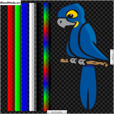
const BlendMode(1)
Composite the source image over the destination image, but only where it overlaps the destination.
This corresponds to the "Source atop Destination" Porter-Duff operator.
This is essentially the srcOver operator, but with the output's opacity channel being set to that of the destination image instead of being a combination of both image's opacity channels.
For a variant with the destination on top instead of the source, see dstATop.
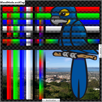
const BlendMode(9)
Show the source image, but only where the two images overlap. The destination image is not rendered, it is treated merely as a mask. The color channels of the destination are ignored, only the opacity has an effect.
To show the destination image instead, consider dstIn.
To reverse the semantic of the mask (only showing the source where the destination is absent, rather than where it is present), consider srcOut.
This corresponds to the "Source in Destination" Porter-Duff operator.
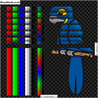
const BlendMode(5)
Show the source image, but only where the two images do not overlap. The destination image is not rendered, it is treated merely as a mask. The color channels of the destination are ignored, only the opacity has an effect.
To show the destination image instead, consider dstOut.
To reverse the semantic of the mask (only showing the source where the destination is present, rather than where it is absent), consider srcIn.
This corresponds to the "Source out Destination" Porter-Duff operator.
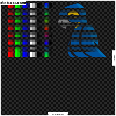
const BlendMode(7)
Composite the source image over the destination image.
This is the default value. It represents the most intuitive case, where shapes are painted on top of what is below, with transparent areas showing the destination layer.
This corresponds to the "Source over Destination" Porter-Duff operator, also known as the Painter's Algorithm.

const BlendMode(3)
A constant List of the values in this enum, in order of their declaration.
const List<BlendMode>
Apply a bitwise xor operator to the source and destination images. This
leaves transparency where they would overlap.
This corresponds to the "Source xor Destination" Porter-Duff operator.
const BlendMode(11)
Styles to use for blurs in MaskFilter objects.
Fuzzy inside, nothing outside. This can make shapes appear to be lit from within.
const BlurStyle(3)
Fuzzy inside and outside. This is useful for painting shadows that are offset from the shape that ostensibly is casting the shadow.
const BlurStyle(0)
Nothing inside, fuzzy outside. This is useful for painting shadows for partially transparent shapes, when they are painted separately but without an offset, so that the shadow doesn't paint below the shape.
const BlurStyle(2)
Solid inside, fuzzy outside. This corresponds to drawing the shape, and additionally drawing the blur. This can make objects appear brighter, maybe even as if they were fluorescent.
const BlurStyle(1)
A constant List of the values in this enum, in order of their declaration.
const List<BlurStyle>
Defines various ways to vertically bound the boxes returned by Paragraph.getBoxesForRange.
Extends the bottom edge of the bounds to fully cover any line spacing.
The line spacing will be added to the bottom of the box.
The top edge of each line should be the same as the bottom edge of the line above. There should be no gaps in vertical coverage given any amount of line spacing. Line spacing is not included above the first line and below the last line due to no additional space present there.
const BoxHeightStyle(4)
Extends the top and bottom edge of the bounds to fully cover any line spacing.
The top and bottom of each box will cover half of the space above and half of the space below the line.
The top edge of each line should be the same as the bottom edge of the line above. There should be no gaps in vertical coverage given any amount of line spacing. Line spacing is not included above the first line and below the last line due to no additional space present there.
const BoxHeightStyle(2)
Extends the top edge of the bounds to fully cover any line spacing.
The line spacing will be added to the top of the box.
null
const BoxHeightStyle(3)
The height of the boxes will be the maximum height of all runs in the line. All boxes in the same line will be the same height.
This does not guarantee that the boxes will cover the entire vertical height of the line when there is additional line spacing.
See RectHeightStyle.includeLineSpacingTop, RectHeightStyle.includeLineSpacingMiddle, and RectHeightStyle.includeLineSpacingBottom for styles that will cover the entire line.
const BoxHeightStyle(1)
Calculate box heights based on the metrics of this paragraph's StrutStyle.
Boxes based on the strut will have consistent heights throughout the entire paragraph. The top edge of each line will align with the bottom edge of the previous line. It is possible for glyphs to extend outside these boxes.
const BoxHeightStyle(5)
Provide tight bounding boxes that fit heights per run. This style may result in uneven bounding boxes that do not nicely connect with adjacent boxes.
const BoxHeightStyle(0)
A constant List of the values in this enum, in order of their declaration.
const List<BoxHeightStyle>
Defines various ways to horizontally bound the boxes returned by Paragraph.getBoxesForRange.
Adds up to two additional boxes as needed at the beginning and/or end of each line so that the widths of the boxes in line are the same width as the widest line in the paragraph.
The additional boxes on each line are only added when the relevant box at the relevant edge of that line does not span the maximum width of the paragraph.
const BoxWidthStyle(1)
const BoxWidthStyle(0)
A constant List of the values in this enum, in order of their declaration.
const List<BoxWidthStyle>
Describes the contrast of a theme or color palette.
The color is dark and will require a light text color to achieve readable contrast.
For example, the color might be dark grey, requiring white text.
const Brightness(0)
The color is light and will require a dark text color to achieve readable contrast.
For example, the color might be bright white, requiring black text.
const Brightness(1)
A constant List of the values in this enum, in order of their declaration.
const List<Brightness>
A wrapper for a raw callback handle.
This is the return type for PluginUtilities.getCallbackHandle.
MethodChannel or SendPort
(to pass to another Isolate).
Create an instance using a raw callback handle.
Only values produced by a call to CallbackHandle.toRawHandle should be used, otherwise this object will be an invalid handle.
CallbackHandle.fromRawHandle(this._handle)
: assert(_handle != null, "'_handle' must not be null.");The hash code for this object.
A hash code is a single integer which represents the state of the object that affects operator == comparisons.
All objects have hash codes. The default hash code represents only the identity of the object, the same way as the default operator == implementation only considers objects equal if they are identical (see identityHashCode).
If operator == is overridden to use the object state instead, the hash code must also be changed to represent that state.
Hash codes must be the same for objects that are equal to each other according to operator ==. The hash code of an object should only change if the object changes in a way that affects equality. There are no further requirements for the hash codes. They need not be consistent between executions of the same program and there are no distribution guarantees.
Objects that are not equal are allowed to have the same hash code, it is even technically allowed that all instances have the same hash code, but if clashes happen too often, it may reduce the efficiency of hash-based data structures like HashSet or HashMap.
If a subclass overrides hashCode, it should override the operator == operator as well to maintain consistency.
@override
int get hashCode => _handle.hashCode;The equality operator.
The default behavior for all Objects is to return true if and
only if this and other are the same object.
Override this method to specify a different equality relation on a class. The overriding method must still be an equivalence relation. That is, it must be:
Total: It must return a boolean for all arguments. It should never throw
or return null.
Reflexive: For all objects o, o == o must be true.
Symmetric: For all objects o1 and o2, o1 == o2 and o2 == o1 must
either both be true, or both be false.
Transitive: For all objects o1, o2, and o3, if o1 == o2 and
o2 == o3 are true, then o1 == o3 must be true.
The method should also be consistent over time, so whether two objects are equal should only change if at least one of the objects was modified.
If a subclass overrides the equality operator it should override the hashCode method as well to maintain consistency.
@override
bool operator ==(dynamic other) {
if (runtimeType != other.runtimeType)
return false;
final CallbackHandle typedOther = other;
return _handle == typedOther._handle;
}An interface for recording graphical operations.
Canvas objects are used in creating Picture objects, which can themselves be used with a SceneBuilder to build a Scene. In normal usage, however, this is all handled by the framework.
A canvas has a current transformation matrix which is applied to all operations. Initially, the transformation matrix is the identity transform. It can be modified using the translate, scale, rotate, skew, and transform methods.
A canvas also has a current clip region which is applied to all operations. Initially, the clip region is infinite. It can be modified using the clipRect, clipRRect, and clipPath methods.
The current transform and clip can be saved and restored using the stack managed by the save, saveLayer, and restore methods.
src argument into
the canvas in the axis-aligned rectangle given by the dst argument. [...]
paint's Paint.colorFilter and Paint.blendMode
applied. [...]
Creates a canvas for recording graphical operations into the given picture recorder.
Graphical operations that affect pixels entirely outside the given
cullRect might be discarded by the implementation. However, the
implementation might draw outside these bounds if, for example, a command
draws partially inside and outside the cullRect. To ensure that pixels
outside a given region are discarded, consider using a clipRect. The
cullRect is optional; by default, all operations are kept.
To end the recording, call PictureRecorder.endRecording on the given recorder.
@pragma('vm:entry-point')
Canvas(PictureRecorder recorder, [ Rect cullRect ]) : assert(recorder != null) {
if (recorder.isRecording)
throw ArgumentError('"recorder" must not already be associated with another Canvas.');
cullRect ??= Rect.largest;
_constructor(recorder, cullRect.left, cullRect.top, cullRect.right, cullRect.bottom);
}Reduces the clip region to the intersection of the current clip and the given Path.
If doAntiAlias is true, then the clip will be anti-aliased.
If multiple draw commands intersect with the clip boundary, this can result multiple draw commands intersect with the clip boundary, this can result in incorrect blending at the clip boundary. See saveLayer for a discussion of how to address that.
void clipPath(Path path, {bool doAntiAlias = true}) {
assert(path != null); // path is checked on the engine side
assert(doAntiAlias != null);
_clipPath(path, doAntiAlias);
}Reduces the clip region to the intersection of the current clip and the given rounded rectangle.
If doAntiAlias is true, then the clip will be anti-aliased.
If multiple draw commands intersect with the clip boundary, this can result in incorrect blending at the clip boundary. See saveLayer for a discussion of how to address that and some examples of using clipRRect.
void clipRRect(RRect rrect, {bool doAntiAlias = true}) {
assert(_rrectIsValid(rrect));
assert(doAntiAlias != null);
_clipRRect(rrect._value32, doAntiAlias);
}Reduces the clip region to the intersection of the current clip and the given rectangle.
If doAntiAlias is true, then the clip will be anti-aliased.
If multiple draw commands intersect with the clip boundary, this can result in incorrect blending at the clip boundary. See saveLayer for a discussion of how to address that.
Use ClipOp.difference to subtract the provided rectangle from the current clip.
void clipRect(Rect rect, { ClipOp clipOp = ClipOp.intersect, bool doAntiAlias = true }) {
assert(_rectIsValid(rect));
assert(clipOp != null);
assert(doAntiAlias != null);
_clipRect(rect.left, rect.top, rect.right, rect.bottom, clipOp.index, doAntiAlias);
}Draw an arc scaled to fit inside the given rectangle. It starts from startAngle radians around the oval up to startAngle + sweepAngle radians around the oval, with zero radians being the point on the right hand side of the oval that crosses the horizontal line that intersects the center of the rectangle and with positive angles going clockwise around the oval. If useCenter is true, the arc is closed back to the center, forming a circle sector. Otherwise, the arc is not closed, forming a circle segment.
This method is optimized for drawing arcs and should be faster than Path.arcTo.
void drawArc(Rect rect, double startAngle, double sweepAngle, bool useCenter, Paint paint) {
assert(_rectIsValid(rect));
assert(paint != null);
_drawArc(rect.left, rect.top, rect.right, rect.bottom, startAngle,
sweepAngle, useCenter, paint._objects, paint._data);
}void drawAtlas(Image atlas,
List<RSTransform> transforms,
List<Rect> rects,
List<Color> colors,
BlendMode blendMode,
Rect cullRect,
Paint paint) {
assert(atlas != null); // atlas is checked on the engine side
assert(transforms != null);
assert(rects != null);
assert(colors != null);
assert(blendMode != null);
assert(paint != null);
final int rectCount = rects.length;
if (transforms.length != rectCount)
throw ArgumentError('"transforms" and "rects" lengths must match.');
if (colors.isNotEmpty && colors.length != rectCount)
throw ArgumentError('If non-null, "colors" length must match that of "transforms" and "rects".');
final Float32List rstTransformBuffer = Float32List(rectCount * 4);
final Float32List rectBuffer = Float32List(rectCount * 4);
for (int i = 0; i < rectCount; ++i) {
final int index0 = i * 4;
final int index1 = index0 + 1;
final int index2 = index0 + 2;
final int index3 = index0 + 3;
final RSTransform rstTransform = transforms[i];
final Rect rect = rects[i];
assert(_rectIsValid(rect));
rstTransformBuffer[index0] = rstTransform.scos;
rstTransformBuffer[index1] = rstTransform.ssin;
rstTransformBuffer[index2] = rstTransform.tx;
rstTransformBuffer[index3] = rstTransform.ty;
rectBuffer[index0] = rect.left;
rectBuffer[index1] = rect.top;
rectBuffer[index2] = rect.right;
rectBuffer[index3] = rect.bottom;
}
final Int32List colorBuffer = colors.isEmpty ? null : _encodeColorList(colors);
final Float32List cullRectBuffer = cullRect?._value32;
_drawAtlas(
paint._objects, paint._data, atlas, rstTransformBuffer, rectBuffer,
colorBuffer, blendMode.index, cullRectBuffer
);
}Draws a circle centered at the point given by the first argument and that has the radius given by the second argument, with the Paint given in the third argument. Whether the circle is filled or stroked (or both) is controlled by Paint.style.
void drawCircle(Offset c, double radius, Paint paint) {
assert(_offsetIsValid(c));
assert(paint != null);
_drawCircle(c.dx, c.dy, radius, paint._objects, paint._data);
}Paints the given Color onto the canvas, applying the given BlendMode, with the given color being the source and the background being the destination.
void drawColor(Color color, BlendMode blendMode) {
assert(color != null);
assert(blendMode != null);
_drawColor(color.value, blendMode.index);
}Draws a shape consisting of the difference between two rounded rectangles with the given Paint. Whether this shape is filled or stroked (or both) is controlled by Paint.style.
This shape is almost but not quite entirely unlike an annulus.
void drawDRRect(RRect outer, RRect inner, Paint paint) {
assert(_rrectIsValid(outer));
assert(_rrectIsValid(inner));
assert(paint != null);
_drawDRRect(outer._value32, inner._value32, paint._objects, paint._data);
}Draws the given Image into the canvas with its top-left corner at the given Offset. The image is composited into the canvas using the given Paint.
void drawImage(Image image, Offset p, Paint paint) {
assert(image != null); // image is checked on the engine side
assert(_offsetIsValid(p));
assert(paint != null);
_drawImage(image, p.dx, p.dy, paint._objects, paint._data);
}Draws the given Image into the canvas using the given Paint.
The image is drawn in nine portions described by splitting the image by
drawing two horizontal lines and two vertical lines, where the center
argument describes the rectangle formed by the four points where these
four lines intersect each other. (This forms a 3-by-3 grid of regions,
the center region being described by the center argument.)
The four regions in the corners are drawn, without scaling, in the four
corners of the destination rectangle described by dst. The remaining
five regions are drawn by stretching them to fit such that they exactly
cover the destination rectangle while maintaining their relative
positions.
void drawImageNine(Image image, Rect center, Rect dst, Paint paint) {
assert(image != null); // image is checked on the engine side
assert(_rectIsValid(center));
assert(_rectIsValid(dst));
assert(paint != null);
_drawImageNine(image,
center.left,
center.top,
center.right,
center.bottom,
dst.left,
dst.top,
dst.right,
dst.bottom,
paint._objects,
paint._data);
}Draws the subset of the given image described by the src argument into
the canvas in the axis-aligned rectangle given by the dst argument.
This might sample from outside the src rect by up to half the width of
an applied filter.
Multiple calls to this method with different arguments (from the same image) can be batched into a single call to drawAtlas to improve performance.
void drawImageRect(Image image, Rect src, Rect dst, Paint paint) {
assert(image != null); // image is checked on the engine side
assert(_rectIsValid(src));
assert(_rectIsValid(dst));
assert(paint != null);
_drawImageRect(image,
src.left,
src.top,
src.right,
src.bottom,
dst.left,
dst.top,
dst.right,
dst.bottom,
paint._objects,
paint._data);
}Draws a line between the given points using the given paint. The line is stroked, the value of the Paint.style is ignored for this call.
The p1 and p2 arguments are interpreted as offsets from the origin.
void drawLine(Offset p1, Offset p2, Paint paint) {
assert(_offsetIsValid(p1));
assert(_offsetIsValid(p2));
assert(paint != null);
_drawLine(p1.dx, p1.dy, p2.dx, p2.dy, paint._objects, paint._data);
}Draws an axis-aligned oval that fills the given axis-aligned rectangle with the given Paint. Whether the oval is filled or stroked (or both) is controlled by Paint.style.
void drawOval(Rect rect, Paint paint) {
assert(_rectIsValid(rect));
assert(paint != null);
_drawOval(rect.left, rect.top, rect.right, rect.bottom,
paint._objects, paint._data);
}Draws the text in the given Paragraph into this canvas at the given Offset.
The Paragraph object must have had Paragraph.layout called on it first.
To align the text, set the textAlign on the ParagraphStyle object
passed to the new ParagraphBuilder constructor. For more details see
TextAlign and the discussion at new ParagraphStyle.
If the text is left aligned or justified, the left margin will be at the
position specified by the offset argument's Offset.dx coordinate.
If the text is right aligned or justified, the right margin will be at the
position described by adding the ParagraphConstraints.width given to
Paragraph.layout, to the offset argument's Offset.dx coordinate.
If the text is centered, the centering axis will be at the position
described by adding half of the ParagraphConstraints.width given to
Paragraph.layout, to the offset argument's Offset.dx coordinate.
void drawParagraph(Paragraph paragraph, Offset offset) {
assert(paragraph != null);
assert(_offsetIsValid(offset));
paragraph._paint(this, offset.dx, offset.dy);
}Draws the given Path with the given Paint. Whether this shape is filled or stroked (or both) is controlled by Paint.style. If the path is filled, then sub-paths within it are implicitly closed (see Path.close).
void drawPath(Path path, Paint paint) {
assert(path != null); // path is checked on the engine side
assert(paint != null);
_drawPath(path, paint._objects, paint._data);
}Draw the given picture onto the canvas. To create a picture, see PictureRecorder.
void drawPicture(Picture picture) {
assert(picture != null); // picture is checked on the engine side
_drawPicture(picture);
}Draws a sequence of points according to the given PointMode.
The points argument is interpreted as offsets from the origin.
See also:
points as a Float32List rather than a
List<Offset>.void drawPoints(PointMode pointMode, List<Offset> points, Paint paint) {
assert(pointMode != null);
assert(points != null);
assert(paint != null);
_drawPoints(paint._objects, paint._data, pointMode.index, _encodePointList(points));
}Draws a rounded rectangle with the given Paint. Whether the rectangle is filled or stroked (or both) is controlled by Paint.style.
void drawRRect(RRect rrect, Paint paint) {
assert(_rrectIsValid(rrect));
assert(paint != null);
_drawRRect(rrect._value32, paint._objects, paint._data);
}void drawRawAtlas(Image atlas,
Float32List rstTransforms,
Float32List rects,
Int32List colors,
BlendMode blendMode,
Rect cullRect,
Paint paint) {
assert(atlas != null); // atlas is checked on the engine side
assert(rstTransforms != null);
assert(rects != null);
assert(colors != null);
assert(blendMode != null);
assert(paint != null);
final int rectCount = rects.length;
if (rstTransforms.length != rectCount)
throw ArgumentError('"rstTransforms" and "rects" lengths must match.');
if (rectCount % 4 != 0)
throw ArgumentError('"rstTransforms" and "rects" lengths must be a multiple of four.');
if (colors != null && colors.length * 4 != rectCount)
throw ArgumentError('If non-null, "colors" length must be one fourth the length of "rstTransforms" and "rects".');
_drawAtlas(
paint._objects, paint._data, atlas, rstTransforms, rects,
colors, blendMode.index, cullRect?._value32
);
}Draws a sequence of points according to the given PointMode.
The points argument is interpreted as a list of pairs of floating point
numbers, where each pair represents an x and y offset from the origin.
See also:
points as a List<Offset> rather than a
List<Float32List>.void drawRawPoints(PointMode pointMode, Float32List points, Paint paint) {
assert(pointMode != null);
assert(points != null);
assert(paint != null);
if (points.length % 2 != 0)
throw ArgumentError('"points" must have an even number of values.');
_drawPoints(paint._objects, paint._data, pointMode.index, points);
}Draws a rectangle with the given Paint. Whether the rectangle is filled or stroked (or both) is controlled by Paint.style.
void drawRect(Rect rect, Paint paint) {
assert(_rectIsValid(rect));
assert(paint != null);
_drawRect(rect.left, rect.top, rect.right, rect.bottom,
paint._objects, paint._data);
}Draws a shadow for a Path representing the given material elevation.
The transparentOccluder argument should be true if the occluding object
is not opaque.
The arguments must not be null.
void drawShadow(Path path, Color color, double elevation, bool transparentOccluder) {
assert(path != null); // path is checked on the engine side
assert(color != null);
assert(transparentOccluder != null);
_drawShadow(path, color.value, elevation, transparentOccluder);
}void drawVertices(Vertices vertices, BlendMode blendMode, Paint paint) {
assert(vertices != null); // vertices is checked on the engine side
assert(paint != null);
assert(blendMode != null);
_drawVertices(vertices, blendMode.index, paint._objects, paint._data);
}Returns the number of items on the save stack, including the initial state. This means it returns 1 for a clean canvas, and that each call to save and saveLayer increments it, and that each matching call to restore decrements it.
This number cannot go below 1.
int getSaveCount() native 'Canvas_getSaveCount';Pops the current save stack, if there is anything to pop. Otherwise, does nothing.
Use save and saveLayer to push state onto the stack.
If the state was pushed with with saveLayer, then this call will also cause the new layer to be composited into the previous layer.
void restore() native 'Canvas_restore';Add a rotation to the current transform. The argument is in radians clockwise.
void rotate(double radians) native 'Canvas_rotate';Saves a copy of the current transform and clip on the save stack, and then
creates a new group which subsequent calls will become a part of. When the
save stack is later popped, the group will be flattened into a layer and
have the given paint's Paint.colorFilter and Paint.blendMode
applied.
This lets you create composite effects, for example making a group of drawing commands semi-transparent. Without using saveLayer, each part of the group would be painted individually, so where they overlap would be darker than where they do not. By using saveLayer to group them together, they can be drawn with an opaque color at first, and then the entire group can be made transparent using the saveLayer's paint.
Call restore to pop the save stack and apply the paint to the group.
When a rectangular clip operation (from clipRect) is not axis-aligned with the raster buffer, or when the clip operation is not rectilinear (e.g. because it is a rounded rectangle clip created by clipRRect or an arbitrarily complicated path clip created by clipPath), the edge of the clip needs to be anti-aliased.
If two draw calls overlap at the edge of such a clipped region, without using saveLayer, the first drawing will be anti-aliased with the background first, and then the second will be anti-aliased with the result of blending the first drawing and the background. On the other hand, if saveLayer is used immediately after establishing the clip, the second drawing will cover the first in the layer, and thus the second alone will be anti-aliased with the background when the layer is clipped and composited (when restore is called).
For example, this CustomPainter.paint method paints a clean white
rounded rectangle:
void paint(Canvas canvas, Size size) {
Rect rect = Offset.zero & size;
canvas.save();
canvas.clipRRect(new RRect.fromRectXY(rect, 100.0, 100.0));
canvas.saveLayer(rect, Paint());
canvas.drawPaint(new Paint()..color = Colors.red);
canvas.drawPaint(new Paint()..color = Colors.white);
canvas.restore();
canvas.restore();
}
On the other hand, this one renders a red outline, the result of the red paint being anti-aliased with the background at the clip edge, then the white paint being similarly anti-aliased with the background including the clipped red paint:
void paint(Canvas canvas, Size size) {
// (this example renders poorly, prefer the example above)
Rect rect = Offset.zero & size;
canvas.save();
canvas.clipRRect(new RRect.fromRectXY(rect, 100.0, 100.0));
canvas.drawPaint(new Paint()..color = Colors.red);
canvas.drawPaint(new Paint()..color = Colors.white);
canvas.restore();
}
This point is moot if the clip only clips one draw operation. For example, the following paint method paints a pair of clean white rounded rectangles, even though the clips are not done on a separate layer:
void paint(Canvas canvas, Size size) {
canvas.save();
canvas.clipRRect(new RRect.fromRectXY(Offset.zero & (size / 2.0), 50.0, 50.0));
canvas.drawPaint(new Paint()..color = Colors.white);
canvas.restore();
canvas.save();
canvas.clipRRect(new RRect.fromRectXY(size.center(Offset.zero) & (size / 2.0), 50.0, 50.0));
canvas.drawPaint(new Paint()..color = Colors.white);
canvas.restore();
}
(Incidentally, rather than using clipRRect and drawPaint to draw rounded rectangles like this, prefer the drawRRect method. These examples are using drawPaint as a proxy for "complicated draw operations that will get clipped", to illustrate the point.)
Generally speaking, saveLayer is relatively expensive.
There are a several different hardware architectures for GPUs (graphics processing units, the hardware that handles graphics), but most of them involve batching commands and reordering them for performance. When layers are used, they cause the rendering pipeline to have to switch render target (from one layer to another). Render target switches can flush the GPU's command buffer, which typically means that optimizations that one could get with larger batching are lost. Render target switches also generate a lot of memory churn because the GPU needs to copy out the current frame buffer contents from the part of memory that's optimized for writing, and then needs to copy it back in once the previous render target (layer) is restored.
See also:
void saveLayer(Rect bounds, Paint paint) {
assert(paint != null);
if (bounds == null) {
_saveLayerWithoutBounds(paint._objects, paint._data);
} else {
assert(_rectIsValid(bounds));
_saveLayer(bounds.left, bounds.top, bounds.right, bounds.bottom,
paint._objects, paint._data);
}
}Add an axis-aligned scale to the current transform, scaling by the first argument in the horizontal direction and the second in the vertical direction.
If sy is unspecified, sx will be used for the scale in both
directions.
void scale(double sx, [double sy]) => _scale(sx, sy ?? sx);Add an axis-aligned skew to the current transform, with the first argument being the horizontal skew in rise over run units clockwise around the origin, and the second argument being the vertical skew in rise over run units clockwise around the origin.
void skew(double sx, double sy) native 'Canvas_skew';Multiply the current transform by the specified 4⨉4 transformation matrix specified as a list of values in column-major order.
void transform(Float64List matrix4) {
assert(matrix4 != null);
if (matrix4.length != 16)
throw ArgumentError('"matrix4" must have 16 entries.');
_transform(matrix4);
}Different ways to clip a widget's content.
Clip with anti-aliasing.
This mode has anti-aliased clipping edges to achieve a smoother look.
It' s much faster than antiAliasWithSaveLayer, but slower than hardEdge.
This will be the common case when dealing with circles and arcs.
Different from hardEdge and antiAliasWithSaveLayer, this clipping may have bleeding edge artifacts. (See https://fiddle.skia.org/c/21cb4c2b2515996b537f36e7819288ae for an example.)
See also:
const Clip(2)
Clip with anti-aliasing and saveLayer immediately following the clip.
This mode not only clips with anti-aliasing, but also allocates an offscreen buffer. All subsequent paints are carried out on that buffer before finally being clipped and composited back.
This is very slow. It has no bleeding edge artifacts (that antiAlias has) but it changes the semantics as an offscreen buffer is now introduced. (See https://github.com/flutter/flutter/issues/18057#issuecomment-394197336 for a difference between paint without saveLayer and paint with saveLayer.)
This will be only rarely needed. One case where you might need this is if you have an image overlaid on a very different background color. In these cases, consider whether you can avoid overlaying multiple colors in one spot (e.g. by having the background color only present where the image is absent). If you can, antiAlias would be fine and much faster.
See also:
const Clip(3)
Clip, but do not apply anti-aliasing.
This mode enables clipping, but curves and non-axis-aligned straight lines will be jagged as no effort is made to anti-alias.
Faster than other clipping modes, but slower than none.
This is a reasonable choice when clipping is needed, if the container is an axis- aligned rectangle or an axis-aligned rounded rectangle with very small corner radii.
See also:
const Clip(1)
No clip at all.
This is the default option for most widgets: if the content does not overflow the widget boundary, don't pay any performance cost for clipping.
If the content does overflow, please explicitly specify the following Clip options:
const Clip(0)
A constant List of the values in this enum, in order of their declaration.
const List<Clip>
Defines how a new clip region should be merged with the existing clip region.
Used by Canvas.clipRect.
Subtract the new region from the existing region.
const ClipOp(0)
Intersect the new region from the existing region.
const ClipOp(1)
A constant List of the values in this enum, in order of their declaration.
const List<ClipOp>
A handle to an image codec.
This class is created by the engine, and should not be instantiated or extended directly.
To obtain an instance of the Codec interface, see instantiateImageCodec.
Release the resources used by this object. The object is no longer usable after this method is called.
void dispose() native 'Codec_dispose';Number of frames in this image.
int get frameCount native 'Codec_frameCount';Fetches the next animation frame.
Wraps back to the first frame after returning the last frame.
The returned future can complete with an error if the decoding has failed.
Future<FrameInfo> getNextFrame() {
return _futurize(_getNextFrame);
}Number of times to repeat the animation.
int get repetitionCount native 'Codec_repetitionCount';An immutable 32 bit color value in ARGB format.
Consider the light teal of the Flutter logo. It is fully opaque, with a red
channel value of 0x42 (66), a green channel value of 0xA5 (165), and a blue
channel value of 0xF5 (245). In the common "hash syntax" for color values,
it would be described as #42A5F5.
Here are some ways it could be constructed:
Color c = const Color(0xFF42A5F5);
Color c = const Color.fromARGB(0xFF, 0x42, 0xA5, 0xF5);
Color c = const Color.fromARGB(255, 66, 165, 245);
Color c = const Color.fromRGBO(66, 165, 245, 1.0);
If you are having a problem with Color wherein it seems your color is just
not painting, check to make sure you are specifying the full 8 hexadecimal
digits. If you only specify six, then the leading two digits are assumed to
be zero, which means fully-transparent:
Color c1 = const Color(0xFFFFFF); // fully transparent white (invisible)
Color c2 = const Color(0xFFFFFFFF); // fully opaque white (visible)
See also:
rgba() in CSS. [...]
a (which ranges from 0 to 255). [...]
b (which ranges from 0 to 255). [...]
g (which ranges from 0 to 255). [...]
opacity (which ranges from 0.0 to 1.0). [...]
r (which ranges from 0 to 255). [...]
Construct a color from the lower 8 bits of four integers.
a is the alpha value, with 0 being transparent and 255 being fully
opaque.r is red, from 0 to 255.g is green, from 0 to 255.b is blue, from 0 to 255.Out of range values are brought into range using modulo 255.
See also fromRGBO, which takes the alpha value as a floating point value.
const Color.fromARGB(int a, int r, int g, int b) :
value = (((a & 0xff) << 24) |
((r & 0xff) << 16) |
((g & 0xff) << 8) |
((b & 0xff) << 0)) & 0xFFFFFFFF;Create a color from red, green, blue, and opacity, similar to rgba() in CSS.
r is red, from 0 to 255.g is green, from 0 to 255.b is blue, from 0 to 255.opacity is alpha channel of this color as a double, with 0.0 being
transparent and 1.0 being fully opaque.Out of range values are brought into range using modulo 255.
See also fromARGB, which takes the opacity as an integer value.
const Color.fromRGBO(int r, int g, int b, double opacity) :
value = ((((opacity * 0xff ~/ 1) & 0xff) << 24) |
((r & 0xff) << 16) |
((g & 0xff) << 8) |
((b & 0xff) << 0)) & 0xFFFFFFFF;Construct a color from the lower 32 bits of an int.
The bits are interpreted as follows:
In other words, if AA is the alpha value in hex, RR the red value in hex,
GG the green value in hex, and BB the blue value in hex, a color can be
expressed as const Color(0xAARRGGBB).
For example, to get a fully opaque orange, you would use const
Color(0xFFFF9000) (FF for the alpha, FF for the red, 90 for the
green, and 00 for the blue).
@pragma('vm:entry-point')
const Color(int value) : value = value & 0xFFFFFFFF;The alpha channel of this color in an 8 bit value.
A value of 0 means this color is fully transparent. A value of 255 means this color is fully opaque.
int get alpha => (0xff000000 & value) >> 24;Combine the foreground color as a transparent color over top of a background color, and return the resulting combined color.
This uses standard alpha blending ("SRC over DST") rules to produce a blended color from two colors. This can be used as a performance enhancement when trying to avoid needless alpha blending compositing operations for two things that are solid colors with the same shape, but overlay each other: instead, just paint one with the combined color.
static Color alphaBlend(Color foreground, Color background) {
final int alpha = foreground.alpha;
if (alpha == 0x00) { // Foreground completely transparent.
return background;
}
final int invAlpha = 0xff - alpha;
int backAlpha = background.alpha;
if (backAlpha == 0xff) { // Opaque background case
return Color.fromARGB(
0xff,
(alpha * foreground.red + invAlpha * background.red) ~/ 0xff,
(alpha * foreground.green + invAlpha * background.green) ~/ 0xff,
(alpha * foreground.blue + invAlpha * background.blue) ~/ 0xff,
);
} else { // General case
backAlpha = (backAlpha * invAlpha) ~/ 0xff;
final int outAlpha = alpha + backAlpha;
assert(outAlpha != 0x00);
return Color.fromARGB(
outAlpha,
(foreground.red * alpha + background.red * backAlpha) ~/ outAlpha,
(foreground.green * alpha + background.green * backAlpha) ~/ outAlpha,
(foreground.blue * alpha + background.blue * backAlpha) ~/ outAlpha,
);
}
}The blue channel of this color in an 8 bit value.
int get blue => (0x000000ff & value) >> 0;Returns a brightness value between 0 for darkest and 1 for lightest.
Represents the relative luminance of the color. This value is computationally expensive to calculate.
double computeLuminance() {
// See <https://www.w3.org/TR/WCAG20/#relativeluminancedef>
final double R = _linearizeColorComponent(red / 0xFF);
final double G = _linearizeColorComponent(green / 0xFF);
final double B = _linearizeColorComponent(blue / 0xFF);
return 0.2126 * R + 0.7152 * G + 0.0722 * B;
}The green channel of this color in an 8 bit value.
int get green => (0x0000ff00 & value) >> 8;The hash code for this object.
A hash code is a single integer which represents the state of the object that affects operator == comparisons.
All objects have hash codes. The default hash code represents only the identity of the object, the same way as the default operator == implementation only considers objects equal if they are identical (see identityHashCode).
If operator == is overridden to use the object state instead, the hash code must also be changed to represent that state.
Hash codes must be the same for objects that are equal to each other according to operator ==. The hash code of an object should only change if the object changes in a way that affects equality. There are no further requirements for the hash codes. They need not be consistent between executions of the same program and there are no distribution guarantees.
Objects that are not equal are allowed to have the same hash code, it is even technically allowed that all instances have the same hash code, but if clashes happen too often, it may reduce the efficiency of hash-based data structures like HashSet or HashMap.
If a subclass overrides hashCode, it should override the operator == operator as well to maintain consistency.
@override
int get hashCode => value.hashCode;Linearly interpolate between two colors.
This is intended to be fast but as a result may be ugly. Consider
HSVColor or writing custom logic for interpolating colors.
If either color is null, this function linearly interpolates from a
transparent instance of the other color. This is usually preferable to
interpolating from material.Colors.transparent (const
Color(0x00000000)), which is specifically transparent black.
The t argument represents position on the timeline, with 0.0 meaning
that the interpolation has not started, returning a (or something
equivalent to a), 1.0 meaning that the interpolation has finished,
returning b (or something equivalent to b), and values in between
meaning that the interpolation is at the relevant point on the timeline
between a and b. The interpolation can be extrapolated beyond 0.0 and
1.0, so negative values and values greater than 1.0 are valid (and can
easily be generated by curves such as Curves.elasticInOut). Each channel
will be clamped to the range 0 to 255.
Values for t are usually obtained from an Animation<double>, such as
an AnimationController.
static Color lerp(Color a, Color b, double t) {
assert(t != null);
if (a == null && b == null)
return null;
if (a == null)
return _scaleAlpha(b, t);
if (b == null)
return _scaleAlpha(a, 1.0 - t);
return Color.fromARGB(
lerpDouble(a.alpha, b.alpha, t).toInt().clamp(0, 255),
lerpDouble(a.red, b.red, t).toInt().clamp(0, 255),
lerpDouble(a.green, b.green, t).toInt().clamp(0, 255),
lerpDouble(a.blue, b.blue, t).toInt().clamp(0, 255),
);
}The alpha channel of this color as a double.
A value of 0.0 means this color is fully transparent. A value of 1.0 means this color is fully opaque.
double get opacity => alpha / 0xFF;The equality operator.
The default behavior for all Objects is to return true if and
only if this and other are the same object.
Override this method to specify a different equality relation on a class. The overriding method must still be an equivalence relation. That is, it must be:
Total: It must return a boolean for all arguments. It should never throw
or return null.
Reflexive: For all objects o, o == o must be true.
Symmetric: For all objects o1 and o2, o1 == o2 and o2 == o1 must
either both be true, or both be false.
Transitive: For all objects o1, o2, and o3, if o1 == o2 and
o2 == o3 are true, then o1 == o3 must be true.
The method should also be consistent over time, so whether two objects are equal should only change if at least one of the objects was modified.
If a subclass overrides the equality operator it should override the hashCode method as well to maintain consistency.
@override
bool operator ==(dynamic other) {
if (identical(this, other))
return true;
if (other.runtimeType != runtimeType)
return false;
final Color typedOther = other;
return value == typedOther.value;
}The red channel of this color in an 8 bit value.
int get red => (0x00ff0000 & value) >> 16;Returns a string representation of this object.
@override
String toString() => 'Color(0x${value.toRadixString(16).padLeft(8, '0')})';A 32 bit value representing this color.
The bits are assigned as follows:
final int value
Returns a new color that matches this color with the alpha channel
replaced with the given opacity (which ranges from 0.0 to 1.0).
Out of range values will have unexpected effects.
Color withOpacity(double opacity) {
assert(opacity >= 0.0 && opacity <= 1.0);
return withAlpha((255.0 * opacity).round());
}A description of a color filter to apply when drawing a shape or compositing a layer with a particular Paint. A color filter is a function that takes two colors, and outputs one color. When applied during compositing, it is independently applied to each pixel of the layer being drawn before the entire layer is merged with the destination.
Instances of this class are used with Paint.colorFilter on Paint objects.
Construct a color filter that applies the sRGB gamma curve to the RGB channels.
const ColorFilter.linearToSrgbGamma()
: _color = null,
_blendMode = null,
_matrix = null,
_type = _TypeLinearToSrgbGamma;Construct a color filter that transforms a color by a 4x5 matrix. The matrix is in row-major order and the translation column is specified in unnormalized, 0...255, space.
const ColorFilter.matrix(List<double> matrix)
: _color = null,
_blendMode = null,
_matrix = matrix,
_type = _TypeMatrix;Creates a color filter that applies the blend mode given as the second argument. The source color is the one given as the first argument, and the destination color is the one from the layer being composited.
The output of this filter is then composited into the background according to the Paint.blendMode, using the output of this filter as the source and the background as the destination.
const ColorFilter.mode(Color color, BlendMode blendMode)
: _color = color,
_blendMode = blendMode,
_matrix = null,
_type = _TypeMode;Creates a color filter that applies the inverse of the sRGB gamma curve to the RGB channels.
const ColorFilter.srgbToLinearGamma()
: _color = null,
_blendMode = null,
_matrix = null,
_type = _TypeSrgbToLinearGamma;The hash code for this object.
A hash code is a single integer which represents the state of the object that affects operator == comparisons.
All objects have hash codes. The default hash code represents only the identity of the object, the same way as the default operator == implementation only considers objects equal if they are identical (see identityHashCode).
If operator == is overridden to use the object state instead, the hash code must also be changed to represent that state.
Hash codes must be the same for objects that are equal to each other according to operator ==. The hash code of an object should only change if the object changes in a way that affects equality. There are no further requirements for the hash codes. They need not be consistent between executions of the same program and there are no distribution guarantees.
Objects that are not equal are allowed to have the same hash code, it is even technically allowed that all instances have the same hash code, but if clashes happen too often, it may reduce the efficiency of hash-based data structures like HashSet or HashMap.
If a subclass overrides hashCode, it should override the operator == operator as well to maintain consistency.
@override
int get hashCode => hashValues(_color, _blendMode, hashList(_matrix), _type);The equality operator.
The default behavior for all Objects is to return true if and
only if this and other are the same object.
Override this method to specify a different equality relation on a class. The overriding method must still be an equivalence relation. That is, it must be:
Total: It must return a boolean for all arguments. It should never throw
or return null.
Reflexive: For all objects o, o == o must be true.
Symmetric: For all objects o1 and o2, o1 == o2 and o2 == o1 must
either both be true, or both be false.
Transitive: For all objects o1, o2, and o3, if o1 == o2 and
o2 == o3 are true, then o1 == o3 must be true.
The method should also be consistent over time, so whether two objects are equal should only change if at least one of the objects was modified.
If a subclass overrides the equality operator it should override the hashCode method as well to maintain consistency.
@override
bool operator ==(dynamic other) {
if (other is! ColorFilter) {
return false;
}
final ColorFilter typedOther = other;
if (_type != typedOther._type) {
return false;
}
if (!_listEquals<double>(_matrix, typedOther._matrix)) {
return false;
}
return _color == typedOther._color && _blendMode == typedOther._blendMode;
}Returns a string representation of this object.
@override
String toString() {
switch (_type) {
case _TypeMode:
return 'ColorFilter.mode($_color, $_blendMode)';
case _TypeMatrix:
return 'ColorFilter.matrix($_matrix)';
case _TypeLinearToSrgbGamma:
return 'ColorFilter.linearToSrgbGamma()';
case _TypeSrgbToLinearGamma:
return 'ColorFilter.srgbToLinearGamma()';
default:
return 'Unknown ColorFilter type. This is an error. If you\'re seeing this, please file an issue at https://github.com/flutter/flutter/issues/new.';
}
}A handle for the framework to hold and retain an engine layer across frames.
Quality levels for image filters.
See Paint.filterQuality.
Best possible quality filtering, albeit also the slowest.
Typically this implies bicubic interpolation or better.
const FilterQuality(3)
Better quality than none, faster than medium.
Typically this implies bilinear interpolation.
const FilterQuality(1)
Better quality than low, faster than high.
Typically this implies a combination of bilinear interpolation and pyramidal parametric pre-filtering (mipmaps).
const FilterQuality(2)
Fastest possible filtering, albeit also the lowest quality.
Typically this implies nearest-neighbor filtering.
const FilterQuality(0)
A constant List of the values in this enum, in order of their declaration.
const List<FilterQuality>
A feature tag and value that affect the selection of glyphs in a font.
Create a FontFeature object that disables the feature with the given tag.
const FontFeature.disable(String feature) : this(feature, 0);Create a FontFeature object that enables the feature with the given tag.
const FontFeature.enable(String feature) : this(feature, 1);Creates a FontFeature object, which can be added to a TextStyle to change how the engine selects glyphs when rendering text.
feature is the four-character tag that identifies the feature.
These tags are specified by font formats such as OpenType.
value is the value that the feature will be set to. The behavior
of the value depends on the specific feature. Many features are
flags whose value can be 1 (when enabled) or 0 (when disabled).
See docs.microsoft.com/en-us/typography/opentype/spec/featuretags
const FontFeature(this.feature, [ this.value = 1 ]) : assert(feature != null), assert(feature.length == 4), assert(value != null), assert(value >= 0);Use oldstyle figures.
Some fonts have variants of the figures (e.g. the digit 9) that, when this feature is enabled, render with descenders under the baseline instead of being entirely above the baseline.
This overrides FontFeature.slashedZero.
See also:
const FontFeature.oldstyleFigures() : feature = 'onum', value = 1;Use proportional (varying width) figures.
For fonts that have both proportional and tabular (monospace) figures, this enables the proportional figures.
This is mutually exclusive with FontFeature.tabularFigures.
The default behavior varies from font to font.
See also:
const FontFeature.proportionalFigures() : feature = 'pnum', value = 1;Randomize the alternate forms used in text.
For example, this can be used with suitably-prepared handwriting fonts to vary the forms used for each character, so that, for instance, the word "cross-section" would be rendered with two different "c"s, two different "o"s, and three different "s"s.
See also:
const FontFeature.randomize() : feature = 'rand', value = 1;Use the slashed zero.
Some fonts contain both a circular zero and a zero with a slash. This enables the use of the latter form.
This is overridden by FontFeature.oldstyleFigures.
See also:
const FontFeature.slashedZero() : feature = 'zero', value = 1;Select a stylistic set.
Fonts may have up to 20 stylistic sets, numbered 1 through 20.
See also:
factory FontFeature.stylisticSet(int value) {
assert(value >= 1);
assert(value <= 20);
return FontFeature('ss${value.toString().padLeft(2, "0")}');
}Use tabular (monospace) figures.
For fonts that have both proportional (varying width) and tabular figures, this enables the tabular figures.
This is mutually exclusive with FontFeature.proportionalFigures.
The default behavior varies from font to font.
See also:
const FontFeature.tabularFigures() : feature = 'tnum', value = 1;The tag that identifies the effect of this feature. Must consist of 4 ASCII characters (typically lowercase letters).
See docs.microsoft.com/en-us/typography/opentype/spec/featuretags
final String feature
The hash code for this object.
A hash code is a single integer which represents the state of the object that affects operator == comparisons.
All objects have hash codes. The default hash code represents only the identity of the object, the same way as the default operator == implementation only considers objects equal if they are identical (see identityHashCode).
If operator == is overridden to use the object state instead, the hash code must also be changed to represent that state.
Hash codes must be the same for objects that are equal to each other according to operator ==. The hash code of an object should only change if the object changes in a way that affects equality. There are no further requirements for the hash codes. They need not be consistent between executions of the same program and there are no distribution guarantees.
Objects that are not equal are allowed to have the same hash code, it is even technically allowed that all instances have the same hash code, but if clashes happen too often, it may reduce the efficiency of hash-based data structures like HashSet or HashMap.
If a subclass overrides hashCode, it should override the operator == operator as well to maintain consistency.
@override
int get hashCode => hashValues(feature, value);The equality operator.
The default behavior for all Objects is to return true if and
only if this and other are the same object.
Override this method to specify a different equality relation on a class. The overriding method must still be an equivalence relation. That is, it must be:
Total: It must return a boolean for all arguments. It should never throw
or return null.
Reflexive: For all objects o, o == o must be true.
Symmetric: For all objects o1 and o2, o1 == o2 and o2 == o1 must
either both be true, or both be false.
Transitive: For all objects o1, o2, and o3, if o1 == o2 and
o2 == o3 are true, then o1 == o3 must be true.
The method should also be consistent over time, so whether two objects are equal should only change if at least one of the objects was modified.
If a subclass overrides the equality operator it should override the hashCode method as well to maintain consistency.
@override
bool operator ==(dynamic other) {
if (identical(this, other))
return true;
if (other.runtimeType != runtimeType)
return false;
final FontFeature typedOther = other;
return feature == typedOther.feature
&& value == typedOther.value;
}Returns a string representation of this object.
@override
String toString() => 'FontFeature($feature, $value)';The value assigned to this feature.
Must be a positive integer. Many features are Boolean values that accept values of either 0 (feature is disabled) or 1 (feature is enabled).
final int value
Whether to slant the glyphs in the font
The thickness of the glyphs used to draw the text
w700
w400
const <FontWeight>[w100, w200, w300, w400, w500, w600, w700, w800, w900]
const FontWeight._(0)
const FontWeight._(1)
const FontWeight._(2)
const FontWeight._(3)
const FontWeight._(4)
const FontWeight._(5)
const FontWeight._(6)
const FontWeight._(7)
const FontWeight._(8)
A commonly used font weight that is heavier than normal.
static const FontWeight bold = w700
The encoded integer value of this font weight.
final int index
Linearly interpolates between two font weights.
Rather than using fractional weights, the interpolation rounds to the nearest weight.
If both a and b are null, then this method will return null. Otherwise,
any null values for a or b are interpreted as equivalent to normal
(also known as w400).
The t argument represents position on the timeline, with 0.0 meaning
that the interpolation has not started, returning a (or something
equivalent to a), 1.0 meaning that the interpolation has finished,
returning b (or something equivalent to b), and values in between
meaning that the interpolation is at the relevant point on the timeline
between a and b. The interpolation can be extrapolated beyond 0.0 and
1.0, so negative values and values greater than 1.0 are valid (and can
easily be generated by curves such as Curves.elasticInOut). The result
is clamped to the range w100–w900.
Values for t are usually obtained from an Animation<double>, such as
an AnimationController.
static FontWeight lerp(FontWeight a, FontWeight b, double t) {
assert(t != null);
if (a == null && b == null)
return null;
return values[lerpDouble(a?.index ?? normal.index, b?.index ?? normal.index, t).round().clamp(0, 8)];
}The default font weight.
static const FontWeight normal = w400
Returns a string representation of this object.
@override
String toString() {
return const <int, String>{
0: 'FontWeight.w100',
1: 'FontWeight.w200',
2: 'FontWeight.w300',
3: 'FontWeight.w400',
4: 'FontWeight.w500',
5: 'FontWeight.w600',
6: 'FontWeight.w700',
7: 'FontWeight.w800',
8: 'FontWeight.w900',
}[index];
}A list of all the font weights.
static const List<FontWeight> values = <FontWeight>[
w100, w200, w300, w400, w500, w600, w700, w800, w900
]
Thin, the least thick
static const FontWeight w100 = FontWeight._(0)
Extra-light
static const FontWeight w200 = FontWeight._(1)
Light
static const FontWeight w300 = FontWeight._(2)
Normal / regular / plain
static const FontWeight w400 = FontWeight._(3)
Medium
static const FontWeight w500 = FontWeight._(4)
Semi-bold
static const FontWeight w600 = FontWeight._(5)
Bold
static const FontWeight w700 = FontWeight._(6)
Extra-bold
static const FontWeight w800 = FontWeight._(7)
Black, the most thick
static const FontWeight w900 = FontWeight._(8)
Signature for Window.onBeginFrame.
typedef FrameCallback = void Function(Duration duration);Information for a single frame of an animation.
To obtain an instance of the FrameInfo interface, see Codec.getNextFrame.
The duration this frame should be shown.
Duration get duration => Duration(milliseconds: _durationMillis);Various important time points in the lifetime of a frame.
FrameTiming records a timestamp of each phase for performance analysis.
When the UI thread finishes building a frame.
See also FrameTiming.buildDuration.
const FramePhase(1)
When the UI thread starts building a frame.
See also FrameTiming.buildDuration.
const FramePhase(0)
When the GPU thread finishes rasterizing a frame.
See also FrameTiming.rasterDuration.
const FramePhase(3)
When the GPU thread starts rasterizing a frame.
See also FrameTiming.rasterDuration.
const FramePhase(2)
A constant List of the values in this enum, in order of their declaration.
const List<FramePhase>
Time-related performance metrics of a frame.
See Window.onReportTimings for how to get this.
The metrics in debug mode (flutter run without any flags) may be very
different from those in profile and release modes due to the debug overhead.
Therefore it's recommended to only monitor and analyze performance metrics
in profile and release modes.
Construct FrameTiming with raw timestamps in microseconds.
List timestamps must have the same number of elements as
FramePhase.values.
This constructor is usually only called by the Flutter engine, or a test. To get the FrameTiming of your app, see Window.onReportTimings.
FrameTiming(List<int> timestamps)
: assert(timestamps.length == FramePhase.values.length), _timestamps = timestamps;The duration to build the frame on the UI thread.
The build starts approximately when Window.onBeginFrame is called. The
Duration in the Window.onBeginFrame callback is exactly the
Duration(microseconds: timestampInMicroseconds(FramePhase.buildStart)).
The build finishes when Window.render is called.
To ensure smooth animations of X fps, this should not exceed 1000/X milliseconds.That's about 16ms for 60fps, and 8ms for 120fps.
Duration get buildDuration => _rawDuration(FramePhase.buildFinish) - _rawDuration(FramePhase.buildStart);The duration to rasterize the frame on the GPU thread.
To ensure smooth animations of X fps, this should not exceed 1000/X milliseconds. That's about 16ms for 60fps, and 8ms for 120fps.
Duration get rasterDuration => _rawDuration(FramePhase.rasterFinish) - _rawDuration(FramePhase.rasterStart);This is a raw timestamp in microseconds from some epoch. The epoch in all FrameTiming is the same, but it may not match DateTime's epoch.
int timestampInMicroseconds(FramePhase phase) => _timestamps[phase.index];Returns a string representation of this object.
@override
String toString() {
return '$runtimeType(buildDuration: ${_formatMS(buildDuration)}, rasterDuration: ${_formatMS(rasterDuration)}, totalSpan: ${_formatMS(totalSpan)})';
}The timespan between build start and raster finish.
To achieve the lowest latency on an X fps display, this should not exceed 1000/X milliseconds. That's about 16ms for 60fps, and 8ms for 120fps.
See also buildDuration and rasterDuration.
Duration get totalSpan => _rawDuration(FramePhase.rasterFinish) - _rawDuration(FramePhase.buildStart);A shader (as used by Paint.shader) that renders a color gradient.
There are several types of gradients, represented by the various constructors on this class.
See also:
painting library.from to to. [...]
center that ends at radius
distance from the center. [...]
center that starts at startAngle
and ends at endAngle. [...]
Creates a linear gradient from from to to.
If colorStops is provided, colorStops[i] is a number from 0.0 to 1.0
that specifies where color[i] begins in the gradient. If colorStops is
not provided, then only two stops, at 0.0 and 1.0, are implied (and
color must therefore only have two entries).
The behavior before from and after to is described by the tileMode
argument. For details, see the TileMode enum.
If from, to, colors, or tileMode are null, or if colors or
colorStops contain null values, this constructor will throw a
NoSuchMethodError.
If matrix4 is provided, the gradient fill will be transformed by the
specified 4x4 matrix relative to the local coordinate system. matrix4 must
be a column-major matrix packed into a list of 16 values.
Gradient.linear(
Offset from,
Offset to,
List<Color> colors, [
List<double> colorStops,
TileMode tileMode = TileMode.clamp,
Float64List matrix4,
]) : assert(_offsetIsValid(from)),
assert(_offsetIsValid(to)),
assert(colors != null),
assert(tileMode != null),
assert(matrix4 == null || _matrix4IsValid(matrix4)),
super._() {
_validateColorStops(colors, colorStops);
final Float32List endPointsBuffer = _encodeTwoPoints(from, to);
final Int32List colorsBuffer = _encodeColorList(colors);
final Float32List colorStopsBuffer = colorStops == null ? null : Float32List.fromList(colorStops);
_constructor();
_initLinear(endPointsBuffer, colorsBuffer, colorStopsBuffer, tileMode.index, matrix4);
}Creates a radial gradient centered at center that ends at radius
distance from the center.
If colorStops is provided, colorStops[i] is a number from 0.0 to 1.0
that specifies where color[i] begins in the gradient. If colorStops is
not provided, then only two stops, at 0.0 and 1.0, are implied (and
color must therefore only have two entries).
The behavior before and after the radius is described by the tileMode
argument. For details, see the TileMode enum.
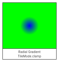

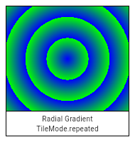
If center, radius, colors, or tileMode are null, or if colors or
colorStops contain null values, this constructor will throw a
NoSuchMethodError.
If matrix4 is provided, the gradient fill will be transformed by the
specified 4x4 matrix relative to the local coordinate system. matrix4 must
be a column-major matrix packed into a list of 16 values.
If focal is provided and not equal to center and focalRadius is
provided and not equal to 0.0, the generated shader will be a two point
conical radial gradient, with focal being the center of the focal
circle and focalRadius being the radius of that circle. If focal is
provided and not equal to center, at least one of the two offsets must
not be equal to Offset.zero.
Gradient.radial(
Offset center,
double radius,
List<Color> colors, [
List<double> colorStops,
TileMode tileMode = TileMode.clamp,
Float64List matrix4,
Offset focal,
double focalRadius = 0.0
]) : assert(_offsetIsValid(center)),
assert(colors != null),
assert(tileMode != null),
assert(matrix4 == null || _matrix4IsValid(matrix4)),
super._() {
focalRadius ??= 0.0;
_validateColorStops(colors, colorStops);
final Int32List colorsBuffer = _encodeColorList(colors);
final Float32List colorStopsBuffer = colorStops == null ? null : Float32List.fromList(colorStops);
// If focal is null or focal radius is null, this should be treated as a regular radial gradient
// If focal == center and the focal radius is 0.0, it's still a regular radial gradient
if (focal == null || (focal == center && focalRadius == 0.0)) {
_constructor();
_initRadial(center.dx, center.dy, radius, colorsBuffer, colorStopsBuffer, tileMode.index, matrix4);
} else {
assert(center != Offset.zero || focal != Offset.zero); // will result in exception(s) in Skia side
_constructor();
_initConical(focal.dx, focal.dy, focalRadius, center.dx, center.dy, radius, colorsBuffer, colorStopsBuffer, tileMode.index, matrix4);
}
}Creates a sweep gradient centered at center that starts at startAngle
and ends at endAngle.
startAngle and endAngle should be provided in radians, with zero
radians being the horizontal line to the right of the center and with
positive angles going clockwise around the center.
If colorStops is provided, colorStops[i] is a number from 0.0 to 1.0
that specifies where color[i] begins in the gradient. If colorStops is
not provided, then only two stops, at 0.0 and 1.0, are implied (and
color must therefore only have two entries).
The behavior before startAngle and after endAngle is described by the
tileMode argument. For details, see the TileMode enum.
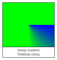
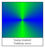
If center, colors, tileMode, startAngle, or endAngle are null,
or if colors or colorStops contain null values, this constructor will
throw a NoSuchMethodError.
If matrix4 is provided, the gradient fill will be transformed by the
specified 4x4 matrix relative to the local coordinate system. matrix4 must
be a column-major matrix packed into a list of 16 values.
Gradient.sweep(
Offset center,
List<Color> colors, [
List<double> colorStops,
TileMode tileMode = TileMode.clamp,
double startAngle = 0.0,
double endAngle = math.pi * 2,
Float64List matrix4,
]) : assert(_offsetIsValid(center)),
assert(colors != null),
assert(tileMode != null),
assert(startAngle != null),
assert(endAngle != null),
assert(startAngle < endAngle),
assert(matrix4 == null || _matrix4IsValid(matrix4)),
super._() {
_validateColorStops(colors, colorStops);
final Int32List colorsBuffer = _encodeColorList(colors);
final Float32List colorStopsBuffer = colorStops == null ? null : Float32List.fromList(colorStops);
_constructor();
_initSweep(center.dx, center.dy, colorsBuffer, colorStopsBuffer, tileMode.index, startAngle, endAngle, matrix4);
}Opaque handle to raw decoded image data (pixels).
To obtain an Image object, use instantiateImageCodec.
To draw an Image, use one of the methods on the Canvas class, such as Canvas.drawImage.
See also:
widgets library.Release the resources used by this object. The object is no longer usable after this method is called.
void dispose() native 'Image_dispose';The number of image pixels along the image's vertical axis.
int get height native 'Image_height';Converts the Image object into a byte array.
The format argument specifies the format in which the bytes will be
returned.
Returns a future that completes with the binary image data or an error if encoding fails.
Future<ByteData> toByteData({ImageByteFormat format = ImageByteFormat.rawRgba}) {
return _futurize((_Callback<ByteData> callback) {
return _toByteData(format.index, (Uint8List encoded) {
callback(encoded?.buffer?.asByteData());
});
});
}Returns a string representation of this object.
@override
String toString() => '[$width\u00D7$height]';The number of image pixels along the image's horizontal axis.
int get width native 'Image_width';The format in which image bytes should be returned when using Image.toByteData.
PNG format.
A loss-less compression format for images. This format is well suited for images with hard edges, such as screenshots or sprites, and images with text. Transparency is supported. The PNG format supports images up to 2,147,483,647 pixels in either dimension, though in practice available memory provides a more immediate limitation on maximum image size.
PNG images normally use the .png file extension and the image/png MIME
type.
See also:
const ImageByteFormat(2)
Raw RGBA format.
Unencoded bytes, in RGBA row-primary form, 8 bits per channel.
const ImageByteFormat(0)
Raw unmodified format.
Unencoded bytes, in the image's existing format. For example, a grayscale image may use a single 8-bit channel for each pixel.
const ImageByteFormat(1)
A constant List of the values in this enum, in order of their declaration.
const List<ImageByteFormat>
Callback signature for decodeImageFromList.
typedef ImageDecoderCallback = void Function(Image result);A filter operation to apply to a raster image.
See also:
BackdropFilter, a widget that applies ImageFilter to its rendering.Creates an image filter that applies a matrix transformation.
For example, applying a positive scale matrix (see Matrix4.diagonal3)
when used with BackdropFilter would magnify the background image.
ImageFilter.matrix(Float64List matrix4,
{ FilterQuality filterQuality = FilterQuality.low }) {
if (matrix4.length != 16)
throw ArgumentError('"matrix4" must have 16 entries.');
_constructor();
_initMatrix(matrix4, filterQuality.index);
}A shader (as used by Paint.shader) that tiles an image.
Creates an image-tiling shader. The first argument specifies the image to tile. The second and third arguments specify the TileMode for the x direction and y direction respectively. The fourth argument gives the matrix to apply to the effect. All the arguments are required and must not be null.
@pragma('vm:entry-point')
ImageShader(Image image, TileMode tmx, TileMode tmy, Float64List matrix4) :
assert(image != null), // image is checked on the engine side
assert(tmx != null),
assert(tmy != null),
assert(matrix4 != null),
super._() {
if (matrix4.length != 16)
throw ArgumentError('"matrix4" must have 16 entries.');
_constructor();
_initWithImage(image, tmx.index, tmy.index, matrix4);
}Static methods to allow for simple sharing of SendPorts across Isolates.
All isolates share a global mapping of names to ports. An isolate can register a SendPort with a given name using registerPortWithName; another isolate can then look up that port using lookupPortByName.
To create a SendPort, first create a ReceivePort, then use ReceivePort.sendPort.
Since multiple isolates can each obtain the same SendPort associated with a particular ReceivePort, the protocol built on top of this mechanism should typically consist of a single message. If more elaborate two-way communication or multiple-message communication is necessary, it is recommended to establish a separate communication channel in that first message (e.g. by passing a dedicated SendPort).
Looks up the SendPort associated with a given name.
Returns null if the name does not exist. To register the name in the first place, consider registerPortWithName.
The name argument must not be null.
static SendPort lookupPortByName(String name) {
assert(name != null, "'name' cannot be null.");
return _lookupPortByName(name);
}Registers a SendPort with a given name.
Returns true if registration is successful, and false if the name entry already existed (in which case the earlier registration is left unchanged). To remove a registration, consider removePortNameMapping.
Once a port has been registered with a name, it can be obtained from any Isolate using lookupPortByName.
Multiple isolates should avoid attempting to register ports with the same name, as there is an inherent race condition in doing so.
The port and name arguments must not be null.
static bool registerPortWithName(SendPort port, String name) {
assert(port != null, "'port' cannot be null.");
assert(name != null, "'name' cannot be null.");
return _registerPortWithName(port, name);
}Removes a name-to-SendPort mapping given its name.
Returns true if the mapping was successfully removed, false if the mapping did not exist. To add a registration, consider registerPortWithName.
Generally, removing a port name mapping is an inherently racy operation (another isolate could have obtained the name just prior to the name being removed, and thus would still be able to communicate over the port even after it has been removed).
The name argument must not be null.
static bool removePortNameMapping(String name) {
assert(name != null, "'name' cannot be null.");
return _removePortNameMapping(name);
}An identifier used to select a user's language and formatting preferences.
This represents a Unicode Language Identifier (i.e. without Locale extensions), except variants are not supported.
Locales are canonicalized according to the "preferred value" entries in the
IANA Language Subtag
Registry.
For example, const Locale('he') and const Locale('iw') are equal and
both have the languageCode he, because iw is a deprecated language
subtag that was replaced by the subtag he.
See also:
Creates a new Locale object.
The keyword arguments specify the subtags of the Locale.
The subtag values are case sensitive and must be valid subtags according to CLDR supplemental data: language, script and region for each of languageCode, scriptCode and countryCode respectively.
The countryCode subtag is optional. When there is no country subtag,
the parameter should be omitted or passed null instead of an empty-string.
Validity is not checked by default, but some methods may throw away invalid data.
const Locale.fromSubtags({
String languageCode = 'und',
this.scriptCode,
String countryCode,
}) : assert(languageCode != null),
assert(languageCode != ''),
_languageCode = languageCode,
assert(scriptCode != ''),
assert(countryCode != ''),
_countryCode = countryCode;Creates a new Locale object. The first argument is the primary language subtag, the second is the region (also referred to as 'country') subtag.
For example:
const Locale swissFrench = Locale('fr', 'CH');
const Locale canadianFrench = Locale('fr', 'CA');
The primary language subtag must not be null. The region subtag is
optional. When there is no region/country subtag, the parameter should
be omitted or passed null instead of an empty-string.
The subtag values are case sensitive and must be one of the valid subtags according to CLDR supplemental data: language, region. The primary language subtag must be at least two and at most eight lowercase letters, but not four letters. The region region subtag must be two uppercase letters or three digits. See the Unicode Language Identifier specification.
Validity is not checked by default, but some methods may throw away invalid data.
See also:
const Locale(
this._languageCode, [
this._countryCode,
]) : assert(_languageCode != null),
assert(_languageCode != ''),
scriptCode = null;static String cachedLocaleString
The region subtag for the locale.
This may be null, indicating that there is no specified region subtag.
This is expected to be string registered in the IANA Language Subtag Registry with the type "region". The string specified must match the case of the string in the registry.
Region subtags that are deprecated in the registry and have a preferred
code are changed to their preferred code. For example, const Locale('de',
'DE') and const Locale('de', 'DD') are equal, and both have the
countryCode DE, because DD is a deprecated language subtag that was
replaced by the subtag DE.
See also:
String get countryCode => _deprecatedRegionSubtagMap[_countryCode] ?? _countryCode;The hash code for this object.
A hash code is a single integer which represents the state of the object that affects operator == comparisons.
All objects have hash codes. The default hash code represents only the identity of the object, the same way as the default operator == implementation only considers objects equal if they are identical (see identityHashCode).
If operator == is overridden to use the object state instead, the hash code must also be changed to represent that state.
Hash codes must be the same for objects that are equal to each other according to operator ==. The hash code of an object should only change if the object changes in a way that affects equality. There are no further requirements for the hash codes. They need not be consistent between executions of the same program and there are no distribution guarantees.
Objects that are not equal are allowed to have the same hash code, it is even technically allowed that all instances have the same hash code, but if clashes happen too often, it may reduce the efficiency of hash-based data structures like HashSet or HashMap.
If a subclass overrides hashCode, it should override the operator == operator as well to maintain consistency.
@override
int get hashCode => hashValues(languageCode, scriptCode, countryCode);The primary language subtag for the locale.
This must not be null. It may be 'und', representing 'undefined'.
This is expected to be string registered in the IANA Language Subtag Registry with the type "language". The string specified must match the case of the string in the registry.
Language subtags that are deprecated in the registry and have a preferred
code are changed to their preferred code. For example, const
Locale('he') and const Locale('iw') are equal, and both have the
languageCode he, because iw is a deprecated language subtag that was
replaced by the subtag he.
This must be a valid Unicode Language subtag as listed in Unicode CLDR supplemental data.
See also:
String get languageCode => _deprecatedLanguageSubtagMap[_languageCode] ?? _languageCode;The equality operator.
The default behavior for all Objects is to return true if and
only if this and other are the same object.
Override this method to specify a different equality relation on a class. The overriding method must still be an equivalence relation. That is, it must be:
Total: It must return a boolean for all arguments. It should never throw
or return null.
Reflexive: For all objects o, o == o must be true.
Symmetric: For all objects o1 and o2, o1 == o2 and o2 == o1 must
either both be true, or both be false.
Transitive: For all objects o1, o2, and o3, if o1 == o2 and
o2 == o3 are true, then o1 == o3 must be true.
The method should also be consistent over time, so whether two objects are equal should only change if at least one of the objects was modified.
If a subclass overrides the equality operator it should override the hashCode method as well to maintain consistency.
@override
bool operator ==(dynamic other) {
if (identical(this, other))
return true;
if (other is! Locale)
return false;
final Locale typedOther = other;
return languageCode == typedOther.languageCode
&& scriptCode == typedOther.scriptCode
&& countryCode == typedOther.countryCode;
}The script subtag for the locale.
This may be null, indicating that there is no specified script subtag.
This must be a valid Unicode Language Identifier script subtag as listed in Unicode CLDR supplemental data.
See also:
final String scriptCode
Returns a syntactically valid Unicode BCP47 Locale Identifier.
Some examples of such identifiers: "en", "es-419", "hi-Deva-IN" and "zh-Hans-CN". See http://www.unicode.org/reports/tr35/ for technical details.
String toLanguageTag() => _toLanguageTag();Returns a string representing the locale.
This identifier happens to be a valid Unicode Locale Identifier using underscores as separator, however it is intended to be used for debugging purposes only. For parseable results, use toLanguageTag instead.
@override
String toString() => _toLanguageTag('_');A mask filter to apply to shapes as they are painted. A mask filter is a function that takes a bitmap of color pixels, and returns another bitmap of color pixels.
Instances of this class are used with Paint.maskFilter on Paint objects.
Creates a mask filter that takes the shape being drawn and blurs it.
This is commonly used to approximate shadows.
The style argument controls the kind of effect to draw; see BlurStyle.
The sigma argument controls the size of the effect. It is the standard
deviation of the Gaussian blur to apply. The value must be greater than
zero. The sigma corresponds to very roughly half the radius of the effect
in pixels.
A blur is an expensive operation and should therefore be used sparingly.
The arguments must not be null.
See also:
const MaskFilter.blur(
this._style,
this._sigma,
) : assert(_style != null),
assert(_sigma != null);The hash code for this object.
A hash code is a single integer which represents the state of the object that affects operator == comparisons.
All objects have hash codes. The default hash code represents only the identity of the object, the same way as the default operator == implementation only considers objects equal if they are identical (see identityHashCode).
If operator == is overridden to use the object state instead, the hash code must also be changed to represent that state.
Hash codes must be the same for objects that are equal to each other according to operator ==. The hash code of an object should only change if the object changes in a way that affects equality. There are no further requirements for the hash codes. They need not be consistent between executions of the same program and there are no distribution guarantees.
Objects that are not equal are allowed to have the same hash code, it is even technically allowed that all instances have the same hash code, but if clashes happen too often, it may reduce the efficiency of hash-based data structures like HashSet or HashMap.
If a subclass overrides hashCode, it should override the operator == operator as well to maintain consistency.
@override
int get hashCode => hashValues(_style, _sigma);The equality operator.
The default behavior for all Objects is to return true if and
only if this and other are the same object.
Override this method to specify a different equality relation on a class. The overriding method must still be an equivalence relation. That is, it must be:
Total: It must return a boolean for all arguments. It should never throw
or return null.
Reflexive: For all objects o, o == o must be true.
Symmetric: For all objects o1 and o2, o1 == o2 and o2 == o1 must
either both be true, or both be false.
Transitive: For all objects o1, o2, and o3, if o1 == o2 and
o2 == o3 are true, then o1 == o3 must be true.
The method should also be consistent over time, so whether two objects are equal should only change if at least one of the objects was modified.
If a subclass overrides the equality operator it should override the hashCode method as well to maintain consistency.
@override
bool operator ==(dynamic other) {
if (other is! MaskFilter)
return false;
final MaskFilter typedOther = other;
return _style == typedOther._style &&
_sigma == typedOther._sigma;
}Returns a string representation of this object.
@override
String toString() => 'MaskFilter.blur($_style, ${_sigma.toStringAsFixed(1)})';An immutable 2D floating-point offset.
Generally speaking, Offsets can be interpreted in two ways:
As representing a point in Cartesian space a specified distance from a
separately-maintained origin. For example, the top-left position of
children in the RenderBox protocol is typically represented as an
Offset from the top left of the parent box.
As a vector that can be applied to coordinates. For example, when
painting a RenderObject, the parent is passed an Offset from the
screen's origin which it can add to the offsets of its children to find
the Offset from the screen's origin to each of the children.
Because a particular Offset can be interpreted as one sense at one time then as the other sense at a later time, the same class is used for both senses.
See also:
scaleX and the y
component scaled by scaleY. [...]
Creates an offset from its direction and distance.
The direction is in radians clockwise from the positive x-axis.
The distance can be omitted, to create a unit vector (distance = 1.0).
factory Offset.fromDirection(double direction, [ double distance = 1.0 ]) {
return Offset(distance * math.cos(direction), distance * math.sin(direction));
}The angle of this offset as radians clockwise from the positive x-axis, in the range -pi to pi, assuming positive values of the x-axis go to the left and positive values of the y-axis go down.
Zero means that dy is zero and dx is zero or positive.
Values from zero to pi/2 indicate positive values of dx and dy, the bottom-right quadrant.
Values from pi/2 to pi indicate negative values of dx and positive values of dy, the bottom-left quadrant.
Values from zero to -pi/2 indicate positive values of dx and negative values of dy, the top-right quadrant.
Values from -pi/2 to -pi indicate negative values of dx and dy, the top-left quadrant.
When dy is zero and dx is negative, the direction is pi.
When dx is zero, direction is pi/2 if dy is positive and -pi/2 if dy is negative.
See also:
double get direction => math.atan2(dy, dx);The magnitude of the offset.
If you need this value to compare it to another Offset's distance, consider using distanceSquared instead, since it is cheaper to compute.
double get distance => math.sqrt(dx * dx + dy * dy);The hash code for this object.
A hash code is a single integer which represents the state of the object that affects operator == comparisons.
All objects have hash codes. The default hash code represents only the identity of the object, the same way as the default operator == implementation only considers objects equal if they are identical (see identityHashCode).
If operator == is overridden to use the object state instead, the hash code must also be changed to represent that state.
Hash codes must be the same for objects that are equal to each other according to operator ==. The hash code of an object should only change if the object changes in a way that affects equality. There are no further requirements for the hash codes. They need not be consistent between executions of the same program and there are no distribution guarantees.
Objects that are not equal are allowed to have the same hash code, it is even technically allowed that all instances have the same hash code, but if clashes happen too often, it may reduce the efficiency of hash-based data structures like HashSet or HashMap.
If a subclass overrides hashCode, it should override the operator == operator as well to maintain consistency.
@override
int get hashCode => hashValues(dx, dy);An offset with infinite x and y components.
See also:
static const Offset infinite = Offset(double.infinity, double.infinity)
Linearly interpolate between two offsets.
If either offset is null, this function interpolates from Offset.zero.
The t argument represents position on the timeline, with 0.0 meaning
that the interpolation has not started, returning a (or something
equivalent to a), 1.0 meaning that the interpolation has finished,
returning b (or something equivalent to b), and values in between
meaning that the interpolation is at the relevant point on the timeline
between a and b. The interpolation can be extrapolated beyond 0.0 and
1.0, so negative values and values greater than 1.0 are valid (and can
easily be generated by curves such as Curves.elasticInOut).
Values for t are usually obtained from an Animation<double>, such as
an AnimationController.
static Offset lerp(Offset a, Offset b, double t) {
assert(t != null);
if (a == null && b == null)
return null;
if (a == null)
return b * t;
if (b == null)
return a * (1.0 - t);
return Offset(lerpDouble(a.dx, b.dx, t), lerpDouble(a.dy, b.dy, t));
}Rectangle constructor operator.
Combines an Offset and a Size to form a Rect whose top-left coordinate is the point given by adding this offset, the left-hand-side operand, to the origin, and whose size is the right-hand-side operand.
Rect myRect = Offset.zero & const Size(100.0, 100.0);
// same as: Rect.fromLTWH(0.0, 0.0, 100.0, 100.0)
Rect operator &(Size other) => Rect.fromLTWH(dx, dy, other.width, other.height);Division operator.
Returns an offset whose coordinates are the coordinates of the left-hand-side operand (an Offset) divided by the scalar right-hand-side operand (a double).
See also scale.
Offset operator /(double operand) => Offset(dx / operand, dy / operand);Compares two Offsets for equality.
@override
bool operator ==(dynamic other) {
if (other is! Offset)
return false;
final Offset typedOther = other;
return dx == typedOther.dx &&
dy == typedOther.dy;
}Binary subtraction operator.
Returns an offset whose dx value is the left-hand-side operand's dx minus the right-hand-side operand's dx and whose dy value is the left-hand-side operand's dy minus the right-hand-side operand's dy.
See also translate.
Offset operator -(Offset other) => Offset(dx - other.dx, dy - other.dy);Modulo (remainder) operator.
Returns an offset whose coordinates are the remainder of dividing the coordinates of the left-hand-side operand (an Offset) by the scalar right-hand-side operand (a double).
Offset operator %(double operand) => Offset(dx % operand, dy % operand);Multiplication operator.
Returns an offset whose coordinates are the coordinates of the left-hand-side operand (an Offset) multiplied by the scalar right-hand-side operand (a double).
See also scale.
Offset operator *(double operand) => Offset(dx * operand, dy * operand);Binary addition operator.
Returns an offset whose dx value is the sum of the dx values of the two operands, and whose dy value is the sum of the dy values of the two operands.
See also translate.
Offset operator +(Offset other) => Offset(dx + other.dx, dy + other.dy);Integer (truncating) division operator.
Returns an offset whose coordinates are the coordinates of the left-hand-side operand (an Offset) divided by the scalar right-hand-side operand (a double), rounded towards zero.
Offset operator ~/(double operand) => Offset((dx ~/ operand).toDouble(), (dy ~/ operand).toDouble());Returns a new offset with the x component scaled by scaleX and the y
component scaled by scaleY.
If the two scale arguments are the same, consider using the * operator
instead:
Offset a = const Offset(10.0, 10.0);
Offset b = a * 2.0; // same as: a.scale(2.0, 2.0)
If the two arguments are -1, consider using the unary - operator
instead:
Offset a = const Offset(10.0, 10.0);
Offset b = -a; // same as: a.scale(-1.0, -1.0)
Offset scale(double scaleX, double scaleY) => Offset(dx * scaleX, dy * scaleY);Returns a string representation of this object.
@override
String toString() => 'Offset(${dx?.toStringAsFixed(1)}, ${dy?.toStringAsFixed(1)})';Returns a new offset with translateX added to the x component and translateY added to the y component.
If the arguments come from another Offset, consider using the + or -
operators instead:
Offset a = const Offset(10.0, 10.0);
Offset b = const Offset(10.0, 10.0);
Offset c = a + b; // same as: a.translate(b.dx, b.dy)
Offset d = a - b; // same as: a.translate(-b.dx, -b.dy)
Offset translate(double translateX, double translateY) => Offset(dx + translateX, dy + translateY);Base class for Size and Offset, which are both ways to describe a distance as a two-dimensional axis-aligned vector.
Abstract const constructor. This constructor enables subclasses to provide const constructors so that they can be used in const expressions.
The first argument sets the horizontal component, and the second the vertical component.
const OffsetBase(this._dx, this._dy);The hash code for this object.
A hash code is a single integer which represents the state of the object that affects operator == comparisons.
All objects have hash codes. The default hash code represents only the identity of the object, the same way as the default operator == implementation only considers objects equal if they are identical (see identityHashCode).
If operator == is overridden to use the object state instead, the hash code must also be changed to represent that state.
Hash codes must be the same for objects that are equal to each other according to operator ==. The hash code of an object should only change if the object changes in a way that affects equality. There are no further requirements for the hash codes. They need not be consistent between executions of the same program and there are no distribution guarantees.
Objects that are not equal are allowed to have the same hash code, it is even technically allowed that all instances have the same hash code, but if clashes happen too often, it may reduce the efficiency of hash-based data structures like HashSet or HashMap.
If a subclass overrides hashCode, it should override the operator == operator as well to maintain consistency.
@override
int get hashCode => hashValues(_dx, _dy);Whether both components are finite (neither infinite nor NaN).
See also:
bool get isFinite => _dx.isFinite && _dy.isFinite;Returns true if either component is double.infinity, and false if both are finite (or negative infinity, or NaN).
This is different than comparing for equality with an instance that has both components set to double.infinity.
See also:
bool get isInfinite => _dx >= double.infinity || _dy >= double.infinity;Equality operator. Compares an Offset or Size to another Offset or Size, and returns true if the horizontal and vertical values of the left-hand-side operand are equal to the horizontal and vertical values of the right-hand-side operand respectively. Returns false otherwise.
@override
bool operator ==(dynamic other) {
if (other is! OffsetBase)
return false;
final OffsetBase typedOther = other;
return _dx == typedOther._dx &&
_dy == typedOther._dy;
}Greater-than operator. Compares an Offset or Size to another Offset or Size, and returns true if both the horizontal and vertical values of the left-hand-side operand are bigger than the horizontal and vertical values of the right-hand-side operand respectively. Returns false otherwise.
This is a partial ordering. It is possible for two values to be neither less, nor greater than, nor equal to, another.
bool operator >(OffsetBase other) => _dx > other._dx && _dy > other._dy;Greater-than-or-equal-to operator. Compares an Offset or Size to another Offset or Size, and returns true if both the horizontal and vertical values of the left-hand-side operand are bigger than or equal to the horizontal and vertical values of the right-hand-side operand respectively. Returns false otherwise.
This is a partial ordering. It is possible for two values to be neither less, nor greater than, nor equal to, another.
bool operator >=(OffsetBase other) => _dx >= other._dx && _dy >= other._dy;Less-than operator. Compares an Offset or Size to another Offset or Size, and returns true if both the horizontal and vertical values of the left-hand-side operand are smaller than the horizontal and vertical values of the right-hand-side operand respectively. Returns false otherwise.
This is a partial ordering. It is possible for two values to be neither less, nor greater than, nor equal to, another.
bool operator <(OffsetBase other) => _dx < other._dx && _dy < other._dy;Less-than-or-equal-to operator. Compares an Offset or Size to another Offset or Size, and returns true if both the horizontal and vertical values of the left-hand-side operand are smaller than or equal to the horizontal and vertical values of the right-hand-side operand respectively. Returns false otherwise.
This is a partial ordering. It is possible for two values to be neither less, nor greater than, nor equal to, another.
bool operator <=(OffsetBase other) => _dx <= other._dx && _dy <= other._dy;Returns a string representation of this object.
@override
String toString() => 'OffsetBase(${_dx?.toStringAsFixed(1)}, ${_dy?.toStringAsFixed(1)})';A description of the style to use when drawing on a Canvas.
Most APIs on Canvas take a Paint object to describe the style to use for that operation.
A blend mode to apply when a shape is drawn or a layer is composited.
The source colors are from the shape being drawn (e.g. from Canvas.drawPath) or layer being composited (the graphics that were drawn between the Canvas.saveLayer and Canvas.restore calls), after applying the colorFilter, if any.
The destination colors are from the background onto which the shape or layer is being composited.
Defaults to BlendMode.srcOver.
See also:
restore is called.saveLayer with blendMode.BlendMode get blendMode {
final int encoded = _data.getInt32(_kBlendModeOffset, _kFakeHostEndian);
return BlendMode.values[encoded ^ _kBlendModeDefault];
}set blendMode(BlendMode value) {
assert(value != null);
final int encoded = value.index ^ _kBlendModeDefault;
_data.setInt32(_kBlendModeOffset, encoded, _kFakeHostEndian);
}The color to use when stroking or filling a shape.
Defaults to opaque black.
See also:
This color is not used when compositing. To colorize a layer, use colorFilter.
Color get color {
final int encoded = _data.getInt32(_kColorOffset, _kFakeHostEndian);
return Color(encoded ^ _kColorDefault);
}set color(Color value) {
assert(value != null);
final int encoded = value.value ^ _kColorDefault;
_data.setInt32(_kColorOffset, encoded, _kFakeHostEndian);
}A color filter to apply when a shape is drawn or when a layer is composited.
See ColorFilter for details.
When a shape is being drawn, colorFilter overrides color and shader.
ColorFilter get colorFilter {
switch (_data.getInt32(_kColorFilterOffset, _kFakeHostEndian)) {
case ColorFilter._TypeNone:
return null;
case ColorFilter._TypeMode:
return ColorFilter.mode(
Color(_data.getInt32(_kColorFilterColorOffset, _kFakeHostEndian)),
BlendMode.values[_data.getInt32(_kColorFilterBlendModeOffset, _kFakeHostEndian)],
);
case ColorFilter._TypeMatrix:
return ColorFilter.matrix(_objects[_kColorFilterMatrixIndex]);
case ColorFilter._TypeLinearToSrgbGamma:
return const ColorFilter.linearToSrgbGamma();
case ColorFilter._TypeSrgbToLinearGamma:
return const ColorFilter.srgbToLinearGamma();
}
return null;
}set colorFilter(ColorFilter value) {
if (value == null) {
_data.setInt32(_kColorFilterOffset, ColorFilter._TypeNone, _kFakeHostEndian);
_data.setInt32(_kColorFilterColorOffset, 0, _kFakeHostEndian);
_data.setInt32(_kColorFilterBlendModeOffset, 0, _kFakeHostEndian);
if (_objects != null) {
_objects[_kColorFilterMatrixIndex] = null;
}
} else {
_data.setInt32(_kColorFilterOffset, value._type, _kFakeHostEndian);
if (value._type == ColorFilter._TypeMode) {
assert(value._color != null);
assert(value._blendMode != null);
_data.setInt32(_kColorFilterColorOffset, value._color.value, _kFakeHostEndian);
_data.setInt32(_kColorFilterBlendModeOffset, value._blendMode.index, _kFakeHostEndian);
} else if (value._type == ColorFilter._TypeMatrix) {
assert(value._matrix != null);
_objects ??= List<dynamic>(_kObjectCount);
_objects[_kColorFilterMatrixIndex] = Float32List.fromList(value._matrix);
}
}
}Controls the performance vs quality trade-off to use when applying filters, such as maskFilter, or when drawing images, as with Canvas.drawImageRect or Canvas.drawImageNine.
Defaults to FilterQuality.none.
// TODO(ianh): verify that the image drawing methods actually respect this
FilterQuality get filterQuality {
return FilterQuality.values[_data.getInt32(_kFilterQualityOffset, _kFakeHostEndian)];
}set filterQuality(FilterQuality value) {
assert(value != null);
final int encoded = value.index;
_data.setInt32(_kFilterQualityOffset, encoded, _kFakeHostEndian);
}Whether the colors of the image are inverted when drawn.
Inverting the colors of an image applies a new color filter that will be composed with any user provided color filters. This is primarily used for implementing smart invert on iOS.
bool get invertColors {
return _data.getInt32(_kInvertColorOffset, _kFakeHostEndian) == 1;
}set invertColors(bool value) {
_data.setInt32(_kInvertColorOffset, value ? 1 : 0, _kFakeHostEndian);
}Whether to apply anti-aliasing to lines and images drawn on the canvas.
Defaults to true.
bool get isAntiAlias {
return _data.getInt32(_kIsAntiAliasOffset, _kFakeHostEndian) == 0;
}set isAntiAlias(bool value) {
// We encode true as zero and false as one because the default value, which
// we always encode as zero, is true.
final int encoded = value ? 0 : 1;
_data.setInt32(_kIsAntiAliasOffset, encoded, _kFakeHostEndian);
}A mask filter (for example, a blur) to apply to a shape after it has been drawn but before it has been composited into the image.
See MaskFilter for details.
MaskFilter get maskFilter {
switch (_data.getInt32(_kMaskFilterOffset, _kFakeHostEndian)) {
case MaskFilter._TypeNone:
return null;
case MaskFilter._TypeBlur:
return MaskFilter.blur(
BlurStyle.values[_data.getInt32(_kMaskFilterBlurStyleOffset, _kFakeHostEndian)],
_data.getFloat32(_kMaskFilterSigmaOffset, _kFakeHostEndian),
);
}
return null;
}set maskFilter(MaskFilter value) {
if (value == null) {
_data.setInt32(_kMaskFilterOffset, MaskFilter._TypeNone, _kFakeHostEndian);
_data.setInt32(_kMaskFilterBlurStyleOffset, 0, _kFakeHostEndian);
_data.setFloat32(_kMaskFilterSigmaOffset, 0.0, _kFakeHostEndian);
} else {
// For now we only support one kind of MaskFilter, so we don't need to
// check what the type is if it's not null.
_data.setInt32(_kMaskFilterOffset, MaskFilter._TypeBlur, _kFakeHostEndian);
_data.setInt32(_kMaskFilterBlurStyleOffset, value._style.index, _kFakeHostEndian);
_data.setFloat32(_kMaskFilterSigmaOffset, value._sigma, _kFakeHostEndian);
}
}The shader to use when stroking or filling a shape.
When this is null, the color is used instead.
See also:
Shader get shader {
if (_objects == null)
return null;
return _objects[_kShaderIndex];
}set shader(Shader value) {
_objects ??= List<dynamic>(_kObjectCount);
_objects[_kShaderIndex] = value;
}The kind of finish to place on the end of lines drawn when style is set to PaintingStyle.stroke.
Defaults to StrokeCap.butt, i.e. no caps.
StrokeCap get strokeCap {
return StrokeCap.values[_data.getInt32(_kStrokeCapOffset, _kFakeHostEndian)];
}set strokeCap(StrokeCap value) {
assert(value != null);
final int encoded = value.index;
_data.setInt32(_kStrokeCapOffset, encoded, _kFakeHostEndian);
}The kind of finish to place on the joins between segments.
This applies to paths drawn when style is set to PaintingStyle.stroke, It does not apply to points drawn as lines with Canvas.drawPoints.
Defaults to StrokeJoin.miter, i.e. sharp corners.
Some examples of joins:
The centers of the line segments are colored in the diagrams above to highlight the joins, but in normal usage the join is the same color as the line.
See also:
StrokeJoin get strokeJoin {
return StrokeJoin.values[_data.getInt32(_kStrokeJoinOffset, _kFakeHostEndian)];
}set strokeJoin(StrokeJoin value) {
assert(value != null);
final int encoded = value.index;
_data.setInt32(_kStrokeJoinOffset, encoded, _kFakeHostEndian);
}The limit for miters to be drawn on segments when the join is set to StrokeJoin.miter and the style is set to PaintingStyle.stroke. If this limit is exceeded, then a StrokeJoin.bevel join will be drawn instead. This may cause some 'popping' of the corners of a path if the angle between line segments is animated, as seen in the diagrams below.
This limit is expressed as a limit on the length of the miter.
Defaults to 4.0. Using zero as a limit will cause a StrokeJoin.bevel join to be used all the time.
The centers of the line segments are colored in the diagrams above to highlight the joins, but in normal usage the join is the same color as the line.
See also:
double get strokeMiterLimit {
return _data.getFloat32(_kStrokeMiterLimitOffset, _kFakeHostEndian);
}set strokeMiterLimit(double value) {
assert(value != null);
final double encoded = value - _kStrokeMiterLimitDefault;
_data.setFloat32(_kStrokeMiterLimitOffset, encoded, _kFakeHostEndian);
}How wide to make edges drawn when style is set to PaintingStyle.stroke. The width is given in logical pixels measured in the direction orthogonal to the direction of the path.
Defaults to 0.0, which correspond to a hairline width.
double get strokeWidth {
return _data.getFloat32(_kStrokeWidthOffset, _kFakeHostEndian);
}set strokeWidth(double value) {
assert(value != null);
final double encoded = value;
_data.setFloat32(_kStrokeWidthOffset, encoded, _kFakeHostEndian);
}Whether to paint inside shapes, the edges of shapes, or both.
Defaults to PaintingStyle.fill.
PaintingStyle get style {
return PaintingStyle.values[_data.getInt32(_kStyleOffset, _kFakeHostEndian)];
}set style(PaintingStyle value) {
assert(value != null);
final int encoded = value.index;
_data.setInt32(_kStyleOffset, encoded, _kFakeHostEndian);
}Returns a string representation of this object.
@override
String toString() {
final StringBuffer result = StringBuffer();
String semicolon = '';
result.write('Paint(');
if (style == PaintingStyle.stroke) {
result.write('$style');
if (strokeWidth != 0.0)
result.write(' ${strokeWidth.toStringAsFixed(1)}');
else
result.write(' hairline');
if (strokeCap != StrokeCap.butt)
result.write(' $strokeCap');
if (strokeJoin == StrokeJoin.miter) {
if (strokeMiterLimit != _kStrokeMiterLimitDefault)
result.write(' $strokeJoin up to ${strokeMiterLimit.toStringAsFixed(1)}');
} else {
result.write(' $strokeJoin');
}
semicolon = '; ';
}
if (isAntiAlias != true) {
result.write('${semicolon}antialias off');
semicolon = '; ';
}
if (color != const Color(_kColorDefault)) {
if (color != null)
result.write('$semicolon$color');
else
result.write('${semicolon}no color');
semicolon = '; ';
}
if (blendMode.index != _kBlendModeDefault) {
result.write('$semicolon$blendMode');
semicolon = '; ';
}
if (colorFilter != null) {
result.write('${semicolon}colorFilter: $colorFilter');
semicolon = '; ';
}
if (maskFilter != null) {
result.write('${semicolon}maskFilter: $maskFilter');
semicolon = '; ';
}
if (filterQuality != FilterQuality.none) {
result.write('${semicolon}filterQuality: $filterQuality');
semicolon = '; ';
}
if (shader != null) {
result.write('${semicolon}shader: $shader');
semicolon = '; ';
}
if (invertColors)
result.write('${semicolon}invert: $invertColors');
result.write(')');
return result.toString();
}Strategies for painting shapes and paths on a canvas.
See Paint.style.
Apply the Paint to the inside of the shape. For example, when applied to the Canvas.drawCircle call, this results in a disc of the given size being painted.
const PaintingStyle(0)
Apply the Paint to the edge of the shape. For example, when applied to the Canvas.drawCircle call, this results is a hoop of the given size being painted. The line drawn on the edge will be the width given by the Paint.strokeWidth property.
const PaintingStyle(1)
A constant List of the values in this enum, in order of their declaration.
const List<PaintingStyle>
A paragraph of text.
A paragraph retains the size and position of each glyph in the text and can be efficiently resized and painted.
To create a Paragraph object, use a ParagraphBuilder.
Paragraphs can be displayed on a Canvas using the Canvas.drawParagraph method.
maxLines lines of text or because the maxLines was
null, ellipsis was not null, and one of the lines exceeded the width
constraint. [...]
start, end of the word at the given offset. Characters not
part of a word, such as spaces, symbols, and punctuation, have word breaks
on both sides. In such cases, this method will return offset, offset+1.
Word boundaries are defined more precisely in Unicode Standard Annex #29
http://www.unicode.org/reports/tr29/#Word_Boundaries
The distance from the top of the paragraph to the alphabetic baseline of the first line, in logical pixels.
double get alphabeticBaseline native 'Paragraph_alphabeticBaseline';True if there is more vertical content, but the text was truncated, either
because we reached maxLines lines of text or because the maxLines was
null, ellipsis was not null, and one of the lines exceeded the width
constraint.
See the discussion of the maxLines and ellipsis arguments at
new ParagraphStyle.
bool get didExceedMaxLines native 'Paragraph_didExceedMaxLines';Returns a list of text boxes that enclose all placeholders in the paragraph.
The order of the boxes are in the same order as passed in through addPlaceholder.
Coordinates of the TextBox are relative to the upper-left corner of the paragraph, where positive y values indicate down.
List<TextBox> getBoxesForPlaceholders() native 'Paragraph_getRectsForPlaceholders';Returns a list of text boxes that enclose the given text range.
The boxHeightStyle and boxWidthStyle parameters allow customization
of how the boxes are bound vertically and horizontally. Both style
parameters default to the tight option, which will provide close-fitting
boxes and will not account for any line spacing.
Coordinates of the TextBox are relative to the upper-left corner of the paragraph, where positive y values indicate down.
The boxHeightStyle and boxWidthStyle parameters must not be null.
See BoxHeightStyle and BoxWidthStyle for full descriptions of each option.
List<TextBox> getBoxesForRange(int start, int end, {BoxHeightStyle boxHeightStyle = BoxHeightStyle.tight, BoxWidthStyle boxWidthStyle = BoxWidthStyle.tight}) {
assert(boxHeightStyle != null);
assert(boxWidthStyle != null);
return _getBoxesForRange(start, end, boxHeightStyle.index, boxWidthStyle.index);
}Returns the text position closest to the given offset.
TextPosition getPositionForOffset(Offset offset) {
final List<int> encoded = _getPositionForOffset(offset.dx, offset.dy);
return TextPosition(offset: encoded[0], affinity: TextAffinity.values[encoded[1]]);
}Returns the start, end of the word at the given offset. Characters not
part of a word, such as spaces, symbols, and punctuation, have word breaks
on both sides. In such cases, this method will return offset, offset+1.
Word boundaries are defined more precisely in Unicode Standard Annex #29
http://www.unicode.org/reports/tr29/#Word_Boundaries
List<int> getWordBoundary(int offset) native 'Paragraph_getWordBoundary';The distance from the top of the paragraph to the ideographic baseline of the first line, in logical pixels.
double get ideographicBaseline native 'Paragraph_ideographicBaseline';Computes the size and position of each glyph in the paragraph.
The ParagraphConstraints control how wide the text is allowed to be.
void layout(ParagraphConstraints constraints) => _layout(constraints.width);Builds a Paragraph containing text with the given styling information.
To set the paragraph's alignment, truncation, and ellipsizing behavior, pass an appropriately-configured ParagraphStyle object to the new ParagraphBuilder constructor.
Then, call combinations of pushStyle, addText, and pop to add styled text to the object.
Finally, call build to obtain the constructed Paragraph object. After this point, the builder is no longer usable.
After constructing a Paragraph, call Paragraph.layout on it and then paint it with Canvas.drawParagraph.
Creates a new ParagraphBuilder object, which is used to create a Paragraph.
@pragma('vm:entry-point')
ParagraphBuilder(ParagraphStyle style) {
_placeholderCount = 0;
List<String> strutFontFamilies;
if (style._strutStyle != null) {
strutFontFamilies = <String>[];
if (style._strutStyle._fontFamily != null)
strutFontFamilies.add(style._strutStyle._fontFamily);
if (style._strutStyle._fontFamilyFallback != null)
strutFontFamilies.addAll(style._strutStyle._fontFamilyFallback);
}
_constructor(
style._encoded,
style._strutStyle?._encoded,
style._fontFamily,
strutFontFamilies,
style._fontSize,
style._height,
style._ellipsis,
_encodeLocale(style._locale)
);
}Adds an inline placeholder space to the paragraph.
The paragraph will contain a rectangular space with no text of the dimensions specified.
The width and height parameters specify the size of the placeholder rectangle.
The alignment parameter specifies how the placeholder rectangle will be vertically
aligned with the surrounding text. When PlaceholderAlignment.baseline,
PlaceholderAlignment.aboveBaseline, and PlaceholderAlignment.belowBaseline
alignment modes are used, the baseline needs to be set with the baseline.
When using PlaceholderAlignment.baseline, baselineOffset indicates the distance
of the baseline down from the top of of the rectangle. The default baselineOffset
is the height.
Examples:
addPlaceholder(30, 50, PlaceholderAlignment.bottom);addPlaceholder(30, 50, PlaceholderAlignment.middle);.addPlaceholder(30, 50, PlaceholderAlignment.aboveBaseline, baseline: TextBaseline.alphabetic).addPlaceholder(30, 50, PlaceholderAlignment.baseline, baseline: TextBaseline.alphabetic, baselineOffset: 40).Lines are permitted to break around each placeholder.
Decorations will be drawn based on the font defined in the most recently pushed TextStyle. The decorations are drawn as if unicode text were present in the placeholder space, and will draw the same regardless of the height and alignment of the placeholder. To hide or manually adjust decorations to fit, a text style with the desired decoration behavior should be pushed before adding a placeholder.
Any decorations drawn through a placeholder will exist on the same canvas/layer as the text. This means any content drawn on top of the space reserved by the placeholder will be drawn over the decoration, possibly obscuring the decoration.
Placeholders are represented by a unicode 0xFFFC "object replacement character" in the text buffer. For each placeholder, one object replacement character is added on to the text buffer.
The scale parameter will scale the width and height by the specified amount,
and keep track of the scale. The scales of placeholders added can be accessed
through placeholderScales. This is primarily used for acessibility scaling.
void addPlaceholder(double width, double height, PlaceholderAlignment alignment, {
double scale = 1.0,
double baselineOffset,
TextBaseline baseline,
}) {
// Require a baseline to be specified if using a baseline-based alignment.
assert((alignment == PlaceholderAlignment.aboveBaseline ||
alignment == PlaceholderAlignment.belowBaseline ||
alignment == PlaceholderAlignment.baseline) ? baseline != null : true);
// Default the baselineOffset to height if null. This will place the placeholder
// fully above the baseline, similar to [PlaceholderAlignment.aboveBaseline].
baselineOffset = baselineOffset ?? height;
_addPlaceholder(width * scale, height * scale, alignment.index, (baselineOffset == null ? height : baselineOffset) * scale, baseline == null ? null : baseline.index);
_placeholderCount++;
_placeholderScales.add(scale);
}Adds the given text to the paragraph.
The text will be styled according to the current stack of text styles.
void addText(String text) {
final String error = _addText(text);
if (error != null)
throw ArgumentError(error);
}Applies the given paragraph style and returns a Paragraph containing the added text and associated styling.
After calling this function, the paragraph builder object is invalid and cannot be used further.
Paragraph build() native 'ParagraphBuilder_build';The number of placeholders currently in the paragraph.
int get placeholderCount => _placeholderCount;Ends the effect of the most recent call to pushStyle.
Internally, the paragraph builder maintains a stack of text styles. Text added to the paragraph is affected by all the styles in the stack. Calling pop removes the topmost style in the stack, leaving the remaining styles in effect.
void pop() native 'ParagraphBuilder_pop';Applies the given style to the added text until pop is called.
See pop for details.
void pushStyle(TextStyle style) {
final List<String> fullFontFamilies = <String>[];
if (style._fontFamily != null)
fullFontFamilies.add(style._fontFamily);
if (style._fontFamilyFallback != null)
fullFontFamilies.addAll(style._fontFamilyFallback);
ByteData encodedFontFeatures;
if (style._fontFeatures != null) {
encodedFontFeatures = ByteData(style._fontFeatures.length * FontFeature._kEncodedSize);
int byteOffset = 0;
for (FontFeature feature in style._fontFeatures) {
feature._encode(ByteData.view(encodedFontFeatures.buffer, byteOffset, FontFeature._kEncodedSize));
byteOffset += FontFeature._kEncodedSize;
}
}
_pushStyle(
style._encoded,
fullFontFamilies,
style._fontSize,
style._letterSpacing,
style._wordSpacing,
style._height,
style._decorationThickness,
_encodeLocale(style._locale),
style._background?._objects,
style._background?._data,
style._foreground?._objects,
style._foreground?._data,
Shadow._encodeShadows(style._shadows),
encodedFontFeatures,
);
}Layout constraints for Paragraph objects.
Instances of this class are typically used with Paragraph.layout.
The only constraint that can be specified is the width. See the discussion at width for more details.
Creates constraints for laying out a paragraph.
The width argument must not be null.
const ParagraphConstraints({
this.width,
}) : assert(width != null);The hash code for this object.
A hash code is a single integer which represents the state of the object that affects operator == comparisons.
All objects have hash codes. The default hash code represents only the identity of the object, the same way as the default operator == implementation only considers objects equal if they are identical (see identityHashCode).
If operator == is overridden to use the object state instead, the hash code must also be changed to represent that state.
Hash codes must be the same for objects that are equal to each other according to operator ==. The hash code of an object should only change if the object changes in a way that affects equality. There are no further requirements for the hash codes. They need not be consistent between executions of the same program and there are no distribution guarantees.
Objects that are not equal are allowed to have the same hash code, it is even technically allowed that all instances have the same hash code, but if clashes happen too often, it may reduce the efficiency of hash-based data structures like HashSet or HashMap.
If a subclass overrides hashCode, it should override the operator == operator as well to maintain consistency.
@override
int get hashCode => width.hashCode;The equality operator.
The default behavior for all Objects is to return true if and
only if this and other are the same object.
Override this method to specify a different equality relation on a class. The overriding method must still be an equivalence relation. That is, it must be:
Total: It must return a boolean for all arguments. It should never throw
or return null.
Reflexive: For all objects o, o == o must be true.
Symmetric: For all objects o1 and o2, o1 == o2 and o2 == o1 must
either both be true, or both be false.
Transitive: For all objects o1, o2, and o3, if o1 == o2 and
o2 == o3 are true, then o1 == o3 must be true.
The method should also be consistent over time, so whether two objects are equal should only change if at least one of the objects was modified.
If a subclass overrides the equality operator it should override the hashCode method as well to maintain consistency.
@override
bool operator ==(dynamic other) {
if (other.runtimeType != runtimeType)
return false;
final ParagraphConstraints typedOther = other;
return typedOther.width == width;
}Returns a string representation of this object.
@override
String toString() => 'ParagraphConstraints(width: $width)';The width the paragraph should use whey computing the positions of glyphs.
If possible, the paragraph will select a soft line break prior to reaching this width. If no soft line break is available, the paragraph will select a hard line break prior to reaching this width. If that would force a line break without any characters having been placed (i.e. if the next character to be laid out does not fit within the given width constraint) then the next character is allowed to overflow the width constraint and a forced line break is placed after it (even if an explicit line break follows).
The width influences how ellipses are applied. See the discussion at new ParagraphStyle for more details.
This width is also used to position glyphs according to the TextAlign alignment described in the ParagraphStyle used when building the Paragraph with a ParagraphBuilder.
final double width
An opaque object that determines the configuration used by ParagraphBuilder to position lines within a Paragraph of text.
Creates a new ParagraphStyle object.
textAlign: The alignment of the text within the lines of the
paragraph. If the last line is ellipsized (see ellipsis below), the
alignment is applied to that line after it has been truncated but before
the ellipsis has been added.
textDirection: The directionality of the text, left-to-right (e.g.
Norwegian) or right-to-left (e.g. Hebrew). This controls the overall
directionality of the paragraph, as well as the meaning of
TextAlign.start and TextAlign.end in the textAlign field.
maxLines: The maximum number of lines painted. Lines beyond this
number are silently dropped. For example, if maxLines is 1, then only
one line is rendered. If maxLines is null, but ellipsis is not null,
then lines after the first one that overflows the width constraints are
dropped. The width constraints are those set in the
ParagraphConstraints object passed to the Paragraph.layout method.
fontFamily: The name of the font family to apply when painting the text,
in the absence of a textStyle being attached to the span.
fontSize: The fallback size of glyphs (in logical pixels) to
use when painting the text. This is used when there is no TextStyle.
height: The height of the spans as a multiplier of the font size. The
fallback height to use when no height is provided in through
TextStyle.height.
fontWeight: The typeface thickness to use when painting the text
(e.g., bold).
fontStyle: The typeface variant to use when drawing the letters (e.g.,
italics).
strutStyle: The properties of the strut. Strut defines a set of minimum
vertical line height related metrics and can be used to obtain more
advanced line spacing behavior.
ellipsis: String used to ellipsize overflowing text. If maxLines is
not null, then the ellipsis, if any, is applied to the last rendered
line, if that line overflows the width constraints. If maxLines is
null, then the ellipsis is applied to the first line that overflows
the width constraints, and subsequent lines are dropped. The width
constraints are those set in the ParagraphConstraints object passed to
the Paragraph.layout method. The empty string and the null value are
considered equivalent and turn off this behavior.
locale: The locale used to select region-specific glyphs.
// See: https://github.com/flutter/flutter/issues/9819
///
/// * `textDirection`: The directionality of the text, left-to-right (e.g.
/// Norwegian) or right-to-left (e.g. Hebrew). This controls the overall
/// directionality of the paragraph, as well as the meaning of
/// [TextAlign.start] and [TextAlign.end] in the `textAlign` field.
///
/// * `maxLines`: The maximum number of lines painted. Lines beyond this
/// number are silently dropped. For example, if `maxLines` is 1, then only
/// one line is rendered. If `maxLines` is null, but `ellipsis` is not null,
/// then lines after the first one that overflows the width constraints are
/// dropped. The width constraints are those set in the
/// [ParagraphConstraints] object passed to the [Paragraph.layout] method.
///
/// * `fontFamily`: The name of the font family to apply when painting the text,
/// in the absence of a `textStyle` being attached to the span.
///
/// * `fontSize`: The fallback size of glyphs (in logical pixels) to
/// use when painting the text. This is used when there is no [TextStyle].
///
/// * `height`: The height of the spans as a multiplier of the font size. The
/// fallback height to use when no height is provided in through
/// [TextStyle.height].
///
/// * `fontWeight`: The typeface thickness to use when painting the text
/// (e.g., bold).
///
/// * `fontStyle`: The typeface variant to use when drawing the letters (e.g.,
/// italics).
///
/// * `strutStyle`: The properties of the strut. Strut defines a set of minimum
/// vertical line height related metrics and can be used to obtain more
/// advanced line spacing behavior.
///
/// * `ellipsis`: String used to ellipsize overflowing text. If `maxLines` is
/// not null, then the `ellipsis`, if any, is applied to the last rendered
/// line, if that line overflows the width constraints. If `maxLines` is
/// null, then the `ellipsis` is applied to the first line that overflows
/// the width constraints, and subsequent lines are dropped. The width
/// constraints are those set in the [ParagraphConstraints] object passed to
/// the [Paragraph.layout] method. The empty string and the null value are
/// considered equivalent and turn off this behavior.
///
/// * `locale`: The locale used to select region-specific glyphs.
ParagraphStyle({
TextAlign textAlign,
TextDirection textDirection,
int maxLines,
String fontFamily,
double fontSize,
double height,
FontWeight fontWeight,
FontStyle fontStyle,
StrutStyle strutStyle,
String ellipsis,
Locale locale,
}) : _encoded = _encodeParagraphStyle(
textAlign,
textDirection,
maxLines,
fontFamily,
fontSize,
height,
fontWeight,
fontStyle,
strutStyle,
ellipsis,
locale,
),
_fontFamily = fontFamily,
_fontSize = fontSize,
_height = height,
_strutStyle = strutStyle,
_ellipsis = ellipsis,
_locale = locale;The hash code for this object.
A hash code is a single integer which represents the state of the object that affects operator == comparisons.
All objects have hash codes. The default hash code represents only the identity of the object, the same way as the default operator == implementation only considers objects equal if they are identical (see identityHashCode).
If operator == is overridden to use the object state instead, the hash code must also be changed to represent that state.
Hash codes must be the same for objects that are equal to each other according to operator ==. The hash code of an object should only change if the object changes in a way that affects equality. There are no further requirements for the hash codes. They need not be consistent between executions of the same program and there are no distribution guarantees.
Objects that are not equal are allowed to have the same hash code, it is even technically allowed that all instances have the same hash code, but if clashes happen too often, it may reduce the efficiency of hash-based data structures like HashSet or HashMap.
If a subclass overrides hashCode, it should override the operator == operator as well to maintain consistency.
@override
int get hashCode => hashValues(hashList(_encoded), _fontFamily, _fontSize, _height, _ellipsis, _locale);The equality operator.
The default behavior for all Objects is to return true if and
only if this and other are the same object.
Override this method to specify a different equality relation on a class. The overriding method must still be an equivalence relation. That is, it must be:
Total: It must return a boolean for all arguments. It should never throw
or return null.
Reflexive: For all objects o, o == o must be true.
Symmetric: For all objects o1 and o2, o1 == o2 and o2 == o1 must
either both be true, or both be false.
Transitive: For all objects o1, o2, and o3, if o1 == o2 and
o2 == o3 are true, then o1 == o3 must be true.
The method should also be consistent over time, so whether two objects are equal should only change if at least one of the objects was modified.
If a subclass overrides the equality operator it should override the hashCode method as well to maintain consistency.
@override
bool operator ==(dynamic other) {
if (identical(this, other))
return true;
if (other.runtimeType != runtimeType)
return false;
final ParagraphStyle typedOther = other;
if (_fontFamily != typedOther._fontFamily ||
_fontSize != typedOther._fontSize ||
_height != typedOther._height ||
_strutStyle != typedOther._strutStyle ||
_ellipsis != typedOther._ellipsis ||
_locale != typedOther._locale)
return false;
for (int index = 0; index < _encoded.length; index += 1) {
if (_encoded[index] != typedOther._encoded[index])
return false;
}
return true;
}Returns a string representation of this object.
@override
String toString() {
return 'ParagraphStyle('
'textAlign: ${ _encoded[0] & 0x002 == 0x002 ? TextAlign.values[_encoded[1]] : "unspecified"}, '
'textDirection: ${ _encoded[0] & 0x004 == 0x004 ? TextDirection.values[_encoded[2]] : "unspecified"}, '
'fontWeight: ${ _encoded[0] & 0x008 == 0x008 ? FontWeight.values[_encoded[3]] : "unspecified"}, '
'fontStyle: ${ _encoded[0] & 0x010 == 0x010 ? FontStyle.values[_encoded[4]] : "unspecified"}, '
'maxLines: ${ _encoded[0] & 0x020 == 0x020 ? _encoded[5] : "unspecified"}, '
'fontFamily: ${ _encoded[0] & 0x040 == 0x040 ? _fontFamily : "unspecified"}, '
'fontSize: ${ _encoded[0] & 0x080 == 0x080 ? _fontSize : "unspecified"}, '
'height: ${ _encoded[0] & 0x100 == 0x100 ? "${_height}x" : "unspecified"}, '
'ellipsis: ${ _encoded[0] & 0x200 == 0x200 ? "\"$_ellipsis\"" : "unspecified"}, '
'locale: ${ _encoded[0] & 0x400 == 0x400 ? _locale : "unspecified"}'
')';
}A complex, one-dimensional subset of a plane.
A path consists of a number of sub-paths, and a current point.
Sub-paths consist of segments of various types, such as lines, arcs, or beziers. Sub-paths can be open or closed, and can self-intersect.
Closed sub-paths enclose a (possibly discontiguous) region of the plane based on the current fillType.
The current point is initially at the origin. After each operation adding a segment to a sub-path, the current point is updated to the end of that segment.
Paths can be drawn on canvases using Canvas.drawPath, and can used to create clip regions using Canvas.clipPath.
path offset by the given
offset. [...]
forceMoveTo argument is false, adds a straight line
segment and an arc segment. [...]
radius
and rotated by rotation. [...]
radius
and rotated by rotation. [...]
Create a new empty Path object.
@pragma('vm:entry-point')
Path() { _constructor(); }Adds a new sub-path with one arc segment that consists of the arc that follows the edge of the oval bounded by the given rectangle, from startAngle radians around the oval up to startAngle + sweepAngle radians around the oval, with zero radians being the point on the right hand side of the oval that crosses the horizontal line that intersects the center of the rectangle and with positive angles going clockwise around the oval.
void addArc(Rect oval, double startAngle, double sweepAngle) {
assert(_rectIsValid(oval));
_addArc(oval.left, oval.top, oval.right, oval.bottom, startAngle, sweepAngle);
}Adds a new sub-path that consists of a curve that forms the ellipse that fills the given rectangle.
To add a circle, pass an appropriate rectangle as oval. Rect.fromCircle
can be used to easily describe the circle's center Offset and radius.
void addOval(Rect oval) {
assert(_rectIsValid(oval));
_addOval(oval.left, oval.top, oval.right, oval.bottom);
}Adds a new sub-path that consists of the given path offset by the given
offset.
If matrix4 is specified, the path will be transformed by this matrix
after the matrix is translated by the given offset. The matrix is a 4x4
matrix stored in column major order.
void addPath(Path path, Offset offset, {Float64List matrix4}) {
assert(path != null); // path is checked on the engine side
assert(_offsetIsValid(offset));
if (matrix4 != null) {
assert(_matrix4IsValid(matrix4));
_addPathWithMatrix(path, offset.dx, offset.dy, matrix4);
} else {
_addPath(path, offset.dx, offset.dy);
}
}Adds a new sub-path with a sequence of line segments that connect the given points.
If close is true, a final line segment will be added that connects the
last point to the first point.
The points argument is interpreted as offsets from the origin.
void addPolygon(List<Offset> points, bool close) {
assert(points != null);
_addPolygon(_encodePointList(points), close);
}Adds a new sub-path that consists of the straight lines and curves needed to form the rounded rectangle described by the argument.
void addRRect(RRect rrect) {
assert(_rrectIsValid(rrect));
_addRRect(rrect._value32);
}Adds a new sub-path that consists of four lines that outline the given rectangle.
void addRect(Rect rect) {
assert(_rectIsValid(rect));
_addRect(rect.left, rect.top, rect.right, rect.bottom);
}If the forceMoveTo argument is false, adds a straight line
segment and an arc segment.
If the forceMoveTo argument is true, starts a new sub-path
consisting of an arc segment.
In either case, the arc segment consists of the arc that follows the edge of the oval bounded by the given rectangle, from startAngle radians around the oval up to startAngle + sweepAngle radians around the oval, with zero radians being the point on the right hand side of the oval that crosses the horizontal line that intersects the center of the rectangle and with positive angles going clockwise around the oval.
The line segment added if forceMoveTo is false starts at the
current point and ends at the start of the arc.
void arcTo(Rect rect, double startAngle, double sweepAngle, bool forceMoveTo) {
assert(_rectIsValid(rect));
_arcTo(rect.left, rect.top, rect.right, rect.bottom, startAngle, sweepAngle, forceMoveTo);
}Appends up to four conic curves weighted to describe an oval of radius
and rotated by rotation.
The first curve begins from the last point in the path and the last ends
at arcEnd. The curves follow a path in a direction determined by
clockwise and largeArc in such a way that the sweep angle
is always less than 360 degrees.
A simple line is appended if either either radii are zero or the last
point in the path is arcEnd. The radii are scaled to fit the last path
point if both are greater than zero but too small to describe an arc.
void arcToPoint(Offset arcEnd, {
Radius radius = Radius.zero,
double rotation = 0.0,
bool largeArc = false,
bool clockwise = true,
}) {
assert(_offsetIsValid(arcEnd));
assert(_radiusIsValid(radius));
_arcToPoint(arcEnd.dx, arcEnd.dy, radius.x, radius.y, rotation,
largeArc, clockwise);
}Closes the last sub-path, as if a straight line had been drawn from the current point to the first point of the sub-path.
void close() native 'Path_close';Combines the two paths according to the manner specified by the given
operation.
The resulting path will be constructed from non-overlapping contours. The curve order is reduced where possible so that cubics may be turned into quadratics, and quadratics maybe turned into lines.
static Path combine(PathOperation operation, Path path1, Path path2) {
assert(path1 != null);
assert(path2 != null);
final Path path = Path();
if (path._op(path1, path2, operation.index)) {
return path;
}
throw StateError('Path.combine() failed. This may be due an invalid path; in particular, check for NaN values.');
}Creates a PathMetrics object for this path.
If forceClosed is set to true, the contours of the path will be measured
as if they had been closed, even if they were not explicitly closed.
PathMetrics computeMetrics({bool forceClosed = false}) {
return PathMetrics._(this, forceClosed);
}Adds a bezier segment that curves from the current point to the given point (x2,y2), using the control points (x1,y1) and the weight w. If the weight is greater than 1, then the curve is a hyperbola; if the weight equals 1, it's a parabola; and if it is less than 1, it is an ellipse.
void conicTo(double x1, double y1, double x2, double y2, double w) native 'Path_conicTo';Tests to see if the given point is within the path. (That is, whether the point would be in the visible portion of the path if the path was used with Canvas.clipPath.)
The point argument is interpreted as an offset from the origin.
Returns true if the point is in the path, and false otherwise.
bool contains(Offset point) {
assert(_offsetIsValid(point));
return _contains(point.dx, point.dy);
}Adds a cubic bezier segment that curves from the current point to the given point (x3,y3), using the control points (x1,y1) and (x2,y2).
void cubicTo(double x1, double y1, double x2, double y2, double x3, double y3) native 'Path_cubicTo';Adds the given path to this path by extending the current segment of this path with the the first segment of the given path.
If matrix4 is specified, the path will be transformed by this matrix
after the matrix is translated by the given offset. The matrix is a 4x4
matrix stored in column major order.
void extendWithPath(Path path, Offset offset, {Float64List matrix4}) {
assert(path != null); // path is checked on the engine side
assert(_offsetIsValid(offset));
if (matrix4 != null) {
assert(_matrix4IsValid(matrix4));
_extendWithPathAndMatrix(path, offset.dx, offset.dy, matrix4);
} else {
_extendWithPath(path, offset.dx, offset.dy);
}
}Determines how the interior of this path is calculated.
Defaults to the non-zero winding rule, PathFillType.nonZero.
PathFillType get fillType => PathFillType.values[_getFillType()];set fillType(PathFillType value) => _setFillType(value.index);Computes the bounding rectangle for this path.
A path containing only axis-aligned points on the same straight line will
have no area, and therefore Rect.isEmpty will return true for such a
path. Consider checking rect.width + rect.height > 0.0 instead, or
using the computeMetrics API to check the path length.
For many more elaborate paths, the bounds may be inaccurate. For example, when a path contains a circle, the points used to compute the bounds are the circle's implied control points, which form a square around the circle; if the circle has a transformation applied using transform then that square is rotated, and the (axis-aligned, non-rotated) bounding box therefore ends up grossly overestimating the actual area covered by the circle.
// see https://skia.org/user/api/SkPath_Reference#SkPath_getBounds
Rect getBounds() {
final Float32List rect = _getBounds();
return Rect.fromLTRB(rect[0], rect[1], rect[2], rect[3]);
}Adds a quadratic bezier segment that curves from the current point to the given point (x2,y2), using the control point (x1,y1).
void quadraticBezierTo(double x1, double y1, double x2, double y2) native 'Path_quadraticBezierTo';Appends up to four conic curves weighted to describe an oval of radius
and rotated by rotation.
The last path point is described by (px, py).
The first curve begins from the last point in the path and the last ends
at arcEndDelta.dx + px and arcEndDelta.dy + py. The curves follow a
path in a direction determined by clockwise and largeArc
in such a way that the sweep angle is always less than 360 degrees.
A simple line is appended if either either radii are zero, or, both
arcEndDelta.dx and arcEndDelta.dy are zero. The radii are scaled to
fit the last path point if both are greater than zero but too small to
describe an arc.
void relativeArcToPoint(Offset arcEndDelta, {
Radius radius = Radius.zero,
double rotation = 0.0,
bool largeArc = false,
bool clockwise = true,
}) {
assert(_offsetIsValid(arcEndDelta));
assert(_radiusIsValid(radius));
_relativeArcToPoint(arcEndDelta.dx, arcEndDelta.dy, radius.x, radius.y,
rotation, largeArc, clockwise);
}Adds a bezier segment that curves from the current point to the point at the offset (x2,y2) from the current point, using the control point at the offset (x1,y1) from the current point and the weight w. If the weight is greater than 1, then the curve is a hyperbola; if the weight equals 1, it's a parabola; and if it is less than 1, it is an ellipse.
void relativeConicTo(double x1, double y1, double x2, double y2, double w) native 'Path_relativeConicTo';Adds a cubic bezier segment that curves from the current point to the point at the offset (x3,y3) from the current point, using the control points at the offsets (x1,y1) and (x2,y2) from the current point.
void relativeCubicTo(double x1, double y1, double x2, double y2, double x3, double y3) native 'Path_relativeCubicTo';Adds a quadratic bezier segment that curves from the current point to the point at the offset (x2,y2) from the current point, using the control point at the offset (x1,y1) from the current point.
void relativeQuadraticBezierTo(double x1, double y1, double x2, double y2) native 'Path_relativeQuadraticBezierTo';Clears the Path object of all sub-paths, returning it to the same state it had when it was created. The current point is reset to the origin.
void reset() native 'Path_reset';Returns a copy of the path with all the segments of every sub-path transformed by the given matrix.
Path transform(Float64List matrix4) {
assert(_matrix4IsValid(matrix4));
return _transform(matrix4);
}Determines the winding rule that decides how the interior of a Path is calculated.
This enum is used by the Path.fillType property.
The interior is defined by an odd number of edge crossings.
For a given point, the point is considered to be on the inside of the path if a line drawn from the point to infinity crosses an odd number of lines.
See: en.wikipedia.org/wiki/Even-odd_rule
const PathFillType(1)
The interior is defined by a non-zero sum of signed edge crossings.
For a given point, the point is considered to be on the inside of the path if a line drawn from the point to infinity crosses lines going clockwise around the point a different number of times than it crosses lines going counter-clockwise around that point.
See: en.wikipedia.org/wiki/Nonzero-rule
const PathFillType(0)
A constant List of the values in this enum, in order of their declaration.
const List<PathFillType>
Utilities for measuring a Path and extracting sub-paths.
Iterate over the object returned by Path.computeMetrics to obtain PathMetric objects.
Once created, the methods on this class will only be valid while the iterator is at the contour for which they were created. It will also only be valid for the path as it was specified when Path.computeMetrics was called. If additional contours are added or any contours are updated, the metrics need to be recomputed. Previously created metrics will still refer to a snapshot of the path at the time they were computed, rather than to the actual metrics for the new mutations to the path.
The zero-based index of the contour.
Path objects are made up of zero or more contours. The first contour is created once a drawing command (e.g. Path.lineTo) is issued. A Path.moveTo command after a drawing command may create a new contour, although it may not if optimizations are applied that determine the move command did not actually result in moving the pen.
This property is only valid with reference to its original iterator and the contours of the path at the time the path's metrics were computed. If additional contours were added or existing contours updated, this metric will be invalid for the current state of the path.
final int contourIndex
Given a start and stop distance, return the intervening segment(s).
start and end are pinned to legal values (0..length)
Returns null if the segment is 0 length or start > stop.
Begin the segment with a moveTo if startWithMoveTo is true.
Path extractPath(double start, double end, {bool startWithMoveTo = true}) {
return _measure.extractPath(contourIndex, start, end, startWithMoveTo: startWithMoveTo);
}Computes the position of the current contour at the given offset, and the angle of the path at that point.
For example, calling this method with a distance of 1.41 for a line from 0.0,0.0 to 2.0,2.0 would give a point 1.0,1.0 and the angle 45 degrees (but in radians).
Returns null if the contour has zero length.
The distance is clamped to the length of the current contour.
Tangent getTangentForOffset(double distance) {
return _measure.getTangentForOffset(contourIndex, distance);
}Whether the contour is closed.
Returns true if the contour ends with a call to Path.close (which may
have been implied when using Path.addRect) or if forceClosed was
specified as true in the call to Path.computeMetrics. Returns false
otherwise.
final bool isClosed
Return the total length of the current contour.
final double length
Returns a string representation of this object.
@override
String toString() => '$runtimeType{length: $length, isClosed: $isClosed, contourIndex:$contourIndex}';Tracks iteration from one segment of a path to the next for measurement.
Returns the current element.
Returns null if the iterator has not yet been moved to the first
element, or if the iterator has been moved past the last element of the
Iterable.
The current getter should keep its value until the next call to
moveNext, even if an underlying collection changes.
After a successful call to moveNext, the user doesn't need to cache
the current value, but can keep reading it from the iterator.
@override
PathMetric get current => _pathMetric;Moves to the next element.
Returns true if current contains the next element. Returns false if no elements are left.
It is safe to invoke moveNext even when the iterator is already positioned after the last element. In this case moveNext returns false again and has no effect.
A call to moveNext may throw if iteration has been broken by
changing the underlying collection.
@override
bool moveNext() {
if (_pathMeasure._nextContour()) {
_pathMetric = PathMetric._(_pathMeasure);
return true;
}
_pathMetric = null;
return false;
}An iterable collection of PathMetric objects describing a Path.
A PathMetrics object is created by using the Path.computeMetrics method, and represents the path as it stood at the time of the call. Subsequent modifications of the path do not affect the PathMetrics object.
Each path metric corresponds to a segment, or contour, of a path.
For example, a path consisting of a Path.lineTo, a Path.moveTo, and another Path.lineTo will contain two contours and thus be represented by two PathMetric objects.
When iterating across a PathMetrics' contours, the PathMetric objects are only valid until the next one is obtained.
Iterator that allows iterating the elements of this
Iterable. [...]
true if there are no elements in this collection. [...]
test. [...]
R instances. [...]
element. [...]
indexth element. [...]
test. [...]
test. [...]
other. [...]
f to each element of this collection in iteration
order.
test. [...]
f on each element of this Iterable in iteration order. [...]
test. [...]
count elements. [...]
Iterable that skips leading elements while test is satisfied. [...]
count first elements of this iterable. [...]
test. [...]
this. [...]
test. [...]
T. [...]
Returns a new Iterator that allows iterating the elements of this
Iterable.
Iterable classes may specify the iteration order of their elements (for example List always iterate in index order), or they may leave it unspecified (for example a hash-based Set may iterate in any order).
Each time iterator is read, it returns a new iterator,
which can be used to iterate through all the elements again.
The iterators of the same iterable can be stepped through independently,
but should return the same elements in the same order,
as long as the underlying collection isn't changed.
Modifying the collection may cause new iterators to produce different elements, and may change the order of existing elements. A List specifies its iteration order precisely, so modifying the list changes the iteration order predictably. A hash-based Set may change its iteration order completely when adding a new element to the set.
Modifying the underlying collection after creating the new iterator may cause an error the next time Iterator.moveNext is called on that iterator. Any modifiable iterable class should specify which operations will break iteration.
@override
Iterator<PathMetric> get iterator => _iterator;Strategies for combining paths.
See also:
Subtract the second path from the first path.
For example, if the two paths are overlapping circles of equal diameter but differing centers, the result would be a crescent portion of the first circle that was not overlapped by the second circle.
See also:
const PathOperation(0)
Create a new path that is the intersection of the two paths, leaving the overlapping pieces of the path.
For example, if the two paths are overlapping circles of equal diameter but differing centers, the result would be only the overlapping portion of the two circles.
See also:
const PathOperation(1)
Subtract the first path from the second path.
For example, if the two paths are overlapping circles of equal diameter but differing centers, the result would be a crescent portion of the second circle that was not overlapped by the first circle.
See also:
const PathOperation(4)
Create a new path that is the union (inclusive-or) of the two paths.
For example, if the two paths are overlapping circles of equal diameter but differing centers, the result would be a figure-eight like shape matching the outer boundaries of both circles.
const PathOperation(2)
A constant List of the values in this enum, in order of their declaration.
const List<PathOperation>
Create a new path that is the exclusive-or of the two paths, leaving everything but the overlapping pieces of the path.
For example, if the two paths are overlapping circles of equal diameter but differing centers, the figure-eight like shape less the overlapping parts
See also:
const PathOperation(3)
An object representing a sequence of recorded graphical operations.
To create a Picture, use a PictureRecorder.
A Picture can be placed in a Scene using a SceneBuilder, via the SceneBuilder.addPicture method. A Picture can also be drawn into a Canvas, using the Canvas.drawPicture method.
Returns the approximate number of bytes allocated for this object.
The actual size of this picture may be larger, particularly if it contains references to image or other large objects.
int get approximateBytesUsed native 'Picture_GetAllocationSize';Release the resources used by this object. The object is no longer usable after this method is called.
void dispose() native 'Picture_dispose';Creates an image from this picture.
The picture is rasterized using the number of pixels specified by the given width and height.
Although the image is returned synchronously, the picture is actually rasterized the first time the image is drawn and then cached.
Future<Image> toImage(int width, int height) {
if (width <= 0 || height <= 0)
throw Exception('Invalid image dimensions.');
return _futurize(
(_Callback<Image> callback) => _toImage(width, height, callback)
);
}Records a Picture containing a sequence of graphical operations.
To begin recording, construct a Canvas to record the commands. To end recording, use the PictureRecorder.endRecording method.
Creates a new idle PictureRecorder. To associate it with a Canvas and begin recording, pass this PictureRecorder to the Canvas constructor.
@pragma('vm:entry-point')
PictureRecorder() { _constructor(); }Finishes recording graphical operations.
Returns a picture containing the graphical operations that have been recorded thus far. After calling this function, both the picture recorder and the canvas objects are invalid and cannot be used further.
Returns null if the PictureRecorder is not associated with a canvas.
Picture endRecording() native 'PictureRecorder_endRecording';Whether this object is currently recording commands.
Specifically, this returns true if a Canvas object has been created to record commands and recording has not yet ended via a call to endRecording, and false if either this PictureRecorder has not yet been associated with a Canvas, or the endRecording method has already been called.
bool get isRecording native 'PictureRecorder_isRecording';The format of pixel data given to decodeImageFromPixels.
Each pixel is 32 bits, with the highest 8 bits encoding blue, the next 8 bits encoding green, the next 8 bits encoding red, and the lowest 8 bits encoding alpha.
const PixelFormat(1)
Each pixel is 32 bits, with the highest 8 bits encoding red, the next 8 bits encoding green, the next 8 bits encoding blue, and the lowest 8 bits encoding alpha.
const PixelFormat(0)
A constant List of the values in this enum, in order of their declaration.
const List<PixelFormat>
Where to vertically align the placeholder relative to the surrounding text.
Used by ParagraphBuilder.addPlaceholder.
Align the bottom edge of the placeholder with the baseline such that the placeholder sits on top of the baseline.
The TextBaseline to use must be specified and non-null when using this alignment mode.
const PlaceholderAlignment(1)
Match the baseline of the placeholder with the baseline.
The TextBaseline to use must be specified and non-null when using this alignment mode.
const PlaceholderAlignment(0)
Align the top edge of the placeholder with the baseline specified such that the placeholder hangs below the baseline.
The TextBaseline to use must be specified and non-null when using this alignment mode.
const PlaceholderAlignment(2)
Align the bottom edge of the placeholder with the top edge of the font.
When the placeholder is very tall, the extra space will rise from the bottom and extend through the top of the line.
const PlaceholderAlignment(4)
Align the middle of the placeholder with the middle of the text.
When the placeholder is very tall, the extra space will grow equally from the top and bottom of the line.
const PlaceholderAlignment(5)
Align the top edge of the placeholder with the top edge of the font.
When the placeholder is very tall, the extra space will hang from the top and extend through the bottom of the line.
const PlaceholderAlignment(3)
A constant List of the values in this enum, in order of their declaration.
const List<PlaceholderAlignment>
Signature for Window.onPlatformMessage.
typedef PlatformMessageCallback = void Function(String name, ByteData data, PlatformMessageResponseCallback callback);Signature for responses to platform messages.
Used as a parameter to Window.sendPlatformMessage and Window.onPlatformMessage.
typedef PlatformMessageResponseCallback = void Function(ByteData data);Functionality for Flutter plugin authors.
See also:
Get a tear-off of a named top-level or static callback represented by a handle.
The handle argument must not be null.
If handle is not a valid handle returned by
PluginUtilities.getCallbackHandle, null is returned. Otherwise, a
tear-off of the callback associated with handle is returned.
static Function getCallbackFromHandle(CallbackHandle handle) {
assert(handle != null, "'handle' must not be null.");
return _backwardCache.putIfAbsent(
handle, () => _getCallbackFromHandle(handle.toRawHandle()));
}Get a handle to a named top-level or static callback function which can be easily passed between isolates.
The callback argument must not be null.
Returns a CallbackHandle that can be provided to
PluginUtilities.getCallbackFromHandle to retrieve a tear-off of the
original callback. If callback is not a top-level or static function,
null is returned.
static CallbackHandle getCallbackHandle(Function callback) {
assert(callback != null, "'callback' must not be null.");
return _forwardCache.putIfAbsent(callback, () {
final int handle = _getCallbackHandle(callback);
return handle != null ? CallbackHandle.fromRawHandle(handle) : null;
});
}Defines how a list of points is interpreted when drawing a set of points.
Used by Canvas.drawPoints.
Draw each sequence of two points as a line segment.
If the number of points is odd, then the last point is ignored.
The lines are stroked as described by the Paint (ignoring Paint.style).
const PointMode(1)
Draw each point separately.
If the Paint.strokeCap is StrokeCap.round, then each point is drawn as a circle with the diameter of the Paint.strokeWidth, filled as described by the Paint (ignoring Paint.style).
Otherwise, each point is drawn as an axis-aligned square with sides of length Paint.strokeWidth, filled as described by the Paint (ignoring Paint.style).
const PointMode(0)
Draw the entire sequence of point as one line.
The lines are stroked as described by the Paint (ignoring Paint.style).
const PointMode(2)
A constant List of the values in this enum, in order of their declaration.
const List<PointMode>
How the pointer has changed since the last report.
The device has started tracking the pointer.
For example, the pointer might be hovering above the device, having not yet made contact with the surface of the device.
const PointerChange(1)
The input from the pointer is no longer directed towards this receiver.
const PointerChange(0)
The pointer has made contact with the device.
const PointerChange(4)
The pointer has moved with respect to the device while not in contact with the device.
const PointerChange(3)
The pointer has moved with respect to the device while in contact with the device.
const PointerChange(5)
The device is no longer tracking the pointer.
For example, the pointer might have drifted out of the device's hover detection range or might have been disconnected from the system entirely.
const PointerChange(2)
The pointer has stopped making contact with the device.
const PointerChange(6)
A constant List of the values in this enum, in order of their declaration.
const List<PointerChange>
Information about the state of a pointer.
Creates an object that represents the state of a pointer.
const PointerData({
this.timeStamp = Duration.zero,
this.change = PointerChange.cancel,
this.kind = PointerDeviceKind.touch,
this.signalKind,
this.device = 0,
this.physicalX = 0.0,
this.physicalY = 0.0,
this.buttons = 0,
this.obscured = false,
this.pressure = 0.0,
this.pressureMin = 0.0,
this.pressureMax = 0.0,
this.distance = 0.0,
this.distanceMax = 0.0,
this.size = 0.0,
this.radiusMajor = 0.0,
this.radiusMinor = 0.0,
this.radiusMin = 0.0,
this.radiusMax = 0.0,
this.orientation = 0.0,
this.tilt = 0.0,
this.platformData = 0,
this.scrollDeltaX = 0.0,
this.scrollDeltaY = 0.0,
});Bit field using the *Button constants (primaryMouseButton, secondaryStylusButton, etc). For example, if this has the value 6 and the kind is PointerDeviceKind.invertedStylus, then this indicates an upside-down stylus with both its primary and secondary buttons pressed.
final int buttons
How the pointer has changed since the last report.
final PointerChange change
Unique identifier for the pointing device, reused across interactions.
final int device
The distance of the detected object from the input surface (e.g. the distance of a stylus or finger from a touch screen), in arbitrary units on an arbitrary (not necessarily linear) scale. If the pointer is down, this is 0.0 by definition.
final double distance
The maximum value that a distance can return for this pointer. If this input device cannot detect "hover touch" input events, then this will be 0.0.
final double distanceMax
The kind of input device for which the event was generated.
final PointerDeviceKind kind
Set if an application from a different security domain is in any way obscuring this application's window. (Aspirational; not currently implemented.)
final bool obscured
For PointerDeviceKind.touch events:
The angle of the contact ellipse, in radius in the range:
-pi/2 < orientation <= pi/2
...giving the angle of the major axis of the ellipse with the y-axis (negative angles indicating an orientation along the top-left / bottom-right diagonal, positive angles indicating an orientation along the top-right / bottom-left diagonal, and zero indicating an orientation parallel with the y-axis).
For PointerDeviceKind.stylus and PointerDeviceKind.invertedStylus events:
The angle of the stylus, in radians in the range:
-pi < orientation <= pi
...giving the angle of the axis of the stylus projected onto the input surface, relative to the positive y-axis of that surface (thus 0.0 indicates the stylus, if projected onto that surface, would go from the contact point vertically up in the positive y-axis direction, pi would indicate that the stylus would go down in the negative y-axis direction; pi/4 would indicate that the stylus goes up and to the right, -pi/2 would indicate that the stylus goes to the left, etc).
final double orientation
X coordinate of the position of the pointer, in physical pixels in the global coordinate space.
final double physicalX
Y coordinate of the position of the pointer, in physical pixels in the global coordinate space.
final double physicalY
Opaque platform-specific data associated with the event.
final int platformData
The pressure of the touch as a number ranging from 0.0, indicating a touch with no discernible pressure, to 1.0, indicating a touch with "normal" pressure, and possibly beyond, indicating a stronger touch. For devices that do not detect pressure (e.g. mice), returns 1.0.
final double pressure
The radius of the contact ellipse along the major axis, in logical pixels.
final double radiusMajor
The minimum value that could be reported for radiusMajor and radiusMinor for this pointer, in logical pixels.
final double radiusMax
The minimum value that could be reported for radiusMajor and radiusMinor for this pointer, in logical pixels.
final double radiusMin
The radius of the contact ellipse along the minor axis, in logical pixels.
final double radiusMinor
For events with signalKind of PointerSignalKind.scroll:
The amount to scroll in the x direction, in physical pixels.
final double scrollDeltaX
For events with signalKind of PointerSignalKind.scroll:
The amount to scroll in the y direction, in physical pixels.
final double scrollDeltaY
The kind of signal for a pointer signal event.
final PointerSignalKind signalKind
The area of the screen being pressed, scaled to a value between 0 and 1. The value of size can be used to determine fat touch events. This value is only set on Android, and is a device specific approximation within the range of detectable values. So, for example, the value of 0.1 could mean a touch with the tip of the finger, 0.2 a touch with full finger, and 0.3 the full palm.
final double size
For PointerDeviceKind.stylus and PointerDeviceKind.invertedStylus events:
The angle of the stylus, in radians in the range:
0 <= tilt <= pi/2
...giving the angle of the axis of the stylus, relative to the axis perpendicular to the input surface (thus 0.0 indicates the stylus is orthogonal to the plane of the input surface, while pi/2 indicates that the stylus is flat on that surface).
final double tilt
Time of event dispatch, relative to an arbitrary timeline.
final Duration timeStamp
Returns a string representation of this object.
@override
String toString() => 'PointerData(x: $physicalX, y: $physicalY)';Returns a complete textual description of the information in this object.
String toStringFull() {
return '$runtimeType('
'timeStamp: $timeStamp, '
'change: $change, '
'kind: $kind, '
'signalKind: $signalKind, '
'device: $device, '
'physicalX: $physicalX, '
'physicalY: $physicalY, '
'buttons: $buttons, '
'pressure: $pressure, '
'pressureMin: $pressureMin, '
'pressureMax: $pressureMax, '
'distance: $distance, '
'distanceMax: $distanceMax, '
'size: $size, '
'radiusMajor: $radiusMajor, '
'radiusMinor: $radiusMinor, '
'radiusMin: $radiusMin, '
'radiusMax: $radiusMax, '
'orientation: $orientation, '
'tilt: $tilt, '
'platformData: $platformData, '
'scrollDeltaX: $scrollDeltaX, '
'scrollDeltaY: $scrollDeltaY'
')';
}A sequence of reports about the state of pointers.
Creates a packet of pointer data reports.
const PointerDataPacket({ this.data = const <PointerData>[] });Data about the individual pointers in this packet.
This list might contain multiple pieces of data about the same pointer.
final List<PointerData> data
Signature for Window.onPointerDataPacket.
typedef PointerDataPacketCallback = void Function(PointerDataPacket packet);The kind of pointer device.
A pointer device with a stylus that has been inverted.
const PointerDeviceKind(3)
A mouse-based pointer device.
const PointerDeviceKind(1)
A pointer device with a stylus.
const PointerDeviceKind(2)
A touch-based pointer device.
const PointerDeviceKind(0)
An unknown pointer device.
const PointerDeviceKind(4)
A constant List of the values in this enum, in order of their declaration.
const List<PointerDeviceKind>
The kind of PointerDeviceKind.signal.
The event is not associated with a pointer signal.
const PointerSignalKind(0)
A pointer-generated scroll (e.g., mouse wheel or trackpad scroll).
const PointerSignalKind(1)
An unknown pointer signal kind.
const PointerSignalKind(2)
A constant List of the values in this enum, in order of their declaration.
const List<PointerSignalKind>
An immutable rounded rectangle with the custom radii for all four corners.
NaN.
Construct a rounded rectangle from its left, top, right, and bottom edges, and topLeft, topRight, bottomRight, and bottomLeft radii.
The corner radii default to Radius.zero, i.e. right-angled corners.
RRect.fromLTRBAndCorners(
double left,
double top,
double right,
double bottom, {
Radius topLeft = Radius.zero,
Radius topRight = Radius.zero,
Radius bottomRight = Radius.zero,
Radius bottomLeft = Radius.zero,
}) : this._raw(
top: top,
left: left,
right: right,
bottom: bottom,
tlRadiusX: topLeft.x,
tlRadiusY: topLeft.y,
trRadiusX: topRight.x,
trRadiusY: topRight.y,
blRadiusX: bottomLeft.x,
blRadiusY: bottomLeft.y,
brRadiusX: bottomRight.x,
brRadiusY: bottomRight.y,
);Construct a rounded rectangle from its left, top, right, and bottom edges, and the same radius in each corner.
RRect.fromLTRBR(double left, double top, double right, double bottom,
Radius radius)
: this._raw(
top: top,
left: left,
right: right,
bottom: bottom,
tlRadiusX: radius.x,
tlRadiusY: radius.y,
trRadiusX: radius.x,
trRadiusY: radius.y,
blRadiusX: radius.x,
blRadiusY: radius.y,
brRadiusX: radius.x,
brRadiusY: radius.y,
);Construct a rounded rectangle from its left, top, right, and bottom edges, and the same radii along its horizontal axis and its vertical axis.
const RRect.fromLTRBXY(double left, double top, double right, double bottom,
double radiusX, double radiusY) : this._raw(
top: top,
left: left,
right: right,
bottom: bottom,
tlRadiusX: radiusX,
tlRadiusY: radiusY,
trRadiusX: radiusX,
trRadiusY: radiusY,
blRadiusX: radiusX,
blRadiusY: radiusY,
brRadiusX: radiusX,
brRadiusY: radiusY,
);Construct a rounded rectangle from its bounding box and and topLeft, topRight, bottomRight, and bottomLeft radii.
The corner radii default to Radius.zero, i.e. right-angled corners
RRect.fromRectAndCorners(
Rect rect,
{
Radius topLeft = Radius.zero,
Radius topRight = Radius.zero,
Radius bottomRight = Radius.zero,
Radius bottomLeft = Radius.zero
}
) : this._raw(
top: rect.top,
left: rect.left,
right: rect.right,
bottom: rect.bottom,
tlRadiusX: topLeft.x,
tlRadiusY: topLeft.y,
trRadiusX: topRight.x,
trRadiusY: topRight.y,
blRadiusX: bottomLeft.x,
blRadiusY: bottomLeft.y,
brRadiusX: bottomRight.x,
brRadiusY: bottomRight.y,
);Construct a rounded rectangle from its bounding box and a radius that is the same in each corner.
RRect.fromRectAndRadius(Rect rect, Radius radius)
: this._raw(
top: rect.top,
left: rect.left,
right: rect.right,
bottom: rect.bottom,
tlRadiusX: radius.x,
tlRadiusY: radius.y,
trRadiusX: radius.x,
trRadiusY: radius.y,
blRadiusX: radius.x,
blRadiusY: radius.y,
brRadiusX: radius.x,
brRadiusY: radius.y,
);Construct a rounded rectangle from its bounding box and the same radii along its horizontal axis and its vertical axis.
RRect.fromRectXY(Rect rect, double radiusX, double radiusY)
: this._raw(
top: rect.top,
left: rect.left,
right: rect.right,
bottom: rect.bottom,
tlRadiusX: radiusX,
tlRadiusY: radiusY,
trRadiusX: radiusX,
trRadiusY: radiusY,
blRadiusX: radiusX,
blRadiusY: radiusY,
brRadiusX: radiusX,
brRadiusY: radiusY,
);The bottom-left horizontal radius.
final double blRadiusX
The bottom-left vertical radius.
final double blRadiusY
The offset of the bottom edge of this rectangle from the y axis.
final double bottom
The bottom-right horizontal radius.
final double brRadiusX
The bottom-right vertical radius.
final double brRadiusY
The offset to the point halfway between the left and right and the top and bottom edges of this rectangle.
Offset get center => Offset(left + width / 2.0, top + height / 2.0);Whether the point specified by the given offset (which is assumed to be relative to the origin) lies inside the rounded rectangle.
This method may allocate (and cache) a copy of the object with normalized radii the first time it is called on a particular RRect instance. When using this method, prefer to reuse existing RRects rather than recreating the object each time.
bool contains(Offset point) {
if (point.dx < left || point.dx >= right || point.dy < top || point.dy >= bottom)
return false; // outside bounding box
final RRect scaled = _scaleRadii();
double x;
double y;
double radiusX;
double radiusY;
// check whether point is in one of the rounded corner areas
// x, y -> translate to ellipse center
if (point.dx < left + scaled.tlRadiusX &&
point.dy < top + scaled.tlRadiusY) {
x = point.dx - left - scaled.tlRadiusX;
y = point.dy - top - scaled.tlRadiusY;
radiusX = scaled.tlRadiusX;
radiusY = scaled.tlRadiusY;
} else if (point.dx > right - scaled.trRadiusX &&
point.dy < top + scaled.trRadiusY) {
x = point.dx - right + scaled.trRadiusX;
y = point.dy - top - scaled.trRadiusY;
radiusX = scaled.trRadiusX;
radiusY = scaled.trRadiusY;
} else if (point.dx > right - scaled.brRadiusX &&
point.dy > bottom - scaled.brRadiusY) {
x = point.dx - right + scaled.brRadiusX;
y = point.dy - bottom + scaled.brRadiusY;
radiusX = scaled.brRadiusX;
radiusY = scaled.brRadiusY;
} else if (point.dx < left + scaled.blRadiusX &&
point.dy > bottom - scaled.blRadiusY) {
x = point.dx - left - scaled.blRadiusX;
y = point.dy - bottom + scaled.blRadiusY;
radiusX = scaled.blRadiusX;
radiusY = scaled.blRadiusY;
} else {
return true; // inside and not within the rounded corner area
}
x = x / radiusX;
y = y / radiusY;
// check if the point is outside the unit circle
if (x * x + y * y > 1.0)
return false;
return true;
}Whether any of the dimensions are NaN.
bool get hasNaN => left.isNaN || top.isNaN || right.isNaN || bottom.isNaN ||
trRadiusX.isNaN || trRadiusY.isNaN || tlRadiusX.isNaN || tlRadiusY.isNaN ||
brRadiusX.isNaN || brRadiusY.isNaN || blRadiusX.isNaN || blRadiusY.isNaN;The hash code for this object.
A hash code is a single integer which represents the state of the object that affects operator == comparisons.
All objects have hash codes. The default hash code represents only the identity of the object, the same way as the default operator == implementation only considers objects equal if they are identical (see identityHashCode).
If operator == is overridden to use the object state instead, the hash code must also be changed to represent that state.
Hash codes must be the same for objects that are equal to each other according to operator ==. The hash code of an object should only change if the object changes in a way that affects equality. There are no further requirements for the hash codes. They need not be consistent between executions of the same program and there are no distribution guarantees.
Objects that are not equal are allowed to have the same hash code, it is even technically allowed that all instances have the same hash code, but if clashes happen too often, it may reduce the efficiency of hash-based data structures like HashSet or HashMap.
If a subclass overrides hashCode, it should override the operator == operator as well to maintain consistency.
@override
int get hashCode => hashValues(left, top, right, bottom,
tlRadiusX, tlRadiusY, trRadiusX, trRadiusY,
blRadiusX, blRadiusY, brRadiusX, brRadiusY);The distance between the top and bottom edges of this rectangle.
double get height => bottom - top;Returns a new RRect with edges and radii moved outwards by the given delta.
RRect inflate(double delta) {
return RRect._raw(
left: left - delta,
top: top - delta,
right: right + delta,
bottom: bottom + delta,
tlRadiusX: tlRadiusX + delta,
tlRadiusY: tlRadiusY + delta,
trRadiusX: trRadiusX + delta,
trRadiusY: trRadiusY + delta,
blRadiusX: blRadiusX + delta,
blRadiusY: blRadiusY + delta,
brRadiusX: brRadiusX + delta,
brRadiusY: brRadiusY + delta,
);
}Whether this rounded rectangle would draw as a circle.
bool get isCircle => width == height && isEllipse;Whether this rounded rectangle has no side with a straight section.
bool get isEllipse {
return tlRadius == trRadius
&& trRadius == brRadius
&& brRadius == blRadius
&& width <= 2.0 * tlRadiusX
&& height <= 2.0 * tlRadiusY;
}Whether this rounded rectangle encloses a non-zero area. Negative areas are considered empty.
bool get isEmpty => left >= right || top >= bottom;Whether all coordinates of this rounded rectangle are finite.
bool get isFinite => left.isFinite && top.isFinite && right.isFinite && bottom.isFinite;Whether this rounded rectangle is a simple rectangle with zero corner radii.
bool get isRect {
return (tlRadiusX == 0.0 || tlRadiusY == 0.0) &&
(trRadiusX == 0.0 || trRadiusY == 0.0) &&
(blRadiusX == 0.0 || blRadiusY == 0.0) &&
(brRadiusX == 0.0 || brRadiusY == 0.0);
}Whether this rounded rectangle has a side with no straight section.
bool get isStadium {
return tlRadius == trRadius
&& trRadius == brRadius
&& brRadius == blRadius
&& (width <= 2.0 * tlRadiusX || height <= 2.0 * tlRadiusY);
}The offset of the left edge of this rectangle from the x axis.
final double left
Linearly interpolate between two rounded rectangles.
If either is null, this function substitutes RRect.zero instead.
The t argument represents position on the timeline, with 0.0 meaning
that the interpolation has not started, returning a (or something
equivalent to a), 1.0 meaning that the interpolation has finished,
returning b (or something equivalent to b), and values in between
meaning that the interpolation is at the relevant point on the timeline
between a and b. The interpolation can be extrapolated beyond 0.0 and
1.0, so negative values and values greater than 1.0 are valid (and can
easily be generated by curves such as Curves.elasticInOut).
Values for t are usually obtained from an Animation<double>, such as
an AnimationController.
static RRect lerp(RRect a, RRect b, double t) {
assert(t != null);
if (a == null && b == null)
return null;
if (a == null) {
return RRect._raw(
left: b.left * t,
top: b.top * t,
right: b.right * t,
bottom: b.bottom * t,
tlRadiusX: b.tlRadiusX * t,
tlRadiusY: b.tlRadiusY * t,
trRadiusX: b.trRadiusX * t,
trRadiusY: b.trRadiusY * t,
brRadiusX: b.brRadiusX * t,
brRadiusY: b.brRadiusY * t,
blRadiusX: b.blRadiusX * t,
blRadiusY: b.blRadiusY * t,
);
}
if (b == null) {
final double k = 1.0 - t;
return RRect._raw(
left: a.left * k,
top: a.top * k,
right: a.right * k,
bottom: a.bottom * k,
tlRadiusX: a.tlRadiusX * k,
tlRadiusY: a.tlRadiusY * k,
trRadiusX: a.trRadiusX * k,
trRadiusY: a.trRadiusY * k,
brRadiusX: a.brRadiusX * k,
brRadiusY: a.brRadiusY * k,
blRadiusX: a.blRadiusX * k,
blRadiusY: a.blRadiusY * k,
);
}
return RRect._raw(
left: lerpDouble(a.left, b.left, t),
top: lerpDouble(a.top, b.top, t),
right: lerpDouble(a.right, b.right, t),
bottom: lerpDouble(a.bottom, b.bottom, t),
tlRadiusX: lerpDouble(a.tlRadiusX, b.tlRadiusX, t),
tlRadiusY: lerpDouble(a.tlRadiusY, b.tlRadiusY, t),
trRadiusX: lerpDouble(a.trRadiusX, b.trRadiusX, t),
trRadiusY: lerpDouble(a.trRadiusY, b.trRadiusY, t),
brRadiusX: lerpDouble(a.brRadiusX, b.brRadiusX, t),
brRadiusY: lerpDouble(a.brRadiusY, b.brRadiusY, t),
blRadiusX: lerpDouble(a.blRadiusX, b.blRadiusX, t),
blRadiusY: lerpDouble(a.blRadiusY, b.blRadiusY, t),
);
}The rectangle that would be formed using the axis-aligned intersection of the sides of the rectangle, i.e., the rectangle formed from the inner-most centers of the ellipses that form the corners. This is the intersection of the wideMiddleRect and the tallMiddleRect. If any of the intersections are void, the resulting Rect will have negative width or height.
Rect get middleRect {
final double leftRadius = math.max(blRadiusX, tlRadiusX);
final double topRadius = math.max(tlRadiusY, trRadiusY);
final double rightRadius = math.max(trRadiusX, brRadiusX);
final double bottomRadius = math.max(brRadiusY, blRadiusY);
return Rect.fromLTRB(
left + leftRadius,
top + topRadius,
right - rightRadius,
bottom - bottomRadius
);
}The equality operator.
The default behavior for all Objects is to return true if and
only if this and other are the same object.
Override this method to specify a different equality relation on a class. The overriding method must still be an equivalence relation. That is, it must be:
Total: It must return a boolean for all arguments. It should never throw
or return null.
Reflexive: For all objects o, o == o must be true.
Symmetric: For all objects o1 and o2, o1 == o2 and o2 == o1 must
either both be true, or both be false.
Transitive: For all objects o1, o2, and o3, if o1 == o2 and
o2 == o3 are true, then o1 == o3 must be true.
The method should also be consistent over time, so whether two objects are equal should only change if at least one of the objects was modified.
If a subclass overrides the equality operator it should override the hashCode method as well to maintain consistency.
@override
bool operator ==(dynamic other) {
if (identical(this, other))
return true;
if (runtimeType != other.runtimeType)
return false;
final RRect typedOther = other;
return left == typedOther.left &&
top == typedOther.top &&
right == typedOther.right &&
bottom == typedOther.bottom &&
tlRadiusX == typedOther.tlRadiusX &&
tlRadiusY == typedOther.tlRadiusY &&
trRadiusX == typedOther.trRadiusX &&
trRadiusY == typedOther.trRadiusY &&
blRadiusX == typedOther.blRadiusX &&
blRadiusY == typedOther.blRadiusY &&
brRadiusX == typedOther.brRadiusX &&
brRadiusY == typedOther.brRadiusY;
}The bounding box of this rounded rectangle (the rectangle with no rounded corners).
Rect get outerRect => Rect.fromLTRB(left, top, right, bottom);The offset of the right edge of this rectangle from the x axis.
final double right
The non-rounded rectangle that is constrained by the smaller of the two diagonals, with each diagonal traveling through the middle of the curve corners. The middle of a corner is the intersection of the curve with its respective quadrant bisector.
Rect get safeInnerRect {
const double kInsetFactor = 0.29289321881; // 1-cos(pi/4)
final double leftRadius = math.max(blRadiusX, tlRadiusX);
final double topRadius = math.max(tlRadiusY, trRadiusY);
final double rightRadius = math.max(trRadiusX, brRadiusX);
final double bottomRadius = math.max(brRadiusY, blRadiusY);
return Rect.fromLTRB(
left + leftRadius * kInsetFactor,
top + topRadius * kInsetFactor,
right - rightRadius * kInsetFactor,
bottom - bottomRadius * kInsetFactor
);
}Returns a new RRect translated by the given offset.
RRect shift(Offset offset) {
return RRect._raw(
left: left + offset.dx,
top: top + offset.dy,
right: right + offset.dx,
bottom: bottom + offset.dy,
tlRadiusX: tlRadiusX,
tlRadiusY: tlRadiusY,
trRadiusX: trRadiusX,
trRadiusY: trRadiusY,
blRadiusX: blRadiusX,
blRadiusY: blRadiusY,
brRadiusX: brRadiusX,
brRadiusY: brRadiusY,
);
}The biggest rectangle that is entirely inside the rounded rectangle and has the full height of the rounded rectangle. If the rounded rectangle does not have an axis-aligned intersection of its top and bottom side, the resulting Rect will have negative width or height.
Rect get tallMiddleRect {
final double leftRadius = math.max(blRadiusX, tlRadiusX);
final double rightRadius = math.max(trRadiusX, brRadiusX);
return Rect.fromLTRB(
left + leftRadius,
top,
right - rightRadius,
bottom
);
}The top-left horizontal radius.
final double tlRadiusX
The top-left vertical radius.
final double tlRadiusY
Returns a string representation of this object.
@override
String toString() {
final String rect = '${left.toStringAsFixed(1)}, '
'${top.toStringAsFixed(1)}, '
'${right.toStringAsFixed(1)}, '
'${bottom.toStringAsFixed(1)}';
if (tlRadius == trRadius &&
trRadius == brRadius &&
brRadius == blRadius) {
if (tlRadius.x == tlRadius.y)
return 'RRect.fromLTRBR($rect, ${tlRadius.x.toStringAsFixed(1)})';
return 'RRect.fromLTRBXY($rect, ${tlRadius.x.toStringAsFixed(1)}, ${tlRadius.y.toStringAsFixed(1)})';
}
return 'RRect.fromLTRBAndCorners('
'$rect, '
'topLeft: $tlRadius, '
'topRight: $trRadius, '
'bottomRight: $brRadius, '
'bottomLeft: $blRadius'
')';
}The offset of the top edge of this rectangle from the y axis.
final double top
The top-right horizontal radius.
final double trRadiusX
The top-right vertical radius.
final double trRadiusY
The biggest rectangle that is entirely inside the rounded rectangle and has the full width of the rounded rectangle. If the rounded rectangle does not have an axis-aligned intersection of its left and right side, the resulting Rect will have negative width or height.
Rect get wideMiddleRect {
final double topRadius = math.max(tlRadiusY, trRadiusY);
final double bottomRadius = math.max(brRadiusY, blRadiusY);
return Rect.fromLTRB(
left,
top + topRadius,
right,
bottom - bottomRadius
);
}The distance between the left and right edges of this rectangle.
double get width => right - left;A rounded rectangle with all the values set to zero.
static const RRect zero = RRect._raw()
A transform consisting of a translation, a rotation, and a uniform scale.
Used by Canvas.drawAtlas. This is a more efficient way to represent these simple transformations than a full matrix.
Creates an RSTransform from its individual components.
The rotation parameter gives the rotation in radians.
The scale parameter describes the uniform scale factor.
The anchorX and anchorY parameters give the coordinate of the point
around which to rotate.
The translateX and translateY parameters give the coordinate of the
offset by which to translate.
This constructor computes the arguments of the new RSTransform constructor and then defers to that constructor to actually create the object. If many RSTransform objects are being created and there is a way to factor out the computations of the sine and cosine of the rotation (which are computed each time this constructor is called) and reuse them over multiple RSTransform objects, it may be more efficient to directly use the more direct new RSTransform constructor instead.
factory RSTransform.fromComponents({
double rotation,
double scale,
double anchorX,
double anchorY,
double translateX,
double translateY
}) {
final double scos = math.cos(rotation) * scale;
final double ssin = math.sin(rotation) * scale;
final double tx = translateX + -scos * anchorX + ssin * anchorY;
final double ty = translateY + -ssin * anchorX - scos * anchorY;
return RSTransform(scos, ssin, tx, ty);
}Creates an RSTransform.
An RSTransform expresses the combination of a translation, a rotation around a particular point, and a scale factor.
The first argument, scos, is the cosine of the rotation, multiplied by
the scale factor.
The second argument, ssin, is the sine of the rotation, multiplied by
that same scale factor.
The third argument is the x coordinate of the translation, minus the
scos argument multiplied by the x-coordinate of the rotation point, plus
the ssin argument multiplied by the y-coordinate of the rotation point.
The fourth argument is the y coordinate of the translation, minus the ssin
argument multiplied by the x-coordinate of the rotation point, minus the
scos argument multiplied by the y-coordinate of the rotation point.
The RSTransform.fromComponents method may be a simpler way to construct these values. However, if there is a way to factor out the computations of the sine and cosine of the rotation so that they can be reused over multiple calls to this constructor, it may be more efficient to directly use this constructor instead.
RSTransform(double scos, double ssin, double tx, double ty) {
_value
..[0] = scos
..[1] = ssin
..[2] = tx
..[3] = ty;
}The cosine of the rotation multiplied by the scale factor.
double get scos => _value[0];The sine of the rotation multiplied by that same scale factor.
double get ssin => _value[1];A radius for either circular or elliptical shapes.
The hash code for this object.
A hash code is a single integer which represents the state of the object that affects operator == comparisons.
All objects have hash codes. The default hash code represents only the identity of the object, the same way as the default operator == implementation only considers objects equal if they are identical (see identityHashCode).
If operator == is overridden to use the object state instead, the hash code must also be changed to represent that state.
Hash codes must be the same for objects that are equal to each other according to operator ==. The hash code of an object should only change if the object changes in a way that affects equality. There are no further requirements for the hash codes. They need not be consistent between executions of the same program and there are no distribution guarantees.
Objects that are not equal are allowed to have the same hash code, it is even technically allowed that all instances have the same hash code, but if clashes happen too often, it may reduce the efficiency of hash-based data structures like HashSet or HashMap.
If a subclass overrides hashCode, it should override the operator == operator as well to maintain consistency.
@override
int get hashCode => hashValues(x, y);Linearly interpolate between two radii.
If either is null, this function substitutes Radius.zero instead.
The t argument represents position on the timeline, with 0.0 meaning
that the interpolation has not started, returning a (or something
equivalent to a), 1.0 meaning that the interpolation has finished,
returning b (or something equivalent to b), and values in between
meaning that the interpolation is at the relevant point on the timeline
between a and b. The interpolation can be extrapolated beyond 0.0 and
1.0, so negative values and values greater than 1.0 are valid (and can
easily be generated by curves such as Curves.elasticInOut).
Values for t are usually obtained from an Animation<double>, such as
an AnimationController.
static Radius lerp(Radius a, Radius b, double t) {
assert(t != null);
if (a == null && b == null)
return null;
if (a == null)
return Radius.elliptical(b.x * t, b.y * t);
if (b == null) {
final double k = 1.0 - t;
return Radius.elliptical(a.x * k, a.y * k);
}
return Radius.elliptical(
lerpDouble(a.x, b.x, t),
lerpDouble(a.y, b.y, t),
);
}Division operator.
Returns a radius whose coordinates are the coordinates of the left-hand-side operand (a radius) divided by the scalar right-hand-side operand (a double).
Radius operator /(double operand) => Radius.elliptical(x / operand, y / operand);The equality operator.
The default behavior for all Objects is to return true if and
only if this and other are the same object.
Override this method to specify a different equality relation on a class. The overriding method must still be an equivalence relation. That is, it must be:
Total: It must return a boolean for all arguments. It should never throw
or return null.
Reflexive: For all objects o, o == o must be true.
Symmetric: For all objects o1 and o2, o1 == o2 and o2 == o1 must
either both be true, or both be false.
Transitive: For all objects o1, o2, and o3, if o1 == o2 and
o2 == o3 are true, then o1 == o3 must be true.
The method should also be consistent over time, so whether two objects are equal should only change if at least one of the objects was modified.
If a subclass overrides the equality operator it should override the hashCode method as well to maintain consistency.
@override
bool operator ==(dynamic other) {
if (identical(this, other))
return true;
if (runtimeType != other.runtimeType)
return false;
final Radius typedOther = other;
return typedOther.x == x && typedOther.y == y;
}Binary subtraction operator.
Returns a radius whose x value is the left-hand-side operand's x minus the right-hand-side operand's x and whose y value is the left-hand-side operand's y minus the right-hand-side operand's y.
Radius operator -(Radius other) => Radius.elliptical(x - other.x, y - other.y);Modulo (remainder) operator.
Returns a radius whose coordinates are the remainder of dividing the coordinates of the left-hand-side operand (a radius) by the scalar right-hand-side operand (a double).
Radius operator %(double operand) => Radius.elliptical(x % operand, y % operand);Multiplication operator.
Returns a radius whose coordinates are the coordinates of the left-hand-side operand (a radius) multiplied by the scalar right-hand-side operand (a double).
Radius operator *(double operand) => Radius.elliptical(x * operand, y * operand);Binary addition operator.
Returns a radius whose x value is the sum of the x values of the two operands, and whose y value is the sum of the y values of the two operands.
Radius operator +(Radius other) => Radius.elliptical(x + other.x, y + other.y);Integer (truncating) division operator.
Returns a radius whose coordinates are the coordinates of the left-hand-side operand (a radius) divided by the scalar right-hand-side operand (a double), rounded towards zero.
Radius operator ~/(double operand) => Radius.elliptical((x ~/ operand).toDouble(), (y ~/ operand).toDouble());Unary negation operator.
Returns a Radius with the distances negated.
Radiuses with negative values aren't geometrically meaningful, but could occur as part of expressions. For example, negating a radius of one pixel and then adding the result to another radius is equivalent to subtracting a radius of one pixel from the other.
Radius operator -() => Radius.elliptical(-x, -y);Returns a string representation of this object.
@override
String toString() {
return x == y ? 'Radius.circular(${x.toStringAsFixed(1)})' :
'Radius.elliptical(${x.toStringAsFixed(1)}, '
'${y.toStringAsFixed(1)})';
}A radius with x and y values set to zero.
You can use Radius.zero with RRect to have right-angle corners.
static const Radius zero = Radius.circular(0.0)
An immutable, 2D, axis-aligned, floating-point rectangle whose coordinates are relative to a given origin.
A Rect can be created with one its constructors or from an Offset and a
Size using the & operator:
Rect myRect = const Offset(1.0, 2.0) & const Size(3.0, 4.0);
NaN.
other has a nonzero area of overlap with this rectangle.
Constructs a rectangle from its center point, width, and height.
The center argument is assumed to be an offset from the origin.
Rect.fromCenter({ Offset center, double width, double height }) : this.fromLTRB(
center.dx - width / 2,
center.dy - height / 2,
center.dx + width / 2,
center.dy + height / 2,
);Construct a rectangle that bounds the given circle.
The center argument is assumed to be an offset from the origin.
Rect.fromCircle({ Offset center, double radius }) : this.fromCenter(
center: center,
width: radius * 2,
height: radius * 2,
);Construct a rectangle from its left, top, right, and bottom edges.
@pragma('vm:entry-point')
const Rect.fromLTRB(this.left, this.top, this.right, this.bottom)
: assert(left != null),
assert(top != null),
assert(right != null),
assert(bottom != null);Construct a rectangle from its left and top edges, its width, and its height.
To construct a Rect from an Offset and a Size, you can use the
rectangle constructor operator &. See Offset.&.
const Rect.fromLTWH(double left, double top, double width, double height) : this.fromLTRB(left, top, left + width, top + height);Construct the smallest rectangle that encloses the given offsets, treating them as vectors from the origin.
Rect.fromPoints(Offset a, Offset b) : this.fromLTRB(
math.min(a.dx, b.dx),
math.min(a.dy, b.dy),
math.max(a.dx, b.dx),
math.max(a.dy, b.dy),
);The offset of the bottom edge of this rectangle from the y axis.
final double bottom
The offset to the center of the bottom edge of this rectangle.
See also Size.bottomLeft.
Offset get bottomCenter => Offset(left + width / 2.0, bottom);The offset to the intersection of the bottom and left edges of this rectangle.
See also Size.bottomLeft.
Offset get bottomLeft => Offset(left, bottom);The offset to the intersection of the bottom and right edges of this rectangle.
See also Size.bottomRight.
Offset get bottomRight => Offset(right, bottom);The offset to the point halfway between the left and right and the top and bottom edges of this rectangle.
See also Size.center.
Offset get center => Offset(left + width / 2.0, top + height / 2.0);The offset to the center of the left edge of this rectangle.
See also Size.centerLeft.
Offset get centerLeft => Offset(left, top + height / 2.0);The offset to the center of the right edge of this rectangle.
See also Size.centerLeft.
Offset get centerRight => Offset(right, top + height / 2.0);Whether the point specified by the given offset (which is assumed to be relative to the origin) lies between the left and right and the top and bottom edges of this rectangle.
Rectangles include their top and left edges but exclude their bottom and right edges.
bool contains(Offset offset) {
return offset.dx >= left && offset.dx < right && offset.dy >= top && offset.dy < bottom;
}Returns a new rectangle which is the bounding box containing this rectangle and the given rectangle.
Rect expandToInclude(Rect other) {
return Rect.fromLTRB(
math.min(left, other.left),
math.min(top, other.top),
math.max(right, other.right),
math.max(bottom, other.bottom),
);
}Whether any of the dimensions are NaN.
bool get hasNaN => left.isNaN || top.isNaN || right.isNaN || bottom.isNaN;The hash code for this object.
A hash code is a single integer which represents the state of the object that affects operator == comparisons.
All objects have hash codes. The default hash code represents only the identity of the object, the same way as the default operator == implementation only considers objects equal if they are identical (see identityHashCode).
If operator == is overridden to use the object state instead, the hash code must also be changed to represent that state.
Hash codes must be the same for objects that are equal to each other according to operator ==. The hash code of an object should only change if the object changes in a way that affects equality. There are no further requirements for the hash codes. They need not be consistent between executions of the same program and there are no distribution guarantees.
Objects that are not equal are allowed to have the same hash code, it is even technically allowed that all instances have the same hash code, but if clashes happen too often, it may reduce the efficiency of hash-based data structures like HashSet or HashMap.
If a subclass overrides hashCode, it should override the operator == operator as well to maintain consistency.
@override
int get hashCode => hashValues(left, top, right, bottom);The distance between the top and bottom edges of this rectangle.
double get height => bottom - top;Returns a new rectangle that is the intersection of the given rectangle and this rectangle. The two rectangles must overlap for this to be meaningful. If the two rectangles do not overlap, then the resulting Rect will have a negative width or height.
Rect intersect(Rect other) {
return Rect.fromLTRB(
math.max(left, other.left),
math.max(top, other.top),
math.min(right, other.right),
math.min(bottom, other.bottom)
);
}Whether this rectangle encloses a non-zero area. Negative areas are considered empty.
bool get isEmpty => left >= right || top >= bottom;Whether all coordinates of this rectangle are finite.
bool get isFinite => left.isFinite && top.isFinite && right.isFinite && bottom.isFinite;Whether any of the coordinates of this rectangle are equal to positive infinity.
// included for consistency with Offset and Size
bool get isInfinite {
return left >= double.infinity
|| top >= double.infinity
|| right >= double.infinity
|| bottom >= double.infinity;
}A rectangle that covers the entire coordinate space.
This covers the space from -1e9,-1e9 to 1e9,1e9. This is the space over which graphics operations are valid.
static const Rect largest = Rect.fromLTRB(-_giantScalar, -_giantScalar, _giantScalar, _giantScalar)
The offset of the left edge of this rectangle from the x axis.
final double left
Linearly interpolate between two rectangles.
If either rect is null, Rect.zero is used as a substitute.
The t argument represents position on the timeline, with 0.0 meaning
that the interpolation has not started, returning a (or something
equivalent to a), 1.0 meaning that the interpolation has finished,
returning b (or something equivalent to b), and values in between
meaning that the interpolation is at the relevant point on the timeline
between a and b. The interpolation can be extrapolated beyond 0.0 and
1.0, so negative values and values greater than 1.0 are valid (and can
easily be generated by curves such as Curves.elasticInOut).
Values for t are usually obtained from an Animation<double>, such as
an AnimationController.
static Rect lerp(Rect a, Rect b, double t) {
assert(t != null);
if (a == null && b == null)
return null;
if (a == null)
return Rect.fromLTRB(b.left * t, b.top * t, b.right * t, b.bottom * t);
if (b == null) {
final double k = 1.0 - t;
return Rect.fromLTRB(a.left * k, a.top * k, a.right * k, a.bottom * k);
}
return Rect.fromLTRB(
lerpDouble(a.left, b.left, t),
lerpDouble(a.top, b.top, t),
lerpDouble(a.right, b.right, t),
lerpDouble(a.bottom, b.bottom, t),
);
}The equality operator.
The default behavior for all Objects is to return true if and
only if this and other are the same object.
Override this method to specify a different equality relation on a class. The overriding method must still be an equivalence relation. That is, it must be:
Total: It must return a boolean for all arguments. It should never throw
or return null.
Reflexive: For all objects o, o == o must be true.
Symmetric: For all objects o1 and o2, o1 == o2 and o2 == o1 must
either both be true, or both be false.
Transitive: For all objects o1, o2, and o3, if o1 == o2 and
o2 == o3 are true, then o1 == o3 must be true.
The method should also be consistent over time, so whether two objects are equal should only change if at least one of the objects was modified.
If a subclass overrides the equality operator it should override the hashCode method as well to maintain consistency.
@override
bool operator ==(dynamic other) {
if (identical(this, other))
return true;
if (runtimeType != other.runtimeType)
return false;
final Rect typedOther = other;
return left == typedOther.left &&
top == typedOther.top &&
right == typedOther.right &&
bottom == typedOther.bottom;
}The offset of the right edge of this rectangle from the x axis.
final double right
Returns a new rectangle translated by the given offset.
To translate a rectangle by separate x and y components rather than by an Offset, consider translate.
Rect shift(Offset offset) {
return Rect.fromLTRB(left + offset.dx, top + offset.dy, right + offset.dx, bottom + offset.dy);
}The distance between the upper-left corner and the lower-right corner of this rectangle.
Size get size => Size(width, height);Returns a string representation of this object.
@override
String toString() => 'Rect.fromLTRB(${left.toStringAsFixed(1)}, ${top.toStringAsFixed(1)}, ${right.toStringAsFixed(1)}, ${bottom.toStringAsFixed(1)})';The offset of the top edge of this rectangle from the y axis.
final double top
The offset to the center of the top edge of this rectangle.
See also Size.topCenter.
Offset get topCenter => Offset(left + width / 2.0, top);The offset to the intersection of the top and left edges of this rectangle.
See also Size.topLeft.
Offset get topLeft => Offset(left, top);The offset to the intersection of the top and right edges of this rectangle.
See also Size.topRight.
Offset get topRight => Offset(right, top);Returns a new rectangle with translateX added to the x components and translateY added to the y components.
To translate a rectangle by an Offset rather than by separate x and y components, consider shift.
Rect translate(double translateX, double translateY) {
return Rect.fromLTRB(left + translateX, top + translateY, right + translateX, bottom + translateY);
}The distance between the left and right edges of this rectangle.
double get width => right - left;A rectangle with left, top, right, and bottom edges all at zero.
static const Rect zero = Rect.fromLTRB(0.0, 0.0, 0.0, 0.0)
An opaque object representing a composited scene.
To create a Scene object, use a SceneBuilder.
Scene objects can be displayed on the screen using the Window.render method.
Releases the resources used by this scene.
After calling this function, the scene is cannot be used further.
void dispose() native 'Scene_dispose';Creates a raster image representation of the current state of the scene. This is a slow operation that is performed on a background thread.
Future<Image> toImage(int width, int height) {
if (width <= 0 || height <= 0)
throw Exception('Invalid image dimensions.');
return _futurize(
(_Callback<Image> callback) => _toImage(width, height, callback)
);
}Builds a Scene containing the given visuals.
A Scene can then be rendered using Window.render.
To draw graphical operations onto a Scene, first create a Picture using a PictureRecorder and a Canvas, and then add it to the scene using addPicture.
Creates an empty SceneBuilder object.
@pragma('vm:entry-point')
SceneBuilder() { _constructor(); }(Fuchsia-only) Adds a scene rendered by another application to the scene for this application.
void addChildScene({
Offset offset = Offset.zero,
double width = 0.0,
double height = 0.0,
SceneHost sceneHost,
bool hitTestable = true
}) {
_addChildScene(offset.dx,
offset.dy,
width,
height,
sceneHost,
hitTestable);
}Adds an object to the scene that displays performance statistics.
Useful during development to assess the performance of the application. The enabledOptions controls which statistics are displayed. The bounds controls where the statistics are displayed.
enabledOptions is a bit field with the following bits defined:
The "UI thread" is the thread that includes all the execution of the main Dart isolate (the isolate that can call Window.render). The UI thread frame time is the total time spent executing the Window.onBeginFrame callback. The "GPU thread" is the thread (running on the CPU) that subsequently processes the Scene provided by the Dart code to turn it into GPU commands and send it to the GPU.
See also the PerformanceOverlayOption enum in the rendering library.
for more details.
// Values above must match constants in //engine/src/sky/compositor/performance_overlay_layer.h
void addPerformanceOverlay(int enabledOptions, Rect bounds) {
_addPerformanceOverlay(enabledOptions,
bounds.left,
bounds.right,
bounds.top,
bounds.bottom);
}Adds a Picture to the scene.
The picture is rasterized at the given offset.
void addPicture(Offset offset, Picture picture, { bool isComplexHint = false, bool willChangeHint = false }) {
int hints = 0;
if (isComplexHint)
hints |= 1;
if (willChangeHint)
hints |= 2;
_addPicture(offset.dx, offset.dy, picture, hints);
}Adds a platform view (e.g an iOS UIView) to the scene.
Only supported on iOS, this is currently a no-op on other platforms.
On iOS this layer splits the current output surface into two surfaces, one for the scene nodes preceding the platform view, and one for the scene nodes following the platform view.
Adding an additional surface doubles the amount of graphics memory directly used by Flutter for output buffers. Quartz might allocated extra buffers for compositing the Flutter surfaces and the platform view.
With a platform view in the scene, Quartz has to composite the two Flutter surfaces and the embedded UIView. In addition to that, on iOS versions greater than 9, the Flutter frames are synchronized with the UIView frames adding additional performance overhead.
void addPlatformView(int viewId, { Offset offset = Offset.zero, double width = 0.0, double height = 0.0}) {
assert(offset != null, 'Offset argument was null');
_addPlatformView(offset.dx, offset.dy, width, height, viewId);
}Add a retained engine layer subtree from previous frames.
All the engine layers that are in the subtree of the retained layer will be automatically appended to the current engine layer tree.
Therefore, when implementing a subclass of the Layer concept defined in
the rendering layer of Flutter's framework, once this is called, there's
no need to call addToScene for its children layers.
void addRetained(EngineLayer retainedLayer) native 'SceneBuilder_addRetained';Adds a backend texture to the scene.
The texture is scaled to the given size and rasterized at the given offset.
If freeze is true the texture that is added to the scene will not
be updated with new frames. freeze is used when resizing an embedded
Android view: When resizing an Android view there is a short period during
which the framework cannot tell if the newest texture frame has the
previous or new size, to workaround this the framework "freezes" the
texture just before resizing the Android view and un-freezes it when it is
certain that a frame with the new size is ready.
void addTexture(int textureId, { Offset offset = Offset.zero, double width = 0.0, double height = 0.0 , bool freeze = false}) {
assert(offset != null, 'Offset argument was null');
_addTexture(offset.dx, offset.dy, width, height, textureId, freeze);
}Finishes building the scene.
Returns a Scene containing the objects that have been added to this scene builder. The Scene can then be displayed on the screen with Window.render.
After calling this function, the scene builder object is invalid and cannot be used further.
Scene build() native 'SceneBuilder_build';Ends the effect of the most recently pushed operation.
Internally the scene builder maintains a stack of operations. Each of the operations in the stack applies to each of the objects added to the scene. Calling this function removes the most recently added operation from the stack.
void pop() native 'SceneBuilder_pop';Pushes a backdrop filter operation onto the operation stack.
The given filter is applied to the current contents of the scene prior to rasterizing the given objects.
See pop for details about the operation stack.
EngineLayer pushBackdropFilter(ImageFilter filter) native 'SceneBuilder_pushBackdropFilter';Pushes a path clip operation onto the operation stack.
Rasterization outside the given path is discarded.
See pop for details about the operation stack. See Clip for different clip modes. By default, the clip will be anti-aliased (clip = Clip.antiAlias).
EngineLayer pushClipPath(Path path, {Clip clipBehavior = Clip.antiAlias}) {
assert(clipBehavior != null);
assert(clipBehavior != Clip.none);
return _pushClipPath(path, clipBehavior.index);
}Pushes a rounded-rectangular clip operation onto the operation stack.
Rasterization outside the given rounded rectangle is discarded.
See pop for details about the operation stack, and Clip for different clip modes. By default, the clip will be anti-aliased (clip = Clip.antiAlias).
EngineLayer pushClipRRect(RRect rrect, {Clip clipBehavior = Clip.antiAlias}) {
assert(clipBehavior != null);
assert(clipBehavior != Clip.none);
return _pushClipRRect(rrect._value32, clipBehavior.index);
}Pushes a rectangular clip operation onto the operation stack.
Rasterization outside the given rectangle is discarded.
See pop for details about the operation stack, and Clip for different clip modes. By default, the clip will be anti-aliased (clip = Clip.antiAlias).
EngineLayer pushClipRect(Rect rect, {Clip clipBehavior = Clip.antiAlias}) {
assert(clipBehavior != null);
assert(clipBehavior != Clip.none);
return _pushClipRect(rect.left, rect.right, rect.top, rect.bottom, clipBehavior.index);
}Pushes a color filter operation onto the operation stack.
The given color is applied to the objects' rasterization using the given blend mode.
See pop for details about the operation stack.
EngineLayer pushColorFilter(Color color, BlendMode blendMode) {
return _pushColorFilter(color.value, blendMode.index);
}Pushes an offset operation onto the operation stack.
This is equivalent to pushTransform with a matrix with only translation.
See pop for details about the operation stack.
EngineLayer pushOffset(double dx, double dy) native 'SceneBuilder_pushOffset';Pushes an opacity operation onto the operation stack.
The given alpha value is blended into the alpha value of the objects' rasterization. An alpha value of 0 makes the objects entirely invisible. An alpha value of 255 has no effect (i.e., the objects retain the current opacity).
See pop for details about the operation stack.
EngineLayer pushOpacity(int alpha, {Offset offset = Offset.zero}) {
return _pushOpacity(alpha, offset.dx, offset.dy);
}Pushes a physical layer operation for an arbitrary shape onto the operation stack.
By default, the layer's content will not be clipped (clip = Clip.none).
If clip equals Clip.hardEdge, Clip.antiAlias, or Clip.antiAliasWithSaveLayer,
then the content is clipped to the given shape defined by path.
If elevation is greater than 0.0, then a shadow is drawn around the layer.
shadowColor defines the color of the shadow if present and color defines the
color of the layer background.
See pop for details about the operation stack, and Clip for different clip modes.
// ignore: deprecated_member_use
EngineLayer pushPhysicalShape({ Path path, double elevation, Color color, Color shadowColor, Clip clipBehavior = Clip.none}) {
return _pushPhysicalShape(path, elevation, color.value, shadowColor?.value ?? 0xFF000000, clipBehavior.index);
}Pushes a shader mask operation onto the operation stack.
The given shader is applied to the object's rasterization in the given rectangle using the given blend mode.
See pop for details about the operation stack.
EngineLayer pushShaderMask(Shader shader, Rect maskRect, BlendMode blendMode) {
return _pushShaderMask(shader,
maskRect.left,
maskRect.right,
maskRect.top,
maskRect.bottom,
blendMode.index);
}Pushes a transform operation onto the operation stack.
The objects are transformed by the given matrix before rasterization.
See pop for details about the operation stack.
EngineLayer pushTransform(Float64List matrix4) {
assert(_matrix4IsValid(matrix4));
return _pushTransform(matrix4);
}Sets whether the compositor should checkerboard layers that are rendered to offscreen bitmaps.
This is only useful for debugging purposes.
void setCheckerboardOffscreenLayers(bool checkerboard) native 'SceneBuilder_setCheckerboardOffscreenLayers';Sets whether the raster cache should checkerboard cached entries. This is only useful for debugging purposes.
The compositor can sometimes decide to cache certain portions of the widget hierarchy. Such portions typically don't change often from frame to frame and are expensive to render. This can speed up overall rendering. However, there is certain upfront cost to constructing these cache entries. And, if the cache entries are not used very often, this cost may not be worth the speedup in rendering of subsequent frames. If the developer wants to be certain that populating the raster cache is not causing stutters, this option can be set. Depending on the observations made, hints can be provided to the compositor that aid it in making better decisions about caching.
Currently this interface is difficult to use by end-developers. If you're interested in using this feature, please contact flutter-dev.
void setCheckerboardRasterCacheImages(bool checkerboard) native 'SceneBuilder_setCheckerboardRasterCacheImages';Sets a threshold after which additional debugging information should be recorded.
Currently this interface is difficult to use by end-developers. If you're interested in using this feature, please contact flutter-dev. We'll hopefully be able to figure out how to make this feature more useful to you.
void setRasterizerTracingThreshold(int frameInterval) native 'SceneBuilder_setRasterizerTracingThreshold';(Fuchsia-only) Hosts content provided by another application.
SceneHost.fromViewHolderToken(
dynamic viewHolderToken,
void Function() viewConnectedCallback,
void Function() viewDisconnectedCallback,
void Function(bool) viewStateChangedCallback) {
_constructor(viewHolderToken, viewConnectedCallback, viewDisconnectedCallback, viewStateChangedCallback);
}Creates a host for a child scene's content.
The ViewHolder token is bound to a ViewHolder scene graph node which acts as a container for the child's content. The creator of the SceneHost is responsible for sending the corresponding ViewToken to the child.
The ViewHolder token is a dart:zircon Handle, but that type isn't available here. This is called by ChildViewConnection in //topaz/public/dart/fuchsia_scenic_flutter/.
The SceneHost takes ownership of the provided ViewHolder token.
SceneHost(
dynamic viewHolderToken,
void Function() viewConnectedCallback,
void Function() viewDisconnectedCallback,
void Function(bool) viewStateChangedCallback) {
_constructor(viewHolderToken, viewConnectedCallback, viewDisconnectedCallback, viewStateChangedCallback);
}Releases the resources associated with the SceneHost.
After calling this function, the SceneHost cannot be used further.
void dispose() native 'SceneHost_dispose';Set the opacity of the linked scene. This opacity value is applied only once, when the child scene is composited into our own.
void setOpacity(double opacity) native 'SceneHost_setOpacity';Set properties on the linked scene. These properties include its bounds, as well as whether it can be the target of focus events or not.
void setProperties(
double width,
double height,
double insetTop,
double insetRight,
double insetBottom,
double insetLeft,
bool focusable) native 'SceneHost_setProperties';The possible actions that can be conveyed from the operating system accessibility APIs to a semantics node.
const SemanticsAction._(_kCopyIndex)
const SemanticsAction._(_kCustomAction)
const SemanticsAction._(_kCutIndex)
const SemanticsAction._(_kDecreaseIndex)
const SemanticsAction._(_kDidGainAccessibilityFocusIndex)
const SemanticsAction._(_kDidLoseAccessibilityFocusIndex)
const SemanticsAction._(_kDismissIndex)
const SemanticsAction._(_kIncreaseIndex)
const SemanticsAction._(_kLongPressIndex)
const SemanticsAction._(_kMoveCursorBackwardByCharacterIndex)
const SemanticsAction._(_kMoveCursorBackwardByWordIndex)
const SemanticsAction._(_kMoveCursorForwardByCharacterIndex)
const SemanticsAction._(_kMoveCursorForwardByWordIndex)
const SemanticsAction._(_kPasteIndex)
const SemanticsAction._(_kScrollDownIndex)
const SemanticsAction._(_kScrollLeftIndex)
const SemanticsAction._(_kScrollRightIndex)
const SemanticsAction._(_kScrollUpIndex)
const SemanticsAction._(_kSetSelectionIndex)
const SemanticsAction._(_kShowOnScreenIndex)
const SemanticsAction._(_kTapIndex)
const <int, SemanticsAction>{_kTapIndex : tap, _kLongPressIndex : longPress, _kScrollLeftIndex : scrollLeft, _kScrollRightIndex : scrollRight, _kScrollUpIndex : scrollUp, _kScrollDownIndex : scr…
Copy the current selection to the clipboard.
static const SemanticsAction copy = SemanticsAction._(_kCopyIndex)
Indicates that the user has invoked a custom accessibility action.
This handler is added automatically whenever a custom accessibility action is added to a semantics node.
static const SemanticsAction customAction = SemanticsAction._(_kCustomAction)
Cut the current selection and place it in the clipboard.
static const SemanticsAction cut = SemanticsAction._(_kCutIndex)
A request to decrease the value represented by the semantics node.
For example, this action might be recognized by a slider control.
static const SemanticsAction decrease = SemanticsAction._(_kDecreaseIndex)
Indicates that the node has gained accessibility focus.
This handler is invoked when the node annotated with this handler gains the accessibility focus. The accessibility focus is the green (on Android with TalkBack) or black (on iOS with VoiceOver) rectangle shown on screen to indicate what element an accessibility user is currently interacting with.
The accessibility focus is different from the input focus. The input focus is usually held by the element that currently responds to keyboard inputs. Accessibility focus and input focus can be held by two different nodes!
static const SemanticsAction didGainAccessibilityFocus = SemanticsAction._(_kDidGainAccessibilityFocusIndex)
Indicates that the node has lost accessibility focus.
This handler is invoked when the node annotated with this handler loses the accessibility focus. The accessibility focus is the green (on Android with TalkBack) or black (on iOS with VoiceOver) rectangle shown on screen to indicate what element an accessibility user is currently interacting with.
The accessibility focus is different from the input focus. The input focus is usually held by the element that currently responds to keyboard inputs. Accessibility focus and input focus can be held by two different nodes!
static const SemanticsAction didLoseAccessibilityFocus = SemanticsAction._(_kDidLoseAccessibilityFocusIndex)
A request that the node should be dismissed.
A Snackbar, for example, may have a dismiss action to indicate to the
user that it can be removed after it is no longer relevant. On Android,
(with TalkBack) special hint text is spoken when focusing the node and
a custom action is available in the local context menu. On iOS,
(with VoiceOver) users can perform a standard gesture to dismiss it.
static const SemanticsAction dismiss = SemanticsAction._(_kDismissIndex)
A request to increase the value represented by the semantics node.
For example, this action might be recognized by a slider control.
static const SemanticsAction increase = SemanticsAction._(_kIncreaseIndex)
The numerical value for this action.
Each action has one bit set in this bit field.
final int index
The equivalent of a user pressing and holding the screen with the finger for a few seconds without moving it.
static const SemanticsAction longPress = SemanticsAction._(_kLongPressIndex)
Move the cursor backward by one character.
This is for example used by the cursor control in text fields.
The action includes a boolean argument, which indicates whether the cursor movement should extend (or start) a selection.
static const SemanticsAction moveCursorBackwardByCharacter = SemanticsAction._(_kMoveCursorBackwardByCharacterIndex)
Move the cursor backward by one word.
This is for example used by the cursor control in text fields.
The action includes a boolean argument, which indicates whether the cursor movement should extend (or start) a selection.
static const SemanticsAction moveCursorBackwardByWord = SemanticsAction._(_kMoveCursorBackwardByWordIndex)
Move the cursor forward by one character.
This is for example used by the cursor control in text fields.
The action includes a boolean argument, which indicates whether the cursor movement should extend (or start) a selection.
static const SemanticsAction moveCursorForwardByCharacter = SemanticsAction._(_kMoveCursorForwardByCharacterIndex)
Move the cursor forward by one word.
This is for example used by the cursor control in text fields.
The action includes a boolean argument, which indicates whether the cursor movement should extend (or start) a selection.
static const SemanticsAction moveCursorForwardByWord = SemanticsAction._(_kMoveCursorForwardByWordIndex)
Paste the current content of the clipboard.
static const SemanticsAction paste = SemanticsAction._(_kPasteIndex)
The equivalent of a user moving their finger across the screen from top to bottom.
This action should be recognized by controls that are vertically scrollable.
static const SemanticsAction scrollDown = SemanticsAction._(_kScrollDownIndex)
The equivalent of a user moving their finger across the screen from right to left.
This action should be recognized by controls that are horizontally scrollable.
static const SemanticsAction scrollLeft = SemanticsAction._(_kScrollLeftIndex)
The equivalent of a user moving their finger across the screen from left to right.
This action should be recognized by controls that are horizontally scrollable.
static const SemanticsAction scrollRight = SemanticsAction._(_kScrollRightIndex)
The equivalent of a user moving their finger across the screen from bottom to top.
This action should be recognized by controls that are vertically scrollable.
static const SemanticsAction scrollUp = SemanticsAction._(_kScrollUpIndex)
Set the text selection to the given range.
The provided argument is a Map<String, int> which includes the keys base
and extent indicating where the selection within the value of the
semantics node should start and where it should end. Values for both
keys can range from 0 to length of value (inclusive).
Setting base and extent to the same value will move the cursor to
that position (without selecting anything).
static const SemanticsAction setSelection = SemanticsAction._(_kSetSelectionIndex)
A request to fully show the semantics node on screen.
For example, this action might be send to a node in a scrollable list that is partially off screen to bring it on screen.
static const SemanticsAction showOnScreen = SemanticsAction._(_kShowOnScreenIndex)
The equivalent of a user briefly tapping the screen with the finger without moving it.
static const SemanticsAction tap = SemanticsAction._(_kTapIndex)
Returns a string representation of this object.
@override
String toString() {
switch (index) {
case _kTapIndex:
return 'SemanticsAction.tap';
case _kLongPressIndex:
return 'SemanticsAction.longPress';
case _kScrollLeftIndex:
return 'SemanticsAction.scrollLeft';
case _kScrollRightIndex:
return 'SemanticsAction.scrollRight';
case _kScrollUpIndex:
return 'SemanticsAction.scrollUp';
case _kScrollDownIndex:
return 'SemanticsAction.scrollDown';
case _kIncreaseIndex:
return 'SemanticsAction.increase';
case _kDecreaseIndex:
return 'SemanticsAction.decrease';
case _kShowOnScreenIndex:
return 'SemanticsAction.showOnScreen';
case _kMoveCursorForwardByCharacterIndex:
return 'SemanticsAction.moveCursorForwardByCharacter';
case _kMoveCursorBackwardByCharacterIndex:
return 'SemanticsAction.moveCursorBackwardByCharacter';
case _kSetSelectionIndex:
return 'SemanticsAction.setSelection';
case _kCopyIndex:
return 'SemanticsAction.copy';
case _kCutIndex:
return 'SemanticsAction.cut';
case _kPasteIndex:
return 'SemanticsAction.paste';
case _kDidGainAccessibilityFocusIndex:
return 'SemanticsAction.didGainAccessibilityFocus';
case _kDidLoseAccessibilityFocusIndex:
return 'SemanticsAction.didLoseAccessibilityFocus';
case _kCustomAction:
return 'SemanticsAction.customAction';
case _kDismissIndex:
return 'SemanticsAction.dismiss';
case _kMoveCursorForwardByWordIndex:
return 'SemanticsAction.moveCursorForwardByWord';
case _kMoveCursorBackwardByWordIndex:
return 'SemanticsAction.moveCursorBackwardByWord';
}
return null;
}The possible semantics actions.
The map's key is the index of the action and the value is the action itself.
static const Map<int, SemanticsAction> values = <int, SemanticsAction>{
_kTapIndex: tap,
_kLongPressIndex: longPress,
_kScrollLeftIndex: scrollLeft,
_kScrollRightIndex: scrollRight,
_kScrollUpIndex: scrollUp,
_kScrollDownIndex: scrollDown,
_kIncreaseIndex: increase,
_kDecreaseIndex: decrease,
_kShowOnScreenIndex: showOnScreen,
_kMoveCursorForwardByCharacterIndex: moveCursorForwardByCharacter,
_kMoveCursorBackwardByCharacterIndex: moveCursorBackwardByCharacter,
_kSetSelectionIndex: setSelection,
_kCopyIndex: copy,
_kCutIndex: cut,
_kPasteIndex: paste,
_kDidGainAccessibilityFocusIndex: didGainAccessibilityFocus,
_kDidLoseAccessibilityFocusIndex: didLoseAccessibilityFocus,
_kCustomAction: customAction,
_kDismissIndex: dismiss,
_kMoveCursorForwardByWordIndex: moveCursorForwardByWord,
_kMoveCursorBackwardByWordIndex: moveCursorBackwardByWord,
}
Signature for Window.onSemanticsAction.
typedef SemanticsActionCallback = void Function(int id, SemanticsAction action, ByteData args);A Boolean value that can be associated with a semantics node.
const SemanticsFlag._(_kHasCheckedStateIndex)
const SemanticsFlag._(_kHasEnabledStateIndex)
const SemanticsFlag._(_kHasImplicitScrollingIndex)
const SemanticsFlag._(_kHasToggledStateIndex)
const SemanticsFlag._(_kIsButtonIndex)
const SemanticsFlag._(_kIsCheckedIndex)
const SemanticsFlag._(_kIsEnabledIndex)
const SemanticsFlag._(_kIsFocusedIndex)
const SemanticsFlag._(_kIsHeaderIndex)
const SemanticsFlag._(_kIsHiddenIndex)
const SemanticsFlag._(_kIsImageIndex)
const SemanticsFlag._(_kIsInMutuallyExclusiveGroupIndex)
const SemanticsFlag._(_kIsLiveRegionIndex)
const SemanticsFlag._(_kIsObscuredIndex)
const SemanticsFlag._(_kIsReadOnlyIndex)
const SemanticsFlag._(_kIsSelectedIndex)
const SemanticsFlag._(_kIsTextFieldIndex)
const SemanticsFlag._(_kIsToggledIndex)
const SemanticsFlag._(_kNamesRouteIndex)
const SemanticsFlag._(_kScopesRouteIndex)
const <int, SemanticsFlag>{_kHasCheckedStateIndex : hasCheckedState, _kIsCheckedIndex : isChecked, _kIsSelectedIndex : isSelected, _kIsButtonIndex : isButton, _kIsTextFieldIndex : isTextField, _…
The semantics node has the quality of either being "checked" or "unchecked".
This flag is mutually exclusive with hasToggledState.
For example, a checkbox or a radio button widget has checked state.
See also:
static const SemanticsFlag hasCheckedState = SemanticsFlag._(_kHasCheckedStateIndex)
The semantics node has the quality of either being "enabled" or "disabled".
For example, a button can be enabled or disabled and therefore has an "enabled" state. Static text is usually neither enabled nor disabled and therefore does not have an "enabled" state.
static const SemanticsFlag hasEnabledState = SemanticsFlag._(_kHasEnabledStateIndex)
Whether the platform can scroll the semantics node when the user attempts to move focus to an offscreen child.
For example, a ListView widget has implicit scrolling so that users can
easily move the accessibility focus to the next set of children. A
PageView widget does not have implicit scrolling, so that users don't
navigate to the next page when reaching the end of the current one.
static const SemanticsFlag hasImplicitScrolling = SemanticsFlag._(_kHasImplicitScrollingIndex)
The semantics node has the quality of either being "on" or "off".
This flag is mutually exclusive with hasCheckedState.
For example, a switch has toggled state.
See also:
static const SemanticsFlag hasToggledState = SemanticsFlag._(_kHasToggledStateIndex)
The numerical value for this flag.
Each flag has one bit set in this bit field.
final int index
Whether the semantic node represents a button.
Platforms has special handling for buttons, for example Android's TalkBack and iOS's VoiceOver provides an additional hint when the focused object is a button.
static const SemanticsFlag isButton = SemanticsFlag._(_kIsButtonIndex)
Whether a semantics node that hasCheckedState is checked.
If true, the semantics node is "checked". If false, the semantics node is "unchecked".
For example, if a checkbox has a visible checkmark, isChecked is true.
See also:
static const SemanticsFlag isChecked = SemanticsFlag._(_kIsCheckedIndex)
Whether a semantic node that hasEnabledState is currently enabled.
A disabled element does not respond to user interaction. For example, a button that currently does not respond to user interaction should be marked as disabled.
static const SemanticsFlag isEnabled = SemanticsFlag._(_kIsEnabledIndex)
Whether the semantic node currently holds the user's focus.
The focused element is usually the current receiver of keyboard inputs.
static const SemanticsFlag isFocused = SemanticsFlag._(_kIsFocusedIndex)
Whether a semantic node is a header that divides content into sections.
For example, headers can be used to divide a list of alphabetically sorted words into the sections A, B, C, etc. as can be found in many address book applications.
static const SemanticsFlag isHeader = SemanticsFlag._(_kIsHeaderIndex)
Whether the semantics node is considered hidden.
Hidden elements are currently not visible on screen. They may be covered by other elements or positioned outside of the visible area of a viewport.
Hidden elements cannot gain accessibility focus though regular touch. The only way they can be focused is by moving the focus to them via linear navigation.
Platforms are free to completely ignore hidden elements and new platforms are encouraged to do so.
Instead of marking an element as hidden it should usually be excluded from the semantics tree altogether. Hidden elements are only included in the semantics tree to work around platform limitations and they are mainly used to implement accessibility scrolling on iOS.
static const SemanticsFlag isHidden = SemanticsFlag._(_kIsHiddenIndex)
Whether the semantics node represents an image.
Both TalkBack and VoiceOver will inform the user the the semantics node represents an image.
static const SemanticsFlag isImage = SemanticsFlag._(_kIsImageIndex)
Whether a semantic node is in a mutually exclusive group.
For example, a radio button is in a mutually exclusive group because only one radio button in that group can be marked as isChecked.
static const SemanticsFlag isInMutuallyExclusiveGroup = SemanticsFlag._(_kIsInMutuallyExclusiveGroupIndex)
Whether the semantics node is a live region.
A live region indicates that updates to semantics node are important. Platforms may use this information to make polite announcements to the user to inform them of updates to this node.
An example of a live region is a SnackBar widget. On Android, A live
region causes a polite announcement to be generated automatically, even
if the user does not have focus of the widget.
static const SemanticsFlag isLiveRegion = SemanticsFlag._(_kIsLiveRegionIndex)
Whether the value of the semantics node is obscured.
This is usually used for text fields to indicate that its content is a password or contains other sensitive information.
static const SemanticsFlag isObscured = SemanticsFlag._(_kIsObscuredIndex)
Whether the semantic node is read only.
Only applicable when isTextField is true.
static const SemanticsFlag isReadOnly = SemanticsFlag._(_kIsReadOnlyIndex)
Whether a semantics node is selected.
If true, the semantics node is "selected". If false, the semantics node is "unselected".
For example, the active tab in a tab bar has isSelected set to true.
static const SemanticsFlag isSelected = SemanticsFlag._(_kIsSelectedIndex)
Whether the semantic node represents a text field.
Text fields are announced as such and allow text input via accessibility affordances.
static const SemanticsFlag isTextField = SemanticsFlag._(_kIsTextFieldIndex)
If true, the semantics node is "on". If false, the semantics node is "off".
For example, if a switch is in the on position, isToggled is true.
See also:
static const SemanticsFlag isToggled = SemanticsFlag._(_kIsToggledIndex)
Whether the semantics node label is the name of a visually distinct route.
This is used by certain widgets like Drawers and Dialogs, to indicate that the node's semantic label can be used to announce an edge triggered semantics update.
Semantic nodes annotated with this flag will still receive a11y focus.
Updating this label within the same active route subtree will not cause additional announcements.
static const SemanticsFlag namesRoute = SemanticsFlag._(_kNamesRouteIndex)
Whether the semantics node is the root of a subtree for which a route name should be announced.
When a node with this flag is removed from the semantics tree, the framework will select the last in depth-first, paint order node with this flag. When a node with this flag is added to the semantics tree, it is selected automatically, unless there were multiple nodes with this flag added. In this case, the last added node in depth-first, paint order will be selected.
From this selected node, the framework will search in depth-first, paint order for the first node with a namesRoute flag and a non-null, non-empty label. The namesRoute and scopesRoute flags may be on the same node. The label of the found node will be announced as an edge transition. If no non-empty, non-null label is found then:
Semantic nodes annotated with this flag are generally not a11y focusable.
This is used in widgets such as Routes, Drawers, and Dialogs to communicate significant changes in the visible screen.
static const SemanticsFlag scopesRoute = SemanticsFlag._(_kScopesRouteIndex)
Returns a string representation of this object.
@override
String toString() {
switch (index) {
case _kHasCheckedStateIndex:
return 'SemanticsFlag.hasCheckedState';
case _kIsCheckedIndex:
return 'SemanticsFlag.isChecked';
case _kIsSelectedIndex:
return 'SemanticsFlag.isSelected';
case _kIsButtonIndex:
return 'SemanticsFlag.isButton';
case _kIsTextFieldIndex:
return 'SemanticsFlag.isTextField';
case _kIsFocusedIndex:
return 'SemanticsFlag.isFocused';
case _kHasEnabledStateIndex:
return 'SemanticsFlag.hasEnabledState';
case _kIsEnabledIndex:
return 'SemanticsFlag.isEnabled';
case _kIsInMutuallyExclusiveGroupIndex:
return 'SemanticsFlag.isInMutuallyExclusiveGroup';
case _kIsHeaderIndex:
return 'SemanticsFlag.isHeader';
case _kIsObscuredIndex:
return 'SemanticsFlag.isObscured';
case _kScopesRouteIndex:
return 'SemanticsFlag.scopesRoute';
case _kNamesRouteIndex:
return 'SemanticsFlag.namesRoute';
case _kIsHiddenIndex:
return 'SemanticsFlag.isHidden';
case _kIsImageIndex:
return 'SemanticsFlag.isImage';
case _kIsLiveRegionIndex:
return 'SemanticsFlag.isLiveRegion';
case _kHasToggledStateIndex:
return 'SemanticsFlag.hasToggledState';
case _kIsToggledIndex:
return 'SemanticsFlag.isToggled';
case _kHasImplicitScrollingIndex:
return 'SemanticsFlag.hasImplicitScrolling';
case _kIsReadOnlyIndex:
return 'SemanticsFlag.isReadOnly';
}
return null;
}The possible semantics flags.
The map's key is the index of the flag and the value is the flag itself.
static const Map<int, SemanticsFlag> values = <int, SemanticsFlag>{
_kHasCheckedStateIndex: hasCheckedState,
_kIsCheckedIndex: isChecked,
_kIsSelectedIndex: isSelected,
_kIsButtonIndex: isButton,
_kIsTextFieldIndex: isTextField,
_kIsFocusedIndex: isFocused,
_kHasEnabledStateIndex: hasEnabledState,
_kIsEnabledIndex: isEnabled,
_kIsInMutuallyExclusiveGroupIndex: isInMutuallyExclusiveGroup,
_kIsHeaderIndex: isHeader,
_kIsObscuredIndex: isObscured,
_kScopesRouteIndex: scopesRoute,
_kNamesRouteIndex: namesRoute,
_kIsHiddenIndex: isHidden,
_kIsImageIndex: isImage,
_kIsLiveRegionIndex: isLiveRegion,
_kHasToggledStateIndex: hasToggledState,
_kIsToggledIndex: isToggled,
_kHasImplicitScrollingIndex: hasImplicitScrolling,
_kIsReadOnlyIndex: isReadOnly,
}
An opaque object representing a batch of semantics updates.
To create a SemanticsUpdate object, use a SemanticsUpdateBuilder.
Semantics updates can be applied to the system's retained semantics tree using the Window.updateSemantics method.
Releases the resources used by this semantics update.
After calling this function, the semantics update is cannot be used further.
void dispose() native 'SemanticsUpdate_dispose';An object that creates SemanticsUpdate objects.
Once created, the SemanticsUpdate objects can be passed to Window.updateSemantics to update the semantics conveyed to the user.
id. [...]
id. [...]
Creates an empty SemanticsUpdateBuilder object.
@pragma('vm:entry-point')
SemanticsUpdateBuilder() { _constructor(); }Creates a SemanticsUpdate object that encapsulates the updates recorded by this object.
The returned object can be passed to Window.updateSemantics to actually update the semantics retained by the system.
SemanticsUpdate build() native 'SemanticsUpdateBuilder_build';Update the custom semantics action associated with the given id.
The name of the action exposed to the user is the label. For overridden
standard actions this value is ignored.
The hint should describe what happens when an action occurs, not the
manner in which a tap is accomplished. For example, use "delete" instead
of "double tap to delete".
The text direction of the hint and label is the same as the global
window.
For overridden standard actions, overrideId corresponds with a
SemanticsAction.index value. For custom actions this argument should not be
provided.
void updateCustomAction({int id, String label, String hint, int overrideId = -1}) {
assert(id != null);
assert(overrideId != null);
_updateCustomAction(id, label, hint, overrideId);
}Update the information associated with the node with the given id.
The semantics nodes form a tree, with the root of the tree always having
an id of zero. The childrenInTraversalOrder and childrenInHitTestOrder
are the ids of the nodes that are immediate children of this node. The
former enumerates children in traversal order, and the latter enumerates
the same children in the hit test order. The two lists must have the same
length and contain the same ids. They may only differ in the order the
ids are listed in. For more information about different child orders, see
DebugSemanticsDumpOrder.
The system retains the nodes that are currently reachable from the root. A given update need not contain information for nodes that do not change in the update. If a node is not reachable from the root after an update, the node will be discarded from the tree.
The flags are a bit field of SemanticsFlags that apply to this node.
The actions are a bit field of SemanticsActions that can be undertaken
by this node. If the user wishes to undertake one of these actions on this
node, the Window.onSemanticsAction will be called with id and one of
the possible SemanticsActions. Because the semantics tree is maintained
asynchronously, the Window.onSemanticsAction callback might be called
with an action that is no longer possible.
The label is a string that describes this node. The value property
describes the current value of the node as a string. The increasedValue
string will become the value string after a SemanticsAction.increase
action is performed. The decreasedValue string will become the value
string after a SemanticsAction.decrease action is performed. The hint
string describes what result an action performed on this node has. The
reading direction of all these strings is given by textDirection.
The fields 'textSelectionBase' and 'textSelectionExtent' describe the
currently selected text within value.
The field platformViewId references the platform view, whose semantics
nodes will be added as children to this node. If a platform view is
specified, childrenInHitTestOrder and childrenInTraversalOrder must be
empty.
For scrollable nodes scrollPosition describes the current scroll
position in logical pixel. scrollExtentMax and scrollExtentMin
describe the maximum and minimum in-rage values that scrollPosition can
be. Both or either may be infinity to indicate unbound scrolling. The
value for scrollPosition can (temporarily) be outside this range, for
example during an overscroll. scrollChildren is the count of the
total number of child nodes that contribute semantics and scrollIndex
is the index of the first visible child node that contributes semantics.
The rect is the region occupied by this node in its own coordinate
system.
The transform is a matrix that maps this node's coordinate system into
its parent's coordinate system.
The elevation describes the distance in z-direction between this node
and the elevation of the parent.
The thickness describes how much space this node occupies in the
z-direction starting at elevation. Basically, in the z-direction the
node starts at elevation above the parent and ends at elevation +
thickness above the parent.
void updateNode({
int id,
int flags,
int actions,
int textSelectionBase,
int textSelectionExtent,
int platformViewId,
int scrollChildren,
int scrollIndex,
double scrollPosition,
double scrollExtentMax,
double scrollExtentMin,
double elevation,
double thickness,
Rect rect,
String label,
String hint,
String value,
String increasedValue,
String decreasedValue,
TextDirection textDirection,
Float64List transform,
Int32List childrenInTraversalOrder,
Int32List childrenInHitTestOrder,
Int32List additionalActions,
}) {
assert(_matrix4IsValid(transform));
assert(
scrollChildren == 0 || scrollChildren == null || (scrollChildren > 0 && childrenInHitTestOrder != null),
'If a node has scrollChildren, it must have childrenInHitTestOrder',
);
_updateNode(
id,
flags,
actions,
textSelectionBase,
textSelectionExtent,
platformViewId,
scrollChildren,
scrollIndex,
scrollPosition,
scrollExtentMax,
scrollExtentMin,
rect.left,
rect.top,
rect.right,
rect.bottom,
elevation,
thickness,
label,
hint,
value,
increasedValue,
decreasedValue,
textDirection != null ? textDirection.index + 1 : 0,
transform,
childrenInTraversalOrder,
childrenInHitTestOrder,
additionalActions,
);
}Base class for objects such as Gradient and ImageShader which correspond to shaders as used by Paint.shader.
A single shadow.
Multiple shadows are stacked together in a TextStyle.
Construct a shadow.
The default shadow is a black shadow with zero offset and zero blur. Default shadows should be completely covered by the casting element, and not be visible.
Transparency should be adjusted through the color alpha.
Shadow order matters due to compositing multiple translucent objects not being commutative.
const Shadow({
this.color = const Color(_kColorDefault),
this.offset = Offset.zero,
this.blurRadius = 0.0,
}) : assert(color != null, 'Text shadow color was null.'),
assert(offset != null, 'Text shadow offset was null.'),
assert(blurRadius >= 0.0, 'Text shadow blur radius should be non-negative.');The standard deviation of the Gaussian to convolve with the shadow's shape.
final double blurRadius
The blurRadius in sigmas instead of logical pixels.
See the sigma argument to MaskFilter.blur.
double get blurSigma => convertRadiusToSigma(blurRadius);Color that the shadow will be drawn with.
The shadows are shapes composited directly over the base canvas, and do not represent optical occlusion.
final Color color
Converts a blur radius in pixels to sigmas.
See the sigma argument to MaskFilter.blur.
// See SkBlurMask::ConvertRadiusToSigma().
// <https://github.com/google/skia/blob/bb5b77db51d2e149ee66db284903572a5aac09be/src/effects/SkBlurMask.cpp#L23>
static double convertRadiusToSigma(double radius) {
return radius * 0.57735 + 0.5;
}The hash code for this object.
A hash code is a single integer which represents the state of the object that affects operator == comparisons.
All objects have hash codes. The default hash code represents only the identity of the object, the same way as the default operator == implementation only considers objects equal if they are identical (see identityHashCode).
If operator == is overridden to use the object state instead, the hash code must also be changed to represent that state.
Hash codes must be the same for objects that are equal to each other according to operator ==. The hash code of an object should only change if the object changes in a way that affects equality. There are no further requirements for the hash codes. They need not be consistent between executions of the same program and there are no distribution guarantees.
Objects that are not equal are allowed to have the same hash code, it is even technically allowed that all instances have the same hash code, but if clashes happen too often, it may reduce the efficiency of hash-based data structures like HashSet or HashMap.
If a subclass overrides hashCode, it should override the operator == operator as well to maintain consistency.
@override
int get hashCode => hashValues(color, offset, blurRadius);Linearly interpolate between two shadows.
If either shadow is null, this function linearly interpolates from a a shadow that matches the other shadow in color but has a zero offset and a zero blurRadius.
The t argument represents position on the timeline, with 0.0 meaning
that the interpolation has not started, returning a (or something
equivalent to a), 1.0 meaning that the interpolation has finished,
returning b (or something equivalent to b), and values in between
meaning that the interpolation is at the relevant point on the timeline
between a and b. The interpolation can be extrapolated beyond 0.0 and
1.0, so negative values and values greater than 1.0 are valid (and can
easily be generated by curves such as Curves.elasticInOut).
Values for t are usually obtained from an Animation<double>, such as
an AnimationController.
static Shadow lerp(Shadow a, Shadow b, double t) {
assert(t != null);
if (a == null && b == null)
return null;
if (a == null)
return b.scale(t);
if (b == null)
return a.scale(1.0 - t);
return Shadow(
color: Color.lerp(a.color, b.color, t),
offset: Offset.lerp(a.offset, b.offset, t),
blurRadius: lerpDouble(a.blurRadius, b.blurRadius, t),
);
}Linearly interpolate between two lists of shadows.
If the lists differ in length, excess items are lerped with null.
The t argument represents position on the timeline, with 0.0 meaning
that the interpolation has not started, returning a (or something
equivalent to a), 1.0 meaning that the interpolation has finished,
returning b (or something equivalent to b), and values in between
meaning that the interpolation is at the relevant point on the timeline
between a and b. The interpolation can be extrapolated beyond 0.0 and
1.0, so negative values and values greater than 1.0 are valid (and can
easily be generated by curves such as Curves.elasticInOut).
Values for t are usually obtained from an Animation<double>, such as
an AnimationController.
static List<Shadow> lerpList(List<Shadow> a, List<Shadow> b, double t) {
assert(t != null);
if (a == null && b == null)
return null;
a ??= <Shadow>[];
b ??= <Shadow>[];
final List<Shadow> result = <Shadow>[];
final int commonLength = math.min(a.length, b.length);
for (int i = 0; i < commonLength; i += 1)
result.add(Shadow.lerp(a[i], b[i], t));
for (int i = commonLength; i < a.length; i += 1)
result.add(a[i].scale(1.0 - t));
for (int i = commonLength; i < b.length; i += 1)
result.add(b[i].scale(t));
return result;
}The displacement of the shadow from the casting element.
Positive x/y offsets will shift the shadow to the right and down, while negative offsets shift the shadow to the left and up. The offsets are relative to the position of the element that is casting it.
final Offset offset
The equality operator.
The default behavior for all Objects is to return true if and
only if this and other are the same object.
Override this method to specify a different equality relation on a class. The overriding method must still be an equivalence relation. That is, it must be:
Total: It must return a boolean for all arguments. It should never throw
or return null.
Reflexive: For all objects o, o == o must be true.
Symmetric: For all objects o1 and o2, o1 == o2 and o2 == o1 must
either both be true, or both be false.
Transitive: For all objects o1, o2, and o3, if o1 == o2 and
o2 == o3 are true, then o1 == o3 must be true.
The method should also be consistent over time, so whether two objects are equal should only change if at least one of the objects was modified.
If a subclass overrides the equality operator it should override the hashCode method as well to maintain consistency.
@override
bool operator ==(dynamic other) {
if (identical(this, other))
return true;
if (other is! Shadow)
return false;
final Shadow typedOther = other;
return color == typedOther.color &&
offset == typedOther.offset &&
blurRadius == typedOther.blurRadius;
}Returns a new shadow with its offset and blurRadius scaled by the given factor.
Shadow scale(double factor) {
return Shadow(
color: color,
offset: offset * factor,
blurRadius: blurRadius * factor,
);
}Create the Paint object that corresponds to this shadow description.
The offset is not represented in the Paint object. To honor this as well, the shape should be translated by offset before being filled using this Paint.
This class does not provide a way to disable shadows to avoid inconsistencies in shadow blur rendering, primarily as a method of reducing test flakiness. toPaint should be overridden in subclasses to provide this functionality.
Paint toPaint() {
return Paint()
..color = color
..maskFilter = MaskFilter.blur(BlurStyle.normal, blurSigma);
}Returns a string representation of this object.
@override
String toString() => 'TextShadow($color, $offset, $blurRadius)';Holds a 2D floating-point size.
You can think of this as an Offset from the origin.
width and height.
height and an infinite width.
width and an infinite height.
Creates a square Size whose width and height are twice the given dimension.
This is a square that contains a circle with the given radius.
See also:
const Size.fromRadius(double radius) : super(radius * 2.0, radius * 2.0);Creates a square Size whose width and height are the given dimension.
See also:
const Size.square(double dimension) : super(dimension, dimension);The aspect ratio of this size.
This returns the width divided by the height.
If the width is zero, the result will be zero. If the height is zero (and the width is not), the result will be double.infinity or double.negativeInfinity as determined by the sign of width.
See also:
AspectRatio, a widget for giving a child widget a specific aspect
ratio.FittedBox, a widget that (in most modes) attempts to maintain a
child widget's aspect ratio while changing its size.double get aspectRatio {
if (height != 0.0)
return width / height;
if (width > 0.0)
return double.infinity;
if (width < 0.0)
return double.negativeInfinity;
return 0.0;
}The offset to the center of the bottom edge of the rectangle described by the given offset (which is interpreted as the top-left corner) and this size.
See also Rect.bottomLeft.
Offset bottomCenter(Offset origin) => Offset(origin.dx + width / 2.0, origin.dy + height);The offset to the intersection of the bottom and left edges of the rectangle described by the given offset (which is interpreted as the top-left corner) and this size.
See also Rect.bottomLeft.
Offset bottomLeft(Offset origin) => Offset(origin.dx, origin.dy + height);The offset to the intersection of the bottom and right edges of the rectangle described by the given offset (which is interpreted as the top-left corner) and this size.
See also Rect.bottomRight.
Offset bottomRight(Offset origin) => Offset(origin.dx + width, origin.dy + height);The offset to the point halfway between the left and right and the top and bottom edges of the rectangle described by the given offset (which is interpreted as the top-left corner) and this size.
See also Rect.center.
Offset center(Offset origin) => Offset(origin.dx + width / 2.0, origin.dy + height / 2.0);The offset to the center of the left edge of the rectangle described by the given offset (which is interpreted as the top-left corner) and this size.
See also Rect.centerLeft.
Offset centerLeft(Offset origin) => Offset(origin.dx, origin.dy + height / 2.0);The offset to the center of the right edge of the rectangle described by the given offset (which is interpreted as the top-left corner) and this size.
See also Rect.centerLeft.
Offset centerRight(Offset origin) => Offset(origin.dx + width, origin.dy + height / 2.0);Whether the point specified by the given offset (which is assumed to be relative to the top left of the size) lies between the left and right and the top and bottom edges of a rectangle of this size.
Rectangles include their top and left edges but exclude their bottom and right edges.
bool contains(Offset offset) {
return offset.dx >= 0.0 && offset.dx < width && offset.dy >= 0.0 && offset.dy < height;
}The hash code for this object.
A hash code is a single integer which represents the state of the object that affects operator == comparisons.
All objects have hash codes. The default hash code represents only the identity of the object, the same way as the default operator == implementation only considers objects equal if they are identical (see identityHashCode).
If operator == is overridden to use the object state instead, the hash code must also be changed to represent that state.
Hash codes must be the same for objects that are equal to each other according to operator ==. The hash code of an object should only change if the object changes in a way that affects equality. There are no further requirements for the hash codes. They need not be consistent between executions of the same program and there are no distribution guarantees.
Objects that are not equal are allowed to have the same hash code, it is even technically allowed that all instances have the same hash code, but if clashes happen too often, it may reduce the efficiency of hash-based data structures like HashSet or HashMap.
If a subclass overrides hashCode, it should override the operator == operator as well to maintain consistency.
@override
int get hashCode => hashValues(_dx, _dy);The vertical extent of this size.
double get height => _dy;A size whose width and height are infinite.
See also:
static const Size infinite = Size(double.infinity, double.infinity)
Whether this size encloses a non-zero area.
Negative areas are considered empty.
bool get isEmpty => width <= 0.0 || height <= 0.0;Linearly interpolate between two sizes
If either size is null, this function interpolates from Size.zero.
The t argument represents position on the timeline, with 0.0 meaning
that the interpolation has not started, returning a (or something
equivalent to a), 1.0 meaning that the interpolation has finished,
returning b (or something equivalent to b), and values in between
meaning that the interpolation is at the relevant point on the timeline
between a and b. The interpolation can be extrapolated beyond 0.0 and
1.0, so negative values and values greater than 1.0 are valid (and can
easily be generated by curves such as Curves.elasticInOut).
Values for t are usually obtained from an Animation<double>, such as
an AnimationController.
static Size lerp(Size a, Size b, double t) {
assert(t != null);
if (a == null && b == null)
return null;
if (a == null)
return b * t;
if (b == null)
return a * (1.0 - t);
return Size(lerpDouble(a.width, b.width, t), lerpDouble(a.height, b.height, t));
}Division operator.
Returns a Size whose dimensions are the dimensions of the left-hand-side operand (a Size) divided by the scalar right-hand-side operand (a double).
Size operator /(double operand) => Size(width / operand, height / operand);Compares two Sizes for equality.
// We don't compare the runtimeType because of _DebugSize in the framework.
@override
bool operator ==(dynamic other) {
if (other is! Size)
return false;
final Size typedOther = other;
return _dx == typedOther._dx &&
_dy == typedOther._dy;
}Binary subtraction operator for Size.
Subtracting a Size from a Size returns the Offset that describes how
much bigger the left-hand-side operand is than the right-hand-side
operand. Adding that resulting Offset to the Size that was the
right-hand-side operand would return a Size equal to the Size that was
the left-hand-side operand. (i.e. if sizeA - sizeB -> offsetA, then
offsetA + sizeB -> sizeA)
Subtracting an Offset from a Size returns the Size that is smaller than the Size operand by the difference given by the Offset operand. In other words, the returned Size has a width consisting of the width of the left-hand-side operand minus the Offset.dx dimension of the right-hand-side operand, and a height consisting of the height of the left-hand-side operand minus the Offset.dy dimension of the right-hand-side operand.
OffsetBase operator -(OffsetBase other) {
if (other is Size)
return Offset(width - other.width, height - other.height);
if (other is Offset)
return Size(width - other.dx, height - other.dy);
throw ArgumentError(other);
}Modulo (remainder) operator.
Returns a Size whose dimensions are the remainder of dividing the left-hand-side operand (a Size) by the scalar right-hand-side operand (a double).
Size operator %(double operand) => Size(width % operand, height % operand);Multiplication operator.
Returns a Size whose dimensions are the dimensions of the left-hand-side operand (a Size) multiplied by the scalar right-hand-side operand (a double).
Size operator *(double operand) => Size(width * operand, height * operand);Binary addition operator for adding an Offset to a Size.
Returns a Size whose width is the sum of the width of the left-hand-side operand, a Size, and the Offset.dx dimension of the right-hand-side operand, an Offset, and whose height is the sum of the height of the left-hand-side operand and the Offset.dy dimension of the right-hand-side operand.
Size operator +(Offset other) => Size(width + other.dx, height + other.dy);Integer (truncating) division operator.
Returns a Size whose dimensions are the dimensions of the left-hand-side operand (a Size) divided by the scalar right-hand-side operand (a double), rounded towards zero.
Size operator ~/(double operand) => Size((width ~/ operand).toDouble(), (height ~/ operand).toDouble());Returns a string representation of this object.
@override
String toString() => 'Size(${width?.toStringAsFixed(1)}, ${height?.toStringAsFixed(1)})';The offset to the center of the top edge of the rectangle described by the given offset (which is interpreted as the top-left corner) and this size.
See also Rect.topCenter.
Offset topCenter(Offset origin) => Offset(origin.dx + width / 2.0, origin.dy);The offset to the intersection of the top and left edges of the rectangle described by the given Offset (which is interpreted as the top-left corner) and this Size.
See also Rect.topLeft.
Offset topLeft(Offset origin) => origin;The offset to the intersection of the top and right edges of the rectangle described by the given offset (which is interpreted as the top-left corner) and this size.
See also Rect.topRight.
Offset topRight(Offset origin) => Offset(origin.dx + width, origin.dy);The horizontal extent of this size.
double get width => _dx;Styles to use for line endings.
See also:
Begin and end contours with a flat edge and no extension.

Compare to the square cap, which has the same shape, but extends past the end of the line by half a stroke width.
const StrokeCap(0)
Begin and end contours with a semi-circle extension.

The cap is colored in the diagram above to highlight it: in normal use it is the same color as the line.
const StrokeCap(1)
Begin and end contours with a half square extension. This is similar to extending each contour by half the stroke width (as given by Paint.strokeWidth).

The cap is colored in the diagram above to highlight it: in normal use it is the same color as the line.
Compare to the butt cap, which has the same shape, but doesn't extend past the end of the line.
const StrokeCap(2)
A constant List of the values in this enum, in order of their declaration.
const List<StrokeCap>
Styles to use for line segment joins.
This only affects line joins for polygons drawn by Canvas.drawPath and rectangles, not points drawn as lines with Canvas.drawPoints.
See also:
Joins between line segments connect the corners of the butt ends of the line segments to give a beveled appearance.
The center of the line segment is colored in the diagram above to highlight the join, but in normal usage the join is the same color as the line.
See also:
const StrokeJoin(2)
Joins between line segments form sharp corners.
The center of the line segment is colored in the diagram above to highlight the join, but in normal usage the join is the same color as the line.
See also:
const StrokeJoin(0)
Joins between line segments are semi-circular.
The center of the line segment is colored in the diagram above to highlight the join, but in normal usage the join is the same color as the line.
See also:
const StrokeJoin(1)
A constant List of the values in this enum, in order of their declaration.
const List<StrokeJoin>
See also:
painting library.Creates a new StrutStyle object.
fontFamily: The name of the font to use when painting the text (e.g.,
Roboto).
fontFamilyFallback: An ordered list of font family names that will be searched for when
the font in fontFamily cannot be found.
fontSize: The size of glyphs (in logical pixels) to use when painting
the text.
height: The minimum height of the line boxes, as a multiplier of the
font size. The lines of the paragraph will be at least `(height + leading)
TextStyle.fontSize may cause the actual line height after layout to be
taller than specified here. fontSize must be provided for this property
to take effect.leading: The minimum amount of leading between lines as a multiple of
the font size. fontSize must be provided for this property to take effect.
fontWeight: The typeface thickness to use when painting the text
(e.g., bold).
fontStyle: The typeface variant to use when drawing the letters (e.g.,
italics).
forceStrutHeight: When true, the paragraph will force all lines to be exactly
(height + leading) * fontSize tall from baseline to baseline.
TextStyle is no longer able to influence the line height, and any tall
glyphs may overlap with lines above. If a fontFamily is specified, the
total ascent of the first line will be the min of the Ascent + half-leading
of the fontFamily and (height + leading) * fontSize. Otherwise, it
will be determined by the Ascent + half-leading of the first text.
StrutStyle({
String fontFamily,
List<String> fontFamilyFallback,
double fontSize,
double height,
double leading,
FontWeight fontWeight,
FontStyle fontStyle,
bool forceStrutHeight,
}) : _encoded = _encodeStrut(
fontFamily,
fontFamilyFallback,
fontSize,
height,
leading,
fontWeight,
fontStyle,
forceStrutHeight,
),
_fontFamily = fontFamily,
_fontFamilyFallback = fontFamilyFallback;The hash code for this object.
A hash code is a single integer which represents the state of the object that affects operator == comparisons.
All objects have hash codes. The default hash code represents only the identity of the object, the same way as the default operator == implementation only considers objects equal if they are identical (see identityHashCode).
If operator == is overridden to use the object state instead, the hash code must also be changed to represent that state.
Hash codes must be the same for objects that are equal to each other according to operator ==. The hash code of an object should only change if the object changes in a way that affects equality. There are no further requirements for the hash codes. They need not be consistent between executions of the same program and there are no distribution guarantees.
Objects that are not equal are allowed to have the same hash code, it is even technically allowed that all instances have the same hash code, but if clashes happen too often, it may reduce the efficiency of hash-based data structures like HashSet or HashMap.
If a subclass overrides hashCode, it should override the operator == operator as well to maintain consistency.
@override
int get hashCode => hashValues(hashList(_encoded.buffer.asInt8List()), _fontFamily);The equality operator.
The default behavior for all Objects is to return true if and
only if this and other are the same object.
Override this method to specify a different equality relation on a class. The overriding method must still be an equivalence relation. That is, it must be:
Total: It must return a boolean for all arguments. It should never throw
or return null.
Reflexive: For all objects o, o == o must be true.
Symmetric: For all objects o1 and o2, o1 == o2 and o2 == o1 must
either both be true, or both be false.
Transitive: For all objects o1, o2, and o3, if o1 == o2 and
o2 == o3 are true, then o1 == o3 must be true.
The method should also be consistent over time, so whether two objects are equal should only change if at least one of the objects was modified.
If a subclass overrides the equality operator it should override the hashCode method as well to maintain consistency.
@override
bool operator ==(dynamic other) {
if (identical(this, other))
return true;
if (other.runtimeType != runtimeType)
return false;
final StrutStyle typedOther = other;
if (_fontFamily != typedOther._fontFamily)
return false;
final Int8List encodedList = _encoded.buffer.asInt8List();
final Int8List otherEncodedList = typedOther._encoded.buffer.asInt8List();
for (int index = 0; index < _encoded.lengthInBytes; index += 1) {
if (encodedList[index] != otherEncodedList[index])
return false;
}
if (!_listEquals<String>(_fontFamilyFallback, typedOther._fontFamilyFallback))
return false;
return true;
}The geometric description of a tangent: the angle at a point.
See also:
Creates a Tangent based on the angle rather than the vector.
The vector is computed to be the unit vector at the given angle, interpreted as clockwise radians from the x axis.
factory Tangent.fromAngle(Offset position, double angle) {
return Tangent(position, Offset(math.cos(angle), math.sin(angle)));
}The direction of the curve at position.
When used with PathMetric.getTangentForOffset, this is the angle of the curve that is the given offset along the path (i.e. the direction of the curve at position).
This value is in radians, with 0.0 meaning pointing along the x axis in the positive x-axis direction, positive numbers pointing downward toward the negative y-axis, i.e. in a clockwise direction, and negative numbers pointing upward toward the positive y-axis, i.e. in a counter-clockwise direction.
// flip the sign to be consistent with [Path.arcTo]'s `sweepAngle`
double get angle => -math.atan2(vector.dy, vector.dx);Position of the tangent.
When used with PathMetric.getTangentForOffset, this represents the precise position that the given offset along the path corresponds to.
final Offset position
The vector of the curve at position.
When used with PathMetric.getTangentForOffset, this is the vector of the curve that is at the given offset along the path (i.e. the direction of the curve at position).
final Offset vector
A way to disambiguate a TextPosition when its offset could match two different locations in the rendered string.
For example, at an offset where the rendered text wraps, there are two visual positions that the offset could represent: one prior to the line break (at the end of the first line) and one after the line break (at the start of the second line). A text affinity disambiguates between these two cases.
This affects only line breaks caused by wrapping, not explicit newline characters. For newline characters, the position is fully specified by the offset alone, and there is no ambiguity.
TextAffinity also affects bidirectional text at the interface between LTR and RTL text. Consider the following string, where the lowercase letters will be displayed as LTR and the uppercase letters RTL: "helloHELLO". When rendered, the string would appear visually as "helloOLLEH". An offset of 5 would be ambiguous without a corresponding TextAffinity. Looking at the string in code, the offset represents the position just after the "o" and just before the "H". When rendered, this offset could be either in the middle of the string to the right of the "o" or at the end of the string to the right of the "H".
The position has affinity for the downstream side of the text position, i.e. in the direction of the end of the string.
In the example of an offset at the place where text is wrapping, downstream indicates the beginning of the second line.
In the bidirectional text example "helloHELLO", an offset of 5 with TextAffinity downstream would appear at the end of the rendered text, just to the right of the "H". See the definition of TextAffinity for the full example.
const TextAffinity(1)
The position has affinity for the upstream side of the text position, i.e. in the direction of the beginning of the string.
In the example of an offset at the place where text is wrapping, upstream indicates the end of the first line.
In the bidirectional text example "helloHELLO", an offset of 5 with TextAffinity upstream would appear in the middle of the rendered text, just to the right of the "o". See the definition of TextAffinity for the full example.
const TextAffinity(0)
A constant List of the values in this enum, in order of their declaration.
const List<TextAffinity>
Whether and how to align text horizontally.
Align the text in the center of the container.
const TextAlign(2)
Align the text on the trailing edge of the container.
For left-to-right text (TextDirection.ltr), this is the right edge.
For right-to-left text (TextDirection.rtl), this is the left edge.
const TextAlign(5)
Stretch lines of text that end with a soft line break to fill the width of the container.
Lines that end with hard line breaks are aligned towards the start edge.
const TextAlign(3)
Align the text on the left edge of the container.
const TextAlign(0)
Align the text on the right edge of the container.
const TextAlign(1)
Align the text on the leading edge of the container.
For left-to-right text (TextDirection.ltr), this is the left edge.
For right-to-left text (TextDirection.rtl), this is the right edge.
const TextAlign(4)
A constant List of the values in this enum, in order of their declaration.
const List<TextAlign>
A horizontal line used for aligning text.
The horizontal line used to align the bottom of glyphs for alphabetic characters.
const TextBaseline(0)
The horizontal line used to align ideographic characters.
const TextBaseline(1)
A constant List of the values in this enum, in order of their declaration.
const List<TextBaseline>
A rectangle enclosing a run of text.
This is similar to Rect but includes an inherent TextDirection.
Creates an object that describes a box containing text.
const TextBox.fromLTRBD(
this.left,
this.top,
this.right,
this.bottom,
this.direction,
);The bottom edge of the text box.
final double bottom
The direction in which text inside this box flows.
final TextDirection direction
The hash code for this object.
A hash code is a single integer which represents the state of the object that affects operator == comparisons.
All objects have hash codes. The default hash code represents only the identity of the object, the same way as the default operator == implementation only considers objects equal if they are identical (see identityHashCode).
If operator == is overridden to use the object state instead, the hash code must also be changed to represent that state.
Hash codes must be the same for objects that are equal to each other according to operator ==. The hash code of an object should only change if the object changes in a way that affects equality. There are no further requirements for the hash codes. They need not be consistent between executions of the same program and there are no distribution guarantees.
Objects that are not equal are allowed to have the same hash code, it is even technically allowed that all instances have the same hash code, but if clashes happen too often, it may reduce the efficiency of hash-based data structures like HashSet or HashMap.
If a subclass overrides hashCode, it should override the operator == operator as well to maintain consistency.
@override
int get hashCode => hashValues(left, top, right, bottom, direction);The equality operator.
The default behavior for all Objects is to return true if and
only if this and other are the same object.
Override this method to specify a different equality relation on a class. The overriding method must still be an equivalence relation. That is, it must be:
Total: It must return a boolean for all arguments. It should never throw
or return null.
Reflexive: For all objects o, o == o must be true.
Symmetric: For all objects o1 and o2, o1 == o2 and o2 == o1 must
either both be true, or both be false.
Transitive: For all objects o1, o2, and o3, if o1 == o2 and
o2 == o3 are true, then o1 == o3 must be true.
The method should also be consistent over time, so whether two objects are equal should only change if at least one of the objects was modified.
If a subclass overrides the equality operator it should override the hashCode method as well to maintain consistency.
@override
bool operator ==(dynamic other) {
if (identical(this, other))
return true;
if (other.runtimeType != runtimeType)
return false;
final TextBox typedOther = other;
return typedOther.left == left
&& typedOther.top == top
&& typedOther.right == right
&& typedOther.bottom == bottom
&& typedOther.direction == direction;
}Returns a rect of the same size as this box.
Rect toRect() => Rect.fromLTRB(left, top, right, bottom);Returns a string representation of this object.
@override
String toString() => 'TextBox.fromLTRBD(${left.toStringAsFixed(1)}, ${top.toStringAsFixed(1)}, ${right.toStringAsFixed(1)}, ${bottom.toStringAsFixed(1)}, $direction)';A linear decoration to draw near the text.
const TextDecoration._(0x4)
const TextDecoration._(0x0)
const TextDecoration._(0x2)
const TextDecoration._(0x1)
Creates a decoration that paints the union of all the given decorations.
factory TextDecoration.combine(List<TextDecoration> decorations) {
int mask = 0;
for (TextDecoration decoration in decorations)
mask |= decoration._mask;
return TextDecoration._(mask);
}Whether this decoration will paint at least as much decoration as the given decoration.
bool contains(TextDecoration other) {
return (_mask | other._mask) == _mask;
}The hash code for this object.
A hash code is a single integer which represents the state of the object that affects operator == comparisons.
All objects have hash codes. The default hash code represents only the identity of the object, the same way as the default operator == implementation only considers objects equal if they are identical (see identityHashCode).
If operator == is overridden to use the object state instead, the hash code must also be changed to represent that state.
Hash codes must be the same for objects that are equal to each other according to operator ==. The hash code of an object should only change if the object changes in a way that affects equality. There are no further requirements for the hash codes. They need not be consistent between executions of the same program and there are no distribution guarantees.
Objects that are not equal are allowed to have the same hash code, it is even technically allowed that all instances have the same hash code, but if clashes happen too often, it may reduce the efficiency of hash-based data structures like HashSet or HashMap.
If a subclass overrides hashCode, it should override the operator == operator as well to maintain consistency.
@override
int get hashCode => _mask.hashCode;Draw a line through each line of text
static const TextDecoration lineThrough = TextDecoration._(0x4)
Do not draw a decoration
static const TextDecoration none = TextDecoration._(0x0)
The equality operator.
The default behavior for all Objects is to return true if and
only if this and other are the same object.
Override this method to specify a different equality relation on a class. The overriding method must still be an equivalence relation. That is, it must be:
Total: It must return a boolean for all arguments. It should never throw
or return null.
Reflexive: For all objects o, o == o must be true.
Symmetric: For all objects o1 and o2, o1 == o2 and o2 == o1 must
either both be true, or both be false.
Transitive: For all objects o1, o2, and o3, if o1 == o2 and
o2 == o3 are true, then o1 == o3 must be true.
The method should also be consistent over time, so whether two objects are equal should only change if at least one of the objects was modified.
If a subclass overrides the equality operator it should override the hashCode method as well to maintain consistency.
@override
bool operator ==(dynamic other) {
if (other is! TextDecoration)
return false;
final TextDecoration typedOther = other;
return _mask == typedOther._mask;
}Draw a line above each line of text
static const TextDecoration overline = TextDecoration._(0x2)
Returns a string representation of this object.
@override
String toString() {
if (_mask == 0)
return 'TextDecoration.none';
final List<String> values = <String>[];
if (_mask & underline._mask != 0)
values.add('underline');
if (_mask & overline._mask != 0)
values.add('overline');
if (_mask & lineThrough._mask != 0)
values.add('lineThrough');
if (values.length == 1)
return 'TextDecoration.${values[0]}';
return 'TextDecoration.combine([${values.join(", ")}])';
}Draw a line underneath each line of text
static const TextDecoration underline = TextDecoration._(0x1)
The style in which to draw a text decoration
Draw a dashed line
const TextDecorationStyle(3)
Draw a dotted line
const TextDecorationStyle(2)
Draw two lines
const TextDecorationStyle(1)
Draw a solid line
const TextDecorationStyle(0)
A constant List of the values in this enum, in order of their declaration.
const List<TextDecorationStyle>
Draw a sinusoidal line
const TextDecorationStyle(4)
A direction in which text flows.
Some languages are written from the left to the right (for example, English, Tamil, or Chinese), while others are written from the right to the left (for example Aramaic, Hebrew, or Urdu). Some are also written in a mixture, for example Arabic is mostly written right-to-left, with numerals written left-to-right.
The text direction must be provided to APIs that render text or lay out boxes horizontally, so that they can determine which direction to start in: either right-to-left, TextDirection.rtl; or left-to-right, TextDirection.ltr.
Flutter is designed to address the needs of applications written in any of the world's currently-used languages, whether they use a right-to-left or left-to-right writing direction. Flutter does not support other writing modes, such as vertical text or boustrophedon text, as these are rarely used in computer programs.
It is common when developing user interface frameworks to pick a default text direction — typically left-to-right, the direction most familiar to the engineers working on the framework — because this simplifies the development of applications on the platform. Unfortunately, this frequently results in the platform having unexpected left-to-right biases or assumptions, as engineers will typically miss places where they need to support right-to-left text. This then results in bugs that only manifest in right-to-left environments.
In an effort to minimize the extent to which Flutter experiences this
category of issues, the lowest levels of the Flutter framework do not have a
default text reading direction. Any time a reading direction is necessary,
for example when text is to be displayed, or when a
writing-direction-dependent value is to be interpreted, the reading
direction must be explicitly specified. Where possible, such as in switch
statements, the right-to-left case is listed first, to avoid the impression
that it is an afterthought.
At the higher levels (specifically starting at the widgets library), an
ambient Directionality is introduced, which provides a default. Thus, for
instance, a Text widget in the scope of a MaterialApp widget does not
need to be given an explicit writing direction. The Directionality.of
static method can be used to obtain the ambient text direction for a
particular BuildContext.
Despite the design intent described above, certain left-to-right biases have nonetheless crept into Flutter's design. These include:
The Canvas origin is at the top left, and the x-axis increases in a left-to-right direction.
The default localization in the widgets and material libraries is American English, which is left-to-right.
Many classes in the Flutter framework are offered in two versions, a
visually-oriented variant, and a text-direction-dependent variant. For
example, EdgeInsets is described in terms of top, left, right, and bottom,
while EdgeInsetsDirectional is described in terms of top, start, end, and
bottom, where start and end correspond to right and left in right-to-left
text and left and right in left-to-right text.
There are distinct use cases for each of these variants.
Text-direction-dependent variants are useful when developing user interfaces
that should "flip" with the text direction. For example, a paragraph of text
in English will typically be left-aligned and a quote will be indented from
the left, while in Arabic it will be right-aligned and indented from the
right. Both of these cases are described by the direction-dependent
TextAlign.start and EdgeInsetsDirectional.start.
In contrast, the visual variants are useful when the text direction is known and not affected by the reading direction. For example, an application giving driving directions might show a "turn left" arrow on the left and a "turn right" arrow on the right — and would do so whether the application was localized to French (left-to-right) or Hebrew (right-to-left).
In practice, it is also expected that many developers will only be targeting one language, and in that case it may be simpler to think in visual terms.
The text flows from left to right (e.g., English, French).
const TextDirection(1)
The text flows from right to left (e.g. Arabic, Hebrew).
const TextDirection(0)
A constant List of the values in this enum, in order of their declaration.
const List<TextDirection>
A position in a string of text.
A TextPosition can be used to locate a position in a string in code (using the offset property), and it can also be used to locate the same position visually in a rendered string of text (using offset and, when needed to resolve ambiguity, affinity).
The location of an offset in a rendered string is ambiguous in two cases. One happens when rendered text is forced to wrap. In this case, the offset where the wrap occurs could visually appear either at the end of the first line or the beginning of the second line. The second way is with bidirectional text. An offset at the interface between two different text directions could have one of two locations in the rendered text.
See the documentation for TextAffinity for more information on how TextAffinity disambiguates situations like these.
Creates an object representing a particular position in a string.
The arguments must not be null (so the offset argument is required).
const TextPosition({
this.offset,
this.affinity = TextAffinity.downstream,
}) : assert(offset != null),
assert(affinity != null);Disambiguates cases where the position in the string given by offset could represent two different visual positions in the rendered text. For example, this can happen when text is forced to wrap, or when one string of text is rendered with multiple text directions.
See the documentation for TextAffinity for more information on how TextAffinity disambiguates situations like these.
final TextAffinity affinity
The hash code for this object.
A hash code is a single integer which represents the state of the object that affects operator == comparisons.
All objects have hash codes. The default hash code represents only the identity of the object, the same way as the default operator == implementation only considers objects equal if they are identical (see identityHashCode).
If operator == is overridden to use the object state instead, the hash code must also be changed to represent that state.
Hash codes must be the same for objects that are equal to each other according to operator ==. The hash code of an object should only change if the object changes in a way that affects equality. There are no further requirements for the hash codes. They need not be consistent between executions of the same program and there are no distribution guarantees.
Objects that are not equal are allowed to have the same hash code, it is even technically allowed that all instances have the same hash code, but if clashes happen too often, it may reduce the efficiency of hash-based data structures like HashSet or HashMap.
If a subclass overrides hashCode, it should override the operator == operator as well to maintain consistency.
@override
int get hashCode => hashValues(offset, affinity);The index of the character that immediately follows the position in the string representation of the text.
For example, given the string 'Hello', offset 0 represents the cursor
being before the H, while offset 5 represents the cursor being just
after the o.
final int offset
The equality operator.
The default behavior for all Objects is to return true if and
only if this and other are the same object.
Override this method to specify a different equality relation on a class. The overriding method must still be an equivalence relation. That is, it must be:
Total: It must return a boolean for all arguments. It should never throw
or return null.
Reflexive: For all objects o, o == o must be true.
Symmetric: For all objects o1 and o2, o1 == o2 and o2 == o1 must
either both be true, or both be false.
Transitive: For all objects o1, o2, and o3, if o1 == o2 and
o2 == o3 are true, then o1 == o3 must be true.
The method should also be consistent over time, so whether two objects are equal should only change if at least one of the objects was modified.
If a subclass overrides the equality operator it should override the hashCode method as well to maintain consistency.
@override
bool operator ==(dynamic other) {
if (other.runtimeType != runtimeType)
return false;
final TextPosition typedOther = other;
return typedOther.offset == offset
&& typedOther.affinity == affinity;
}Returns a string representation of this object.
@override
String toString() {
return 'TextPosition(offset: $offset, affinity: $affinity)';
}An opaque object that determines the size, position, and rendering of text.
See also:
painting library.Creates a new TextStyle object.
color: The color to use when painting the text. If this is specified, foreground must be null.decoration: The decorations to paint near the text (e.g., an underline).decorationColor: The color in which to paint the text decorations.decorationStyle: The style in which to paint the text decorations (e.g., dashed).decorationThickness: The thickness of the decoration as a muliplier on the thickness specified by the font.fontWeight: The typeface thickness to use when painting the text (e.g., bold).fontStyle: The typeface variant to use when drawing the letters (e.g., italics).fontFamily: The name of the font to use when painting the text (e.g., Roboto). If a fontFamilyFallback is
provided and fontFamily is not, then the first font family in fontFamilyFallback will take the position of
the preferred font family. When a higher priority font cannot be found or does not contain a glyph, a lower
priority font will be used.fontFamilyFallback: An ordered list of the names of the fonts to fallback on when a glyph cannot
be found in a higher priority font. When the fontFamily is null, the first font family in this list
is used as the preferred font. Internally, the 'fontFamilyis concatenated to the front of this list.
When no font family is provided through 'fontFamilyFallback' (null or empty) orfontFamily`, then the
platform default font will be used.fontSize: The size of glyphs (in logical pixels) to use when painting the text.letterSpacing: The amount of space (in logical pixels) to add between each letter.wordSpacing: The amount of space (in logical pixels) to add at each sequence of white-space (i.e. between each word).textBaseline: The common baseline that should be aligned between this text span and its parent text span, or, for the root text spans, with the line box.height: The height of this text span, as a multiplier of the font size.locale: The locale used to select region-specific glyphs.background: The paint drawn as a background for the text.foreground: The paint used to draw the text. If this is specified, color must be null.fontFeatures: The font features that should be applied to the text.TextStyle({
Color color,
TextDecoration decoration,
Color decorationColor,
TextDecorationStyle decorationStyle,
double decorationThickness,
FontWeight fontWeight,
FontStyle fontStyle,
TextBaseline textBaseline,
String fontFamily,
List<String> fontFamilyFallback,
double fontSize,
double letterSpacing,
double wordSpacing,
double height,
Locale locale,
Paint background,
Paint foreground,
List<Shadow> shadows,
List<FontFeature> fontFeatures,
}) : assert(color == null || foreground == null,
'Cannot provide both a color and a foreground\n'
'The color argument is just a shorthand for "foreground: Paint()..color = color".'
),
_encoded = _encodeTextStyle(
color,
decoration,
decorationColor,
decorationStyle,
decorationThickness,
fontWeight,
fontStyle,
textBaseline,
fontFamily,
fontFamilyFallback,
fontSize,
letterSpacing,
wordSpacing,
height,
locale,
background,
foreground,
shadows,
fontFeatures,
),
_fontFamily = fontFamily ?? '',
_fontFamilyFallback = fontFamilyFallback,
_fontSize = fontSize,
_letterSpacing = letterSpacing,
_wordSpacing = wordSpacing,
_height = height,
_decorationThickness = decorationThickness,
_locale = locale,
_background = background,
_foreground = foreground,
_shadows = shadows,
_fontFeatures = fontFeatures;The hash code for this object.
A hash code is a single integer which represents the state of the object that affects operator == comparisons.
All objects have hash codes. The default hash code represents only the identity of the object, the same way as the default operator == implementation only considers objects equal if they are identical (see identityHashCode).
If operator == is overridden to use the object state instead, the hash code must also be changed to represent that state.
Hash codes must be the same for objects that are equal to each other according to operator ==. The hash code of an object should only change if the object changes in a way that affects equality. There are no further requirements for the hash codes. They need not be consistent between executions of the same program and there are no distribution guarantees.
Objects that are not equal are allowed to have the same hash code, it is even technically allowed that all instances have the same hash code, but if clashes happen too often, it may reduce the efficiency of hash-based data structures like HashSet or HashMap.
If a subclass overrides hashCode, it should override the operator == operator as well to maintain consistency.
@override
int get hashCode => hashValues(hashList(_encoded), _fontFamily, _fontFamilyFallback, _fontSize, _letterSpacing, _wordSpacing, _height, _locale, _background, _foreground, hashList(_shadows), _decorationThickness, hashList(_fontFeatures));The equality operator.
The default behavior for all Objects is to return true if and
only if this and other are the same object.
Override this method to specify a different equality relation on a class. The overriding method must still be an equivalence relation. That is, it must be:
Total: It must return a boolean for all arguments. It should never throw
or return null.
Reflexive: For all objects o, o == o must be true.
Symmetric: For all objects o1 and o2, o1 == o2 and o2 == o1 must
either both be true, or both be false.
Transitive: For all objects o1, o2, and o3, if o1 == o2 and
o2 == o3 are true, then o1 == o3 must be true.
The method should also be consistent over time, so whether two objects are equal should only change if at least one of the objects was modified.
If a subclass overrides the equality operator it should override the hashCode method as well to maintain consistency.
@override
bool operator ==(dynamic other) {
if (identical(this, other))
return true;
if (other is! TextStyle)
return false;
final TextStyle typedOther = other;
if (_fontFamily != typedOther._fontFamily ||
_fontSize != typedOther._fontSize ||
_letterSpacing != typedOther._letterSpacing ||
_wordSpacing != typedOther._wordSpacing ||
_height != typedOther._height ||
_decorationThickness != typedOther._decorationThickness ||
_locale != typedOther._locale ||
_background != typedOther._background ||
_foreground != typedOther._foreground)
return false;
for (int index = 0; index < _encoded.length; index += 1) {
if (_encoded[index] != typedOther._encoded[index])
return false;
}
if (!_listEquals<Shadow>(_shadows, typedOther._shadows))
return false;
if (!_listEquals<String>(_fontFamilyFallback, typedOther._fontFamilyFallback))
return false;
if (!_listEquals<FontFeature>(_fontFeatures, typedOther._fontFeatures))
return false;
return true;
}Returns a string representation of this object.
@override
String toString() {
return 'TextStyle('
'color: ${ _encoded[0] & 0x00002 == 0x00002 ? Color(_encoded[1]) : "unspecified"}, '
'decoration: ${ _encoded[0] & 0x00004 == 0x00004 ? TextDecoration._(_encoded[2]) : "unspecified"}, '
'decorationColor: ${ _encoded[0] & 0x00008 == 0x00008 ? Color(_encoded[3]) : "unspecified"}, '
'decorationStyle: ${ _encoded[0] & 0x00010 == 0x00010 ? TextDecorationStyle.values[_encoded[4]] : "unspecified"}, '
// The decorationThickness is not in encoded order in order to keep it near the other decoration properties.
'decorationThickness: ${_encoded[0] & 0x00100 == 0x00100 ? _decorationThickness : "unspecified"}, '
'fontWeight: ${ _encoded[0] & 0x00020 == 0x00020 ? FontWeight.values[_encoded[5]] : "unspecified"}, '
'fontStyle: ${ _encoded[0] & 0x00040 == 0x00040 ? FontStyle.values[_encoded[6]] : "unspecified"}, '
'textBaseline: ${ _encoded[0] & 0x00080 == 0x00080 ? TextBaseline.values[_encoded[7]] : "unspecified"}, '
'fontFamily: ${ _encoded[0] & 0x00200 == 0x00200
&& _fontFamily != null ? _fontFamily : "unspecified"}, '
'fontFamilyFallback: ${ _encoded[0] & 0x00200 == 0x00200
&& _fontFamilyFallback != null
&& _fontFamilyFallback.isNotEmpty ? _fontFamilyFallback : "unspecified"}, '
'fontSize: ${ _encoded[0] & 0x00400 == 0x00400 ? _fontSize : "unspecified"}, '
'letterSpacing: ${ _encoded[0] & 0x00800 == 0x00800 ? "${_letterSpacing}x" : "unspecified"}, '
'wordSpacing: ${ _encoded[0] & 0x01000 == 0x01000 ? "${_wordSpacing}x" : "unspecified"}, '
'height: ${ _encoded[0] & 0x02000 == 0x02000 ? "${_height}x" : "unspecified"}, '
'locale: ${ _encoded[0] & 0x04000 == 0x04000 ? _locale : "unspecified"}, '
'background: ${ _encoded[0] & 0x08000 == 0x08000 ? _background : "unspecified"}, '
'foreground: ${ _encoded[0] & 0x10000 == 0x10000 ? _foreground : "unspecified"}, '
'shadows: ${ _encoded[0] & 0x20000 == 0x20000 ? _shadows : "unspecified"}, '
'fontFeatures: ${ _encoded[0] & 0x40000 == 0x40000 ? _fontFeatures : "unspecified"}'
')';
}Defines what happens at the edge of the gradient.
A gradient is defined along a finite inner area. In the case of a linear gradient, it's between the parallel lines that are orthogonal to the line drawn between two points. In the case of radial gradients, it's the disc that covers the circle centered on a particular point up to a given radius.
This enum is used to define how the gradient should paint the regions outside that defined inner area.
See also:
painting.Gradient, the superclass for LinearGradient and
RadialGradient, as used by BoxDecoration et al, which works in
relative coordinates and can create a Shader representing the gradient
for a particular Rect on demand.Edge is clamped to the final color.
The gradient will paint the all the regions outside the inner area with the color of the point closest to that region.
const TileMode(0)
Edge is mirrored from last color to first.
This is as if the stop points from 0.0 to 1.0 were then repeated backwards from 2.0 to 1.0, then forwards from 2.0 to 3.0, then backwards again from 4.0 to 3.0, and so forth (and for linear gradients, similarly from in the negative direction).
const TileMode(2)
Edge is repeated from first color to last.
This is as if the stop points from 0.0 to 1.0 were then repeated from 1.0 to 2.0, 2.0 to 3.0, and so forth (and for linear gradients, similarly from -1.0 to 0.0, -2.0 to -1.0, etc).
const TileMode(1)
A constant List of the values in this enum, in order of their declaration.
const List<TileMode>
Signature for Window.onReportTimings.
The callback takes a list of FrameTiming because it may not be immediately triggered after each frame. Instead, Flutter tries to batch frames together and send all their timings at once to decrease the overhead (as this is available in the release mode). The list is sorted in ascending order of time (earliest frame first). The timing of any frame will be sent within about 1 second (100ms if in the profile/debug mode) even if there are no later frames to batch.
typedef TimingsCallback = void Function(List<FrameTiming> timings);Defines how a list of points is interpreted when drawing a set of triangles.
Used by Canvas.drawVertices.
Draw the first point and each sliding window of two points as the vertices of a triangle.
const VertexMode(2)
Draw each sequence of three points as the vertices of a triangle.
const VertexMode(0)
Draw each sliding window of three points as the vertices of a triangle.
const VertexMode(1)
A constant List of the values in this enum, in order of their declaration.
const List<VertexMode>
A set of vertex data used by Canvas.drawVertices.
Vertices(
VertexMode mode,
List<Offset> positions, {
List<Offset> textureCoordinates,
List<Color> colors,
List<int> indices,
}) : assert(mode != null),
assert(positions != null) {
if (textureCoordinates != null && textureCoordinates.length != positions.length)
throw ArgumentError('"positions" and "textureCoordinates" lengths must match.');
if (colors != null && colors.length != positions.length)
throw ArgumentError('"positions" and "colors" lengths must match.');
if (indices != null && indices.any((int i) => i < 0 || i >= positions.length))
throw ArgumentError('"indices" values must be valid indices in the positions list.');
final Float32List encodedPositions = _encodePointList(positions);
final Float32List encodedTextureCoordinates = (textureCoordinates != null)
? _encodePointList(textureCoordinates)
: null;
final Int32List encodedColors = colors != null
? _encodeColorList(colors)
: null;
final Uint16List encodedIndices = indices != null
? Uint16List.fromList(indices)
: null;
_constructor();
if (!_init(mode.index, encodedPositions, encodedTextureCoordinates, encodedColors, encodedIndices))
throw ArgumentError('Invalid configuration for vertices.');
}Vertices.raw(
VertexMode mode,
Float32List positions, {
Float32List textureCoordinates,
Int32List colors,
Uint16List indices,
}) : assert(mode != null),
assert(positions != null) {
if (textureCoordinates != null && textureCoordinates.length != positions.length)
throw ArgumentError('"positions" and "textureCoordinates" lengths must match.');
if (colors != null && colors.length * 2 != positions.length)
throw ArgumentError('"positions" and "colors" lengths must match.');
if (indices != null && indices.any((int i) => i < 0 || i >= positions.length))
throw ArgumentError('"indices" values must be valid indices in the positions list.');
_constructor();
if (!_init(mode.index, positions, textureCoordinates, colors, indices))
throw ArgumentError('Invalid configuration for vertices.');
}Signature of callbacks that have no arguments and return no data.
typedef VoidCallback = void Function();The most basic interface to the host operating system's user interface.
There is a single Window instance in the system, which you can obtain from the window property.
In this diagram, the black areas represent system UI that the app cannot draw over. The red area represents view padding that the application may not be able to detect gestures in and may not want to draw in. The grey area represents the system keyboard, which can cover over the bottom view padding when visible.
The Window.viewInsets are the physical pixels which the operating system reserves for system UI, such as the keyboard, which would fully obscure any content drawn in that area.
The Window.viewPadding are the physical pixels on each side of the display that may be partially obscured by system UI or by physical intrusions into the display, such as an overscan region on a television or a "notch" on a phone. Unlike the insets, these areas may have portions that show the user application painted pixels without being obscured, such as a notch at the top of a phone that covers only a subset of the area. Insets, on the other hand, either partially or fully obscure the window, such as an opaque keyboard or a partially transluscent statusbar, which cover an area without gaps.
The Window.padding property is computed from both Window.viewInsets and Window.viewPadding. It will allow a view inset to consume view padding where appropriate, such as when a phone's keyboard is covering the bottom view padding and so "absorbs" it.
Clients that want to position elements relative to the view padding regardless of the view insets should use the Window.viewPadding property, e.g. if you wish to draw a widget at the center of the screen with respect to the iPhone "safe area" regardless of whether the keyboard is showing.
Window.padding is useful for clients that want to know how much padding should be accounted for without concern for the current inset(s) state, e.g. determining whether a gesture should be considered for scrolling purposes. This value varies based on the current state of the insets. For example, a visible keyboard will consume all gestures in the bottom part of the Window.viewPadding anyway, so there is no need to account for that in the Window.padding, which is always safe to use for such calculations.
Additional accessibility features that may be enabled by the platform.
AccessibilityFeatures get accessibilityFeatures => _accessibilityFeatures;The setting indicating whether time should always be shown in the 24-hour format.
This option is used by showTimePicker.
bool get alwaysUse24HourFormat => _alwaysUse24HourFormat;The route or path that the embedder requested when the application was launched.
This will be the string "/" if no particular route was requested.
On Android, calling
FlutterView.setInitialRoute
will set this value. The value must be set sufficiently early, i.e. before
the runApp call is executed in Dart, for this to have any effect on the
framework. The createFlutterView method in your FlutterActivity
subclass is a suitable time to set the value. The application's
AndroidManifest.xml file must also be updated to have a suitable
<intent-filter>.
On iOS, calling
FlutterViewController.setInitialRoute
will set this value. The value must be set sufficiently early, i.e. before
the runApp call is executed in Dart, for this to have any effect on the
framework. The application:didFinishLaunchingWithOptions: method is a
suitable time to set this value.
See also:
Navigator, a widget that handles routing.SystemChannels.navigation, which handles subsequent navigation
requests from the embedder.String get defaultRouteName => _defaultRouteName();The number of device pixels for each logical pixel. This number might not be a power of two. Indeed, it might not even be an integer. For example, the Nexus 6 has a device pixel ratio of 3.5.
Device pixels are also referred to as physical pixels. Logical pixels are also referred to as device-independent or resolution-independent pixels.
By definition, there are roughly 38 logical pixels per centimeter, or about 96 logical pixels per inch, of the physical display. The value returned by devicePixelRatio is ultimately obtained either from the hardware itself, the device drivers, or a hard-coded value stored in the operating system or firmware, and may be inaccurate, sometimes by a significant margin.
The Flutter framework operates in logical pixels, so it is rarely necessary to directly deal with this property.
When this changes, onMetricsChanged is called.
See also:
WidgetsBindingObserver, for a mechanism at the widgets layer to
observe when this value changes.double get devicePixelRatio => _devicePixelRatio;The lifecycle state immediately after dart isolate initialization.
This property will not be updated as the lifecycle changes.
It is used to initialize SchedulerBinding.lifecycleState at startup
with any buffered lifecycle state events.
String get initialLifecycleState {
_initialLifecycleStateAccessed = true;
return _initialLifecycleState;
}The system-reported default locale of the device.
This establishes the language and formatting conventions that application should, if possible, use to render their user interface.
This is the first locale selected by the user and is the user's primary locale (the locale the device UI is displayed in)
This is equivalent to locales.first and will provide an empty non-null locale
if the locales list has not been set or is empty.
Locale get locale {
if (_locales != null && _locales.isNotEmpty) {
return _locales.first;
}
return null;
}The full system-reported supported locales of the device.
This establishes the language and formatting conventions that application should, if possible, use to render their user interface.
The list is ordered in order of priority, with lower-indexed locales being preferred over higher-indexed ones. The first element is the primary locale.
The onLocaleChanged callback is called whenever this value changes.
See also:
WidgetsBindingObserver, for a mechanism at the widgets layer to
observe when this value changes.List<Locale> get locales => _locales;A callback that is invoked when the value of accessibilityFeatures changes.
The framework invokes this callback in the same zone in which the callback was set.
VoidCallback get onAccessibilityFeaturesChanged => _onAccessibilityFeaturesChanged;set onAccessibilityFeaturesChanged(VoidCallback callback) {
_onAccessibilityFeaturesChanged = callback;
_onAccessibilityFlagsChangedZone = Zone.current;
}A callback that is invoked to notify the application that it is an appropriate time to provide a scene using the SceneBuilder API and the render method. When possible, this is driven by the hardware VSync signal. This is only called if scheduleFrame has been called since the last time this callback was invoked.
The onDrawFrame callback is invoked immediately after onBeginFrame, after draining any microtasks (e.g. completions of any Futures) queued by the onBeginFrame handler.
The framework invokes this callback in the same zone in which the callback was set.
See also:
SchedulerBinding, the Flutter framework class which manages the
scheduling of frames.RendererBinding, the Flutter framework class which manages layout and
painting.FrameCallback get onBeginFrame => _onBeginFrame;set onBeginFrame(FrameCallback callback) {
_onBeginFrame = callback;
_onBeginFrameZone = Zone.current;
}A callback that is invoked for each frame after onBeginFrame has completed and after the microtask queue has been drained. This can be used to implement a second phase of frame rendering that happens after any deferred work queued by the onBeginFrame phase.
The framework invokes this callback in the same zone in which the callback was set.
See also:
SchedulerBinding, the Flutter framework class which manages the
scheduling of frames.RendererBinding, the Flutter framework class which manages layout and
painting.VoidCallback get onDrawFrame => _onDrawFrame;set onDrawFrame(VoidCallback callback) {
_onDrawFrame = callback;
_onDrawFrameZone = Zone.current;
}A callback that is invoked whenever locale changes value.
The framework invokes this callback in the same zone in which the callback was set.
See also:
WidgetsBindingObserver, for a mechanism at the widgets layer to
observe when this callback is invoked.VoidCallback get onLocaleChanged => _onLocaleChanged;set onLocaleChanged(VoidCallback callback) {
_onLocaleChanged = callback;
_onLocaleChangedZone = Zone.current;
}A callback that is invoked whenever the devicePixelRatio, physicalSize, padding, or viewInsets values change, for example when the device is rotated or when the application is resized (e.g. when showing applications side-by-side on Android).
The engine invokes this callback in the same zone in which the callback was set.
The framework registers with this callback and updates the layout appropriately.
See also:
WidgetsBindingObserver, for a mechanism at the widgets layer to
register for notifications when this is called.MediaQuery.of, a simpler mechanism for the same.VoidCallback get onMetricsChanged => _onMetricsChanged;set onMetricsChanged(VoidCallback callback) {
_onMetricsChanged = callback;
_onMetricsChangedZone = Zone.current;
}A callback that is invoked whenever platformBrightness changes value.
The framework invokes this callback in the same zone in which the callback was set.
See also:
WidgetsBindingObserver, for a mechanism at the widgets layer to
observe when this callback is invoked.VoidCallback get onPlatformBrightnessChanged => _onPlatformBrightnessChanged;set onPlatformBrightnessChanged(VoidCallback callback) {
_onPlatformBrightnessChanged = callback;
_onPlatformBrightnessChangedZone = Zone.current;
}Called whenever this window receives a message from a platform-specific plugin.
The name parameter determines which plugin sent the message. The data
parameter is the payload and is typically UTF-8 encoded JSON but can be
arbitrary data.
Message handlers must call the function given in the callback parameter.
If the handler does not need to respond, the handler should pass null to
the callback.
The framework invokes this callback in the same zone in which the callback was set.
PlatformMessageCallback get onPlatformMessage => _onPlatformMessage;set onPlatformMessage(PlatformMessageCallback callback) {
_onPlatformMessage = callback;
_onPlatformMessageZone = Zone.current;
}A callback that is invoked when pointer data is available.
The framework invokes this callback in the same zone in which the callback was set.
See also:
GestureBinding, the Flutter framework class which manages pointer
events.PointerDataPacketCallback get onPointerDataPacket => _onPointerDataPacket;set onPointerDataPacket(PointerDataPacketCallback callback) {
_onPointerDataPacket = callback;
_onPointerDataPacketZone = Zone.current;
}A callback that is invoked to report the FrameTiming of recently rasterized frames.
This can be used to see if the application has missed frames (through FrameTiming.buildDuration and FrameTiming.rasterDuration), or high latencies (through FrameTiming.totalSpan).
Unlike Timeline, the timing information here is available in the release mode (additional to the profile and the debug mode). Hence this can be used to monitor the application's performance in the wild.
The callback takes a list of FrameTiming because it may not be immediately triggered after each frame. Instead, Flutter tries to batch frames together and send all their timings at once to decrease the overhead (as this is available in the release mode). The list is sorted in ascending order of time (earliest frame first). The timing of any frame will be sent within about 1 second (100ms if in the profile/debug mode) even if there are no later frames to batch.
If this is null, no additional work will be done. If this is not null, Flutter spends less than 0.1ms every 1 second to report the timings (measured on iPhone6S). The 0.1ms is about 0.6% of 16ms (frame budget for 60fps), or 0.01% CPU usage per second.
TimingsCallback get onReportTimings => _onReportTimings;set onReportTimings(TimingsCallback callback) {
if ((callback == null) != (_onReportTimings == null)) {
_setNeedsReportTimings(callback != null);
}
_onReportTimings = callback;
_onReportTimingsZone = Zone.current;
}A callback that is invoked whenever the user requests an action to be performed.
This callback is used when the user expresses the action they wish to perform based on the semantics supplied by updateSemantics.
The framework invokes this callback in the same zone in which the callback was set.
SemanticsActionCallback get onSemanticsAction => _onSemanticsAction;set onSemanticsAction(SemanticsActionCallback callback) {
_onSemanticsAction = callback;
_onSemanticsActionZone = Zone.current;
}A callback that is invoked when the value of semanticsEnabled changes.
The framework invokes this callback in the same zone in which the callback was set.
VoidCallback get onSemanticsEnabledChanged => _onSemanticsEnabledChanged;set onSemanticsEnabledChanged(VoidCallback callback) {
_onSemanticsEnabledChanged = callback;
_onSemanticsEnabledChangedZone = Zone.current;
}A callback that is invoked whenever textScaleFactor changes value.
The framework invokes this callback in the same zone in which the callback was set.
See also:
WidgetsBindingObserver, for a mechanism at the widgets layer to
observe when this callback is invoked.VoidCallback get onTextScaleFactorChanged => _onTextScaleFactorChanged;set onTextScaleFactorChanged(VoidCallback callback) {
_onTextScaleFactorChanged = callback;
_onTextScaleFactorChangedZone = Zone.current;
}The number of physical pixels on each side of the display rectangle into which the application can render, but which may be partially obscured by system UI (such as the system notification area), or or physical intrusions in the display (e.g. overscan regions on television screens or phone sensor housings).
This value is calculated by taking
max(0.0, Window.viewPadding - Window.viewInsets). This will treat a
system IME that increases the bottom inset as consuming that much of the
bottom padding. For example, on an iPhone X, Window.padding.bottom is
the same as Window.viewPadding.bottom when the soft keyboard is not
drawn (to account for the bottom soft button area), but will be 0.0 when
the soft keyboard is visible.
When this changes, onMetricsChanged is called.
The relationship between this Window.viewInsets, Window.viewPadding, and Window.padding are described in more detail in the documentation for Window.
See also:
WidgetsBindingObserver, for a mechanism at the widgets layer to
observe when this value changes.MediaQuery.of, a simpler mechanism for the same.Scaffold, which automatically applies the padding in material design
applications.WindowPadding get padding => _padding;The dimensions of the rectangle into which the application will be drawn, in physical pixels.
When this changes, onMetricsChanged is called.
At startup, the size of the application window may not be known before Dart code runs. If this value is observed early in the application lifecycle, it may report Size.zero.
This value does not take into account any on-screen keyboards or other system UI. The padding and viewInsets properties provide a view into how much of each side of the application may be obscured by system UI.
See also:
WidgetsBindingObserver, for a mechanism at the widgets layer to
observe when this value changes.Size get physicalSize => _physicalSize;The setting indicating the current brightness mode of the host platform. If the platform has no preference, platformBrightness defaults to Brightness.light.
Brightness get platformBrightness => _platformBrightness;Updates the application's rendering on the GPU with the newly provided Scene. This function must be called within the scope of the onBeginFrame or onDrawFrame callbacks being invoked. If this function is called a second time during a single onBeginFrame/onDrawFrame callback sequence or called outside the scope of those callbacks, the call will be ignored.
To record graphical operations, first create a PictureRecorder, then construct a Canvas, passing that PictureRecorder to its constructor. After issuing all the graphical operations, call the PictureRecorder.endRecording function on the PictureRecorder to obtain the final Picture that represents the issued graphical operations.
Next, create a SceneBuilder, and add the Picture to it using SceneBuilder.addPicture. With the SceneBuilder.build method you can then obtain a Scene object, which you can display to the user via this render function.
See also:
SchedulerBinding, the Flutter framework class which manages the
scheduling of frames.RendererBinding, the Flutter framework class which manages layout and
painting.void render(Scene scene) native 'Window_render';Requests that, at the next appropriate opportunity, the onBeginFrame and onDrawFrame callbacks be invoked.
See also:
SchedulerBinding, the Flutter framework class which manages the
scheduling of frames.void scheduleFrame() native 'Window_scheduleFrame';Whether the user has requested that updateSemantics be called when the semantic contents of window changes.
The onSemanticsEnabledChanged callback is called whenever this value changes.
bool get semanticsEnabled => _semanticsEnabled;Sends a message to a platform-specific plugin.
The name parameter determines which plugin receives the message. The
data parameter contains the message payload and is typically UTF-8
encoded JSON but can be arbitrary data. If the plugin replies to the
message, callback will be called with the response.
The framework invokes callback in the same zone in which this method
was called.
void sendPlatformMessage(String name,
ByteData data,
PlatformMessageResponseCallback callback) {
final String error =
_sendPlatformMessage(name, _zonedPlatformMessageResponseCallback(callback), data);
if (error != null)
throw Exception(error);
}Set the debug name associated with this window's root isolate.
Normally debug names are automatically generated from the Dart port, entry
point, and source file. For example: main.dart$main-1234.
This can be combined with flutter tools --isolate-filter flag to debug
specific root isolates. For example: flutter attach --isolate-filter=[name].
Note that this does not rename any child isolates of the root.
void setIsolateDebugName(String name) native 'Window_setIsolateDebugName';The system-reported text scale.
This establishes the text scaling factor to use when rendering text, according to the user's platform preferences.
The onTextScaleFactorChanged callback is called whenever this value changes.
See also:
WidgetsBindingObserver, for a mechanism at the widgets layer to
observe when this value changes.double get textScaleFactor => _textScaleFactor;Change the retained semantics data about this window.
If semanticsEnabled is true, the user has requested that this function be called whenever the semantic content of this window changes.
In either case, this function disposes the given update, which means the semantics update cannot be used further.
void updateSemantics(SemanticsUpdate update) native 'Window_updateSemantics';The number of physical pixels on each side of the display rectangle into which the application can render, but over which the operating system will likely place system UI, such as the keyboard, that fully obscures any content.
When this changes, onMetricsChanged is called.
The relationship between this Window.viewInsets, Window.viewPadding, and Window.padding are described in more detail in the documentation for Window.
See also:
WidgetsBindingObserver, for a mechanism at the widgets layer to
observe when this value changes.MediaQuery.of, a simpler mechanism for the same.Scaffold, which automatically applies the view insets in material
design applications.WindowPadding get viewInsets => _viewInsets;The number of physical pixels on each side of the display rectangle into which the application can render, but which may be partially obscured by system UI (such as the system notification area), or or physical intrusions in the display (e.g. overscan regions on television screens or phone sensor housings).
Unlike Window.padding, this value does not change relative to Window.viewInsets. For example, on an iPhone X, it will not change in response to the soft keyboard being visible or hidden, whereas Window.padding will.
When this changes, onMetricsChanged is called.
The relationship between this Window.viewInsets, Window.viewPadding, and Window.padding are described in more detail in the documentation for Window.
See also:
WidgetsBindingObserver, for a mechanism at the widgets layer to
observe when this value changes.MediaQuery.of, a simpler mechanism for the same.Scaffold, which automatically applies the padding in material design
applications.WindowPadding get viewPadding => _viewPadding;A representation of distances for each of the four edges of a rectangle,
used to encode the view insets and padding that applications should place
around their user interface, as exposed by Window.viewInsets and
Window.padding. View insets and padding are preferably read via
MediaQuery.of.
For a generic class that represents distances around a rectangle, see the
EdgeInsets class.
See also:
WidgetsBindingObserver, for a widgets layer mechanism to receive
notifications when the padding changes.MediaQuery.of, for the preferred mechanism for accessing these values.Scaffold, which automatically applies the padding in material design
applications.const WindowPadding._(left: 0.0, top: 0.0, right: 0.0, bottom: 0.0)
The distance from the bottom edge to the first unpadded pixel, in physical pixels.
final double bottom
The distance from the left edge to the first unpadded pixel, in physical pixels.
final double left
The distance from the right edge to the first unpadded pixel, in physical pixels.
final double right
Returns a string representation of this object.
@override
String toString() {
return 'WindowPadding(left: $left, top: $top, right: $right, bottom: $bottom)';
}The distance from the top edge to the first unpadded pixel, in physical pixels.
final double top
A window padding that has zeros for each edge.
static const WindowPadding zero = WindowPadding._(left: 0.0, top: 0.0, right: 0.0, bottom: 0.0)
Built-in types and core primitives for a Flutter application.
To use, import dart:ui.
This library exposes the lowest-level services that Flutter frameworks use to bootstrap applications, such as classes for driving the input, graphics text, layout, and rendering subsystems.
MediaQuery.of. [...]
PointerDeviceKind.signal.
Loads a single image frame from a byte array into an Image object.
This is a convenience wrapper around instantiateImageCodec. Prefer using instantiateImageCodec which also supports multi frame images.
void decodeImageFromList(Uint8List list, ImageDecoderCallback callback) {
_decodeImageFromListAsync(list, callback);
}Convert an array of pixel values into an Image object.
pixels is the pixel data in the encoding described by format.
rowBytes is the number of bytes consumed by each row of pixels in the
data buffer. If unspecified, it defaults to width multiplied by the
number of bytes per pixel in the provided format.
The targetWidth and targetHeight arguments specify the size of the output
image, in image pixels. If they are not equal to the intrinsic dimensions of the
image, then the image will be scaled after being decoded. If exactly one of
these two arguments is specified, then the aspect ratio will be maintained
while forcing the image to match the other given dimension. If neither is
specified, then the image maintains its real size.
void decodeImageFromPixels(
Uint8List pixels,
int width,
int height,
PixelFormat format,
ImageDecoderCallback callback,
{int rowBytes, int targetWidth, int targetHeight}
) {
final _ImageInfo imageInfo = _ImageInfo(width, height, format.index, rowBytes);
final Future<Codec> codecFuture = _futurize(
(_Callback<Codec> callback) => _instantiateImageCodec(pixels, callback, imageInfo, targetWidth ?? _kDoNotResizeDimension, targetHeight ?? _kDoNotResizeDimension)
);
codecFuture.then((Codec codec) => codec.getNextFrame())
.then((FrameInfo frameInfo) => callback(frameInfo.image));
}Combine the Object.hashCode values of an arbitrary number of objects from an Iterable into one value. This function will return the same value if given null as if given an empty list.
int hashList(Iterable<Object> arguments) {
int result = 0;
if (arguments != null) {
for (Object argument in arguments)
result = _Jenkins.combine(result, argument);
}
return _Jenkins.finish(result);
}Combine up to twenty objects' hash codes into one value.
If you only need to handle one object's hash code, then just refer to its Object.hashCode getter directly.
If you need to combine an arbitrary number of objects from a List or other Iterable, use hashList. The output of hashList can be used as one of the arguments to this function.
For example:
int hashCode => hashValues(foo, bar, hashList(quux), baz);
int hashValues(
Object arg01, Object arg02, [ Object arg03 = _hashEnd,
Object arg04 = _hashEnd, Object arg05 = _hashEnd, Object arg06 = _hashEnd,
Object arg07 = _hashEnd, Object arg08 = _hashEnd, Object arg09 = _hashEnd,
Object arg10 = _hashEnd, Object arg11 = _hashEnd, Object arg12 = _hashEnd,
Object arg13 = _hashEnd, Object arg14 = _hashEnd, Object arg15 = _hashEnd,
Object arg16 = _hashEnd, Object arg17 = _hashEnd, Object arg18 = _hashEnd,
Object arg19 = _hashEnd, Object arg20 = _hashEnd ]) {
int result = 0;
result = _Jenkins.combine(result, arg01);
result = _Jenkins.combine(result, arg02);
if (arg03 != _hashEnd) {
result = _Jenkins.combine(result, arg03);
if (arg04 != _hashEnd) {
result = _Jenkins.combine(result, arg04);
if (arg05 != _hashEnd) {
result = _Jenkins.combine(result, arg05);
if (arg06 != _hashEnd) {
result = _Jenkins.combine(result, arg06);
if (arg07 != _hashEnd) {
result = _Jenkins.combine(result, arg07);
if (arg08 != _hashEnd) {
result = _Jenkins.combine(result, arg08);
if (arg09 != _hashEnd) {
result = _Jenkins.combine(result, arg09);
if (arg10 != _hashEnd) {
result = _Jenkins.combine(result, arg10);
if (arg11 != _hashEnd) {
result = _Jenkins.combine(result, arg11);
if (arg12 != _hashEnd) {
result = _Jenkins.combine(result, arg12);
if (arg13 != _hashEnd) {
result = _Jenkins.combine(result, arg13);
if (arg14 != _hashEnd) {
result = _Jenkins.combine(result, arg14);
if (arg15 != _hashEnd) {
result = _Jenkins.combine(result, arg15);
if (arg16 != _hashEnd) {
result = _Jenkins.combine(result, arg16);
if (arg17 != _hashEnd) {
result = _Jenkins.combine(result, arg17);
if (arg18 != _hashEnd) {
result = _Jenkins.combine(result, arg18);
if (arg19 != _hashEnd) {
result = _Jenkins.combine(result, arg19);
if (arg20 != _hashEnd) {
result = _Jenkins.combine(result, arg20);
// I can see my house from here!
}
}
}
}
}
}
}
}
}
}
}
}
}
}
}
}
}
}
return _Jenkins.finish(result);
}Instantiates an image codec Codec object.
list is the binary image data (e.g a PNG or GIF binary data).
The data can be for either static or animated images. The following image
formats are supported: JPEG, PNG, GIF, Animated GIF, WebP, Animated WebP, BMP, and WBMP
The targetWidth and targetHeight arguments specify the size of the output
image, in image pixels. If they are not equal to the intrinsic dimensions of the
image, then the image will be scaled after being decoded. If exactly one of
these two arguments is specified, then the aspect ratio will be maintained
while forcing the image to match the specified dimension. If both are not
specified, then the image maintains its real size.
The returned future can complete with an error if the image decoding has failed.
Future<Codec> instantiateImageCodec(Uint8List list, {
int targetWidth,
int targetHeight,
}) {
return _futurize(
(_Callback<Codec> callback) => _instantiateImageCodec(list, callback, null, targetWidth ?? _kDoNotResizeDimension, targetHeight ?? _kDoNotResizeDimension)
);
}Loads a font from a buffer and makes it available for rendering text.
list: A list of bytes containing the font file.fontFamily: The family name used to identify the font in text styles.
If this is not provided, then the family name will be extracted from the font file.Future<void> loadFontFromList(Uint8List list, {String fontFamily}) {
return _futurize(
(_Callback<void> callback) => _loadFontFromList(list, callback, fontFamily)
);
}Returns runtime Dart compilation trace as a UTF-8 encoded memory buffer.
The buffer contains a list of symbols compiled by the Dart JIT at runtime up
to the point when this function was called. This list can be saved to a text
file and passed to tools such as flutter build or Dart gen_snapshot in
order to pre-compile this code offline.
The list has one symbol per line of the following format:
<namespace>,<class>,<symbol>\n.
Here are some examples:
dart:core,Duration,get:inMilliseconds
package:flutter/src/widgets/binding.dart,::,runApp
file:///.../my_app.dart,::,main
This function is only effective in debug and dynamic modes, and will throw in AOT mode.
List<int> saveCompilationTrace() {
final dynamic result = _saveCompilationTrace();
if (result is Error)
throw result;
return result;
}Syncfusion Flutter Charts is a data visualization library written natively in Dart for creating beautiful and high-performance charts, which are used to craft high-quality mobile app user interfaces using Flutter.
Create various types of cartesian or circular charts with seamless interaction, responsiveness, and smooth animation. It has a rich set of features, and it is completely customizable and extendable.
Chart types - Provide functionality for plotting 12 chart types, namely line, spline, column, bar, area, bubble, scatter, step line, fast line, pie, doughnut, and radial bar. Each chart type is easily configured and customized with built-in features for creating stunning visual effects.
Axis types - Plot various types of data in a graph with the help of numeric, category, and date-time axis types. The built-in axis features allow to customize an axis elements further to make the axis more readable.
Legends - Display additional information about the chart series. The chart legend can also be used to collapse the series. The legends can be wrapped or scrolled if an item exceeds the available bounds.
User interaction - The end-user experience is greatly enhanced by including the user interaction features such as zooming and panning, crosshair, trackball, events, selection, and tooltip in chart.
Dynamic update - Updates the chart dynamically with live data that changes over seconds or minutes like stock prices, temperature, speed, etc.
Install the latest version from pub.
Import the following package.
import 'package:syncfusion_flutter_charts/charts.dart';
Add the chart widget as a child of any widget. Here, the chart widget is added as a child of container widget.
@override
Widget build(BuildContext context) {
return Scaffold(
body: Center(
child: Container(
child: SfCartesianChart(
)
)
)
);
}
Based on data, initialize the appropriate axis type and series type. In the series, map the data source and the fields for x and y data points. To render a line chart with category axis, initialize appropriate properties.
@override
Widget build(BuildContext context) {
return Scaffold(
body: Center(
child: Container(
child: SfCartesianChart(
// Initialize category axis
primaryXAxis: CategoryAxis(),
series: <LineSeries<SalesData, String>>[
LineSeries<SalesData, String>(
// Bind data source
dataSource: <SalesData>[
SalesData('Jan', 35),
SalesData('Feb', 28),
SalesData('Mar', 34),
SalesData('Apr', 32),
SalesData('May', 40)
],
xValueMapper: (SalesData sales, _) => sales.year,
yValueMapper: (SalesData sales, _) => sales.sales
)
]
)
)
)
);
}
class SalesData {
SalesData(this.year, this.sales);
final String year;
final double sales;
}
Note
SfCartesianChart widget to render line, spline, area, column, bar, bubble, scatter, step line, and fast line charts.SfCircularChart widget to render pie, doughnut, and radial bar charts.Add the chart elements such as title, legend, data label, and tooltip to display additional information about the data plotted in the chart.
@override
Widget build(BuildContext context) {
return Scaffold(
body: Center(
child: Container(
child: SfCartesianChart(
primaryXAxis: CategoryAxis(),
// Chart title
title: ChartTitle(text: 'Half yearly sales analysis'),
// Enable legend
legend: Legend(isVisible: true),
// Enable tooltip
tooltipBehavior: TooltipBehavior(enable: true),
series: <LineSeries<SalesData, String>>[
LineSeries<SalesData, String>(
dataSource: <SalesData>[
SalesData('Jan', 35),
SalesData('Feb', 28),
SalesData('Mar', 34),
SalesData('Apr', 32),
SalesData('May', 40)
],
xValueMapper: (SalesData sales, _) => sales.year,
yValueMapper: (SalesData sales, _) => sales.sales,
// Enable data label
dataLabelSettings: DataLabelSettings(isVisible: true)
)
]
)
)
)
);
}
The following screenshot illustrates the result of the above code sample.
Take a look at the following to learn more about Syncfusion Flutter charts: